Sean provided this week’s #WOW2024 challenge, to produce a dual axis chart which he labelled a ‘candle line’ chart. The line displays the 2024 sales per month, while the candles represent the absolute difference from the previous year.
Setting up the calculations
Rather than ‘hardcode’ to 2024, I decided to use a calculation to get the latest year in the data set
Latest Year
{MAX(YEAR([Order Date]))}
which I formatted to a number with 0dp which did not use thousand separators
and then created
Previous Year
[Latest Year] – 1
I moved both of these up into the ‘dimensions’ section of the data pane (above the line).
To get the latest year sales I created
Latest Year Sales
IF YEAR([Order Date]) = [Latest Year] THEN [Sales] END
and then created
Prev Year Sales
IF YEAR([Order Date]) = [Previous Year] THEN [Sales] END
Both these fields I formatted to $ with 0 dp
We need to know the difference between these values, so I created
Sales Diff
SUM([Latest Year Sales]) – SUM([Prev Year Sales])
which I formatted to $ with 0 dp.
and we also need the percentage difference
% Diff
[Sales Diff] / SUM([Prev Year Sales])
which was formatted to a % with 0 dp.
We need to know if the Sales Diff is positive or negative, so create
Diff is +ve
[Sales Diff]>=0
Finally, when we hover on the tooltip we can see the values are coloured based on whether the difference is +ve or not, so we need some additional fields for the tooltip
Tooltip Sales Diff +ve
IF [Diff is +ve] THEN [Sales Diff] END
and
Tooltip Sales Diff -ve
IF NOT([Diff is +ve]) THEN [Sales Diff] END
both these fields I custom formatted to +”$”#,##0;-“$”#,##0 (essentially this is $ with 0 dp, but positive values are prefixed with an explicit + sign).
And then we also need
Tooltip Sales Diff % +ve
IF [Diff is +ve] THEN ‘(‘ + STR(ROUND([% Diff]* 100,0)) + ‘%)’ END
and
Tooltip Sales Diff % -ve
IF NOT(Diff is +ve]) THEN ‘(‘ + STR(ROUND([% Diff]* 100,0)) + ‘%)’ END
Now we have all the fields, we can build the viz.
Building the viz
On a new sheet, add Order Date at the discrete month level (blue pill) to Columns and add Latest Year Sales to Rows.
Then add another instance of Latest Year Sales to Rows. On the second marks cards, change the mark type to Gantt Bar and add Sales Diff to Size. Reduce the Size to make the bars that display narrower.
Add Diff is +ve to the Colour shelf, and adjust accordingly. Change the colour of the line chart on the other marks card. Make the chart dual axis and synchronise the axis.
On the All marks card, add Latest Year and the four Tooltip xxx fields we created to the tooltip shelf, then update the tooltip to reference all the relevant fields, and colour them accordingly
Add Region, Category and Segment to the Filter shelf, selecting all values.
Then finally, tidy up the sheet by removing all row/column dividers, the right hand axis (uncheck show header), and the Order Date label (right click and hide field labels for columns). Rename the left hand axis Sales.
Add to a dashboard and position as appropriate adding a title and updating the filters to be single value drop downs.
That ultimately is the core of the challenge, but Sean did suggest to use the new Google font Poppins. I’m on Windows and that font isn’t visible by default/installed, so after publishing, I then edited on Tableau Public and changed the fonts throughout via the Format > Workbook menu option and setting All fonts to Poppins.
It was Lorna’s turn to set the challenge this week – to compare YTD with Previous YTD while also filtering date ranges which updated based on the year of focus. She hinted it was a great use case for an INCLUDE LoD and I have to admit that seemed to fry my brain! I spent a couple of hours trying various concepts and then put it to bed as I wasn’t progressing.
When Rosario Gauna published her solution, I had a quick look and realised that there was no need for an LOD after all, and I shouldn’t have got hung up on the hint. So thanks Rosario!
Setting up the data
The data set provided contains 4 complete years worth of data from 1st Jan 2021 to 31st Dec 2024. In order to simulate ‘YTD’ for 2024 and ensure my workbook would always show the concept of a partial year, I created a parameter
pToday
date parameter defaulted to 3 July 2024
and then I created
Records to Keep
[Order Date]<= [pToday]
In a typical business scenario, the pToday parameter would simply be replaced by the TODAY() function.
I then added this as a data source filter (right click data source > add data source filter) and set to True to restrict the data from 01 Jan 2021 through to 03 July 2024.
Setting up the calculations
Before building the Viz, we’re going to work through what calculations are needed to drive the behaviour we require. We’ll do this in a tabular view. First up we will need a couple of parameters
pYear
integer parameter defaulted to 2024 containing a list of values from 2021 to 2024. The display value should be formatted to a whole number without the , separators.
pDatePart
string parameter defaulted to Month containing a list of 2 values Month and Week.
Show these parameters on a sheet.
On the sheet, add Order Date as a discrete exact date (blue pill) to Rows.
The first thing we will do is identify the set of Order Dates that we need to consider based on the pYear parameter. That is if pYear is 2024, we want to consider the Order Dates in 2024 and the Order Dates in 2023. But if the pYear is 2023, we want to consider all Order Dates in 2023 and 2022. When we do identify these dates, we will ‘baseline’ them to all align to the focus year (ie the pYear value).
Add this as a discrete exact date (blue pill) to Rows.
If you scroll through, you should see how the Date Baseline field is behaving as you change the pYear value.
Now we only want to include rows with dates, and in the case of 2024 v 2023, we only want dates up to ‘today’.
Filter Dates
IF [pYear] = YEAR([pToday]) THEN [Date Baseline] <= [pToday] ELSE [Date Baseline] <= MAKEDATE([pYear], 12, 31) END
If the pYear parameter matches the year of ‘Today’, then only include dates up to ‘Today’, otherwise include dates up to 31 Dec of the selected year.
Add this to the Filter shelf and set to True.
When pYear is 2024, you can see that we have Order Dates from 01 Jan 2023 to 03 Jul 2023 and then 01 Jan 2024 to 03 Jul 2024. But changing pYear to 2023, you get all dates through from 01 Jan 2022 to 31 Dec 2023.
Add Date Baseline to the Filter shelf, and select Range of Dates, then choose the Special tab and verify All dates is selected and select Apply to commit this option.
Show the Date Baseline filter to display the range control filter.
Changing the pYear parameter will change the start & end dates in the Date Baseline filter to match the year selected. But with 2024 selected, the range ends at 31 Dec 2024. We don’t want this – we only have data up to 3rd July 2024. To resolve this, set the property of the filter control to Only Relevant Values
Adjust the date ranges and the records in the table should adjust too. If you change the pYear parameter after you’ve adjusted the date range, you’ll need to reset/clear the date range filter.
The next thing we need to handle is the switch between months and weeks. For this create
Date to Display
DATE(CASE [pDatePart] WHEN ‘month’ THEN DATETRUNC(‘month’,[Date Baseline]) ELSE DATETRUNC(‘week’, [Date Baseline]) END)
Add this as a discrete exact date to Rows and you can see how this field works when the pDatePart field is altered.
So now we have the core filtering functionality working, we need to get the measures we need
YTD Sales
IF YEAR([Order Date]) = [pYear] THEN [Sales] END
PYTD Sales
IF YEAR([Order Date]) = [pYear]-1 THEN [Sales] END
On a new sheet, double click into Columns and type MIN(0), then repeat, so there are 2 instances on MIN(0) on Columns and 2 marks cards.
Change the mark type on the All marks card to shape, and select a transparent shape (see here for details). Set the sheet to Entire View.
On the 1st MIN(0) marks card, add YTD Sales to Label. Then adjust the label font and text and align middle centre.
On the 2nd MIN(0) add PYTD Sales and % Diff to Label and adjust the layout and formatting as required. Align middle centre.
On the tabular worksheet we were using to test things out, set both the filters to ‘apply to worksheets > all using this data source’, so persist the changes made on one sheet to all others.
On the All marks card, add Date Baseline to Tooltip and adjust to use the MIN aggregation. Then add another instance of Date Baseline to Tooltip and adjust to use the MAX aggregation. Update the Tooltip accordingly.
Remove all row/column dividers, gridlines, zero lines. Hide the axis. Name the sheet KPI or similar.
Building the line chart
ON a new sheet add Date to Display as a continuous exact date (green pill) to Columns and YTD Sales to Rows. Show the pYear and pDatePart parameters. The Date Baseline and Filter Date fields should have automatically been added to the Filter shelf. Show the Date Baseline filter.
Drag the PTYD Sales field from the data pane onto the YTD Sales axis and drop it when the cursor changes to a double green column icon.
This will automatically adjust the pills to include Measure Names and Measure Values onto the view. Adjust the colours of the lines and ensure the YTD Sales line is displayed on top of the PYTD Sales line (just reorder the values in the colour legend if need be).
Add YTD Sales and PYTD Sales to Tooltip and adjust accordingly. Edit the Value axis and adjust the title of the axis to Sales. Remove the title from the Date to Display axis.
Building the dashboard
Use a combination of layout containers to add the objects onto a dashboard. I started with a horizontal container, with a vertical container in each side.
In this week’s #WOW2023 challenge, Erica asked us to show the data for the selected year for a set of EU countries, but within the tooltip, provide additional information as to how the data compared to the same month in the previous year.
A note about the data
For this we needed to use the EU Superstore data set, a copy of which was provided via a link in the challenge page. Since part of validating whether I’ve done the right thing is to have the same numbers, I often tend to use any link to the data provided, rather than use any local references I may have to data sets (ie I have so many instances of Superstore on my local machine due to the number of Tableau instances I have installed). I did find however, that using the data from the link Erica provided, I ended up with a data set spanning 2015-2018 rather than 2016-2019. However I quickly saw that the numbers for each year had just been shifted by a year, so 2018 in Erica’s solution was equivalent to the 2017 data I had.
The viz is also just focussed on a subset of 6 countries. I chose to add a data source filter on Country to restrict the data to just those countries required (right click data source in the data pane -> Add data source filter).
Building out the required data calculations
The data will be controlled by two parameters relating to the Year and the Country
pYear
integer parameter, defaulted to 2017, displayed using the 2017 format (ie no thousand separators). 3 options available in a list : 2016,2017,2018
pCountry
string parameter defaulted to Germany. This is a list parameter and rather than type the values, I chose the option Add values from -> Country
We need to use the pYear parameter to determine the data we want to display, rather than simply apply a quick filter on Order Date, as we need to reference data from across years. Simply filtering by Order Date = 2017 will remove all the data except that for 2017, and so we won’t be able to work out the difference from the previous year. Instead we create
Sales Selected Year
ZN(IF [pYear] = YEAR([Order Date]) THEN [Sales] END)
Wrapping within ZN means the field will return 0 if there is no data.
Format this to € with 0 dp.
We can then also work out
Sales Prior Year
ZN(IF [pYear]-1 = YEAR([Order Date]) THEN [Sales] END)
This will display a positive change in the format +12.1%, a negative change as -12.1% and no change as 0.0%
Let’s pop all this information out in a tabular view along with the Country and Order Date to sense check the numbers
This gives us the core data to build the basic viz.
Core viz
Add Order Date at the Month date part level (blue pill) to Columns and Sales Selected Year to Rows and Country to Colour. Make sure it’s a line chart (use Show Me) if need be. Adjust the colours accordingly.
Amend the Order Date axis, so the month names are in the abbreviated format (right click on the bottom axis -> format)
Identifying the selected country
We need to change the colours of the lines to only show a coloured line for the selected country. For this we need
Is Selected Country
[Country]=[pCountry]
Add this field to the Detail shelf . Then click on the small icon to the left of the Is Selected Country pill, and select the Colour option.
This will mean that both Country and Is Selected Country are on the Colour shelf, and the colour legend will have changed to a combo of both pills
Move the Is Selected Country pill so it is positioned above the Country pill in the marks card section, and this will swap the order to be True | Country instead. Modify all the colours in the legend that start with False to be ‘grey’. Change the pCountry parameter and check the right colour combinations are displayed.
Change the Sort on the Is Selected Country pill so it is sorted by Data source orderdescending. This will ensure the coloured line is in front of the grey lines.
Adding the circles on the marks
We need a new field that will just identify the Sales for the selected country and selected year.
Sales Selected Year & Country
IF [Is Selected Country] AND [Year Order Date]=[pYear] THEN [Sales] END
Add this to Rows, then make the chart dual axis and synchronise the axis. Change the mark type of the Sales Selected Year & Country marks card to a circle, and adjust the Size to suit.
Finalising the line chart
Add Diff From PY onto the Tooltip shelf of the All marks card.
Create a new field
Month Order Date
DATENAME(‘month’, [Order Date])
and also add this to the Tooltip shelf. Adjust the tooltip to match the required formatting.
Hide the right hand axis (uncheck Show header).
Edit the left hand axis and delete the title, fix the axis from 0 to 50,000 and verify the axis ticks are displaying every 10,000 units.
Hide the 60 nulls indicator (right click -> hide indicator).
Remove the row & column dividers. Hide the Order Date column heading (right click -> hide field labels for columns)
Create the Country name for the heading
On a new sheet
Add Country to Rows
Add Is Selected Country to Filters and set to True
Add Country to Colour and then also add Is Selected Country to colour in the way described above.
Add Country to Label
Adjust the formatting of the Text so it is much larger font.
Hide the Country column (uncheck show header), and remove all row/column dividers. Ensure the tooltip won’t display.
Putting it all together
I used a horizontal container placed above the core viz. In the horizontal container I added blank objects, a text object, and the Country label sheet. I adjusted the size of the objects to leave space to then float the parameters. The parameters were resized to around 25 pixels so they just displayed the arrow part of the parameter. All this was a little bit of trial and error, and I did find that after publishing to Tableau Public, I had to adjust this section again using web edit.
Week 2 of #WOW2022 was Kyle Yetter’s first challenge as official WOW coach. On first glance when it was posted on Twitter, I thought it didn’t look too bad… I figured they’d be some ‘baselining’ of dates that I’d need to do to get the axis to display.
However, it was a little trickier than I first anticipated, mainly in trying to ensure I got the right values to match with Kyle’s posted solution (which at one point seemed to change while I was building). I’ve also realised since clicking on the link to the challenge again, that it was tagged as an LoD challenge, although there was nothing specific in the requirements indicating this was a requirement. I don’t think I used any LoDs…
Anyway onto the build, and I’m going to start by getting the dates all sorted, as this I found was the trickiest part.
Firstly connect to the data, then verify that the date properties of the data source are set to start the week on a Monday (right click data source > Date Properties
Build a basic view that displays Sales by the week of Order Date and the year of Order Date. Exclude 2018 since we’re only focussing on up to the last 2 years of data.
Examining this data compared to the solution, the first points of each line relate to the data shown against the 7 Jan 2019, 6 Jan 2020 and 4 Jan 2021. Ie the first point for each line is the first Monday in the year.
For simplicity, to make some of the calculations easier to read , I’m going to store the start date of the order date week in a field.
Order Date Week Start
DATE(DATETRUNC(‘week’, [Order Date]))
This means I can easily work out the last day of the week
Order Date Week End
DATE(DATEADD(‘day’,6,[Order Date Week Start]))
Add these fields as discrete exact dates (blue pills) onto the table and remove the existing WEEK(Order Date) field since this is the same as Order Date Week Start
When we examine the end points of each line in the solution, the points relate to the data shown against the week starting 30 Dec 2019 to 5 Jan 2020, 28 Dec 2020 to 3 Jan 2021 and 22 Nov to 28 Nov 2021. For the first 2 points, we can see the data is ‘spread’ across 2 years (ie 2 columns), which means when categorising the data ‘by year’, using the Year associated to the Order Date itself isn’t going to work. We need something else
Year Group
YEAR([Order Date Week Start])
Move this field into the Dimensions pane (above the line), then add to the table, replacing the existing YEAR(Order Date) field. 2018 will appear due to the very first row of data, but don’t worry about this for now.
If you scroll down to the week starting 30 Dec 2019, all the data is now aggregated in a single Year Group.
So things are starting to take shape. We can now work on how to filter the data.
The requirements indicate we should imagine ‘today’ is 1st Dec 2021, so we’ll use a parameter to hold this value.
Today
Date parameter defaulted to 1 Dec 2021
We only want to show data for the last 2 years and for complete weeks up to today
Core Data to Include
[Order Date Week End] < [Today] AND YEAR([Order Date Week Start]) >= YEAR([Today])-2
Remove the existing filter and add this field instead, set to True. You should now have just 3 columns and the data starting and ending at the right points.
The next area of focus is to think about how the data is going to be presented – the lines are all plotted against a single continuous (green) date axis, so we need to ‘baseline’ the dates, that is adjust the dates so they are all on the same year.
Date To Plot
MAKEDATE(2021, MONTH([Order Date Week Start]), DAY([Order Date Week Start]))
this is basically setting the week start dates to the equivalent date in 2021.
In the table we’ve been building, add Date To Plot to Rows and set to the week level and be discrete (blue). Remove the Order Date Week Start pill and move the Order Date Week End to the Tooltip as this is where this pill will be relevant in the final viz.
We’re starting to now see how the data comes together, but we’ve still got some steps to go.
I’m going to adjust the Year Group, so we can present the Current, Previous, Last 2 Yrs labels. Change as follows
Year Group
YEAR([Order Date Week Start]) – YEAR([Today])
This returns values -2, -1, 0 which means the values will be consistent even if the ‘Today’ value changes. The values can then be aliased (right click Year Group > Aliases
Next focus is on the % difference in sales. Add a Percent Difference quick table calculation to the existing Sales pill. The vales will change to those we can see when hovering over the points in the solution.
Edit the table calculation and modify to explicitly compute by Year Group, which is important to understand as, when we build the viz, whether the data is going across or down may change, so ‘fixing’ like this ensures we retain the values we know are correct.
In order to manage the custom colour formatting in the tooltip, we’re going to ‘bake’ this field as a calculated field. Press CTRL, then click and drag the pill into the data pane and name the field accordingly. If you examine the field, it’ll probably look quite complex
I’m going to start building the viz now, and then we’ll add the final calcs needed for the formatting later.
On a new sheet
Add Core Data to Include to Filter and set to True
Add Date to Plot to Columns and set to a continuous week level (green pill)
Add Sales to Rows
Add Year Group to Colour and adjust accordingly
Reorder the values in the Year Group colour legend, so the ‘current’ line in the chart is displayed on the top, and the ‘2 yrs ago’ line is at the bottom
Format the WEEK(Date To Plot) field to be a custom date of dd mmm (ie 10 Jan)
Format the Sales axis to be $ with 0 dp
Add Order Date Week End to the Tooltip shelf and format the field to custom date format of mmm dd (ie Jan 10).
Now we need a couple of additional calcs to help format the % sales difference displayed on the tooltip.
% Sales Diff +ve
IF [% Sales Diff] >= 0 THEN [% Sales Diff] END
% Sales Diff -ve
IF [% Sales Diff] < 0 THEN [% Sales Diff] END
Format both these fields with a custom number format as ▲0.0%;▼0.0%
Add both these fields onto the Tooltip and adjust the table calculation settings of each to compute using by Year Group only
The 2 yrs ago line has no % Sales Diff value, and also no label, so we need a field to help this too
TOOLTIP: Label YoY%
IF NOT(ISNULL([% Sales Diff])) THEN ‘YoY%:’ END
This means the text ‘YoY%’ will only display if there is a % Sales Diff value.
Add this field onto the Tooltip too, and again adjust the table calculation settings.
Now format the text and tooltip as below, setting the two % Sales Diff pills to be side by side and colouring accordingly.
Hopefully, this means you now have a completed viz
My published viz is here. And nope… no LODs used 🙂 There are a few more calculated fields than what Kyle mentioned, but I could have condensed these by not having so many ‘building blocks’, but this may have made it harder to read.
I’m now off to check out Kyle’s solution and see whether I really over complicated anything…
A relatively straightforward challenge was set by Luke this week, to visualise the difference in Sales between 2020 and 2021 in a slightly different format than what you might usually think of.
Start by filtering the data to just the years 2020 and 2021 (add Order Date to the Filter shelf and select specific years, or add a data source filter to limit the whole data set).
Add Sub-Category to Rows, and Sales to Columns, then add Order Date to Colour which by default will display as YEAR(Order Date). Colour the years appropriately.
Now unstack the marks (Analysis menu -> Stack Marks -> Off), and re-order the colour legend, so 2021 is listed first (this makes the 2021 bars sit ‘on top’ of 2020).
Adjust the size to make the bars thinner.
Now add another instance of Sales to the Columns shelf, and make the chart dual axis (synchronising the axis). Reset the mark type of the original SUM(Sales) marks card back to bar.
We need the circle mark for the 2021 Sales to be blue. To do this, duplicate the Order Date field, then add Order Date (copy) to the Colour shelf of the SUM(Sales)(2) marks card. This will show another colour legend, and you can set the colours accordingly. Add a white border around the circle marks.
To work out the % difference to display on the label, we need the following fields
2021 Sales
{FIXED [Sub-Category]: SUM(IF YEAR([Order Date])=2021 Then [Sales] END)}
This returns the value of the 2021 sales for each Sub-Category against all the years in the data set. Similarly we need
2020 Sales
{FIXED [Sub-Category]: SUM(IF YEAR([Order Date])=2020 Then [Sales] END)}
It’s Community Month over at #WOW HQ this month, which means guest posters, and Kyle Yetter kicked it all off with this challenge. Having completed numerous YoY related workbooks both through work and previous #WOW challenges, this looked like it might be relatively straight forward on the surface. But Kyle threw in some curve balls, which I’ll try to explain within this blog. The points I’ll be focussing on
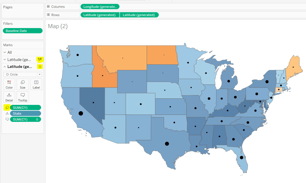
YoY % calculation for colouring the map
Displaying the circles on the map
Restricting the Date parameter to 1st Jan – 14th July only
Showing Daily or Weekly dates on the viz in tooltip
Restricting to full weeks only (in weekly view)
YoY % calculation
The data provided includes dates from 1st Jan 2019 to 21st July 2020. We need to be able to show Current Year (CY) values alongside Previous Year (PY) values and the YoY% difference. I built up the following calculations for all this
Today
#2020-07-15#
This is just hardcoded based on the requirement. In a business scenario where the data changes, you may use the TODAY() function to get the current date.
Current Year
YEAR([Today])
simply returns 2020, which I could have hardcoded as well, but I prefer to build solutions as if the data were more dynamic.
CY
IF YEAR([Subscription Date]) = [Current Year] THEN [Subscription] END
stores the value of the Subscription field but only for records associated to 2020
PY
IF YEAR([Subscription Date]) = [Current Year]-1 THEN [Subscription] END
stores the value of the Subscription field but only for records associated to 2019 (ie 2020-1)
YoY%
(SUM([CY])- SUM([PY]))/SUM([PY])
format this to a percentage with 0 decimal places. This ultimately is the measure used to colour the map. CY, PY & YoY% are also referenced on the Tooltip.
Displaying circles on the map
This is achieved using a dual axis map (via a second instance of the Latitude pill on Rows). One ‘axis’ is a map mark type coloured by the YoY% and the other is a circle mark type, sized by CY, explicitly coloured black.
The Tooltip for the circle mark type also shows the % of Total subscriptions for the current year, which is a Percent of Total Quick Table Calculation
Restricting the Date parameter to 1st Jan – 14th July only
As mentioned the Subscription Date contains dates from 01 Jan 2019 to 21 July 2020, but we can’t simply add a filter restricting this date to 01 Jan 20 to 14 Jul 20 as that would remove all the rows associated to the 2019 data which we need available to provide the PY and YoY% values.
So to solve this we need a new date field, and we need to baseline / normalise the dates in the data set to all align to the same year.
Baseline Date
//set all dates to be based on current year MAKEDATE([Current Year], MONTH([Subscription Date]), DAY([Subscription Date]))
So if the Subscription Date is 01 Jan 2019, the equivalent Baseline Date associated will be 01 Jan 2020. The Subscription Date of 01 Jan 2020 will also have a Baseline Date of 01 Jan 2020.
We also want to ensure we don’t have dates beyond ‘today’
Include Dates < Today
[Baseline Date]< [Today]
Add Include Dates < Today to the Filter shelf, and set to True.
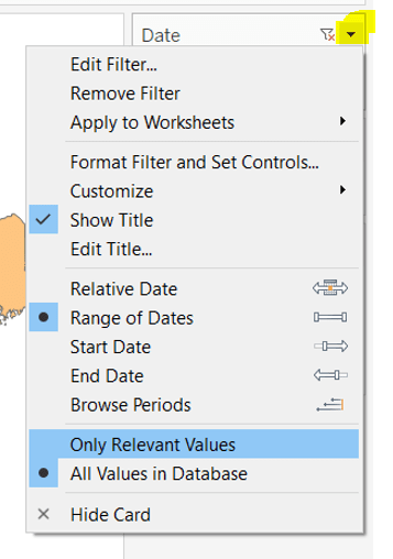
Add Baseline Date to the Filter shelf, choose Range of Dates , and by default the dates 01 Jan 2020 to 14 Jul 2020 should be displayed
Select to Show Filter, and when the filter displays, select the drop down arrow (top right) and change to Only Relevant Values
Whilst you can edit the start and end dates in the filter to be before/after the specific dates, this won’t actually use those dates, and the filter control slider can only be moved between the range we want.
The Baseline Date field should then be custom formatted to mmmm dd to display the dates in the January 01 format.
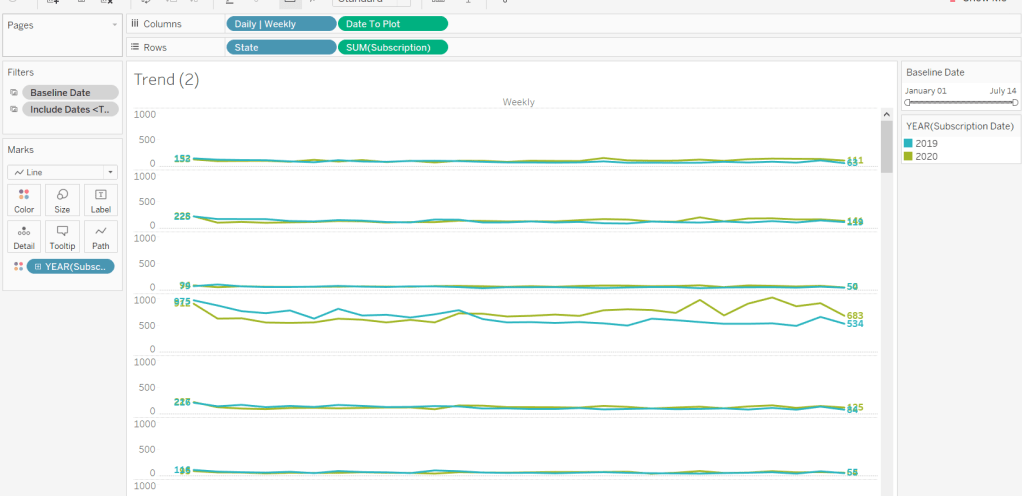
Showing Daily or Weekly dates on the viz in tooltip
The requirements state that if the date range selected is <=30 days, the trend chart shown on the Viz in Tooltip should display daily data, otherwise it should be weekly figures, where the week ‘starts’ on the minimum date selected in the range.
There’s a lot going on to meet this requirement.
First up we need to be able to identify the min & max dates selected by the user via the Baseline Date filter.
This did cause me some trouble. I knew what I wanted, but struggled. A FIXED LOD always gave me the 1st Jan 2020 for the Min Date, regardless of where I moved the slider, whereas a WINDOW_MIN() table calculation function caused issues as it required the data displayed to be at a level of detail that I didn’t want.
A peak at Kyle’s solution and I found he’dadded the date filters to context. This means a FIXED LOD would then return the min & max dates I was after.
Min Date
{MIN([Baseline Date])}
Note this is a shortened notation for {FIXED : MIN([Baseline Date])}
Max Date
{MAX([Baseline Date])}
With these, we can work out
Days between Min & Max
DATEDIFF(‘day’,[Min Date], [Max Date])
which in turn we can categorise
Daily | Weekly
IF [Days between Min & Max]<=30 THEN ‘Daily’ ELSE ‘Weekly’ END
We also need to understand the day the weeks will start on.
Day of Week Min Date
DATEPART(‘weekday’,[Min Date])
This returns a number from 1 (Sunday) to 7 (Saturday) based on the Min Date selected.
Using this we can essentially ‘categorise’ and therefore ‘group’ the Baseline Date into the appropriate week.
Baseline Date Week
CASE [Day of Week Min Date] WHEN 1 THEN DATETRUNC(‘week’,([Baseline Date]),’Sunday’) WHEN 2 THEN DATETRUNC(‘week’,([Baseline Date]),’Monday’) WHEN 3 THEN DATETRUNC(‘week’,([Baseline Date]),’Tuesday’) WHEN 4 THEN DATETRUNC(‘week’,([Baseline Date]),’Wednesday’) WHEN 5 THEN DATETRUNC(‘week’,([Baseline Date]),’Thursday’) WHEN 6 THEN DATETRUNC(‘week’,([Baseline Date]),’Friday’) WHEN 7 THEN DATETRUNC(‘week’,([Baseline Date]),’Saturday’) END
Ideally we want to simplify this using something like DATETRUNC(‘week’, [Baseline Date], DATEPART(‘weekday’, [Min Date])), but unfortunately, at this point, Tableau won’t accept a function as the 3rd parameter of the DATETRUNC function.
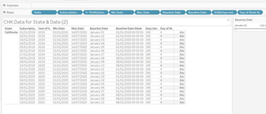
Let’s just have a look at what we’ve got so far
Rows for California only showing the Subscription Dates from 01 Jan 2019 – 10 Jan 2019 and 01 Jan 2020 to 10 Jan 2020. Min & Max date for all rows are identical and matches the values in the filter. The Baseline Date field for both 01 Jan 2019 and 01 Jan 2020 is January 01. The Baseline Date Week for 01 Jan 2019 – 07 Jan 2019 AND 01 Jan 2020 – 07 Jan 2020 is 01 Jan 2020. The other dates are associated with the week starting 08 Jan 20202.
So now we have all this information, we need yet another date field that will be plotted on the date axis of the Viz in Tooltip.
Date to Plot
IF [Days between Min & Max] <=30 THEN ([Baseline Date]) ELSE [Baseline Date Week] END
If you add this field to the tabular display I built out above, you can see how the value changes as you move the filter dates to be within 30 days of each other and out again.
When added to the actual viz, this field is formatted to dd mmm ie 01 Jan, and then is plotted as a continuous, exact date (green pill) field on the Columns alongside the Daily | Weekly field, with State & Subscription on Rows. The YEAR(Subscription Date) provides the separation of the data into 2 lines.
Restricting to full weeks only (in weekly view)
The requirements state only full weeks (ie 7 days of data) should be included when the data is plotted at a weekly level. For this we need to ascertain the ‘week’ the maximum date falls in
Max Date Week
CASE [Day of Week Min Date] WHEN 1 THEN DATETRUNC(‘week’,([Max Date]),’Sunday’) WHEN 2 THEN DATETRUNC(‘week’,([Max Date]),’Monday’) WHEN 3 THEN DATETRUNC(‘week’,([Max Date]),’Tuesday’) WHEN 4 THEN DATETRUNC(‘week’,([Max Date]),’Wednesday’) WHEN 5 THEN DATETRUNC(‘week’,([Max Date]),’Thursday’) WHEN 6 THEN DATETRUNC(‘week’,([Max Date]),’Friday’) WHEN 7 THEN DATETRUNC(‘week’,([Max Date]),’Saturday’) END
so if the maximum date selected is a Thursday (eg Thurs 11th June 2020) but the minimum date happens to be a Tuesday, then the week starts on a Tuesday, and this field will return the previous Tuesday date (eg Tues 9th June 2020).
And then to restrict to complete weeks only…
Full Weeks Only
IF [Daily | Weekly]=’Weekly’ THEN [Date To Plot]< [Max Date Week] ELSE TRUE END
If we’re in the ‘weekly’ mode, the Date To Plot field will be storing dates related to the start of the week, so will return true for all records where the field is less than the week of the max date. Otherwise if we’re in ‘daily’ mode we just want all records.
This field is added to the Filter shelf and set to true.
Hopefully that covers off all the complicated bits you need to know to complete this challenge. My published solution is here.
The requirement was to show some month to date / year to date metrics in comparison to the previous month to date, and also work out where the current month might finish.
I took up the challenge on Weds 25th March, and the challenge was dated ‘as at 24th March’. There was nothing in the requirements to indicate whether this was ‘hardcoded’ to this date, or whether it happened to be this date based on the time I viewed (ie it was yesterday, the last full day). In the interest of being ‘flexible’ I therefore chose to design my solution more dynamically. I based my challenge on viewing the data up to ‘yesterday’, where ‘yesterday’ is yesterday’s date in 2019. So if today is 27 March 2020, then the dashboard will be based up to 26 March 2019. Hope that’s clear.
As a result of this, there’s a fair few date calculations involved, so let’s crack on.
Setting up the calculations
I like to build up my calculations so they’re easier to read, rather than nest everything. First up we need
Current Year
{MAX(YEAR([Order Date]))}
The maximum year in the data set (which happens to be 2019 for the data source I’m connected to).
To get this, use the formatting to set to $ and 1 decimal place, then once set, change the format to ‘custom formatting’, which will display the ‘formatting code’. Then add the ▲▼ symbols. I use this site to get the characters I need.
The final calculation we need to work out is what’s been referred to as the ‘run rate’. This is basically trying to show what the final month sales/profit will be, based on the current rate. This means taking the current MTD Sales/Profit, dividing it by the number days this has been computed over to get an average sales/profit per day. Then this number is multiplied by the number of days in the month. Got it?
This is counting the number of days between the 1st of the month (based on yesterday), and the 1st of the next month.
Run Rate Sales
(SUM([Current MTD Sales])/SUM([Days in Current MTD])) * SUM([Days in Current Full Month])
Run Rate Profit
(SUM([Current MTD Profit])/SUM([Days in Current MTD])) * SUM([Days in Current Full Month])
Format these to $ and 1 decimal place.
This gives us all of the core calculations we need to build the KPIs.
Building the KPI card
This is done on one sheet, and is simply utilising the Text mark type.
By typing in, create a pill MIN(0) on the Rows shelf, and another one right next to it. Change the mark type to Text. This gives you 2 ‘cards’ you can now use. Add the all Sales related calculated fields to the Text shelf of the first card, and the Profit fields to the second card, and just format the font/layout accordingly. Then remove the axis headers, gridlines etc etc.
Building the Sales YoY Bar Chart
To ensure we only have the dates for the last 2 years, up to the current point in time, we need some additional fields
Previous Year
[Current Year]-1
Dates To Include
YEAR([Order Date])>= [Previous Year] AND [Order Date]<= [Yesterday]
Add Dates To Include to the Filter shelf and set to True.
Now build the viz by
Sales on Rows
Order Date on Columns, set to the Month level only (discrete blue pill).
Mark Type = bar
Order Date on Colour, set to Year level. Adjust colours to suit
Order Date on Size, set to Year level. Adjust size to suit so the latest year is narrower.
Set Stack Marks = Off (Analysis -> Stack Marks). This will stop the bars for each year from sitting on top of each other.
Format the Order Date axis, so the Month is displayed as 1st letter only.
Format the Sales axis so the value is displayed to K with no decimal places.
Due to the above, the format of the Sales value on the tooltip is likely to change too. If this happens, duplicate the Sales field, rename it to Tooltip – Sales or similar and format to $ with 0 dp. Add this to the Tooltip shelf.
You’ll need to do similar to get a month field for the tooltip. Create a calculated field Tooltip-Month = DATETRUNC(‘month’,[Order Date]) and custom format this to mmm yy. Add this to the Tooltip shelf.
Repeat the same steps to build the YoY Profit chart.
Date Sheet
The final dashboard indicates the date of the report. As my dashboard is dynamic and changes based on the current date, I couldn’t hardcode this. So I built the date to display on another sheet. This means I have 1 more sheet than stated in the challenge.
I simply added Yesterday to the Text shelf and referenced it
Building the Dashboard
Here we get into a bit of container fun! As I did last week, I’ll try to just step through the order you need to place the objects on the dashboard…
Add a Text object to store the title.
Beneath it, add the Date sheet.
To the right of both of these, add another Text object to store the sheet information text which will be displayed top right.
Add a Horizontal container beneath all of the above. Set the background of this container to light grey, and Inner Padding to 10 all round
Add the KPI sheet into the container and remove the title. Adjust the height of the objects to suit.
Now add a Vertical container to the right of the KPI chart. Adjust width to suit
Add the Sales YoY chart to the vertical container. Set the background of this object to white, so the title background isn’t grey.
Add the Profit YoY sheet below the Sales one. Again set the background of this to white.
Remove the container on the right hand side that contains the legends.
Add a floating blank object to the sheet. Set the background of this to light grey, and then adjust the positioning and height and width so it’s splitting your KPI card.
Finally if you haven’t already, edit the title and summary text appropriately.