
This week’s #WOW2023 challenge was inspired by Sam Parson’s TC presentation where he demonstrated the concept of an interactive Viz in Tooltip (the workbook he presented is here).
I was aware when I set this challenge, that this was likely to be on the higher end of the difficulty scale, but WOW challenges to me have have always provided a source of inspiration and ideas to take forward into my day job. And by blogging the solutions, I provide myself with a guide to refer to when the need arises. When Sam presented the concept, I immediately wanted to understand how he’d done it, and by setting it as a challenge it provided me with the opportunity to dig into it, and get that documented ‘how to’ guide 🙂
As mentioned in the requirements, I built this using multiple sheets, so we’ll start by just building out most of those sheets.
Building the Scatter Plot
We’re only concerned with data over the last 2 years, so we need to define some measures relevant to these years
Current Year
ZN(IF YEAR([Order Date]) = YEAR({MAX([Order Date])}) THEN [Sales] END)
{MAX([Order Date]} is a Fixed Level of Detail calculation which returns the maximum date in the data set. This calculation is then comparing the Year associated to that date with the Year of each Order Date, and if they match, return the Sales. Wrapping in a ZN ensures a value of 0 in the event there are no Sales.
Prior Year
ZN(IF YEAR([Order Date]) = YEAR({Max([Order Date])}) -1 THEN [Sales] END)
YEAR({Max([Order Date])}) -1 returns the year associated to the latest date then decrements by 1 to get the value of the previous year.
We also need to calculate the difference between the sales across the 2 years and categorise based on the difference
Sales Performance
IF SUM([Current Year]) / SUM([Prior Year]) > 1.1 THEN ‘Increasing’
ELSEIF SUM([Current Year]) / SUM([Prior Year]) < 0.9 THEN ‘Decreasing’
ELSE ‘Static’ END
If the current year sales > 10% of the previous year sales then flag as ‘increasing’, else if current month sales < 90% of the previous year sales then flag as ‘decreasing’ else flag as ‘static’.
Add Prior Year to Columns and Current Year to Rows. Add Manufacturer, Sub-Category and Category to Detail. Change the mark type to Circle. Add Sales Performance to Colour, adjust colours to match and reduce opacity to around 80%. Re-order the colour legend to display Increasing at the top and Decreasing at the bottom. Name the sheet Scatter.

Building the bar chart
On a new sheet add Order Date at the discrete (blue) Month level to Columns. Add Current Year to Rows. Change the mark type to bar and add Sales Performance to Colour. Reduce the opacity of the colour to 80%.
Add Prior Year to Rows. Change the mark type on the Prior Year marks card to gantt bar. Remove the Sales Performance pill from the colour shelf on this marks card. Adjust the colour to black.
Make the chart dual axis and synchronise axis.

Hide the axis, remove all gridlines & row/column dividers. Format the months to be abbreviated to the first letter. Right click on the Order Date label at the top and hide field labels for columns. Set the sheet to Entire View. Name the sheet Bar.

Building the KPI
On a new sheet add Current Year to Text. Adjust the format (size & colour of font) and align middle centre. Set the sheet to Entire View. Name the sheet KPI.

Building the % Change Indicator
Firstly we need to capture the value of the % change in sales
Sales Performance % Change
(SUM([Current Year]) – SUM([Prior Year]))/ SUM([Prior Year])
Use custom formatting to format as ▲ 0.0%;▼ 0.0%
On a new sheet, add Sales Performance % Change and Prior Year to Text. Change the mark type to square and increase the size to as large as possible. Set to Entire View. Adjust the font size of the text to match the display and align middle centre. Add Sales Performance to Colour. Name the sheet % Change

Identifying the data to filter
The final sheet we need is one to serve the title of the Viz in Tooltip (ViT). It includes references to information related to the mark selected on the scatter plot, namely the Category, the Sub-Category and the Maufacturer. Before building this title sheet though, we need to understand how we’re going to identify the mark selected so we can filter other sheets based on it.
Typically, for most use cases, when you add a worksheet to the tooltip of another sheet, you want to ‘filter’ what’s displayed in the ViT based on the mark you’re hovering/clicking on.
So by default, when you add a worksheet via the Viz in Tooltip functionality (see Tableau KB here for more info), the markup that’s automatically added looks like below
<Sheet name=”My ViT Sheet” maxwidth=”300″ maxheight=”300″ filter=”<All Fields>”>
where the filter property is set to <All Fields> which is the instruction to pass information from the ‘parent’ sheet through to the ViT sheet.
For this challenge however, when a user first hovers on a mark on the scatter plot (the parent sheet), the information displayed in the Viz in Tooltip (ViT) sheets is for the whole unfiltered data set (ie display information related to the Current Year and Prior Year Sales across all manufacturers, sub-categories & categories). But once selected (clicked on) the information displayed in the ViT should be filtered just to that mark.
For this to work, we can’t use the filter property of the ViT markup. That property needs to be set to “” to ensure the resulting sheets aren’t filtered ‘on hover’. So we need another way to drive the filtering behaviour.
We need to use sets.
We’re going to use sets to capture the Manufacturer, Sub-Category and Category of the mark that is clicked on. So to start, right click on Manufacturer > Create > Set and select all values.
Manufacturer Set

Repeat the same steps to create a Category Set and a Sub-Category Set.
Create a dashboard and add the Scatter sheet to the dashboard. Then create dashboard set actions (Dashboard Menu > Actions > Add Action > Change Set Values)
Select Manufacturer
On select of the Scatter sheet on the dashboard, target the Manufacturer Set, assigning values to the set when the action is initiated, and adding all values to the set when the action is cleared.

Note – ‘assign value to set’ will replace any values already in the set (ie all values) with the relevant value based on the selection made, whereas ‘add values to set’ just appends the selected value to the values already in the set.
Repeat the above steps to create set actions for the Category Set and the Sub-Category Set
Navigate to the Bar sheet. Add Category Set, Sub-Category Set and Manufacturer Set to the Filter shelf, and click on each pill and Show Set to list the sets and their selected values on the left hand side (this is just so you can see what’s going on).

Initially you can see all values in all the sets are selected. Now navigate back to the dashboard and click on a single mark. Then come back to the bar sheet and check the results…

You should see a change to the bars as they are now being filtered by only the values which have been assigned to the set via the ‘on click’ action.
Building the title sheet
Now we have the sets established, we can build on these to generate the information needed for the title sheet.
To start with, we need to understand how many values have been captured in each set.
Count Categories
COUNTD([Category])
Count Sub-Categories
COUNTD([Sub-Category])
Count Manufacturers
COUNTD([Manufacturer])
Then we need to build up a title based on what’s been selected
Title
IF [Count Manufacturers] = 1 THEN MIN([Manufacturer])
ELSEIF [Count Sub-Categories] = 1 THEN ‘All ‘ + MIN([Sub-Category])
ELSEIF [Count Categories] = 1 THEN ‘All ‘ + MIN([Category])
ELSE ‘All Manufacturers’
END
and a sub title
Sub Title
IF [Count Manufacturers] = 1 AND [Count Sub-Categories] = 1 AND [Count Categories] = 1 THEN ‘(‘ + MIN([Category]) + ‘ > ‘ + MIN([Sub-Category]) + ‘)’
ELSE ‘* ‘ + STR([Count Manufacturers]) + ‘ Manufacturers across ‘ + STR([Count Sub-Categories]) + ‘ Sub-Categories’
END
On a new sheet, add Title and Sub Title to Text. Format the background of the worksheet to be orange, set to Entire View, then adjust the text and font format and align top left. Name the sheet Title.

Now navigate back to the Bar sheet, and for each of the fields in the Filter shelf (the set ones), make them apply to selected worksheets, KPI, % Change, and Title

As a result, across all 4 sheets (not the Scatter one), you should have the 3 set fields as filters with the ‘multiple worksheet’ symbol indicating a shared filter.

If you go back to the dashboard and click on a mark then check the Title sheet, the information displayed should update.
Building the Viz In Tooltip
Now we have (most of) the components we need, let’s start to put together the actual ViT.
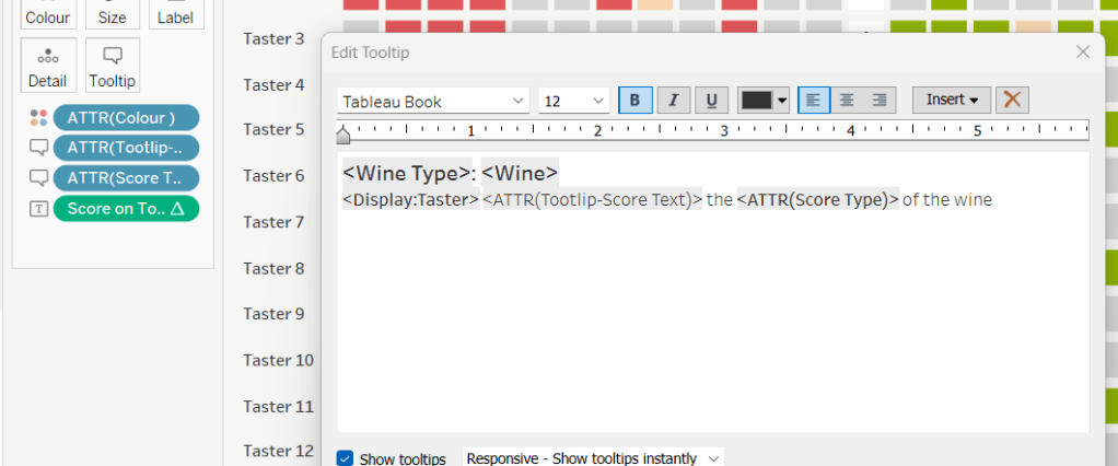
On the Scatter sheet, click on the Tooltip button to open the Edit Tooltip dialog.
Start by deleting all the text.
Then from the toolbar, click Insert > Sheets > Title to add the Title sheet to the tooltip. You should have something like

The key to getting the tooltip to display ‘nicely’ is to consider the height and widths, and align the markup text. Sometimes this does take a bit of trial & error and can also look differently when published to Tableau Public.
Adjust the above, so the maxwidth =500 and maxheight = 100, filter = “” and the whole line of text is centred.

Then add the other 3 sheets, using carriage returns to add space between the sheets as required, and adjusting the heights and widths.

If you go back to the dashboard and hover on a mark, you should see the display below for All Manufacturers

and if you then click on a mark, the display should adjust to filter

Making the ViT interactive
Edit the Tooltip on the Scatter sheet, and add a section at the bottom that references the Category , Sub-Category and Manufacturer fields (add via the Insert menu again). Style the font as you wish

Now if you go back to the dashboard and click on a mark, you can then also click on one of the links added at the bottom. In this instance I clicked on the Chairs link and all the marks in the scatter plot related to chairs were highlighted and the ViT data all updated to show the values associated to the Chairs Sub-Category

This is happening ‘automatically’ due to the fact the Allow selection by category option on the Tooltip is checked. This is a feature (along with Include command buttons) I personally often switch off.

Now ideally, we’d be finished at this point, but we just need to add a final feature, due to the fact that some Manufacturers exist across multiple Sub-Categories. For example, below while I have clicked a mark that is related to the Global Manufacturer in Chairs, clicking Global in the links at the bottom highlight all the Global Manufacturers across all Sub-Categories, so we can’t get back to seeing the information just about the selected mark.

Adding the ‘Current Mark’ selection
We need to capture the ‘product hierarchy’ for each mark into a single field
Category | Sub Cat | Manu
[Category] + ‘|’ + [Sub-Category] + ‘|’ + [Manufacturer]
Add this to the Detail shelf of the Scatter sheet.
We will need a parameter to then capture the ‘product hierarchy’ for the selected mark
pSelectedMarkIdentifier
string parameter set to ”” ie empty string

On the dashboard, add a parameter action
Identify Current Mark
On hover of the scatter sheet on the dashboard, set the pSelectedMarkIdentifier parameter to the value stored in the Category | Sub Cat | Manu field. Keep the current value when the selection is cleared.

Finally, we need to have a link to select in the tooltip, so we need
Current Mark Identifier
IF [pSelectedMarkIdentifier] = [Category | Sub Cat | Manu] THEN ‘Current Mark’
ELSE ”
END
Add this to the Detail shelf of the Scatter sheet, and then update the Tooltip and add a reference to the Current Mark Identifier field

If you now go back to the dashboard and test by clicking on a mark associated to the Global Manufacturer, you should be able to click on Current Mark using the link in tooltip after clicking other links, and get back to what you would have seen in the tooltip when you first clicked on the mark.
It should just now be a case of sorting out the layout on the dashboard.
Congratulations on getting this far! My published viz is here.
Happy vizzin’!
Donna


 Donna + DataViz