
Inspired by a discussion on Twitter that resulted in this blog post from Kevin Flerlage, Sean challenged us this week to build a viz that should adapt for different devices.
This makes use of the dashboard layout feature in Tableau (see here for further information). The focus on this week is really on the layouts, the charts are relatively straightforward, so I’m just going to summarise each one fairly quickly.
Note on the data
In the requirements, Sean talked about filtering the date to 2023 and assuming a YTD value where ‘today’ was 8th March 2023. The data set linked in the requirements didn’t contain that information. I chose instead just to use the 2022.4 version of Superstore I had. As this challenge wasn’t going to contain any complicated table calcs/LODs I wasn’t worried that my numbers might not match.
Filtering the data
To restrict the information based on Sean’s requirements, I created a parameter to represent ‘today’
pToday
date parameter defaulted to 8 March 2022

I then created a field to use to ensure I only counted data up to that date.
Dates to Include
[Order Date] <= [pToday]
I added this to the Filter shelf and set to True. In addition I added Order Date to the Filter shelf, and selected Years > 2022. Both these fields I set to apply to all worksheets using this datasource.
Building the KPIs
Format Sales and Profit to be $ with 0 dp. If it doesn’t exist, create
Profit Ratio
SUM([Profit])/SUM([Sales])
and format this to % to 1 dp.
Add Measure Names to Filter and filter to the three measures (Sales, Profit and Profit Ratio). Add Measure Names to Columns and Measure Values to Text. Re-order as required. Add Measure Names to Text too and format the Text as required, Remove row dividers and hide the column headers.

Building the bar chart
Add Sub-Category to Rows and Profit Ratio to Columns and sort descending, Add Sales to Colour and add Profit to Tooltip. Adjust tooltip. Hide the Sub-Category column heading from displaying (right click > Hide field labels for Rows). Change the title of the viz.

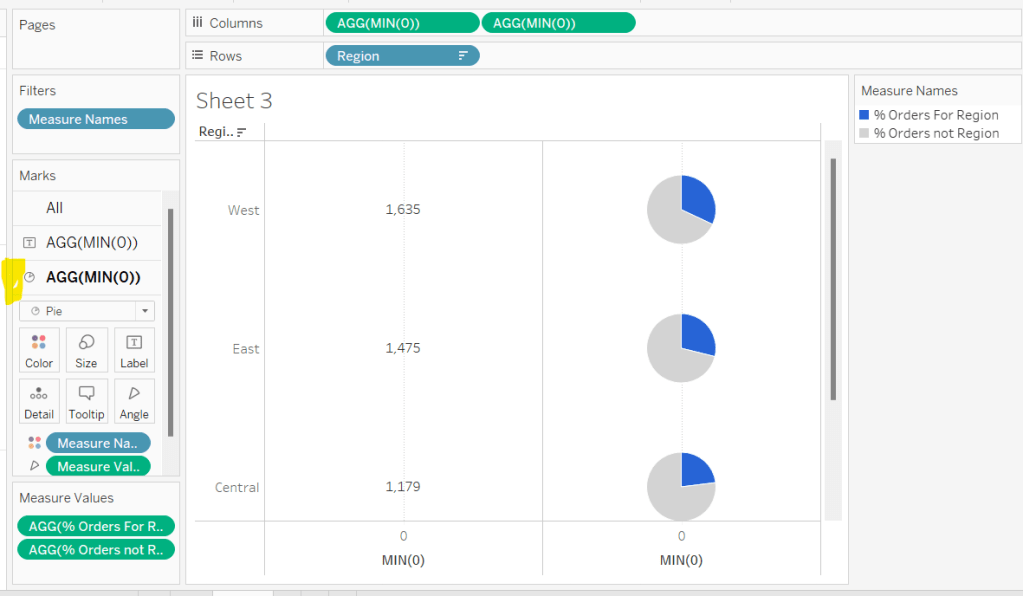
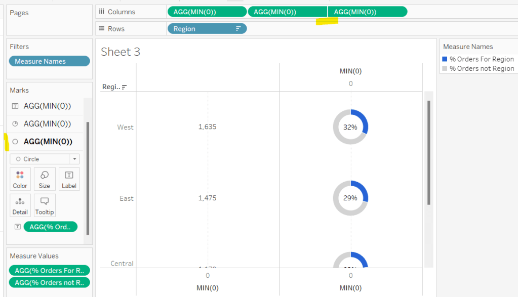
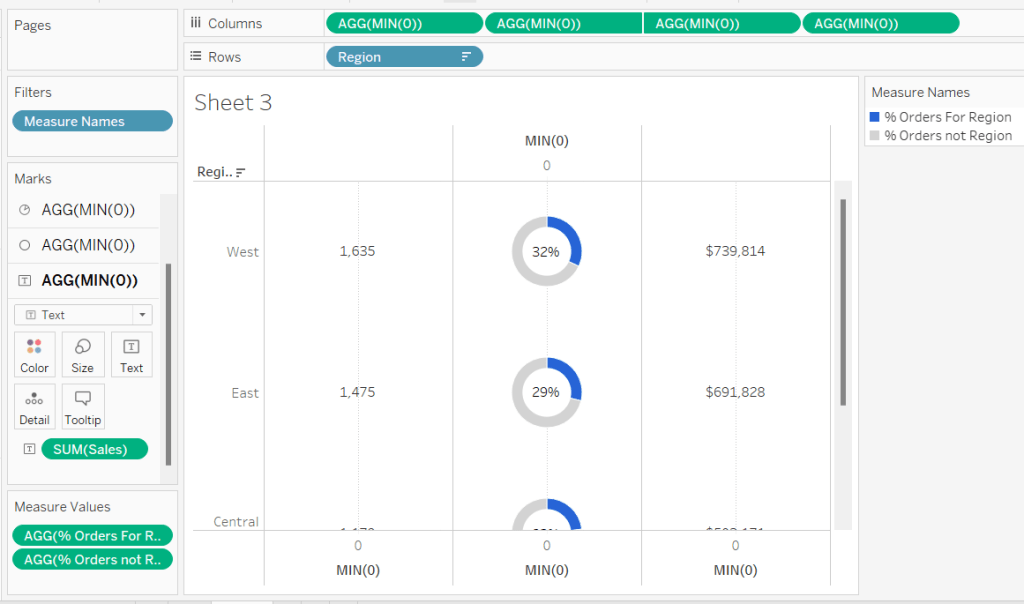
Building the Map
Double click State/Province to automatically generate a map of the USA (if it doesn’t display, check the location is set to USA – Map menu > Edit Locations).
Add Profit Ratio to Colour and add Sales and Profit to Tooltip. Adjust tooltip.
Remove all the background map layers by selecting Background Layers from the Map menu, and unchecking all the options listed on the menu that displays on the left hand side.
Hide the ‘unknown’ indicator if its displaying (right click > hide indicator).
Stop the map options (that allow zoom & pan etc) from displaying by selecting Map Options from the Map menu and unchecking all the options that are presented.
Remove row and column dividers and change the title of the viz.

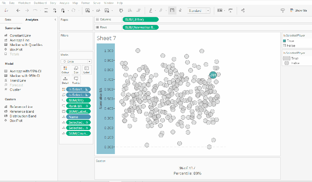
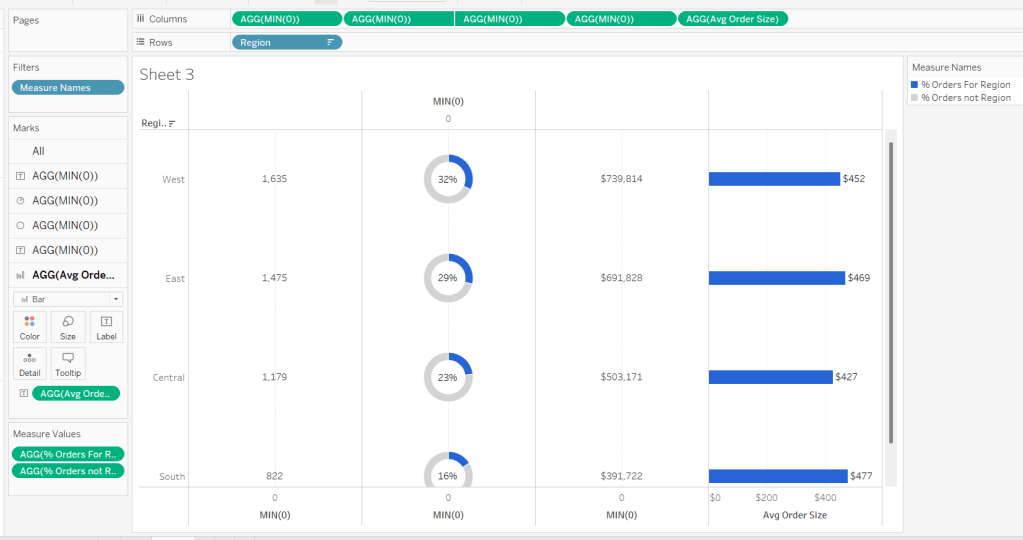
Building the Scatter Plot
Add Sales to Columns and Profit to Rows. Add Order ID to Detail and Profit Ratio to Colour. Make the zero lines slightly more prominent and title the viz.

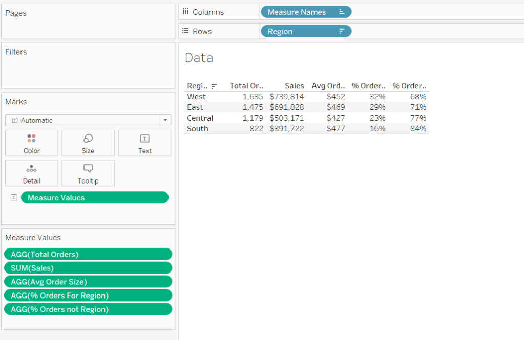
On a new sheet, add Customer Name and Product Name to Rows. Add Measure Names to Columns and Measure Values to Text. Add Measure Names to Filter and restrict to Quantity, Sales and Profit. Reorder the measures as required.
Add subtotals -from the Analysis menu select Totals > Add all Subtotals.
Set the row banding to none. Centre align the Customer Name column. Name the sheet Order Details or similar

Back on the scatter plot sheet, adjust the Tooltip and add a reference to the Order Details sheet by using the Insert > Sheets > select sheet

How well the viz in tooltip displays can often be a bit of trial and error. You may need to adjust the width and height properties on the referenced sheet in the tooltip. Also, sometimes setting the Fit property of the Order Details sheet may help too.
Building the default dashboard
Create a dashboard sized Generic Desktop. Set the background of the dashboard to grey (Format menu > Dashboard) Arrange the four vizzes on the dashboard. You may need to use horizontal and vertical containers to help you align everything where you want. Add padding around all the viz objects (I set mine to 10). Hide the title of the KPI viz. For the other 3 vizzes, set the background to white, so the title is also in white.

Set filter actions on both the bar chart and map, by selecting the object and then choosing Use as Filter from the context menu.

Click on the bar and check the other vizzes all filter. Do the same with the map. Now we’re ready to apply the different device layouts.
Creating the Tablet layout
The dashboard initially created is the Default dashboard, and we can tell this by looking at the left hand pane.

To add a new layout for a generic tablet, click the Device Preview button.
A Device Preview bar will appear at the top of the dashboard, Scroll through the Device type options until Tablet is displayed. By default the model should already be Generic Tablet. A border will display over the dashboard which indicates the boundaries of the dashboard based on the dimensions of the device. Click the Add Tablet Layout button.

The dashboard will immediately be resized to fit the boundary. Some of the vizzes are squashed up. Manually readjust so everything is displayed as required. A Tablet option will have appeared on the left hand side, and you can now toggle between Default and Tablet (click on the words in the left hand pane) and see the dashboard adjusting.

Creating the phone layout
Click on the Phone option (top left under Tablet), or scroll through and select Device Type = Phone.

By default, everything on the default dashboard is displayed on the Phone layout, which is obviously a portrait layout, optimised for scrolling down.
We don’t want the title, or the Scatter plot on this layout. To remove them, click the locked padlock icon and it will change to an unlocked icon, and the dashboard will be editable..

Remove the title object and the scatter plot object. In my case I also removed my footer information. Adjust the bar chart so its a bit longer, so the bars and labels are readable. It doesn’t matter that it will extend outside the bounds.
And that’s it – you now have 3 layouts for a single dashboard. Publish the viz to Tableau Public, then test out by accessing the viz from a tablet and/or your phone. Tableau will detect the type of device you’re accessing from, and show the most suitable display. Below are images of my viz accessed from my laptop, and on my mobile.


My published viz is accessible here.
Happy vizzin’!
Donna


 Donna + DataViz