
Continuing the theme of alternative chart types, Kyle decided to challenge us to recreate this jitter plot inspired by an example from The Big Book of Dashboards.
I’ve built jitter plots in the past for #WorkoutWednesday challenges (the hidden RANDOM() function is your friend in this), but I wanted to see how far I could get without having to peak at my previous solutions.
So I connected to the baseball data provided, and cracked on, building the jitter in a single sheet using Measure Names on the columns. But then I got stuck when it came to labelling the tooltips…. surely this didn’t need a sheet per measure did it…
…maybe it did… so I proceeded to recreate as 4 separate sheets, and felt quite smug that I’d managed to make use of the ‘little used’ worksheet caption to provide the summary detail at the bottom of each measure. When I’d finished, I checked Kyle’s solution, as the summary values for the SLG & OPS measures seemed to be mixed up…. and what did I find…. he had managed to build the jitter within a single sheet as he had pivoted the data first! Argggghhhh! It just hadn’t crossed my mind, and Kyle had chosen not to drop that hint in the requirements…. hey ho! c’est la vie! I may well recreate with a pivoted version at a later date, but for now, I am blogging what I did…
My solution has ended up with a lot of calculated fields as a result, as equivalent fields needed to be created for every measure. Most of this was managed via duplicating and editing existing fields, so it actually wasn’t too onerous.
Building the calculated fields
We’ll start as usual by building out the fields required, and will focus on the BA measure initially.
Add Name and BA into a tabular view and Sort descending. Format the BA measure to be a number with 3 decimal places.

We need to know the rank of each player. Create a calculated field
Rank BA
RANK(SUM([BA]))
Add this to the view, and we should get the player rankings displayed from 1 downwards.

Now the requirement wants us to normalise the measures so they can be displayed on the same axis (or in my case, since it’s not a single chart I’m building), within the same axis range.
What this means is we want to plot the measure on a scale between 0 and 1 where 0 represents the lowest measure value, and 1 the highest. for this we need
Min BA
{FIXED :MIN([BA])}
and
Max BA
{FIXED :MAX([BA])}

The normalised value then becomes
Normalise BA
([BA] – [Min BA])/([Max BA]-[Min BA])
The difference between the current value and the lowest value, as a proportion of the range (ie the difference between the highest and lowest values).
Adding this to the table, you should see that the Normalise BA value for the highest ranked player is 1 and that for the lowest ranked is 0.

As part of the information displayed, we also need to know the percentile each player is in.
Percentile BA
RANK_PERCENTILE(SUM([BA]))
Format this to a percentage with 0 dp and add into the table.
Next we need to identify the player selected, so we’re going to create a parameter based off of the Name.
Select a Player
Right click Name -> create -> Parameter. This will open the parameter dialog and auto populate the list of options with the values from the Name field. Default the parameter to Julio Rodriguez.

We can then create a field to identify if the player is the one selected
Is Selected Player?
[Name] = [Select a Player]
Add this into the table, on the Rows before Name and sort so True is listed at the top (just easier to check the results).

So now we need to identify the rank and percentile of the selected player only
Selected Player BA Rank
WINDOW_MAX(IF ATTR([Is Selected Player]) THEN [Rank BA] END)
format this to a number with 0 dp
Selected Player BA Percentile
WINDOW_MAX(IF ATTR([Is Selected Player]) THEN [Percentile BA] END)
format this to a percentage with 0 dp.
The window_max function has the effect of ‘spreading’ the result over all the rows.

Finally we need to get a count of all the players
Count Players
{FIXED:COUNTD([Name])}
format this to a number with 0 dp.

Building the Jitter Plot
To build a jitter plot, we need to plot each mark against 2 axes. The Normalise BA measure is one axis, but we need to create ‘something’ for the other. This is the value to make the ‘jitter’ which is essentially an arbitrary value between 0 and 1 that we can plot the mark against, and means the marks don’t all end up in a single line on top of each other, and we can get a better ‘feel’ for the volume of data being represented.
Jitter
RANDOM()
The random() function is a ‘hidden’ function that will, as it’s name suggests, generate a random number. It is ‘hidden’ as it only works with some data sources. Excel for example is fine, but if you were connected to a Snowflake database, you can’t use it.
The nature of random, also means that you can’t guarantee the value it produces, and it will regenerate on data refresh, so if you’re looking to compare your solution directly, your dots will not be positioned exactly the same.
On a new sheet add Jitter to Columns and Normalise BA to Rows. Add Name to Detail and change the mark type to Circle.

Add Is Selected Player to Colour, adjust accordingly and add a border to the circle. I dropped the opacity to 70%. Order the colour legend, so True is listed first, to ensure this circle is always ‘on top’.
Then add Is Selected Player to Size. Edit the sizes so they are reversed and adjust the sizes until you’re happy.

To label just the selected player mark
Label:BA
IF [Is Selected Player] THEN [BA] END
format this with a custom number font ,##.000;-#,##.000
Add this to the Label shelf and adjust the font colour, and align centrally
Add Rank BA and BA to the Tooltip shelf and adjust tooltip to suit. You will need to adjust the table calculation setting of the Rank BA field so that it is computing by all the fields.

Add Selected Player BA Rank and Selected Player BA Percentile and Count Players to the Detail shelf. Adjust the table calculations as above (including any nested calcs), then show the worksheet caption (Worksheet -> Show Caption), and edit the caption to display the relevant text.

From the analytics pane, drag the Median with Quartiles option onto the canvas and drop it on the table / Normalise BA axis option. Remove the quartile reference lines (right cick axis -> remove reference line), and edit the median reference line to be a dashed line with no label.
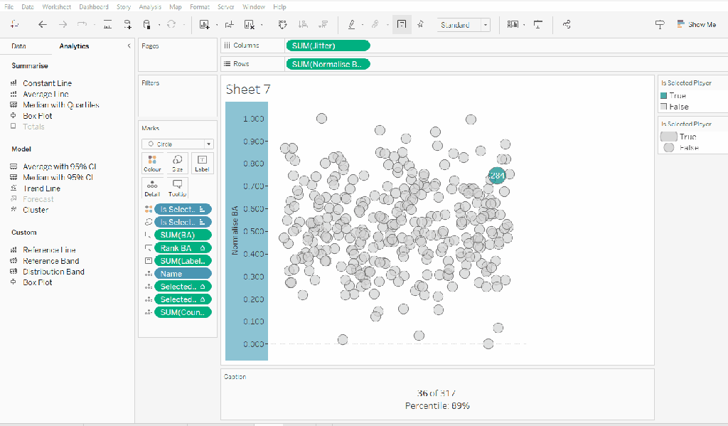
Finally remove all gridlines/dividers/axes lines and hide the axes. Title the sheet as per the measure ie BA, and align centrally.
Format the Caption and the Title to have a light grey background and a slightly darker thin border.

Now, repeat all that for the other measures 🙂 This isn’t that bad. All the fields above labelled BA, need duplicating, renaming and updated to reference the next measure eg OBP.
Once done, duplicate the BA jitter plot sheet, and replace all the ‘BA’ related fields with the equivalent ones, by dragging the equivalent field and dropping it directly on top. Sense check the table calculation settings are all ok. You may need to update the text in the caption, as that seems to lose anything to do with the table calculation fields referenced when they get touched.
Ultimately you should end up with 4 sheets.
Putting it all together
On a dashboard, use a horizontal container to position all 4 sheets in side by side. Show the worksheet caption for each sheet. Reduce the outer padding for each sheet to 0, and add a thin border around each sheet.

Add a parameter action to drive the interactivity ‘on click’ of a circle
Select Player
On select of any of the source sheets, update the Select a Player parameter with the value from the Name field. Retain the selected value on ‘unclick’

To prevent the selection on click from being ‘highlighted’, and al the other marks ‘fading’, we need one final step.
Create new calculated fields
True
TRUE
False
FALSE
Add both these fields to the Detail shelf of each of the 4 sheets.
Then add a dashboard filter action for each sheet which on select, goes from the sheet on the dashboard to the worksheet itself, passing the selected fields of True = False. Show all values when unselected.

My published viz is here. Kyle’s solution with a lot less calculated fields, and only 2 sheets (1 for the jitter and 1 for the summary section at the bottom) is here. You will need to pivot the data via the data source pane first through 🙂 Next time, when I really feel something should be able to be done in 1 sheet, I’ll try to think a little longer…. upshot though, I impressed myself at the use of the caption for the summary – something I must consider using more often!
Happy vizzin’!
Donna

[…] Read https://donnacoles.home.blog/2023/02/09/can-you-create-a-normalised-jitter-plot/ […]
LikeLike