Kyle set the challenge this week, revisiting his favourite topic – baseball. The aim was to build what I’ve often referred to as a ‘rocket chart’, as it charts progress from a single ‘launch’ date/point. However having had a quick google, I can’t see any other reference to this being used for this type of chart….no idea where it came from <shrug>.
Anyway, the requirement was to compare the profiles of when home runs (HRs) had been accumulated over the course of a player’s career, restricting to just the players who are in the all-time top 10. These players hadn’t necessarily played during the same years or even decades, so there was a need to baseline the information according to the days since they started. Kyle also threw in the requirement that this was to be an LoD based challenge only, with no use of table calculations.
Build the basic chart
As mentioned above, we first need to ascertain how many days have passed between when the player hit their first home run, and the subsequent dates. We use a FIXED LoD to work out the minimum date per player
Min Date Per Player
DATE({FIXED [Player] : MIN([Date])})
And with that we can the work out the number of days that have passed
Days Since Min Date
DATEDIFF(‘day’,[Min Date Per Player], [Date])
And with this, we can quickly build out the main crux of the chart. Add Days Since in Date to Columns, and change to be a continuous dimension. Add Career HR to Rows and amend the aggregation to use AVG rather than SUM, as I found there looked to be duplicate records for some dates for the same player. Add Player to Detail.
Colouring the lines
Kyle provided a custom colour palette to use based on the team colours of the player. I updated by preferences.tps file with this data, and closed and reopened Tableau Desktop to ensure it picked it up. For more information on working with custom colour palettes see this Tableau help article.
Along with the player colours, we also need to identify which player has been selected.
For that we need a parameter to define who the selected player is
pPlayer
string parameter using a List where the values are added from the Player dimension. this causes the default to be set to Albert Pujols.
Show the parameter on the display.
We can now create
Is Selected Player?
[Player] = [pPlayer]
which will return a boolen true/false.
Kyle stated that we should be able to set the colours without having to manually click against every Player|T or F combination.
Now I managed this when I first built my solution, but in writing this blog and trying to replicate the steps, I’m not getting the same behaviour. So I have managed to come up with another way. The gif below hopefully demonstrates, but I’ll list the steps too.
Move the Player pill from Detail onto Colour
Edit the Is Selected Player field to just return True (use // to just comment out the original calculation)
Add Is Selected Player to the Detail shelf, then click the detail icon to the left of the pill and change it to Colour. This is a way to get multiple pills on the Colour shelf. Dragging will just replace the field being used for colour.
The colour legend dialog box should display a list of <Player>, True entries (if the legend isn’t displaying go to Worksheet > Show Cards > Reset Cards – you may then have to add the parameter to the display again).
Edit the colour legend, select the MLB HR Top 10 colour palette and click Assign Palette. This will automatically assign the relevant colour to each entry, since they were added based on alphabetical order.
Re-edit the Is Selected Player field, so it is back to [Player] = [pPlayer].
The entries in the colour legend will now only list one <Player>, True entry and the rest all false.
Edit the colour legend, and multi-select (ctrl-click) all the False entries, and then select the lightest shade of grey from the Seattle Grays palette. This should give you the desired display.
Select Alan Rodriguez from the parameter control. Both Albert, False & Alan, True should now be coloured. Edit the colour legend again and manually set the Albert Pujols, False entry to the same grey shade.
Now if you select any other player, only 1 line should be coloured, and it should be coloured to the corresponding player’s colour.
Setting the Tooltip
Add Season HR to Tooltip and change the aggregation to AVG. Add Date to Tooltip too and set it to be an Attribute. Amend the tooltip accordingly.
Adding the highest season HR indicator
Firstly we need to determine what the maximum Season HR value is per player
Max Season HRPer Player
{FIXED [Player]: MAX([Season HR])}
With this, we then want to get the corresponding Career HR value for that same time.
Career HR | Max Season HR
IF [Season HR] = [Max Season HR Per Player] THEN [Career HR] END
Add this field to Rows and change the aggregation to Avg.
Set to Dual Axis, Synchronise Axis and then set the mark type to Circle. Adjust the size of the circle mark slightly if need be.
Labelling the lines
On the Line marks card, add Player and Career HR to the Label shelf. Adjust the aggregation of Career HR to Avg. Edit the label, so only line ends are labelled. Adjust the font size to something quite small, and set the colour to Match Mark Colour.
Finally remove all gridlines, row & column dividers, and hide the axis. Title the chart.
When added to a dashboard, I then used a floating text object for the introductory text and positioned the parameter as a floating object underneath the text.
Sean set the challenge this week and went retro, revisiting a challenge from 2017 originally set by Emma Whyte to build a Marrimeko chart.
Hang on… a what chart? Marrimeko…???
A good place to understand what a Marrimeko chart actually is, is this blog post by Tableau Visionary & Ambassador, Jonathan Drummey. This leads onto this post which explains the steps to help build.
The main concept of this type of chart is to show part-to-whole relationships across two variables at once. In the above for each job title, we have a split vertically based on proportion by gender; but the proportion of people with each job title is also being represented horizontally by the width of the ‘bars’. Both the x and the y axis are up to 100%.
I was actually around when the original challenge was set, so have my solution from then already on my Tableau Public profile. But it was a long time ago, with an older version of Tableau, so I built this from scratch (using the referenced blogs as a quick refresher). This blog will take you through the steps I took (which actually didn’t end up that different from the last time).
The data
The data set isn’t very large and contains all the information we will need, but not quite in the structure we might expect
The Sub-Type = Total field contains the % we will need to define how the width of the bars should be split (all the Total values add up to 100% or just about).
Whereas the combination of the Sub Types of Male and Female define how the height of the bars should be split (Male + Female = 100% for each Job Type).
So when we come to build, we ideally want to ‘filter out’ the Sub-Type = Total field, but we still need to retain this information to build the viz.
We need to get the % values associated to each Total row to be reflected against the Male/Female rows.
We’ll create an LoD for this
Job Type Percentage
{FIXED [Job Type]: SUM(IF [Sub-Type] = ‘Total’ THEN [Percentage]END )}
format this to % with 0 dp
If we pop the data out into a tabular format as below and add Sub-Type to the Filter shelf so it excludes the Total row, we can see we have essentially transposed the values which were stored against the Total row into it’s own column.
Building the Marrimeko chart
As stated above, the Job Type Percentage field defines the width of the bars we’ll be displaying. But before we can get to the point, we also need to define where on the x-axis each mark should be positioned. This too is based on Job Type Percentage, but is the cumulative value.
On a new sheet add Job Type to Rows, Filter by Sub-Type to exclude Total, and add Job Type Percentage to text. Sort by Job Type Percentage descending.
Now add a Running Total Quick Table Calculation to the Job Type Percentage field, and the cumulative values will display.
It is these values we need to plot on the x-axis.
Duplicate the sheet.
Edit the table calculation against the Job Type Percentage field, so that it is explicitly set to compute using Job Type. This is important to ensure the calculation is retained regardless as to where we put the pill on the canvas.
Now move this pill from the Text shelf to Columns, and change the mark type to Gantt Bar. Move Job Type from Rows to the Detail shelf. Reapply the Sort to the Job Type field so its sorting by Job Type Percentagedescending
The markers for the Gantt should all be positioned at the correct position.
Now add Percentage to Rows and change the mark type to Bar.
Add Job Type Percentage to the Size shelf, then click on the shelf, and change to be Fixed and aligned Right.
Now add Sub-Type to Colour. Manually drag the values in the COlour legend to re-order (so Male is listed first) and adjust colours to suit.
Ta dah! The crux of the chart.
Now to add the ‘bells and whistles’.
The chart is labelled, but only for the Entry Job Type. We need a calculated field to manage this.
Label: Sub Type
IF [Job Type] = ‘Entry’ THEN [Sub-Type] END
Add this to the Label shelf, and set to Show Mark labels. If it doesn’t show (like it didn’t on mine), change the field to be an attribute (I need to do a dig on why this is required… I think it’s something to do with the table calcs….).
I tried to use the alignment setting of the label to set to ‘top left’, but while they would left align they wouldn’t move to the top. I manually moved them instead – simply click on the label and when the cursor changes to a cross, drag the label to the desired position.
Do this for both labels, and adjust the formatting of the label too (I set it to 12pt bold).
Remove all gridlines, axis lines, zero lines etc.
Add a 50% reference line on the y-axis. Right click on the Percentage axis ->Add Reference Line. Add a table level constant of 0.5 which is a thin dotted grey line that is almost invisible (due to the colour selected).
Hide the axes (uncheck show header).
The tooltip has a minor nuance in that it refers to ‘Women’ & Men rather than Male & Female, so we need a field for this
Gender
CASE [Sub-Type] WHEN ‘Female’ THEN ‘Women’ WHEN ‘Male’ THEN ‘Men’ END
Add this to the Tooltip shelf and adjust the tooltip accordingly.
Labelling the axes
The final viz has labels on both the x and y axis, but these are all managed by text/image objects positioned ‘cleverly’ on the dashboard. It’s a bit of trial and error to get everything aligned as required.
To label the Job Type, I used a horizontal container, positioned beneath the chart, with several text objects, some of which had the text rotated.
The Equal Proportions and Less Equality text are both floating text objects. I saved an ‘arrow’ image from the internet and added a floating image object too.
Lorna set this challenge this week to test some LoD fundamentals. My solution has a mix of LoDs and table calculations – there weren’t any ‘no table calcs’ allowed instructions, so I assumed they weren’t off limits and in my opinion, were the quickest method to achieve the line graph.
Note – For this challenge, I downloaded and installed the latest version of Tableau Desktop v2022.2.0 since Lorna was using the version of Superstore that came with it. The Region field in that dataset was set to a geographic role type. I built everything I describe below using the field fine, but when I extracted the data source at the end and ‘hid all unused fields’ before publishing, the Region field reported an error (pill went red, viz wouldn’t display). To resolve, I ended up removing the geographic role from the field and setting it just to be a string datatype. At this point I’m not sure if this an ‘unexpected feature’ in the new release…
Ok, let’s get on with the build.
Building the basic viz
I started by building out the basic bar & line chart. Add Region to Rows, Order Date as continuous month (green pill) to Columns and Sales to Rows. Change the mark type to bar, change the Size to manual and adjust.
Drag another copy of the Sales pill to Rows, so its next the other one. Click on the context menu of that 2nd pill, and select Quick Table Calculation -> Moving Average
Change the mark type of the 2nd Sales pill to line.
Now click on the context menu of the 2nd Sales pill again and Edit Table Calculation. Select the arrow next to the ‘Average, prev 2, next 0’ statement, and in the resulting dialog box, change the Previous values to 3 and uncheck the Current Value box
At this point you can verify whether the values match Lorna’s solution when set to 3 previous months.
But, we need to be able to alter the number of months the moving average is computing over. For that we need a parameter
pPriorMonths
integer parameter, default to 3, that ranges from 2 to 12 in steps of 1.
Then click on the 2nd Sales pill and hold down Shift, and drag the pill into the field pane on the left hand side. This will create a new field for you, based on the moving average table calculation. Edit the field. Rename it and amend it so it references the pPriorMonths parameter as below
Moving Avg Sales
WINDOW_AVG(SUM([Sales]), -1*[pPriorMonths], -1)
Adjust the tooltip for both the line and the bar (they do differ). Ignore the additional statement on the final bar for now.
Colour the line black and adjust size. Then make the chart dual axis and synchronise axis. Hide the right hand axis. Remove Measure Names from the Colour shelf of both marks cards.
Colouring the last bar
In order to colour the last bar in each row, we need 3 pieces of information – the value of Sales for the last month, the moving average value for the last month, and an indicator of whether one is bigger than the other. This is where the LoDs come in.
First up, lets work out the latest month in the dataset.
finds the latest date in the whole dataset and truncates to the 1st of the month. Note, this works as there’s sales in the last month for all Regions, if there hadn’t been, the calculation would have needed to be amended to be FIXED by Region.
From this, we can get the Sales for that month for each Region
Latest Sales Per Region
{FIXED [Region] :SUM( IF DATETRUNC(‘month’, [Order Date]) = [Latest Month] THEN [Sales] END)}
To work out the value of the moving average sales in that last month, we want to sum the Sales for the relevant number of months prior to the last month, and divide by the number of months, so we have an average.
First let’s work out the month we’re going to be averaging from
This subtracts the relevant number of months from our Latest Month, so if the Latest Month is 01 Dec 2022 and we want to go back 3 months, we get 01 Sept 2022.
Avg Sales Last n Months
{FIXED [Region]:SUM( IF DATETRUNC(‘month’, [Order Date]) >= [Prior n Month] AND [Order Date] < [Latest Month] THEN [Sales] END)} / [pPriorMonths]
So assuming we’re looking at prior 3 months, for each Region, if the Order Date is greater than or equal to 01 Sept 2022 and the Order Date is less than 1st Dec 2022, get me the Sales value, then Sum it all up and divide by 3.
And now we determine whether the sales is above or below the average
Latest Sales Above Avg
SUM([Latest Sales Per Region]) > SUM([Avg Sales Last n Months])
If you want to sense check the figures, and play with the previous months, then pop the data into a table as below
So now we’re happy with the core calculations, we just need a couple more to finalise the visualisation.
If we just dropped the Latest Sales Above Avg pill onto the Colour shelf of the bar chart, all the bars for every month would be coloured, since the calculation is FIXED at the Region level, and so the value is the same for all rows associated to the the Region. We don’t want that, so we need
Colour Bar
IF DATETRUNC(‘month’, MIN([Order Date])) = MIN([Latest Month]) THEN [Latest Sales Above Avg] END
If it’s latest month, then determine if we’re above or below. Note the MIN() is required as the Latest Sales Above Avg is an aggregated field so the other values need to be aggregated. MAX() or ATTR() would have worked just as well.
Add this field to the Colour shelf of the bar marks card and adjust accordingly.
Sorting the Tooltip for the last bar
The final bar has an additional piece of text on the tooltip indicating whether it was above or below the average. This is managed within it’s own calculated field.
Tooltip: above|below
IF DATETRUNC(‘month’ ,MIN([Order Date])) = MIN([Latest Month]) THEN IF [Latest Sales Above Avg] THEN ‘The latest month was above the prior ‘ + STR([pPriorMonths]) + ‘ month sales average’ ELSE ‘The latest month was below the prior ‘ + STR([pPriorMonths]) + ‘ month sales average’ END END
If it’s the latest month, then if the sales is above average, then output the string “The latest month was above the prior x month sales average” otherwise output the string “The latest month was below the prior x month sales average”.
Add this field onto the Tooltip shelf of the bar marks card, and amend the tooltip text to reference the field.
Finalise the chart by removing column banding, hiding field labels for rows, and hiding the ‘4 nulls’ indicator displayed bottom right.
Creating an Info icon
On a new sheet, double click into the space within the marks card that is beneath the Detail, Tooltip, Shape shelves, and type in any random string (”, or ‘info’ or ‘dummy’). Change the mark type to shape and select an appropriate shape. I happened to have some ? custom shapes, so used that rather than create a new one. For information on how to create custom shapes, see here. Amend the tooltip to the relevant text. When adding to the dashboard, this sheet was just ‘floated’ into the position I was afte. I removed the title and fit to entire view.
Week 32 of #WOW2022 and Kyle set this challenge to build a dumbbell chart (also sometimes referred to as a barbell chart, a gap chart, a connected dot plot, a DNA chart). I first built one of these a long time ago, and have built many since, so chose not to refer to Ryan Sleeper’s blog Kyle so generously provided. I figured I’d have a go myself from memory. Looking back now, I actually started by going down the same route a Ryan, but then switched my approach in order to handle the tooltip requirements.
So here’s what I did.
Defining the calculations required
I’m going to start with these, as it’s then easier just to explain how everything then gets built. In reality, some of these calculations came along mid-build.
I decided to create explicit fields to store the Ownership values for the 2015 & 2019 years ie
Ownership 2015
IF [Year]=2015 THEN [Ownership] END
Ownership 2019
IF [Year]=2019 THEN [Ownership] END
Both these fields I formatted to % with 0dp.
Given these, I can then work out the difference
Difference
SUM([Ownership 2019])-SUM([Ownership 2015])
also formatted to % with 0dp
and finally, I can work out whether the change exceeds 20% or not
Difference>0.2
[Difference]>0.2
These are all the fields required 🙂
Building the Dot Plot
Add Age to Columns as a discrete dimension (blue pill) and Ownership 2015 to Rows. This will create a bar chart.
Then drag Ownership 2019 onto the canvas, and release your mouse at the point it is over the Ownership 2015 axis and the 2 green columns symbol appears.
This will have the effect of adding Measure Names and Measure Values to the view.
Change the mark type to Circle and move Measure Names from Columns onto Colour. Adjust colours accordingly.
Show mark labels and adjust so they are formatted middle centre, and are bold. Increase the size of the circles so the label text is completely within the circle, and the font colour should automatically adjust to white on the darker circles and black on the lighter ones.
Add Ownership 2015, Ownership 2019 and Difference onto the Tooltip shelf, and adjust the tooltip to suit. Note – I chose to adjust the wording of the tooltip to not assume there was always an increase. I used the word ‘change’ instead and as a result applied the custom formatting of ▲0%;▼0% to the Difference field that was on the Tooltip shelf.
So my tooltip was
which generated a tooltip that looked like
Connecting the dots
Add another instance of Measure Values to Rows alongside the existing one. This will generate a 2nd Measure Values marks card.
On that marks card, remove Measure Names from Colour and add Difference>0.2 to the Colour shelf instead, and adjust the colours.
Change the mark type to Line and add Measure Names to the Path shelf.
Move the Difference pill from the Tooltip shelf to the Label shelf. Edit the label controls, so the label only displays at the start of the line, which should make the label only show at the bottom. Adjust the label alignment so it is bottom centre.
Delete all the text from the Tooltip of the ‘line’ marks card.
Now make the chart dual axis and synchronise the axis. You’ll notice the bars sit on top of the circles, and the difference text is not displaying under the circles.
To remedy this, first, right click on the right hand axis, and select move marks to back. The lines should now be behind the circles.
Then, on the lines marks card, edit the Label text and just add a single carriage return in the dialog box, so the text is shifted down.
Adding Age to be displayed at the top
The quickest way to do this is to double click in the space on the Columns shelf, next to the Age pill, and type in ‘Dummy’ or just ” if you prefer. This has the affect of adding another ‘dimension’ into the view and as a result the Age values immediately get moved to the top.
Now just remove all axis, all gridlines, all row & column dividers. Then uncheck show header against the Dummy pill and hide field labels for columns for the Age header (right click on the Age label in the view itself to get this option, not the pill). Then format the Age text to be a bit bigger and bolder, and also increase the Size of the lines mark type. And that’s your viz 🙂
Additional Note
If you had followed Ryan’s blog post, then you would still have needed to create separate calculated fields to store the ownership values for 2015 and 2019, but these would have had to been LOD fields eg
Ownership 2015
{FIXED [Age]:SUM(IF [Year]=2015 THEN [Ownership] END)}
and a similar one for Ownership 2019. The other 2 fields related to the difference would then need to reference these instead.
Sean set this fun and very relevant challenge this week displaying key measures (KPIs) along with further details for a selected measure displayed in a horizontal layout rather than the more traditional long-form, using ranking. The ‘gotcha’ part of this challenge was ensuring the tooltips displayed the measures in the right format, ie $ for Sales and Profit, % for Profit Ratio and a standard number to 0 dp for # of Orders.
We’ll start by
Building the KPI sheet
The data source I connected to already had Profit Ratio included, but if yours doesn’t, you’ll need to create as
Profit Ratio
SUM([Profit])/SUM([Sales])
You’ll also need to create
# of Orders
COUNTD([Order ID])
On a new sheet, double-click Sales and then double-click Profit to add them both to a sheet, and then use Show Me to display the fields as a text table.
Move Measure Names from Rows to Columns, then add Profit Ratio and # of Orders into the Measure Values section under the marks card. Re-order the measures into the required order.
Modify the format of each pill in the Measure Values section to the relevant format (millions, thousands, %)
Add Measure Names to the Text shelf, and adjust the text to be aligned middle centre and resize the fonts.
Hide the header (uncheck Show Header against the Measure Names in the Columns, and remove row dividers. Set the Tooltip not to show.
Building the Ranked Chart
The value to display in this chart is dependent on the KPI measure clicked on. We’re going to use a parameter to help drive this behaviour, so start by creating
Measure to Display
string parameter defaulted to ‘Sales’ containing 4 options: Sales, Profit, Profit Ratio, # of Orders
Based on the parameter, we need to determine which value to display
Selected Value
CASE [Measure to Display] WHEN ‘Sales’ THEN SUM([Sales]) WHEN ‘Profit’ THEN SUM([Profit]) WHEN ‘Profit Ratio’ THEN [Profit Ratio] WHEN ‘# of Orders’ THEN [# of Orders] END
On a new sheet, add Sub-Category to Rows and Selected Value to Text and sort by Sub-Category descending. Show the Measure to Display parameter on the sheet and play around with the different options to see how the viz changes. When you’re happy it’s working as expected, reset back to ‘Sales’.
We’ll need to display the rank value, so create
Rank Value
RANK_UNIQUE([Selected Value])
and format this to be a number with 0dp but pre-fixed by #
Add this into the table.
Now, to display this information, we need to distribute each Sub-Category across 5 rows and 4 columns which is based on the Rank Value. So let’s work out which row and column each entry should be in
Rows
IF [Rank Value]%5 = 0 THEN 5 ELSE [Rank Value]%5 END
If the rank is divisible by 5, then place in the 5th row, otherwise place in the row associated to the remainder when divided by 5.
Cols
IF [Rank Value] <=5 THEN 1 ELSEIF [Rank Value] <=10 THEN 2 ELSEIF [Rank Value] <=15 THEN 3 ELSE 4 END
Add these fields to the table, so you can see how they’re working.
The Rank Value, Rows and Cols fields are all table calculations, and should be set to explicitly compute using Sub-Category.
On a new sheet, add Sub-Category to Detail, Cols to Columns as a blue discrete pill and Rows to Rows as a blue discrete pill. Add Selected Value to Columns. Drag Sub-Category from Detail on to Label and adjust to align the labels left. Widen each row slightly, so the text is visible. Adjust the Colour of the bars to be a pale grey.
Change the Measure to Display parameter to ‘Profit’, and notice what happens to the bars & labels associated to those with a negative profit. They’re positioned where you’d expect, on the negative axis, but this doesn’t match Sean’s solution.
Sean has chosen to display the values as absolute values (although the tooltips display the negative values). This means we need
Abs Value to Display
ABS([Selected Value])
Drag this field and drop directly on top of the Selected Value pill on the Columns shelf – this will replace the measure being displayed.
Now that’s sorted, we can get the ranking added.
Double click in the space next to Abs Value to Display on Columns and type in MIN(0) to create an additional axis and create a 2nd marks card.
On the MIN(0) marks card, move Sub-Category to the Detail shelf and thenadd Rank Value to the Label shelf. Make sure the table calc is set to compute by Sub-Category as before.
Change the mark type of the MIN(0) card to GanttBar, set the size to the smallest possible, and colour opacity to 0. The change of the mark type, will have changed the position of the rank label to be aligned to the left of the mark.
Make the chart dual axis, synchronise the axis and change the mark type of the Abs Value to Display back to Bar. Remove Measure Names from both of the marks cards.
Hide both axis and the headers and remove grid lines and divider lines. Make the zero line on the columns a solid line, slightly thicker.
Formatting the Tooltips
The tooltips display the selected measure name and associated value, formatted appropriately. As we’re using a ‘generic’ field to display the value, we can’t format this field as we’d usually do. Instead, I chose to resolve this using dedicated fields to store each value based on the measure selected.
Tooltip: Sales
IF [Measure to Display]=’Sales’ THEN [Sales] END
format this to $ with 0dp.
Tooltip: Profit
IF [Measure to Display]=’Profit’ THEN [Profit] END
format this to $ with 0dp.
Tooltip: Profit Ratio
IF [Measure to Display]=’Profit Ratio’ THEN [Profit Ratio] END
format this to 5 with 2 dp
Tooltip: #Orders
IF [Measure to Display]=’# of Orders’ THEN [# of Orders] END
format this to a number with 0 dp.
Add all these fields to the Tooltip shelf on the Abs Value to Display marks card, and then amend the tooltip so all these fields are listed side by side with no spacing. As only one of the fields will only ever contain a value, the correctly formatted figure will display. The Tooltip will also need to reference the Measure to Display parameter to act as the ‘label’ for the value displayed.
Finally adjust the title of the sheet to also reference the Measure to Display parameter,
Adding the interactivity
Add the sheets to a dashboard, then add a parameter action
Select Measure
On select of the KPI sheet, update the Measure to Display parameter, passing through the Measure Names value. When the measure is unselected, revert the display back to ‘Sales’.
Bonus – Colour the bars
As an added extra to call out the fact the negative values were being displayed on the positive axis, my fellow #WOW participant, Rosario Gauna, chose to colour the bars.
Colour Bar
[Selected Value] < 0
Add this to the Colour shelf of the Abs Value to Display marks card and adjust colours according.
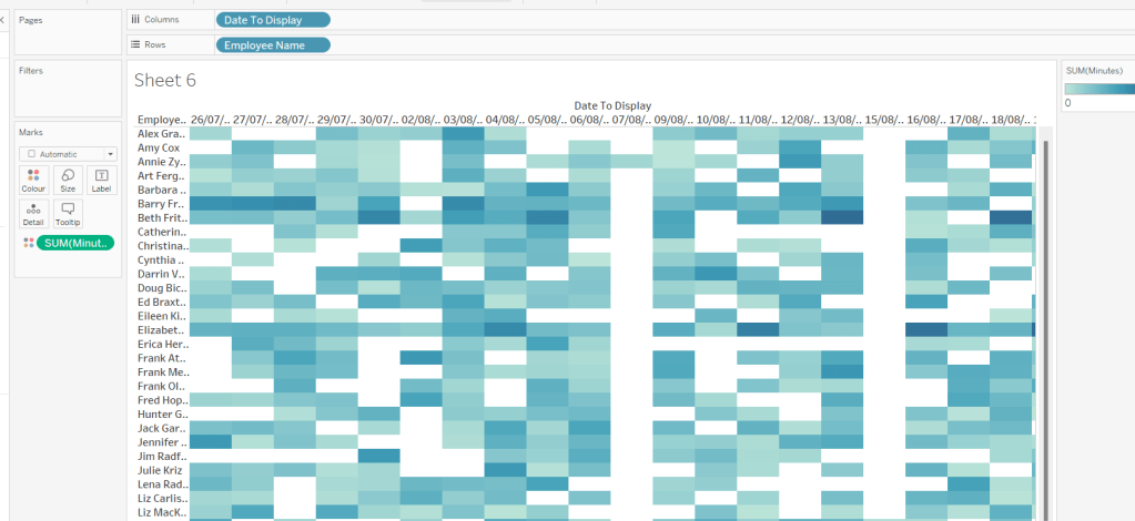
Erica set the challenge this week using a custom made dataset. The focus was to handle viewing different aggregations of the dates based on the date range selected, ie for short date ranges seeing the data at a day level, for medium ranges, view at the week level and then at a monthly level for larger ranges. This type of challenge has been set before, but the visual is typically a line chart rather than a heat map. The principles are similar though.
Determining the Date to Display
Each row in the data set has a Date associated to it. For this challenge we need to ‘truncate’ the date to the appropriate level depending on the date range and the date level selected by the user. By that I mean that if the level is deemed to be weekly, we need to ‘reset’ each date to be the 1st day of the week.
To start with, we need to set up some parameters which drives the initial user input.
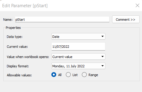
pStart
Date parameter defaulted to 11/07/2022 (11th July 2022), with a display format of <weekday>, <date>
pEnd
As above, but defaulted to 24/07/2022 (24th July 2022).
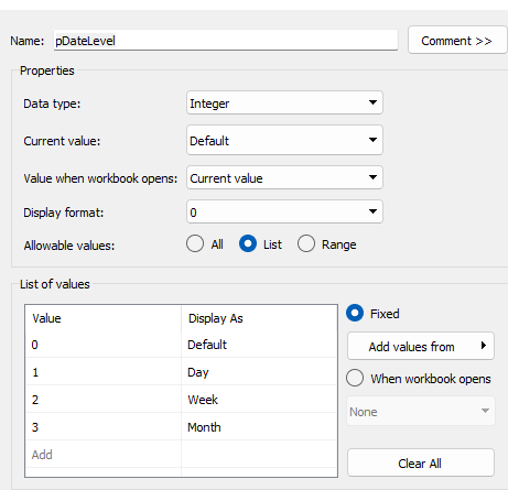
pDateLevel
integer with values 0-3 as listed below, with a text Display As. Defaulted to ‘Default’. Note, I am using integers as we will be referencing them in IF statements later, and integers are more performant than comparing strings.
With these parameters, we can then build
Date To Display
DATE( IF [pDateLevel] = 0 THEN IF DATEDIFF(‘day’, [pStart], [pEnd]) < 28 THEN DATETRUNC(‘day’,[Date]) ELSEIF DATEDIFF(‘day’, [pStart], [pEnd]) < 90 THEN DATETRUNC(‘week’, [Date]) ELSE DATETRUNC(‘month’, [Date]) END ELSEIF [pDateLevel] = 1 THEN DATETRUNC(‘day’,[Date]) ELSEIF [pDateLevel] = 2 THEN DATETRUNC(‘week’,[Date]) ELSE DATETRUNC(‘month’, [Date]) END )
If the pDateLevel is set to 0 (ie Default), then compare the difference between the dates entered and truncate to the ‘day’ level if the difference is less than 28 days, the ‘week’ level if the difference is less than 90 days, else truncate to the month level (which will return 1st of the month). Otherwise, if the pDateLevel is 1 (ie Day), truncate to the day level, if it’s 2 (ie Week), truncate to the week level, else use the month level.
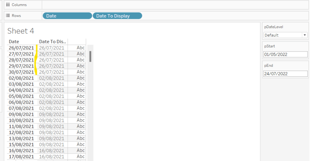
To see how this field is working, add Date and Date To Display to Rows, both as discrete exact dates (blue pills), display the parameter fields, and adjust the values. Below you can see that using the Default level, between 1st May and 24th July, the 1st day of the associated week against each date is displayed.
Building the Bar Chart
This is the simpler of the two charts to build, so we’ll start with this.
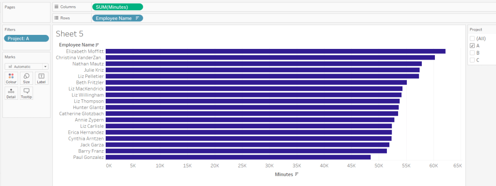
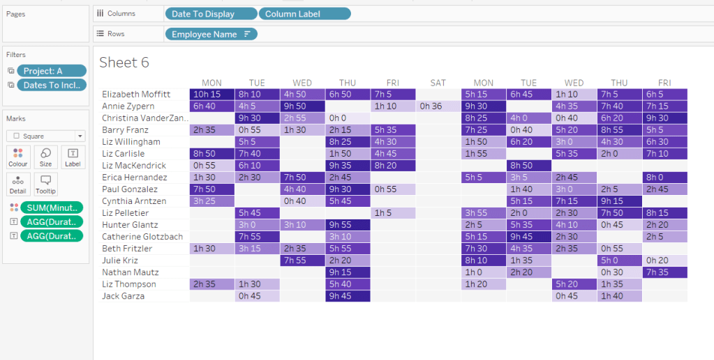
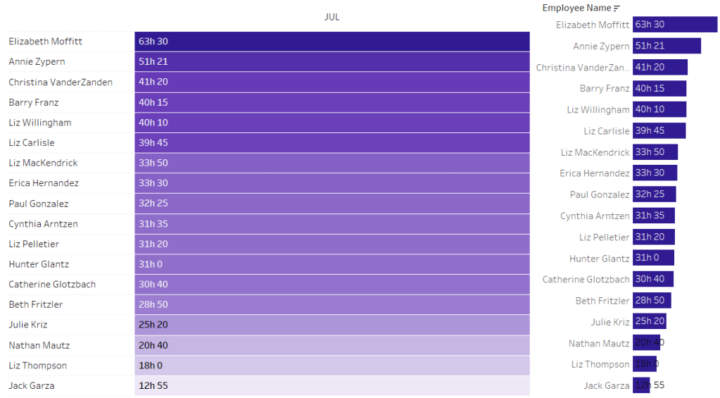
Add Employee Name to Rows, and Minutes to Columns. and sort by Minutes descending (just click the sort descending button in the toolbar). Add Project to Filter, select ‘A’ and then show the filter. Adjust the colour of the bars. I used #311b92
We need to restrict the data displayed based on the date range defined.
Dates to Include
[Date]>=[pStart] AND [Date]<=[pEnd]
Add this to the Filter shelf and set to True.
Now, we need to label the bars, and need new fields for this.
Duration (hrs)
FLOOR(SUM([Minutes])/60)
Using the FLOOR function means the value is always rounded down to the relevant whole number (eg 60.5 and above will still result in 60).
Format this field to be 0 decimal places with a ‘h’ suffix
Duration (mins)
SUM([Minutes])%60
Modulo (%) 60 means return the remainder when divided by 60. Format this to be 0 dp.
Add both these fields to the Label shelf, and adjust so the labels are displaying on the same line and are aligned to the left. You may need to increase the width of each row to see them.
Add Project to the Tooltip shelf and update, then remove all gridlines and the axis. Leave the Employee Name column visible for now. We’ll come back to this later.
Building the Heat Map
On a new sheet, add Employee Name to Rows and Date to Display as a discrete exact date (blue pill) to Columns. Add Minutes to Colour and a heat map should automatically display.
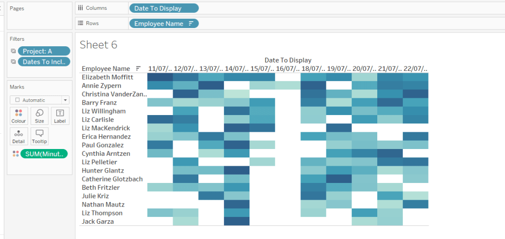
Go back to the bar sheet, and set both the Project and the Dates To Include filters to apply to the heat map worksheet as well (right click each pill on the filter shelf -> Apply to Worksheets -> Selected Worksheets and select the other one you’re building).
Then click the sort descending button in the toolbar, to order the data as per the bar.
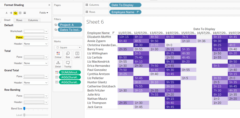
Add both Duration (hrs) and Duration (mins) to the Label shelf and change the mark type to Square. Adjust the label so it is on the same line and left aligned (I added a couple of spaces to the front of the text so it isn’t so squashed).
Edit the colours of the heat map – I used a colour palette I had installed called Material Design Deep Purple Seq which seemed to match, but may not be installed by default.
Format the main heat map section to have a light grey background by right clicking on the table -> format and setting the shading of the pane only to pale grey
Then adjust the row dividers of the pane to be white, and the header to be pale grey (set the level to the max).
Adjust the column dividers similarly, setting the pane to be white, the header to none, and level to max
Next we want to deal with the column labels. By default they’re showing the date, but we want this to show something different depending on the date level being displayed.
Column Label
IF (([pDateLevel] = 1) OR (([pDateLevel] = 0) AND (DATEDIFF(‘day’, [pStart],[pEnd])<28))) THEN UPPER(LEFT([Weekday],3)) ELSEIF (([pDateLevel] = 2) OR (([pDateLevel] = 0) AND (DATEDIFF(‘day’, [pStart],[pEnd])<90))) THEN ‘w/c ‘ + IIF(LEN(STR(DATEPART(‘day’, [Date To Display])))=1,’0’+STR(DATEPART(‘day’, [Date To Display])), STR(DATEPART(‘day’, [Date To Display]))) + ‘-‘ + UPPER(LEFT(DATENAME(‘month’, [Date To Display]),3)) ELSE UPPER(LEFT(DATENAME(‘month’, [Date To Display]),3)) END
If the date level is ‘day’ or the date level is the default and the start & end are less than 28 days apart, then show the day of the week (1st 3 letters only in upper case).
Else if the date level is ‘week’ or the date level is the default and the start & end are less than 90 days apart, then show the text ‘w/c’ along with the day number (which should be 01 to 09 if the day is < 10) a dash (-) and then the 1st 3 letters of the month in upper case.
Else, we’re in monthly mode, so show the 1st 3 letters of the month in upper case.
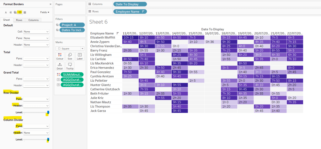
Add this to the Columns shelf, then hide the Date To Display field (uncheck show header), hide field label for columns and hide field label for rows. Format the Employee Name field so its a different font (I changed to Tableau Book).
Again play around with the parameters and see the changes to the column label.
Finally, add Project to the Tooltip and update. You’ll need to adjust the formatting of the Date To Display field to get it into <day of week>, <date> format.
Adding to the Dashboard
When you add the two charts to the dashboard, you’ll need to set them side by side within a horizontal layout container. Remove the titles. They both need to be set to ‘fit entire view’, and the width of the heat map chart should be fixed (I set it to 870px), so it retains the space it stays in, even when you only have 1 month displayed.
Once you’re happy the order of the heat map employees matches the order of your bar chart, uncheck show header against the Employee Name field on the bar chart.
To get the bars to align with the heat map, I showed the title of the bar, removed the text and just entered a space. This dropped the bars so they just about aligned. You may need to tweak by increasing the size of the bars slightly.
Finally, you need to move your parameters around. I placed them in a horizontal container, whose background colour was set to pale grey. I then set the objects within to be equally spaced by setting the container to Distribute Contents Evenly.
I then altered the padding of each of the parameter objects to have outer padding = 0 and inner padding = 5 and added a pale grey border surrounding each.
Indeed! What is the time-weighted return? It’s not a term I’d ever heard of until Luke set the challenge this week. Fortunately he provided a link to a web page to explain all about it – phew!
I actually approached the challenge initially by downloading the data source, copying the contents of sheet2 into a separate excel workbook, and then stepping through the example in the web page, creating new columns in the excel sheet for each part of the calculation. I didn’t apply any rounding and ended up with slightly different figures from Luke. However after a chat with my fellow WOW participant Rosario Gauna, we were both aligned, so I was happy. I’d understood the actual calculation itself, so I then cracked open Desktop to begin building. This bit didn’t really take that long – most of the time on this challenge was actually spent in Excel, but shhhhh! don’t tell anyone 🙂
Building the calculations
I’m going to build lots of calculated fields for this, primarily because I like to do things step by step and validate I’m getting what I expect at each stage. You could probably actually do this in just 2 or 3 calcs. As I built each calc, I added it into a tabular view of the data. I’m not going to screen shot what the table looks like after every calc though.
To start though, I chose to rename some of the existing fields as follows :
Flows -> A: Flows
Start Value -> B: Start Value
End Value -> C: End Value
I did this because I have several new fields to make, and coming up with a meaningful name for each was going to be tricky – you’ll understand as you read on 🙂
First up, create a sheet and add Reporting Date as an exact date discrete blue pill to Rows then add the above 3 fields.
Now onto the calculations, and this all just comes from the website. Each calc builds on from the previous. I chose to add inline comments as a reminder. After I built each calc I added to the table.
//difference between end value and (flow+start) SUM([C: End Value]) – [D: A+B]
F: E/D
//Difference as a proportion of (start + flow) [E: C-D]/ [D: A+B]
I formatted this one to 3 decimal places so the figure showed on screen, but ‘under the bonnet’ Tableau will use the full number in the onward calcs.
At this point now, F: E/D stores what the article describes as the ‘HP’ value for each date. Now we need to start building the calcs we need to compute the TWR value.
G: 1+F
1+[F: E/D]
formatted to 3 dp
H: Multiply G values
//Running Product of column G [G: 1+F]*PREVIOUS_VALUE(1)
This is the core calculation for this challenge. This takes the value of the G: 1+F field in each row, and multiples it by the value of the G: 1+F field in the previous row. As each row ends being the product of itself and the former row, this ultimately builds up a ‘running product’ value.
Add these fields onto the table and explicitly set the table calculation of the H: Multiply G values field to compute using Reporting Date.
And finally we can create
I: TWR
//subtract 1 from the running product -1 [H: Multiply G values]-1
format this to be a % with 0dp. Add to the table and again ensure the table calc (and all nested calcs) are set to compute using Reporting Date
The final calculation needed is one to use to display the TWR value for the last date.
J: Latest TWR Value
//get the last value computed WINDOW_MAX([I:TWR])
format this to be a % with 0dp.
This function looks for the highest number across the whole table, and spreads that value across every row. Since the I: TWR field is cumulative, the highest number will be the last value. Add this onto the table and verify all the tab calcs are set to compute by Reporting Date.
And now you can build the viz
Building the Viz
Add Reporting Date as an exact date continuous green pill to Columns and I:TWR to Rows, setting the compute by of the table calculation as described above. Add J:Latest TWR Value to Detail, and again set the compute by.
Then update the title of the sheet to reference the J:Latest TWR Value field, amend the tooltips and update the label on the y-axis. Add to a dashboard and you’re done 🙂
Lorna Brown set the challenge this week to build this butterfly chart, so called because of the symmetrical display. I’ve built these before so hoped it wouldn’t be too taxing.
The data set isn’t very verbose, fields for gender & year specific values by age bracket
When connecting to this excel file, you need to tick the Use Data Interpreter checkbox which removes all the superfluous rows you can see in the excel file.
Now, I started by building a version that required no further data reshaping, which I’ve published here. This version uses two sets of dual axis, and I use the reversed axis feature to display the male figures on the left. This version required me to float the Population axis label onto the dashboard so it was central. Overall it works, the only annoying snag is that I have two 0M labels displayed on the bottom axis, since this isn’t a single axis. As a result, I came up with an alternative, which matches the solution, and which I’m going to blog about.
Reshaping the data
So once I connected to the data and applied the Use Data Interpreter option, I then selected the Males, 2021 and Females, 2021 columns, right clicked and selected Pivot
This results in a row for the Male figures and a row for the Female figures, with a column Pivot Names indicating the labels for each row. I renamed this to Gender, and the Pivot Values column to Population.
Building the Chart
On a sheet, add Age to Rows and Population to Columns and Gender to Colour. Set Stack Marks Off (Analysis > Stack Marks > Off).
You’ll see that both the values for the Male & Female data is displaying in the positive x-axis. We don’t want this. So let’s create
Population – Split
IF [Gender]= ‘Males, 2021’ THEN [Population]*-1 ELSE [Population] END
Replace the Population pill on Columns with Population Split
So this is the basic butterfly, but now we need to show the Total Population. Firstly, let’s create
Total Population per Age Bracket
{FIXED Age: SUM([Population])}
And then similarly to before, we need to display this in both directions against the Male and the Female side, so create
Total Population Split
IF [Gender]= ‘Males, 2021’ THEN [Total Population per Age Bracket]*-1 ELSE [Total Population per Age Bracket] END
Drag this field onto the Population Split axis until the two green column icon appears, then let go of the mouse. This is creating a combined axis, where multiple measures are on the same axis.
Move Measure Names from Rows to the Detail shelf and then change the symbol to the left, so the pill is also added to the Colour shelf. Adjust the colours of the 4 options accordingly.
Edit the axis and rename to Population. Then Format the axis, and set the scale to display in millions to 0dp
The tooltip needs to display % of total, so we’ll need
% of Total
SUM([Population]) / SUM([Total Population per Age Bracket])
Add this to the Tooltip shelf
We also need the population figures on the tooltip displayed differently, so explicitly add Population Split and Total Population Split to the Tooltip shelf. Use the context menu of the pills on this shelf, to set the display format in the pane to be millions to 2 decimal places. But this time, once set using the Number(Custom) dialog, switch to the Custom option and remove the – (minus sign) from the format string. This will make the values displayed against the Males which are plotted on the -ve axis, to show as a positive number.
Finally, set aliases against the Gender field, so it displays as Males or Females (right click on Gender > Aliases).
Now you have all the information to set the tooltip text.
Now add a title to the sheet to match that displayed, hide field labels for rows, and adjust any other formatting with row/column dividers etc that may be required, and add to a dashboard.
And that should be it. My published version of this build is here.
Kyle returned this week to set this challenge to create a bullet chart which compared Win % for baseball teams in a year (bar) to the previous year (line), along with call out indicators (red circles) if the difference was greater than a user defined threshold. To add an extra ‘dimension’ to the challenge, a viz in tooltip showing the historical profile for the selected team was also required.
Building the basic bar chart
We’re going to use a parameter to define which year we want to analyse, as we can’t just filter by the Year as we need information about multiple years
pYear
integer field defaulted to 2018, formatted so the thousands separator does not display, and populated by Add values from the existing Year field
With this, we can create the following fields
Wins – CY
IF Year = [pYear] THEN [Wins] END
Wins – PY
IF Year = [pYear]-1 THEN [Wins] END
Games – CY
IF Year = [pYear] THEN [Games] END
Games – PY
IF Year = [pYear]-1 THEN [Games] END
and subsequently
Wins per Game – CY
SUM([Wins – CY]) / SUM([Games – CY])
and
Wins per Game – PY
SUM([Wins – PY]) / SUM([Games – PY])
Both these 2 fields are formatted to a custom format of ,##.000;-#,##.000 (this basically strips off the leading 0, so rather than 0.595 it’ll display as .595.
Now we have all these, we can build a dual axis chart.
Add League and Team to Rows and Wins per Game – CY to Columns. Sort by Wins per Game – CY descending. Display the pYear parameter.
Add Wins per Game – PY to Columns, make dual axis and synchronise the axis. Change the mark type of the CY card to a bar and the mark type of the PY card to Gantt. Remove Measure Names from the Colour shelf of both cards, and change the colour of the gantt bar to black.
Show mark labels for the bar mark and align left (expand the width of each row if need be).
Colouring the bars
The colour of the bars is based on whether the CY value is greater or less than the PY value. So we need to find the difference
CY-PY DIfference
[Wins per Game – CY]-[Wins per Game – PY ]
and then work out if the difference is positive or not
CY-PY Difference is +ve
[CY-PY Difference]>0
Add this to the Colour shelf of the bar marks card and adjust accordingly.
Adding the call out indicator
The red circle is based on whether the difference is above a threshold set by the user . A parameter is required for this
pChange
float field set to 0.1 by default; the values should range from 0.05 to 0.2 in 0.05 intervals
Show this parameter on the sheet.
We then can create
CY-PY Diff Greater than Change
IF ABS([CY-PY Difference])>[pChange] THEN ‘●’ ELSE ” END
The ABS function is used, as we want to show the indicator regardless as to whether the difference is a +ve or -ve difference. The ● image I get from copying from https://jrgraphix.net/r/Unicode/25A0-25FF. I use this page a lot, so keep it bookmarked.
Add this field to Rows, and then format the field so it is red and the font size is bigger (I used 12pt)
Now the viz just needs to be tidied up by
Hide field labels for rows
Rotate label of the League field
Format the font of the Team text
Reduce the width of the first three columns
Remove gridlines and zero lines
Adjust the row divider to be a dotted line at the 2nd level
Remove column dividers
Add an axis ruler to Rows
Uncheck Show Header on the axis to hide them
Tidy up the tooltip on the gantt mark type.
Building the Viz in Tooltip line chart
For this we need the Win % for every year, so we need
Wins per Game
SUM([Wins]) / SUM ([Games])
Add Team to Rows, Year to Columns (change to be a continuous, green pill) and Wins per Game to Rows
Add pYear to the Detail shelf, then add a Reference line to the Year axis to display the value of pYear as as dotted line
Right click on the reference line > format and adjust the alignment of the value displayed to be top centre.
Show mark labels and set to just show the min & max values for each line.
Colouring the lines
The colour of the line is based on whether the current year’s value is bigger or smaller than the previous year (ie the colour of the line matches the bar).
However, we can’t just use the fields we’ve already built, as because we have Year in the view, the data only exists against the appropriate year, so the difference can’t be computed. You can see this better if you build out the table below…
We need to ‘spread’ these values across every year for each team.
Wins per Game – CY Win Max
WINDOW_MAX(SUM([Wins – CY]) / SUM([Games – CY]))
Format this as you did above.
Add this to the view and amend the table calculation so it is computing by the Year field only. You should see that the value of this field matches the Wins per Game – CY value, but the same value is listed against every year now, rather than just the one selected.
Similarly, create
Wins per Game – PY Win Max
WINDOW_MAX(SUM([Wins – PY]) / SUM([Games – PY]))
format, and add this to the view too and adjust the table calculation as you did above.
So now we have this, we can work out whether the difference between these two fields is +ve or not
CY-PY Difference is +ve Win Max
[Wins per Game – CY Win Max]- [Wins per Game – PY Win Max]>0
Add this to the Colour shelf of the line chart. Verfify the table calculation is set to compute by Year only for both nested calculations, and then adjust the colours to match.
Finally tidy up the viz, to remove all headings, axis, gridlines, row/column dividers etc Set the background colour of the sheet to a light grey, then finally set the fit to be Entire View.
Adding the Viz in Tooltip
Go back the bar chart, and on the tooltip of the bar mark, adjust the initial text, then insert the line chart sheet via the Insert > Sheets > Sheetname option.
I adjusted the maxwidth & maxheight properties of the inserted text to be 350px each
If you hover over the bar chart now, you should get a filtered view of the line chart.
Final step is to put all this on a dashboard. My published viz is here.
Sean set the challenge this week to build a custom relative date filter. He uttered the words “this week is pretty straightforward” which always makes me a bit nervous…
The premise was to essentially replicate the out of the box relative date filter. I had a good play with Sean’s solution, hovering my mouse over various fields, to see if there were any clues to get me started. I deduced the filter box, was a floating container, which stored multiple other worksheets and some parameters used to drive the behaviour.
I worked out that I think I’d need to build at least 4 sheets – 1 for the main chart, 1 to manage the date part ‘tabbed’ selector at the top of the relative date control, 1 to manage the radio button selections within the relative date control, and 1 to display the date range.
So let’s crack on.
Building the initial chart
I used the Superstore data from v2022.1, so my dates went up to 31 Dec 2022.
We need to create a line chart that shows the dates at a user defined date level – we need a parameter to control this selection
pDateLevel
string parameter containing the relevant date parts in a list, and defaulted to ‘Week’. Notice the Value fields are all lower case, while the Display As as all proper case. The lower case values is important, as this parameter will be fed into date functions, which expect the string values to be lower case.
Then we need a new date field to show the dates at the level specified
Display Date
DATE(DATETRUNC([pDateLevel], [Order Date]))
Then add this field onto Columns as a continuous exact date (green pill) and add Sales to Rows. Show the pDateLevel parameter and test the chart changes as the parameter does.
Name this sheet Chart or similar. We’ll come back to it later, as we need to ensure this data gets filtered based on the selections made in the relative date control.
Setting up a scaffold data source
So there were no additional data source files provided, and also no ‘you must do it this way’ type instructions, so I decided to create my own ‘scaffold’ data source to help with building the relative date control. Doing this means the concept should be portable if I wanted to add the same control into any other dashboards.
I created an Excel file (RelativeDate_ControlSheet.xslx) which had the following sheets
DateParts
A single column headed Datepart containing the values Year, Quarter, Month, Week, Day
Relative Options
3 columns Option ID (containing values 1-6), Option Type (containing values date part, n periods, to date) and Option Text (containing values Last, This, Next, to date)
I added both of these sheets as new data sources to my workbook (so I have 3 data sources listed in my data pane in total).
Building the Date Part Selector
From the DateParts data source, add the Datepart field to both the Rows and Text fields. Manually re-sort by dragging the values to be in the required order.
Manually type in MIN(1) into the Rows shelf and edit the axis to be fixed from 0-1. Align the text centrally.
We’re going to need another parameter to capture the date part that will be clicked.
pDatePartSelected
string parameter defaulted to ‘quarter’ (note case)
We also need a new calculated field to store the value of the date parts in lower case
Datepart Lower
LOWER([Datepart])
and then we can use these fields to work out which date part has been selected on the viz
Selected Date Part
[pDatePartSelected] = [Datepart Lower]
Add this to the Colour shelf, and adjust colours accordingly (False is white).
Remove headers, column/row dividers, gridlines and axis, and don’t show tooltips.
Finally, we’re going to need to ensure that when a value is clicked on in the dashboard, it doesn’t remain ‘highlighted’ as we’re using the colouring already applied to define the selection made.
In the DateParts data source, create new calculated fields
True
TRUE
False
FALSE
and add both these fields to the Detail shelf, along with the Datepart Lower field. We’ll refer to all these later when we get to the dashboard.
Building the Relative Date Radio Button Selector
In the Relative Options data source, create the following fields
Row
IF ([Option ID] %3) = 0 THEN 3 ELSE ([Option ID] %3) END
Column
INT([Option ID]<=3)
These fields will be used to define where each entry in our scaffold data source will be positioned in the tabular display.
We then need to get all the text displayed as is expected, but firstly we need to define the parameter that will capture n number of days, which is incorporated into the label displayed
pSelectPeriods
integer parameter
We can now create
Option Label
IF [pDatePartSelected] = ‘day’ THEN IF [Option ID]=1 THEN ‘Yesterday’ ELSEIF [Option ID] =2 THEN ‘Today’ ELSEIF [Option ID] = 3 THEN ‘Tomorrow’ ELSEIF [Option Type] = ‘n periods’ THEN [Option Text] + ‘ ‘ + STR([pSelectPeriods]) + ‘ ‘ + [pDatePartSelected] +’s’ ELSE UPPER(LEFT([pDatePartSelected],1)) + MID([pDatePartSelected],2) + ‘ ‘ + [Option Text] END ELSE IF [Option Type] = ‘date part’ THEN [Option Text] + ‘ ‘ + [pDatePartSelected] ELSEIF [Option Type] = ‘n periods’ THEN [Option Text] + ‘ ‘ + STR([pSelectPeriods]) + ‘ ‘ + [pDatePartSelected] +’s’ ELSE UPPER(LEFT([pDatePartSelected],1)) + MID([pDatePartSelected],2) + ‘ ‘ + [Option Text] END END
This looks a bit convoluted and could possibly be simplified… it grew organically as I was building, and special cases had to be added for the ‘yesterday’/’today’/’tomorrow’ options. I could have added more detail to the the scaffold to help with all this, but ‘que sera’…
Add Column to Columns and Row to Rows. Add Option ID to Detail and Option Label to Text. Manually re-sort the columns so they are reversed
We’re going to need to identify which of the options has been selected. This will be captured in a parameter
pOptionSelected
integer parameter defaulted to 2
and then we need to know if the row of data matches that selected, so create a calculated field
Selected Relative Date Option
[Option ID] = [pOptionSelected]
Manually type in to columns Min(0.0), then change the mark type to shape and add Selected Relative Date Option to the Shape shelf, and amend the shapes to be an open and filled circle. Change the colour to grey.
As before, remove all headers, axis, gridlines, row/column dividers and don’t show the tooltip. Also we’ll need those True and False fields on this viz too – you’ll need to create new calculated fields in this data source, just like you did above, and then add them to the Detail shelf.
Restricting the dates displayed
Now we need to work on getting the line chart to change based on the selections being made that get captured into parameters. But first we need one more parameter
pAnchorDate
date parameter, defaulted to 31 Dec 2022
From playing with Sean’s solution, what date is actually used when filtering can vary based on the date part that is selected. Eg if you choose Month, next 2 months, anchor date of 15 Dec 2022 and choose to display data at the day level, you’ll see all the data for the whole of December rather than just up to 15 Dec (there is no Jan 23 data to display – so you actually only see 1 month’s worth of data). Based on these observations, I created another calculated field to run the filtering against.
CASE [pOptionSelected] WHEN 1 THEN ([Order Date] >= DATEADD([pDatePartSelected],-1,[Compare Date]) AND [Order Date]< [Compare Date])
WHEN 2 THEN ([Order Date]>= [Compare Date] AND [Order Date] < DATEADD([pDatePartSelected], 1, [Compare Date]))
WHEN 3 THEN ([Order Date]>= DATEADD([pDatePartSelected],1,[Compare Date]) AND [Order Date] < DATEADD([pDatePartSelected],2,[Compare Date]))
WHEN 4 THEN ([Order Date]> DATEADD([pDatePartSelected],-1*[pSelectPeriods],[Compare Date]) AND [Order Date]<= [Compare Date])
WHEN 5 THEN ([Order Date] >= [Compare Date] AND [Order Date]< DATEADD([pDatePartSelected],[pSelectPeriods],[Compare Date]))
WHEN 6 THEN ([Order Date] >= [Compare Date] AND [Order Date]<= [pAnchorDate]) ELSE FALSE END
This returns a boolean true or false. Add this field to the Filter shelf of the line chart and set to True.
If you show all the parameters on the view, you can play around manually altering the values to see how the line chart changes
Building the data range display
On a new sheet, add Dates To Show to the Filter shelf and set to True. Then add Order Date as a discrete exact date (blue pill) to Text and change the aggregation to Min. Repeat adding another instance of Order Date and change the aggregation to Max. Format the text accordingly.
Note at this point, I have reset everything back to be based on the original defaults I set in all the parameters.
Finally, there’s one additional sheet to build – something to display the ‘value’ of the option selected in the relative date filter control.
On a new sheet, using the Relative Options datasource, add Selected Relative Date Option to Filter and set to True. Then add Option Label to Text. Add row and column dividers, so it looks like a box.
Putting it all together
On a dashboard, add the Chart sheet (without title). Position the pDateLevel parameter above the chart, and add the input display box we built last, next to it (remove the title). Add a title to the whole dashboard at the top. Then remove the container that contains all the other parameters etc which don’t want to display.
You should have something similar to the below.
Change the title of the pDateLevel parameter and then adjust the input box so it looks to be in line – this can be fiddly, and there’s no guarantee that it’ll be aligned when it gets published to server. You may have to adjust again once published. You can try using padding – ultimately this is a bit of trial and error.
Now add a floating vertical container onto the sheet (click the Floating button at the bottom of the Dashboard panel on the left and drag a vertical object onto the canvas). Resize and position where you think it should be. Add a dark border to the container and set the background to white.
Now click the Tiled button at the bottom of the dashboard panel on the left, and add the Date Part Selector sheet into the container. Remove the title, and also remove any legend that automatically gets added.
Now add a line : add a blank object beneath the date part selector. Edit the outer padding of this object to be 10 px on the left and right and 0 px on the top and bottom. Change the background colour to grey, then edit the height of the object to 1px.
Now add the radio button chart beneath the line (fit entire view)., and again delete any additional legend, parameters added
Now add a Horizontal container beneath the radio button chart. Then click on the context menu of the radio button chart and select parameter > pAnchorDate to display the anchor date on the sheet. Hopefully this should land in the horizontal container, but if it doesn’t, you’ll have to move it. Add the pSelectPeriods parameter this way too.
Change the titles of these parameters as required, then add another line blank object using the technique described above, although delay changing the height for now.
Add the Date range sheet below, and fit to entire view, and now you can edit the height of the line blank object to size 1px.
Next select the container object (it will have a blue border when selected like below) and use the context menu to select Add Show/Hide Button
This will generate a little X show/hide floating object. Use the context menu of this object to Edit Button
I used powerpoint to create the up/down triangle images, which I then saved and referenced via the ‘choose an image’ option
I then added a border to this option and positioned it (through trial and error) where I wanted it to be.
Adding the interactivity
The final step is to now add all the required dashboard action controls.
At least, this is the final step based on how I’ve authored this post. In reality, when I built this originally, I added the objects to the dashboard quite early to test the functionality in the various calculated fields I’d written, so it’s possible you may have already done some of this already 🙂
We need to set which date part has been selected on the control. This is a parameter action
Set Date Part
On select of the Date Part Selector sheet, set the pDatePartSelected parameter, passing through the value of the associated Datepart Lower field.
Add another parameter to capture which radio button has been selected
Select Relative Date Option
On select of the Relative Date Selector sheet, set the pOptionSelected parameter, passing through the value of the associated Option ID field (ensuring aggregation is set to None).
Then we need to add dashboard filter actions to stop the selected options from being highlighted when clicked. Create a filter action
Deselect Dale Part Selecteor
on select of the Date Part Selector view on the dashboard, target the Date Part Selector sheet directly, passing the fields True = False, and show all values when the selection is cleared
Apply a second filter action using the same principals but with the Relative Date radio button selector sheet instead.
And with all that, the dashboard should now be built and functioning as required.


 Donna + DataViz