Erica provided a set action based challenge this week requiring us to drill down to 2 levels in a hierarchy. I know there’s been similar challenges to this in the past, but I resisted checking them out, and attempted to build from memory. I succeeded – yay! Let’s crack on…
Note – I used the v2022.1 Superstore data that I already had on my laptop so filtered to December 2022. I also connected to the provided tds file rather than the excel instance, as for some reason, the tds includes Manufacturer which the excel file doesn’t.
Creating the main viz
On a new sheet, add Category to Rows and Sales to Columns and display as a bar chart. Add Order Date to Filter and restrict to the latest month/year in the data you have (in my case Dec 2022).
Create a set based off of Category (right click the Category pill > create set) and select a single value (eg Furniture) to be in the set. A field called Category Set should now exist in the data pane.
What we need to do is create a 2nd level in the hierarchy that shows the sub-categories related to the Category in the set, otherwise just display the Category.
2nd Level
IF [Category Set] THEN [Sub-Category] ELSE [Category] END
Add 2nd Level to Rows. Then right click on the Category Set field in the data pane and select Show Set to display the set values in a control on the sheet.
If you manually change the options in the Category Set control, the values displayed in the 2nd Level column will change.
Change the sort of the 2nd Level pill to sort by Sales descending
Create a set based off the 2nd Level field (right click field > create set), and select a single option that is one of the Furniture sub categories (eg Bookcases). A field called 2nd Level Set will be added to the data pane.
What we now need to do is create a 3rd level in the hierarchy that either shows the Category, the Sub-Category or the Manufacturer depending on the options selected in the sets. This is the only field which will actually be displayed on screen.
Display
IF [Category Set] AND NOT([2nd Level Set]) THEN ‘- ‘ + [Sub-Category] ELSEIF [Category Set] AND [2nd Level Set] THEN ‘ — ‘ + [Manufacturer] ELSE [Category] END
If we have a value selected in the Category Set but no value selected in the 2nd Level Set then display the Sub-Category (with some additional text formatting to give the indented effect).
Else, if we have a value selected in the Category Set and a value selected in the 2nd Level Set, then display the Manufacturer (again with additional text formatting and spacing).
Otherwise, display the Category.
Add Display onto the Rows, and then right click 2nd Level Set and select Show Set. Apply a sort to the Display pill so it’s also sorting by Sales descending.
Test the functionality, by changing the options in the set controls. For representative testing, ensure only 1 option maximum is selected in each set, and if an option in the 2nd Level Set is chosen, ensure it’s a Sub-Category related to the value selected in the Category Set.
Once happy, revert the options back to Furniture and Bookcases.
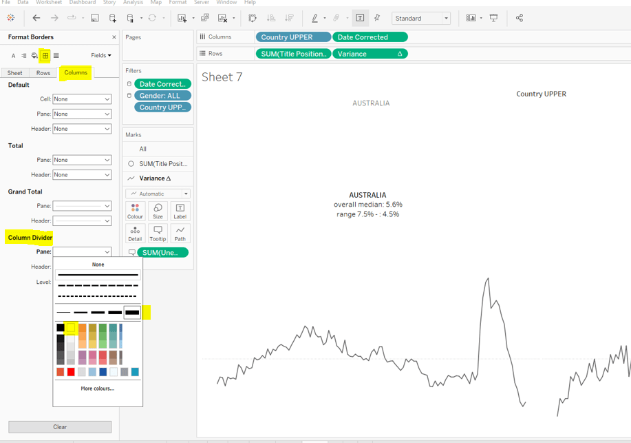
Format the sheet, and adjust the Row Divider so the slider is at the 2nd mark, and set the Column Divider to none.
Remove all gridlines. Then uncheck Show Header against the Category and 2nd Level pills in Rows. And finally, click on the Display title at the top of the column and Hide field labels for Rows.
To colour the bars, we’re going to use similar logic to that used to determine what to display
Colour Bar
IF [Category Set] AND NOT([2nd Level Set]) THEN ‘Sub Category’ ELSEIF [Category Set] AND [2nd Level Set] THEN ‘Manufacturer’ ELSE ‘Category’ END
Add this to the Colour shelf and adjust the colours. Update the tooltip and widen the rows slightly.
We’ve got the viz, now to add the interactivity so the changes happen ‘on click’ rather than via the set controls we’ve displayed.
Adding the interactivity
Create a dashboard and add the viz. Uncheck the options selected in both sets, so no options are selected – this should collapse the viz to just show the 3 Category values. Delete the container that shows the set controls/colour legend.
Create a new set action as below
Category Selected
on select (single selection only) assign the values to the Category Set, and remove all values when selection is cleared.
Create a 2nd set action
SubCat Selected
on select (single selection only) assign the values to the 2nd Level Set, and remove all values when selection is cleared.
Start clicking around, and BOOM! you should get the desired behaviour (note, once you reach the Manufacturer level, you’ll need to click twice on a manufacturer to get the viz to completely reset.
Bonus – building the ‘header’
I deduced from hovering over Erica’s solution that the ‘header’ was made up of multiple sheets, all aligned in a single row in the dashboard. I did have a play to see if I could come up with a single-sheet option, and while I think there is an alternative, it wouldn’t necessarily display exactly as Erica had shown. So I went down the multiple sheet option too.
Firstly we need a sheet to simply display the text >> Category.
On a new sheet, double click in the space below the Detail shelf on the marks card and type the text ‘dummy’. Then drag the ‘dummy’ pill onto the Label shelf, which will automatically change to now be labelled Text. Click on the Text shelf, and the 3dots to open the Edit Label dialog.
Delete the ‘dummy’ field, and replace it with ˃˃ Category. HOWEVER the ˃ symbol isn’t the > character I typed from keyboard. I found the double >> wasn’t retained this way, which I’m putting down to some HTML/XML related encoding that isn’t being handled. Instead I copied the symbol from this page https://www.compart.com/en/unicode/U+02C3 and pasted it into the text window. I then formatted the font size and style and coloured it the relevant blue.
Next we want to create a sheet showing the Category selected. Click on your viz to add a Category to the set (eg click the Furniture bar).
On a new sheet, add Category Set to the Filter shelf (this by default filter to values IN the set). Then add Category to Text and update the Text field as below, adjusting the font size/colour etc as before.
Duplicate this sheet as we can use this as the basis of the >>Sub-Category display.
On the duplicated sheet, update the text field to contain ˃˃ Sub-Category, where again the > is the character pasted. Format/colour the text
Now click on your viz to add a Sub-Category into the 2nd Level Set (eg click the Chairs bar).
On a new sheet, add 2nd Level Set to the Filter shelf (this by default filter to values IN the set). Then add 2nd Level to Text and update the Text field as below, adjusting the font size/colour etc as before.
Finally, once again, duplicate this sheet. Then on the duplicated sheet replace the text with >> Manufacturer instead
Now you have all the components you need. Add all these sheets onto your dashboard using a horizontal container to keep them all together. Apply the grey background shading if required (you’ll need to format the background colour on each worksheet, as well as the various objects on the dashboard.
This week’s #WOW2022 challenge required us to build an horizon chart. While I’m familiar with them, I haven’t had to build one before.
Luke provided references to a workbook and blog post as part of the challenge. I was also aware that Marc Reid had recently published this blog post on the subject and that in turn referenced this Tableau guest blog post by Yves Fornes. Reading through them both I hoped I’d have the clues I’d need to build the chart.
Note – the blogs referenced all give a good explanation on the process we’re trying to achieve with the horizon chart (divide into equal sized layers and ‘merge’), so I’m not going to spend time repeating that in this post.
Unfortunately, despite a good start, I couldn’t just couldn’t quite manage it – I tried both Marc’s and Yves techniques and also downloaded Joe Mako’s workbook and tried to follow his method, but I just couldn’t get the display to match up, and there were minimal clues in Luke’s published solution.
My fellow #WOW participant Rosaria Guana also pinged me, as she had got further than I had, but wasn’t matching Luke’s solution either. With some assistance from Rosario I managed to build the solution that matched hers and seemed the closest fit to Luke’s. As yet we can’t figure out where the discrepancy may lie… maybe we’ve overthought the issue… who knows.
For now though, I’ll step through the solution as per my published workbook.
Sorting out the dates
The data needs to be segregated into decades, so first I created
Decade
IF [Year]>=1990 AND [Year]<2000 THEN ‘1990s’
ELSEIF [Year]>=2000 AND [Year]<2010 THEN ‘2000s’
ELSEIF [Year]>=2010 AND [Year]<2020 THEN ‘2010s’
ELSEIF [Year]>=2020 THEN ‘2020s’
ELSE NULL END
In the requirements, it mentions using data from the 1980s onwards, but the solution only presents 1990s onwards. I interpreted this as a typo in the requirements, so I added a Data Source Filter (right click data source > Edit Data Source Filters), and added Decade excludes Null to eliminate all the unnecessary rows.
The chart shows 10 years worth of data at the day level across the x-axis. We can’t just use the existing Date field to plot as this will extend for 30+ years. Instead we need to ‘baseline’ the dates to a fixed set of 10 years.
Firstly we need to know what year in the decade it is (ie the 1st, 2nd, 3rd year etc).
Year Index
RIGHT(STR([Year]),1)
This returns values of 0, 1, 2, 3… or 9
I then create the years I’ll baseline my dates against – this can start at any year. I chose 1980.
Baseline Year
INT(STR(198) + [Year Index])
So this will result in years 1980, 1981, 1982… up to 1989.
I can then create a new date which I’ll use to plot against
If we pop some of this data into a table, you can see how the Date field relates to this revised date
The 1st of January for the 1st year in each decade will all be plotted against 1st Jan 1980 etc.
Normalising the Arctic ice (NH) value
The NH values need to be adjusted so that they all sit on a scale of 0-1. This means the date with the lowest NH value across all the years will have a value of 0, and the date with the highest NH value across all the years will have a value of 1, and all the values in between will sit proportionally between. To compute this we need
take the difference between the NH value and the minimum as a proportion of the difference between the max and min values. This gives us the scale we need – the image below is sorted based on the Normalise NH value descending (so the dates aren’t in order)
Creating the Levels & the chart
All of the above I managed with no issue. It was this section that I struggled with 😦 As mentioned I tried all sorts of calculations, and after discussions with Rosario, the calcs I was using based on Yves blog post came closest…
We’re aiming to get bands which are 20% (0.2) in width.
Range 0.8-1
IF ([Normalise NH]) > 1 THEN 0.2 ELSE IF ([Normalise NH])<0.8 THEN NULL ELSE ([Normalise NH]) – 0.8 END END
If the normalised value is over 1 then draw a mark at 0.2, our band size (there won’t be any values, but I did this for completeness). Otherwise if we’re below our lower threshold of 0.8, don’t draw anything, else as we’re within our specific range, draw a mark at the point which is the difference between our normalised value and our lower threshold of 0.8 ( ie a record with a normalised value of 0.91 will plot at 0.11).
On a new sheet add Baseline Date as a continuous exact date to Columns and Decade to Rows. Then add Range 0.8-1 to Rows too. Change to an Area chart.
Now let’s build the next level based on the same principals
Range 0.6-0.8
IF ([Normalise NH]) > 0.8 THEN 0.2 ELSE IF ([Normalise NH])<0.6 THEN NULL ELSE ([Normalise NH]) – 0.6 END END
As you can see this is very similar to the above calculation, but this time, we will have values greater than the upper threshold of 0.8, which will all be plotted at 0.2.
Drag this field on the Range 0.8-1 axis and drop when you see the ‘two column’ symbol appear. This will make the chart a Combined Axis chart and Measure Names and Measure Values will automatically get added to the view. Colour the Measure Names accordingly, and up the transparency on the Colour shelf to 100%.
This looks very close to what we need, but you can see the axis is plotting values at >0.2. This is because the measures are stacked on top of each other. We need to turn this off via the Analysis > Stack Marks > Off menu.
When you do this, it’ll look like some marks have disappeared, but they are just hidden behind the other marks. Use the Measure Namescolour legend on the right to drag and re-order the options listed.
Let’s now add the next level
Range 0.4-0.6
IF ([Normalise NH]) > 0.6 THEN 0.2 ELSE IF ([Normalise NH])<0.4 THEN NULL ELSE ([Normalise NH]) – 0.4 END END
And drag the field into the Measure Values box. For the purposes of display at this point, I have coloured this measure a light grey, when it should be white (but that won’t show up at this point).
Now if we continue with the pattern and create similar calculated field for the next 2 ranges, we end up with something that isn’t right… too much red, and white in places we shouldn’t have white… 😦
This is where I started having discussions with Rosario. I could see by observing Luke’s solution that the dark reds were ‘inverted’ ie looked like humps coming ‘down’ from the top line, rather than humps ‘going up’ from the bottom line, but I was stumped where I needed to go next. Rosario confirmed this was her thinking too, and provided alternative computations for the light and dark red levels.
Range 0.2-0.4
IF [Normalise NH] < 0.2 THEN -0.2 ELSE IF [Normalise NH]<0.4 THEN [Normalise NH] – 0.4 ELSE NULL END END
If we’re below the lower threshold, plot at -0.2 (minus 0.2) instead. If we’re within the lower and higher threshold, plot the difference between the Normalise NH value and 0.4 (which will be a negative number), otherwise plot nothing.
and finally for the last band
Range 0-0.2
IF ([Normalise NH]) < 0.2 THEN [Normalise NH]-0.2 ELSE NULL END
Add this to the view, but you’ll need to change the order, so this measure is sitting above the Range 0.2-0.4 one.
Ok, so the shapes look like they might be correct, although we are missing some dark red in the 1990s compared to Luke’s solution, and as mentioned at the start, we don’t know where the discrepancy comes from.
So how do we make this all be ‘above the line’.
Drag another instance of Measure Values onto Rows so it’s sitting next to the existing one.
The make the chart dual axis BUT DON’T synchronise axis.
Instead, right click on the left axis to edit it, and fix the axis from 0-0.2
Then right click on the right axis to edit, and fix this from -0,2 to 0.
Set the colour of the Range 0.4-0.6 back to white, and you should have
Now you just need to
add tooltips
Edit the date axis and fix from 01/01/1980 to 31/12/1989
hide all 3 axis
remove row gridlines
remove column dividers
hide the null indicator
hide field labels for rows
adjust the font side and alignment of the Decade header
Since authoring this blog, Luke has made his workbook available to download. I have looked at it, and the calculations he uses are much much simpler. However I’m still struggling with the concept and not fully convinced with it all. I have played around with the workbook, and try to step through based on how the horizon chart is described in the various blogs, but I’m not entirely sure I know what the right answer might be in order to know whether what I’m seeing is actually correct or not. Feels like this is one I could do with a face to face discussion over, and ultimately is probably one for another day. ..
It’s a double whammy this week – a #PreppinData & #WOW2022 combo! And I’m going to attempt to blog a solution guide to both! Wish me luck… it may take some time!
The #PreppinData & #WOW2022 crew combined with the requirement to prep some Salesforce data with Tableau Prep as per the challenge here, and to then use the output to visualise in Tableau Desktop as per the challenge here.
Prepping the Data
Two files were provided for the input: Opportunity provided 1 row per opportunity, and Opportunity History providing multiple rows per Opportunity, where each row indicated the stage in the lifecycle the opportunity goes through.
The first requirement was to pivot the Opportunity data, to get 2 rows per Opportunity; 1 indicating the date opened, and the other indicating the date closed (or expected to be closed).
After connecting to the Opportunity date and adding a Clean step to view the contents, add a Pivot step to transform Columns to Rows, adding the CloseDate and CreatedDate fields to the pivot.
Before adding any further steps, rename Pivot1 Names to Stage and rename Pivot1 Values to Date.
Add a Clean Step.
Change the CloseDate value in the Stage field to be renamed to ExpectedCloseDate, and the change the CreatedDate value in the Stage field to be renamed to Opened. To do this, simply double click on the value and type in.
We then need to further update this field, based on whether the Opportunity record is closed or not. The requirement said to refer to the StageName field for this, even though there is an IsClosed field. I chose to stick with the requirements.
Create a calculated field
Stage
IF CONTAINS([StageName], ‘Closed’) AND [Stage]=’ExpectedCloseDate’ THEN [StageName] ELSE [Stage] END
Having applied this logic, your Stage field should now contain 4 values rather than 2.
Then remove all fields except for Date, Stage, Id and StageName, and rename the step Opportunity.
We now need to combine with the OpportunityHistory data. This data contains a row for each stage the Oppotrunity goes through. What we’re looking to do is to supplement this with a Stage = Opened record, and, in the event the opportunity hasn’t been closed, a Stage = ExpectedCloseDate record.
For this we’ll need a Union step.
Add in the OpportunityHistory data, and add a Clean step. Rename this step to History. To help with the union step, rename the CreatedDate field to Date. In the Opportunity step above, rename Id to OppID.
Add a Union step to the Opportunity path. Then drag History and add it to the Union. Add a Clean step and view the data. If the renaming worked ok, you should have 6 fields.
Update the SortOrder field by creating a new calculated field
SortOrder
If [Stage]=’Opened’ THEN 0 ELSEIF [Stage]=’ExpectedCloseDate’ THEN 11 ELSE [SortOrder] END
Update the Stage fields for those which have null records.
Stage
IF ISNULL([Stage]) THEN [StageName] ELSE [Stage] END
All the records with SortOrder = null are actually duplicates now, as we have them captured as part of the pivoting step we did initially. All these records can therefore be excluded (click on the null value in the SortOrder field, right click and Exclude).
Now remove the redundant fields of Table Naems, Stage Name, and you should be left with 4 columns and 876 rows of data, which you can output to csv or similar.
Building the Viz
Now we’ve got the data sorted, we can build the viz. If you haven’t done the PreppinData challenge, you will need to download the Opportunity.csv input file and the provided Output.csv files from the website.
Modelling the data
In Tableau Desktop, connect to the file generated in the above process (or download the output file from the PreppinData site if you haven’t built your own). My file was called 2022_06_08_SalesOpps.csv.
Then add an additional connection to the Opportunity.csv file you used in the Prep challenge (or again download from the PreppinData site).
Add a relationship from Opp ID to Id
Building the Open Opportunities chart
We need to work out what Lorna has used to identify an ‘open’ opportunity. After a bit of trial and error, I discovered it was any opportunity that had an ExpectedCloseDate stage. To identify these, create a new calculated field
This will return the value 1 against all the rows for an Opp ID which have an ExpectedCloseDate Stage, and 0 for those that don’t.
As you can see below, all the rows for the 1st two Opp IDs listed are flagged with 1 as they have at least 1 stage which is ExpectedCloseDate. For the other Opp IDs listed, they are all 0.
Right click this field and drag to the Filter shelf. When you release the mouse, choose the All values option from the dialog displayed, then Next
Then select 1 to filter the sheet just to the the Opportunity records we care about.
Add Opp ID and Name to Rows. Add Date to Columns as a continuous exact date (green pill).
Change the mark type to Circle and add the Stage field to Colour, and adjust accordingly using the relevant colour palette.
To add the grey lozenge marks, add another instance of Date next to itself. This will create a second marks card called Date2. Remove the Stage field from the Colour.
Change the mark type of the Date2 card to line, and adjust the colour to a light grey and the size to be a bit larger.
Make this chart dual axis and synchronise the axis. Move the lozenge marks ‘to the back’ (right click on the top axis and move marks to back.
We need to identify those with a Close Date in the past. For the purposes of this exercise, I hardcoded ‘today’ into a parameter pToday and set it to 8th June 2022. Otherwise in a ‘live’ situation I would refer to the TODAY() function rather than the parameter.
Add this field to the Rows before the Opp ID field. You won’t get the symbol against every row, but don’t worry about that just yet. Format this circle to be right aligned and red font.
Now we need to mange the sorting. Firstly create a new parameter
pSortBy
an integer containing values 1 and 2, defaulted to 2 where the values displayed are aliased as below
To determine how long an opportunity has been open we need
Days Open
DATEDIFF(‘day’, [Created Date], [Close Date])
We then need a field to utilise this parameter and determine the measure we can use to sort
Sort By
CASE [pSortby] WHEN 1 THEN SUM([Days Open]) * -1 ELSE INT(MIN([Close Date])) END
If we’re sorting based on the Longest Open we’ll use the number of days the opportunity has been open. By default the data will ascend from smallest to largest value but we want the opposite, so we multiple by -1.
If we’re sorting based on the Close Date. then we can just use the Close Date field itself, converted into a integer.
Add Sort By to Rows , change it to be discrete (blue) and then move it to be the first pill on the Rows shelf. The data should now be reordered, and you’ll now get a red circle per row.
Add the pSortBy parameter to the sheet and test the sorting. Once happy, hide the Sort By field (right click and uncheck Show Header), then Hide Field Labels for Rows. Remove row & column dividers and make the first column narrow. You should now have your chart.
Building the legend
Lorna’s decided the legend should be circles rather than the ‘out of the box’ squares, so a custom sheet is required.
On a new sheet, add Sort Order discrete dimension (blue pill) and Stage to Rows. Add Stage to Filter and exclude Closed Lost and Closed Won. We’re going to need to organise these Stages into 2 rows and 3 columns, so we need some fields to help.
Row Index
IF [Sort Order] ❤ THEN 1 ELSE 2 END
Column Index
IF [Sort Order] = 0 OR [Sort Order] = 4 THEN 1 ELSEIF [Sort Order]=2 OR [Sort Order]= 8 THEN 2 ELSE 3 END
Note I’m very much ‘hardcoding’ this as this is acceptable for this view I believe.
Add Row Index as discrete dimension to Rows and Column Index as discrete dimension to Columns, and move Stage to Label.
Type in FLOAT(MIN(0)) into Columns to create a fake axis. Change mark type to circle, and add Stage to Colour. Increase the width of each row if all your text isn’t showing.
Edit the axis so it is fixed to start at -0.1 and end at 0.5 – this will shift the circles to the left.
Uncheck Show Header against the Row Index, Column Index and the MIN(0) axis. Then remove all gridlines and row/column dividers. Turn off tooltips.
The Summary View
Now we need to work on the summary values at the top of the screen. We’re focussing on ‘open’ opportunities in the current month, which is June 2022 (based on the pToday parameter). We need Has Expected Close Date Stage = 1 on Filter, and to identify the current month we use
Now let’s have closer look at the rows of data we’re got so far.
Add Opp ID, Sort Order (discrete dimension) and Stage to Rows and Amount to Text.
What we’re looking for is to aggregate the Amount by Stage, but if we remove the Opp ID and Sort Order fields, we don’t get the right values
This is because we’ve got multiple rows per Opp ID, so the value is counting in multiple Stages. We want to just limit the rows to the latest Stage before the ExpectedCloseDate stage.
First lets work out the maximum Sort Order value for each Opp ID that isn’t the Expected Close Date row (which has a Sort Order = 11).
Max Stage Sort Order
{FIXED [Opp ID]: MAX(IF [Sort Order]<=10 THEN [Sort Order] END)}
Add this to the tabular view as a discrete dimesion. Hopefully you can see from the image below that we’re getting the value we want.
Now let’s identify the matching row
Stage To Keep
[Sort Order] = [Max Stage Sort Order]
Add this to the Filter shelf and set to True.
Now if we remove Sort Order, Max Stage Sort Order and Stage from Rows, we get the correct summarised values.
Move Stage to Columns and add Stage to Text and Colour. Set to Fit Entire View. Align Text centred and remove all row/column dividers. Uncheck Show Header against the Stage field on Rows. Use the Colour Legend to manually sort the values into the correct order.
Update the sheet title.
Past Close Date
This is a bit simpler… add Past Close Date? to Filter and select ●. Add Stage to Filter and select ExpectedCloseDate. Add Amount to Text and the auto generated field Opportunity.csv (Count) to Text.
Format the text and add a title, and you’re all done You just need to add everything to the dashboard now.
Kyle set a challenge this week inspired by a chart Ann Jackson demoed at #data22 as part of her Advanced Speed Tips session with Lorna Brown. This was both an in person presentation and available virtually (hence the link to the video above). I couldn’t attend the in person session due to a clash, but I had already watched the session prior to this challenge being set, so I attempted to build from memory without referring back. To find out what to do, you can either watch Ann herself demonstrate via the link above, or read on 🙂
Building the WAR chart
Build a basic bar chart by adding Name to Rows and WAR to Columns
Whilst we could sort the data at this point, we’re going to leave for now, as we want the ‘ranking’ field to define the sort.
Now rather than use the RANK table calculation option, the essence of this being included in a tipping session, is to utilise the INDEX table calculation instead. By using INDEX, we don’t need to create as many fields as if we used RANK. We can reuse the INDEX across all the charts.
So, let’s create that field
Index
INDEX()
Format this to be a number with 0dp and prefixed by #
The INDEX() table calculation simply lists your rows or columns of data from 1 to however many entries there are. The Index can span the whole width/length of the table or can restart at intervals depending how you choose to partition/structure your table. You can also control how the data will be indexed based on how you want it sorted.
Add Index to Rows, then change it to be discrete (blue), and position in front of Name. Edit the table calculation setting so that it is computing using Name and is sorted by WAR descending.
We need to capture the name of a player, so we’ll create a parameter for this
pSelectedPlayer
String parameter defaulted to Ken Giffey Jr.
Show this parameter on the view.
We also need a field to identify whether the row matches the parameter
Is Selected Player?
[pSelectedPlayer] = [Name]
Add this to the Colour shelf and adjust accordingly.
Then re-edit the table calculation so it is computing by Is Selected Player as well.
Note – to prevent having to change the table calculation, the alternative is to make the Is Selected Player field on the Colour shelf an Attribute (just choose this setting from the context menu when you click on the pill).
Additionally add Is Selected Player to Rows before Index., the manually sort that field so True is listed first. This will move the relevant record to the top of the scree, but the rank number will be preserved.
Hide the Is Selected Player field (uncheck Show Header), and Hide Field Labels for Rows.
Adjust row dividers, so the divider is at level 1, and the header is dotted line, while the pane is solid.
Remove column gridlines, but add a column axis ruler.
Show mark labels, set them to be left aligned and the colour to match mark colour. You may need to widen the rows to see the labels display.
Add a border to the bars via the Colour shelf.
Format the Index and Name fields displayed – I used Tableau Regular font size 12, and right aligned the Index field.
Update the tooltip and add a header.
The final step, which we’ll do now, is to add a couple of fields to stop the rows from being highlighted when selected on the dashboard.
Create a field True = TRUE and False = FALSE, and add these fields to the Detail shelf.
Building the Batting Average chart
Create a basic bar chart with Name on Rows and BA on Columns. Add Is Selected Player to Colour and apply border.
Format the BA field using custom formatting of .000;-.000 then show mark labels, and left align and format as you did above.
Add Index to Rows, make discrete and move to be in front on Name. Adjust the table calculation to compute by Name and Is Selected Player and this time adjust the sort to use BA descending.
We now need to filter the data to only show the 5 rows above & below the selected index. First we need to identify them.
Selected Player Index
WINDOW_MAX(IF ATTR([Is Selected Player]) THEN INDEX() END)
The inner IF statement returns the index associated to the selected player. The WINDOW_MAX function then ‘spreads’ this value across all the rows in the data. So we can then identify the records we need
Records to Keep
[Index] >= [Selected Player Index]-5 AND [Index] <= [Selected Player Index]+ 5
Add this to the Filter shelf and initially select all the values.
Now edit the table calculation settings of this field. It will now contain nested calculations – one related to Index and one related to Selected Player Index. Ensure both are computing by Name and Is Selected Player and both are sorting by BA descending.
Then edit the filter and just select True.
Now apply the tooltip, set the heading and format the headers, remove gridlines, row dividers etc.
Then follow the same steps to create similar charts of the OPS and HR measures, remembering to apply the sorts on the table calculations to the relevant field.
Adding the interaction
Once you have all four sheets built, add to a dashboard. Then create a parameter action to select the player from the WAR sheet.
Select Player
On select of the WAR sheet, set the pSelectedPlayer parameter passing in the Name field.
Then create a filter action to prevent the selection on the WAR sheet from remaining highlighted.
Unhighlight WAR
On selection of the WAR sheet on the dashboard, target the WAR sheet directly and use Selected fields, setting True = False.
Fingers crossed and you should now have a working dashboard. My published version is here.
It only seems like yesterday I was writing a solution guide, and I’m back at it again. This week Sean asked us to recreate this challenge to build a small multiple / trellis chart using table calculations only.
A note on the data
After downloading and connecting to the provided data source, I found the dates weren’t coming through as intended – they’d been transposed from dd/mm/yyyy to a mm/dd/yyyy so consequently the only dates I was getting were for the first 12 days in January for every year. Rather than trying to solve this at source, I just created a new field which transposed the Date field back so it behaved as I expected
You may not need to do this if the data pulls in correctly.
Filters
There are two filters that should be applied, which can either be added as data source filters (right click data source > Edit data source filters) or can be applied to the Filter shelf on any sheets created. Ultimately, this challenge only requires 1 sheet, but when building and verifying logic, I tend to have additional ‘check sheets’. I therefore added the filters below to the Filter shelf of the first sheet I started working with, but set them to apply to all worksheets using the data source (right click pill once it’s on the filter shelf -> Apply to Worksheets -> All using this data source).
Gender : All
Date Corrected : starting date = 01 Jan 2012
Setting up the data
As is good practice when working with table calculations, I start by building out the calculations I need and validating them in a tabular format before I build any vizzes. So let’s do that.
All the countries are displayed in capital letters, so we need
Country UPPER
UPPER([Country Name])
Add this to Rows
Additionally, for the purpose of validation and performance only, add this field to the Filter shelf too and just filter to Australia and Austria.
If you haven’t already added them as data source filters, apply the filters mentioned in the section above to this sheet too and set to apply to all worksheets using the data source.
Add Date Corrected to Rows as a discrete (blue pill) exact date. Format the date so it displays in month year format.
Add Unemployment Rate to Text. Format this number to 1 decimal place and add a % as a suffix.
Now for the table calcs
Median
WINDOW_MEDIAN(SUM([Unemployment Rate]))
Format this to display as a % using the same option as above. Add this to the table and set to compute using Date Corrected
You should find that your median value only differs by country.
Now we work out
Variance
SUM([Unemployment Rate]) – [Median]
Format this to display as a % and add to the table, setting the table calc to compute by Date Corrected again. This is the measure that will be used to plot the trend line against.
We also need to display the range of Unemployment rates for each country – ie we need to work out the minimum and maximum values.
Max Unemployment Rate
WINDOW_MAX(MAX([Unemployment Rate]))
Min Unemployment Rate
WINDOW_MIN(MIN([Unemployment Rate]))
Format both of these to display as 5 with 1dp, and add to the table, verifying the calculations are computing by Date Corrected once again. Verify you get the same values for all the rows associated to a single country.
Now we know the calculations are as expected, we can start to build out the viz.
Building the core chart
To start with we’ll just focus on getting the line chart with the associated text displayed for the two countries Australia & Austria. So on a new sheet add Country (UPPER) to Filter and filter to these selections. The other filters should automatically add.
Add Country UPPER and Date Corrected (green continuous exact date) to Columns and Variance to Rows. Set Variance to Compute By Date Corrected.
Add Unemployment Rate to the Tooltip and adjust the text to match.
To add the country title and other displayed text, we’re going to use a ‘fake axis’ and plot a mark at a central date. On hovering over the solution, October 2016 seems to be the appropriate date selected. So we need
Title Position to Plot
IF [Date Corrected] = #2016-10-01# THEN 1 END
Add this to Rows in front of the existing pill. Change the mark type of this measure only to a circle and re-Size to make it as small as possible and adjust the Colour Opacity to 0%. This will make the mark ‘disappear’.
Add Country UPPER, Median, Max Unemployment Rate and Min Unemployment Rate to the Label shelf of this marks card. Ensure all the table calculation fields are set to compute by Date Corrected. Adjust the text as required, and align centre. Ensure the Tooltip is blank for this marks card.
Change the colour of the variance line to grey, then remove all gridlines, row dividers and axis. Set the Column Dividers to be a thick white line (this will help provide a separator between the small multiples later).
Creating the trellis
There are multiple blog posts about creating trellis charts. My go to post has always been this one by Chris Love. It’s a more complex solution that dynamically flexes the number of rows and columns based on the number of members in the dimension you’re visualising. There have also been other Workout Wednesday challenges involving trellis charts, which I’ve blogged about too (see here).
Ultimately we’re aiming to determine a ‘grid position’ for each member of our dimension. In this case the dimension is Country UPPER and its a static list of 36 values, which we can display in a 6 x 6 grid. So Australia needs to be in row 1 column 1, Austria in row 1 column 2….. Costa Rica in row 2 column 1… USA in row 6 column.
As our members are static, the calculations we can use for this can be a bit simpler than those in Chris’ blog.
Firstly, let’s get our data in a tabular layout so we can ‘see’ the values as we go.
Duplicate the data sheet we built up, then move Measure Name and Date Corrected from Rows/Columns to the Detail shelf. Remove the Country UPPER field from the Filter shelf. You should have something like below, showing 1 row per country
Double click into the Rows shelf and type in INDEX(), then change the resulting pill to discrete (blue). You will see that index numbers every row. It’s a table calculation and although working as expected, let’s explicitly set it to compute using County UPPER.
Let’s now create our grid position values.
Cols
FLOAT(INT((INDEX()-1)%6))
This takes the Index value and subtracts 1, and returns the remainder when divided by 6 (%6=modulus of 6 – ie 6%6=0, 7%6=1). 6 is the number of columns we want.
Rows
FLOAT(INT((INDEX()-1)/6))
This takes the Index value and subtracts 1, and returns the integer part of the value when divided by 6. Again we’re using 6 as this is the number of rows we want to display.
Add these to the table, set to be discrete (blue) and compute using Country UPPER.
You can see that the first 6 countries are all in the same row (row 0) but different columns (0-5).
Now that’s understood, we can create the small multiples on the viz.
Duplicate the sheet we created further above which displays the trend graph for Australia & Austria. As we’re now going to make the changes to create the charts for every country, if things go a bit screwy, you can always get back to this one to try again :-).
Add Cols to Columns. Set to discrete and compute using Country UPPER. Add Rows to Rows and do the same thing. Move Country UPPER from Columns to the Detail shelf on the All marks card. Then remove Country UPPER from the Filter shelf.
Hopefully everything worked as expected and you have
Final step is to uncheck Show Header against the Cols and Rows pills so they don’t display and you can add to a dashboard.
This week the whole #WOW2022 crew and myself were lucky enough to be able to attend #data22 – the Tableau Conference in Las Vegas. In the 10 years I’ve been involved in the Tableau Community, this was my very first US conference, and my first opportunity to meet some of the people I engage with on a weekly basis, in person. Meeting all those who have been involved in the WOW challenges over the years and my fellow regular participant, Rosario Gauna, was a big highlight for me.
Erica led the live #WOW2022 session at the conference on Thursday morning (not sure the organisers fully understood the title), with this challenge.
Erica walked through the challenge end-to-end in the session, but I attempted to build out my solution, just as I would at home, so let’s crack on.
Modelling the data
The viz compares actual sales vs target, and an additional data set was provided to store the target data. As a consequence this needs to be combined/joined/related with the actual sales data.
For this you need to download the two excel data sources provided in the challenge – SuperStore Sales and Superstore Category Monthly Sales Targets.
Connect to the Superstore Sales file and drag the Orders sheet into the canvas. The Add a new connection to theSuperstore Category Monthly Sales Targets file and drag in the Sales Targets sheet to the right of the Orders object in the canvas.
This will try to create a relationship between the two objects, but can’t as it needs to be defined.
In the section at the bottom, relate the Category field from the Orders object to the Category field in the Sales Target object.
This creates a valid link between the two objects, but it’s not enough. We also need to relate on a date field. In the Sales Targets object there is a field Month which stores the date on the 1st of a month. So to relate the Orders data we need to
Click + to Add more fields
From the Select a field dropdown on the Orders side, select Create a Relationship calculation
In the calculation window type in DATE(DATETRUNC(‘month’, [Order Date])). This returns the 1st of the month related to each Order Date into a Date rather than Datetime datatype.
Select Month from the Sales Targets dropdown.
Building the bar in bar chart
You can build this type of chart using a dual axis chart, where both axis are set to use the bar mark type, but the sizes of the bars are different. However, if you go down this route you’ll struggle to get the labels right (as the labelling is the trickiest part of this challenge).
Instead for this challenge you need to build a combined axis chart, which is possible since both measures are represented by the same mark type, a bar.
First up, add Order Date to the Filter shelf and select to filter by the Year 2021.
Then add Order Date to Rows and set it to the discrete (blue pill) ‘month’ level (the ‘May’ option rather than the ‘May 2015’ option on the context menu). Add Sales to Columns and change the mark type to bar.
Then drag Sum Targets from the left hand pane onto the Sales axis, releasing the mouse when you see the ‘double column’ green icon appear.
This will result in a combined axis chart being created, and the fields Measure Names and Measure Values automatically added to the viz.
Move Measure Names from the Columns and place on Size. Additionally add another copy of Measure Names onto Colour and adjust accordingly.
On the Analysis menu, select Stack Marks -> Off so the bars both start from 0, rather than being placed on top of each other.
We now need to adjust the bar sizing. Edit the sizes via the Size legend on the right hand side, so the range between the sizes is less than that set.
We now need to work on colouring the Sales bars based on whether they met target or not. For this we first need to work out whether the Target is bigger or not.
Met Target?
SUM([Sales]) > SUM([Sum Targets])
This returns a boolean true/false result. We want this on the colour shelf in addition to the Measure Names field that is already there. If we just drag it onto colour, it will replace Measure Names. Instead, drag Met Target? onto the Detail shelf. Then click on the 3 dots immediately to the left of the Met Target? pill in the marks card, and select the Colour icon.
This has the effect of adding this as an additional colour field, so four options rather than two are now presented in the colour legend. Adjust the colours once again.
We’ve now got the core bar-in-bar chart. We can just add some final formatting to this section.
Format the month axis to set the dates to be abbreviated, and then rotate the labels.
Click the Order Date label at the top of the chart and Hide field labels for columns.
Edit the Value axis and rename the title to Sales ($).
Amend the number format of both the Sales and Sum Targets fields to be a number with 0dp and $ prefix. Add both fields to the Tooltip and adjust so that both values display when you hover over either the Sales bar or the Targets bar.
Labelling the bars
Labelling the bars to match Erica’s display is the trickiest part of this challenge. Bottom line – it shouldn’t be so tricksy but that’s just the way it is until Tableau see fit to fix it in the product.
Anyway, on examining Erica’s published solution before I started, I could see, by hovering my mouse over the viz, that there was a small mark highlighted above the bars that missed target. This provided a clue that there was a dual axis involved (hence the need for a combined axis to display the bars), with a mark plotted at some distance above the existing data…but where…?
Before working that out, I need to build a couple of fields
Difference
SUM([Sum Targets])- SUM([Sales])
which returns the difference between the Sales and Sum Targets for each month. But since I only want the values when the target hasn’t been met, I need
Missed Target Diff
IF NOT([Met Target?]) THEN [Difference] END
which is formatted to $ with 0dp.
I also needed some text to only display when the target was missed
Label Text Missed Target
IF NOT([Met Target?]) THEN ‘Target missed by’ END.
Now to figure out what measure to plot….
In Erica’s solution, she worked out an ‘uplift’ of the Sum Targets value to plot, but only when the target was missed. She did this using quite a complex looking nested LOD calculation (check out her solution for this).
After much deliberation, discussions, trial and error, I finally came up with a alternative that isn’t perfect, but is ‘good enough’ in my book.
Firstly, I needed another measure to plot
Target to plot
IF NOT([Met Target?]) THEN SUM([Sum Targets]) END
This plots the Targets value but only against the months where the target wasn’t month.
I then added this to the Columns shelf and I changed the mark type to circle on the Target to Plot marks card only.
I then made the chart dual axis and synchronised the axis.
Then, remove Measure Names from the Colour and Size shelf on the Target to Plot marks card, and also remove the Met Target? field from the Colour shelf too.
Adjust the Size of this mark to the smallest possible, and change the Opacity (via the Colour shelf) to 0%, so the circle mark becomes invisible except on hover.
Add Missed Target Diff to the Text shelf of the Target To Plot marks card. Edit the text in the label as below
I added a carriage return, formatted the text to 11pts and orangey/red and added 5 spaces to the front of the 2nd line.
I then changed the label alignment so the text was rotated and it was positioned top centre.
Next I added Label TextMissed Target to the Label shelf on the Measure Values marks card.
I edited the text as below, left aligning and again adding 5 spaces in front
Then I adjusted the alignment to be top left
Adding Category to the Filter shelf and testing with the different filters, suggested this technique seemed to work (at least on Desktop).
Last step is to remove the secondary axis, remove the row & column dividers, and hide the ‘nulls indicator’. Then add to a dashboard.
This challenge certainly raised questions over these formatting specifics. As I mentioned above, it shouldn’t be that hard to add a label that looks like this – left aligned and positioned above the bar. However the product doesn’t let you achieve this easily as yet, which is disappointing and certainly confusing to new users of the product – it seems such a straightforward requirement after all.
If I was doing this for my own work, I’d have kept with whatever options a single label allowed (where the text was all right aligned), or placed on a single line. The impact on performance of a complicated calculation along with the maintainability of a dashboard using it, are important considerations when deciding what’s ‘good enough’, and are arguments that should be made if a client/user insists. After all, what real benefit does this particular format provide over
This week’s #WOW2022 challenge was focused on dashboard layout, specifically the use of containers and padding to give your charts room ‘to breathe’ and be aligned beautifully.
This has come at a great time for me, as now I’m spending more time in my role developing business dashboards, I’m trying to find a ‘go to’ style that works for me. I know things will often need to be adapted on a client by client basis, but having a consistent reference point for anything I develop personally, or just want to conceptualize will make my life easier (less decisions to be made). As a result I’m currently spending a lot of time figuring out what padding/background colours etc I want to use for my dashboards.
A note on the data
You may notice that my solution looks a bit different from Luke’s in terms of content. The requirements state to use Superstore v2021.4, but the excel file that ships with Tableau doesn’t actually contain a Manufacturer field which Luke uses. I thought I’d try to use the file linked in the requirements, but (at the time of writing), that actually linked to a 2019.4 version, so the numbers didn’t match up. I therefore chose to use the Superstore v2021.4 excel file I already had on my laptop, and built the table using the Product Name field instead. I think the Superstore.tds file that ships may contain Manufacturer, but I couldn’t see to find that either at the time.
I also chose to use a count distinct function when counting the Order IDs rather than a count, as this seemed more appropriate to me, which is why that KPI differs.
As the focus on the challenge was on the layout, I didn’t think it was necessary to get these points resolved before building my solution.
Building the KPIs
I managed to build the visuals required for the solution using 5 sheets – 1 sheet per KPI ‘card’ and 1 for the table. After I completed my solution, the requirements were updated and suggested 9 sheets were required, essentially 2 per KPI card – the measure and the bar chart. Personally I think having 1 sheet for each KPI is ‘cleaner’ so I left it as is.
In order to build each KPI in a single sheet, I need additional calculations to provide the ‘total’ measure value.
Total Sales
{FIXED: SUM([Sales])}
Count of Orders
COUNTD([Order ID])
Total Orders
{FIXED: [Count of Orders]}
Profit Ratio
SUM([Profit]) / SUM([Sales])
formatted to % with 1 dp
Total Profit Ratio
{FIXED: [Profit Ratio]}
formatted to % with 1 dp
Total Profit
{FIXED : SUM([Profit])}
Then create a bar chart by adding Order Date to Columns and setting to the Month (May) date part (blue discrete pill), and adding Sales to Rows. Add Total Sales to the Detail shelf. Change the mark type to Bar.
Change the Colour to #afaaf3 and reduce the Size. Edit the title of the chart to reference the Total Sales field and format as below with the SALES in 9pt and Total Sales in 15pt.
Modify the Tooltip then remove all gridlines/axis rulers etc, and hide the axis and the month headers.
Rename this sheet as Sales, then duplicate, and create one for Orders by replacing Sales with Count of Orders and Total Sales with Total Orders. You should be able to drop the replacement pill directly on top of the pill being replaced, and everything will update. Update the sheet title to change the word SALES to ORDERS. Rename this sheet Orders, then duplicate again and repeat the process to create the Profit Ratio and Profit sheets.
Building the table
On a new sheet add Product Name (or Manufacturer if you have the right data set) to Rows and add Sales, Profit, Count of Orders and Profit Ratio into the table so you end up with Measure Names on Columns and Measure Values on Text.
Remove all row banding, but add row dividers across each row. Widen each row and the header. Sort by Sales descending.
Change the mark type to Square then add another instance of Measure Values to the Colour shelf. Right click on the Measure Values pill and select Use separate legends.
This will display 4 colour legends, which you need to amend as follows :
Sales Legend
Edit the colour and select Purple sequential. The click on the coloured square at the right end of the range, and change this colour to #675CF3.
Then select the Stepped Colour checkbox and change the value to 8.
Profit Legend
Edit the colour and choose a Diverging colour palette. It doesn’t matter which one. Click on the coloured squares at each end and change them both to white. Set the number of steps to 2.
Count of Orders Legend
Do exactly as described above for the Profit Legend.
Profit Ratio Legend.
Edit the colours and choose a diverging colour palette. Change the colour on the left to #9A1500. Change the colour on the right to #777777. Set the number of steps to 8.
Building the dashboard
Now we have the charts, we need to start building the dashboard, and I’ll see if I can step through my approach to doing it, and if I’ll end up with the right result….
Firstly create a dashboard and set the size to 1100 by 850.
Now a habit I’ve got into when I want to be really precise about the formatting I’m applying (ie I’m building a business dashboard), is I start by adding a floating container to the dashboard, which is set to the exact dimensions of the dashboard. This was a tip I picked up from Curtis Harris here. The main reason for doing this, is that I feel I have more control as I don’t then use any Tiled container type that automatically gets added. If any do appear, I find the objects I want out of them and move them elsewhere, then delete the whole tiled section. In this instance I’m going to start by adding a Vertical floating container, and position it at 0,0 and 1100 wide and 850 high. Use the fields on the Layout pane to set these.
I also get into the habit of renaming the containers, to help me keep track of what is where and whether the objects are in the right place.
The next thing I always do when working with containers, is add a blank object. As we build out, this object will eventually be removed, but it’s a recommended step to help position other objects you add into the containers.
So on the Dashboard tab, change the selection to Tiled and then drag a blank object into the main canvas.
This ‘blank’ is now in the container and the ’tiled’ option means its anchored to that container, which means if you move the container, the objects within will move with it (unlike if the object was floating).
In the item hierarchy, you can see the blank nested in the Base container.
In the item hierarchy, click the Base container, so it is selected on the dashboard (it will be surrounded by a blue frame). Adjust the settings so the background is pale grey, the outer padding is 20px all round, and inner padding is 30px all round.
Add a Horizontal container above the blank object. This is going to be a header section for the title and the export options. Name the container Header in the item hierarchy. Add a blank object into the header container.
Add a Text object into the Header container to the left of the blank object, and enter the text for the title and strapline. I used Tableau Book 16pt bold for the main title and 9pt for the subtitle (there was no instruction for this). Set the outer padding of this text box to 0 all round.
Download the image files Luke provided.
Add a Download object to the right of the blank in the Header container. Edit the button and set to export to an image, use an image button style and select the relevant image.
The image will probably look incredibly large, but don’t worry. First, set the outer padding of this object to be 10 all round.
Then select the Header container and edit the height to be 55px (use the down arrow on the selected object to open the context menu and select Edit Height).
Add further download objects to the right of the existing one (making sure you’re in the Header container) – one to export to PDF and one to PowerPoint. Set the outer padding of the PDF one to 10 all round, and for the PowerPoint one, set the outer padding to 10 for left, top & bottom, but 0 for the right.
Now add another Horizontal container below the Header container and above the blank. Rename this to Main. Set the outer padding of the Main container so that it has 25px at the top. This padding (25) + height of header container (55) + inner padding of Base container (30) gives us the requirement that the height of the grey header to the components needs to be 110px. Add a blank object into the Main container.
You can now remove the blank object that is at the bottom of the Base container – the one underneath the Main container.
NoteIt’s worth saying at this point, that when I built my solution most of this was all bit trial and error / tweaking this & that to meet all the specific layout requirements Luke states. As I’m rebuilding my original solution as I write, I know what order I want to add objects to the dashboard and what all the settings need to be as I add each object.
The Main container is horizontal as it it will consist of 2 columns; 1 with the KPIs and 1 with the table. However both columns need to contain a Vertical container each. For the KPIs columns, this is to stack each KPI card on top of each other. For the table, this is because we have to add the purple bar on top of the table.
So, add a Vertical container into the Main container, to the right of the blank. Rename this container Table Column. Then add a blank into this container, and underneath that add the Table sheet.
If you look in the item hierarchy, you should see that a Tiled section has been automatically added to the dashboard – boo!! This contains all the colour legends associated to the table, and you can just make out where they are (top right) as they’re behind the floating Base container.
In fact, the Tiled container added actually contains lots of other containers.
We don’t need any of these legends to display or any of the containers that have been added, so remove (right click on the first Tiled container and Remove from Dashboard). You’ll get a warning message but just hit Delete to continue. The section will be removed and your item hierarchy looks nice and clean again 🙂
Now that’s sorted, we can focus back on the Table Column container and the objects within. Select the Blank object in the container. Change the background colour to #675cf3, set the outer padding to 0 all round, then edit the height to be 10 px. Rename the blank object in the item hierarchy to ‘purple bar’.
Now select the table sheet itself. Hide the sheet title. Set the outer padding to 0 all round and set the inner padding to 10 all round. Set the background colour to white. Set the sheet to Fit Width. Don’t worry at this point about the table looking cramped.
Now add another Vertical container into the Main container, this time to the left of the blank. Rename this container KPI Column and add a blank into it. You can now remove the blank that is sitting between the KPI Column container and the Table Column container. This will cause the table to expand.
Edit the width of the KPI Column container to be 300 px.
Now we’re ready to deal with the KPIs.
Each KPI ‘card’ consists of a purple vertical line and the KPI sheet itself. This means we need a horizontal container per card to manage this. WHAT! More containers……. Fun isn’t it 🙂
So add a Horizontal container into the KPI Column container, above the blank object. Name this container Sales KPI. Add a blank object into this container. Then add the Sales sheet into the Sales KPI container to the right of the blank. Hopefully you have something like below…
Select the blank object in the Sales KPI container and set the background colour to #675cf3, and the outer padding to 0 all round and edit the width to be 10 px. Rename this object to ‘purple bar’.
Then select the Sales sheet. Set the background to white, the outer padding to 0 all round and the inner padding to 10 all round.
Now select the Sales KPI container, and set the bottom and right outer padding to be 5px. The top and left should be 0.
Add another horizontal container to the KPI Column container directly below the Sales KPI container. Name this container Orders KPI. Set the outer padding on this container to be left 0, right, top & bottom all 5.
Add a blank object into the Orders KPI container, then add the Orders sheet to the right of this. As before, select the blank object and set the background colour to #675cf3, and the outer padding to 0 all round and edit the width to be 10 px. Rename this object to ‘purple bar’.
Now select the Orders sheet. Set the background to white, the outer padding to 0 all round and the inner padding to 10 all round.
Repeat this process to create the Profit Ratio and Profit sections. When you add the Profit KPI container, set the outer padding for the top and right to 5, and the bottom and left to 0.
Remove the blank object that should now be at the bottom of the KPI Column container. The click on the KPI Column container in the item hierarchy to select it, and use the context menu from the drop down at the top right of the object and Distribute Contents Evenly.
The final tweak to make is to add some left padding to the Table Column container. Select the container and set the left padding to 5 and the rest to 0.
And that should hopefully be it, and meet all the requirements. My full item hierarchy is visible below.
Granted there are more containers than Luke suggests, but hopefully you can see how it’s organised and much more maintainable.
Containers can be tricky beasts, but if you work methodically with them, they become easier to use. In summary, the steps I try to follow are
Start with a floating container sized accordingly, and add ’tiled’ (ie not floating) objects into that
Always add a blank object into any container you add. Add required objects, then remove the blank if no longer required.
Rename containers as you go.
Deal with any Tiled containers as they appear – if you need a legend/filter that gets added in it, select that object via the item hierarchy and move it to where you want it to be, then delete the complete tiled container.
It’s Tableau Conference next week, and I’m actually going to be attending in person for the very first time (I’m super super excited!). I’m not sure when next week’s challenge will actually land or when I’ll actually get a chance to complete, let alone blog. I might have to end up playing catch, so I apologise in advance for those who can’t attend and may be waiting for my guide to help them out. It will get published… I just don’t know when!
In a break from tradition, this isn’t a #WorkoutWednesday solution guide. Instead this is likely to be more of a ‘heart on my sleeve’ type of post; a bit of self-reflection and musings on my current state of mind. Don’t be alarmed – I’m perfectly well; I’m just having a little identity crisis and hoping that by putting ‘pen to paper’, it alleviates some of those feelings that bounce around in my brain.
2022 so far has been an epic year in terms of my career, and we’re only 4 full months in…. I’ve joined a brilliant consultancy, been named a Tableau Visionary and in a few days, I’ll be heading to my first major Tableau Conference in Las Vegas.
It’s all incredibly exciting, but also overwhelming at the same time, and the classic ‘imposter syndrome’ anxieties have started to creep in… am I really good enough, do people think I’m a fraud…?
You see, I worry about what people think of me. This isn’t anything new, it’s been like that since my school days, and it affects all aspects of my life, both professional and personal. I’ve accepted it isn’t anything I’m ever likely to ‘get over’, and work hard to try not to overanalyse things too much (but hey, I’m a data person after all, and isn’t that just the type of people we are 🙂 ).
On a professional level, since leaving a company I’d been at for 20 years, my confidence levels and belief in myself have increased significantly, and certainly helped me get my current role. But I’ve now gone from companies where I was the acknowledged Tableau ‘expert’, to a consultancy firm which is full of brilliant Tableau people. It’s fabulous – I’m surrounded by people who love Tableau and just ‘get it’; who are all incredibly supportive and helpful. But still, I can’t help but worry about peoples’ expectations of me and my capabilities. I’ve built up a profile in the Tableau community over the years, and some people in the company had heard of me….. “Is that THE Donna Coles joining us?” Gulp!
And then came the Visionary announcement.
I knew I’d been nominated, but never did I think I’d actually get selected!
I complete the #WorkoutWednesday challenges and blog my solutions, and I commit myself to that task. I plan my weekly activities around fitting in completing the challenge and writing up my solution (it’s sooooo helpful when the challenge actually lands on a Tuesday). And that’s it. I don’t come up with any clever ways of using Tableau, I don’t produce beautifully crafted visualisations. I don’t organise user groups or run any community projects. I am a Tableau Forums Ambassador and have been for several years, but even there, I’m not the one at the top of the leader board answering question after question. I tend to dip in when I can (which definitely isn’t as often as I’d like) and manage the moderation queue and be vocal in the forum ambassador meet ups, sharing my thoughts and experiences about the platform and the program.
When I was originally asked to be an Ambassador, I was told “just keep doing what you do”, and those sentiments were echoed again when I joined my first Visionary meet-up. It’s what I’m already doing that has got me recognised; there’s no expectations to do more. There may well be new opportunities that open up, but it’s my choice to pursue if I wish.
So that’s what I took onboard, and try to keep telling myself….”just keep doing what you do”. I don’t feel I have time to do ‘more’ – some days I do just want to ‘Netflix & chill’ – and that’s just as it should be.
And I was gradually beginning to feel more comfortable with the moniker I’d been awarded.
But then I was on a remote internal training session at work, and part of the activities involved reworking some dashboards in a short space of time. And I panicked. The weight of expectation built up and I struggled to come up with anything I felt worthy of sharing in the timeframe for fear of judgement. Others were confident to share their work, while I, the Visionary, couldn’t.
And so the questions over my worthiness rose again, which has led me to writing this post. I’m not seeking validation for being in the role I’m in. I’m simply writing this down to help me accept who I am.
I know what I’m good at, and I also know what I’m not so great at – there’s also plenty I haven’t got a scooby about! And that is most probably the case with all the Visionaries. We’re only human after all!
It is the Community and Tableau that have recognised what I do and if it’s good enough for them, then who am I to object? I will endeavour to continue doing what I’ve been doing and help where I can.
If you’ve made it this far, then thank you. Writing this down has been quite a cathartic experience, and if it helps anyone else who reads this, then that’s a bonus too 🙂
If you’re at TC22 in person, then feel free to reach out and say ‘hi’. Just don’t ask me to rebuild a dashboard in 20 mins 😉
For #WOW2022 week 18, Lorna set this challenge to allow us to familiarise ourselves with the new Tableau Workbook Optimizer feature released in version 2022.1 (so you’ll need this version of Tableau Desktop to complete this challenge).
You need to download the workbook Lorna provides from Tableau Public, and then the only stipulation is to get the workbook to fully pass all 12 checks made on the workbook – no changes to the dashboard presented is required.
So, open the workbook and start by running the optimizer via the Server > Run Optimizer menu
You’re presented with the following – 3 important Take Action suggestions and 1 warning Needs Review suggestion.
Each of the suggestions can then be expanded to see more detail
Take Action – unused data sources
You’re told exactly which data sources aren’t used. Close the Optimizer dialog then navigate to a worksheet so you can access the listed data sources in the top section of the left hand Data tab. Right click on the relevant data sources and Close. If you happen to click one that is in use, you will be warned.
Take Action – Unused Fields
On each of the remaining data sources listed, right click and select Hide all unused fields to hide all the fields mentioned in the optimizer.
The optimizer also identifies unused parameters, which are listed at the bottom of the left hand pane. Right click on these and Hide.
If you now run the optimiser again, you should find you’re now left with just 1 Take Action notification, since the removal of the unused data sources, also removed the Needs Review item which was advising about the number of data sources being used.
I made an attempt to build a solution without referencing Lindsey’s viz, but ended up building multiple sheets and creating multiple calculations, which just ‘didn’t feel right’ – it would have worked, but it just seemed ‘too clunky’ of a solution, so I ended up checking out Lindsey’s viz as a guide. The key to the ‘simpler’ solution involves utilisation of a field in the data that allows the ‘measures’ to be arranged horizontally in a single sheet. I’ll explain further as we get to that section. I also don’t make any use of set actions in my solution. Instead I use parameter actions. So let’s crack on…
To build this solution I need 7 sheets
1 sheet to display the 5 measure boxes with the summary stats per player for each measure
1 sheet per sparkline that is displayed in each box (5 sheets in total)
1 sheet to display the larger line chart at the bottom which changes the measure on selection of a card
Creating the measure calculations
Firstly, we need to set up the measures that are being used throughout this viz. Some are new calculations, some are just renamed fields. I renamed the following fields :
G -> GAMES (formatted to 0 dp)
H – > HITS (formatted to 0 dp)
HR -> HOME RUNS (formatted to 0 dp)
then I created
HITS/GAME
ROUND(SUM([HITS])/SUM([GAMES]),2)
AB/HR
ROUND(SUM([AB])/SUM([HOME RUNS]),2)
Building the measure swap line chart
I’m going to start by building out the line chart at the bottom of the dashboard, as once built and formatted, we can duplicate it to form the basis of the other 5 line charts.
As with any measure swap chart, we need to create a parameter that is going to store the value of the measure that has ben selected to show. In this instance we just need
pMeasure
a string parameter which is defaulted to the value ‘GAMES’
Then we need a field that is going to determine which measure to display based on the parameter value
Value to Display
CASE [pMeasure] WHEN ‘GAMES’ THEN SUM([GAMES]) WHEN ‘HITS’ THEN SUM([HITS]) WHEN ‘HITS/GAME’ THEN [HITS/GAME] WHEN ‘HOME RUNS’ THEN SUM([HOME RUNS]) WHEN ‘AB/HR’ THEN [AB/HR] END
Show the pMeasure parameter, then add Year (as green, continuous pill) to Columns and Value to Display to Rows and Player to Colour. Adjust colours accordingly. Add Year (as blue discrete pill) to the Filter shelf, and exclude 2022, as Kyle chooses not to show this data – probably as its an incomplete year).
Manually change the values in the parameter to HITS, or HITS/GAME etc and check the display changes as expected.
On the Label shelf, select to Show Mark Labels and only label Max/Min values. Modify the colour of the label to Match Mark Colour.
Finally, format the Value to Display field to Number(Standard). This is a format that will automatically display the values as whole numbers or decimals, which is really neat (Note – it’s only while rebuilding the solution to blog that I remembered this and tried it out, so you may see that my published solution has a bit of a convoluted calculation to get the display as I needed).
Edit the Year axis to start at 2000 and end in 2022, and remove the title. Edit the Value to Display axis to not include zero and remove the title. Remove all gridlines.
Finally amend the tooltip, and then edit the title of the sheet to reference the pMeasure parameter.
Building the individual sparkline charts
We need to create a sheet per measure to be used in the sparkline display in the card. To create the first one, duplicate the Selected Measure Trend sheet you just created, then
Uncheck Show mark labels
Uncheck Show Tooltips
Hide the Year axis
Replace the Value to Display pill with the GAMES field (drag the GAMES field from the Dimensions pane and drop it directly on the Value to Display pill, so it is just replaced).
Hide the Games axis
Format to remove all zero lines/axis rulers
Set the worksheet background colour to None (which will make it transparent when we add it to the dashboard later, although you won’t notice anything at this point).
Name the sheet Games Trend or similar.
Now duplicate this sheet, and replace the GAMES pill with the HITS pill. Name this new sheet Hits Trend or similar.
Repeat this process for the HITS/GAMES, HOME RUNS, and AB/HR measures, so you have 5 trend charts.
Building the Measure Selector card
We’re going to use some Tableau trickery to ‘fake’ these cards. We’re looking to build a table of 1 row and 5 columns where each column contains 3 lines of text.
We can’t just use Measure Names & Measure Values split by Player, as we need to create a ‘box’ for each measure with the Players text displayed ‘together’ top left.
So we use some trickery.
Firstly, we’re going to ‘map’ the name of each measure to a Year in the data set which exists for each Player (ie we use the last years and not the first ones).
MetricName
CASE [Year] WHEN 2017 THEN ‘GAMES’ WHEN 2018 THEN ‘HITS’ WHEN 2019 THEN ‘HITS/GAME’ WHEN 2020 THEN ‘HOME RUNS’ WHEN 2021 THEN ‘AB/HR’ END
Then we need to capture the get the set of measures for each player into a dedicated field :
C Measures
IF [Player] = ‘Cabrera’ THEN CASE [Metric Name] WHEN ‘GAMES’ THEN {FIXED [Player]: SUM([GAMES])} WHEN ‘HITS’ THEN {FIXED [Player]: SUM([HITS])} WHEN ‘HITS/GAME’ THEN {FIXED [Player]: [HITS/GAME]} WHEN ‘HOME RUNS’ THEN {FIXED [Player]: SUM([HOME RUNS])} WHEN ‘AB/HR’ THEN {FIXED [Player]: [AB/HR]} END END
P Measures
IF [Player] = ‘Pujols’ THEN CASE [Metric Name] WHEN ‘GAMES’ THEN {FIXED [Player]: SUM([GAMES])} WHEN ‘HITS’ THEN {FIXED [Player]: SUM([HITS])} WHEN ‘HITS/GAME’ THEN {FIXED [Player]: [HITS/GAME]} WHEN ‘HOME RUNS’ THEN {FIXED [Player]: SUM([HOME RUNS])} WHEN ‘AB/HR’ THEN {FIXED [Player]: [AB/HR]} END END
We’re using FIXED LoDs to get the totals of each measure across all years for each Player
You can see below that the numbers highlighted match the numbers per player from the image above
With these calculations, we can now build the ‘card’.
Add Year (blue discrete pill) to Columns, and filter to only show the years 2017-2021. Type in MIN(1) on the Rows shelf. Change mark type to Bar and edit the axis to be fixed from 0-1. Set the Fit to Fit Width.
Add Metric Name, P Measures and C Measures to the Label shelf. Adjust the label so it is formatted with the right colours, and aligned left. I used some extra spaces at the start of each line so that there was a bit of padding.
To colour the bars, we need a further calculated field
Measure is Selected
[pMeasure]=[Metric Name]
Add this to the Colour shelf and adjust accordingly and reduce the opacity to 50%.
Hide all headers/axes, remove all gridlines/axis rulers and format the background colour of the worksheet to None as you did before. Don’t show the tooltip.
Finally we need to create & add a couple more fields to prevent the selected box from remaining highlighted when we click on it. Create fields
True
TRUE
False
FALSE
and add both to the Detail shelf.
Building the dashboard
Now we have the components to build the dashboard. The Measure Selector sheet and the 5 sparkline charts will all be floating objects carefully arranged. It’s up to you whether the remaining objects will also be floating or captured in tiled containers.
The key with the Measure Selector and Sparkline sheet is that all the sparkline sheets should be sent to back, so they are behind the Measure Selector card. This is where the transparency settings help as you can then ‘see through’ the sheet that is on the top.
You should also make sure each of your sparkline sheets are the same height & width and start at the same y position
Adding the interactivity
Once all your objects are placed, add a parameter dashboard action that on select of the Measure Selector sheet will set the pMeasure parameter, passing in the Metric Name field.
Then create a filter dashboard action that will on select of the Measure Selector object on the dashboard, will filter the Measure Selector sheet itself, setting the fields True = False. As this can never happen, the filter doesn’t apply, and the sheet removes the auto highlight that Tableau applies.
Hopefully, you now have a fully functional dashboard with a chart that changes on click of a KPI card in the top section. My published viz is here.