Lorna set this week’s #WOW2025 challenge asking us to recreate what looked to be a simple line and area chart combination. I have to admit this was indeed a bit tricksy. I built out the data relatively quickly, but when trying to create the area chart I just wasn’t getting any joy.
After lots of trial and error, attempting various options, I eventually resorted to checking out Lorna’s solution. I found there were two specific areas that were causing the creation of the area chart to fail..why this happens is still a mystery….
Before we get on with the solution, I figured it was worth detailing at the start what I tried that failed, just in case you’ve been banging your head against a brick wall too 🙂
What didn’t work
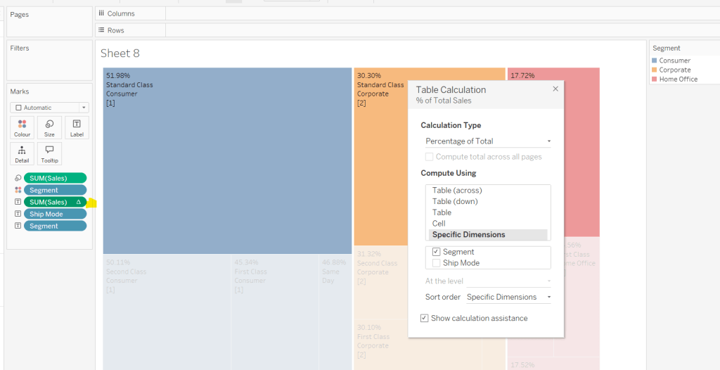
The solution requires table calculations; for one calculation we need a percent of sales per quarter which means we also need to work out the total sales for the quarter. I originally used a FIXED LOD for this but found I could only get the area chart to work if I used a WINDOW_SUM() table calculation instead.
This challenge also requires all the customers for each quarter to be in the view to identify which are in the top X. I used a sorted INDEX() table calculation to identify the top X, but this too failed to work when it came to actually creating the area chart. Using the RANK() table calculation instead worked.
Like I said before why? I don’t know… but putting down as one of ‘just those things’ and hoping that maybe I’ll remember this post in future if it happens again!
Now back to the solution guide…
Creating the calculations
We’re dealing with table calculations, so I’m going to build out the required data in a tabular format to start with.
Create a parameter
pTop
Integer parameter ranging from 5 to 20 with the step size of 5 defaulted to 20
Show this parameter on the sheet, and then create a calculated field
Order Date (Quarters)
DATE(DATETRUNC(‘quarter’, [Order Date]))
Format to the YYYY QX style. Add Order Date (Quarters) to Rows as a discrete exact date (blue pill). Add Customer Name to Rows and add Sales to Text.
We need to identify customers who are in the top x for each quarter. Create a new calculated field
Is Top X Customer?
RANK(SUM([Sales]))<=[pTop]
Add to Rows and adjust the table calculation so it is computing by Customer Name only.
We now want the Sales just for those customers who are in the top x, so create
Top X Sales
IF [Is Top X Customer?] THEN SUM([Sales]) END
Add this field to Rows and we should see that Sales are only displayed for those customers that where Is Top X Customer? = True.
We now need the total of these sales per quarter so create
Total Top X Sales
WINDOW_SUM([Top X Sales])
Add this to the table and adjust the table calculation so both nested calculations are computing by just Customer Name. You should see that the total value is the same for every row for each quarter
We also need the value of the total sales in the quarter regardless of whether the customer is in the top X or not so create
Total Sales per Quarter
WINDOW_SUM(SUM([Sales]))
Add this to the table and again adjust the table calculation to compute by Customer Name only.
Now we have these two figures we can calculate the percentage. Create a new calculated field
Sales % per Quarter
[Total Top X Sales]/[Total Sales per Quarter]
Format this as a % to 1dp. Add to the table.
Duplicate this sheet. I like to do this as I make further changes so I don’t want to lose what I had.
Remove all the surplus field so that only Order Date (Quarters), Customer Name and the Sales % per Quarter fields remain
Create a new field
Customer Index
INDEX()
Convert this field to discrete (right click on the field).
Add this field to the Filter shelf and select 1. Adjust the table calculation so that it is computing using Customer Name only and sorted by SUM of Sales
Re-edit the filter and reselect 1 (making changes to the table calculation resets the filter values).
If everything has been set properly then you should end up with 1 row per quarter. Move the Customer Name pill from Rows to Detail.
We’ve now got the core fields we need to build the viz.
Building the Viz
Once again start by duplicating this sheet. Move Order Date (Quarters) to Columns and change to be continuous (green pill), then move Sales % per Quarter to Rows.
Add another instance of Order Date (Quarters) to the path shelf and change to be an attribute. You should now have a line chart. Increase the size of the line a little.
Add another instance of Sales % per Quarter to Rows, making sure the table calculation is set exactly as the existing version. Change the mark type of the 2nd marks card to Area.
Make the chart dual axes and synchronise axes .
Finally, tidy up the chart by
Adjusting the Tooltip
Removing gridlines, zero lines and row/column dividers
Hide the right hand axis
Fix the left hand axis to end at 1 (so the axis goes to 100%)
Edit the left hand axis title
Update the sheet title to reference the pTop parameter
Then add the viz to a dashboard. My published viz is here.
For #WOW2025 Week 25, Kyle challenged us to make use of Set Actions to recreate a viz where the ‘viz in tooltip’ updates based on the option the user interacts with on the base viz.
Modelling the data
The excel file provided contained 3 sheets which needed to be combined to use for this challenge. My data model looks like this
Attendance is related to Divisions on the fields Tm = Team
Attendance is also related to Record on the fields Tm = Tm.
Building the Base Bar Chart
On a new sheet, add Division to Rows and Attend/G to Columns changing the aggregation to AVG.Sort the data descending.
Change the Colour of the bars to dark grey and show mark labels to display the average attendance per game value. Add W-L% and Est.Payroll fields to the Tooltip shelf and set both to be AVG. Format Est. Payroll to be $ with 0dp. Format W-L% to be formatted to 3dp, but then adjust again and use a custom format to remove the leading 0 (,##.000;-#,##.000)
Format the label to be bold and to match mark colour. Format the row labels, remove the row label heading (right click > hide field labels for rows). Hide the axis and remove all gridlines, axis rulers etc. Update the viz title and name the sheet Bar-Division or similar.
Build the Scatter Plot
On a new sheet add W-L% to Columns and Attend/G to Rows, setting both the use an AVG aggregation, and then add Tm (from the Attendance table) to Detail. Adjust the W-L% axis so it doesn’t always include 0 (right click axis > edit axis> uncheck include zero). Adjust the title of the axis too. Adjust the title of the Attend/G axis too. Change the mark type to circle and increase the size.
We need the chart to show a difference between the marks related to a selected Division and those which aren’t. Create a set from the Division field (right click the field > create > and select NL West.
Add Division Set to Colour and adjust accordingly. Add a dark grey border to the circles. Remove all gridlines and name the sheet Scatter or similar.
Build the Attendance by Team Bar Chart
On a new sheet, add Tm (from the Attendance table) to Rows and Attend/G to Columns, setting the aggregation to AVG. Sort descending. Add Division Set to Colour.
Create a new field
Label Attendance
IF [Division Set] THEN [Attend/G] END
and add to the Label shelf. Format the label so it is bold and set to match mark colour. Hide the row label heading and the axis. Hide all gridlines, zero lines et. Name the sheet Bar-Team or similar.
Adding the Viz in Tooltip
Navigate back to the Bar-Division sheet. Update the Tooltip to reference the Division and the other top level measures. I used a double tab between the headings on one line and again on the values on the next line to make the information line up on hover (even though they look misaligned on the tooltip dialog).
To add each sheet to the tooltip, use Insert > Sheets button in toolbar and select the Scatter sheet and then press tab and select the Bar Team sheet.
Then adjust the text inserted so both filtering sections state filter=”None”. This stops the VIT filtering out by default all the data that isn’t associated to the selection you’re coming from. Adjust maxwidth and maxheight to 350 (I had it set larger, but then it didn’t display properly on Tableau Public, so had to adjust there.
Adding the interactivity
Create a dashboard and add the Bar-Divison sheet. At this point showing the tooltip on each bar will always show the information related to NL West since that was the option selected when we created the set. To fix this, create a new dashboard set action
Set Division
On hover of the Bar-Division sheet, target the Division Set, and assign values to the set. When the selection is cleared, keep set values. Only allow this to be run on single-select only
And now as you hover over different bars, the highlighted circles and bars in the viz in tooltip will change.
For this week’s #WOW2025 challenge, I looked to recreate part of Kathryn McCrindle’s TC25 Iron Viz Final dashboard. The main focus was building the ‘cockpit dials’ – the concentric donut charts, but I also wanted to use the challenge to highlight a couple of techniques Iron Viz finalists use to make the build quicker – background images and custom themes, a new feature introduced in v2025.1. I provided 3 files for this challenge, accessible from here.
A simplified dataset
An image for the background
A json file for the custom theme.
Checking the numbers
To start, we’ll build out some of the calculations needed to sense check the logic.
After connecting to the data, make sure all the fields are defined as dimensions (above the Measure Names line on the data pane) – if they aren’t drag them up. The only field in the Measure Values section should be the count of the records.
We first need to identify how many times each part was recorded in a strike (or not). Drag Part to Rows and Struck? to Columns. Create a new field
# Strikes
COUNTD([Strike ID])
Add to Text. This gives our basis for the inner ring.
The True values above, form the basis for which we then want to understand the split between whether the struck part was then damaged or not. On a new sheet, add Part to Rows and Damaged? to Columns, then create field
# Struck
COUNTD([Strike ID – Is Struck])
and add to Text. Additionally add row grand totals (Analysis menu > Totals > Show Row grand totals). The total for each row should match the True value from the previous sheet (pop the sheets side by side on a dashboard to sense check).
Once again, the Damaged? =True values, form the basis for which we then want to understand the split between whether the struck part was then substantially damaged or not. On a new sheet, add Part to Rows and Substantially Damaged and Part Damaged? to Columns, then create field
# Damaged
COUNTD([Strike ID – Is Damaged])
and add to Text and show row grand totals. Add this sheet to the dashboard too. The total for this sheet should match the True values from the Damaged sheet.
Building the Donuts
Now we’re happy with the numbers, we can start to build the viz. We’ll be using map layers for this, but as we don’t actually have a geometric datatype field in the data set, we need to create one. I’ll be following the core principles discussed in this blog post I wrote for the company I work for, Biztory. In the blog post, we’re just building 1 donut chart, so created a Zero point using MAKEPOINT(0,0). In this instance, I want multiple donuts arranged in rows and columns. This can be done in 2 ways:
use the MAKEPOINT(0,0) method and then create 2 dimension fields added to Rows and Columns that represent the row and column for each Part (akin to what we do when building trellis/ small multiple charts) or
use the MAKEPOINT method to define the point to position the donut. This is the method I’m using, but will break the fields required down, so it’s clear.
Create a new field
Row
CASE [Part] WHEN ‘Engine’ THEN 1 WHEN ‘Nose’ THEN 1 WHEN ‘Windshield’ THEN 1 WHEN ‘Lights’ THEN 2 WHEN ‘LandingGear’ THEN 2 WHEN ‘Radome’ THEN 2 WHEN ‘WingOrRotor’ THEN 3 WHEN ‘Fuselage’ THEN 3 WHEN ‘Propellor’ THEN 3 WHEN ‘Tail’ THEN 4 WHEN ‘Other’ THEN 4 END
Column
CASE [Part] WHEN ‘Engine’ THEN 1 WHEN ‘Nose’ THEN 2 WHEN ‘Windshield’ THEN 3 WHEN ‘Lights’ THEN 1 WHEN ‘LandingGear’ THEN 2 WHEN ‘Radome’ THEN 3 WHEN ‘WingOrRotor’ THEN 1 WHEN ‘Fuselage’ THEN 2 WHEN ‘Propellor’ THEN 3 WHEN ‘Tail’ THEN 1 WHEN ‘Other’ THEN 2 END
Ensure both of these are dimensions, by dragging above the Measure Names on the data pane if required. These fields are simply ‘hardcoding’ the position of each Part (and can be used if adopting the ‘trellis’ route).
Then create a field
Grid Position
MAKEPOINT([Column],[Row])
On a new sheet, add Grid Position to Detail and for now, add Part to the Label shelf so we can see what Part each mark represents.
Change the mark type to Circle.
Drag another instance of Grid Position on to the canvas and drop when you see the option Add a Marks Layer. This will create another marks card called Grid Position (2).
Now we have 2 layers, we can reposition the marks. Note – doing the next steps before adding a 2nd marks layer, won’t let you then create any layers.
Use the swap axis button to change the axis so Latitude is on Columns and Longitude on Rows. Edit the Longitude axis (y-axis) and set the scale to be reversed. The Parts should all now be in the right place.
Now we can start to make the donuts. When using map layers, its good practice to rename the marks cards, so start by renaming the marks card Grid Position to be Centre and Grid Position (2) to be Struck Ring.
On the Centre marks card, change the colour to be dark grey (#44505b) and increase the size. Create a new field
Label – # Substantially Damaged
COUNTD(IF [Substantially Damaged and Part Damaged] THEN [Strike ID – Is Damaged] END)
Add this to the Label shelf and move Part to Detail instead. Position the label middle centre, but don’t adjust the font style in any way.
Create new fields
Tooltip – #Damaged
COUNTD(IF [Damaged?] THEN [Strike ID – Is Struck] END)
and
Tooltip – #Struck
COUNTD(IF [Struck?] THEN [Strike ID] END)
and add these to the tooltip shelf of the Centre marks card, and adjust Tooltip text – again don’t adjust the font style.
Click on the Struck Ring marks card. Drag it so it is under the Centre marks card. Add Part to Detail. Increase the Size until you can see a ring larger than the centre circle. Change the Mark Type to Pie and add #Strikes to the Angle shelf. Add Struck? to Colour. Adjust the colours, and re-order the colour legend so True is listed first.
Disable Selection on the Struck Ring marks card
Add another layer by dragging Grid Position on to the canvas. Rename this marks card to Inner Dark Grey Ring and move the card to the bottom. Add Part to Detail and then increase the Size. Change the mark type to Circle and set the colour to dark grey. Disable selection of the card.
Add another layer by dragging Grid Position on to the canvas. Rename this marks card to Damaged Ring and move the card to the bottom. Add Part to Detail and then increase the Size. Change the mark type to Pie, add #Struck to Angle and add Damaged? to Colour and adjust. Reorder the colour legend so True is listed first. Disable selection of the card.
Add another layer by dragging Grid Position on to the canvas. Rename this marks card to Outer Dark Grey Ring and move the card to the bottom. Add Part to Detail and then increase the Size. Change the mark type to Circle and set the colour to dark grey. Disable selection of the card.
Add the final layer by dragging Grid Position on to the canvas. Rename this marks card to Substantial Damage Ring and move the card to the bottom. Add Part to Detail and then increase the Size. Change the mark type to Pie, add #Damaged to Angle and add SubstantiallyDamaged and Part Damaged? to Colour and adjust. Reorder the colour legend so True is listed first. Disable selection of the card.
Note – you may find you have to tweak the sizes of each layer – when published to Tableau Public, you can do this more accurately by setting a size % – on Desktop you just have to guess the slider position
Add in the custom theme
On the Format menu, select import custom theme and select the json file provided. When prompted select Override to apply the theme.
The font style and other properties of the chart should immediately update
Hide the axis, remove axis rulers and re-name the sheet.
Create the dashboard
Create a dashboard and set it to 1000 x 900. Add an Image object onto the dashboard, and select the background image provided, setting it to fit and centred. Remove the outer padding from both the image object, and the tiled container, so that the image object is exactly 1000 x 900.
You can see, that the labels for each donut, are actually part of the background image. So we now need to add the viz so it is positioned in the right place.
Change the dashboard objects to be ‘floating’ and add the Donut viz. Remove the Title, and delete the colour legends. Adjust the position and height/width to be x=448, y=104 and width=516 and height = 762 (this was done by trial and error – Iron Vizzers will have practiced so many times, they will know what they want these numbers).
But the background isn’t visible through the chart, so right click on the Donut sheet (while its on the dashboard), and Format and then set the background to be set to None.
And that is the crux of the challenge. I then added a floating title along with my standard footer. My published viz is here.
Sean set this table calculation based challenge this week. The key to this was for the reference line & bands to change if any of the non-date related filters were change, but for the values to remain constant regardless of the timeframe being reported. Based on this, I figured a table calculation filter would be necessary for the timeframe filter, as these get applied at the end of the ‘order of operations’.
I used the data set Sean provided in the challenge, to ensure I would get the same values to verify my solution. After connecting to the dataset, I did set the date properties on the data source so the week started on a Sunday, again to ensure the numbers aligned (in the UK, my preferences are set to Mondays).
Building out the calculations
Since we’re working with table calcs, I’m going to build the calcs into a table first, so we can verify the figures are behaving. Start by adding Order Date to Rows as a discrete (blue) pill at the Week level. Then add Sales.
Create a new field
Median
WINDOW_MEDIAN(SUM([Sales]))
and add this into the table. The value should the same for every row.
Create a new field
Std D
WINDOW_STDEV(SUM([Sales]))
and add this too – again this should be the same for every row.
But we want to to show the distribution based on +1 or -1 standard deviations, so create
Std Upper
WINDOW_AVG(SUM([Sales])) + [Std D]
and Std Lower
WINDOW_AVG(SUM([Sales])) – [Std D]
and add these to the table.
Each mark needs to be coloured based on whether it is greater than the upper band, so create
Sales above Std Upper
SUM([Sales]) > [Std Upper]
and add to the table on Rows
Add Category, Sub-Category and Segment to the Filter shelf, and show the filters. Adjust them to see that the table calculation fields change, although still remain the same across every row.
To restrict the timeline displayed, we need a parameter
pWeeks
integer parameter defaulted to 18
Show this parameter on the canvas. Then, to identify the weeks to keep, create a new field
Index
INDEX()
and convert it to discrete, then add to Rows to create a ‘row number’ for each row.
But, I want the index to start from 1 from the end of the table, so adjust the tableau calculation on the Index field so that is it computing explicitly by Week of Order Date and is sorted by Min Order Date descending
The first row in the table is now indexed with the greatest number, and if you scroll down, the last row should be indexed with 1.
With this we can now created
Filter – Date
[Index]<=[pWeeks]+1 AND [Index]<>1
I was expecting just to have [Index}<=pWeeks, but Sean’s solution excluded the data associated to the last week, I assume as it wasn’t a full week, so the above calculation resolved that.
Add this to the Filter shelf and set to True.
Changing the value in the pWeeks parameter only should adjust the number of rows displayed, but the values for the table calculated fields shouldn’t change.
Building the viz
On a new sheet, add Order Date as a continuous (green) pill at the week level to Columns and Sales to Rows.
Add another instance of Sales to Rows. Change the mark type of the Sales(2) marks card to circle. Make the chart dual axis and synchronise axis.
On the All marks card, add Median, Std Upper and Std Lower to the Detail shelf.
Add a reference line to the Sales axis, referencing the Median value. Set it to be a thicker darker line.
Then add another reference line but this time set it to be a band and reference the Std Lower and Std Upper fields, selecting a pale grey fill.
On the Sales(2) marks card, add Sales above Std Upper to the Colour shelf, and adjust to suit. Add a border to the circles. If required, adjust the colour and size of the line on the Sales marks card too.
Add the Category, Sub-Category and Segment fields to the Filter shelf, and show the filters. Show the pWeeks parameter. Then add Filter-Date to the Filter shelf. Adjust the table calculation as described above, then re-edit the filter to just show the True values
Finally tidy up by
remove row and column dividers
hide the right hand axis (uncheck show header)
edit the date axis and delete the title
Then add all the information to a dashboard and you’re good to go!
Erica set this fun and incredibly useful challenge this week, based on the TC25 talk by Lorna Brown & Robbin Vernooij, to showcase different methods of normalising data when comparing measures which have drastically different scales.
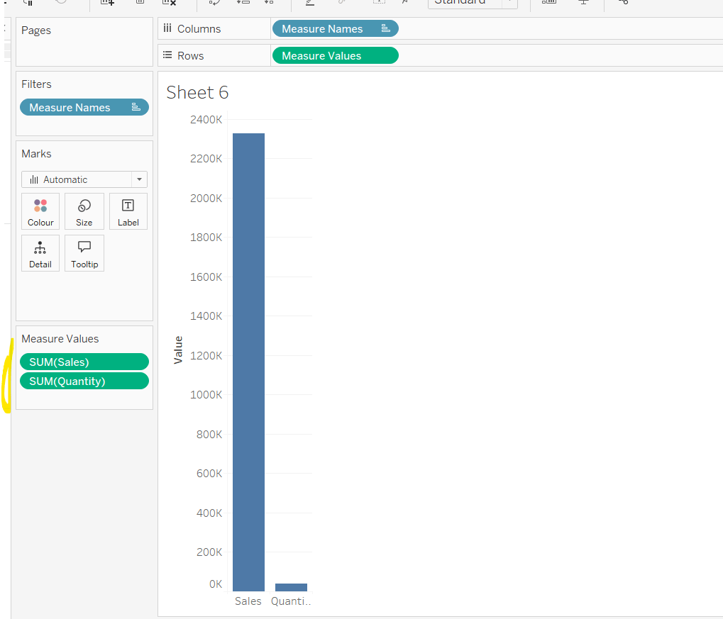
Building the Raw Values chart
Add Sales to Rows. Then drag Quantity on to the canvas and drop the pill on the Sales axis (when you see the ‘2 column’ icon appear). This has the affect of adding the fields onto a shared axis, and the sheet will update to automatically reference Measure Names and Measure Values. Swap Quantity so it is displayed below Sales in the Measure Values section.
Add Region and Category to Detail and change the Mark type to Circle.
I’m going to incorporate the last requirement at this stage, as it helps with the build, so create parameters
pSelectedRegion
string parameter, defaulted to West
pSelectedCategory
string parameter, defaulted to Furntiture
show both these parameters on the sheet.
Create a new field
Is Selected Region & Category
[pSelectedCategory]=[Category] AND [pSelectedRegion]=[Region]
Add this field to Colour, and swap the values in the legend, so True is listed first. Then change the Region on the Detail shelf, so it is also on colour, by adjusting the icon to the left of the pill. Adjust the colours as required and then reduce the opacity on colour to 80%.
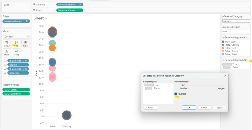
Manually update the entry in the pSelectedRegion parameter to each Region, so the True-<Region> colour combination can be updated to the dark grey.
Add Is Selected Region & Category to Size. Edit the size so they are reversed and the range in size is closer than the default. Once done, then manually adjust the dial on the Size shelf.
Show mark labels, selecting the option to only show the min & max values per cell and aligning middle right
Update the Tooltip. Then create fields True = TRUE and False = FALSE and add both of these to the Detail shelf. We’ll need these to disable the default highlighting later (adding now, as for all the other sheets, we’ll duplicate this one, so makes things easier).
Show the caption (Worksheet menu > show caption) and update the caption to reference the website Erica refers to. Then update the title of the sheet, and name the tab Raw or similar.
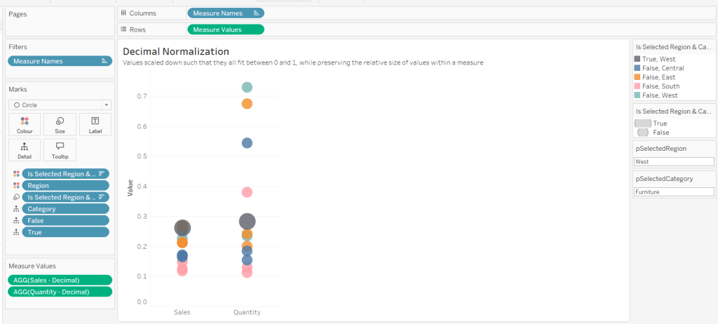
Building the Decimal Normalisation chart
Duplicate the Raw sheet, and name Decimal or similar. Update the title.
Create new fields
Sales – Decimal
SUM([Sales]) / 10^6
Quantity– Decimal
SUM([Quantity]) / 10^4
Drag Sales – Decimal onto the canvas and drop directly over the existing Sales pill in the Measure Values section, so it replaces it. Do the same with the Quantity – Decimal pill. Uncheck Show Labels.
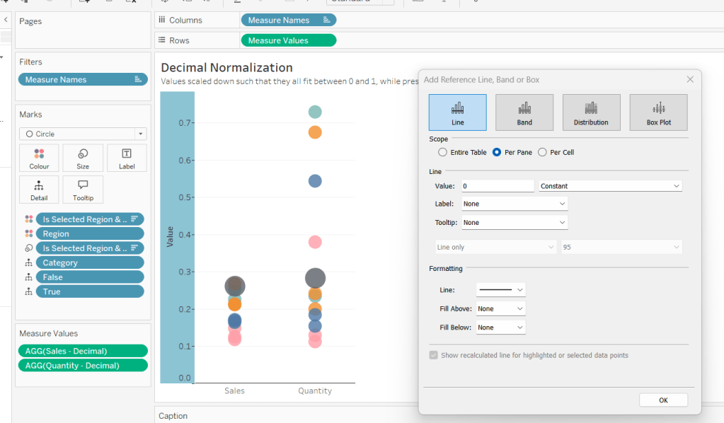
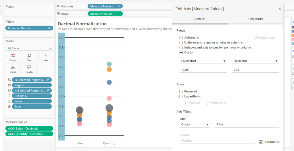
Add constantreference line of 0 that displays as a black solid line at 100% opacity
Repeat and create a constant reference line with value of 1. Edit the axis and fix from -0.05 to 1.05 and remove the axis title.
Update the text in the caption.
Building the Max-Min Normalisation Chart
Duplicate the Decimal sheet and rename Max-Min or similar. Update the title.
Drag Sales – Max-Min onto the canvas and drop directly over the existing Sales – Decimal pill in the Measure Values section, so it replaces it. Do the same with the Quantity – Max-Min pill.
Adjust the table calculation setting for each of the measures so they are computing by Category, Region and Is Selected Region & Category.
Adjust the Tooltip if required. Right click on the bottom column headings and Edit Alias to update the text- you may not be able to rename Sales – Max-Min along xyz… just to ‘Sales’, so you may need to be creative and add spaces eg ‘ Sales ‘ or similar. Update the caption.
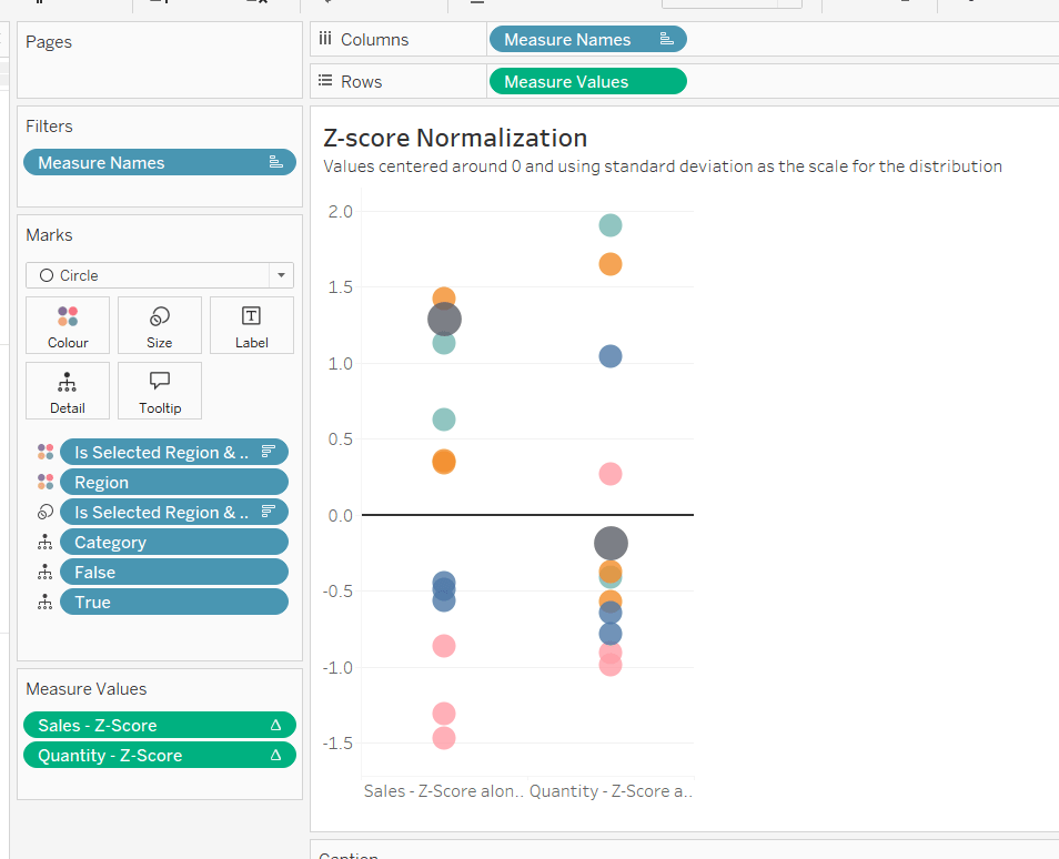
Building the Z-Score Normalisation Chart
Duplicate the Max-Min sheet, and name Z-Score or similar. Update the title.
Drag Sales – Z-Score onto the canvas and drop directly over the existing Sales – Max-Min pill in the Measure Values section, so it replaces it. Do the same with the Quantity – Z-Score pill.
Adjust the table calculation setting for each of the measures so they are computing by Category, Region and Is Selected Region & Category. Remove the reference line for the constant value of 1. Edit the axis, so the range is now Automatic rather than fixed.
As before, adjust the Tooltip again if required, edit the column labels using the alias feature, and update the caption.
Creating the dashboard and adding the interactivity
Add all 4 charts onto a dashboard, using a horizontal container to arrange the charts side by side. From the object context menu on the dashboard, select the option to show the caption
To disable the default highlighting ‘on click’ create a dashboard filter action based on the True/False method described here – you’ll need to create an action per sheet.
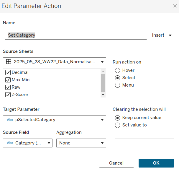
To set the parameters, create a parameter action
Set Category
On select of all the sheets, set the pSelectedCategory parameter passing in the value from the Category field.
Create another similar action called Set Region which sets the pSelectedRegion parameter with the value from the region field.
Finally, add a text section to the top right of the dashboard that references the pSelectedRegion and pSelectedCategory parameters.
Yusuke set the #WOW2025 challenge this week, asking us to build a chart that was drill downable and drill uppable 🙂
I had a fair idea of how this was going to play out, knowing it would involve parameter actions and built the main table fairly quickly. Then it came to the parameter actions, and defining the logic to get them set to the right values. This was very tricky, and I confess I couldn’t completely manage it. The behaviour just wasn’t doing what I wanted 😦
So I looked at Yusuke’s solution, and even after using the exact same logic, field naming and parameter actions (including the names of these), it still wouldn’t quite do what Yusuke’s did. At the point the bars are expanded down to Manufacturer, if a Category is selected, Yusuke’s solution collapses back to the Category > Sub-Category level. Mine expands down to Manufacturer for the Sub-Category listed first (see below).
I spent a considerable amount of time trying to get this to work. Ultimately, I believe it’s something to do with the order in which the parameter actions get applied. In Yusuke’s solution, there are 4 parameter actions firing on each ‘click’, but they only affect 2 parameters. So one change it being applied before the other. But figuring out the order is tricky. From what I understand, actions of the same type (ie all parameter actions as opposed to filter actions, or set actions say), are applied based on alphabetical order. But, as I say, I tried naming my actions exactly like Yusuke’s (even copying and pasting from his solution), and I still couldn’t get his behaviour, and with all 4 actions applied, the drill-down from Sub-Category to Manufacturer didn’t work at all. I couldn’t get my actions to be displayed in the same order as Yusuke’s solution either, even by removing them and then adding them in the order listed, when I closed the dialog and re-opened, the order changed. So, as a result of this, my solution only has 3 actions and doesn’t quite behave exactly like Yusuke’s…. maybe I missed a tiny detail.. who knows, or maybe it’s just Tableau and some quirk in how things get applied…
Anyway, now I’ve said all that, let’s get on to the solution I did manage 🙂
Building out the calculations
For a challenge like this, I’m going to build out all my calculations into tabular form, so I can get the display and sorting as required, especially since table calculations are involved.
We need to capture the selections made ‘on click’ into parameters
pSelectedCategory
string parameter, defaulted to Furniture
pSelectedSubCat
string parameter, defaulted to Bookcases
The Sub-Category and Manufacturer to display will be based on the values in these parameters
On a sheet, add Category, Display – Sub Cat, and Display – Manufacturer to Rows and show the two parameters
If you change the values in the parameters, you’ll see how the display changes.
We want to get the total sales for each ‘level of the hierarchy’, so we can the compute the % sales, and apply sorting. We’ll used Fixed Level of Detail calculations for this.
Format all these to $ with 0 dp, add into the table and note how the values are duplicated across each row, depending on what ‘level of the hierarchy’ we’re looking at
Adjust the sort on the Category pill, to sort by Sales per Category descending – this will move the Technology row to the top.
Sort the Display – Sub Cat pill to sort by Sales per Sub-Category descending and sort the Display – Manufacturer pill to sort by Sales per Manufacturer descending.
With these fields, we can calculate the % of sales
% Sales per Category
SUM([Sales per Category]) / SUM({FIXED:SUM([Sales])})
% Sales per Sub-Category
SUM([Sales per Sub-Category]) / SUM([Sales per Category])
% Sales per Manufacturer
SUM([Sales per Manufacturer]) / SUM([Sales per Sub-Category])
format all these to % with 1 dp and add into the table
For the final display, we don’t want values in every row. We need values displayed at the first row of every level of the hierarchy. I’m going to use the INDEX() tableau calculation to help with this.
Index – Category
INDEX()
Index – Sub-Category
INDEX()
Make both of these fields discrete (right click > convert to discrete).
Add Index – Category to Rows to the right of the Category pill. Adjust the table calculation on the pill so it is computing using Display – Sub Cat and Display – Manufacturer only. This should index the rows so that the numbering restarts when the Category changes.
Add Index – Sub-Category to Rows to the right of the Display – Sub Cat pill. Adjust the table calculation on the pill so it is computing using Display – Manufacturer only. This should index the rows so that the numbering restarts when the Sub–Category changes.
We can then use this information to determine which rows need to display the % Sales values.
Display – % Sales per Category
IIF([Index – Category] = 1, [% Sales per Category],NULL)
Display – % Sales per Sub-Category
IIF([Index – Sub-Category] = 1 AND MIN([Category]) = [pSelectedCategory], [% Sales per Sub-Category],NULL)
Display – % Sales per Manufacturer
IIF(MIN([Sub-Category]) = [pSelectedSubCat], [% Sales per Manufacturer],NULL)
format all these to % with 1 dp, and add to the table (sense check that the table calculations for each field have the settings we applied to the Index fields above.
These 3 fields, are the core fields we need to use in the viz.
Building the Viz
On a new sheet, add Category, Display – Sub Cat, Display – Manufacturer to Rows and apply the sorting on each pill described above, and how the parameters.
Add Display – % Sales per Category to Columns and apply the table calculation settings described above. Add Display – % Sales per Sub-Category to Columns too, and again apply the table calc settings. Then add Display – % Sales per Manufacturer to Columns. Change the mark type on each of the 3 marks cards, specifically to use bar.
Add Category to the Colour shelf on the All marks card, and adjust accordingly.
On the Display – % Sales per Category marks card, add Category and Display – % Sales per Category to Label. Adjust the table calc settings of the % field as required. Adjust the layout of the label. Add Sales per Category to Tooltip and update the tooltip to suit.
On the Display – % Sales per Sub-Category marks card, add Display – Sub Cat and Display – % Sales per Sub-Category to Label. Adjust the table calc settings of the % field as required. Adjust the layout of the label. Add Sales per Sub-Category to Tooltip and update the tooltip to suit.
On the Display – % Sales per Manufacturer marks card, add Display – Manufacturer and Display – % Sales per Manufacturer to Label. Adjust the layout of the label. Add Sales per Manufacturer to Tooltip and update the tooltip to suit.
You may need to widen each row to see the labels displayed.
The axis titles on the top of the chart adjust based on the selections made. To present this within the chart itself (rather than using carefully positioned text fields on a dashboard), we need to make the chart dual axis using ‘fake axes’.
Double click into the space in Columns to the right of the last pill, and manually type MIN(0). Drag this field to sit between Display – % Sales per Sub-Category and Display – % Sales per Manufacturer.
Remove all pills from the MIN(0) marks card. Change the mark type to Shape and select a transparent shape for this (refer to this article to set this up – you can also use any other type of mark but set to very small, and 0% opacity on the colour to make it “invisible”, though a mark could appear on hover, which is why I prefer to use transparent shapes).
Click on the MIN(0) pill and set it to be dual axis, so 2nd column now has a MIN(0) axis heading.
Right click on this top axis, to Edit the axis – Change the Title to reference the pSelectedCategory parameter and set the tTck Marks to None
Repeat the process, creating another instance of MIN(0) to the right of the Display – % Sales by Manufacturer, but this time the axis title should reference the pSelectedSubCat field.
Tidy up the display formatting by
Add row banding with Band Size = 1and Level = 0, so the whole of the Furniture block is coloured grey.
Remove column dividers
Remove gridlines and zero lines
Hide the 3 pills on the Rows (right click each pill and uncheck show header).
Hide the null indicator (right click > hide)
Edit the bottom 3 axis to remove the titles and hide the tick marks on all
Make the axis heading section narrower
Add a border around each of the bars, and make each bar narrower if required
Add some space to the start of each bar, by adjusting the bottom axis to be fixed from -0.1 to 1
Update the title of the sheet, and name the sheet.
Adding the interactivity
Add the sheet to a dashboard.
Firstly, we’re going to stop the bars from being ‘highlighted’ when clicked. we’ll use the True/False filter action technique described here. Create 2 calculated fields True = TRUE and False = FALSE and add to the Detail shelf on the All marks card of the viz. Add a dashboard filter action
Deselect Marks
On select of the the Viz sheet on the dashboard, target the Viz sheet directly, setting True = False.
Now we need to deal with the parameter values. As I discussed at the start of this blog, getting the calculations required and making the functionality work was pretty tricky, so I’m just going to document what I’ve ended up using, that seems to mostly work. Note the names of the parameter actions which both affect the pSelectedCategory param are pre-fixed with a number to force the order (I did test with them the other way round, and things broke).
Create fields
Category for Param_1
IF (([pSelectedCategory]<> [Category]) OR ([pSelectedCategory]=[Category] AND [pSelectedSubCat]=[Display – Sub Cat]) AND ISNULL([Display – Manufacturer])) THEN ‘ ! Please select a Category !’ ELSE [Category] END
Category for Param_2
[Category]
SubCat for Param
IF (([pSelectedCategory]<> [Category]) OR([pSelectedSubCat]=[Display – Sub Cat])) AND NOT(ISNULL([Display – Manufacturer])) THEN ‘ ! Please select a Sub-Category !’ ELSE [Display – Sub Cat] END
Then create 3 parameter actions
Set SubCategory
On select of the viz, set the pSelectedSubCat parameter passing in the value from the SubCat for Param field.
1. Set Category
On select of the viz, set the pSelectedCategory parameter passing in the value from the Category for Param_1 field.
2. Set Category
On select of the viz, set the pSelectedCategory parameter passing in the value from the Category for Param_2 field.
And fingers crossed, that should work, at least work the same as mine… my published viz is here. Note – when I uploaded to Tableau Public, the dynamic axes seemed to break, so I had to manually reset them on public…. or it may have broken before I published and didn’t realise.. the feature does seem to be a bit temperamental.
Yoshi chose to challenge us this week to try using the multi-fact relationship model, something I hadn’t used before so I was keen to have a go.
I have to admit, I did ultimately find the challenge a bit tricky… I did have to look at the hint in the challenge to see how Yoshi had folded in the additional month data source, and then when building the vizzes, I was getting slightly different numbers on occasion. I wasn’t sure whether this was due to differences in how I’d applied the actual relationship fields between the tables in the model, but can’t actually get to Yoshi’s data model in the solution to tell. I used the information on the help article to determine the linking fields, so I think it’s right…
I also struggled with the final requirement – to always show all the libraries in the display, even when there were no copies of the selected book. As soon as I restricted the display to just show the data for the selected book, the libraries which didn’t stock the book disappeared, which with relationships is what I expected as they act like ‘inner joins’. Even looking at Yoshi’s solution, I can’t see what magic trick has been applied, unless there’s something in the model I haven’t applied..
So I’ll explain what I did, and if you can figure out where I may have gone wrong, or if you concur with my set up, then please let me know 🙂
Modelling the data
Download the 3 data sources from Yoshi’s link.
Connect to the Bookshop excel file. Drag Checkouts onto the canvas first – this is one of the base tables.
Drag Book onto the canvas and verify the tables are related by the Book ID field from each table.
Drag Author onto the canvas after Book and verify the tables are related on the Auth ID fields.
Drag Award onto the canvas after Book and verify the tables are related on the Title fields.
Drag Edition onto the canvas after Book and verify the tables are related on Book ID
Drag Info onto the canvas after Book. This time you’ll need to join Book ID from Book to a relationship calculation from Info of [BookID1]+[BookID2]
Drag Ratings onto the canvas after Book and verify the tables are related on Book ID
Add a new connection to the BookshopLibraries excel file and then drag in Catalog after Edition and verify the tables are related on ISBN
Drag in Library Profile after Catalog and verify the tables are related on Library ID
Next from the Bookshop excel data source, add Sales Q1 onto the canvas and drop when the New BaseTable option appears
Multi select the Sales Q2, Sales Q3 and Sales Q4 tables then drag onto the canvas and drop onto the Sales Q1 table when the Union option appears
Right click on the Sales Q1 unioned object and rename to Sales. Add a relationship from Sales to Edition verifying the tables are related on ISBN.
Add a new connection to the Months csv file, then add the Month.csv object onto the canvas so it is related to the Sales table. This time you’ll need to create a relationship calculation on Sales as DATEPART(‘month’, [Sale Date]) and join to Month
Finally also add a relationship from Checkouts to Month.csv, creating a relationship on Checkout Month to Month.
Now we have a model, we can start building the vizzes.
Building the scatter plot
To start, to verify I’m getting the data I expect, I’ll build out a table
Add BookID (Book) and Title to Rows. We need to indicate if the book has won an award.
Awarded?
COUNT([Award])>0
Add this to Rows.
We will be plotting the average number of checkouts per month against the average number of orders per month., so create
Avg Checkouts per Month
SUM([Number of Checkouts])/COUNTD([Checkout Month])
Then create
Avg Orders per Month
COUNT([Order ID])/COUNTD(MONTH([Sale Date]))
Add into the table. The number won’t be correct though, as we are displaying data from the Checkouts base table and the Sales base table without including any field from any tables that link them. To resolve this add BookID (Edition) onto Rows, and if you spot check some of the numbers against the scatter plot solution, they should match (or be very close). – figures for Portmeirion matched for me.
We also need to highlight which book is selected, so create a parameter
pSelectedBookID
string parameter defaulted to <emptystring>
Then create field
Is Selected Book
[BookID (Edition)] = [pSelectedBookID]
Show the parameter and enter the string PP866 (for Portmeirion). Add Is Selected Book to Rows to verify true is displayed against this row.
On a new sheet, add Avg Checkouts per Month to Columns and Average Orders per Month to Rows. Add Book ID (Edition) to Detail. Add Awarded to Shape and adjust shapes as required. Add Awarded to Size and adjust. Add Is Selected Book to Colour and adjust to suit. Make sure True is listed before False for the Colour legend to ensure the selected book mark is always ‘on top’. Hide the null indicator
Create a new field
Label: Selected Title
IF [Is Selected Book] THEN [Title] END
Add this to Label, adjust the font style, match mark colour and align top centre. Adjust the tooltip. Update the title and name the sheet Scatter or similar.
Building the Ratings Bar
Add Rating as a discrete dimension (blue disaggregated field) to Rows. Add Is Selected Book to Columns and add Ratings (Count) to Text. Exclude the Null column that appears (Filter for Is Selected Book). Add a percent of totalquick table calculation to CNT(Ratings) and adjust to compute using Rating.
Duplicate the sheet. Move CNT(Ratings) to Columns and Is Selected Book to Colour. Adjust colours to suit. Unstack the marks (Analysis menu > stack marks off). Add Is Selected Book to Size. Adjust so that True is listed first on the size legend, so it is both narrower than false, and will also now be ‘in front’. Update the tooltip and hide the Rating label heading (right click > hide field labels for rows).
Create a new field
Selected Book Ratings
IF [Is Selected Book] THEN {FIXED [Title]: COUNT([Ratings])} END
and add to Detail. Then update the title of the sheet adding a reference to this field. Exclude the Null option that now appears (Rating is added to the Filter shelf). Name the sheet Ratings Bar or similar.
Build the trend line
We need to show the average number of books ordered and the average number of books checked out each month. For this we need
Avg Orders per Book
COUNTD([Order ID])/COUNTD([BookID (Edition)])
and
Avg Checkouts per Book
SUM([Number of Checkouts])/COUNTD([BookID (Edition)])
On a new sheet, add Month (from Months.csv) to Rows as a discrete dimension (blue pill) and add Avg Checkouts per Book and Avg Orders per Book into the table text. Then add Is Selected Book to Columns.
This is where some of my numbers don’t align with the values in Yoshi’s solution, but it’s not clear why… Exclude the Null columns (Is Selected Book added to Filter).
We’re going to want to display the month numbers as the month names, so create a new field to create a ‘date’ out of the number
Month Name
//convert to a date, then use month/formatting functions in display MAKEDATE(2000, [Month],1)
On a new sheet add Month Name to Columns as a continuous pill at the month (May) level (green pill). Add Avg Orders per Book and Avg Checkouts per Book to the Rows and add Is Selected Book to the Colour shelf of the All marks card. Adjust colour if needed, and ensure True is listed first (on top).
Adjust the y-axis titles, and update tooltip if required. Remove the title from the x-axis. Format the x-axis so the scale uses abbreviated month names
Add Is Selected Book to Filter and exclude Null. Update the sheet title, Name the sheet Monthly Trend or similar.
Building the Library Bar
Add Library to Rows and Number of Copies to Columns. Add Is Selected Book to Filter and set to True. Show mark labels, and adjust to match mark colour. Hide the x-axis. Hide the Library row header. Apply row banding so every other row is shaded. Update the tooltip and sheet title. Name the sheet Library Bar or similar.
Creating the title sheet
On a new sheet add Is Selected Book to Filter and set to True. Then add Title, First Name, Last Name and Genre to Text. Set the mark type to shape and select a transparent shape (see here for info on how to set this up). Set the sheet to Entire View. Organise the text as required and align middle left. Stop the tooltip from showing. Name the sheet Title or similar.
Building the dashboard and interactivity
Use layout containers to position the objects onto the dashboard, and use padding to provide the relevant spacing between objects.
The Title, Ratings Bar, Monthly Trend and Library Bar sheets should all be in a single vertical container which has a dotted blue border surrounding it.
Create a dashboard parameter action
Set Book
on select of the Scatter sheet, set the pSelectedBookID parameter with the value from the BookID (Editiion) field. When the selection is cleared, retain the value.
The layout of my dashboard including the item hierarchy is below
Lorna provided this week’s challenge, drawing on some tips she’d picked up from Nhung Lee at #TC25. We’re building 2 charts, but for the second we need some supplementary data, and for this we need to start with some data modelling.
Modelling the data
I downloaded the ChatGPT Android reviews data from Kaggle into a csv file called chatgpt_reviews.csv. I also then copied the additional data Lorna provided in the challenge into another csv called WOW2025_19_Additional Data.csv.
I chose to model the data using a physical model rather than relationships, as I needed to ensure all the review data would always exist in the view. To do this I started by connecting to the chatgpt_reviews.csv. From the context menu of the sheet added to the datasource canvas, I selected Open to ‘open’ the physical model ‘window’
I then added a new connection to the WOW2025_19_Additional Data.csv file And added a Left Join to it, joining from the chatgpt_reviews.csv using a join calculation of
DATE(DATETRUNC(‘day’,[At]))
and joining this to the Release Date field from the WOW2025_19_Additioanal Data.csv file
Now with this set up, we can start to build.
Creating the bar chart
Add Score as a discrete dimension (blue disaggregated pill) to Rows and chatgtp_reviews.csv (Count) to Columns.
Add Score as a discrete continuous (green disaggregated pill) to Colour and adjust to use a grey colour palette. Make each row a bit wider, and show labels
Hide the Score column (uncheck show header), increase the size of the font for the Star Rating field, hide the Count of chatgpt_reviews axis (uncheck show header), hide all gridlines/axis rulers/ zero lines and row and column dividers. Adjust the font style of the label, hide the ‘Star Rating’ column label (right click > hide field labels for rows). AAjust the Tooltip as desired and update the sheet title. Name the sheet star Rating Bar or similar.
Building the line chart
On a new sheet, add At as a continuous pill at the ‘1st May 2025‘ day level (green pill) to Columns and add chatgpt_reviews.csv (Count) to Rows. Change the Colour of the line to dark grey.
For the ‘reference lines’ we’re actually adding bars all at the same height. The height we’re going to use is the maximum number of reviews, so create
Max Review Count
IF NOT ISNULL(MIN([Release Date (WOW2025 19 Additional Data.csv1)])) THEN WINDOW_MAX(COUNT([chatgpt_reviews.csv])) END
Add this to Rows and hide the null indicator (right click > hide indicator). Change the Mark type to bar.
Add Product to the Label of the Max Review Date marks card, and align as below
Adjust the table calculation of the Max Review Count field so it is computing by both the At and Product fields.
Make the chart dual axis and synchronise the axis. Adjust the Label to explicitly add a couple of carriage returns after the Product text. This has the effect of shifting the text to the left of the bars.
Fix the Count of chatgpt_reviews axis from -100 to 10,800
Ensure mark labels are set to allow labels to overlapother marks.
Tidy up by
hiding the right hand axis (uncheck show header)
Updating the title of both axis (right click > edit axis)
remove all gridlines, zero lines, row & columns dividers
show axis rulers
update tooltips as required
update the sheet title
name the sheets Trend or similar.
Then add both charts to a dashboard. My published viz is here.
Sean set this week’s challenge to give an alternative solution to displaying a table of details rather than the traditional ‘pancake table’ (his words not mine 🙂 ).
The main crux of the challenge relates to the dashboard actions and interactivity, so I’ll be brief(ish) in describing how to build the charts.
Creating the line chart
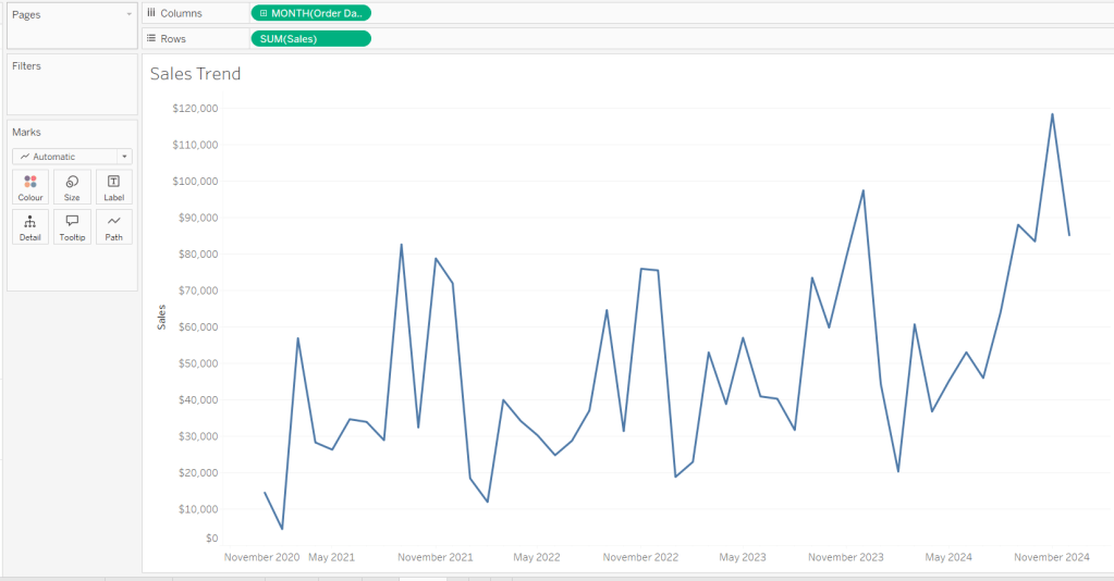
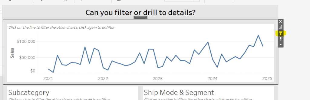
Add Order Date to Columns at the month-yearcontinuous (green pill) level. Add Sales to Rows. Format Sales to $ with 0 dp. Remove the title on the Order Date axis. Update the Tooltip to give an instruction to ‘click the line to filter’. Rename the sheet Sales Trend or similar.
Creating the bar chart
Add Sub-Category to Rows and Sales to Columns. Sort by Sales descending. Hide the Sub-Category row heading label (right click > hide field labels for rows). Update the Tooltip to give an instruction to ‘click the bar to filter’. Rename the sheet Sales by Sub Bar or similar.
Creating the Tree Map
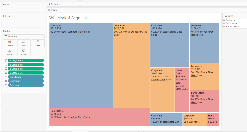
Add Segment and Ship Mode to Detail and Sales to Size. Move Segment to Colour and reduce opacity to about 60%. Move Ship Mode to Label and then add additional Segment and Sales pills to Label. Add a table calculation against the Sales pill on the Label shelf, so it is applying a percentage of Total by Segment only.
Add another instance of the Sales pill to Label and then update the layout of the label.
Move the Segment pills on the marks shelf so they are positioned below the Ship Mode to ensure the tree map is segmented based on the Ship Mode (there should be four blocks divided by the thicker white lines).
Update the Tooltip to give an instruction to ‘click the treemap to filter’. Rename the sheet Treemap or similar.
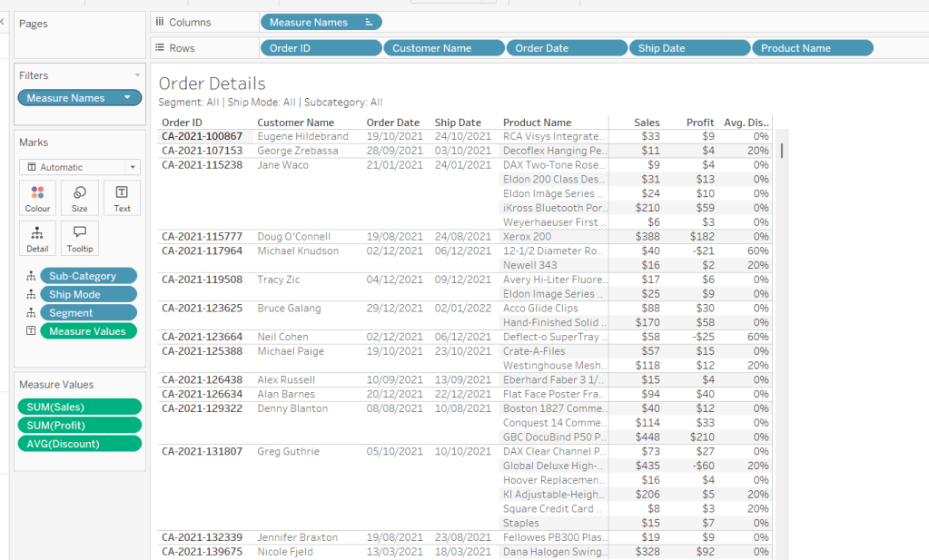
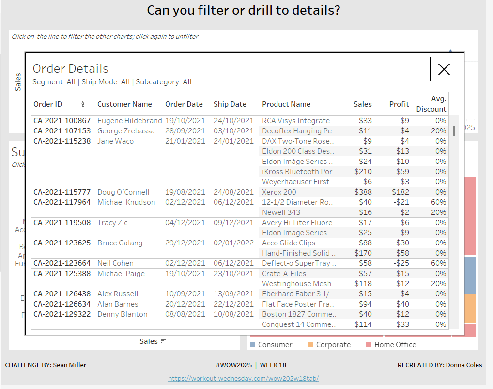
Build the Details table
On a new sheet add Order ID, Customer Name, Order Date (as a discrete exact date – blue pill), Ship Date(as a discrete exact date – blue pill) and Product Name to Rows. Add Sales to Text. Format Profit to $ with 0 dp and drag onto the canvas over the columns of Sales numbers, and release the mouse when the Show Me option appears. Add Discount into the Measure Values section. Change the aggregation to Average and then format to be % to 0 dp. Rearrange the order of the pills in the Measure Values section as required. Add Segment, Sub-Category and Ship Mode to the Detail shelf. Update the title to reference these 3 pills. Hide the Tooltip. Rename the sheet Details or similar.
Building the additional calculations needed
In clicking around Sean’s solution, I was finding what I had initially built wasn’t quite doing what Sean did. If I clicked on the bar chart and then the tree map, the details were only filtered based on the tree map and vice versa. There were ways to solve this, but this then resulted in other issues, in that after closing the details table, the charts remained filtered, but it wasn’t obvious as nothing was highlighted. Basically what I’m trying to say, is the filtering seemed like it should be straightfoward, but wasn’t. I ended up using a combination of parameters and filter actions.
So we’ll start by dealing with the parameters we need.
Create the following parameters
pSelectedDate
date parameter defaulted to 01 Jan 1900
pSelectedSegment
string parameter defaulted to <emptystring>
pSelectedShipMode
string parameter defaulted to <emptystring>
pSelectedSubCat
string parameter defaulted to <emptystring>
Then create the following calculated fields
Filter: Date
[pSelectedDate] = #1900-01-01# OR [pSelectedDate]=DATETRUNC(‘month’,[Order Date])
add this to the Filter shelf on the bar chart, tree map and details sheets and set to True.
Filter: SubCat
[pSelectedSubCat]=” OR [pSelectedSubCat]=[Sub-Category]
add this to the filter shelf on the line chart, tree map and details sheets and set to True
Filter: Segment
[pSelectedSegment]=” OR [pSelectedSegment]=[Segment]
add this to the filter shelf on the line chart, bar chart and details sheets and set to True
Filter: Ship Mode
add this to the filter shelf on the line chart, bar chart and details sheets and set to True
We also need a parameter to capture when we want to show the details table.
pClickMade
boolean parameter defaulted to False.
and to supplement it, we need a calculated field to use to set this parameter to true
Click Made
TRUE
Add Click Made to the Detail shelf of the line chart, bar chart and tree map.
We’ll set these parameters later.
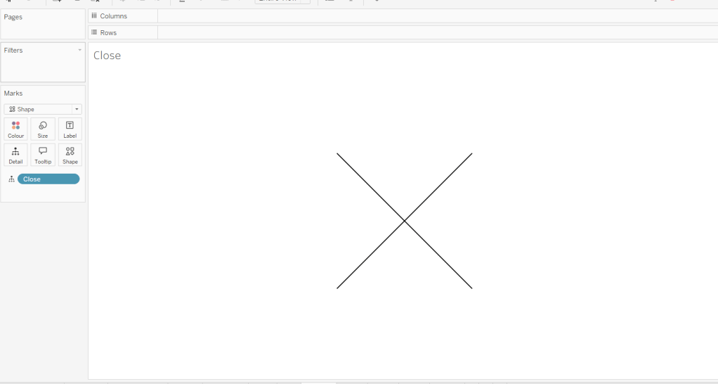
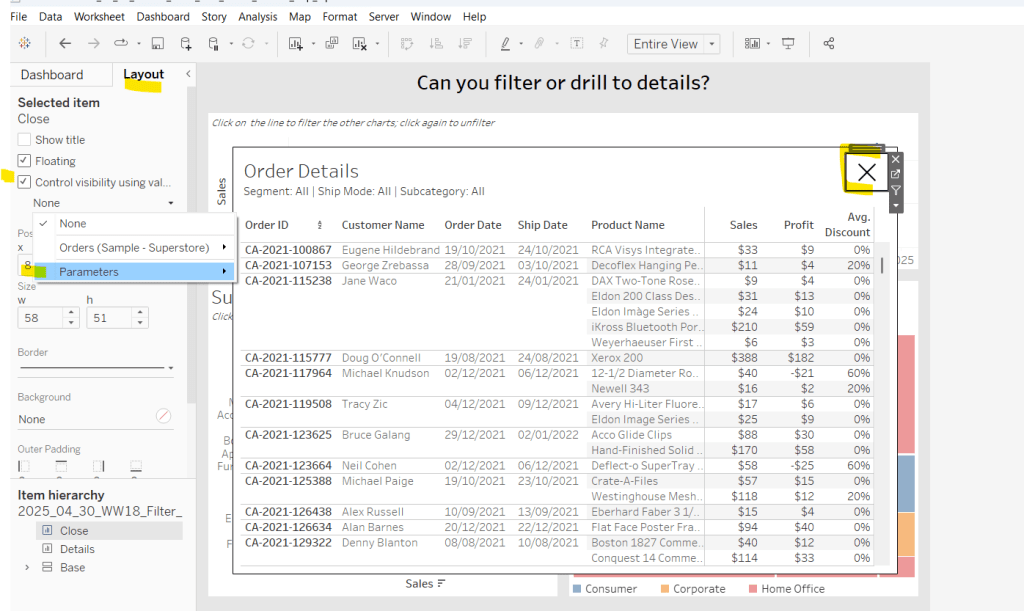
Building the Close icon
The ‘close’ cross when the details sheet is displayed is another sheet. On clicking on it, we will want to set the pClickMade parameter to False so the Details will no longer show. For this we will need
Close
FALSE
Add this field to the Detail shelf on a new sheet. Change the mark type to shape and change the shape to a X. Set the colour to black and set to fit entire view. Hide the Tooltip. Name the sheet Close or similar.
Building the dashboard and interactivity
Using layout containers, arrange the line chart, bar chart and tree map into a dashboard. Use padding and background colours to get the layout as desired.
The add the Details sheet as a floating object and position over the top of the other charts. Set the background to white and add a black border. Also float the Close sheet into position too. Hide the title and also add a black border.
Select the Close sheet object, and then from the Layout tab in the left hand nav, check the Control visibility using value checkbox and select the pClickMade parameter
It should disappear if the parameter is still set to false. Repeat the same process with the Detail sheet object.
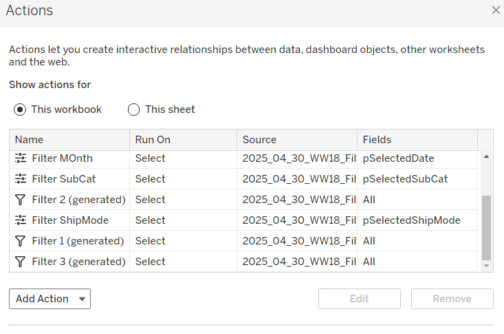
Now create the following dashboard parameter actions
Filter Month
On select of the Sales Trend sheet, target the pSelectedDate parameter, passing in the value from the Order Date. When the selection is cleared, reset to 01 Jan 1900.
Filter SubCat
On select of the Sales by Sub Bar sheet, target the pSelectedSubCat parameter, passing in the value from the Sub-Category. When the selection is cleared, reset to <emptystring>.
Filter Ship Mode
On select of the Treemap sheet, target the pSelectedShipMode parameter, passing in the value from the Ship Mode. When the selection is cleared, reset to <emptystring>.
Filter Segment
On select of the Treemap sheet, target the pSelectedSegment parameter, passing in the value from the Segment. When the selection is cleared, reset to <emptystring>.
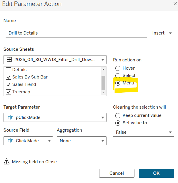
Drill to Details
Via the menu of the Sales by Sub Bar, Sales Trend, and Treemap sheets, target the pClickMade parameter passing in the value from the Click Made field. When the selection is cleared, set the value to False.
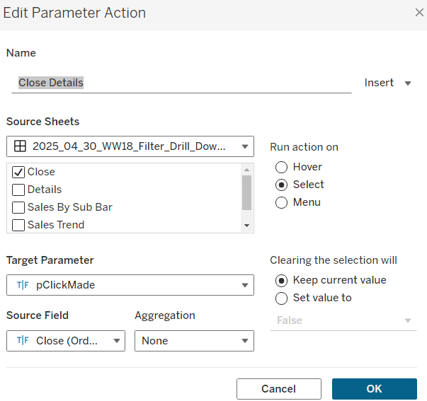
Close Details
On select of the Close sheet, target the pClickMade parameter, passing in the value from the Close field. When the selection is cleared, keep the value.
If you start clicking around, you should find that all these actions do provide some level of filtering, but if you for example, click on the bar (to filter the line and treemap), and then click on a section in the tree map and use the ‘Drill down to details’ menu option, the details table has lost the filtering of the bar chart as the bar has become unselected when the treemap chart was clicked.
To resolve this, apply filter actions to the line chart, bar chart and tree map objects (the quickest way to do this is just select the object on the dashboard and click the ‘filter’ icon in the context menu.
If you do this on all 3 sheets and then look at the list of dashboard actions you’ll see 3 ‘Filter x (generated)’ entries.
By applying this mix of filtering through ‘default’ dashboard filter actions in conjunction with parameters, I think you have a more complete and understandable experience. And you will have to explicitly unselect each of the marks you clicked on to remove that filter. I added instructions on the dashboard to aid with this.
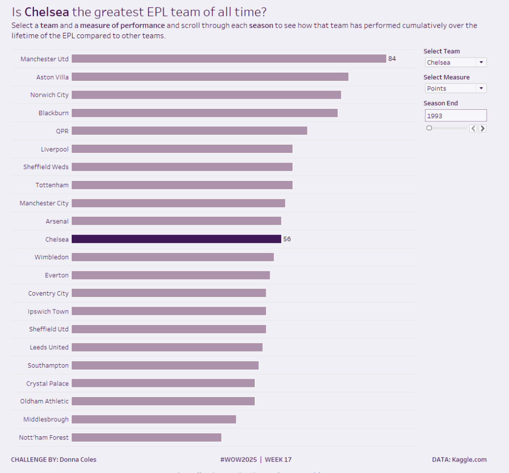
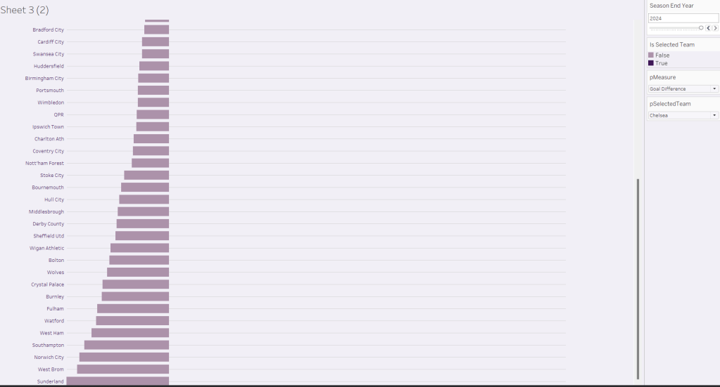
It’s back to the EFL this week for my #WOW challenge. Once again I’ve tried to provide a multi-level challenge – a version that uses some core skills and features, and a version that just pushes the display a bit further, just for fun. I’ll start with the core build and then use that as the base for the bonus challenge.
Setting up the parameters
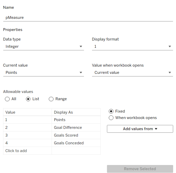
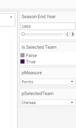
The main crux of this challenge is measure swapping, so for this we need a parameter
pMeasure
integer parameter listing values 1 to 4 which are aliased as per the screen shot below. Default value is 1 (Points).
Note – you can use a string parameter with the actual words. I just chose to use this method to demonstrate the aliasing ability. Also when referencing this parameter in a CASE statement (which we’ll do shortly), using integer values for comparisons is slightly more efficient than string comparisons.
We also need the user to have the ability to select the team they want to track
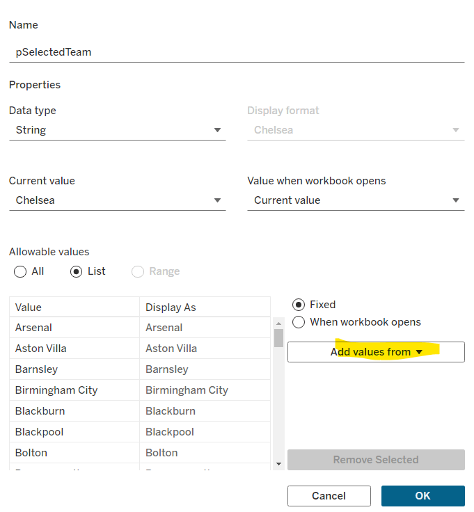
pSelectedTeam
string parameter defaulted to your preferred team (I chose Chelsea). This is a List parameter that is populated from the Team field via the Add values from button
Building the calculations
We need to determine the measure to display based on the parameter selection
Measure to Display
CASE [pMeasure] WHEN 1 THEN SUM([Cumulative Points]) WHEN 2 THEN SUM([Cumulative Goal Difference]) WHEn 3 THEN SUM([Cumulative Goals For]) WHEN 4 THEN SUM([Cumulative Goals Against]) END
We also will need to colour the bars based on the selected team
Is Selected Team
[Team]=[pSelectedTeam]
and we need to sort the data based on best to worst, but need to consider that for Goals Conceded, the higher the value the worse the team is.
Sort Measure
IF [pMeasure] = 4 THEN [Measure to Display]*-1 ELSE [Measure to Display] END
We only want to show teams once they start participating in a Season. For this, we need to identify the team’s 1st season in the EFL
1st Season per Team
{FIXED [Team]: MIN(IF [Cumulative Points] > 0 THEN [Season End Year] END)}
and then we can create a field we can filter on, based on this
Show Team
[Season End Year]>=[1st Season per Team]
We only want to show a label against the 1st team and the selected team, so create
Label to display
IF MIN([Is Selected Team]) OR FIRST()=0 THEN [Measure to Display] END
and finally, we need to display the value of the current season’s measure on the tooltip, as well as the cumulative value, so we need another case statement
Tootltip Measure
CASE [pMeasure] WHEN 1 THEN SUM([Points]) WHEN 2 THEN SUM([Goal Difference]) WHEn 3 THEN SUM([Goals For]) WHEN 4 THEN SUM([Goals Against]) END
Building the core bar chart
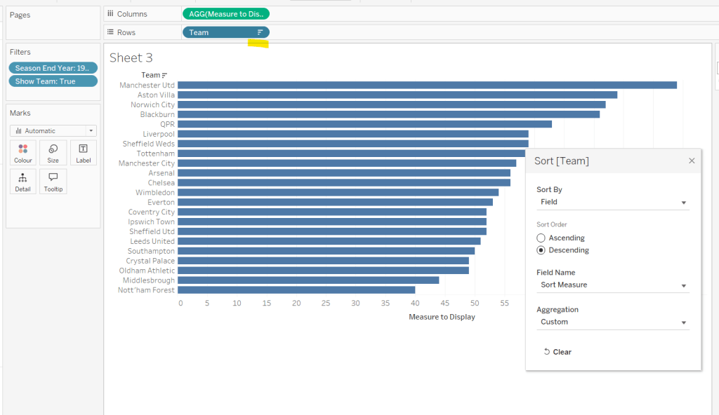
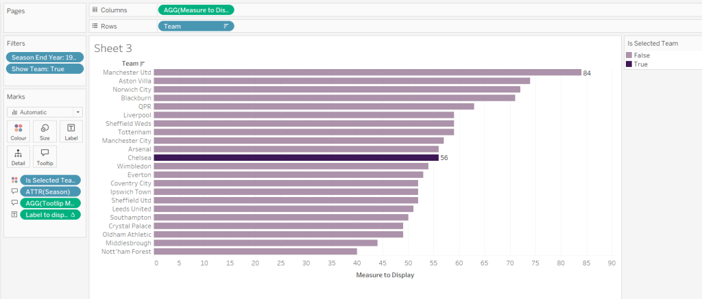
On a new sheet, add Team to Rows and Measure to Display to Columns. Add Season End Year to Filter and select 1993. Add Show Team to Filter and select True. Apply a sort to the Team field to sort by the field Sort Measure descending.
Add Is Selected Team to Colour and adjust accordingly. Add Label to display to Label. Add Season and Tooltip Measure to Tooltip and update accordingly,
Show the pMeasure and pSelectedTeam parameters and the Season End Year Filter. Adjust the Season End Year filter control so that the All option isn’t available and it displays as a single value slider control.
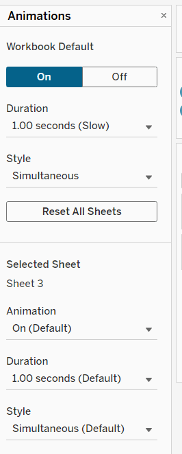
Move the Season End Year filter control on by one value and notice how the chart transitions. Adjust the Animations settings (Format menu > Animations) to be sequential and slow
Finally tidy up the display by
hiding the Measure to Display axis (right click > uncheck show header)
hiding the Team row label (right click > hide field labels for rows)
widen each row a bit
hide gridlines, zero lines, axis rulers and axis ticks
add pale grey row dividers
set the background colour of the worksheet
adjust the font of the row labels – I used Tableau Book 8pt in colour #3e1756 (dark purple)
Name the sheet Core or similar and add to a dashboard setting it to Fit Entire View
Add a title to the dashboard that references the pSelectedTeam parameter.
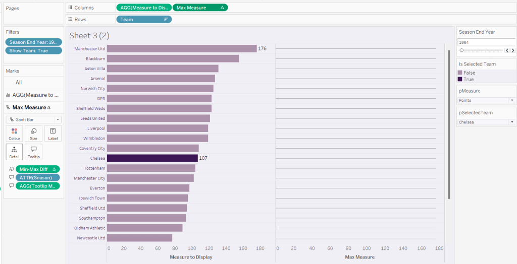
We’re going to use a gantt bar to simulate a central line for each row. This bar needs to extend to the largest measure in the table for every row, so this is the point we’ll plt
Max Measure
WINDOW_MAX([Measure to Display])
Add this to the Columns shelf, and on the Ma Measure markls card that gets added, remove the Is Selected Team from the Colour shelf, and change the mark type to gantt bar.
The bar needs to extend to the 0 or the minimum value in the window (if its less than 0), so we need a field to show the difference between the max and the minimum of 0 or the ‘window min’, but we need to multiple by -1 so the size extends in the right direction.
Max-Min Diff
([Max Measure] – MIN(WINDOW_MIN([Measure to Display]),0)) * -1
Add this to the Size shelf, and then update the size to be as small as possible. Remove Label to Display from the marks card and add a border the same colour as the background to the Gantt bar (via the Colour shelf) to make the line very narrow.
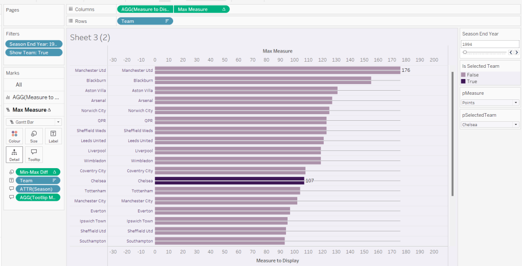
Add Team to the Label shelf and align centre left. Format the label text to be 8pt and dark purple. Then make the chart dual axis and synchronise the axis.
Right click the top axis and select move marks to back. Then hide both axis (right click, uncheck show header) and hide the Team pill on Rows too (again uncheck show header)
Verify the Tooltip on the gantt bar displays the same as on the main bar. If not add the relevant fields and adjust to match.
Tidy up the formatting by removing the row and column dividers. If need be adjust the colour of the Gantt bar to be a paler grey.
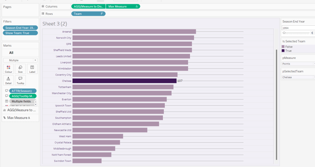
Change the measure value to Goal Difference and adjust the year to 2024 and check the display looks as expected, especially at the bottom – the gap between the label of the team at the bottom and the bar is minimal.
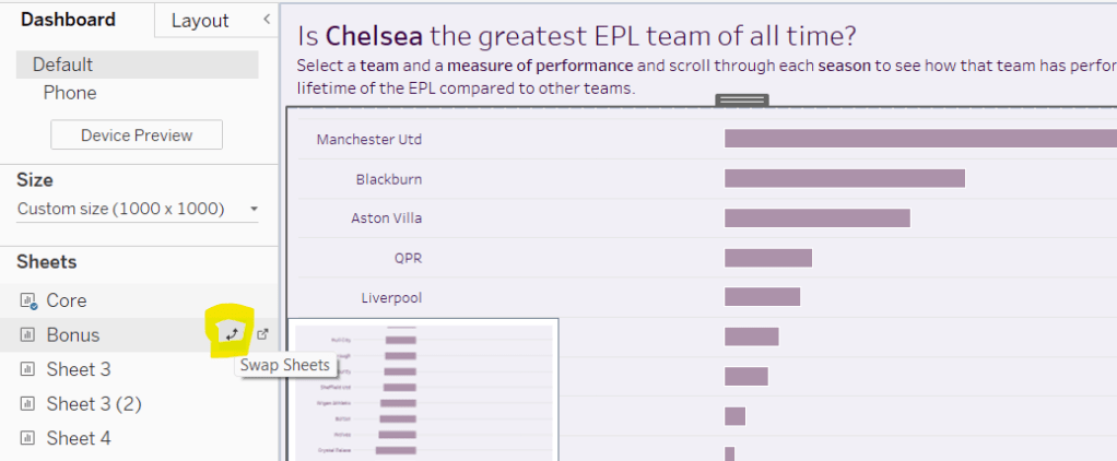
Add the chart to a dashboard – the simplest way is to duplicate the core dashboard and then use the swap sheets feature to quickly swap the main vizzes.