This week’s #WOW2024 challenge was set by Yusuke, challenging us to create a filter for the line chart, using selections from the bar chart. The main aim was to make it as easy to select months with low sales as it is to select months with higher sales.
Building the bar chart
Create a new field
Monthly Sales
[Sales]
and format to $ Thousands (K) with 0 dp.
Also create
Order Date Month
DATE(DATETRUNC(‘month’, [Order Date]))
Add Order Date Month to Columns at the continuous month level (green pill) and add Monthly Sales to Rows. Change the mark type to Bar and set the size of the bar to as wide as possible. Edit the date axis, and remove the title, then fix the tick marks to start on 1st Jan 2021 with an interval of every 1 year.
Create a set call Order Date Month Set, based off of the Order Date Month field (right click the field > create > set, and select a set of dates). Add Order Date Month Set to the Colour shelf and adjust the colours accordingly. Add a dark grey border to the bars too. Modify the Tooltip to suit.
Create a new field
Max Monthly Sales
{MAX({FIXED [Order Date Month]: SUM([Sales])})}
(for each month, get the sum of sales, then return the maximum of all these).
Add this field to Rows. On the Max Monthly Sales marks card, reduce the opacity to 25% and remove the border (all on the Colour shelf)
Set the char to Dual Axis and synchronise the axis. Remove the Measure Names field from the All marks card.
Hide the right hand axis, remove all row and column dividers. Darken the row gridlines slightly, and add the instructional text as the title of the sheet.
We are ultimately going to make use of set actions to define the dates selected by the user. For this we will need to pass the exact date selected, so add Order Date Month to the Detail shelf of the All marks card as a continuous exact date (green pill).
We’re also going to not want the bars to be ‘highlighted’ when selected, so create fields
True
TRUE
and
False
FALSE
and add both to the Detail shelf of the All marks card.
Building the Line Chart
Create a new field
Selected Sales
IF [Order Date Month Set] THEN [Sales] END
and format to $ Thousands to 2dp.
On a new sheet add Order Date to Columns at the continuous day level (green pill), add Region to Rows and add Selected Sales to Rows.
Change the colour of the line and set line markers (via the colour shelf) and reduce the size of the line. Show mark labels, and set to just label the maximum value per pane.
Adjust the row banding so the band size is set to 1
Remove the column dividers, but set the row dividers to be darker grey. Adjust the row gridlines to be a slightly darker grey. Adjust the title of the Selected Sales axis, and remove the title from the date axis. Format the data axis, so it displays a custom date format of mmm dd. Right click the Region label at the top of the chart and hide field labels for rows.
Create fields
Min Date
{MIN(IF [Order Date Month Set] THEN [Order Date Month] END)}
which will return the date of the earliest month selected in the set and
Max Date
DATE(DATEADD(‘day’, -1, DATEADD(‘month’, 1, {MAX(IF [Order Date Month Set] THEN [Order Date Month] END)}) ))
which finds the maximum month selected in the set (which will be 1st of the max month), adds on a month, and takes off a day to get the last day of the maximum month.
Add these to the Detail shelf as continuous exact dates, and then update the Title of the sheet to reference the fields.
Then create
Tooltip: Date
[Order Date]
and add to the Tooltip and adjust the Tooltip to suit.
Finally, depending how the user selects the dates, there may end up being a break in dates. Right click on the Order Date MonthSet and select Show Set. Adjust the dates, so there is at least 1 unselected value between the dates.
To make a continuous line between the dates, click the context menu against the Selected Sales pill on Rows and select Format. On the options on the left hand side, select Pane and at the Special Values option, select Marks: Hide (Connect Lines).
Adding the interactivity
Put the 2 sheets onto a dashboard. Create a dashboard set action
Select Months
On select of the bar chart, target the Order Date Month Set by assigning values to the set when the action is run, and keeping set values when the selection is cleared.
To stop the bars from highlighting on selected, create a dashboard filter action
Deselect Marks
On select of the bar chart on the dashboard, target the Bar Chart sheet, passing in the fields True = False.
And this should now complete the challenge. My published viz is here.
For this week’s challenge, Lorna set the relatively straightforward task of creating a Sankey using Tableau’s Viz Extension. The challenge may not have the complexity/nuances you might sometimes find, but at #WOW HQ, giving you the opportunity to try out new features is one of the key benefits of running this community project.
This blog will be brief:-)
Connect to the data source, and and drag Number from the Dimensions section of the data pane (above the line) to the Measures section (below the line).
On the Markscard, select to AddExtension
in the Add an Extension dialog window, select the Sankey (by Tableau) option which is likely to be the first listed (if not, search for it).
then click Open on the following screen and the marks card will change and give different buttons/shelves
Add Age group to Level. Then add Mode of former study to Level, followed by Level of qualification obtained and then Domicile.
The Levels listed from top to bottom on the marks card is represented from left to right in the Sankey on the canvas.
Add Number to Link to adjust the size of the flows between each Level.
Then press Format Extension and adjust settings as required. I set the Level Padding and the Edge Padding to 10 to increase the spacing between each ‘row’ and ‘column’. I set the colour palette to Purple-Pink-Grayand set the Level Labels font to bold.
I then adjusted the Tooltip to suit and added the sheet to a dashboard. Simples 🙂
Tableau’s documentation on Viz extensions here and my published viz is here.
For this week’s #WOW2024 challenge, Kyle simulated a real-world challenge he’s faced at work where he wanted the ability to select multiple parameters as he was sourcing data from multiple data sources, so using traditional filters didn’t work.
Connecting to the data
The challenge required connecting to the Superstore data twice but applying a data source filter to each connection to restrict the Order Date to Year 2023 or 2024.
After making the 1st connection and filtering to 2023, I renamed the data source and appended 2023.
I then added a data source and made the 2nd connection to Superstore, this time adding a data source filter to 2024. I then renamed this data source and appended 2024. So I ended up with 2 data sources at the top of the data pane window.
Building the line charts
Starting with the Superstore – 2023 data source, put Order Date on columns and change to be the continuous (green) Week number option. Add Sales to Rows.
Then
format Sales to be $ with 0 dp
format Order Date to be mmm dd custom date format
to match the solution, set the Date Property of the data source to start a week on Sunday (right click data source > date properties)
Remove the titles against both axis
adjust the Tooltip
Remove all gridlines, zero lines, axis rulers & axis ticks
Name the sheet 2023 Sales
Create a new sheet, and the repeat all the steps but source the fields from the Superstore 2024 data source.
Building the Category Selection
On a new sheet, manually type MIN(1) into the Columns and add Category from the Superstore 2023 data source to Rows. Amend the axis to fix it from 0 to 1. Set to Entire View. Increase the Size to 100%. Add Category to Label. Adjust the font and align centrally. Hide the Category headers and the Min(1) axis. Remove the Tooltip.
To build the multi-select parameters, we’re going to use a sheet to capture the interactions the user makes into a parameter that will store a delimited string of selected values. This is using the same principles discussed in a previous challenge I created and blogged about here.
We need a parameter
pSelectedCategories
string parameter defaulted to empty string
We’ll use a parameter action to capture the user selection and add it into the pSelectedCategories parameter.
When using delimited strings, you need to choose a character to separate the field values that isn’t going to appear within the field value itself; ie choose a character that won’t appear within a Category name. In this instance I’m choosing | (pipe), and I’m going to build up the parameter as follows
Action
pSelectedCategories
Display
Initial state
<empty string>
All Categories selected – coloured green
1 category selected eg Furniture
|Furniture|
Furniture is green, others categories grey
2 categories selected eg Furniture then Office Supplies
|Furniture||Office Supplies|
Furniture & Office Supplies are green, Technology is grey
3 categories selected eg Furniture, then Office Supplies, then Technology
|Furniture||Office Supplies||Technology|
All Categories selected – coloured green
Existing category is selected again eg Office Supplies
|Furniture||Technology|
Furniture & Technology are green, Office Supplies is grey
We need a calculated field to populate the parameter, which will get modified by comparing what’s already in the parameter with the Category being selected.
In the Superstore 2023 data source create
Category for Param
IF CONTAINS([pSelectedCategories], [Category]) THEN REPLACE([pSelectedCategories],’|’ + [Category] + ‘|’, ”) //selected category is already in the parameter, so remove it ELSE [pSelectedCategories] + ‘|’ + [Category] + ‘|’ //append current category selected to the existing parameter string END
Add Category for Param to the Detail shelf.
We need to set the colour of the bars. Show the pSelectedCategories parameter and manually type in |Furniture|
Then create
Category is Selected
[pSelectedCategories] = ” OR CONTAINS([pSelectedCategories], [Category])
Add this to the colour shelf, and adjust the colours accordingly
Remove the text from the pSelectedCategories parameter, and all the bars should be green.
Format the bars so there is a light grey thick row divider, and set the background of the worksheet to the same light grey. Reduce the Size slightly, so there is a noticeable gap between the bars.
When added to the dashboard, we won’t want the unselected bars to ‘fade’, so we’ll use the True/False trick, which means we’ll need to create
True
TRUE
False
FALSE
and add both these fields to the Detail shelf.
Name the sheet Category.
Building the Region and Ship Mode Selections
Basically repeat the above steps on a separate sheet for each selector. You may find it easier to duplicate the Category sheet and then replace the various fields.
You’ll need to create a pSelectedRegions and a pSelectedShipModes parameter, and calculated Region for Param, Region Is Selected and Ship Mode for Param and ShipMode Is Selected calculated fields.
Name the new sheets Region and Ship Mode.
Filtering the line charts
On the 2023 Sales sheet, add Category Is Selected, Region Is Selected and Ship Mode Is Selected to the Filter shelf, and set all to be True.
Switch to the 2024 Sales sheet.
Recreate the 3 ‘Is Selected’ fields in the Superstore 2024 data source. You can either do this manually, or select the fields in the Superstore 2023 data source (ctl-click to multi-select), the right click and Copy
then switch to the 2024 Sales sheet, and right-click anywhere in the right hand data pane and paste.
Then add each of the fields to the filter shelf and set to True.
Adding the interactivity
Make sure all the parameters are empty, then add all the objects to a dashboard. I used a vertical layout container to place the Selector objects, as I could then set them to be distributed evenly. I also set the background of the layout container to the same light grey as the worksheet, and centrally aligned all the sheet titles.
6 dashboard actions are required, 2 for each selector.
Select Categories
Parameter action that on select of the Category sheet, sets the pSelectedCategories parameter with the value from the Category for Param field.
Deselect Categories
Filter dashboard action that on select of the Category sheet on the dashboard, targets the actual Category sheet, passing the values of True = False.
Create a version of each of these dashboard actions for the Region sheet and the Ship Mode sheet, and that should complete the challenge.
For this week’s #WOW2024 challenge, I asked the community to rebuild this unit chart depicting the medals won each day by country. I built this out while the Olympics was on, curating the data myself, so there is a chance it may not match ‘official’ records (some events got delayed, some medallists may have since been disqualified or reinstated).
Creating custom shapes
The challenge requires a set of custom shapes representing the sports. Download all the image files from the Olympic Sports directory here and save them into a new folder in your …\My Tableau Repository\Shapes directory (as discussed here).
Building the viz
Add Day as a discrete (blue) pill to Columns. Change the mark type to Shape and add Event to Shape. Choose the Olympic Sports shape palette you created above (click reload shapes if it isn’t visible), then click Assign Palette. As the images are named exactly as the events are, they should all match without the need to manually assign each shape to the event. Also note, doing this step first, ensures all events are listed and assigned.
Add Country to Filter and select Great Britain. Show the filter and change to a single select drop-down and customise so you can’t select the ‘All’ option.
You can immediately see the basic layout we’re after. However, as we ned to display shapes and circles to represent the medal types, we need to use a dual axis chart. But at this point there is no axis.
Change the Day field on Columns to be continuous (green). This gives us a axis, but the marks for each event are on top of each other.
Create a new field
Index
INDEX()
Add to Rows and adjust the table calculation to compute by Event.
Edit the Index axis and set it to be reversed. Then add Medal, Country and ID to Detail (to ensure distinct marks are displayed), and readjust the table calculation of the Index field to also compute by these fields as well.
Add Event Detail, Athlete and Notes to the Tooltip shelf, and adjust accordingly.
If you change the Country filter to another entry, eg Albania, the display won’t show every day as they only won medals on days 15 & 16. They only won 1 medal on those days too, so the y-axis has also altered. We don’t want this to happen – the ‘frame’ of the display should remain regardless of the country selected. To resolve this, change the data type of the Day field to Number (decimal) (right click field > change data type). Then edit the Day axis and fix from 0.5 to 16.5 – changing the data type means we can fix using decimal numbers which means we don’t get 0 and 17 displayed on the axis.
To fix the height of the chart, we could ‘hardcode’ it as well, but while the number of days in an Olympic Games cycle is always static for cycle, the maximum medals won per day could change – so if I wanted to reuse this chart on a set of data for a different Olympic Games, I’d have to find out what the max was to hardcode. So instead, we’ll make this dynamic using a nested LoD calc.
{FIXED Day, [Country]: COUNT([Daily Medal Winners])} returns the count of medals per day per country
{FIXED Country: MAX(<code above>)} then returns the max number of the above per country
then the outer (FIXED: MAX()} statement gets the maximum of all of these
Add this to the Detail shelf, then add a Reference Line to the Index axis that shows the average of this field, and doesn’t display any line or values, or tooltips. The axis should extend.
If you select other countries, the axis should remain the same.. until you choose USA and it moves to show 20, as the maximum number of medals in one day has been hit.
Again we don’t want this causing any shift in the ‘frame’. So to resolve, double click into the Max Medal Count field and type + 1 at the end, so the reference line is actually 1 higher. The 20 is still visible, but now it’s visible for all countries. This axis won’t be displayed anyway, but now it won’t shift at all either. Chang the
Now the main framework is in place, we can add the ‘medals’. Add another instance of Day to Columns. On the Day(2) marks card, change the mark type to circle then add Medal to Colour and adjust accordingly. I used bronze: #ce8451, silver: #b3b7b8, gold: #edc948 and the reduced the opacity to 50% and added a dark grey border. Re-order the values in the colour legend and then edit the table calculation on the Index pill again, and ensure Medal is listed first. This should make any bronze medals won on a day be listed at the top, followed by silver and then gold
NOTE – I noticed at this point, that adjusting the Index meant I lost the reference line, so I had to reapply.
Make the chart dual axis and synchronise the axis. You may need to make adjustments to the size of each of the marks cards so the event shapes are within the circles, but this is probably best done after you’ve added to the dashboard.
Hide all gridlines, zero lines, axis rulers and row & column dividers. Hide the Index axis (uncheck show header). Edit the bottom Day axis, delete the title and set the tick marks to None for both major & minor tick marks. Edit the top axis and hide the title. Increase the font of the top axis labels.
Finally we need to show the count of the medals each day. Create field
Count Medals by Country Per Day
{FIXED Day, [Country]: COUNT([Daily Medal Winners])}
then
Label: Medal per Day
IF INDEX()=SIZE() THEN SUM([Count Medals By Country Per Day]) END
Add this to the Label shelf of the ‘circles’ marks card, and adjust the table calculation so it’s computing by all fields except Day and that Medal is listed at the top. The label should display underneath the last circle.
Format the font to be a bigger/bolder style and explicitly align bottom centre, then add to a dashboard and that should be it.
I’ve been on my holibobs, so haven’t blogged a solution for a few weeks. It’s been a bit of a struggled to get my head re-engaged to be honest, as I’m sure you can all relate to.
Anyway this week’s challenge was set by Sean, to produce a waterfall chart depicting specific measures without any pivoting.
I had a little bit of an initial struggle with this… firstly I assumed from the title of the challenge that I would need to be using Measure Names/Measure Values, and secondly, as nothing was mentioned, that I just had to use the data provided. This is how far I got…
but I couldn’t figure out how to get the sizes of the gantt bars inverted for some of the measures…
So I had a bit of a Google, and came across this video by one of our old WOW alumni, Luke Stanke. It made use of a scaffold data source which basically provide placeholders for each of the specific measures we want to display. Sean hadn’t explicitly said we’d need a scaffold, but then he hadn’t explicitly said we couldn’t use one either… so I had a quick peak at his solution, and I found he had used one.
So I went about recreating the challenge just by following Luke’s video. As a result, this blog won’t be as detailed, but I’ll detail the core information needed.
The scaffold data set
I created a simple excel sheet on 1 column called Points with values 1 to 5 listed.
This was then related to the Financials.csv data Sean provided using a relationship calculation of 1=1 as demonstrated in the video.
The calculations
4 calculations are created in the video
Label
CASE [Point] WHEN 1 THEN ‘Gross Sales’ WHEN 2 THEN ‘Discounts’ WHEN 3 THEN ‘Net Sales’ WHEN 4 THEN ‘COGS’ WHEN 5 THEN ‘Profit’ END
Start
CASE [Point] WHEN 1 THEN 0 WHEN 2 THEN [Gross Sales] WHEN 3 THEN 0 WHEN 4 THEN [Gross Sales] – [Discounts] WHEN 5 THEN 0 END
Value
CASE [Point] WHEN 1 THEN [Gross Sales] WHEN 2 THEN [Discounts] * -1 WHEN 3 THEN [Gross Sales] – [Discounts] WHEN 4 THEN [Cogs] * -1 WHEN 5 THEN [Profit] END
format this to $, millions with 2 dp.
Colour
SIGN(SUM([Value]))
convert this to discrete
Note on the date field
When I connected to the csv, I found the dates were being displayed to me in the UK format so a date in source of 06/01/2024 was reporting as 6th Jan, when it was intended to represent 1st Jun. There’s probably something I could have done with regional settings etc, but the quickest way for me to resolve as create
which just transposed the month & day and gave me the dates expected.
Building the Viz
Add Date to Filter, select Month-Year and select May 2024. Add Label to Columns and apply a Sort to sort by Point ascending. Add Start to Rows and change the Mark type to Gantt
Add Value to Size and Colour to Colour and adjust colours to suit
Add Value to Label and adjust font to match mark colour and increase size and style, Set the sheet to Entire View. Uncheck Show Tooltip.
Double click into the Rows shelf and type SUM([Start]) + SUM([Value]). This will create a second marks card. Change the mark type of this to line and remove all fields from the marks card shelf. Set the line type (via the Path shelf) to stepped and manually adjust colour to black.
Set the chart to dual axis and synchroniseaxis, then right click on the right hand axis and move marks to back.
Finally tidy the display up by hiding both axis, removing row & column dividers, hiding the Label title (right click and hide field label for columns) and formatting the Measure Name labels to a larger, darker font style.
Add fields Country, Product and Segment to the Filter shelf, then add to a dashboard.
As the Paris 2024 Olympic Games continues, then #WOW continues with another Olympic themed challenge, this time set by Kyle.
Defining the core calculations
There’s a lot of LoD calcs used in this, so let’s set this up to start with.
Avg Age Per Sport
INT({FIXED [Sport]: AVG([Age])})
Avg Age Per Sport– Gold
INT({FIXED [Sport]: AVG(IF [Medal]=’Gold’ THEN [Age] END)})
Avg Age Per Sport– Silver
INT({FIXED [Sport]: AVG(IF [Medal]=’Silver’ THEN [Age] END)})
Avg Age Per Sport– Bronze
INT({FIXED [Sport]: AVG(IF [Medal]=’Bronze’ THEN [Age] END)})
Oldest Age Per Sport
INT({FIXED [Sport]: MAX([Age])})
Youngest Age Per Sport
INT({FIXED [Sport]: MIN([Age])})
Format all these fields to use Number Standard format so just whole numbers are displayed.
Let’s put all these out in a table – add Sport to Rows and then add all these measures
Kyle hinted that while the display looks like a trellis chart, it’s been built with multiple sheets – 1 per row. So we need to identify which row each set of sports is associated to, given there are 5 sports per row.
Row
INT((INDEX()-1)/5)
Make this discrete, and add this to Rows, and then adjust the table calculation so that it is explicitly computing by Sport, and we can see how each set of sports is ‘grouped’ on the same row.
Building the core viz
The viz is essentially a stacked bar chart of number of medallists by Age. But the bars are segmented by each individual medallist, and uniquely identified based on Name, Medal, Sport, Event, Year.
Add Sport to Columns, Age to Columns (as a continuous dimension – green pill) and Summer Olympic Medallists (Count) to Rows.
Change the mark type to Bar and reduce the Size a bit. Add Year, Event and Name to the Detail shelf, then add Medal to the Colour shelf and adjust accordingly. Re-order the colour legend, so it’s listed Bronze, Silver , Gold.
For the Tooltip we need to colour the type of medal, so need to create
Tooltip: Bronze
UPPER(IF [Medal] = ‘Bronze’ THEN [Medal] END)
Tooltip: Silver
UPPER(IF [Medal] = ‘Silver’ THEN [Medal] END)
Tooltip: Gold
UPPER(IF [Medal] = ‘Gold’ THEN [Medal] END)
Add all these to the Tooltip shelf, then adjust the Tooltip accordingly, referencing the 3 fields above and colouring the text.
The summary information for each sport displayed above each bar chart, is simply utilising the ‘header’ section of the display. We need to craft dedicated fields to display the text we need (note the spaces)
Heading – Medal Age
“Avg Medalling Age: ” + STR([Avg Age Per Sport])
Heading: Age per Medal
“Gold: ” + STR(IFNULL([Avg Age Per Sport – Gold],0)) + ” Silver: ” + STR(IFNULL([Avg Age Per Sport – Silver],0)) + ” Bronze: ” + STR(IFNULL([Avg Age Per Sport – Bronze],0))
Heading: Young | Old
“Youngest: ” + STR([Youngest Age Per Sport]) + ” Oldest: ” + STR([Oldest Age Per Sport])
Add each of these to Rows in the relevant order. Widen each column and reduce the height of each header row if need be
Adjust the font style of all the 4 fields in the header. I used
Sport – Tableau Medium 14pt, black, bold
Heading – Medal Age – Tableau Book 12pt, black, bold
Heading: Age per Medal – Tableau Book 10pt, black bold
Heading: Young | Old – Tableau Book 9pt, black
The title needs to reflect the number of medallists above a user defined age. To capture the age we need a parameter
pAge
integer parameter defaulted to 42
Then we can create
Total Athletes at Age+
{FIXED:COUNTD( IF [Age]>= [pAge] THEN [Name] END)}
Add this to the Detail shelf, then update the title of the viz to reference this field. Note the spacing to incorporate the positioning of the parameter later.
The chart also needs to show background banding based on the selected age. Add a reference line to the Age axis (right click axis > add reference line), which references the pAge parameter, and fills above the point with a grey colour
Ultimately this viz is going to be broken up into separate rows, but we need the Age axis to cover the same range. To ensure this happens, we need
Ref Line – Oldest Age
{FIXED: MAX([Oldest Age Per Sport])}
Add this to the Detail shelf, then add a reference line which references this field, but doesn’t actually ‘display’ anything (it’s invisible).
Tidy up the visual – remove gridlines, zero lines, row & column dividers. Hide the y-axis (uncheck show header). Remove the x-axis title. Hide the heading label (right click > hide field labels for columns). Hide the null indicator.
Filtering per row
Add the Row field to the Filter shelf and select the only option displayed (0). Then edit the table calculation and select all the fields to compute by, but set the level to Sport.
Show the Row filter and select the 0 option only. – only the first 5 sports are now displayed.
Name this sheet Row1. Then duplicate the sheet, set the Row filter to 1 and name the sheet Row2. Repeat so you have 7 sheets.
Building the dashboard
Use vertical containers to help position each of the 7 rows on the dashboard. For 6 of the sheets, the title needs to be hidden. I used a vertical container nested within another vertical container to contain the 6 sheets with no title. I then fixed the height of this ‘nested’ container and ‘distributed” the contents evenly. But I did have to do some maths based on the space the other objects (title & footer) used up on my dashboard, to work out what the height should be.
You’ll then need to float the pAge parameter onto your layout, and may find that after publishing to Tableau Public, you’ll need to edit online to tweak the positioning further.
As we’re in the midst of the 33rd Summer Olympics, I set an Olympic-ish themed challenge this week which was a recreation of a Viz built by my Biztory colleague, James Newton (Twitter|X / Linked In).
Whilst fun, I knew this was likely to be a bit tricky, so I tried to provide a lot of pointers, and several hints – hopefully they helped, but obviously this guide should clarify further 🙂
Modelling the data
3 csv data sets were provided, and I advised how they needed to be joined using the physical model rather than using logical relations.
Connect to the points.csv file, then click on the context menu and select Open to ‘open’ the physical layer.
Then add the Records data to the canvas and join as a left join on Lane and Event
Then add in the Scaffold data and join to Points with a left join on the Events field.
Define the parameters
Lanes 5 and 6 will be defined via user inputs, so we need parameters to capture this information
pRunner1
string parameter defaulted to any name (eg Donna)
pRunner2
string parameter defaulted to another name (eg Lorna)
pRunner1Time
string parameter defaulted to a time (in seconds) that it may take the 1st runner to run 100m eg 17.5. Note this is a string parameter as we need to handle a value for when there is no value any numeric value like 0 isn’t going to work in this situation.
pRunner2Time
string parameter defaulted to a time (in seconds) that it may take the 2nd runner to run 100m eg 20
Defining the calculations
Let’s start by adding some data to a table to help validate the calculations we need to build.
From the Points data, add Event and Lane to Rows. Then add X Start, X End, Y Start and Y End to Rows as discrete dimensions (unaggregated blue pills).
As we can see, the X coordinates are the same for each lane, as the race starts and finishes at the same points along the x-axis for every runner. The Y coordinates differ per runner as this reflects the ‘lane’ they’re in, but the values are the same for both the start & end points.
So first off, we want to calculate the ‘distance’ of the race
Start to End Distance
[X End] – [X Start]
Make this a dimension then add to Rows as a discrete (blue) field.
The 330 ‘points’ between the X Start and the X End essentially represent the 100 metres to be ‘run’.
To enable the effect of ‘running’ the 100 metre race, the 100m is split into ‘markers’ where we will plot the position of a runner as it ‘runs’. The number of markers (50) is defined within the Scaffold data, but rather than ‘hardcode’ the value, I calculated the number via
Count Markers
{FIXED: MAX([Marker])}
Doing this, means you can adjust the number of markers in the Scaffold data if you wish. From this, we can then work out how much distance is covered per marker
Distance per Marker
[Start to End Distance]/[Count Markers]
Add this into the table as a discrete dimension.
Next we want to establish the time of the slowest runner, but first we need to get a handle on the times of the runners from the parameters.
As we captured the times as strings in the parameters we can now convert to a numeric float value, and capture a NULL if no data is provided.
Now we can work out the slowest time, which is the maximum of the times provided for lanes 1-4 and the times in the parameters. I’ve managed this in a single calculation
Most of the time when we use the MAX() function we are just passing a single expression eg MAX([Sales}) to get the maximum value from the [Sales] field. But you can also use MAX() to compare the maximum values from two expressions eg MAX([Value1], [Value2]) will get all the values stored in both the [Value1] and [Value2] fields and return the overall maximum of both.
So breaking down the expression above, we’re replacing any null values for Runner 1 and 2 with 0, then returning the maximum of these two runners via the inner MAX expression ie
Max of parameters : MAX(IFNULL([Runner 1 Time],0), IFNULL([Runner 2 Time],0))
and then comparing this with the Time of the runners from lanes 1-4
(MAX([Time], <Max of parameters>)
This is all then wrapped in a FIXED Level of Detail calc as we want the value to perpetuate across every row of data. Note, the outer MAX that forms part of the FIXED calc could just as easily be a MIN or AVG.
Add this to the table as a discrete dimension. In this instance the value is 20 as the largest value comes from one of the parameters. You can set these to empty or change the timings to see how the field changes.
Now we compare each runner’s time against the slowest time. Add in Time from the Records data source to the table as a discrete dimension.
Lanes 4 & 5 are Null, so we need to get a field that stores the runner’s time for every lane
Lane Time
IFNULL([Time], (IF [Lane] = 5 THEN [Runner 1 Time] ELSEIF [Lane] = 6 THEN [Runner 2 Time] END) )
Use the Time field, but if null, get the relevant time associated to the Lane. Format this to a number with 2dp and add to the table as a discrete dimension.
Next we calculate the proportion of time for each Lane (runner) compared to the slowest runner
Time % of Slowest Time
[Lane Time]/[Slowest Time]
Again add to the table as a discrete dimension
Now, if we assume the slowest runner (in this case Lane 6 at 20s) covers the Distance per Marker (6.6 ‘points’) for every marker in the whole of the ’50 point’ race, then we can assume that faster runners, cover a greater distance for each marker, and that is based on the time proportion calculated above. Eg if a runner took 10s (half the time), we would expect them to cover double the distance (13.2 points) for each marker.
Distance per Marker per Lane
[Distance per Marker] / [Lane Time % of Slowest Time]
Add this to the table too as a discrete dimension. This is essentially a ‘constant’ value per runner
Now we can work out the x-coordinate for each marker. So add Marker from the Scaffold data into the table, so we now have 51 rows per lane, and then create
X to Plot
MIN(([X Start] + ([Marker] * [Distance per Marker per Lane])), [X End])
As we need the runner to stop once they reach the end, we are using the MIN([Value1],[Value2]) functionality again to just return the end position of the race. Add this field to Text.
We can see that for Lane 1, they have reached the end of the race at the 24th marker, and the X to Plot has incremented by 13.78 ‘points’ for each marker. While if you look at Lane 6, the slowest runner, X to Plot increments by 6.6 ‘points’ and reaches the end on the last marker.
We now have the core of the data we need to build the viz.
Creating the race
On a new sheet, add X to Plot as a continuous dimension (green unaggregated pill) to Columns and Y Start to Rows (also as a continuous dimension)
Change the mark type to shape and assign the custom runner shape (see here for info on how to do this). Add Lane to Colour and adjust accordinglt. Increase the Size a bit.
Add the background image (Maps > Background Images > <Datasource Name> > Add Image). Browse to the image file you should have saved and then adjust the values to reflect the size of the image (500 wide by 288 high), so X field that references X to Plot goes from 0 to 500, and the Y Field that references Y Start goes from 0 to 288.
Then fix the X to Plot axis to range from 0 to 500,and the Y Start axis from 0 to 288.
This should make the runners appear to be in each lane.
Add Marker to the Pages shelf. The page control should display starting at 0 and only 1 runner image per lane should display. Adjust the Size of each runner if need be.
Press the ‘play’ button on the control, and set the speed to max and you should see the runners move down the track.
Labelling the viz
We need to get the name of runner in each lane, which is sourced either from the parameters for lanes 5 & 6 or from the Records data, BUT we only want the label to display at the start or end of the race.
Label – Runner
IF [Marker] = 0 THEN IF [Lane] = 5 THEN [pRunner1] ELSEIF [Lane] = 6 THEN [pRunner2] ELSE [Record (Records.csv1)] + ” ” + [Gender (Records.csv1)] END ELSEIF [Marker] = [Count Markers] THEN IF [Lane] = 5 THEN [pRunner1] ELSEIF [Lane] = 6 THEN [pRunner2] ELSE [Record (Records.csv1)] + ” ” + [Gender (Records.csv1)] END END
We also want the runner’s Time to display on the label, but only at the end of the race
Label – Time
IF [Marker] = [Count Markers] THEN [Lane Time] END
Format this to a number with 2 dp and suffixed with ‘s’
Add both these fields to the Label shelf and arrange accordingly. Set the font to match mark colour and align label middle left.. Test the labels display as expected by setting the marker value back to 0 and playing the race through again.
Adding Tooltips
Create the field
Tooltip – Athlete
IF [Lane] = 5 THEN [pRunner1] ELSEIF [Lane] = 6 THEN [pRunner2] ELSE [Athlete (Records.csv1)] END
Then add this field, Lane Time, Gender and Record to the Tooltip shelf and adjust accordingly.
Tidying up
Finally remove all gridlines, zero lines, axis rulers & ticks, row/column dividers and hide the axes.
Add the sheet to a dashboard and arrange the objects as required, using containers to help organise the parameters and controls, and setting a background colour to some objects when required.
Customise the page control object so it only shows the slider and playback controls. Unfortunately, when you publish to Tableau Public, the speed controls won’t display, so the runners won’t ‘run’ as fast on Public 😦
My published viz is here. I hope you enjoyed it, and didn’t find it too complicated!
Sean set this challenge this week, to build a connected scatterplot to allow additional insights to be gained.
We need to show a circle per country related to the specified year, and then show the data for all years if a country is specified from the drop down, or ‘clicked on’ by the user; these data points are all then connected.
Let’s start by building up the various parameters and calculated fields needed to help with this.
Setting up the data
For the user inputs, I used parameters
pYear
Integer parameter, defaulted to 2000, displayed in a format so no thousand separators are shown. I populated the list using the values from the Year field.
pCountry
string parameter defaulted to All. I populated the list of entries by first adding values from the Country field. I then manually added an All entry to the bottom of the list and dragged it to the top. I could then set All as the default value.
On a new sheet, show these parameters.
We’re going to use a dual axis chart to display the viz, and for this, we’re going to get the relevant measures for the specific Year and for the specific Country.
To see what I’m aiming for, lets’ build out the data in a table. Add Country to Columns and Year to Rows. Display the values of Fertility Rate and Life Expectancy. This just gives us all the data points
But we only want the points related to the pYear (2000) or if pCountry if it’s not All (in this case Afghanistan).
So we create
Fertility Rate for Year
[Year] = [pYear] THEN [Fertility Rate] END
Life Expectancy for Year
IF [Year] = [pYear] THEN [Life Expectancy] END
format these to 1 dp and then add to the table. The fields only contain values for the specified pYear.
Create
Fertility Rate for Country
IF [Country] = [pCountry] THEN [Fertility Rate] END
Life Expectancy for Country
IF [Country] = [pCountry] THEN [Life Expectancy] END
format these to 1 dp and also add to the table. We now have these entries only existing for the selected pCountry.
If pCountry is set to All, the Fertility Rate for Country and Life Expectancy for Country are empty for every Country.
We now have the basics we need to build the viz.
Building the ScatterPlot
On a new sheet, show the parameters, then add Fertility Rate for Year to Columns and Life Expectancy for Year to Rows and Country to Detail. Change the mark type to circle. Adjust the Tooltip.
Create a new field
All Countries
[pCountry] = ‘All’
and add to the Colour shelf. Adjust the colours so when pCountry = All, the All Countries colour legend is True and displays a darker instance of a colour, as opposed to when pCountry is set to something else, and the All Countries colour legend is false.
Now add Fertility Rate for Country to Columns and Life Expectancy for Country to Rows. Change both fields to be Dimensions. On the 2nd marks card, add Year to Detail. and remove the All Countries field from the Colour shelf. Change the mark type to line and move Year to Path. Set the colour accordingly.
Then set both the Rows and Columns to be Dual Axis and synchronise both axis. Remove Measure Names from the colour shelf on the all marks card.
Adjust the Tooltip of the 2nd (line) marks card.
Add Year to the Label shelf of the 2nd marks card and update so it just displays for the Min & Max value. Adjust font size and style.
On the first marks card (the circle) add Country to Label and adjust so it only displays when selected.
Hide the right and top axis. Remove row & column dividers. Hide the null indicator and update the title of the axes. Name the sheet Scatterplot or similar.
Building the Dashboard
Add the sheet to a dashboard, and float the parameters into a suitable location. Add a floating text box that references the pYear parameter and position bottom left of the chart. Add a parameter action to update the pCountry parameter when a circle is clicked.
Click Country
On select of the Scatterplot Viz, set the pCountry parameter, passing in the value from the Country field. When cleared, set the parameter back to All.
Finally, if you click a circle to select a Country, you’ll find that the circles ‘fade out’ more than what you want – you want them to look the same as the colour when a country is selected via the dropdown. Essentially, you want all the circles to be ‘highlighted’ on click. To do this, create a new field
HL
“Highlight”
and add this to the Detail shelf on the scatterplot sheet. Then on the dashboard, add a Highlight action
HL marks on click
On select of the scatterplot viz, target itself, highlighting the HL selected field
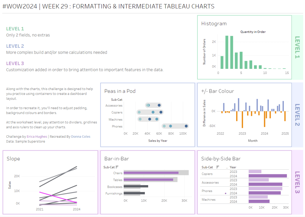
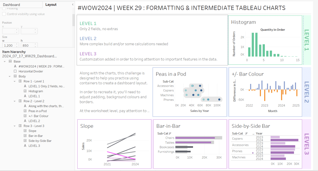
Erica set this challenge primarily aimed at building a beautifully presented dashboard, with the requirement to consider the use of layout containers and padding. She threw in creating some very specific chart types too. The easiest way to blog this, is by chart type.
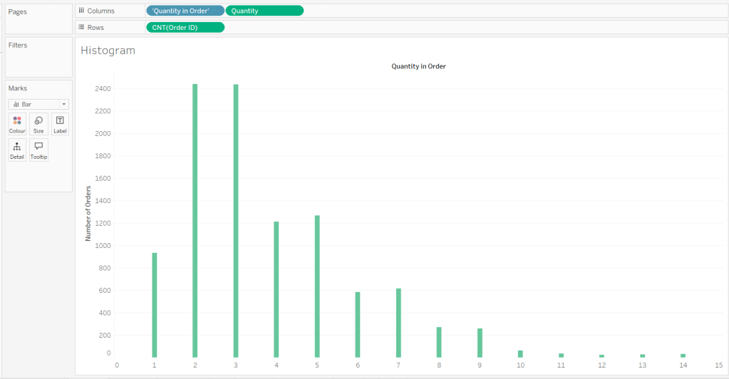
Building the Histogram
Add Quantity to Columns as continuous dimension (green unaggregated pill) and add Order ID as a measure using the CNT aggregation to Rows. The easiest way to do this is right click and drag Order ID from the left hand date pane and drop onto rows. When you release the mouse, the option to select the aggregation should be available.
Change the mark type to bar and adjust the colour. Edit the title of the y-axis and remove the title from the x-axis. Update the Tooltip.
Double -click into Columns and manually type ‘Quantity in Order’ (including the quotes). Right click on the first text displayed and hide field labels for columns. Adjust the font of the Quantity in Order label that remains.
Remove row and column dividers and column gridlines. Remove Row axis rulers.
Note, when you add to the dashboard , you may find you want to adjust the Size of the bars.
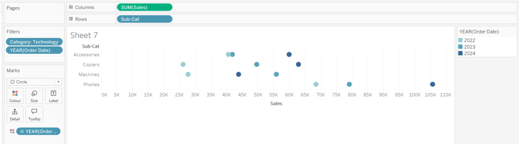
Building the Peas in a Pod chart
On a new sheet, add Category to Filter and select Technology. Add Order Date to Filter and select Years then choose 2022,2023 and 2024.
Rename the Sub-Category field to Sub-Cat and add to Rows. Add Sales to Columns. Change the mark type to circle. Add Order Date to Colour. By default it should display YEAR(Order Date). Adjust colours to suit. Widen each row a bit.
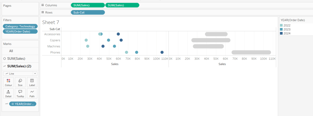
Add another instance of Sales to Columns.
On the Sale (2) marks card change the mark type to line and move YEAR(Order Date) to Path. Increase the size and adjust the colour so it’s a grey lozenge.
Make the chart dual axis and synchronise the axis. Right click the top axis and move marks to back. Adjust the Tooltip. Edit the title of the x-axis.
Hide the top axis. Remove row and column dividers. Remove row gridlines. Remove axis rulers for both columns and rows.
Note, when you add to the dashboard , you may find you want to adjust the Size of the circles and the line. I found it was best adjusted on the web after I published to Tableau Public.
Building the +/- Bar Chart
On a new sheet add Order Date to Filter and select Years then choose 2022,2023 and 2024. Add Order Date to Columns and select to be at the continuous month level (green pill, May 2015 format). Add Sales to Rows and change the mark type to bar.
Add a quick table calculation of Difference to the Sales pill.
Adjust the size of the bars (select manual over fixed and adjust the slider).
and add to the Colour shelf. Adjust colours to suit. Hide the null indicator. Adjust the Tooltip. Adjust the title of the x-axis.
Remove all gridlines and axis rulers. Remove the columns zero line. Set the rows zero line to be a continuous unbroken line.
Note – once again the size may need further adjusting once on the dashboard and/or after publishing.
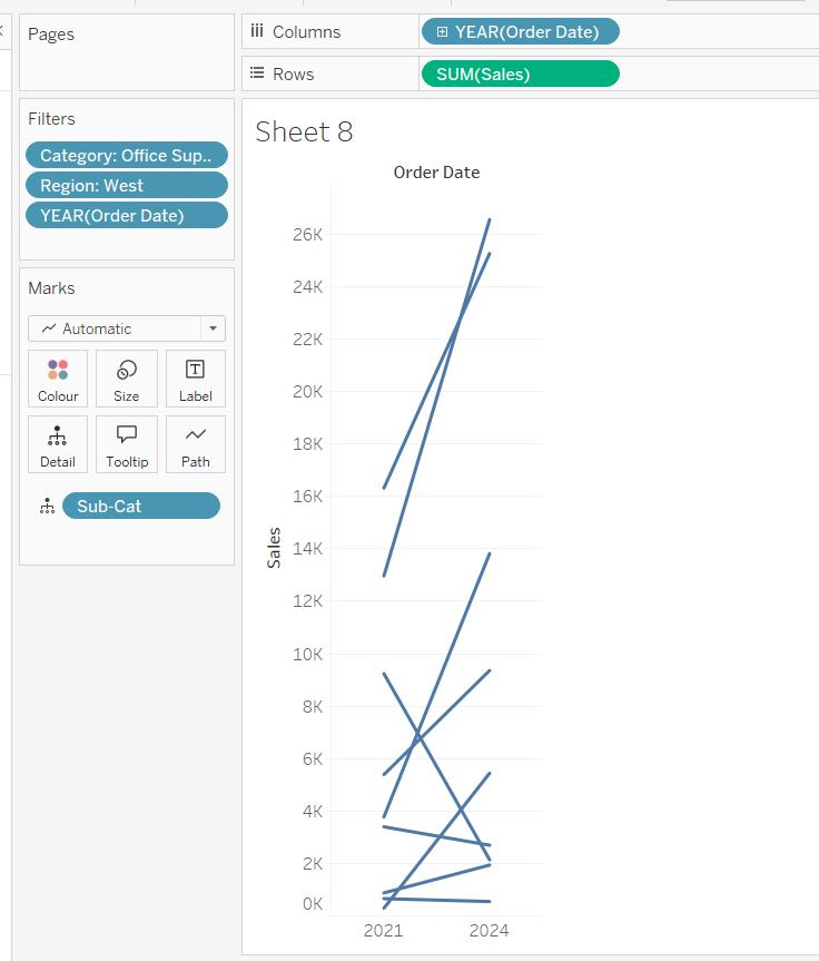
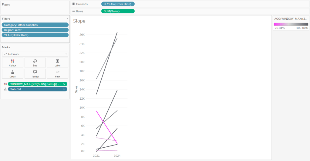
Building the slope chart
Add Category to filter and select Office Supplies. Add Region to filter and select West. Add Order Date to filter and select Years then choose 2021 and 2024 only.
Add Order Date to Columns and Sales to Rows. Add Sub-Cat to Detail.
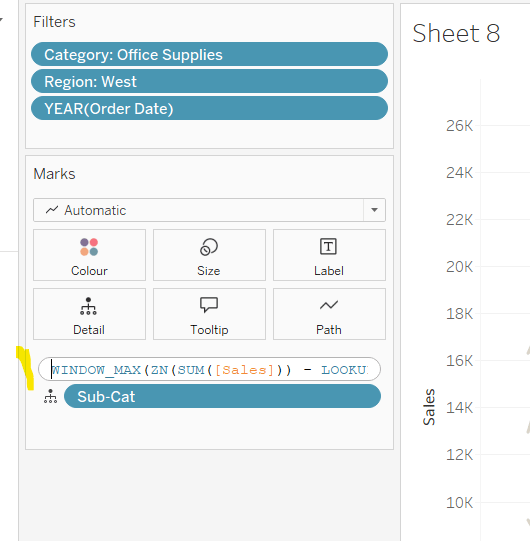
Add Sales to Colour then add a quick table calculation of Percentage Difference. This only sets a value against the 2024 marks though, whereas we want a value for the whole line for each Sub-Cat.
Double-click into the Sales pill on Colour to edit it, and wrap the whole calculation in a WINDOW_MAX() function – the whole calculation should look like
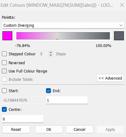
Adjust the colour legend. I set the start & end colours to #ff00ff (hot pink) and #5d6068 (dark grey) and then applied an upper limit to the range and centred at 0 as below.
Hide the Order Date heading at the top of the chart. Adjust the Tooltip.
Remove column gridlines, zero lines and axis rulers.
Edit the Sort of the Sub-Cat pill on the Detail shelf, so it is sorting by % Difference ascending. This will ensure the lines are displayed overlapping in the expected manner.
Building the Bar-in-Bar Chart
On a new sheet, add Category to filter and select Furniture. Add Region to filter and select West. Add Order Date to filter and select Years then choose 2023 and 2024 only.
Create a new field
2023 Sales
IF YEAR([Order Date]) = 2023 THEN [Sales] END
Add Sub Cat to Rows and 2023 Sales to Columns. Add a sort to the Sub-Cat pill to sort by 2024 Sales descending. Add 2024 Sales to Columns. Make the chart dual axis and synchronise the axis. Change the mark type on the All marks card to bar. Remove Measure Names from the Colour shelf on the All marks card. Set the colour of the 2023 Sales marks card to light grey. Increase the width of each row, then reduce the size of the bar on the 2024 Sales marks card.
Create a new field
Sales Decreased
SUM([2024 Sales]) < SUM([2023 Sales])
and add to the Colour shelf of the 2024 Sales marks card. Adjust colours to suit.
In the solution, the Tooltip shows an indicator – I’m not sure if this was necessary, but I added it just in case
2024 Sales > 2023 Sales
IF [Sales Decreased] THEN ‘●’ END
Add this to the Tooltip shelf of the All marks card, along with the 2023 Sales and 2024 Sales fields. Adjust the Tooltip accordingly.
Hide the top axis. Remove the title of the x-axis.
Remove row and column dividers. Remove row gridlines and row axis rulers and ticks. Remove all zero lines.
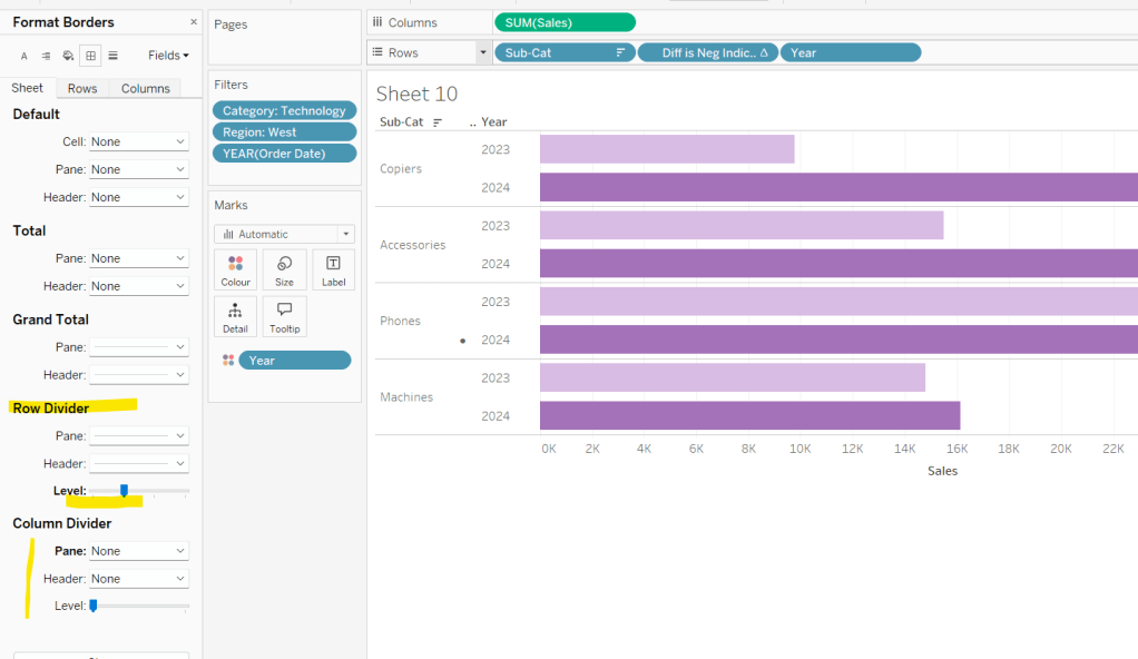
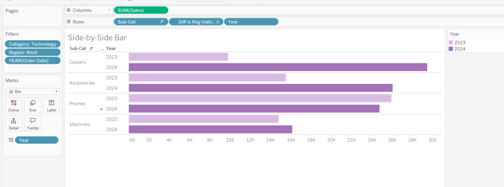
Building the side-by-side bar chart
On a new sheet, add Category to filter and select Technology. Add Region to filter and select West. Add Order Date to filter and select Years then choose 2023 and 2024 only.
Add Sub Cat to Rows and Sales to Columns. Apply a Sort to Sub-Cat based on 2024 Sales descending.
Create a new field
Year
YEAR([Order Date])
And add to Rows and Colour. Adjust colour to suit. Widen each row.
Create new field
Diff is Neg Indicator
IF NOT([Diff is +ve]) THEN ‘●’ ELSE ” END
Add to Rows before Year and then adjust the table calculation setting so it is just computing by Year only.
Adjust the alignment of the Sub-Cat column so it is aligned middle right. Narrow the width of the Diff is Neg Indicator column to try to remove all the column heading text. If some still shows, rename the field so it is padded with some spaces at the front. Adjust the Tooltip.
Remove the x-axis title. Remove Column dividers. Adjust the row dividers so they are at level 1 and are partitioning each Sub Cat only and not splitting the Year column.
Remove all gridlines
Building the dashboard
It’s always hard to walk through the steps for placing objects on a dashboard in the specified places. My general rules are
Start with a floating vertical container that is positioned 0,0 and set to the dashboard height and width. I name this Base.
Then add tiled objects such as a text object for the title, blank objects, other containers, charts etc.
When you add a container, add a blank object initially to help get everything into place. Remove once you have at least 2 objects side by side / on top of each other depending on the direction you’re organising.
The item hierarchy shouldn’t have any containers of type Tiled listed.
Try to name your containers to help maintenance in the future
Below is a picture of the item hierarchy I ended up with using this approach
I created a floating vertical container called Base, positioned 0,0 and 1200 x 850. Background set to None, no border and inner and outer padding all 0.
I added a text object to contain the title. Background set to None and no border. Outer padding set to 10 all round, and inner padding 0.
I added a blank object, which I renamed Horizontal divider. Background set to light grey, no border. Outer padding set to left and right 10 and top and bottom 0. Inner padding all 0. Height set to 2.
I added another Vertical container, which I renamed Body. Background set to None, no border and all inner and outer padding set to 0.
I added 3 horizontal containers on top of each other, and set the property of the Body vertical container to distribute contents evenly so each horizontal container was the same height.
1st horizontal container
I named Row 1 – Level 1. I set the background to the pale green. No border. Outer padding set to left & right 10, top & bottom 5. Inner padding all 0.
Into this I added a text field to describe the levels. Background of this was white, no border and outer padding set to 0 (so the green background disappears). Inner padding was set to top: 20 and 10 for the rest.
Next the Histogram chart. Border set to green. Background white. Outer padding right:5, rest 2. Inner padding set to 10 all round. Width of chart fixed to 380 px.
Next the Level 1 text object. No border, no background. Outer padding 4 all round; inner padding 0. Formatted text object to rotate text. Width of object set to 40 px.
2nd horizontal container
I named Row 2- Level 2. I set the background to the pale blue. No border. Outer padding set to left & right 10, top & bottom 5. Inner padding all 0.
Into this I added a text field to describe the challenge. Background of this was white, no border and outer padding set to 0 (so the blue background disappears). Inner padding was set to 10 all round. Width of object set to 380px.
Next the Peas in a Pod chart. Border set to blue. Background white. Outer padding right:5, rest 2. Inner padding set to 10 all round.
Next the +/- bar chart. Border set to blue. Background white. Outer padding right and left 5, top & bottom 2. Inner padding set to 10 all round. Width of object set to 380px.
Next the Level 2 text object. No border, no background. Outer padding 4 all round; inner padding 0. Formatted text object to rotate text. Width of object set to 40 px.
3rd horizontal container
I named Row 3- Level 3. I set the background to the pale purple. No border. Outer padding set to left & right 10, top & bottom 5. Inner padding all 0.
I added the Slope chart. Border set to purple. Background white. Outer padding right:5, rest 2. Inner padding set to 10 all round. Width of object set to 380px.
Next the bar-in -bar chart. Border set to purple. Background white. Outer padding right & left 5, top & bottom 2. Inner padding set to 10 all round.
Next the side-by-side bar chart. Border set to purple. Background white. Outer padding right and left 5, top & bottom 2. Inner padding set to 10 all round. Width of object set to 380px.
Next the Level 3 text object. No border, no background. Outer padding 4 all round; inner padding 0. Formatted text object to rotate text. Width of object set to 40 px.
It was a bit of trial and error to get the spacing as required, and a few calculations to work out how wide I wanted each chart to be, based on the width of the dashboard and the other items in each row.
Yusuke set this week’s challenge which is pretty tough-going. I got there eventually, but it wasn’t smooth sailing, and had a lot of false starts and changes to calculations throughout to get to the end. I will endeavour to explain where I had difficulties, but some of the calculations I came up with were more down to trial and error ( eg I wonder if this will work…?) rather than a known direction.
Modelling the data
We were provided with a version of Superstore and a State Abbreviations data set. I chose to use the Superstore Excel file I already had. I combined the two data sets in the data source pane using a relationship where State/Province in the Orders table of the Superstore excel file matched with the Full Name field in the State Abbreviations csv file.
As the data was just related to 2024, I added this as a data source filter (Year of Order Date = 2024)
Identifying the month
I decided I was going to use a parameter to select the month to filter. I first created
Order Date MY
DATE(DATETRUNC(‘month’,[Order Date]))
and then created a parameter
pOrderDate
date parameter defaulted to 01 Dec 2024, that I populated as a list using the values from the Order Date MY field. I set the display format to be a custom format of mmmm yyyy
Examining the data
On a new sheet, add State/Province and Abbreviation to Rows and Category to Columns to create a very simple ‘existence table’.
The presence of the Abc in the text table, shows that at least 1 record exists for the State/Category combination during 2024.
We can see some states, such as Arkansas, District of Colombia, Kansas etc don’t have any records at all for some Categories. However, when we look at the viz, we can see markers and labels associated to these Categories. In the image below, Kansas shows markers and labels against Furniture and Technology, when there are no records for these combinations at any point in 2024.
Handling this situation is the reason some of the calculations that follow are more complicated than you might expect.
Building the Trellis/Panel Chart calculations
Now when I built the viz, putting it into a trellis display was the last thing I did, but in rebuilding in order to write the blog, I’m finding that the table calcs needed start to help with the missing marks discussed above.
We need to count the number of States. For this create
State Count
SIZE()
Make this discrete and add to Rows. Adjust the table calculation to compute by State/Province and Abbreviation. 47 should be listed against every row in the column which is the number of rows displayed, and an Abc mark now exists for every State/Category combination.
We’ll also create
Index
INDEX()
make this discrete and add to Rows as well adjusting the table calculation to also compute by State/Province and Abbreviation
This has the effect of providing a counter for every row from 1-47.
We also need a parameter to define how many columns the display will be over
pCols
integer parameter defaulted to 8 which displays a range from 1 – 15 with a step of 1
With these fields, we can now define which row each record will sit on based on the counter for each State (the Index) and the number of columns to display (pCols).
Rows
INT(([Index]-1)/[pCols])
and we can also work out which column each record will sit in
Cols
([Index]-1)%[pCols]
Make both these fields discrete and add to Rows. Verify the table calc setting is as before. Show the pCols parameter, and test changing it and observe how the Rows and Cols values change
Remove State Count and Index from Rows. These won’t be needed in the final viz, as they’re just building blocks for other calculated fields.
Calculating the Profit Ratios
We need two Profit Ratio values – one for each State and Category per month and one ‘overall’ for each State by month
At the State/Category level, create
Monthly Sales
IF [Order Date MY] = [pOrderDate] THEN [Sales] ELSE 0 END
and
Monthly Profit
IF [Order Date MY] = [pOrderDate] THEN [Profit] ELSE 0 END
and from this create
Monthly PR
ZN(SUM([Monthly Profit])/SUM([Monthly Sales]))
custom format this to 0.0%;-0.0%;N/A which will then display the text N/A whenever the value is 0. Add this to the Text shelf.
Some additional State/Province records have appeared at this point with no Abbreviation (null). Filter these out.
To get the Overall profit ratio for the State, I created
State Sales for Month
{FIXED [State/Province]: SUM( IF [Order Date MY] = [pOrderDate] THEN [Sales] ELSE 0 END) }
and
State Profit for Month
{FIXED [State/Province]: SUM( IF [Order Date MY] = [pOrderDate] THEN [Profit] ELSE 0 END) }
and then created
PR for Month
SUM([State Profit for Month])/SUM([State Sales for Month])
and formatted this to a % with 1 dp.
Add PR for Month into the table and then apply a Sort to the State/Province field to sort by PR for Month descending
We’ve still got some gaps – we want to see the PR for Month value populated against every Category which have a profit ratio. For this create
State PR for Month
WINDOW_MAX([PR for Month])
Add this to the table and apply the table calculation to compute by Category only – we now have the overall profit ratio for each State plotted against every Category.
Note – we needed both PR for Month and State PR for Month as the latter is a table calculation and we can’t apply sorting on a table calc.
Building the panel chart
In building this I referred to my own blog post on a previous challenge, as the bar chart we need to build, isn’t a typical bar chart.
On a new sheet, add State/Province, Abbreviation and Category to Rows. Add Monthly PR to Text. Move the Abbreviation pill from Rows to Filters and exclude Null. Sort the State/Province field by PR for Month descending. Show the pOrderDate and pCols parameters.
Add Cols to Columns and Rows to Rows, so it’s the first pill listed. Move State/Province to Detail. Adjust the table calculations of both the Rows and Cols fields to be computing by State/Province and Category (listed in that order), and at the level of State/Province.
To build the bars, we’re using ‘fake axis’ on both the x & y axis to position the marks we want to display. We need
PR Bar Axis
ZN(LOOKUP(MIN(0.0),0))
and
Y-Axis
IFNULL(LOOKUP(MIN(0.5),0),0.5)
As alluded to above, these evolved as I played around to get the behaviour required.
Add Y-Axis to Rows and adjust the table calculation to compute by State/Province and Category (in that order) at the level of State/Province. Edit the axis to be fixed from -1 to 4.
Add PR Bar Axis to Columns. Again adjust the table calculation setting to be as the others. Change the mark type to Bar. Add another instance of Monthly PR to the Size shelf, and then adjust the Size to be Fixed and aligned Left.
Add Monthly PR to the Colour shelf, and adjust the colour legend to be fixed from -1.5 to 1.5 and centred at 0.
Edit the PR Bar Axis axis to be fixed from -1.25 to 1.25, to ensure the bars remain centred aligned regardless of the month selected.
Adjust the Tooltip as required.
Format the chart to remove all gridlines, remove the zero line for rows, and make the zero line for columns more prominent – dashed and darker. Remove all axis ticks. Add dark row and column dividers against the pane only and at the appropriate level so the information for a single State is contained within the boundaries.
Add row banding against the pane only at the appropriate band size and level
Reduce the width of each row, and widen each column to get a ‘squarer’ display.
Now we need to add the State/overall profit square. for this we need to ‘position’ a mark on the viz
Square Point
IF LAST()=0 THEN 0.9 ELSE NULL END
Add this to Columns. Edit the table calculation so it’s just computing by Category, then make the chart dual axis and synchronise axis.
This has created a second marks card, and essentially ‘duplicated’ the information for the ‘last’ Category only in each State.
Change the mark type to square. Remove Monthly PR from Colour and Size and Label . Add State PR for Month to Label and Colour instead. Adjust the table calculations to be computing by Category only. Align the label to be middle centre. Increase the Size of the mark so it’s roughly square.
Adjust the Colour legend of the State PR for Month so it ranges from -1.5 to 1.5 like the other one.
Adding Abbreviation to Label doesn’t work for every cell, so we need
Label – Abbreviation
WINDOW_MAX(MAX([Abbreviation]))
Add to Label and adjust the table calculation to be computing by Category only. Adjust the layout of the Label to match.
Update the Tooltip to reference State PR for Month instead. Hide the null indicator.
Finally hide the axis and the Cols and Rows pills (right click, uncheck show header). Hide the Category column title. Name the sheet.
And that should be the main viz. Add to a dashboard and only show one of the colour legends, renamed accordingly.


 Donna + DataViz