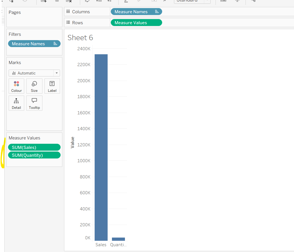
Erica set this fun and incredibly useful challenge this week, based on the TC25 talk by Lorna Brown & Robbin Vernooij, to showcase different methods of normalising data when comparing measures which have drastically different scales.
Building the Raw Values chart
Add Sales to Rows. Then drag Quantity on to the canvas and drop the pill on the Sales axis (when you see the ‘2 column’ icon appear). This has the affect of adding the fields onto a shared axis, and the sheet will update to automatically reference Measure Names and Measure Values. Swap Quantity so it is displayed below Sales in the Measure Values section.
Add Region and Category to Detail and change the Mark type to Circle.
I’m going to incorporate the last requirement at this stage, as it helps with the build, so create parameters
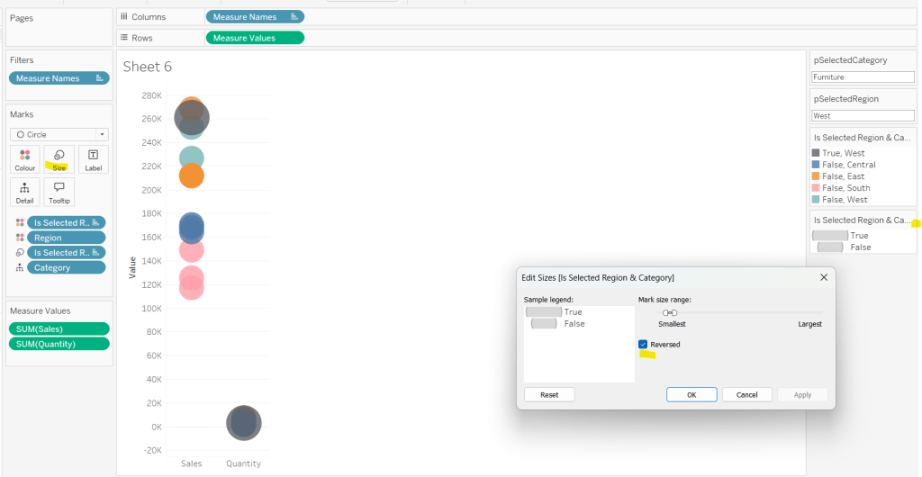
pSelectedRegion
string parameter, defaulted to West
pSelectedCategory
string parameter, defaulted to Furntiture
show both these parameters on the sheet.
Create a new field
Is Selected Region & Category
[pSelectedCategory]=[Category] AND [pSelectedRegion]=[Region]
Add this field to Colour, and swap the values in the legend, so True is listed first. Then change the Region on the Detail shelf, so it is also on colour, by adjusting the icon to the left of the pill. Adjust the colours as required and then reduce the opacity on colour to 80%.
Manually update the entry in the pSelectedRegion parameter to each Region, so the True-<Region> colour combination can be updated to the dark grey.
Add Is Selected Region & Category to Size. Edit the size so they are reversed and the range in size is closer than the default. Once done, then manually adjust the dial on the Size shelf.
Show mark labels, selecting the option to only show the min & max values per cell and aligning middle right
Update the Tooltip. Then create fields True = TRUE and False = FALSE and add both of these to the Detail shelf. We’ll need these to disable the default highlighting later (adding now, as for all the other sheets, we’ll duplicate this one, so makes things easier).
Show the caption (Worksheet menu > show caption) and update the caption to reference the website Erica refers to. Then update the title of the sheet, and name the tab Raw or similar.
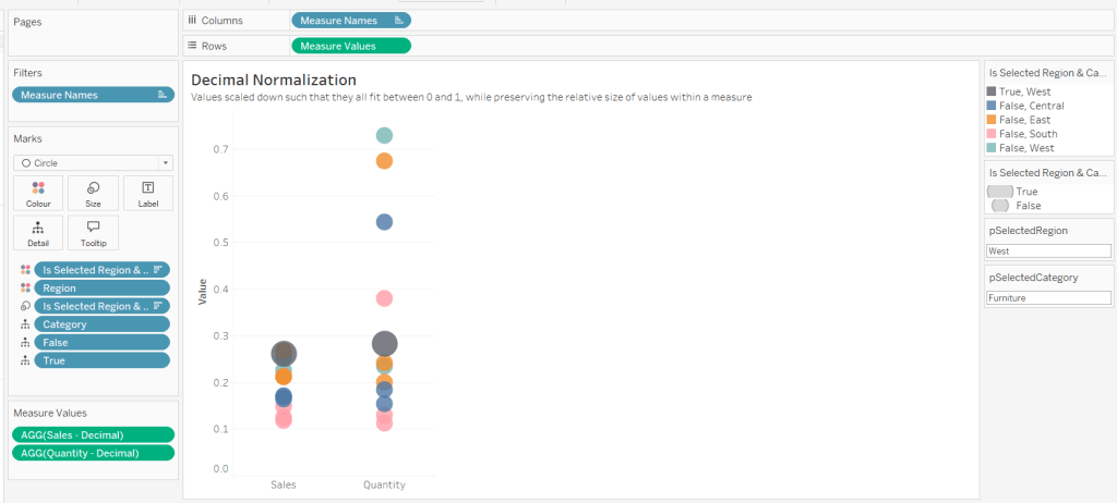
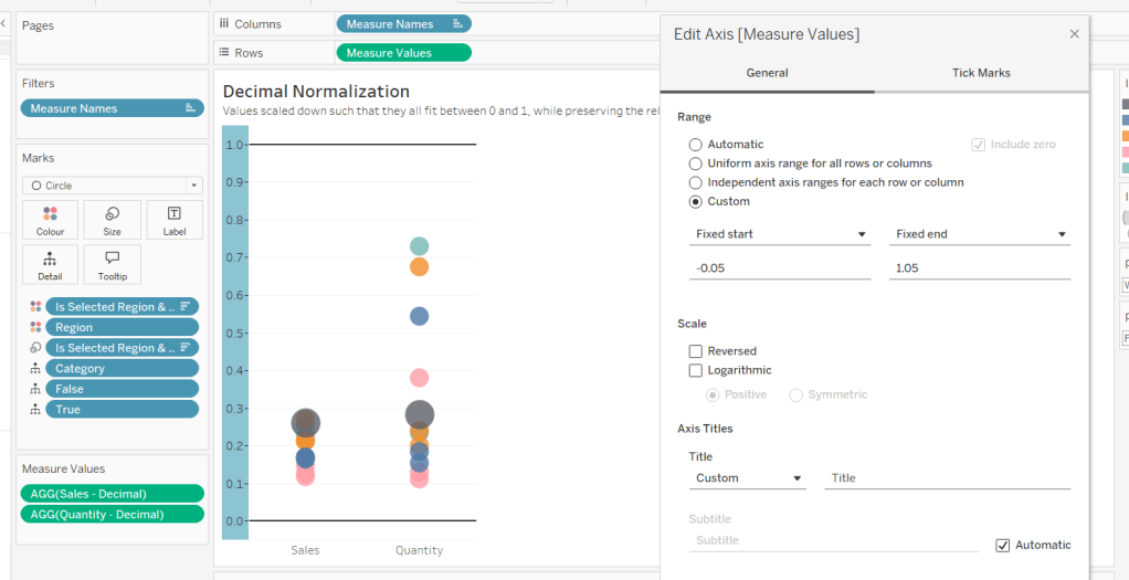
Building the Decimal Normalisation chart
Duplicate the Raw sheet, and name Decimal or similar. Update the title.
Create new fields
Sales – Decimal
SUM([Sales]) / 10^6
Quantity– Decimal
SUM([Quantity]) / 10^4
Drag Sales – Decimal onto the canvas and drop directly over the existing Sales pill in the Measure Values section, so it replaces it. Do the same with the Quantity – Decimal pill. Uncheck Show Labels.
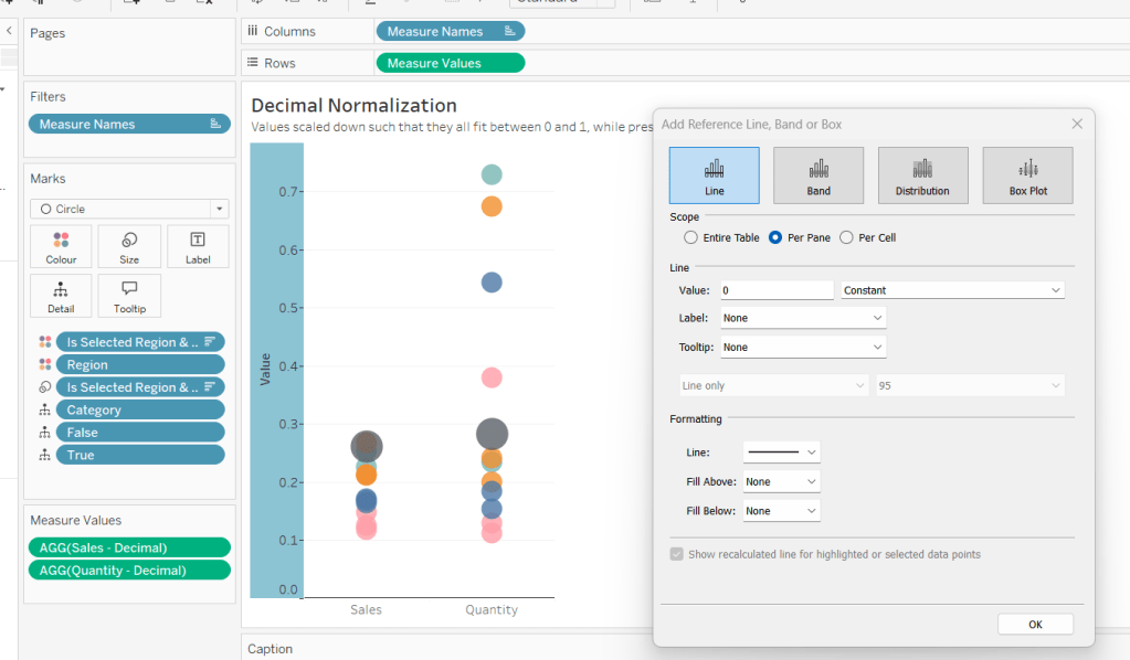
Add constantreference line of 0 that displays as a black solid line at 100% opacity
Repeat and create a constant reference line with value of 1. Edit the axis and fix from -0.05 to 1.05 and remove the axis title.
Update the text in the caption.
Building the Max-Min Normalisation Chart
Duplicate the Decimal sheet and rename Max-Min or similar. Update the title.
Drag Sales – Max-Min onto the canvas and drop directly over the existing Sales – Decimal pill in the Measure Values section, so it replaces it. Do the same with the Quantity – Max-Min pill.
Adjust the table calculation setting for each of the measures so they are computing by Category, Region and Is Selected Region & Category.
Adjust the Tooltip if required. Right click on the bottom column headings and Edit Alias to update the text- you may not be able to rename Sales – Max-Min along xyz… just to ‘Sales’, so you may need to be creative and add spaces eg ‘ Sales ‘ or similar. Update the caption.
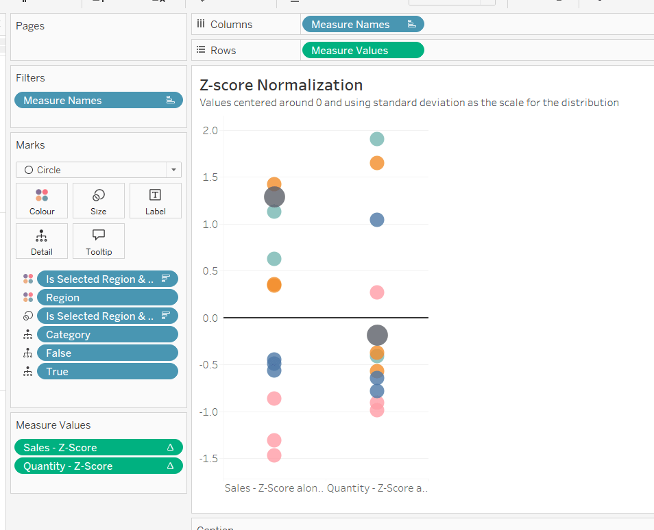
Building the Z-Score Normalisation Chart
Duplicate the Max-Min sheet, and name Z-Score or similar. Update the title.
Drag Sales – Z-Score onto the canvas and drop directly over the existing Sales – Max-Min pill in the Measure Values section, so it replaces it. Do the same with the Quantity – Z-Score pill.
Adjust the table calculation setting for each of the measures so they are computing by Category, Region and Is Selected Region & Category. Remove the reference line for the constant value of 1. Edit the axis, so the range is now Automatic rather than fixed.
As before, adjust the Tooltip again if required, edit the column labels using the alias feature, and update the caption.
Creating the dashboard and adding the interactivity
Add all 4 charts onto a dashboard, using a horizontal container to arrange the charts side by side. From the object context menu on the dashboard, select the option to show the caption
To disable the default highlighting ‘on click’ create a dashboard filter action based on the True/False method described here – you’ll need to create an action per sheet.
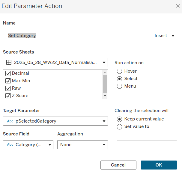
To set the parameters, create a parameter action
Set Category
On select of all the sheets, set the pSelectedCategory parameter passing in the value from the Category field.
Create another similar action called Set Region which sets the pSelectedRegion parameter with the value from the region field.
Finally, add a text section to the top right of the dashboard that references the pSelectedRegion and pSelectedCategory parameters.
Sean chose to revisit the first challenge he participated in as part of retro-month at WOW HQ. Since the original challenge in 2018, there have been a significant number of developments to the product which makes it simpler to fulfil the requirements. The latest challenge we’re building against is here.
Building the KPIs
This is a simple text display showing the values of the two measures, Sales and Profit. Both fields need to be formatted to $ with 0dp.
Add Measure Names to Columns
Add Measure Names to Filter and limit to just Sales and Profit
Add Measure Values and Measure Names to Text
Format the text so it is centrally aligned and styled apprpriately
Uncheck ‘show header’ to hide the column label headings
Remove row/column dividers
Uncheck ‘show tooltip’ so it doesn’t display
Building the map
The map needs to display a different measure depending on what is clicked on in the KPIs. We will capture this measure in a parameter
pMeasure
string parameter defaulted to Profit
Then we need to determine the actual measure to use based on this parameter
Measure to Display
If [pMeasure] = ‘Profit’ THEN SUM([Profit]) ELSE SUM([Sales]) END
format this to $ with 0 dp
Double click on State/Province to automatically generate a map with Longitude & Latitude fields. Add Measure to Display to Colour. Adjust Tooltips.
Remove the map background via the map ->background layers menu option, and setting the washout property to 0%. Hide the ‘unknown’ indicator.
Update the title of the sheet and reference the pMeasure parameter, so the title changes depending on what measure is selected.
Show the pMeasure parameter and test typing in Sales or Profit and see how the map changes
Building the bar chart
Add Sub-Category to Rows and Measure to Display to Columns. Sort descending. Adjust the tooltip.
Edit the axis so the title references the value from the pMeasure parameter, and also update the sheet title to be similar.
Building the dimension selector control
The simplest way of creating this type of control is to use a parameter containing the values ‘State’ and ‘Sub-Category’. But you are very limited as to how the parameter UI looks.
So instead, we need to be build something bespoke.
As we don’t have a field which contains values ‘State’ and ‘Sub-Category’, we’re going to use another field that is in the data set, but isn’t relevant to the rest of the dashboard, and alias some of it’s values. In this instance I’m using Region.
Right click on the Region field in the data pane and select Aliases. Alias Central -> State and East -> Sub-Category.
On a new sheet add Region to Rows and also to Filter and filter to State & Sub-Category. Manually type in MIN(0.0) into the Columns shelf. Add Region to the Label shelf and align right. Edit the axis to be fixed from -0.05 to 1, so the marks are shifted to the left of the display.
We will need to capture the ‘dimension’ selected, and we’ll store this in a parameter
pDimension
string parameter defaulted to Central
(note – although the fields are aliased, this is just for display – the values passed around are still the underlying core values).
To know capture which dimension has been set we need
State is Selected
[Region] = [pDimension]
Change the mark type to Shape and add State is Selected to the Shape shelf, adjusting so ‘true ‘ is represented by a filled circle, and ‘false’ by open circle. Set the colour to dark grey.
Change the background colour to grey, amend the text style, hide the Region column and the axis, remove all gridlines/row dividers.
Finally, we will need to stop the field from being ‘highlighted’ on selection. So create two fields
True
TRUE
False
FALSE
and add both of these to the Detail shelf. We’ll apply the required interactivity later.
Building the dashboard
You will need to make use of containers in order to build this dashboard. I use a vertical container as a ‘base’ which consists of the rows showing the title, then BANs, a horizontal container for the main body, and a footer horizontal container.
In the central horizontal container, the map and the bar chart should be displayed side by side. We need each to disappear depending on the dimension selected. For this we need
Show Map
[pDimension] = ‘Central’
and
Show Bar
[pDimension] = ‘East’
On the dashboard, select the Map object and then from the Layout tab, select the control visibility using value checkbox and select the Show Map field.
Do the same for the Bar chart but select the Show Bar field instead.
Select the colour legend that should be displayed and make it a floating object. Position where you want, and also use the Show Map field to select the control visibility using value checkbox.
Adding the interactivity
To select the different measure on click of the KPI, we need a parameter action
Set Measure
On select of the KPI chart, set the pMeasure parameter passing in the value from the Measure Names field.
And to select the dimension to allow the charts to be swapped, another parameter action
Set Dimension
On select of the Dimension Selector sheet, set the pDimension parameter, passing in the value from the Region field
Finally, to ensure the dimension selector sheet doesn’t stay ‘highlighted’, add a filter action
Unhighlight Dimension Selector
On select of the Dimension Selector sheet on the dashboard, target the Dimension Selector sheet directly, and pass values setting True = False
Hopefully this is everything you need to get the dashboard functioning. My published viz is here.
For this week’s challenge, Kyle revisited a previous challenge from 2020, but remade it over utilising some of the newer features of Tableau, specifically Dynamic Zone Visibility. I blogged my solution to the original challenge here, so this blog will lift some of the techniques (and documentation) I employed directly.
Define the parameters
The first step in this challenge is to define all the parameters needed, these being :
pDateSelector
A string parameter just set to contain the value Last 30 Days
This parameter will be set via a Parameter Action, so there is no need to define this a list with all the options.
pDays
An integer parameter defaulted to 120
pStartDate
A date parameter defaulted to 01 Jan 2023
pEndDate
Another date parameter defaulted to 01 Aug 2023
The chart needs to adjust based on a measure selected, so we need to capture the measure option selected
pSelectedMeasure
string parameter defaulted to Sales
This parameter will be set by a parameter action, so again there is no need to actually list the possible values.
Finally, I also created a parameter
pToday
Date parameter defaulted to 02 May 2023.
The requirements indicate the information displayed should be restricted to ‘today’, using the TODAY() function. However given the data set is static, if I use TODAY() and look at this in a year’s time, nothing will show. So instead I have ‘hardcoded’ ‘today’ using this parameter.
Using this parameter I then created
Order Date < Today
[Order Date] <= [pToday]
and added this as a data source filter set to True. This ensures that all the sheets I build is then automatically ignoring and data where the Order Date is 3rd May 2023 onwards.
Building the time-series chart
We need to determine which measure to show based on the selection made by the user and stored in the pSelectedMeasure parameter. This will be Sales,Profit or a count of the number of orders. First we need to create
Count Orders
COUNTD([Order ID])
and then we can create
Measure to Display
CASE [pSelectedMeasure] WHEN ‘Sales’ THEN SUM([Sales]) WHEN ‘Profit’ THEN SUM([Profit]) WHEN ‘Orders’ THEN [Count Orders] END
Add Order Date set to the continuous day level (green pill) to Columns and Measure to Display to Rows. This gives us all data from the earliest day in the data set up to 2nd May 2023.
We need to restrict this based on the ‘date selector’, so create
In Timeframe
CASE [pDateSelector] WHEN ‘Last 30 Days’ THEN [Order Date]>DATEADD(‘day’,-30,[pToday]) WHEN ‘Last N Days’ THEN [Order Date]>DATEADD(‘day’,-1*[pDays],[pToday]) ELSE [Order Date]>=[pStartDate] AND [Order Date]<=[pEndDate] END
If ‘last 30 days’, get the data that is greater than 30 days ago; if ‘last n days’, get the data that is greater than the last ‘n’ days ago, otherwise get the data between the start & end dates specified.
Add this to the Filter shelf and set to True.
Add another instance of Measure to Display to Rows, make dual axis and synchronise axes. Change the mark type of the first marks card to be Area and set the other to explicitly be a line.
Add pSelectedMeasure to the Colour shelf of the All marks card. Adjust the colour of the ‘Sales’ value accordingly.
If you’re not already displaying it, show the pSelectedMeasure parameter input, and manually change the value by typing in ‘Profit’. The chart will change colour, so again adjust accordingly. Repeat the process by typing in ‘Orders’.
Set the parameter back to ‘Sales’.
The tooltip needs to display different formatted values, so we need a couple of fields to handle this
Tooltip- Sales or Profit
IF [pSelectedMeasure] <> ‘Orders’ THEN [Measure to Display] END
Format this to $ with 0 dp, and set to use ( ) when value is negative.
Tooltip – Orders
IF [pSelectedMeasure] = ‘Orders’ THEN [Measure to Display] END
Format this to a number with 0 dp.
Add both these fields to the Tooltip shelf of the All marks card, and adjust the tooltip accordingly, positioning the two ‘Tooltip’ fields directly adjacent to each other
Hide the right hand axis (right click, uncheck show header), and edit the left hand axis to set the axis title to be sourced from the pSelectedMeasure parameter
Remove all gridlines, zero line, axis ticks etc and row/column dividers, and edit the date axis to remove the axis title. Name the sheet ‘Chart’ or similar.
Building the BANs
Add Measure Names to Columns
Add Measure Names and Measure Values to the Text shelf
Add Measure Names to the Filter shelf and select just the 3 measures we’re interested in.
Reorder the columns to match the requirement
(Optional) Change the mark type to shape and set the shape to be a transparent shape (see this blog post for more details)
Change the formatting of the Measure Names and Measure Values on the Text shelf to set the size of the font to suit, and align middle, centre
Format the Sales and Profit measures to be $ with 0 dp and ( ) for neg values.
Add Measure Names to the Colour shelf and adjust colours to match the ones used on the line chart. (If you’ve used the transparent shape, edit the label to set the font to match mark colour).
Format the display to remove the row lines
Hide the Measure Names heading (right-click the Measure Names pill on the Columns shelf and unselect Show Header).
Add In Timeframe = True to the Filter shelf to restrict the data.
Uncheck the show tooltip option from the Tooltip shelf to stop the tooltip from displaying.
Name the sheet ‘BANs’ or similar
Building the Date Selector
On a new sheet, double click into the Columns shelf and type in MIN(0.0) Change the mark type to Shape.Create a new field
Label: Last 30 Days
‘Last 30 Days’
And add this to the Label shelf.
Create anew field
Is Selected Date Option – Last 30 Day
[pDateSelector] = [Label:Last 30 Days]
And add this to the Shape shelf. Adjust the shape for the ‘True’ value to be a filled circle.
Show the pDateSelector parameter and change the text in some way. This should change the ‘shape’ to ‘False’. Set this shape value to be an open circle.
Change the colour to be a dark grey, and increase the font size. Uncheck ‘Show Tooltip’.
Now type in another instance of MIN(0.0) to Columns. Create the following fields
Label:Last N Days
‘Last N Days’
and
Is Selected Date Option – Last N Days
[pDateSelector] = [Label:Last N Days]
ON the 2nd MIN(0.0) marks card, replace the fields on the shape and label shelves with these ones.
By default, the ‘last n days’ shape should be set to false, so make sure it’s an open circle. Change the value in the pDateSelector parameter to ‘Last N Days’ and the shape should now be ‘true’ – set to a closed circle.
Create a 3rd instance of MIN(0.0) on Columns and create
Label:Custom Dates
‘Custom Dates’
and
Is Selected Date Option – Custom Dates
[pDateSelector] = [Label:Custom Dates]
and repeat the process above
Edit the axis of each to be fixed from -0.2 to 2. This has the effect of ‘left aligning’ the marks.
Hide the axis, and remove the row & column dividers, all gridlines and zero lines and axis lines.
Add Measure Names to the Detail shelf of the All marks card. The right click on Measure Names in the left hand data pane and select Alias. In the dialog box that presents, alias the 3 MIN(0.0) fields as per the 3 date selector options.
This step is the key to enabling the parameter action that will be set up to pass the appropriate ‘value’ into the pDateSelector parameter
Finally format the background of the whole worksheet to be grey.
Controlling the visibility of the selections
On the dashboard, I used a vertical layout container to add my title, the BANs and the Chart. Between the title and BANs, I added a horizontal container. On the left side of that I added the Date Selector sheet. On the right I then had another vertical container which contained other containers to display the start & end data parameters. It took a bit of ‘twiddling’ to get everything where I wanted.
I added the pDays parameter as a floating object and positioned it below the Last N Days option. I used the control visibility using value option to set this to display based on the value of the Is Selected Date Option – Last N Days calculated field.
Similarly, for the date input fields, I had the section all within a single container, so I set the visibility at the container level, rather than the object level (although you could repeat the step against all the objects you need to hide individually). For the container, I used the control visibility using value option to set this to display based on the value of the Is Selected Date Option – Custom Dates calculated field.
Adding the interactivity
To change the timeframe displayed in the BANs and chart, create a dashboard parameter action
Set Date Selection
On select of the Date Selector sheet, target the pDateSelector parameter, passing though Measure Names. When the selection is cleared, reset to ‘Last 30 Days’.
To change the measure displayed in the chart, create a dashboard parameter action
Select Measure
On select of the BANs sheet, target the pSelectedMeasurew parameter, passing through Measure Names. When the selection is cleared, reset to ‘Sales’.
Prevent the BANs and Selected Date option from being selected/highlighted
By default, clicking on one of the BAN numbers, or selecting an option in the date selector, will leave the option chosen ‘highlighted’ or ‘selected’ while the other options are ‘faded out’. To
Create two calculated fields
True
TRUE
False
FALSE
Add both these fields to the Detail shelf of the BANs sheet and the All marks card on the Date Selector sheet.
Then on the dashboard, create a dashboard filter action
Deselect BANs
On select of the BANs sheet on the dashboard, target the BANs sheet directly, passing through selected fields where True = False. Show all Values when the selection is cleared.
Repeat the exact process for the Date Selector sheet, creating a dashboard filter action called Deselect Date Selector.
You should now have a complete dashboard. My published viz is here.
For this week’s #WorkoutWednesday challenge, Lorna revisited a challenge set by Ann Jackson in 2019 which I completed and blogged about here. In that challenge we were using new navigational features introduced in v2018.3. In this recreation, we’re making use of the dynamic zone visibility feature introduced in v2022.3 (so you’ll need at least that version of Tableau to progress).
I used 5 worksheets to build this viz and, as required, just 1 dashboard. 4 of the worksheets relate to the KPI blocks, and the other for the bar chart.
Building the KPI blocks
I started by creating new measures
Count Customers
CountD([Customer Name])
Count Orders
COUNTD([Order ID])
Count Cities
COUNTD([City])
Count Products
COUNTD([Product Name])
On a new sheet, add Count Customers to Text. Then add Measure Names to Filter and filter to just show the Count Customers measure. Then add Measure Values to Text and Measure Names to Text. Remove the original Count Customers from Text. Set the view to Entire View and then centre align and format the text. Set the mark type to Square and increase the Size as large as possible. Set the Colour to the relevant colour and adjust the font to match mark colour. Remove any tooltips from showing by unchecking show tooltips on the Tooltip shelf. Name the sheet Customers.
Repeat the process for creating sheets for City, Products and Orders. You may find you need to format some of the measures to have no decimal places.
Finally add Aliases to Measure Names to change the display of the measure from being Count XXXX to just XXXX (right click on Measure Names in the left hand data pane – > Aliases
Note you could possibly have named the measures just Orders, Cities etc to start with, though I think a measure called Orders already existed, so I chose this way to be consistent.
Building the bar chart
We’re going to use Dimension swapping for this chart – that is build a single chart but use a parameter to determine which dimension needs to be displayed.
pDimension
String parameter which is hardcoded initially to the word Customers.
Create a new field which will determine which dimension to show
Dimension to Display
CASE [pDimension] WHEN ‘Orders’ THEN [Order ID] WHEN ‘Customers’ THEN [Customer Name] WHEN ‘Products’ THEN [Product Name] WHEN ‘Cities’ THEN [City] END
Note the names in the CASE statement to be stored in the parameter need to match the aliases we defined above.
On a new sheet, add Dimension to Display to Rows and Sales to Columns and sort by Sales descending. Add both Dimension to Display and Sales to Label. Format the label as required and align left. You may need to widen the rows to see the text.
Add pDimension to Colour and set the colour for the Customers dimension. Set the font to match mark colour.
Remove all axis and header columns (uncheck show header), all gridlines and row/column dividers. Add a title to the chart which references the pDimension field.
Now update the pDimension parameter to the word Orders, and set the colour. Repeat for Cities and Products.
Building the dashboard
Add the objects on to the dashaboard in such a way that you have a Vertical container that contains a Horizontal container with Customers and Orders side by side, then another Horizontal container underneath (still within the Vertical container), with City and Products side by side, and then finally add the Bar chart underneath. Set the 4 KPI block sheets to fit entire view and the bar chart to fit width. Try not to be tempted to adjust and heights of widths of objects manually on the dashboard, as that can affect things when we try to collapse later. You’ve probably got something like this:
Add a parameter action to drive the setting of the pDimension parameter
Select KPI
On select of any of the KPI block sheets, update the pDiemsion parameter passing through Measure Names. When selection is cleared, set the value to <empty string>/nothing
If you manually set the pDimension parameter to empty, your display should look like
Remove the titles from displaying from the KPI block sheets.
Hiding and showing the relevant sheets
To achieve this, we’re making use of Dynamic zone visibility functionality. For this we need some boolean fields to be created.
Crate a new calculated field
Dimension Selected
[pDimension]<>””
Similarly, create a new calculated field
Dimension Not Selected
[pDimension]=””
Back on the dashboard, select the Customers KPI block sheet (easiest way is to click on the object in the Item hierarchy pane at the bottom of the layout tab on the left hand side, as you may have trouble selecting on the dashboard itself due to the interactivity added). Once the sheet is selected it will have a grey border around it. On the layout tab on the left, select the Control visibility using value checkbox and select the Dimension Not Selected field.
Repeat this against the other 3 KPI block sheets.
Then for the bar sheet, do the same, except this time, select the Dimension Selected field instead. As soon as you do this, the bar should disappear, but reappear once you click on a KPI.
It’s community month still for #WOW2022, and this week saw Samuel Epley set this challenge to visualise the home run trajectories of Aaron Judge.
I had a little mini-break to Rome this week, so was hoping I was going to be able to get this week’s challenge done and dusted on the Tuesday evening if it landed early enough, as I wasn’t going to be around.
It did land on the Tuesday for me, but wow! it was not going to be easy! I managed to build the KPIs & the scatter plots on the Tuesday evening, and knowing I didn’t have much time, just chose to use the Home Runs stats data set only. I knew these charts weren’t going to need any data densification, so found this approach simpler.
I’m afraid I’m still constrained by time at the moment, so this post isn’t going to be the detailed walkthrough you might usually expect – sorry! I’m just going to try to pull out key points from each chart.
KPIs
I built this on a single sheet, using Measure Names and Measure Values.
I used aliases on the Measure Names (right click -> Aliases) to change the label you can see displayed ie the Distance pill is aliased to ‘Average Distance’
I also custom formatted the various numbers and applied suffixes to display the unit of measure
Note – to To get the degree symbol, I typed Alt+ 0176
Scatter Plots
I built the Exit Velocity by Distance scatter plot first, and completed all the formatting & tooltips. Then I duplicated the sheet to form the basis of the other scatter plots, and just swapped the relevant pills as needed.
For the ball shape, I loaded the provided images as custom shapes into my shapes repository. I then just created the following calculated field to use as a discrete dimension I could add to the Shape shelf
Ball Shape
[HR Number]%9
It’s not as completely randomised as perhaps it should be, but it looks random enough on the display.
The Pitcher in the data is in the format <Surname>, <Forename>, but on the tooltip it needs to display as <Forename> <Surname>, so I just used a transformation on the Pitcher field to split the field based on the comma (right click Pitcher -> Transform -> Split). This automatically created 2 fields I could use on the Tooltip.
I also noticed a very subtle wording change in the tooltip based on whether the match was Home or Away. If Home, the tooltip read ‘New York Yankees vs. <Opposition>’ otherwise it read ‘New York Yankees at <Opposition>’. I used a calculated field for this logic
TOOLTIP: vs or at
IIF([Location]=’Home’,’vs.’, ‘at’)
The Trajectory Plot
OK, so this was the hardest part of this challenge, and mainly due to getting your head round the physics involved, as so many of the calculations are dependent on each other.
I’m generally pretty confident with my maths, but this was complex, especially with the force calculations for the y-axis. Samuel stated that both gravity and drag impacted the Y-axis calcs, but it wasn’t clear to me how both these forces should be applied (a bit of trial and error and I ended up adding them within the formula).
By the time I came to tackle this challenge, Samuel had already posted a video walkthrough, which can be viewed here and is another reason why I’m not going down to the nth degree in this post.
My suggestion is to watch Samuel’s video and/or feel free to download my workbook. I built my workbook independent of Samuel’s video, so there may be steps/calculations that differ.
However, I have tried to number my calculations in the order in which I created them, so you can hopefully follow the thought process. I have also left a CHK:Data sheet in the workbook, which I used to sense check what I was doing.
All the table calculations in the CHK:Data sheet are just set to the default ‘table down’ as I have filtered the sheet to a specific Home Run (HR Number = 1) only (ie I didn’t change any of the table calc settings as I added the pills to the sheet).
However, when you build the main trajectory chart, you have multiple HR Numbers in the view, so all the table calculations must be set so that calculations are only working for each HR Number. This means that any table calc (and any nested calculations) need to have all the fields except HR Number checked
When using the Pages shelf, which isn’t something I’ve ever really had to do before, you need to Show History and adjust the various settings to get the trail lines to show
To rotate the ball (the bonus option), you need another field to use on the Shape shelf. I had lost the will to live a bit by this point, so used the formula from my friend Rosario Gauna’s solution.
Rotation Shape
STR(IIF([14-Start Position Y m] <= 0, 0, (MIN([Time Interval]) * 1000 / 25) % 9))
Note – when you add this to the Shape shelf, and select your baseball palette, just then use the Assign Palette button to automatically assign a ball to a number – this will get them into the correct order, without you having to do it one by one.
Finally, when adding the reference average lines, be sure to set the scope to per pane rather than table, otherwise you’ll end up with the wrong figures.
I think I’ve pretty much covered all the ‘little’ points that I came across that may trip you up, aside from all the tricky calcs of course!
My published workbook is here. I hope what I’ve written is enough for you to build it yourself. I think I’d still be here next year if I tried to do anything more fully! I’m off for a lie down now!
Lorna Brown set the challenge this week to build this butterfly chart, so called because of the symmetrical display. I’ve built these before so hoped it wouldn’t be too taxing.
The data set isn’t very verbose, fields for gender & year specific values by age bracket
When connecting to this excel file, you need to tick the Use Data Interpreter checkbox which removes all the superfluous rows you can see in the excel file.
Now, I started by building a version that required no further data reshaping, which I’ve published here. This version uses two sets of dual axis, and I use the reversed axis feature to display the male figures on the left. This version required me to float the Population axis label onto the dashboard so it was central. Overall it works, the only annoying snag is that I have two 0M labels displayed on the bottom axis, since this isn’t a single axis. As a result, I came up with an alternative, which matches the solution, and which I’m going to blog about.
Reshaping the data
So once I connected to the data and applied the Use Data Interpreter option, I then selected the Males, 2021 and Females, 2021 columns, right clicked and selected Pivot
This results in a row for the Male figures and a row for the Female figures, with a column Pivot Names indicating the labels for each row. I renamed this to Gender, and the Pivot Values column to Population.
Building the Chart
On a sheet, add Age to Rows and Population to Columns and Gender to Colour. Set Stack Marks Off (Analysis > Stack Marks > Off).
You’ll see that both the values for the Male & Female data is displaying in the positive x-axis. We don’t want this. So let’s create
Population – Split
IF [Gender]= ‘Males, 2021’ THEN [Population]*-1 ELSE [Population] END
Replace the Population pill on Columns with Population Split
So this is the basic butterfly, but now we need to show the Total Population. Firstly, let’s create
Total Population per Age Bracket
{FIXED Age: SUM([Population])}
And then similarly to before, we need to display this in both directions against the Male and the Female side, so create
Total Population Split
IF [Gender]= ‘Males, 2021’ THEN [Total Population per Age Bracket]*-1 ELSE [Total Population per Age Bracket] END
Drag this field onto the Population Split axis until the two green column icon appears, then let go of the mouse. This is creating a combined axis, where multiple measures are on the same axis.
Move Measure Names from Rows to the Detail shelf and then change the symbol to the left, so the pill is also added to the Colour shelf. Adjust the colours of the 4 options accordingly.
Edit the axis and rename to Population. Then Format the axis, and set the scale to display in millions to 0dp
The tooltip needs to display % of total, so we’ll need
% of Total
SUM([Population]) / SUM([Total Population per Age Bracket])
Add this to the Tooltip shelf
We also need the population figures on the tooltip displayed differently, so explicitly add Population Split and Total Population Split to the Tooltip shelf. Use the context menu of the pills on this shelf, to set the display format in the pane to be millions to 2 decimal places. But this time, once set using the Number(Custom) dialog, switch to the Custom option and remove the – (minus sign) from the format string. This will make the values displayed against the Males which are plotted on the -ve axis, to show as a positive number.
Finally, set aliases against the Gender field, so it displays as Males or Females (right click on Gender > Aliases).
Now you have all the information to set the tooltip text.
Now add a title to the sheet to match that displayed, hide field labels for rows, and adjust any other formatting with row/column dividers etc that may be required, and add to a dashboard.
And that should be it. My published version of this build is here.
For #WOW2020 Week 16, Lorna set a slightly different challenge that involved data blending. Blending is a technique in Tableau used to combine data from different data sources. You can read more about it here.
Lorna’s scenario is quite a common one – you have a data source which stores some ‘actual’ data (that in a typical scenario is likely to change as you move through the year), along with a more static data source, storing plan/budget/target data for each month. This is typically created at the start of the year and rarely changes. Comparing actuals to target is a very common business requirement.
Once again, I’m going to tackle this challenge but working out all the numbers I need for each month in a tabular format, before I go onto build the viz.
Building out the data
For this challenge we have 2 data sources, the pipeline data containing multiple years and the target data just containing data for 2020. So the first this we need to do is add a filter for Closed Date from the PipelineData source to be the Year 2020.
The data has been specially crafted as if it’s at a particular point in time in April, in my case at the point of building it was 15 April 2020. If this was being built for a real life scenario, we’d want to be reporting based off the Today() function. To simulate this, I created a calculated field to hardcode my ‘today’ date, but if I was doing this ‘for real’, I’d have set it to TODAY().
Today
#2020-04-15#
I need to be able to report the Pipeline Data that is at Stage=Closed Won separately from data that is still in the pipeline (hasn’t been closed as won or lost). I’ll use some calculated fields for this
Closed Won
ZN(IF Stage = ‘Closed Won’ THEN [Sales] END)
Note– the ZN will display as 0 if there is no Sales.
Pipeline
IF [Stage]= ‘Negotiating’ OR [Stage] = ‘Proposing’ THEN [Sales] END
Let’s start to build the table out:
Month of Closed Date on Rows
Closed Won and Pipeline on Cols (as Measure Values)
Year of Closed Date = 2020 on Filter Shelf
Let’s now add in the target from the Target Data source. This will be a blend. When we blend we need to define how to ‘join’ the data sources together. I prefer to make it obvious what fields I am blending on, so although I can use existing fields and define a rule, I prefer created explicit calculated fields so it’s clear.
The Target Data contains a record for each month, dated as per the 1st of each month. In the Target Data, create a new field
BLEND – Month
[Date]
The in the Pipeline Data, create a field named exactly the same
BLEND – Month
DATE(DATETRUNC(‘month’,[Closed Date]))
but in this case we’re truncating the Closed Date to the 1st of each month, and ensuring it too is a Date rather than Datetime data type, so the fields can match.
Now add Target from the Target Data onto the table. If you get a warning message, click ok, then click the ‘link’ symbol that is currently greyed out against the Blend – Month field in the Target Data.
The ‘link’ symbol will go red and indicate that the data is being ‘joined’ on this field. The Target values in the table will now match the values if you check the data source excel file directly, and the Target pill in the Measure Values will show a ‘database’ symbol with an ‘orange tick’ which indicates it’s from a secondary data source. The data sources listed in the Data pane (top left) will also be coloured blue (primary) and orange (secondary), which indicates data blending is being used.
We now need to start working out how much off the YTD target we are so far, so we then work out how much pipeline is potentially missing from each future month.
So first up, how much has been closed won so far this year (only considering complete months). Ie how much has been won in Jan, Feb & March?
YTDClosed
WINDOW_SUM(SUM(IF [Closed Date] < DATETRUNC(‘month’, [Today]) THEN [Closed Won] END))
If the Closed Date is before the 1st of the current month (ie April in this example), get the Closed Won value already computed, but SUM all the values we have for all the months.
Add this onto the table, and you can see the total of the Closed Won values for Jan, Feb & Mar is listed against every month.
The table calc has automatically computed ‘table down’, but I’m, going to explicitly set it, as I know I’m going to move the fields around later, and I don’t want that value to change based on where it gets moved to,
Right click on the YTD Closed pill -> Edit Table Calculation and check Month of Closed Date
We need to work out how much we should have closed in the first 3 months of the year too. So in the Target Data, create a similar calculated field
YTD Target
WINDOW_SUM(SUM(IF [Date] < DATETRUNC(‘month’, [Today]) THEN Target END))
(Note – a Today calculated field also hardcoded to 15th April 2020 needs to be added to this data source too).
Add this field into the table too, and again, set the table calculation to be explicitly set against Month of Closed Date.
In order to work out how much missing pipeline to add to each month, we need to figure out how far we’re currently ‘off’, and then distribute this value across the remaining months.
I’m doing all this in steps, so I can sense check the calcs as I go. We can work out how much we’re off by creating a new field in the Pipeline Data
Basically this is YTD Target – YTD Closed, but when you refer to a field from the secondary data source, the field will be prefixed by the data source name.
Add this to the table, and again verify the table calc is set explicitly.
As this is a field based on other table calcs, you will see them listed as Nested Calculations, and you need to verify each one listed is set appropriately.
To work out how many months in the year are remaining that we need to distribute the above value over, we need
Remaining Months
12 – (DATEPART(‘month’, [Today]) -1)
As Today is in April, which is month 4, then the remaining months is 12 – (4-1) = 9.
An now we can work out how much needs to be added per month
Distributed Missed Sales Value
[Missed Sales Value] / [Remaining Months]
Pop this onto the table, and verify the table calc again.
Now we have this, we can work out what the Target needs to be adjusted to for each of the remaining months to make up the shortfall, which is basically adding the monthly shortfall above to the existing Target for the month (but only for the current and future months).
Adjusted Target
IF MIN([Closed Date]) >= DATETRUNC(‘month’, [Today]) THEN SUM([Monthly Target (2020_04_15_WW16_Sales Pipeline)].[Target]) + [Distributed Missed Sales Value] END
Note – we wrap Closed Date in a MIN function as we’re working with aggregated fields, so the Date needs to be aggregated too. MAX would work just the same.
Finally we need to work out what the shortfall is in the existing Pipeline to meet the Adjusted Target (if there is any).
For the months beyond the current month, this is simply the difference between the Pipeline value and the Adjusted Target (but only if the Pipeline is less than the Adjusted Target). For the current month though, it’s the difference between the Pipeline + Closed Won values and the Adjusted Target.
Missing Pipeline
IF ZN(SUM([Pipeline])) = 0 THEN NULL
ELSEIF DATETRUNC(‘month’, MIN([Closed Date])) = DATETRUNC(‘month’,[Today]) THEN //it’s current month, so need to consider what’s closed & what’s remaining IF (SUM([Closed Won]) + SUM([Pipeline])) < [Adjusted Target] THEN ZN([Adjusted Target] – (SUM([Closed Won]) + SUM([Pipeline]))) END
ELSEIF SUM([Pipeline]) < [Adjusted Target] THEN ZN([Adjusted Target] – SUM([Pipeline]))
ELSE 0 END
Add this onto the table
And we’ve now got all the pieces we need to start to build the viz. Name this sheet Check Data or similar. We want this as our reference sheet to make sure our figures remain correct.
Building the Bar Chart
Firstly, duplicate the table viz, and remove the fields we don’t need in the final display (YTD Closed, YTD Target, Missed Sales Value, Distributed Missed Sales Value).
Now move the pills as follows :
Closed Date from Rows to Columns
Measure Values from Text to Rows
Measure Names from Rows to Colour shelf
Change Mark Type to Bar
Now move Adjusted Target and Target to the Detail shelf.
Adjust the colours of the remaining measures to suit, and reorder, so that the bars a stacked with Closed Won on the bottom and Missing Pipeline on the top.
Before we deal with the target lines, we’re going to sort the Tooltip out. It’s quite tricky… it might be there’s a better way, but I had to create a few custom calculated fields to get the display required.
Creating the Tooltip
For the first 3 months, the tooltip just needs to display the Closed Won value, but from April onwards, we need to display values for Closed Won, Pipeline & Missing Pipeline, even if the values are 0. Also the first 3 months just show the Target, but the remaining months need the Adjusted Target too. These values are displayed with | symbols in between along with labels, which should only show if relevant.
Firstly, we need to make sure all the measure values displayed, are accessible regardless as to which bar we hover over. So all of the 3 measures (Closed Won, Pipeline & Missing Pipeline) need to be added to the Tooltip. This is done by holding down Ctrl as you drag each pill from the Measure Values area onto the Tooltip shelf. This has the effect of duplicating the pill, and retaining any table calc settings that have been applied.
We only want the text ‘| Adjusted Target :’ to display if there is an Adjusted Target value :
Tooltip : Adjusted Target
IF [Adjusted Target] > 0 THEN ‘ | Adjusted Target : ‘ END
Add this to the Tooltip shelf.
We only want the text ‘| Pipeline :’ to display if there is a Pipeline value
Tooltip : Pipeline
IF [Pipeline] > 0 THEN ‘ | Pipeline : ‘ END
Add this to the Tooltip shelf.
And we only want the text ‘| Missing Pipeline:’ to display if we’re in the current or future months.
Tooltip : Missing Pipeline
IF DATETRUNC(‘month’, [Closed Date]) >= DATETRUNC(‘month’,[Today]) THEN ‘ | Missing Pipeline : ‘ END
Add this to the Tooltip shelf.
Now modify the Tooltip so the various pills are referenced and formatted as required
Finally adjust the Month axis, to set the months to be displayed as abbreviated values.
Adding the Target lines
At first glance, you might think the two target lines are both reference lines. However, if you hover over the tooltip of the Target (the solid line), you’ll see you have the same tooltip as the bars. Whilst there is some ability to control the tooltip of a reference line now, you can’t reference all the pills this tooltip requires.
So the Target is actually a dual axis mark. The Adjust Target however, is a reference line.
To get the Target to display, hold ctrl & drag the Target pill from the Detail shelf to the Rows shelf (to duplicate the pill), next to Measure Values.
On the Target marks card,
Remove Measure Names from the Colour shelf
Change the Mark Type to Gantt
Change the Colour to black, and add a black border too (to make the mark thicker)
Make the chart Dual Axis and Synchronise Axis
Uncheck Show Header on the Target axis
If you hover over the Gantt mark/Target line, you should have the same tooltip as when you hover over the bar.
The Adjusted Target is a reference line. To add this, right click on the left hand axis and Add Reference Line. Adjust settings as follows :
Scope – per cell
Value – Adjusted Target
Label – None
Tooltip – Custom, set to ‘Adjusted Target (Dashed) :’ then add Value from the selector
Change the Line to be black and dashed
Both target lines should now be displayed. It’s just now a case of applying some formatting to remove gridlines, row & column lines, adjust font sizes and remove axis title and column titles.
Building the legend
The dashboard displays a custom colour legend. As always there are multiple ways to do this. I chose to ‘fake it’ using aliases and some values associated to a completely different and unused dimension in the data.
Duplicate the Opportunity Name dimension. I just left it as Opportunity Name (copy). On a new sheet, add Oppotunity Name (copy) to the Filter shelf, and select 5 values only.
Then right click on Opportunity Name (copy) and select Aliases. For each of the values you selected in the filter, set an alias based on the legend names to display
Then build the legend as follows
Add Opportunity Name (copy) to Columns
Type in MIN(1) to the Columns shelf to create a fake axis
Add Opportunity Name (copy) to the Text shelf
Add Opportunity Name (copy) to the Colour shelf
Fix the axis of Min(1) to start at 0 and end at 1
Reorder the displayed values to suit.
Format to remove all rows/column lines and hide the headers.
Format the Label to be centred and size font
Clear the tooltip.
Note – I chose to copy the Opportunity Name pill just to make sure I didn’t inadvertently break anything, and to easily revert if things didn’t go to plan :-).
Now the 2 sheets can be placed on the dashboard along with a suitable title.
One final tip – to prevent the user from inadvertently clicking on the legend viz when on the dashboard, add a floating blank image and position over the top of the legend.
Week 4 of #WOW2020 saw one of the new contributors, Sean Miller, provide his first challenge, based on providing a technique to improve the user experience when working with date inputs.
The date inputs allow a user to select from 2 ‘static’ options (Last 14 Days or Last 30 Days), a custom Last N Days option, where the user is then prompted to define how many days….
… along with a Custom Dates option, which when selected, prompts the user to define the start & end dates
Both the N Days parameter and the Start & End dates only appear when the appropriate selection is made. This makes the displayed interface much cleaner (as it’s less cluttered), and, more importantly, makes the action the user is then expected to make, much more obvious.
So let’s get started.
Define the parameters
The first step in this challenge is to define all the parameters needed, these being :
Date Selector
A string parameter just set to contain the value Last 14 Days
This parameter will be set via a Parameter Action, so there is no need to define this a list with all the options.
N Days
An integer parameter defaulted to 60
Start Date
A date parameter defaulted to 01 Jan 2019
End Date
Another date parameter defaulted to 31 Dec 2019
Build the Sales over time chart
The Sales over Time trend is simply Order Date as a continuous pill at the Day level, against SUM(Sales). Sales is duplicated as a dual axis, allowing one axis to be set to mark type Area, and the other to Line. The colours of each mark are slightly different, to give the ‘edged’ area look
The requirement stated the ‘Last…’ selections should be anchored to the latest date in the dataset, so we need to determine what this is:
Latest Date
{FIXED:MAX([Order Date])}
To restrict the data displayed, we need something we can filter on:
In Timeframe
CASE [Date Selector] WHEN ‘Last 14 Days’ THEN [Order Date]>DATEADD(‘day’,-14,[Latest Date]) WHEN ‘Last 30 Days’ THEN [Order Date]>DATEADD(‘day’,-30,[Latest Date]) WHEN ‘Last N Days’ THEN [Order Date]>DATEADD(‘day’,-1*[N Days],[Latest Date]) ELSE [Order Date]>=[Start Date] AND [Order Date]<=[End Date] END
In Timeframe can be added to the Filter shelf and set to True.
Based on the defaults selected, at this point, you should be displaying information for the last 14 days.
Expose the parameters onto the display, and test out the rest of the logic by changing the value of the Date Selector (type in one of the other options – eg Last 30 Days, Last N Days, Custom Days).
BANs
The 3 numbers displayed are the measures Sales, Profit and Profit Ratio, where Profit Ratio is a calculated field of
SUM([Profit]) / SUM([Sales])
formatted to be a percentage of 1 decimal place.
Then
Add Measure Names to Columns
Add Measure Names and Measure Values to the Text shelf
Add Measure Names to the Filter shelf and select just the 3 measures we’re interested in.
Reorder the columns to match the requirement
Change the formatting of the Measure Names and Measure Values on the Text shelf to set the colour & size of the font to suit, and align middle, centre
Format the display to remove the row lines
Hide the Measure Names heading (right-click the Measure Names pill on the Columns shelf and unselect Show Header).
Add In Timeframe = True to the Filter shelf to restrict the data.
Format Sales and Profit accordingly.
Measure Selector
I built the measure selection view using the technique I’ve already blogged about related to #WOW2020 Week 1 : Can you sort dimensions with a single click? This is the 3rd week out of 4 so far that I’ve employed this technique, which is great, as it means it’s a concept that I’ve started to remember 🙂 The blog also describes
how to set the parameter action which is needed to alter the Date Selector parameter
how to invoke a filter action using a True and False calculated field to prevent the un-selected measures from ‘fading out’.
By this point, all the sheets should be on the dashboard with everything formatted and positioned where it needs. So now for the final task:
Make the Parameters Hide & Show
This part of the challenge was something totally new to me, so I did what I would usually do, and Googled it.
This is the primary post I followed to achieve the result for this challenge, so I’m not going to document it all here, when it’s already written down 🙂 It’s a bit fiddly to get the parameters positioned in exactly the right place. From other posts I found, this technique is also sometimes referred to as ‘parameter popping’.
Week 2 of #WOW2020 saw Ann post this challenge asking us to create a dynamic bar chart that changed both the measure being reported and the timeframe being reported over, based on user selections.
The measure needed to be displayed as the bar label, which needed to be formatted differently depending on whether it was Sales ($ 0 dp), Profit Ratio (% 1 dp) or Items Per Order (1 dp). Due to this, the label can’t be a single field, as it’s not yet possible in Tableau Desktop to apply number formatting within a calculated field *sigh*.
A couple of calculated fields are needed for the measures
Profit Ratio
SUM([Profit])/SUM([Sales])
and Items Per Order
SUM([Quantity])/COUNTD([Order ID])
The timeframe format displayed also needed to change based on whether the timeframe selected was Last 12 months (MMM’YY eg Apr’19), Last 13 Weeks (Week No) or Last 14 days (mm/dd eg 12/31).
The bar colour needed to reflect the measure selected, and measure selector needed to display a filled or open circle depending on whether the measure was selected or not.
Measure Selector
I realised there were a lot of similarities with the behaviour of the measure selector, and Luke’s challenge from the previous week. I’m not sure if this was intentional or not. As a consequence though, I’m not going to explain how I built the Measure Selector chart, as I utilised exactly the same principles for the Week 1 solution, and I’ve already blogged about it here.
Bar Chart
I built the bar chart on a single sheet, plotting a measure that could change based on selection, against a date field that also changed on selection.
To drive the selection change I needed 2 parameters:
Date Period
A string parameter containing the 3 values available
This parameter was just made available as a drop down for the user to select from on the dashboard.
Selected Measure
This was a string parameter that just stored a piece of text. It was set to the value ‘ Sales ‘ by default, but was changed via a Parameter Action following selection via the Measure Selector chart discussed above.
Note the leading & trailing space in the default value ‘ Sales ‘due to the alias that needs to be set – refer to my previous bog post to understand the relevance
The date field to plot then had to alter based on the Date Period parameter, so the following calculated field was created:
Order Date Truncate
DATE(CASE [Date Period] WHEN ‘Last 12 Months’ THEN DATETRUNC(‘month’,[Order Date]) WHEN ‘Last 13 Weeks’ THEN DATETRUNC(‘week’, [Order Date]) ELSE DATETRUNC(‘day’, [Order Date]) END )
This field is essentially storing the date as the 1st of the month, 1st day of the week or specific day level, so when plotted on a chart it can be set to ‘exact date’ and all the orders in the same month/week/day, are all grouped together.
The measure field to plot alters based on the Selected Measure parameter, so the following calculated field is required :
Measure to Show
CASE [Selected Measure] WHEN ‘ Sales ‘ THEN SUM([Sales]) WHEN ‘ Profit Ratio ‘ THEN [Profit Ratio] WHEN ‘ Items Per Order ‘ THEN [Items Per Order] END
Plotting Order Date Truncate on columns as a discrete exact date against Measure to Show on rows with mark type set to Bar, and you can use the parameter to change the number of bars.
But this is showing all the months/weeks/days, so we need to add a filter to restrict to amount of information showing.
Dates to Include
CASE [Date Period] WHEN ‘Last 12 Months’ THEN [Order Date] >= DATEADD(‘month’,-12,[Today]) WHEN ‘Last 13 Weeks’ THEN [Order Date] >= DATEADD(‘week’,-13,[Today]) ELSE [Order Date] >= DATEADD(‘day’,-14,[Today]) END
This will true or false, and is added to the Filter shelf set to True
Note – [Today] is another parameter that is defaulted to 01 Jan 2020 as per Ann’s requirement.
The field names for the Order Date Truncate isn’t displaying as required though. To fix this, I created
Label:Date
CASE [Date Period] WHEN ‘Last 12 Months’ THEN LEFT(DATENAME(‘month’, [Order Date Truncate]),3) + ”” + RIGHT(STR(YEAR([Order Date Truncate])),2) WHEN ‘Last 13 Weeks’ THEN ‘Week ‘ + STR(DATEPART(‘week’, [Order Date Truncate])) ELSE STR(DATEPART(‘month’,[Order Date Truncate])) + ‘/’ + STR(DATEPART(‘day’, [Order Date Truncate])) END
which is building the required string to display.
Add this to the Columns shelf next to the Order Date Truncate field, then untick Show Header against the Order Date Truncate field
Next up is the labels to display on top of each bar. This also needs to show something different depending on the measure selected. For this I built 3 calculated fields:
Label: Sales
IF [Selected Measure] = ‘ Sales ‘ THEN [Sales] END
which is formatted to $ with 0 decimal places
Label: Profit Ratio
IF [Selected Measure] = ‘ Profit Ratio ‘ THEN [Profit Ratio] END
which is formatted to % with 1 decimal place, and
Label: Items to Order
IF [Selected Measure] = ‘ Items Per Order ‘ THEN [Items Per Order] END
which is formatted to 1 decimal place
These 3 fields are then added to the Label shelf, and the label text is then edited to ensure all the fields are positioned side by side. Due to the fact only 1 of these fields will ever contain data, it looks as though there is only 1 label showing
Next we need to colour the bars, which is based on Selected Measure which is just added to the Colour shelf. When it’s added though, you only get a single measure in the colour legend at a time, so to set the colours you need to set Selected Measure to be each option of Sales, Profit Ratio, Items to Order (based on what the alias has been set though), either by manually typing into the parameter, or selecting a measure on the dashboard via the Measure Selector chart you built initially.
The tooltip is then set as follows
and once again the Label:xxx measures are all positioned alongside each other as, remember, only one will ever contain any data.
Finally it’s just a case of tidying up the chart – remove the rows & columns, the Measure to Show axis, and the Label:Date label.
The zero line of the rows is set to be a thicker grey line to get the desired display
Once done, the bar chart can be added to the dashboard, and if the Parameter Action on the Measure Selector chart has been set up properly, the bar chart display should change as that chart is interacted with.
Luke kicked off the 1st workout of 2020 with this challenge – using a ‘header’ sheet to control the sorting on a tabular view below.
Building the table
A couple of measures need creating initially :
Sales / Order
SUM([Sales])/COUNTD([Order ID])
Profit Ratio
SUM([Profit])/SUM([Sales])
The table consists of 3 measures aligned side by side, of different mark types : bar, text, bar. Sub-Category exists on the Rows.
The Sales measure is displayed first on the Columns, with mark type set to Bar, and the axis is fixed to start at 0 so there is minimal spacing between the Row label and the start of the bar. An additional calculated field [Profit Ratio]< 0 is added to the colour shelf and adjusted to be red/grey as appropriate.
As the requirement for the text Sales/Order measure was to right align it, adding Sales/Order measure to columns won’t work. Instead use MIN(0) setting the mark type to Gantt Bar, and making the mark type as small as possible, and setting the opacity to 0. Sales/Order is then added as a label which is then aligned middle left, and therefore right-aligning the text on the screen.
The final measure, Profit Ratio is added to the Columns shelf, also as mark type of Bar. Once again the [Profit Ratio]< 0 is added to the colour shelf.
All row/column lines, gridlines, zero lines and axis lines were set to nothing, but the Profit Ratio measure required a zero line to display. Using the zero line setting of the formatting would have meant a zero line would also display on the Sales bar chart, which wasn’t required. Instead I used a constant reference line of 0 on the Profit Ratio axis only.
And finally, the requirement stated that sort controls on the table should be switched off. This setting can be found under the Worksheet menu. All the axis were then hidden.
Building the ‘Header’ sheet (basic)
To start off I’m just going to describe how to construct a basic header table so it can then it interact with the table on the dashboard, and apply the sorting. I’ll revisit this all later, as getting the header to meet the specific requirements Luke stated was something I admit I struggled with.
At it’s simplest, you can build the header as follows:
Measure Names on rows and filtered to just the 3 measures we need
Measure Names on Text and aligned Middle Centre
Measure Values on Detail
Measure Names manually sorted in the order we want
Show Header unchecked for Measure Names on the rows shelf
Invoking the Sort
The sort is intended to work by clicking on a label on the header sheet, which in turn should sort the data in the table sheet.
To start off, a string parameter is required which is defaulted to the value Sales
A calculated field is also needed to define the sort measure, based on the sort parameter
Sort By
IF [Sort] = ‘Sales’ THEN SUM([Sales]) ELSEIF [Sort] = ‘Profit Ratio’ THEN [Profit Ratio] ELSEIF [Sort] = ‘Sales / Order’ THEN [Sales / Order] END
On the Table sheet, the Sub-Category field is then set to sort based on the Sort By field
With the Header sheet and the Table sheet added to a dashboard, a Parameter Action can be created which will set the Sort parameter based on the measure name clicked on :
At this point now, you should have the basics of the challenge – a header sheet causing the data in the table sheet to sort based on the label clicked on.
However, Luke added additional complexity to the Header sheet :
add an ▼ to identify the column label clicked on
change the font to be darker for the label clicked on
ensure the column labels not clicked on, remained ‘visible’ (ie did not appear to fade as per standard behaviour when data is selected in a viz).
Building the Header (Initial attempt)
My initial attempt to meet the stated requirements made use of a dual axis MIN(0) table, where one axis was of mark type square, with the Measure Names & ‘ ▼ ‘ on the label shelf, which was formatted to be a dark font, and set to only show when highlighted. The second axis was a Text mark type, with Measure Names on the text, formatted to a lighter font.
On click on one of the labels, the label associated with the square mark type would be shown, but the other labels ‘faded out’.
Whatever I tried to do to stop them, based on tricks I’ve tried in the past (using a Dummy field and applying a highlight action on the dashboard), didn’t work.
As much as I tried I couldn’t get beyond this, so published this as my solution, and waited for Luke to release his workbook. My version using this method is here.
Building the Header (Luke’s method)
Once Luke made his workbook available, I downloaded it to see what he’d done to keep all the header labels ‘enabled’ on click.
He used a dashboard action filter to set a calculated field ‘True’ to match a calculated field ‘False’. Both these calculated fields had to exist on the Detail shelf of the header sheet. (also note how the dashboard source sheet selects the Header v2 view which targets the Header v2 sheet directly (and not the equivalent view on the dashboard).
I have to admit, I had seen this post, and am kicking myself I didn’t remember it to try it out 😦
So…. back to my viz, and I applied Luke’s deselect marks idea to my header sheet, but it didn’t work. As I’d made the arrow show on ‘highlight’, this filter action was undoing the highlight, so preventing my label to show.
So I figured I’d just have to copy what Luke had done… and I started to build out his sheet… 3 columns of Min(0) set to Text with Measure Names on the Text :
All I could display was Min(0)… the only way I could see to get the words Sales, Sales/Orders, Profit Ratio displayed, was to add in Measure Values to the Detail shelf… but then all the words overlapped…
So I messaged Luke, as I just couldn’t understand this black magic… but before I got a response, I had a lightbulb moment….
Aliases!
The MIN(0) in the Measure Names had been aliased, to look like the same name of other measures, but I added a leading and trailing space around them all, as you can’t have duplicated names.
This really is something sneaky! but I was quite chuffed I found it before Luke told me.
To get the display and the formatting right, then required an ‘Arrow’ field for each measure along the lines of :
Arrow for Sales
IF [Sort] = ” Sales “ THEN “▼” ELSE ” “ END
(note the leading & trailing spaces). This field is added to the Text shelf on the 1st Min(0) marks card. An equivalent field is then required for the other 2 measures, which are added to their respective marks cards.
Sort – Sales
[Sort] = ” Sales “
This boolean field is then added to the Colour shelf of the 1st Min(0) marks card. Again an equivalent is required for the other 2 measures. Setting the colours correctly will require each label to be clicked on the dashboard to get all the true/false permutations to show.
My revised version to meet the requirement is available here. Be aware if you do download, the field naming might not be identical to that above. This is because I have 1 workbook with both solutions in it, so in some cases needed to have duplicated versions of the calculated fields/parameters, to ensure both versions continued to function.
That was certainly an interesting challenge for Week 1 of the new year, and ultimately I was stumped! Hoping this isn’t going to be a theme for the weeks to come 🙂