Can you add candlesticks to bar charts?

For the final week of global recognition month, Shunta Nakjima set this challenge inspired by one of the ‘founders’ of #WorkoutWednesday, Andy Kriebel.

Let’s get stuck in, by starting with the selector sheets.

Building the Measure Selector

The measure selector will be used to set a parameter which will store the particular measure selected, so we need

pSelectedMeasure

string parameter defaulted to the value Sales

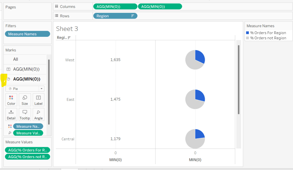
We also need a field to help us ‘draw’ the 3 selection boxes onto a viz, in such a way that we then have a measure value to pass into the parameter on selection. You could build this with its own separate dataset, but I’m going to utilise another field to ‘fake this’, and drive it off the Segment dimension as we don’t need this in the rest of the viz.

Measure Selector Alias

CASE [Segment]
WHEN ‘Consumer’ THEN ‘Sales’
WHEN ‘Corporate’ THEN ‘Profit’
ELSE ‘Quantity’
END

Add Segment to Columns. Then double click into Columns and manually type MIN(1). Widen the row and then add Measure Selector Alias onto Label.

Edit the axis, and fix the range to run from 0 to 1. Adjust the label font and align centrally. Hide the axis and the Segment header.

We need to identify which measure has been selected, both through colour and an arrow indicator. So we need

Is Measure Selected

[Measure Selector Alias] = [pSelectedMeasure]

Add to the Colour shelf and adjust to suit.

Then create

Measure Selected Arrow

IF [Is Measure Selected] THEN ‘►’ END

I use this site to get the characters I need.

Add this to the Label shelf and adjust so the fields are side by side and the arrow text is coloured red.

Finally, stop the Tooltip from displaying, then hide all gridlines, zero lines, axis and row dividers. Set the column dividers to be thick white lines and make the Size as large as possible.

Name the sheet Measure Selector.

Building the Year Selector

In order to not ‘hardcode’ the latest year, we need

Current Year

{FIXED:MAX(YEAR([Order Date]))}

format this to be a number with 0dp and not to show the thousands separator.

From this we can create

Comparison Year

IIF(YEAR([Order Date])<>[Current Year],YEAR([Order Date]),NULL)

On a new sheet, add Comparison Year to Filter and exclude NULL. Then add Comparison Year to Columns and sort descending, so the latest year is listed first. Double click into Columns and manually type MIN(1).

As before widen the rows, and then add Comparison Year to Label. Edit the axis, and fix the range to run from 0 to 1. Adjust the label font and align centrally. Hide the axis and the Comparison Year header.

We’re going to need a parameter which will capture the year selected

pSelectedYear

integer parameter defaulted to 2022 with the display format set to not include the thousand separator

We need to identify which year has been selected, both through colour and an arrow indicator. So we need

Is Selected Year

[Comparison Year] = [pSelectedYear]

Add to the Colour shelf and adjust to suit.

Then create

Year Selected Arrow

IF [Is Selected Year] THEN ‘►’ END

Add this to the Label shelf and adjust so the fields are side by side and the arrow text is coloured red.

Finally, stop the Tooltip from displaying, then hide all gridlines, zero lines, axis and row dividers. Set the column dividers to be thick white lines and make the Size as large as possible. Name the sheet Year Selector.

Building the Current Year ‘card’

Double click into Columns and manually type MIN(1). Add Current Year to Label. Widen the row. Edit the axis, and fix the range to run from 0 to 1. Adjust the label font and align centrally. Hide the axis. Adjust the Colour to suit. Stop the Tooltip from displaying, then hide all gridlines, zero lines, axis and row dividers. Make the Size as large as possible. Name the sheet Curr Year.

Building the bar chart

Based on the measure selected, we need to get the value of the relevant measure for the current year and for the comparison year, so we need

Measure to Display – Curr Year

IF YEAR([Order Date]) = [Current Year] THEN
CASE [pSelectedMeasure]
WHEN ‘Sales’ THEN [Sales]
WHEN ‘Profit’ THEN [Profit]
ELSE [Quantity]
END
END

and

Measure to Display – Comp Year

IF YEAR([Order Date]) = [pSelectedYear] THEN
CASE [pSelectedMeasure]
WHEN ‘Sales’ THEN [Sales]
WHEN ‘Profit’ THEN [Profit]
ELSE [Quantity]
END
END

On a new sheet, add Sub-Category to Rows and Measure to Display – Curr Year to Columns. Sort descending. Then click and drag Measure to Display – Comp Year to the axis and release when the two green columns display. This will automatically add Measure Names and Measure Values into the view.

Reorder the pills in the Measure Values box, so the current year values are listed first. Add Measure Names to Colour and adjust to suit. Add Current Year, Measure to Display – Curr Year and Measure to Display – Comp Year to Tooltip, and adjust the tooltip so it is referencing those 3 fields along with the pSelectedMeasure and pSelectedYear parameters

So we have the bars, but now we need to add the ‘candlestick’, which we’re going to crate using a gantt bar. We need another ‘measure’ row to show, and need another instance of Measure to Display – Comp Year for this – we can’t use the existing measure, as it will put data on the same ‘row’. So simply duplicate the Measure to Display – Comp Year field, to get the Measure to Display – Comp Year (copy) field. Add this to Columns.

Change the mark type of this to a gantt bar. To get the size and the information we need for the labels and to colour the gantt, we need some more fields.

Difference

SUM([Measure to Display – Curr Year]) – SUM([Measure to Display – Comp Year])

custom format this to +#,##0;-#,##0 and add this field to both the Size and the Label shelf.

% Difference

IF (SUM([Measure to Display – Curr Year])>=0 AND SUM([Measure to Display – Comp Year])>=0)
OR (SUM([Measure to Display – Curr Year])<0 AND SUM([Measure to Display – Comp Year])<0) THEN
[Difference]/ABS(SUM([Measure to Display – Comp Year]))
ELSE 0
END

If both the values are positive or both the values are negative, then calculate the difference, otherwise return 0, and then custom format to ▲0.0%;▼0.0%;- . The first section up to the ; formats the number when it’s positive, the next section formats when negative, and the last section formats when the number is 0, so in this case we’re replacing any 0 with a ‘-‘. Add this to the Label shelf.

Diff is +ve

[Difference]>0

Add this to the Colour shelf (remove Measure Names) and adjust accordingly.

Reduce the Size of the gantt bar, adjust the label so the font is smaller, organised as required, and aligned to the right. Remove all the text from the Tooltip. Then make the chart dual axis and synchronise the axis. Explicitly set the mark type of the Measure Names marks card to a bar.

Finally tidy up by hiding both axis, removing all gridlines, axis lines, zero lines and column dividers. Format the Sub-Category label headings and align middle left. Hide the Sub-Category row heading (hide field labels for rows) and hide the Measure Names field (uncheck show header). Name the sheet Chart.

Adding the interactivity

Using vertical and horizontal containers, arrange the objects on the dashboard. I used a horizonal container to align the Curr Year, Year Selector and Measure Selector sheets, adding blank objects in between. I edited the title of the 3 objects to display the required text. I then floated a blank object over the Current Year box, so it couldn’t be clicked.

To select the year and the measure, I needed parameter actions

Select Year

on select of the Year Selector sheet, set the pSelectedYear parameter, passing in the value from the Comparison Year field

and

Select Measure

on select of the Measure Selector sheet, set the pSelectedMeasure parameter passing in the value from the Measure Selector Alias field

Finally to stop the years and measure boxes being ‘highlighted’ on click, create fields

True

TRUE

and

False

FALSE

and add both to the Detail shelf of the Year Selector and Measure Selector sheets. Then add dashboard filter action

Deselect Years

On select of the Year Selector sheet on the dashboard, target the Year Selector sheet itself, passing the values True = False.

Create another similar filter action for the Measure Selector sheet, and that should then be it!

My published workbook is here.

Happy vizzin!

Donna

Can you build an UpSet Plot with just one calculated field?

For this week’s #WOW2023 challenge , guest poster, Venkatesh Iyer asked us to create an UpSet Plot, with the added requirement of using just 1 calculated field.

To start with, I had to read up on what an UpSet plot was and looked through the blog post by Chris Love that was referenced in the challenge introduction. While this post gave me more clarity, it introduced more calculations than I was hoping for, so I started looking a bit wider for a bit of help. This YouTube video set me on my way.

Setting up the data

The requirements stated to limit to the Category of Furniture only, so after connecting to the Superstore data source, I added a Data Source Filter (right click data source > Edit Data Source filters) to restrict the information throughout the workbook just to the Furniture Category.

Doing this means I don’t have to keep adding the Category to the Filter shelf, and any FIXED LoDs I create will only be based on the subset of data that has been ‘pre-filtered’.

There are multiple charts in this challenge, and I used 5 sheets in total. Let’s start with the easy ones.

Building the Customer List

On a new sheet add Customer Name to Rows and Sales to Text. Format Sales to $ with 0dp, and widen each row. Remove row/column dividers and remove the ‘Customer Name’ column heading (right click and hide field labels for rows). Uncheck the Show Tooltips option from the Tooltip shelf. Name the sheet Customer List.

Building the Sub-Category Bar Chart

Add Sub-Category to Rows. Add Customer ID to Columns, then use the context menu to change the field to use the Count (Distinct) measure.

Note – I would typically create a specific calculated field containing the function COUNTD([Customer ID]), but as we only want a single calculated field in the solution, then this is the method to adopt.

Sort the resulting bar chart descending, and add Sub-Category to the Colour shelf and adjust to suit.

Widen each row and then click on the Label shelf and check the Show mark labels tick box. Align the labels middle left and format the font. Hide the axis and the Sub-Category column heading (uncheck show header). Remove all gridlines, row/column dividers/ zero lines etc. Uncheck the Show Tooltips option from the Tooltip shelf. Name the sheet Sub Cat Bar.

Identifying the groupings

Ok, now we’re at the point we need to identify the different ‘cohorts’ of customers based on what Sub-Categories they have purchased. Let’s build out a tabular ‘check’ sheet so we can see what we’re up to…

On a new sheet add Customer Name and Sub-Category to Rows. This simple table shows us that Aaron Bergman has at some point only ever bought Bookcases & Chairs, while Aaron Hawkins has purchased Chairs & Furnishings. These 2 customers are in different cohorts as they haven’t bought exactly the same combination of Sub-Categories. There are 15 different combinations in total.

Based on what I observed in the video, I can create a FIXED LoD calculated field to identify if a customer has bought Bookcases.

BC

{FIXED [Customer ID]: MAX(IIF([Sub-Category] = ‘Bookcases’,1,0))}

Pop this into the view, and we can see that there is a 1 reported against all the rows associated to each customer who bought Bookcases. So Aaron Bergman has a 1 against both rows, and Aaron Hawkins has 0 against both rows.

Creating similar calculated fields, specific for each of the 4 different Sub-Category values, and putting them into the table, we can see we have various combinations of 1s and 0s for each customer. Adam Shillingburg has bought all 4 types, so has 1’s across the board, while Adrian Sharni has only bought Furnishings, so has 3 0’s and a single 1.

Based on our understanding of what these fields are doing, we can combine what each one is doing into a single calculated string field.

Combo

STR({FIXED [Customer ID]: MAX(IIF([Sub-Category] = ‘Furnishings’,1,0))}) + ‘-‘ +
STR({FIXED [Customer ID]: MAX(IIF([Sub-Category] = ‘Chairs’,1,0))}) + ‘-‘ +
STR({FIXED [Customer ID]: MAX(IIF([Sub-Category] = ‘Tables’,1,0))}) + ‘-‘ +
STR({FIXED [Customer ID]: MAX(IIF([Sub-Category] = ‘Bookcases’,1,0))})

Note the order is based on the order of Sub-Category bar chart. Add this into the view on Rows (rejig the order of the measure values to match).

So with this one calculated field Combo, we now have a dimension we can use to count the customers against. The calculated fields I used to demonstrate the concept are now superfluous and can be deleted if you wish, if you remove the check sheet too. I chose to keep mine in for reference.

Building the Combo bar chart

ON a new sheet, add Combo to Columns and then add Customer ID to Rows, but as before, set it to use the COUNTD aggregation.

Sort the bar to be ascending. Check the Show mark labels option on the Label shelf and adjust the alignment to be bottom middle, and the font to be bold. Change the colour of the bar to suit. Hide the axis and the Combo heading (uncheck show header). Remove all gridlines, row/column dividers/ zero lines etc. Uncheck the Show Tooltips option from the Tooltip shelf. Name the sheet Combo Bar.

Building the dot plot

Add Sub-Category to Rows and Combo to Columns. Manually sort the Sub-Category rows so they are listed with Furnishings at the top then Chairs > Tables and Bookcases at the bottom. Sort the Combo field by COUNTD of Customer ID ascending

Double click into Columns and manually type MIN(0) to generate an axis. Change the mark type to circle. Add Sub-Category to Colour. Widen each row.

Add Sub-Category to Label. Then double click into the pill on the label shelf and manually change to add the LEFT function around the pill, so the pill becomes LEFT([Sub-Category],1) to get the initial. Again, this is typically something I would explicitly store in its own calculated field. Manually re-sort the rows again, as this seems to break the sorting.

Align the label middle centre and bold the font. Then add another instance of MIN(0) on Columns to create a 2nd marks card. Change this mark type to Line. Remove the field from the Text shelf, and move the Sub-Category pill from Colour to Path.

Make the chart dual axis and synchronise axis. Right click on the MIN(0) axis title at the top of the chart and move marks to back.

Then hide the axis and the Combo column and Sub-category row (uncheck show header). Remove all gridlines, row/column dividers/ zero lines etc. Adjust the size of the marks as required. Uncheck the Show Tooltips option from the Tooltip shelf. Name the sheet Dot Plot. .

Building the Legend

The quickest way to do this is to duplicate the dot plot sheet. Then remove Combo from the Columns. mark type of the line from line to circle and decrease the size to the smallest possible. Move Sub-Category from Detail to Label and align middle right.

Edit the label and add some spaces in front of the text to push the labels further to the right. Format the font to suit.

Adjust the MIN(0) fields to both be MIN(0.2) instead (just double click into the fields to edit). Then edit the axis to be fixed from 0 to 1. This forces the display to the left.

Hide the axis, and name the sheet Legend.

Adding the interactivity

Arrange the items on a dashboard, using layout containers and padding to organise the 4 main charts and ensure the dot plot aligns both vertically and horizontally with the other two bar charts.. The legend chart is a floating object.

Add a filter dashboard action to filter the customer list

Filter Customers

On select of the Combo Bar or Sub Cat Bar sheets, target the Customer List sheet, showing all values when the selections are cleared.

And that should be it! My published viz is here.

Happy vizzin’!

Donna

Profit vs Target (with Tolerance)

Erica set this challenge this week, an extension of the classic actual vs target visual that is very common in business dashboards. She provided a customised data set based on Superstore Sales which included some target values.

Building the basic viz

Add Order Date to Filter shelf and restrict to the Year 2023 only. Then add Order Date to Columns and set to the discrete (blue) month level. Add Profit to Rows. Change the mark type to bar.

Add Target Profit to Rows. Change the mark type on the Target Profit marks card to Gantt Bar. Make the chart dual axis and synchronise the axis. Remove Measure Names from the All marks card. Adjust the colour of the gantt bar to grey.

Note – it is possible to add the Target Profit as a reference line. However the width of the line will span the whole width of the ‘space’ allowed for a single month, and can’t be adjusted. Putting Target Profit on its own axis means the width of the bars can differ from the width of the gantt bar which in turn differs from the profit tolerance area we’ll add next.

Adding the tolerance bands

Create a new parameter

pTolerance

Float value defaulted to 0.05 that is displayed as % to 0 dp. Set the range from 0 to 1 with 0.01 increments.

Then create

Target Tolerance Min

SUM([Target Profit]) * (1-[pTolerance])

and

Target Tolerance Max

SUM([Target Profit]) * (1+[pTolerance])

Add both these fields to the Detail shelf on the All marks card. Right click on the Profit axis and Add Reference Line. Add a reference band per cell, which gors from the Target Tolerance Min to the Target Tolerance Max field. Set all Labels & Tooltips to None. Fill the band with a light grey.

Colouring the bars

Create a calculated field

Colour – Bar

IF SUM([Profit]) < [Target Tolerance Min] THEN ‘red’ ELSEIF SUM([Profit]) > [Target Tolerance Max] THEN ‘blue’
ELSE ‘grey’
END

Add this the Colour shelf of the Profit marks card, and adjust the colours to suit. Reduce the opacity of the colour to 85%.

Reduce the Size of the bars slightly, so they are narrower than the Gantt lines.

Finalising the chart

Create a new field

Profit Diff From Target

(SUM([Profit])-SUM([Target Profit]))/SUM([Target Profit])

format to % with 0 dp, and add this field to the Detail shelf of the All marks card.

In addition, format Profit and Profit Target to be $ with 0 dp.

Add Profit, Profit Target, Order Date as a discrete (blue) pill set to the Year level, to Detail too.

Adjust the Tooltip accordingly.

The right click on the right hand Target Profit axis and uncheck show header to hide the axis. Remove all column and row dividers. Remove the title from the Profit axis, and hide the Order Date header label (right click > hide field labels for columns).

Show the pTolerance parameter and test the functionality.

Building the legend

This is a sneaky way to build a legend using the data source available. It relies on using a field that isn’t in use, that has at least 3 dimensions. In this case I chose Region.

Add Region to Columns and exclude West. Right click on the Region field in the data pane and select Aliases. Add an alias for each of the other values to marry up to the legend names.

Manually resort the Regions on the sheet so they are listed in the correct order.

Double click into the Rows shelf and type MIN(1). Edit the axis to fix it to run from 0-1. Add Region to colour and adjust colours accordingly. Reduce opacity to 85% to.

Adjust the height and width of the display and you can see how it starts to look like the required legend.

Hide the axis and remove all gridlines. Adjust the font of the header labels. Hide the Region label heading and stop tooltips from displaying.

The final step is just the then add the two sheets onto a dashboard with the pTolerance parameter displayed too.

My published viz is here.

Happy vizzin’!

Donna

Can you create a jittered bar chart?

The theme of alternative chart types continued with Lorna setting this challenge to create a jittered bar chart. We needed to use the same fake survey data set used in week 4, so initially some data remodelling was required. I’ve already blogged that here, so please refer to the modelling the data section if you need help.

The questions all need to be grouped based on the text that preceded the question, so I created

Question Group

TRIM( SPLIT( [Question], “-“, 1 ) )

which split off the text in front of the first ‘-‘. I actually created this by right-clicking on the Question field > Transform > Custom Split and selecting to to split off the first 1 column using the – separator.

I also created a field to number the responses

Response No

CASE [Response]
WHEN ‘Strongly Disagree’ THEN 1
WHEN ‘Disagree’ THEN 2
WHEN ‘Neutral’ THEn 3
WHEN ‘Agree’ THEN 4
ELSE 5
END

Once I’d done that I was able to ratify the numbers by building a simple table with Response No and Response on Columns, Question Group on Rows, and CNT(Id) on Text.

Eyeballing these numbers against where the ‘bars’ in Lorna’s viz stopped and I figured that was on the right track. However then I wasn’t particularly sure what to do next.

Lorna’s instructions were very brief. I figured I’d need to use a jitter (ie RANDOM()) somewhere, and as I’d need to add Id to the Detail shelf at some point, to generate 1 dot per respondent, I deduced I’d also need

Total Respondents

{FIXED [Response], [Question Group]:COUNT([Id])}

Adding this into by table above and I got the same values as CNT(Id) which is what I expected.

After scratching my head a bit, I decided that Lorna was possibly being vague, as there was probably help ‘out there’. So I googled, and immediately stumbled upon this very useful blog post, which pointed me in the right direction for the additional calculations required.

I created

Columns

RANDOM()

Jitter

RANDOM()

note – due to the way RANDOM() works, Jitter and Columns won’t contain the same value.

Rows

[Jitter] * [Total Respondents]

And with these I could build out the viz

Add Response No, Response and Columns to Columns. Change Columns to be a dimension.

Add Question Group and Rows to Rows. Change Rows to be a dimension. Add Id to Detail.

Change the mark type to circle, reduce the size and add Question Group to Colour and adjust accordingly.

Finally add Question to Tooltip and adjust the tooltip. Then remove all gridlines, hide the Columns axis, change the title of the Rows axis, and remove the row and column titles (hide field labels for rows / columns).

A pretty short blog today! My published viz is here.

Happy vizzin’!

Donna

Can you visualise orders?

For Luke’s first challenge of 2023, he asked us to recreate this visualisation which showed multiple chart types (donut charts and bar charts) within a tabular layout, all built on a single sheet.

As with most challenges, I’m going to first work on building out the calculations needed to provide the data being presented.

Building the calculations

Firstly we need to identify the number of orders, based on unique Order IDs

Total Orders

COUNTD([Order ID])

and then to get the average order value we need

Avg Order Size

SUM([Sales]) / [Total Orders]

format this to $ with 0 dp.

In order to build the donut chart, we will need two measures for each region; one which shows the % number of orders for that region, and one which shows the % number of orders across the remaining regions.

% Orders for Region

[Total Orders]/SUM({FIXED:COUNTD([Order ID])})

Format this to % with 0 dp

and then

% Orders for not Region

1 – [% Orders For Region]

format this to % with 0 dp.

Pop all these out in a table along with Sales formatted to $ with 0 dp, and Sort the Region field based on Total Orders descending.

Building the table view

Add Region to Rows and sort by Total Orders descending.

All the columns are going to be managed by what I refer to as a ‘fake axis’. Double click into the Columns shelf and type in MIN(0). This will create an axis.

Change the mark type to Text and add Total Orders to the Text shelf. Remove all the text from the Tooltip dialog box.

This is our 1st ‘column’ in the table.

Create another column by adding another instance of MIN(0) to Columns.

Change the mark type of this 2nd MIN(0) marks card to Pie Chart and remove Total Orders from the text shelf.

Add Measure Names to the Filters shelf, and ensure only % Orders for Region and % Orders for not Region are selected.

Add Measure Values to the Angle shelf of the pie chart, and add Measure Names to Colour. Adjust the colours to suit and ensure a white border is added (via the Colour shelf options). Again remove all the text in the Tooltip dialog.

Now add another instance of MIN(0) to Columns.

Change the mark type of this marks card to Circle and set the colour to white. Add % Orders for Region to the Label and align centre.

Now make this Min(0) pill to be dual axis and synchronise the axis. Reduce the size of the circle mark type marks card, so some of the pie chart is visible. Remove Tooltip text again.

Add another instance of MIN(0) for our ‘3rd’ column. Set the mark type to Text and add Sales to the Text shelf, and remove the tooltip text.

For the final column, add Avg Order Size to Columns. Change the mark type to bar. Reduce the size and adjust the Colour to suit. Add Avg Order Size to the Label and remove all tooltip text.

Remove all gridlines zero lines and column dividers. Add row dividers at the highest level so you have a divider per row. Uncheck Show Header on the first MIN(0) pill to hide the axes, and right click the Region column label and Hide field labels for rows.

This gives you the viz you need to add to a dashboard. Use a horizontal container with a blank and 4 text boxes positioned above the viz to provide the label heading to the columns.

OR…

you can do what I did, and having not noticed the comment about the textboxes, used further instances of MIN(0) to make every ‘column’ a dual axis so I could use the axis label for the secondary axis displayed at the top to provide the required labels.

I set the mark type of these additional MIN(0) axis to polygon, and ensured no other pills existed on the marks shelf. The tick marks on all the top and bottom axes had to be set to none, and the title on all the bottom axis had to be deleted.

The benefit of using the text boxes option is that you aren’t left with a ‘blank’ space underneath the chart. However wide your axis is at the top to display the labels, will be repeated as ‘blank space’ underneath the chart too (vote up this idea to prevent this).

My published viz is here.

Happy vizzin’!

Donna

Can you do this in one dashboard?

For this week’s #WorkoutWednesday challenge, Lorna revisited a challenge set by Ann Jackson in 2019 which I completed and blogged about here. In that challenge we were using new navigational features introduced in v2018.3. In this recreation, we’re making use of the dynamic zone visibility feature introduced in v2022.3 (so you’ll need at least that version of Tableau to progress).

I used 5 worksheets to build this viz and, as required, just 1 dashboard. 4 of the worksheets relate to the KPI blocks, and the other for the bar chart.

Building the KPI blocks

I started by creating new measures

Count Customers

CountD([Customer Name])

Count Orders

COUNTD([Order ID])

Count Cities

COUNTD([City])

Count Products

COUNTD([Product Name])

On a new sheet, add Count Customers to Text. Then add Measure Names to Filter and filter to just show the Count Customers measure. Then add Measure Values to Text and Measure Names to Text. Remove the original Count Customers from Text. Set the view to Entire View and then centre align and format the text. Set the mark type to Square and increase the Size as large as possible. Set the Colour to the relevant colour and adjust the font to match mark colour. Remove any tooltips from showing by unchecking show tooltips on the Tooltip shelf. Name the sheet Customers.

Repeat the process for creating sheets for City, Products and Orders. You may find you need to format some of the measures to have no decimal places.

Finally add Aliases to Measure Names to change the display of the measure from being Count XXXX to just XXXX (right click on Measure Names in the left hand data pane – > Aliases

Note you could possibly have named the measures just Orders, Cities etc to start with, though I think a measure called Orders already existed, so I chose this way to be consistent.

Building the bar chart

We’re going to use Dimension swapping for this chart – that is build a single chart but use a parameter to determine which dimension needs to be displayed.

pDimension

String parameter which is hardcoded initially to the word Customers.

Create a new field which will determine which dimension to show

Dimension to Display

CASE [pDimension]
WHEN ‘Orders’ THEN [Order ID]
WHEN ‘Customers’ THEN [Customer Name]
WHEN ‘Products’ THEN [Product Name]
WHEN ‘Cities’ THEN [City]
END

Note the names in the CASE statement to be stored in the parameter need to match the aliases we defined above.

On a new sheet, add Dimension to Display to Rows and Sales to Columns and sort by Sales descending. Add both Dimension to Display and Sales to Label. Format the label as required and align left. You may need to widen the rows to see the text.

Add pDimension to Colour and set the colour for the Customers dimension. Set the font to match mark colour.

Remove all axis and header columns (uncheck show header), all gridlines and row/column dividers. Add a title to the chart which references the pDimension field.

Now update the pDimension parameter to the word Orders, and set the colour. Repeat for Cities and Products.

Building the dashboard

Add the objects on to the dashaboard in such a way that you have a Vertical container that contains a Horizontal container with Customers and Orders side by side, then another Horizontal container underneath (still within the Vertical container), with City and Products side by side, and then finally add the Bar chart underneath. Set the 4 KPI block sheets to fit entire view and the bar chart to fit width. Try not to be tempted to adjust and heights of widths of objects manually on the dashboard, as that can affect things when we try to collapse later. You’ve probably got something like this:

Add a parameter action to drive the setting of the pDimension parameter

Select KPI

On select of any of the KPI block sheets, update the pDiemsion parameter passing through Measure Names. When selection is cleared, set the value to <empty string>/nothing

If you manually set the pDimension parameter to empty, your display should look like

Remove the titles from displaying from the KPI block sheets.

Hiding and showing the relevant sheets

To achieve this, we’re making use of Dynamic zone visibility functionality. For this we need some boolean fields to be created.

Crate a new calculated field

Dimension Selected

[pDimension]<>””

Similarly, create a new calculated field

Dimension Not Selected

[pDimension]=””

Back on the dashboard, select the Customers KPI block sheet (easiest way is to click on the object in the Item hierarchy pane at the bottom of the layout tab on the left hand side, as you may have trouble selecting on the dashboard itself due to the interactivity added). Once the sheet is selected it will have a grey border around it. On the layout tab on the left, select the Control visibility using value checkbox and select the Dimension Not Selected field.

Repeat this against the other 3 KPI block sheets.

Then for the bar sheet, do the same, except this time, select the Dimension Selected field instead. As soon as you do this, the bar should disappear, but reappear once you click on a KPI.

And that should be it. My published viz is here

Happy vizzin’!

Donna

What is the lifetime value of customers?

Luke Stanke set the #WOW2022 challenge this week (see here) asking us to visualise the lifetime value of customers. I have to admit, I did struggle to really understand what was being requested, and to get the numbers to match Luke’s. I ended up referring to my own blog post on a similar challenge Ann Jackson set in week 2 of 2021 to get the calculations I needed 🙂

We first need to define the quarter that each customer made their first purchase.

Customer First Order Quarter

DATE(DATETRUNC(‘quarter’, {FIXED [Customer ID]:MIN([Order Date])}))

The {FIXED LOD} calculation returns the minimum order date per customer, then truncates this to the first day of the quarter that date falls in.

We then need to determine the difference in quarters between the Customer First Order Quarter and the quarter associated to the Order Date of each order in the data set. The requirement indicated we needed to add 1 to the result. I split this into multiple calculated fields. Firstly,

Order Date Quarter

DATE(DATETRUNC(‘quarter’, [Order Date]))

gets me the quarter of each Order Date, then

Quarters Since First Purchase

DATEDIFF(‘quarter’, [Customer First Order Quarter], [Order Date Quarter])+1

Let’s pop these fields out into a table to check things are behaving as expected.

Add Customer First Order Quarter and Order Date Quarter to Rows as discrete exact dates (blue pills), and add Quarters Since First Purchase to the Text field, but set it to be a dimension, so it is disaggregated.

Now we need to count the number of distinct customers that made a purchase in each Customer First Order Quarter (the cohort)

Count Customers Per Cohort

{FIXED [Customer First Order Quarter]: COUNTD([Customer ID])}

Add this to to the sheet, along with Sales (I moved Quarters Since First Purchase to rows too)

As expected, we can see the same customer count for each Customer First Order Quarter cohort.

We’ve now got all the building blocks to move on the the next requirement, but I’m going to rearrange the table a bit, to start to reflect the data actually needed for the output.

The x-axis of the chart is going to be based on the Quarters Since First Purchase field, so move that to be the first column of data (1st entry in Rows). Then remove Customer First Order Quarter and Order Date Quarter, as we don’t need this level of information in the final viz.

We now have the sum of all the customers and the total sales, so we can now create the division reqiurement

Sales / Customer

SUM([Sales])/SUM([Count Customers Per Cohort])

I set this to currency $ with 0 dp.

Add this to the table

Then to make this a running total, create a Running Total quick table calculation off of this field (right click on field -> Quick Table Calculation -> Running Total). Add back in Sales/ Customer.

We’ve now got all the components needed to build the viz, but do require an additional calculation to be displayed in the tooltip, which is the difference between each row.

Right click the existing running total Sales / Customer pill (the one with the triangle) and choose to Edit Table Calculation. Tick the Add secondary calculation checkbox and choose the Difference From table calc to run down the table, making the calc relative to the previous row.

Re-add a Running Total quick table calc to the other Sales / Customer pill, and then add Sales / Customer back into the view (it’s annoying that Tableau won’t let you add multiple pills of the same measure name unless they have a different calculation against them).

The snag with this is that we need a value to display for the first row. We need to create a new field that can reference the data in the second table calculation. Click and drag the ‘difference’ table calculation field into the Data pane, and name the field Difference. It should look like below, but you shouldn’t have needed to type any of that.

Difference

ZN(RUNNING_SUM([Sales / Customers])) – LOOKUP(ZN(RUNNING_SUM([Sales / Customers])), -1)

Now create a new calculated field

Tooltip:Difference

IF FIRST()=0 THEN [Sales / Customers] ELSE [Difference] END

Set this to a customer number format of 1dp, prefixed by + (the data is always cumulative so is never going to have a -ve value, so this works).

Now we can build the viz.

On a new sheet add Quarters Since First Purchase to Columns as a continuous dimension (green pill), then add Sales / Customers to Rows and set to be a Running Total quick table calc. Change the mark type to be a Gantt Bar.

Create a new field

Size

[Tooltip:Difference]*-1

and add this to the Size shelf.

Add a second instance of the Sales / Customer running total calc (press ctrl and click and drag the existing pill in rows to create another next to it). Change the mark type of this to be bar. Remove the Size pill, and then click the Size shelf button, and set the Size to be fixed, aligned left.

Now make the charts dual axis and synchronise the axis. Set the colour of each mark type to the relevant palette, and set the mark borders to None. Hide the right hand axis.

On the All marks card, add the Tooltip:Difference and Count Customers Per Cohort fields to the Tooltip shelf, and amend the tooltip to match.

On the bar marks card, click the Label shelf button and tick the show mark labels checkbox. Align these left.

Remove the left hand axis, remove all gridlines and row/column dividers. Add column axis ruler and dark tick marks

Edit the x-axis and rename the title to Quarter of Order.

If you find you have the x-axis going from 0 to 18, then change the datatype of Quarters Since First Purchase from a whole number to decimal. (right click pill in data pane -> change data type -> Number(decimal).

Add the chart to a dashboard and boom! you’re done. My public viz is here. (note, I did notice some vertical dividers displaying in the area chart on public, but think this is a Tableau Public ‘bug’ as I’ve switched off all the lines I can think of, and Desktop displays fine….

Happy vizzin’!

Donna

Can you compare the latest month to the prior X months average?

Lorna set this challenge this week to test some LoD fundamentals. My solution has a mix of LoDs and table calculations – there weren’t any ‘no table calcs’ allowed instructions, so I assumed they weren’t off limits and in my opinion, were the quickest method to achieve the line graph.

Note – For this challenge, I downloaded and installed the latest version of Tableau Desktop v2022.2.0 since Lorna was using the version of Superstore that came with it. The Region field in that dataset was set to a geographic role type. I built everything I describe below using the field fine, but when I extracted the data source at the end and ‘hid all unused fields’ before publishing, the Region field reported an error (pill went red, viz wouldn’t display). To resolve, I ended up removing the geographic role from the field and setting it just to be a string datatype. At this point I’m not sure if this an ‘unexpected feature’ in the new release…

Ok, let’s get on with the build.

Building the basic viz

I started by building out the basic bar & line chart. Add Region to Rows, Order Date as continuous month (green pill) to Columns and Sales to Rows. Change the mark type to bar, change the Size to manual and adjust.

Drag another copy of the Sales pill to Rows, so its next the other one. Click on the context menu of that 2nd pill, and select Quick Table Calculation -> Moving Average

Change the mark type of the 2nd Sales pill to line.

Now click on the context menu of the 2nd Sales pill again and Edit Table Calculation. Select the arrow next to the ‘Average, prev 2, next 0’ statement, and in the resulting dialog box, change the Previous values to 3 and uncheck the Current Value box

At this point you can verify whether the values match Lorna’s solution when set to 3 previous months.

But, we need to be able to alter the number of months the moving average is computing over. For that we need a parameter

pPriorMonths

integer parameter, default to 3, that ranges from 2 to 12 in steps of 1.

Then click on the 2nd Sales pill and hold down Shift, and drag the pill into the field pane on the left hand side. This will create a new field for you, based on the moving average table calculation. Edit the field. Rename it and amend it so it references the pPriorMonths parameter as below

Moving Avg Sales

WINDOW_AVG(SUM([Sales]), -1*[pPriorMonths], -1)

Adjust the tooltip for both the line and the bar (they do differ). Ignore the additional statement on the final bar for now.

Colour the line black and adjust size. Then make the chart dual axis and synchronise axis. Hide the right hand axis. Remove Measure Names from the Colour shelf of both marks cards.

Colouring the last bar

In order to colour the last bar in each row, we need 3 pieces of information – the value of Sales for the last month, the moving average value for the last month, and an indicator of whether one is bigger than the other. This is where the LoDs come in.

First up, lets work out the latest month in the dataset.

Latest Month

DATE(DATETRUNC(‘month’,{FIXED : MAX([Order Date])}))

finds the latest date in the whole dataset and truncates to the 1st of the month. Note, this works as there’s sales in the last month for all Regions, if there hadn’t been, the calculation would have needed to be amended to be FIXED by Region.

From this, we can get the Sales for that month for each Region

Latest Sales Per Region

{FIXED [Region] :SUM( IF DATETRUNC(‘month’, [Order Date]) = [Latest Month] THEN [Sales] END)}

To work out the value of the moving average sales in that last month, we want to sum the Sales for the relevant number of months prior to the last month, and divide by the number of months, so we have an average.

First let’s work out the month we’re going to be averaging from

Prior n Month

DATE(DATEADD(‘month’, (-1 * [pPriorMonths]),[Latest Month]))

This subtracts the relevant number of months from our Latest Month, so if the Latest Month is 01 Dec 2022 and we want to go back 3 months, we get 01 Sept 2022.

Avg Sales Last n Months

{FIXED [Region]:SUM( IF DATETRUNC(‘month’, [Order Date]) >= [Prior n Month] AND
[Order Date] < [Latest Month] THEN [Sales] END)} / [pPriorMonths]

So assuming we’re looking at prior 3 months, for each Region, if the Order Date is greater than or equal to 01 Sept 2022 and the Order Date is less than 1st Dec 2022, get me the Sales value, then Sum it all up and divide by 3.

And now we determine whether the sales is above or below the average

Latest Sales Above Avg

SUM([Latest Sales Per Region]) > SUM([Avg Sales Last n Months])

If you want to sense check the figures, and play with the previous months, then pop the data into a table as below

So now we’re happy with the core calculations, we just need a couple more to finalise the visualisation.

If we just dropped the Latest Sales Above Avg pill onto the Colour shelf of the bar chart, all the bars for every month would be coloured, since the calculation is FIXED at the Region level, and so the value is the same for all rows associated to the the Region. We don’t want that, so we need

Colour Bar

IF DATETRUNC(‘month’, MIN([Order Date])) = MIN([Latest Month]) THEN
[Latest Sales Above Avg]
END

If it’s latest month, then determine if we’re above or below. Note the MIN() is required as the Latest Sales Above Avg is an aggregated field so the other values need to be aggregated. MAX() or ATTR() would have worked just as well.

Add this field to the Colour shelf of the bar marks card and adjust accordingly.

Sorting the Tooltip for the last bar

The final bar has an additional piece of text on the tooltip indicating whether it was above or below the average. This is managed within it’s own calculated field.

Tooltip: above|below

IF DATETRUNC(‘month’ ,MIN([Order Date])) = MIN([Latest Month]) THEN
IF [Latest Sales Above Avg] THEN ‘The latest month was above the prior ‘ + STR([pPriorMonths]) + ‘ month sales average’
ELSE ‘The latest month was below the prior ‘ + STR([pPriorMonths]) + ‘ month sales average’
END
END

If it’s the latest month, then if the sales is above average, then output the string “The latest month was above the prior x month sales average” otherwise output the string “The latest month was below the prior x month sales average”.

Add this field onto the Tooltip shelf of the bar marks card, and amend the tooltip text to reference the field.

Finalise the chart by removing column banding, hiding field labels for rows, and hiding the ‘4 nulls’ indicator displayed bottom right.

Creating an Info icon

On a new sheet, double click into the space within the marks card that is beneath the Detail, Tooltip, Shape shelves, and type in any random string (”, or ‘info’ or ‘dummy’). Change the mark type to shape and select an appropriate shape. I happened to have some ? custom shapes, so used that rather than create a new one. For information on how to create custom shapes, see here. Amend the tooltip to the relevant text. When adding to the dashboard, this sheet was just ‘floated’ into the position I was afte. I removed the title and fit to entire view.

My published viz is here.

Happy vizzin’!

Donna

Can you make a bullet chart?

Kyle returned this week to set this challenge to create a bullet chart which compared Win % for baseball teams in a year (bar) to the previous year (line), along with call out indicators (red circles) if the difference was greater than a user defined threshold. To add an extra ‘dimension’ to the challenge, a viz in tooltip showing the historical profile for the selected team was also required.

Building the basic bar chart

We’re going to use a parameter to define which year we want to analyse, as we can’t just filter by the Year as we need information about multiple years

pYear

integer field defaulted to 2018, formatted so the thousands separator does not display, and populated by Add values from the existing Year field

With this, we can create the following fields

Wins – CY

IF Year = [pYear] THEN [Wins] END

Wins – PY

IF Year = [pYear]-1 THEN [Wins] END

Games – CY

IF Year = [pYear] THEN [Games] END

Games – PY

IF Year = [pYear]-1 THEN [Games] END

and subsequently

Wins per Game – CY

SUM([Wins – CY]) / SUM([Games – CY])

and

Wins per Game – PY

SUM([Wins – PY]) / SUM([Games – PY])

Both these 2 fields are formatted to a custom format of ,##.000;-#,##.000 (this basically strips off the leading 0, so rather than 0.595 it’ll display as .595.

Now we have all these, we can build a dual axis chart.

Add League and Team to Rows and Wins per Game – CY to Columns. Sort by Wins per Game – CY descending. Display the pYear parameter.

Add Wins per Game – PY to Columns, make dual axis and synchronise the axis. Change the mark type of the CY card to a bar and the mark type of the PY card to Gantt. Remove Measure Names from the Colour shelf of both cards, and change the colour of the gantt bar to black.

Show mark labels for the bar mark and align left (expand the width of each row if need be).

Colouring the bars

The colour of the bars is based on whether the CY value is greater or less than the PY value. So we need to find the difference

CY-PY DIfference

[Wins per Game – CY]-[Wins per Game – PY ]

and then work out if the difference is positive or not

CY-PY Difference is +ve

[CY-PY Difference]>0

Add this to the Colour shelf of the bar marks card and adjust accordingly.

Adding the call out indicator

The red circle is based on whether the difference is above a threshold set by the user . A parameter is required for this

pChange

float field set to 0.1 by default; the values should range from 0.05 to 0.2 in 0.05 intervals

Show this parameter on the sheet.

We then can create

CY-PY Diff Greater than Change

IF ABS([CY-PY Difference])>[pChange] THEN ‘●’ ELSE ” END

The ABS function is used, as we want to show the indicator regardless as to whether the difference is a +ve or -ve difference. The ● image I get from copying from https://jrgraphix.net/r/Unicode/25A0-25FF. I use this page a lot, so keep it bookmarked.

Add this field to Rows, and then format the field so it is red and the font size is bigger (I used 12pt)

Now the viz just needs to be tidied up by

  • Hide field labels for rows
  • Rotate label of the League field
  • Format the font of the Team text
  • Reduce the width of the first three columns
  • Remove gridlines and zero lines
  • Adjust the row divider to be a dotted line at the 2nd level
  • Remove column dividers
  • Add an axis ruler to Rows
  • Uncheck Show Header on the axis to hide them
  • Tidy up the tooltip on the gantt mark type.

Building the Viz in Tooltip line chart

For this we need the Win % for every year, so we need

Wins per Game

SUM([Wins]) / SUM ([Games])

Add Team to Rows, Year to Columns (change to be a continuous, green pill) and Wins per Game to Rows

Add pYear to the Detail shelf, then add a Reference line to the Year axis to display the value of pYear as as dotted line

Right click on the reference line > format and adjust the alignment of the value displayed to be top centre.

Show mark labels and set to just show the min & max values for each line.

Colouring the lines

The colour of the line is based on whether the current year’s value is bigger or smaller than the previous year (ie the colour of the line matches the bar).

However, we can’t just use the fields we’ve already built, as because we have Year in the view, the data only exists against the appropriate year, so the difference can’t be computed. You can see this better if you build out the table below…

We need to ‘spread’ these values across every year for each team.

Wins per Game – CY Win Max

WINDOW_MAX(SUM([Wins – CY]) / SUM([Games – CY]))

Format this as you did above.

Add this to the view and amend the table calculation so it is computing by the Year field only. You should see that the value of this field matches the Wins per Game – CY value, but the same value is listed against every year now, rather than just the one selected.

Similarly, create

Wins per Game – PY Win Max

WINDOW_MAX(SUM([Wins – PY]) / SUM([Games – PY]))

format, and add this to the view too and adjust the table calculation as you did above.

So now we have this, we can work out whether the difference between these two fields is +ve or not

CY-PY Difference is +ve Win Max

[Wins per Game – CY Win Max]- [Wins per Game – PY Win Max]>0

Add this to the Colour shelf of the line chart. Verfify the table calculation is set to compute by Year only for both nested calculations, and then adjust the colours to match.

Finally tidy up the viz, to remove all headings, axis, gridlines, row/column dividers etc Set the background colour of the sheet to a light grey, then finally set the fit to be Entire View.

Adding the Viz in Tooltip

Go back the bar chart, and on the tooltip of the bar mark, adjust the initial text, then insert the line chart sheet via the Insert > Sheets > Sheetname option.

I adjusted the maxwidth & maxheight properties of the inserted text to be 350px each

If you hover over the bar chart now, you should get a filtered view of the line chart.

Final step is to put all this on a dashboard. My published viz is here.

Happy vizzin’!

Donna

How many patients were admitted every 15 minutes?

This week, Luke set the challenge which is focussed on manipulating time. Medical admissions over many days is represented in a bar chart which spans a 24 hour period. All admissions needs to be ‘bucketed’ into 15 minute intervals over the 24 hours ie admissions between midnight and 12:14am is counted within the same 12:00am ‘bucket’.

The data for this challenge is embedded within a workbook which you need to download via the challenge page. I did as Luke instructed; downloaded the workbook, deleted all the existing sheets, then re-saved as my own file.

The first step that is required is to ‘baseline’ / normalise the admission dates so they all look to be on the same day.

There’s different ways to do this; on this occasion I used the 3rd method from this Tableau KB, although I simply hardcoded a date of 1 Jan 2023 rather than use TODAY(). It doesn’t matter what this particular date is, its just an arbitrary date.

Baseline Admission Date

DATEADD(‘day’, DATEDIFF(‘day’, [Admission Date], #2023-01-01#), [Admission Date])

Once we’ve got this, we then need to manipulate this date again to ‘group’ into the 15 min interval. This isn’t something I know ‘just to do’, but I know I’ve done it before. So a quick google was needed and I used this blog for the required calculation.

Baseline Admission Date 15 mins

DATETIME((INT(FLOAT([Baseline Admission Date])*96))/96)

Pop these fields out into a table to see how these calculated fields are working

The Baseline Admission Date 15 mins is what we’ll use for the x-axis. The next step is work out the value being plotted Stays per Day.

Now when the challenge was first placed, a couple of the requirements were missing, so there was a bit of head-scratching trying to figure out what numbers were being used to get the values presented.

The following fields need to be added to the Filter shelf:

  • Stay Type = Outpatient
  • Admission Date starting from 30 Aug 2017 00:00

When on the filters shelf, both these should then be added to Context, as the data needs to be filtered before the LOD calc we need to use gets calculated (defined below).

Count Days with 15 min interval

{FIXED [Baseline Admission Date 15 mins]: COUNTD(DATETRUNC(‘day’, [Admission Date]))}

This is counting the distinct days when there was admission within each 15 minute period ie if there were 2 admissions on the same day within the same 15 minute window, the day would only count as 1.

From this we can then compute

Stays per Day

SUM([Number of Records])/SUM([Count Days with 15 min interval])

Now we’ve got the data we need, so we can build the viz.

Add Baseline Admission Date 15 mins to Columns as a green continuous pill, and Stays per Day to Rows. Don’t forget to add Admissions Date and Stay Type to the Filter shelf as mentioned above.

The bars look ‘blocky’. You can manually adjust the size, but you might notice that the widths between isn’t exact – the whitespace looks larger between some bars than others. To resolve this, I created a field to control the size, which is based on the number of 15 minute intervals there are in a 24 hour period – 96.

Size

1/96

Add this to the Size shelf, change the aggregation to MIN, and adjust the size to be Fixed and aligned Centre.

Add another instance of Stays per Day to the Rows shelf. Then make it dual axis and synchronise axis. Change the mark type of the 2nd Stays per Day instance to Gantt and change the colour. Then change the colour of the 1st Stays per Day.

Show mark labels, and set the Label just to show the max value.

Right click on the time axis, and format, and custom format to h:nn am/pm

And essentially, that’s it. There’s formatting to do to remove the secondary axis, column & row banding etc and add tooltips, but the core of the viz is complete.

My published instance is here. Note the time formatting seems to be an issue on Tableau Public. Someone did comment that this was an issue with the MAKETIME function, but I didn’t actually use this function.

Happy vizzin’! Stay Safe!

Donna