
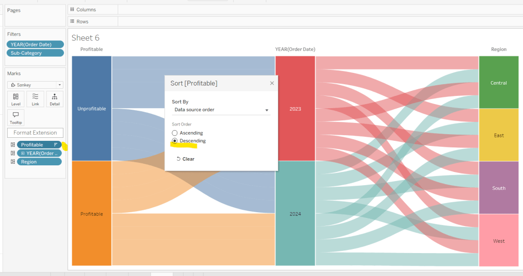
Sean based this week’s challenge on a scenario he’d faced with a client and requires the use of dynamic zone visibility (DMZ) and filter actions.
I’m going to attempt to be relatively brief for the vizzes/views that need building, as the main focus is on the dashboard itself.
Creating the Main KPIs
Connect to the data source and add a data source filter on Country/Region = United States so any data related to Canada gets excluded automatically from everything we build.
Create a new field
Profit Ratio
SUM([Profit])/SUM([Sales])
and format to % to 2 dp
On to a new sheet add Sales, Profit, Profit Ratio and Quantity onto the canvas. I just double-clicked each field and once all added used Show Me to display a Text table.

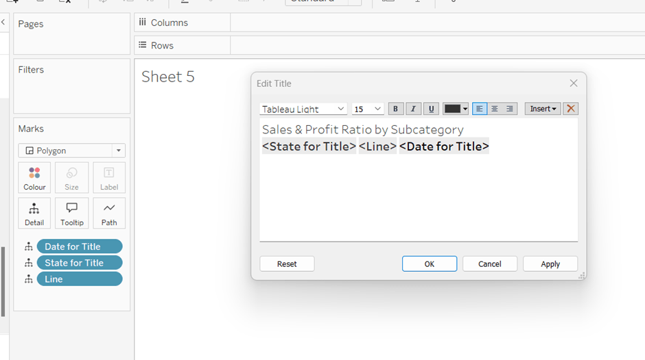
Move Measure Names to Columns and re-order the measures. Add Measure Names to Text too and modify the text so the Measure Names label is beneath Measure Values, aligned centrally and formatted as required. Set the sheet to Entire View. Format the Sales and Profit pills on this sheet to be formatted to $k to 1 dp.

The KPIs need to filter based on the state that will be selected in the map. We’re going to use a parameter to capture the state
pSelectedState
string parameter defaulted to <empty string?

And then we create
Is Selected State?
[pSelectedState]=” OR
[State/Province] = [pSelectedState]
Add this to the Filter shelf and select True.
Format the sheet to remove row/column dividers and hide the Measure Names label header (uncheck show header on the pill).
Name the sheet KPIs-Main or similar.
Creating the Customer KPIs
Although not actually working on Sean’s solution, I believe the intention of showing KPIs on the ‘customer panel’ is to give a summary based on the selected customer. So to do this simply duplicate KPIs-Main and then add Customer Name to the Filter shelf and select all customers. Name the sheet KPIs-Customer or similar.

Creating the Map
ON a new sheet, double click State/Province to automatically create a map and then add Sales to Colour. (if the map doesn’t display the US, then you may need to edit locations – Map > Edit Locations). Adjust the background of the map and remove all city/state labels (Map > Background Layers). Name the sheet Map or similar.

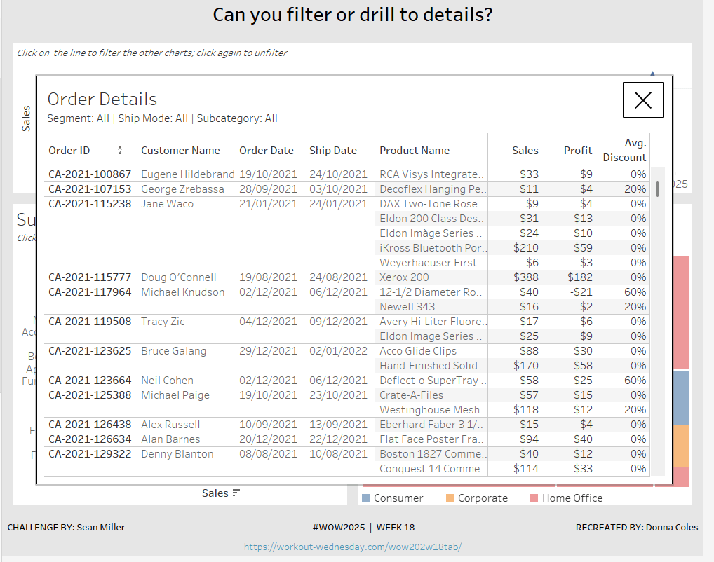
Creating the Customer Orders list
On a new sheet, add Product Name to Rows and then Sales and Quantity as a table. As Is Selected State to Filter and set to True and also add Customer Name to Filter and select all values. Ultimately on click of a state in the map, this list needs to be filtered to just the orders associated to that state , and then additionally be able to be filtered by customer name

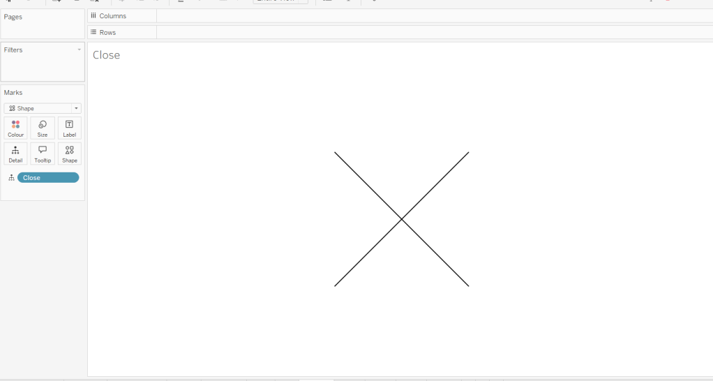
Creating the Reset Button
On a new sheet, double click into the space below the marks card and type ‘Reset’ to create a ‘dynamic’ pill. Then change the mark type to square and add this pill onto the Label shelf. Set the size to the largest possible and set the sheet to entire view. Format the label to be centred and larger. Then create a field
State-Reset
”
and add this onto the Detail shelf. This field basically contains an empty string, and we’ll use it later to ‘reset’ the pSelecedState parameter. Call the sheet Reset Button or similar.

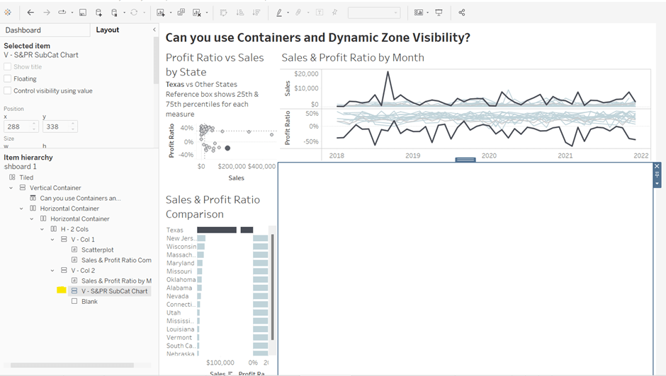
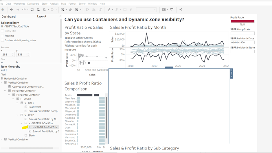
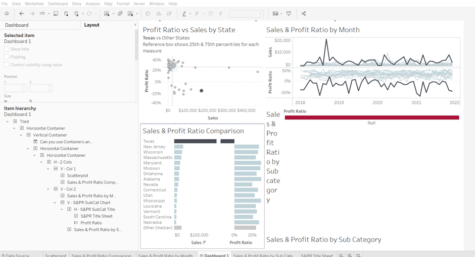
Building the dashboard & interactivity
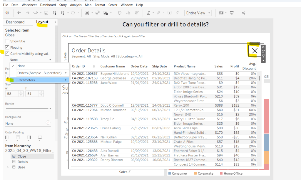
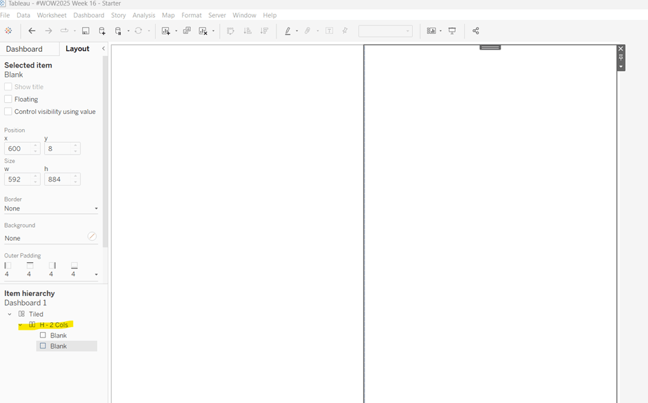
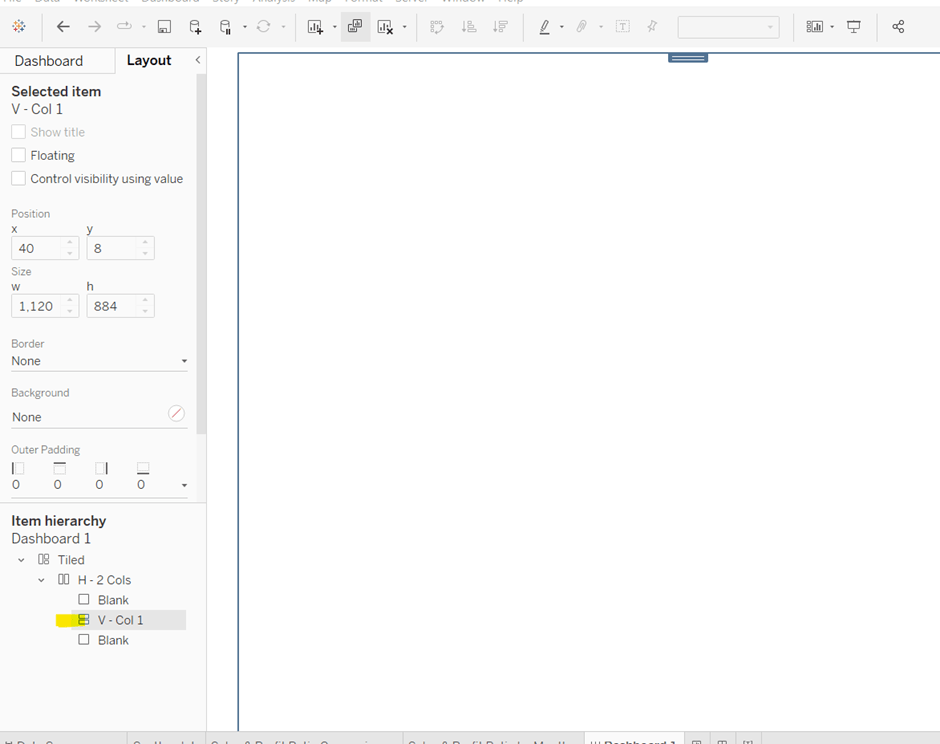
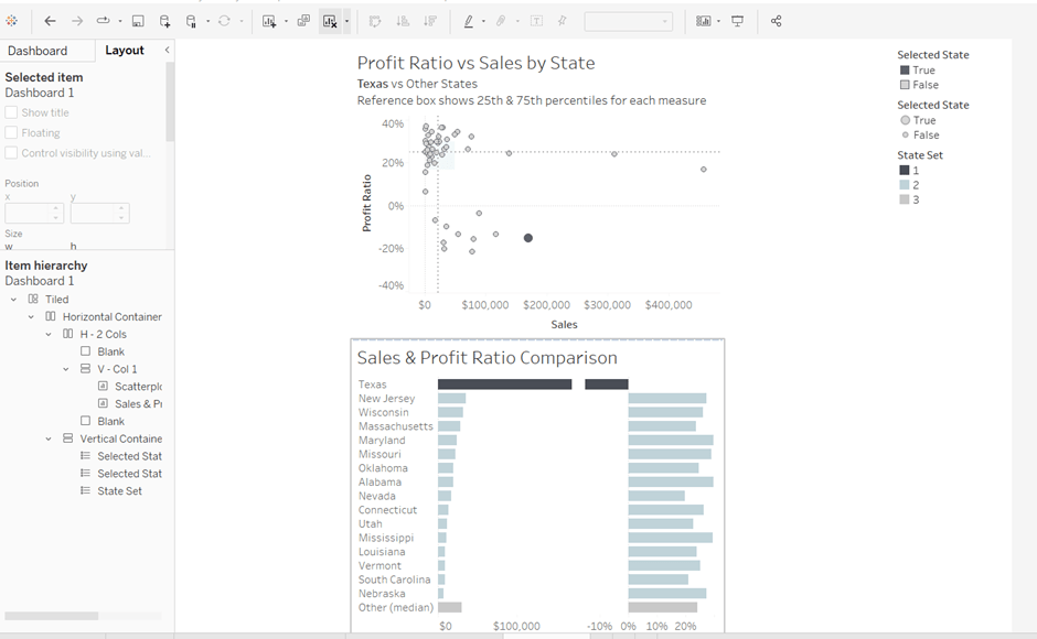
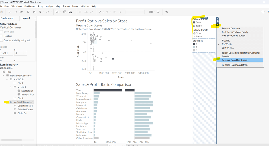
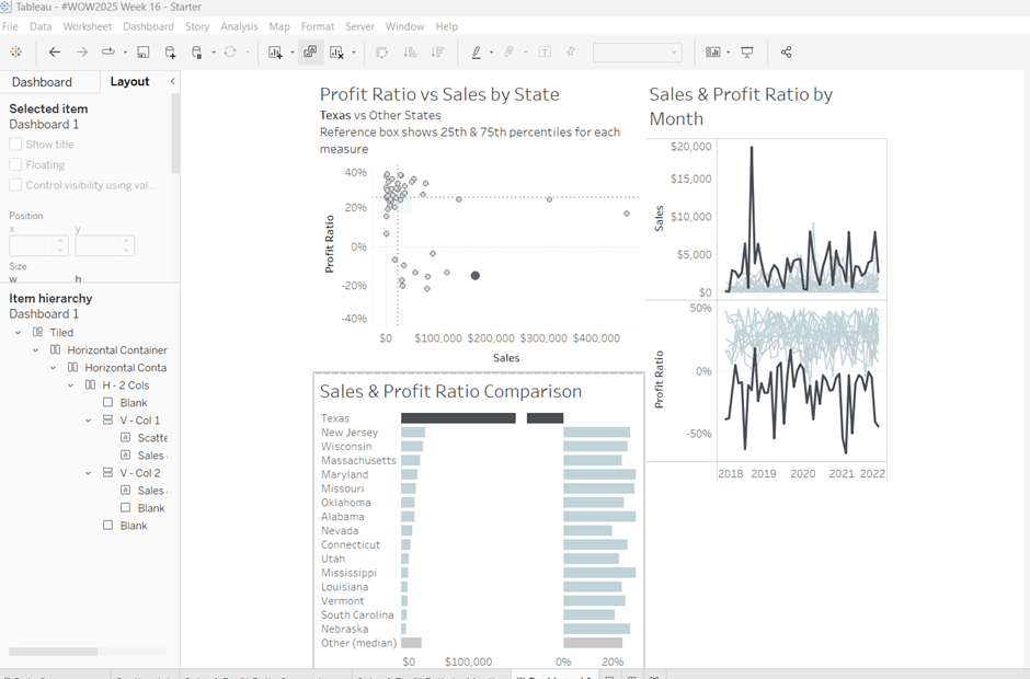
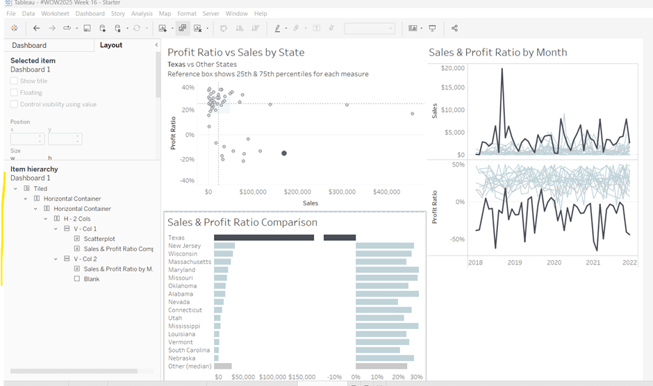
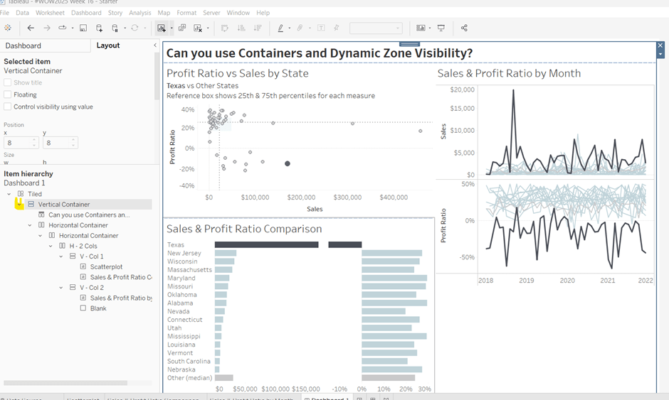
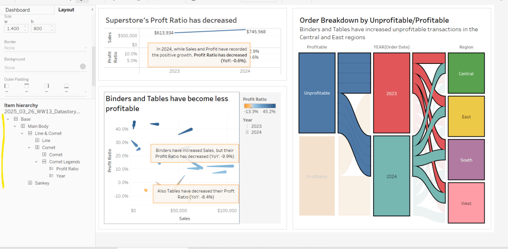
Using layout containers, build out the dashboard as required. I used a horizontal container in the middle of the dashboard which displayed the Map on the left and another Vertical Container on the right. The vertical container is the ‘customer panel’ and it then contained the Customer KPIs, and the Customer Orders sheets along with the Customer Name quick filter (set to a single value dropdown) and reset button in their own horizontal container. My hierarchy is shown below.

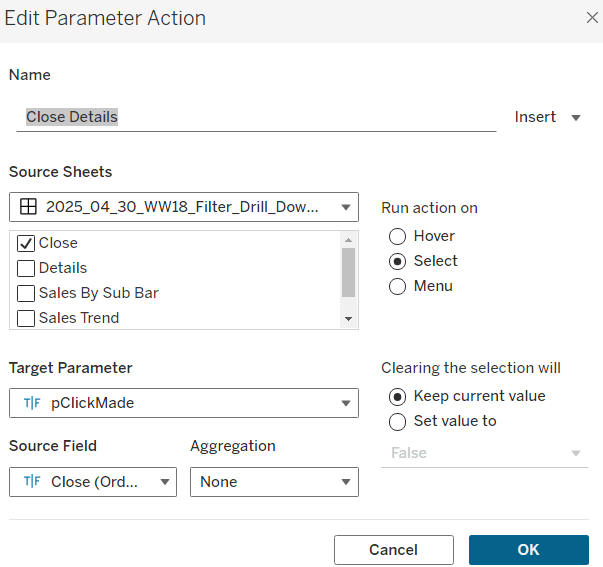
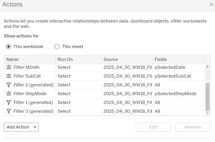
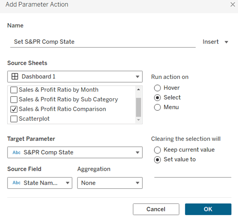
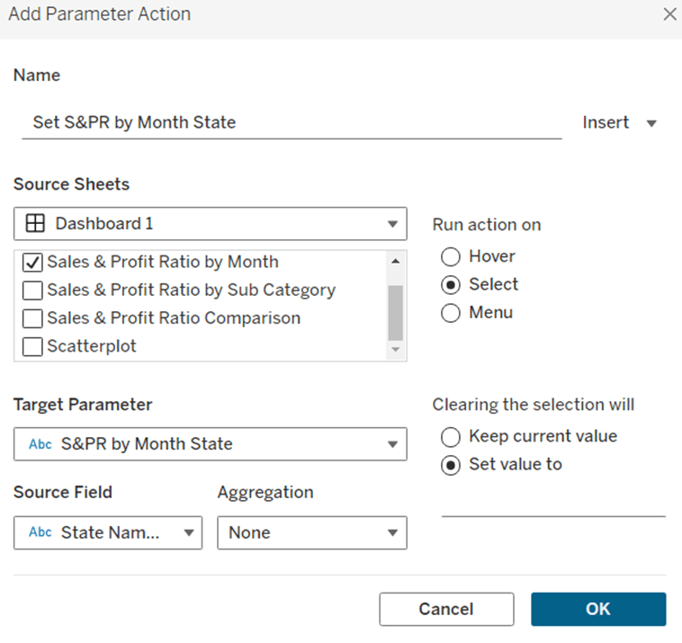
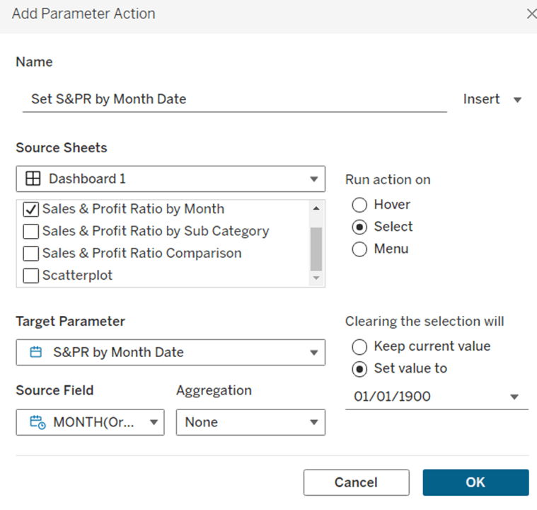
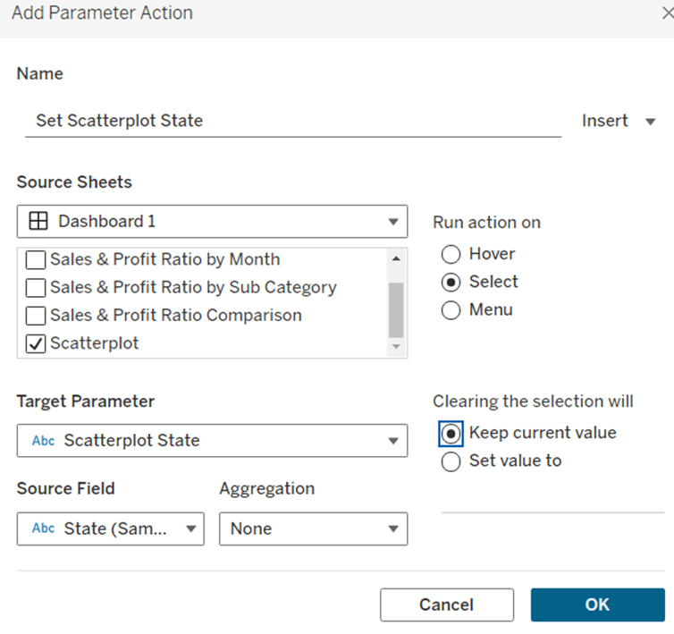
Add a dashboard parameter action to select a state
Set State
On select of the Map sheet, set the pSelectedState parameter with the value from the State/Province field. But on clearing the selected keep the current value.

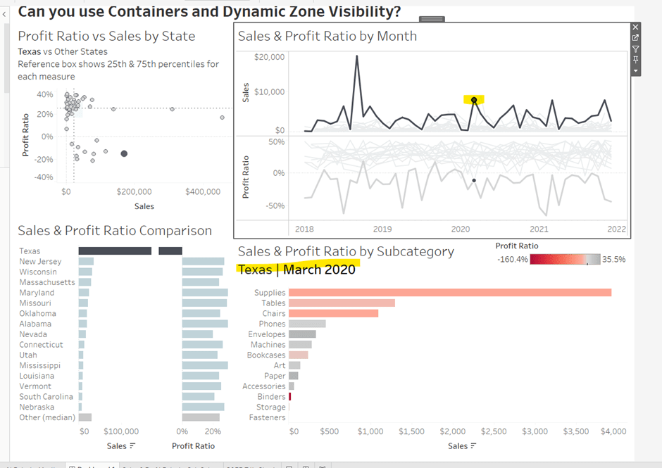
Clicking on a State will now change the KPIs and the list of customer orders

But we also want the list of customers in the filter list to be restricted to those who have orders in the state, so adjust the quick filter settings so that it is set to only relevant values Also customise the control to so the ‘all’ option is not displayed.

Test this behaviour by selecting different States and then checking the values in the Customer Name filter control.
When the Reset button is clicked, we want the State to be deselected and the KPI values all reset, so create another parameter action
Reset State
On select of the Reset Button sheet, set the pSelectedState parameter with the value from the State-Reset field

If you test this out without selecting a Customer Name filter, then the behaviour will work as expected: click a state, KPIs/Orders List and set of customers in the filter change; click reset and KPIs/Orders List and set of customers in the filter all reset .
However if after clicking a state, a customer is then selected in the filter (which filters the Orders List and the Customer KPIs)

If I then click the rest button, the customer panel now shows all the info for the selected customer

and if I now select another state, the customer filter is retained, and if that customer has no orders for the state, I don’t get what I expect

We need to be able to essentially ‘reset’ the customer filter as well when clicking the reset button.
This was the trickiest part of this challenge, and I did try a variety of other ways of displaying the customer filter to see if I could crack it, but I did observe through playing with Sean’s solution and hovering the mouse, that the Customer Name filter was a standard quick filter. Eventually, with the clue being in the challenge title, I got there.
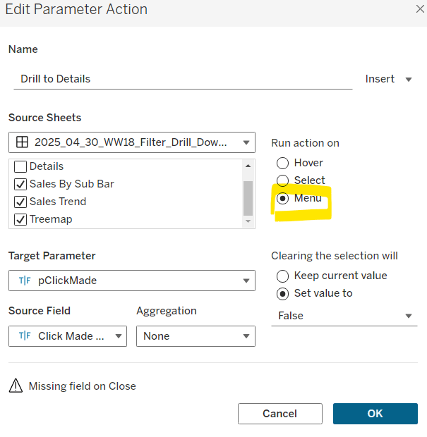
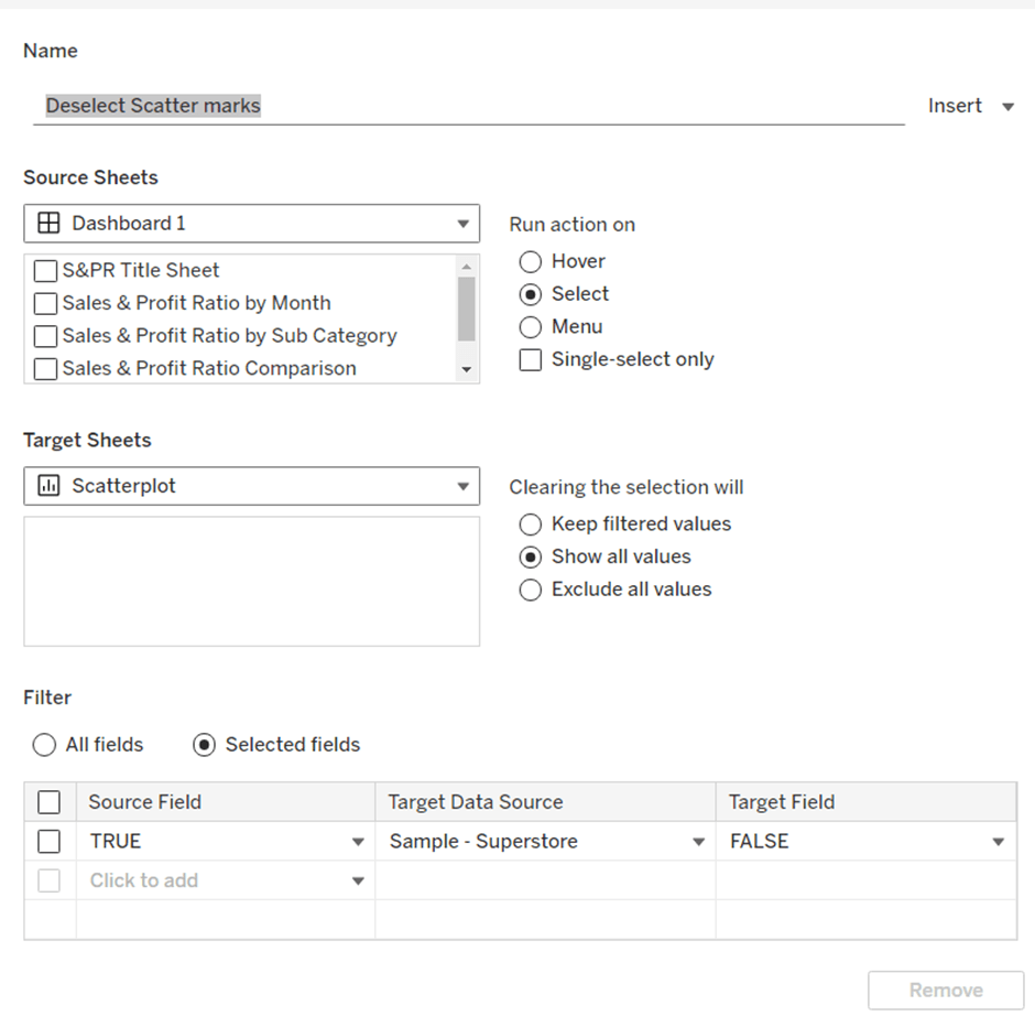
Add a dashboard filter action
Reset Customer Filter
On select of the reset button, target the Customer Orders, KPIs Customer but filter on selected fields where Customer Name = Customer Name

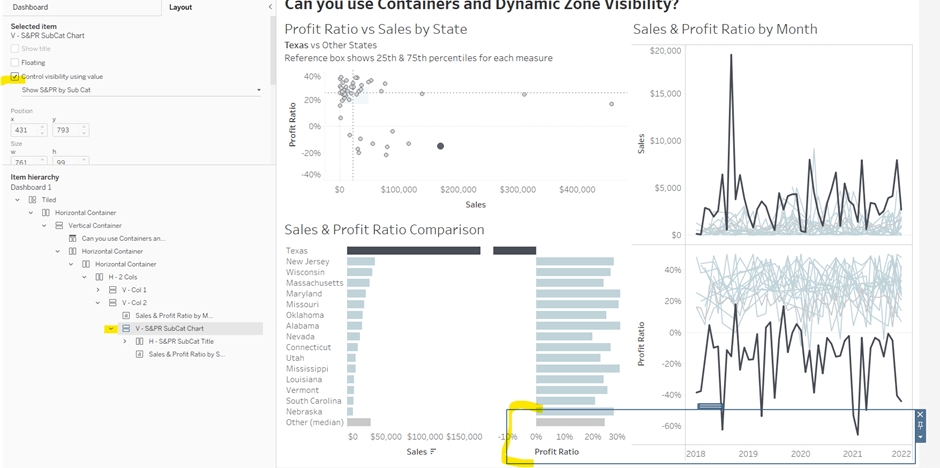
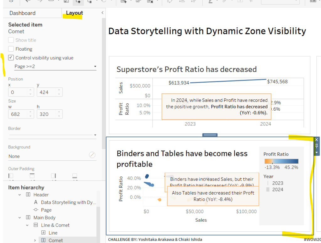
Finally we want the customer panel to only display once the map is clicked. For this, create a new field
State parameter is not empty?
[pSelectedState] <> ”
which will be true when pSelectedState contains the name of a state which happens ‘on click’ of the map. Then back on the dashboard, select the ‘customer panel’ container and on the Layout section, check the control visibility using value option and select the above field

And fingers crossed, you should now have a functioning viz. My published viz is here.
Happy vizzin’!
Donna


 Donna + DataViz