
For this week’s challenge, Sean Miller introduced multiple ways to get insight from a stacked bar chart. I managed this using 5 sheets and 1 dashboard.
Preparing the data
As the requirement stated only 2024 was to be considered, I chose to add a data source filter (right click data source -> Add Data Source Filter) where the Order Date Year = 2024.
Option 1 : The Analytics Pane
On a new sheet, add Order Date to Columns as a discrete month (blue pill) and Sales to Rows. Format Sales to $ with 0 dp. Change the mark type to bar and add Ship Mode to the Colour shelf.

Format MONTH(Order Date) to display the dates as Abbreviation. Manually move Ship Mode = Same Day in the colour legend so it is listed first. Hide the Order Date heading (right click -> hide field labels for columns).

Add a reference line (right click Sales axis -> add reference line) that sets a reference line per cell to the sum of Sales and displays the Value on the label.

Format the reference line (right click on one of the lines) and align the label top centre. Adjust the Tooltip if required. Add a white border around the bars (via the colour shelf).
Right click on the Ship Mode pill on the Colour shelf and check the Show Highlighter option to display the highlight input box. Test that selecting an option in the highlight box shows a recalculated reference line.
Name this sheet Option 1 or similar.
Option 2 – Dual Axis
Duplicate the Option 1 sheet and rename to Option 2 or similar.
We will capture the selected ship mode in a parameter.
pShipModeSelected
string parameter defaulted to empty string.

Show the parameter and then enter the text ‘First Class’
Create a new calculated field
Selected Ship Mode Sales
IF [Ship Mode] = [pShipModeSelected] THEN [Sales] END
format this to $ with 0dp.
Add Selected Ship Mode Sales to Rows. Change the mark type on the associated marks card to line and remove Ship Mode from the Colour shelf. Adjust the colour of the line to a dark grey/black and show mark labels.
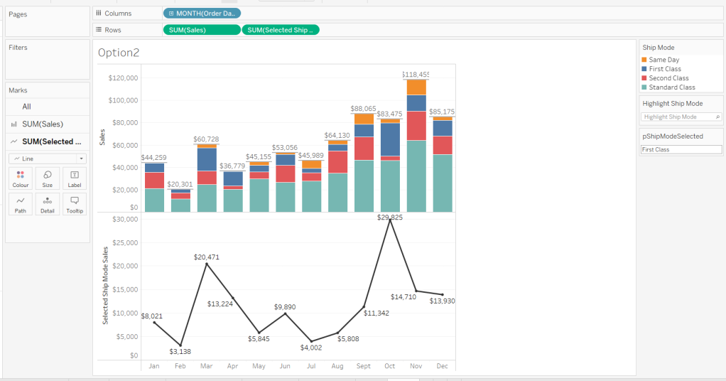
Make the chart dual axis and synchronise the axis. Hide the right hand axis (uncheck show header) and remove column and row dividers.
Change the text in the parameter to Same Day. You should now get a broken line. Right click on the Selected Ship Mode Sales pill and format. Set the marks for special values to Hide (Connect Lines).

Option 3 – Dynamic Stacks
Duplicate the Option1 sheet again and rename to Option3. Show the pShipModeSelected parameter and enter text ‘Same Day’.
Create a new calculated field
Sort
IIF([Ship Mode]=[pShipModeSelected],1,0)
and drag it into the ‘dimension’ section of the data pane (above the line).
Right click on the Ship Mode pill on the Colour shelf and select Sort.. Change the Sort By option to Field ascending and Field Name = Sort. This will push the bars related to Same Day to the bottom of the stacked bar.

Building the Ship Mode Selector
On a new sheet, add Ship Mode to Columns and then double click into Columns and manually type MIN(1). Change the mark type to bar and edit the MIN(1) axis to fix it from 0 to 1.

Add Ship Mode to Colour and to Label (you may have to widen the bars to make the label visible). Align the label middle centre and bold the font. Adjust the size to the largest possible.

Hide the axis and the Ship Mode headings (uncheck show header). Remove all column/row dividers. Hide the Tooltip from displaying. Name the sheet accordingly.

Building the Navigation selector
I chose to add all the sheets onto a single dashboard (rather than separate dashboards), so created a navigation sheet.
To help with this, I basically utilised the Segment field that wasn’t being used, and essentially translated the values to repurpose them for the navigation options.
Navigation
CASE [Segment]
WHEN ‘Consumer’ THEN ‘Option 1: The Analytics Pane’
WHEN ‘Corporate’ THEN ‘Option 2: Dual Axis’
ELSE ‘Option 3: Dynamic Stacks’
END
Add this field to Columns and type in a MIN(1) in Columns too. Change mark type to bar, fix the axis from 0-1. Make the Size as large as possible. Add Navigation to Label and align middle centre and set the font to white. Adjust the column divider to be a thick white line and remove row divider. Hide the axis and the Navigation headings.

Create a new parameter to capture the navigation selection.
pSelectedDisplay
string parameter defaulted to : Option 1: The Analytics Pane

Show the parameter. Create a new field
Is Selected Display
[Navigation] = [pSelectedDisplay]
and add to the Colour shelf. Adjust to suit. Adjust Tooltip as required and rename the sheet.

Building the Dashboard
Create a dashboard and arrange all the objects on the dashboard, with the different options placed above each other. Use containers if need be. You’ll have something like this – it’ll look a little messy but don’t worry.

We’ll be using Dynamic Zone Visibility to control which object displays based on which option from the Navigation sheet is selected.
First, let’s set the interactivity to control the navigation selection. Add a parameter action
Select Display
on select of the Navigation sheet, set the pSelectedDisplay parameter, passing in the value from the Navigation field. Keep current value when deselected.

Clicking on the different options in the Navigation control will now change the parameter value, but this won’t do anything yet. We need several calculated fields
Option 1 Selected
[pSelectedDisplay] = ‘Option 1: The Analytics Pane’
Option 2 Selected
[pSelectedDisplay] = ‘Option 2: Dual Axis’
Option 3 Selected
[pSelectedDisplay] = ‘Option 3: Dynamic Stacks’
Option 2 or 3 Selected
[pSelectedDisplay] <> ‘Option 1: The Analytics Pane’
All of these fields will return True if the condition is met, so we can use these to control which objects display.
Back on the dashboard, select the Highlight Ship Mode object, and from the Layout pane, check the Control visibility using value and choose the Option 1 Selected field.

Select the Option1 bar chart and apply the same settings.
Now select the Ship Mode Selection sheet, but this time, choose the Option 2 or 3 Selected field to control visibility. It’s likely this field will now disappear.
Select the Option2 bar chart and choose Option 2 Selected field. This will disappear.
Select the Option3 bar chart and choose Option 3 Selected field. This will disappear.
Now click on the different options in the Navigation control and the different charts should display.
(Note – I actually chose to contain the highlight selector and the option1 bar chart within their own layout container, which meant I could then just apply the setting to control visibility of the layout container rather than the individual objects).
Ensure either Option2 or 3 on the navigation bar is selected so the Ship Mode selector is displayed. Create another parameter action
Set Ship Mode
On select of the Option 2 & 3 Selector sheet, set the pShipModeSelected parameter, passing in the value from the Ship Mode field. When clearing the selection, set the value to <empty string>.

Clicking on a ship mode should now display the line or reorder the stack depending what Option you were on.
In clicking the nav or the ship mode selector, you will probably have noticed that the other options become ‘greyed out’ or ‘faded’ To stop this from happening, use a highlight dashboard action.
Create a new field, mine happened to be
True
TRUE
but it could just as easily be named anything containing any string. Add this field to the Detail shelf of the Navigation sheet and the Ship Mode Selection sheet.
Back on the dashboard create a new highlight dashboard action
Deselect Ship Mode Selector
On select of the Option 2&3 Selector sheet, target itself but using the selected field of True.

Create another highlight dashboard action apply the same principals for the Navigation sheet (for more information and worked examples on ‘deselecting marks’, see this blog.
And hopefully you should now have a working solution. My published workbook is here.
Happy vizzin’!
Donna
