Can you show the difference from selected sales?

For this week’s challenge, Lorna asked us to complete the challenge by not using LoDs or Table Calcs. Parameters and parameter actions were necessary though (originally I started without using them either, as I misread the information).

Building the core bar chart

As mentioned, we’re going to use parameters to capture the info we need. So start by creating

pSelectedSubCat

string parameter to store the name of the Sub-Category selected – default to Storage

pSelectedSales

float parameter to store the Sales value of the selected sub category. Set this to 224,645 which is the value associated to Storage and set the display format to $ with 0dp.

The plan is that when ‘No Comparison is selected, the pSelectedSubCat will contain nothing ie an empty string of ” “, and pSelectedSales will be 0.

Based on this, we need to define the value to display in the bar, which typically is the difference between the Sub-Category sales and the sales of the pSelecedSubCat (ie the value in pSelectedSales). But in the event No Comparison is selected, we just want the sales. So create

Difference

IIF([pSelectedSales]>0,SUM(Sales)-[pSelectedSales],SUM([Sales]))

is if we have a value in pSelectedSales, return the difference between the Sales value and it, otherwise just return Sales.

Set a custom number format of “$”#,##0;-“$”#,##0;””

Note the last setting after the 2nd “;” is the formatting for a 0 – in this case I’ve set it to ” ” ie nothing/<empty string>, so a value won’t get displayed against the bar of the selected Sub Category

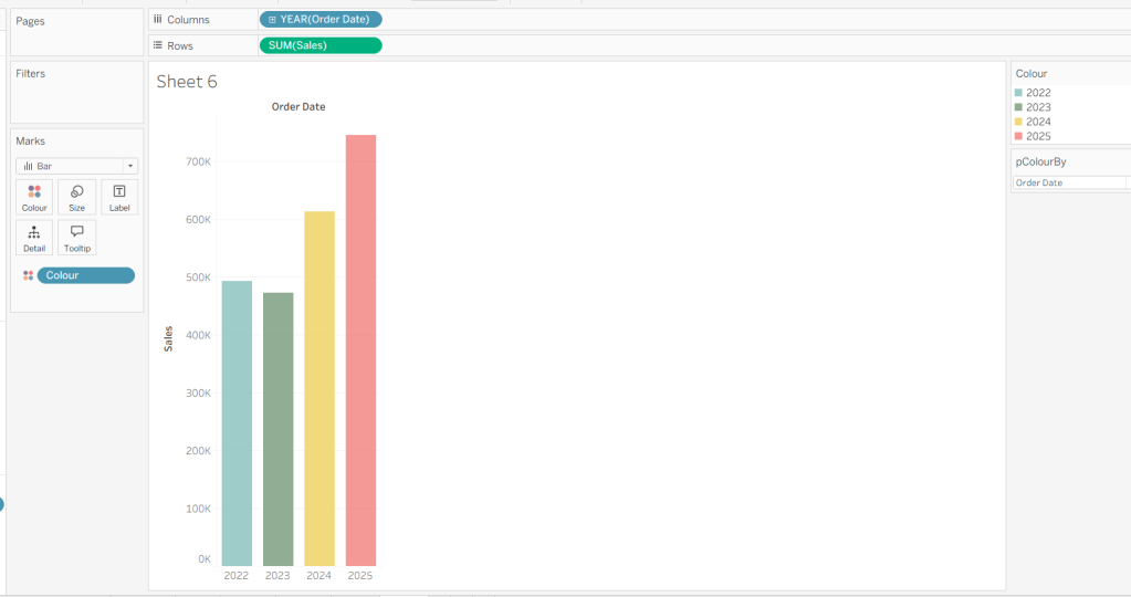
Add Sub-Category to Rows and Difference to Columns. Explicitly sort the SubCategory pill to be sorted by Sales descending

Show mark labels, and widen the bars a bit. Adjust bar colour as required. Add a column grand total, and display at the top (Analysis menu > totals > show column grand totals, then Analysis menu > totals > column totals to top)

We’ve done this as we need the additional row at the top of the chart to align with the ‘No Comparison’ option in the selector we’ll build, but we don’t want the bar to show. To get rid of it, click on the bar and then select Hide from the ‘automatic’ drop down

which gives us

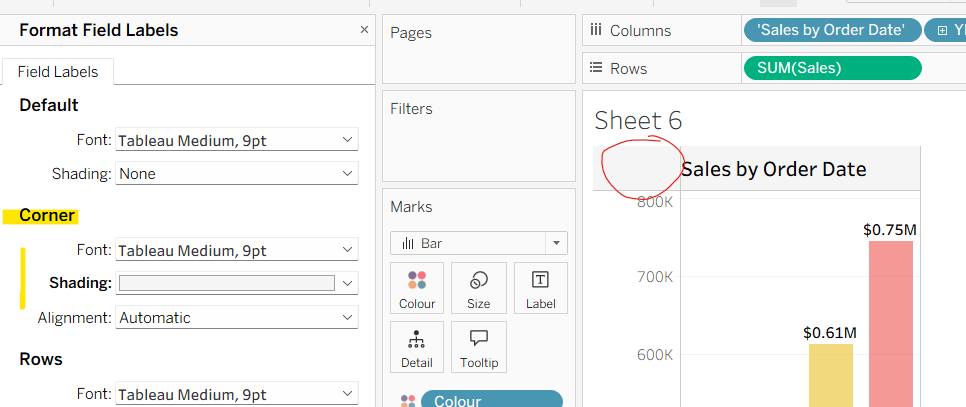
Hide the Sub-Category row heading and axis (uncheck show header from the pills). Remove all gridlines, row/column dividers and axis rulers/zero lines etc.

We’ll come back to this sheet later.

Building the selector sheet

We’re going to build this using a dual axis of a bar chart and a shape.

On a new sheet, add Sub-Category to Rows and again sort by Sales descending.

Double click into Columns and type MIN(-1.0)

Change the mark type to bar and widen each row a little. As before, add Column Grand Totals to the top.

Create a new field

LABEL: Sub Cat

IF MIN([Sub-Category])<>MAX([Sub-Category])
THEN “No Comparison” ELSE ATTR([Sub-Category])
END

If we just add Sub-Category to the label, the grand total row will show as ‘All’. The above is a sneaky way to change the word ‘All’, as in the ‘grand total’ row, all the Sub-Categories are ‘known about’, so the MIN(Sub-Category) and MAX(Sub-Category) are different.

Add this field to the Label shelf, and align left centre (the axis is -ve, so the alignment has to be to the left, even though it’s displayed on the right).

We need to be able to identify which row (including the grand total row) has been ‘selected, so create

Is Selected SubCat

ATTR([Sub-Category]) = [pSelectedSubCat] OR ([pSelectedSubCat]=” AND [LABEL: Sub Cat ] = ‘No Comparison’)

And add this to Colour, and colour the True to match the bar chart colour you chose, and Null and False to white (so it ‘disappears)

Now create a secondary axis by double clicking into Columns and type MIN(-0.9). Change the mark type to Shape. Remove Label: SubCat from the marks card. Create a duplicate of Is Selected SubCat so you have Is Selected Subcat (copy) and add this field to shape and to Colour and set the colour and shape as required

Make the chart dual axis and synchronise the axis. Hide all the axis and the row headings and remove all row/column dividers, gridlines etc.

Building the dashboard and adding the interactivity

Create a dashboard and using a horizontal layout container arrange the Selector sheet and the Bar sheet side by side, ensuring both ‘fit entire view, which will make sure the rows all align with each other.

We need to change the values of the pSelectedSubCat and pSelectedSales parameters on click of either chart. When we do this, we need to pass the relevant values into the parameter. Because we also have to handle the ‘grand total’ row, we need some additional fields for this

Sub Cat for Param

IIF([LABEL: Sub Cat ]=’No Comparison’,”,ATTR([Sub-Category]))

ie use ‘nothing if the ‘grand total’ is clicked, otherwise use the Sub-Category

similarly

Sales for Param

IIF([LABEL: Sub Cat ]=’No Comparison’,0,SUM([Sales]))

ie use 0 f the ‘grand total’ is clicked, otherwise use the Sales value of the Sub-Category

Add both these pills to the Detail shelf of the All marks card on the Selector sheet, and to the Detail shelf on the Bar sheet.

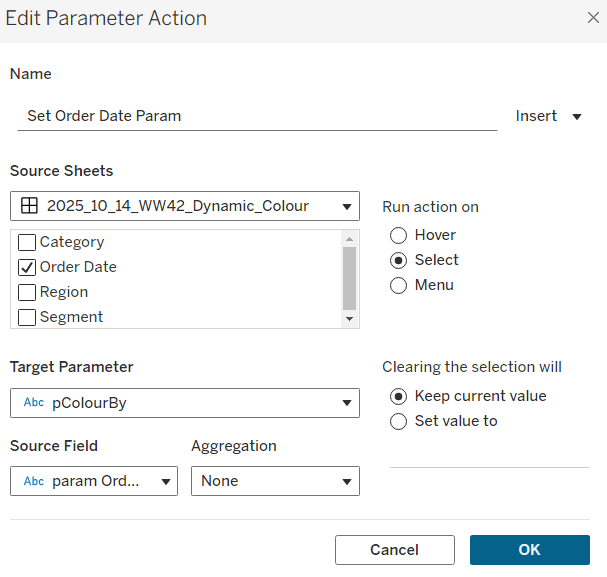
On the dashboard, create a dashboard parameter actions

Set Sales Value

On select of either sheet, set the pSelectedSales parameter, passing in the value from the Sales for Param field aggregated at the SUM level. Set to 0 when selection cleared.

Set Sub Cat

On select of either sheet, set the pSelectedSubCat parameter, passing in the value from the Sub Cat for Param field. Set to “” when selection cleared.

Finally, as we are already differentiating the ‘selection’ through different colours, we don’t want the click to ‘hihglight’ the mark. Create a new field

Dummy

“HL”

and add this to the Detail shelf on both sheets

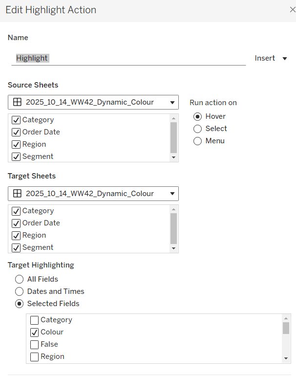
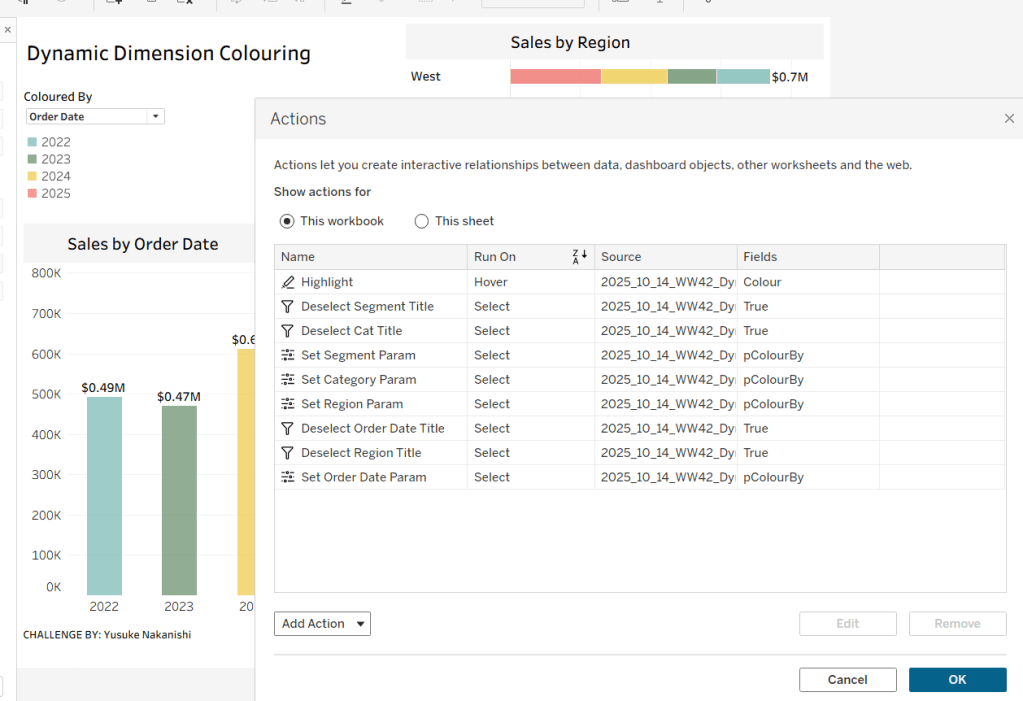
Then create a dashboard Highlight action

Highlight

On select of either sheet, target either sheet but only with the selected Dummy field.

And that in principle should give you a functioning solution. The only extension I made, as to make the Tooltips on the bar chart make sense depending on what was being viewed. This involved building up a series of Tooltip Text fields. Check out my solution if you need to see the details.

My published viz is here

Happy vizzin’!

Donna

Can you visualise and measure distance travelled?

Kyle took inspiration from the 2026 FIFA World Cup for this week’s challenge, looking at how many miles each team need to travel between their base camp and the stadiums where their group matches are being held. He sourced some data which he provided for download.

Modelling the data

The data provided contained 3 sheets. Kyle gave some hints on how he’d used the data, but nothing specific, so I just related the sheets in the following way, to see whether this would be enough.

I related Schedule to Base Camp, but BEFORE I applied the relationship join condition, I pivoted the Schedule data (as Kyle had hinted this may be required). I did this by

  • Adding Base Camp to canvas
  • Then adding Schedule to canvas
  • Then clicking on the Team A and Team B columns in Schedule, and selecting Pivot
  • The renamed Pivot Names field heading to Team A | B
  • and renamed Pivot Values field heading to Team1 (I couldn’t call it Team as this field already exists in Base Camp)
  • I then created a relationship between Base Camp.Team and Schedule.Team1

The add Venues to the canvas a relate to Schedule on the Venue field.

Creating the Map with all locations

For the maps we need to work with spatial data, and need to define the location of each base camp and each venue. The data sets had longitude and latitude fields for both types of location, but for some reason, both the longitude fields were resolving as string fields. So I had to change these to geographic fields by the following steps

  • right click Base Camp > Longitude, and change data type > number (decimal)
  • then right click field again , geographic role > latitude
  • repeat same 2 steps for the Venues > Laitude (Venues) field.

Once done create fields

Base Location

MAKEPOINT([Latitude],[Longitude])

and

Venue Location

MAKEPOINT([Latitude (Venues)],[Longitude (Venues)])

Then create

Line

MAKELINE([Base Location],[Venue Location])

and then

Distance – Base to Venue

DISTANCE([Base Location], [Venue Location],’mi’)

On a new sheet, add Venue Location to Detail, and Venue to Detail. Change the mark type to circle. Adjust the map background layers so only the Base, County/Region Names and State/Province border options are selected (Map menu > background layers)

Create a parameter to store the name of the selected team we want to focus the data for

pTeam

string parameter defaulted to ‘Austria’

Create a field

Is Selected Team?

Team = [pTeam]

Add this to Colour and Size and adjust accordingly. Make sure the ‘true’ is listed first so that the marks for the selected team are ‘on top’ . This will require the Size to ‘be reversed’

Remove all text from the Tooltip

Drag Base Location onto the display and drop it when ‘Add a Marks Layer’ option appears, which will create a 2nd marks card

Drag this card to be beneath the Venues one. Change the mark type to circle. Add Team to Detail. Add Is Selected Team to Colour and Size. Add Training Site and City to Tooltip and update accordingly.

Then click on the context menu of the Venues marks card, and disable selection

Nowt drag Line on to the canvas to make another marks layer. Again move this marks card to the bottom of the list, so it’s beneath the Base Camp marks card. Add Team to Detail and Is Selected Team to Colour. Create a copy of Is Selected Team (right click field and duplicate to create Is Selected Team (copy)) and add this to Size and adjust. I found I needed a copy so I could have different sizes between the circles and the lines Add Training Site and Distance to Tooltip and update the Tooltip accordingly. Remove row & column dividers.

Creating the ‘Team specific’ map

The easiest way I found to do this initially, was just to duplicate the sheet with the above map, and then add Is Selected Team to the Filter shelf, and set to True. This gives us the display we need, but tooltips need changing.

Re-enable the Venues marks card. We’ll need to display information about the match on the venues tooltip, wihich includes details for the teams playing.

As we initially pivoted the data, this information is now across 2 rows, so we need to create fields to capture both the teams on each row. I used FIXED LoDs for this:

Team A

{FIXED [Match]:MIN(IF [Team A | B]=’Team A’ THEN [Team_1] END)}

Team B

{FIXED [Match]:MIN(IF [Team A | B]=’Team B’ THEN [Team_1] END)}

Add these to Tooltip, along with Training Site, Date, Time (Local) and Distance. Format the Date field to “Month, Day Year” format, and custom format the Time (Local) field to h:nn AMPM. The adjust tooltip to suit.

Now do similar to the Line marks card – add Match to the Detail shelf as a blue disaggregated discrete pill, and then add Team A, Team B, Venue, Date and Time(Local) to the Tooltip and update accordingly.

Create the Bar Chart

On a new sheet, add Is Selected Team and Team to Rows and Distance to Columns. Sort descending. Order so Is Selected Team : True is listed first.

Make the rows a little wider. Add Is Selected Team to Colour. Add Team to Label. Adjust Label so the team name is aligned left and coloured in white bold text. Adjust the Tooltip. Add a Reference line to the Distance axis to show per cell the value of the sum of the distance. Don’t show line or tooltip.

Format the reference line, so the numbers are aligned in bold font, middle right

Hide the Is Selected Team, Team and Distance headers & axis (right click pill > uncheck show header). Then remove all row/column dividers and gridline, axis rulers etc.

Finally create 2 fields

True

TRUE

False

FALSE

and add these to the Detail shelf (we’ll need them later to ensure the bar doesn’t highlight when we select values).

Creating the match cards

On a new sheet, add Is Selected Team to Filter and set to true.

We need to identify which match is match 1st, 2nd and 3rd. I did this using the dates, but in hindsight could have used the Match field which just contains an unique number per match… anyway…

Match 1 Date

{FIXED [Team_1] : MIN(Date)}

Match 3 Date

{FIXED [Team_1] : MAX(Date)}

Match No for Team

IF [Date] = [Match 1 Date] THEN ‘Match 1’
ELSEIF [Date] = [Match 3 Date] THEN ‘Match 3’
ELSE ‘Match 2’
END

Add Match No for Team to Filter and set to Match 1.

Chang the mark type to shape and set to use a transparent shape (see here for more details on this). Then add Match No for Team, Match, Venue, City (Venues), Distance, Date and Time (Local) to Label. Format the date and time field as you did above.

Create a field

Opponent

IIF([Team_1]=[Team A],[Team B],[Team A])

and add this to Label too. Then adjust the label as required, and align middle left. Don’t show tooltips.

Duplicate this sheet and change the filter to select Match 2 for match 2, and then repeat for Match 3 so you have 3 separate sheets for the matches.

Creating the ‘team’ sheet

On a new sheet, add Is Selected Team to Filter and set to True. Set the mark type to shape and use a transparent shape. Add Team, Distance, Training Site and City to Label and adjust and format accordingly, aligning left middle. Don’t show tooltips.

Building the dashboard and adding the interactivity

I set the background of the dashboard to dark grey and then used layout containers to organise the content, using padding and rounded corners to style as required. The layout of my dashboard is pictured below. It will take some time to get this layout just right, and you might find that in Desktop some text doesn’t display but will when published on Public.

Add a parameter dashboard action to change the team when the bar chart is clicked on

Set Team

on select of the bar chart sheet, set the pTeam parameter with the value from the Team field.

To prevent the selected bar from being ‘highlighted’ when clicked, add a dashboard filter action

Deselect Bar

On select of the bar chart on the dashboard, target the bar chart sheet directly, setting fields true = false.

And that should be it.! My published viz is here

Happy vizzin’!

Donna

Let’s Viz Tsukurima Show!

This week’s #WOW2026 challenge was inspired by the annual viz challenge held at the Japanese TUG. It took me a bit longer than 10 minutes to build though!

I’ve built this using 3 sheets – a sheet for the section of the calendar above the displayed bar chart, the bar chart and then the section of the calendar below the bar chart.

Building the Calendar Sheets

On a new sheet, add Order Date at the month-year level to Filter and select December 2025. Then add Order Date at the Weekday level to Columns and Order Date at the Week (number) level to Rows. Additionally add Order Date at the month-year level to Columns as a discrete (blue) pill positioned first.

Create a parameter

pSelectedDate

date parameter defaulted to 10 Dec 2025

and show this parameter on the view.

Create a new field

Is Selected Date

[pSelectedDate] = [Order Date]

Change the mark type to circle then add Is Selected Date to colour. Adjust colours to suit and add a dark border to the circle. Set the sheet to entire view. Add Order Date at the Day level to Label and align middle centre.

We want the calendar to show ‘no selected date’, so will utilise 01 Jan 1900 as a ‘null’ date. We also want the calendar to only show the dates related to the week of the day selected and any previous in the month. So create

Show Top

[pSelectedDate] = #1900-01-01# OR WEEK([Order Date])<= WEEK([pSelectedDate])

and add to the Filter shelf and set to True

We also need all the days of the week to display, even if there aren’t sales on those dates. Eg, set pSelectedDate to 03/12/2025 and we lose the ‘Sunday’ column.

To resolve this, select the Show Empty Columns from the Analysis > Table Layout menu

Adjust Tooltip to suit.

Hide the Order Date column heading (right click > hide field labels for columns). Adjust the format (font size) of the other labels. Hide the WEEK(Order Date) row heading (right click, uncheck Show Header). Hide row & column dividers.

Create fields

True

TRUE

False

FALSE

and

Date for Param

IF [Order Date] = [pSelectedDate] THEN #1900-01-01# ELSE [Order Date] END

Add all these to the Detail shelf, setting the Date for Param field to be a discrete (blue) exact date.. They’ll be needed for the interactivity later.

Name this sheet Top or similar, then duplicate the sheet and change the Show Top filter to be False. Then hide the header labels (uncheck Show Header). Remove the True & False fields form the Detail shelf. Name this sheet Bottom or similar.

Building the bar chart

On a new sheet add Is Selected Date to the Filter shelf and set to True. Add Sales to Columns and Region to Colour and add Region to Label. Expand the width to make the bar wider.

Add Order Date to Tooltip and adjust Tooltip to suit. Set the background colour of the worksheet to dark grey, then format axis to have white font. Remove gridlines.

Building the dashboard

Use a vertical container, add the Top sheet and then then Bottom sheet underneath. Remove all padding from these sheets, and remove the title

Then add a horizontal container between the 2 calendar sheets. Add a text object and adjust text as required and reference the pSelectedDate parameter. Then add an image object, and select the image you hopefully downloaded from the link in the challenge page. Then add the bar chart, removing the title and setting to fit entire view.

Remove all padding for each object in this container and set the background colour of the text and image objects to the same dark grey as the bar chart.

Change the colour of the font in the text box, and I set some inner padding on the text object and the bar chart (10 pts all round) just for some extra breathing room. If need be, set the background colour of the bar chart object too.

Change the date in the pSelectedDate parameter and watch the bar chart move

Adding the interactivity

Add a dashboard parameter action

Select Date

on select of the Top or Btm sheets, set the pSelectedDate parameter by passing the value from the Date For Param field.

Also add a dashboard filter action

Unhighlight Top

On select of the Top sheet on the dashboard, target the Top sheet directly, explicitly setting the True field to False. Show all values when selection cleared.

Finally, we need to make the horizontal container disappear when no date is selected (ie the pSelectedDate parameter is set to 01 Jan 1900).

Create a new field in the data set

Is Not Null Date

[pSelectedDate] <> #1900-01-01#

then back on the dashboard, select the whole horizontal container, and from the Layout pane, check the option to control visibility using value, and select the Is Not Null Date field

When the date is 01 Jan 1900, this whole section will now disappear. You should be able to click dates now, and get the functionality as expected.

Once done, you can tidy up the dashboard by removing the container with all the filters and legends, adding a title, and adding some extra padding and background colours as required.

And that should be “Tabutta!”

My published viz is here.

Happy vizzin!

Donna

DZV & Filter Actions

Sean based this week’s challenge on a scenario he’d faced with a client and requires the use of dynamic zone visibility (DMZ) and filter actions.

I’m going to attempt to be relatively brief for the vizzes/views that need building, as the main focus is on the dashboard itself.

Creating the Main KPIs

Connect to the data source and add a data source filter on Country/Region = United States so any data related to Canada gets excluded automatically from everything we build.

Create a new field

Profit Ratio

SUM([Profit])/SUM([Sales])

and format to % to 2 dp

On to a new sheet add Sales, Profit, Profit Ratio and Quantity onto the canvas. I just double-clicked each field and once all added used Show Me to display a Text table.

Move Measure Names to Columns and re-order the measures. Add Measure Names to Text too and modify the text so the Measure Names label is beneath Measure Values, aligned centrally and formatted as required. Set the sheet to Entire View. Format the Sales and Profit pills on this sheet to be formatted to $k to 1 dp.

The KPIs need to filter based on the state that will be selected in the map. We’re going to use a parameter to capture the state

pSelectedState

string parameter defaulted to <empty string?

And then we create

Is Selected State?

[pSelectedState]=” OR
[State/Province] = [pSelectedState]

Add this to the Filter shelf and select True.

Format the sheet to remove row/column dividers and hide the Measure Names label header (uncheck show header on the pill).

Name the sheet KPIs-Main or similar.

Creating the Customer KPIs

Although not actually working on Sean’s solution, I believe the intention of showing KPIs on the ‘customer panel’ is to give a summary based on the selected customer. So to do this simply duplicate KPIs-Main and then add Customer Name to the Filter shelf and select all customers. Name the sheet KPIs-Customer or similar.

Creating the Map

ON a new sheet, double click State/Province to automatically create a map and then add Sales to Colour. (if the map doesn’t display the US, then you may need to edit locations – Map > Edit Locations). Adjust the background of the map and remove all city/state labels (Map > Background Layers). Name the sheet Map or similar.

Creating the Customer Orders list

On a new sheet, add Product Name to Rows and then Sales and Quantity as a table. As Is Selected State to Filter and set to True and also add Customer Name to Filter and select all values. Ultimately on click of a state in the map, this list needs to be filtered to just the orders associated to that state , and then additionally be able to be filtered by customer name

Creating the Reset Button

On a new sheet, double click into the space below the marks card and type ‘Reset’ to create a ‘dynamic’ pill. Then change the mark type to square and add this pill onto the Label shelf. Set the size to the largest possible and set the sheet to entire view. Format the label to be centred and larger. Then create a field

State-Reset

and add this onto the Detail shelf. This field basically contains an empty string, and we’ll use it later to ‘reset’ the pSelecedState parameter. Call the sheet Reset Button or similar.

Building the dashboard & interactivity

Using layout containers, build out the dashboard as required. I used a horizontal container in the middle of the dashboard which displayed the Map on the left and another Vertical Container on the right. The vertical container is the ‘customer panel’ and it then contained the Customer KPIs, and the Customer Orders sheets along with the Customer Name quick filter (set to a single value dropdown) and reset button in their own horizontal container. My hierarchy is shown below.

Add a dashboard parameter action to select a state

Set State

On select of the Map sheet, set the pSelectedState parameter with the value from the State/Province field. But on clearing the selected keep the current value.

Clicking on a State will now change the KPIs and the list of customer orders

But we also want the list of customers in the filter list to be restricted to those who have orders in the state, so adjust the quick filter settings so that it is set to only relevant values Also customise the control to so the ‘all’ option is not displayed.

Test this behaviour by selecting different States and then checking the values in the Customer Name filter control.

When the Reset button is clicked, we want the State to be deselected and the KPI values all reset, so create another parameter action

Reset State

On select of the Reset Button sheet, set the pSelectedState parameter with the value from the State-Reset field

If you test this out without selecting a Customer Name filter, then the behaviour will work as expected: click a state, KPIs/Orders List and set of customers in the filter change; click reset and KPIs/Orders List and set of customers in the filter all reset .

However if after clicking a state, a customer is then selected in the filter (which filters the Orders List and the Customer KPIs)

If I then click the rest button, the customer panel now shows all the info for the selected customer

and if I now select another state, the customer filter is retained, and if that customer has no orders for the state, I don’t get what I expect

We need to be able to essentially ‘reset’ the customer filter as well when clicking the reset button.

This was the trickiest part of this challenge, and I did try a variety of other ways of displaying the customer filter to see if I could crack it, but I did observe through playing with Sean’s solution and hovering the mouse, that the Customer Name filter was a standard quick filter. Eventually, with the clue being in the challenge title, I got there.

Add a dashboard filter action

Reset Customer Filter

On select of the reset button, target the Customer Orders, KPIs Customer but filter on selected fields where Customer Name = Customer Name

Finally we want the customer panel to only display once the map is clicked. For this, create a new field

State parameter is not empty?

[pSelectedState] <> ”

which will be true when pSelectedState contains the name of a state which happens ‘on click’ of the map. Then back on the dashboard, select the ‘customer panel’ container and on the Layout section, check the control visibility using value option and select the above field

And fingers crossed, you should now have a functioning viz. My published viz is here.

Happy vizzin’!

Donna

Can you account for nulls in your averages?

In this week’s challenge Yusuke wanted us to ensure filtering by date didn’t actually exclude any dimension values (so null values displayed as 0) and average calculations then accounted for those null value entries too.

Setting up the core data requirements

Yusuke provided a link to a version of Superstore which I used, since the requirements included the Manufacturer field which isn’t in the usual Excel file. I first created the hierarchy of Category > Sub-Category > Manufacturer.

Category Hierarchy

Right-click the Category field and select Hierarchy > Create Hierarchy. Name it Category Hierarchy, then drag Sub-Category and Manufacturer to be positioned under the Category field.

The display shows the number of orders, so we need

#Orders

COUNTD([Order ID])

Add Category to Rows and then expand to display Sub-Category and Manufacturer. Add #Orders to Text and add Order Date as a discrete (blue) pill at the Weekday level. This table highlights the ‘gaps’ which we need to display as 0. It also shows us how many rows of data we should always expect regardless of the date being filtered.

A standard ‘quick filter’ on date will just remove the rows that aren’t included in the filter, so we need to handle the date filtering using parameters.

pMinDate

date parameter defaulted to 11 Jul 2025

and

pMaxDate

date parameter defaulted to 23 Jul 2025

with these we create

#Orders in Date Range

ZN(COUNTD(IF [Order Date]>=[pMinDate]AND [Order Date]<=[pMaxDate]THEN [Order ID] END))

Add this into the table, and we can see we still have blank entries.

Now the trick here, which I have to admit I just couldn’t resolve until I looked at Yusuke’s solution, is to create a new field

Index

INDEX()

and add this to the Detail shelf, and all the gaps in the #Orders in Date Range measure will be replaced by 0.

Adding the average

Move the #Orders from the Measure Values section onto Tooltip.

The add column totals (Analysis menu > Show All Subtotals). Then go into the menu again and select Total All Using > Average. You’ll have totals at the Manufacturer level and the Sub-Caetgory level

Right click on the Total label in the Manufacturer column, and Format. In the left hand pane, update the Label to read Avg.

Repeat the same by formatting the Total label against the Sub-Category column.

Now format the numbers displayed by right-clicking on the #Orders in Date Range field on the Text shelf and formatting. In the left hand pane, select the Pane tab and set the format of the Numbers in the Default section to standard and the format of the Numbers in the Totals section to 2dp.

Formatting the rest of the table

Add #Orders in Date Range to Colour. Change the mark type to Square. Edit the Colour palette and select a diverging palette (eg red-blue-white diverging) but set the centre to 0 and check the include totals checkbox.

Format the table, and select the shading tab. Set the Total header to pale orage, and row banding to pale grey at band size 1.

Then select the borders option and set the default options against cell, pane and header to dark grey. Then add thicker orange borders against the totals, and remove row dividers. Add grey column dividers.

Hide the Order Date column heading (right click the Order Date label and hide field labels for columns). Right click the Order Date pill in Columns and format; set the Dates option to display abbreviation

Format the font of all columns to be the same (I used Tableau Medium, black).

We want to display a * to indicate null values, so create

Number prefix *

IIF(([#Orders in Date Range])=0,’*’,NULL)

Add to the label shelf and adjust the position of the fields on that shelf.

The create

Tooltip – 0 orders

IIF([Number Prefix ]= ‘‘, ‘* No orders found for this period’, NULL)

and add to the Tooltip shelf and adjust the Tooltip to suit. Then add Category to filter and select all options.,

Collages / expand the viz and adjust the dates to test the functionality and display.

Creating the date filter & Apply button

On a new sheet, double click in to the space below the Marks shelves and the type ‘Apply’. Move the field created from Detail to Label. Change the mark type to square, adjust the size to be as large as possible and then set the fit to entire view. Format the Apply label to be centred and larger font.

Add Order Date to the Filter shelf, select range oi dates and enter values from 11 Jul 2025 to 23 Jul 2025. Show the filter, and the add the Order Date filter to context.

Create new fields

Min Date

MIN([Order Date])

and

Max Date

MAX([Order Date])

and add both to the Detail shelf.

Create a new field

Colour

[Min Date]= [pMinDate] AND [Max Date]= [pMaxDate]

And add to the Colour shelf. Adjust the colour of the true option to pale grey. Then change the value in the Order Date filter, so the colour shows as false and adjust colour to orange. Hide the tooltip.

Finally create fields

True

TRUE

and

False

FALSE

and add both to the Detail shelf.

Building the dashboard

Use layout containers with padding to add the table viz and the apply button viz to a dashboard. Show the Category filter for the table viz, and the Order Date filter for the apply button viz. Below is how I arranged my layout containers

Create the following dashboard actions:

Set Min Date

On select of the Apply Button viz, target the pMinDate parameter passing in the value from the Min Date field.

Set Max Date

On select of the Apply Button viz, target the pMaxDate parameter passing in the value from the Max Date field.

Deselect Button

On select of the Apply Button viz on the dashboard, target the Apply Button sheet directly, selecting the fields True = False.

Finally add a floating text box to provide a key for the * indicator.

My published viz is here.

Happy vizzin’!

Donna

Can you create a dynamically zooming map?

Kyle challenged us this week with another take on zooming into maps, but this time not using spatial parameters.

Modelling the data

There are 4 sheets of data within the provided Excel workbook. The data needs to be related as follows:

  • start with free_bike_status
  • add vehicle_types and relate to free_bike_status on the Vehicle Type Id field
  • add station_info and relate to free_bike_status using a calculated field where1 =1
  • add station_status and relate to station_info on the Station Id field

Building the Core Map

We will be using map layers and spatial functions throughout this challenge. We start by defining the location of each bike and each station

Bike Location

MAKEPOINT([Lat],[Lon])

Station Location

MAKEPOINT([Lat (Station!Info)],[Lon (Station!Info)])

For the bikes, we need to know how much charge it has left

Charge %

SUM([Current Range Meters]) / SUM([Max Range Meters])

format this to % with 0 dp

Add Bike Location to a new sheet. Add Bike Id to Detail and change the mark type to circle. Add Charge % to Colour, and adjust the colour palette as required, and also edit so it is fixed to range from 0 to 1 (ie 0-100%).

Adjust the opacity of the colour to around 70% and add a pale grey border around the circles. Click on the 1 null indicator to the bottom left and select filter data to exclude that record from the display.

Select Map > Map Options from the menu and uncheck all the values to prevent the map from bing manually zoomed in/ changed. Then select Map >Background Layers from the menu, and set the Style to dark and click the Streets,Highways etc map option.

Drag Station Location onto the canvas and drop when the Add a Marks Layer option appears. Add Name the Detail shelf and Num Bikes Available to Colour. Change the mark type to square and adjust the colour palette as required and fix to range from 0 to 50.

Adjust the opacity of the colour to around 70% and add a pale grey border around the circles. Then move the stations marks card so it is listed below the bikes marks card. This means the bikes are displayed ‘on top’

Identifying the selected bike

Create 3 parameters

pSelectedBike

string parameter defaulted to <empty string>

pLat

float parameter, defaulted to 38.9358 (this is the central point mentioned in the requirements)

pLon

float parameter defaulted to -77.1069 (this is the central point mentioned in the requirements)

Note – originally I planned to just capture the ID of the selected bike then determine the lat & lon of that bike using a FIXED LOD to in turn determine the selected bike’s location, but that really hampered the performance, so I just used the parameter action to capture the required Lat & Lon directly

Show the 3 parameters on the sheet.

Update the 3 entries with a Bike Id and its associated Lat & Lon values (eg Bike Id =
8ec444bc696c2c8837ca0dcad39de819 , Lat = 38.8965 , Lon = -77.0334)

We need to identify the selected bike on the map

Is Selected Bike

[Bike Id]=[pSelectedBike]

Add this to the Size shelf on the bikes marks card. Adjust the sizes so True is listed before False and the sizes are therefore reversed. You may need to adjust the slider on the Size shelf too.

Zooming in to the selected bike

Create a new field

Selected Bike Location

MAKEPOINT([pLat],[pLon])

then create a buffer of 2000m around this (the requirements state 1000m, but I found that there were free bikes that were over 1000m from their nearest station, and if they were clicked on in the grid, the map didn’t display).

Selected Bike Buffer

BUFFER([Selected Bike Location],2000,’m’)

We want the map to ‘zoom’ into this buffer area if a bike has been selected, but show all bikes & stations so we need

Within 2000m

([pSelectedBike]=”) OR ((INTERSECTS([Bike Location],[Selected Bike Buffer])) AND (INTERSECTS([Station Location],[Selected Bike Buffer])))

Add this to the Filter shelf and select True

The map should zoom in, and the bike selected should be quite central to the display (the middle point of the buffer). To verify this, create

Buffer for Zoom

IF [pSelectedBike] <> ”
THEN [Selected Bike Buffer]
END

Add this to the map as another marks layer, and the circular buffer ‘zone’ will be displayed (we’ll keep this here for now for validation purposes).

Reset the pSelectedBike to <empty> and set pLat and pLon back to their default values – the buffer circle disappears.

Kyle hinted that we need to make sure that on ‘zooming out’ the display should be centred on the default values. To ensure this, we want to create a buffer around that central point that encapsulates all the stations and bikes. So we need

Default Location

MAKEPOINT(38.9358,-77.1069)

Default Buffer

BUFFER([Default Location],30,’km’)

Choosing a 30km buffer was just trial and error.

Now update the Buffer for Zoom field to

IF [pSelectedBike] = ” // then we’re in the default ‘show all’ view
THEN [Default Buffer]
ELSE [Selected Bike Buffer]
END

A buffer zone for the whole display is now shown

Ensure the buffer marks card is displayed at the bottom, reduce the opacity of the colour to 0 and remove any border to make the circle disappear. Then click on the eye symbol to the left of the marks card name to make the map layer disabled, so it doesn’t show up on hover.

Finally adjust the Tooltips on the relevant marks cards and then name the sheet Map or similar.

Building the Bike Selector Grid

To build this we will need to identify the closest station to each bike. First we need the distance between each bike and each station

Distance Bike to Station

DISTANCE([Bike Location], [Station Location],’m’)

and then we can create

Distance Bike to Closest Station

{FIXED [Bike Id]:MIN([Distance Bike to Station])}

On a new sheet add Bike Id to Detail and Distance Bike to Closet Station to Colour. Change the mark type to square. Sort the Bike Id by the field Distance Bike to Closet Station ascending.

Add Lat and Lon to the Detail shelf, and update the Tooltip as required. Name the sheet Bike Grid or similar.

Adding the interactivity

Add the two sheets onto a dahsboard, then create 3 dashboard parameter actions

Select Bike

On select of the Bike Grid sheet, set the pSelectedBike parameter with the value from the Bike Id field. When the selection is cleared, reset to <empty string>

Set Bike Lat

On select of the Bike Grid sheet, set the pLat parameter with the value from the Lat field. When the selection is cleared, reset to 38.9358

Set Bike Lon

On select of the Bike Grid sheet, set the pLon parameter with the value from the Lon field. When the selection is cleared, reset to -77.1069

And with that, hopefully the map should zoom in and out as required, albeit a bit slowly… (gif below recorded on Desktop)

My published viz is here.

Happy vizzin’!

Donna

Can you build a ranked heatmap tile?

Erica had a guest coach, Valerija Kirjackaja setting the challenge this week, asking us to use table calculations to build this heatmap table.

I built an initial version of the heatmap only, which I’ve published here, but I couldn’t get the display to match Valerija’s when I clicked on it. (Note – I wasn’t bothered about Viz in Tooltip part at this point). I used 2 dimensions to display the yellow header section, and you can see below, when clicking, this is noticeable. But Valerija’s solution treats the header as a single entity.

I couldn’t figure out how she’d managed this, so I had to have a look at the solution, and then I built my own instance, which is what I’ll now blog about.

Defining the core fields

Connect to the datasource and add a data source filter to restrict the data by the latest year (as I used Superstore 2025, I filtered to 2025). Doing this meant I didn’t have to worry about adding worksheet level filter fields.

On a new sheet add Category and Sub-Category to Rows and add Sales to Text and then sort descending so you can see the data we need to work with. Format Sales to be $ to 0 dp.

Create a new field

Sales by Cat Rank

RANK(SUM([Sales]))

change it to be discrete and then add to Rows. Adjust the setting of the table calculation so it is computing by Sub-Category only, so the ranking restarts for each Category

We will also need to display the Category in upper case, so create

Category Upper

UPPER([Category])

and add to Rows.

Having this tabular layout just lets us clarify how the table calculation will be working.

Building the Heatmap Table

On a new sheet, add Category to Columns and Sub-Category and Sales to Text and align centrally (Note – I originally put Category Upper on the columns, and then changed later after taking all the screen shots)

Add Sales by Cat Rank to Rows. Change it to a continuous (green) pill and edit the axis to be reversed. Adjust the table calculation so it is computing by Sub-Category only.

Create a new field

One

1

Change the mark type to gantt bar and add One to the Size shelf, setting the aggregation to Avg. Increase the size of the mark via the Size shelf to as large as possible. Add Sales to Colour then add a white border.

We need the axis numbers to be central to the ‘row’, so to fix this, double click into the Sales by Cat Rank pill and change it to subtract 0.5 ( [Sales by Cat Rank] -0.5 )

Re-edit the axis to reverse it again.

So our ‘table’ is now displaying data on a axis from 0.5 up to 9.5. To add the header, we’re going to plot another mark at -0.5, so we can display a section of the same size as the existing ones. For this, double click into Rows and type MIN(-0.5).

This has the effect of creating a second marks card

Remove Sales from Colour and Sub-Category from Label. Add Category Upper to Label. Adjust the label text alignment and formatting and change the Colour to yellow.

Make the chart dual axis and synchronise the axis and we now have the required display.

Tidy up by

  • Remove row & column dividers
  • Remove gridlines, zero lines & axis ticks
  • Hide the right hand axis (right click > uncheck show header)
  • Hide the Category Upper column labels (right click pill > uncheck show header)
  • Remove the left hand axis title
  • Fix the left hand axis from -0.5 to 9.5
  • Format the axis with a custom formatting of #,##0;-#,##0;TOTAL so that 0 is displayed as the word TOTAL (this is very sneaky by the way, and took me a while to work out)
  • Then format the font to be bold
  • Adjust the Tooltip on the Sales by Cat Rank marks card to display the Sub-Category and Sales value.
  • Delete the text from the Tooltip on the MIN(-0.5) marks card
  • Name the sheet Table or similar

Building the Viz in Tooltip

On a new sheet add Order Date to Columns at the discrete month level (blue pill) and add Sales to Rows. Add Sub-Category and Category to Detail. Format the date axis so the dates are just using First Letter.

Create a new parameter

pSubCat

string parameter defaulted to Bookcases

Then create a field

Is Selected SubCat

[Sub-Category] = [pSubCat]

and add to the Colour shelf. Adjust accordingly, then make sure True is listed first in the legend, so the line is ‘on top’

Create a new field

Label Line

IF [Is Selected SubCat] THEN [Sub-Category] END

and add to the Label shelf and update to allow marks to overlap. Hide the Order Date label heading (right click > hide field labels for columns). Title the chart Line or similar

Remove gridlines and row/column dividers

Go back to the Table sheet, and update the Tooltip of the Sales by Cat Rank marks card to reference the Line chart and update the filter to pass as just <Category>

Adding the final interactivity

Create a dashboard and add the Table sheet. Then add a parameter action

Set Sub Cat Param

On hover of the Table sheet, set the pSubCat parameter with the value from the Sub-Category field, setting the value to <empty string> when the selection is cleared.

If all has been applied, then the line chart should just display the lines associated to the Sub-Categories in the same Category

My published viz is here.

Happy vizzin’!

Donna

Dynamic Dimension Colouring

For this week’s challenge, Yusuke asked us to provide a solution to allow charts to be coloured by different dimension, but he sprinkled a few extras in just for good measure 🙂

Defining the parameter

The key driver here is going to be the use of a parameter to define the dimension we need to colour by.

pColourBy

string parameter defaulted to Order Date, listing the 4 options as below

We then need a field that uses this parameter to define the actual dimension we’ll colour by

Colour

CASE [pColourBy]
WHEN ‘Order Date’ THEN STR(YEAR([Order Date]))
WHEN ‘Region’ THEN [Region]
WHEN ‘Category’ THEN [Category]
WHEN ‘Segment’ THEN [Segment]
END

Building the Order Date chart

On a new sheet, add Order Date to Columns and Sales to Rows. Change the mark type to Bar and add Colour to the Colour shelf. Adjust the colours to suit, set the opacity to 70% and add a white border. Show the pColourBy parameter.

Change the options in the pColourBy parameter and each time readjust the colours as you wish.

Add a reference line to the Sales axis that displays the value of Total Sales per cell

Format the reference line to format the displayed number in $M and bold font, and align top middle.

Create a new field

% of Sales

IF SUM([Sales]) / TOTAL(SUM([Sales])) <> 1 THEN SUM([Sales]) / TOTAL(SUM([Sales])) END

and format to % to 1dp. This will only display a value if its not 100%.

Add this to the Label. Adjust the table calculation setting so it is computing by the Colour field only.

Adjust the Label so the font is bold and the label only appears when Highlighted. Then update the Tooltip as required.

Although not explicitly called out in the requirements, I noted that if Yusuke clicked on the chart title, it reset the dimension to colour by. To deal with this we need to create

param Order Date

‘Order Date’

Add this to the Detail shelf.

We also need to ‘fake’ the title to be part of the chart itself (so it’s clickable). Double click into the Columns and manually type ‘Sales by Order Date’ and position the pill created before Order Date.

Right click on the column label (the text in darker font) and hide field labels for columns. Then right click on the column label to format – set the font to 12pt and bold, align left and shade the background to light grey. Increase the width of the column heading.

Then right click on the corner whitespace next to the heading just created, and format. Apply a light grey shading to the corner too.

If the ‘title’ is clicked, we don’t want it to be ‘highlighted’/’selected’. For this we will need fields

True

TRUE

False

FALSE

Add both of these to the Detail shelf.

Finally tidy up by removing the axis title, adjusting the font of the axis labels (I made them a bit darker), and removing row & column dividers. Name the sheet Order Date or similar.

Building the Region chart

Duplicate the Order Date chart and then click the option in the menu to swap axis so we have a horizontal bar chart.

Move the ‘Sales by Order Date’ pill from Rows to Columns and update the text to become ‘Sales by Region’ instead. Drag the Region pill and drop it directly over the Order Date pill on the Rows so it replaces it and all references to the field are replaced too. Widen the rows.

Right click on the ‘Region’ text in the column heading and hide field labels for rows. Format the reference line to align middle right.

Create a new field

param Region

‘Region’

and add this to the Detail shelf instead of the param Order Date field. Name the sheet Region or similar

Building the Category Chart

Duplicate the Region chart, and go through similar steps described above so the ‘title’ is Sales by Category and a new field

param Category

‘Category’

replaces param Region on the Detail shelf.

Building the Segment Chart

Repeat as above, this time setting the ‘title’ to Sales by Segment and a new field

param Segment

‘Segment’

replaces param Region on the Detail shelf.

Adding the interactivity

Add the sheets to a dashboard using layout containers and padding to organise as required. Then create the following dashboard actions

Highlight Action : Highlight

On hover of any of the charts on the dashboard, target all other charts, highlighting based on the Colour field only.

This action makes all the % labels appear when the mouse cursor is moved over the bars.

Parameter Action : Set Order Date Param

On Select of the Order Date sheet, set the pColourBy parameter with the value from the param Order Date field.

Parameter Action : Set Region Param

On Select of the Region sheet, set the pColourBy parameter with the value from the param Region field.

Parameter Action : Set Category Param

On Select of the Category sheet, set the pColourBy parameter with the value from the param Category field.

Parameter Action : Set Segment Param

On Select of the Segment sheet, set the pColourBy parameter with the value from the param Segment field.

These actions change the value displayed in the pColourBy parameter when the ‘title’ of the charts is clicked on.

Filter Action: Deselect Order Date Title

On select of the Order Date sheet on the dashboard, target the Order Date worksheet directly, passing the selected values of True = False. Show all values when selection is cleared.

Filter Action: Deselect Region Title

On select of the Region sheet on the dashboard, target the Region worksheet directly, passing the selected values of True = False. Show all values when selection is cleared.

Filter Action: Deselect Category Title

On select of the Category sheet on the dashboard, target the Category worksheet directly, passing the selected values of True = False. Show all values when selection is cleared.

Filter Action: Deselect Segment Title

On select of the Segment sheet on the dashboard, target the Segment worksheet directly, passing the selected values of True = False. Show all values when selection is cleared.

And once these have all been applied, you should have a functioning dashboard. My published version is here.

Happy vizzin’!

Donna

Can you create this ‘zoom and reset’ scatter plot?

For this week’s #WOW challenge we’re focusing on parameter driven axes ranges.

Building the basic viz

After connecting to the dataset, add Sales to Columns and Profit to Rows. Add Customer Name to Detail and change the mark type to circle.

The chart is divided by reference lines which I chose to define as parameters (but these were additional to the ones mentioned in the challenge requirements).

pProfitRef

integer parameter defaulted to 0

pSalesRef

integer parameter defaulted to 5000

Add both parameters to the Detail shelf, the add a reference line on the Sales axis that refers to the pSalesRef value.

and then repeat and add a reference line to the Profit axis referencing the pProfitRef field.

To colour the 4 segments of the chart, create new fields

Sales per Customer

{FIXED [Customer Name]:SUM([Sales])}

and

Profit per Customer

{FIXED [Customer Name]: SUM([Profit])}

These capture the total sales / profit at the customer level, and we can then determine which quadrant each customer is in by

Cohort

IF [Sales per Customer]>=[pSalesRef] THEN
IF [Profit Per Customer]>=[pProfitRef] THEN ‘High Sales, High Profit’
ELSE ‘High Sales, Low Profit’
END
ELSE
IF [Profit Per Customer]>=[pProfitRef] THEN ‘Low Sales, High Profit’
ELSE ‘Low Sales, Low Profit’
END
END

Add this to the Colour shelf and adjust colours to suit. Then set the opacity to 50% and increase the size of the marks a bit.

To add matching coloured borders around the marks, add another instance of Profit to Rows. Change the mark type of the 2nd Profit marks card to Shape and change the shape to be an open circle. Set the opacity to 100%. Set the chart to dual axis and synchronise the axis.

Adjust the Tooltip and hide the right hand axis (uncheck show header).

Dynamically adjust the axis

The axes will change by adjusting them to refer to parameters. By default we need the axis to try to replicate what it gets set to automatically. For this we need to capture the maximum and minimum sales and profit values and add a ‘buffer’ to give the extra space. I played around with a few options for the buffer, so created a parameter to store this until I got the value that seemed to work best (again this was an additional parameter that I added to just help not having to change multiple calculated fields as I got the value I wanted.)

pBuffer

integer parameter defaulted to 2000

Then create 4 fields to define the max & min of the two measures +/- buffer

Min Sales + Buffer

{MIN([Sales per Customer]) – [pBuffer]}

Max Sales + Buffer

{MAX([Sales per Customer]) + [pBuffer]}

Min Profit + Buffer

{MIN([Profit Per Customer]) – [pBuffer]}

Max Profit + Buffer

{MAX([Profit Per Customer]) – [pBuffer]}

Then create 4 parameters which will define the values we ca use to set the axis

pX-Min

float parameter that is set to the Min Sales + Buffer field when workbook opens (selecting this will then populate the value)

Create further parameters

pX-Max

float parameter that is set to the Max Sales + Buffer field when workbook opens

pY-Min

float parameter that is set to the Min Profit + Buffer field when workbook opens

pY-Max

float parameter that is set to the Max Profit + Buffer field when workbook opens

Once all the parameters exist, edit the Sales Axis and change the axis to use a custom range that references the pX-Min and pX-Max parameters

Do the same for the Profit axis, but reference the pY-Min and pY-Max parameters instead.

Finally while we’re still on the workbook, create two new fields

True

TRUE

and

False

FALSE

and add these to the Detail shelf. We’ll need these later to stop marks highlighting when we click.

Name the sheet Scatter or similar.

Building the Reset button

This actually requires another sheet (even through the requirements says 1 sheet).

Create a new field

Reset Axis

‘Reset Axis’

Add this to the Text shelf of a new sheet. Change the mark type to shape and select a transparent shape (refer to this blog to understand how to create this).

Set the view to Entire View and align the font middle centre and increase the font size. Set the background of the whole worksheet to black. Adjust the tooltip. Add Min Sales + Buffer, Max Sales + Buffer, Min Profit + Buffer and Max Profit + Buffer to the Detail shelf, along with the True and False fields.

Name the sheet Reset or similar

Adding the interactivity

Add the Scatter and Reset sheets to a dashboard, removing any parameters/legends etc that get added. Create dashboard parameter actions to set the axis parameters when selections are made on the scatter plot:

Set X Max

On select of the Scatter sheet, set the pX-Max parameter, passing in the maximum value of the Sales field.

Set X Min

On select of the Scatter sheet, set the pX-Min parameter, passing in the minimum value of the Sales field.

Set Y Min

On select of the Scatter sheet, set the pY-Min parameter, passing in the minimum value of the Profit field.

Set Y Max

On select of the Scatter sheet, set the pY-Max parameter, passing in the maximum value of the Profit field.

Also create dashboard parameter actions to ‘reset’ the axis parameters when the Reset button is clicked:

Reset X Min

On select of the Reset sheet, set the pX-Min parameter, passing in the minimum value of the Min Sales + Buffer field.

Reset X Max

On select of the Reset sheet, set the pX-Max parameter, passing in the maximum value of the Max Sales + Buffer field.

Reset Y Min

On select of the Reset sheet, set the pY-Min parameter, passing in the minimum value of the Min Profit + Buffer field.

Reset Y Max

On select of the Reset sheet, set the pY-Max parameter, passing in the maximum value of the Max Profit + Buffer field.

All these 8 actions should now combine to drive the ‘zoom & reset’ functionality.

Finally, the last step to make the display ‘nicer’ is to deselect the marks from being highlighted when selected. Add a dashboard filter action

Deselect Scatter

on select of the scatter object on the dashboard, target the scatter sheet directly, passing the selected fields of True = False. Show all values when the selection is cleared.

Repeat an create a similar action for Deselect Reset.

And that should be it. My published viz is here.

Happy vizzin’!

Donna

Can you highlight a treemap?

This week, Sean decided to revisit a challenge from 2017, week 12, which was originally posted by Emma Whyte, one of the #WorkoutWednesday founding coaches.

I’ve been completing the #WOW challenges since their inception, so had the original solution already published to my Tableau Public.

Back then, parameter actions didn’t exist, so I decided to build this latest version using them instead of the parameter dropdown list included in the original requirement.

Building the basic viz

Create a new parameter to capture the Sub-Category we want to highlight

pSubCat

string parameter defaulted to ‘Bookcases’.

(NOTE – if I wanted to use a drop down for the user selection, I would instead have set this parameter to be a list populated from the Sub-Category field when the workbook opens).

I can’t always recall quickly the positioning of all the fields I need to build a treemap, so I started by simply double clicking the fields I needed in turn : Category, Sub-Category, Sales to add them onto the canvas, and then selecting the TreeMap icon in the Show Me tab to reposition the fields as required.

Then move the Category field from Text to Detail.

Colouring the blocks

The requirement is to show the selected Sub-Category in one colour, but also show a graduated colour palette for the non selected Sub-Categories.

First, let’s identify the selected Sub-Category.

Show the pSubCat parameter on the canvas. Then create

Is Selected Sub Cat

[Sub-Category] = [pSubCat]

Change the Sales pill on the Colour shelf from continuous (green) to discrete (blue). This will result in a rainbow of colours

Then add Is Selected Sub Cat to the Detail shelf. Then click on the icon next to the pill that indicates it’s on the detail shelf, and change it to Colour, so 2 fields are now on the Colour shelf.

Move the Is Selected Sub Cat field on the colour shelf so it is listed above the Sales field on the colour shelf. The selected sub-Category should now be highlighted, and the other blocks are graduated.

However, the highlighted sub-category is ‘separated’ from the Category block it belongs in. To resolve this, change the Is Selected Sub Cat field on the colour shelf so it is an Attribute. By setting this, the treemap is now only dividing itself by the Dimension fields of Category and Sub-Category.

Format the Sales field to $ with 0dp, and update the Tooltip as required.

Create the sheet title

Create a new fields

Selected Sales

{FIXED:SUM(IF [Is Selected Sub Cat] THEN [Sales] END)}

format to $ with 0dp and add to the Detail shelf.

Update the title of the sheet to reference the pSubCat parameter and the Selected Sales field and format as desired.

Add the interactivity

Add the sheet to a dashboard ,then add a dashboard parameter action

Set Sub Cat

On select of the treemap sheet on the dashboard, set the pSubCat parameter, passing in the value from the Sub-Category field. When the selection is cleared, keep the current value

However, when the treemap is clicked, the selected block gets ‘highlighted’ and the rest fade. To prevent this, create a new field

HL

‘dummy’

and add to the Detail shelf of the Treemap sheet. Then create a new dashboard Highlight action

Deselect

On select of the Treemap sheet on the dashboard , target the same sheet with the HL field only

As all marks have this HL value set, this has the effect of actually highlighting all marks ‘on click’ rather than just the actual one clicked, so making it look like nothing is actually highlighted.

And that should be it. My published viz is here.

Happy vizzin’!

Donna