Competitor Comparison

Erica set this week’s challenge, focusing on the ability to compare specific entities against themselves and ‘the whole’ without resulting in a mess of coloured spaghetti. 3 levels of difficulty were provided. As it stated the levels didn’t necessarily follow on from each, I just built (and am therefore blogging about) level 3 – the advanced challenge.

Defining the core parameters

For the user to select the main element they want to analyse we need

pPrimarySubCat

string parameter, that is sourced from a List based on the Sub-Category field when the workbook opens. Default to Binders.
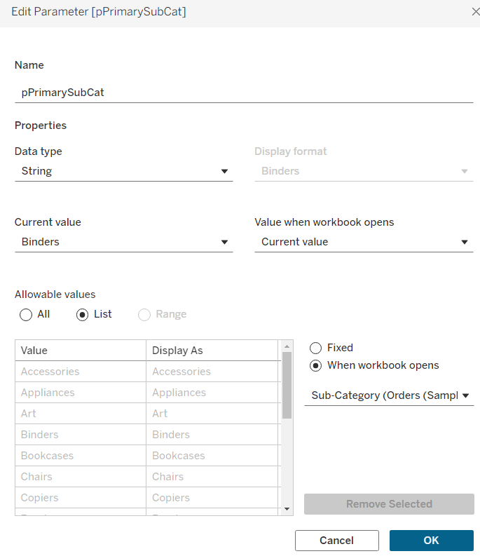
This parameter will be visible to the user to select from a drop down list control.

To capture the secondary element to compare against, we need

pSecondarySubCat

string parameter defaulted to Bookcases.
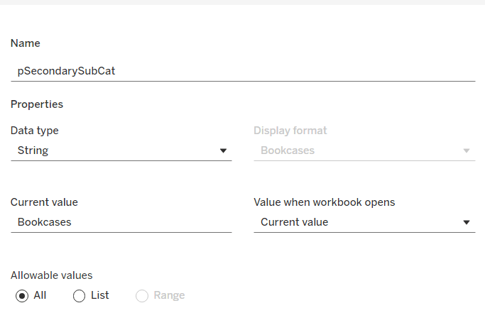
This is just a ‘type in’ field, that won’t ultimately be displayed to the user, but populated via a dashboard parameter action on select of a line in the chart.

To control the different type of display options, we need

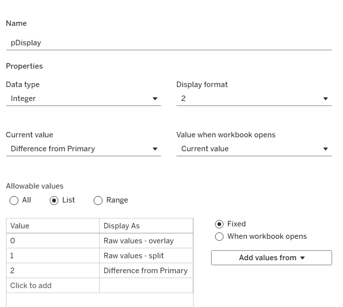
pDisplay

integer parameter sourced from a manual list which aliases the integer values for the displayed text strings. Defaulted to 2 (Difference from Primary)
Defining the additional calculations

As I often do, we’ll build out a tabular display to determine all the calcs required. On a new sheet, add Region and Sub-Category to Rows, then add Order Date at the Quarter level as a discrete (blue) pill to Columns. Add Sales to Text. Show the 3 parameters created above.
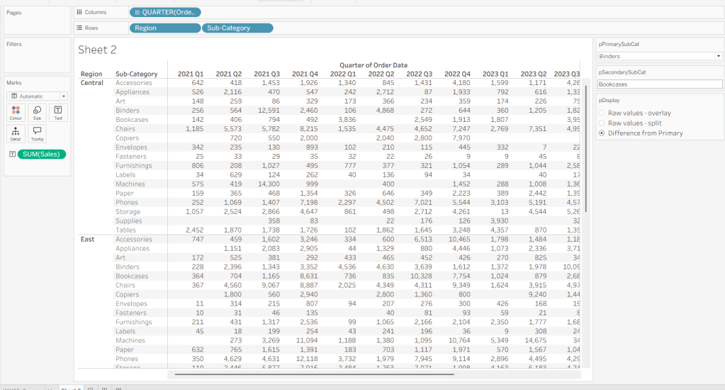
We need to identify which Sub-Categories will be coloured. This is based on whether they are a primary or secondary Sub-Category.

Is Primary or Secondary Sub Cat

[pPrimarySubCat] = [Sub-Category] OR [pSecondarySubCat] = [Sub-Category]

Add this to Rows. Based on existing selections, the rows for Binders and Bookcases should be set to True.

We will also need to identify which is the the Primary Sub-Category only to help determine how many rows are displayed, so create

Is Primary SubCat?

[pPrimarySubCat] = [Sub-Category]

Add to rows. In this case just Binders should be True at this point.
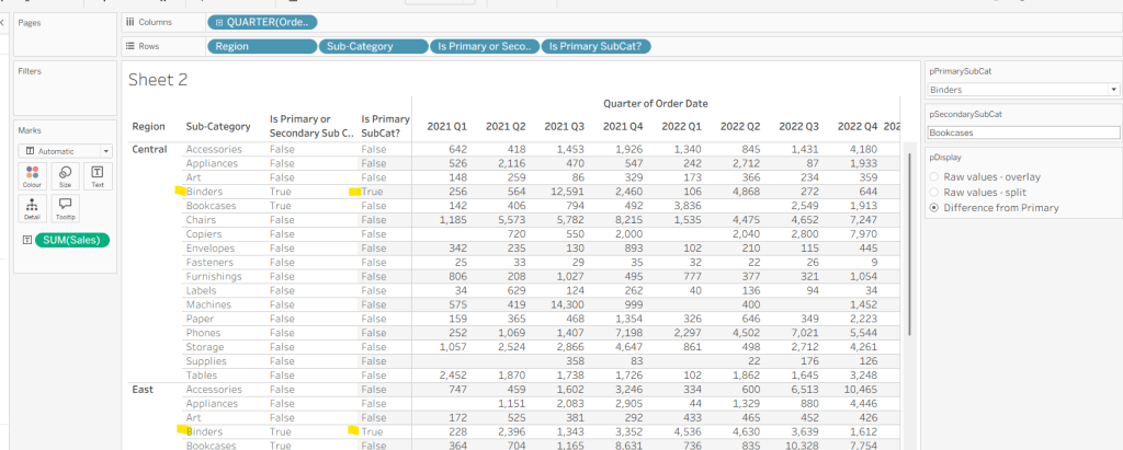
With this field, we can then work out how many ‘rows’ are going to be in our final viz display.

Display Row

IIF([pDisplay] = 0, TRUE, [Is Primary SubCat?])

ie, if the pDisplay parameter is ‘Raw values – overlay’ , then we’ll just display 1 row (so all rows set to True), otherwise there will be 2 rows, split based on whether the Sub-Category is the selected value in the pPrimarySubCat parameter or not.

Add this to Rows, and change the pDisplay parameter to see how this field changes.
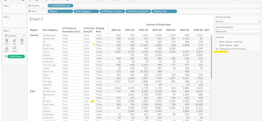
We also need to display different values depending on what pDisplay option is selected. When the ‘Difference from Primary’ option is selected, then we need to show the Sales value for the primary Sub Category, but the difference from this value for all others. For this we first need to capture just the sales for the primary Sub-Category

Sales For Primary Sub Cat

IF [Is Primary SubCat?] THEN [Sales] END

Add to the table and adjust Measure Names so it is displayed after the Order Date field. Rows for this column will only have values when the Sub-Category is the primary one selected.
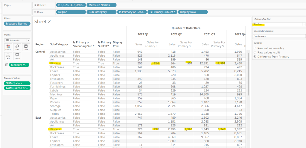
Now we calculate the difference, but only if it’s not the primary Sub-Category; we want Sales in that instance

Sales Difference

IF MIN([Is Primary SubCat?]) THEN SUM([Sales])
ELSE SUM([Sales]) – WINDOW_MAX(SUM([Sales For Primary Sub Cat]))
END

Here we’re using a WINDOW_MAX table calc to essentially ‘spread’ the value in the Sales for Primary Sub Cat column across all rows associated to the Region. Add this to the table, and adjust the table calculation setting of the pill, so it is computing by all fields except Region and Order Date
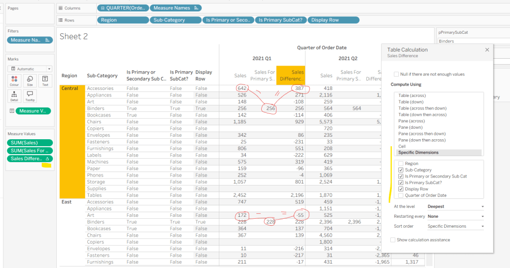
Finally, we need a field that will decide whether we’re displaying Sales or Sales Difference based on the pDisplay selection

Value to Display

IIF([pDisplay]=2, [Sales Difference ], SUM([Sales]))

Again, add to the table, adjust the table calc as above and then test the output of the field, as you adjust the pDisplay parameter.
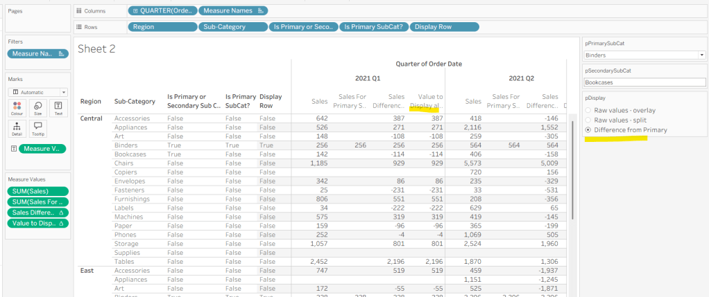
While we’re here, we’ll just define another couple of calcs needed for the viz

Label Sub Cat

IF [Is Primary or Secondary Sub Cat] THEN [Sub-Category] END

Used to only display a label for either of the two selected Sub-Categories.

Tooltip – Value Label

IIF([pDisplay]=2 AND NOT([Is Primary SubCat?]), “Difference from ” + [pPrimarySubCat] + ” Sales”, “Sales”)

Will be used on the Tooltip to ensure the correct text is displayed depending on type of display selected.

Building the Viz

On a new sheet, show the 3 parameters and set them to the defaults (ie Binders, Bookcases and Difference from Primary).

Add Region to Columns, then add Order Date at the Quarter level as a continuous (green) pill to Columns. Add Display Row to Rows and adjust the Sort on the pill to be a manual sort, where True is listed first. Add Sub-Category to Detail, then add Value to Display to Rows and adjust the table calc so all fields except from Region and Order Date are selected.
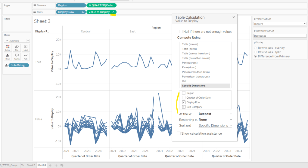
Add Is Primary or Secondary Sub Cat to Colour. Some lines will disappear, but don’t worry. Then add Region to Detail, and then select the ‘detail’ icon to the left of the pill on the marks shelf, and change it to Colour so 2 pills are now on the Colour shelf. Adjust the table calculation setting of the Value to Display pill to ensure the Is Primary or Secondary Sub Cat field is also now checked – this should make all the lines reappear.

Then adjust the colours in the colour legend so all the entries that start ‘False’ are grey and the others are as required.
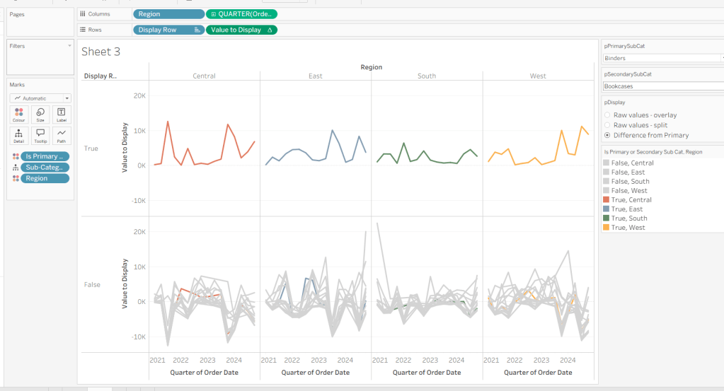
Adjust the sort on the Is Primary or Secondary Sub Cat pill on the marks card, so it is manually sorted with True first. This ensures the coloured lines are ‘on top’ and always visible. Add Is Primary SubCat? to Size shelf. Readjust the table calc on Value to Display again, and then adjust the Size so it is visibly thicker than the rest of the lines, which will probably be by adjusting both the range in the Size legend, and adjusting the slider on the Size shelf.
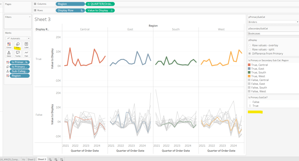
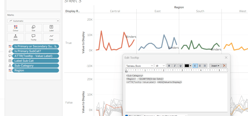
Add Label Sub Cat to the Label shelf (adjust table calc again), and set label to allow labels to overlap other marks. Add Tooltip – Value Label to tooltip and update the Tooltip as required
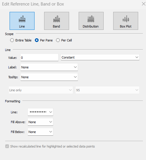
Add a reference line to the Value to Display axis, and set to be a constant of 0 displayed as a black dashed line
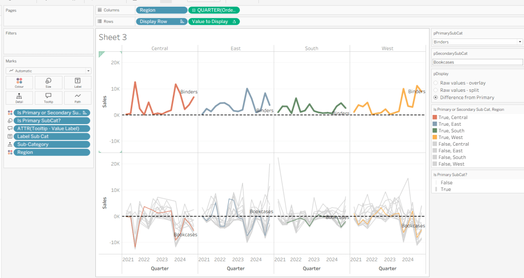
Edit both axis to update the axis titles on each, hide the Display Row pill (uncheck show header on the pill) and hide the Region column label (right click > hide field labels for columns).
Building the dashboard

Use layout containers to construct the dashboard as required

Create a dashboard parameter action to capture the value of the secondary Sub-Category

Set Second Sub Cat

On select of the Viz, set the pSecondarySubCat parameter with the value sourced from the Sub-Category field. When selection is cleared, set it <none>
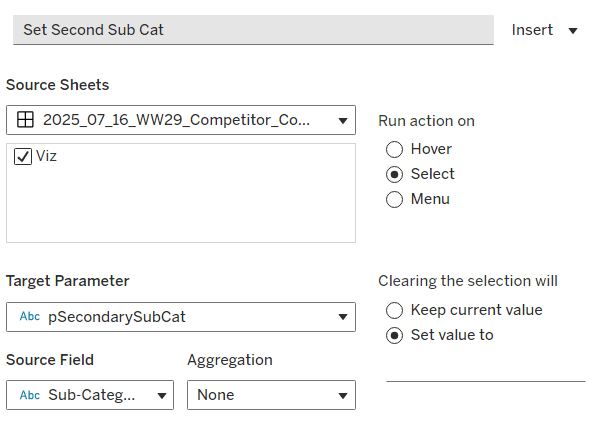
Clicking one of the grey lines should now change the comparison Sub-Category. But you’ll notice the rest of the unselected lines are ‘faded’ and your selection is ‘highlighted’. We don’t want this to happen. To resolve, create new calculated field

HL

‘Dummy’

and add to the Detail shelf on the viz sheet itself.

Then add a dashboard highlight action

Un-Highlight

On selection of the Viz sheet on the dashboard, target the viz sheet on the dashboard, selecting the HL field only.

As all the marks have the HL ‘dummy’ field associated to them, they all become ‘highlighted’, giving the appearance of nothing actually being highlighted.

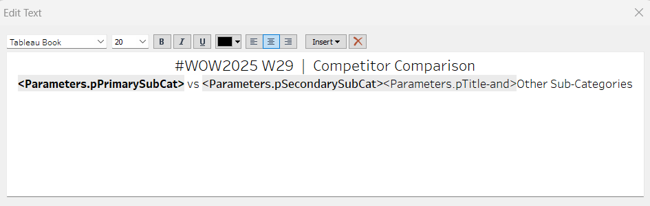
Finally, we need to make the title of the dashboard ‘dynamic’ and reflective of the selections made in the primary and secondary Sub-Category parameters. But the secondary one can be empty, so the text needs to handle this. An additional ‘ and ‘ needs to display if the secondary Sub-Category is set. I chose to use a parameter to help with this, as text objects on a dashboard can reference parameters.

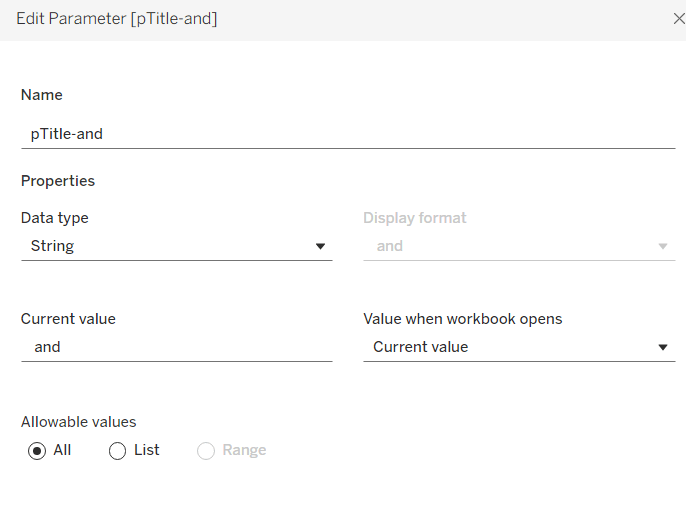
Create a new parameter

pTitle-and

string field defaulted to the text <space>and<space>
Create a calculated field

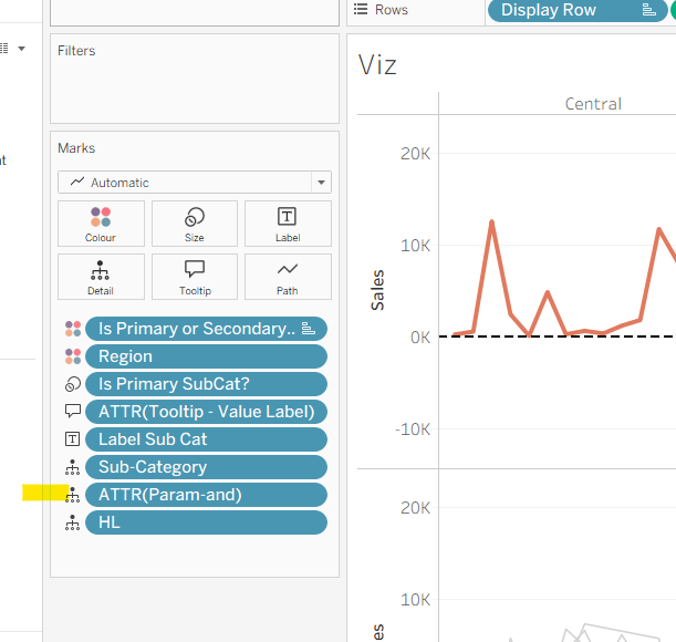
Param-and

‘ and ‘

and add to the Detail shelf on the viz. Set it to be an attribute (this won’t impact the table calc).
Back on the dashboard, create another dashboard parameter action

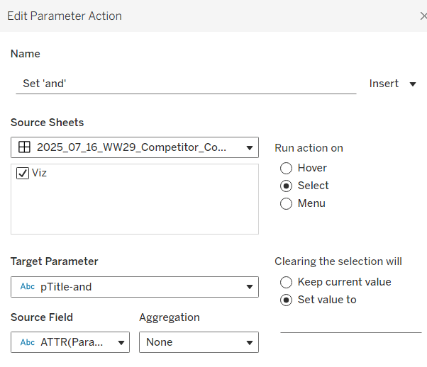
Set ‘and’

on select of the Viz, set the pTitle-and parameter passing in the value from the Param-and field. When the selection is cleared, set to <none>.
Then create (or adjust) the title text object so it references the relevant parameters (notice the spacing – or lack of – between some of the fields)
And that should be it. My published viz is here.

Happy vizzin’!

Donna

Can you use Dynamic Colour Ranges?

Yusuke set the challenge this week which allowed us to try out a new feature of Tableau – Dynamic Colour Ranges. As a consequence, you’ll need v2025.2 for this.

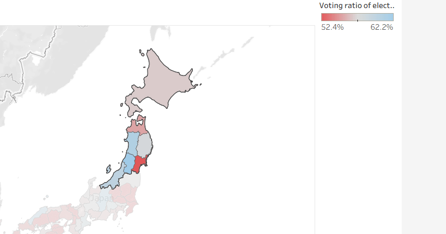
Setting up the Data for use in a Map

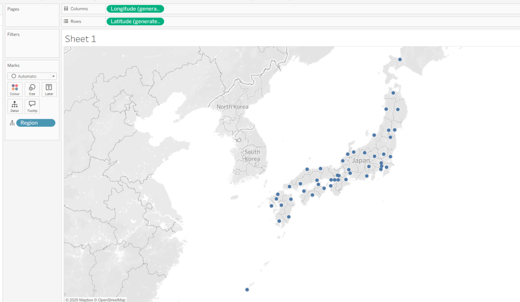
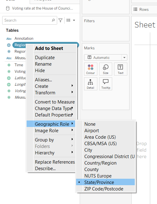
After connecting to the CSV file provided by Yusuke, I had to set the Region field to have a Geographic Role of State/Province

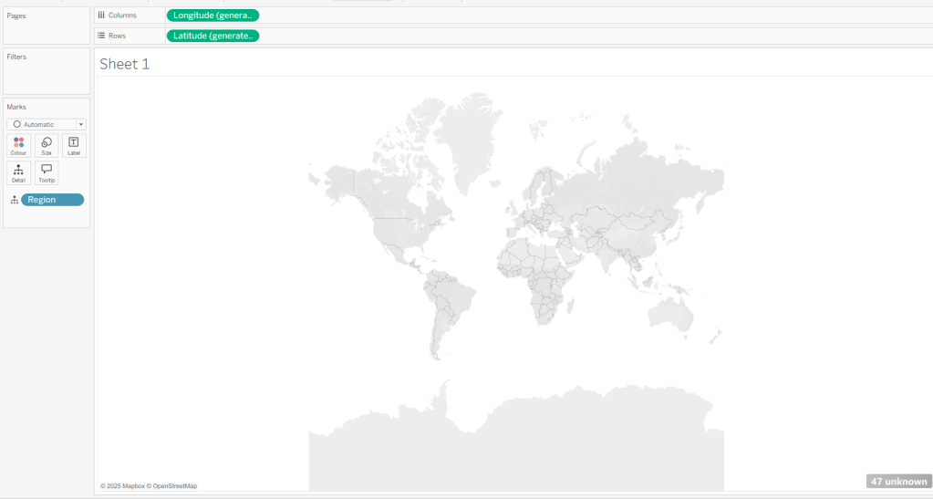
I then double-clicked on Region to generate the map, but due to my location settings, no information displayed.

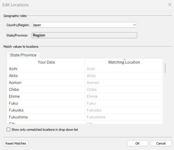
To resolve this, Edit Locations (via Map menu) and change Country/Region to Japan.

The Your Data – Matching Location fields should then match, and pressing OK presents a map.

Building the Basic Viz

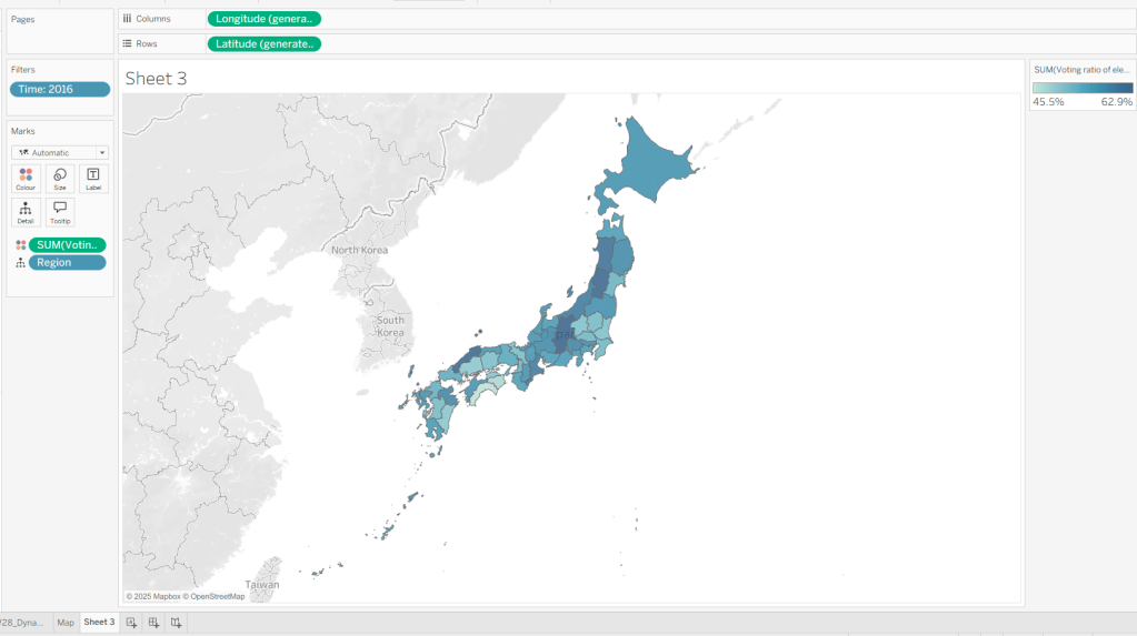
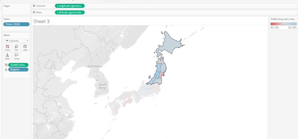
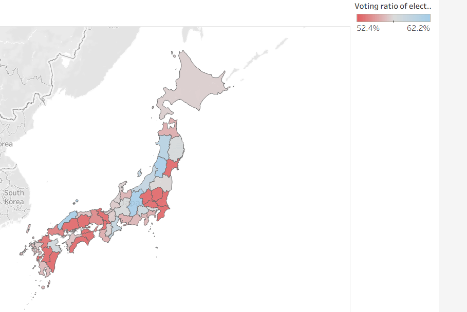
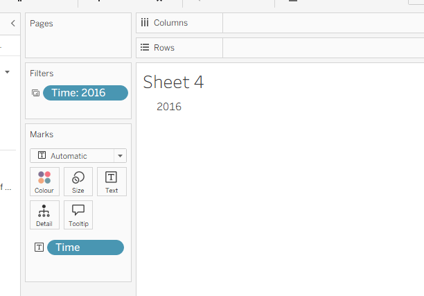
Move Time from the ‘Measures’ section of the Data pane into the ‘Dimension’ section (drag it to be above the line). Format the Time field to be a custom number with 0 dp and to not show ‘,’ as a thousand separator. Then add Time to Filter and select 2016. Add Voting Ratio of election… to Colour. Adjust the Tooltip.

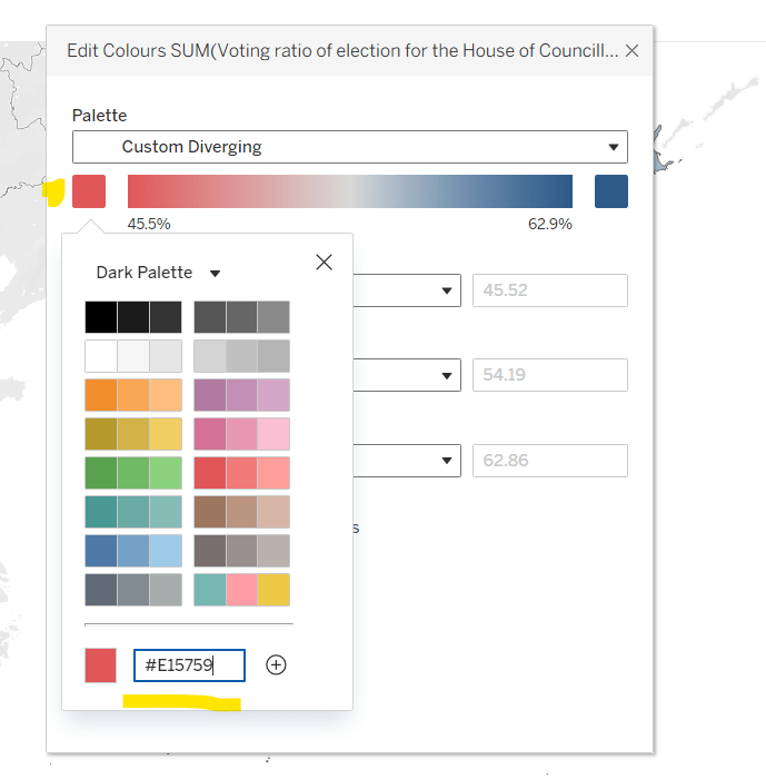
Edit the Colour Legend and choose a diverging colour palette (eg Red-Blue Diverging), then adjust the start and end colours as required

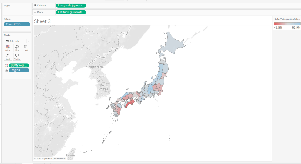
At this point, if you now make a selection on the map, the colours will remain as they are based on the current range

But what we want to happen, is for the colours to reflect a range based on just the selection (dynamic colour range). For this we need to create parameters

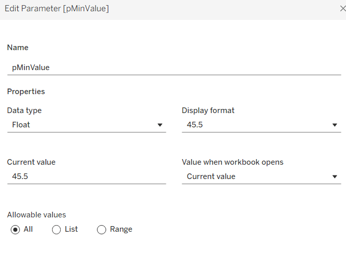
pMinValue

float defaulted to 45.5

pMaxValue

float defaulted to 62.9

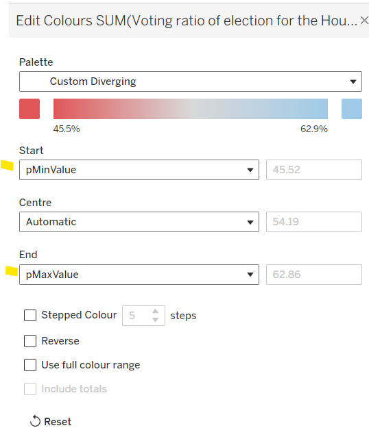
Edit the Colour Legend again, and this time set the Start and End fields to reference the pMinValue and pMaxValue parameters.

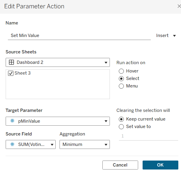
Add the sheet onto a dashboard. Add a dashboard parameter action

Set Min Value

on select of the sheet, set the target parameter pMinValue to the minimum value from the Voting Ratio of election..

Create another dashboard parameter action

Set Max Value

on select of the sheet, set the target parameter pMaxValue to the maximum value from the Voting Ratio of election..

With this you should now find that when making a selection, the colour range is defined by the minimum and maximum values of just the marks selected

However the downside of this, is if you deselect the marks, the range doesn’t reset, and you then see the whole map coloured based on this more restricted range

Bonus – Building a ‘reset button’

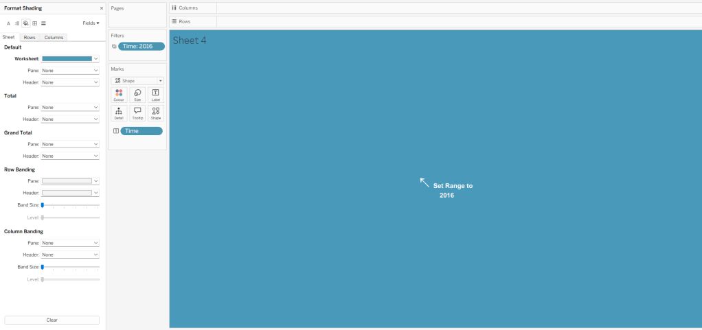
On a new sheet, add Time to Text. Go back to the Map sheet, and set the Time filter to apply to ‘selected worksheets’, and select the new sheet you’re working on.

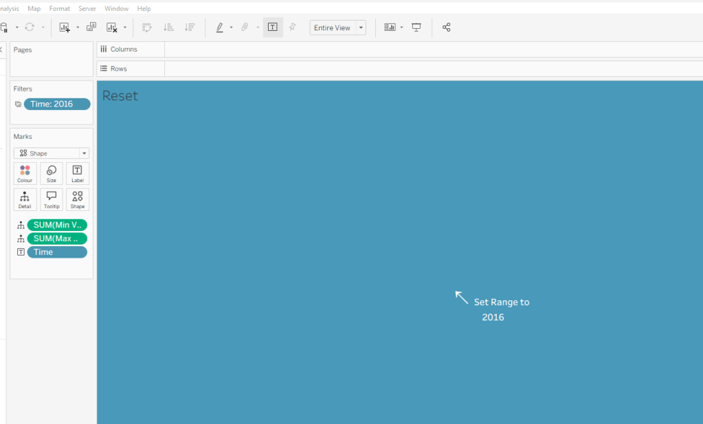
Change the mark type to Shape and choose a transparent shape (see here for details on how to set this up). Set the display to Entire View, then update the text in the Label (I sourced an arrow character from here). Align the text middle centre, set the background of the worksheet to blue and then update the font of the label text to white.

The intention is when the ‘button’ is clicked, we will set the pMinValue and pMaxValue parameters with the smallest and largest values associated to the year selected. His means we need to have some values on the ‘button’ sheet to pass to the parameters. So we need

Min Value for Year

{FIXED [Time]: MIN([Voting ratio of election for the House of Councillors (Single constituencies) %])}

and

Max Value for Year

{FIXED [Time]: MAX([Voting ratio of election for the House of Councillors (Single constituencies) %])}

Add both of these to the Detail shelf. Hide the Tooltip.

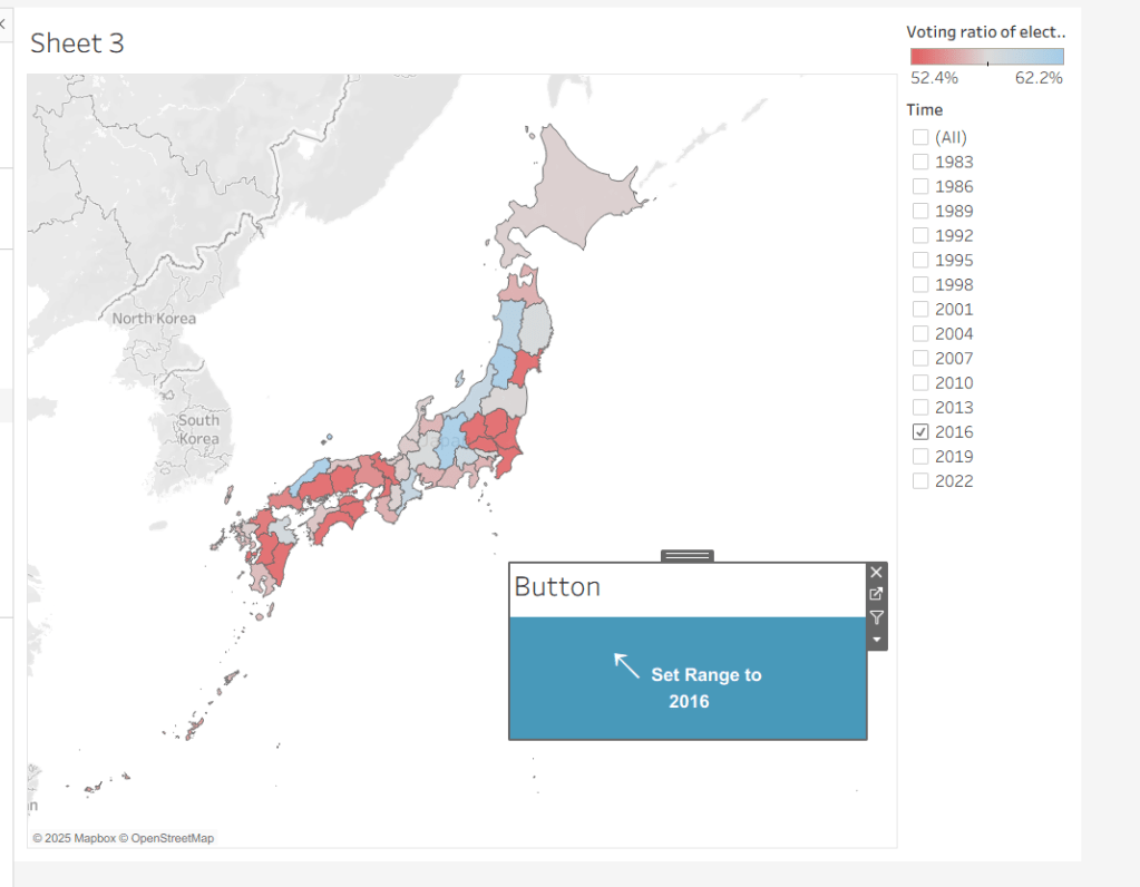
Add this sheet as a floating object to the dashboard. Show the Time filter from either the Map or Button sheets.

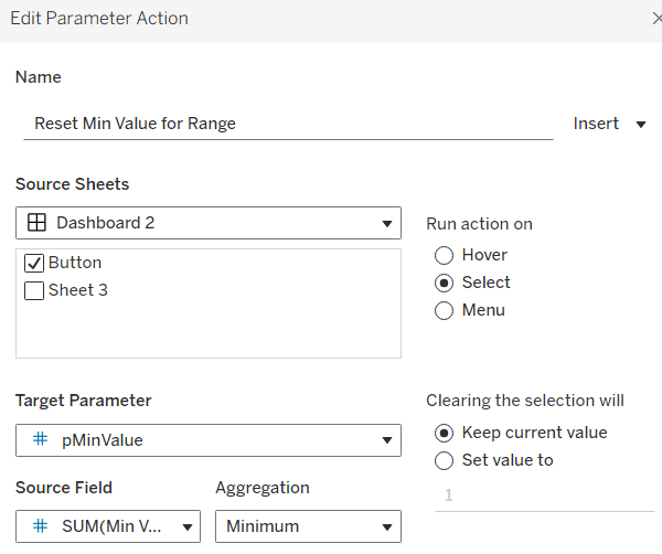
Add dashboard parameter actions, similar to the ones we did before

Reset Min Value for Range

on select of the Button sheet, set the target parameter pMinValue to the minimum value from the Min Value for Year field

Reset Max Value for Range

on select of the Button sheet, set the target parameter pMaxValue to the Maximum value from the Max Value for Year field.

Now if you ‘click’ the button sheet, the range should reset to the complete range for the relevant year.

Create the Label

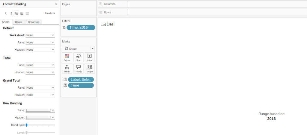
Create a new sheet and add Time to Text. As before set the Time filter from another sheet to apply to ‘selected worksheets’, and select the new sheet you’re working on. Change the mark type to Shape and choose a transparent shape. Set the display to Entire View, and align the text middle centre. Hide the Tooltip.

Create a parameter

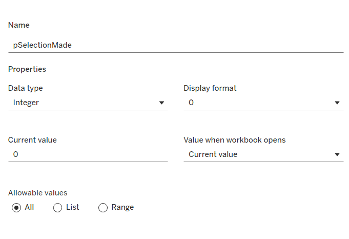
pSelectionMade

integer parameter, defaulted to 0

Create a field

Selection Made

1

and another field

Reset Selection

0

Move both fields into the Dimension section of the data pane.

On the Map sheet, add Selection Made to the Detail shelf.

On the Reset Button sheet, add Reset Selection to the Detail shelf.

Create a new field

Label: Selection Made

[pSelectionMade]=1 THEN ‘, Selected Prefecture(s)’ END

Add Label: Selection Made to the Label shelf and adjust the text. Set the background of the sheet to transparent (None)

Add the sheet to the dashboard and create the following dashboard parameter actions

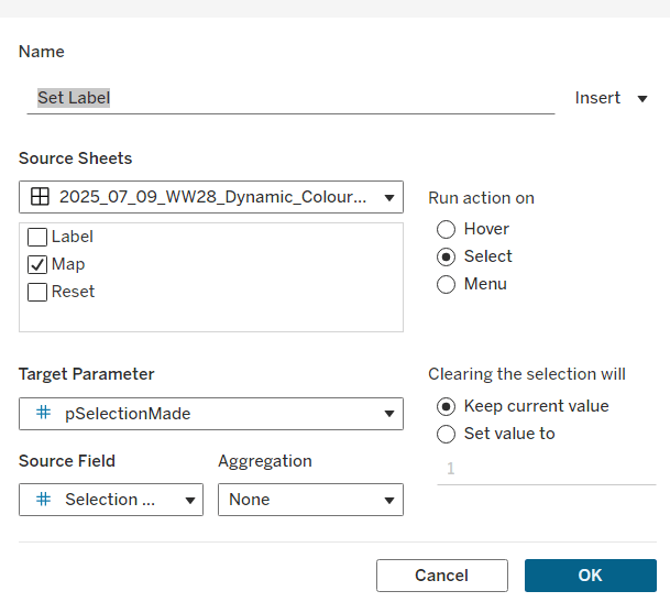
Set Label

on select of the Map sheet, set the target parameter pSelectionMade to the Selection Made field, with no aggregation.

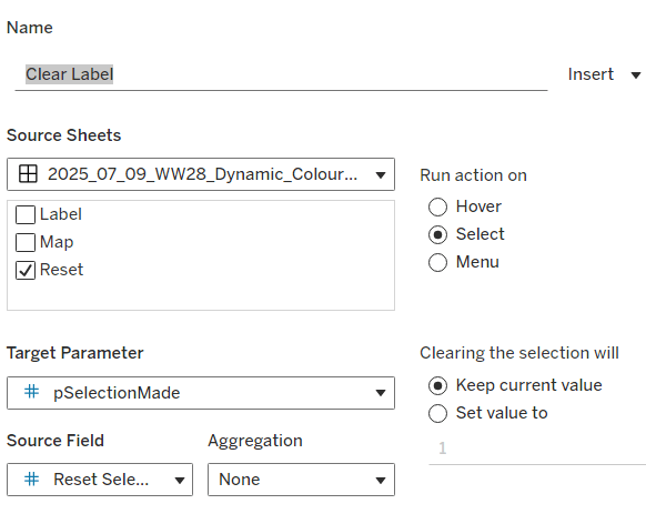
Clear Label

on select of the Reset Button sheet, set the target parameter pSelectionMade to the Reset Selection field, with no aggregation.

Final steps are to then arrange the dashboard as required using floating containers to store the filter, legend, ‘button’ and Label sheets. You’ll also need to change the filter to a single value list and customise so ‘All’ isn’t an option.

And that should be it. My published viz is here.

Note – I did find I needed to adjust the positioning of the floating objects via Tableau Public after publishing.

Happy vizzin’!

Donna

Can you make a drill down chart?

Yusuke set the #WOW2025 challenge this week, asking us to build a chart that was drill downable and drill uppable 🙂

I had a fair idea of how this was going to play out, knowing it would involve parameter actions and built the main table fairly quickly. Then it came to the parameter actions, and defining the logic to get them set to the right values. This was very tricky, and I confess I couldn’t completely manage it. The behaviour just wasn’t doing what I wanted 😦

So I looked at Yusuke’s solution, and even after using the exact same logic, field naming and parameter actions (including the names of these), it still wouldn’t quite do what Yusuke’s did. At the point the bars are expanded down to Manufacturer, if a Category is selected, Yusuke’s solution collapses back to the Category > Sub-Category level. Mine expands down to Manufacturer for the Sub-Category listed first (see below).

I spent a considerable amount of time trying to get this to work. Ultimately, I believe it’s something to do with the order in which the parameter actions get applied. In Yusuke’s solution, there are 4 parameter actions firing on each ‘click’, but they only affect 2 parameters. So one change it being applied before the other. But figuring out the order is tricky. From what I understand, actions of the same type (ie all parameter actions as opposed to filter actions, or set actions say), are applied based on alphabetical order. But, as I say, I tried naming my actions exactly like Yusuke’s (even copying and pasting from his solution), and I still couldn’t get his behaviour, and with all 4 actions applied, the drill-down from Sub-Category to Manufacturer didn’t work at all. I couldn’t get my actions to be displayed in the same order as Yusuke’s solution either, even by removing them and then adding them in the order listed, when I closed the dialog and re-opened, the order changed. So, as a result of this, my solution only has 3 actions and doesn’t quite behave exactly like Yusuke’s…. maybe I missed a tiny detail.. who knows, or maybe it’s just Tableau and some quirk in how things get applied…

Anyway, now I’ve said all that, let’s get on to the solution I did manage 🙂

Building out the calculations

For a challenge like this, I’m going to build out all my calculations into tabular form, so I can get the display and sorting as required, especially since table calculations are involved.

We need to capture the selections made ‘on click’ into parameters

pSelectedCategory

string parameter, defaulted to Furniture

pSelectedSubCat

string parameter, defaulted to Bookcases

The Sub-Category and Manufacturer to display will be based on the values in these parameters

Display – Sub Cat

IIF([pSelectedCategory] = [Category], [Sub-Category],”)

Display – Manufacturer

IIF([pSelectedSubCat] = [Sub-Category], [Manufacturer], ”)

On a sheet, add Category, Display – Sub Cat, and Display – Manufacturer to Rows and show the two parameters

If you change the values in the parameters, you’ll see how the display changes.

We want to get the total sales for each ‘level of the hierarchy’, so we can the compute the % sales, and apply sorting. We’ll used Fixed Level of Detail calculations for this.

Sales per Category

{FIXED [Category]: SUM([Sales])}

Sales per Sub-Category

{FIXED [Category], [Sub-Category]: SUM([Sales])}

Sales per Manufacturer

{FIXED [Category], [Sub-Category], [Manufacturer]: SUM([Sales])}

Format all these to $ with 0 dp, add into the table and note how the values are duplicated across each row, depending on what ‘level of the hierarchy’ we’re looking at

Adjust the sort on the Category pill, to sort by Sales per Category descending – this will move the Technology row to the top.

Sort the Display – Sub Cat pill to sort by Sales per Sub-Category descending and sort the Display – Manufacturer pill to sort by Sales per Manufacturer descending.

With these fields, we can calculate the % of sales

% Sales per Category

SUM([Sales per Category]) / SUM({FIXED:SUM([Sales])})

% Sales per Sub-Category

SUM([Sales per Sub-Category]) / SUM([Sales per Category])

% Sales per Manufacturer

SUM([Sales per Manufacturer]) / SUM([Sales per Sub-Category])

format all these to % with 1 dp and add into the table

For the final display, we don’t want values in every row. We need values displayed at the first row of every level of the hierarchy. I’m going to use the INDEX() tableau calculation to help with this.

Index – Category

INDEX()

Index – Sub-Category

INDEX()

Make both of these fields discrete (right click > convert to discrete).

Add Index – Category to Rows to the right of the Category pill. Adjust the table calculation on the pill so it is computing using Display – Sub Cat and Display – Manufacturer only. This should index the rows so that the numbering restarts when the Category changes.

Add Index – Sub-Category to Rows to the right of the Display – Sub Cat pill. Adjust the table calculation on the pill so it is computing using Display – Manufacturer only. This should index the rows so that the numbering restarts when the SubCategory changes.

We can then use this information to determine which rows need to display the % Sales values.

Display – % Sales per Category

IIF([Index – Category] = 1, [% Sales per Category],NULL)

Display – % Sales per Sub-Category

IIF([Index – Sub-Category] = 1 AND MIN([Category]) = [pSelectedCategory], [% Sales per Sub-Category],NULL)

Display – % Sales per Manufacturer

IIF(MIN([Sub-Category]) = [pSelectedSubCat], [% Sales per Manufacturer],NULL)

format all these to % with 1 dp, and add to the table (sense check that the table calculations for each field have the settings we applied to the Index fields above.

These 3 fields, are the core fields we need to use in the viz.

Building the Viz

On a new sheet, add Category, Display – Sub Cat, Display – Manufacturer to Rows and apply the sorting on each pill described above, and how the parameters.

Add Display – % Sales per Category to Columns and apply the table calculation settings described above. Add Display – % Sales per Sub-Category to Columns too, and again apply the table calc settings. Then add Display – % Sales per Manufacturer to Columns. Change the mark type on each of the 3 marks cards, specifically to use bar.

Add Category to the Colour shelf on the All marks card, and adjust accordingly.

On the Display – % Sales per Category marks card, add Category and Display – % Sales per Category to Label. Adjust the table calc settings of the % field as required. Adjust the layout of the label. Add Sales per Category to Tooltip and update the tooltip to suit.

On the Display – % Sales per Sub-Category marks card, add Display – Sub Cat and Display – % Sales per Sub-Category to Label. Adjust the table calc settings of the % field as required. Adjust the layout of the label. Add Sales per Sub-Category to Tooltip and update the tooltip to suit.

On the Display – % Sales per Manufacturer marks card, add Display – Manufacturer and Display – % Sales per Manufacturer to Label. Adjust the layout of the label. Add Sales per Manufacturer to Tooltip and update the tooltip to suit.

You may need to widen each row to see the labels displayed.

The axis titles on the top of the chart adjust based on the selections made. To present this within the chart itself (rather than using carefully positioned text fields on a dashboard), we need to make the chart dual axis using ‘fake axes’.

Double click into the space in Columns to the right of the last pill, and manually type MIN(0). Drag this field to sit between Display – % Sales per Sub-Category and Display – % Sales per Manufacturer.

Remove all pills from the MIN(0) marks card. Change the mark type to Shape and select a transparent shape for this (refer to this article to set this up – you can also use any other type of mark but set to very small, and 0% opacity on the colour to make it “invisible”, though a mark could appear on hover, which is why I prefer to use transparent shapes).

Click on the MIN(0) pill and set it to be dual axis, so 2nd column now has a MIN(0) axis heading.

Right click on this top axis, to Edit the axis – Change the Title to reference the pSelectedCategory parameter and set the tTck Marks to None

Repeat the process, creating another instance of MIN(0) to the right of the Display – % Sales by Manufacturer, but this time the axis title should reference the pSelectedSubCat field.

Tidy up the display formatting by

  • Add row banding with Band Size = 1 and Level = 0, so the whole of the Furniture block is coloured grey.
  • Remove column dividers
  • Remove gridlines and zero lines
  • Hide the 3 pills on the Rows (right click each pill and uncheck show header).
  • Hide the null indicator (right click > hide)
  • Edit the bottom 3 axis to remove the titles and hide the tick marks on all
  • Make the axis heading section narrower
  • Add a border around each of the bars, and make each bar narrower if required
  • Add some space to the start of each bar, by adjusting the bottom axis to be fixed from -0.1 to 1

Update the title of the sheet, and name the sheet.

Adding the interactivity

Add the sheet to a dashboard.

Firstly, we’re going to stop the bars from being ‘highlighted’ when clicked. we’ll use the True/False filter action technique described here. Create 2 calculated fields True = TRUE and False = FALSE and add to the Detail shelf on the All marks card of the viz. Add a dashboard filter action

Deselect Marks

On select of the the Viz sheet on the dashboard, target the Viz sheet directly, setting True = False.

Now we need to deal with the parameter values. As I discussed at the start of this blog, getting the calculations required and making the functionality work was pretty tricky, so I’m just going to document what I’ve ended up using, that seems to mostly work. Note the names of the parameter actions which both affect the pSelectedCategory param are pre-fixed with a number to force the order (I did test with them the other way round, and things broke).

Create fields

Category for Param_1

IF (([pSelectedCategory]<> [Category]) OR ([pSelectedCategory]=[Category] AND [pSelectedSubCat]=[Display – Sub Cat]) AND ISNULL([Display – Manufacturer])) THEN ‘ ! Please select a Category !’
ELSE [Category]
END

Category for Param_2

[Category]

SubCat for Param

IF (([pSelectedCategory]<> [Category]) OR([pSelectedSubCat]=[Display – Sub Cat])) AND NOT(ISNULL([Display – Manufacturer])) THEN ‘ ! Please select a Sub-Category !’
ELSE [Display – Sub Cat]
END

Then create 3 parameter actions

Set SubCategory

On select of the viz, set the pSelectedSubCat parameter passing in the value from the SubCat for Param field.

1. Set Category

On select of the viz, set the pSelectedCategory parameter passing in the value from the Category for Param_1 field.

2. Set Category

On select of the viz, set the pSelectedCategory parameter passing in the value from the Category for Param_2 field.

And fingers crossed, that should work, at least work the same as mine… my published viz is here. Note – when I uploaded to Tableau Public, the dynamic axes seemed to break, so I had to manually reset them on public…. or it may have broken before I published and didn’t realise.. the feature does seem to be a bit temperamental.

Happy vizzin’!

Donna

Can you filter or drill to details?

Sean set this week’s challenge to give an alternative solution to displaying a table of details rather than the traditional ‘pancake table’ (his words not mine 🙂 ).

The main crux of the challenge relates to the dashboard actions and interactivity, so I’ll be brief(ish) in describing how to build the charts.

Creating the line chart

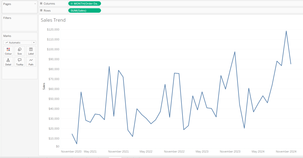
Add Order Date to Columns at the month-year continuous (green pill) level. Add Sales to Rows. Format Sales to $ with 0 dp. Remove the title on the Order Date axis. Update the Tooltip to give an instruction to ‘click the line to filter’. Rename the sheet Sales Trend or similar.

Creating the bar chart

Add Sub-Category to Rows and Sales to Columns. Sort by Sales descending. Hide the Sub-Category row heading label (right click > hide field labels for rows). Update the Tooltip to give an instruction to ‘click the bar to filter’. Rename the sheet Sales by Sub Bar or similar.

Creating the Tree Map

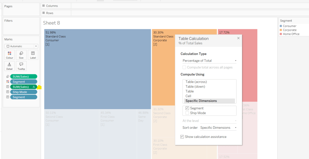
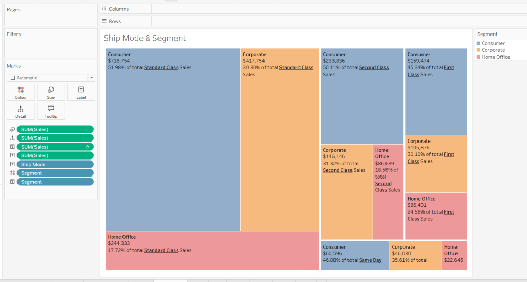
Add Segment and Ship Mode to Detail and Sales to Size. Move Segment to Colour and reduce opacity to about 60%. Move Ship Mode to Label and then add additional Segment and Sales pills to Label. Add a table calculation against the Sales pill on the Label shelf, so it is applying a percentage of Total by Segment only.

Add another instance of the Sales pill to Label and then update the layout of the label.

Move the Segment pills on the marks shelf so they are positioned below the Ship Mode to ensure the tree map is segmented based on the Ship Mode (there should be four blocks divided by the thicker white lines).

Update the Tooltip to give an instruction to ‘click the treemap to filter’. Rename the sheet Treemap or similar.

Build the Details table

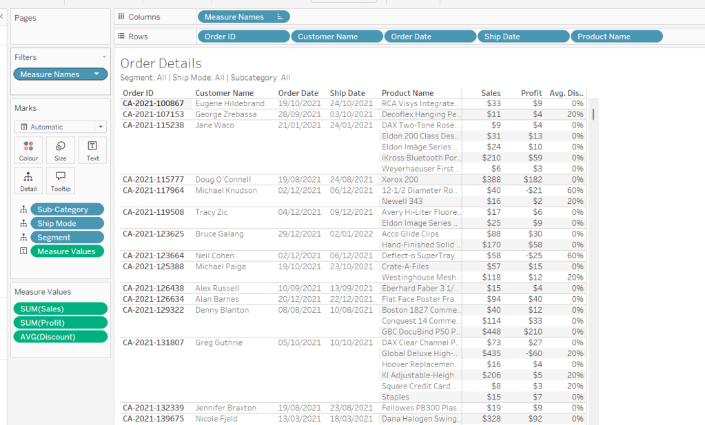
On a new sheet add Order ID, Customer Name, Order Date (as a discrete exact date – blue pill), Ship Date (as a discrete exact date – blue pill) and Product Name to Rows. Add Sales to Text. Format Profit to $ with 0 dp and drag onto the canvas over the columns of Sales numbers, and release the mouse when the Show Me option appears. Add Discount into the Measure Values section. Change the aggregation to Average and then format to be % to 0 dp. Rearrange the order of the pills in the Measure Values section as required. Add Segment, Sub-Category and Ship Mode to the Detail shelf. Update the title to reference these 3 pills. Hide the Tooltip. Rename the sheet Details or similar.

Building the additional calculations needed

In clicking around Sean’s solution, I was finding what I had initially built wasn’t quite doing what Sean did. If I clicked on the bar chart and then the tree map, the details were only filtered based on the tree map and vice versa. There were ways to solve this, but this then resulted in other issues, in that after closing the details table, the charts remained filtered, but it wasn’t obvious as nothing was highlighted. Basically what I’m trying to say, is the filtering seemed like it should be straightfoward, but wasn’t. I ended up using a combination of parameters and filter actions.

So we’ll start by dealing with the parameters we need.

Create the following parameters

pSelectedDate

date parameter defaulted to 01 Jan 1900

pSelectedSegment

string parameter defaulted to <emptystring>

pSelectedShipMode

string parameter defaulted to <emptystring>

pSelectedSubCat

string parameter defaulted to <emptystring>

Then create the following calculated fields

Filter: Date

[pSelectedDate] = #1900-01-01# OR [pSelectedDate]=DATETRUNC(‘month’,[Order Date])

add this to the Filter shelf on the bar chart, tree map and details sheets and set to True.

Filter: SubCat

[pSelectedSubCat]=” OR [pSelectedSubCat]=[Sub-Category]

add this to the filter shelf on the line chart, tree map and details sheets and set to True

Filter: Segment

[pSelectedSegment]=” OR [pSelectedSegment]=[Segment]

add this to the filter shelf on the line chart, bar chart and details sheets and set to True

Filter: Ship Mode

add this to the filter shelf on the line chart, bar chart and details sheets and set to True

We also need a parameter to capture when we want to show the details table.

pClickMade

boolean parameter defaulted to False.

and to supplement it, we need a calculated field to use to set this parameter to true

Click Made

TRUE

Add Click Made to the Detail shelf of the line chart, bar chart and tree map.

We’ll set these parameters later.

Building the Close icon

The ‘close’ cross when the details sheet is displayed is another sheet. On clicking on it, we will want to set the pClickMade parameter to False so the Details will no longer show. For this we will need

Close

FALSE

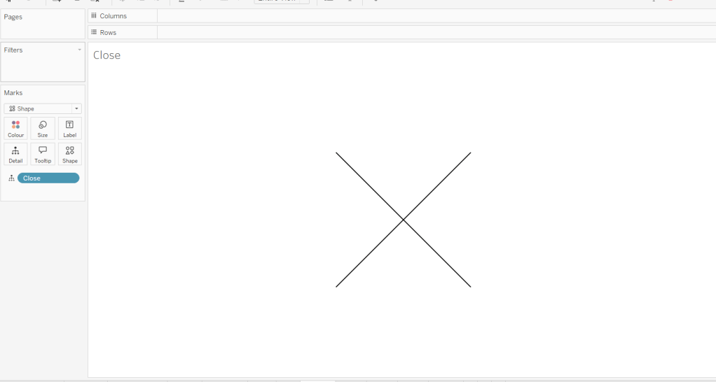
Add this field to the Detail shelf on a new sheet. Change the mark type to shape and change the shape to a X. Set the colour to black and set to fit entire view. Hide the Tooltip. Name the sheet Close or similar.

Building the dashboard and interactivity

Using layout containers, arrange the line chart, bar chart and tree map into a dashboard. Use padding and background colours to get the layout as desired.

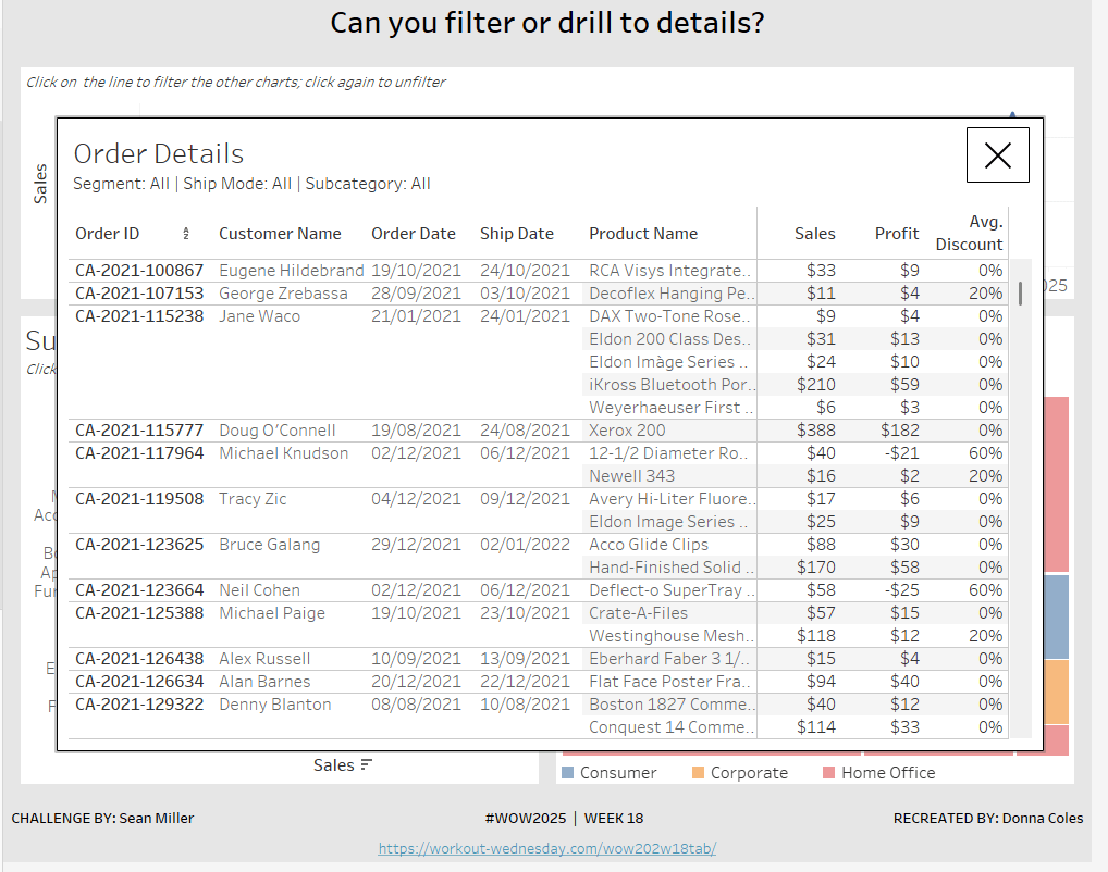
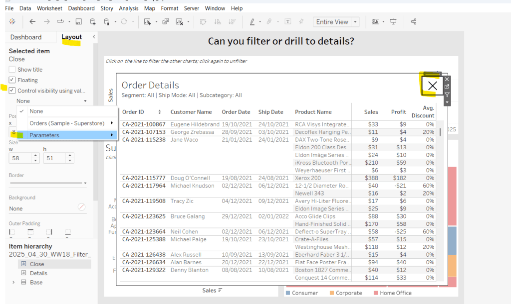
The add the Details sheet as a floating object and position over the top of the other charts. Set the background to white and add a black border. Also float the Close sheet into position too. Hide the title and also add a black border.

Select the Close sheet object, and then from the Layout tab in the left hand nav, check the Control visibility using value checkbox and select the pClickMade parameter

It should disappear if the parameter is still set to false. Repeat the same process with the Detail sheet object.

Now create the following dashboard parameter actions

Filter Month

On select of the Sales Trend sheet, target the pSelectedDate parameter, passing in the value from the Order Date. When the selection is cleared, reset to 01 Jan 1900.

Filter SubCat

On select of the Sales by Sub Bar sheet, target the pSelectedSubCat parameter, passing in the value from the Sub-Category. When the selection is cleared, reset to <emptystring>.

Filter Ship Mode

On select of the Treemap sheet, target the pSelectedShipMode parameter, passing in the value from the Ship Mode. When the selection is cleared, reset to <emptystring>.

Filter Segment

On select of the Treemap sheet, target the pSelectedSegment parameter, passing in the value from the Segment. When the selection is cleared, reset to <emptystring>.

Drill to Details

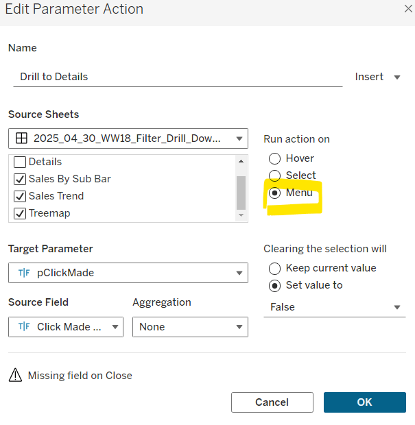
Via the menu of the Sales by Sub Bar, Sales Trend, and Treemap sheets, target the pClickMade parameter passing in the value from the Click Made field. When the selection is cleared, set the value to False.

Close Details

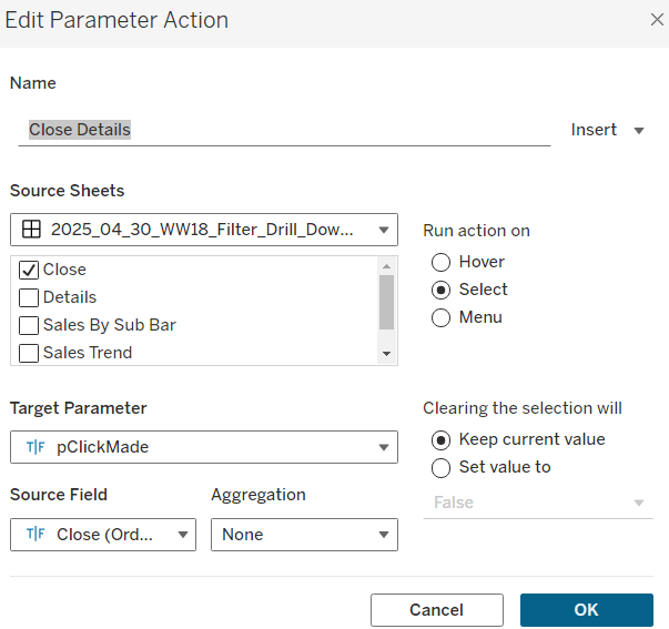
On select of the Close sheet, target the pClickMade parameter, passing in the value from the Close field. When the selection is cleared, keep the value.

If you start clicking around, you should find that all these actions do provide some level of filtering, but if you for example, click on the bar (to filter the line and treemap), and then click on a section in the tree map and use the ‘Drill down to details’ menu option, the details table has lost the filtering of the bar chart as the bar has become unselected when the treemap chart was clicked.

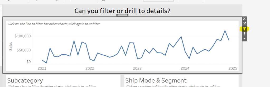
To resolve this, apply filter actions to the line chart, bar chart and tree map objects (the quickest way to do this is just select the object on the dashboard and click the ‘filter’ icon in the context menu.

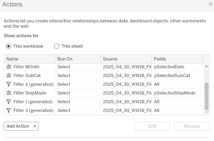
If you do this on all 3 sheets and then look at the list of dashboard actions you’ll see 3 ‘Filter x (generated)’ entries.

By applying this mix of filtering through ‘default’ dashboard filter actions in conjunction with parameters, I think you have a more complete and understandable experience. And you will have to explicitly unselect each of the marks you clicked on to remove that filter. I added instructions on the dashboard to aid with this.

My published viz is here.

Happy vizzin’!

Donna
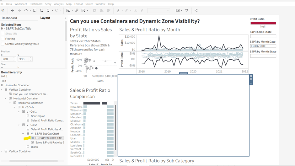
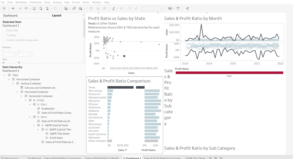
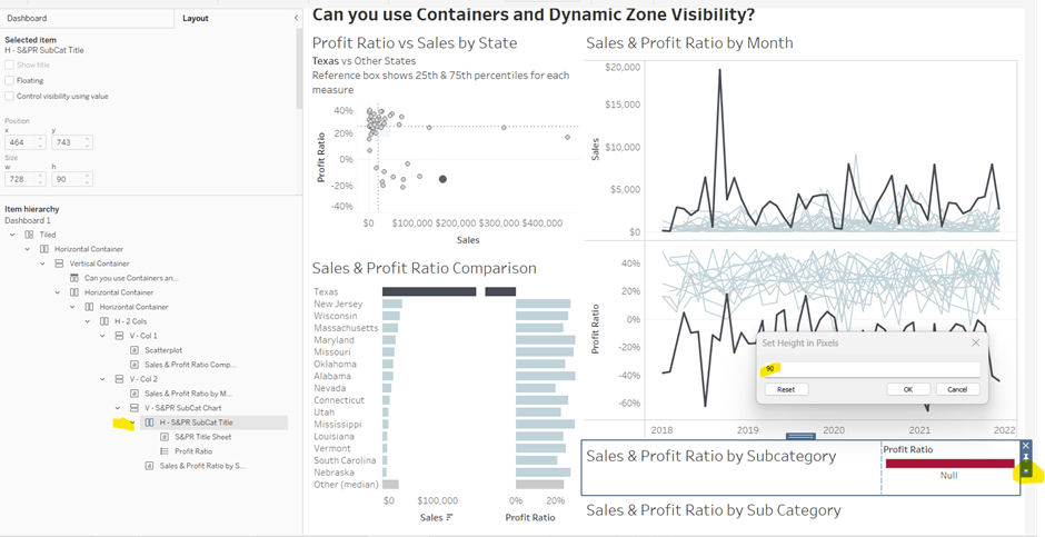
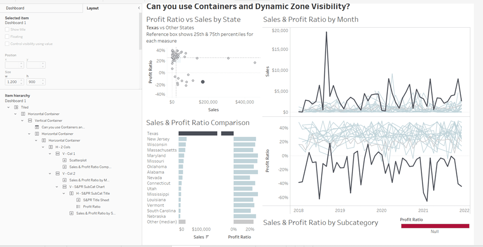
Can you use containers and dynamic zone visibility?

This week’s #WOW2025 challenge was set live as part of TC25. Unfortunately, this year I couldn’t be there in person to meet everyone, which for the last 3 years has been my conference highlight 😦

Anyway, Kyle set the challenge, and conscious of time, provided a starting workbook, so the focus could be on the container and DZV functionality. For those who nailed this, he added some additional interactivity with dashboard actions.

So the first thing is to download the starter workbook from the challenge page.

I’m going to attempt to build this in the order of Kyle’s requirements.

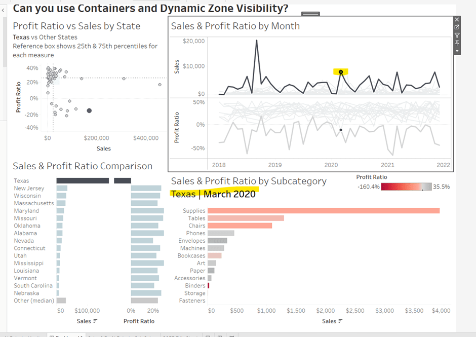
Layout out the dashboard

So the requirement states that no floating objects are allowed. Typically when I build a dashboard for business purposes or where the layout is a little complicated, I always start by adding a floating container sized to the exact dashboard size and positioned 0,0. I then add tiled objects into it. Doing this means I don’t end up with Tiled container objects on my dashboard (or if any get added when legends/filters get automatically added, I just move any items I want to retain and then delete the Tiled container).

However, as Kyle says ‘no floating’, I will build adding to the ‘default’ dashboard which means there will be containers on there I don’t really want.

Now blogging about containers is usually very tricky as it’s hard to explain where things need to go. So I’ll be supplementing this with a lot of screen shots – fingers crossed following along works out ok!

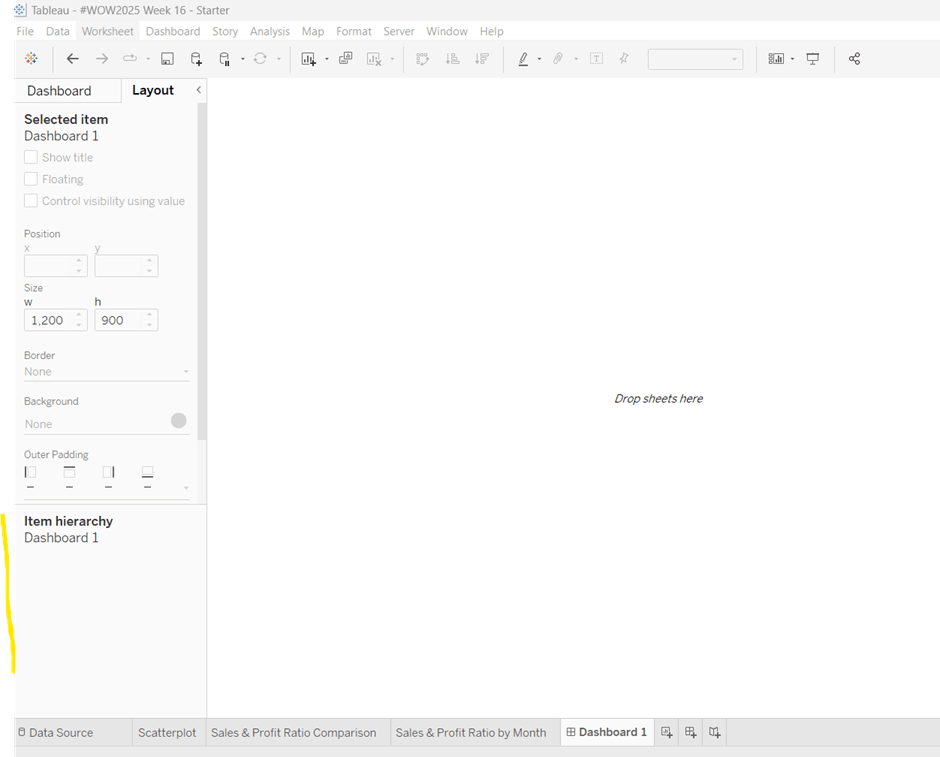
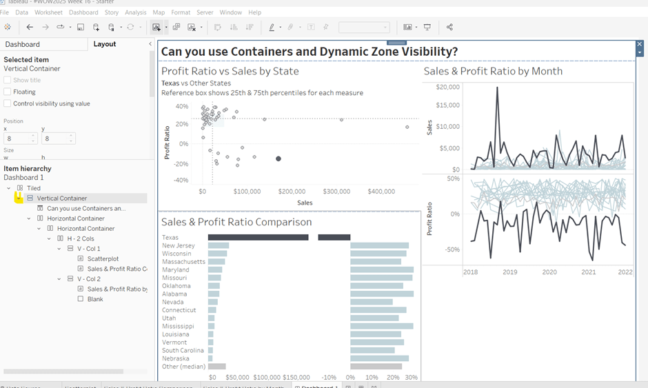
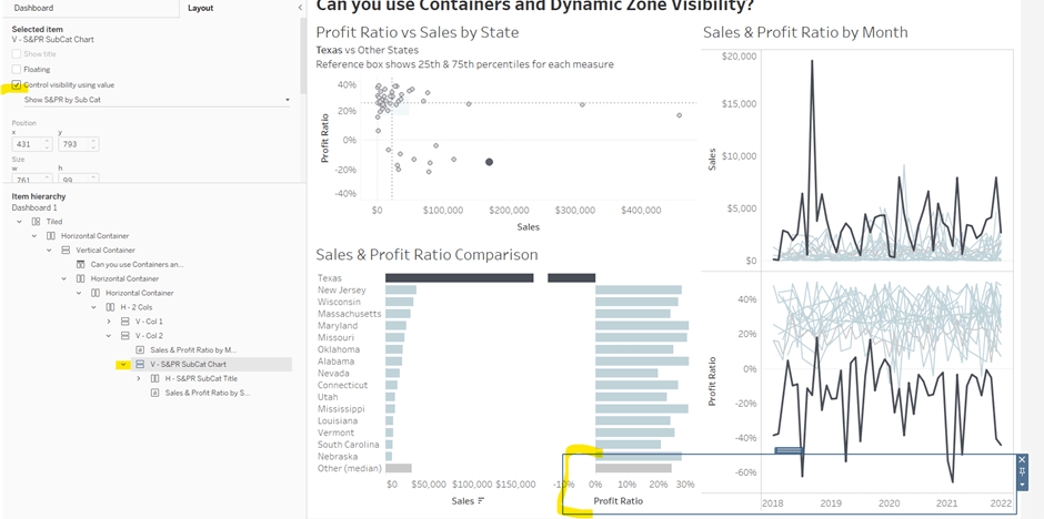
To start, create a dashboard sheet and resize to 1200 x 900 as required. Observe the item hierarchy section of the Layout pane as this is where you’ll see all the containers and objects as we add them to the dashboard.

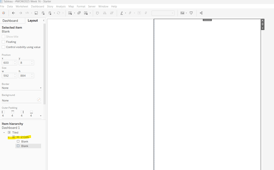
The main structure of the display is split into 2 columns, so start by adding a horizontal layout container to the dashboard. Once added, add 2 blank objects side by side to give the basic layout. Adding blank objects helps when positioning the required objects and is recommended when dealing with layout containers, especially if you’re new to them. They will ultimately be deleted as we go. Rename the horizontal container H – 2 cols or similar (right click on the container in the item hierarchy  > rename).

Notice how a Tiled container has now also appeared on the dashboard, even though we only added a horizontal container.

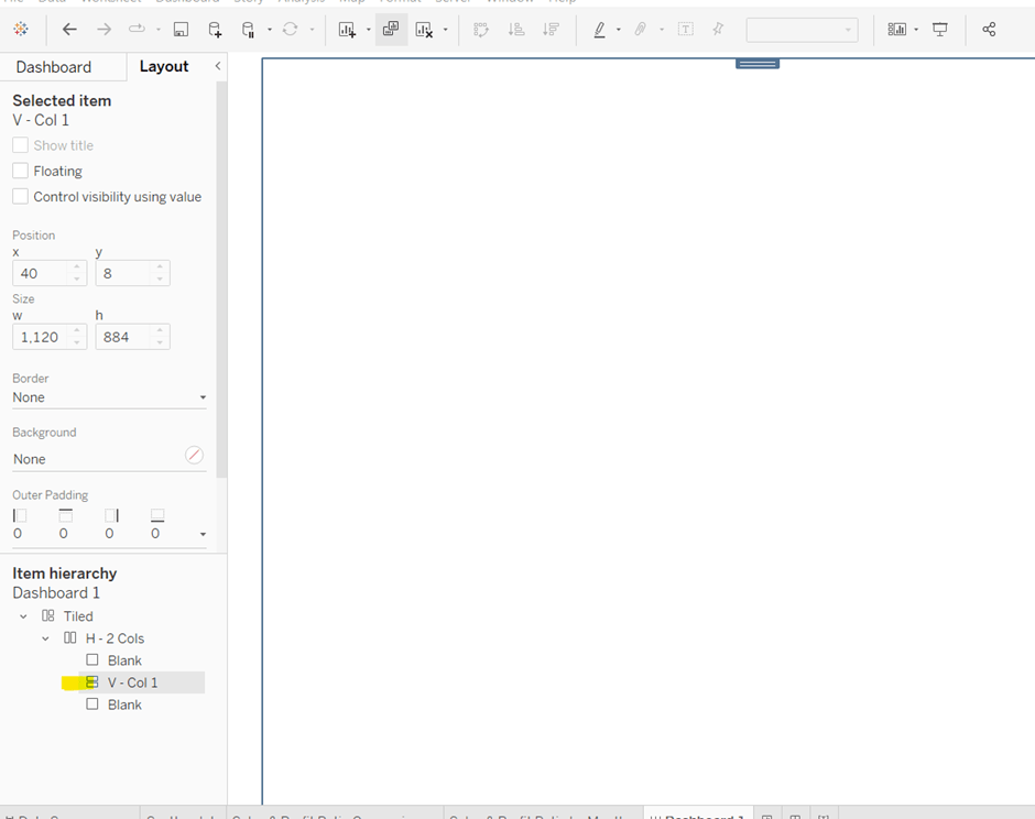
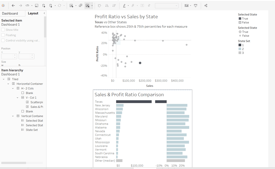
The first column of the dashboard contains 2 charts – the Scatterplot and the Sales & Profit Ratio Comparison sheets – stacked on top of each other. For this, add a vertical layout container between the two blank objects. Rename this V – Col 1.

Add the Scatterplot sheet into the vertical container and then add Sales & Profit Comparison underneath it.

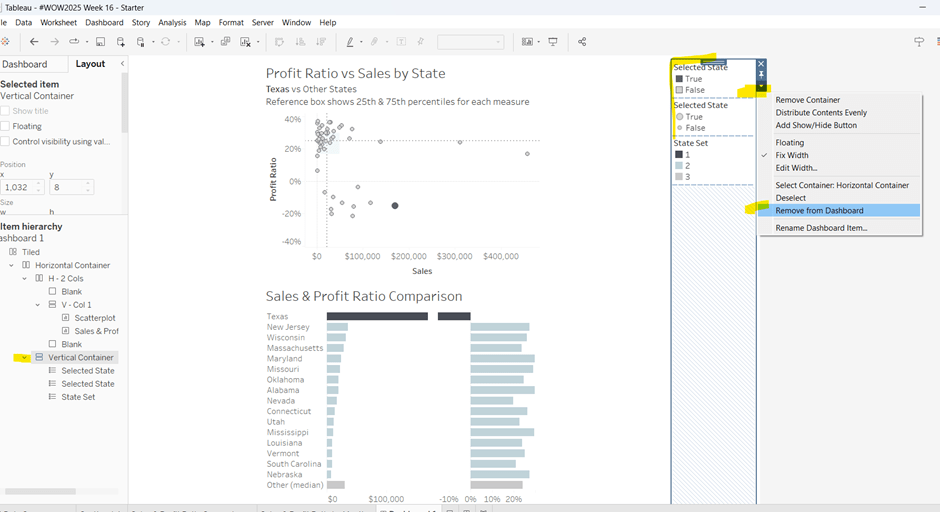
The various legends associated with these 2 sheets, automatically get added into their own vertical container on the right hand side. These aren’t required, so from the item hierarchy, select the Vertical container and then Remove from dashboard.

The right hand column of the display will show the Sales & Profit Ratio by Month sheet and another (hidden) chart that needs to be built.

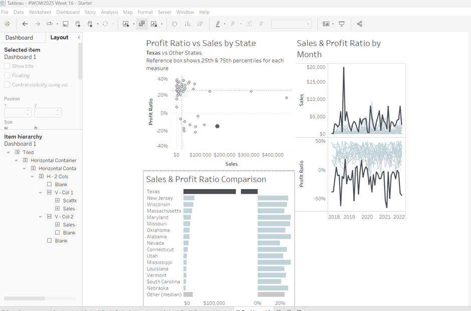
Add another vertical container between the V – Col 1 container and the right hand blank object. Name this V – Col 2, and add the Sales & Profit Ratio by Month sheet and then another blank object underneath it. Once again remove the right hand vertical container that is automatically added with all the legends/filters.

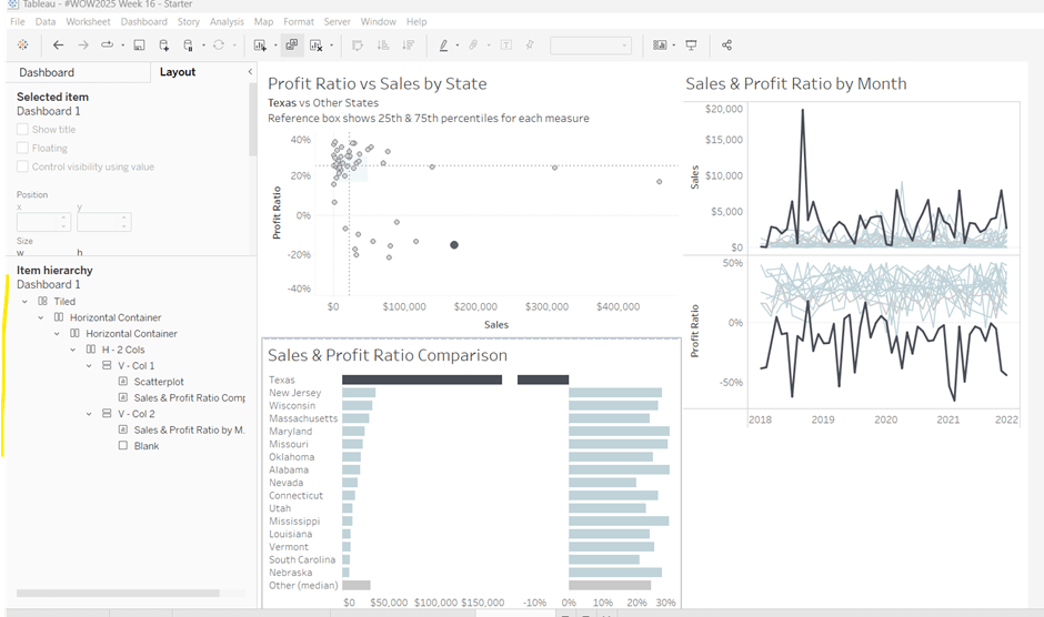
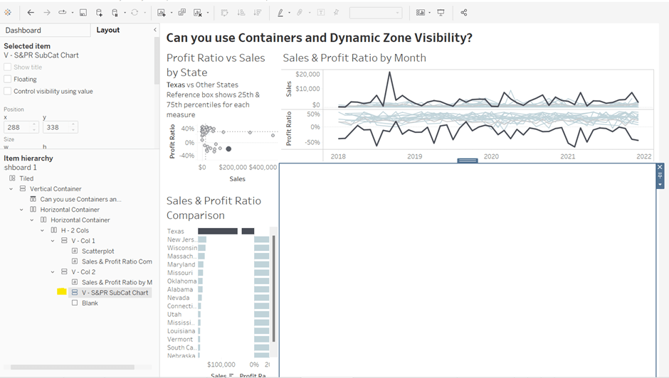
Now we have the ‘core’ layout, the 2 blank objects we added to the horizontal container, H – 2 Cols, right at the start, can be removed, so hopefully you should have a layout organised as below.

Now add the dashboard title (Dashboard menu > Show Title, and then update the text). This will automatically add a vertical layout container around all the existing contents.

Building the Sales & Profit Ratio by Sub-Category bar chart

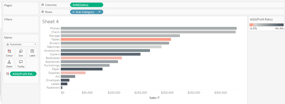
On a new sheet, add Sub-Category to Rows and Sales to Columns. Add Profit Ratio to Colour and adjust the colour legend to use the Red-Black Diverging colour palette. Hide the Sub-Category row label heading (right click > hide field labels for rows).

The bar chart needs to be filtered when a State in the Sales & Profit Ratio Comparison chart is clicked on, or when a Date is selected in the Sales & Profit Ratio by Month chart. However, I noticed when clicking around, that when clicking the Sales & Profit Ratio by Month chart, it filtered the above bar chart by both the State and Date. So based on this, create 3 parameters.

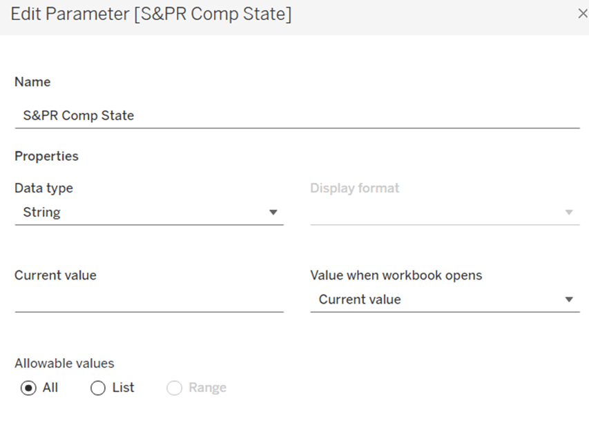
S&PR Comp State

String parameter defaulted to empty string

S&PR by Month State

String parameter defaulted to empty string

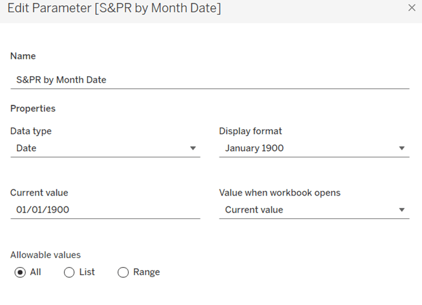
S&PR by Month Date

Date parameter defaulted to 01 Jan 1900 (essentially a null date)

Show these parameters on the sheet.

We want to filter the chart if the S&PR Comp State has a value and the S&PR by Month Date is the ‘null’ date (which means we’ve interacted with the Sales & Profit Ratio Comparison chart), or if the S&PR Monthly State has a value AND the S&PR by Month Date has a value (which means we’ve interacted with the Sales & Profit Ratio by Month chart). So create

Filter – S&PR by SubCat

([State Name] = [S&PR Comp State] AND ([S&PR by Month Date]=#1900-01-01#))

OR

(([State Name] = [S&PR by Month State]) AND (DATETRUNC(‘month’, [Order Date]) = DATETRUNC(‘month’, [S&PR by Month Date])))

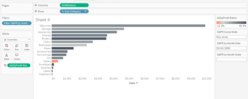
Enter a State name into the S&PR Comp State parameter (eg New Jersey), then add the Filter – S&PR by SubCat field to the Filter shelf and set to True. The chart should change.

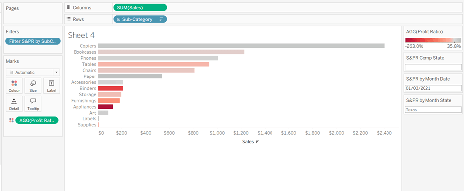
Verify the functionality by adding a state and date into the other parameters eg 01 March 2021 and Texas

Empty the state parameters and set the date back to 01 Jan 1900. Name the sheet Sales & Profit Ratio by SubCat. The chart contents will disappear.

Creating a dynamic title sheet

Originally I hoped to do this without using another sheet and just using the title of the bar chart, but I need the date to show nothing rather than Jan 1900 depending on the user interactivity, so a new sheet is required.

But for it, we need some additional calculated fields.

State for Title

IIF([S&PR by Month State]<>”,[S&PR by Month State], [S&PR Comp State])

We only want to show the name of the state once, and both parameters may have it set.

Date for Title

IF [S&PR by Month Date]=#1900-01-01# THEN ” ELSE DATENAME(‘month’,[S&PR by Month Date]) + ‘ ‘ + STR(YEAR([S&PR by Month Date])) END

Line

IF [S&PR by Month Date]<>#1900-01-01# THEN ‘|’ ELSE ” END

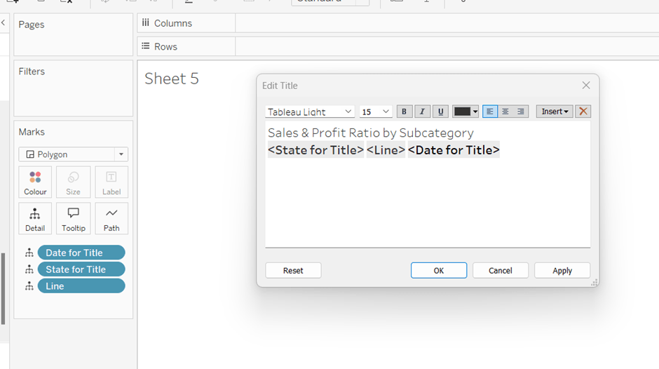
Add all 3 fields to the Detail shelf of a new sheet. Change the mark type to polygon. Update the sheet title as below

Name the sheet S&PR Title Sheet or similar

Adding the bar chart, title & legend to the dashboard

All 3 of these objects – the bar chart, the title sheet and the profit ratio legend need to show or hide based on interactivity. To do this in one step, we can encapsulate the 3 objects within containers within another ‘parent’ container and control the visibility on the ‘parent’ container.

Add a vertical container between the Sales & Profit Ratio by Month chart and the blank object. Name this V – S&PR SubCat Chart

Add the Sales & Profit Ratio by SubCat sheet into this. Then add another horizontal container and place it above the Sales & Profit Ratio by Sub Cat chart (making sure it’s within the V – S&PR Sub Cat Chart container. Rename this H – S&PR Sub Cat Title.

Add the S&PR by Title sheet into this horizontal container, and then click on the Profit Ratio legend on the right hand side and move this object to sit to the right of the title sheet. Then click on the right hand column containing all the remaining legends, and delete this container from the dashboard. Then remove the blank object that’s sitting beneath the Sales & Profit Ratio by SubCat sheet. You should have something like below…

Adjust the width of the S&PR Title sheet so its wider. Set the sheet to Fit Entire View. Then select the H – S&PR SubCat Title container and edit the height to be 90 px.

Hide the title of the Sales & Profit Ratio by SubCat sheet.

Hiding and showing the Sales & Proft Ratio by Sub Category section

Create a new calculated field

Show S&PR by Sub Cat

[S&PR by Month State]<>” OR [S&PR Comp State]<>”

On the dashboard, select the V – S&PR SubCat Chart container and on the Layout pane, check the Control visibility using value checkbox, and select the Show S&PR by Sub Cat field. Assuming all the parameters are set to their default values, then the whole section should disappear, although the container will still be selected.

To make the section show, we need to set the parameters using dashboard parameter actions.

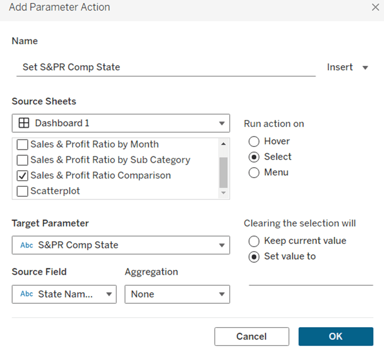
Set S&PR Comp State

On select of the Sales & Profit Ratio Comparison sheet, set the S&PR Comp State parameter passing in the value of the State Name field. When the selection is cleared, set the value back to <emptysrting>

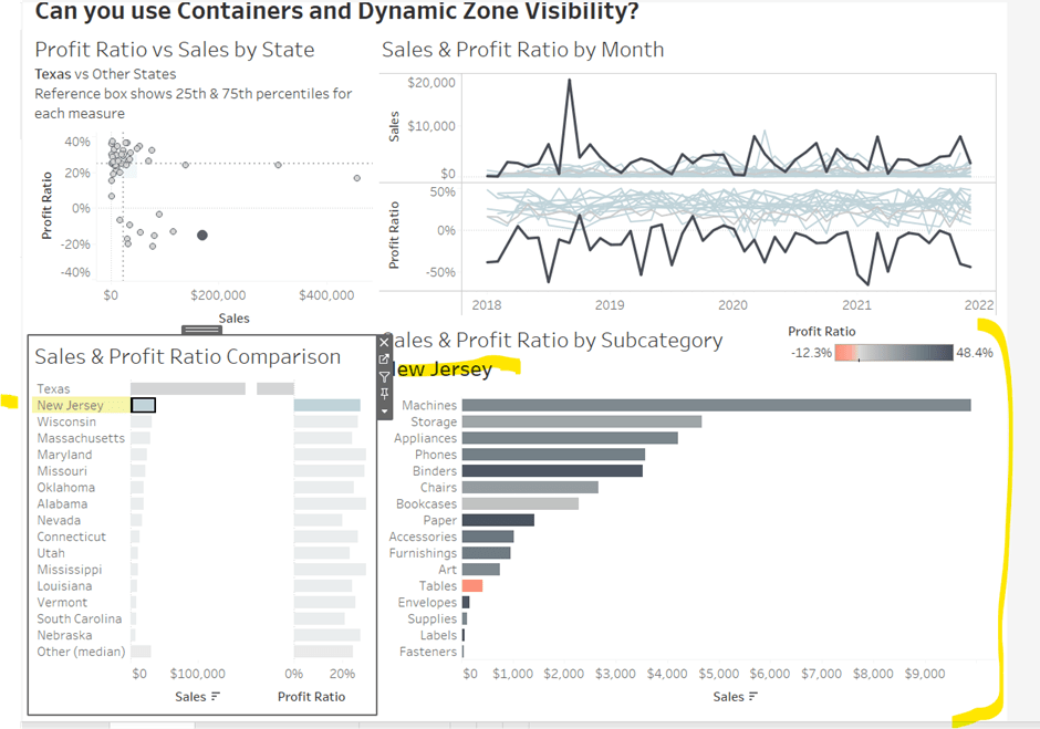
Click on a row in the Sales & Profit Ratio Comparison bar chart, and the Sales & Profit Ratio by SubCat chart should display, filtered to that State, with the selected state name in the title.

Click the state again, and the chart disappears.

Create 2 further dashboard parameter actions

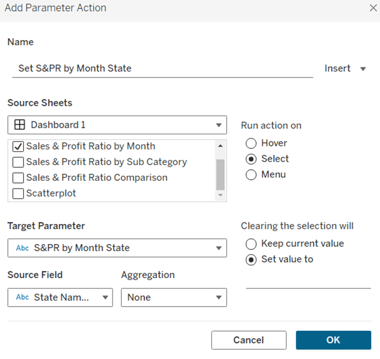
Set S&PR by Month State

On select of the Sales & Profit Ratio by Month sheet, set the S&PR by Month State parameter, passing in the value from the State Name field. When the selection is cleared, set it back to <emptystring>

Set S&PR by Month Date

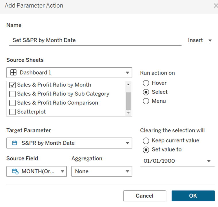
On select of the Sales & Profit Ratio by Month sheet, set the S&PR by Month Date parameter, passing in the value from the Month([Order Date]) field. When the selection is cleared, set it back to 01/01/1900

Now click on a point in the line chart, and the Sales & Profit Ratio by SubCat chart should display filtered to the relevant state and month

Adding the Additional Interactivity

When the Scatterplot is clicked, the State in the existing Scatterplot State parameter should be updated. Create a dashboard parameter action

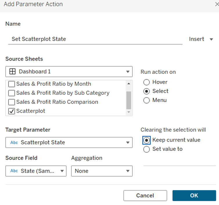
Set Scatterplot State

On select of the Scatterplot sheet, set the Scatterplot State parameter, passing in the value from the State field. When the selection is cleared, retain the value

If you click around the scatterplot, the Sales & Profit Ratio by Month line chart and Sales & Profit Ratio Comparison charts should update.

But we don’t want the other marks on the scatter plot to ‘fade’. To solve this, create a dashboard filter action.

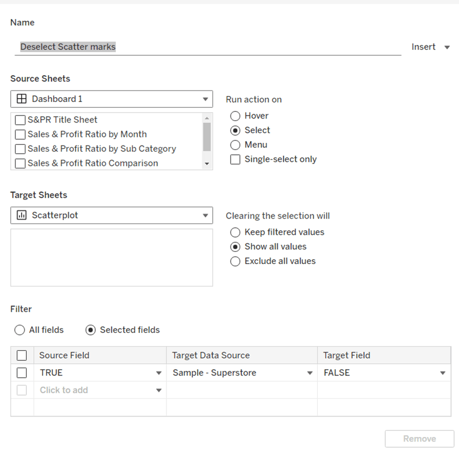
Deselect Scatter marks

On select of the Scatterplot sheet on the dashboard, target the Scatterplot sheet directly, setting the fields TRUE = FALSE. On clearing the selection, show all values.

Finally, the last requirement is to highlight the line in the Sales & Profit Ratio by Month chart associated to the State selected in the Sales & Profit Ratio Comparison chart. For this first create a dashboard set action to capture the selected state

Add State to Set

On select of the Sales & Profit Ratio Comparison sheet, target the State Name Set. Check the single-select only checkbox. Running the action should Assign value to set and clearing the selection should remove all values from set

Then add a dashboard highlight action

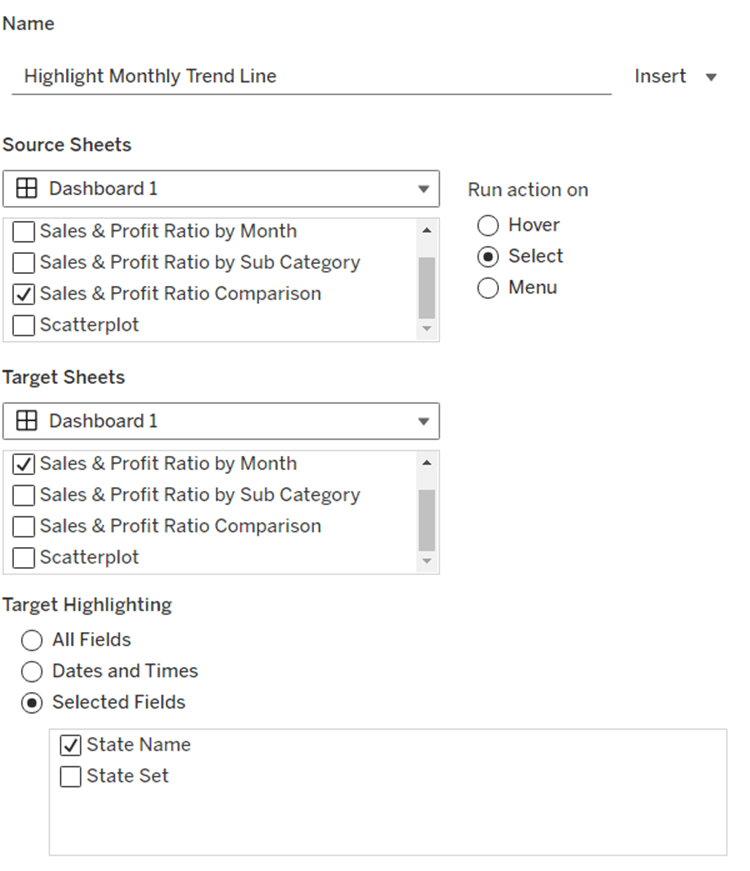
Highlight Monthly Trend Chart

On select of the Sales & Profit Ration Comparison sheet, target the Sales & Profit Ratio by Month sheet targeting the State Name field only

And hopefully, with all this, you should have a fully interactive dashboard. My published viz is here.

Happy vizzin!

Donna

Binary Parameters

This week’s challenge was a guest post by Felicia Styer, who wanted us to make multiple selections using just a single parameter, rather than any groupings or sets.

We’ll start by focusing on the initial requirement, which was to bucket into Sub-Categories selected and those not.

Setting up the parameter

The main functionality is controlled via a single string parameter which will just contain a string of 0s and 1s. 0 indicates the Sub-Category is not selected, 1 indicates it is. The position of the 1 or 0 in the string represents the associated Sub-Category. There are 17 Sub-Categories in the data set, so we need to create a parameter of 17 characters. Arbitrarily set some entries to 1 and the rest to 0.

Binary Parameter

string parameter containing the string 01000101000010000

Building the Sales by Subcategory viz

Add Sub-Category to Rows and Sales to Columns. Sort by Sales descending.

We want to assign a number for each row. We can use Index() or Rank the rows based on Sales. I chose to to the latter

Sub Cat Rank

RANK_UNIQUE(SUM(Sales), ‘desc’)

Format this to a number with 0dp but prefixed with #

Add this to Rows, change to discrete (blue pill) and then move to be listed before Sub-Category.

We want to colour the bars based on the ‘bucket’ they’re in according to the Binary Parameter.

Bucket

MID([Binary Parameter],[Sub Cat Rank],1)

This returns the character that is in the nth position in the string – ie Tables is ranked fourth, so this calculation will return the 4th character in the Binary Parameter string.

Add this to Colour and adjust accordingly. Show the Binary Parameter on the sheet, and then adjust the values between 1 and 0 to see the bars change colour.

When a bar is clicked, we want to update the parameter. We will use a dashboard parameter action to drive this functionality, but we need to pass a value into the parameter. This value needs to be a 17 character string of 1s or 0s, where only the character at the nth position based on the rank needs to differ.

For example, the string 01000101000010000 indicates Phones is selected – it’s ranked 2nd in the list and the 2nd character of the string is a 1. When Phones is clicked, we want it to become unselected. So the character in the 2nd position needs to change to a 0, while all the other characters remain the same.

Value for Param

IF [Bucket] = “0” THEN
LEFT([Binary Parameter],[Sub Cat Rank]-1) + “1” + MID([Binary Parameter],[Sub Cat Rank]+1)
ELSE
LEFT([Binary Parameter],[Sub Cat Rank]-1) + “0” + MID([Binary Parameter],[Sub Cat Rank]+1)
END

If the row is currently in Bucket 0, then get the portion of the Binary Parameter string before the nth term, concatenate it to 1 and then concatenate that with the portion of the Binary Parameter string after the nth term, otherwise, the row is associated to Bucket 1, so concatenate the preceding and following string with a 0 instead.

Add this to the Detail shelf.

Finalise the display by adding Sales to the Label, removing row & column dividers, updating the Tooltip, hiding the column headers and adjusting the font size.

Adding the selection interactivity

Add the sheet to a dashboard. Add a dashboard parameter action

Set Bucket

On selection of the sheet, set the Binary Parameter parameter passing the value of the Value for Param field. Leave the parameter with the current value when selection is cleared.

Click a bar to test the functionality. The bars should be changing colour. However, on click, Tableau automatically highlights the selected bar and the others ‘fade’. We’re already using colour to identify what’s been selected, so don’t want this to happen. To resolve this we will apply the True/False method to deselect the marks which is documented here.

You will need to create True and False calculated fields, and add them to the Detail shelf of the viz sheet. Then add a dashboard filter action as below.

Now when you click, the bars immediately change to the right colour with a single click of the mouse.

Building the Sales by Bucket bar chart

On a new sheet, add Sales to Columns, Bucket to Rows and Sub-Category to Detail. Adjust the table calculation setting of the Bucket pill so it is computing explicitly by Sub-Category.

Add Bucket to Colour and again adjust the table calculation as above. When you hover over the bar, you will see it is actually a stacked bar of each Sub-Category. We want these ordered so those with the smallest sales are on the left. Apply a Sort to the Sub-Category field on the Detail shelf to sort by Sales Descending

Widen each row. Add Sales to Label and set the Label to only show when selected (so they only appear when the segment of the bar is clicked on)

Add a Reference line to the Sales axis that shows the Sum of Sales per cell, and displays the Value. Don’t show any line or tooltip, and ensure the reference line isn’t recalculated when the bar chart is clicked.

Format the reference line label so it is positioned right middle, and adjust the font size.

Once again remove any row/column dividers and row headings and adjust the font sizes.

Arrange this chart onto the dashboard with the other chart using layout containers as required.

My version of this challenge is published here.

Bonus Challenge

For the bonus challenge to use more than 2 buckets, there was no example actually published. So I interpreted it as each click added it to the next bucket until you reached the maximum number of buckets allowed, at which point the Sub-Category would become deselected.

For this I created a parameter

# of Buckets

integer parameter from 1 to 5

The expectation in this instance was that rather than a string of 1s and 0s in the parameter, the parameter could contain any number from 0 up to # of Buckets – 1.

So the Value for Parameter field just had to change to become

IF [Bucket] = “0” THEN
//we’ve clicked once so move it to 1st bucket
LEFT([Binary Parameter],[Sub Cat Rank]-1) + “1” + MID([Binary Parameter],[Sub Cat Rank]+1)
ELSEIF [Bucket] = STR([# of Buckets]) THEN
//we’re already at the end, so reset to the starting position of 0
LEFT([Binary Parameter],[Sub Cat Rank]-1) + “0” + MID([Binary Parameter],[Sub Cat Rank]+1)
ELSE
// need to move to the next bucket
LEFT([Binary Parameter],[Sub Cat Rank]-1) + STR(INT([Bucket])+1) + MID([Binary Parameter],[Sub Cat Rank]+1)
END

The Colours associated to the Bucket field also then need to be updated to handle however many buckets you have, which you can set initially by manually updating the Binary Parameter parameter.

Note – as I have both versions in my workbook, I have fields suffixed with ‘bonus’ to represent the calculated fields/parameters needed.

My published version of this viz is here.

Happy vizzin’!

Donna

Can you compare to a selected months value?

This week’s challenge by Lorna was to deliver some functionality without using LODs or table calculations. She hinted that parameters and parameter actions would be your friends.

Setting up the parameters

Create a parameter to capture the month selected

pMonth

date parameter defaulted to 01 April 2023

and then create one that will store the value associated to the month selected

pMonthSales

float parameter defaulted to 0

Building the Viz

On a new sheet add Order Date as a continuous (green) pill at the month-year level to Columns. Add Sales to Rows.

Create a new calculated field

Difference from Selected Sales

SUM([Sales]) – [pMonthSales]

and add this to Rows.

Change the mark type of this second marks card to bar and add Difference From Selected Sales to the Colour shelf. Adjust the colour to a diverging scale and centre at 0

Set the Size of the bars to be Manual rather than Fixed and adjust the slider to suit.

Add a reference line to the Order Date axis, that references the pMonth parameter.

Adjust the Tooltips, remove gridlines and add a title.

Adding the interactivity

Add the sheet to a dashboard. Add a dashboard parameter action

Set Date

On select of the viz, update the pMonth parameter with the value from the Month([Order Date]) field.

Add another dashboard action

Set Value

On select of the Viz, update the pMonthSales parameter with the value from the SUM(Sales) field that is aggregated at the SUM level.

Now if you click on a point on the line chart, the bottom bars should alter, but they’ll all appear ‘faded’ initially.

To resolve this, create a new calculated field

HL

“HL”

and add this to the Detail shelf of the All marks card. Then create a dashboard highlight action

Highlight

On select of the viz, highlight the HL field only

When you now click, the bottom marks aren’t faded as they essentially are all ‘highlighted’ too.

And that’s it for this week!

My published viz is here.

Happy vizzin’!

Donna
Filter for One Value OR All Others

Erica set the latest challenge, testing us on our ability to master tricky filter scenarios – in this case either show the info for one specific value of a field, or only show the other values, but allow them to be filtered themselves too. The challenge had two parts – the main challenge and a bonus option. I managed to complete both, so will blog both too.

Main challenge – Building the basic viz

On a new sheet add Region and Category to Rows and Sales to Columns. Add Region to Colour and adjust accordingly.

Sort Region by Sales descending

and then click the descended sort button on the toolbar to sort the Category field by Sales too.

Format Sales to be $ with 0 dp. Remove column dividers, and widen each row slightly.

Main challenge – Apply the filtering

Create a parameter

pRegionType

string parameter with 2 options : Not West and West, defaulted to Not West

Create a calculated field to determine whether to display the West Region only, or the other Regions

Filter Region West or Not v1

([pRegionType] = ‘West’ AND [Region] = ‘West’)
OR
([pRegionType] = ‘Not West’ AND [Region] <> ‘West’)

Add this to the Filter shelf and set to True. This is essentially the ‘first level’ filter. Show the parameter and switch between the two values to see the behaviour

Now we need a ‘second’ filter, to allow the relevant Regions to be selected. For this, add Region to the Filter shelf, but select the Use all option

and then show the Region filter list on the canvas, and adjust the settings so only relevant values are displayed

This means when the pRegionType parameter is West, only West will be displayed in the Region filter, but when Not West is selected, all regions except West will display, and the filter can be interacted with in the normal manner.

Main challenge – Building the dashboard

Arrange the viz and the parameters on the dashboard as required, using layout containers, padding and background colours to help organise the content and display required.

We only want the Region selection filter to display when the pRegionType parameter is set to Not West. We can use dynamic zone visibility for this. Create a calculated field

DMZ – Display Filter Control

[pRegionType] = ‘Not West’

and then on the dashboard, select the Region filter and check the Control visibility using value option and select the DMZ – Display Filter Control field.

Bonus Challenge – Building the Viz

Recreate the viz as described above (or duplicate the sheet of the original viz, and remove all the pills from the Filter shelf.

Bonus challenge – Apply the filtering

Create a parameter

pSelectedRegion

string parameter, defaulted to <empty string>

This parameter is going to contain a string that can contain one or more Regions in a delimited format eg | East | or |East||South| etc. The contents of this string will determine how we filter the chart to mimic the required behaviour.

Firstly, we want the ‘1st level’ filter to determine whether we’re displaying just the West Region or all the other Regions.

Filter Region West or Not v2

(CONTAINS([pSelectedRegion],’West’) AND [Region] = ‘West’)
OR
(NOT CONTAINS([pSelectedRegion], ‘West’) AND [Region] <> ‘West’)

Add this to the Filter shelf and set to True. Show the pSelectedRegion parameter. With the parameter empty, the West Region should not display.

Type the word West into the parameter. Now the just the West Region should display.

And if you enter additional text alongside the word ‘West’, still the ‘West’ Region should display

But if you remove the ‘West’ text, all the Regions should display whatever the text is contained.

This behaviour is essentially simulating that of the ‘West’ | ‘Not West’ parameter selection in the previous version.

Now we want to control the 2nd level of filtering where the same parameter is used to drive which of the ‘other’ Regions display.

Filter Other Regions v2

CONTAINS([pSelectedRegion], ‘West’) OR
NOT CONTAINS([pSelectedRegion],[Region])

Set the pSelectedRegion parameter to empty so all Regions are displayed. Add Filter Other Regions v2 to the Filter shelf and set to True.

Enter the text East into the parameter. The East option should disappear.

Add the text ‘South’. That too should disappear

Add the text ‘West’ and only the West Region will show

Play around entering multiple combinations of Regions. Ultimately if the text ‘West’ is present anywhere in the parameter string, only the West Region will display. If West is not present, then any other Region in the string will not be presented in the display. All sounds a bit backwards, but it works 🙂

So now we need to actually control how the pSelectedRegion parameter will get populated. And this will be via a parameter action fired from the selection made from a ‘custom’ legend sheet.

Bonus challenge – Building the filter control

On a new sheet, add Region to Rows and manually type in MIN(0.0) into Columns. Change the mark type to shape. Add Region to Label and show the labels (widen each row slightly). Edit the MIN(0.0) axis to be fixed from -0.1 to 0.5 which will shift the display to the left.

Sort the Region field by Sales descending.

Hide the axis, stop the Tooltip from displaying, hide the Region header, remove all gridlines/ axis rulers/ zero lines, row/column dividers. Set the background colour to light grey.

The Colour and the Shape (filled or unfilled) is determined based on the entries we have captured in the pSelectedRegion parameter, but the logic for each attribute is different.

Colour v2

If [pSelectedRegion] = ‘|West|’ THEN ‘West’ ELSE [Region] END

Show that parameter and make it empty. Add Colour v2 to the Colour shelf. Adjust colour to suit if not already set.

Then enter the text |West| – all the symbols should now all be Navy (or whatever colour you have chosen for West).

For the shape, create

Shape v2

IF CONTAINS([pSelectedRegion] , ‘West’) AND [Region] = ‘West’ THEN ‘Fill’
ELSEIF CONTAINS([pSelectedRegion], ‘West’) AND [Region] <> ‘West’ THEN ‘Empty’
ELSEIF ([Region] <> ‘West’) AND [pSelectedRegion]=” THEN ‘Fill’
ELSEIF ([Region] <> ‘West’) AND NOT CONTAINS([pSelectedRegion],[Region]) THEN ‘Fill’
ELSE ‘Empty’
END

and add to the Shape shelf. Note – this logic took a lot of trial and error to get the desired result.

Whenever the text West exists in the parameter, then the West Region should be a filled circle and all the other regions should be empty (the first 2 lines of the logic statement). If the parameter is empty, we want all the regions (except West) to be filled (so West will be empty). And if the parameter contains a Region(s) that isn’t West, we want that Region to be empty as well – only non-West Regions that aren’t in the parameter should be filled.

To control the text being passed into the pSelectedRegion parameter, we need a field

Region for Param

IF CONTAINS([pSelectedRegion],’West’) THEN ” //West has been selected again so reset parameter to empty
ELSEIF CONTAINS([pSelectedRegion], [Region]) THEN REPLACE([pSelectedRegion], ‘|’ + [Region] + ‘|’ ,”) //selected region is already in the parameter, so remove it ”
ELSE [pSelectedRegion]+ ‘|’ + [Region] + ‘|’ //append current region selected to the existing parameter string
END

Add this to the Detail shelf.

Finally, we will want to ensure the marks aren’t highlighted on selection, so create fields

True

TRUE

False

FALSE

and add these to the Detail shelf too.

Bonus challenge – adding the interactivity

Build the dashboard again using layout containers and background colours and padding

Create a dashboard parameter action

Set Region

On selection of the Filter Control viz, set the pSelectedRegion parameter passing in the value from the Region for Param field. Set the field to <empty string> when deselected

Create a dashboard filter action

Deselect Marks

On select of the Filter Control viz on the dashboard, target the Filter Control sheet itself, passing in the specific fields of True = False.

And this should complete the required elements. My published viz is here.

Happy vizzin’!

Donna
Top 5 Product Sales vs Other Products

Erica set this week’s challenge and provided multiple levels specifically aimed a newer users of Tableau. My solution is for Level 3.

Setting up the calculations

First, create a parameter to capture the Sub-Category we care about

pSelectedSubCat

string parameter defaulted to Tables

Create a new field

Is Selected SubCat

[pSelectedSubCat]= [Sub-Category]

then create another field

Product to Display – Step 1

IIF([Is Selected SubCat], [Product Name], ”)

On a new sheet add Sub-Category and Product to Display – Step 1 to Rows. Show the pSelectedSubCat parameter. You will see that the Product rows only show for the Sub Category entered in the pSelectedSubCat parameter

We want to show the average of the product sales for each Sub-Category, so we can create

Sales by Sub Cat & Product

{FIXED [Sub-Category], [Product Name]: SUM([Sales])}

Add this to Text. By default it will aggregate this value to SUM, change it to AVG. For the rows associated to the selected Sub-Category the value of this field is the same whether its SUM or AVG, as it has been calculated at the level of detail being displayed on the row (Sub-Category and Product Name). For the other rows, by changing the aggregation to AVG we are getting the required value, which is essentially the sum of all sales associated to the Sub-Category divided by the number of distinct products. Sort the Sub-Category pill by the Average of the Sales by Sub Cat & Product field descending

Additionally, sort the Product to Display – Step 1 field the same way

We need to identify the top 5 records for the products associated to the selected Sub-Category. We will use a set for this. Right click on Product to Display – Step 1 > Create > Set

Product to Display Set

Select the Top tab and select the top 5 by formula

AVG(IF [Is Selected SubCat] THEN [Sales by Sub Cat & Product] END)

Add this to Rows and you should get In displayed against the product rows with the highest values

With this we can start to think about the ‘other’ text we need to display, but for this we need a handle on the number of products in each Sub-Category. Create

Count Products Per Sub-Category

{FIXED [Sub-Category]: COUNTD([Product Name])}

Add to Text so you can see the value, and then subsequently we can create

Product to Display – Step 2

IF NOT([Is Selected SubCat]) THEN ”
ELSEIF [Product to Display Set] THEN [Product Name]
ELSE ‘Other: ‘ + STR([Count Products Per Sub-Category] – 5) + ‘ Products’
END

Add to Rows to see the behaviour

The viz also needs to show an index value against the top 5 rows, so create

Index to Display

IF MIN([Is Selected SubCat]) AND MIN([Product to Display Set]) THEN STR(INDEX())
ELSE ” END

Add this to Rows as a blue discrete pill in front of the Product to Display – Step 2 field. Adjust the table calculation setting so the Sub-Category field is unchecked.

Next, we’re going to need to display a reference line that is the overall average product sales for the Sub-Category. This may sound like it’s what we already have, but that field is at the Sub-Category and Product Name level of detail, and we need to aggregate this back up to be at the Sub-Category level, so we create

Avg Sales by Sub Cat and Product

{FIXED [Sub-Category]: AVG([Sales by Sub Cat & Product])}

which is the average of the field we previous created but per Sub-Category. Pop this into the table to see what is happening. For the rows where the Products aren’t showing, the values match, but for the rows where the Products are displayed, you get the overall average, which is the same for all the rows.

If we now remove Product to Display – Step 1 from Rows (and amend the Index to Display table calc so it is not longer computing by this field too), we should have the data we expect. Format the Sales by Sub Cat & Product field to be $ with 0 dp.

Building the Viz

On a new sheet add Sub-Category, Product to Display Set, Index to Display and Product to Display – Step 2 to Rows and Sales by Sub Cat & Product to Columns and aggregate to AVG.

Sort the Sub-Category pill by the Average of the Sales by Sub Cat & Product field descending and apply the same sort to the Product to Display – Step 2 field. Edit the table calculation of the Index to Display field so it is not computing by Sub-Category.

Create a new field

Colour

IF [Is Selected SubCat] AND [Product to Display Set] THEN ‘Dark’
ELSEIF [Is Selected SubCat] THEN ‘Light’
ELSE ‘Grey’
END

Add this to Colour shelf and adjust accordingly.

Add Avg Sales by Sub Cat & Product to the Detail shelf, then add a reference line based on the Average of this field

Widen each row and from the Label shelf check Show mark labels. From the Tooltip shelf uncheck Show tooltips.

Hide the In/Out Product to Display Set field in Rows (uncheck show header). Format the font and style of the header columns, then hide the header field labels and hide the axis. Adjust the row banding and set all gridlines, zero lines, axis rulers and column dividers to none. Change the title of the sheet.

Test the behaviour by manually changing the value of the parameter.

Adding the interactivity

Add the sheet to a dashboard, then create a parameter dashboard action

Set SubCat

On select of the viz, update the pSelectedSubCat parameter passing in the value from the Sub-Category field.

My published viz is here

Happy vizzin’!

Donna
Datafam Europe Live: London’s Top Attractions

This week’s #WOW2024 challenge was run live at the #Datafam Europe event in London and was a combo with the #PreppinData crew. If you want to have a go at shaping the data required for this challenge yourself, then check out the PreppinData challenge here. Otherwise, you can use the data provided in the excel workbook from the link in the #WOW2024 challenge (I’m building based on this).

Modelling the data

There are 3 data sources for this challenge which we need to relate together. We have

  • Attraction Locations – a list of attractions in London with their lat and long coordinates
  • Tube Locations – a list of tube stations in London with their lat & long coordinates
  • Attraction Footfall – a list of attractions with their annual footfall

Connect to the Excel file and add Attraction Locations to the canvas. Then add Tube Locations and then create a relationship calculation of 1=1 to essentially map every attraction to every tube station.

Then add Attraction Footfall to the canvas and relate it to Attraction Locations by setting Attraction Name = Attraction

Finally, in the viz we have to understand the distance between a selected attraction (the start point) and other attractions (the end point), so we need to have an additional instance of Attraction Locations to be able to generate the information we will need between the start and end. So add another instance of Attraction Locations and set the relationship as Attraction Name <> Attraction Name

To make things a bit easier for reference purposes, rename Attraction Locations to Selected Attraction and Attraction Locations1 to Other Attractions (just right click on the data connection in the canvas to do this).

Building the Footfall Bar Chart

On a new sheet add Attraction Name (from Selected Attraction) to Rows and add 5 Year Avg Footfall to Columns. Change this from SUM to AVG (as the data consists of multiple rows per year and this value is the same for each row associated to an attraction). Sort the chart descending.

Click on the 2 nulls indicator and select to filter the data which will remove the bottom two rows and automatically add 5 Year Avg Footfall to the Filter shelf.

Manually increase the width of each row. Set the format of the 5 Year Avg Footfall to be in millions (M) to 2dp, and then show mark labels and align middle left.

Create a parameter to capture the selected attraction

pSelectedAttraction

string parameter defaulted to St Paul’s Cathedral

show the parameter on the screen.

We need to identify which attraction has been selected, so create

Is Selected Attraction

[Attraction Name]=[pSelectedAttraction]

and then add this to the Colour shelf. Adjust the colours accordingly and set an orange border. Then add Attraction Rank to Rows. Set it to be a discrete dimension (blue pill) and move it to be in front of Attraction Name.

Set the font of the row labels to be navy, hide the row label names (hide field labels for rows), hide the axis (uncheck show header), don’t show tooltips, and remove all row/column dividers, gridlines and zero/axis lines. Set the background of the worksheet to be None (ie transparent). Update the title of the sheet and then name the sheet Footfall or similar.

Building the map

We’re going to use map layers for this, and will build 4 layers

  • the selected attraction
  • the other attractions
  • the tube stations
  • the buffer circle

When using map layers we want to work with spatial data, so we’ll start by creating a point for the selected attraction

Selected Attraction Point

MAKEPOINT([Attraction Latitude], [Attraction Longitude])

Double click on this and it will automatically generate a map. Add Is Selected Attraction to the Filter shelf and set to True so only 1 mark should display, Add Attraction Name to Detail. Show the pSelectedAttraction parameter. Change the mark type to shape and select a filled star. Set the Colour of the shape to navy and add an orange halo. Update the Tooltip.

For the buffer, we need another parameter

pDistance(miles)

float parameter defaulted to 1 that ranges from 0.5 to 2 with a step size of 0.5

Then create

Buffer Attraction (x miles)

BUFFER([Selected Attraction Point], [pDistance(miles)],’mi’)

And drag this onto the canvas and drop when the Add Marks Layer option appears

This will create a new marks layer, which we can rename to Buffer. Reduce the opacity of the colour to 0%. Move the marks layer so it is at the bottom (below the other marks card) , and set the disable selection option so when you move the cursor over the map the buffer circle does not highlight.

Adjust the background layers of the map so only the Postcode Boundaries are visible.

To add the tube stations, we first need to create

Tube Station Point

MAKEPOINT([Station Latitude],[Station Longitude])

Then drag this onto the canvas to create a new marks layer. Add Station to the Detail shelf of this new marks card, and move the marks card so it is below the Selected Attraction marks card.

We don’t want all the stations to display. We just need to show those up to 1.5x the buffer distance, so we need

Distance to Tube Station

DISTANCE([Selected Attraction Point], [Tube Station Point], ‘mi’)

format to a number with 2 dp and then create

Tube Station Within Range

[Distance to Tube Station]<= 1.5 * [pDistance(miles)]

Add this to the Filter shelf and set to True.

We want the size of the displayed stations to differ depending on whether they’re inside the buffer or not, so create

Tube Station Within Buffer

[Distance to Tube Station] <= [pDistance(miles)]

and add this to Size. Change the mark type to circle, then adjust the size as required. Change the colour to orange and add a white border. Add Distance to Tube Station to Tooltip and update. You may want to adjust the size of the shape on the Selected Attraction marks card too, so it’s bigger than the tube stations.

The stations need to be labelled based on the closest x number of stations that are within the buffer. For this we need a parameter

pTop

integer parameter defaulted to 5 that ranges from 5 to 20 with a step size of 1.

We need to rank the stations based on the distance, so create

Station Rank

RANK(SUM([Distance to Tube Station]), ‘asc’)

We’re also going to label the stations with a letter based on their rank

Rank Stations as Letters

CHAR([Station Rank] + 64)

but we only want to show labels for the ‘top’ ranked stations, so create

Label Stations

IF MIN([Tube Station Within Buffer]) AND [Station Rank]<=[pTop] THEN [Rank Stations as Letters] END

and add this to the Label shelf. Adjust the table calculation settings, so the calculation is computing by both Station and Tube Station Within Buffer.

Set the labels to be aligned middle centre, and allow labels to overlap other marks. If things are working as expected, then if you increase the buffer distance to 1.5 miles and the pTop parameter to 20, you should see that not all stations within the buffer circle are labelled

To add the other attractions, we need to create

Other Attraction Point

MAKEPOINT([Attraction Latitude (Attraction Locations1)],[Attraction Longitude (Attraction Locations1)])

and drag this onto the canvas to Add a marks layer. Move this layer so it is beneath the Selected Attraction marks card, and add Attraction Name (from the Other Attractions) section to Detail

Once again, we want to limit what attractions display, so need

Distance to Other Attraction

DISTANCE([Selected Attraction Point], [Other Attraction Point], ‘mi’)

and then

Other Attraction Within Range

[Distance to Other Attraction]<= 1.5 * [pDistance(miles)]

and add this to the Filter shelf and set to True.

Add Distance to Other Attraction to the Tooltip shelf and update. Change the mark type to shape. The shape needs to differ whether it’s within the top x closest attractions that’s inside the buffer or not. So we need

Rank Other Attractions

RANK(SUM([Distance to Other Attraction]), ‘asc’)

and then

Top X Attraction in Buffer

IF [Rank Other Attractions] <= [pTop] AND MIN([Other Attraction within Buffer]) THEN MIN([Attraction Name (Attraction Locations1)])
ELSE ‘Not Top X’
END

Add this to the Shape shelf. Set the table calculation so it is computing explicitly by both Attraction Name and Other Attraction Within Buffer. Setting the specific shape for each of the named attractions that could show is fiddly, so I just chose to leave as per the default values listed. The only shape I explicitly set was the Not Top X which I set to a filled circle. I set the colour of the shapes to dark grey and added a halo of the same colour to make the shape more prominent. The shapes also need to differ in size based on whether they are in the buffer or not, so need

Other Attraction Within Buffer

[Distance to Other Attraction] <= [pDistance(miles)]

Add to the Size shelf and then adjust sizes to suit.

Set the background of the worksheet to None, remove all row/column dividers and name the sheet Map or similar. Finally remove all the Map Options (Map > Map Options > uncheck all selections) to prevent to toolbar from displaying on hover. Test the map functionality by changing the various parameters and entering a new starting location.

Note – in subsequent testing I found that for some attractions where there were either no tube stations or other attractions within the range, the map would disappear. If I get time I’m going to try to work on a solution for this, but I’ll leave as is for now (Lorna’s published solution has the same issue).

Building the Tube Station Rank Bar

On a new sheet add Station to Rows and Distance to Tube Station to Columns. Add Is Selected Attraction to Filter and set to True. Sort the chart ascending, so closet is listed first.

We only want to display the stations that are within the buffer, so add Tube Station Within Buffer to Filter and set to True.

We also want to restrict this list to just those that are the closest ‘x’ to the attraction based on the pTop parameter. Add Station to the Filter shelf and on the General tab, select Use all and then select the Top tab and add the condition to display the bottom pTop by Distance to Tube Station.

However, this doesn’t quite show the correct results, as the Top n filtering has been applied BEFORE the other filters on the shelf. To resolve this we need to add Is Selected Attraction and Tube Station Within Buffer to context (right click each pill on the filter shelf).

Add Station and Distance to Tube Station to the Label shelf, and adjust the label to display the text as required and align middle left. Change the mark type to bar and manually widen the width of each row so the labels are readable. Adjust the colour of the bars.

For the circle labels, we need a ‘fake’ axis – double click into Columns and manually type MIN(-0.05). Move the pill that is created to be in front of the Distance to Tube Station pill.

Change the mark type of the MIN(-0.05) pill to circle and remove the fields from the Label shelf. Add Rank Stations as Letters to the Label shelf instead and adjust the table calculation so it is explicitly computing by Station. Format the label and align middle centre.

Make the chart dual axis and synchronise the axis. Remove Measure Names from the All marks card.

Don’t show the Tooltip, remove all row/column dividers, hide the axis and the Station column. Hide all gridlines, axis lines, zero lines. Format the background of the workbook to be None (ie transparent).

Update the title of the sheet referencing the parameters as required, and name the sheet Tube Station Rank Bar or similar.

Building the Tube Station Rank Bar

On a new sheet add Attraction Name (from the Other Attractions data set) to Rows and Distance to Other Attraction to Columns. Add Is Selected Attraction to Filter and set to True. Sort the chart ascending, so closet is listed first.

We only want to display the other attractions that are within the buffer, so add Other Attraction Within Buffer to Filter and set to True.

We also want to restrict this list to just those that are the closest ‘x’ to the attraction based on the pTop parameter. Add Attraction Name to the Filter shelf, on the General tab, select Use all and then select the Top tab and add the condition to display the bottom pTop by Distance to Other Attraction.

Add Is Selected Attraction and Other Attraction Within Range to context.

Add Attraction Name (from the Other Attractions data set) and Distance to Other Attraction to the Label shelf, and adjust the label to display the text as required and align middle left. Change the mark type to bar and manually widen the width of each row so the labels are readable. Adjust the colour of the bars.

Double click into Columns and manually type MIN(-0.1). Move the pill that is created to be in front of the Distance to Other Attraction pill.

Change the mark type of the MIN(-0.1) pill to shape and remove the fields from the Label shelf. Add Attraction Name to the Shape shelf. Set the colour of the shape. Edit the shape for each Attraction so it matches the shapes assigned to the attractions on the Map sheet. Unfortunately, this is a bit fiddly and just a case of trial and error which involves changing the parameters to try to ensure all the options are presented at least once of each of the charts. There is probably a better way, but I’d have to rebuild something so sorry!

Make the chart dual axis and synchronise the axis. Remove Measure Names from the All marks card.

Don’t show the Tooltip, remove all row/column dividers, hide the axis and the Attraction Name column. Hide all gridlines, axis lines, zero lines. Format the background of the workbook to be None (ie transparent).

Update the title of the sheet referencing the parameters as required, and name the sheet Tube Attraction Rank Bar or similar.

Adding the interactivity

Add the sheets onto the dashboard making use of layout containers to get the objects positioned where required. Format the dashboard to set the background to the light peach colour. How I’ve organised the content is show by the item hierarchy below

Create a parameter dashboard action

Select attraction

On select of the footfall bar chart, set the pSelectedAttraction parameter with the value from the Attraction Name field. Keep the value when the mark is deselected.

And at this point, you should hopefully now have a functioning dashboard. My published version is here.

Happy vizzin!

Donna