It was Luke’s turn to set the #WOW2023 challenge this week and he chose to focus on remaking a visualisation relating to the change in the Antarctic Sea Ice, inspired by charts created by Zach Labe.
The challenge involved the use of extensive calculations, which at times I found hard to validate due to the steps involved in reaching the final number, and only having visibility of the final number on hover on a point on the chart. If it didn’t match, it became a bit of a puzzle to figure out where in the process I’d gone wrong.
Getting the data for the faded yearly line charts was ok, but I ended up overthinking how the decade level darker line chart was calculating and couldn’t get matches. Anyway, after sleeping on it, I realised my error, and found I didn’t need half the calculations I’d been playing with.
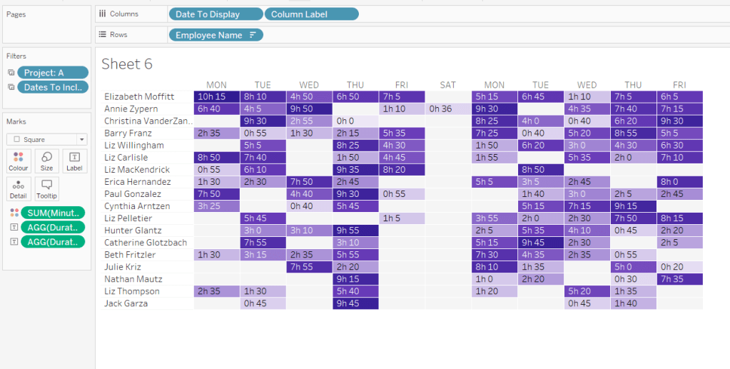
So let’s step through this. As we’re working with moving averages, we’re looking at using table calculations, so the starting point is to build out the data and the calculations required into a tabular form first.
Setting up the calculations
I used the data stored in the Google sheet that was linked to in the challenge, which I saved down as a csv file. After connecting to the file, I had separate fields for Day, Month and Year which I changed to be discrete fields (right click on field and Convert to discrete).
We need to create two date fields from these fields. Firstly
Actual Date
MAKEDATE([Year],[Month],[Day])
basically combines the 3 separate fields into a proper date field. I formatted this to “14 March 2001” format.
Secondly, we’ll be plotting the data on an axis to span a single year. We can’t use the Actual Date field for that as it will generate an axis that runs from the earliest date to the latest. Instead we need a date field that is ‘normalised’ across a single year
Date Normalise
MAKEDATE({max([Year])}, [Month], [Day])
the {max([Year])} notation is a short cut for {FIXED: MAX([Year])} which is a level of detail (LoD) expression which returns the greatest value of the Year field in the data set. In this case it returns 2023. So the Date Normalise field only contains date for the year 2023. Ie if the Actual Date is 01 Jan 2018 or the Actual Date is 01 Jan 2020, the equivalent Date Normalise for both records will be 01 Jan 2023.
Let’s start to put some of this out into a table.
Put Year on Columns, and Date Normalise as a blue (discrete) exact date field on Rows. Add Area(10E6M2) to Text and change to be Average rather than Sum (in leap years, the 29 Feb seems to have been mapped to 01 March, so there are multiple entries for 01 March). This gives us the Area of the Ice for each date in each year.

We need to calculate the 7 day moving average of this value. The easiest was to do this is add a Moving Average Quick Table Calculation to the pill on the Text shelf.

Once done, edit the table calculation, and set so that is average across the previous 6 entries (including itself means 7 entries in total) and it computes down the table (or explicitly set to compute by Date Normalise).

It is best to create an explicit instance of this field, so if you click on the field and press ctrl while you drag and drop it into the data pane on the left hand side, you can then rename the field. I named mine
Moving Avg: Area
WINDOW_AVG(AVG([Area (10E6M2)]), -6, 0)
It should contain the above syntax as that’s what the table calculation automatically generates. If you’re struggling, just create manually and then add this into the table instead.
Add Area (10E6M2) back into the table too. You should have the below, and you should be able to validate the moving average is behaving as expected

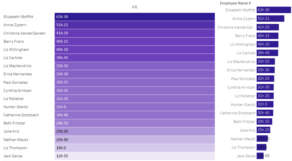
Now we need to work out the data related to the ‘global’ average which is the average for all years across a single date.
Average for Date
{FIXED [Date Normalise]: AVG([Area (10E6M2)])}
for each Date Normalise value. return the average area.
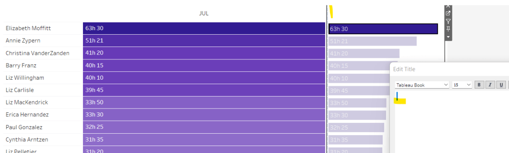
Pop this into the table, and you should see that you have the same value for every year across each row.

We can then create a moving average off of this value, by repeating similar steps above. In this instance you should end up with
Moving Avg Date
WINDOW_AVG(SUM([Average For Date]), -6, 0)
Add into the table, and ensure the table calculation is computing by Date Normalise and again you should be able to validate the moving average is behaving as expected
Note – you can also filter out Years 1978 & 1979 as they’re not displayed in the charts

So now we have the moving average per date, and the global moving average, we can compute the delta
Ice Extent vs Normal
[Moving Avg: Area] -[Moving Avg Date]
Format this to 3 dp and add to the table. You should be able to do some spot check validation against the solution by hovering over some of the points on the faded lines and comparing to the equivalent date for the year in the table.

This is the data that will be used to plot the faded lines. For the bolder lines, we need
Decade
IF [Year] = {max([Year])} THEN STR([Year])
ELSE
STR((FLOOR([Year]/10))*10) + ‘s’
END
and we don’t need any further calculations. To verify, simply duplicate the above sheet, and then replace the Year field on Columns with the Decade field. You should have the same values in the 2023 section as on the previous sheet, and you should be able to reconcile some of the values for each decade against marks on the thicker lines.
Basically, the ‘global’ values to compare the decade averages against are based on the average across each individual year, and not some aggregation of aggregated data (this is where I was overthinking things too much).

Building the viz
On a new sheet add Date Normalise as a green continuous exact date field to Columns, and Ice Extent vs Normal to Rows. Add Year to Detail and Decade to Colour. Adjust colours to suit and reduce to 30% opacity. Reduce the size to as small as possible. Add Decade to Filter and exclude 1970s. Ensure both the table calculations referenced within the Ice Extent vs Normal field are computing by Date Normalise only.

Add Actual Date to the Tooltip and and adjust the tooltip to display the date and the Ice Extent vs Normal field in MSM.

Now add a second instance of Ice Extent vs Normal to Rows. On the 2nd marks card that is created, remove Year from Detail and Actual Date from Tooltip. Increase the opacity back up to 100% and increase the Size of the line. Sort the colour legend to be data source order descending to ensure the lines for the more recent decades sit ‘on top’ of the earlier ones.

Modify the format of the Date Normalise field to be dd mmmm (ie no year). Adjust the Tooltip as below

Make the chart dual axis and synchronise the axis. Remove the right hand axis.

Edit the axis titles, remove row and column dividers and add row & column gridlines.
Adding the labels
We want the final point for date 18 June 2023 to be labelled with the actual Area of ice on that date and the difference compared to the average of that date (not the moving average). I create multiple calculated fields for this label, using conditional logic to ensure the value only returns for the maximum date in the data
Max Date
{max([Actual Date])}
Label:Date
IF MIN([Decade])=’2023′ AND MIN([Actual Date])=MIN([Max Date]) THEN MIN([Max Date]) END
Label: Area
IF MIN([Decade])=’2023′ AND MIN([Actual Date])=MIN([Max Date]) THEN AVG([Area (10E6M2)]) END
Label:Ice Extent v Avg for Date
IF MIN([Decade])=’2023′ AND MIN([Actual Date])=MIN([Max Date]) THEN AVG([Area (10E6M2)]) – SUM([Average For Date]) END
Label:unit of measure
IF MIN([Decade])=’2023′ AND MIN([Actual Date])=MIN([Max Date]) THEN ‘MSM’ END
Label: unit of measure v avg
IF MIN([Decade])=’2023′ AND MIN([Actual Date])=MIN([Max Date]) THEN ‘MSM vs. avg’ END
All these fields were then added to the Text shelf of the 2nd marks card and arranged as below, formattign each field accordingly

And this sheet can then be added to the dashboard. The legend needs be adjusted to arrange the items in a single row.
My published viz is here.
Happy vizzin’!
Donna