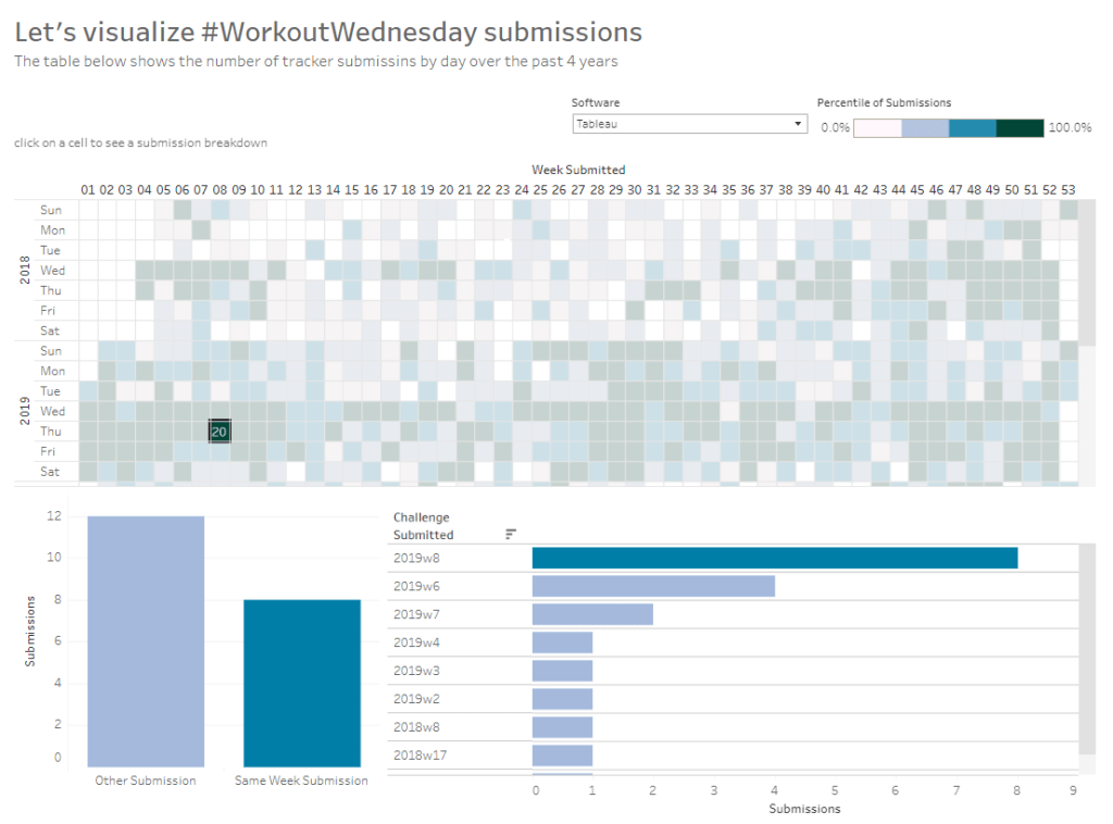
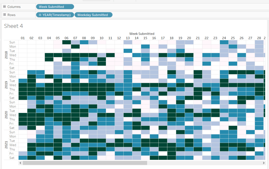
Sean Miller decided to use the data gathered by the #WorkoutWednesday team in this week’s challenge, to visualise how people use the submission tracker. I try to fill it in immediately after publishing and tweeting my solution, which is usually within the same week as when the challenge is set, unless I’m on holiday. Sometimes I do forget and as I know I’ve completed every challenge, I will fill it in if I see gaps in the tracker. However, I do think there’s something a bit awry with my submission data as there’s a few holes that don’t seem to tally properly with the weeks in the month…. there’s probably a typo or duplication in my data (if any of the team happen to read this, could you have a look.. or let me see my data to see if I can find the problem 😉 )
Anyway onto the challenge – we’re going to build a heat map and 2 bar charts and then add some interactivity between the two – nothing majorly taxing this week, so hopefully this blog won’t take too long to write… I’m prepping for Christmas so have lots to do 🙂
Building the heat map
The heat map displays the week number in the year across the top, and year and day of week down the side. We need to create some calculated fields to extract some of these values from the Timestamp date field provided (note if your Timestamp field doesn’t import automatically as a date, then right click > Change Data Type > Date to convert it).
Week Submitted
DATEPART(‘week’,[Timestamp])
Format this to custom format of 00, so you display 01 rather than 1. Drag the pill into the top half of the data pane, so it’s stored as a dimension.
Weekday Submitted
LEFT(DATENAME(‘weekday’,[Timestamp]),3)
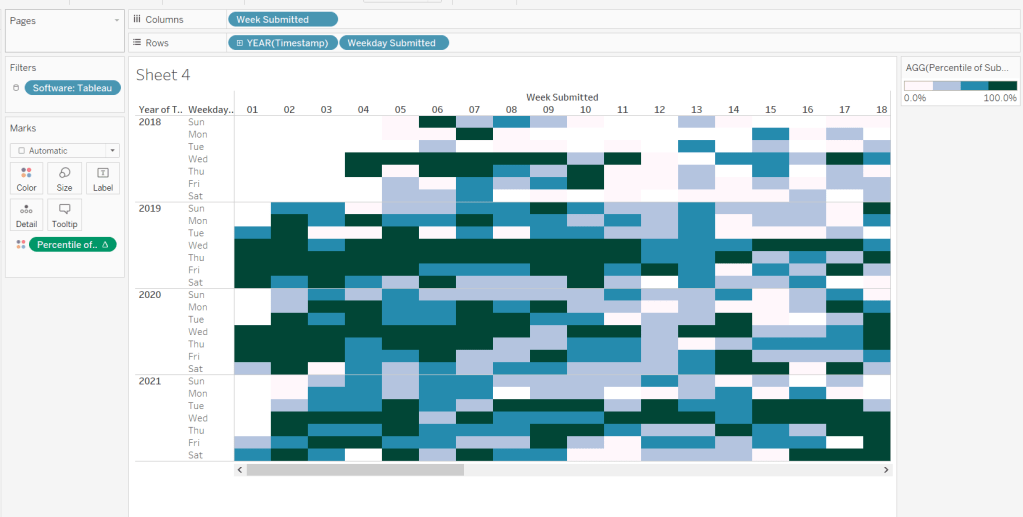
Add Week Submitted to Columns and then YEAR(Timestamp) and Weekday Submitted to Rows.
To get the numbers and display to match Sean, you will need to ensure your week starts on a Sunday. If you’re in the UK like me, you may have it set to Monday. To change this right-click on the data source > Date Properties > Week start = Sunday.
where the field referenced is automatically generated field that is created (ie what used to be Number of Records).
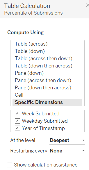
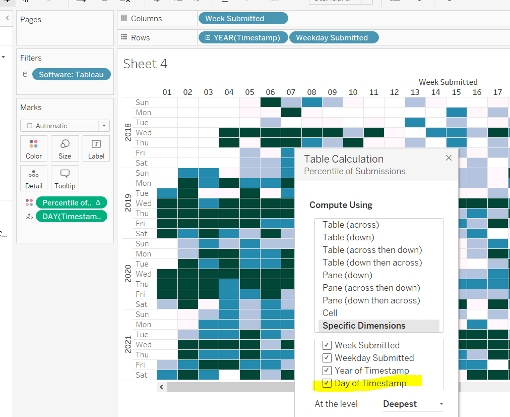
And then we need to calculate the Rank Percentile, which isn’t as scary as it sounds – there’s a handy function…
Percentile of Submissions
RANK_PERCENTILE([Submissions])
Format to a percentage with 1 dp.
Add this onto the Colour shelf, and adjust the table calculation so it is computing by all the fields.
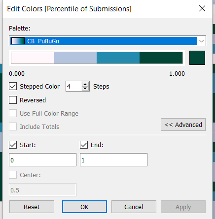
Edit the colour range to use the one specified, and adjust the settings so it only uses 4 colours, and ranges from 0 to 1
Add Software to the Filter shelf and select Tableau
This is the core of the chart complete. Add column and row dividers, rotate the Year headings, narrow the columns and hide the row label headings.
Now we just need to sort the Tooltip. Add Timestamp to the Detail shelf, and change to the Day May 8, 2015 display. This will change the viz, but don’t panic. Re-edit the table calculation so Day of Timestamp is also checked.
Then add Submissions to Tooltip and adjust the tooltip text as required.
Finally, also add Submissions to the Label shelf and edit so the value on shows on selection.
Building the bar charts
Firstly, amend the Software filter on the heatmap so it is set to apply to worksheets > all using this data source.
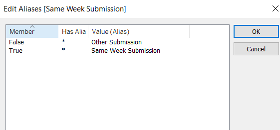
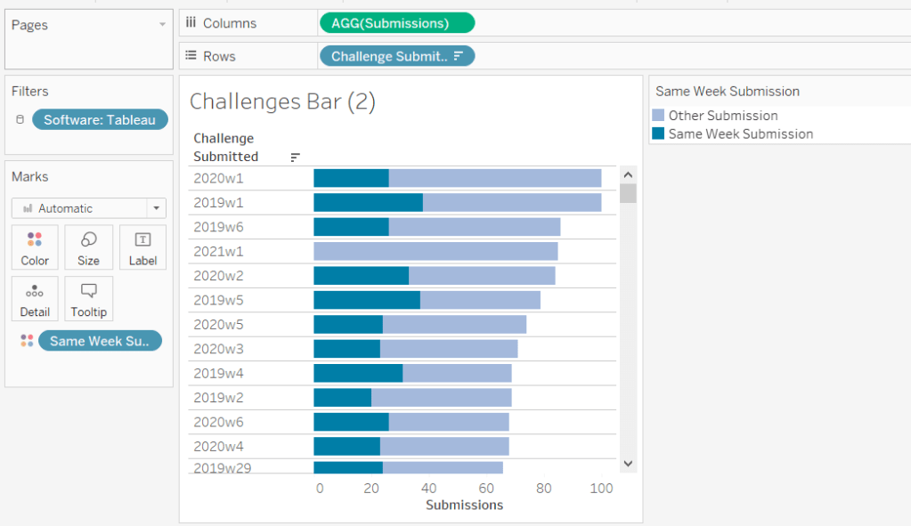
Next wee need to identify whether the challenge was submitted in the same wee as it was set
Same Week Submission
([Challenge Week]=[Week Submitted]) AND ([Challenge Year]=YEAR([Timestamp]))
This returns a boolean of true or false, but we can alias these values (right click field > Aliases) to give the displayed options
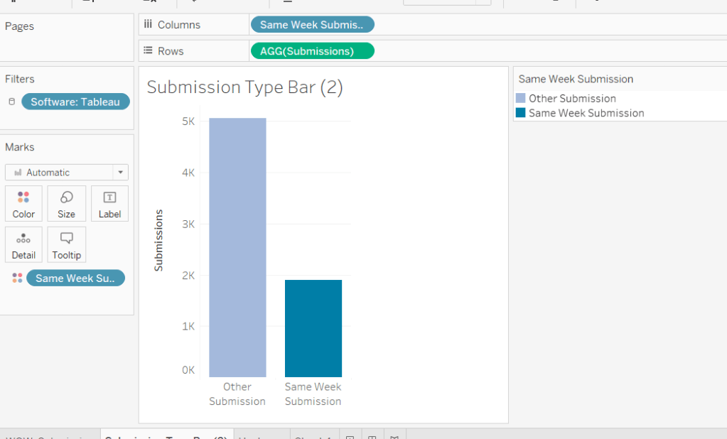
Now add Same Week Submssions to Columns, Submissions to Rows and Same week Submissions to Colour and adjust accordingly. Amend gridelines, borders etc to get the required display format
For the next bar chart we need to build the text for
Challenge Submitted
STR([Challenge Year])+’w’+STR([Challenge Week])
Add this to Rows and Submissions to Columns and add Same Week Submission to Colour. Again adjust formatting accordingly.
Adding the Interactivity
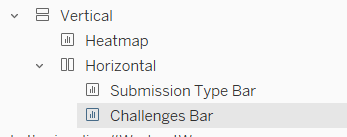
On a dashboard, add a Vertical container. Drop the Heat map into it. Then underneath, still within the Vertical container, add a Horizontal container. Add the two bar charts side by side. You may have other objects, but part of your layout hierarchy should look like
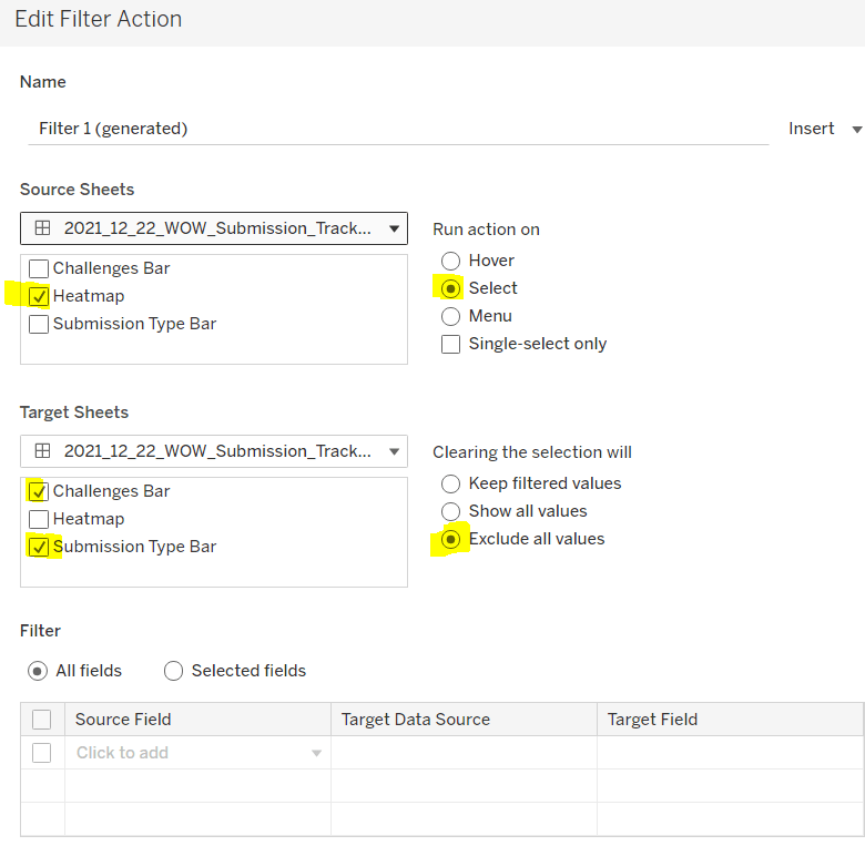
Add a dashboard filter action to the heatmap chart that on select affects the two bar charts, but when unselecting, excludes all values.
As you click on the heatmap and then unclick, the bar charts should disappear and the heat map should fill out the space.
Finalise the dashboard adding a title, supplementary text, the software filter and colour legend.
This week’s #WOW2021 challenge by Ann Jackson is focussed on dashboard design/layout, reference lines and formatting time, so that will be the focus of this blog too. I’m hoping it might be a fairly short post this week 🙂
Filtering the data
Creating the key measures, formatting time, adding average lines
Dashboard layout
Filtering the data
The data Ann provided is based on the Google Analytics data the team have harnessed related to the activity on the #WOW website. It’s a static data set, which contains data from 29 Dec 2019 up to 12 April 2021, but Ann states her solution only includes data up to 10 April 2021. I therefore added the Date field to the Filter shelf on the sheet and set it to end on 10 April 2021
Knowing I’d be building multiple sheets for this challenge, I set this filter to be a global filter by setting it to apply to worksheets – > all using this data source
Creating the key measures, formatting time, adding average lines
For this challenge, we’ll be creating a sheet for each BAN, and a sheet for each trend line depicting a measure by week, so 8 sheets in total.
For the Sessions measure, both the BAN and the trend chart are straightforward.
The BAN just shows SUM([Sessions]) on the Text shelf, appropriately formatted. The other BAN sheets are pretty much the same, but just show the appropriate measure in the appropriate colour.
The trend line displays Week([Date]) by SUM([Sessions]), with the average line added by dragging Average Line from the Analytics pane onto the chart and then formatting.
If the numbers don’t quite match up, it may be because your week is set to start on a different day. By default as I’m UK based, dates are set to start their week on a Monday. For this challenge to match Ann’s solution, your week needs to start on a Sunday. You can set this by right clicking on the data source itself and changing via the Date Properties option
To determine the average session duration, we need to build a calculated field, that then needs to be formatted to show minutes and seconds.
Average Session Duration
(SUM([Session Duration]) / SUM([Sessions]))/86400
Session Duration / Sessions will return a value in seconds. To be able to format this in the way required, we need to get the number of seconds as a proportion of a day. There are 86400 seconds in a day (60 * 60 * 24), so we divide by this.
We can then use a custom format on this field and use the nn:ss notation. NOTE not mm:ss. If you needed to format this as hours:minutes:seconds, the format would be hh:mm:ss, but mm:ss does not provide you with the right values. This video demonstrates all this, if you’re interested.
When it comes to building the trend line for this measure, the average line, can’t be added as simply in the way it could for the Sessions trend chart (at least I couldn’t get it to work that way…).
We need to build a calculated field that will show the same overall average value alongside the weekly averages. This value needs to match what’s displayed in the BAN chart.
Overall Session Duration mm:ss
{FIXED : [Avg Session Duration]}
This is returning the Avg Session Duration based on all the rows in the data. As the Date field has been added as a global filter, it is acting like a data source filter, so the dates we don’t want have been excluded from the data set that the FIXED LoD is being applied against. If the Date filter was a simple ‘quick filter’, this calculation wouldn’t work, as the data for the 11th & 12th April would also be included in the calculation.
Format this to nn:ss as well. Add this field to the Detail shelf of the trend chart, then right click on the Average Session Duration axis and Add Reference Line, and reference the Overall Session Duration mm:ss field.
For the bounce rate, we simply need
Bounce Rate
SUM([Bounces])/SUM([Sessions])
which is formatted to a percentage of 1 dp.
When building the trend line, I added the average line from the analytics pane, but that gave me a different value from my BAN. So I built
Overall Bounce Rate
{FIXED : [Bounce Rate]}
This was formatted to % 1dp, and added as a reference line as described above.
Finally the last measure, we need
Avg Time on Page
(SUM([Time on Page])/(SUM([Pageviews])- SUM([Exits])))/86400
formatted to nn:ss
and
Overall Time on Page mm:ss
{FIXED : [Avg Time on Page]}
and again formatted to nn:ss.
The charts for these are built exactly like the Average Session Duration.
Dashboard Layout
The easiest way to describe the layout I built is to show it 🙂 Note the Item Hierarchy on the left hand side of the image below.
I have a vertical container as the Main page.
The first row in this container is the title in a Text object.
The second row is a Blank object and is the yellow line. The background of the blank object is set to the relevant yellow, the outer padding is set to 0 all round, and then the height is set to 4. This gives the appearance of a thick coloured line.
The third row is another vertical container, and I’ve done this, so I can ultimately use the option to Distribute Contents Evenly on the container to ensure the horizontal container ‘rows’, which I’ll be adding into this container, are evenly spaced.
So ‘within’ the 3rd row, the 4th-7th rows are managed using a horizontal container, which in turn contains a blank object (the coloured vertical line), the BAN sheet and the trend sheet. Around each horizontal container I set the outer padding to 10 all round to give some spacing. The blank object in each ‘row’ is given the relevant background colour and set to a width of 15.
Finally, I finished off with an additional horizontal container at the bottom which is where I added my standard #WOW footer. Note this horizontal container is essentially the 4th row of the original Main vertical container though.
Hopefully I’ve provided enough for you to build the challenge yourself / resolve any issues you might have. If there’s anything I’ve missed, do please comment to let me know.
My published viz is here. Please note, that for some reason (and I don’t know why), Tableau Public does not seem to display my time axis properly (just shows 0). As the workbook renders on Public, the values on the axis show, but once fully loaded, they change. If you download the workbook, the values are fine. I published from Tableau Desktop 2021.1.0. I’m putting this down to an issue with Tableau Public.
Week 49 of #WOW2020 was a guest challenge by Sam Epley to demonstrate the ability to toggle between filtering using AND logic and filtering using OR logic. Sam stated that it had been something he and colleagues had been pondering for a while but v2020.2 provided a possible solution.
So the first thing I did was a quick check on what functionality had been released in v2020.2 which included set controls. I also noticed when examining the published solution, that if I hovered over the Select Values filter controls, a small set icon would appear, which indicated these filters were indeed based on set controls
This blog will focus on
Select a Field for Slicer x parameter
Select Values for Slicer x filter
Building the Logic
Select a Field for Slicer x parameter
I had a slight ‘moment’ with this, until I realised I just had to copy the ╚ character and paste it into the parameter list I created
You’ll need to create 3 instances of this parameter (or create once, duplicate and rename).
Select Values for Slicer x filter
Note – what I describe here will need to be duplicated for each slicer.
There’s a chance I may well have been a bit long-winded in how I went about this, but it worked for me…
First up, I extracted the value selected in the Select a Field parameter, only returning a value if it contained the special ╚ character. So this would return the word ‘Region’ or ‘Segment’ but would return NULL if ‘Location’ or ‘Customer’ had been selected.
Selected Slicer 1
IF CONTAINS([Select a Field for Slicer 1:],’╚ ‘) THEN REPLACE([Select a Field for Slicer 1:],’╚ ‘,”) ELSE NULL END
I then needed to ‘map’ this value to the actual field in the data source, so I could get a handle on the actual values associated to the field
Selected Slicer 1 Values
IF [Selected Slicer 1] = ‘Region’ THEN [Region] ELSEIF [Selected Slicer 1] = ‘State’ THEN [State] ELSEIF [Selected Slicer 1] = ‘Category’ THEN [Category] ELSEIF [Selected Slicer 1] = ‘Sub-Category’ THEN [Sub-Category] ELSEIF [Selected Slicer 1] = ‘Segment’ THEN [Segment] ELSEIF [Selected Slicer 1] = ‘Ship Mode’ THEN [Ship Mode] ELSE ‘No Selection’ END
From this I could create a set to store the values, by right-clicking on the Selected Slicer 1 Values field and choosing Create -> Set, and selecting the Use all option.
The values in the set can then be accessible on the sheet foe selection by right-clicking on the set field and choosing Show Set
Building the Logic
To help with this, you can build out a basic view by Region that returns In or Out for each of the sets
As you can see when everything is set to ‘None Selected’, everything is In.
As we change the filter options, you can see the values change to be In and Out
For the AND logic to work, we’re looking for the rows of data where every In/Out column is In.
For the OR logic to work, we’re looking for the rows of data where In exists in at least one column.
However, when there is a No Selection option selected, all values are In the set, and when we’re using the OR logic, we don’t want these.
So we need to identify when No Selection is selected in the filter
Slicer 1 is Not Selected?
[Selected Slicer 1 Values] = ‘No Selection’
and we need this for the other slicers too.
Then we need to build a new calculated field that is going to handle all this logic, which is driven by a pLogic parameter which simply contains the values of AND and OR.
In Combined Set
IF [pLogic]=’AND’ THEN [Select Values for Slicer 1:] AND [Select Values for Slicer 2:] AND [Select Values for Slicer 3:] ELSE //It’s OR IF [Slicer 2 Is Not Selected?] AND [Slicer 3 Is Not Selected?] THEN [Select Values for Slicer 1:] ELSEIF [Slicer 1 Is Not Selected?] AND [Slicer 3 Is Not Selected?] THEN [Select Values for Slicer 2:] ELSEIF [Slicer 1 Is Not Selected?] AND [Slicer 2 Is Not Selected?] THEN [Select Values for Slicer 3:] ELSEIF [Slicer 3 Is Not Selected?] THEN [Select Values for Slicer 1:] OR [Select Values for Slicer 2:] ELSEIF [Slicer 2 Is Not Selected?] THEN [Select Values for Slicer 1:] OR [Select Values for Slicer 3:] ELSEIF [Slicer 1 Is Not Selected?] THEN [Select Values for Slicer 2:] OR [Select Values for Slicer 3:] ELSE [Select Values for Slicer 1:] OR [Select Values for Slicer 2:] OR [Select Values for Slicer 3:] END END
This field returns a true or false against each row in the data set, and can be used to build the bar chart display.
This covers the most ‘complex’ bit of this challenge – below shows what one of the charts looks like
If you’re not familiar with how to use measure swapping, which is another feature of this challenge, then check out a previous blog I wrote.
I also created a field to add to the Tooltip to show a $ symbol in the event the measure selected was Sum of Sales.
Luke Stanke returned for week 43 of #WOW2020 with a challenge focussed on building KPIs for mobile consumption.
In general this looked to be (and was) less taxing than some from previous weeks, but Luke did throw in some very specific requirements which did prove to be a bit tricksy.
To deliver this solution I built 8 sheets, 1 for each KPI heading and 1 for each bar chart. The dashboard then uses a vertical layout container to arrange the 8 objects in. A filter control on each bar chart determines whether the bar chart should ‘show’ or not. When a particular bar chart is displayed it fills up the space, which makes the display look to ‘expand’. Parameter actions are used to drive the ‘expand/collapse’ functionality.
The areas of focus for this blog are
Building the KPI chart
Formatting the Bar chart
Expand / Collapse function
Ensuring the KPI isn’t highlighted on selection
Making the display work for mobile
Building the KPI Chart
Because we have text on the left and the right, then I built this as a dual axis chart.
I’m going to build the Sales KPI.
I used MIN(1) on Columns, with Mark Type of bar, and fixed the axis to range from 0 to 1. SUM(Sales) is then added to Label, right aligned and formatted appropriately.
For the 2nd axis, we’re going to use MIN(0) positioned alongside MIN(1) on Columns, and this time, set the Mark Type to Gantt. I type the word ‘SALES’ into the Label field.
We also need to display a + or – icon on this label too. This will rely on a parameter that is going to be set.
Create a string parameter Selected Measure which is just empty.
For the icon, then create
Sales – Icon
IF [Selected Measure] = ‘SALES’ THEN ‘▬’ ELSE ‘✚’ END
I use this site to get the characters I use for these types of things.
Add Sales – Icon to the Label shelf of the MIN(0) axis, and position in front of the ‘SALES’ text.
If you show the Selected Measure parameter on the screen, and enter the word SALES, you’ll see the shape change to ‘-‘. Make this a dual axis chart and synchronise axis, and you should have the basis of the KPI (once all the axis have been hidden of course).
We also need to add an additional field onto the chart that we’ll need to use with the parameter action later.
Sales – String to pass
IF [Selected Measure] <> ‘SALES’ THEN ‘SALES’ ELSE ” END
When the Selected Measure parameter is empty (or contains another value), then this field will contain ‘SALES’ otherwise it’ll be blank.
Add this onto the Detail shelf of the ‘All’ Marks card (ie it needs to exist on both axes).
You essentially need to duplicate this sheet and build instances of the calculated fields for for Profit, Margin (SUM(Profit)/SUM(Sales)), and Customers (COUNTD(Customer ID)).
Formatting the Bar chart
Luke is very specific in his requirements that the axis tick for the bars displayed needs to be centred. This means there needs to be a continuous (green) pill on the date axis.
This very tiny requirement gave me a lot of grief 😦
I initially used MONTH(Order Date) (which will return numbers 1-12), but when I formatted the axis to First Letter, I get a D (for 0) and J (for 13) at each end.
Fixing the axis to start from 1-12 doesn’t work, as this chops off part of the first and last bars.
I tried a variety of mechanisms but to no avail. A chat with my fellow #WOW participant Rosario Gauna, who was also mulling over the issue eventually provided a solution, courtesy of Annabelle Rincon.
We need to use an ‘undocumented’ formatting option of mmmmm, which is the formatting for first letter. However, this doesn’t work with the above. I need to change the axis to use an actual date field (which was one of the mechanisms I’d already tried).
This is taking every date in the data set, and ‘baselining’ it to all be on the same year (I chose 2019, but this could be any year you choose). The DATETRUNC is then setting all dates within the same month to be reported as being the 1st of the month.
Adding this to Columns instead as an exact date, and then formatting the axis and changing the Dates option to mmmmm will display the 1st letter
There is also a requirement to just show a label and tick mark for every other month, starting in Feb. You need to edit the axis, and on the Tick Marks tab
Set Major Ticked Marks to Fixed
Set the Tick Origin to 01 Dec 2018, and the interval to every 2 months (2 months after 1st Dec 2018 is 1st Feb 2019, so the F displays while the J for Jan doesn’t)
Set Minor Tick Marks to None
An additional ‘formatting’ setting I used on the bar charts was to fix the vertical axis to a number high enough to ensure the label always displayed after the bar and not in it. What this needs to be set to will vary and is only really noticeable once added to the dashboard, so may require some tweaking to get it correct.
Once again, you’ll need an instance of this bar chart for each of the measures Sales, Profit, Margin & Customers.
Expand / Collapse Function
On the dashboard, you need to use a vertical layout container, and place all the sheets in order underneath each other, so you have KPI, bar, KPI, bar etc.
Each bar chart needs a filter which will determine whether it shows any data or not. Create a calculated field
FILTER : Selected Measure
[Selected Measure]
On the Sales bar chart, make sure the Selected Measure parameter contains the value ‘SALES’, then add the Filter: Selected Measure to the Filter shelf and select the value SALES (it’ll be the only option available)
Then go to the Profit bar chart, and change the Selected Measure parameter to PROFIT. Now add the FILTER : Selected Measure to the Filter shelf and select the value PROFIT. If you switch back to the Sales bar, you’ll find the display is empty. Repeat this for the MARGIN and CUSTOMERS bar charts.
If you return to the dashboard you should find you probably have the 4 KPIs displayed and 1 bar chart showing. The final step is to add parameter actions.
For each KPI sheet, create a parameter action that targets the Selected Measure parameter by passing the relevant <Measure> – String to Pass field.
Ensuring the KPI isn’t highlighted on selection
I’ve used the True = False concept which I’ve applied multiple times to previous challenges.
Create a calculated field called True that just stores the value of True and and a calculated field called False that stores the value False. Add both of these to the Detail shelf of teach KPI viz.
Then on the dashboard, add a Filter action for each KPI sheet that goes from the KPI object on the dashboard to the sheet itself, passing the values Source: True = Target: False
Making the display work for mobile
This frustrated me no end. When I click on the Phone layout option (right image below), the layout container just doesn’t behave as it does on the Default view – the space for the bar charts is retained even when there’s no data.
I tried all sorts of combinations of containers to try to resolve this, and just couldn’t get it, and I struggled to find anything online that would help. I published to Tableau Public to test what the result would actually look like on my mobile, in the vain hope it might ‘just work’ but it didn’t 😦
When Sam Epley posted his solution, and I found it worked on mobile, I had to look. and found that you could just ‘delete’ the phone layout.
A couple of gems in this one that I need to store away for future! My published viz is here.
Guest poster Ivett Kovacs was back to set the weekly #WOW2020 challenge this week, and delivered a very ‘relatable’ business challenge – Fiscal Year to Date reporting.
I’ve been quite used to doing this type of reporting within my job, so on the whole I found the core requirements pretty straightforward – there’s just a lot of calculated fields 🙂 The trickiest part I found was getting everything organised on the dashboard and making the budget parameters appear/disappear based on the filter selected – this took an extraordinarily looonnnng time even though I knew the technique – more on that later.
Setting up the Fiscal Year
The data source provided was one curated by Ivett. It contained financial ‘transactions’ against Account Codes from Oct 2018 to May 2020.
The date in the file was initially recognised by Tableau as a string, but simply changing it to a Date datatype in the Data Source pane easily resolved this.
The fiscal year starts on 1st October, so once on a sheet, set this by right-clicking on the Accounting Date field and choosing Default Properties -> Fiscal Year Start -> October
If you add Accounting Date to a sheet and expand from Year -> Month, you’ll see that the Year part is now labelled as FY 2019 and FY 2020, and Q1 starts in October
Just a couple of points to be aware of if you’re not familiar with working with Fiscal Years.
A relative date filter for ‘this year’ will recognise your fiscal date setting, so if you did this on this data set, you’d get data from Oct 2019 to May 2020.
Any date related functions such as YEAR([Date]) or DATETRUNC(‘year’, [Date]) does not recognise the fiscal year setting. So YEAR(#2019-11-01#) will return 2019 and YEAR(#2020-01-01) will return 2020 even though they are both in the same FY 2020 fiscal year. It does mean at times, depending on what you’re building, you may need to hard-code information that defines the start month of your fiscal year.
Building all the calculated fields
First up we need a couple of measures as stated in the requirements.
Sales
IF STARTSWITH([Account Number],’5′) THEN [Value] END
only counts for Account Number starting with a 5
OPP
IF STARTSWITH([Account Number],’5′) OR STARTSWITH([Account Number],’696′) THEN [Value] END
only counts for Account Numbers starting with a 5 or 696.
Then we need lots of fields to help us get all the various data needed. This is simply going to be a big list 🙂
finds the maximum date in the dataset and sets to the 1st of the month, in this instance it will be 01 May 2020. This is a more generic approach than harcoding.
FY Start Current Year
#2019-10-01#
I said there might need to be some hardcoding! Ideally, having set a fiscal year, you’d like a function along the lines of DATETRUNC(‘fiscal year’, [Date]) to give you this value. Apart from setting this value in a parameter, I’m not aware of any way you can determine this date without any sort of hardcoding 😦 This KB article tries to provide some suggestions, but you still need to hardcode a value to ‘shift’ to the appropriate month; in this case we’d have to hardcode 10 as October is the 10th month. Feel free to upvote this idea on the Tableau Forums which asks to address this 🙂
Current FYTD Sales
IF DATETRUNC(‘month’,[Accounting Date]) >= [FY Start Current Year] AND DATETRUNC(‘month’,[Accounting Date])<=[Current Month] THEN [Sales] END
only return sales values for dates from 01 Oct 2019 to 31 May 2020.
Current FTYD OPP
IF DATETRUNC(‘month’,[Accounting Date]) >= [FY Start Current Year] AND DATETRUNC(‘month’,[Accounting Date])<=[Current Month] THEN [OPP] END
as above but for the OPP measure.
Current Month Prev FY
DATE(DATEADD(‘year’,-1,[Current Month]))
go back 1 year to 1st May 2019.
Prev FYTD Sales
IF DATETRUNC(‘month’,[Accounting Date])<= [Current Month Prev FY] THEN [Sales] END
Only return sales values for dates up to 31 May 2019. Note the data only starts from 01 Oct 2018, which is the start of the previous FY, but if we couldn’t guarantee that, we’d have stored an ‘FY Start Prior Year’ and added an additional clause to the above calculation.
Prev FYTD OPP
IF DATETRUNC(‘month’,[Accounting Date])<=[Current Month Prev FY] THEN [OPP] END
To deal with the Budgets, we need to create a couple of parameters Budget Sales (M) and Budget OPP (M). Both are integer parameters defaulted to 2,300 and 3000 respectively.
But because these parameters aren’t actually in millions, we need further fields to translate them into the value we really need for comparisons.
We need the MIN() function as the same Budget Sales Ref Line value is stored on every row, so SUM() will multiply the value too much. AVG() or MAX() would have worked just as well.
Curr vs Budget Sales Diff %
[Curr v Budget Sales Diff] / MIN([Budget Sales Ref Line])
and again we need to duplicate these for the OPP measure
Curr vs Budget OPP Diff
SUM([Current FYTD OPP]) – MIN([Budget OPP Ref Line])
Curr vs Budget OPP Diff %
[Curr v Budget OPP Diff] / MIN([Budget OPP Ref Line])
Now we’ve got all the core variables we need, we need to determine which one to use as the comparison in the bar chart and the KPI indicator. This is based on a parameter for the user to decide if they’re comparing Actuals against Budget or against Previous Year Actuals.
Compare Filter
I chose to create an integer based parameter with the display altered to show the relevant text. We will be using this parameter in calculated fields and comparing integers rather than strings is much more efficient (and easier to read).
So with the parameter set up, we now need to create a few fields that we’ll use to show the values we want
Sales Diff
IF [Compare Filter] = 0 THEN [Curr v Budget Sales Diff] ELSE [Curr v Prev Sales Diff] END
This is custom formatted to display as $ in millions with an arrow to show positive or negative : ▲”$”#,##0,,M;▼”$”#,##0,,M
Sales Diff %
IF [Compare Filter] = 0 THEN [Curr v Budget Sales Diff %] ELSE [Curr v Prev Sales Diff %] END
This is formatted to 1 decimal place.
Opp Diff
IF [Compare Filter] = 0 THEN [Curr v Budget OPP Diff] ELSE [Curr v Prev OPP Diff] END
Same custom formatting as above.
Opp Diff %
IF [Compare Filter] = 0 THEN [Curr v Budget OPP Diff %] ELSE [Curr v Prev OPP Diff % ] END
Sales Ref Line
IF [Compare Filter] = 0 THEN MIN([Budget Sales Ref Line]) ELSE SUM([Prev FYTD Sales]) END
This is used for the line shown on the bar chart, and we’ll need the same for the Opp measure.
Opp Ref Line
IF [Compare Filter] = 0 THEN MIN([Budget OPP Ref Line]) ELSE SUM([Prev FYTD OPP]) END
Finally we need a couple of fields to use to work what colour the bars need to be.
Colour : Sales Diff
IF [Sales Diff %] <-0.05 THEN ‘Difference < -5%’ ELSEIF [Sales Diff %] > 0.05 THEN ‘Difference > 5%’ ELSE ‘-5% <= Difference <= 5%’ END
Colour : OPP Diff
IF [OPP Diff %] <-0.05 THEN ‘Difference < -5%’ ELSEIF [OPP Diff %] > 0.05 THEN ‘Difference > 5%’ ELSE ‘-5% <= Difference <= 5%’ END
Note – my published solution has something slightly longer winded as when I originally built the viz, I created the colour fields before I created the generic Diff/Diff% fields referenced above.
Right! That’s a LOT of calculated fields (I did warn you!). In some cases it may have been possible to combine, but I like creating building blocks to keep things simpler to read.
Sales YoY Trend Line
The basis of this type of chart is pretty much Desktop 101.
Month(Accounting Date) on Columns (blue pill)
Sales on Rows
Year(Accounting Date) on Colour with colours adjusted accordingly.
Add the average line and Label the most recent point
Format the gridlines/rows etc and axis
The most recent mark is a larger circle. We need another calculated field for this
Current Month Sales
IF DATETRUNC(‘month’,[Accounting Date]) = [Current Month] THEN [Sales] END
This just stores the sales value for the latest month.
Add this field to the Columns and make dual axis and synchronise axis. Adjust the marks back to be a line and a circle and adjust the Sizes to suit.
Duplicate all the above on another sheet for the OPP values instead.
Sales Bar Chart
Simple bar chart
Current FYTD Sales on Columns
Colour : Sales Diff on Colour
Sales Ref Line on Detail
Add Sales Ref Line as a reference line and label & format to suit.
Label bar and align middle right; format to suit.
The colour legend will only display a single option at a time. You’ll need to set the Compare Filter to compare against budget and show, then adjust, the value of the Budget Sales (M) parameter to values that go beyond the thresholds, to set the other colour options.
Repeat all this again on another sheet for the bar displaying the OPP measure.
Sales KPI
Simply add Sales Diff & Sales Diff % to the Text.Format row/column lines to suit.
Again, repeat for the equivalent OPP measures.
Year Legend
The standard legends aren’t used as these are only square icons, but the challenge shows circles. So a custom legend sheet is created as below
The hidden axis has been fixed from 0.45-1 to push the display to the left more.
% Diff Indicator Legend
Again the standard legend can’t be used this time, as only 1 option ever shows. So this is a custom ‘fake’ legend.
I simply used the Account Number field for this purpose. I filtered a sheet to just 3 different Account Numbers. I then built a similar viz to the above, but using Account Number throughout.
The sneaky trick I used here was to simply ‘alias’ the actual Account Numbers displayed to the text I wanted.
Building the dashboard
Getting all the objects in the right places can be a bit of trial and error. All the objects on my dashboard, apart from the Budget parameters, are tiled using a mix of horizontal and vertical containers, nested within.
Hide/Show the Budget Parameters
This probably took me the most time. It’s using a technique sometimes referred to as Parameter Popping. It uses containers and works similarly to sheet swapping.
I had to build a ‘blank’ sheet for this – a sheet that will show (a blank value) and hide based on the Compare Filter parameter.
I needed another field
Is Prev Value to Compare
[Compare Filter]=1
This returns true if the parameter is set to compare against the Previous Year rather than the Budget.
This is added as a Filter to the blank sheet and set to True, which means the sheet will ‘show’ when comparing to Previous Year, and hide when comparing to Budget.
A floating horizontal container is then added to the sheet, and all the objects – the Budget parameters, some Text boxes to label the parameters and the ‘blank’ sheet are ‘carefully’ added. The blank sheet should be the first object on the left. I say ‘carefully’ as it took a lot of trial and error to make it work. If it is done right, then changing the Compare Filter parameter should make the budget parameters move left & right as the blank sheet shows and then hides.
The floating horizontal container is made wider than the dashboard itself, so the showing of the ‘blank’ sheet, pushes the other objects so far to the right that they’re not on the dashboard at all.
The screen shots below show what it looks like in Desktop
As I said, Parameter Popping can be a bit tricky – I only used it twice, so haven’t yet found a sure fire way to get it right first time. If you google ‘Tableau Parameter Popping’ you’ll find a few links that might help, and/or check out Week 4 of #WOW2020 which also uses it (the other time I’ve used it).
And that’s about it. My published viz is here. Enjoy!
The requirement was to show some month to date / year to date metrics in comparison to the previous month to date, and also work out where the current month might finish.
I took up the challenge on Weds 25th March, and the challenge was dated ‘as at 24th March’. There was nothing in the requirements to indicate whether this was ‘hardcoded’ to this date, or whether it happened to be this date based on the time I viewed (ie it was yesterday, the last full day). In the interest of being ‘flexible’ I therefore chose to design my solution more dynamically. I based my challenge on viewing the data up to ‘yesterday’, where ‘yesterday’ is yesterday’s date in 2019. So if today is 27 March 2020, then the dashboard will be based up to 26 March 2019. Hope that’s clear.
As a result of this, there’s a fair few date calculations involved, so let’s crack on.
Setting up the calculations
I like to build up my calculations so they’re easier to read, rather than nest everything. First up we need
Current Year
{MAX(YEAR([Order Date]))}
The maximum year in the data set (which happens to be 2019 for the data source I’m connected to).
To get this, use the formatting to set to $ and 1 decimal place, then once set, change the format to ‘custom formatting’, which will display the ‘formatting code’. Then add the ▲▼ symbols. I use this site to get the characters I need.
The final calculation we need to work out is what’s been referred to as the ‘run rate’. This is basically trying to show what the final month sales/profit will be, based on the current rate. This means taking the current MTD Sales/Profit, dividing it by the number days this has been computed over to get an average sales/profit per day. Then this number is multiplied by the number of days in the month. Got it?
This is counting the number of days between the 1st of the month (based on yesterday), and the 1st of the next month.
Run Rate Sales
(SUM([Current MTD Sales])/SUM([Days in Current MTD])) * SUM([Days in Current Full Month])
Run Rate Profit
(SUM([Current MTD Profit])/SUM([Days in Current MTD])) * SUM([Days in Current Full Month])
Format these to $ and 1 decimal place.
This gives us all of the core calculations we need to build the KPIs.
Building the KPI card
This is done on one sheet, and is simply utilising the Text mark type.
By typing in, create a pill MIN(0) on the Rows shelf, and another one right next to it. Change the mark type to Text. This gives you 2 ‘cards’ you can now use. Add the all Sales related calculated fields to the Text shelf of the first card, and the Profit fields to the second card, and just format the font/layout accordingly. Then remove the axis headers, gridlines etc etc.
Building the Sales YoY Bar Chart
To ensure we only have the dates for the last 2 years, up to the current point in time, we need some additional fields
Previous Year
[Current Year]-1
Dates To Include
YEAR([Order Date])>= [Previous Year] AND [Order Date]<= [Yesterday]
Add Dates To Include to the Filter shelf and set to True.
Now build the viz by
Sales on Rows
Order Date on Columns, set to the Month level only (discrete blue pill).
Mark Type = bar
Order Date on Colour, set to Year level. Adjust colours to suit
Order Date on Size, set to Year level. Adjust size to suit so the latest year is narrower.
Set Stack Marks = Off (Analysis -> Stack Marks). This will stop the bars for each year from sitting on top of each other.
Format the Order Date axis, so the Month is displayed as 1st letter only.
Format the Sales axis so the value is displayed to K with no decimal places.
Due to the above, the format of the Sales value on the tooltip is likely to change too. If this happens, duplicate the Sales field, rename it to Tooltip – Sales or similar and format to $ with 0 dp. Add this to the Tooltip shelf.
You’ll need to do similar to get a month field for the tooltip. Create a calculated field Tooltip-Month = DATETRUNC(‘month’,[Order Date]) and custom format this to mmm yy. Add this to the Tooltip shelf.
Repeat the same steps to build the YoY Profit chart.
Date Sheet
The final dashboard indicates the date of the report. As my dashboard is dynamic and changes based on the current date, I couldn’t hardcode this. So I built the date to display on another sheet. This means I have 1 more sheet than stated in the challenge.
I simply added Yesterday to the Text shelf and referenced it
Building the Dashboard
Here we get into a bit of container fun! As I did last week, I’ll try to just step through the order you need to place the objects on the dashboard…
Add a Text object to store the title.
Beneath it, add the Date sheet.
To the right of both of these, add another Text object to store the sheet information text which will be displayed top right.
Add a Horizontal container beneath all of the above. Set the background of this container to light grey, and Inner Padding to 10 all round
Add the KPI sheet into the container and remove the title. Adjust the height of the objects to suit.
Now add a Vertical container to the right of the KPI chart. Adjust width to suit
Add the Sales YoY chart to the vertical container. Set the background of this object to white, so the title background isn’t grey.
Add the Profit YoY sheet below the Sales one. Again set the background of this to white.
Remove the container on the right hand side that contains the legends.
Add a floating blank object to the sheet. Set the background of this to light grey, and then adjust the positioning and height and width so it’s splitting your KPI card.
Finally if you haven’t already, edit the title and summary text appropriately.
The requirement was to create a bar chart showing number of orders per subcategory per day/week/month over a user defined number of years. The chart is coloured based on Profit. The bars also need to change size based on what date part was being displayed Lorna already hinted they’d be parameters and set actions involved.
Building the chart
First off let’s create the parameters we need to drive the dates we need to include in the viz.
Select Period
A string parameter listing Daily, Weekly, Monthly. The trick here is to store the datepart of day, week, month as the value, while displaying the required text for selection. Default to Weekly.
Doing this means later we can refer directly to the parameter when we need some date manipulation.
Number of Years
A range integer parameter starting from 1 to 4, defaulting to 2
With these, we can define the Date field that we need to plot on our axis
This has the effect of truncating every order date to the 1st day of the relevant month or week or just to the day, so for example if ‘month’ is selected all the orders placed in May 2019 will be grouped together under 01 May 2019 etc.
Dates to Include
YEAR([Order Date])>={MAX(Year([Order Date]))}-([Number of Years]-1)
{MAX(Year([Order Date]))} is a shortened notation for the level of detail calculation (LoD)
{FIXED : MAX(Year([Order Date]))}
which basically returns the highest year in the data set, which in this case is 2019. If the [Number of Years] parameter is set to 1 for example, we would expect all of 2019 to display, hence we need to subtract 1 in the formula so we get all orders in 2019.
Adding this to the Filter shelf and set to true will limit the orders to the dates in the years required.
Finally we need the measure
Number of Orders
COUNTD([Order ID])
Right, with those parameters set, we can now build the basic bar chart. For now we’ll just restrict the data to a single Sub-Category directly – we’ll look to adjust this later.
Add Dates to Include = True to Filter
Add Sub-Category = Tables to Filter
Add Date to Plot as a continuous exact date to Rows (green pill)
Add Number of Orders to Columns
Add Profit to Colour
Set Mark Type to Bar
Adjust the Tooltip to match
Show the Select Period & Number of Years parameters
Adjust the Sheet Title to reference the Select Period parameter
Sizing the bars
You’ll see the bars all look a bit overlapped. You might be tempted to adjust the bar size by moving the slider to reduce the overlap, which may well work, but as you change the Select Period parameter you’ll find that what you’re doing is setting the bar width to set width that is the same whether you have 24 marks displayed (monthly for 2 years) or 156 marks (daily for 2 years). The requirement is for the bar to adjust in width, so it’s wider when there’s less marks.
To do this, we need a calculated field
Size
CASE [Select Period] WHEN ‘day’ THEN 1 WHEN ‘week’ THEN 5 WHEN ‘month’ THEN 10 END
These are just arbitrary values I chose, and you can play around with the values to suit, but the key is you’re choosing a range of numbers with the smallest for ‘day’ and the largest for ‘month’.
Add this field to the Size shelf. and change it to be a Continuous Dimension ie a green pill of just Size rather than SUM([Size]).
Then click on the Size shelf and change from Manual to Fixed, and set the alignment to Centre.
Changing the Select Period parameter you’ll see the bars adjust their width from being very narrow for Daily, wider for Weekly, and wider again for Monthly.
Sub Category Selector
This is based on techniques that have cropped up in a few #WOWs this year.
We’re going to be using Set Actions for this bit, so to start we need a Set.
Right click on Sub-Category -> Create Set. Name the set Selected Sub-Category and just select a single value, Tables for now.
Now on a new sheet, add MIN(0.0) to Columns (type directly in) and Sub-Category to Rows.
Change the Mark Type to Shape
Add Sub-Category to Label
Add Selected Sub Category set to Shape, and adjust the shape and colour to suit
Create a calculated field called True and another called False, each containing the value True and False respectively – add these to the Detail shelf.
Edit the Axis to be Fixed to start at -0.07 to 1. This is to shift everything to the left.
Turn off Tooltips
Format to remove all column, row, zero & grid lines & axis rulers.
Uncheck Show Header on Sub-Category and MIN(0.0)
Building the dashboard
First up, now we’ve got a Set to store the Selected Sub-Category, remove, the Sub-Category field from the Filter shelf of the bar chart. Add the Selected Sub-Category set to the Filter shelf instead.
Now create a new dashboard sheet and add the bar chart to it.
By default, the Profit colour legend and parameters will be displayed in a vertical layout container to the right of the bar chart.
Remove the colour legend, and position the Select Period parameter above the Number of Years.
Then add the Selector sheet between the two parameters, and remove any additional legends that get added.
Add a dashboard action Deselect against the Selector sheet to stop the un-selected Sub-Categories from fading out.
Add a further dashboard action Select Sub Cat against the Selector sheet to set the value of the Selected Sub-Category set on selection. The dashboard action should be set flagged to Run on single select only, so multiple values can’t be chosen.
Change the vertical layout container to be floating, then adjust the height and set the background colour to white.
Use the Add Show/Hide Button option on the Layout container to enable the collapsible container functionality.
You’ll just need to move things around a bit, adjust the sizes to suit, but that should be pretty much it.
After last week’s tricky calcs that meant my solution didn’t match up, it was a welcome relief to get this challenge from Curtis Harris. Whilst some ‘seasoned’ #WorkoutWednesdayers may find this challenge very straightfoward, the main intention was to ensure everyone had been given an opportunity to implement the technique of sheet swapping.
I put myself into the seasoned category and have completed sheet swapping challenges in the past. In the past I would have been googling ‘tableau sheet swapping’ and referring to the raft of blogs & videos that provide you with the technique (maybe this one will become one of those in future!).
The challenge for me this time, was whether I could remember what to do without having to access previous workbooks or online references.
The answer was ‘yes’. I got through this in about 30 mins, which was very satisfying. So here’s what I did.
Build the Views
I created 6 views for this challenge; 3 for the main chart, and 3 for the preview.
I started by creating the Sales by Month line chart, applied all the various formatting to remove the axis & gridlines, set the tooltips etc. Once happy, I duplicated the sheet and changed the mark type to ‘bar’, then I duplicated again and changed the mark type ‘area’
I then named the 3 sheets line, bar , area.
Next I created a ‘preview’ chart. I duplicated the bar chart, removed the text from the tooltip, then added another instance of the date pill alongside to give me a secondary marks card, which I changed to be area.
I duplicated this chart 2 more times, changing the mark types so one showed a line and area, and another line and bar.
I named these Preview :Line, Preview: Bar and Preview:Area.
Show & Hide the Data
I created a parameter called Choose Display Type to store 3 string values : Line, Bar, Area.
The parameter won’t do anything until referenced within another field, so I created the following calculated field
FILTER: Display
CASE [Choose Display Type] WHEN ‘Line’ THEN ‘Line’ WHEN ‘Bar’ THEN ‘Bar’ ELSE ‘Area’ END
I then navigated to the Line sheet created above, showed the parameter control and set the option to Line. Then I added the FILTER:Display field to the Filters shelf. The only option available to select is ‘Line’ , so I ticked it.
I then selected to ‘apply this filter’ to ‘selected worksheets’, selecting my Preview:Line sheet
Then I went to the Bar sheet. Again showed the parameter control, and changed it to ‘bar’. Then I added the FILTER:Display field to the Filters shelf. The only option available this time to select is ‘Bar’ , so I ticked it, and then ‘applied the filter’ to the Preview:Bar sheet too.
At this point, navigating back to the Line sheet, the display is blank because ‘bar’ is the selected option in the parameter, and this sheet is filtered to ‘Line’. Looking at the filter, you see as the parameter is set to bar, the only option for selection in the filter is also bar. As line <> bar, the data doesn’t show.
Finally I went to the Area sheet. Again showed the parameter control, and changed it to ‘area’. Then I added the FILTER:Display field to the Filters shelf. The only option available this time to select is ‘Area’ , so I ticked it, and then ‘applied the filter’ to the Preview:Area sheet too.
Adding to the Dashboard
So while the parameter is driving the visibility of the views, they now need to be added to the dashboard.
The trick is to use Containers objects. These can be a bit fiddly and take some time to get used to. If you haven’t used them before, I recommend you have a watch of Tim Ngwena‘s videos :
I added a vertical container to the dashboard, and one of the first things I always do when working with containers is add a blank object. I then added the 3 initial charts (line, bar, area). Due to the parameter driving the hiding function, only one of these views actually displayed, although the title of each is visible, so you can see it’s been added. As a double check to make sure all are inside the same container, select one of the views on the dashboard (it will have a grey border when selected), then double click on the ‘handle’ at the top
This will then select the layout container the view is in, identified by the blue border
and you should see the 3 sheets + the blank object surrounded by a solid blue border, separated by dotted lines.
Test changing the parameter, and the appropriate sheet should display and the others hidden. Now hide the titles of each sheet, and remove the blank object. The displayed chart should look to fill up the whole space
The ‘preview’ sheets also need adding to another vertical container, but this vertical container needs to be positioned next to some text, so what I actually need first is a horizontal container.
I add the horizontal container to exist inside the same vertical container as the 3 sheets, so it’s at the bottom. The Item Hierarchy on the left nav bar of the Layout tab, helps show where items are positioned
The horizontal container has pushed the other objects up, but I’ll deal with that shortly.
I then add a text object into this container, then place another vertical container to the right of the text object
So now we have a vertical container inside a horizontal container, inside a vertical container. Phew! Once again double-clicking on the container handle will highlight the container the object is within to help you get to grips with the arrangement (I personally wish there was a way to see the layout by displayed lines in some way that don’t show on publication – a bit like the grid display, so you can get a better sense of the structure).
Now into this final vertical container add the 3 preview sheets.
and remove all the titles again, and test the parameter control.
Finally, the requirement is for the preview to be 50 pixels. Containers allow you to set the height for horizontal containers, and the width for vertical containers.
So select the horizontal container (either by selecting on the dashboard, or click the relevant horizontal container on the Item Hierarchy).
then choose Edit Height from the container menu accessible from the right hand side. Set to 50, and voila, the section shrinks.