This week’s #WOW2024 challenge was run live at the #Datafam Europe event in London and was a combo with the #PreppinData crew. If you want to have a go at shaping the data required for this challenge yourself, then check out the PreppinData challenge here. Otherwise, you can use the data provided in the excel workbook from the link in the #WOW2024 challenge (I’m building based on this).
Modelling the data
There are 3 data sources for this challenge which we need to relate together. We have
- Attraction Locations – a list of attractions in London with their lat and long coordinates
- Tube Locations – a list of tube stations in London with their lat & long coordinates
- Attraction Footfall – a list of attractions with their annual footfall
Connect to the Excel file and add Attraction Locations to the canvas. Then add Tube Locations and then create a relationship calculation of 1=1 to essentially map every attraction to every tube station.

Then add Attraction Footfall to the canvas and relate it to Attraction Locations by setting Attraction Name = Attraction

Finally, in the viz we have to understand the distance between a selected attraction (the start point) and other attractions (the end point), so we need to have an additional instance of Attraction Locations to be able to generate the information we will need between the start and end. So add another instance of Attraction Locations and set the relationship as Attraction Name <> Attraction Name

To make things a bit easier for reference purposes, rename Attraction Locations to Selected Attraction and Attraction Locations1 to Other Attractions (just right click on the data connection in the canvas to do this).

Building the Footfall Bar Chart
On a new sheet add Attraction Name (from Selected Attraction) to Rows and add 5 Year Avg Footfall to Columns. Change this from SUM to AVG (as the data consists of multiple rows per year and this value is the same for each row associated to an attraction). Sort the chart descending.

Click on the 2 nulls indicator and select to filter the data which will remove the bottom two rows and automatically add 5 Year Avg Footfall to the Filter shelf.
Manually increase the width of each row. Set the format of the 5 Year Avg Footfall to be in millions (M) to 2dp, and then show mark labels and align middle left.

Create a parameter to capture the selected attraction
pSelectedAttraction
string parameter defaulted to St Paul’s Cathedral

show the parameter on the screen.
We need to identify which attraction has been selected, so create
Is Selected Attraction
[Attraction Name]=[pSelectedAttraction]
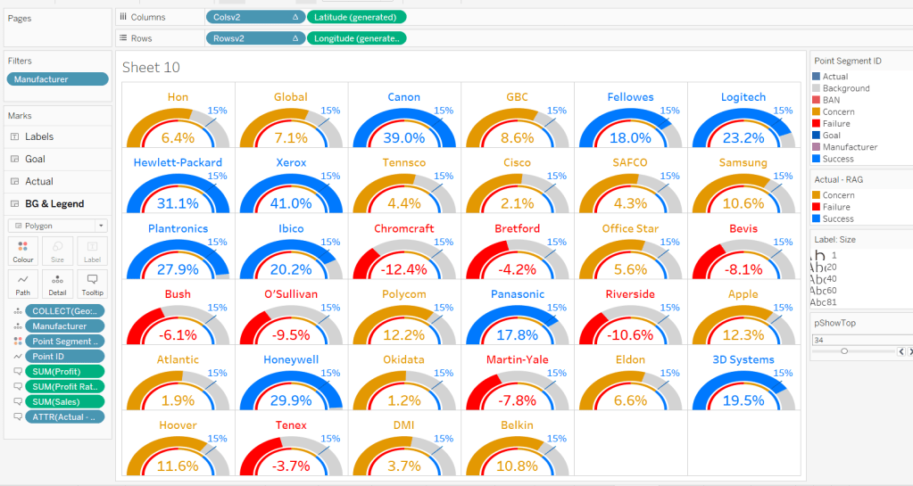
and then add this to the Colour shelf. Adjust the colours accordingly and set an orange border. Then add Attraction Rank to Rows. Set it to be a discrete dimension (blue pill) and move it to be in front of Attraction Name.

Set the font of the row labels to be navy, hide the row label names (hide field labels for rows), hide the axis (uncheck show header), don’t show tooltips, and remove all row/column dividers, gridlines and zero/axis lines. Set the background of the worksheet to be None (ie transparent). Update the title of the sheet and then name the sheet Footfall or similar.

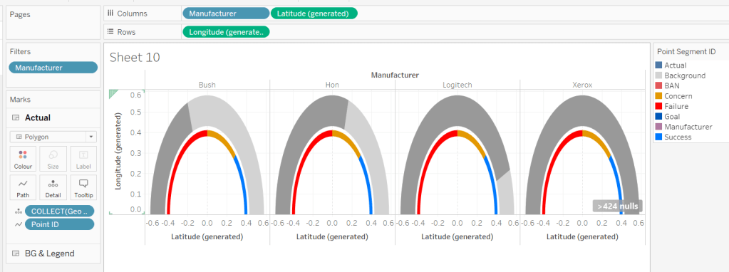
Building the map
We’re going to use map layers for this, and will build 4 layers
- the selected attraction
- the other attractions
- the tube stations
- the buffer circle
When using map layers we want to work with spatial data, so we’ll start by creating a point for the selected attraction
Selected Attraction Point
MAKEPOINT([Attraction Latitude], [Attraction Longitude])
Double click on this and it will automatically generate a map. Add Is Selected Attraction to the Filter shelf and set to True so only 1 mark should display, Add Attraction Name to Detail. Show the pSelectedAttraction parameter. Change the mark type to shape and select a filled star. Set the Colour of the shape to navy and add an orange halo. Update the Tooltip.

For the buffer, we need another parameter
pDistance(miles)
float parameter defaulted to 1 that ranges from 0.5 to 2 with a step size of 0.5

Then create
Buffer Attraction (x miles)
BUFFER([Selected Attraction Point], [pDistance(miles)],’mi’)
And drag this onto the canvas and drop when the Add Marks Layer option appears

This will create a new marks layer, which we can rename to Buffer. Reduce the opacity of the colour to 0%. Move the marks layer so it is at the bottom (below the other marks card) , and set the disable selection option so when you move the cursor over the map the buffer circle does not highlight.

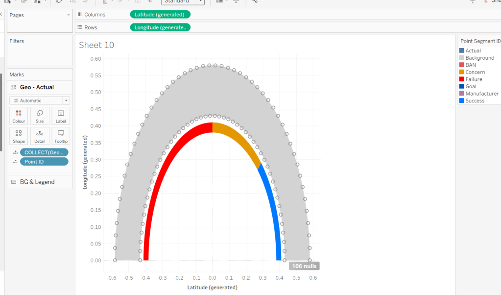
Adjust the background layers of the map so only the Postcode Boundaries are visible.

To add the tube stations, we first need to create
Tube Station Point
MAKEPOINT([Station Latitude],[Station Longitude])
Then drag this onto the canvas to create a new marks layer. Add Station to the Detail shelf of this new marks card, and move the marks card so it is below the Selected Attraction marks card.

We don’t want all the stations to display. We just need to show those up to 1.5x the buffer distance, so we need
Distance to Tube Station
DISTANCE([Selected Attraction Point], [Tube Station Point], ‘mi’)
format to a number with 2 dp and then create
Tube Station Within Range
[Distance to Tube Station]<= 1.5 * [pDistance(miles)]
Add this to the Filter shelf and set to True.

We want the size of the displayed stations to differ depending on whether they’re inside the buffer or not, so create
Tube Station Within Buffer
[Distance to Tube Station] <= [pDistance(miles)]
and add this to Size. Change the mark type to circle, then adjust the size as required. Change the colour to orange and add a white border. Add Distance to Tube Station to Tooltip and update. You may want to adjust the size of the shape on the Selected Attraction marks card too, so it’s bigger than the tube stations.

The stations need to be labelled based on the closest x number of stations that are within the buffer. For this we need a parameter
pTop
integer parameter defaulted to 5 that ranges from 5 to 20 with a step size of 1.

We need to rank the stations based on the distance, so create
Station Rank
RANK(SUM([Distance to Tube Station]), ‘asc’)
We’re also going to label the stations with a letter based on their rank
Rank Stations as Letters
CHAR([Station Rank] + 64)
but we only want to show labels for the ‘top’ ranked stations, so create
Label Stations
IF MIN([Tube Station Within Buffer]) AND [Station Rank]<=[pTop] THEN [Rank Stations as Letters] END
and add this to the Label shelf. Adjust the table calculation settings, so the calculation is computing by both Station and Tube Station Within Buffer.

Set the labels to be aligned middle centre, and allow labels to overlap other marks. If things are working as expected, then if you increase the buffer distance to 1.5 miles and the pTop parameter to 20, you should see that not all stations within the buffer circle are labelled

To add the other attractions, we need to create
Other Attraction Point
MAKEPOINT([Attraction Latitude (Attraction Locations1)],[Attraction Longitude (Attraction Locations1)])
and drag this onto the canvas to Add a marks layer. Move this layer so it is beneath the Selected Attraction marks card, and add Attraction Name (from the Other Attractions) section to Detail

Once again, we want to limit what attractions display, so need
Distance to Other Attraction
DISTANCE([Selected Attraction Point], [Other Attraction Point], ‘mi’)
and then
Other Attraction Within Range
[Distance to Other Attraction]<= 1.5 * [pDistance(miles)]
and add this to the Filter shelf and set to True.

Add Distance to Other Attraction to the Tooltip shelf and update. Change the mark type to shape. The shape needs to differ whether it’s within the top x closest attractions that’s inside the buffer or not. So we need
Rank Other Attractions
RANK(SUM([Distance to Other Attraction]), ‘asc’)
and then
Top X Attraction in Buffer
IF [Rank Other Attractions] <= [pTop] AND MIN([Other Attraction within Buffer]) THEN MIN([Attraction Name (Attraction Locations1)])
ELSE ‘Not Top X’
END
Add this to the Shape shelf. Set the table calculation so it is computing explicitly by both Attraction Name and Other Attraction Within Buffer. Setting the specific shape for each of the named attractions that could show is fiddly, so I just chose to leave as per the default values listed. The only shape I explicitly set was the Not Top X which I set to a filled circle. I set the colour of the shapes to dark grey and added a halo of the same colour to make the shape more prominent. The shapes also need to differ in size based on whether they are in the buffer or not, so need
Other Attraction Within Buffer
[Distance to Other Attraction] <= [pDistance(miles)]
Add to the Size shelf and then adjust sizes to suit.

Set the background of the worksheet to None, remove all row/column dividers and name the sheet Map or similar. Finally remove all the Map Options (Map > Map Options > uncheck all selections) to prevent to toolbar from displaying on hover. Test the map functionality by changing the various parameters and entering a new starting location.
Note – in subsequent testing I found that for some attractions where there were either no tube stations or other attractions within the range, the map would disappear. If I get time I’m going to try to work on a solution for this, but I’ll leave as is for now (Lorna’s published solution has the same issue).
Building the Tube Station Rank Bar
On a new sheet add Station to Rows and Distance to Tube Station to Columns. Add Is Selected Attraction to Filter and set to True. Sort the chart ascending, so closet is listed first.

We only want to display the stations that are within the buffer, so add Tube Station Within Buffer to Filter and set to True.
We also want to restrict this list to just those that are the closest ‘x’ to the attraction based on the pTop parameter. Add Station to the Filter shelf and on the General tab, select Use all and then select the Top tab and add the condition to display the bottom pTop by Distance to Tube Station.

However, this doesn’t quite show the correct results, as the Top n filtering has been applied BEFORE the other filters on the shelf. To resolve this we need to add Is Selected Attraction and Tube Station Within Buffer to context (right click each pill on the filter shelf).

Add Station and Distance to Tube Station to the Label shelf, and adjust the label to display the text as required and align middle left. Change the mark type to bar and manually widen the width of each row so the labels are readable. Adjust the colour of the bars.

For the circle labels, we need a ‘fake’ axis – double click into Columns and manually type MIN(-0.05). Move the pill that is created to be in front of the Distance to Tube Station pill.
Change the mark type of the MIN(-0.05) pill to circle and remove the fields from the Label shelf. Add Rank Stations as Letters to the Label shelf instead and adjust the table calculation so it is explicitly computing by Station. Format the label and align middle centre.

Make the chart dual axis and synchronise the axis. Remove Measure Names from the All marks card.
Don’t show the Tooltip, remove all row/column dividers, hide the axis and the Station column. Hide all gridlines, axis lines, zero lines. Format the background of the workbook to be None (ie transparent).
Update the title of the sheet referencing the parameters as required, and name the sheet Tube Station Rank Bar or similar.

Building the Tube Station Rank Bar
On a new sheet add Attraction Name (from the Other Attractions data set) to Rows and Distance to Other Attraction to Columns. Add Is Selected Attraction to Filter and set to True. Sort the chart ascending, so closet is listed first.
We only want to display the other attractions that are within the buffer, so add Other Attraction Within Buffer to Filter and set to True.
We also want to restrict this list to just those that are the closest ‘x’ to the attraction based on the pTop parameter. Add Attraction Name to the Filter shelf, on the General tab, select Use all and then select the Top tab and add the condition to display the bottom pTop by Distance to Other Attraction.
Add Is Selected Attraction and Other Attraction Within Range to context.

Add Attraction Name (from the Other Attractions data set) and Distance to Other Attraction to the Label shelf, and adjust the label to display the text as required and align middle left. Change the mark type to bar and manually widen the width of each row so the labels are readable. Adjust the colour of the bars.

Double click into Columns and manually type MIN(-0.1). Move the pill that is created to be in front of the Distance to Other Attraction pill.
Change the mark type of the MIN(-0.1) pill to shape and remove the fields from the Label shelf. Add Attraction Name to the Shape shelf. Set the colour of the shape. Edit the shape for each Attraction so it matches the shapes assigned to the attractions on the Map sheet. Unfortunately, this is a bit fiddly and just a case of trial and error which involves changing the parameters to try to ensure all the options are presented at least once of each of the charts. There is probably a better way, but I’d have to rebuild something so sorry!

Make the chart dual axis and synchronise the axis. Remove Measure Names from the All marks card.
Don’t show the Tooltip, remove all row/column dividers, hide the axis and the Attraction Name column. Hide all gridlines, axis lines, zero lines. Format the background of the workbook to be None (ie transparent).
Update the title of the sheet referencing the parameters as required, and name the sheet Tube Attraction Rank Bar or similar.

Adding the interactivity
Add the sheets onto the dashboard making use of layout containers to get the objects positioned where required. Format the dashboard to set the background to the light peach colour. How I’ve organised the content is show by the item hierarchy below

Create a parameter dashboard action
Select attraction
On select of the footfall bar chart, set the pSelectedAttraction parameter with the value from the Attraction Name field. Keep the value when the mark is deselected.

And at this point, you should hopefully now have a functioning dashboard. My published version is here.
Happy vizzin!
Donna