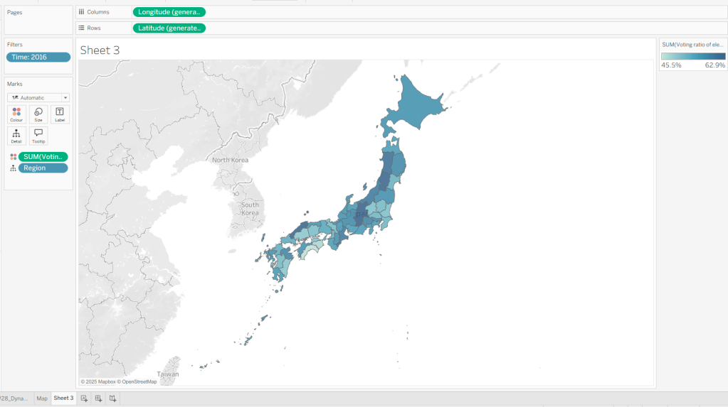
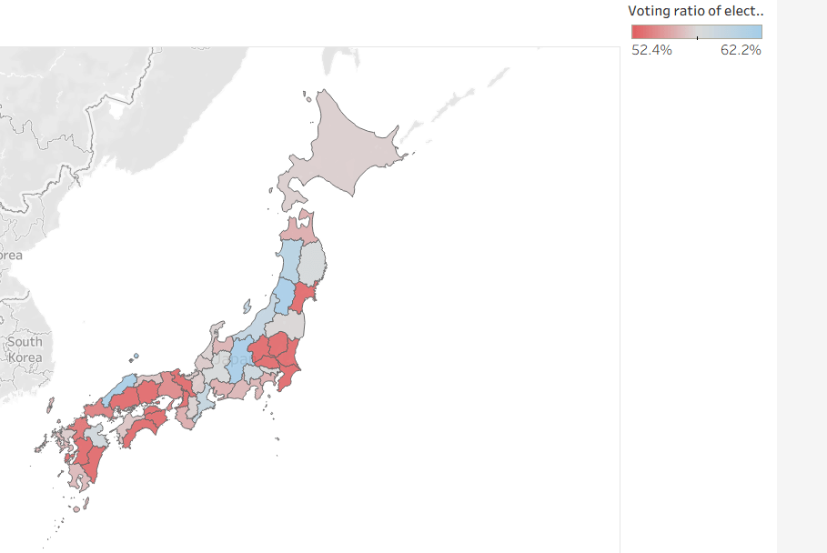
Yusuke set the challenge this week which allowed us to try out a new feature of Tableau – Dynamic Colour Ranges. As a consequence, you’ll need v2025.2 for this.
Setting up the Data for use in a Map
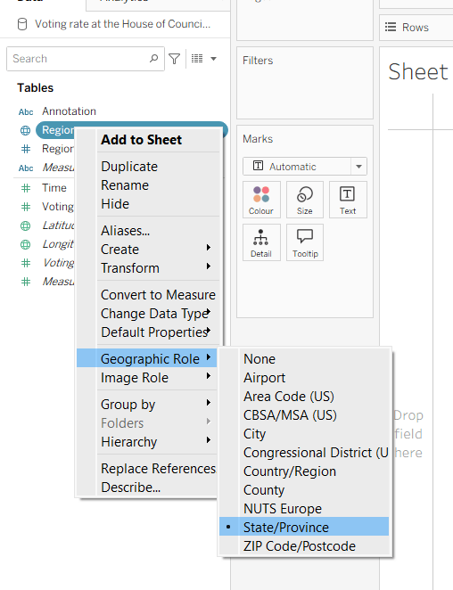
After connecting to the CSV file provided by Yusuke, I had to set the Region field to have a Geographic Role of State/Province
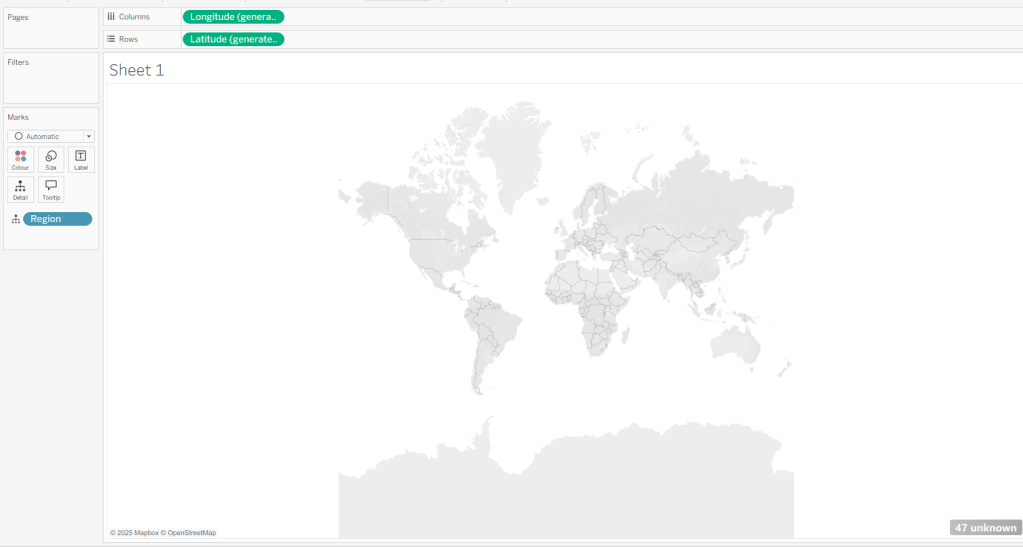
I then double-clicked on Region to generate the map, but due to my location settings, no information displayed.
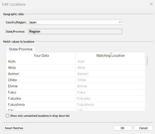
To resolve this, Edit Locations (via Map menu) and change Country/Region to Japan.
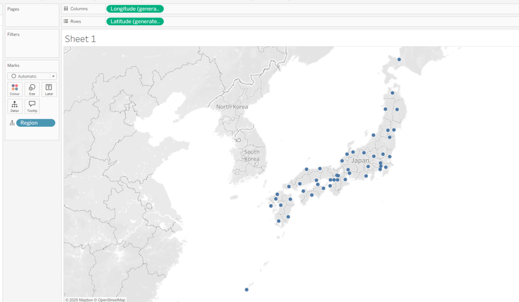
The Your Data – Matching Location fields should then match, and pressing OK presents a map.
Building the Basic Viz
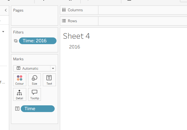
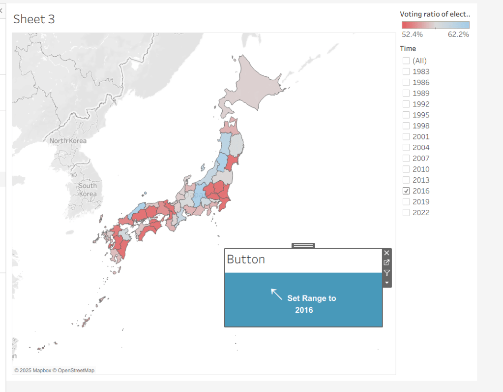
Move Time from the ‘Measures’ section of the Data pane into the ‘Dimension’ section (drag it to be above the line). Format the Time field to be a custom number with 0 dp and to not show ‘,’ as a thousand separator. Then add Time to Filter and select 2016. Add Voting Ratio of election… to Colour. Adjust the Tooltip.
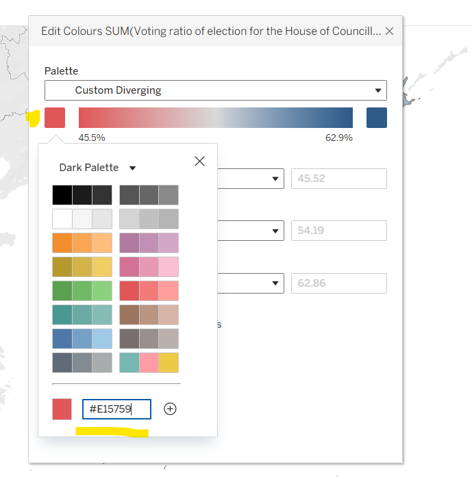
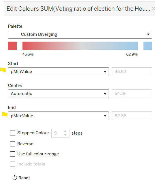
Edit the Colour Legend and choose a diverging colour palette (eg Red-Blue Diverging), then adjust the start and end colours as required
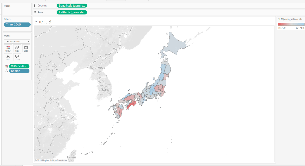
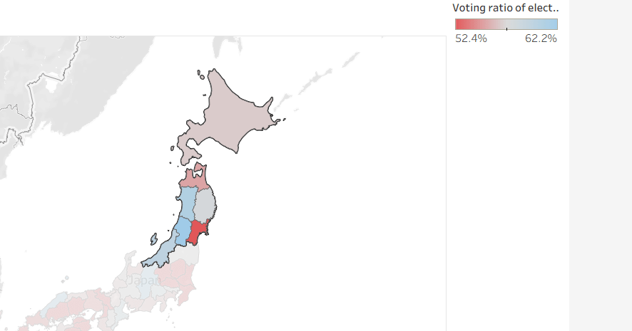
At this point, if you now make a selection on the map, the colours will remain as they are based on the current range
But what we want to happen, is for the colours to reflect a range based on just the selection (dynamic colour range). For this we need to create parameters
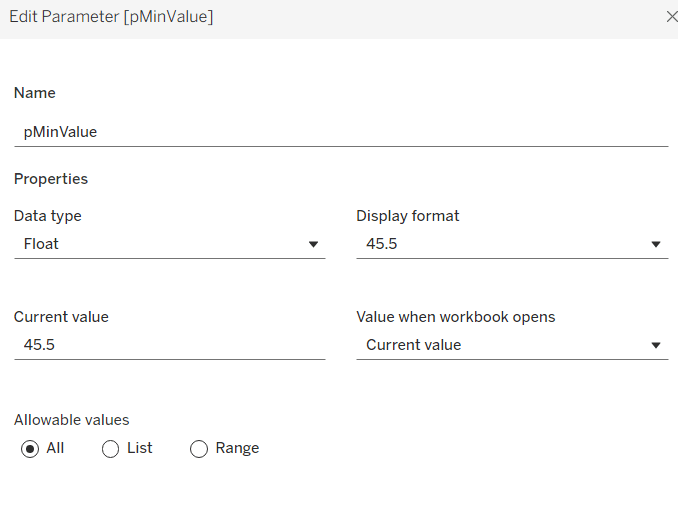
pMinValue
float defaulted to 45.5
pMaxValue
float defaulted to 62.9
Edit the Colour Legend again, and this time set the Start and End fields to reference the pMinValue and pMaxValue parameters.
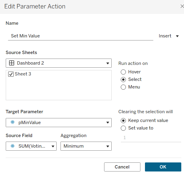
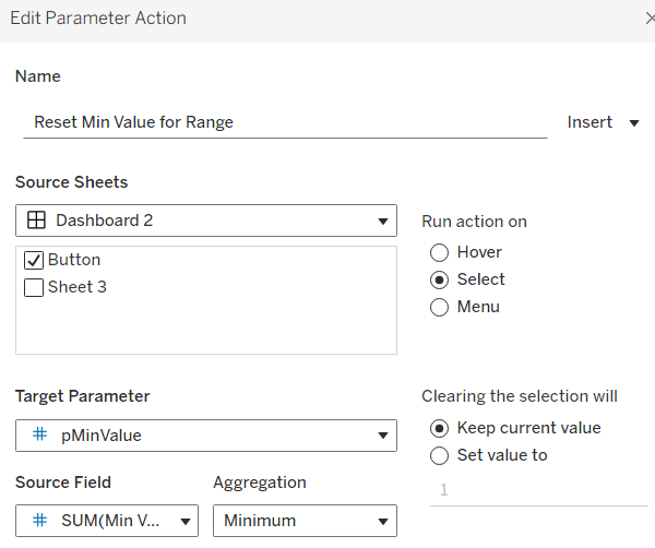
Add the sheet onto a dashboard. Add a dashboard parameter action
Set Min Value
on select of the sheet, set the target parameter pMinValue to the minimum value from the Voting Ratio of election..
Create another dashboard parameter action
Set Max Value
on select of the sheet, set the target parameter pMaxValue to the maximum value from the Voting Ratio of election..
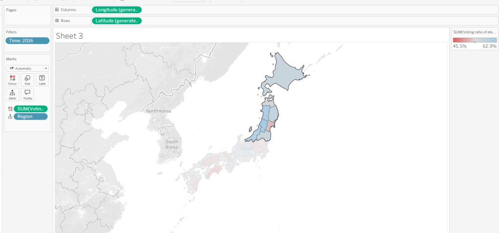
With this you should now find that when making a selection, the colour range is defined by the minimum and maximum values of just the marks selected
However the downside of this, is if you deselect the marks, the range doesn’t reset, and you then see the whole map coloured based on this more restricted range
Bonus – Building a ‘reset button’
On a new sheet, add Time to Text. Go back to the Map sheet, and set the Time filter to apply to ‘selected worksheets’, and select the new sheet you’re working on.
Change the mark type to Shape and choose a transparent shape (see here for details on how to set this up). Set the display to Entire View, then update the text in the Label (I sourced an arrow character from here). Align the text middle centre, set the background of the worksheet to blue and then update the font of the label text to white.
The intention is when the ‘button’ is clicked, we will set the pMinValue and pMaxValue parameters with the smallest and largest values associated to the year selected. His means we need to have some values on the ‘button’ sheet to pass to the parameters. So we need
Min Value for Year
{FIXED [Time]: MIN([Voting ratio of election for the House of Councillors (Single constituencies) %])}
and
Max Value for Year
{FIXED [Time]: MAX([Voting ratio of election for the House of Councillors (Single constituencies) %])}
Add both of these to the Detail shelf. Hide the Tooltip.
Add this sheet as a floating object to the dashboard. Show the Time filter from either the Map or Button sheets.
Add dashboard parameter actions, similar to the ones we did before
Reset Min Value for Range
on select of the Button sheet, set the target parameter pMinValue to the minimum value from the Min Value for Year field
Reset Max Value for Range
on select of the Button sheet, set the target parameter pMaxValue to the Maximum value from the Max Value for Year field.
Now if you ‘click’ the button sheet, the range should reset to the complete range for the relevant year.
Create the Label
Create a new sheet and add Time to Text. As before set the Time filter from another sheet to apply to ‘selected worksheets’, and select the new sheet you’re working on. Change the mark type to Shape and choose a transparent shape. Set the display to Entire View, and align the text middle centre. Hide the Tooltip.
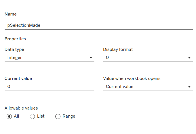
Create a parameter
pSelectionMade
integer parameter, defaulted to 0
Create a field
Selection Made
1
and another field
Reset Selection
0
Move both fields into the Dimension section of the data pane.
On the Map sheet, add Selection Made to the Detail shelf.
On the Reset Button sheet, add Reset Selection to the Detail shelf.
Create a new field
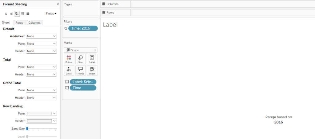
Label: Selection Made
[pSelectionMade]=1 THEN ‘, Selected Prefecture(s)’ END
Add Label: Selection Made to the Label shelf and adjust the text. Set the background of the sheet to transparent (None)
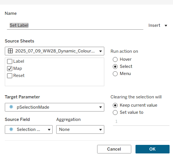
Add the sheet to the dashboard and create the following dashboard parameter actions
Set Label
on select of the Map sheet, set the target parameter pSelectionMade to the Selection Made field, with no aggregation.
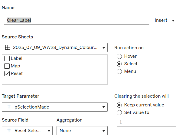
Clear Label
on select of the Reset Button sheet, set the target parameter pSelectionMade to the Reset Selection field, with no aggregation.
Final steps are to then arrange the dashboard as required using floating containers to store the filter, legend, ‘button’ and Label sheets. You’ll also need to change the filter to a single value list and customise so ‘All’ isn’t an option.
This week, Kyle set the challenge to test our use of functionality released in 2024.3 – spatial parameters. I hadn’t used these before, so did have a watch of the video link posted in the challenge, which was really useful.
Accessing the data
Kyle provided two links to web pages for the data. You need to download the zipped Shapefile from each
Once downloaded, extract each zip file. There will be a SHP (shape) file in each set of unpackaged files. In Tableau desktop, you will need to create 2 connections to a spatial file, one to each shp file
Build the State Map
From the School_District_Characteristics data source, double click on Geometry to automatically create a map.
Add Lea Name to the Detail shelf and add Statename to the Filter shelf, and select Washington.
From the Map menu, select Background Maps > Dark to set the background.
Name the sheet State or similar.
Building the District Map
On a new sheet, double click on Geometry from the School_Neighbourhood_Poverty_Estimates data source to automatically create another map.
Add Name to Detail.
On the Map menu, select Background Layers, and then set the Style to dark and tick the Street,Highways etc option.
Name the sheet District or similar.
Create the spatial parameter and filter
Create a new parameter to store the geometric data
pLea
a spatial parameter, defaulted to Empty
In the School_Neighbourhood_Poverty_Estimates data source, create a calculated filed
Filter
INTERSECTS([pLea],[Geometry])
this will return true if the geometric data that represents the state(s) selected from the state map overlap with the geometric data that represents the schools.
Adding the interactivity
Create a dashboard, placing the State and the District sheets side by side in a horizontal layout container.
Create a dashboard parameter action
Set Lea
On select of the State sheet, set the pLea parameter passing in the value from the Geometry field. Set the value to Empty when the selection is cleared.
Click on the State map (which will populate the pLea parameter). Then navigate back to the District sheet and add the Filter calculation to the Filter shelf and select True, which will result in the District map being filtered
Return to the dashboard and click on the State map to see the District map change.
When no states are selected though, the District map is empty, which is the desired behaviour, but we want to fill the display with the State map (ie hide the space where the District map is).
To do this, create a calculated field (in either of the data sources)
State Selected
NOT ISNULL([pLea])
This will return True if there is something in the pLea parameter.
Back on the dashboard, select the District object on the dashboard, then from the Layout tab, check the Control visibility using value checkbox, and select the State Selected field
Remove the title from the District sheet on the dashboard, and now when all states are unselected the State sheet fills the view.
Finalise the dashboard by adding the title and any other information required. Set the background of the dashboard to dark grey and show the State parameter.
For the final week of Community Month, my colleague, Nik Eveleigh, posed this challenge to apply some tricky filters to a map. Let’s dive straight in!
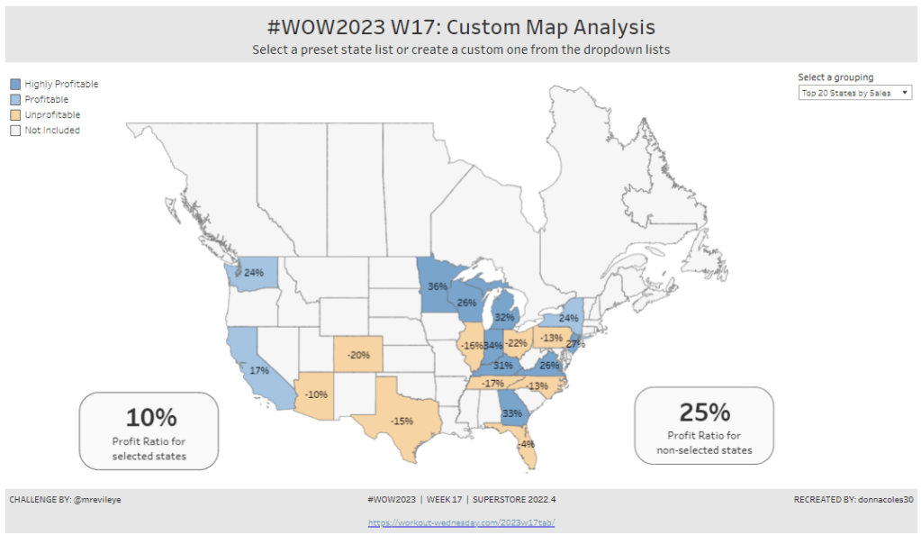
Identifying the States and Profitability
The core functionality of the map display is driven by a parameter allowing the user to select which set of states they want to analyse, so let’s set this up first.
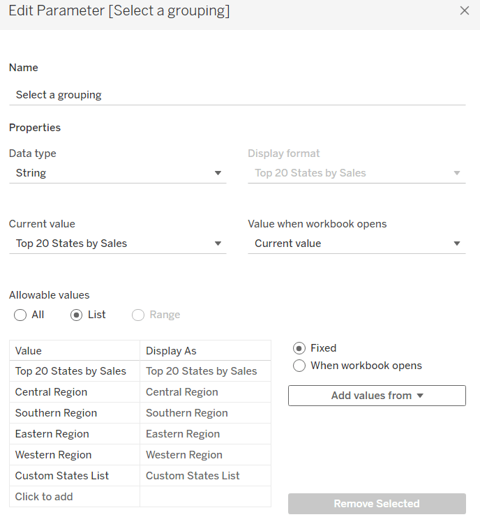
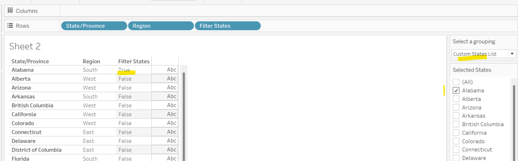
Select a grouping
string parameter containing 6 entries in the list and defaulted to ‘Top 20 States by Sales’
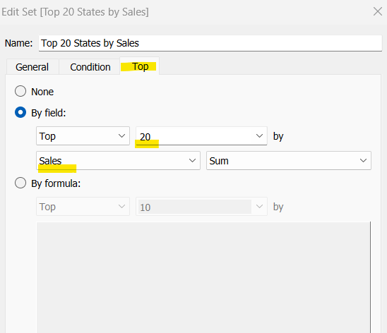
To identify the top 20 States by Sales, we need to create a Set. Right click on State/Province > Create > Set and use the ‘Top’ option to create the set based on top 20 sum of Sales.
Top 20 States by Sales
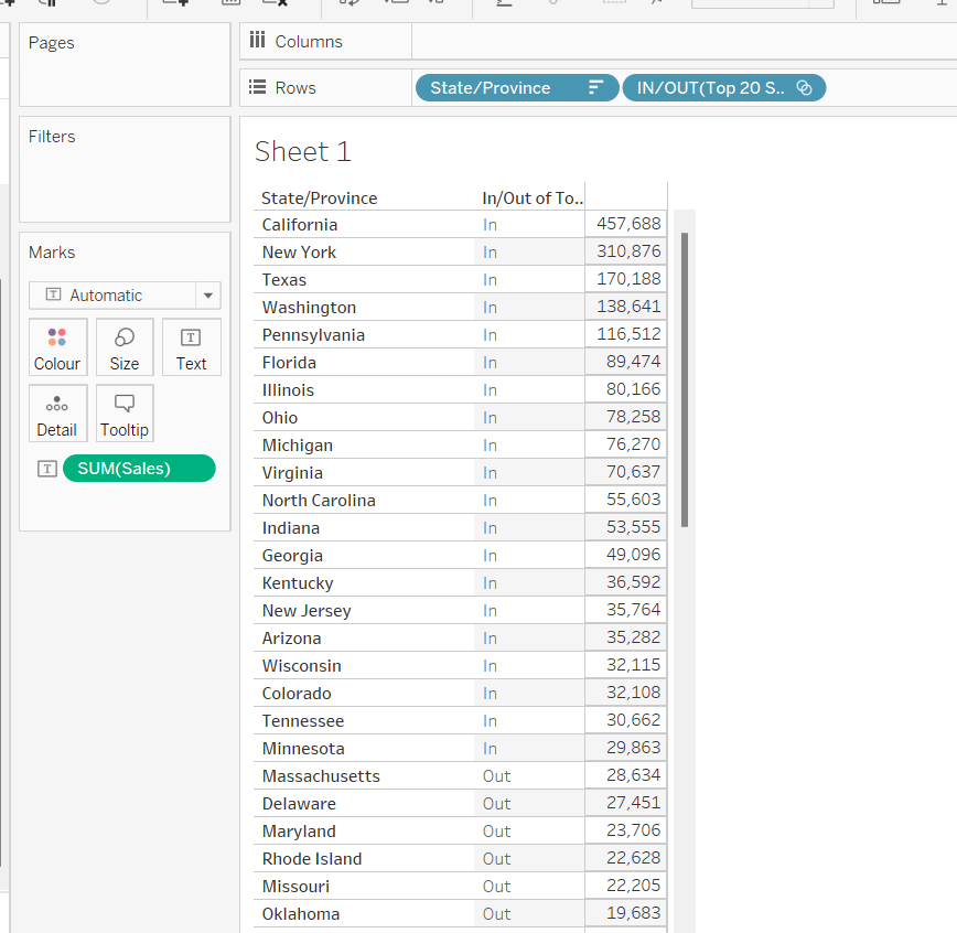
To verify this is working as expected, add State/Province to Rows, Sales to Text and sort descending. The add Top 20 States by Sales to Rows and you should see the first 20 rows with In and the rest listed as Out.
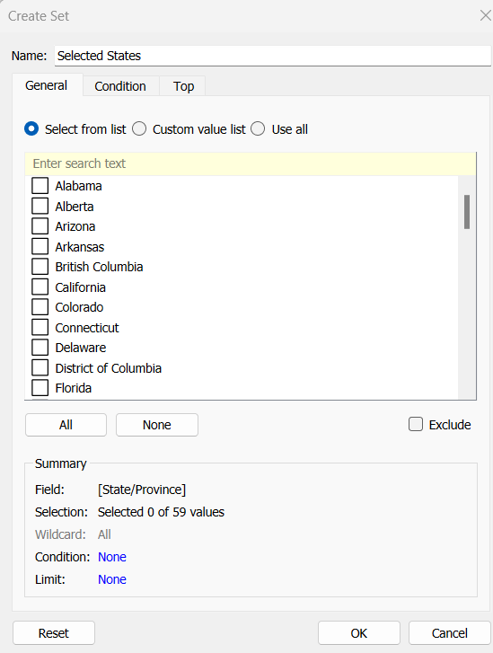
To identify the states selected when the ‘Custom States List’ option is selected, we’ll also need another set to store the selections. Right click on State/Province > Create > Set, leave the list of states all unselected and rename the set
Selected States
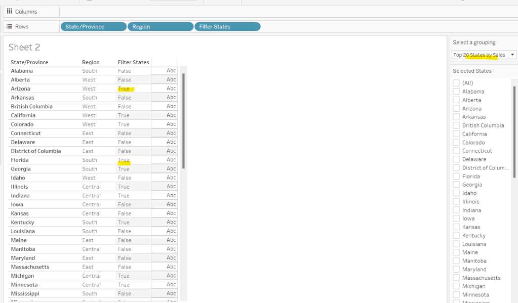
To verify this is working, on a new sheet add State/Province to Rows and Selected States to Rows too. Then on the context menu of the Selected States pill, choose Show Set to get the list of States displayed. Select the first couple in the list and see the value in the table change from Out to In.
It is this set control filter list that will be used to provide the selection when the appropriate value in the Select a grouping parameter is chosen.
While the sets display In or Out when shown in the table, they are actually booleans with the equivalent of a True or False. We now need to build a boolean field which will encapsulate all the relevant states included based on the parameter option selected.
Filter States
CASE [Select a grouping] WHEN ‘Top 20 States by Sales’ THEN [Top 20 States by Sales] WHEN ‘Central Region’ THEN IF [Region] = ‘Central’ THEN TRUE ELSE FALSE END WHEN ‘Southern Region’ THEN IF [Region] = ‘South’ THEN TRUE ELSE FALSE END WHEN ‘Eastern Region’ THEN IF [Region] = ‘East’ THEN TRUE ELSE FALSE END WHEN ‘Western Region’ THEN IF [Region] = ‘West’ THEN TRUE ELSE FALSE END WHEN ‘Custom States List’ THEN [Selected States] END
Let’s sense check the workings of this too. On a sheet add State/Province, Region and Filter States to Rows. Show the Select a grouping parameter. Also click on the Selected States field in the left hand data pane and Show Set, so the list of states shows. Ensure all are unchecked. Depending on the option selected in the Select a grouping parameter, then Filter States column should display true or false.
If you select a state from the list, this should only present as True when the Custom States List option is selected
Right, now we know how to identify the states we want, we can start to look at understanding their profitability. Firstly we need to get the profit ration
Profit Ratio
SUM([Profit])/SUM([Sales])
format this to % with 0 dp.
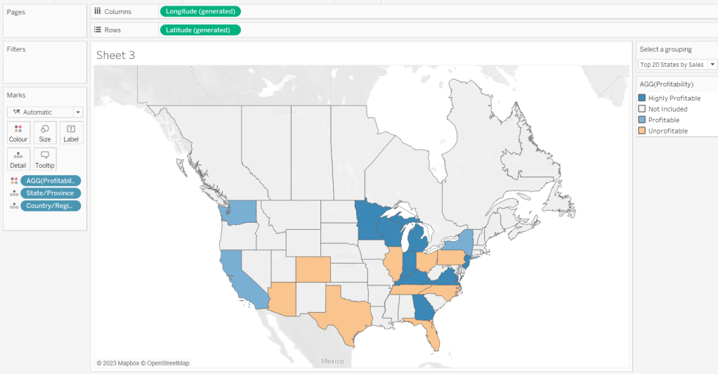
Profitability
IF ATTR([Filter States]) THEN
IF [Profit Ratio] < -0.25 THEN ‘Highly Unprofitable’
ELSEIF [Profit Ratio] >= -0.25 And [Profit Ratio] < 0 THEN ‘Unprofitable’
ELSEIF [Profit Ratio] >=0 AND [Profit Ratio] < 0.25 THEN ‘Profitable’
ELSE ‘Highly Profitable’
END
ELSE ‘Not Included’ END
If the states is one of the filtered ones then work out isn’t profitability ‘bracket’ otherwise report as ‘Not Included’.
Building the Map
On a new sheet double-click on State/Province to automatically generate the map. If the map doesn’t display with US and Canada Edit Locations (via the Map menu) and ensure your settings are as below
Display the Show a grouping parameter and have it set to Top 20 States by Sales. Add Profitability to Colour and adjust colours accordingly.
Click on the Selected States field in the left hand data pane and Show Set, so the list of states shows, then test changing the values in the Select a grouping parameter and see the display change.
Clean the map up by clicking Map -> Background Layers, and then unchecking all the options in the Background Map Layers section displayed on the left hand side.
To label the highlighted state we need
Label – PR
IF ATTR([Filter States]) THEN [Profit Ratio] END
format to % with 0 dp and then add to the Label shelf and set the font to bold.
Add Profit Ratio to the Tooltip shelf and adjust the tooltip.
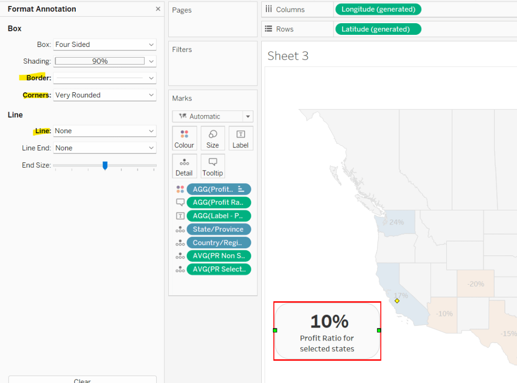
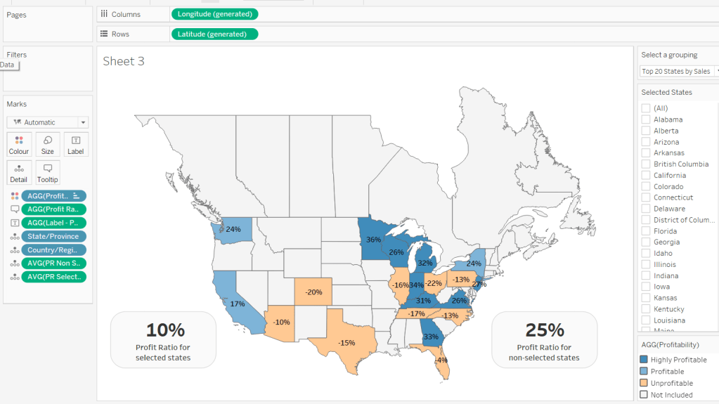
To display the summary Profit Ratio values for all the filtered states vs those not selected, we need
PR by Filter State
{FIXED [Filter States]: [Profit Ratio]}
and then
PR Selected States
ZN({FIXED:AVG(IF [Filter States] THEN [PR by Filter State] END)})
Custom format this with 0%;-0%;–
This formatting with show values with 0dp for positive and negative values and — when no values exists.
Repeat the process to create
PR Non Selected States
ZN({FIXED:AVG(IF NOT([Filter States]) THEN [PR by Filter State] END)})
and apply the same formatting above.
Add both PR Selected States and PR Non Selected States to the Detail shelf and change the aggregation to Average.
Then click on a state on the bottom left of the map (I chose California) and select Annotate > Mark. Add the reference to the PR Selected States and supporting text into the annotation dialog. The when completed, manually move the annotation to the space to the left of the map. Format the annotation to add a border, round the edges and remove the line. You many need to re-edit the annotation to rec-centre the text.
Repeat a similar process, by annotating a state on the right hand side and referencing the PR Non Selected States field instead.
Finally remove all row & column dividers and hide the map options (Map -> Map Options -> uncheck all selections)
Hiding the Selected States control
In order to control visibility of the Selected States list, we need a boolean field
Custom States Selected
[Select a grouping] = ‘Custom States List’
Once all objects have been added to the dashboard and arranged where you want, click on the Selected States control, so it is selected via a grey border, then on the left hand Layout pane, select the Control visibility using value checkbox and choose the Custom States Selected field
The State list will now only display when the Select a grouping parameter contains the ‘Custom States List’ value.
Sean Miller began the start of #WOW2022 with this challenge where the focus was on layout, interactivity and maps.
Building the map
Building the bar
Building the area chart
The Unknown indicator
Adding interactivity
Building the map
I’m starting with this as in order to build the map, I found after a bit of trial and error I needed to build a data model which related the wildlife strike data source provided by Sean with the spatial file data source provided via the link to the community post. I downloaded all the files, but found the link to the us_ak_hi_territories_shift_conformal_faux_WM.hyper.zip was the file I needed once unzipped (the middle file to download from Sarah’s post on 19 July 2020 (see below)
Once I unzipped the downloaded file I copied the us_ak_hi_territories_shift_conformal_faux_WM.hyper file to my usual data sources repository on my laptop.
I then connected to Tableau and built a data model by first connecting to the wildlife strikes csv file, then adding a relationship to us_ak_hi_territories_shift_conformal_faux_WM on State Name = Name
To make things clearer, I created a fields to store the number of incidents
This is simply referencing the ‘count’ field that is automatically generated that is related to the wildlife strike data source.
I then built the map by
add Geometry and Name to Detail
add Wildlife Incidents to Colour
This should have created the below
Remove all the background imagery via the Map > Map Layers menu – uncheck all the options from the left hand pane.
Add Name to the Filter shelf and exclude American Samoa, Guam, Northen Marianas, Puerto Rico and the Virgin Islands. This will remove the cluster of shapes to the right (I’m not sure if this is the expected method or not..).
Change the colour palette to use the red-gold colour range.
Finally amend the Tooltip accordingly and also remove the row and column dividers.
Building the bar
The bar chart displays the top 10 incidents by species type, with the rest all grouped under ‘other’, and displayed at the bottom. We need to create a set for this. Right click on Species Type and Create > Set. Create a set based on the top 10 of the count of the wildlife incidents data source.
Species Type Set
We then need a field to display the info in the bar
Species Type to Display
IF [Species Type Set] THEN [Species Type] ELSE ‘Other’ END
ie if the Species Type is in the Species Type Set then display the Species Type, otherwise display Other.
Add Species Type Set and Species Type To Display to Rows and Wildlife Incidents to Columns and sort descending (just click the sort descending button in the toolbar)
Add Species Type Set to the Colour shelf and adjust accordingly. Remove the column and row dividers and the row gridlines. Adjust the Tooltip.
The final step we need is to make the title dynamic and display a state name if filtered.
Firstly we will need a parameter to capture the selected state
pSelectedState
A string parameter defaulted to <empty string>
We will use a parameter action to populate this parameter later. We need an additional field to use in the chart title
Title: Selected State
IF [pSelectedState] <> ” THEN ‘in ‘ + [pSelectedState] ELSE ” END
Add this field onto the Detail shelf, then adjust the chart title
Building the area chart
Add Incident Year to Columns and Wildlife Incidents to Rows and change to mark type = Area. Adjust colour accordingly, and remove the column gridlines. Adjust the Tooltip.
Again the chart title needs to be dynamic based on state name and the species type selected, so we’ll need another parameter
pSelectedSpecies
string parameter defaulted to <empty string>
Add Title: Selected State to Detail and adjust the title as below
The Unknown indicator
On a new sheet double click in the space below the marks card to create a ‘type in’ pill
Enter the text ‘Unknown Location’ (including the single quotes) and the add this pill onto the Text shelf.
Change the mark type to square and adjust the Size to the maximum.
Add Wildlife Incidents to the Tooltip shelf. Then add Name to the Filter shelf and filter to only show the Null values. Adjust the colour and the Tooltip.
Adding interactivity
Create a dashboard and use layout containers to position the charts in the relevant places. The colour legend and the ‘unknown’ indicator will need to be ‘floated’ into position.
We’re going to need 4 dashboard actions; one to set the selected State, one to set the selected Species Type, one to filter the bar and area chart based on the the selected state, and one to filter the map and area chart based on the selected species.
Select Species
this is a parameter action to set the pSelectedSpecies paramater on selection of the bar chart, using the value in the Species Type To Display. The parameter should be reset to <empty string> when unclicked.
Select State
similar to above, but runs on selection of the map chart, and passes the Name field into the pSelectedState parameter.
Filter by State
This is a filter action that runs on selection of a state in the map chart. It affects all other charts on the dashboard except the unknown sheet. It should only filter on the Name field and not All fields.
Filter by Species
Another filter action, that runs on selection of the bar chart. This one does impact all the other charts on the dashboard, but again only filters based on the Species Type to Display field rather than all fields.
Hopefully, with all this, you should have a working solution. My published viz is here.
There’s a lot packed into the challenge this week, which was “set” by Lorna Brown and Erica Hughes to test our Set Action skills. How detailed this blog will go, I have yet to decide… I’ve got a couple of hours to get this nailed, so it could get quite brief as we get towards the end 🙂
I’ve got 6 sheets/charts making up this dashboard, so my intention is to summarise each one, and I’ll define the various calculations that are going to be needed as we go.
The overall summary table
The selected months summary table
The trend line
The donut chart
The top 3 states table
The map
Adding the interactivity
The overall summary table
This challenge is focused on understanding the Sales per month. Whilst its possible to use the built in aggregation features of a date field, I often prefer to create explicit date fields at the level I require, so it’s easier to reference. Therefore, the first field I created for this challenge was
Order Date To Plot
DATETRUNC(‘month’, [Order Date])
This essentially ‘groups’ every order placed in a month to be tagged with the 1st of the month. I custom formatted this field to MMM yyyy (ie Oct 21).
For the overall summary table, I need to capture the total sales of the whole data set, and I use a Fixed LoD calculation for this.
Total Sales
{FIXED: SUM([Sales])}
This field is formatted to $0.00M
NOTE – I actually named this field <space>Total Sales<space> as I want to display the name of the field (the measure name) in the summary table, but the ‘selected months’ summary table also has a Total Sales measure which is a different calculation (see later). Adding the <spaces> is a sneaky way to get two fields with what appears to be the same name. As this field when displayed will be centred, the <spaces> aren’t noticeable.
We also need to get the monthly average sales for the whole data set
Average Sales by Month
AVG({FIXED [Order Date To Plot]: SUM([Sales])})
Format this to to $0.0K
We can now build the summary table by adding Measure Names to the Filter shelf and selecting these 2 fields. The placing Measure Names on Rows and Measure Names and Measure Values on Text. Reorder the measures as required, hide Measure Names on Rows and format the Text as required.
Change the title of the sheet to Superstore Sales, ensure the tooltip doesn’t display and remove all gridlines / row banding etc.
The selected months summary table
The core requirement of this challenge is to make use of set actions, so we’re obviously going to need a set which will contain the dates (months) the user will select on the chart. This set will be based off of Order Date To Plot. Right click on the field > Create > Set. Name it Order Dates To Plot Set and by default, select all the months between Oct 20 to Jun 21 inclusive.
Later I’ll describe how the values of this set will get updated, but for now, we need to get some information relating to the sales in these selected months.
Firstly, we want the total sales for the months in this set.
Total Sales
IF [Order Date To Plot Set] THEN [Sales] END
The default format for this field is set to $ with 0 dp.
Note – this is the other ‘total sales’ field mentioned earlier. This field name has no leading/trailing spaces.
To get the average, I needed a field just to store each member of the set (ie each selected month)
Selected Dates
IF [Order Date To Plot Set] THEN [Order Date To Plot] END
and with this I can then work out
Average Sales
AVG({FIXED [Selected Dates]: SUM([Total Sales])})
The final measure required for this section is the change within the date range, which is basically comparing the value of sales at the first month in the selection with the sales in the final month selected. We need a few fields to get to this.
Firstly, we want to identify the first and last months
Min Selected Date
{FIXED:MIN(IF [Order Date To Plot Set] THEN [Order Date To Plot] END)}
If the date is in the set, then return the date and then take the minimum of all the dates, and store against all the rows in the data. Similarly we have
Max Selected Date
{FIXED:MAX(IF [Order Date To Plot Set] THEN [Order Date To Plot] END)}
Putting this info into a table, you can see how the calculations are working. The values for the Min & Max dates are the same across every row.
Next we need to get the Sales at the min & max points, and spread that value across all rows
Sales at Min Date
{FIXED: SUM(IF [Order Date To Plot]=[Min Selected Date] THEN [Sales] END)}
Sales at Max Date
{FIXED: SUM(IF [Order Date To Plot]=[Max Selected Date] THEN [Sales] END)}
Now we can work out the difference
Change within Date Range
([Sales at Max Date]-[Sales at Min Date])/[Sales at Min Date]
format this to a percentage set to 1 dp
Finally, we need to know the number of months in the set, which is displayed in the title of the monthly summary sheet.
Months in Set
{FIXED: COUNTD(IF [Order Date To Plot Set] THEN [Order Date To Plot] END)}
If the date is within the set, then capture the date, and the count the distinct set of dates captured.
Make this a discrete field (move from the measures section at the bottom of the data pane to the dimensions section at the top (above the line), and add to the tabular view
Now we can build the summary sheet.
Add Measure Names to the Filter shelf and this time filter by Total Sales, Average Sales and Change within Date Range. Add Measure Names to Rows and Measure Values to Text. Reorder the measures.
Format the Total Sales to be in $K, by selecting the Format option from the context menu of the Total Sales pill on the Measure Values shelf (hover on the pill and click the carrot/down arrow that appears – by formatting this way, we’re changing the display of this field for this sheet only).
Add Min Selected Date and Max Selected Date to the Detail shelf and set to be Exact Date. Format both these fields via the pill context menu to be the ‘March 2001’ format
Also add Months in Set to the Detail shelf.
Adjust the title of the sheet as below
Finally you need to set the background of the worksheet to the relevant purple (I used #8074a8), adjust the colours of all the fonts to white and adjust the size/style of the fonts in the table. Remove all gridlines/row banding etc, and you should have something like below
The Trend Line
By this point we’ve built all the calculated fields we need for this chart. This is a dual axis line chart, as we want the colour of the line for the selected dates to be different from the non selected ones, and we want to display a label for the highest sales in the selected timeframe.
Add Order Date to Plot to Columns, and set as a Continuous (green) pill set to Exact Date
Add Sales to Rows
Add Total Sales to Rows
Make the chart dual axis, and synchronise axis.
Adjust the colours of the Measure Names colour legend
On the Label shelf of the Total Sales marks card, set to label the maximum value only
On the All Marks Card, add Min Selected Date and Max Selected Date to the Detail shelf and set to Exact Date.
Right click on the Order Date To Plot axis and Add Reference Line
Create a reference band that starts at the constant Min Selected Date, ends at the constant Max Selected Date, is bounded by dotted lines and shaded between
Hide the Sales and Total Sales axis, format tooltips and adjust the row & column dividers.
Change the title and you should get to
The donut chart
Donut charts are 2 different sized pie charts on top of each other, created using a dual axis chart. On the Rows shelf type in MIN(0). Then type the same next to it. This gives you two axis and two marks cards.
We only care about information related to the selected dates for this chart, so we can add Order Date To Plot Set to the Filter shelf, which by default will just restrict the information to the data ‘in’ the set.
Change the mark type of the 1st MIN(0) marks card to Circle and add Sales to the Tooltip shelf. Adjust the size of the charts/mark.
Change the mark type of the 2nd MIN(0) marks card to Pie and add Sales to the Angle shelf. Add State to the Detail shelf. Sort the State field by Sales descending.
Note – the circles might look the same at this point, but if you hover over the bottom one, you should see that it’s segmented by State.
We need some new fields now to help us identify the top ranking states.
Sales Rank
RANK(SUM([Sales]))
This is a table calculation, so it’s best to see how this field will work in a table view – build one out as below, and set the table calculation on the Sales Rank field as shown
We’re now going to ‘group’ the ranks into the top 3 and everything else
Sales Rank Group
IF [Sales Rank]<=3 THEN [Sales Rank] ELSE 10 END
We can now use this Sales Rank Group field to colour the pie chart. On the 2nd MIN(0) marks card, add Sales Rank Group to the Colour shelf. Adjust the table calculation to compute using State as above, then change the field to be Discrete (blue). Adjust the colours to suit.
Now make the chart dual axis, and synchronise the axis. Adjust the size of the 1st MIN(0) circle to be smaller than the pie. If it’s not showing, right click on the right hand axis and move marks to back. Colour the circle white. Adjust tooltips to suit and hide axis, column/row dividers etc. Update the title. You should have
The top 3 states table
Add Order Date To Plot Set to Filter
Add State to Rows and Sales to Text and sort descending.
Add Sales Rank to Filter and set to At Most is 3. This will just show the top 3 states.
Add State to Text
Add a Percent of TotalQuick Table Calculation to the existing Sales field that’s on the Text shelf (via the context menu of the pill)
Add another instance of Sales back onto the Text shelf
Adjust / format the font size and layout of the fields on the Text shelf
Add Sales Rank to the Size shelf and set to be discrete (blue) and set the mark type to be Text. Adjust the size of the marks – it’s likely it’ll need to be reversed and the range adjusted.
Hide the State field on Rows, adjust the font colours, remove row banding and row/column dividers. You should end up with…
The map
Add Order Date To Plot Set to the Filter shelf
Add State to Detail – this should create a map (edit locations to be US if need be – Map -> Edit Locations menu)
Add Sales to the Colour shelf
Edit the colour range to a suitable purple range ( I set the darkest colour of the range to #6c638f)
Adjust the map layers (Map -> Map Layers) so only the option highlighted below is selected.
Adding the interactivity
Add all the sheets to the dashboard, using vertical and horizontal containers to arrange the relevant layout. Then add a Set Action (Dashboard > Actions > Add Action > Change Set Values). The Set Action should be configured as below :
And fingers crossed, you should now be able to select marks on the trend line and see all the other charts, except the initial summary table, all update. My published viz is here.
It’s Community Month over at #WOW HQ this month, which means guest posters, and Kyle Yetter kicked it all off with this challenge. Having completed numerous YoY related workbooks both through work and previous #WOW challenges, this looked like it might be relatively straight forward on the surface. But Kyle threw in some curve balls, which I’ll try to explain within this blog. The points I’ll be focussing on
YoY % calculation for colouring the map
Displaying the circles on the map
Restricting the Date parameter to 1st Jan – 14th July only
Showing Daily or Weekly dates on the viz in tooltip
Restricting to full weeks only (in weekly view)
YoY % calculation
The data provided includes dates from 1st Jan 2019 to 21st July 2020. We need to be able to show Current Year (CY) values alongside Previous Year (PY) values and the YoY% difference. I built up the following calculations for all this
Today
#2020-07-15#
This is just hardcoded based on the requirement. In a business scenario where the data changes, you may use the TODAY() function to get the current date.
Current Year
YEAR([Today])
simply returns 2020, which I could have hardcoded as well, but I prefer to build solutions as if the data were more dynamic.
CY
IF YEAR([Subscription Date]) = [Current Year] THEN [Subscription] END
stores the value of the Subscription field but only for records associated to 2020
PY
IF YEAR([Subscription Date]) = [Current Year]-1 THEN [Subscription] END
stores the value of the Subscription field but only for records associated to 2019 (ie 2020-1)
YoY%
(SUM([CY])- SUM([PY]))/SUM([PY])
format this to a percentage with 0 decimal places. This ultimately is the measure used to colour the map. CY, PY & YoY% are also referenced on the Tooltip.
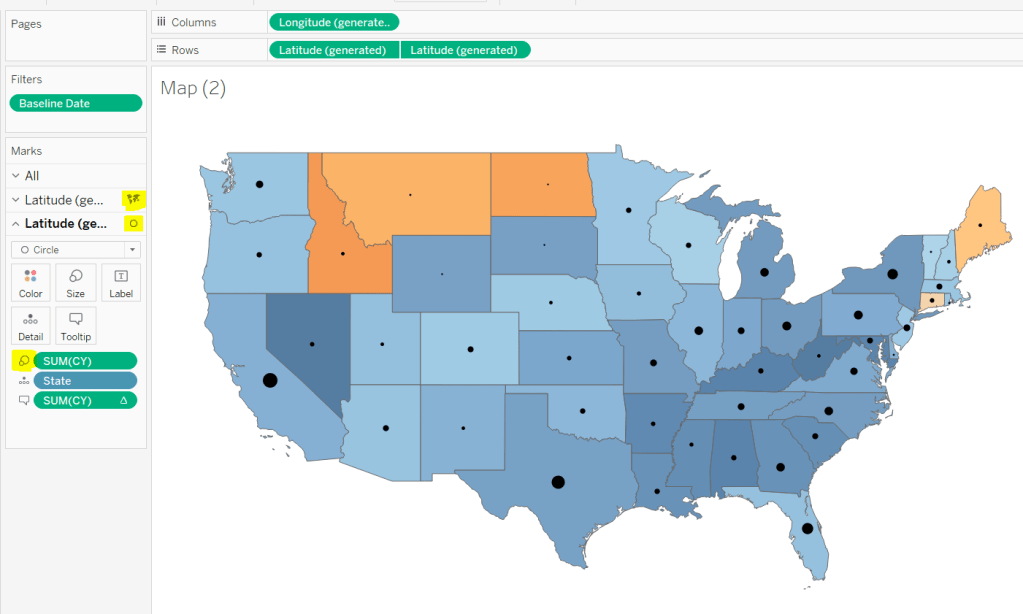
Displaying circles on the map
This is achieved using a dual axis map (via a second instance of the Latitude pill on Rows). One ‘axis’ is a map mark type coloured by the YoY% and the other is a circle mark type, sized by CY, explicitly coloured black.
The Tooltip for the circle mark type also shows the % of Total subscriptions for the current year, which is a Percent of Total Quick Table Calculation
Restricting the Date parameter to 1st Jan – 14th July only
As mentioned the Subscription Date contains dates from 01 Jan 2019 to 21 July 2020, but we can’t simply add a filter restricting this date to 01 Jan 20 to 14 Jul 20 as that would remove all the rows associated to the 2019 data which we need available to provide the PY and YoY% values.
So to solve this we need a new date field, and we need to baseline / normalise the dates in the data set to all align to the same year.
Baseline Date
//set all dates to be based on current year MAKEDATE([Current Year], MONTH([Subscription Date]), DAY([Subscription Date]))
So if the Subscription Date is 01 Jan 2019, the equivalent Baseline Date associated will be 01 Jan 2020. The Subscription Date of 01 Jan 2020 will also have a Baseline Date of 01 Jan 2020.
We also want to ensure we don’t have dates beyond ‘today’
Include Dates < Today
[Baseline Date]< [Today]
Add Include Dates < Today to the Filter shelf, and set to True.
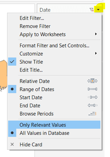
Add Baseline Date to the Filter shelf, choose Range of Dates , and by default the dates 01 Jan 2020 to 14 Jul 2020 should be displayed
Select to Show Filter, and when the filter displays, select the drop down arrow (top right) and change to Only Relevant Values
Whilst you can edit the start and end dates in the filter to be before/after the specific dates, this won’t actually use those dates, and the filter control slider can only be moved between the range we want.
The Baseline Date field should then be custom formatted to mmmm dd to display the dates in the January 01 format.
Showing Daily or Weekly dates on the viz in tooltip
The requirements state that if the date range selected is <=30 days, the trend chart shown on the Viz in Tooltip should display daily data, otherwise it should be weekly figures, where the week ‘starts’ on the minimum date selected in the range.
There’s a lot going on to meet this requirement.
First up we need to be able to identify the min & max dates selected by the user via the Baseline Date filter.
This did cause me some trouble. I knew what I wanted, but struggled. A FIXED LOD always gave me the 1st Jan 2020 for the Min Date, regardless of where I moved the slider, whereas a WINDOW_MIN() table calculation function caused issues as it required the data displayed to be at a level of detail that I didn’t want.
A peak at Kyle’s solution and I found he’dadded the date filters to context. This means a FIXED LOD would then return the min & max dates I was after.
Min Date
{MIN([Baseline Date])}
Note this is a shortened notation for {FIXED : MIN([Baseline Date])}
Max Date
{MAX([Baseline Date])}
With these, we can work out
Days between Min & Max
DATEDIFF(‘day’,[Min Date], [Max Date])
which in turn we can categorise
Daily | Weekly
IF [Days between Min & Max]<=30 THEN ‘Daily’ ELSE ‘Weekly’ END
We also need to understand the day the weeks will start on.
Day of Week Min Date
DATEPART(‘weekday’,[Min Date])
This returns a number from 1 (Sunday) to 7 (Saturday) based on the Min Date selected.
Using this we can essentially ‘categorise’ and therefore ‘group’ the Baseline Date into the appropriate week.
Baseline Date Week
CASE [Day of Week Min Date] WHEN 1 THEN DATETRUNC(‘week’,([Baseline Date]),’Sunday’) WHEN 2 THEN DATETRUNC(‘week’,([Baseline Date]),’Monday’) WHEN 3 THEN DATETRUNC(‘week’,([Baseline Date]),’Tuesday’) WHEN 4 THEN DATETRUNC(‘week’,([Baseline Date]),’Wednesday’) WHEN 5 THEN DATETRUNC(‘week’,([Baseline Date]),’Thursday’) WHEN 6 THEN DATETRUNC(‘week’,([Baseline Date]),’Friday’) WHEN 7 THEN DATETRUNC(‘week’,([Baseline Date]),’Saturday’) END
Ideally we want to simplify this using something like DATETRUNC(‘week’, [Baseline Date], DATEPART(‘weekday’, [Min Date])), but unfortunately, at this point, Tableau won’t accept a function as the 3rd parameter of the DATETRUNC function.
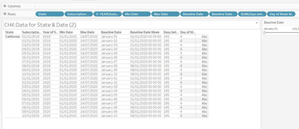
Let’s just have a look at what we’ve got so far
Rows for California only showing the Subscription Dates from 01 Jan 2019 – 10 Jan 2019 and 01 Jan 2020 to 10 Jan 2020. Min & Max date for all rows are identical and matches the values in the filter. The Baseline Date field for both 01 Jan 2019 and 01 Jan 2020 is January 01. The Baseline Date Week for 01 Jan 2019 – 07 Jan 2019 AND 01 Jan 2020 – 07 Jan 2020 is 01 Jan 2020. The other dates are associated with the week starting 08 Jan 20202.
So now we have all this information, we need yet another date field that will be plotted on the date axis of the Viz in Tooltip.
Date to Plot
IF [Days between Min & Max] <=30 THEN ([Baseline Date]) ELSE [Baseline Date Week] END
If you add this field to the tabular display I built out above, you can see how the value changes as you move the filter dates to be within 30 days of each other and out again.
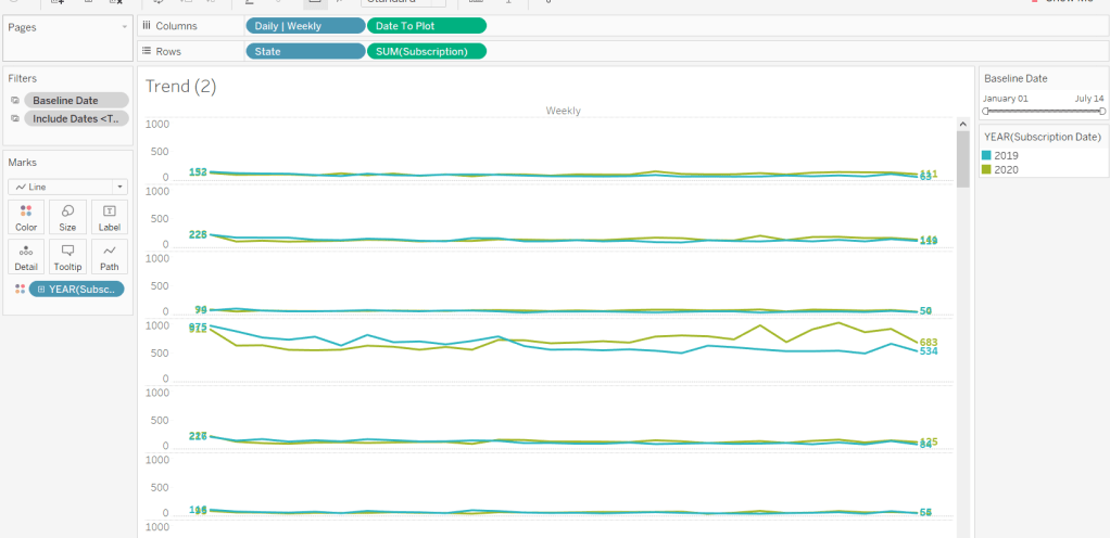
When added to the actual viz, this field is formatted to dd mmm ie 01 Jan, and then is plotted as a continuous, exact date (green pill) field on the Columns alongside the Daily | Weekly field, with State & Subscription on Rows. The YEAR(Subscription Date) provides the separation of the data into 2 lines.
Restricting to full weeks only (in weekly view)
The requirements state only full weeks (ie 7 days of data) should be included when the data is plotted at a weekly level. For this we need to ascertain the ‘week’ the maximum date falls in
Max Date Week
CASE [Day of Week Min Date] WHEN 1 THEN DATETRUNC(‘week’,([Max Date]),’Sunday’) WHEN 2 THEN DATETRUNC(‘week’,([Max Date]),’Monday’) WHEN 3 THEN DATETRUNC(‘week’,([Max Date]),’Tuesday’) WHEN 4 THEN DATETRUNC(‘week’,([Max Date]),’Wednesday’) WHEN 5 THEN DATETRUNC(‘week’,([Max Date]),’Thursday’) WHEN 6 THEN DATETRUNC(‘week’,([Max Date]),’Friday’) WHEN 7 THEN DATETRUNC(‘week’,([Max Date]),’Saturday’) END
so if the maximum date selected is a Thursday (eg Thurs 11th June 2020) but the minimum date happens to be a Tuesday, then the week starts on a Tuesday, and this field will return the previous Tuesday date (eg Tues 9th June 2020).
And then to restrict to complete weeks only…
Full Weeks Only
IF [Daily | Weekly]=’Weekly’ THEN [Date To Plot]< [Max Date Week] ELSE TRUE END
If we’re in the ‘weekly’ mode, the Date To Plot field will be storing dates related to the start of the week, so will return true for all records where the field is less than the week of the max date. Otherwise if we’re in ‘daily’ mode we just want all records.
This field is added to the Filter shelf and set to true.
Hopefully that covers off all the complicated bits you need to know to complete this challenge. My published solution is here.
I’ve been on annual leave for a few weeks. I’ve managed to catch up on all the challenges but haven’t blogged a solution for a while. It’s been a real struggle to get back into things to be honest – back to work, back to school, back to football clubs for my kids, and I’m wondering where I found the time before 😦
Trying to think about when/if I was going to get this blog out has caused me a bit of stress, which I don’t need, and so I need to change my mindset a bit…try to relax a bit … if I don’t manage to post a blog, just accept it and move on. I’ve also got to try to reduce the time it takes me to blog. I’m a ‘detail’ person, so often end up documenting to such a low level, but for my own sanity, I’m going to have to make an effort to be a bit briefer. I can’t guarantee I’ll stick to this though.. will just have to see how things pan out.
Going forward, I’m going to try to focus on the points that I think are key to the challenge, or those I found a bit tricksy.
So onto this week’s challenge. Sean Miller returned as guest poster with a COVID-19 related distance challenge.
Note – I connected to the provided hyper extract file rather than the csv file.
The core points I’m going to discuss are
Identify counties within n miles
How to select a county without set actions
How to handle ‘All’ counties being selected
Colouring based on ‘percentile’ of hospital beds
How to only show county borders of counties within selected range
Identify counties within n miles
The number of miles is stored within an integer parameter, n miles, that is defaulted to 100.
A county to act as the ‘start point’ is stored in a set, Selected County, based on the County, State field.
The long/lat coordinates of this selected county need to be captured.
Selected County Lat
{FIXED : AVG(IF [Selected County] THEN [Latitude] END)}
Selected County Long
{FIXED : AVG(IF [Selected County] THEN [Longitude] END)}
By using a FIXED LoD calculation, the values are stored against every ‘row’ in the data set.
With these, the starting point can be determined
Selected County Start Point
MAKEPOINT([Selected County Lat],[Selected County Long])
The position of every other county – the ‘destination’ / end point – also needs to be determined
End Point
MAKEPOINT([Latitude],[Longitude])
With these, the distance between can be computed
Distance
DISTANCE([Selected County Start Point],[End Point],’miles’)
And the counties can then be restricted by
Within n miles
[Distance]<= [n miles]
which can be used as a filter and set to True.
How to select a county without set actions
This is managed via the set control feature; right click on the Selected County set and choose Show Set to display the list of counties with the option to select which ones are in or out of the set. Change the display of the control via the dropdown arrow (top right) to be Single value dropdown which automatically provides as ‘All’ option or the ability to select a single set only.
How to handle ‘All’ counties being selected
When ‘All’ is chosen via the Set Control selector, this has the effect of adding all the State, County values into the set, which means we don’t really have a starting state. So the n miles parameter is essentially redundant. But we need to make the Within n miles filter understand this.
We can manage this by first identifying how many values we have in the set
Count Selected States
{FIXED : COUNTD(IF [Selected County] THEN [County, State] END)}
There will either be 1 or if All is selected, then they’ll be 3000+, and we use the FIXED LoD, so the total is stored against all rows.
We can then update our Within n miles filter to consider this value
Within n miles
([Count Selected States]=1 AND [Distance]<= [n miles]) OR [Count Selected States] > 1
This now returns true if either one State, County is selected and the other records are within n miles OR all the states are selected (the count is > 1).
Colouring based on ‘percentile’ of hospital beds
This caused me a little bit of headscratching. I assumed ‘percentile’ would be based on a percentage of the total num_staffed_beds (note I simply renamed this field to Hospital Beds), associated to the state,counties being displayed (ie within n miles). But after building the calculation I thought, and adding it to colour and choosing the Green-Gold colour range, I didn’t get the same spread as shown in the solution.
I messaged Sean to question whether I’d made the right assumption, but while waiting for a response, I did an online search for “Tableau Percentile Rank”, and quickly spotted that a Table Calculation exists. As you can guess, I don’t use this particular calculation very much at all 🙂
So to colour, add Hospital Beds , and simply add a Percentile table calculation
How to only show county borders of counties within selected range
When working with Maps, you can use the options within the Map Layers menu to select which features of the map should be displayed. One of these options is State/Province Borders, which you might think is what is needed.
However, this will show all the state borders, which is evident if you zoom out a bit, including those for states that don’t have counties within n miles.
This isn’t the requirement – we only want to show the borders of the states which have counties within the desired range. So instead, we don’t want to show any State/Province Borders via the Map Layers. And we’ll utilise a dual axis instead, by first identifying the states that are within n miles
States within n miles
If [Within n miles] THEN [State] END
Duplicate the Latitude (generated) field on the Rows, remove all the fields on that mark, and then add the States within n miles to the Detail shelf. Set the colour of this mark to white, and swap the Latitude (generated) fields if needed, so the States are on the top, as below.
Then make dual axis 🙂
And that’s the key points that I hope will help you solve this challenge. My published version is here, which is available to be downloaded. If there’s anything I haven’t covered that you’re not sure about, feel free to contact me.
Week 10 of #WOW2020 was set by guest challenger Sean Miller, who chose to demonstrate a ‘hot off the press’ feature released in v2020.1 (so having this version is a prerequisite to completing this challenge).
I was excited to see this as I don’t use maps often in my day job, and I love being able to have the opportunity to try the new stuff.
Sean provided references to two blog posts, which are a must read as they will definitely help guide you through the challenge, and explain in more detail what’s going on ‘under the bonnet’. I’m not therefore going to repeat any of this.
Sean provided 2 versions for the challenge with supporting datasets.
Intermediate challenge – Can you isolate pubs within 500m of a hotel?
For this we are provided with a set of hotels in London and a set of pubs. The requirement is to only include on the display the pubs which are within a 500m radius (ie buffer) of each hotel.
Join the data
The provided data consisted of a sheet of Pubs with a Lat & Lon field, and a sheet of Hotels with a LAT & LON field
These 2 data sets need to be Inner Joined together as
In the join clause window, you have the option to Edit Join Calculation which lets you type the calculation you need
Mapping the Hotels
Whilst the join has been made, we will need the ‘buffer’ calculation to display on the viz, so create
Buffer Hotel
BUFFER(MAKEPOINT([LAT],[LON]),500,”m”)
Then double click the Latitude (generated) and Longitude (generated) fields which will automatically display a map on screen.
Add Buffer Hotel to the Detail shelf and you’ll get the following (and the mark type will change to Map)
The circles look to be representing each hotel, but if you hover over one circle, all get selected. Add Hotel Name to Detail to allow individual selection.
Add Number of Records to the Label shelf, and format to suit.
Change the Colour of the mark to be pale orange and adjust the Opacity to suit.
Set the map background by choosing Map -> Map Layers from the menu and selecting Streets from the background style section
Mapping the Pubs
As with the hotel, we’re going to need the Pub Location spatial point to display on the viz, so create
Pub Location
MAKEPOINT([Lat],[Lon])
Duplicate/drag another instance of Latitude (generated) onto the Rows shelf.
On the second marks card, remove all the fields, and change the mark type to circle, then add Pub Location onto the Detail shelf, along with Pub Name.
You might be struggling to see the marks, but they are there – change the colour to grey, add a white border and adjust the size… found them?
The Tooltip on the pub marks, displays the distance from the hotel to the pub, so create
which is the distance in metres from the Pub Location to the Hotel Location (I could have used my Pub Location field and created a Hotel Location field to put into this calculated field.
Add Distance to the Tooltip field for the pub marks, and adjust to match.
Now make dual axis
Hotel List – Viz in Tooltip
On hover over the hotel buffer circle, a full list of the pubs in range is displayed. This a managed using another sheet and the Viz in Tooltip functionality.
Create a basic table with Hotel Name, Pub Name on Rows and Distance on Text. Type in the word ‘Distance’ into the Columns to make a ‘fake’ column label.
Hide Hotel Name from displaying by unchecking Show Header on the field, then Hide Field Labels for Rows and Hide Field Labels for Columns. Format to remove the column divider
Name the sheet Pubs or similar
On the Tooltip of the hotels buffer marks, adjust the initial text required, then insert the sheet by Insert -> Sheets -> <select sheet>
This will insert text as below
At the point it says ‘<All Fields>’, delete the text, then Insert -> Hotel Name
Now, if you hover over the buffer circle on the map, the list of pubs associated to just that hotel should display.
Note – when adding the sheets into the viz in tooltip, or changing the fields to filter by, always use the insert & select options rather than just typing in, as I find it doesn’t always work otherwise….may be just me though….
Phew! That’s the intermediate challenge completed (well once you’ve tidied and added to a dashboard of course.
onto the next….
Jedi Challenge – Can you find the pubs closest to a chosen hotel?
Sean provided a separate pre-combined dataset for this, as the display needs to show all the pubs, regardless of which hotel is selected, whereas in the intermediate challenge, the spatial join meant all the pubs outside of the buffer zones were excluded.
The map itself follows very similar principles. We need a dual axis, where one axis is plotting a selected hotel with it’s buffer, and the other axis, the pub locations.
The selected hotel is ultimately going to be derived from a parameter action, but we’ll set that later. For now, let’s just create the string parameter, Selected Hotel, to store the name of the hotel, which is just set to a ‘default’ value of “The Hoxton – Shoreditch”
Additionally, the buffer radius can be changed in this challenge, so we have another parameter, Buffer Radius, this time an integer with a max value of 500, and defaulted to 500 as well.
To draw the selected hotel with buffer on the map, we first need to isolate the selected hotel’s latitude & longitude, to determine the location, and store it against every row in the dataset via a LoD calculation
MAKEPOINT([Selected Hotel Lat],[Selected Hotel Long])
Now we know the location, we can create the buffer around it
Hotel Buffer
BUFFER([Selected Hotel Location],[Buffer Radius],’m’)
The Hotel Buffer and the Selected Hotel parameter are needed to display the hotel on the map.
We then need to create the fields used to display the pubs.
Pub Name
IF [Location Type]=’Pub’ THEN [Name] END
Pub Location
IF [Location Type]=’Pub’ THEN MAKEPOINT([LAT],[LON]) END
You should now be able to create the map following the steps outlined above in the intermediate challenge. One axis will show the buffer around the selected hotel, the other will show all the pubs.
The pubs need to be sized & coloured based on the distance from the selected hotel, so we need
Distance Selected Hotel-Pub
DISTANCE([Selected Hotel Location],[Pub Location],’m’)
Add this to the Size & Colour shelf of the pubs marks card, and adjust to suit (you’ll need to reverse the colour range). Also note, there are 2 pubs named Alchemist, so add Neighbourhood to the Detail shelf too to make sure the distance calcs returns the correct values. Update the tooltip on the pubs mark too.
Finally
update the tooltip on the pubs mark
add the Selected Hotel parameter to the Label of the hotel mark and adjust font to suit
remove the tooltip from the hotel mark
At this point the main map is built, but Sean has added a bit extra to this challenge, a bar chart to drive the hotel selection with a sort selector to drive the ranking of the hotels; all of this is wrapped up in a collapsible container – phew!
Let’s break this down and start with the bar chart.
Hotel Selector Bar Chart
Build a bar chart as follows :
Name, Yelp Rating (as discrete field), Price Rating on Rows
Yelp # of Ratings on Columns
Location Type = Hotel on Filter
Is Selected Hotel on Colour
Show mark labels so Yelp # of Ratings is displayed at the end of the bars
Adjust formatting to match (remove column/row lines, set the row banding, hide headers etc)
Set the Alias of the Price Rating field, so Null displays as <blank>
Name the sheet Hotel List or similar.
On a dashboard, add the Hotel List and the Map, so we can create the parameter action (Dashboard -> Actions -> Add Action -> Set Parameter) to interact between the list and map.
Clicking a hotel in the bar chart should now change which hotel is selected in the map.
Bar Chart Sort Selector
The bar chart can be sorted based on the 3 measures displayed; Price Rating, Number of Ratings, YELP Rating. We need to build the selector to allow a choice, and then change the bar chart based on the selection. This again is parameter actions, and builds on techniques used in previous WoW challenges blogged about here and here and here.
As a result, I’ll be relatively brief about how the selector is built, as the blogs should help with this.
I used 3 instances of MIN(0.0) on the Columns, and aliased the Measure Name of these to ‘ Yelp Rating ‘, ‘ Price Rating ‘, ‘ Number of Ratings ‘ (Note the spaces either side). I also adjusted the axis of each measure to make them all appear left aligned,(this was a bit trial & error).
I also needed a parameter Selected Sort Measure defaulted to ‘ Price Rating ‘
Three calculated fields are used to set the Shape of the displayed mark for each measure
Sort – Price Rating
[Selected Sort Measure] = ‘ Price Rating ‘
Sort – Number of Ratings
[Selected Sort Measure] = ‘ Number of Ratings ‘
Sort – Yelp Rating
[Selected Sort Measure] = ‘ Yelp Rating ‘
I also added the True = False url action trick to ensure the marks all appeared ‘selected’ when only one was selected.
To invoke the sort on the bar chart itself, create a calculated field
Chart Sort
CASE [Selected Sort Measure] WHEN ‘ Yelp Rating ‘ THEN SUM([Yelp Rating]) WHEN ‘ Price Rating ‘ THEN SUM([Price Rating Sort]) * -1 WHEN ‘ Number of Ratings ‘ THEN SUM([Yelp # of Ratings]) END
Note the Price Rating Sort field is multiple by -1 to ensure it displays from lowest to highest on the sort, whilst the other fields will display highest to lowest.
Alter the Hotel Name field on the Hotel list bar chart to sort descending by Chart Sort
Add the Sort Selector sheet to the dashboard, and add a parameter action
You should now be able to play around, selecting a sort option to change the order of the hotel list, then selecting a hotel to change the map.
Hiding the hotel list / sort selector
On the dashboard add a vertical container, then place the Sort Selector sheet and the Hotel List bar chart inside.
Remove the chart titles, set the background of the container to white, then set the container to be floating and select the container option to Add Show/Hide Button.
A Cross image will appear, select to Edit Button and change the button style to TextButton
In the Title section enter the required text for when the section is displayed (Item Shown) and then for when the section is collapsed (Item Hidden). Adjust the font too.
After hitting apply, the button section, will need resizing to get the text to display
The show/hide functionality needs to be manually selected on Desktop. When on server the interactivity will work. So to close the container, on the button menu, select Hide
and the container with the selector and the bar chart will disappear
Now it’s all just about finalising the dashboard to display all the objects in the appropriate locations. The colour/size legend and Buffer parameter are also within a container, which is floated and positioned bottom left.
Hopefully I’ve covered everything. There’s a fair bit going on in this Jedi version!
Week 49 of #WorkoutWednesday2019 was Luke’s last challenge of the year, so following a poll he posted a ‘notably tough’ challenge.
On the face of it, it didn’t look too bad…. I figured it would involve a trellis chart for the small multiples, set actions (for the state selection), and something table calculation related to crack the ranking. Hovering over the state label for each small multiple, I also figured some dual axis was probably at play. The bit that actually looked most tricky to me initially, was displaying the States just as their shapes.
Single State viz
I decided to build the single state viz first. I created a set (Selected State) based off the [State] field, and selected California as the state ‘in’ the set.
I then started to build the viz simply by double-clicking on State (which automatically adds State to the detail shelf, and the automatically generated Long & Lat fields to the rows & columns. I added the Selected State set to the filter shelf, which immediately restricted the data to California, and I changed the mark type to filled Map.
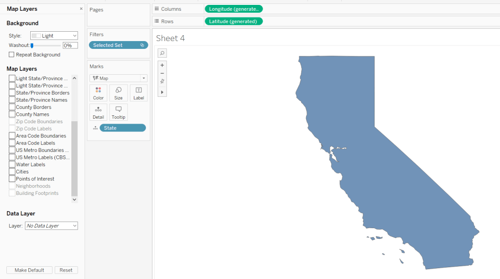
To isolate the display just to the State itself, I figured would be something to do with the various Map Layer options available (menu Map -> Map Layers); I wasn’t sure exactly what but found by unchecking every pre-selected option, I got a ‘clean’ display.
Changing the opacity of the mark colour to 0 and setting the border to red gave me the desired display.
Maybe the State shape wasn’t going to be as much of an issue as I thought….?
The cities needed to be displayed as circular marks, so I knew this would need a dual axis to make this work. I duplicated the Latitude field (hold ctrl as you click and drag the field) and did the following :
changed the mark type of the duplicated field to circle
added City to the Detail shelf
added Sales to the Size shelf
changed the colour of the mark to blue, upped the opacity to 50% and removed the shape border
I then made the chart dual axis and increased the size of the circles to suit.
Finally I added State and Sales to the Label shelf of the Map marks card and adjusted the Label formatting to suit.
Ranking
So the requirement was to show the top 25 states in a ‘grid’ or ‘trellis’ format ordered by the state with the most sales.
However there was a subtlety to this:
the grid should always show 25 states
the selected state should not display in the grid
the overall rank of the state should display, so if the 3rd largest state is selected, the displayed ranking would be 1, 2, 4, 5, 6… up to 26; 3 would be omitted from the list.
The best way to explain how I tackled this, is to show the info in a tabular format.
Firstly, create a table of Sales by State sorting the State by Sales desc
Apply a Quick Table Calculation of Rank to the SUM(Sales) pill. Then edit the table calculation, setting the rank to be unique and fixing the Compute Using to apply over State.
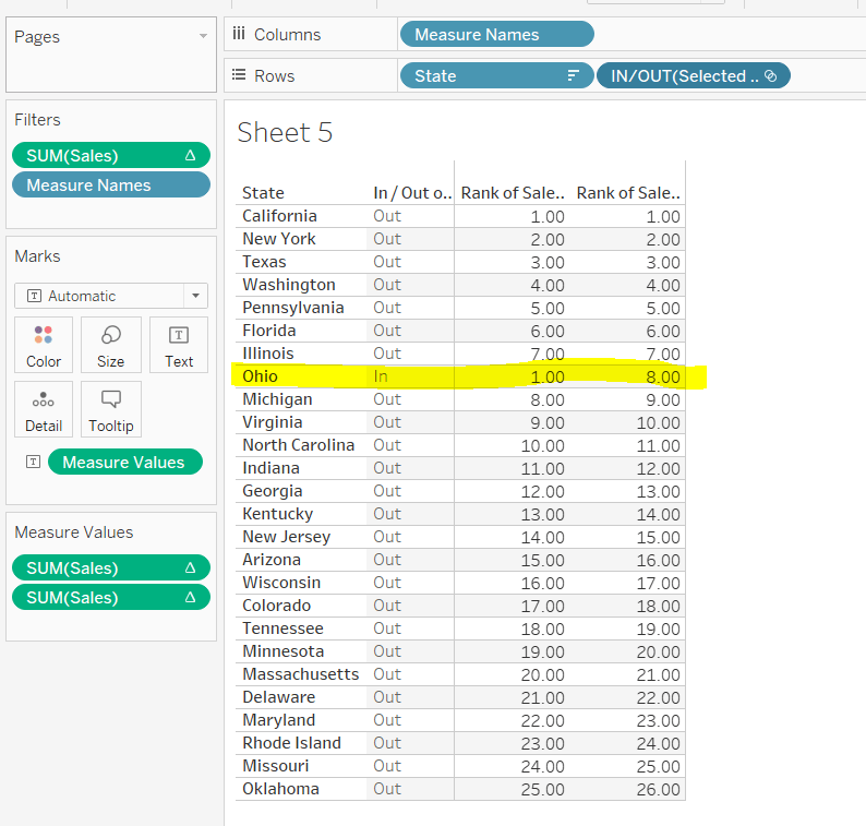
Add the Selected State pill alongside State, and as California is still our selected state, you see we now have two ‘1’s. This is because we fixed the table calculation to State, so its now being applied for each ‘In/Out Selected State’
This is the table calculation we want to use to filter our data to get the ‘top 25’ fields. With ‘California’ selected as being ‘in the set’ and therefore the selected state, we need the next 25 states to the be ones showing in the grid. This being from New York to Oklahoma.
Holding down ctrl and then dragging the Sum(Sales) pill to the filter shelf (ie duplicating the pill), you can set it to show at most 25
However, the ‘rank’ displayed against each row, isn’t the rank we want to show on the viz. New York is the 2nd largest state, so should be labelled no 2, not no 1 as shown above.
We need another version of the Sales rank. Add Sales back into the chart, and again apply a Quick Table Calculation of Rank.
The 2nd rank is now showing values 1 – 26, and if you edit the table calc, you’ll see it automatically has set itself to ‘table down’ which is actually being applied to both State and the In/Out Selected State. Alter the table calc to be unique and fix it to apply to State & In/Out Selected State, which will ensure the values remain the same regardless as to how you move pills around.
This second rank is what is used to display the ‘overall rank.
Finally, we’ve still actually got 26 states shown, when we only want the 25 states ‘out’ of the set displayed. We simply apply the sneaky trick to ‘hide’ the In (click on the ‘In’, right-click and select Hide).
Change the set value to Ohio for example, and re-show the hidden data (click on In/Out Selected Set pill and Show hidden data). You’ll see Ohio is 8th in the overall rank, but is ‘in’ the set so ranked 1 in the ‘top 25’ filter rank.
When I come to build the map trellis later, it is these table calcs and techniques I will have applied.
Trellis Chart
In this instance we have a fixed number of states to display (25), to show in a 5×5 grid; 5 rows and 5 columns. Each of the 25 states we have needs to be assigned a row number and a column number.
Let’s go back to the tabular display to help with this. With the display just showing the 25 States ‘out’ of the set (by hiding the ‘In’), let’s add INDEX() to the view. INDEX() is a table calculation most often used to number rows. INDEX() is set to compute over the State only (so the numbers 1-25 are listed). Note this is giving the same information as the Sales ranking discussed above, and we could reference the same field, but INDEX() is more generic and referenced in many trellis chart solutions, so let’s stick with that.
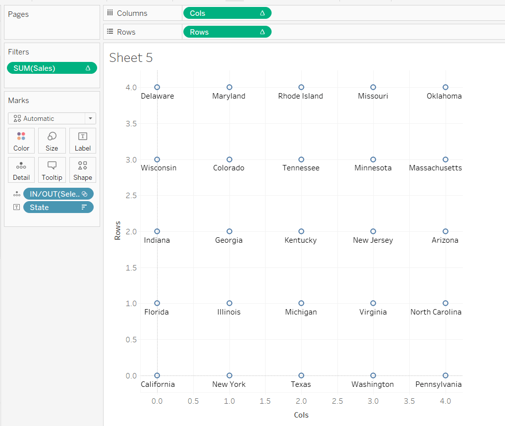
What we’re looking to achieve, is the first 5 rows listed, to appear in the 1st row, across 5 columns. Rows 6-10 would be in the 2nd row etc etc. I need to build
Cols
FLOAT(INT((INDEX()-1)%5))
This takes the Index value and subtracts 1, and returns the remainder when divided by 5 (%5=modulus of 5). Storing the final output as a float will become clearer later.
Rows
FLOAT(INT((INDEX()-1)/5))
This takes the Index value and subtracts 1, and returns the integer part of the value when divided by 5. Storing the final output as a float will become clearer later.
Adding these on to the table, and again setting the table calculation to compute by State only, you get
and if we shuffle the pills around to create the rows & columns, and keep just the pills we need we get
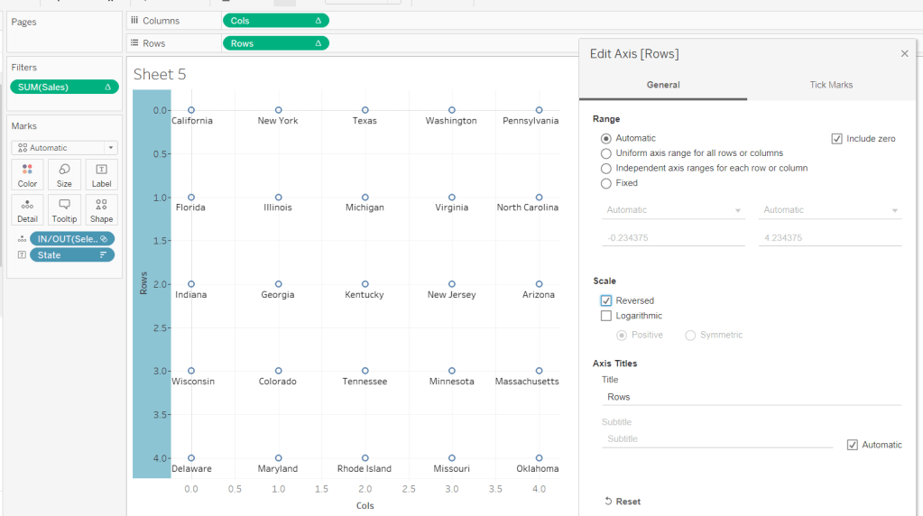
But it’s all upside-down : we need California top left, not bottom left. We can fix this by editing the Rows axis, and reversing it.
Now by simply changing the mark type to Map, we can get the shape states to show – it’s like magic! You’ll need to increase the size to see them properly.
Side note – this was actually quite a revelation; it took some time for me to get to this, having unsuccessfully had views with Lat & Long displayed (as that’s what a map chart always needs right?), resulting in the state shapes being positioned all over the place. Writing this blog and reproducing steps as I type, has made things seem much simpler, than when I was tackling the challenge initially!
As you can see, things aren’t perfect yet, but we’re on the right track. The axis need editing to extend them. Rows is set from -0.5 to 5, and Cols from -0.5 to 4.5 (this is why we needed to set the field to be FLOATs).
The colour of the mark also needs adjusting to match what we did when building the single state viz.
The label positioning isn’t also right, even if you change the alignment, so move the State from the Text to the Detail shelf and don’t show any labels. Then create an additional axis on the rows by duplicating the Rows field to exist alongside, then ‘type’ into the second instance and change to Rows+0.5
Make this dual axis, synchronise and change mark type to Text. Make sure the opacity on the colour is increased back to 100% and adjust the size of the text.
Now it’s just a case of tidying this view to match the requirements; adding additional fields to the Text shelf, removing axis, row/column lines and gridlines etc.
Once done, both the views can be added to a dashboard, and the ‘select state’ interactivity is achieved using a Set Action dashboard action.
And that’s it. As stated I did have some struggles when building initially, but as most things, it’s down to the path you happen to follow. If I’d initially built based on the order I’ve authored this blog, and the tabular views I’ve built to demonstrate techniques, I wouldn’t have had any problem. But it’s all valuable learning experiences and adds to my understanding!