Sean Miller began the start of #WOW2022 with this challenge where the focus was on layout, interactivity and maps.
- Building the map
- Building the bar
- Building the area chart
- The Unknown indicator
- Adding interactivity
Building the map
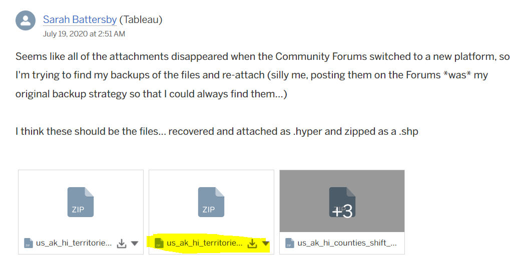
I’m starting with this as in order to build the map, I found after a bit of trial and error I needed to build a data model which related the wildlife strike data source provided by Sean with the spatial file data source provided via the link to the community post. I downloaded all the files, but found the link to the us_ak_hi_territories_shift_conformal_faux_WM.hyper.zip was the file I needed once unzipped (the middle file to download from Sarah’s post on 19 July 2020 (see below)
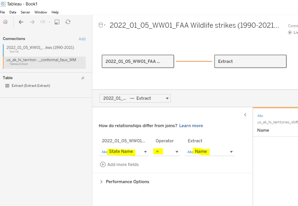
Once I unzipped the downloaded file I copied the us_ak_hi_territories_shift_conformal_faux_WM.hyper file to my usual data sources repository on my laptop.
I then connected to Tableau and built a data model by first connecting to the wildlife strikes csv file, then adding a relationship to us_ak_hi_territories_shift_conformal_faux_WM on State Name = Name
To make things clearer, I created a fields to store the number of incidents
Wildlife Incidents
COUNT([2022_01_05_WW01_FAA Wildlife strikes (1990-2021).csv])
This is simply referencing the ‘count’ field that is automatically generated that is related to the wildlife strike data source.
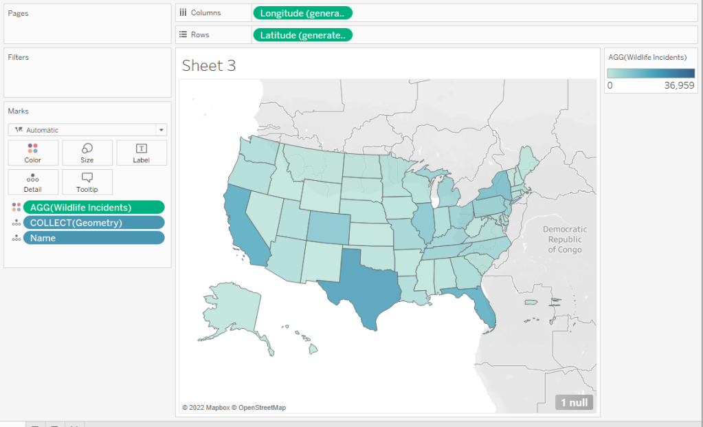
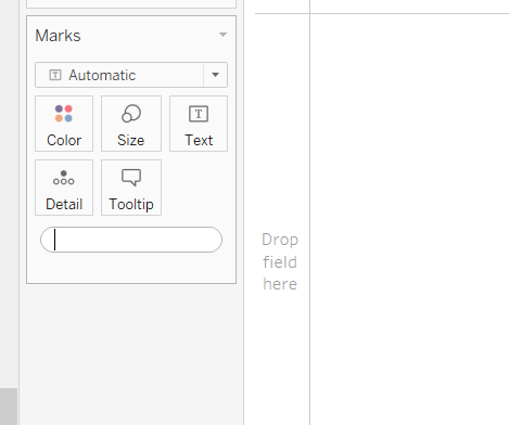
I then built the map by
- add Geometry and Name to Detail
- add Wildlife Incidents to Colour
This should have created the below
Remove all the background imagery via the Map > Map Layers menu – uncheck all the options from the left hand pane.
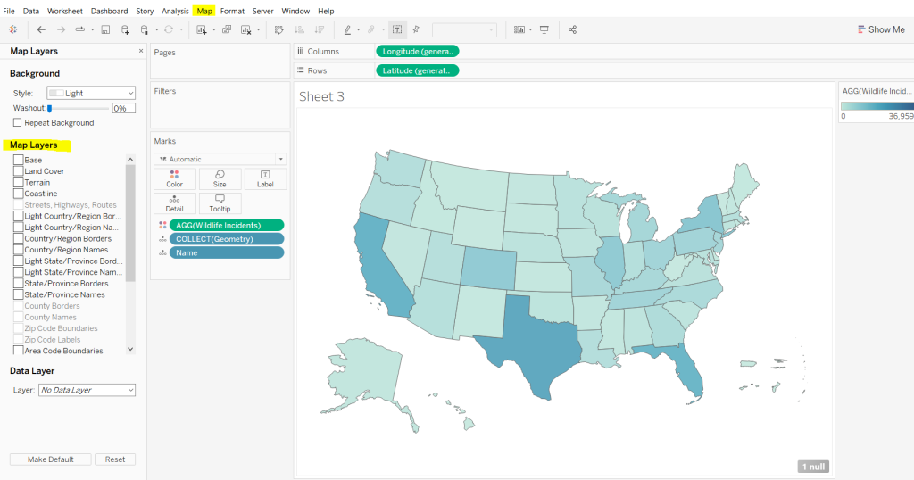
Add Name to the Filter shelf and exclude American Samoa, Guam, Northen Marianas, Puerto Rico and the Virgin Islands. This will remove the cluster of shapes to the right (I’m not sure if this is the expected method or not..).
Change the colour palette to use the red-gold colour range.
Finally amend the Tooltip accordingly and also remove the row and column dividers.

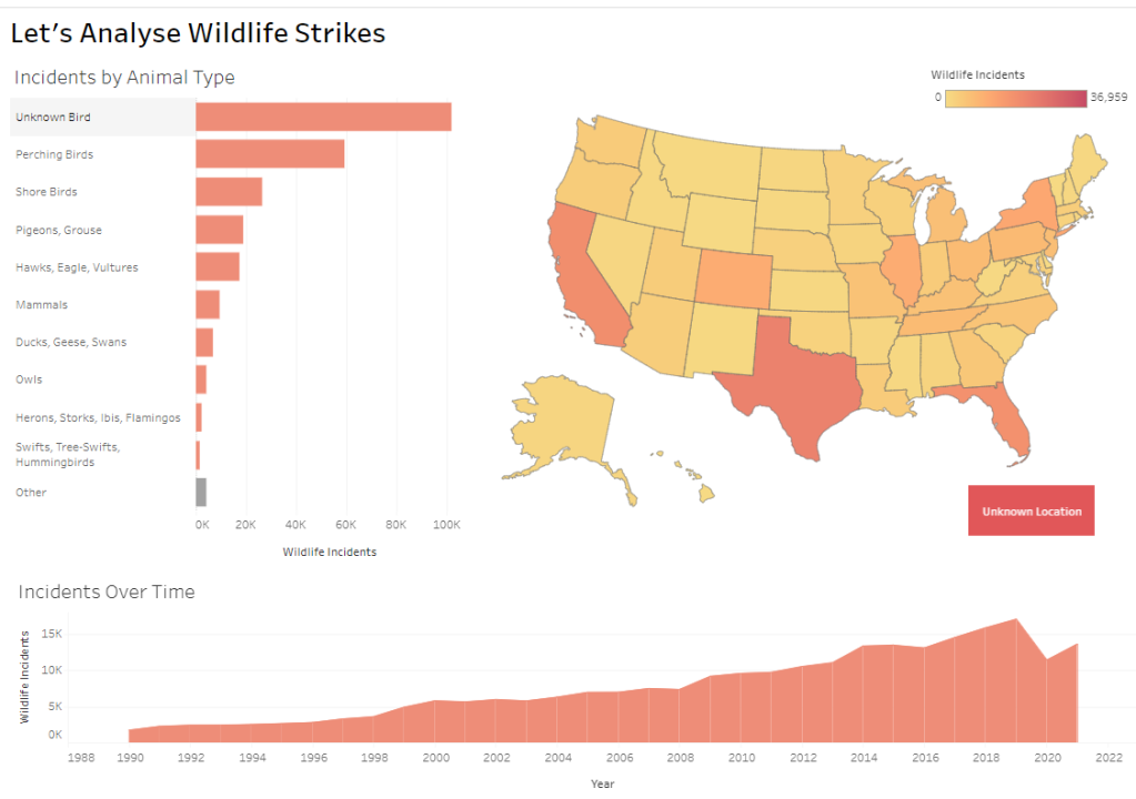
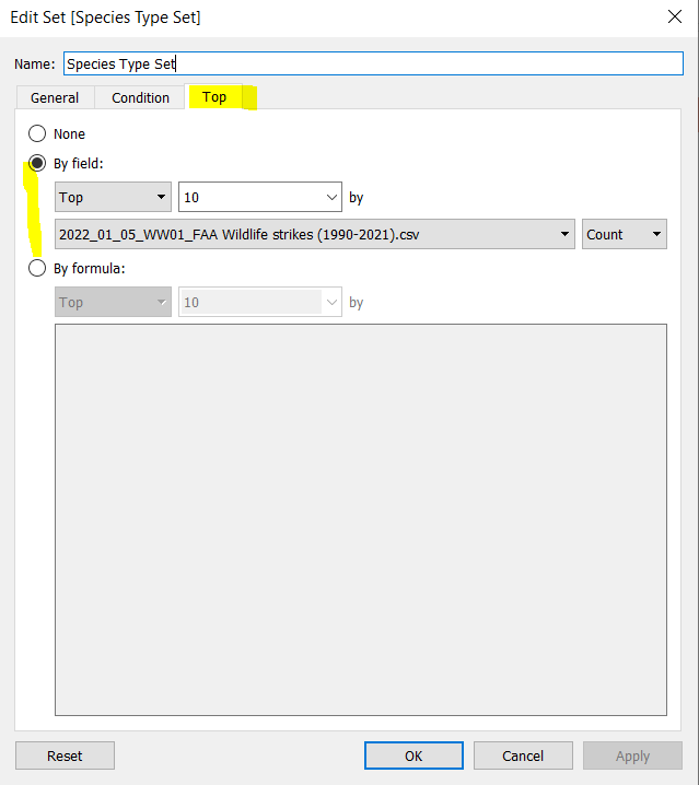
Building the bar
The bar chart displays the top 10 incidents by species type, with the rest all grouped under ‘other’, and displayed at the bottom. We need to create a set for this. Right click on Species Type and Create > Set. Create a set based on the top 10 of the count of the wildlife incidents data source.
Species Type Set
We then need a field to display the info in the bar
Species Type to Display
IF [Species Type Set] THEN [Species Type] ELSE ‘Other’ END
ie if the Species Type is in the Species Type Set then display the Species Type, otherwise display Other.
Add Species Type Set and Species Type To Display to Rows and Wildlife Incidents to Columns and sort descending (just click the sort descending button in the toolbar)

Add Species Type Set to the Colour shelf and adjust accordingly. Remove the column and row dividers and the row gridlines. Adjust the Tooltip.

The final step we need is to make the title dynamic and display a state name if filtered.
Firstly we will need a parameter to capture the selected state
pSelectedState
A string parameter defaulted to <empty string>
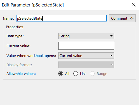
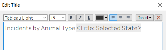
We will use a parameter action to populate this parameter later. We need an additional field to use in the chart title
Title: Selected State
IF [pSelectedState] <> ” THEN ‘in ‘ + [pSelectedState] ELSE ” END
Add this field onto the Detail shelf, then adjust the chart title
Building the area chart
Add Incident Year to Columns and Wildlife Incidents to Rows and change to mark type = Area. Adjust colour accordingly, and remove the column gridlines. Adjust the Tooltip.

Again the chart title needs to be dynamic based on state name and the species type selected, so we’ll need another parameter
pSelectedSpecies
string parameter defaulted to <empty string>

Add Title: Selected State to Detail and adjust the title as below

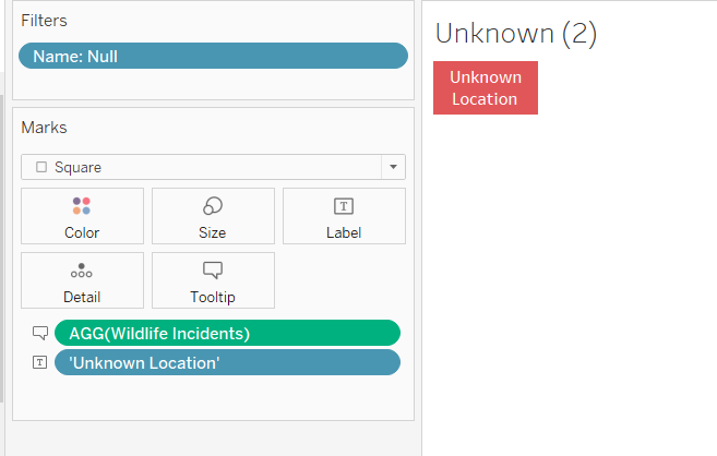
The Unknown indicator
On a new sheet double click in the space below the marks card to create a ‘type in’ pill
Enter the text ‘Unknown Location’ (including the single quotes) and the add this pill onto the Text shelf.
Change the mark type to square and adjust the Size to the maximum.
Add Wildlife Incidents to the Tooltip shelf. Then add Name to the Filter shelf and filter to only show the Null values. Adjust the colour and the Tooltip.
Adding interactivity
Create a dashboard and use layout containers to position the charts in the relevant places. The colour legend and the ‘unknown’ indicator will need to be ‘floated’ into position.
We’re going to need 4 dashboard actions; one to set the selected State, one to set the selected Species Type, one to filter the bar and area chart based on the the selected state, and one to filter the map and area chart based on the selected species.
Select Species
this is a parameter action to set the pSelectedSpecies paramater on selection of the bar chart, using the value in the Species Type To Display. The parameter should be reset to <empty string> when unclicked.

Select State
similar to above, but runs on selection of the map chart, and passes the Name field into the pSelectedState parameter.

Filter by State
This is a filter action that runs on selection of a state in the map chart. It affects all other charts on the dashboard except the unknown sheet. It should only filter on the Name field and not All fields.

Filter by Species
Another filter action, that runs on selection of the bar chart. This one does impact all the other charts on the dashboard, but again only filters based on the Species Type to Display field rather than all fields.

Hopefully, with all this, you should have a working solution. My published viz is here.
Happy vizzin’!
Donna
