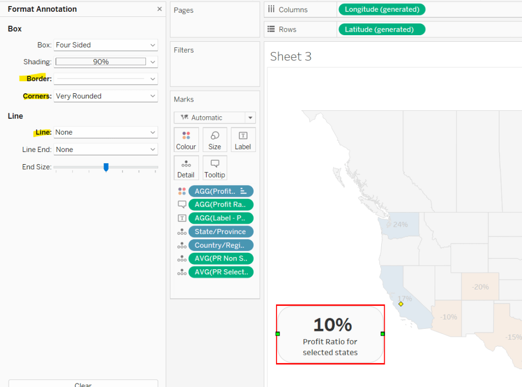
This week’s challenge was a guest post by Felicia Styer, who wanted us to make multiple selections using just a single parameter, rather than any groupings or sets.
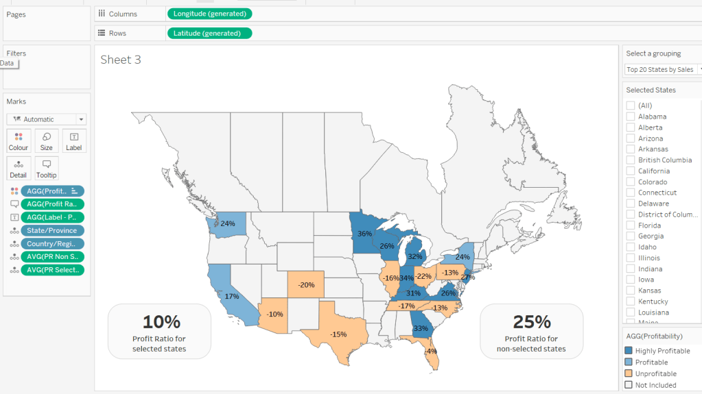
We’ll start by focusing on the initial requirement, which was to bucket into Sub-Categories selected and those not.
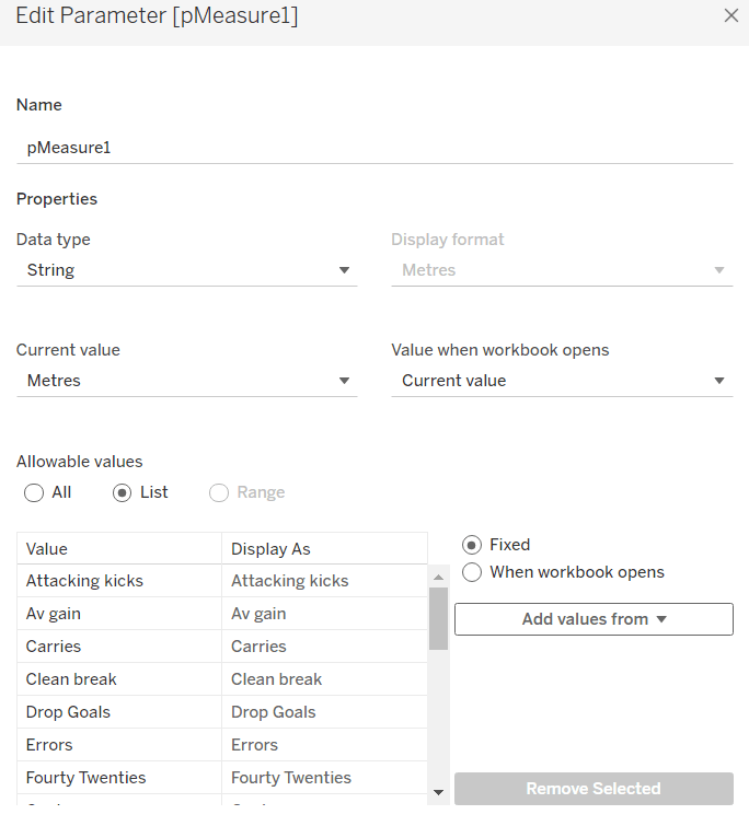
Setting up the parameter
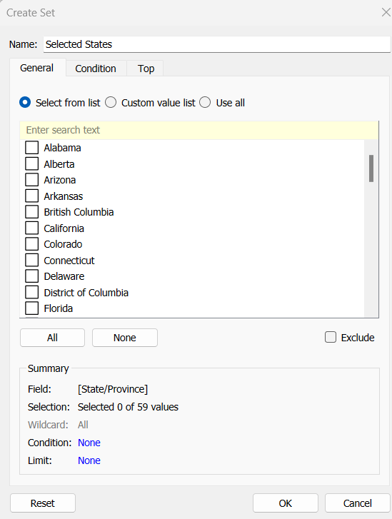
The main functionality is controlled via a single string parameter which will just contain a string of 0s and 1s. 0 indicates the Sub-Category is not selected, 1 indicates it is. The position of the 1 or 0 in the string represents the associated Sub-Category. There are 17 Sub-Categories in the data set, so we need to create a parameter of 17 characters. Arbitrarily set some entries to 1 and the rest to 0.
Binary Parameter
string parameter containing the string 01000101000010000

Building the Sales by Subcategory viz
Add Sub-Category to Rows and Sales to Columns. Sort by Sales descending.

We want to assign a number for each row. We can use Index() or Rank the rows based on Sales. I chose to to the latter
Sub Cat Rank
RANK_UNIQUE(SUM(Sales), ‘desc’)
Format this to a number with 0dp but prefixed with #
Add this to Rows, change to discrete (blue pill) and then move to be listed before Sub-Category.

We want to colour the bars based on the ‘bucket’ they’re in according to the Binary Parameter.
Bucket
MID([Binary Parameter],[Sub Cat Rank],1)
This returns the character that is in the nth position in the string – ie Tables is ranked fourth, so this calculation will return the 4th character in the Binary Parameter string.
Add this to Colour and adjust accordingly. Show the Binary Parameter on the sheet, and then adjust the values between 1 and 0 to see the bars change colour.

When a bar is clicked, we want to update the parameter. We will use a dashboard parameter action to drive this functionality, but we need to pass a value into the parameter. This value needs to be a 17 character string of 1s or 0s, where only the character at the nth position based on the rank needs to differ.
For example, the string 01000101000010000 indicates Phones is selected – it’s ranked 2nd in the list and the 2nd character of the string is a 1. When Phones is clicked, we want it to become unselected. So the character in the 2nd position needs to change to a 0, while all the other characters remain the same.
Value for Param
IF [Bucket] = “0” THEN
LEFT([Binary Parameter],[Sub Cat Rank]-1) + “1” + MID([Binary Parameter],[Sub Cat Rank]+1)
ELSE
LEFT([Binary Parameter],[Sub Cat Rank]-1) + “0” + MID([Binary Parameter],[Sub Cat Rank]+1)
END
If the row is currently in Bucket 0, then get the portion of the Binary Parameter string before the nth term, concatenate it to 1 and then concatenate that with the portion of the Binary Parameter string after the nth term, otherwise, the row is associated to Bucket 1, so concatenate the preceding and following string with a 0 instead.
Add this to the Detail shelf.
Finalise the display by adding Sales to the Label, removing row & column dividers, updating the Tooltip, hiding the column headers and adjusting the font size.

Adding the selection interactivity
Add the sheet to a dashboard. Add a dashboard parameter action
Set Bucket
On selection of the sheet, set the Binary Parameter parameter passing the value of the Value for Param field. Leave the parameter with the current value when selection is cleared.

Click a bar to test the functionality. The bars should be changing colour. However, on click, Tableau automatically highlights the selected bar and the others ‘fade’. We’re already using colour to identify what’s been selected, so don’t want this to happen. To resolve this we will apply the True/False method to deselect the marks which is documented here.
You will need to create True and False calculated fields, and add them to the Detail shelf of the viz sheet. Then add a dashboard filter action as below.

Now when you click, the bars immediately change to the right colour with a single click of the mouse.
Building the Sales by Bucket bar chart
On a new sheet, add Sales to Columns, Bucket to Rows and Sub-Category to Detail. Adjust the table calculation setting of the Bucket pill so it is computing explicitly by Sub-Category.

Add Bucket to Colour and again adjust the table calculation as above. When you hover over the bar, you will see it is actually a stacked bar of each Sub-Category. We want these ordered so those with the smallest sales are on the left. Apply a Sort to the Sub-Category field on the Detail shelf to sort by Sales Descending

Widen each row. Add Sales to Label and set the Label to only show when selected (so they only appear when the segment of the bar is clicked on)

Add a Reference line to the Sales axis that shows the Sum of Sales per cell, and displays the Value. Don’t show any line or tooltip, and ensure the reference line isn’t recalculated when the bar chart is clicked.

Format the reference line label so it is positioned right middle, and adjust the font size.
Once again remove any row/column dividers and row headings and adjust the font sizes.

Arrange this chart onto the dashboard with the other chart using layout containers as required.

My version of this challenge is published here.
Bonus Challenge
For the bonus challenge to use more than 2 buckets, there was no example actually published. So I interpreted it as each click added it to the next bucket until you reached the maximum number of buckets allowed, at which point the Sub-Category would become deselected.
For this I created a parameter
# of Buckets
integer parameter from 1 to 5

The expectation in this instance was that rather than a string of 1s and 0s in the parameter, the parameter could contain any number from 0 up to # of Buckets – 1.
So the Value for Parameter field just had to change to become
IF [Bucket] = “0” THEN
//we’ve clicked once so move it to 1st bucket
LEFT([Binary Parameter],[Sub Cat Rank]-1) + “1” + MID([Binary Parameter],[Sub Cat Rank]+1)
ELSEIF [Bucket] = STR([# of Buckets]) THEN
//we’re already at the end, so reset to the starting position of 0
LEFT([Binary Parameter],[Sub Cat Rank]-1) + “0” + MID([Binary Parameter],[Sub Cat Rank]+1)
ELSE
// need to move to the next bucket
LEFT([Binary Parameter],[Sub Cat Rank]-1) + STR(INT([Bucket])+1) + MID([Binary Parameter],[Sub Cat Rank]+1)
END
The Colours associated to the Bucket field also then need to be updated to handle however many buckets you have, which you can set initially by manually updating the Binary Parameter parameter.

Note – as I have both versions in my workbook, I have fields suffixed with ‘bonus’ to represent the calculated fields/parameters needed.
My published version of this viz is here.
Happy vizzin’!
Donna