For this week’s challenge, we’re using the data from a previous challenge and visualising it using Sam Parson’s ‘satellite’ chart idea – see here.
Modelling the data
Connect to the Food Self-Sufficiency csv file then add another connection to the Circle_Scaffold excel file. Relate the two together using a relationship calculation where 1 = 1 (ie relate every row in left hand data source to every row in the right hand).
Since we only care about data from FY2019, add a data source filter to set Fiscal Year = FY2019.
This saves us from having to apply that filter to each sheet we build.
Building a single spiral
On a new sheet, add Prefecture to the Filter shelf and select Akita-ken (which is near the top of the list and has a % value over 200%).
Create a parameter
pMinRadius
integer parameter defaulted to 500
To build the spiral, we need to plot a mark for every percentage point from 0 up to the Food Self-Sufficiency % value. For this we will need to determine an (x,y) coordinate value for each point, which will require some trigonometry, based on the diagram below
For each point on the circle, we will need to identify the x & y position of where the radius intersects the edge of the circle. As we are building a spiral, the radius of the circle will increase as we move around each percentage point, so we need
Radius
[pMinRadius]+[Path Percent Point]
We then need to determine the angle θ. As a circle is 360°, and a complete circle represents 100%, then 1% is 360/100, so the angle (in radians) for each % point plotted round the circle can be calculated as
Angle
RADIANS([Path Percent Point] * (360/100))
X
(SIN([Angle]) * [Radius])/360
Y
(COS([Angle]) * [Radius])/360
Now create the point
Spiral Point
MAKEPOINT([X],[Y])
Note– the X & Y values are divided by 360 due to the spiral we’re building and the increasing radius when displayed using map layers. If we were just plotting X against Y and not using map layers, this wouldn’t be required.
Double click on Spiral Point to automatically add Longitude and Latitude fields to the sheet.
Change the mark type to line and then add Path Percent Point to the Path shelf.
Add Prefecture to the Detail shelf, as it’ll be needed later when we build the trellis and remove the filter.
At this point, the spiral is showing 3 complete revolutions, as the data in the circle_scaffold data set contains info for up to 300%. We need to restrict it so we only show up to the Self-sufficiency ratio… so we need
Filter Percent PointDisplayed
[Path Percent Point] <=[Self-sufficiency ratio for food in calorie base 【%】]
Add this to Filter shelf and set to True.
We now want to colour the spiral based on the percentage point associated to each mark plotted being <100%, between 100% & 199% or >= 200%, so we can use
Colour – Spiral
FLOOR([Path Percent Point]/100)
which will return an integer of 0, 1, or 2
Change this field to be discrete and then add it to the colour shelf and adjust colours accordingly.
Now obviously, you might be thinking things aren’t quite right – we’re not starting at the top and rotating differently. Simply pressing the swap rows and columns icon in the menu bar will resolve this, but if we do that too early, we lose the ability to add map layers, so leave as is for now.
Add the label map layer
Create a 0 point
Zero
MAKEPOINT(0,0)
Drag this onto the canvas and drop when the Add a Marks Layer option appears
This has the effect of creating a 2nd marks card
and now we have this, we can press the swap rows and columns icon in the menu bar to get the start of the spiral at X=0
Change the mark type to circle and add Self-sufficiency ratio… and Prefecture to the Label shelf. Adjust the font style and align centrally. Set the colour of the circle to white and increase the size. Move the Zero marks card to be below the Spiral Point marks card.
Rename the marks cards if you wish.
Add the starting point map layer
We need to create a point for the start of each line which is at the 0% mark
Start Point
MAKEPOINT((IF [Path Percent Point] = 0 THEN [X] END), (IF [Path Percent Point] = 0 THEN [Y] END))
Add this as a new marks layer. Change the mark type to circle and increase the size a bit. Colour the mark to the same base colour you used for your <100% range and remove the border. Rename the marks card to 3.Start Point
Add the end point map layers
Create a new point to represent the end of each line
End Point
MAKEPOINT((IF [Path Percent Point]= [Self-sufficiency ratio for food in calorie base 【%】] THEN [X] END), (IF [Path Percent Point]= [Self-sufficiency ratio for food in calorie base 【%】] THEN [Y] END))
Add this as a new marks layer. Change the mark type to circle and increase the size a bit. Add Colour-Spiral to the Colour shelf as a discrete dimension (blue disaggregated pill) and remove the border. Rename the marks card to 4.End Point Outer.
Add another instance of End Point as another marks layer. Again change the mark type to circle and adjust the size so it is smaller than the previous circle, and set the Colour to white. Rename the marks card to 5.End Point Inner.
Tidy up by
removing the Tooltip from each layer
disabling selection of each map layer (so nothing happens when you hover over it)
Hide the axis
Remove axis rulers and gridlines, but make sure the zero lines are shown
Hide the null indicator
Name the sheet Single Spiral or similar.
Building the trellis
Duplicate the single spiral (so if things go awry, you can get back to this). Then start by adding Prefecture to the Detail sheet of all the marks card.
When creating trellis charts, we need to create fields that represent which row and which column each Prefecture should sit in. There’s lots of blogs on creating trellis charts. As we know the number of rows and columns we need, I created
Cols
INT((INDEX()-1)%10)
Rows
INT((INDEX()-1)/10)
and make both fields discrete.
Add Cols to Columns and Rows to Rows. Adjust the table calculation setting of each field so it is computing by Prefecture only, and custom sorted descending by Self-sufficiency ratio…
Then show the Prefecture filter and select all values to display the ordered set of Prefectures.
Hide the Rows and Cols fields, remove row & column dividers. Adjust the size of the start and end point circles to suit, and if the zero lines aren’t showing, reduce the size of the label circle map layer and fit to Entire View.
Then name this sheet Trellis or similar and add to the dashboard.
Yusuke set this interesting challenge : to combine a ‘bump’/’slope’ chart visualising the change in rank whilst also visually displaying the Sales value for the relevant Sub-Category in the ranked position.
Defining the calculations
This challenge will involve table calculations, so I’m going to start by building out the various calculations that will be required and displaying in a tabular view.
Add Category to Filter and select Office Supplies. Then add Sub-Category and Order Date at the Year level as a discrete (blue) pill to Rows. Add Sales to Text.
Create a new field
Sales Rank
RANK(SUM([Sales]))
And add to the table, and verify the table calculation is set to compute by Sub-Category only.
We will need to ‘colour’ the viz based on the rank compared to the previous year. For this create
Is Min Year
{MIN(YEAR([Order Date]))} = YEAR([Order Date])
which will return true for the first year in the data (in this instance 2022) and then create
Colour
IF [Sales Rank] = LOOKUP([Sales Rank],-1) OR ATTR([Is Min Year]) THEN ‘Same as last year’ ELSE ‘Different from last year’ END
If the rank is the same as the previous one, or it’s the first year, then treat as the same, otherwise treat as different.
Add the Colour field to the table, and this time make sure the table calculation for Colour is computing by Year of Order Date only (while the nested calc for Sales Rank should still be computed by Sub-Category only)
The labels on the viz only want to show in certain scenarios – if it’s the first record (ie for 2022) or there has been a change in rank. We need
Label : Rank & Sub Cat
IF ATTR([Is Min Year]) OR [Colour] = ‘Different from last year’ THEN STR([Sales Rank]) + ‘ | ‘ + MIN([Sub-Category]) END
and
Label : Sales
IF ATTR([Is Min Year]) OR [Colour] = ‘Different from last year’ THEN SUM([Sales]) END
format this to $ with 0dp
Add these to the sheet, and double check the nested table calculations on each pill are computing as required (Sales Rank by Sub-Category only, Colour by Year Order Date only)
Now we have all this, we can start building
Creating the Viz
On a new sheet, add Category to Filter and select Office Supplies. The add Order Date to Columns, but set to be continuous (green) pill at the Year level. Add Sub-Category to Detail and add Sales Rank to Rows as a discrete (blue) pill. Verify the table calculation setting against the Sales Rank pill is by Sub-Category only.
Change the mark type to line and then add Order Date to Path. By default it should be at the Year level as a discrete pill.
This is the ‘bump’ chart.
Now add another instance of Order Date to Columns as a continuous pill at the Year level to essentially duplicate the display. On the 2nd marks card, change the mark type to Gantt
This gives us the ‘starting point’ for each ‘bar’. But we need to determine the size for each bar. First we’re going to ‘normalise’ the sales values for all the sales being displayed so we get a value between 0 and 1, where 0 is the smallest sale, and 1 is the largest.
To see what this is doing, format the field to 2dp, then add the field to the tabular view, and ensure the table calculation is computing by both Sub-Category and Year Order Date.
But the ‘axis’ we want to plot the bar length against is in years, so we need to adjust this size to be a proportion of a year (ie 365 days)
Gantt Size
//proportion of a year [Normalised Sales] * 365
Add this to the Size shelf on the 2nd marks card on the viz. Adjust the table calc setting so it is computing by all the fields listed.
We now have the core concept so now we can start finalising the display.
Make the chart dual axis and synchronise the axis.
Set the view to fit height.
On the 1st marks card (that represents the line)
change the line style to dotted (via the Path shelf)
reduce the Size to suit
change the colour to pale grey
Add Label : Sales and Label : Rank & Sub Cat to the Label shelf.
Adjust the table calc settings of each so the nested table calcs in each have Sales Ranks by Sub Category only and Colour by both the Year Order Date fields only.
Adjust the layout of the text as required
Align the font to be top right
Change the font style (bold & black)
Ensure the Label is set to ‘allow labels to overlap marks’
Remove the Tooltip
On the 2nd marks card, the gantt bar
Add Colour to the Colour shelf and adjust the colours accordingly.
Verify the table calc settings are as expected
I chose to reduce the opacity slightly, so I could see the dotted line underneath (set to 70%)
Add Sales to Tooltip (format to $ with 0 dp) and the adjust Tooltip as required
Then we just ned to finalise the formatting/display
Set the font of the years and rank numbers to black & bold.
hide the Sales Rank label heading (right click > hide field labels for rows)
remove row & column dividers
Add black column gridlines (I set to the 2nd thickness level), and remove any row gridlines
Edit the top axis to have a fixed start (use default option) and end at 31/12/2025 so the 2026 label and line disappears.
Remove the title from the top axis.
Edit the bottom axis – remove the tile, and then set the tick marks to None, so the bottom axis now looks empty.
And that should be it. Now add the sheet to a dashboard and display the category filter as a single select, customising the remove the ‘all’ option.
Lorna set this week’s #WOW2025 challenge asking us to recreate what looked to be a simple line and area chart combination. I have to admit this was indeed a bit tricksy. I built out the data relatively quickly, but when trying to create the area chart I just wasn’t getting any joy.
After lots of trial and error, attempting various options, I eventually resorted to checking out Lorna’s solution. I found there were two specific areas that were causing the creation of the area chart to fail..why this happens is still a mystery….
Before we get on with the solution, I figured it was worth detailing at the start what I tried that failed, just in case you’ve been banging your head against a brick wall too 🙂
What didn’t work
The solution requires table calculations; for one calculation we need a percent of sales per quarter which means we also need to work out the total sales for the quarter. I originally used a FIXED LOD for this but found I could only get the area chart to work if I used a WINDOW_SUM() table calculation instead.
This challenge also requires all the customers for each quarter to be in the view to identify which are in the top X. I used a sorted INDEX() table calculation to identify the top X, but this too failed to work when it came to actually creating the area chart. Using the RANK() table calculation instead worked.
Like I said before why? I don’t know… but putting down as one of ‘just those things’ and hoping that maybe I’ll remember this post in future if it happens again!
Now back to the solution guide…
Creating the calculations
We’re dealing with table calculations, so I’m going to build out the required data in a tabular format to start with.
Create a parameter
pTop
Integer parameter ranging from 5 to 20 with the step size of 5 defaulted to 20
Show this parameter on the sheet, and then create a calculated field
Order Date (Quarters)
DATE(DATETRUNC(‘quarter’, [Order Date]))
Format to the YYYY QX style. Add Order Date (Quarters) to Rows as a discrete exact date (blue pill). Add Customer Name to Rows and add Sales to Text.
We need to identify customers who are in the top x for each quarter. Create a new calculated field
Is Top X Customer?
RANK(SUM([Sales]))<=[pTop]
Add to Rows and adjust the table calculation so it is computing by Customer Name only.
We now want the Sales just for those customers who are in the top x, so create
Top X Sales
IF [Is Top X Customer?] THEN SUM([Sales]) END
Add this field to Rows and we should see that Sales are only displayed for those customers that where Is Top X Customer? = True.
We now need the total of these sales per quarter so create
Total Top X Sales
WINDOW_SUM([Top X Sales])
Add this to the table and adjust the table calculation so both nested calculations are computing by just Customer Name. You should see that the total value is the same for every row for each quarter
We also need the value of the total sales in the quarter regardless of whether the customer is in the top X or not so create
Total Sales per Quarter
WINDOW_SUM(SUM([Sales]))
Add this to the table and again adjust the table calculation to compute by Customer Name only.
Now we have these two figures we can calculate the percentage. Create a new calculated field
Sales % per Quarter
[Total Top X Sales]/[Total Sales per Quarter]
Format this as a % to 1dp. Add to the table.
Duplicate this sheet. I like to do this as I make further changes so I don’t want to lose what I had.
Remove all the surplus field so that only Order Date (Quarters), Customer Name and the Sales % per Quarter fields remain
Create a new field
Customer Index
INDEX()
Convert this field to discrete (right click on the field).
Add this field to the Filter shelf and select 1. Adjust the table calculation so that it is computing using Customer Name only and sorted by SUM of Sales
Re-edit the filter and reselect 1 (making changes to the table calculation resets the filter values).
If everything has been set properly then you should end up with 1 row per quarter. Move the Customer Name pill from Rows to Detail.
We’ve now got the core fields we need to build the viz.
Building the Viz
Once again start by duplicating this sheet. Move Order Date (Quarters) to Columns and change to be continuous (green pill), then move Sales % per Quarter to Rows.
Add another instance of Order Date (Quarters) to the path shelf and change to be an attribute. You should now have a line chart. Increase the size of the line a little.
Add another instance of Sales % per Quarter to Rows, making sure the table calculation is set exactly as the existing version. Change the mark type of the 2nd marks card to Area.
Make the chart dual axes and synchronise axes .
Finally, tidy up the chart by
Adjusting the Tooltip
Removing gridlines, zero lines and row/column dividers
Hide the right hand axis
Fix the left hand axis to end at 1 (so the axis goes to 100%)
Edit the left hand axis title
Update the sheet title to reference the pTop parameter
Then add the viz to a dashboard. My published viz is here.
I’ve been on my holibobs, so haven’t blogged a solution for a few weeks. It’s been a bit of a struggled to get my head re-engaged to be honest, as I’m sure you can all relate to.
Anyway this week’s challenge was set by Sean, to produce a waterfall chart depicting specific measures without any pivoting.
I had a little bit of an initial struggle with this… firstly I assumed from the title of the challenge that I would need to be using Measure Names/Measure Values, and secondly, as nothing was mentioned, that I just had to use the data provided. This is how far I got…
but I couldn’t figure out how to get the sizes of the gantt bars inverted for some of the measures…
So I had a bit of a Google, and came across this video by one of our old WOW alumni, Luke Stanke. It made use of a scaffold data source which basically provide placeholders for each of the specific measures we want to display. Sean hadn’t explicitly said we’d need a scaffold, but then he hadn’t explicitly said we couldn’t use one either… so I had a quick peak at his solution, and I found he had used one.
So I went about recreating the challenge just by following Luke’s video. As a result, this blog won’t be as detailed, but I’ll detail the core information needed.
The scaffold data set
I created a simple excel sheet on 1 column called Points with values 1 to 5 listed.
This was then related to the Financials.csv data Sean provided using a relationship calculation of 1=1 as demonstrated in the video.
The calculations
4 calculations are created in the video
Label
CASE [Point] WHEN 1 THEN ‘Gross Sales’ WHEN 2 THEN ‘Discounts’ WHEN 3 THEN ‘Net Sales’ WHEN 4 THEN ‘COGS’ WHEN 5 THEN ‘Profit’ END
Start
CASE [Point] WHEN 1 THEN 0 WHEN 2 THEN [Gross Sales] WHEN 3 THEN 0 WHEN 4 THEN [Gross Sales] – [Discounts] WHEN 5 THEN 0 END
Value
CASE [Point] WHEN 1 THEN [Gross Sales] WHEN 2 THEN [Discounts] * -1 WHEN 3 THEN [Gross Sales] – [Discounts] WHEN 4 THEN [Cogs] * -1 WHEN 5 THEN [Profit] END
format this to $, millions with 2 dp.
Colour
SIGN(SUM([Value]))
convert this to discrete
Note on the date field
When I connected to the csv, I found the dates were being displayed to me in the UK format so a date in source of 06/01/2024 was reporting as 6th Jan, when it was intended to represent 1st Jun. There’s probably something I could have done with regional settings etc, but the quickest way for me to resolve as create
which just transposed the month & day and gave me the dates expected.
Building the Viz
Add Date to Filter, select Month-Year and select May 2024. Add Label to Columns and apply a Sort to sort by Point ascending. Add Start to Rows and change the Mark type to Gantt
Add Value to Size and Colour to Colour and adjust colours to suit
Add Value to Label and adjust font to match mark colour and increase size and style, Set the sheet to Entire View. Uncheck Show Tooltip.
Double click into the Rows shelf and type SUM([Start]) + SUM([Value]). This will create a second marks card. Change the mark type of this to line and remove all fields from the marks card shelf. Set the line type (via the Path shelf) to stepped and manually adjust colour to black.
Set the chart to dual axis and synchroniseaxis, then right click on the right hand axis and move marks to back.
Finally tidy the display up by hiding both axis, removing row & column dividers, hiding the Label title (right click and hide field label for columns) and formatting the Measure Name labels to a larger, darker font style.
Add fields Country, Product and Segment to the Filter shelf, then add to a dashboard.
Sean set this challenge this week, to build a connected scatterplot to allow additional insights to be gained.
We need to show a circle per country related to the specified year, and then show the data for all years if a country is specified from the drop down, or ‘clicked on’ by the user; these data points are all then connected.
Let’s start by building up the various parameters and calculated fields needed to help with this.
Setting up the data
For the user inputs, I used parameters
pYear
Integer parameter, defaulted to 2000, displayed in a format so no thousand separators are shown. I populated the list using the values from the Year field.
pCountry
string parameter defaulted to All. I populated the list of entries by first adding values from the Country field. I then manually added an All entry to the bottom of the list and dragged it to the top. I could then set All as the default value.
On a new sheet, show these parameters.
We’re going to use a dual axis chart to display the viz, and for this, we’re going to get the relevant measures for the specific Year and for the specific Country.
To see what I’m aiming for, lets’ build out the data in a table. Add Country to Columns and Year to Rows. Display the values of Fertility Rate and Life Expectancy. This just gives us all the data points
But we only want the points related to the pYear (2000) or if pCountry if it’s not All (in this case Afghanistan).
So we create
Fertility Rate for Year
[Year] = [pYear] THEN [Fertility Rate] END
Life Expectancy for Year
IF [Year] = [pYear] THEN [Life Expectancy] END
format these to 1 dp and then add to the table. The fields only contain values for the specified pYear.
Create
Fertility Rate for Country
IF [Country] = [pCountry] THEN [Fertility Rate] END
Life Expectancy for Country
IF [Country] = [pCountry] THEN [Life Expectancy] END
format these to 1 dp and also add to the table. We now have these entries only existing for the selected pCountry.
If pCountry is set to All, the Fertility Rate for Country and Life Expectancy for Country are empty for every Country.
We now have the basics we need to build the viz.
Building the ScatterPlot
On a new sheet, show the parameters, then add Fertility Rate for Year to Columns and Life Expectancy for Year to Rows and Country to Detail. Change the mark type to circle. Adjust the Tooltip.
Create a new field
All Countries
[pCountry] = ‘All’
and add to the Colour shelf. Adjust the colours so when pCountry = All, the All Countries colour legend is True and displays a darker instance of a colour, as opposed to when pCountry is set to something else, and the All Countries colour legend is false.
Now add Fertility Rate for Country to Columns and Life Expectancy for Country to Rows. Change both fields to be Dimensions. On the 2nd marks card, add Year to Detail. and remove the All Countries field from the Colour shelf. Change the mark type to line and move Year to Path. Set the colour accordingly.
Then set both the Rows and Columns to be Dual Axis and synchronise both axis. Remove Measure Names from the colour shelf on the all marks card.
Adjust the Tooltip of the 2nd (line) marks card.
Add Year to the Label shelf of the 2nd marks card and update so it just displays for the Min & Max value. Adjust font size and style.
On the first marks card (the circle) add Country to Label and adjust so it only displays when selected.
Hide the right and top axis. Remove row & column dividers. Hide the null indicator and update the title of the axes. Name the sheet Scatterplot or similar.
Building the Dashboard
Add the sheet to a dashboard, and float the parameters into a suitable location. Add a floating text box that references the pYear parameter and position bottom left of the chart. Add a parameter action to update the pCountry parameter when a circle is clicked.
Click Country
On select of the Scatterplot Viz, set the pCountry parameter, passing in the value from the Country field. When cleared, set the parameter back to All.
Finally, if you click a circle to select a Country, you’ll find that the circles ‘fade out’ more than what you want – you want them to look the same as the colour when a country is selected via the dropdown. Essentially, you want all the circles to be ‘highlighted’ on click. To do this, create a new field
HL
“Highlight”
and add this to the Detail shelf on the scatterplot sheet. Then on the dashboard, add a Highlight action
HL marks on click
On select of the scatterplot viz, target itself, highlighting the HL selected field
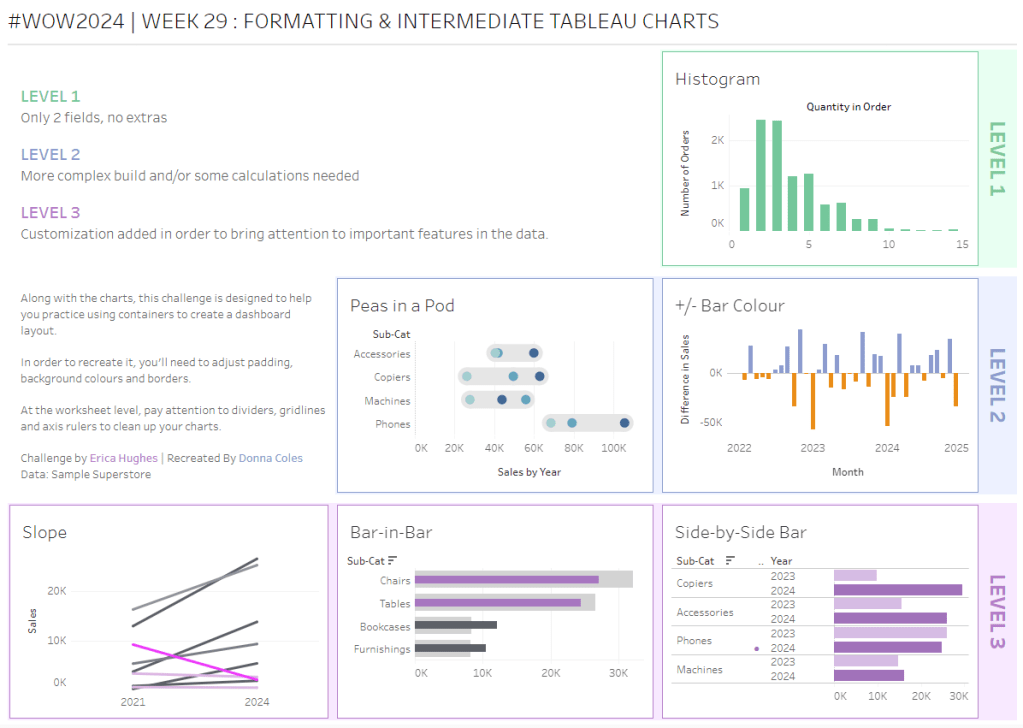
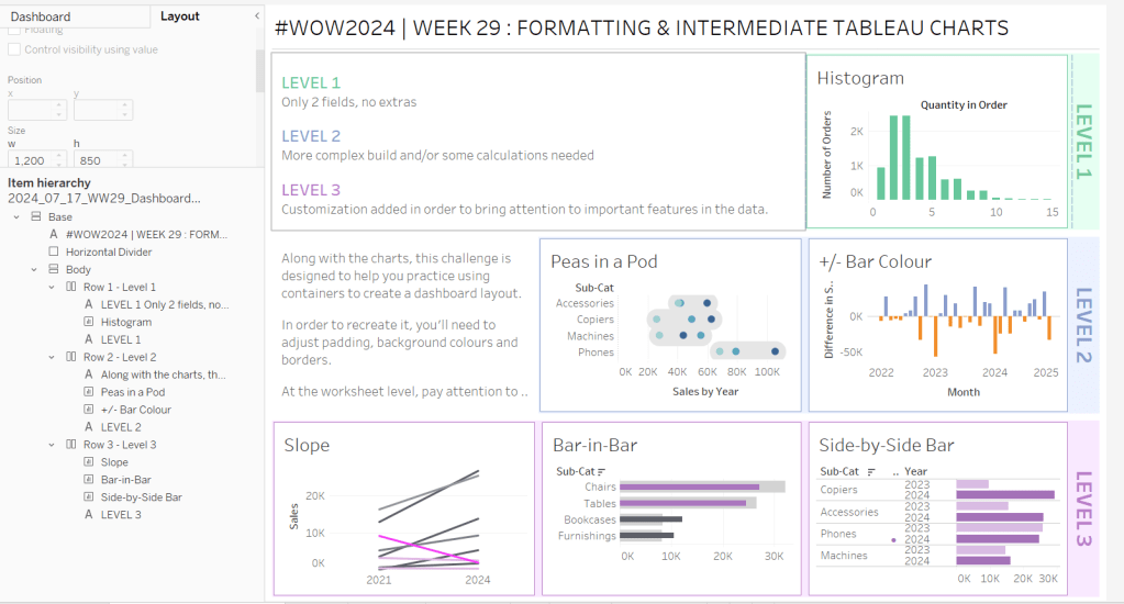
Erica set this challenge primarily aimed at building a beautifully presented dashboard, with the requirement to consider the use of layout containers and padding. She threw in creating some very specific chart types too. The easiest way to blog this, is by chart type.
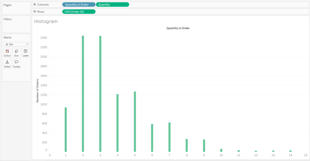
Building the Histogram
Add Quantity to Columns as continuous dimension (green unaggregated pill) and add Order ID as a measure using the CNT aggregation to Rows. The easiest way to do this is right click and drag Order ID from the left hand date pane and drop onto rows. When you release the mouse, the option to select the aggregation should be available.
Change the mark type to bar and adjust the colour. Edit the title of the y-axis and remove the title from the x-axis. Update the Tooltip.
Double -click into Columns and manually type ‘Quantity in Order’ (including the quotes). Right click on the first text displayed and hide field labels for columns. Adjust the font of the Quantity in Order label that remains.
Remove row and column dividers and column gridlines. Remove Row axis rulers.
Note, when you add to the dashboard , you may find you want to adjust the Size of the bars.
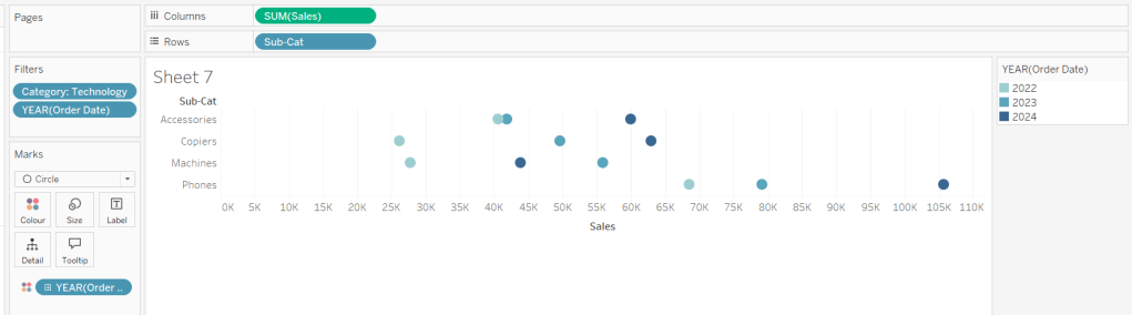
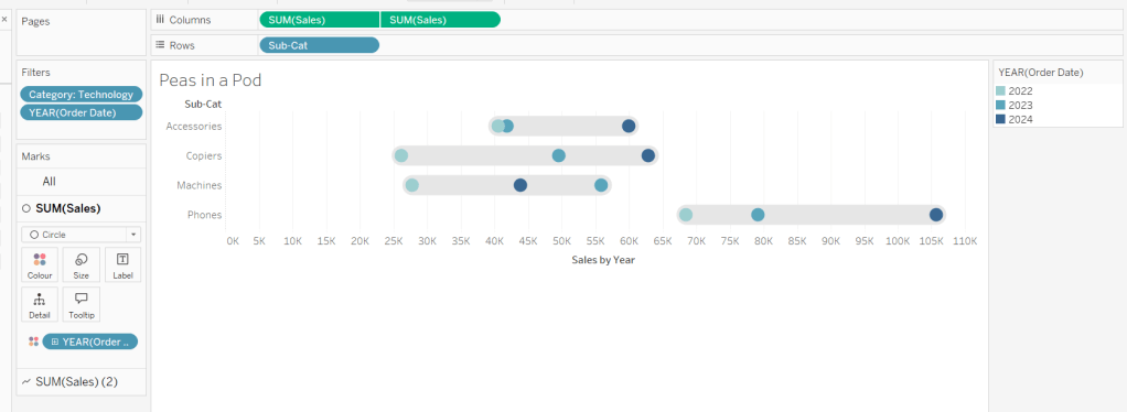
Building the Peas in a Pod chart
On a new sheet, add Category to Filter and select Technology. Add Order Date to Filter and select Years then choose 2022,2023 and 2024.
Rename the Sub-Category field to Sub-Cat and add to Rows. Add Sales to Columns. Change the mark type to circle. Add Order Date to Colour. By default it should display YEAR(Order Date). Adjust colours to suit. Widen each row a bit.
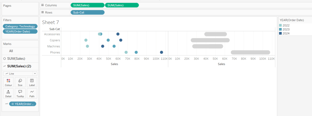
Add another instance of Sales to Columns.
On the Sale (2) marks card change the mark type to line and move YEAR(Order Date) to Path. Increase the size and adjust the colour so it’s a grey lozenge.
Make the chart dual axis and synchronise the axis. Right click the top axis and move marks to back. Adjust the Tooltip. Edit the title of the x-axis.
Hide the top axis. Remove row and column dividers. Remove row gridlines. Remove axis rulers for both columns and rows.
Note, when you add to the dashboard , you may find you want to adjust the Size of the circles and the line. I found it was best adjusted on the web after I published to Tableau Public.
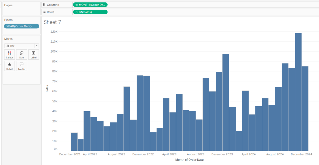
Building the +/- Bar Chart
On a new sheet add Order Date to Filter and select Years then choose 2022,2023 and 2024. Add Order Date to Columns and select to be at the continuous month level (green pill, May 2015 format). Add Sales to Rows and change the mark type to bar.
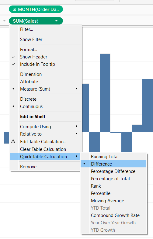
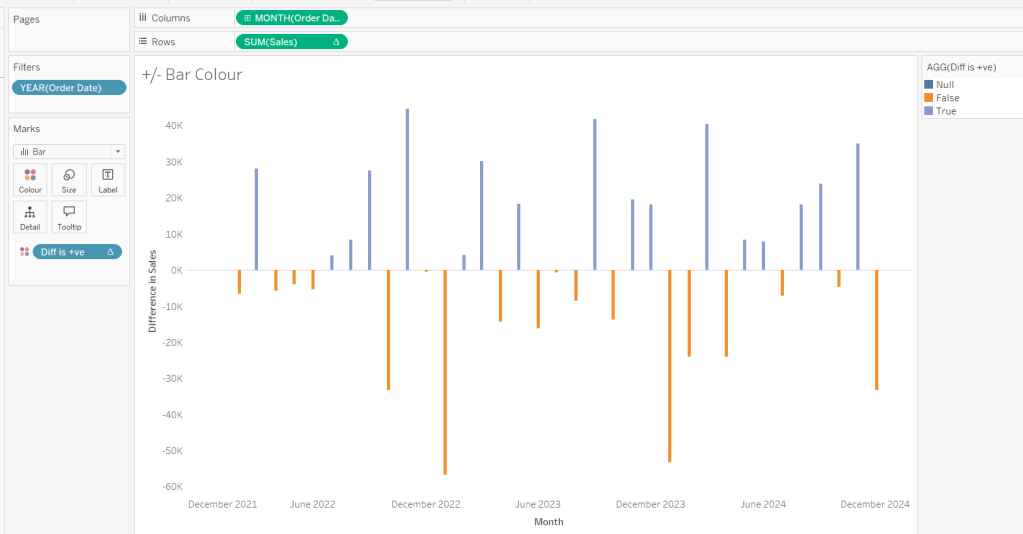
Add a quick table calculation of Difference to the Sales pill.
Adjust the size of the bars (select manual over fixed and adjust the slider).
and add to the Colour shelf. Adjust colours to suit. Hide the null indicator. Adjust the Tooltip. Adjust the title of the x-axis.
Remove all gridlines and axis rulers. Remove the columns zero line. Set the rows zero line to be a continuous unbroken line.
Note – once again the size may need further adjusting once on the dashboard and/or after publishing.
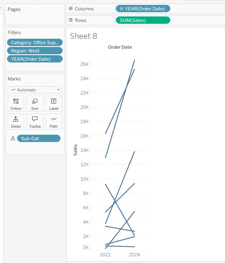
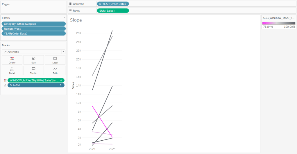
Building the slope chart
Add Category to filter and select Office Supplies. Add Region to filter and select West. Add Order Date to filter and select Years then choose 2021 and 2024 only.
Add Order Date to Columns and Sales to Rows. Add Sub-Cat to Detail.
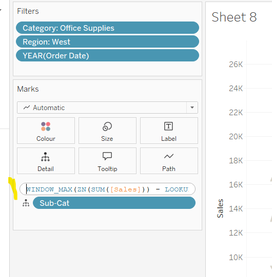
Add Sales to Colour then add a quick table calculation of Percentage Difference. This only sets a value against the 2024 marks though, whereas we want a value for the whole line for each Sub-Cat.
Double-click into the Sales pill on Colour to edit it, and wrap the whole calculation in a WINDOW_MAX() function – the whole calculation should look like
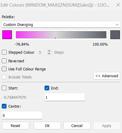
Adjust the colour legend. I set the start & end colours to #ff00ff (hot pink) and #5d6068 (dark grey) and then applied an upper limit to the range and centred at 0 as below.
Hide the Order Date heading at the top of the chart. Adjust the Tooltip.
Remove column gridlines, zero lines and axis rulers.
Edit the Sort of the Sub-Cat pill on the Detail shelf, so it is sorting by % Difference ascending. This will ensure the lines are displayed overlapping in the expected manner.
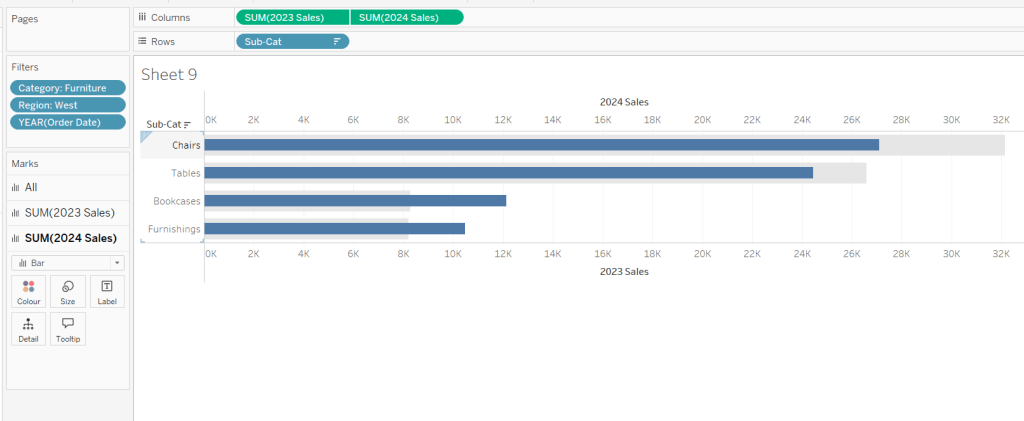
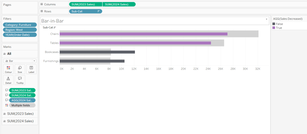
Building the Bar-in-Bar Chart
On a new sheet, add Category to filter and select Furniture. Add Region to filter and select West. Add Order Date to filter and select Years then choose 2023 and 2024 only.
Create a new field
2023 Sales
IF YEAR([Order Date]) = 2023 THEN [Sales] END
Add Sub Cat to Rows and 2023 Sales to Columns. Add a sort to the Sub-Cat pill to sort by 2024 Sales descending. Add 2024 Sales to Columns. Make the chart dual axis and synchronise the axis. Change the mark type on the All marks card to bar. Remove Measure Names from the Colour shelf on the All marks card. Set the colour of the 2023 Sales marks card to light grey. Increase the width of each row, then reduce the size of the bar on the 2024 Sales marks card.
Create a new field
Sales Decreased
SUM([2024 Sales]) < SUM([2023 Sales])
and add to the Colour shelf of the 2024 Sales marks card. Adjust colours to suit.
In the solution, the Tooltip shows an indicator – I’m not sure if this was necessary, but I added it just in case
2024 Sales > 2023 Sales
IF [Sales Decreased] THEN ‘●’ END
Add this to the Tooltip shelf of the All marks card, along with the 2023 Sales and 2024 Sales fields. Adjust the Tooltip accordingly.
Hide the top axis. Remove the title of the x-axis.
Remove row and column dividers. Remove row gridlines and row axis rulers and ticks. Remove all zero lines.
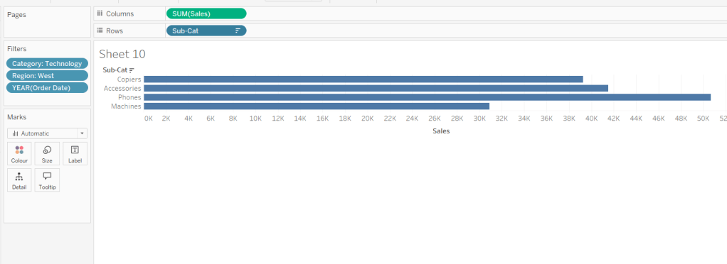
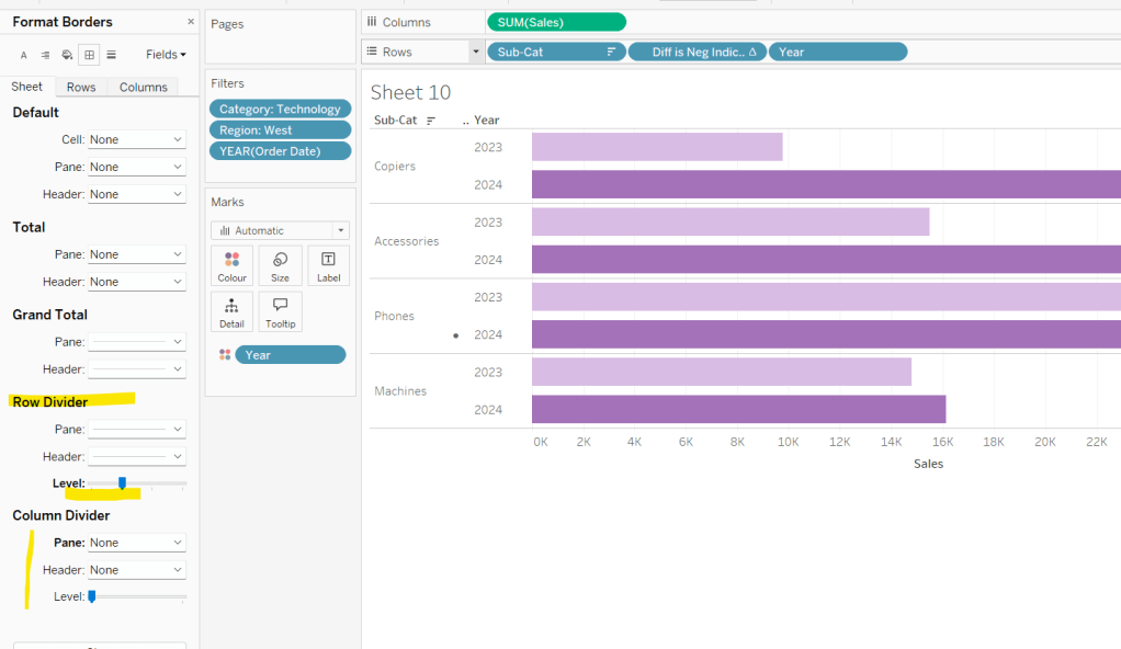
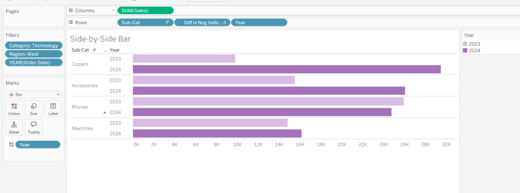
Building the side-by-side bar chart
On a new sheet, add Category to filter and select Technology. Add Region to filter and select West. Add Order Date to filter and select Years then choose 2023 and 2024 only.
Add Sub Cat to Rows and Sales to Columns. Apply a Sort to Sub-Cat based on 2024 Sales descending.
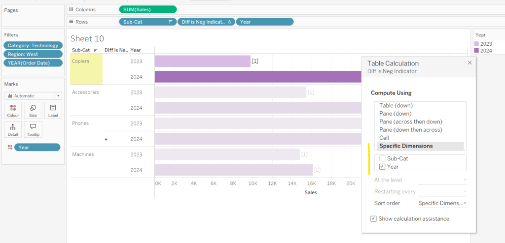
Create a new field
Year
YEAR([Order Date])
And add to Rows and Colour. Adjust colour to suit. Widen each row.
Create new field
Diff is Neg Indicator
IF NOT([Diff is +ve]) THEN ‘●’ ELSE ” END
Add to Rows before Year and then adjust the table calculation setting so it is just computing by Year only.
Adjust the alignment of the Sub-Cat column so it is aligned middle right. Narrow the width of the Diff is Neg Indicator column to try to remove all the column heading text. If some still shows, rename the field so it is padded with some spaces at the front. Adjust the Tooltip.
Remove the x-axis title. Remove Column dividers. Adjust the row dividers so they are at level 1 and are partitioning each Sub Cat only and not splitting the Year column.
Remove all gridlines
Building the dashboard
It’s always hard to walk through the steps for placing objects on a dashboard in the specified places. My general rules are
Start with a floating vertical container that is positioned 0,0 and set to the dashboard height and width. I name this Base.
Then add tiled objects such as a text object for the title, blank objects, other containers, charts etc.
When you add a container, add a blank object initially to help get everything into place. Remove once you have at least 2 objects side by side / on top of each other depending on the direction you’re organising.
The item hierarchy shouldn’t have any containers of type Tiled listed.
Try to name your containers to help maintenance in the future
Below is a picture of the item hierarchy I ended up with using this approach
I created a floating vertical container called Base, positioned 0,0 and 1200 x 850. Background set to None, no border and inner and outer padding all 0.
I added a text object to contain the title. Background set to None and no border. Outer padding set to 10 all round, and inner padding 0.
I added a blank object, which I renamed Horizontal divider. Background set to light grey, no border. Outer padding set to left and right 10 and top and bottom 0. Inner padding all 0. Height set to 2.
I added another Vertical container, which I renamed Body. Background set to None, no border and all inner and outer padding set to 0.
I added 3 horizontal containers on top of each other, and set the property of the Body vertical container to distribute contents evenly so each horizontal container was the same height.
1st horizontal container
I named Row 1 – Level 1. I set the background to the pale green. No border. Outer padding set to left & right 10, top & bottom 5. Inner padding all 0.
Into this I added a text field to describe the levels. Background of this was white, no border and outer padding set to 0 (so the green background disappears). Inner padding was set to top: 20 and 10 for the rest.
Next the Histogram chart. Border set to green. Background white. Outer padding right:5, rest 2. Inner padding set to 10 all round. Width of chart fixed to 380 px.
Next the Level 1 text object. No border, no background. Outer padding 4 all round; inner padding 0. Formatted text object to rotate text. Width of object set to 40 px.
2nd horizontal container
I named Row 2- Level 2. I set the background to the pale blue. No border. Outer padding set to left & right 10, top & bottom 5. Inner padding all 0.
Into this I added a text field to describe the challenge. Background of this was white, no border and outer padding set to 0 (so the blue background disappears). Inner padding was set to 10 all round. Width of object set to 380px.
Next the Peas in a Pod chart. Border set to blue. Background white. Outer padding right:5, rest 2. Inner padding set to 10 all round.
Next the +/- bar chart. Border set to blue. Background white. Outer padding right and left 5, top & bottom 2. Inner padding set to 10 all round. Width of object set to 380px.
Next the Level 2 text object. No border, no background. Outer padding 4 all round; inner padding 0. Formatted text object to rotate text. Width of object set to 40 px.
3rd horizontal container
I named Row 3- Level 3. I set the background to the pale purple. No border. Outer padding set to left & right 10, top & bottom 5. Inner padding all 0.
I added the Slope chart. Border set to purple. Background white. Outer padding right:5, rest 2. Inner padding set to 10 all round. Width of object set to 380px.
Next the bar-in -bar chart. Border set to purple. Background white. Outer padding right & left 5, top & bottom 2. Inner padding set to 10 all round.
Next the side-by-side bar chart. Border set to purple. Background white. Outer padding right and left 5, top & bottom 2. Inner padding set to 10 all round. Width of object set to 380px.
Next the Level 3 text object. No border, no background. Outer padding 4 all round; inner padding 0. Formatted text object to rotate text. Width of object set to 40 px.
It was a bit of trial and error to get the spacing as required, and a few calculations to work out how wide I wanted each chart to be, based on the width of the dashboard and the other items in each row.
For those of you who are regular readers of my blog, you’ll know that working with maps and spatial data isn’t something I do often, so challenges like this always start with me feeling a little bit daunted by what’s required.
Side Note – I originally built this challenge using Tableau Desktop v2024.1, but encountered some issues with getting the data on the map updated as I made changes to the selections – the selection changes were visible on other tabular sheets, just not on the map, unless I forcibly refreshed the data source. Recreating in Tableau Desktop v2023.3 was fine. And the version published from v2024.1 to Tableau Public also worked fine on Tableau Public. I have raised this to Tableau via Slack channels I have access to, so if you experience similar issues, that may be why…
Understanding the data and the requirement
I initially spent some time trying to understand how the data matched up to the information I could see on the viz, specifically what was being listed in the Arrival Station selection box.
I found, every Station was associated with a Line, but the Station could be associated to more than one Line. Every Line was associated to a Branch, but again, the Line could be associated with more that one Branch. Picking some specific Stations as an example…
Amersham Station is associated to 1 Line (Metropolitan) which is associated to 1 Branch (Metropolitan Line Branch 0) – so Amersham is associated to 1 Branch
Bank Station is asscociated to 3 Lines (Central, Northern, Waterloo) which in turn are only associated to 1 Branch each – so Bank is associated to 3 Branches
Acton Town Station is associated to 2 Lines (District and Piccadilly); District is associated to 1 Branch which Piccadilly is associated to 2 Branches – so therefore Acton Town is associated to 3 Branches.
The list of possible Arrival Stations is based on the set of Stations associated to any of the Branches the Starting Station is associated to.
So for Amersham, we’re looking for all those Stations on the metropolitan branch 0 Branch
For Bank we’re looking at Stations on the central 0, northern 1 and waterloo 0 Branches
and for Acton Town, we’re looking at stations on the district 0, piccadilly 0 and piccadilly 1 Branches.
So first we need to find a way to
Identify the Starting Station
Identify the Branches the Starting Station is associated with
Identify the Stations associated to these Branches.
Identifying the Arrival Stations
To start with, we need to capture the starting station, which we can do with a parameter
pStart
String parameter which is a List object that populates from the Station field when the work book is opened, and is defaulted to Bank.
For the rest, we’ll build up what we need step by step, so on a new sheet add Branch and Station to Rows and display the pStart parameter.
I’m first going to identify the possible Branches associated to the pStart station, and ‘spread’ this across all the stations in that Branch
Possible Branches
{FIXED [Branch] : MIN(IF [Station] = [pStart] THEN [Branch] END)}
If the Station in the row matches that in pStart, then get the Branch for that row, then ‘spread’ that across all the rows with the same Branch (via the {FIXED [Branch]: …. } statement.
Add this onto Rows and you’ll see the name of the Branch is listed against all the stations associated to the branch that the pStart station is related to
Now we can define a field to capture the stations that have a Possible Branch
Possible Destination Stations
IF NOT ISNULL([Possible Branches]) THEN [Station] END
Add this to Rows too, and stations should only be listed against those rows with a Possible Branch
We can use this field to then create a Set. Right click on Possible Destination Stations > Create > Set
Destination Stations Set
Select Epping from the list displayed
Add the field to the Colour shelf (the Epping row should be coloured IN the set). Then click on the pill on the Colour shelf and select Show Set
The list of possible options in the Destination Stations Set should be displayed. Change the control type to be single value dropdown
Now test the behaviour of the set by changing the value of the pStart parameter eg select Amersham. Epping remains selected but is now contained in ( ) as it’s not a valid value. The other options to select though should all now have changed.
This is the ‘relative values’ only type behaviour required.
Determining the number of stops
While we’re working with a ‘check sheet’, let’s finalise the other calculations we’re going to need to build the final viz; firstly the number of stops between the two selected stations. We’re going to use the Path Order field to help with this.
Firstly, if it’s appearing as a string in the data set, convert it to a numeric whole number field, then add it to Rows between Branch and Station It should be a discrete dimension (blue disaggregated field). A unique number should be listed against each record; this record is effectively an index defining the order of the Stations on the Branch.
Let’s reset the station parameters to start at Bank and end at Epping These stations are on the Central 0 Branch, and Bank is at Path Order 47 and Epping at 61
The number of stations is the absolute difference between these two numbers. To determine this, we need to capture the Path Order for the starting station against every row.
Now, it’s possible that the stations are on multiple branches, so we need to make sure we have a handle on the Branch we care about
Selected Branch
{FIXED: MIN(IF [Destination Stations Set] THEN [Branch] END)}
Get the Branch associated to the selected destination station, and then ‘spread this’ across all rows.
Add this to Rows.
Now we can get the number associated to the pStart station on the Selected Branch, and spread this across every row
Starting Station Path No
INT({FIXED: MIN(IF [pStart] = [Station] AND [Branch] = [Selected Branch] THEN [Path Order] END)})
as well as
Destination Station Path No
INT({FIXED: MIN(IF [Destination Stations Set] AND [Branch]=[Selected Branch] THEN [Path Order] END)})
Add both of these as discrete dimensions to Rows
Then we can create
No. of Stops
ABS([Starting Station Path No] – [Destination Station Path No])
which is just the absolute difference between the two
Identifying the stations between start & end
The final piece of the puzzle, that we’re going to need is just to isolate all the Stations on the Branch that lie between the pStart station and the station in the Destinations Station Set. As this is going to be used to highlight the section of line on the map, I called this
Highlight Line
[Path Order] >= MIN([Starting Station Path No],[Destination Station Path No]) AND [Path Order] <= MAX([Starting Station Path No], [Destination Station Path No])
Here I utilised the rarely used (at least in my case) feature of the MIN and MAX functions, that allows you to supply multiple values and return a single value – the MIN or the MAX of the options provided. So in this case, I want to flag all the rows as being true if the Path Order sits between the Starting Station Path No and the Destination Station Path No. Add this onto Colour instead of the In/Out set and we can see all the rows between the two endpoints are highlighted.
Test by trying different start and ends, so you’re happy how the behaviour is working.
Building the tube map
This did take a bit of time to get right, and I did end up referring to Tableau’s own KB article on creating paths between origin and destination to get some pointers (although I didn’t follow it to the letter…)
Create a new sheet, then create a spatial field
Station Location
MAKEPOINT([Right Latitude], [Right Longitude])
and double click to automatically add the field to the new sheet. Longitude and Latitude fields are automatically generated and a basic layout is immediately visible
Add Branch to Detail then change the mark type to Line.
Add Path Order to Path. The lines should all now join up as expected
Delete all the text from the Tooltip, but ensure Show Tooltip is still enabled.
Set the background of the map to dark (Map menu > Background Maps > Dark). Adjust the Colour of the line to whatever suits (I used #01e6ff)
Add a 2nd map layer – drag Station Location onto the canvas and drop when the Add a marks layer option appears
Change the Mark type of this 2nd marks card to circle, then add Station and Line to the Detail shelf. Change the colour to same as the line and adjust the Size if required. Update the Tooltip as required.
To highlight the stations between those selected, create a new spatial field, just for those stations
Selected Stations
IF [Highlight Line] THEN [Station Location] END
Drag this on to the canvas to make a 3rd marks layer.
Add Branch to Detail, change the Mark type to line and add Path Order to Path. Change the Colour to something contrasting (I chose #ff00ff). Adjust the Size so the line is a bit thicker than the other lines.
To label the start & end station, create
Label – Stations
IF [Station] = [pStart] OR [Destination Stations Set] THEN [Station] END
Add to the Label shelf, and change to be an attribute (rather than dimension) so it doesn’t break up the line. Adjust the font accordingly. I set it to Tableau Medium 8pt bold in white, aligned top centre. All the labels to overlap other marks.
Show the pStart parameter and the Destination Stations Set list (just right click on the field in the data pane on the left and select Show Set – this is now an option as there are fields already on the viz that reference that set). Test the display by changing the options.
Add No of Stops to the Detail shelf, then update the title to reference the field. Set the font to white and align right.
Format the background of the whole worksheet to black, remove row/column dividers. Hide the null indicator field, and remove all map options (Map menu > map options, uncheck all the fields).
The viz should now be ready.
Add it onto a dashboard, which is also formatted to have a black background. Display the pStart parameter and the Destination Stations Set as floating objects. Update the title of each and format the latter so it has a black shading to the body of the control. Remove the ‘all’ option from the arrival station control (customise > uncheck show ‘all’ value).
My published version is here. Hopefully I’ve built it in a way that supports the impending Part 2…
For this week’s #WOW2023 challenge , guest poster, Venkatesh Iyer asked us to create an UpSet Plot, with the added requirement of using just 1 calculated field.
To start with, I had to read up on what an UpSet plot was and looked through the blog post by Chris Love that was referenced in the challenge introduction. While this post gave me more clarity, it introduced more calculations than I was hoping for, so I started looking a bit wider for a bit of help. This YouTube video set me on my way.
Setting up the data
The requirements stated to limit to the Category of Furniture only, so after connecting to the Superstore data source, I added a Data Source Filter (right click data source > Edit Data Source filters) to restrict the information throughout the workbook just to the Furniture Category.
Doing this means I don’t have to keep adding the Category to the Filter shelf, and any FIXED LoDs I create will only be based on the subset of data that has been ‘pre-filtered’.
There are multiple charts in this challenge, and I used 5 sheets in total. Let’s start with the easy ones.
Building the Customer List
On a new sheet add Customer Name to Rows and Sales to Text. Format Sales to $ with 0dp, and widen each row. Remove row/column dividers and remove the ‘Customer Name’ column heading (right click and hide field labels for rows). Uncheck the Show Tooltips option from the Tooltip shelf. Name the sheet Customer List.
Building the Sub-Category Bar Chart
Add Sub-Category to Rows. Add Customer ID to Columns, then use the context menu to change the field to use the Count (Distinct) measure.
Note– I would typically create a specific calculated field containing the function COUNTD([Customer ID]), but as we only want a single calculated field in the solution, then this is the method to adopt.
Sort the resulting bar chart descending, and add Sub-Category to the Colour shelf and adjust to suit.
Widen each row and then click on the Label shelf and check the Show mark labels tick box. Align the labels middle left and format the font. Hide the axis and the Sub-Category column heading (uncheck show header). Remove all gridlines, row/column dividers/ zero lines etc. Uncheck the Show Tooltips option from the Tooltip shelf. Name the sheet Sub Cat Bar.
Identifying the groupings
Ok, now we’re at the point we need to identify the different ‘cohorts’ of customers based on what Sub-Categories they have purchased. Let’s build out a tabular ‘check’ sheet so we can see what we’re up to…
On a new sheet add Customer Name and Sub-Category to Rows. This simple table shows us that Aaron Bergman has at some point only ever bought Bookcases & Chairs, while Aaron Hawkins has purchased Chairs & Furnishings. These 2 customers are in different cohorts as they haven’t bought exactly the same combination of Sub-Categories. There are 15 different combinations in total.
Based on what I observed in the video, I can create a FIXED LoD calculated field to identify if a customer has bought Bookcases.
Pop this into the view, and we can see that there is a 1 reported against all the rows associated to each customer who bought Bookcases. So Aaron Bergman has a 1 against both rows, and Aaron Hawkins has 0 against both rows.
Creating similar calculated fields, specific for each of the 4 different Sub-Category values, and putting them into the table, we can see we have various combinations of 1s and 0s for each customer. Adam Shillingburg has bought all 4 types, so has 1’s across the board, while Adrian Sharni has only bought Furnishings, so has 3 0’s and a single 1.
Based on our understanding of what these fields are doing, we can combine what each one is doing into a single calculated string field.
Note the order is based on the order of Sub-Category bar chart. Add this into the view on Rows (rejig the order of the measure values to match).
So with this one calculated field Combo, we now have a dimension we can use to count the customers against. The calculated fields I used to demonstrate the concept are now superfluous and can be deleted if you wish, if you remove the check sheet too. I chose to keep mine in for reference.
Building the Combo bar chart
ON a new sheet, add Combo to Columns and then add Customer ID to Rows, but as before, set it to use the COUNTD aggregation.
Sort the bar to be ascending. Check the Show mark labels option on the Label shelf and adjust the alignment to be bottom middle, and the font to be bold. Change the colour of the bar to suit. Hide the axis and the Combo heading (uncheck show header). Remove all gridlines, row/column dividers/ zero lines etc. Uncheck the Show Tooltips option from the Tooltip shelf. Name the sheet Combo Bar.
Building the dot plot
Add Sub-Category to Rows and Combo to Columns. Manually sort the Sub-Category rows so they are listed with Furnishings at the top then Chairs > Tables and Bookcases at the bottom. Sort the Combo field by COUNTD of Customer ID ascending
Double click into Columns and manually type MIN(0) to generate an axis. Change the mark type to circle. Add Sub-Category to Colour. Widen each row.
Add Sub-Category to Label. Then double click into the pill on the label shelf and manually change to add the LEFT function around the pill, so the pill becomes LEFT([Sub-Category],1) to get the initial. Again, this is typically something I would explicitly store in its own calculated field. Manually re-sort the rows again, as this seems to break the sorting.
Align the label middle centre and bold the font. Then add another instance of MIN(0) on Columns to create a 2nd marks card. Change this mark type to Line. Remove the field from the Text shelf, and move the Sub-Category pill from Colour to Path.
Make the chart dual axis and synchronise axis. Right click on the MIN(0) axis title at the top of the chart and move marks to back.
Then hide the axis and the Combo column and Sub-category row (uncheck show header). Remove all gridlines, row/column dividers/ zero lines etc. Adjust the size of the marks as required. Uncheck the Show Tooltips option from the Tooltip shelf. Name the sheet Dot Plot. .
Building the Legend
The quickest way to do this is to duplicate the dot plot sheet. Then remove Combo from the Columns. mark type of the line from line to circle and decrease the size to the smallest possible. Move Sub-Category from Detail to Label and align middle right.
Edit the label and add some spaces in front of the text to push the labels further to the right. Format the font to suit.
Adjust the MIN(0) fields to both be MIN(0.2) instead (just double click into the fields to edit). Then edit the axis to be fixed from 0 to 1. This forces the display to the left.
Hide the axis, and name the sheet Legend.
Adding the interactivity
Arrange the items on a dashboard, using layout containers and padding to organise the 4 main charts and ensure the dot plot aligns both vertically and horizontally with the other two bar charts.. The legend chart is a floating object.
Add a filter dashboard action to filter the customer list
Filter Customers
On select of the Combo BarorSub Cat Bar sheets, target the Customer List sheet, showing all values when the selections are cleared.
This week, Luke set a challenge he’s had in his back pocket since he first joined as a WOW coach. He did provide several good clues within the requirements to help build the chart.
The challenge involves some data modelling (unioning 2 instances of the Superstore data set together) and what I refer to as ‘normalising’ of dates – to get data spread across multiple years to set to the same year.
I have to admit, I’ve had a busy week so far, attending a conferences and dealing with some personal matters, that I feel I’m going to struggle to get a thorough solution guide documented in a timely manner – it won’t be long before we’re on to week 39….
So for this week, I’m going to direct you to get help from my fellow #WOW participator and Visionary, the most excellent Rosario Gauna, who has already published her solution guide : English | Spanish
Our approaches were very similar – completed in a single sheet, though, as if often the case, Rosario’s solution is far more elegant than mine!
For the next few Workout Wednesdays, the coaches will be revisiting old challenges – retro month! Erica kicked the month off with this challenge, to recreate Ann Jackson’s challenge from 2018 Week 38. I completed this challenge at the time (see here), but the additions and changes to the visual display Erica incorporated meant I couldn’t just republish it 🙂
So I built it from scratch using the data source from the google drive Erica referenced in the requirements (which I believe may be why my summary KPIs didn’t actually match Erica’s).
There’s a heck of a lot going on in this challenge – it certainly took some time to complete, which may mean this blog becomes quite lengthy… I will endeavour to be as succinct as I can, which may mean I don’t explicitly state every step, or show lots of screen shots.
Setting up the parameters
I used parameters and subsequently dashboard parameter actions to build my solution. Erica mentions set actions, but I chose not use any sets.
As a result there’s lots of parameters that need creating
pAggregate
This is a string parameter that contains the list of possible dimensions to define the lowest level of detail to show on the scatter plot (ie what each dot represents). Default to Sub-Category. Note how the Display As field differs from the Value field.
pColour Dimension
This is a string parameter that will contain the value of the dimension used to split the display into rows (where each row is coloured). This will get set by a parameter action from interactivity on the dashboard, so no list of options is displayed. Default to Segment.
pSplit-Colour
boolean parameter to control whether the chart should be split with a row per ‘colour’ dimension, or just have a single row. The values are aliased to Yes/No
pSplit-Year
another boolean parameter to control whether the chart should be split with a column per year or just have a single column. The values are aliased to Yes/No (essentially similar to above)
pX-Axis
string parameter that contains the value of the measure to display on the x-axis. This will be set by a dashboard parameter action, so no list is required. Default to Sales.
pY-Axis
Similar to above, a string parameter that contains the value of the measure to display on the y-axis. This will be set by a dashboard parameter action, so no list is required. Default to Profit.
pSelectedDimensionValue
string parameter that contains the dimension value associated to the mark that a user clicks on when interacting with the scatter plot, and then causes other marks to be highlighted, or a line to be drawn to connect the marks. This will be set by a dashboard parameter action, so no list is required. Default to <nothing>/empty string.
Building the basic Scatter Plot
The scatter plot will display information based on the measures defined in the pX-Axis and pY-Axis parameters. We need to translate exactly what the measures will be based on the text strings
X-Axis
CASE [pX-Axis] WHEN ‘Profit’ THEN SUM([Profit]) WHEN ‘Sales’ THEN SUM([Sales]) WHEN ‘Quantity’ THEN SUM([Quantity]) END
Y-Axis
CASE [pY-Axis] WHEN ‘Profit’ THEN SUM([Profit]) WHEN ‘Sales’ THEN SUM([Sales]) WHEN ‘Quantity’ THEN SUM([Quantity]) END
We also need to define which field will control the lowest level of detail based on the pAggregate dimension
Dimension Detail
CASE [pAggregate] WHEN ‘Category’ THEN [Category] WHEN ‘Sub-Category’ THEN [Sub-Category] WHEN ‘Product’ THEN [Product Name] WHEN ‘Region’ THEN [Region] WHEN ‘State’ THEN [State] WHEN ‘City’ THEN [City] END
Similarly we need to know which field to split our rows by (the colour)
Dimension Row
CASE [pColour Dimension] WHEN ‘Segment’ THEN [Segment] WHEN ‘Category’ THEN [Category] WHEN ‘Region’ THEN [Region] WHEN ‘Ship Mode’ THEN [Ship Mode] END
but as we need different behaviour depending on whether the pSplit-Colour field is yes or no, we need
Row Display
IF [pSplit-Colour] THEN [Dimension Row] ELSEIF [pColour Dimension] = ‘Category’ THEN ‘All Categories’ ELSE ‘All ‘ + [pColour Dimension] + ‘s’ END
If the parameter is true, then just show the value from the Dimension Row, otherwise display as ‘All Categories’ or ‘All Segments’ or ‘All Regions’ etc.
Similarly, as the columns can be split by years or not, we need
Years
IF [pSplit-Year] THEN STR(YEAR([Order Date])) ELSE ” END
Add the fields to a sheet with
Years & X-Axis on Columns
Row Display & Y-Axis on Rows
Dimension Detail on Detail
Dimension Row on Colour
Set the mark type to circle and reduce colour opacity
Edit the axes, so the titles are sourced from the pX-Axis and pY-Axis parameters
Show all the parameters and manually edit the values/change the selections to test the functionality.
Highlighting corresponding marks
Show the pSelectedDimension parameter and hover over a mark in the scatter plot to read the value of the Dimension Detail field. Enter than value into the pSelectedDimension parameter (eg based on what is displayed above, each mark is a Sub-Category, so I’ll set the field to ‘Phones’).
We need to determine whether the value in the parameter matches the dimension in the detail
Highlight Mark
[pSelectedDimensionValue] = [Dimension Detail]
This returns True or False. Add this field to the Detail shelf, then add it as second field on the Colour shelf.
Adjust the default sorting of the Highlight Mark field, so the True is listed before False (sorted descending) – right click on the field > Default Properties > Sort. And ensure the colour fields on the shelf are listed so Dimension Row is above Highlight Mark. If all this is done, then the colour legend show look similar to below, where the Dimension Row is listed before the True/False, and the Trues are listed above the Falses, so the True is a darker shade of the colour.
Add Highlight Mark to the Size shelf and then edit the size legend to be reversed and adjust the sizes so the smaller ones aren’t too small, but you can differentiate (you may need to adjust the overall size slider on the size shelf too).
Making a connected dot plot
Add Order Date at the Year level (blue discrete pill) to the Detail shelf of the scatter plot.
To make the lines join up when the viz isn’t split by year, we need a field
Y-Axis Line
IF NOT [pSplit-Year] AND [pSelectedDimensionValue] = MIN([Dimension Detail]) THEN [Y-Axis] END
This will only return a value to plot on the Y-Axis if pSplit-Year = No and a user has clicked on a mark.
Set the pSplit-Year parameter to No, then add Y-Axis Line to Rows. On the Y-Axis Line marks card, remove Highlight Mark from colour and size and also remove Dimension Row from Colour. Add Order Date at the Year level (blue discrete pill) to Detail. Change the mark type to Line then add Year(Order Date) to Path instead of Detail.
Make the chart dual axis and synchronise the axis.
Play around changing the pSplit-Year parameter and the value in the pSelectedDimension parameter to test the functionality.
Tidy the scatter plot by adjusting font sizes, removing the right hand axis & the gridlines, lightening the row & column dividers, removing row & column label headings. Tidy up tooltips. Add a title that references the parameter values.
Building the Total Marks KPI
Create a new field
Count Marks
SIZE()
and a field
Index
INDEX()
Set this field to be a discrete dimension (right click > convert to discrete)
On a new sheet, add Dimension Row, Dimension Detail and Order Date (set to Year level as blue discrete pill) to the Detail shelf. Add Count Marks to Text. Adjust the table calculation setting of Count Marks so that all the fields are selected.
Add Index to the Filter shelf and select 1. Then adjust the table calculation setting of this field so it is also computing by all fields. Re-edit the filter, and adjust so only 1 is selected. This should leave you with 1 mark. Change the mark type to shape and set to use a transparent shape.
Adjust font size & style, set background colour of worksheet to grey, adjust title, hide tooltips.
Building the X-Axis KPI
For this we need
Total X-Axis
TOTAL([X-Axis ])
Min X-Axis
WINDOW_MIN([X-Axis ])
Max X-Axis
WINDOW_MAX([X-Axis ])
On a new sheet add Dimension Row, Dimension Detail, YEAR(Order Date) to Detail. Add pX-Axis, Total X-Axis, Min X-Axis & Max X-Axis to Text. Adjust all the table calcs of the Total, Min, Max fields to compute using all dimensions listed. Add Index to filter and again set to 1, then adjust the table calc and re-edit so it is just filtered to be 1. Set the mark type to shape and use a transparent shape. Adjust the layout & font of the text on the label. Set background colour of worksheet to grey, adjust title, hide tooltips.
Building the Y-Axis KPI
Repeat the steps above, creating equivalent Total, Min & Max fields referencing the Y-Axis.
Creating the Y-Axis ‘buttons’
We’ll start with creating a Profit button
Create a field
Label: Profit
“Profit”
and
Y-Axis is Profit
[pY-Axis] = ‘Profit’
We will also need the field below for later on
Y-Axis not Profit
[pY-Axis] <> ‘Profit’
On a new sheet double click on Columns and manually type in MIN(1). Add Label: Profit to Text and Y-Axis is Profit to Colour. Change the mark type to bar.
Set the Size of the bar to maximum, adjust the axis to be fixed from 0-1 and hide the axis. Remove all column/row banding, axis line, gridlines etc.
Show the pY-Axis parameter. If the colour legend is set to True (as pY-Axis contains Profit), then adjust the colour to a dark grey. Then change the value of the pY-Axis parameter, which should then display False in the colour legend. Adjust this to light grey. You may need to do this the other way round. Hide tooltips.
Repeat the same process to create separate sheets for Sales and Quantity with equivalent calculated fields (I found the easiest way was to duplicate the sheet and then swap out the fields).
Creating the X-Axis ‘buttons’
Again, just duplicate the above steps but reference the pX-Axis parameter instead.
You should end up with 6 sheets (1 per measure – Sales, Profit, Quantity – per axis), and 18 calculated fields (3 per measure & axis) as a result.
Creating the ‘Select Colour’ buttons
For the Category button, create
Label: Category
‘Category’
and
Colour is Category
[pColour Dimension] = ‘Category’
Build a ‘button’ as a bar chart, using the same principals as above. You will need to show the pColour Dimension parameter to test changing the value to set the different colours.
Repeat the same steps to build 3 further sheets for Region, Segment and Ship Mode.
Building the dashboard
You will need to use layout containers to arrange all the objects in. The main body of the dashboard consists of a horizontal layout container, which contains 3 objects: a vertical container (left column with configuration options), the scatter plot in the middle and then another vertical container (right column with KPIs).
The left hand ‘Configure Your Chart’ vertical container consists of text objects, parameters, the X-Axis ‘button’ sheets, the Y-Axis ‘button’ sheets and the Colour ‘button’ sheets.
For each of the X-Axis and Y-Axis button sheets, a parameter action needs to be created like below
Set Y-Axis to Profit
On select of the Y-Axis Profit sheet (or whatever you have named the sheet), set the pY-Axis parameter with the value from the Label:Profit field.
You should end up with 6 different parameter actions for these fields – 1 per measure per axis .
For each of the ‘Colour’ buttons, a similar parameter action is also required
Set Colour to Category
On select of the Colour-Category sheet (or whatever you have named the sheet), set the pColour Dimension parameter with the value from the Label:Category field.
You should end up with 4 parameter actions like this.
The Y-Axis and X-Axis buttons should only display 2 options at a time, so you can’t select the same measure for both axis.
Assuming Profit is currently selected on the Y-Axis, then select the object that displays the Profit X-Axis ‘button’ and from the Layout tab, set to control visibility using value and select the Y-Axis not Profit calculated field. As the Y-Axis is set to Profit, the Profit X-Axis button will disappear.
Repeat these steps for each of the X & Y Axis button sheets. Note, sometimes it’s easier to select the object via the Item Hierarchy section of the Layout tab.
For the scatter plot, the user needs the ability to select a mark and the others be highlighted/connected depending on the current settings. This needs another parameter action
Select Dimension Value
On select of the scatter plot, set the pSelectedDimensionValue parameter with the value from the Dimension Detail field.
For the right hand KPI nav, the vertical container consists of text objects, and the KPI sheets.
To make horizontal line separators, set the padding on a blank object to 0, the background colour to the colour you want, and then edit the height of the blank object to 2pt.
For the Info ‘button’, add a floating text box containing the relevant text and position it where you want it to display. Give the object a border and set the background to white. Then select the object and choose the Add Show/HideButton from the context menu. Edit the button to display an info icon when hidden. Ensure the button is also floating and position where you want.
I used additional floating text boxes to display some of the other text information on the dashboard.
No doubt you’ll need to spend some time adjusting padding and layout to get everything where you want, but this should get you the core functionality.