For this week’s #WOW2023 challenge, Lorna asked us to recreate this small multiple (or trellis) chart which organises the time series charts per Sub-Category into a grid format, where the number of columns is determined by the user.
Whenever I need to build these types of charts, I often end up referencing this blog post by Chris Love from 2014, as this has the basis for the calculations required.
To get started, we need to capture the number of columns based on a parameter
pCols
integer parameter ranging from 1 to 5 with a step size of 1, that is defaulted to 5
On a new sheet, display the parameter, and add Sub-Category to Rows. Apply a sort to Sub-Category based on the field Sum of Sales descending.
Based on the pCols parameter, we need to determine which column and subsequently which row each Sub-Category should be positioned in. We will make use of the index of each entry in the list. Double click into the Rows shelf and manually type in INDEX(). Change the field to be discrete (blue). This will number every Sub-Category row from 1 upwards. To be explicit, edit the table calculation, to explicitly set it to compute using the Sub-Category dimension.
To determine the column for each sub-category
Column
(INDEX()-1)%[pCols]
the % symbol, is the modulo and returns the remainder when the INDEX()-1 is divided by pCols – ie if INDEX() = 12, then 12-1 = 11 and 11 divided by 5 is 2 with 1 left over, so the result is 1.
Add this to the sheet, set it to be discrete (blue) and also edit the table calculation to compute using Sub-Category. You can see that Chairs and Machines are in the same column. If you adjust pCols, the values will adjust too.
To determine which row each Sub-Category will be positioned in we need
Row
INT((INDEX()-1) / [pCols])
This divides INDEX()-1 by pCols and just returns the whole number. ie if INDEX() = 8, then 8-1 = 7, and 7 divided by 5 = 1.4. The integer part of 1.4 is 1.
Add this to Rows and set to be discrete, and adjust the table calculation as before. You can see Chairs and Phones are in the same row (but different columns), which Chairs and Machines are in the same column, but different rows.
Let’s rearrange – Move Column to Columns, Sub-Category to Text and remove INDEX() altogether, and you’ll get the basic grid layout we need.
Create a new field to store the date part we’re going to present
Month Order Date
DATE(DATETRUNC(‘month’,[Order Date]))
Add this to Columns, and set as exact date and add Sales to Rows and move Sub-Category to Detail. At first gland this may look ok, but if you look closely, you’ll notice that there are multiple lines on some of the charts.
This is because there are some states that didn’t sell some of the sub-categories on the month, and this affects the index() calculation when the Month Order Date is set to be a continuous (green) pill (the viz below highlights this better – Accessories is now indexed with 6 and 7…
So to resolve this, add Month Order Date as a discrete (blue) exact date to the Detail shelf underneath the Sub-Category field. Then change the Month Order Date field in the Columns shelf to be a Continuous (green) attribute. Then adjust the table calculation on both the Column and the Row fields, so they are computing over both Sub-Category and Month Order Date, but at the level of Sub-Category.
Format the ATTR(Month Order Date) field on Columns to be the custom format of yyyy, so the axis just display years
and then format the Month Order Date field on the Detail shelf, to be the custom format of mmmm yyyy, so the information in the Tooltip will display the date as March 2001 etc. Adjust the Tooltip to match.
The label for each Sub-Category needs to be positioned based on the y-axis at the maximum sales across the whole display, and on the x-axis at the last point in the date scale ie December 2023. For this we need
Max Sales in Table
WINDOW_MAX(MAX([Sales]))
Label Position
IF LAST()=0 THEN [Max Sales in Table] END
Add Label Position to Rows and adjust the table calculation so the Max Sales in Table nested calculation is computing by both Sub-Category and Month Order Date, and the Label Position nested calculation is computing by Month Order Date only. This should result in a single mark per Sub-Category displaying.
Make the chart dual axis and synchronise the axis. Remove Measure Names from the All marks card. On the Label Position marks card, change the Mark type to shape and select a transparent shape (see this post for details on how to get this set up). Move Sub-Category to Label and align top right.
Finalise the display by hiding the Column and Row fields (uncheck show header), hiding the right hand axis (uncheck show header). Format to remove all gridlines & zero lines and hide the null indicator. Remove the axis title.
You should then be able to just add this to a dashboard. My published viz is here.
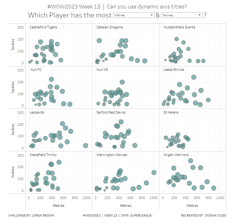
Lorna used this week’s challenge to showcase a new feature in Tableau v2023.1 – dynamic axis titles. As you can expect, you’ll therefore need this version of Desktop (or later if you’re reading this in the future ;-)) to complete the challenge.
Modelling the data
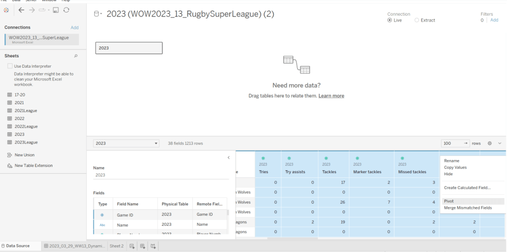
Download the file Lorna provided and connect to the 2023 sheet. Lorna hinted that a pivot would help, so in the data source canvas, multi-select all the measures (ctrl-click each column – there are several) then right-click and Pivot.
Rename Pivot Field Names to Measure and rename Pivot Field Values to Value.
Building the Basic Scatter Plot
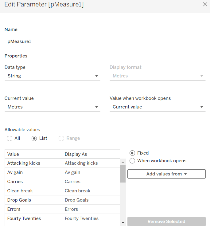
We need 2 parameters to control the selection of the measures we want to display in the scatter plot. Right click on Measure > Create > Parameter
pMeasure1
string parameter defaulted to Metres, and all the possible other values should be listed
Repeat the steps again to create pMeasure2 which is defaulted to Tackles
To determine the value to plot on the axes based on the selections from the parameters we need
X-Axis Value
IF [pMeasure1] = [Measure] THEN IF [Value] <> 0 THEN [Value] END END
Note – the additional nested IF was added as I discovered while playing with the Lorna’s solution that marks didn’t display when the value was zero.
Similarly we need
Y-Axis Value
IF [pMeasure2] = [Measure] THEN IF [Value] <> 0 THEN [Value]END END
Add X-Axis to Columns, Y-Axis to Rows, Team Name to Rows and Name to Detail. This will give a basic scatter plot.
Change the mark type to circle, adjust the colour, and reduce the opacity to around 70%. Add a grey border to the circles.
The size is based on the number of games the player has played, so we need
Count Games
COUNTD([Game ID])
Add this to the Size shelf.
Adjust the Tooltip so it references the parameters and the other relevant fields
To change the axis titles, edit the x-axis (right click axis > edit axis) and from the menu arrow next to the word ‘custom’, select the pMeasure1 option.
Repeat the same for the y-axis, but select pMeasure2 instead.
Making the small multiples
For this we need to define which row and column each Team Name should sit in. As we’ve only got 12 teams to work with, and that number is static, and we know we’re working with a 3×4 grid, I’m going to ‘hardcode’ this a bit rather than use more dynamic calculations.
To see what’s going on, on a new sheet add Team Name to Rows. Then create a new field
INDEX
INDEX()
and add this to Rows and convert to discrete. It should provider a counter from 1 to 12 for each Team Name.
Based off this INDEX value we’ll work out which row and colum each team will sit.
Column
(INDEX()-1) % 3
Row
IF [INDEX]<=3 THEN 1 ELSEIF [INDEX]<=6 THEN 2 ELSEIF [INDEX]<=9 THEN 3 ELSE 4 END
Add these to the table as blue discrete pills
Back onto the scatter plot sheet, add Row to Rows as a blue discrete pill, add Column to Columns as a discrete pill, and move Team Name to Detail. Modify the table calculation settings of both the Row and the Column pill so that the calculation is computed using Team Name and Name (in that order) and at the level of Team Name
Hide the Column and Row pills (uncheck Show Header)
Adding the Team Name title
Create a new field
Ref Line
WINDOW_MAX(SUM([Y-Axis Value])) * 1.1
and add this to the Rows. This will create a second marks card. Set the table calcuation of the Ref Line pill to compute using Name and Team Name (in that order).
On the Ref Line marks card, remove the pill from the Size shelf, change the mark type to gantt bar, and reduce the size to the smallest possible, set the opacity to 0%, and border to none.
Add Team Name to the Label shelf, then set to label min/max values, by the X-Axis Value field and Label Minimum value only.
Each team name should only be displayed once. Edit the text of the label and add a few spaces to shift the label across and align it better.
Edit the Tooltip of this marks card, and delete all the text. Now make the chart dual axis and synchronise the axis. Then remove Measure Names from the All marks card, and hide the right hand axis.
Finally remove the 0 lines from displaying, and hide the nulls indicator (right click). Add the chart to a dashboard, and position the parameters as floating objects within the text of the title. I just used spaces within the text to leave room for where I wanted to place the parameterss.
A colourful #WOW2022 challenge this week set by Kyle Yetter and using his favourite data – Baseball. Let’s jump straight in.
Building the required calculations
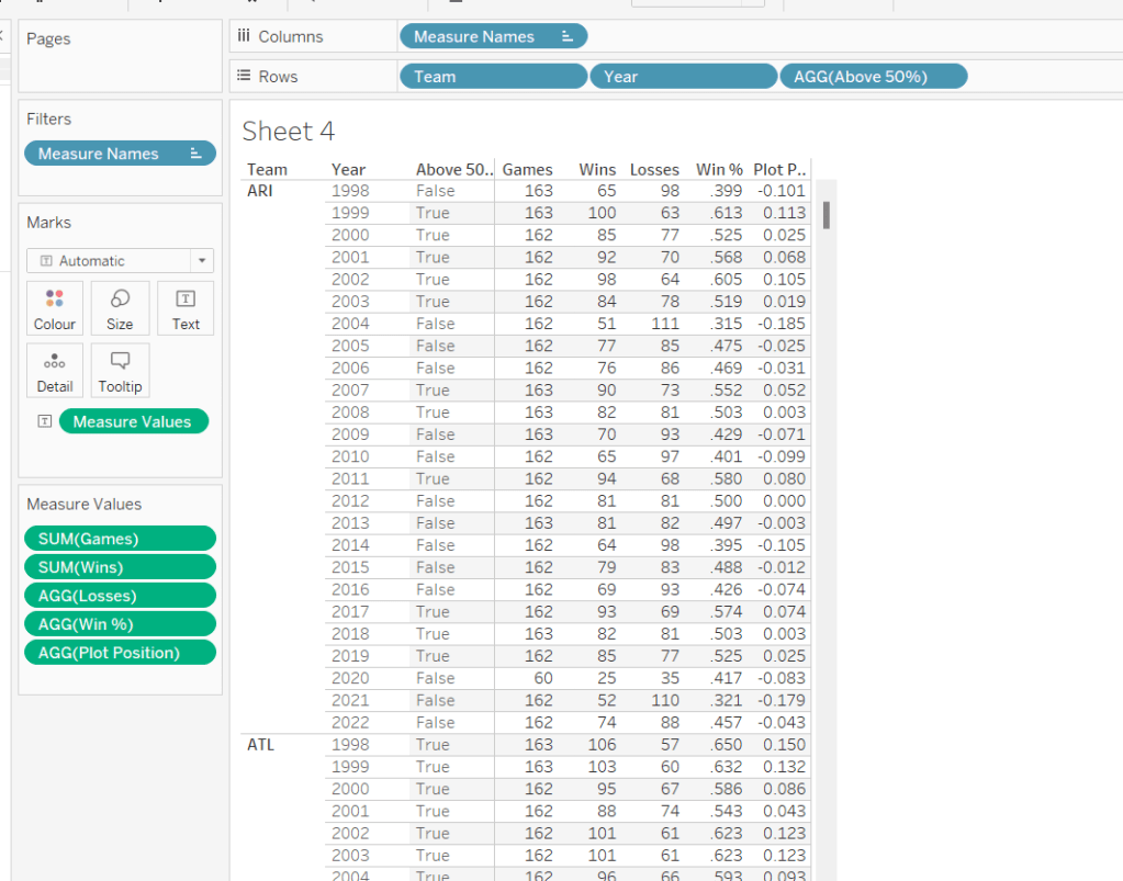
First up we need to calculate the core measure the viz is based on – % of wins
Win %
SUM([Wins])/SUM([Games])
I formatted this to 3 decimal places, then applied a custom number format to remove the leading 0 (custom number format looks like ,##.000;-#,##.000).
We also need to know the number of losses as this is part of the tooltip.
Losses
SUM([Games]) – SUM([Wins])
Let’s pop all these out into a table (I formatted all the whole numbers to display without any decimal places).
The viz however isn’t plotting the actual Win%, it’s plotting the difference from 50% (or 0.5), so values less than 50% are negative and those above are positive.
Plot Postion
[Win %] – 0.5
And we also need to know whether the Win% is above 50% or not
Above 50%
[Win %]>0.5
Pop these out onto the table too
The viz also displays the overall Win% for each team, and also uses this to sort the data. As it is used for sorting, we need to use an LoD calculation (rather than a table calculation).
for each team, get the total wins, and divide by the total games for the team. Format this to 3 dp with no leading 0 as before.
pop this into the view (you’ll see it’s the same value for each row for a single team), and then apply a Sort on the Team field to sort descending by the Overeall Win% LOD.
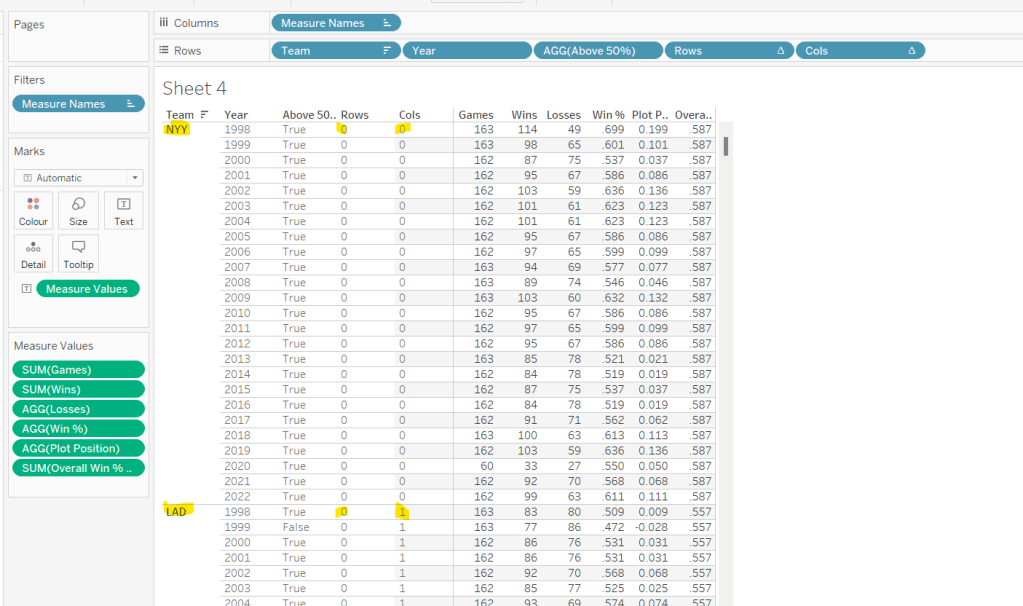
Now we have the data sorted, we can create the fields needed to build the trellis chart.
I have already blogged challenges relating to trellis charts / small multiples (see here) which in turn reference other blogs in the community, so I’m not going to go into all the details. We just need to build two calculated fields to identify which row and which column each Team will sit in. The table is fixed at 6 columns wide as the data wea re using is static. Some solutions work with a more dynamic layout depending on how many entities you need to display. We’re keeping things simpler.
Cols
FLOAT(INT((INDEX()-1)%6))
Rows
FLOAT(INT((INDEX()-1)/6))
Add both these fields to the table as discrete dimensions (blue pills), and as they are both table calculations, set them both to Compute Using – > Team.
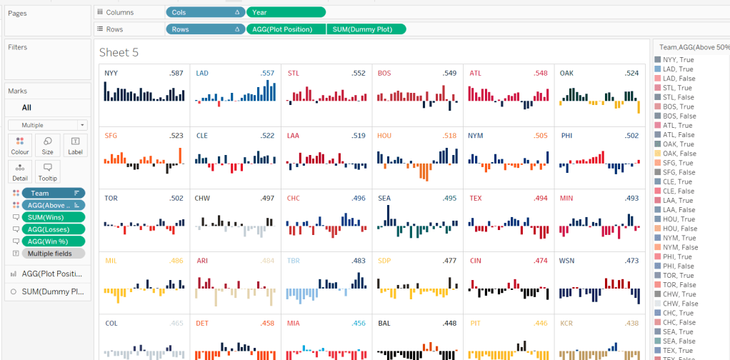
Building the Core Viz
On a new sheet, add Cols to Columns as discrete dimension, Rows to Rows as discrete dimension and Team to Detail. Set both Rows and Cols to Compute Using Team.
Add Year as continuous (green) pill to Columns and Plot Position to Rows and change the mark type to Bar and reduce the size. Sort the Team field based on Overall Win% LOD descending.
Add Wins, Losses, and Win% to the Tooltip shelf and adjust the tooltip to display as required. Add Above 50% to the Colour shelf (you may need to readjust the size). Leave the colours as they are for now – we’ll deal with this later.
Adding the labels
Create a new calculated field
Dummy Plot
FLOAT(IF [Year]=2000 OR Year = 2020 THEN 0.35 END)
This is basically going to position a mark at height 0.35 but only if the year is either 2000 or 2020. These values were all just based on a bit of trial and error as to what worked to get the desired result.
Also create a field
LABEL:Team
IF [Year]=2000 THEN [Team] END
and
LABEL:Win%
IF [Year]=2020 THEN [Overall Win % LOD] END
format this to 3dp and exclude the leading 0.
Add DummyPlot onto Rows and change the mark type of this measure to circle. Amend the Tooltip of this marks card so it’s empty.
Add LABEL:TEAM and LABEL:Win% to the Label shelf, and adjust the label so both fields sit side by side (only 1 value will only ever actually display). Adjust the table calculation of both the Rows and Cols pills so they now compute using both the Team and the LABEL:Team fields.
Adjust the alignment of the labels so they are positioned bottom centre. Set the font colour to match mark colour and bold.
Then reduce the size of the circle mark to as small as possible, reduce the opacity of the mark colour to 0.
Now make the chart dual axis and synchronise the axis. Remove the Measure Names field that has automatically been added to the All marks card.
Hide all the headers and axis (uncheck Show Header), remove all grid lines, zero line, axis rulers.
Hide the null indicator (bottom right).
Colouring by Team
Copy the colour palette text Kyle provided into your preferences.tps file (usually located in the My Tableau Repository directory). For more information on working with custom colour palettes see this Tableau help article.
You’ll need to save your workbook and re-open for the new palette to be available for use.
In order to prevent having to manually set all the colours (and believe me you don’t want to do this!), perform the following steps in order
Add Team to also be on the Colour shelf. Click on the 3 dots (…) that are to the left of the Team pill on the All marks card, and change it to Colour. This means there are now 2 fields on colour. Move the Team field so it is listed above the Above 50% pill. This means your colour legend should be listed as <Team>, <True|False>
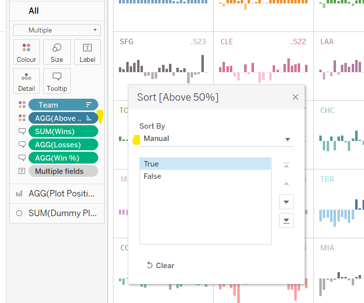
Adjust the Sort of the Above 50% pill, so it is manually sorted to list True before False.
Now change the Sort on the Team field so it is sorted alphabetically ascending instead. This will cause the viz to change its sort order, but don’t worry for now. It also changes the list on the colour legend, so ARI, True is listed first then ARI, False etc.
Now edit the Colour Legend and select the new MLB Team Colours palette we added. Click the Assign Palette button to automatically assign the colours. As we’ve made sure the entries listed are in the right order, they should get the correct colours.
Change the Sort on the Team field back to be based on Overall Win% LOD descending
And that should be it. You can now add the viz to a dashboard and publish. My published version is here.
It only seems like yesterday I was writing a solution guide, and I’m back at it again. This week Sean asked us to recreate this challenge to build a small multiple / trellis chart using table calculations only.
A note on the data
After downloading and connecting to the provided data source, I found the dates weren’t coming through as intended – they’d been transposed from dd/mm/yyyy to a mm/dd/yyyy so consequently the only dates I was getting were for the first 12 days in January for every year. Rather than trying to solve this at source, I just created a new field which transposed the Date field back so it behaved as I expected
You may not need to do this if the data pulls in correctly.
Filters
There are two filters that should be applied, which can either be added as data source filters (right click data source > Edit data source filters) or can be applied to the Filter shelf on any sheets created. Ultimately, this challenge only requires 1 sheet, but when building and verifying logic, I tend to have additional ‘check sheets’. I therefore added the filters below to the Filter shelf of the first sheet I started working with, but set them to apply to all worksheets using the data source (right click pill once it’s on the filter shelf -> Apply to Worksheets -> All using this data source).
Gender : All
Date Corrected : starting date = 01 Jan 2012
Setting up the data
As is good practice when working with table calculations, I start by building out the calculations I need and validating them in a tabular format before I build any vizzes. So let’s do that.
All the countries are displayed in capital letters, so we need
Country UPPER
UPPER([Country Name])
Add this to Rows
Additionally, for the purpose of validation and performance only, add this field to the Filter shelf too and just filter to Australia and Austria.
If you haven’t already added them as data source filters, apply the filters mentioned in the section above to this sheet too and set to apply to all worksheets using the data source.
Add Date Corrected to Rows as a discrete (blue pill) exact date. Format the date so it displays in month year format.
Add Unemployment Rate to Text. Format this number to 1 decimal place and add a % as a suffix.
Now for the table calcs
Median
WINDOW_MEDIAN(SUM([Unemployment Rate]))
Format this to display as a % using the same option as above. Add this to the table and set to compute using Date Corrected
You should find that your median value only differs by country.
Now we work out
Variance
SUM([Unemployment Rate]) – [Median]
Format this to display as a % and add to the table, setting the table calc to compute by Date Corrected again. This is the measure that will be used to plot the trend line against.
We also need to display the range of Unemployment rates for each country – ie we need to work out the minimum and maximum values.
Max Unemployment Rate
WINDOW_MAX(MAX([Unemployment Rate]))
Min Unemployment Rate
WINDOW_MIN(MIN([Unemployment Rate]))
Format both of these to display as 5 with 1dp, and add to the table, verifying the calculations are computing by Date Corrected once again. Verify you get the same values for all the rows associated to a single country.
Now we know the calculations are as expected, we can start to build out the viz.
Building the core chart
To start with we’ll just focus on getting the line chart with the associated text displayed for the two countries Australia & Austria. So on a new sheet add Country (UPPER) to Filter and filter to these selections. The other filters should automatically add.
Add Country UPPER and Date Corrected (green continuous exact date) to Columns and Variance to Rows. Set Variance to Compute By Date Corrected.
Add Unemployment Rate to the Tooltip and adjust the text to match.
To add the country title and other displayed text, we’re going to use a ‘fake axis’ and plot a mark at a central date. On hovering over the solution, October 2016 seems to be the appropriate date selected. So we need
Title Position to Plot
IF [Date Corrected] = #2016-10-01# THEN 1 END
Add this to Rows in front of the existing pill. Change the mark type of this measure only to a circle and re-Size to make it as small as possible and adjust the Colour Opacity to 0%. This will make the mark ‘disappear’.
Add Country UPPER, Median, Max Unemployment Rate and Min Unemployment Rate to the Label shelf of this marks card. Ensure all the table calculation fields are set to compute by Date Corrected. Adjust the text as required, and align centre. Ensure the Tooltip is blank for this marks card.
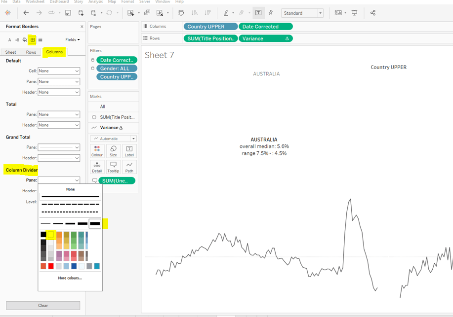
Change the colour of the variance line to grey, then remove all gridlines, row dividers and axis. Set the Column Dividers to be a thick white line (this will help provide a separator between the small multiples later).
Creating the trellis
There are multiple blog posts about creating trellis charts. My go to post has always been this one by Chris Love. It’s a more complex solution that dynamically flexes the number of rows and columns based on the number of members in the dimension you’re visualising. There have also been other Workout Wednesday challenges involving trellis charts, which I’ve blogged about too (see here).
Ultimately we’re aiming to determine a ‘grid position’ for each member of our dimension. In this case the dimension is Country UPPER and its a static list of 36 values, which we can display in a 6 x 6 grid. So Australia needs to be in row 1 column 1, Austria in row 1 column 2….. Costa Rica in row 2 column 1… USA in row 6 column.
As our members are static, the calculations we can use for this can be a bit simpler than those in Chris’ blog.
Firstly, let’s get our data in a tabular layout so we can ‘see’ the values as we go.
Duplicate the data sheet we built up, then move Measure Name and Date Corrected from Rows/Columns to the Detail shelf. Remove the Country UPPER field from the Filter shelf. You should have something like below, showing 1 row per country
Double click into the Rows shelf and type in INDEX(), then change the resulting pill to discrete (blue). You will see that index numbers every row. It’s a table calculation and although working as expected, let’s explicitly set it to compute using County UPPER.
Let’s now create our grid position values.
Cols
FLOAT(INT((INDEX()-1)%6))
This takes the Index value and subtracts 1, and returns the remainder when divided by 6 (%6=modulus of 6 – ie 6%6=0, 7%6=1). 6 is the number of columns we want.
Rows
FLOAT(INT((INDEX()-1)/6))
This takes the Index value and subtracts 1, and returns the integer part of the value when divided by 6. Again we’re using 6 as this is the number of rows we want to display.
Add these to the table, set to be discrete (blue) and compute using Country UPPER.
You can see that the first 6 countries are all in the same row (row 0) but different columns (0-5).
Now that’s understood, we can create the small multiples on the viz.
Duplicate the sheet we created further above which displays the trend graph for Australia & Austria. As we’re now going to make the changes to create the charts for every country, if things go a bit screwy, you can always get back to this one to try again :-).
Add Cols to Columns. Set to discrete and compute using Country UPPER. Add Rows to Rows and do the same thing. Move Country UPPER from Columns to the Detail shelf on the All marks card. Then remove Country UPPER from the Filter shelf.
Hopefully everything worked as expected and you have
Final step is to uncheck Show Header against the Cols and Rows pills so they don’t display and you can add to a dashboard.
For 2020 Week 42, the #WoW founder, Andy Kriebel, returned with a challenge to reproduce the Strava training calendar. Compared to some challenges recently, this looked to be quite straight forward; Andy threw in some specific requirements to test certain features – ie no data modelling and no LoDs.
I’ve been doing #WorkoutWednesday challenges since they first started, so I know that Andy is a stickler for formatting and layout – points not necessarily listed as a requirement, just expected as part of the challenge to reproduce. I kept my fingers tightly crossed when I published that I’d got all the finer details, but alas, Andy still found fault – my month summaries weren’t right aligned (my bad – missed that little nuance completely), and my bars had borders on them… Andy must have eyes like Superman to have seen that, as it wasn’t obvious. It also wasn’t a setting I’d intentionally added. I later found out that adding a particular type of pill to the Detail shelf caused borders to automagically be added… There’s always something to learn when Andy’s about!
So onto the challenge – as with previous weeks, I’m going to try to focus on the areas that may be a bit trickier / newer to some rather than detail the complete build step by step.
Using the data sets – blending
Building the calendar grid
Ensuring a 0 measure value is displayed for missing days
Adding the monthly hours summary
Building the BANs
Year Filter control
Remove highlighting
Setting the colour of the Calendar chart background
Using the data sets – blending
Andy was very specific that the 2 data sets provided should be used separately and not joined in any via the data pane.
This meant the data sources would need to be blended (further detail on this is here). Blending used to be one of the only ways within Tableau you could combine data together.
When blending, the number of rows in your output will never be more than the number of rows in your primary* data source. If there are multiple matching rows in the secondary data source, then the results will be aggregated in the display.
* whatever data source the first pill you add to your canvas comes from, will be the primary, and is denoted by a small blue icon by your data source. Secondary data sources are denoted by a small orange icon.
In the case of this challenge, we had a data set containing a list of dates (1 row per day from 01 Jan 2014 up to 31 Dec 2021), along with Andy’s Strava activity, containing a row for each activity recorded, which included the date time the activity occurred. This data could vary in that there could be multiple activities on the same day, and equally days when no activity occurred at all.
So the Calendar data set is our primary data source, as we need to show a bar on the calendar chart for every day of the year, regardless if there’s any activity. The Activity data set is our secondary data source. The number of hours, number of activities etc can all be aggregated from this data set.
When blending data sources, especially on dates, I prefer to create explicit calculated fields that define the fields I want to blend on. So in the Calendar data source I created
BLEND: Date
[Date]
essentially just a duplicate of the existing Date field, and in the Activity data source, I also created
BLEND: Date
DATE([Date Time])
Note the fields are spelled exactly the same, so Tableau automatically uses them as the linking fields when the view is built.
If you now do the following
Add the Calendar.BLEND: Date field to the Filter shelf, and select the Year = 2020,
Add Calendar.BLEND: Date as an exact date to Rows
Add Activity.BLEND: Date as an exact date to Rows
Add Activity.Seconds to Text
You can see that fields from the secondary data source have an orange icon by them; and that there are Null/missing values for the records from the secondary data source as these were the days when there was no activity recorded. You can also see a red link icon against the BLEND: Date field in the left hand data source pane, as this identifies how the two data sets are being matched.
Building the calendar grid
The calendar is essentially a ‘small multiple’ layout with each month being positioned in a particular row or column. To build out this layout we need to define the row number and the column number. There are many ways to build a dynamic small multiple grid which can flex based on the number of items you might be trying to organise, but for the purpose of this exercise, we can keep it simple. We’re working with 12 months that are to be displayed in a 4 x 3 grid layout. Create the following calculated fields in the Calendar data source.
Rows
IF MONTH([Date])<=4 THEN 0 ELSEIF MONTH([Date]) <=8 THEN 1 ELSE 2 END
Cols
(MONTH([Date])-1)%4
I make both of these to be dimensions rather than measures by dragging them above the line on the left hand data source pane. If you build out the view as below, you can see how these calcs are working
As we want to show a mark for every day in the month, we need to add the day of the month from the Calendar data source to Columns. Drag Calendar.BLEND: Date to Columns, then select the drop down to change to the Day date part
We need to show the amount of time in hours rather than seconds. In the Activity data source, create the field
Hours
([Seconds]/60)/60
and drag this onto the Rows, and change the mark type to bar. If need be re-add the YEAR(BLEND: Date) = 2020 to the Filter shelf. Now add Calendar.BLEND: Date as an exact date to the Detail shelf. You should now have
where you can see the gaps in the days where no activities took place, and if you hover vertically, you should find that the days of the month are vertically aligned – ie 30th Jan aligns with 30th May etc.
Ensuring a 0 measure value is displayed for missing days
With the above we displayed the Activity.Hours field, but if you hover over the day when there is no activity, nothing displays on the tooltip rather then 0.
To fix this, create a calculated field in the primary Calendar data source
Hours
ZN(SUM([Sheet1 (Activities Summary)].[Hours]))
This is basically just referencing the field in the secondary blended data source, but wrapping in a ZN() function means it will display 0 when no match can be found
Use this field from the primary data source instead on the calendar viz.
Adding the monthly hours summary
The requirements meant Andy expected the summary to be displayed within the same sheet as the daily calendar viz.
For this I used an old friend MIN(0) to create another axis, which is placed on the Rows in front of the Hours measure.
What I now plan to do is set this axis to be Text and plot the month, monthly hours, and the word ‘hours’ at a specific point to the right of the each cell – I’m choosing day 28 – you might want to experiment and choose a different day.
First up though, I need to build some fields to plot.
Month Name Abbrev
IF DAY([Date]) = 28 THEN UPPER(LEFT(DATENAME(‘month’,[Date]),3)) END
Hours in Month
IF MIN(DAY([Date])) = 28 THEN WINDOW_SUM([Hours]) END
LABEL: Hours
IF DAY([Date]) = 28 THEN ‘HOURS’ END
Month
DATE(DATETRUNC(‘month’,[Date]))
Add Month as an exact discrete date to Detail and the other 3 fields to the Text shelf of the Min(0) marks card (change the mark type to Text if you haven’t already done so). Alter the table calculation setting of the Hours in Month field to compute by all fields except Month
Building the BANs
These use a similar concept as above, by using 3 instances of MIN(0) placed side by side on the Columns shelf and set to the Text mark type. This creates 3 marks cards which you can then add the relevant measures and text on.
The measures are all coming from fields in the primary data source that reference measures in the seconday data source ie
# Activities (in Activity data source)
COUNT([Activity ID])
# Activities (in Calendar data source)
ZN([Sheet1 (Activities Summary)].[# Activities])
#Miles (in Calendar data source)
ZN(SUM([Sheet1 (Activities Summary)].[Miles]))
Year Filter Control
All the sheets you are building need to be filtered by the same BLEND: Date field from the Calendar data source (set the filter to Apply to all worksheets).
When this field is added to the dashboard, you can customise it so the All values does not show and the slider control also doesn’t display
Remove highlighting
To stop items on the dashboard from highlighting when they are clicked on, I use a trick that has been probably been the ‘most used trick of #WOW2020’ 🙂
In the primary data source, create a field called True which contains the value TRUE and a field False containing the value FALSE. Add both these fields to the Detail shelf of each sheet you don’t want highlighting on.
On the dashboard, create a Filter URL action for the each sheet that goes from the sheet on the dashboard to the sheet itself, and passes selected fields setting true = false. As this condition will never be true, then there is nothing to ‘filter’ so the marks don’t highlight. This needs to be repeated for each sheet on the dashboard, so I had 3 filter dashboard actions.
NOTE – a consequence of adding the True and False fields to the Detail shelf on the bar sheets, was that it caused a border to be added around the bars.
This wasn’t something I noticed, as it isn’t at all obvious, but Andy called it out!
Setting the colour of the Calendar chart background
You need to format the sheet and set the fill colour of the Pane rather than the whole sheet to grey.
There’s obviously a lot of other formatting settings to apply to get rid of all the row/column borders and gridlines etc, but this was a slight difference that I wanted to call out, as ended up with a ‘border’ on my dashboard that wasn’t required when I set the whole worksheet background.
Right, I think that’s about it for this week! Thanks for the fun challenge Andy – great to have you back!
This viz is essentially equivalent to a small multiple display where the charts for a specific dimension (in this case State) get displayed across numerous rows and columns. The difference here, is the row and column for the State to be displayed in, is specifically defined, rather than just sequentially based on how the data is being sorted.
Luke very kindly provided the logic to determine the rows and columns.
Building out the data
Once again, I’m going to start by putting all my data into a table so I can check my calculations, especially since this challenge does involve table calculations (there’s a hint on the Latest Challenges page)
Data Source Filter
Although not explicitly mentioned in the requirements, the information we need to present is based on the dates from 1st March 2020 to 31st July 2020. I messaged Luke to check this, before I then realised it was stated in the title of the viz – doh!
To make things easier, I therefore added a data source filter to remove all the other dates, setting the Report Date to range from 01 March 2020 to 31 July 2020 (right click on the data source -> add data source filter
I then added the basic fields I needed to a table
Province State Name to Rows
Report Date discrete, exact date (blue pill) to Rows, custom formatted to mmmm, dd
People Positive New Cases to Text
I excluded the fields where Province State Name = Null
We need to calculate the 7 day rolling average per Province State Name which we can do by using the UI to create a Moving Average quick table calculation against the People PositiveNew Cases pill, and then editing to compute over the previous 6 records (+ the current record makes 7 days). But I want to be able to reference this field, so I’m going to ‘bake it’ into the data model by creating a specific calculated field
7 day moving Avg
WINDOW_AVG(SUM([People Positive New Cases Count]), -6, 0)
Add this into the table, and edit the table calculation to compute by Report Date only and set the Null if not enough values checkbox
Do a basic sense check that the averages are correct by summing up 7 sequential rows and working out the average by dividing by 7.
So it looks like we’ve got the core measure to be plotted, but we’re going to need some additional fields in the presentation.
Again it’s not explicitly stated in the requirements, but it is in the title, that the values plotted need to be normalised. This is to ensure the data for each state is visible; if a state with a relatively low number of cases is positioned in the same row as one with a very high number of cases, it will be hard to see the data for the state with the low cases, because while the axis can be set to be independent, this will only work against a row and not an individual instance of a chart.
To normalise, we need to understand the maximum 7 day rolling average for each state.
Max Avg Per State
WINDOW_MAX([7 day moving Avg])
Add this to the table, setting both the nested table calcs to compute by Report Date.
In normalising, what we’re essentially going to do is determine the 7 day moving Avg as a proportion of the Max Avg Per State, so every value to plot will be on a range of 0-1.
Normalised Value
[7 day moving Avg]/[Max Avg Per State]
Format this to 2 dp, and add to chart, remembering to check the table calcs continue to compute by Report Date only.
Above you can see the max value for Alabama occurred on 19th July, so the Normalised Value to plot is 1
In the chart displayed, each State is titled by the name of the State. In a small multiple grid of rows & columns, we can’t use a dimension field for this, as it won’t appear where we want it. Instead we’re going to achieve this using dual axis, and plotting a mark at the centre point. For this we need to determine the centre date
This looks a bit complex, so I’ll break it down. What we’re doing is finding the number of days between the minimum date in the data set and the maximum date in the data set. This is
We’re then halving this value ( /2) and rounding it down to the nearest whole number (FLOOR).
We then add this number of whole days to the minimum date in the data set (DATEADD), to get our central date – 16 May 2020.
Now we need a point where we can plot a mark against that date. It needs to be above the maximum value in the main chart (which is 1). After a bit of trial and error, I decided 1.75 worked
Plot State
IF [Report Date] = [Centre Date] THEN 1.75 END
Finally we need to create our Rows and Columns fields which provides the co-ordinates to plot each state. The calculations for these were just lifted straight out of the requirements – thanks Luke!
Building the Viz
Start by adding the Rows and Columns fields to their respective shelf. Set them to be discrete dimensions (blue pills). You should immediately see a ‘map’ type layout of the US States.
Exclude the Null Rows value.
Now add Report Date as a continuous exact date (green pill) to Columns and Normalised Value to Rows, remembering to set the table calc to compute by Report Date only for all nested calculations. Change the mark type to Area.
Add 7 day moving Avg to Label and set the label to display the max value only and adjust the font size – I ended up at 7pt. Then add Province State Name & People Positive New Cases Count to Tooltip. Format the tooltip to match.
Remove all column/row lines and grid lines, zero lines etc.
There is a requirement to ‘add a line underneath each of the area trends’.
For this I added a 0 constant reference line formatted to be a solid black line.
But you’ll notice that for the charts that sit directly side by side, the line seems to be continuous, but I want to break it up. I re-added the column divider line to be a thick white line to get the desired effect.
Right, now lets get the State label added.
Add Plot State to Rows before Normalised Value and change the aggregation from SUM to MIN.
Change the Mark Type to Text and move the Province State Name field from Tooltip to the Text shelf. Adjust the text label to remove any other fields that are displaying, and resize the font – again I used 7. Clear the Tooltip for the this mark, so nothing displays on hover.
Make the chart dual axis and synchronise axis. Remove the Measure Names pill from the Colour shelf on both marks cards which will have automatically been added.
And now all you need to do is remove all the headers (uncheck Show Header) against Rows, Columns, Report Date & Plot Value, then right click on the >8k nulls label at the bottom right and select Hide Indicator.
You’re all done – you just need to add to a dashboard now. My published version is here.
I really enjoyed this challenge – a nice mix of calculations & format complexity but not overly cumbersome, which meant this blog didn’t take so many hours to write this week 🙂
Luke Stanke set the challenge this week, and posted a ‘sneak peak’ on Twitter before the challenge was formally released
Challenges from Luke can sometimes be on the harder end of the scale, so with the bit of extra time available and only the gif in the tweet as a clue , I had a play to see if I could get close at all. And surprisingly I could, so once it was formally issued, it was just a case of tidying up some of my calcs.
Calculations
First up we need to establish the basic calculations
Plotting these out onto a table with Segment we get
Note #Orders Per Customers needs to be set to be a discrete dimension.
So while this shows us a summary of the number of customers, we’ve only got 1 mark showing the summarised count. When plotting the chart we need something else in the view that will generate more marks. This is Customer ID.
At this point in order to help us build up our tabular view to ‘see’ what’s going on, I’ll filter the table to just show Segment = Consumer, and I’ll add Customer ID to Rows
As expected, our # Customers is now showing a count of 1 per row, but the data is now expanded as we have now got a row (ie a mark) per customer for each # Orders Per Customer ‘bucket’. But we still need a handle on the total customers in each ‘bucket’.
Customers Per Order Count
WINDOW_SUM([# Customers])
Adding this to the view and setting the table calc to compute based on Segment & Customer ID, we get the summarised value back again.
But we don’t want to actually show that number of marks; the number of circles to plot on the chart is dependent on a user parameter:
pMarkIndicator
Based on the requirements, if the number of customers is 15 and the user parameter is 5, then 3 circles should be drawn (15 / 5 =3 ), but if the number of customers was 14, only 2 circles should be drawn (14 / 5 = 2.8), ie the number of circles will always be set to the integer of the equal or lesser value (essentially the FLOOR() function). This can also be achieved by
Marks to Plot
INT([# Customers per Order Count]/[pMarkIndicator])
For some reason FLOOR can’t be used in the above as a table calculation is being used, but INT does the job just fine, and adding to the tabular view and adjust the table calculation accordingly we get
ie for the Consumer Segment, 6 customers have made 1 order in total, so based on batching the customers into groups of 5, this means 1 circle should be displayed. Whereas, 30 customers have made 3 orders in total, so 6 circles should be displayed.
But we can’t actually reduce the amount of rows (ie marks) displayed – we either have 1 row (by removing Customer ID) or a row per customer. But that’s fine, we don’t need to.
What we want is something in our data to group each row into the relevant batch size.
First up let’s generate an ID per row for each customer that restarts for each #Orders Per Customer.
Index
INDEX()
Add this as a discrete pill to Rows, and adjust the table calc
Now we have this, we calculate which ‘column’ each customer can sit in, a bit like what we would do if we were building a small multiple table, arranging objects in rows and columns (see here for an example of what I mean).
Cols
[Index]%([Marks to Plot])
This uses the modulo (%) notation which returns the remainder of the division sum. Lets put this on the view
For customers who have only ordered once, and where we’re only going to plot 1 mark, the Cols value is the same (0) for all rows.
Whereas for customers who have ordered twice, and where we want to plot 2 marks, the Cols value is either 0 or 1.
We’ve now got a value we can use to plot on an axis. We’re still going to plot a mark for each Customer ID, but some marks will be plotted in the same position, ie on top of each other, which therefore looks like just one mark.
Let’s show this more graphically, by duplicating the sheet, deleting some pills, moving some around, changing some to continuous, and setting the mark type to circle as below
Change the pMarksIndicator parameter and the number of circles will adjust as required.
So far, so good. We’ve got the right number of marks, it’s just not looking as nice and symmetrical as it should be.
We need to shift the marks to the left. But how far it shifts is dependent on whether we’ve plotted an odd or even number of marks.
If we have an odd number, the middle mark should be plotted at 0. If we have an even number the middle two marks should be plotted at -0.5 and +0.5 respectively. The calculation below will achieve this
Cols Shifted
IF [Marks to Plot]%2 = 0 //we’re even THEN [Cols] – ([Marks to Plot]/2) + 0.5 ELSE //we’re odd [Cols] – (([Marks to Plot]-1)/2) END
To demonstrate this, I’ve added Cols Shifted along side Cols on the viz (this time make sure all the table calculation settings (including the nested calcs) are applied to compute based on Customer ID only which is different from the calcs above)..
Now you can see how it all works, you can remove the Cols and the Segment from the Filter shelf.
And now its just a case of applying the various formatting to clean up the display, and adding to the dashboard.