
It only seems like yesterday I was writing a solution guide, and I’m back at it again. This week Sean asked us to recreate this challenge to build a small multiple / trellis chart using table calculations only.
A note on the data
After downloading and connecting to the provided data source, I found the dates weren’t coming through as intended – they’d been transposed from dd/mm/yyyy to a mm/dd/yyyy so consequently the only dates I was getting were for the first 12 days in January for every year. Rather than trying to solve this at source, I just created a new field which transposed the Date field back so it behaved as I expected
Date Corrected
(MAKEDATE(YEAR([Date]), DAY([Date]),MONTH([Date])))
You may not need to do this if the data pulls in correctly.
Filters
There are two filters that should be applied, which can either be added as data source filters (right click data source > Edit data source filters) or can be applied to the Filter shelf on any sheets created. Ultimately, this challenge only requires 1 sheet, but when building and verifying logic, I tend to have additional ‘check sheets’. I therefore added the filters below to the Filter shelf of the first sheet I started working with, but set them to apply to all worksheets using the data source (right click pill once it’s on the filter shelf -> Apply to Worksheets -> All using this data source).
Gender : All
Date Corrected : starting date = 01 Jan 2012
Setting up the data
As is good practice when working with table calculations, I start by building out the calculations I need and validating them in a tabular format before I build any vizzes. So let’s do that.
All the countries are displayed in capital letters, so we need
Country UPPER
UPPER([Country Name])
Add this to Rows
Additionally, for the purpose of validation and performance only, add this field to the Filter shelf too and just filter to Australia and Austria.
If you haven’t already added them as data source filters, apply the filters mentioned in the section above to this sheet too and set to apply to all worksheets using the data source.
Add Date Corrected to Rows as a discrete (blue pill) exact date. Format the date so it displays in month year format.
Add Unemployment Rate to Text. Format this number to 1 decimal place and add a % as a suffix.

Now for the table calcs
Median
WINDOW_MEDIAN(SUM([Unemployment Rate]))
Format this to display as a % using the same option as above. Add this to the table and set to compute using Date Corrected

You should find that your median value only differs by country.
Now we work out
Variance
SUM([Unemployment Rate]) – [Median]
Format this to display as a % and add to the table, setting the table calc to compute by Date Corrected again. This is the measure that will be used to plot the trend line against.
We also need to display the range of Unemployment rates for each country – ie we need to work out the minimum and maximum values.
Max Unemployment Rate
WINDOW_MAX(MAX([Unemployment Rate]))
Min Unemployment Rate
WINDOW_MIN(MIN([Unemployment Rate]))
Format both of these to display as 5 with 1dp, and add to the table, verifying the calculations are computing by Date Corrected once again. Verify you get the same values for all the rows associated to a single country.

Now we know the calculations are as expected, we can start to build out the viz.
Building the core chart
To start with we’ll just focus on getting the line chart with the associated text displayed for the two countries Australia & Austria. So on a new sheet add Country (UPPER) to Filter and filter to these selections. The other filters should automatically add.
Add Country UPPER and Date Corrected (green continuous exact date) to Columns and Variance to Rows. Set Variance to Compute By Date Corrected.

Add Unemployment Rate to the Tooltip and adjust the text to match.
To add the country title and other displayed text, we’re going to use a ‘fake axis’ and plot a mark at a central date. On hovering over the solution, October 2016 seems to be the appropriate date selected. So we need
Title Position to Plot
IF [Date Corrected] = #2016-10-01# THEN 1 END
Add this to Rows in front of the existing pill. Change the mark type of this measure only to a circle and re-Size to make it as small as possible and adjust the Colour Opacity to 0%. This will make the mark ‘disappear’.
Add Country UPPER, Median, Max Unemployment Rate and Min Unemployment Rate to the Label shelf of this marks card. Ensure all the table calculation fields are set to compute by Date Corrected. Adjust the text as required, and align centre. Ensure the Tooltip is blank for this marks card.

Change the colour of the variance line to grey, then remove all gridlines, row dividers and axis. Set the Column Dividers to be a thick white line (this will help provide a separator between the small multiples later).

Creating the trellis
There are multiple blog posts about creating trellis charts. My go to post has always been this one by Chris Love. It’s a more complex solution that dynamically flexes the number of rows and columns based on the number of members in the dimension you’re visualising. There have also been other Workout Wednesday challenges involving trellis charts, which I’ve blogged about too (see here).
Ultimately we’re aiming to determine a ‘grid position’ for each member of our dimension. In this case the dimension is Country UPPER and its a static list of 36 values, which we can display in a 6 x 6 grid. So Australia needs to be in row 1 column 1, Austria in row 1 column 2….. Costa Rica in row 2 column 1… USA in row 6 column.
As our members are static, the calculations we can use for this can be a bit simpler than those in Chris’ blog.
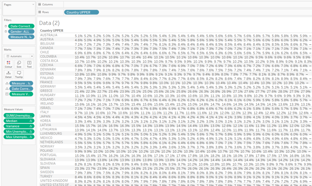
Firstly, let’s get our data in a tabular layout so we can ‘see’ the values as we go.
Duplicate the data sheet we built up, then move Measure Name and Date Corrected from Rows/Columns to the Detail shelf. Remove the Country UPPER field from the Filter shelf. You should have something like below, showing 1 row per country
Double click into the Rows shelf and type in INDEX(), then change the resulting pill to discrete (blue). You will see that index numbers every row. It’s a table calculation and although working as expected, let’s explicitly set it to compute using County UPPER.
Let’s now create our grid position values.
Cols
FLOAT(INT((INDEX()-1)%6))
This takes the Index value and subtracts 1, and returns the remainder when divided by 6 (%6=modulus of 6 – ie 6%6=0, 7%6=1). 6 is the number of columns we want.
Rows
FLOAT(INT((INDEX()-1)/6))
This takes the Index value and subtracts 1, and returns the integer part of the value when divided by 6. Again we’re using 6 as this is the number of rows we want to display.
Add these to the table, set to be discrete (blue) and compute using Country UPPER.

You can see that the first 6 countries are all in the same row (row 0) but different columns (0-5).
Now that’s understood, we can create the small multiples on the viz.
Duplicate the sheet we created further above which displays the trend graph for Australia & Austria. As we’re now going to make the changes to create the charts for every country, if things go a bit screwy, you can always get back to this one to try again :-).
Add Cols to Columns. Set to discrete and compute using Country UPPER. Add Rows to Rows and do the same thing. Move Country UPPER from Columns to the Detail shelf on the All marks card. Then remove Country UPPER from the Filter shelf.
Hopefully everything worked as expected and you have

Final step is to uncheck Show Header against the Cols and Rows pills so they don’t display and you can add to a dashboard.
My published viz is here.
Happy vizzin’!
Donna
