It’s Tableau Conference week, so this week’s challenge, set by Yoshi, was presented as part of the live session at #TC26. Yoshi set 3 levels of the challenge, to represent session data from TC25. I managed to get through the Basic and Bonus challenges
Building the Basic KPI sheet
After connecting to the data set, create a new field to determine if the session is AI related or not
AI-related
CONTAINS([Title], “AI”) OR CONTAINS([Title],”Agent”) OR CONTAINS(IFNULL([Topic],”),”Agentic Analytics”) OR CONTAINS(IFNULL([Topic],”),”Artificial Intelligence”)
Add this to the Text field on a new sheet, then adjust the text to include the rest of the words, adjusting the font style and colour as required.
Building the basic calendar sheet
Format Start Time and End Time to custom date format of hh:nn, and format Date as mmm dd
On a new sheet add Date as a discrete exact date (blue pill) to Columns and Start Time as a continuous exact date (green pill)to Rows, and edit the Start Time axis so it is reversed.
Add ID to Detail and change the mark type to circle. Create a new field
Index
INDEX()
and add this to Columns
Add AI-related to Colour and adjust accordingly. The edit the Index table calculation so it is computing by Id and AI-related only and sorted by the min value of AI-related descending, so the AI related sessions are listed first
Format the Start Time axis, so the Scale is formatted as h AM/PM and change the font style to larger, blue and bold
Format row and column dividers in the pane only to be thicker blue lines, with no dividers on the headers
Add thin blue gridlines to the Rows and remove column gridlines and zero lines
Edit the Start Time axis again, and set the Tick Marks to start at 08:00 and display every 2 hours
Remove the axis title. Hide the Index axis (right click, uncheck show header). Format the Date header fields (large, blue, bold) and remove the Date label (right click – hide field labels for columns).
Add Title, Description, Start Time and End Time to Tooltip and adjust accordingly.
Add both sheets onto a dashboard, and add an additional Text object to contain the additional explanation.
As before, add this to the Text field on a new sheet and adjust text to contain the additional wording and formatting.
Building the Bonus Calendar Sheet
Start by duplicating the basic calendar sheet. Add Session Duration to Size.
The sessions need to be sorted by the longest durations first, while still be grouped with AI -related sessions listed before non AI session. Create a new field
Sort
[Session Duration] + (INT([AI-related])*100)
I’m basically creating a numeric value to sort by, based on the duration. adding 100 if the session is AI related, ensuring the Sort value for even the shortest AI session (20 mins) will be larger than the longest non AI session (90 mins).
Adjust the Sort property on the Index field table calculation, to now sort by the minimum of Sort descending
Adjust the tooltip to include the Session Duration, and you should be done.
Duplicate your basic dashboard, then use the ‘object swap’ feature to change the 2 vizzes
Yusuke set the #WOW2025 challenge this week, asking us to build a chart that was drill downable and drill uppable 🙂
I had a fair idea of how this was going to play out, knowing it would involve parameter actions and built the main table fairly quickly. Then it came to the parameter actions, and defining the logic to get them set to the right values. This was very tricky, and I confess I couldn’t completely manage it. The behaviour just wasn’t doing what I wanted 😦
So I looked at Yusuke’s solution, and even after using the exact same logic, field naming and parameter actions (including the names of these), it still wouldn’t quite do what Yusuke’s did. At the point the bars are expanded down to Manufacturer, if a Category is selected, Yusuke’s solution collapses back to the Category > Sub-Category level. Mine expands down to Manufacturer for the Sub-Category listed first (see below).
I spent a considerable amount of time trying to get this to work. Ultimately, I believe it’s something to do with the order in which the parameter actions get applied. In Yusuke’s solution, there are 4 parameter actions firing on each ‘click’, but they only affect 2 parameters. So one change it being applied before the other. But figuring out the order is tricky. From what I understand, actions of the same type (ie all parameter actions as opposed to filter actions, or set actions say), are applied based on alphabetical order. But, as I say, I tried naming my actions exactly like Yusuke’s (even copying and pasting from his solution), and I still couldn’t get his behaviour, and with all 4 actions applied, the drill-down from Sub-Category to Manufacturer didn’t work at all. I couldn’t get my actions to be displayed in the same order as Yusuke’s solution either, even by removing them and then adding them in the order listed, when I closed the dialog and re-opened, the order changed. So, as a result of this, my solution only has 3 actions and doesn’t quite behave exactly like Yusuke’s…. maybe I missed a tiny detail.. who knows, or maybe it’s just Tableau and some quirk in how things get applied…
Anyway, now I’ve said all that, let’s get on to the solution I did manage 🙂
Building out the calculations
For a challenge like this, I’m going to build out all my calculations into tabular form, so I can get the display and sorting as required, especially since table calculations are involved.
We need to capture the selections made ‘on click’ into parameters
pSelectedCategory
string parameter, defaulted to Furniture
pSelectedSubCat
string parameter, defaulted to Bookcases
The Sub-Category and Manufacturer to display will be based on the values in these parameters
On a sheet, add Category, Display – Sub Cat, and Display – Manufacturer to Rows and show the two parameters
If you change the values in the parameters, you’ll see how the display changes.
We want to get the total sales for each ‘level of the hierarchy’, so we can the compute the % sales, and apply sorting. We’ll used Fixed Level of Detail calculations for this.
Format all these to $ with 0 dp, add into the table and note how the values are duplicated across each row, depending on what ‘level of the hierarchy’ we’re looking at
Adjust the sort on the Category pill, to sort by Sales per Category descending – this will move the Technology row to the top.
Sort the Display – Sub Cat pill to sort by Sales per Sub-Category descending and sort the Display – Manufacturer pill to sort by Sales per Manufacturer descending.
With these fields, we can calculate the % of sales
% Sales per Category
SUM([Sales per Category]) / SUM({FIXED:SUM([Sales])})
% Sales per Sub-Category
SUM([Sales per Sub-Category]) / SUM([Sales per Category])
% Sales per Manufacturer
SUM([Sales per Manufacturer]) / SUM([Sales per Sub-Category])
format all these to % with 1 dp and add into the table
For the final display, we don’t want values in every row. We need values displayed at the first row of every level of the hierarchy. I’m going to use the INDEX() tableau calculation to help with this.
Index – Category
INDEX()
Index – Sub-Category
INDEX()
Make both of these fields discrete (right click > convert to discrete).
Add Index – Category to Rows to the right of the Category pill. Adjust the table calculation on the pill so it is computing using Display – Sub Cat and Display – Manufacturer only. This should index the rows so that the numbering restarts when the Category changes.
Add Index – Sub-Category to Rows to the right of the Display – Sub Cat pill. Adjust the table calculation on the pill so it is computing using Display – Manufacturer only. This should index the rows so that the numbering restarts when the Sub–Category changes.
We can then use this information to determine which rows need to display the % Sales values.
Display – % Sales per Category
IIF([Index – Category] = 1, [% Sales per Category],NULL)
Display – % Sales per Sub-Category
IIF([Index – Sub-Category] = 1 AND MIN([Category]) = [pSelectedCategory], [% Sales per Sub-Category],NULL)
Display – % Sales per Manufacturer
IIF(MIN([Sub-Category]) = [pSelectedSubCat], [% Sales per Manufacturer],NULL)
format all these to % with 1 dp, and add to the table (sense check that the table calculations for each field have the settings we applied to the Index fields above.
These 3 fields, are the core fields we need to use in the viz.
Building the Viz
On a new sheet, add Category, Display – Sub Cat, Display – Manufacturer to Rows and apply the sorting on each pill described above, and how the parameters.
Add Display – % Sales per Category to Columns and apply the table calculation settings described above. Add Display – % Sales per Sub-Category to Columns too, and again apply the table calc settings. Then add Display – % Sales per Manufacturer to Columns. Change the mark type on each of the 3 marks cards, specifically to use bar.
Add Category to the Colour shelf on the All marks card, and adjust accordingly.
On the Display – % Sales per Category marks card, add Category and Display – % Sales per Category to Label. Adjust the table calc settings of the % field as required. Adjust the layout of the label. Add Sales per Category to Tooltip and update the tooltip to suit.
On the Display – % Sales per Sub-Category marks card, add Display – Sub Cat and Display – % Sales per Sub-Category to Label. Adjust the table calc settings of the % field as required. Adjust the layout of the label. Add Sales per Sub-Category to Tooltip and update the tooltip to suit.
On the Display – % Sales per Manufacturer marks card, add Display – Manufacturer and Display – % Sales per Manufacturer to Label. Adjust the layout of the label. Add Sales per Manufacturer to Tooltip and update the tooltip to suit.
You may need to widen each row to see the labels displayed.
The axis titles on the top of the chart adjust based on the selections made. To present this within the chart itself (rather than using carefully positioned text fields on a dashboard), we need to make the chart dual axis using ‘fake axes’.
Double click into the space in Columns to the right of the last pill, and manually type MIN(0). Drag this field to sit between Display – % Sales per Sub-Category and Display – % Sales per Manufacturer.
Remove all pills from the MIN(0) marks card. Change the mark type to Shape and select a transparent shape for this (refer to this article to set this up – you can also use any other type of mark but set to very small, and 0% opacity on the colour to make it “invisible”, though a mark could appear on hover, which is why I prefer to use transparent shapes).
Click on the MIN(0) pill and set it to be dual axis, so 2nd column now has a MIN(0) axis heading.
Right click on this top axis, to Edit the axis – Change the Title to reference the pSelectedCategory parameter and set the tTck Marks to None
Repeat the process, creating another instance of MIN(0) to the right of the Display – % Sales by Manufacturer, but this time the axis title should reference the pSelectedSubCat field.
Tidy up the display formatting by
Add row banding with Band Size = 1and Level = 0, so the whole of the Furniture block is coloured grey.
Remove column dividers
Remove gridlines and zero lines
Hide the 3 pills on the Rows (right click each pill and uncheck show header).
Hide the null indicator (right click > hide)
Edit the bottom 3 axis to remove the titles and hide the tick marks on all
Make the axis heading section narrower
Add a border around each of the bars, and make each bar narrower if required
Add some space to the start of each bar, by adjusting the bottom axis to be fixed from -0.1 to 1
Update the title of the sheet, and name the sheet.
Adding the interactivity
Add the sheet to a dashboard.
Firstly, we’re going to stop the bars from being ‘highlighted’ when clicked. we’ll use the True/False filter action technique described here. Create 2 calculated fields True = TRUE and False = FALSE and add to the Detail shelf on the All marks card of the viz. Add a dashboard filter action
Deselect Marks
On select of the the Viz sheet on the dashboard, target the Viz sheet directly, setting True = False.
Now we need to deal with the parameter values. As I discussed at the start of this blog, getting the calculations required and making the functionality work was pretty tricky, so I’m just going to document what I’ve ended up using, that seems to mostly work. Note the names of the parameter actions which both affect the pSelectedCategory param are pre-fixed with a number to force the order (I did test with them the other way round, and things broke).
Create fields
Category for Param_1
IF (([pSelectedCategory]<> [Category]) OR ([pSelectedCategory]=[Category] AND [pSelectedSubCat]=[Display – Sub Cat]) AND ISNULL([Display – Manufacturer])) THEN ‘ ! Please select a Category !’ ELSE [Category] END
Category for Param_2
[Category]
SubCat for Param
IF (([pSelectedCategory]<> [Category]) OR([pSelectedSubCat]=[Display – Sub Cat])) AND NOT(ISNULL([Display – Manufacturer])) THEN ‘ ! Please select a Sub-Category !’ ELSE [Display – Sub Cat] END
Then create 3 parameter actions
Set SubCategory
On select of the viz, set the pSelectedSubCat parameter passing in the value from the SubCat for Param field.
1. Set Category
On select of the viz, set the pSelectedCategory parameter passing in the value from the Category for Param_1 field.
2. Set Category
On select of the viz, set the pSelectedCategory parameter passing in the value from the Category for Param_2 field.
And fingers crossed, that should work, at least work the same as mine… my published viz is here. Note – when I uploaded to Tableau Public, the dynamic axes seemed to break, so I had to manually reset them on public…. or it may have broken before I published and didn’t realise.. the feature does seem to be a bit temperamental.
In the final week of ‘alternative charts month’, Luke set this challenge as different way of presenting data that you might typically see in a side-by-side bar chart.
Luke had indicated on the #WOW splash screen, that this challenge was ‘easy’, but that’s always dependent on your level of Tableau. He also added a note in the requirements that if you wanted to be ‘advanced’ to solve it with Table Calcs only.
I figured I’d just start and see what I ended up with (sometimes, my natural brain thinking takes me down a table calc route..)
In a change to my usual starting point, I started trying to remember what I needed to do to get the comet… I felt pretty sure that path would be involved somewhere.
So, I added Order Date to the Filter shelf and filtered to years 2021 and 2022 only.
Then I added Sub-Category to Rows, Sales to Columns and Order Date (which defaulted to YEAR(Order Date)) to Detail. I changed the mark type to circle initially.
Ok – I had what I was expecting – 2 circles per row, one for each year.
So then I change the mark type to line and moved YEAR([Order Date]) from Detail to Path. This meant my lines were joined.
I then added Order Date to Size, and reset Order Date to be at the YEAR level. Hey presto! My comet shapes appeared.
I now wanted to show a white circle mark just for the 2022 sales, so I created
Max Year Sales LOD
{FIXED [Sub-Category]:SUM(IF YEAR([Order Date]) = {FIXED:MAX(YEAR([Order Date]))} THEN [Sales] END)}
this looks a bit long-winded ( I do usually break this up)… so let’s review what’s going on…
{FIXED:MAX(YEAR([Order Date]))} returns the latest year in the data set (ie 2022) and spreads that across every row of data. So the formula is comparing each row, and if the Order Date year matches 2022, the value of the Sales is returned. This is then all aggregated and totalled for each Sub-Category.
Add this field to Columns, make dual axis and synchronise axis.
Remove Measure Names from the All marks card and change the mark type of the Max Years Sales LOD card to circle. Colour white.
Remove the YEAR([Order Date]) pill from the Size shelf of the Max Years Sales LOD card, so the size of the comet (the Sales card) and the circle can be adjusted independently. Adjust the sizes enough so the comet is visible around the circle.
Sort the Sub-Category field by Max Year Sales LOD descending
Next we need to colour the comets based on whether Sales increased or decreased.
Prev Year Sales LOD
{FIXED [Sub-Category]: SUM( IF YEAR([Order Date]) = {FIXED:MAX(YEAR([Order Date]))} -1 THEN [Sales] END)}
is doing similar to the above calculation, but {FIXED:MAX(YEAR([Order Date]))} -1 returns 2021 instead.
and with this we can created
Sales Increased? LOD
[Max Year Sales LOD] > [Prev Year Sales LOD]
Add this to the Colour shelf of the Sales marks card, and adjust accordingly.
To label the comets, check the show mark labels checkbox on the Label shelf dialog, and set to line ends and label end of line. You may need to check the allow labels to overlap option too if you’re not seeing all the labels.
The dashboard shows a circular size legend which is related to the circle mark, so I created
Order Date (Years)
YEAR([Order Date])
and added this to the Size shelf of the Max Year Sales LOD marks card.
Add Sales to the Tooltip shelf of the Max Year Sales LOD marks card too and adjust the tooltips.
Add row dividers, and remove all column dividers, gridlines and axis. Adjust the formatting of the Sub-Category row labels and hide the column title. Set the background of the worksheet to a grey colour.
And so that ended up being the LOD version of the chart, which is accessible from here.
But I had time, so I figured I’d see if I could crack the Table calcs version…
Building the Table Calculation Solution
This starts by repeating the intial steps above to get a basic single axis comet chart for Sales, split by Year.
We now need to get the sales for 2022 only. For starters, let’s identify the latest year
Latest Year
WINDOW_MAX(MAX(YEAR([Order Date])))
and let’s build up a table, so we can start to sense check what’s going on, as table calcs can be pesky!
Our Latest Year table calc is returning 2022 for every row in our table. To get the sales just for 2022
Window Max Year Sales
WINDOW_MAX(IF MIN(YEAR([Order Date]))=[Latest Year] THEN SUM([Sales]) END)
if the order date year is 2022, then return Sales (otherwise null) and spread the maximum value across the rows. When we add this into the table, we need to set the table calculation to compute using Year or Order Date, so that it is calculating the WINDOW_MAX for each Sub-Category
Add this field to Columns on the comet chart, and adjust the table calculation so Window Max Year Sales is computing by Year of Order Date only, and Latest Year by both fields (see the Nested Calculations dropdown)
Make the chart dual axis, and synchronise the axis. Make the adjustments to the mark types and sizes as described above.
We can’t sort the Sub-Category field in the way we did above, as table calculation fields aren’t accessible in the sort dialog. Instead add Window Max Year Sales to Rows and change it to be discrete (blue pill) and move it to be in front of Sub_Category. Adjust the table calc settings to match that described above. This should make the chart sort ascending.
To reverse, double click into the blue Window Max Year Sales pill on Rows and add * -1 to the end
Annoyingly this will revert it back to a measure, so reapply the steps above, and you should end up with a correctly sorted display. Hide the Window Max Year Sales blue pill.
Now to colour the comet.
Back to the tabular view. Add a Difference quick table calculation to the Sales pill and edit the table calculation to compute using Year(Order Date) only.
Drag the Sales pill with the difference table calc from the Measure Values section and drop into the left hand data pane. This will create a dedicated instance of the calculation. Rename it to
Sales Diff – TC
ZN(SUM([Sales])) – LOOKUP(ZN(SUM([Sales])), -1)
If you examine it, it should contain the above calculation.
With this we can then work out if sales have increased or not
Adding this into the table, and setting the nested table calcs to both compute by Year Order Date, you can see that the values for each Sub-Category are either 1 or 0.
Add this to the Colour shelf of the Sales marks card. Make sure the field is discrete and the table calcs are set to compute by Year Order Date. Adjust the colours.
Finally make adjustments for the tooltip and adjust the formatting to clean up the chart. My table calc version of the viz is here.
For her final challenge of #WOW2022, Erica set this interesting challenge; to show how the sales of the top n Products within each Sub-Category compared against the total sales. An added twist was to flip the display between actual sales, and % of total.
It did take me a short while to get my starting point. When I’ve worked with the concept of proportional brushing before, it’s typically involved set actions and one viz driving the interactivity on another viz via a dashboard action. I didn’t have this. I’ve obviously come up with a solution, but I’m not sure if it’s overly complicated… it doesn’t seem it, but for some reason I feel it could have been simpler than I’ve made it. Only time will tell as I check out other solutions.
My solution involves table calcs, so as I do with many challenges, I’ll start by building out all the data I need in tabular form.
Defining the calculated fields
Start off by adding Sub-Category to Rows, Product Name to Rows and Sales into Text and sort descending. We want to identify the Product Names in the top n, so lets first rank the products per sub-category. Create a calculated field
Sales Rank
RANK_UNIQUE(SUM([Sales]))
Make it a discrete field, then add it to Rows between Sub-Category and Product Name. Set the table calculation to compute using Product Name.
The rows should be numbered from 1 upwards, and restart at 1 when the Sub-Category changes
We want to get the sum of the sales for all those products in the top n. We’ll use a parameter to identify the n
pTop
Integer parameter defaulted to 10
Then we’ll use another table calculation to get the sum of the sales in that top n
Sales in Top n
WINDOW_SUM(IF [Sales Rank]<=[pTop] THEN SUM([Sales]) END)
If the Sales Rank is less than or equal to the top parameter, then get the Sales for that row, then sum all the sales values up together.
Show the parameter on screen, and add Sales in Top n into the table, setting the table calc to once again compute using by Product Name.
You should see that the sum of the sales for the rows marked 1-10 should equate to the value in the Sales in Top n column for the Sub-Category
We also need to get the total sales for each Sub-Category, which we can do with
Sub Cat Sales
{FIXED [Sub-Category]: SUM([Sales])}
Format to $ with 0 dp and displayed in k.
With this , we can also determine the proportion of sales
Top n % of Total
[Sales in Top n]/SUM([Sub Cat Sales])
Format this to a % with 0 dp.
Add both these fields to the table, making sure the table calcs are set to compute using Product Name.
So now we’ve got the base fields that form the building blocks for the viz. But we have this added functionality where we want to show either actual values (ie Sales in Topn and Sub Cat Sales), or we want to show the Top n % of Total compared to the ‘whole’ ie 1.
To manage this, we first need the parameter to control the decision
pView
integer list parameter set to 0 or 1, with appropriate display values. and defaulted to Sales Value
We can then build
Measure 1 to Display
CASE [pView] WHEN 0 THEN [Sub Cat Sales] ELSE 1 END
and
Measure 2 to Display
CASE [pView] WHEN 0 THEN [Sales in Top n] ELSE [Top n % of Total] END
Pop these into the table and show the pView parameter. Test changing the parameter and see the results. Don’t worry that the % shows 0.. you can format the Measure 2 to Display field to show 2 dp if you want to see the data really changing.
Building the bar chart
On a new sheet, add Sub-Category to Rows, Product Name to Detail and Measure 1 to Display to Columns.
Drag the Measure 2 to Display field onto the Measue 1 to Display axis, and release when the 2 green columns symbol appears
Set the Measure 2 to Display field to compute using Product Name, then move Measure Names from Rows to Colour, and adjust the colours. Ensure Measure 2 to Display is listed first in the colour legend, so the marks are on top. Set stack marks to off (Analysis menu -> Stack marks -> off) to make the bars a single block, rather than being split per Product.
Switch the view parameter to change the display and verify it behaves as expected
Add the Top n % of Total field to Rows and change to be discrete (blue). Ensure the field is set to compute by Product Name still.
Create a new field
Label to Display
CASE [pView] WHEN 0 THEN [Sub Cat Sales] ELSE NULL END
Format this to $ with 0 dp and displayed in k. Add this to the Label shelf
Add Sub Cat Sales to the Tooltip shelf and then adjust the tooltip to match.
The final step (other than formatting) is to apply the sorting. Create a new field
Sort
CASE [pView] WHEN 0 THEN SUM([Sub Cat Sales]) * -1
ELSE [Top n % of Total] *-1 END
Make this field discrete and then add to Rows in front of the Sub-Category pill. You should now find the bars are being sorted descended depending on the view being displayed
Finally, tidy everything up – Uncheck show header on both the Sort and Measure Values pills. Hide field labels for rows to remove the column headings. Change the font size/format of the first two columns, and adjust the colour of the bar label. Remove all gridlines, column banding etc.
Finally add to a dashboard. I used a horizontal container, text boxes and padding to build up the parameter selections at the top. My published viz is here.
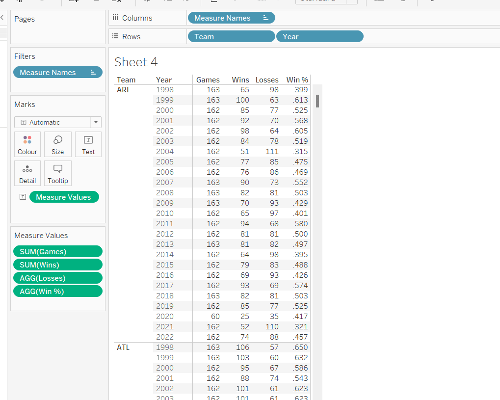
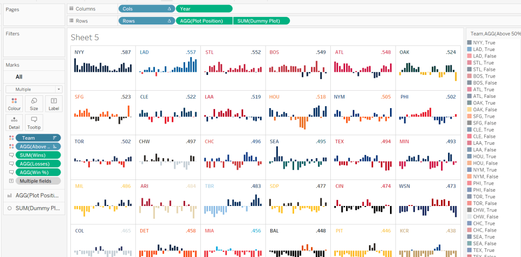
A colourful #WOW2022 challenge this week set by Kyle Yetter and using his favourite data – Baseball. Let’s jump straight in.
Building the required calculations
First up we need to calculate the core measure the viz is based on – % of wins
Win %
SUM([Wins])/SUM([Games])
I formatted this to 3 decimal places, then applied a custom number format to remove the leading 0 (custom number format looks like ,##.000;-#,##.000).
We also need to know the number of losses as this is part of the tooltip.
Losses
SUM([Games]) – SUM([Wins])
Let’s pop all these out into a table (I formatted all the whole numbers to display without any decimal places).
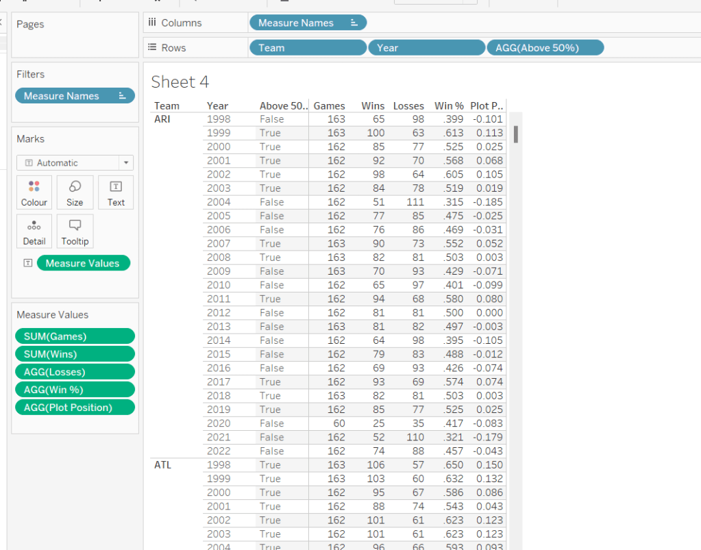
The viz however isn’t plotting the actual Win%, it’s plotting the difference from 50% (or 0.5), so values less than 50% are negative and those above are positive.
Plot Postion
[Win %] – 0.5
And we also need to know whether the Win% is above 50% or not
Above 50%
[Win %]>0.5
Pop these out onto the table too
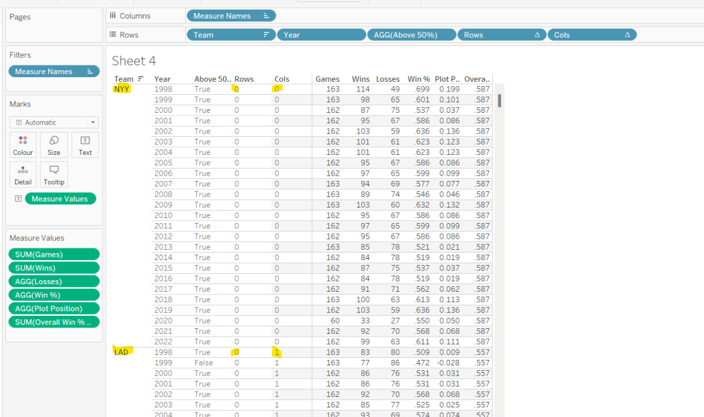
The viz also displays the overall Win% for each team, and also uses this to sort the data. As it is used for sorting, we need to use an LoD calculation (rather than a table calculation).
for each team, get the total wins, and divide by the total games for the team. Format this to 3 dp with no leading 0 as before.
pop this into the view (you’ll see it’s the same value for each row for a single team), and then apply a Sort on the Team field to sort descending by the Overeall Win% LOD.
Now we have the data sorted, we can create the fields needed to build the trellis chart.
I have already blogged challenges relating to trellis charts / small multiples (see here) which in turn reference other blogs in the community, so I’m not going to go into all the details. We just need to build two calculated fields to identify which row and which column each Team will sit in. The table is fixed at 6 columns wide as the data wea re using is static. Some solutions work with a more dynamic layout depending on how many entities you need to display. We’re keeping things simpler.
Cols
FLOAT(INT((INDEX()-1)%6))
Rows
FLOAT(INT((INDEX()-1)/6))
Add both these fields to the table as discrete dimensions (blue pills), and as they are both table calculations, set them both to Compute Using – > Team.
Building the Core Viz
On a new sheet, add Cols to Columns as discrete dimension, Rows to Rows as discrete dimension and Team to Detail. Set both Rows and Cols to Compute Using Team.
Add Year as continuous (green) pill to Columns and Plot Position to Rows and change the mark type to Bar and reduce the size. Sort the Team field based on Overall Win% LOD descending.
Add Wins, Losses, and Win% to the Tooltip shelf and adjust the tooltip to display as required. Add Above 50% to the Colour shelf (you may need to readjust the size). Leave the colours as they are for now – we’ll deal with this later.
Adding the labels
Create a new calculated field
Dummy Plot
FLOAT(IF [Year]=2000 OR Year = 2020 THEN 0.35 END)
This is basically going to position a mark at height 0.35 but only if the year is either 2000 or 2020. These values were all just based on a bit of trial and error as to what worked to get the desired result.
Also create a field
LABEL:Team
IF [Year]=2000 THEN [Team] END
and
LABEL:Win%
IF [Year]=2020 THEN [Overall Win % LOD] END
format this to 3dp and exclude the leading 0.
Add DummyPlot onto Rows and change the mark type of this measure to circle. Amend the Tooltip of this marks card so it’s empty.
Add LABEL:TEAM and LABEL:Win% to the Label shelf, and adjust the label so both fields sit side by side (only 1 value will only ever actually display). Adjust the table calculation of both the Rows and Cols pills so they now compute using both the Team and the LABEL:Team fields.
Adjust the alignment of the labels so they are positioned bottom centre. Set the font colour to match mark colour and bold.
Then reduce the size of the circle mark to as small as possible, reduce the opacity of the mark colour to 0.
Now make the chart dual axis and synchronise the axis. Remove the Measure Names field that has automatically been added to the All marks card.
Hide all the headers and axis (uncheck Show Header), remove all grid lines, zero line, axis rulers.
Hide the null indicator (bottom right).
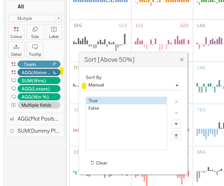
Colouring by Team
Copy the colour palette text Kyle provided into your preferences.tps file (usually located in the My Tableau Repository directory). For more information on working with custom colour palettes see this Tableau help article.
You’ll need to save your workbook and re-open for the new palette to be available for use.
In order to prevent having to manually set all the colours (and believe me you don’t want to do this!), perform the following steps in order
Add Team to also be on the Colour shelf. Click on the 3 dots (…) that are to the left of the Team pill on the All marks card, and change it to Colour. This means there are now 2 fields on colour. Move the Team field so it is listed above the Above 50% pill. This means your colour legend should be listed as <Team>, <True|False>
Adjust the Sort of the Above 50% pill, so it is manually sorted to list True before False.
Now change the Sort on the Team field so it is sorted alphabetically ascending instead. This will cause the viz to change its sort order, but don’t worry for now. It also changes the list on the colour legend, so ARI, True is listed first then ARI, False etc.
Now edit the Colour Legend and select the new MLB Team Colours palette we added. Click the Assign Palette button to automatically assign the colours. As we’ve made sure the entries listed are in the right order, they should get the correct colours.
Change the Sort on the Team field back to be based on Overall Win% LOD descending
And that should be it. You can now add the viz to a dashboard and publish. My published version is here.
It’s a double whammy this week – a #PreppinData & #WOW2022 combo! And I’m going to attempt to blog a solution guide to both! Wish me luck… it may take some time!
The #PreppinData & #WOW2022 crew combined with the requirement to prep some Salesforce data with Tableau Prep as per the challenge here, and to then use the output to visualise in Tableau Desktop as per the challenge here.
Prepping the Data
Two files were provided for the input: Opportunity provided 1 row per opportunity, and Opportunity History providing multiple rows per Opportunity, where each row indicated the stage in the lifecycle the opportunity goes through.
The first requirement was to pivot the Opportunity data, to get 2 rows per Opportunity; 1 indicating the date opened, and the other indicating the date closed (or expected to be closed).
After connecting to the Opportunity date and adding a Clean step to view the contents, add a Pivot step to transform Columns to Rows, adding the CloseDate and CreatedDate fields to the pivot.
Before adding any further steps, rename Pivot1 Names to Stage and rename Pivot1 Values to Date.
Add a Clean Step.
Change the CloseDate value in the Stage field to be renamed to ExpectedCloseDate, and the change the CreatedDate value in the Stage field to be renamed to Opened. To do this, simply double click on the value and type in.
We then need to further update this field, based on whether the Opportunity record is closed or not. The requirement said to refer to the StageName field for this, even though there is an IsClosed field. I chose to stick with the requirements.
Create a calculated field
Stage
IF CONTAINS([StageName], ‘Closed’) AND [Stage]=’ExpectedCloseDate’ THEN [StageName] ELSE [Stage] END
Having applied this logic, your Stage field should now contain 4 values rather than 2.
Then remove all fields except for Date, Stage, Id and StageName, and rename the step Opportunity.
We now need to combine with the OpportunityHistory data. This data contains a row for each stage the Oppotrunity goes through. What we’re looking to do is to supplement this with a Stage = Opened record, and, in the event the opportunity hasn’t been closed, a Stage = ExpectedCloseDate record.
For this we’ll need a Union step.
Add in the OpportunityHistory data, and add a Clean step. Rename this step to History. To help with the union step, rename the CreatedDate field to Date. In the Opportunity step above, rename Id to OppID.
Add a Union step to the Opportunity path. Then drag History and add it to the Union. Add a Clean step and view the data. If the renaming worked ok, you should have 6 fields.
Update the SortOrder field by creating a new calculated field
SortOrder
If [Stage]=’Opened’ THEN 0 ELSEIF [Stage]=’ExpectedCloseDate’ THEN 11 ELSE [SortOrder] END
Update the Stage fields for those which have null records.
Stage
IF ISNULL([Stage]) THEN [StageName] ELSE [Stage] END
All the records with SortOrder = null are actually duplicates now, as we have them captured as part of the pivoting step we did initially. All these records can therefore be excluded (click on the null value in the SortOrder field, right click and Exclude).
Now remove the redundant fields of Table Naems, Stage Name, and you should be left with 4 columns and 876 rows of data, which you can output to csv or similar.
Building the Viz
Now we’ve got the data sorted, we can build the viz. If you haven’t done the PreppinData challenge, you will need to download the Opportunity.csv input file and the provided Output.csv files from the website.
Modelling the data
In Tableau Desktop, connect to the file generated in the above process (or download the output file from the PreppinData site if you haven’t built your own). My file was called 2022_06_08_SalesOpps.csv.
Then add an additional connection to the Opportunity.csv file you used in the Prep challenge (or again download from the PreppinData site).
Add a relationship from Opp ID to Id
Building the Open Opportunities chart
We need to work out what Lorna has used to identify an ‘open’ opportunity. After a bit of trial and error, I discovered it was any opportunity that had an ExpectedCloseDate stage. To identify these, create a new calculated field
This will return the value 1 against all the rows for an Opp ID which have an ExpectedCloseDate Stage, and 0 for those that don’t.
As you can see below, all the rows for the 1st two Opp IDs listed are flagged with 1 as they have at least 1 stage which is ExpectedCloseDate. For the other Opp IDs listed, they are all 0.
Right click this field and drag to the Filter shelf. When you release the mouse, choose the All values option from the dialog displayed, then Next
Then select 1 to filter the sheet just to the the Opportunity records we care about.
Add Opp ID and Name to Rows. Add Date to Columns as a continuous exact date (green pill).
Change the mark type to Circle and add the Stage field to Colour, and adjust accordingly using the relevant colour palette.
To add the grey lozenge marks, add another instance of Date next to itself. This will create a second marks card called Date2. Remove the Stage field from the Colour.
Change the mark type of the Date2 card to line, and adjust the colour to a light grey and the size to be a bit larger.
Make this chart dual axis and synchronise the axis. Move the lozenge marks ‘to the back’ (right click on the top axis and move marks to back.
We need to identify those with a Close Date in the past. For the purposes of this exercise, I hardcoded ‘today’ into a parameter pToday and set it to 8th June 2022. Otherwise in a ‘live’ situation I would refer to the TODAY() function rather than the parameter.
Add this field to the Rows before the Opp ID field. You won’t get the symbol against every row, but don’t worry about that just yet. Format this circle to be right aligned and red font.
Now we need to mange the sorting. Firstly create a new parameter
pSortBy
an integer containing values 1 and 2, defaulted to 2 where the values displayed are aliased as below
To determine how long an opportunity has been open we need
Days Open
DATEDIFF(‘day’, [Created Date], [Close Date])
We then need a field to utilise this parameter and determine the measure we can use to sort
Sort By
CASE [pSortby] WHEN 1 THEN SUM([Days Open]) * -1 ELSE INT(MIN([Close Date])) END
If we’re sorting based on the Longest Open we’ll use the number of days the opportunity has been open. By default the data will ascend from smallest to largest value but we want the opposite, so we multiple by -1.
If we’re sorting based on the Close Date. then we can just use the Close Date field itself, converted into a integer.
Add Sort By to Rows , change it to be discrete (blue) and then move it to be the first pill on the Rows shelf. The data should now be reordered, and you’ll now get a red circle per row.
Add the pSortBy parameter to the sheet and test the sorting. Once happy, hide the Sort By field (right click and uncheck Show Header), then Hide Field Labels for Rows. Remove row & column dividers and make the first column narrow. You should now have your chart.
Building the legend
Lorna’s decided the legend should be circles rather than the ‘out of the box’ squares, so a custom sheet is required.
On a new sheet, add Sort Order discrete dimension (blue pill) and Stage to Rows. Add Stage to Filter and exclude Closed Lost and Closed Won. We’re going to need to organise these Stages into 2 rows and 3 columns, so we need some fields to help.
Row Index
IF [Sort Order] ❤ THEN 1 ELSE 2 END
Column Index
IF [Sort Order] = 0 OR [Sort Order] = 4 THEN 1 ELSEIF [Sort Order]=2 OR [Sort Order]= 8 THEN 2 ELSE 3 END
Note I’m very much ‘hardcoding’ this as this is acceptable for this view I believe.
Add Row Index as discrete dimension to Rows and Column Index as discrete dimension to Columns, and move Stage to Label.
Type in FLOAT(MIN(0)) into Columns to create a fake axis. Change mark type to circle, and add Stage to Colour. Increase the width of each row if all your text isn’t showing.
Edit the axis so it is fixed to start at -0.1 and end at 0.5 – this will shift the circles to the left.
Uncheck Show Header against the Row Index, Column Index and the MIN(0) axis. Then remove all gridlines and row/column dividers. Turn off tooltips.
The Summary View
Now we need to work on the summary values at the top of the screen. We’re focussing on ‘open’ opportunities in the current month, which is June 2022 (based on the pToday parameter). We need Has Expected Close Date Stage = 1 on Filter, and to identify the current month we use
Now let’s have closer look at the rows of data we’re got so far.
Add Opp ID, Sort Order (discrete dimension) and Stage to Rows and Amount to Text.
What we’re looking for is to aggregate the Amount by Stage, but if we remove the Opp ID and Sort Order fields, we don’t get the right values
This is because we’ve got multiple rows per Opp ID, so the value is counting in multiple Stages. We want to just limit the rows to the latest Stage before the ExpectedCloseDate stage.
First lets work out the maximum Sort Order value for each Opp ID that isn’t the Expected Close Date row (which has a Sort Order = 11).
Max Stage Sort Order
{FIXED [Opp ID]: MAX(IF [Sort Order]<=10 THEN [Sort Order] END)}
Add this to the tabular view as a discrete dimesion. Hopefully you can see from the image below that we’re getting the value we want.
Now let’s identify the matching row
Stage To Keep
[Sort Order] = [Max Stage Sort Order]
Add this to the Filter shelf and set to True.
Now if we remove Sort Order, Max Stage Sort Order and Stage from Rows, we get the correct summarised values.
Move Stage to Columns and add Stage to Text and Colour. Set to Fit Entire View. Align Text centred and remove all row/column dividers. Uncheck Show Header against the Stage field on Rows. Use the Colour Legend to manually sort the values into the correct order.
Update the sheet title.
Past Close Date
This is a bit simpler… add Past Close Date? to Filter and select ●. Add Stage to Filter and select ExpectedCloseDate. Add Amount to Text and the auto generated field Opportunity.csv (Count) to Text.
Format the text and add a title, and you’re all done You just need to add everything to the dashboard now.
Kyle set a challenge this week inspired by a chart Ann Jackson demoed at #data22 as part of her Advanced Speed Tips session with Lorna Brown. This was both an in person presentation and available virtually (hence the link to the video above). I couldn’t attend the in person session due to a clash, but I had already watched the session prior to this challenge being set, so I attempted to build from memory without referring back. To find out what to do, you can either watch Ann herself demonstrate via the link above, or read on 🙂
Building the WAR chart
Build a basic bar chart by adding Name to Rows and WAR to Columns
Whilst we could sort the data at this point, we’re going to leave for now, as we want the ‘ranking’ field to define the sort.
Now rather than use the RANK table calculation option, the essence of this being included in a tipping session, is to utilise the INDEX table calculation instead. By using INDEX, we don’t need to create as many fields as if we used RANK. We can reuse the INDEX across all the charts.
So, let’s create that field
Index
INDEX()
Format this to be a number with 0dp and prefixed by #
The INDEX() table calculation simply lists your rows or columns of data from 1 to however many entries there are. The Index can span the whole width/length of the table or can restart at intervals depending how you choose to partition/structure your table. You can also control how the data will be indexed based on how you want it sorted.
Add Index to Rows, then change it to be discrete (blue), and position in front of Name. Edit the table calculation setting so that it is computing using Name and is sorted by WAR descending.
We need to capture the name of a player, so we’ll create a parameter for this
pSelectedPlayer
String parameter defaulted to Ken Giffey Jr.
Show this parameter on the view.
We also need a field to identify whether the row matches the parameter
Is Selected Player?
[pSelectedPlayer] = [Name]
Add this to the Colour shelf and adjust accordingly.
Then re-edit the table calculation so it is computing by Is Selected Player as well.
Note – to prevent having to change the table calculation, the alternative is to make the Is Selected Player field on the Colour shelf an Attribute (just choose this setting from the context menu when you click on the pill).
Additionally add Is Selected Player to Rows before Index., the manually sort that field so True is listed first. This will move the relevant record to the top of the scree, but the rank number will be preserved.
Hide the Is Selected Player field (uncheck Show Header), and Hide Field Labels for Rows.
Adjust row dividers, so the divider is at level 1, and the header is dotted line, while the pane is solid.
Remove column gridlines, but add a column axis ruler.
Show mark labels, set them to be left aligned and the colour to match mark colour. You may need to widen the rows to see the labels display.
Add a border to the bars via the Colour shelf.
Format the Index and Name fields displayed – I used Tableau Regular font size 12, and right aligned the Index field.
Update the tooltip and add a header.
The final step, which we’ll do now, is to add a couple of fields to stop the rows from being highlighted when selected on the dashboard.
Create a field True = TRUE and False = FALSE, and add these fields to the Detail shelf.
Building the Batting Average chart
Create a basic bar chart with Name on Rows and BA on Columns. Add Is Selected Player to Colour and apply border.
Format the BA field using custom formatting of .000;-.000 then show mark labels, and left align and format as you did above.
Add Index to Rows, make discrete and move to be in front on Name. Adjust the table calculation to compute by Name and Is Selected Player and this time adjust the sort to use BA descending.
We now need to filter the data to only show the 5 rows above & below the selected index. First we need to identify them.
Selected Player Index
WINDOW_MAX(IF ATTR([Is Selected Player]) THEN INDEX() END)
The inner IF statement returns the index associated to the selected player. The WINDOW_MAX function then ‘spreads’ this value across all the rows in the data. So we can then identify the records we need
Records to Keep
[Index] >= [Selected Player Index]-5 AND [Index] <= [Selected Player Index]+ 5
Add this to the Filter shelf and initially select all the values.
Now edit the table calculation settings of this field. It will now contain nested calculations – one related to Index and one related to Selected Player Index. Ensure both are computing by Name and Is Selected Player and both are sorting by BA descending.
Then edit the filter and just select True.
Now apply the tooltip, set the heading and format the headers, remove gridlines, row dividers etc.
Then follow the same steps to create similar charts of the OPS and HR measures, remembering to apply the sorts on the table calculations to the relevant field.
Adding the interaction
Once you have all four sheets built, add to a dashboard. Then create a parameter action to select the player from the WAR sheet.
Select Player
On select of the WAR sheet, set the pSelectedPlayer parameter passing in the Name field.
Then create a filter action to prevent the selection on the WAR sheet from remaining highlighted.
Unhighlight WAR
On selection of the WAR sheet on the dashboard, target the WAR sheet directly and use Selected fields, setting True = False.
Fingers crossed and you should now have a working dashboard. My published version is here.
It was Kyle’s turn to set this jittered box plot challenge this week. While it may sound complicated, this is quite a straightforward challenge this week, made more so as Kyle very kindly provides references to other blogs which help you.
So let’s build…
Firstly you need to download the 2 excel files Kyle provides, then relate them via the Team field (this should happen automatically).
On a new sheet add Team to Columns, Age to Rows and Player Code to Detail. Change the mark type to circle, and reduce the Size slightly.
From the Analytics pane, drag box plot onto the sheet and drop onto the Cell image that displays.
Create a new field which is the key field for the jittering functionality
Jitter
RANDOM()
This just generates a random number between 0 and 1.
Add this to Columns and change the view to Entire View so its not all squashed up.
We’ve got our jittered box plot. Now we just have to add in the additional functionality required.
Drag the Playoffs field so that it’s above the line in the data pane on the right hand side (ie change it from a measure to a dimension). Then right click > Aliases to alias to 0 and 1 values to the labels required
Add this field to the Columns in front of the Team field. Re-order so ‘Playoff Teams’ is listed first (I just click on the field name and drag it to the left).
We also need to sort the data based on the median value per team. We need a new field for this.
Median Age per Team
{FIXED [Team]:MEDIAN([Age])}
Add a sort to the Team field, so it sorts by the Median Age per Team descending
Add League to the Filter shelf and set to AL.
Format the worksheet and set the Column Banding to be level 0 and band size 1 to shade the sections as required.
Then adjust the format of the gridlines to remove all row and column gridlines.
Finally, add Name to the Tooltip and adjust accordingly. Then hide the Jitter axes (uncheck Show Header) and adjust the Age axis so it is fixed to start at 18.
You can now add this to a dashboard and you’re done! My published viz is here.
Candra McRae was back to set the challenge this week. I found it relatively straightforward, so if you’re relatively new to Tableau, this is quite a good challenge to start with. In this we’ll cover
Grouping the states
Applying the sort
Adding the total value
Adding the interactivity
Grouping the states
The states need to be grouped based on the initial letter. Candra stated she wasn’t expecting a large IF STARTWITH… type formula. I did it by making use of the fact characters can be converted into ASCII which provides a numerical representation of a letter, which we can then utilise. So we need
State Initial ASCII
ASCII(UPPER(LEFT([State],1)))
This takes the 1st letter of the State, ensures it is uppercase, and converts to ASCII. You can see below what this looks does
With this knowledge, we can then create
State Group
IF [State Initial ASCII] <=77 THEN ‘A-M’ ELSE ‘N-Z’ END
and you can now easily create the stacked bar chart (note, I’ve already removed the various gridlines etc)
Applying the Sort
The ultimate intention is to capture the Category a user clicks on into a parameter, so we need to define that parameter
pSelectedCategory
A string parameter defaulted to Office Supplies
Show this parameter on your sheet, so you can manually test how the sort will work by manually changing the values.
Create a new calculated field to define the sort
Sort
IF [pSelectedCategory]=[Category] THEN 0 ELSE 1 END
Then edit the sort property of the Category field that’s on the Colour shelf as below
Now change the value in the parameter box to Technology and see how the chart changes.
Adding the total value
Create a new field to store the total values
Total Sales by State Group
{FIXED [State Group]: SUM([Sales])}
Add this onto the Detail shelf, then add a reference line per line as below
Adding the interactivity
Once you’ve added the chart onto a dashboard, you need to add a parameter action which will set the pSelectedCategory parameter with the value from the Category field on select.
To prevent the selected category from ‘remaining selected’ on click, I applied the ‘true=false’ trick I use a lot.
Create a field True = true and a field False = false, then add both to the Detail shelf of the chart viz. On the dashboard add a new filter action which on select passes selected fields only setting true = false. As this condition can never be true, the filter doesn’t apply and this clears the highlight action.
And that is it for this week – short & sweet, but covers a handful of bite-size concepts. My published viz is here.
It was Luke’s turn to provide the challenge for this week – to produce a modified mekko chart (or marimekko chart / mosaic plot – see here for more information).
Luke suggested it would require LODs to solve, but that it would also be possible with table calcs. I tackled it with a mixture of both, mainly based on what felt right at the time.
Like most challenges I worked out the data I needed for the final viz in tabular form first, so I could ratify the numbers and calculations I built before building the viz.
Building out the data
Building the viz
Building out the data
The y-axis of the viz plots the % of profitable orders for each Sub-Category. So the first thing we need to do is identify a profitable order. A single order can have multiple product lines, where each product line might be associated to a different Sub-Category. We need to determine whether the profit against all the products for the same Sub-Category on a single order is positive (ie profitable) or not. We use an LoD for this
For each Sub-Category within a single Order ID, check if the total profit is a positive number. If it is then return 1 else 0. I’m purposefully choosing 1 and 0 to help with the next step.
To determine the % of profitable orders, we need to know the total of all the profitable orders as a proportion of all the orders for a Sub-Category.
Count Orders
COUNTD([Order ID])
The number of distinct orders.
Profitable Orders
SUM([Order Is Profitable])/[Count Orders]
formatted to be a percentage with 0 dp.
Put these into a table, along with the Sales measure, and you can see what’s going on
We need to sort this data, first by Profitable Orders desc, then by Sales desc. And we need to sort in a way that can be used once this table of data is displayed in the required Viz format. If we just wanted to sort this table of data displayed here, we can use a technique described in Tableau’s KB here. However this doesn’t work for the viz, as it relies on the newly created dimension existing on the Rows shelf, which won’t work when we get to building the viz, as we can’t put it on rows. Since the field also contains table calculations (Rank), you can’t reference the field in the Sort option of a pill.
Anyway, based on this, and after a bit of trial and error, I managed to create a sort field that I could reference.
Here I’m building up a string field combining the Profitable Orders field, that I’ve rounded to 2 decimal places, with the Sales field that I’ve rounded to $millions at 2 decimal places. This is to ensure that since we’re working with string data, 800 is ordered after 8000 when sorting descending.
Pop this into the view, and set the sort property of the Sub-Category pill to sort by Sort descending
There may be a better way of doing this, and I’m not sure it would work in all circumstances, but it worked for this challenge. I’ll be interested in seeing how others approach this element of the challenge.
Now, that’s resolved, let’s get the other fields we need.
Along with the Profitable Orders %, we also need to display the percentage of non-profitable orders
Non-Profitable Orders
1 – [Profitable Orders]
I also chose to format this to % with 0dp (purely for display purposes in the table).
The width of the bars in the viz, is based on the % of total sales, so let’s work that out…
% of Total Sales
SUM([Sales])/TOTAL(SUM([Sales]))
TOTAL is a table calculation that ‘totals’ up the sales in the table. In this case we care about the whole table, but as with any table calculation it can be set to apply to certain partitions in the view.
Having worked out the % of Total Sales, we now need to work out where to plot each Sub-Category along the x axis, as due to the variable width of the bars, we can’t just use the Sub-Category dimension on the Columns shelf.
Each Sub-Category is going to be positioned based on its % of Total Sales relative to it’s position in the sort order. That is we need to work out the cumulative value of % of Total Sales.
% of Total Sales Cumulative
RUNNING_SUM([% of Total Sales])
This totals up the % of Total Sales as we go down the rows in the table, as shown below. I’ve included column grand totals, so you see that % of Total Sales adds up to 100%, and the cumulative version sums up the previous values as it goes down the table, ending in 100% (note the numbers have been rounded due to 0dp, but if you changed the formatting, you’d see this better).
Now we have all the core elements we need to build the viz.
Building the Viz
On a new sheet,
add Profitable Orders to Rows
add Sub-Category to Detail
add % Total Sales Cumulative to Columns
Edit the table calculation setting of the % Total Sales Cumulative field, so that it is computing by Sub-Category (Compute Using -> Sub-Category option from the drop down /context menu of the pill).
Set the sort option against the Sub-Category pill to sort by the Sort field descending
Change the mark type to Bar.
Add % of Total Sales to the Size shelf. Then change the Size option (by clicking on the button) from Manual to Fixed, and set the alignment to Right
Add Non-Profitable Orders to Rows, then right-click on the relevant axis, Edit Axis, and set to reversed
This is the basic viz – it just now needs formatting
Add Measure Names to Colour and adjust accordingly
Set a white border around each bar (via the Colour shelf)
Edit the % Total Sales Cumulative axis, and change to start from -0.05 which will give a bit of space at the front
Remove all row / column borders and gridlines
To get the black bar visible across the 0 line, I ended up adding a reference line; a constant set to 0, formatted to a black line.
Hide the axes
Add appropriate fields to the Tooltip and set accordingly.
Add Segment to the Filter shelf.
Then just add to a dashboard, and you’re all set. My published viz is here.