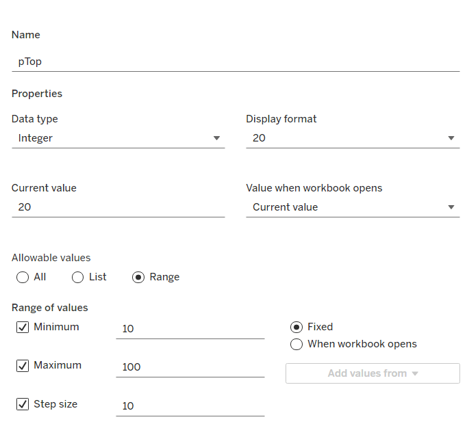
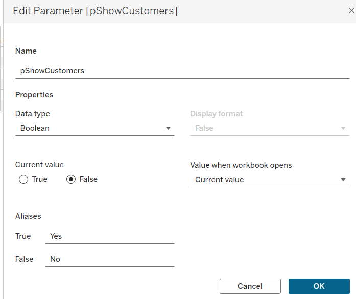
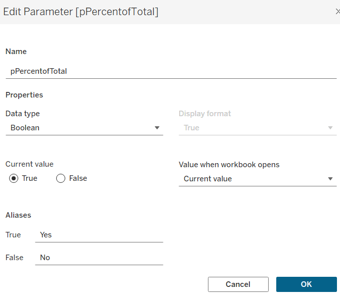
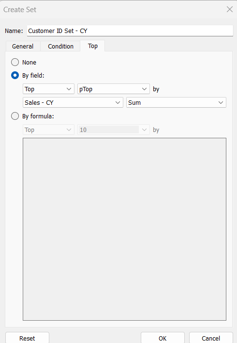
Erica set this week’s challenge and provided multiple levels specifically aimed a newer users of Tableau. My solution is for Level 3.
Setting up the calculations
First, create a parameter to capture the Sub-Category we care about
pSelectedSubCat
string parameter defaulted to Tables
Create a new field
Is Selected SubCat
[pSelectedSubCat]= [Sub-Category]
then create another field
Product to Display – Step 1
IIF([Is Selected SubCat], [Product Name], ”)
On a new sheet add Sub-Category and Product to Display – Step 1 to Rows. Show the pSelectedSubCat parameter. You will see that the Product rows only show for the Sub Category entered in the pSelectedSubCat parameter
We want to show the average of the product sales for each Sub-Category, so we can create
Add this to Text. By default it will aggregate this value to SUM, change it to AVG. For the rows associated to the selected Sub-Category the value of this field is the same whether its SUM or AVG, as it has been calculated at the level of detail being displayed on the row (Sub-Category and Product Name). For the other rows, by changing the aggregation to AVG we are getting the required value, which is essentially the sum of all sales associated to the Sub-Category divided by the number of distinct products. Sort the Sub-Category pill by the Average of the Sales by Sub Cat & Product field descending
Additionally, sort the Product to Display – Step 1 field the same way
We need to identify the top 5 records for the products associated to the selected Sub-Category. We will use a set for this. Right click on Product to Display – Step 1 > Create > Set
Product to Display Set
Select the Top tab and select the top 5 by formula
AVG(IF [Is Selected SubCat] THEN [Sales by Sub Cat & Product] END)
Add this to Rows and you should get In displayed against the product rows with the highest values
With this we can start to think about the ‘other’ text we need to display, but for this we need a handle on the number of products in each Sub-Category. Create
Count Products Per Sub-Category
{FIXED [Sub-Category]: COUNTD([Product Name])}
Add to Text so you can see the value, and then subsequently we can create
Product to Display – Step 2
IF NOT([Is Selected SubCat]) THEN ” ELSEIF [Product to Display Set] THEN [Product Name] ELSE ‘Other: ‘ + STR([Count Products Per Sub-Category] – 5) + ‘ Products’ END
Add to Rows to see the behaviour
The viz also needs to show an index value against the top 5 rows, so create
Index to Display
IF MIN([Is Selected SubCat]) AND MIN([Product to Display Set]) THEN STR(INDEX()) ELSE ” END
Add this to Rows as a blue discrete pill in front of the Product to Display – Step 2 field. Adjust the table calculation setting so the Sub-Category field is unchecked.
Next, we’re going to need to display a reference line that is the overall average product sales for the Sub-Category. This may sound like it’s what we already have, but that field is at the Sub-Category and Product Name level of detail, and we need to aggregate this back up to be at the Sub-Category level, so we create
Avg Sales by Sub Cat and Product
{FIXED [Sub-Category]: AVG([Sales by Sub Cat & Product])}
which is the average of the field we previous created but per Sub-Category. Pop this into the table to see what is happening. For the rows where the Products aren’t showing, the values match, but for the rows where the Products are displayed, you get the overall average, which is the same for all the rows.
If we now remove Product to Display – Step 1 from Rows (and amend the Index to Display table calc so it is not longer computing by this field too), we should have the data we expect. Format the Sales by Sub Cat & Product field to be $ with 0 dp.
Building the Viz
On a new sheet add Sub-Category, Product to Display Set, Index to Display and Product to Display – Step 2 to Rows and Sales by Sub Cat & Product to Columns and aggregate to AVG.
Sort the Sub-Category pill by the Average of the Sales by Sub Cat & Product field descending and apply the same sort to the Product to Display – Step 2 field. Edit the table calculation of the Index to Display field so it is not computing by Sub-Category.
Create a new field
Colour
IF [Is Selected SubCat] AND [Product to Display Set] THEN ‘Dark’ ELSEIF [Is Selected SubCat] THEN ‘Light’ ELSE ‘Grey’ END
Add this to Colour shelf and adjust accordingly.
Add Avg Sales by Sub Cat & Product to the Detail shelf, then add a reference line based on the Average of this field
Widen each row and from the Label shelf check Show mark labels. From the Tooltip shelf uncheck Show tooltips.
Hide the In/Out Product to Display Set field in Rows (uncheck show header). Format the font and style of the header columns, then hide the header field labels and hide the axis. Adjust the row banding and set all gridlines, zero lines, axis rulers and column dividers to none. Change the title of the sheet.
Test the behaviour by manually changing the value of the parameter.
Adding the interactivity
Add the sheet to a dashboard, then create a parameter dashboard action
Set SubCat
On select of the viz, update the pSelectedSubCat parameter passing in the value from the Sub-Category field.
For this week’s #WOW2024 challenge, I asked the community to rebuild this unit chart depicting the medals won each day by country. I built this out while the Olympics was on, curating the data myself, so there is a chance it may not match ‘official’ records (some events got delayed, some medallists may have since been disqualified or reinstated).
Creating custom shapes
The challenge requires a set of custom shapes representing the sports. Download all the image files from the Olympic Sports directory here and save them into a new folder in your …\My Tableau Repository\Shapes directory (as discussed here).
Building the viz
Add Day as a discrete (blue) pill to Columns. Change the mark type to Shape and add Event to Shape. Choose the Olympic Sports shape palette you created above (click reload shapes if it isn’t visible), then click Assign Palette. As the images are named exactly as the events are, they should all match without the need to manually assign each shape to the event. Also note, doing this step first, ensures all events are listed and assigned.
Add Country to Filter and select Great Britain. Show the filter and change to a single select drop-down and customise so you can’t select the ‘All’ option.
You can immediately see the basic layout we’re after. However, as we ned to display shapes and circles to represent the medal types, we need to use a dual axis chart. But at this point there is no axis.
Change the Day field on Columns to be continuous (green). This gives us a axis, but the marks for each event are on top of each other.
Create a new field
Index
INDEX()
Add to Rows and adjust the table calculation to compute by Event.
Edit the Index axis and set it to be reversed. Then add Medal, Country and ID to Detail (to ensure distinct marks are displayed), and readjust the table calculation of the Index field to also compute by these fields as well.
Add Event Detail, Athlete and Notes to the Tooltip shelf, and adjust accordingly.
If you change the Country filter to another entry, eg Albania, the display won’t show every day as they only won medals on days 15 & 16. They only won 1 medal on those days too, so the y-axis has also altered. We don’t want this to happen – the ‘frame’ of the display should remain regardless of the country selected. To resolve this, change the data type of the Day field to Number (decimal) (right click field > change data type). Then edit the Day axis and fix from 0.5 to 16.5 – changing the data type means we can fix using decimal numbers which means we don’t get 0 and 17 displayed on the axis.
To fix the height of the chart, we could ‘hardcode’ it as well, but while the number of days in an Olympic Games cycle is always static for cycle, the maximum medals won per day could change – so if I wanted to reuse this chart on a set of data for a different Olympic Games, I’d have to find out what the max was to hardcode. So instead, we’ll make this dynamic using a nested LoD calc.
{FIXED Day, [Country]: COUNT([Daily Medal Winners])} returns the count of medals per day per country
{FIXED Country: MAX(<code above>)} then returns the max number of the above per country
then the outer (FIXED: MAX()} statement gets the maximum of all of these
Add this to the Detail shelf, then add a Reference Line to the Index axis that shows the average of this field, and doesn’t display any line or values, or tooltips. The axis should extend.
If you select other countries, the axis should remain the same.. until you choose USA and it moves to show 20, as the maximum number of medals in one day has been hit.
Again we don’t want this causing any shift in the ‘frame’. So to resolve, double click into the Max Medal Count field and type + 1 at the end, so the reference line is actually 1 higher. The 20 is still visible, but now it’s visible for all countries. This axis won’t be displayed anyway, but now it won’t shift at all either. Chang the
Now the main framework is in place, we can add the ‘medals’. Add another instance of Day to Columns. On the Day(2) marks card, change the mark type to circle then add Medal to Colour and adjust accordingly. I used bronze: #ce8451, silver: #b3b7b8, gold: #edc948 and the reduced the opacity to 50% and added a dark grey border. Re-order the values in the colour legend and then edit the table calculation on the Index pill again, and ensure Medal is listed first. This should make any bronze medals won on a day be listed at the top, followed by silver and then gold
NOTE – I noticed at this point, that adjusting the Index meant I lost the reference line, so I had to reapply.
Make the chart dual axis and synchronise the axis. You may need to make adjustments to the size of each of the marks cards so the event shapes are within the circles, but this is probably best done after you’ve added to the dashboard.
Hide all gridlines, zero lines, axis rulers and row & column dividers. Hide the Index axis (uncheck show header). Edit the bottom Day axis, delete the title and set the tick marks to None for both major & minor tick marks. Edit the top axis and hide the title. Increase the font of the top axis labels.
Finally we need to show the count of the medals each day. Create field
Count Medals by Country Per Day
{FIXED Day, [Country]: COUNT([Daily Medal Winners])}
then
Label: Medal per Day
IF INDEX()=SIZE() THEN SUM([Count Medals By Country Per Day]) END
Add this to the Label shelf of the ‘circles’ marks card, and adjust the table calculation so it’s computing by all fields except Day and that Medal is listed at the top. The label should display underneath the last circle.
Format the font to be a bigger/bolder style and explicitly align bottom centre, then add to a dashboard and that should be it.
As the Paris 2024 Olympic Games continues, then #WOW continues with another Olympic themed challenge, this time set by Kyle.
Defining the core calculations
There’s a lot of LoD calcs used in this, so let’s set this up to start with.
Avg Age Per Sport
INT({FIXED [Sport]: AVG([Age])})
Avg Age Per Sport– Gold
INT({FIXED [Sport]: AVG(IF [Medal]=’Gold’ THEN [Age] END)})
Avg Age Per Sport– Silver
INT({FIXED [Sport]: AVG(IF [Medal]=’Silver’ THEN [Age] END)})
Avg Age Per Sport– Bronze
INT({FIXED [Sport]: AVG(IF [Medal]=’Bronze’ THEN [Age] END)})
Oldest Age Per Sport
INT({FIXED [Sport]: MAX([Age])})
Youngest Age Per Sport
INT({FIXED [Sport]: MIN([Age])})
Format all these fields to use Number Standard format so just whole numbers are displayed.
Let’s put all these out in a table – add Sport to Rows and then add all these measures
Kyle hinted that while the display looks like a trellis chart, it’s been built with multiple sheets – 1 per row. So we need to identify which row each set of sports is associated to, given there are 5 sports per row.
Row
INT((INDEX()-1)/5)
Make this discrete, and add this to Rows, and then adjust the table calculation so that it is explicitly computing by Sport, and we can see how each set of sports is ‘grouped’ on the same row.
Building the core viz
The viz is essentially a stacked bar chart of number of medallists by Age. But the bars are segmented by each individual medallist, and uniquely identified based on Name, Medal, Sport, Event, Year.
Add Sport to Columns, Age to Columns (as a continuous dimension – green pill) and Summer Olympic Medallists (Count) to Rows.
Change the mark type to Bar and reduce the Size a bit. Add Year, Event and Name to the Detail shelf, then add Medal to the Colour shelf and adjust accordingly. Re-order the colour legend, so it’s listed Bronze, Silver , Gold.
For the Tooltip we need to colour the type of medal, so need to create
Tooltip: Bronze
UPPER(IF [Medal] = ‘Bronze’ THEN [Medal] END)
Tooltip: Silver
UPPER(IF [Medal] = ‘Silver’ THEN [Medal] END)
Tooltip: Gold
UPPER(IF [Medal] = ‘Gold’ THEN [Medal] END)
Add all these to the Tooltip shelf, then adjust the Tooltip accordingly, referencing the 3 fields above and colouring the text.
The summary information for each sport displayed above each bar chart, is simply utilising the ‘header’ section of the display. We need to craft dedicated fields to display the text we need (note the spaces)
Heading – Medal Age
“Avg Medalling Age: ” + STR([Avg Age Per Sport])
Heading: Age per Medal
“Gold: ” + STR(IFNULL([Avg Age Per Sport – Gold],0)) + ” Silver: ” + STR(IFNULL([Avg Age Per Sport – Silver],0)) + ” Bronze: ” + STR(IFNULL([Avg Age Per Sport – Bronze],0))
Heading: Young | Old
“Youngest: ” + STR([Youngest Age Per Sport]) + ” Oldest: ” + STR([Oldest Age Per Sport])
Add each of these to Rows in the relevant order. Widen each column and reduce the height of each header row if need be
Adjust the font style of all the 4 fields in the header. I used
Sport – Tableau Medium 14pt, black, bold
Heading – Medal Age – Tableau Book 12pt, black, bold
Heading: Age per Medal – Tableau Book 10pt, black bold
Heading: Young | Old – Tableau Book 9pt, black
The title needs to reflect the number of medallists above a user defined age. To capture the age we need a parameter
pAge
integer parameter defaulted to 42
Then we can create
Total Athletes at Age+
{FIXED:COUNTD( IF [Age]>= [pAge] THEN [Name] END)}
Add this to the Detail shelf, then update the title of the viz to reference this field. Note the spacing to incorporate the positioning of the parameter later.
The chart also needs to show background banding based on the selected age. Add a reference line to the Age axis (right click axis > add reference line), which references the pAge parameter, and fills above the point with a grey colour
Ultimately this viz is going to be broken up into separate rows, but we need the Age axis to cover the same range. To ensure this happens, we need
Ref Line – Oldest Age
{FIXED: MAX([Oldest Age Per Sport])}
Add this to the Detail shelf, then add a reference line which references this field, but doesn’t actually ‘display’ anything (it’s invisible).
Tidy up the visual – remove gridlines, zero lines, row & column dividers. Hide the y-axis (uncheck show header). Remove the x-axis title. Hide the heading label (right click > hide field labels for columns). Hide the null indicator.
Filtering per row
Add the Row field to the Filter shelf and select the only option displayed (0). Then edit the table calculation and select all the fields to compute by, but set the level to Sport.
Show the Row filter and select the 0 option only. – only the first 5 sports are now displayed.
Name this sheet Row1. Then duplicate the sheet, set the Row filter to 1 and name the sheet Row2. Repeat so you have 7 sheets.
Building the dashboard
Use vertical containers to help position each of the 7 rows on the dashboard. For 6 of the sheets, the title needs to be hidden. I used a vertical container nested within another vertical container to contain the 6 sheets with no title. I then fixed the height of this ‘nested’ container and ‘distributed” the contents evenly. But I did have to do some maths based on the space the other objects (title & footer) used up on my dashboard, to work out what the height should be.
You’ll then need to float the pAge parameter onto your layout, and may find that after publishing to Tableau Public, you’ll need to edit online to tweak the positioning further.
Yusuke set this week’s challenge which is pretty tough-going. I got there eventually, but it wasn’t smooth sailing, and had a lot of false starts and changes to calculations throughout to get to the end. I will endeavour to explain where I had difficulties, but some of the calculations I came up with were more down to trial and error ( eg I wonder if this will work…?) rather than a known direction.
Modelling the data
We were provided with a version of Superstore and a State Abbreviations data set. I chose to use the Superstore Excel file I already had. I combined the two data sets in the data source pane using a relationship where State/Province in the Orders table of the Superstore excel file matched with the Full Name field in the State Abbreviations csv file.
As the data was just related to 2024, I added this as a data source filter (Year of Order Date = 2024)
Identifying the month
I decided I was going to use a parameter to select the month to filter. I first created
Order Date MY
DATE(DATETRUNC(‘month’,[Order Date]))
and then created a parameter
pOrderDate
date parameter defaulted to 01 Dec 2024, that I populated as a list using the values from the Order Date MY field. I set the display format to be a custom format of mmmm yyyy
Examining the data
On a new sheet, add State/Province and Abbreviation to Rows and Category to Columns to create a very simple ‘existence table’.
The presence of the Abc in the text table, shows that at least 1 record exists for the State/Category combination during 2024.
We can see some states, such as Arkansas, District of Colombia, Kansas etc don’t have any records at all for some Categories. However, when we look at the viz, we can see markers and labels associated to these Categories. In the image below, Kansas shows markers and labels against Furniture and Technology, when there are no records for these combinations at any point in 2024.
Handling this situation is the reason some of the calculations that follow are more complicated than you might expect.
Building the Trellis/Panel Chart calculations
Now when I built the viz, putting it into a trellis display was the last thing I did, but in rebuilding in order to write the blog, I’m finding that the table calcs needed start to help with the missing marks discussed above.
We need to count the number of States. For this create
State Count
SIZE()
Make this discrete and add to Rows. Adjust the table calculation to compute by State/Province and Abbreviation. 47 should be listed against every row in the column which is the number of rows displayed, and an Abc mark now exists for every State/Category combination.
We’ll also create
Index
INDEX()
make this discrete and add to Rows as well adjusting the table calculation to also compute by State/Province and Abbreviation
This has the effect of providing a counter for every row from 1-47.
We also need a parameter to define how many columns the display will be over
pCols
integer parameter defaulted to 8 which displays a range from 1 – 15 with a step of 1
With these fields, we can now define which row each record will sit on based on the counter for each State (the Index) and the number of columns to display (pCols).
Rows
INT(([Index]-1)/[pCols])
and we can also work out which column each record will sit in
Cols
([Index]-1)%[pCols]
Make both these fields discrete and add to Rows. Verify the table calc setting is as before. Show the pCols parameter, and test changing it and observe how the Rows and Cols values change
Remove State Count and Index from Rows. These won’t be needed in the final viz, as they’re just building blocks for other calculated fields.
Calculating the Profit Ratios
We need two Profit Ratio values – one for each State and Category per month and one ‘overall’ for each State by month
At the State/Category level, create
Monthly Sales
IF [Order Date MY] = [pOrderDate] THEN [Sales] ELSE 0 END
and
Monthly Profit
IF [Order Date MY] = [pOrderDate] THEN [Profit] ELSE 0 END
and from this create
Monthly PR
ZN(SUM([Monthly Profit])/SUM([Monthly Sales]))
custom format this to 0.0%;-0.0%;N/A which will then display the text N/A whenever the value is 0. Add this to the Text shelf.
Some additional State/Province records have appeared at this point with no Abbreviation (null). Filter these out.
To get the Overall profit ratio for the State, I created
State Sales for Month
{FIXED [State/Province]: SUM( IF [Order Date MY] = [pOrderDate] THEN [Sales] ELSE 0 END) }
and
State Profit for Month
{FIXED [State/Province]: SUM( IF [Order Date MY] = [pOrderDate] THEN [Profit] ELSE 0 END) }
and then created
PR for Month
SUM([State Profit for Month])/SUM([State Sales for Month])
and formatted this to a % with 1 dp.
Add PR for Month into the table and then apply a Sort to the State/Province field to sort by PR for Month descending
We’ve still got some gaps – we want to see the PR for Month value populated against every Category which have a profit ratio. For this create
State PR for Month
WINDOW_MAX([PR for Month])
Add this to the table and apply the table calculation to compute by Category only – we now have the overall profit ratio for each State plotted against every Category.
Note – we needed both PR for Month and State PR for Month as the latter is a table calculation and we can’t apply sorting on a table calc.
Building the panel chart
In building this I referred to my own blog post on a previous challenge, as the bar chart we need to build, isn’t a typical bar chart.
On a new sheet, add State/Province, Abbreviation and Category to Rows. Add Monthly PR to Text. Move the Abbreviation pill from Rows to Filters and exclude Null. Sort the State/Province field by PR for Month descending. Show the pOrderDate and pCols parameters.
Add Cols to Columns and Rows to Rows, so it’s the first pill listed. Move State/Province to Detail. Adjust the table calculations of both the Rows and Cols fields to be computing by State/Province and Category (listed in that order), and at the level of State/Province.
To build the bars, we’re using ‘fake axis’ on both the x & y axis to position the marks we want to display. We need
PR Bar Axis
ZN(LOOKUP(MIN(0.0),0))
and
Y-Axis
IFNULL(LOOKUP(MIN(0.5),0),0.5)
As alluded to above, these evolved as I played around to get the behaviour required.
Add Y-Axis to Rows and adjust the table calculation to compute by State/Province and Category (in that order) at the level of State/Province. Edit the axis to be fixed from -1 to 4.
Add PR Bar Axis to Columns. Again adjust the table calculation setting to be as the others. Change the mark type to Bar. Add another instance of Monthly PR to the Size shelf, and then adjust the Size to be Fixed and aligned Left.
Add Monthly PR to the Colour shelf, and adjust the colour legend to be fixed from -1.5 to 1.5 and centred at 0.
Edit the PR Bar Axis axis to be fixed from -1.25 to 1.25, to ensure the bars remain centred aligned regardless of the month selected.
Adjust the Tooltip as required.
Format the chart to remove all gridlines, remove the zero line for rows, and make the zero line for columns more prominent – dashed and darker. Remove all axis ticks. Add dark row and column dividers against the pane only and at the appropriate level so the information for a single State is contained within the boundaries.
Add row banding against the pane only at the appropriate band size and level
Reduce the width of each row, and widen each column to get a ‘squarer’ display.
Now we need to add the State/overall profit square. for this we need to ‘position’ a mark on the viz
Square Point
IF LAST()=0 THEN 0.9 ELSE NULL END
Add this to Columns. Edit the table calculation so it’s just computing by Category, then make the chart dual axis and synchronise axis.
This has created a second marks card, and essentially ‘duplicated’ the information for the ‘last’ Category only in each State.
Change the mark type to square. Remove Monthly PR from Colour and Size and Label . Add State PR for Month to Label and Colour instead. Adjust the table calculations to be computing by Category only. Align the label to be middle centre. Increase the Size of the mark so it’s roughly square.
Adjust the Colour legend of the State PR for Month so it ranges from -1.5 to 1.5 like the other one.
Adding Abbreviation to Label doesn’t work for every cell, so we need
Label – Abbreviation
WINDOW_MAX(MAX([Abbreviation]))
Add to Label and adjust the table calculation to be computing by Category only. Adjust the layout of the Label to match.
Update the Tooltip to reference State PR for Month instead. Hide the null indicator.
Finally hide the axis and the Cols and Rows pills (right click, uncheck show header). Hide the Category column title. Name the sheet.
And that should be the main viz. Add to a dashboard and only show one of the colour legends, renamed accordingly.
For this week’s challenge, Erica wanted us to be able to set a discount value for a Sub-Category which once set, overwrote the value displayed in the table and applied the discount to the other visuals. She added an additional complexity to display the input field aligned with the selected Sub-Category. She alluded to the fact this last requirement was likely to be tricky, and she wasn’t wrong. I managed to build a solution, and I’ll walk through the principles, but there will be a bit of trial and error involved….
Building the table
We will need to capture the discount value to apply in a parameter, so create
pDiscount
integer parameter defaulted to 5
and we also need capture the Sub-Category to apply the discount to
pSubCat
string parameter defaulted to Art
The discount to display will need to be adjusted for the selected Sub-Category
Discount to Display
IF [Sub-Category] = [pSubCat] THEN [pDiscount]/100 ELSE [Discount] END
format this to % with 1 dp.
Add Category and Sub-Category to Rows. Double-click into rows and manually type in MIN(1). Change the mark type to shape and change the shape to be a transparent shape (see this blog for more details). Add Discount to Display to the Label shelf, and change the aggregation to Average. Align middle centre. You should see that the value associated to Art is 5%.
Note – you may be wondering why this is not being displayed in a standard table – why the need for the fake axis? I can’t recall exactly why I ended up with this, but it will have been borne out of later steps, and the need to try and get the input parameter aligned – by all means feel free to try without and see how it goes 🙂
Hide the MIN(1) axis, remove column dividers and gridlines / zero lines, axis rulers etc. Add subtotals (Analysis menu > Totals > Add all subtotals). Stop the Tooltip from displaying. Adjust the height and width of the cells so you can see all the rows on the screen. Show the parameters, and test the functionality by manually changing the parameters.
Create a new field
Index
INDEX()
Set this to be a discrete field and add to Rows after Sub-Category. Adjust the table calculation so it is set to compute using both Category and Sub-Category, and you show see the rows numbered from 1 to 17 (except for the total rows).
In order to help us position the input parameter, we will need to capture the index of the selected Sub-Category, so create a parameter
pIndex
integer parameter defaulted to 6 (the value associated to Art)
For now, we’ll leave the index displaying in the table. But we will hide it eventually. Name this sheet Table.
Building the line chart
The line chart needs to show the actual Sales and the sales as they would be if the revised discount was applied for the selected Sub-Category. The value stored in the Sales field will already account for the original value stored in the existing Discount field. So to work out what the adjusted Sales will be, we need to determine the full sale price (Sales / (1 – Discount)) and then apply the inputted discount value from pDiscount (multiply by (1- (pDiscount/100))
Adjusted Sales
IF [Sub-Category] = [pSubCat] THEN ([Sales] / (1-[Discount])) * (1- ([pDiscount]/100)) ELSE [Sales] END
format this and the Sales fields to $ with 0do
On a new sheet add Order Date at the continuous Month/Year level (green pill) to Columns. Add Sales to Rows, and then drag Adjusted Sales and drop it on the Sales axis when the green ‘2 column’ icon appears. This will automatically add Measure Values to Rows and Measure Names to Filter and Colour.
Calculate the difference as
Difference
IF [pSubCat]<>” THEN (SUM([Adjusted Sales]) -SUM([Sales])) / SUM([Sales]) END
and apply a custom number format of ▲0.00%;▼0.00%;0%
Format the date axis to display dates as custom format mmm yy, and edit the axis to change the title to Month.
Add Sales, Adjusted Sales and Difference to the Tooltip and update to suit. Show the pDiscount parameter and update it to a really large value, say 10,000. The 2 lines will show more prominently and the Sales axis will adjust its scale.
The requirement is to ensure the grey line (the original sales) doesn’t move, so edit the value axis, adjust the title to Sales and then fix the start from 0, but end ‘automatic’
This will push the Adjusted Sales off the chart. Reset the pDiscount to something more reasonable like 5.
Remove row/column dividers and gridlines, but retain axis rulers. Name the sheet Line.
Building the KPI card
On a new sheet, add Sales to Text. Change the Mark type to shape and select a transparent shape. Align the text middle centre, and set the display to Entire View.
We want to only show the Adjusted Sales if a Sub-Category has been selected, but we need to line chart to display a blue line all the time, so we need another field
Label Sales
IF [pSubCat]<>” THEN [Adjusted Sales] END
format this to $ with 0dp and add to the Label shelf.
Adjust the layout and display of the text as required. Hide the Tooltip. Name the sheet KPI.
Right, we’ve got the key components. Let’s get these all on a dashboard first.
Building the dashboard
Getting all the objects you want on the dashboard (including titles, footers etc) positioned exactly where you want them, with the appropriate padding set is crucial to getting the method I’m going to use to reposition the input parameter. It’s also quite fiddly and I can’t guarantee that even if you follow the steps, you’ll get things looking right…
Anyway, let’s start with the dashboard.
I set the dashboard size to 1100 x 650, then I added a floating vertical container which I positioned 0,0 and sized 1100 x 650. I formatted the dashboard and set the background colour to light grey.
I then switched to Tiled and added a text box for my title. I set the background of this to white, outer padding to 0 and inner padding to 5.
I then added another text box beneath for the instructions. I set the outer padding to 0 and inner padding to 5. I then fixed the height to 70.
Next I added a horizontal container beneath the instructions. I add a blank object to it as a placeholder. Ensuring the horizontal container was selected (blue border), I set the outer padding to 5.
I then added another horizontal container beneath this, and added my standard footer (created by, recreated by etc). I set the outer padding of this container to have 5px on the left and right, and 0 on top and bottom. All the text boxes within I set to have 0 outer padding and 0 inner padding.
I then added another text box beneath to add in the link to the challenge, also part of my ‘standard footer. I set the outer padding for this text box to 0.
I then calculated how high all the ‘rows’ of objects were on the dashboard (the height of the title + the height of the instructions + height of my standard footer and challenge link), and then subtracted this from 650. I then fixed the height of the central horizontal container based on this value
Add the Table sheet into the left side of this container. Remove the title. Set the background to white. Adjust the outer padding to 0. Set the sheet to Fit Width. Very carefully, adjust the width of a row, so the table fills as much of the vertical space as possible without there being a scroll bar. This is really fiddly to do.
The addition of the table will have automatically added some parameters and a Tiled object to the layout. We’ll deal with these shortly, but leave them be for now.
Add a Vertical container to the right hand side. Add the KPI sheet and then then Line sheet underneath. Remove the blank object that was the placeholder. Widen the vertical container so the vizzes have more space. For both the KPI and the Line objects, remove the title, set the background to white, set the outer padding to 0. Set the inner padding of the KPI chart to 20, and the inner padding of the line chart to 10. Adjust the height of the KPI chart so its visible.
If all is well, you should have something like
Adding the interactivity
Create a parameter action
Set Sub Cat
On select of the Table chart, set the pSubCat parameter, passing in the value from the Sub-Category field. Reset to ” when unselected.
Set Index
On select of the Table chart, set the pIndex parameter, passing in the value from the Index field aggregated to None. Reset to 0 when unselected.
If you click different Sub-Categorys, the KPI and line chart will change. Once unselected, no adjusted sales or discount will display.
Getting the parameter to move
Duplicate the Table sheet, and remove all subtotals. On this sheet, we’re only going to display the rows up to the row before the selected Sub–Category. For this we need
Show Top Rows
[pIndex]=0 OR [Index]<[pIndex]
Add this to the Filter shelf and set to True. Verify the table calculation is computing by both Category and Sub-Category. If need be adjust, then recheck the filter is just displaying True still. Show the pIndex parameter and just test the filter is working, by changing the value. Here, with the parameter set to 6, it is showing rows up to 5.
What we’re trying to do is just display the rows necessary so that the parameter input can be added beneath this sheet on the dashboard. The reason we have removed the subtotals, is that if the index is set to 2, we only want to display 1 row above; that for Bookcases. With subtotals included we’d get a row for Bookcases and a Total row. However once we get to a new Category as we have above, we need to show an additional row to accommodate for the subtotal displayed within the original table.
So we need to force additional rows to show in some circumstances but not others.
To help with this I have made use of the Region field. I checked that for two regions, Central & East, there were Sales in both Regions for every Sub-Category.
Add Region to the Filter shelf and set to Central & East only. Add Region to the Detail shelf. Remove Discountto Display from the Label shelf. Create
Extra Row
IF LAST()=0 THEN STR(ATTR([Region]) )
ELSE ''
END
Add this to Rows after Index. Adjust the table calculation so that it is computing by Sub-Category only. With pIndex set to 0, this should just display the two Regions against the last Sub-Categorys in each Category, simulating the subtotal rows.
But set the index to 6 and we just get the additional rows for the Furniture Category
and set to 2 and we just the row for Bookcases
Hide the Category column (uncheck show header). Name the sheet Top. Set the pIndex back to 0, and let’s start seeing how this works on the dashboard.
Add a vertical container between the existing table and the kpi/line chart. Reduce the width. Add the Top sheet into this container. Remove the title and set the inner and outer padding to 0. Set the sheet to fit width. If you’re lucky, all the rows should align. If not you may need to tweak again.
Select a Sub-Category in the original table, and the 2nd table should shrink.
From the Tiled section on the layout item hierarchy, navigate through until you find the pDiscount parameter. Click it to select it on the dashboard, then move that object to sit beneath the shortened table. Then select the Tiled section on the item hierarchy, and right click and remove from dashboard, which will remove all the unnecessary parameters/legends that were being displayed.
For the pDiscount object, remove the title, set the background to white and set the outer padding to 0. Set the background of the vertical container to white too. We only want this discount parameter to show when a Sub-Category has been selected. To manage this, we need
Show pDiscount
[pSubCat]<>”
Select the pDiscount object on the dashboard, and then from the Layout tab, check the Control visibility using value and choose the Show pDiscount field
Unselecting the Sub-Category and the field won’t display
So now we’ve got the basics of what we’re trying to do, we obviously don’t actually want any of the table to be visible. But if we hide all the fields (uncheck show header), we lose the column headings which was helping with the positioning, as we can see below – the input box is no longer aligned with Art.
To fix this, create a new field
Dummy Header
”
and add to the Columns of the Top sheet. If you haven’t already, uncheck show header against all the other blue pills (Category, Sub-Category, Index and Extra Row). The sheet should look like below, and what the Dummy Header has done is create an extra spacing at the bottom of the page, which compensates for the heading we don’t have at the top… and this is the reason for creating a table using a fake axis 🙂
Back on the dashboard, everything is aligned again.
… except when we select Bookcases … argghhh!
Add a blank object above the parameter. Set the padding to 0, and adjust the height to about 18 px – enough to bring the parameter in line. Create a new field
Show Blank
[pIndex]=1
and use this to control the visibility of the blank object – ie we only want the blank object to come into play when Bookcases is selected, and nothing else.
Click around every Sub-Category and hopefully the parameter box is aligned each time.
Final touches
On the Top sheet, remove row dividers, so the sheet just always looks empty.
On the Table sheet, hide the Index field (uncheck show header).
Add left outer padding of 10px to the vertical container that contains the Top sheet and the pDiscount parameter. This should mean some grey spacing appears between the table and the input field.
Adjust the width of the objects to suit BUT DON’T fiddle with the heights at all!
To stop the other discounts from ‘fading’ when a Sub-Category is clicked, create a new field
HL
‘HL’
and add to the Detail shelf on the Table sheet. Then on the dashboard, add a highlight dashboard action that on select of the Table sheet, targets the Table sheet with the HL field only. This essentially has the effect of highlighting all the fields, since the HL field is applicable to every row.
Phew! This took some time and a lot of fiddling to get right, and even then I know there’s every chance that you can’t quite get things to align just right, or publishing to Tableau Public and it all seems to shift … My published viz is here. Fingers crossed you’re successful!
Community Month continues and this week Hideaki Yamamoto provided us with this 1 sheet view. He very kindly posted requirements aimed at different levels, but I’m writing the solution for the Level 1 version.
Identifying the Current & Previous FY
The dashboard is all focused on reporting over financial years, and Tableau very kindly allows us to set the start month of the FY, in this case April. Right click on Order Date -> Default Properties -> Fiscal Year Start
If you now double click on Order Date to add it to a new sheet, you automatically get the discrete YEAR part of the Order Date displayed with the relevant FY label.
Expand the field to show the quarter & month, then create an explicit field
Year Order Date
YEAR([Order Date])
convert to discrete, and format as a number with 0dp and no thousand separators.
Add this to the display too and you can see how the dates behave…. every FY start with the month of April, but the FY label is based on the year of the last month (ie March), so FY2024 contains data from April 2023 to March 2024.
Throughout the challenge though, the FY is displayed in the FYXXXX-XX format, and there doesn’t seem to be a way to get a handle on the formatting Tableau applies when the fiscal year is set. So I had to come up with a calculated field to get the FY to display as I wanted.
FY Display
IF MONTH([Order Date])>=4 THEN “FY” + STR(YEAR([Order Date])) + “-” + RIGHT(STR(YEAR([Order Date])+1),2) ELSE “FY” + STR(YEAR([Order Date])-1) + “-” + RIGHT(STR(YEAR([Order Date])),2) END
Add this to the display (remove the quarter field too).
With this we can identify the maximum FY display (as there’s a requirement not to hardcode anything).
Max FY
{MAX([FY Display])}
Add this to the table
Now we can create a parameter which will display the values of FY Display and automatically show the latest/maximum value by default. Right click on FY Display -> Create -> Parameter
pSelectedFY
string parameter that sets the value to Max FY when workbook opened and lists the value when the workbook opens from the FY Display field.
To identify what records relate to the current or previous year, we create
FY End Year
INT(RIGHT([FY Display],2))
which returns the last two numbers of the FY Display string. Make this a dimension. Then we can get whether the row is related to the FY selected in the parameter by
Is Current Year
INT(RIGHT([pSelectedFY],2)) = [FY End Year]
and
Is Previous Year
INT(RIGHT([pSelectedFY],2))-1 = [FY End Year]
Add the fields onto the table, and show the pSelectedFY parameter
Adjust the parameter to see how the values change. We can now create a field that we can use to filter the data to the rows we’ll need – ie just those for the current year or the previous year
Dates to Display
[Is Current Year] OR [Is Previous Year]
It feels like I created a lot of fields just to get to this point…. there’s probably a more efficient route, but that’s just where my logical next step went to as I built out what I thought I’d need…
Building the basic chart
On a new sheet, add Dates to Display to Filter and set to True.
Add Order Date to Columns and set to the discrete Month level (blue pill). Add Sales to Rows. Add Is Current Year to Colour and adjust accordingly. Re-order so True is listed first.
We need to split the chart by Region, but the headings need to be adjusted based on which region is going to be selected. The selected Region will be stored in a parameter
pSelectedRegion
string parameter defaulted to ‘East’
Show this parameter on the sheet and then create a new field
Region to Display
IF [Region] = [pSelectedRegion] THEN ‘▼’ + [Region] ELSE ‘►’ + [Region] END
Add this field in front of MONTH(Order Date) on Columns and Sort based on Region ascending.
We need to show the cumulative sales. We can do this with a quick table calculation on the Sales pill, but sometimes like to create an explicit field, so I know exactly what pill is what
Running Sum Sales
RUNNING_SUM(SUM([Sales]))
This is the same code that a quick table calculation will generate. Format to $ with 0 dp.
Replace the Sales field on Rows with Running Sum Sales and adjust the table calculation setting, so it is computing by Month of Order Date only. Add Order Date to Detail too.
Now, the required solution at Level 3 shows the line (above), the area underneath coloured, and circular markers on the line where the end point is larger than the rest. This ‘feels’ like 3 different marks – line, area and circle, but we can’t do more than 2 mark types with dual axis….
…but we can ‘fake’ it. Now getting the large circle to display was actually part of the challenge that got me stumped, and that I ended up applying at the end after mulling it over with my colleague, Sam Parsons. For the purposes of this blog though, it’s easier to add the relevant logic now.
We want to identify the value associated to the last point for the current year
Last Sales Value
IF LAST() = 0 AND ATTR([Is Current Year]) THEN RUNNING_SUM(SUM([Sales])) END
Drag this onto the Running Sum Sales axis, and drop it when the two green columns appear
This will automatically add Measure Names and Measure Values to the sheet. Move Measure Names from Columns to Detail. Change the mark type explicitly to line. Adjust the table calculation settings of the Last Sales Value field so it is computing by Month of Order Date only. You should notice the end of each ‘current year’ line has a little circle. It’s still a line mark type, but as it’s only 1 point it has no other points to join up to, so looks lie a circle.
We want it to be more prominent though, so move Measure Names from Detail to Size. Reorder the size the fields on the size legend, so the Last Sales Value is bigger. Then from the Colour shelf, add markers to lines
Add another instance of Running Sum Sales to the Rows shelf. This will create a 2nd marks card. Change the mark type of this to Area. Remove Measure Names from this marks card, and adjust the Colour to have an opacity of around 30%. Turn stack marks off (Analysis Menu ->Stack Marks -> off). Set the chart to dual axis and synchronise axis.
Hide the right hand axis, and rename the title of the left hand axis. Format the axis to be $ with 0 dp.
On the bottom half of the chart, we want to display the current year sales as bars with previous year as a reference line, so we need
Sales – CY
IF [Is Current Year] THEN [Sales] END
and
Sales – PY
IF [Is Previous Year] THEN [Sales] END
Format both to $ with 0dp.
Add Sales – CY to Rows which will add a 3rd marks card. Change the mark type to Bar.
Add Sales – PY to Detail. The right click on the Sales – CY axis and Add Reference Line.
Set the reference line to be per cell based on the Sales-PY field, formatted as a line and with a fill below of light grey to give the appearance of a bar.
Change the title of the Sales – CY axis. Remove all gridlines and zero lines. Format the MONTH(Order Date) to use 1st letter only. Hide the null indicator.
Adding the ‘headers’
We need to have 4 rows of headers at the top – currently we’ve got 1 – the Region.
Below Region we want to split the data by Category if its the selected region, so we need
Category to Display
IIF([Region]=[pSelectedRegion], [Category],”)
Add this on to Columns after Region to Display. The visuals should automatically adapt. Adjust the value of the pSelectedRegion parameter to see how the viz changes.
Now double click into the Columns shelf and manually type ‘Total Sales’ (including the quotes). This will create a ‘dummy’ header pill. Move it to be after Category To Display.
Finally, create a new field
Current Year Sales
{FIXED [Region], [Category To Display]: SUM([Sales – CY])}
change this to be a dimension and format to $ with 0dp. Add this field to Columns after Total Sales, and we now have all the header fields we need.
Change the formatting as follows
Region To Display : Shading navy, font white, size 12, Tableau Medium Bold
Category to Display : font black, Tableau Medium size 12
Current Year Sales : font dark teal, Tableau Medium size 14 bold
Adjust the width of each header row to give a bit more ‘breathing room’.
Format the column dividers so the Header level is set to a thick white line, and set the row divider so the header level is set to None
Hide the ‘Region To Display / Category To Display / ‘Total Sales’/… etc heading label (right click and hide field labels for columns). Adjust the font of both axis to be smaller (I set to 8pt).
Adding the Tooltips
Add FY Display, Year Order Date, Region, Sales and Category To Display to the Tooltip shelf of the All marks card.
We need another couple of fields to get the required display.
Month Order Date
MONTH([Order Date])
convert to a dimension and custom format as 00
Tooltip |
IF [Category To Display] <> ” THEN ‘|’ END
Add these fields to the Tooltip shelf too of the All marks card and adjust the tooltip
Adding the sheet title
For the sheet title, we need to display the FY of the previous year
Add this to the Detail shelf of the All marks card. Then adjust the title of the sheet so its referencing the pSelectedFY parameter and the FY Display Prev Year field.
Adding the interactivity
Add the sheet onto a dashboard. I floated the pSelectedFY parameter and displayed it as a slider but customised to not show the slider.
Create a single dashboard parameter action to select the Region
Set Region
On select of the viz, set the pSelectedRegion parameter passing in the Region field. Set the value to empty when selection is cleared.
And with that, you should have a completed solution. My published viz is here.
Erica set the challenge this week, and I’m not gonna lie, I found this tough. On the face of it, it looks like something I felt I should be ok at, but nuances cropped up as I was building that meant I often had to change tact and try something different.
My intention was to build each version – Beginner, Intermediate then Advanced, adding to my solution each time, but decisions I made early on, then caused me grief later. For example, I did choose to utilise a lot of table calcs, but that meant when it came to applying the sorting mechanism that I wanted, I couldn’t reference the sort field I needed, as it contained a table calc. So I had to unpick the logic and build with LODs instead which took me a while to get right. Getting single lines to display in each ‘state’ cell also proved tricky at times, and that was even before I’d got to the requirement to pad out the ‘missing values’ with 0s. I also seemed to find that some things only seemed to work if I added pills and applied settings in a particular order. All in all, quite a challenge, and while I did get there in the end, I did have to peek at the solution at times to figure out if I was going nuts, but I found trying to scale back Erica’s solution to the beginner/intermediate version also suffered the same issues I was experiencing. I built with Desktop v2024.1 and there were times I was wondering if something had “broken” in that version, although having finally reached the end, I’ve yet to test that theory.
So, I’m blogging this guide with several caveats – Going from beginner to intermediate is ‘okay’, but when it gets to advanced I had to start again(ish). Some of the calcs I provide will just be ‘as is’. I will do my best to explain what’s going on, but there are times that I just don’t get it, and it’s just been trial and error that got me the results I needed – sorry!
So with all that in mind, let’s get building.
Initial steps
After connecting to the provided hyper file, I found I did have to create the modified sales value
Sales Modified
IF SUM([Sales])<5000 THEN SUM([Sales])*10 ELSE SUM([Sales]) END
I also decided to add a data source filter (right click data source > edit data source filters) to restrict the data to just Country/Region = USA.
The later versions of superstore have Canadian Provinces included too, and I don’t think these were listed in Erica’s solution. It just felt easier all round to exclude these records from source.
Beginner challenge
When building a trellis chart, we need to determine which Row and which Column our specific dimensions (in this case State/Province) will sit in. As the requirements already stated it was to be a 3 column grid, our calculations for this didn’t need to be so complex.
Cols
(INDEX()-1)%3
INDEX() returns an incremental number starting at 1 for whatever dimension or set of dimensions we’re counting over. In this case we’re counting the number of State/Provinces. %3 returns the remainder when the index is divided by 3, so we get values of 0, 1 and 2.
Change this field to be discrete (right click -> convert to discrete)
Add State/Province to Rows then add Cols to Rows. Edit the table calculation so the field is computing by State/Province. You can see that the first 3 rows will be positioned in columns 0, 1,2 respectively and so on.
Create a new field
Rows
INT((INDEX()-1) / 3)
This takes the index value (minus 1), divides by 3 and ’rounds’ to a whole number. Make this discrete too and add to Rows, setting the table calculation as described above. Now we can see the first 3 rows will all actually be in the same row (row 0), then next 3 rows in row 1 and so on.
Shift the pills around so Cols is on Columns, Rows is on Rows and State/Province is on Detail. Add Sales Modified to Rows.
Create a new field
Quarter Date
DATE(DATETRUNC(‘quarter’, [Order Date]))
and add this to Columns setting it as a continuous exact date (green pill). We’ve got a bit of unexpected ‘spaghetti’ going on…
To fix it, do the following ..
Add Quarter Date to Detail as a discrete exact date (blue pill). Change Quarter Date on Columns to be a continuous attribute (green pill – first change to attribute, then change to continuous). Edit the table calculation settings for both the Rows and the Cols fields to be computing by both State/Province and Quarter Date at the level of State/Province.
I had to reference previous challenges and blog posts I’d written to manage this… maybe there is something simpler, as this is pretty taxing for the ‘beginner’ part of the challenge.
Add another instance of ATTR(Quarter Date) to Columns and make dual axis and synchronise the axis. This will create an axis at the top of the chart as well as the bottom.
Format the ATTR(Quarter Date) pill so the axis format is custom formatted to “Q”q “‘”yy
Edit all the axis (top/bottom and left) and update the title. Adjust the Tooltip. Hide the Cols and Rows fields (right click and uncheck show header). Change the Colour of the line to grey.
This should be the Beginner solution. I have published this here.
Intermediate challenge
For this part of the challenge, we need to set up lots of new calculations, so let’s do this first. As usual, I’ll manage this in a tabular format. So on a new sheet, add State/Province and Quarter Date as a discrete exact date (blue pill) to Rows. Add Sales Modified to Text.
We need to get the threshold value for each State/Province, which is the average of the numbers all listed above, multiplied by 2. We’ll use LODs for this
working inside out… get the value of the Sales Modified value for each State/Province and Quarter Date (which is the same as the values you see listed above) and then average this at the State/Province level and multiple the final result by 2. Add this to the table. This is the field we’ll be using for the horizontal reference line.
Next we need to identify the rows where the Sales Modified value exceeds the threshold, and then return the Sales Modified values for only these rows. I’ll do this in 2 stages
Is Above Threshold?
INT([Sales Modified] > SUM([Threshold]))
This returns a 1 or 0 depending on whether the statement is True or False. Using actual numeric values rather than boolean helps later on. Set this field to be discrete and add to the table.
Above Threshold Sales
IF [Is Above Threshold?]=1 THEN [Sales Modified] END
Add this to the table too. For the rows where we have 1’s, a value is displayed. This is the field we’ll be using for the red circles.
Finally we need to determine some fields to help us define a reference band. These need to be dates as they’ll be applied to the date axis, but the band doesn’t stretch to the previous/next quarter, and is only present if the last value is over the threshold.
Again using LODs let’s get the final date in the quarter
Max Quarter Per State
{FIXED [State/Province]: MAX([Quarter Date])}
Add this to the table as a discrete exact date (blue pill).
Now we need to know if the value associated with the final quarter is above the threshold or not
Final Quarter Above Threshold
INT(MIN([Quarter Date]) = MIN([Max Quarter per State]) AND [Is Above Threshold?]=1)
Again this will return a 1 or 0. Change to discrete and pop that into the table too. We can see Colorado is the first state listed where this is true.
Now we want to ‘spread’ that value across every row associated to the state
For each State/Province and Quarter Date, get the Final Quarter Above Threshold value and then get the maximum value of this for each State/Province. This is where having the values as 1’s and 0s helps.
Make discrete and add this to the table. Every row for Colorado has this set to 1
Now we can work out some dates
Ref Band Min
DATE(IF [State Has Final Quarter Above Threshold] = 1 THEN DATEADD(‘month’, -1, [Max Quarter per State]) END)
If the State/Province is over the threshold for it’s final quarter, then get a date and set it to be 1 month less than the final quarter for that state.
Similarly
Ref Band Max
DATE(IF [State Has Final Quarter Above Threshold] = 1 THEN DATEADD(‘month’, 1, [Max Quarter per State]) END)
If the State/Province is over the threshold for it’s final quarter, then get a date and set it to be 1 month more than the final quarter for that state.
Add both of these of the table as discrete exact dates (blue pills).
Now we have all the building blocks to build the next bit of the challenge.
Start by duplicating the Beginner viz.
Add Above Threshold Sales to Rows and make Dual axis and synchronise the axis.. Remove the 2nd instance of the Quarter Date from Columns, so we now have marks cards relating to the 2 measures rather than the 2 dates. Remove Measure Names from the All marks card.
Change the mark type on the Above Threshold Sales marks card to circle and change the colour to red. Adjust size to suit.
Add Threshold to the Detail shelf of the All marks card. Right click on the Sales axis and add reference line. Set it to be per pane and use the Threshold field. Display the value as the Label. Don’t show a Tooltip. Display a dotted black line.
Update the Tooltip to now have a reference to the threshold value too.
Add Ref Band Max and Ref Band Min to the Detail shelf of the All marks card. Set them both to be continuous attributes (green pills).
Right click on the Quarter Date axis and add reference line. Set it to be a bandper pane that goes from the Ref Band Min to the Ref Band Max. Don’t display labels or tooltips or a line. Fill with a pale shade ot red/pink.
Add back in the additional Quarter Date dual axis as described in the Beginner section to get the dates listed the top again.
Hide the right hand axis (uncheck show header) and hide the NULL indicator.
This completes the Intermediate challenge. My version is published here.
Advanced challenge
Go back to the tabular sheet we were using to check the calculations needed for the Intermediate challenge, as we’ll build on this.
Firstly the sorting. We need to sort the states based on whether the final quarter was above the threshold or not, and then by the number of times the state was above the threshold. Let’s get the count to start with
For each State/Province and Quarter Date, get the Is Above Threshold? value and then sum these up for each State/Province. This is where again having the values as 1’s and 0s helps.
Make this discrete and add to the table
then create a field we’ll use for the sort. This is going to be a numeric field
Sort
IF [State Has Final Quarter Above Threshold] = 1 THEN 100000 + [Above Threshold Count Per State] ELSE [Above Threshold Count Per State] END
We’re just using a very large arbitrary number to force those states where the final quarter is over the threshold to be higher in the list. Make this discrete and add to the table too.
We can now apply a Sort to the State/Province field to sort by the Sort field descending
This results in Colorado moving to the top of the list followed by Minnesota, which also has 3 quarters above the threshold, including the last quarter, but alphabetically falls after Colorado so is listed 2nd.
To filter the data, I created another field, just for ease
Filter
IIF([State Has Final Quarter Above Threshold]=1,’Urgent’,’Non-Urgent’)
Add this to the Filter shelf and set to Urgent. The states should now be restricted to just those where the final quarter is above threshold.
For the final requirement of this challenge, we’ll build out another table on another sheet to demonstrate, as we need to work with a different instance of the quarter date.
On a new sheet, add State/Province to Rows and add Order Date at the Quarter (month year) level as a discrete field (blue pill) to Rows. Add Sales Modified to Text
For Alabama, we don’t have a 2020 Q3 or a 2023 Q3. Click on the Quarter(Order Date) pill and select Show Missing Values. These quarters appear but with no Sales Modified value.
We’ve had to use this different way to define the date quarter as if we tried to ‘show missing values’ against the Quarter Date field that is set to ‘exact date’, we send up getting every day that is missing, not just the dates relating to the quarter. Also, the ATTR(Quarter Date) field we’ve used on the previous vizzes, doesn’t allow the Show Missing Dates option.
Anyway, we need to get 0s in to these dates.
Show Modified with 0
ZN(LOOKUP([Sales Modified],0))
Apart from the Rows/Cols calcs needed for the trellis, this is the only table calculation I ended up using. It’s basically looking up it’s own row (LOOKUP([field],0)) and if it can’t find a value (as it’s missing) it’s returning 0 (the ZN() function). Add that to the table.
Ok so now we have the components needed, let’s build the viz. We can use the Intermediate version as a starting point, but will need to reapply some of the features.
Duplicate the Intermediate viz.
Remove the 2nd instance of the ATTR(Quarter Date) pill on Columns. Drag the Sales Modified with 0 pill and drop it directly over the Sales Modified pill so it replaces it. Hopefully the chart should still look the same.
Right click the Order Date field from the left hand data pane, and drag it directly onto the ATTR(Quarter Date) pill. Release the mouse and select the continuous quarter/year option from the dialog that displays.
Things will start to look a bit odd… you’ve lost your lines… Remove the Quarter Date pill from the Detail shelf on the All marks card. Fix the Rows and Cols table calc fields by just updating them to compute by State/Province only. Adjust the table calc of the Sales Modified With 0 field to compute by Quarter of Order Date and State/Province in that order.
Things still look crazy…. but just one more step… Show Missing Values on the Quarter(Order Date) pill.
Now every cell should be associated to a single State/Province with no broken lines, and Wyoming, right at the bottom, should show more than a single dot. This was A LOT of trial and error to fathom all this out.
Add back in the reference band following the instructions above (you should find the reference line for the threshold value will just then appear) and re-update the Tooltip.
Add another instance of Order Date at the quarter/year continuous level (green pill) to Columns and make dual axis and synchronise the axis. Edit the axis titles, and format them to the “Q”q “‘”yy custom format.
Apply the sort to the State/Province field on the Detail shelf so it is sorting by Sort Descending. Add Filter to the Filter shelf and select Urgent.
Add this to a dashboard, and that should be the completed Advanced challenge which I’ve published here.
There really was some black magic going on here at times. Tough one this week!
It was Yoshi’s first challenge as a #WOW coach this week, and it provided us with an opportunity to develop our data densification and date calculation skills. I will admit, this certainly was a challenge that made me have to think a lot and reference other content where I’d done similar things before.
Modelling the data
Yoshi provided us with an adapted data set of patient waiting times, based on the Healthcare dataset from the Real World Fake Data (#RWFD) site. This provides 1 row per patient with a wait start time and end time. The requirement was to understand how many patients were waiting in each 30 min time slot in a 24hr period, so if a patient waited over 30 mins, or the start & wait time spanned a 30 min time slot, then the data needed to be densified appropriately. Yoshi therefore provided an additional data set to use for this densification, and I have to be honest, it wasn’t quite what I was expecting.
So the first challenge was to understand how to relate the two sets of data together, and this took some testing before I got it right. Yoshi provided hints about using a DATEDIFF calculation to find the time difference between the wait start time (rounded to 30 mins) and the wait end time (rounded to 30 mins).
To work out the calculation required, I actually first connected to the Hospital ER data set and then spent time working out the various parts of the formula required. I wanted to work out what the waiting start time was ’rounded down’ to the previous 30 min time slot, and what the waiting end time was ’rounded up’ to the next 30 min time slot.
If the minute of Date Start is between 0 and 29, then return the date at the hour mark, otherwise (if the minute of Date Start is between 30-59) then find the date at the hour mark, and add on 30 minutes. So if Date Start is 23/04/2019 13:23:00 then return 23/04/2019 13:00:00, but if DateStart is 23/04/2019 13:47, then return 23/04/2019 13:30:00.
If the minute of Date End is between 0 and 29, then find the date at the hour mark, and add on 30 minutes, otherwise (if the minute of Date End is between 30-59) then find the date at the hour mark, and add on 1 hour. So if Date End is 23/04/2019 13:23:00 then return 23/04/2019 13:30:00, but if DateEnd is 23/04/2019 13:47, then return 23/04/2019 14:00:00.
With this, I was then able to relate the Hospital ER data set to the dummy by 30 min data set by adding a relationship calculation to the Hospital ER data set of
(which returns the difference in minutes between the ’rounded down’ Date Start and the ’rounded up’ Date End – you can’t reference calculated fields in the relationship, so you have to recreate)
and set this to be >= to Range End from the dummy by 30 min data set
Let’s see what this has done to the data.
On a sheet add Patient ID. Date Start (as discrete exact date – blue pill), Date End(as discrete exact date – blue pill), Date Start Round (as discrete exact date – blue pill), Date End Round(as discrete exact date – blue pill) and Index (as discrete dimension – blue pill) to Rows and add Patient Waittime to Text.
Looking at the data for Patient Id 899-89-7946 : they started waiting at 06:18 and ended at 07:17. This meant they spanned three 30 min time slots: 06:00-06:30, 06:30-07:00 and 07:00-07:30, and consequently there are 3 rows displayed, and the ’rounded’ start & end dates go from 06:00 to 07:30.
Identifying the axis to plot the 24hr time period against
Having ‘densified’ the data, we now need to get a date against each row related to the 30 min time slot it represents. ie, for the example above we need to capture a date with the 06:00 time slot, the 06:30 time slot and the 07:00 time slot.
But, as the chart we want to display is depicted over a 24hr timeframe, we need to align all the dates to the exact same day, while retaining the time period associated to each record. This technique to shift the dates to the same date, is described in this Tableau Knowledge Base article.
Add this into the table, you can see what this data all looks like – note, I’m just choosing a arbitrary date of 01 Jan 1990, so my baseline dates are all on this date, but the time portions reflect that of the Date Start Round field.
With the day all aligned, we now want to get a time reflective of each 30 min timeslot. The logic took a bit of trial and error to get right, and there may well be a much better method than what I came up with. It became tricky as I had to handle what happens if the time is after 11pm (23:00) as I needed to make sure I didn’t end up returning dates on a different day (ie 2nd Jan 1990). I’ll describe my logic first.
If the Index is 0 then we just want the date time we’ve already adjusted – ie Date Start Baseline
If the Index is 1, then we need to shift the Date Start Baseline by 30 minutes. However, if Date Start Baseline is already 23:30, then we need to hardcode the date to be 01 Jan 1990 00:00:00, as ‘adding’ 30 mins will result in 02 Jan 1990 00:00:00.
If the Index is 2, then we need to shift the Date Start Baseline by 1 hour. However, if Date Start Baseline is already 23:30, then we need to hardcode the date to be 01 Jan 1990 00:30:00, as ‘adding’ 1 hour will result in 02 Jan 1990 00:30:00. Similarly, if Date Start Baseline is already 23:00, then we need to hardcode the date to 01 Jan 1990 00:00:00, otherwise we’ll end up with 02 Jan 1990 00:00:00.
As the relationship didn’t result in any instances of Index > 2, I stopped my logic there. This is all encapsulated within the calculation
Date to Plot
CASE [Index] WHEN 0 THEN [Date Start Baseline ] WHEN 1 THEN IIF(DATEPART(‘hour’, [Date Start Baseline ])=23 AND DATEPART(‘minute’, [Date Start Baseline ])=30, #1990-01-01 00:00:00#, DATEADD(‘minute’, 30, [Date Start Baseline ])) WHEN 2 THEN IIF(DATEPART(‘hour’, [Date Start Baseline ])=23 AND DATEPART(‘minute’, [Date Start Baseline ])=30, #1990-01-01 00:30:00#, IIF(DATEPART(‘hour’, [Date Start Baseline ])=23 AND DATEPART(‘minute’, [Date Start Baseline ])=0, #1990-01-01 00:00:00#, DATEADD(‘hour’, 1, [Date Start Baseline ]))) END
Phew!
Add this to the table as a discrete exact date (blue pill), and you can see what’s happening.
For Patient Id 899-89-7946, we have the 3 timeslots we wanted: 06:00 (representing 06:00-06:30), 06:30 (representing 06:30 -07:00) and 07:00 (representing 07:00-07:30).
On a new sheet, add Date To Plot as a discrete exact date (blue pill) and then create
Count Patients
COUNT([Patient Id])
and add to Text and you have a list of the 48 30 min time slots that exist within a 24hr period, with the patient counts.
We need to be able to filter this based on a quarter, so create
Date Start Quarter
DATE(DATETRUNC(‘quarter’,[Date Start]))
and custom format this to yyyy-“Q”q
Add to the Filter shelf selecting individual dates and filter to 2019-Q2, and the results will adjust, and you should be able to reconcile against the solution.
Building the 30 minute time slot bar chart
On a new sheet, add Date Start Quarter to the Filter shelf and set to 2019-Q2. Then add Date to Plot as a continuous exact date (green pill) to Columns and Count Patients to Rows. Change the mark type to a bar and show mark labels.
Custom format Date To Plot to hh:nn.
We need to identify a selected bar in a different colour. We’ll use a parameter to capture the selected bar.
pSelectTimePeriod
date parameter defaulted to 01 Jan 1990 14:00 with a display format of hh:nn
Then create a calculated field
Is Selected Time Period
[Date to Plot] = [pSelectTimePeriod]
and add to the Colour shelf, adjusting colours to suit and setting the font on the labels to match mark colour.
A ‘bonus’ requirement is to make each bar ’30 mins’ wide. For this we need
Size – 30 Mins
//number of seconds in 30 mins divided by number of seconds in a day (24hrs) (30 * 60) / 86400
Add this to the Size shelf, change it to be a dimension (so no longer aggregated to SUM), then click on the Size shelf, and set it to be fixed width, left aligned.
Via the Colour shelf, change the border of the mark to white.
Next, we need to get the tooltip to reflect the ‘current’ time slot, as well as the next time slot. For this I created
Next Time Period
IIF(LAST()=0, #1990-01-01 00:00:00#, LOOKUP(MIN([Date to Plot]),1))
This is a table calculation. If it’s the last record (ie 01 Jan 1990 23:30), then set the time slot to be 1st Jan 1990 00:00, otherwise return the next time slot (lookup the next (+1) record). Custom format this to hh:nn and add to the Tooltip shelf. Set the table calculation to compute by Date to Plot and Is Selected Time Period.
Update the Tooltip as required.
The final part of this bar chart is another ‘bonus’ requirement – to add 2 hr time interval ‘bandings’. For this I created another calculated field
2hr Time Period to Plot
IIF(DATEPART(‘hour’, MIN([Date to Plot]))%4 = 0 AND DATEPART(‘minute’, MIN([Date to Plot]))=0,WINDOW_MAX([Count Patients])*1.1,NULL)
If the hour part of the date is divisible by 4 (ie 0, 4, 8,12,16, 20), and we’re at the hour mark (minute of date is 0), then get the value of highest patient count displayed in the chart, and uplift it by 10%, otherwise return nothing.
Add this to Rows. On the 2nd marks card created, remove Is Selected Time Period from Colour and Next Time Period from Tooltip. Adjust the table calculation of the 2hr Time Period to Plot to compute by Date to Plot only. Remove labels from displaying.
The bars are currently showing all at the same height (as required) but at a width of 30 minutes. We want this to be 2 hrs instead, so create
Size – 2 Hrs
//number of seconds in 2hrs / number of seconds in a day (24 hrs) (60*60*2)/86400
Add this to the Size shelf instead (fixing it to left again). Adjust the colour to a pale grey, and delete all the text from the Tooltip.
Hide the nulls indicator. Make the chart dual axis and synchronise the axis. Right click on the 2hr Time Period Plot axis (the right hand axis) and move marks to back.
Tidy up the chart by removing row & column dividers, hiding the right hand axis, removing the titles from the other axes. Update the title accordingly.
Building the Patient Detail bar chart
On a new sheet, add Is Selected Time Period to Filter and set to True. Then go back to the other bar chart, and set the Date Start QuarterFilter to Apply to Worksheets -> Selected Worksheets and select the new one being built.
Add Department Referral, Patient Id, Date Start (as discrete exact date – blue pill) and Date End(as discrete exact date – blue pill) to Rows and Patient Waittime to Columns. Manually drag the NoneDepartment Referral option to the top of the chart. Add Patient Waittime to Colour and adjust to use the grey colour palette. Remove column dividers.
The title of this chart needs to display the number of patients in the selection, as well as the timeframe of the 30 min period. We already have the start of this captured in the parameter pSelectTimePeriod. We can use parameters to capture the other values too.
pNumberPatients
integer parameter defaulted to 0
pNextTimePeriod
date parameter, defaulted to 01 Jan 1990 14:30:00, with a custom display format of hh:nn
Update the title of the Patient Detail bar chart to reference these parameters (don’t worry about the count not being right at this point).
Capturing the selections
Add the sheets onto a dashboard. Then create the following dashboard parameter actions.
Set Selected Start
On select of the 30 Min bar chart, set the pSelectTimePeriod parameter passing in the value from the Date To Plot field.
Set Selected End
On select of the 30 Min bar chart, set the pNextTimePeriod parameter passing in the value from the Next Time Period field.
Set Count of Patients
On select of the 30 Min bar chart, set the pNumberPatients parameter passing in the value from the Count Patients field, aggregated at the SUM level.
With these all set, you should find you can click on a bar in the 30 minute chart and filter the list of patients below, with the title reflecting the bar chosen.
The basic viz itself wasn’t overly tricky, once you get over the hurdle of the calculations needed for the relationship and identifying the relevant 30 min time periods.
For #WOW2024 Week 6, Sean challenged us to create a viz depicting the top and bottom entries based on a variable set by the user. He instructed that no LoDs (level of detail calculations) should be used, and then also added a bonus to complete the challenge without using sets either (and so hinting that sets would solve the problem). I built both, and will provide the solution for both.
Setting up the common fields
Regardless of the solution, various calculated fields and parameters are required.
pTop
integer parameter defaulted to 12, which is used to drive how many entities to display in our top & bottom cohorts.
For the user to select a month, I first created a new field
Month of Order Date
DATE(DATETRUNC(‘month’, [Order Date]))
and I changed the default sort order of this field to descending (right click the field > default properties > sort > choose descending in the disalog box).
I then created a parameter
pSelectedMonth
date field that selects from a list that is populated when the workbook opens from the Month of Order Date field. Default to July 2021 and format the display to a custom format of mmmm yyyy – having defined the sort order to be descending, the most recent month will be at the top (this wasn’t in the requirements, but is just a useful trick to know).
Now we have a handle on the month we want to report over, we can create
Selected Month Sales
ZN(IF [Month of Order Date] = [pSelectedMonth] THEN [Sales] END)
Return the sales only if the month is that selected, otherwise return 0 (this is what the ZN function will do)
Format this to $ with 0dp.
Previous Month Sales
ZN(IF [Month of Order Date] = DATEADD(‘month’, -1, [pSelectedMonth]) THEN [Sales] END)
Return the sales only if the month matches the previous month to that selected, otherwise return 0.
Pop all these into a table sorted by Difference in Sales ascending to see what it all looks like.
Solution 1 – Using sets
Right click on the State/Province field and create > set
Top States
using the Top condition to get the Top n States where n is the value from the pTop parameter, based on the Difference in Sales field.
and then create another set
Bottom States
using the Top condition to get the Bottom n States where n is the value from the pTop parameter, based on the Difference in Sales field.
Then right click on one of these states and create combined set
Top & Bottom
shows all members in both the Top States and the Bottom States sets
Add Top & Bottom to the Filter shelf. By default only the records ‘in’ either of the sets will display. Modify the pTop parameter to see the list change.
To build the viz
add State/Province to Rows
Add Difference in Sales to Columns and sort ascending
Add Top & Bottom to Filter
Add Colour – Dff > 0 to Colour and adjust accordingly.
Add Selected Month Sales to Tooltip and adjust
Show the pTop and pSelectedMonth parameters
To display the name of the month selected as a column header, create
Selected Month
[pSelectedMonth]
and add to Columns as a discrete (blue) pill at the month-year level. Hide field labels for rows and columns, remove all row/column dividers, zero lines, axis rules & tick marks.
Solution 2 – not using sets
This solution involves using the Rank table calculation
Create a new field
Asc
RANK_UNIQUE([Difference in Sales],’asc’)
and another called
Desc
RANK_UNIQUE([Difference in Sales],’desc’)
Revert back to the data table we built and remove the Top & Bottom set filter. Now add Asc and Desc to the output.
There are now two fields indexing each row; one which starts at 1 and increments, and the other that decrements so the last row is 1. We can now use these to filter just to the records we want
Records to Include
[Asc]<= [pTop] OR [Desc]<=[pTop]
Add this to the Filter shelf and set to True, and we can now see our top 12 and bottom 12 listed
Build the viz exactly as described above, but this time, add the Records to Include field onto the Filter shelf instead.
For the penultimate challenge of 2023, Erica set this fun Christmas themed challenge to visualise the toy production in Santa’s workshop. It was a collaboration with the #PreppinData crew, where you were encouraged to complete their challenge to prep the data for this one. I did do that, but to ensure no discrepancies or field name differences, I used the outputs from the challenge itself as the source for my viz.
Building the Line Chart
This needs to show the quota vs the cumulative number of toys produced for each production manager/toy and uses the data from the Output 1 of the Prep challenge.
Add Week to Columns and change to exact date. Format the Week pill on the Columns to show as custom format yyyy on the axis
then edit the axis and set the tick marks to be fixed from 01 Jan 2023 with an interval of 1 year. This will result in just 2 axis labels displayed, one for 2023 and one for 2024
Add Production Manager and Toy to Rows and then add Quota to Rows too. Then drag Toys Produced onto the Quota axis and drop it when the double green column icon appears.
This will convert the viz to have Measure Values on the Rows instead, and the Quota and Toys Produced pills sitting in the Measure Values section on the left.
Add a Running Total quick table calculation against the Toys Produced pill. Then edit the Value axis, so that the axis are independent axis ranges for each row & column.
The colour of the running total line needs to change based on whether the overall value is above or below the quota. Erica asked us not to use LODs in this challenge, so to determine this, we need
Colour – Over | Under
IF WINDOW_MAX(RUNNING_SUM(SUM([Toys Produced]))) > WINDOW_MAX(SUM([Quota])) THEN ‘Over’ ELSE ‘Under’ END
The WINDOW_MAX function is taking the highest value of the measure and essentially ‘spreads’ that across every row of data being plotted (in this case every week).
Add this field to the Detail shelf and then click on the 3 dot symbol to the left of the pill and change it to the Colour symbol. This allows multiple pills to be on the Colour shelf – Measure Names and Colour – Over | Under, resulting in 4 different colours in the colour legend.
Adjust the legend colours, so the two relating to the Quota are the same colour and the others coloured based on whether the value is Over or Under.
On the Label shelf, check the show mark labels option, and then select most recent. Adjust the font to be bold and match mark colour. Format both the pills sitting in the Measure Values section to be Millions with 1 dp.
Add Week to the Tooltip shelf and format to be in the <day of week>, <day> <month> <year> style. Adjust the tooltip accordingly.
Hide the Production Manager and Toy fields (uncheck show header). Edit the title of the Value axis and the Week axis. Remove all gridlines, zero lines, row & column dividers, but ensure the axis are displayed. Change the worksheet background colour.
Update the Title of the sheet to reference the Toy, then name the sheet Line or similar.
Building the KPIs
We’re still using the data from Output 1. We’re going to do this in 2 sheets, as we want to format the text of the PM name differently. To start, we need some additional calculated fields.
Rate of Production
AVG([Toys Produced])
Then we need to work out for those Production Managers who were under their quota, how far off they were and how long, based on their production rate, it would take for them to fulfil that difference. So first we need
Difference
AVG([Quota]) – SUM([Toys Produced])
This gives us how far under (or over) the PM was from their target quota.
We can then calculate
Weeks Needed to Meet Quota
IF MIN([Over or Under Quota?]) = ‘Over’ THEN 0 ELSE CEILING([Difference] /[Rate of Production]) END
If the PM has exceeded their quota, then 0, as there’s nothing to build, otherwise determine the number of whole weeks. The CEILING function ensures even if the result is only a fraction over a number, the result is ’rounded up’ the next whole number so 12.1 weeks and 12.9 weeks are both reported as 13 weeks.
Add Production Manager and the 2 fields above onto a new sheet and display in tabular form.
Set the sheet to Entire View and adjust the text to be larger (I used bold 18pt font). Format the column headings to be larger too (I used 12pt). Stop the tooltips from displaying, remove row/column dividers and row banding. Set the background colour of the worksheet and hide the Production Manager column (uncheck show header).
Name this sheet KPI or similar.
On a new sheet, add Production Manager to Rows and add Production Manager to the Text shelf too. Double click in to the Columns shelf and type ‘Production Manager’ to create a heading for the text column.
Set the sheet to Entire View, then adjust the font of the Text shelf. I chose a handwriting script font and set to 18pt and bold. The hide the Production Manager field on Rows, and hide the ‘Production Manager’ column label heading (right click – hide field labels for columns). Adjust the font of the column heading and remove all row/column dividers and row banding, Set the background colour. Hide the tooltip.
Name the sheet PM Name or similar.
Building the bar chart
For this, we’re now using the data from Output 2.
We’re plotting 2 measures for the bars – the amount under or over the quota which is a +ve (over) or -ve (under) number which will be plotted either side of a zero line as you would expect. The Toys Over/Under Quota field has this value.
We also need to plot the amount of toys produced, but while this is a positive number, it is displayed on the bar chart on the negative side of the zero line. So to enable this we need
Toys Produced to Plot
-1 * [Toys Produced]
ON a new sheet, add List and Toy to Rows. Then add Toys Produced to Plot to Columns, and then drag Toys Over/Under Quota onto the axis and drop when the 2 green column icon appears. This will result in the following display where Measure Names and Measure Values are automatically added.
Move Measure Names from Rows onto Colour, then change the order of the pills listed in the Measure Values section, so Toys Produced to Plot is listed first.
Create a new field
Colour – Over | Under
IF [Toys Over/Under Quota] < 0 THEN ‘under’ ELSE ‘over’ END
and add to the Detail shelf, then adjust the symbol to add this field to the Colour shelf as well to give you 4 colours on the legend. Adjust accordingly. Add Quota, Toys Produced and Toys Over/Under Quota to Tooltip and adjust.
For the label to display against each bar, we need to plot another measure, which is either 0 for those which were under production, or the value of the over production.
Label Value to Plot
IF SUM([Toys Over/Under Quota]) < 0 THEN 0 ELSE SUM([Toys Over/Under Quota]) END
Add this to Columns. On the Label Value to Plot marks card, change the mark type to circle and remove Measure Names from colour.
Create a new field
% Difference
SUM([Toys Over/Under Quota]) / SUM([Quota])
and apply a custom number format of 0%;0% which means -ve numbers will display as +ve.
Add this to the Label shelf along with Colour – Over | Under. Adjust the label text so the labels are displayed on a single line, are aligned middle right and the font matches mark colour and is bold. Make the chart dual axis and synchronise the axis (set the mark type of Measure Values to a bar if the display changes). On the Label Value to Plot marks card, reduce the opacity of the circle colour to 0% and reduce the size to the smallest possible. Remove all the text from the Tooltip.
To ensure the label text doesn’t overlap the bars, we can extend the axis by creating
Ref Line
WINDOW_MAX([Label Value to Plot]) *2
Add this to the Detail shelf of the Label Value to Plot marks card. Then right click on the top axis and Add Reference Line that refers to the maximum of the Ref Line field. Apply settings as below so the line is invisible.
Finally hide both axis, remove all gridlines, zero lines, axis and column dividers. Adjust the row dividers to be thick grey dashed lines. Update the title of the sheet.
Name the sheet Bar or similar.
Adding the interactivity
Using layout containers, add the sheets to a dashboard so they are arranged in the format required. Then add a dashboard filter action
Select PM
on select of the Bar sheet, target the KPI, Line and PM Name sheets. When the selection is cleared, keep filtered values Only allow 1 selection to be made at a time.
Click the bar against Barbie Doll to set the other charts to filter just to that toy, then unclick the bar again. The remaining charts should stay filtered.
And that should be it. Obviously you can add imagery as you wish but I didn’t go down that route – I just chose to set coloured borders on the layout containers.