Can you create a Waterfall Pipeline using Salesforce data?

For the Salesforce Dreamforce (#DF22) conference, Lorna set this challenge based on using Salesforce data. You could access the data either by creating a Salesforce Developer account, or using the provided csv data set. I chose to use the latter.

I’m not overly familiar with the SF data, so it’s possible in the course of this blog, I may have missed a field in the data set that could have been used instead of whatever technique I describe. Feel free to let me know in the comments if this is the case.

Setting up the calcs

After connecting to the data, the first step was to amend the amount based on whether the Stage Name was ‘Closed Lost’ or not.

Revised Amount

IF [Stage Name]=’Closed Lost’ THEN -1 * [Amount] ELSE [Amount] END

I set the format of this field to be Currency £M with 1 dp.

Now the crux of the waterfall, is that the position of the mark that needs to be plotted it is based on the cumulative sum of the values displayed. So for this we need to create a table calculation

Revised Amount (Running Total)

RUNNING_SUM(SUM([Revised Amount]))

I set the format of this field to be Currency £M with 0 dp.

Let’s put the data into a table to see what’s going on.

The table calculation of the 2nd column (Revised Amount (Running Total)) is computing ‘down’ the table, so for this to work as we require the order of the rows is important. I just manually sorted by dragging each Stage Name into the relevant position. and then added a grand total.

With these 2 fields, we can now build the basic waterfall.

Build the Waterfall

I chose to duplicate the above sheet and then move the pills around as follows

  • Move Stage Name to Columns
  • Move Revised Amount (Running Total) to Rows. Amend the table calculation setting so it is set to explicitly compute using Stage Name.
  • Change the Mark Type to Gantt Bar
  • Move Revised Amount from Text to Size, then double click on the Revised Amount pill so it becomes editable and add * -1 to the end, to invert the value

  • Add Row Grand Total
  • Add Stage Name to Colour and manually adjust each colour accordingly

  • Add Revised Amount to Tooltip and adjust.
  • Edit Revised Amount (Running Total) axis (right click axis -> Edit Axis) and amend axis title
  • Format the Grand Total label (right click label -> Format) and amend says ‘Total’ and is bold.
  • Hide the Stage Name label at the top of the chart (right click label -> hide field names for columns)

Labelling the bars

Labelling the bars isn’t quite as simple as you think it might be, as the position of the label differs depending on whether the Revised Amount is positive (at the top) or negative (at the bottom).

So we need to create some new calculations

LABEL – +ve Revised Amount

IF SUM([Revised Amount])>=0 THEN SUM([Revised Amount])

formatted to £M to 1 decimal place

LABEL – -ve Revised Amount

IF SUM([Revised Amount])<0 THEN SUM([Revised Amount]) END

formatted to £M to 1 dp

Adding these to the tabular layout we had earlier you can see how these fields are behaving.

Switch back to the waterfall chart, and add LABEL – +ve Revised Amount to the Label shelf. Format the label to be smaller font (I chose 8pt), bold and explicitly aligned to the top.

Now duplicate the Revised Amount (Running Total) pill that is on Rows to add another instance directly next to it. I do this by holding down ctrl as I then click and drag the pill. This will create another axis.

On the second marks card, remove LABEL – +ve Revised Amount from Label and add LABEL – -ve Revised Amount instead. Adjust the label so it is aligned at the bottom instead.

Now make the chart dual axis and synchronise the axis.

Then hide the right hand axis, and remove all divider and gridlines.

Then add to the dashboard. I used a vertical layout container so I could add blanks of 1 pixel in height with a black background colour to present the this black lines separating the header and footer text.

My published viz is here.

Happy vizzin’!

Donna

Let’s build a Marrimeko Chart!

Sean set the challenge this week and went retro, revisiting a challenge from 2017 originally set by Emma Whyte to build a Marrimeko chart.

Hang on… a what chart? Marrimeko…???

A good place to understand what a Marrimeko chart actually is, is this blog post by Tableau Visionary & Ambassador, Jonathan Drummey. This leads onto this post which explains the steps to help build.

The main concept of this type of chart is to show part-to-whole relationships across two variables at once.  In the above for each job title, we have a split vertically based on proportion by gender; but the proportion of people with each job title is also being represented horizontally by the width of the ‘bars’. Both the x and the y axis are up to 100%.

I was actually around when the original challenge was set, so have my solution from then already on my Tableau Public profile. But it was a long time ago, with an older version of Tableau, so I built this from scratch (using the referenced blogs as a quick refresher). This blog will take you through the steps I took (which actually didn’t end up that different from the last time).

The data

The data set isn’t very large and contains all the information we will need, but not quite in the structure we might expect

The Sub-Type = Total field contains the % we will need to define how the width of the bars should be split (all the Total values add up to 100% or just about).

Whereas the combination of the Sub Types of Male and Female define how the height of the bars should be split (Male + Female = 100% for each Job Type).

So when we come to build, we ideally want to ‘filter out’ the Sub-Type = Total field, but we still need to retain this information to build the viz.

We need to get the % values associated to each Total row to be reflected against the Male/Female rows.

We’ll create an LoD for this

Job Type Percentage

{FIXED [Job Type]: SUM(IF [Sub-Type] = ‘Total’ THEN [Percentage]END )}

format this to % with 0 dp

If we pop the data out into a tabular format as below and add Sub-Type to the Filter shelf so it excludes the Total row, we can see we have essentially transposed the values which were stored against the Total row into it’s own column.

Building the Marrimeko chart

As stated above, the Job Type Percentage field defines the width of the bars we’ll be displaying. But before we can get to the point, we also need to define where on the x-axis each mark should be positioned. This too is based on Job Type Percentage, but is the cumulative value.

On a new sheet add Job Type to Rows, Filter by Sub-Type to exclude Total, and add Job Type Percentage to text. Sort by Job Type Percentage descending.

Now add a Running Total Quick Table Calculation to the Job Type Percentage field, and the cumulative values will display.

It is these values we need to plot on the x-axis.

Duplicate the sheet.

Edit the table calculation against the Job Type Percentage field, so that it is explicitly set to compute using Job Type. This is important to ensure the calculation is retained regardless as to where we put the pill on the canvas.

Now move this pill from the Text shelf to Columns, and change the mark type to Gantt Bar. Move Job Type from Rows to the Detail shelf. Reapply the Sort to the Job Type field so its sorting by Job Type Percentage descending

The markers for the Gantt should all be positioned at the correct position.

Now add Percentage to Rows and change the mark type to Bar.

Add Job Type Percentage to the Size shelf, then click on the shelf, and change to be Fixed and aligned Right.

Now add Sub-Type to Colour. Manually drag the values in the COlour legend to re-order (so Male is listed first) and adjust colours to suit.

Ta dah! The crux of the chart.

Now to add the ‘bells and whistles’.

The chart is labelled, but only for the Entry Job Type. We need a calculated field to manage this.

Label: Sub Type

IF [Job Type] = ‘Entry’ THEN [Sub-Type] END

Add this to the Label shelf, and set to Show Mark labels. If it doesn’t show (like it didn’t on mine), change the field to be an attribute (I need to do a dig on why this is required… I think it’s something to do with the table calcs….).

I tried to use the alignment setting of the label to set to ‘top left’, but while they would left align they wouldn’t move to the top. I manually moved them instead – simply click on the label and when the cursor changes to a cross, drag the label to the desired position.

Do this for both labels, and adjust the formatting of the label too (I set it to 12pt bold).

Remove all gridlines, axis lines, zero lines etc.

Add a 50% reference line on the y-axis. Right click on the Percentage axis ->Add Reference Line. Add a table level constant of 0.5 which is a thin dotted grey line that is almost invisible (due to the colour selected).

Hide the axes (uncheck show header).

The tooltip has a minor nuance in that it refers to ‘Women’ & Men rather than Male & Female, so we need a field for this

Gender

CASE [Sub-Type]
WHEN ‘Female’ THEN ‘Women’
WHEN ‘Male’ THEN ‘Men’
END

Add this to the Tooltip shelf and adjust the tooltip accordingly.

Labelling the axes

The final viz has labels on both the x and y axis, but these are all managed by text/image objects positioned ‘cleverly’ on the dashboard. It’s a bit of trial and error to get everything aligned as required.

To label the Job Type, I used a horizontal container, positioned beneath the chart, with several text objects, some of which had the text rotated.

The Equal Proportions and Less Equality text are both floating text objects. I saved an ‘arrow’ image from the internet and added a floating image object too.

My published viz is here.

Happy vizzin’!

Donna

Can you compare the latest month to the prior X months average?

Lorna set this challenge this week to test some LoD fundamentals. My solution has a mix of LoDs and table calculations – there weren’t any ‘no table calcs’ allowed instructions, so I assumed they weren’t off limits and in my opinion, were the quickest method to achieve the line graph.

Note – For this challenge, I downloaded and installed the latest version of Tableau Desktop v2022.2.0 since Lorna was using the version of Superstore that came with it. The Region field in that dataset was set to a geographic role type. I built everything I describe below using the field fine, but when I extracted the data source at the end and ‘hid all unused fields’ before publishing, the Region field reported an error (pill went red, viz wouldn’t display). To resolve, I ended up removing the geographic role from the field and setting it just to be a string datatype. At this point I’m not sure if this an ‘unexpected feature’ in the new release…

Ok, let’s get on with the build.

Building the basic viz

I started by building out the basic bar & line chart. Add Region to Rows, Order Date as continuous month (green pill) to Columns and Sales to Rows. Change the mark type to bar, change the Size to manual and adjust.

Drag another copy of the Sales pill to Rows, so its next the other one. Click on the context menu of that 2nd pill, and select Quick Table Calculation -> Moving Average

Change the mark type of the 2nd Sales pill to line.

Now click on the context menu of the 2nd Sales pill again and Edit Table Calculation. Select the arrow next to the ‘Average, prev 2, next 0’ statement, and in the resulting dialog box, change the Previous values to 3 and uncheck the Current Value box

At this point you can verify whether the values match Lorna’s solution when set to 3 previous months.

But, we need to be able to alter the number of months the moving average is computing over. For that we need a parameter

pPriorMonths

integer parameter, default to 3, that ranges from 2 to 12 in steps of 1.

Then click on the 2nd Sales pill and hold down Shift, and drag the pill into the field pane on the left hand side. This will create a new field for you, based on the moving average table calculation. Edit the field. Rename it and amend it so it references the pPriorMonths parameter as below

Moving Avg Sales

WINDOW_AVG(SUM([Sales]), -1*[pPriorMonths], -1)

Adjust the tooltip for both the line and the bar (they do differ). Ignore the additional statement on the final bar for now.

Colour the line black and adjust size. Then make the chart dual axis and synchronise axis. Hide the right hand axis. Remove Measure Names from the Colour shelf of both marks cards.

Colouring the last bar

In order to colour the last bar in each row, we need 3 pieces of information – the value of Sales for the last month, the moving average value for the last month, and an indicator of whether one is bigger than the other. This is where the LoDs come in.

First up, lets work out the latest month in the dataset.

Latest Month

DATE(DATETRUNC(‘month’,{FIXED : MAX([Order Date])}))

finds the latest date in the whole dataset and truncates to the 1st of the month. Note, this works as there’s sales in the last month for all Regions, if there hadn’t been, the calculation would have needed to be amended to be FIXED by Region.

From this, we can get the Sales for that month for each Region

Latest Sales Per Region

{FIXED [Region] :SUM( IF DATETRUNC(‘month’, [Order Date]) = [Latest Month] THEN [Sales] END)}

To work out the value of the moving average sales in that last month, we want to sum the Sales for the relevant number of months prior to the last month, and divide by the number of months, so we have an average.

First let’s work out the month we’re going to be averaging from

Prior n Month

DATE(DATEADD(‘month’, (-1 * [pPriorMonths]),[Latest Month]))

This subtracts the relevant number of months from our Latest Month, so if the Latest Month is 01 Dec 2022 and we want to go back 3 months, we get 01 Sept 2022.

Avg Sales Last n Months

{FIXED [Region]:SUM( IF DATETRUNC(‘month’, [Order Date]) >= [Prior n Month] AND
[Order Date] < [Latest Month] THEN [Sales] END)} / [pPriorMonths]

So assuming we’re looking at prior 3 months, for each Region, if the Order Date is greater than or equal to 01 Sept 2022 and the Order Date is less than 1st Dec 2022, get me the Sales value, then Sum it all up and divide by 3.

And now we determine whether the sales is above or below the average

Latest Sales Above Avg

SUM([Latest Sales Per Region]) > SUM([Avg Sales Last n Months])

If you want to sense check the figures, and play with the previous months, then pop the data into a table as below

So now we’re happy with the core calculations, we just need a couple more to finalise the visualisation.

If we just dropped the Latest Sales Above Avg pill onto the Colour shelf of the bar chart, all the bars for every month would be coloured, since the calculation is FIXED at the Region level, and so the value is the same for all rows associated to the the Region. We don’t want that, so we need

Colour Bar

IF DATETRUNC(‘month’, MIN([Order Date])) = MIN([Latest Month]) THEN
[Latest Sales Above Avg]
END

If it’s latest month, then determine if we’re above or below. Note the MIN() is required as the Latest Sales Above Avg is an aggregated field so the other values need to be aggregated. MAX() or ATTR() would have worked just as well.

Add this field to the Colour shelf of the bar marks card and adjust accordingly.

Sorting the Tooltip for the last bar

The final bar has an additional piece of text on the tooltip indicating whether it was above or below the average. This is managed within it’s own calculated field.

Tooltip: above|below

IF DATETRUNC(‘month’ ,MIN([Order Date])) = MIN([Latest Month]) THEN
IF [Latest Sales Above Avg] THEN ‘The latest month was above the prior ‘ + STR([pPriorMonths]) + ‘ month sales average’
ELSE ‘The latest month was below the prior ‘ + STR([pPriorMonths]) + ‘ month sales average’
END
END

If it’s the latest month, then if the sales is above average, then output the string “The latest month was above the prior x month sales average” otherwise output the string “The latest month was below the prior x month sales average”.

Add this field onto the Tooltip shelf of the bar marks card, and amend the tooltip text to reference the field.

Finalise the chart by removing column banding, hiding field labels for rows, and hiding the ‘4 nulls’ indicator displayed bottom right.

Creating an Info icon

On a new sheet, double click into the space within the marks card that is beneath the Detail, Tooltip, Shape shelves, and type in any random string (”, or ‘info’ or ‘dummy’). Change the mark type to shape and select an appropriate shape. I happened to have some ? custom shapes, so used that rather than create a new one. For information on how to create custom shapes, see here. Amend the tooltip to the relevant text. When adding to the dashboard, this sheet was just ‘floated’ into the position I was afte. I removed the title and fit to entire view.

My published viz is here.

Happy vizzin’!

Donna

What is the time-weighted return?

Indeed! What is the time-weighted return? It’s not a term I’d ever heard of until Luke set the challenge this week. Fortunately he provided a link to a web page to explain all about it – phew!

I actually approached the challenge initially by downloading the data source, copying the contents of sheet2 into a separate excel workbook, and then stepping through the example in the web page, creating new columns in the excel sheet for each part of the calculation. I didn’t apply any rounding and ended up with slightly different figures from Luke. However after a chat with my fellow WOW participant Rosario Gauna, we were both aligned, so I was happy. I’d understood the actual calculation itself, so I then cracked open Desktop to begin building. This bit didn’t really take that long – most of the time on this challenge was actually spent in Excel, but shhhhh! don’t tell anyone 🙂

Building the calculations

I’m going to build lots of calculated fields for this, primarily because I like to do things step by step and validate I’m getting what I expect at each stage. You could probably actually do this in just 2 or 3 calcs. As I built each calc, I added it into a tabular view of the data. I’m not going to screen shot what the table looks like after every calc though.

To start though, I chose to rename some of the existing fields as follows :

  • Flows -> A: Flows
  • Start Value -> B: Start Value
  • End Value -> C: End Value

I did this because I have several new fields to make, and coming up with a meaningful name for each was going to be tricky – you’ll understand as you read on 🙂

First up, create a sheet and add Reporting Date as an exact date discrete blue pill to Rows then add the above 3 fields.

Now onto the calculations, and this all just comes from the website. Each calc builds on from the previous. I chose to add inline comments as a reminder. After I built each calc I added to the table.

D: A+B

//sum flow + start point
SUM([A: Flows]) + SUM([B: Start Value])

E: C-D

//difference between end value and (flow+start)
SUM([C: End Value]) – [D: A+B]

F: E/D

//Difference as a proportion of (start + flow)
[E: C-D]/ [D: A+B]

I formatted this one to 3 decimal places so the figure showed on screen, but ‘under the bonnet’ Tableau will use the full number in the onward calcs.

At this point now, F: E/D stores what the article describes as the ‘HP’ value for each date. Now we need to start building the calcs we need to compute the TWR value.

G: 1+F

1+[F: E/D]

formatted to 3 dp

H: Multiply G values

//Running Product of column G
[G: 1+F]*PREVIOUS_VALUE(1)

This is the core calculation for this challenge. This takes the value of the G: 1+F field in each row, and multiples it by the value of the G: 1+F field in the previous row. As each row ends being the product of itself and the former row, this ultimately builds up a ‘running product’ value.

Add these fields onto the table and explicitly set the table calculation of the H: Multiply G values field to compute using Reporting Date.

And finally we can create

I: TWR

//subtract 1 from the running product -1
[H: Multiply G values]-1

format this to be a % with 0dp. Add to the table and again ensure the table calc (and all nested calcs) are set to compute using Reporting Date

The final calculation needed is one to use to display the TWR value for the last date.

J: Latest TWR Value

//get the last value computed
WINDOW_MAX([I:TWR])

format this to be a % with 0dp.

This function looks for the highest number across the whole table, and spreads that value across every row. Since the I: TWR field is cumulative, the highest number will be the last value. Add this onto the table and verify all the tab calcs are set to compute by Reporting Date.

And now you can build the viz

Building the Viz

Add Reporting Date as an exact date continuous green pill to Columns and I:TWR to Rows, setting the compute by of the table calculation as described above. Add J:Latest TWR Value to Detail, and again set the compute by.

Then update the title of the sheet to reference the J:Latest TWR Value field, amend the tooltips and update the label on the y-axis. Add to a dashboard and you’re done 🙂

My published viz is here.

Happy vizzin’!

Donna

Can you maintain rank?

Kyle set a challenge this week inspired by a chart Ann Jackson demoed at #data22 as part of her Advanced Speed Tips session with Lorna Brown. This was both an in person presentation and available virtually (hence the link to the video above). I couldn’t attend the in person session due to a clash, but I had already watched the session prior to this challenge being set, so I attempted to build from memory without referring back. To find out what to do, you can either watch Ann herself demonstrate via the link above, or read on 🙂

Building the WAR chart

Build a basic bar chart by adding Name to Rows and WAR to Columns

Whilst we could sort the data at this point, we’re going to leave for now, as we want the ‘ranking’ field to define the sort.

Now rather than use the RANK table calculation option, the essence of this being included in a tipping session, is to utilise the INDEX table calculation instead. By using INDEX, we don’t need to create as many fields as if we used RANK. We can reuse the INDEX across all the charts.

So, let’s create that field

Index

INDEX()

Format this to be a number with 0dp and prefixed by #

The INDEX() table calculation simply lists your rows or columns of data from 1 to however many entries there are. The Index can span the whole width/length of the table or can restart at intervals depending how you choose to partition/structure your table. You can also control how the data will be indexed based on how you want it sorted.

Add Index to Rows, then change it to be discrete (blue), and position in front of Name. Edit the table calculation setting so that it is computing using Name and is sorted by WAR descending.

We need to capture the name of a player, so we’ll create a parameter for this

pSelectedPlayer

String parameter defaulted to Ken Giffey Jr.

Show this parameter on the view.

We also need a field to identify whether the row matches the parameter

Is Selected Player?

[pSelectedPlayer] = [Name]

Add this to the Colour shelf and adjust accordingly.

Then re-edit the table calculation so it is computing by Is Selected Player as well.

Note – to prevent having to change the table calculation, the alternative is to make the Is Selected Player field on the Colour shelf an Attribute (just choose this setting from the context menu when you click on the pill).

Additionally add Is Selected Player to Rows before Index., the manually sort that field so True is listed first. This will move the relevant record to the top of the scree, but the rank number will be preserved.

Hide the Is Selected Player field (uncheck Show Header), and Hide Field Labels for Rows.

Adjust row dividers, so the divider is at level 1, and the header is dotted line, while the pane is solid.

Remove column gridlines, but add a column axis ruler.

Show mark labels, set them to be left aligned and the colour to match mark colour. You may need to widen the rows to see the labels display.

Add a border to the bars via the Colour shelf.

Format the Index and Name fields displayed – I used Tableau Regular font size 12, and right aligned the Index field.

Update the tooltip and add a header.

The final step, which we’ll do now, is to add a couple of fields to stop the rows from being highlighted when selected on the dashboard.

Create a field True = TRUE and False = FALSE, and add these fields to the Detail shelf.

Building the Batting Average chart

Create a basic bar chart with Name on Rows and BA on Columns. Add Is Selected Player to Colour and apply border.

Format the BA field using custom formatting of .000;-.000 then show mark labels, and left align and format as you did above.

Add Index to Rows, make discrete and move to be in front on Name. Adjust the table calculation to compute by Name and Is Selected Player and this time adjust the sort to use BA descending.

We now need to filter the data to only show the 5 rows above & below the selected index. First we need to identify them.

Selected Player Index

WINDOW_MAX(IF ATTR([Is Selected Player]) THEN INDEX() END)

The inner IF statement returns the index associated to the selected player. The WINDOW_MAX function then ‘spreads’ this value across all the rows in the data. So we can then identify the records we need

Records to Keep

[Index] >= [Selected Player Index]-5 AND
[Index] <= [Selected Player Index]+ 5

Add this to the Filter shelf and initially select all the values.

Now edit the table calculation settings of this field. It will now contain nested calculations – one related to Index and one related to Selected Player Index. Ensure both are computing by Name and Is Selected Player and both are sorting by BA descending.

Then edit the filter and just select True.

Now apply the tooltip, set the heading and format the headers, remove gridlines, row dividers etc.

Then follow the same steps to create similar charts of the OPS and HR measures, remembering to apply the sorts on the table calculations to the relevant field.

Adding the interaction

Once you have all four sheets built, add to a dashboard. Then create a parameter action to select the player from the WAR sheet.

Select Player

On select of the WAR sheet, set the pSelectedPlayer parameter passing in the Name field.

Then create a filter action to prevent the selection on the WAR sheet from remaining highlighted.

Unhighlight WAR

On selection of the WAR sheet on the dashboard, target the WAR sheet directly and use Selected fields, setting True = False.

Fingers crossed and you should now have a working dashboard. My published version is here.

Happy vizzin’!

Donna

Let’s build a trellis chart!

It only seems like yesterday I was writing a solution guide, and I’m back at it again. This week Sean asked us to recreate this challenge to build a small multiple / trellis chart using table calculations only.

A note on the data

After downloading and connecting to the provided data source, I found the dates weren’t coming through as intended – they’d been transposed from dd/mm/yyyy to a mm/dd/yyyy so consequently the only dates I was getting were for the first 12 days in January for every year. Rather than trying to solve this at source, I just created a new field which transposed the Date field back so it behaved as I expected

Date Corrected

(MAKEDATE(YEAR([Date]), DAY([Date]),MONTH([Date])))

You may not need to do this if the data pulls in correctly.

Filters

There are two filters that should be applied, which can either be added as data source filters (right click data source > Edit data source filters) or can be applied to the Filter shelf on any sheets created. Ultimately, this challenge only requires 1 sheet, but when building and verifying logic, I tend to have additional ‘check sheets’. I therefore added the filters below to the Filter shelf of the first sheet I started working with, but set them to apply to all worksheets using the data source (right click pill once it’s on the filter shelf -> Apply to Worksheets -> All using this data source).

Gender : All

Date Corrected : starting date = 01 Jan 2012

Setting up the data

As is good practice when working with table calculations, I start by building out the calculations I need and validating them in a tabular format before I build any vizzes. So let’s do that.

All the countries are displayed in capital letters, so we need

Country UPPER

UPPER([Country Name])

Add this to Rows

Additionally, for the purpose of validation and performance only, add this field to the Filter shelf too and just filter to Australia and Austria.

If you haven’t already added them as data source filters, apply the filters mentioned in the section above to this sheet too and set to apply to all worksheets using the data source.

Add Date Corrected to Rows as a discrete (blue pill) exact date. Format the date so it displays in month year format.

Add Unemployment Rate to Text. Format this number to 1 decimal place and add a % as a suffix.

Now for the table calcs

Median

WINDOW_MEDIAN(SUM([Unemployment Rate]))

Format this to display as a % using the same option as above. Add this to the table and set to compute using Date Corrected

You should find that your median value only differs by country.

Now we work out

Variance

SUM([Unemployment Rate]) – [Median]

Format this to display as a % and add to the table, setting the table calc to compute by Date Corrected again. This is the measure that will be used to plot the trend line against.

We also need to display the range of Unemployment rates for each country – ie we need to work out the minimum and maximum values.

Max Unemployment Rate

WINDOW_MAX(MAX([Unemployment Rate]))

Min Unemployment Rate

WINDOW_MIN(MIN([Unemployment Rate]))

Format both of these to display as 5 with 1dp, and add to the table, verifying the calculations are computing by Date Corrected once again. Verify you get the same values for all the rows associated to a single country.

Now we know the calculations are as expected, we can start to build out the viz.

Building the core chart

To start with we’ll just focus on getting the line chart with the associated text displayed for the two countries Australia & Austria. So on a new sheet add Country (UPPER) to Filter and filter to these selections. The other filters should automatically add.

Add Country UPPER and Date Corrected (green continuous exact date) to Columns and Variance to Rows. Set Variance to Compute By Date Corrected.

Add Unemployment Rate to the Tooltip and adjust the text to match.

To add the country title and other displayed text, we’re going to use a ‘fake axis’ and plot a mark at a central date. On hovering over the solution, October 2016 seems to be the appropriate date selected. So we need

Title Position to Plot

IF [Date Corrected] = #2016-10-01# THEN 1 END

Add this to Rows in front of the existing pill. Change the mark type of this measure only to a circle and re-Size to make it as small as possible and adjust the Colour Opacity to 0%. This will make the mark ‘disappear’.

Add Country UPPER, Median, Max Unemployment Rate and Min Unemployment Rate to the Label shelf of this marks card. Ensure all the table calculation fields are set to compute by Date Corrected. Adjust the text as required, and align centre. Ensure the Tooltip is blank for this marks card.

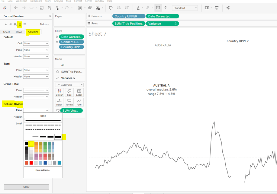
Change the colour of the variance line to grey, then remove all gridlines, row dividers and axis. Set the Column Dividers to be a thick white line (this will help provide a separator between the small multiples later).

Creating the trellis

There are multiple blog posts about creating trellis charts. My go to post has always been this one by Chris Love. It’s a more complex solution that dynamically flexes the number of rows and columns based on the number of members in the dimension you’re visualising. There have also been other Workout Wednesday challenges involving trellis charts, which I’ve blogged about too (see here).

Ultimately we’re aiming to determine a ‘grid position’ for each member of our dimension. In this case the dimension is Country UPPER and its a static list of 36 values, which we can display in a 6 x 6 grid. So Australia needs to be in row 1 column 1, Austria in row 1 column 2….. Costa Rica in row 2 column 1… USA in row 6 column.

As our members are static, the calculations we can use for this can be a bit simpler than those in Chris’ blog.

Firstly, let’s get our data in a tabular layout so we can ‘see’ the values as we go.

Duplicate the data sheet we built up, then move Measure Name and Date Corrected from Rows/Columns to the Detail shelf. Remove the Country UPPER field from the Filter shelf. You should have something like below, showing 1 row per country

Double click into the Rows shelf and type in INDEX(), then change the resulting pill to discrete (blue). You will see that index numbers every row. It’s a table calculation and although working as expected, let’s explicitly set it to compute using County UPPER.

Let’s now create our grid position values.

Cols

FLOAT(INT((INDEX()-1)%6))

This takes the Index value and subtracts 1, and returns the remainder when divided by 6 (%6=modulus of 6 – ie 6%6=0, 7%6=1). 6 is the number of columns we want.

Rows

FLOAT(INT((INDEX()-1)/6))

This takes the Index value and subtracts 1, and returns the integer part of the value when divided by 6. Again we’re using 6 as this is the number of rows we want to display.

Add these to the table, set to be discrete (blue) and compute using Country UPPER.

You can see that the first 6 countries are all in the same row (row 0) but different columns (0-5).

Now that’s understood, we can create the small multiples on the viz.

Duplicate the sheet we created further above which displays the trend graph for Australia & Austria. As we’re now going to make the changes to create the charts for every country, if things go a bit screwy, you can always get back to this one to try again :-).

Add Cols to Columns. Set to discrete and compute using Country UPPER. Add Rows to Rows and do the same thing. Move Country UPPER from Columns to the Detail shelf on the All marks card. Then remove Country UPPER from the Filter shelf.

Hopefully everything worked as expected and you have

Final step is to uncheck Show Header against the Cols and Rows pills so they don’t display and you can add to a dashboard.

My published viz is here.

Happy vizzin’!

Donna

Can you track headcount?

Luke decided to set us a challenge this week based on Human Resources (HR) data, using a dataset provided as part of the #RWFD Real World Fake Data project managed by Mark Bradbourne.

The challenge focussed on reporting monthly headcount, using a dataset that contained 1 row per employee with a column relating to the start date (Hire Date) and a column relating to the date the employee left (Termdate), which could have been a future date or NULL/blank.

I’ve worked on headcount reporting before in my day job, but have used a snapshotted data source, which captures the active employees as at midnight on the 1st day of every month. This method makes counting the headcount each month very simple, as it’s just counting the number of rows per snapshot date.

Obviously, this wasn’t an option in this case. Luke gave very little clues as to what approach would be required, apart from saying ‘you will also need to manipulate the data’….

A word about the data…

Just a little side note here…. I ended up in discussions with my fellow #WOW participant Rosario Gauna as after attempting one method, I wasn’t getting as high numbers as the solution originally suggested. There were rows in the data set that had NULL values for most of the data except job title, but I think this was only around 225 rows, so even including them I didn’t get close to the figures. Rosario however, was somehow managing to see approx 15,000 rows of null data. I ended up building and publishing my initial solutions based on a version of the data sent to me directly by Rosario.

Since then, it seems others were also confused, and so the solution was adjusted to ignore all the null rows. As a result I reworked one of my solutions to use the original data source I downloaded from the site, and it’s this I will focus on in the blog.

A word about my solutions…

With little instruction, it took a bit of head-scratching to figure out how to work through the problem. I initially decided to use a scaffold dataset to help. I built a simple file in Excel which contained 1 column listing 1 date per month which went from 01 Jan 2017 to 01 Jan 2021. I then joined this to the HR data in Tableau Desktop using the physical data layer (ie I did not use relations), using join calculations as below (note, this is using the amended copy of data I received where Termdate was already defined as a date field.

The solution using this method is published here.

However, I didn’t feel completely comfortable with this approach. Luke had suggested the difficulty of this was 9/10 and referred to nested tableau calculations… the above solution just used quick table calcs. So I decided to see if I could come up with an alternative, just using the provided data, and that’s what I’ll document below.

Setting up the data

I downloaded the Human Resources.csv file from the link provided, and connected to it in Tableau Desktop. I found the Termdate field presented as a string field, so I converted it to a date, just by clicking on the ABC symbol of the data type against the field. I also added a data source filter to exclude all records where the Id field was NULL.

I then added a new data source, and connected to the same file again. This meant I had 2 instances of the Human Resources data source listed in my Data pane. I renamed the 2nd instance to be Leavers Only, changed the data type of the Termdate field again and added a data source filter so that only records with non-Null Termdate values were retained.

Note – What I will be doing here is using the Human Resources data source to manage the months we’re reporting headcount over. This method only works if there is at least 1 new starter every month, which in this case there is.

Building the calculations

The requirements state that a new starter doesn’t count in the monthly headcount figures until the following month, so the date field we need to use in the output, needs to be created as

Report Date

DATE(DATETRUNC(‘month’,DATEADD(‘month’,1, [Hire Date])))

This basically shifts the date the new starter joined to the 1st day of the following month.

To make the calculations easier to read, I also created

Starters

COUNT([2022_04_06_WW14_Human Resources.csv])

which is literally a reference to the field that automatically gets added as part of the connection – it’s just a bit of a mouthful as its named according the data connection.

Let’s pop these out in a table as below – I’m deliberately using the dateparts of the Report Date field as they’ll be used in the viz like this.

So this is just showing the new starters against the month at which they will count for headcount. We need to get details of leavers now, and we’ll do this by blending.

When I blend data sources, I tend to create specific fields so it’s clear to me that they’re being used for blending, rather than defining blend relationships between differently named fields. So in the Human Resources data source I’ve created

BLEND – Date

[Report Date]

and then in the Leavers data source, I’ve created

BLEND – Date

DATE(DATETRUNC(‘month’,DATEADD(‘month’,1,[Termdate])))

which is shifting the Termdate forward to the the 1st of the next month, since leavers should also only be recorded in the following month.

In the Human Resources data source I then created

Leavers Per Month

ZN(COUNT([2022_04_06_WW14_Human Resources – Leavers Only].[2022_04_06_WW14_Human Resources.csv]))

which is just referencing the automatically generated ‘count’ field from the Leavers data source. I’ve wrapped it in ZN so 0 is reported in the event no match is found.

Add Leavers Per Month into the table, and ensure the linking field from the secondary Leaver data source is connected on the BLEND – Date field

So now we know how many starters and leavers per month, we now need to total these up by generating a cumulative running sum of the starters, but subtracting any leavers along the way.

Official Headcount

([Starters] + PREVIOUS_VALUE(0)) – [Leavers Per Month]

Takes the value of the Starters in the current row, adds it to the value of Official Headcount from the previous row, then subtracts any Leavers recorded against the current row. Add this onto the table, and as its a table calculation, edit it so it is explicitly computing my the month & year of Report Date

For the annual change, we’re looking to compare the difference of the Official Headcount value for the current month eg Jan 2021, with the Official Headcount value for the same month 1 year ago eg Jan 2020.

Annual Change

(ZN([Official Headcount]) – LOOKUP(ZN([Official Headcount]), -12)) / ABS(LOOKUP(ZN([Official Headcount]), -12))

Take the Official Headcount from the current row, subtract the Official Headcount from 12 rows before, then divide the result by the Official Headcount from 12 rows before.

Format this to a percentage at 1 dp. (For some reason my numbers here don’t seem to match Luke’s revised solution…).

Again add to the sheet and set the table calcs of both the nested calcs to compute by month and year

The final measure was a bit of a strangely named one IMO. I felt I should be doing some rolling calculation, but ultimately, it just seemed to be reporting the difference between the headcount now and that 12 months ago ie the numerator of the calculation above.

Net Rolling 12 Change

(ZN([Official Headcount]) – LOOKUP(ZN([Official Headcount]), -12))

Pop this into the view, adjust the table calc settings again

Building the viz

On a new sheet, add Report Date at the month level, but then set to be continuous, to Columns and Report Date at the year level to Colour. Add Official Headcount to Rows (adding the linking field for the blend when prompted), and adjust the table calc settings to compute over both month & year, ensuring the Year of Report Date is listed first.

Then in the legend, select all the years from 2000-2017 and ‘hide’ (this is probably a cheat way, but the quickest – we need to retain the data from the previous years, so can’t just ‘filter’).

Edit the axis to not start from zero. Adjust colours to suit.

Add Annual Change and Net Rolling 12 Change to the Rows shelf, adjust both of the table calc settings, so all nested calcs are computing by Year & then Month.

Edit the axis of both these additional measures to also exclude 0. On the All marks card, click the Label button and tick the Show mark labels option.

Final steps ….

…on the All marks card, click the Tooltip button and uncheck Show tooltips so no tooltips display on hover.

Right click on the Month axis and format the axis so the dates in the Scale section are displayed as abbreviated dates

Edit the same axis and remove the title, then format the whole chart to

  • remove all row and column dividers
  • to set the row banding with a band size of 1
  • adjust the colour of the row and column gridlines to be a slightly darker shade of grey

And you’re done 🙂 My published viz is here

Had a bit of all sorts this week… I’ll be intrigued to see how Luke solved it!

Happy vizzin’!

Donna

Sales Budget “Burndown” Chart

Erica Hughes had a table-calc-tastic challenge for us this week! I was using Tableau before LoDs were invented, so became very familiar with the ‘dark art’ of table calculations, and subconsciously often turn to these first when solving problems. Since the advent of LoDs, this functionality can get forgotten about, so this is a great challenge to help flex those table calc muscles and become a good reference point.

With any table calc challenge, I work out what I need in a tabular form before even attempting any visual, so that’s where we’ll start today.

I also tend to ‘build up’ the calculated fields I need, as this helps me validate the data I’m working with. It means I end up with more calculated fields than absolutely necessary, but it’s a good practice to get in as it eases troubleshooting in the long run.

In this example, we need to treat Sales as if it’s a budget that is then being ‘spent’ over the course of the following months. The first thing we need to define is the total budget

Total Sales

TOTAL(SUM([Sales]))

We then need to understand the cumulative (running sum) of Sales per month.

Running Sum Sales

RUNNING_SUM(SUM([Sales]))

Notethis calculation can be achieved by applying a Quick Table Calculation to the Sales pill once added to a view, but I will need to reference the values in other calculated fields, so created the field directly.

Let’s start building out our table of data to see what’s going on with these calculations.

Add Order Date to Rows and set so its displaying the date in the Month Year format

Then add Total Sales, Sales and Running Sum Sales

The Total Sales column will be the same for every row and match the same value in the last row of the Running Sum Sales column. The value in each Running Sum Sales row is the sum of the Sales value in the same and all preceding rows.

By default the table calculations are working ‘down’ the table which gives the desired result, but I tend to ‘fix’ the field the calculation is computing over, as when we build the viz we won’t be going ‘down’, but ‘across’, so fixing helps ensure we get all our settings just right.

So edit the table calculation of both the Total Sales and the Running Sum Sales fields to compute using Month of Order Date.

With these fields, we can calculate the ‘sales budget’ value being displayed as

Total Less Running Sum Sales

[Total Sales]- [Running Sum Sales]

Pop this on the view and verify the table calculation settings are set as above (this field contains nested calcs, so check each setting). You should be able to verify the value of this column is the result of the 1st column – 3rd column values

But there’s a twist.

The requirements state that “for dates in the future, the sales budget should remain constant”.

For this we need to work out what month ‘today’ is in. For this task, I have hard coded ‘today’ into a parameter called Today and set to 8th March 2022. If this was a ‘real’ production business dashboard, I’d just refer to the function TODAY() directly.

I can then work out

Current Month

DATETRUNC(‘month’, [Today])

which will return 01 March 2022 in this instance.

I then want to identify the record that matches the current month

Is Current Month?

DATETRUNC(‘month’, [Order Date]) = DATE([Current Month])

which just returns a boolean True/False.

And with this, I can then determine the value from the Total Less Running Sum Sales column that is associated to March 2022, and ‘spread’ that value across every row in the view.

Curr Month: Total Less Running Sum Sales

WINDOW_MAX(IF ATTR([Is Current Month]) THEN [Total Less Running Sum Sales] END)

If the month in the row is the current month, get the required value and ‘spread’ over every other row using WINDOW_MAX. Add this to the view, checking your table calc settings again.

Now we can work out the values needed for the Sales Budget line

Sales Budget

IF MIN(DATETRUNC(‘month’, [Order Date])) > MIN(DATE([Current Month])) THEN [Curr Month: Total Sales Less Running Sum Sales] ELSE [Total Less Running Sum Sales] END

Format this to $, Millions (M), 1dp.

If the month is later than the current month, use the value associated to the current month, otherwise use the Total Less Running Sum Sales value. Note here, the date functions are wrapped within a MIN function as the other fields are table calculations which means they’ve been aggregated, so all other fields referenced need to be aggregated to. The function MAX will have worked just as well.

Phew! we’ve finally got the data we need for the first line :-). As mentioned earlier, this can be achieved by combining some of the logic in the calcs, but I like to be methodical and verify my numbers give me what I expect at each stage.

In order to display the Estimated Budget line, we need to first work out how much of the total sales would be spent each month, if the same amount was spent each month – ie Total Sales divided by number of months.

Size (Count of Months)

SIZE()

I just chose to use the SIZE() table calculation to essentially count the number of rows in my view.

Estimated Budget Constant

//average the sales over the total months to get a constant budget
[Total Sales] / [Size (Count of Months)]

Add these into the view and adjust the table calc settings as before

essentially Total Sales (2,297,201) / Count of Months (48) = Estimated Budget Constant (47,858).

Like before, we need to compute running sum of this estimated budget

Running Sum Est Budget

RUNNING_SUM([Estimated Budget Constant])

and then we can calculate the Estimated Budget

Total Less Running Sum Est Budget

[Total Sales] – [Running Sum Est Budget]

This now gives us the data to plot the 2nd line.

The final calculation we need for the tooltip is the difference between the sales budget and estimated budget

Difference to Estimated

[Sales Budget]- [Total Less Estimated Running Sum]

format this using a custom format of +”$”#,##0,K;-“$”#,##0,K

Now we can build the viz! I tend to keep sheets like above in any workbook as a ‘check sheet’ if I need to do any troubleshooting later on.

So on a new sheet, add Order Date to Rows and set to be a continuous (green) month/year format this time. Add Sales Budget to Columns. Adjust the table calculation so all nested calculations are computing by Order Date.

Add Total Less Estimated Running Sum to Columns (set the table calc settings), then change to dual axis and synchronise axis.

Remove Measure Names from the All Marks card to remove the colours that have been set. Change the Colour of the Sales Budget line to purple, and set the markers to have circles.

From the Analytics tab, drag a Trend Line to the canvas and drop it as a linear trend on the Total Less Estimated Running Sum measure

This will add the ‘dotted’ line.

On the Total Less Estimated Running Sum marks card, set the Opacity of the Colour to 0%, so only the grey dotted trend line is visible.

Edit the trendline and uncheck Show recalculated line for highlighted or selected data points

Add Current Month to the Detail shelf of the All Marks card, and set to the month/year format. Then right click on the Order Date axis and Add Reference Line, setting the values as below

Right click on the reference line, and Format; adjust the alignment and font size & colour, so ‘Future’ is listed at the top.

Add Difference to Estimated onto the Tooltip of the Sales Budget card (adjust those table calc settings). The format the tooltip accordingly.

Add Curr Month: Total Sales Less Running Sum Sales to the Detail shelf of the All Marks Card (adjust those table calc settings). Edit the title of the viz

Finally tidy up the display by removing axis, row and column banding etc, and adjust the Sales Budget axis so it displays every 500,000.

And that should be it… my published viz is here.

Happy vizzin’!

Donna

Can you visualise percent difference from a selected date?

Lorna Brown returned this week with her first challenge of 2022 which was aimed at practising tableau calculations, although when I completed the build, I realised I actually didn’t use any – oops! I’d ended up using an LoD based solution instead. As is often the case in Tableau, there can be multiple ways to solve a problem, so I created another solution involving table calcs. As I blog I will endeavour to provide both sets of calculations used and make it obvious when I do so. Hopefully, it’ll all make sense 🙂

Building the calculated fields

After connecting to the data, the first step I did was to create a parameter to store the ‘selected date’. I hard coded/defaulted this to 1st Nov 2020.

pSelectedDate

Date parameter defaulted to 01 Nov 2020

Show this on the worksheet, so you can test what happens when you manually change it later.

As I typically do, I’m going to work in a tabular format to sense check all the calculations we’re going to need before I start visualising the information graphically.

To start add Company then Date (set to exact date & discrete) to Rows then add Close to Text and change the aggregation to AVG.

I now want to work out what the value of the average Close is on the selected date (in this case 01 Nov 2020) for each company, and I want this value to be displayed against every row associated to that company.

Close on Selected Date per Company

LOD Option

{FIXED [Company]: AVG(IF [pSelectedDate]=DATETRUNC(‘month’,[Date]) THEN [Close] END)}

Table Calc Option

WINDOW_MAX(AVG(IF [pSelectedDate]=DATETRUNC(‘month’,[Date]) THEN [Close] END))

Drag this field onto the table. If you’re using the LoD option, change the aggregation to AVG (although as we’re working with the data at the lowest granularity, SUM gives the same value, it just makes ‘more sense’ to me). If you’re using the Table Calc option, change the table calculation so that it is computing by Date only. In the below screen shot, I have included both versions of the calculation which match each other. Scrolling down, you should be able to verify that the value displayed in the new field(s) for all rows for a specific company, matches the value in the first column for the selected date. Test by entering different dates in the parameter (though make sure you’re just entering 1st of month each time, as that is what our Date field contains).

Now that for each row we have an average Close value and the average Close value on a specific date, we can work out the percentage difference for each row.

% Diff from Selected Date

LOD option

(AVG([Close])-AVG([Close on Selected Date per Company]))/AVG([Close on Selected Date per Company])

Table Calc option

(AVG([Close])-[Close on Selected Date per Company])/[Close on Selected Date per Company]

There is a slight difference in the syntax as the table calc option is referring to a field that is a table calculation and which is already aggregated, so there’s no need to aggregate again (ie wrap in an AVG…. Tableau will error if you try to do this).

Format this to a Percentage with 0 dp.

Once again I am choosing to show both versions on the screenshot below. Again if you’re using the table calc version, you need to verify the calculation is set to compute by Date only.

So now we have the core fields we need to start building the viz.

I am now just going to refer to the calculated field names I’ve mentioned above and not differentiate between LoD or table calc version. The only thing to remember is when adding the table calc fields, set the compute by, and if you’re using the LoDs, set the aggregation to AVG (although SUM will work too due to the level of aggregation we’re at).

Building the viz

On a new sheet add Date to Columns and set to the continuous Month level or exact date (either will work in this instance, since we only have 1 date per month in the data set). Add % Diff from Selected Date to Rows. Add Company to Colour and adjust to suit (use the hue circle colour palette).

Add Company to the Label shelf and also add % Diff from Selected Date to the Label shelf.

Adjust the Label settings, so the labels only display at the end of the line.

To make the text match the mark colour, click Label >then expand the Font dialog by clicking the arrow to the right, and select Match Mark Colour.

To format the % value displayed, right-click on the % Diff from Selected Date pill on the Text shelf, and select format. In the formatting pane that appears on the left hand side, change the number formatting to custom ▲0.0%;▼0.0% ( I use this site to get the shapes I need – just copy and paste)

Now rearrange the text on the label so that company is displayed first.

To format the Date field within the tooltip and the axis, right click on the Date pill in Columns and select format. On the Format Date pane on the left hand side, set the Dates value on the Pane tab, in the Default section, to custom : mmm yy. Then click on the Axis tab and set the Dates value in the Scale section to the same custom mmm yy value.

The Tooltip

We need quite a few fields on the Tooltip to get the information required.

Add Close and Close on Selected Date per Company to Tooltip. We also need a couple more calculated fields

TOOLTIP – Selected Date

[pSelectedDate]

format this field to custom mmm yy

TOOLTIP – % Diff

[% Diff from Selected Date]

Format this to % with 0 dp.

Add both these to the Tooltip too, then adjust the wording on the tooltip as required.

The Reference Line

Add pSelectedDate to the Detail shelf. Then right click the date axis and Add Reference Line. Adjust the settings so there is a Line for the Entire Table, which references the pSelectedDate value and has a custom Label of Reference Date: <Value>. Set the tooltip to None and the Line to be dotted

Format the pSelectedDate value displayed, by right clicking on the pill on the Detail shelf and set the Dates format on the Pane tab to mmm yy.

The right click on the Reference Date: Nov 20 label itself and select Format, and change the alignment to the top.

Finally, remove the axes titles, remove the gridlines and all axes rulers and change the worksheet background colour. Again, format the reference line label, so there is 0 transparency.

Test the visualisation by manually changing the date of the parameter to the 1st of another month and seeing how the viz updates.

Building the interactivity

Add the sheet to a dashboard, then create a parameter action, the runs on select of a mark on your sheet. It should change (target) the pSelectedDate parameter passing in the Date field

The only problem with this, is that when selecting a mark, the line relating to the mark is highlighted while the others ‘fade’ into the background. To prevent this from happening :

  • Create a new calculated field called True which contains the value True
  • Create a new calculated field called False which contains the value False
  • Add both these fields to the Detail shelf on the line chart.
  • Add a Dashboard Filter action, which runs on select, and has the sheet on the dashboard as it’s source, and the sheet in the workbook as it’s target. Set to show all values when selection is cleared, and filter by selected fields, setting True = False.
And with that, you should have a functioning solution – there just may be a few further formatting tweaks to apply.

My published vizzes are here

Happy vizzin’! Stay Safe!

Donna

Can you build a weekly year-over-year line chart?

Week 2 of #WOW2022 was Kyle Yetter’s first challenge as official WOW coach. On first glance when it was posted on Twitter, I thought it didn’t look too bad… I figured they’d be some ‘baselining’ of dates that I’d need to do to get the axis to display.

However, it was a little trickier than I first anticipated, mainly in trying to ensure I got the right values to match with Kyle’s posted solution (which at one point seemed to change while I was building). I’ve also realised since clicking on the link to the challenge again, that it was tagged as an LoD challenge, although there was nothing specific in the requirements indicating this was a requirement. I don’t think I used any LoDs…

Anyway onto the build, and I’m going to start by getting the dates all sorted, as this I found was the trickiest part.

Firstly connect to the data, then verify that the date properties of the data source are set to start the week on a Monday (right click data source > Date Properties

Build a basic view that displays Sales by the week of Order Date and the year of Order Date. Exclude 2018 since we’re only focussing on up to the last 2 years of data.

Examining this data compared to the solution, the first points of each line relate to the data shown against the 7 Jan 2019, 6 Jan 2020 and 4 Jan 2021. Ie the first point for each line is the first Monday in the year.

For simplicity, to make some of the calculations easier to read , I’m going to store the start date of the order date week in a field.

Order Date Week Start

DATE(DATETRUNC(‘week’, [Order Date]))

This means I can easily work out the last day of the week

Order Date Week End

DATE(DATEADD(‘day’,6,[Order Date Week Start]))

Add these fields as discrete exact dates (blue pills) onto the table and remove the existing WEEK(Order Date) field since this is the same as Order Date Week Start

When we examine the end points of each line in the solution, the points relate to the data shown against the week starting 30 Dec 2019 to 5 Jan 2020, 28 Dec 2020 to 3 Jan 2021 and 22 Nov to 28 Nov 2021. For the first 2 points, we can see the data is ‘spread’ across 2 years (ie 2 columns), which means when categorising the data ‘by year’, using the Year associated to the Order Date itself isn’t going to work. We need something else

Year Group

YEAR([Order Date Week Start])

Move this field into the Dimensions pane (above the line), then add to the table, replacing the existing YEAR(Order Date) field. 2018 will appear due to the very first row of data, but don’t worry about this for now.

If you scroll down to the week starting 30 Dec 2019, all the data is now aggregated in a single Year Group.

So things are starting to take shape. We can now work on how to filter the data.

The requirements indicate we should imagine ‘today’ is 1st Dec 2021, so we’ll use a parameter to hold this value.

Today

Date parameter defaulted to 1 Dec 2021

We only want to show data for the last 2 years and for complete weeks up to today

Core Data to Include

[Order Date Week End] < [Today] AND YEAR([Order Date Week Start]) >= YEAR([Today])-2

Remove the existing filter and add this field instead, set to True. You should now have just 3 columns and the data starting and ending at the right points.

The next area of focus is to think about how the data is going to be presented – the lines are all plotted against a single continuous (green) date axis, so we need to ‘baseline’ the dates, that is adjust the dates so they are all on the same year.

Date To Plot

MAKEDATE(2021, MONTH([Order Date Week Start]), DAY([Order Date Week Start]))

this is basically setting the week start dates to the equivalent date in 2021.

In the table we’ve been building, add Date To Plot to Rows and set to the week level and be discrete (blue). Remove the Order Date Week Start pill and move the Order Date Week End to the Tooltip as this is where this pill will be relevant in the final viz.

We’re starting to now see how the data comes together, but we’ve still got some steps to go.

I’m going to adjust the Year Group, so we can present the Current, Previous, Last 2 Yrs labels. Change as follows

Year Group

YEAR([Order Date Week Start]) – YEAR([Today])

This returns values -2, -1, 0 which means the values will be consistent even if the ‘Today’ value changes. The values can then be aliased (right click Year Group > Aliases

Next focus is on the % difference in sales. Add a Percent Difference quick table calculation to the existing Sales pill. The vales will change to those we can see when hovering over the points in the solution.

Edit the table calculation and modify to explicitly compute by Year Group, which is important to understand as, when we build the viz, whether the data is going across or down may change, so ‘fixing’ like this ensures we retain the values we know are correct.

In order to manage the custom colour formatting in the tooltip, we’re going to ‘bake’ this field as a calculated field. Press CTRL, then click and drag the pill into the data pane and name the field accordingly. If you examine the field, it’ll probably look quite complex

% Sales Diff

(ZN(SUM([Sales])) – LOOKUP(ZN(SUM([Sales])), -1)) / ABS(LOOKUP(ZN(SUM([Sales])), -1))

I’m going to start building the viz now, and then we’ll add the final calcs needed for the formatting later.

On a new sheet

  • Add Core Data to Include to Filter and set to True
  • Add Date to Plot to Columns and set to a continuous week level (green pill)
  • Add Sales to Rows
  • Add Year Group to Colour and adjust accordingly
  • Reorder the values in the Year Group colour legend, so the ‘current’ line in the chart is displayed on the top, and the ‘2 yrs ago’ line is at the bottom
  • Format the WEEK(Date To Plot) field to be a custom date of dd mmm (ie 10 Jan)
  • Format the Sales axis to be $ with 0 dp
  • Add Order Date Week End to the Tooltip shelf and format the field to custom date format of mmm dd (ie Jan 10).

Now we need a couple of additional calcs to help format the % sales difference displayed on the tooltip.

% Sales Diff +ve

IF [% Sales Diff] >= 0 THEN [% Sales Diff] END

% Sales Diff -ve

IF [% Sales Diff] < 0 THEN [% Sales Diff] END

Format both these fields with a custom number format as ▲0.0%;▼0.0%

Add both these fields onto the Tooltip and adjust the table calculation settings of each to compute using by Year Group only

The 2 yrs ago line has no % Sales Diff value, and also no label, so we need a field to help this too

TOOLTIP: Label YoY%

IF NOT(ISNULL([% Sales Diff])) THEN ‘YoY%:’ END

This means the text ‘YoY%’ will only display if there is a % Sales Diff value.

Add this field onto the Tooltip too, and again adjust the table calculation settings.

Now format the text and tooltip as below, setting the two % Sales Diff pills to be side by side and colouring accordingly.

Hopefully, this means you now have a completed viz

My published viz is here. And nope… no LODs used 🙂 There are a few more calculated fields than what Kyle mentioned, but I could have condensed these by not having so many ‘building blocks’, but this may have made it harder to read.

I’m now off to check out Kyle’s solution and see whether I really over complicated anything…

Happy vizzin’!

Donna