Yoshi chose to challenge us this week to try using the multi-fact relationship model, something I hadn’t used before so I was keen to have a go.
I have to admit, I did ultimately find the challenge a bit tricky… I did have to look at the hint in the challenge to see how Yoshi had folded in the additional month data source, and then when building the vizzes, I was getting slightly different numbers on occasion. I wasn’t sure whether this was due to differences in how I’d applied the actual relationship fields between the tables in the model, but can’t actually get to Yoshi’s data model in the solution to tell. I used the information on the help article to determine the linking fields, so I think it’s right…
I also struggled with the final requirement – to always show all the libraries in the display, even when there were no copies of the selected book. As soon as I restricted the display to just show the data for the selected book, the libraries which didn’t stock the book disappeared, which with relationships is what I expected as they act like ‘inner joins’. Even looking at Yoshi’s solution, I can’t see what magic trick has been applied, unless there’s something in the model I haven’t applied..
So I’ll explain what I did, and if you can figure out where I may have gone wrong, or if you concur with my set up, then please let me know 🙂
Modelling the data
Download the 3 data sources from Yoshi’s link.
Connect to the Bookshop excel file. Drag Checkouts onto the canvas first – this is one of the base tables.
Drag Book onto the canvas and verify the tables are related by the Book ID field from each table.

Drag Author onto the canvas after Book and verify the tables are related on the Auth ID fields.

Drag Award onto the canvas after Book and verify the tables are related on the Title fields.

Drag Edition onto the canvas after Book and verify the tables are related on Book ID

Drag Info onto the canvas after Book. This time you’ll need to join Book ID from Book to a relationship calculation from Info of [BookID1]+[BookID2]

Drag Ratings onto the canvas after Book and verify the tables are related on Book ID

Add a new connection to the BookshopLibraries excel file and then drag in Catalog after Edition and verify the tables are related on ISBN

Drag in Library Profile after Catalog and verify the tables are related on Library ID

Next from the Bookshop excel data source, add Sales Q1 onto the canvas and drop when the New Base Table option appears


Multi select the Sales Q2, Sales Q3 and Sales Q4 tables then drag onto the canvas and drop onto the Sales Q1 table when the Union option appears

Right click on the Sales Q1 unioned object and rename to Sales. Add a relationship from Sales to Edition verifying the tables are related on ISBN.

Add a new connection to the Months csv file, then add the Month.csv object onto the canvas so it is related to the Sales table. This time you’ll need to create a relationship calculation on Sales as DATEPART(‘month’, [Sale Date]) and join to Month

Finally also add a relationship from Checkouts to Month.csv, creating a relationship on Checkout Month to Month.

Now we have a model, we can start building the vizzes.
Building the scatter plot
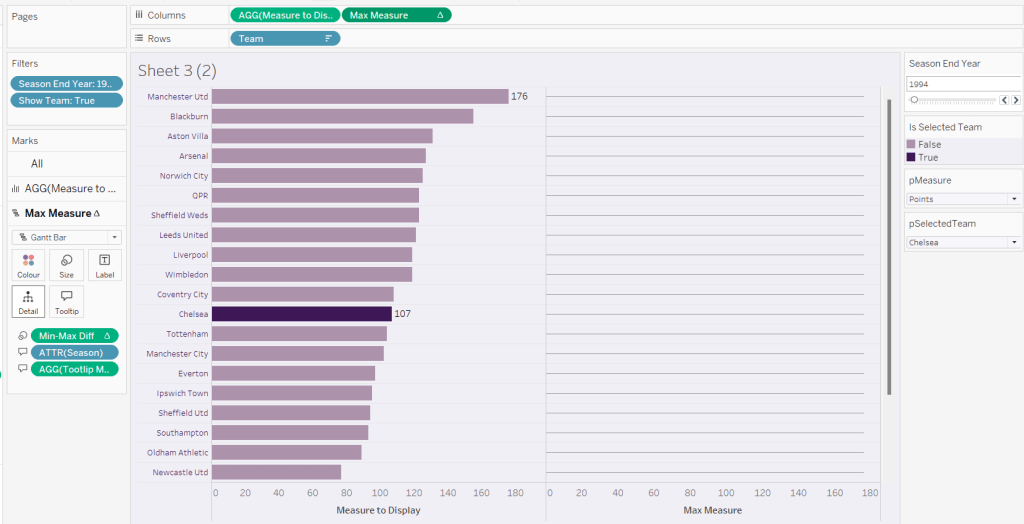
To start, to verify I’m getting the data I expect, I’ll build out a table
Add BookID (Book) and Title to Rows. We need to indicate if the book has won an award.
Awarded?
COUNT([Award])>0
Add this to Rows.
We will be plotting the average number of checkouts per month against the average number of orders per month., so create
Avg Checkouts per Month
SUM([Number of Checkouts])/COUNTD([Checkout Month])
Then create
Avg Orders per Month
COUNT([Order ID])/COUNTD(MONTH([Sale Date]))
Add into the table. The number won’t be correct though, as we are displaying data from the Checkouts base table and the Sales base table without including any field from any tables that link them. To resolve this add BookID (Edition) onto Rows, and if you spot check some of the numbers against the scatter plot solution, they should match (or be very close). – figures for Portmeirion matched for me.

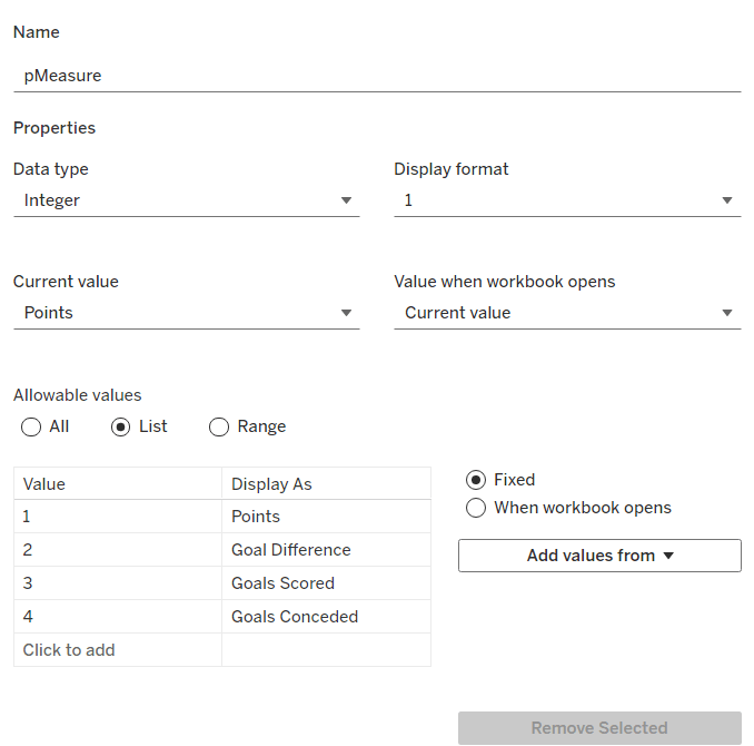
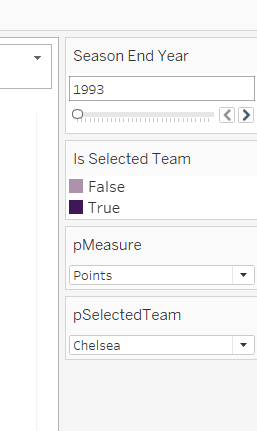
We also need to highlight which book is selected, so create a parameter
pSelectedBookID
string parameter defaulted to <emptystring>
Then create field
Is Selected Book
[BookID (Edition)] = [pSelectedBookID]
Show the parameter and enter the string PP866 (for Portmeirion). Add Is Selected Book to Rows to verify true is displayed against this row.
On a new sheet, add Avg Checkouts per Month to Columns and Average Orders per Month to Rows. Add Book ID (Edition) to Detail. Add Awarded to Shape and adjust shapes as required. Add Awarded to Size and adjust. Add Is Selected Book to Colour and adjust to suit. Make sure True is listed before False for the Colour legend to ensure the selected book mark is always ‘on top’. Hide the null indicator

Create a new field
Label: Selected Title
IF [Is Selected Book] THEN [Title] END
Add this to Label, adjust the font style, match mark colour and align top centre. Adjust the tooltip. Update the title and name the sheet Scatter or similar.

Building the Ratings Bar
Add Rating as a discrete dimension (blue disaggregated field) to Rows. Add Is Selected Book to Columns and add Ratings (Count) to Text. Exclude the Null column that appears (Filter for Is Selected Book). Add a percent of total quick table calculation to CNT(Ratings) and adjust to compute using Rating.

Duplicate the sheet. Move CNT(Ratings) to Columns and Is Selected Book to Colour. Adjust colours to suit. Unstack the marks (Analysis menu > stack marks off). Add Is Selected Book to Size. Adjust so that True is listed first on the size legend, so it is both narrower than false, and will also now be ‘in front’. Update the tooltip and hide the Rating label heading (right click > hide field labels for rows).

Create a new field
Selected Book Ratings
IF [Is Selected Book] THEN
{FIXED [Title]: COUNT([Ratings])}
END
and add to Detail. Then update the title of the sheet adding a reference to this field. Exclude the Null option that now appears (Rating is added to the Filter shelf). Name the sheet Ratings Bar or similar.

Build the trend line
We need to show the average number of books ordered and the average number of books checked out each month. For this we need
Avg Orders per Book
COUNTD([Order ID])/COUNTD([BookID (Edition)])
and
Avg Checkouts per Book
SUM([Number of Checkouts])/COUNTD([BookID (Edition)])
On a new sheet, add Month (from Months.csv) to Rows as a discrete dimension (blue pill) and add Avg Checkouts per Book and Avg Orders per Book into the table text. Then add Is Selected Book to Columns.

This is where some of my numbers don’t align with the values in Yoshi’s solution, but it’s not clear why… Exclude the Null columns (Is Selected Book added to Filter).
We’re going to want to display the month numbers as the month names, so create a new field to create a ‘date’ out of the number
Month Name
//convert to a date, then use month/formatting functions in display
MAKEDATE(2000, [Month],1)
On a new sheet add Month Name to Columns as a continuous pill at the month (May) level (green pill). Add Avg Orders per Book and Avg Checkouts per Book to the Rows and add Is Selected Book to the Colour shelf of the All marks card. Adjust colour if needed, and ensure True is listed first (on top).

Adjust the y-axis titles, and update tooltip if required. Remove the title from the x-axis. Format the x-axis so the scale uses abbreviated month names

Add Is Selected Book to Filter and exclude Null. Update the sheet title, Name the sheet Monthly Trend or similar.

Building the Library Bar
Add Library to Rows and Number of Copies to Columns. Add Is Selected Book to Filter and set to True. Show mark labels, and adjust to match mark colour. Hide the x-axis. Hide the Library row header. Apply row banding so every other row is shaded. Update the tooltip and sheet title. Name the sheet Library Bar or similar.

Creating the title sheet
On a new sheet add Is Selected Book to Filter and set to True. Then add Title, First Name, Last Name and Genre to Text. Set the mark type to shape and select a transparent shape (see here for info on how to set this up). Set the sheet to Entire View. Organise the text as required and align middle left. Stop the tooltip from showing. Name the sheet Title or similar.

Building the dashboard and interactivity
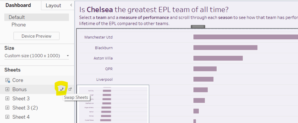
Use layout containers to position the objects onto the dashboard, and use padding to provide the relevant spacing between objects.
The Title, Ratings Bar, Monthly Trend and Library Bar sheets should all be in a single vertical container which has a dotted blue border surrounding it.
Create a dashboard parameter action
Set Book
on select of the Scatter sheet, set the pSelectedBookID parameter with the value from the BookID (Editiion) field. When the selection is cleared, retain the value.

The layout of my dashboard including the item hierarchy is below

My published viz is here.
Happy vizzin’!
Donna