Can you create a dynamic small multiple chart?

For this week’s #WOW2023 challenge, Lorna asked us to recreate this small multiple (or trellis) chart which organises the time series charts per Sub-Category into a grid format, where the number of columns is determined by the user.

Whenever I need to build these types of charts, I often end up referencing this blog post by Chris Love from 2014, as this has the basis for the calculations required.

To get started, we need to capture the number of columns based on a parameter

pCols

integer parameter ranging from 1 to 5 with a step size of 1, that is defaulted to 5

On a new sheet, display the parameter, and add Sub-Category to Rows. Apply a sort to Sub-Category based on the field Sum of Sales descending.

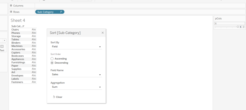
Based on the pCols parameter, we need to determine which column and subsequently which row each Sub-Category should be positioned in. We will make use of the index of each entry in the list. Double click into the Rows shelf and manually type in INDEX(). Change the field to be discrete (blue). This will number every Sub-Category row from 1 upwards. To be explicit, edit the table calculation, to explicitly set it to compute using the Sub-Category dimension.

To determine the column for each sub-category

Column

(INDEX()-1)%[pCols]

the % symbol, is the modulo and returns the remainder when the INDEX()-1 is divided by pCols – ie if INDEX() = 12, then 12-1 = 11 and 11 divided by 5 is 2 with 1 left over, so the result is 1.

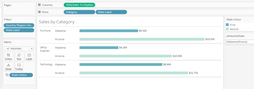
Add this to the sheet, set it to be discrete (blue) and also edit the table calculation to compute using Sub-Category. You can see that Chairs and Machines are in the same column. If you adjust pCols, the values will adjust too.

To determine which row each Sub-Category will be positioned in we need

Row

INT((INDEX()-1) / [pCols])

This divides INDEX()-1 by pCols and just returns the whole number. ie if INDEX() = 8, then 8-1 = 7, and 7 divided by 5 = 1.4. The integer part of 1.4 is 1.

Add this to Rows and set to be discrete, and adjust the table calculation as before. You can see Chairs and Phones are in the same row (but different columns), which Chairs and Machines are in the same column, but different rows.

Let’s rearrange – Move Column to Columns, Sub-Category to Text and remove INDEX() altogether, and you’ll get the basic grid layout we need.

Create a new field to store the date part we’re going to present

Month Order Date

DATE(DATETRUNC(‘month’,[Order Date]))

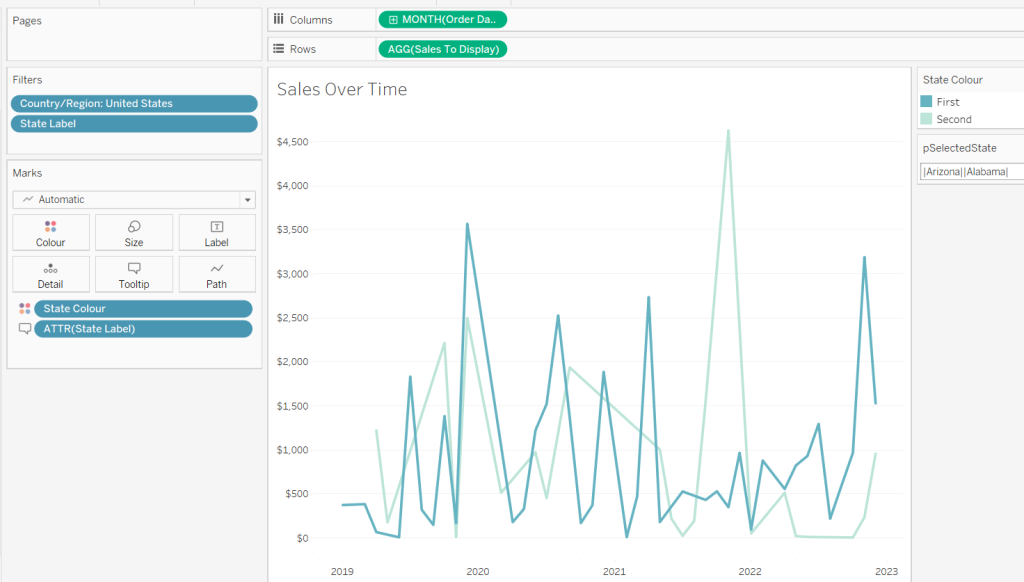
Add this to Columns, and set as exact date and add Sales to Rows and move Sub-Category to Detail. At first gland this may look ok, but if you look closely, you’ll notice that there are multiple lines on some of the charts.

This is because there are some states that didn’t sell some of the sub-categories on the month, and this affects the index() calculation when the Month Order Date is set to be a continuous (green) pill (the viz below highlights this better – Accessories is now indexed with 6 and 7…

So to resolve this, add Month Order Date as a discrete (blue) exact date to the Detail shelf underneath the Sub-Category field. Then change the Month Order Date field in the Columns shelf to be a Continuous (green) attribute. Then adjust the table calculation on both the Column and the Row fields, so they are computing over both Sub-Category and Month Order Date, but at the level of Sub-Category.

Format the ATTR(Month Order Date) field on Columns to be the custom format of yyyy, so the axis just display years

and then format the Month Order Date field on the Detail shelf, to be the custom format of mmmm yyyy, so the information in the Tooltip will display the date as March 2001 etc. Adjust the Tooltip to match.

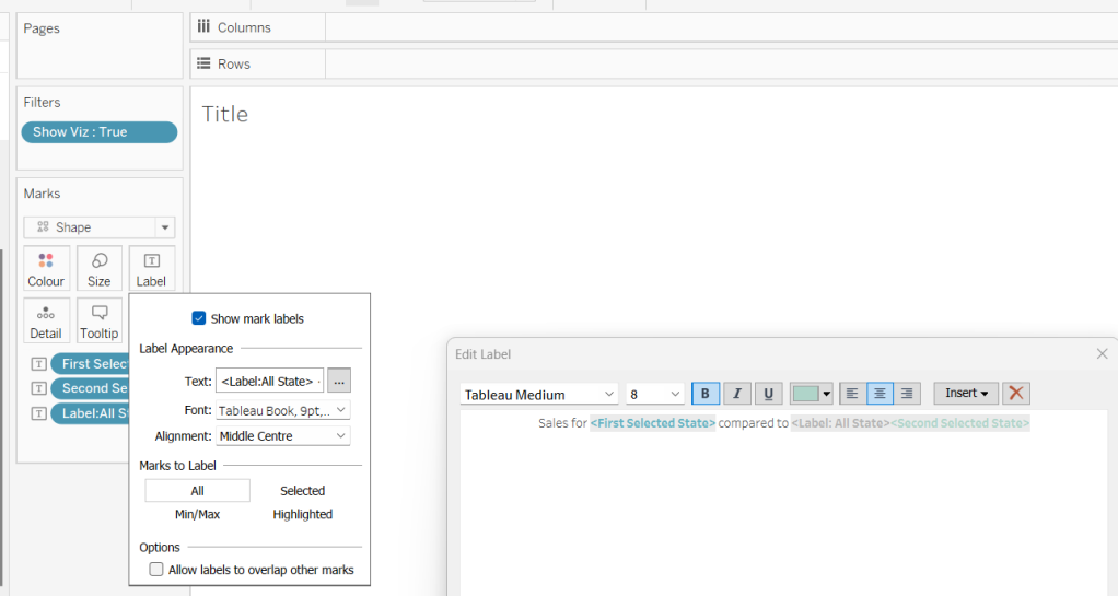
The label for each Sub-Category needs to be positioned based on the y-axis at the maximum sales across the whole display, and on the x-axis at the last point in the date scale ie December 2023. For this we need

Max Sales in Table

WINDOW_MAX(MAX([Sales]))

Label Position

IF LAST()=0 THEN [Max Sales in Table] END

Add Label Position to Rows and adjust the table calculation so the Max Sales in Table nested calculation is computing by both Sub-Category and Month Order Date, and the Label Position nested calculation is computing by Month Order Date only. This should result in a single mark per Sub-Category displaying.

Make the chart dual axis and synchronise the axis. Remove Measure Names from the All marks card. On the Label Position marks card, change the Mark type to shape and select a transparent shape (see this post for details on how to get this set up). Move Sub-Category to Label and align top right.

Finalise the display by hiding the Column and Row fields (uncheck show header), hiding the right hand axis (uncheck show header). Format to remove all gridlines & zero lines and hide the null indicator. Remove the axis title.

You should then be able to just add this to a dashboard. My published viz is here.

Happy vizzin’!

Donna

Can you proportionally brush from multiple selections?

For this week’s #WOW2023 challenge, Kyle wanted us to build a viz that used selections on the viz rather than a set of filter controls to show how the sales for those selections were distributed.

This concept is referred to as proportional brushing and makes use of set actions to achieve the results. The complexity added here was the multiple selections being made.

6 sheets make up this dashboard – 1 for each bar chart, 1 for the KPI and 1 for the breadcrumb trail.

Building the basic bar charts

Create 4 sheets, one for each of the Region, Segment, Ship Mode and Sub-Category dimensions. The simplest way is to build one sheet, get all the formatting applied etc, then duplicate and replace the dimension on the duplicated sheet with the new one.

When building the first sheet, place the dimension (eg Region) on Rows and Sales on Columns, sorted descending. Adjust the Sales to be formatted to $ with 0dp. Hide the Sales axis, and format to remove all gridlines/axis lines/ zero lines and row/column dividers. Show mark labels and align centrally. Adjust the font label to 8pt. Widen each column if need be. Hide the dimension label from displaying (hide field label for columns). Adjust the tooltip to suit. Name the sheet based on the dimension.

Then duplicate this sheet, and drag the next dimension, eg Segment, and drop it directly on Region. If done properly, everything should seamlessly update. Re-name this sheet accordingly, then repeat the process until you have a sheet for each of the four dimensions.

Applying the proportional brushing

Create a set for each of the relevant dimensions.

Region Set – right click on the Region field in the data pane and select Create > Set. Select all the options to be in the set.

Repeat and do the same for each dimension, so you end up with Segment Set, Ship Mode Set and Sub-Category Set.

We need to determine the combination of all the values selected in each set. So we need

Is Selected Options

[Segment Set] AND [Ship Mode Set] AND [Region Set] AND [Sub-Category Set]

This returns true for all the records in the data which match the combined selections of the individual sets.

On the Region sheet, add Is Selected Options to the Colour shelf. The right click on each set in the data and and select Show Set, so the set of selections are listed on the canvas.

Change the options so only the Segment Consumer and rthe Ship Mode Standard Class are selected, along with all Region and Sub-Category values. Adjust the colours associated to the True and False values that are now presented

If need be, adjust the tooltip so the Is Selected Options is not displaying, then add the Is Selected Options field to the Colour shelf of the Segment, Ship Mode and Sub-Category sheets. Play with the set selections to see how the bars change. Once you’re familiar with the behaviour, reset all the sets so they all contain all the values.

Building the KPI sheet

On a new sheet add Sales to Text. Change the mark type to shape and select a transparent shape (see this blog to get this set up). Adjust the Label to include the text ‘Sales’ and format accordingly. Align middle centre. Add Is Selected Options to the Filter shelf and set to True.

Again, if you adjust the set selections, the value will adjust accordingly.

Building the Dashboard interactivity

Add the sheets onto a dashboard. I used both vertical and horizontal layout containers to get the objects positioned where I wanted. I also used blank objects set to height/width of 1px and with a black background colour to create the horizontal and vertical divider lines. You can see from the item hierarchy in the image below, how I laid out my dashboard (I like to rename my containers to help understanding)

Now add a dashboard change set values action for each of the 4 bar chart sheets.

Select Region

On select of the Region sheet only, target the Region Set. On running the action (ie clicking the bar), assign values to set, and when clearing the selection (clicking the bar again), add all values to the set.

Note – While not specified in the requirements, I noticed that the breadcrumbing functionality in Kyle’s solution didn’t behave if multiple selections of the same dimension were made – eg 2 regions were selected. I decided to add the requirement of only allowing a single dimension to be clicked (ie the single-select only box is checked).

Create a Select Segment, Select Ship Mode and Select Sub-Category set action using the same principals described above.

Creating the breadcrumb

I’ve added this last, so you understand how we can ensure each set only has either all the values in it, or just 1 value.

To create the breadcrumb, we’re going to build up some strings based on what the state of each set looks like. This involved several calculated fields…. I’m not sure if I’ve over complicated this though..

Anyway firstly, we want to capture the values that have been added to each set, so we need

Regions in Set

IF [Region Set] THEN [Region] END

Segments in Set

IF [Segment Set] THEN [Segment] END

Ship Modes in Set

IF [Ship Mode Set] THEN [Ship Mode] END

SubCats in Set

IF [Sub-Category Set] THEN [Sub-Category] END

The image below shows how each of these fields are behaving based on the set selections – if the value is not selected in the set, the Regions in Set field is Null.

Next we have fields to count how many different values exist in each of these fields.

Count Selected Regions

{FIXED: COUNTD([Regions in Set])}

Count Selected Segments

{FIXED: COUNTD([Segments in Set])}

Count Selected Ship Modes

{FIXED: COUNTD([Ship Modes in Set])}

Count Selected SubCats

{FIXED: COUNTD([SubCats in Set])}

Again you can see from the sheet below, this is counting the number of selections, which is ‘fixed’ (ie the same) for every row.

Now, while this is showing 2, as we’ve manually clicked on the set options, in practice when driven from the dashboard, we’re either going to have all values in the set, or just 1. So based on this assumption, we now just want to get the name of the single selection

Selected Region

IF SUM([Count Selected Regions]) = 1 THEN MAX([Regions in Set]) ELSE ” END

If there’s only 1 item in the set, then get it’s value, otherwise return ‘blank’.

Just testing this behaviour, we can see below that with all the Regions selected, the Selected Region field is empty, but with 1 value selected, we show that value.

Create equivalent fields for each dimension

Selected Segment

IF SUM([Count Selected Segments]) = 1 THEN MAX([Segments in Set]) ELSE ” END

Selected Ship Mode

IF SUM([Count Selected Ship Modes]) = 1 THEN MAX([Ship Modes in Set]) ELSE ” END

Selected SubCat

IF SUM([Count Selected SubCats]) = 1 THEN MAX([SubCats in Set]) ELSE ” END

The order of the dimensions displayed in the breadcrumb is fixed, regardless of the order in which you click the options. That is, if you click a Segment then a Region, the breadcrumb will display the <segment> followed by the <region>. But if you click the Region first and then the Segment, the breadcrumb will still display the<segment> followed by the <region>. Based on this, we can create string values for each dimension that differ depending on whether we know there is a selection made against a subsequent dimension (ie should we include the ‘>’ character or not).

Let’s go through in order. Firstly, no selections made

All Segmentations BC

IF [Selected Segment]=” AND [Selected Ship Mode]=” AND [Selected Region]=” AND [Selected SubCat]=” THEN ‘All Segmentations’ END

If all the ‘selected’ values are empty, then all the sets contain all the values, so display ‘All Segmentations’.

If there are selections made, then the dimensions are ordered as Segment > Ship Mode > Region > Sub-Category

Segment BC

IF [Selected Segment]<>” AND ([Selected Ship Mode]<>” OR [Selected Region]<>” OR [Selected SubCat]<>”) THEN [Selected Segment] + ‘ > ‘
ELSE [Selected Segment]
END

If there is only 1 Segment selected and at least 1 of the other dimensions has been selected too, then add the ‘>’ character after the Segment name, otherwise just show the Segment.

Ship Mode BC

IF [Selected Ship Mode]<>” AND ([Selected Region]<>” OR [Selected SubCat]<>”) THEN [Selected Ship Mode] + ‘ > ‘
ELSE [Selected Ship Mode]
END

Similar to above, but this time, we only need to compare with the dimensions that are below Ship Mode in the display hierarchy.

Region BC

IF [Selected Region]<>” AND [Selected SubCat]<>” THEN [Selected Region] + ‘ > ‘
ELSE [Selected Region]
END

There is only one dimension below Region. As Sub-Category is at the bottom of the ordering, we don’t need anything special – the value of the Selected SubCat field will do.

On a new sheet, add All Segmentations BC, Segment BC, Ship Mode BC, Region BC and Selected SubCat to the Text shelf. Change the mark type to shape and change to use a transparent shape.

Adjust the label, so all the fields are ordered correctly and positioned exactly next to each otherwith no spacing/carriage returns between. Align the label middle left.

Show the set controls, and then test the functionality by altering the selections, ensuring either only 1 value or all values are selected

Once you’ve finished testing, ensure all values are selected in all sets.

The add this sheet to the dashboard – I had the title and the breadcrumb in a vertical container, which was the left hand side of a horizontal container

And hopefully that should be it. My published viz is here.

Happy vizzin’!

Donna

Can you compare state sales – Part 2?

This week’s #WOW challenge is an extension of this challenge which I blogged about here. The premise is to mimic a real world scenario – a dashboard has been built and used, but now, a few months after use, additional functionality is required. I am going to be building on top of the solution I delivered for week 11. If you participated in that week, your solution may not have matched mine, so this guide may not be as coherent.

Identifying the selected states

In part 1, we captured the single state selected within a parameter pSelectedState via a parameter dashboard action. We now need to be able to capture multiple states. We’re still going to use the same parameter and a parameter action, but we need to adapt what will be stored within in it.

Instead of a single state being stored in the parameter, we’re now going use this parameter to build up a delimited list of the states selected. We can then interrogate that string to determine the first and the second state selected, and identify if any additional states have been selected.

When using delimited strings, you need to choose a character to separate the field values that isn’t going to appear within the field value itself; ie choose a character that won’t appear within a State name. In this instance I’m choosing | (pipe), and I’m going to build up the parameter as follows

ActionpSelectedState
No states selected<empty string>
1 state selected eg Arizona|Arizona|
2 states selected eg Arizona then Utah|Arizona||Utah|
3 states selected eg Arizona, then Utah, then Colorado|Arizona||Utah||Colorado|
Existing state is selected again (trigger to reset the view)<empty string>

Based on the logic above, we need to modify the existing field

State for Param

IF CONTAINS([pSelectedState], [State]) THEN ” //selected state is already in the parameter, so reset back to ”
ELSE [pSelectedState] + ‘|’ + [State] + ‘|’ //append current state selected to the existing parameter string
END

To see how this is working, go the the dashboard and display the pSelectedState parameter. Click on states and see how the parameter is changing.

As we interact with the hex maps, we can see the list of states building up in the parameter. We’ve obviously lost some of the other functionality now, but that’s ok, we have more things to adapt.

We can now manipulate this string to identify the first two states selected

First Selected State

SPLIT([pSelectedState],’|’,2)

returns the string that comes before the 2nd instance of the ‘|’ (and after the 1st)

Second Selected State

SPLIT([pSelectedStateString],’|’,4)

returns the string that comes before the 4th instance of the ‘|’ (and after the 3rd).

We can then use these fields to set the colour for the map

State Colour

IF [State] = [First Selected State] THEN ‘First’
ELSEIF [State] = [Second Selected State] THEN ‘Second’
ELSE ‘Other’
END

Replace the Is Selected State field that is currently on the Colour shelf and the Shape shelf of the Column (2) marks card, with this new State Colour field. Ensure you have at least 2 states listed in the pSelectedState parameter, so you have options for First, Second, Other all listed in both the colour and shape legends.

Adjust the Shape legend and set the First and Second values to use the same hexagon shape used initially, but set the Other option to use a transparent shape.

Adjust the colours. Increase the opacity on this mark to 100% Set the colours as you wish – I used:

  • First – teal : #66b3c2
  • Second – light teal : #bce4d8
  • Other – pale grey : #d3d3d3

Click around on the dashboard. You should find as you click the first state it is coloured dark teal. Click a second, it is coloured light teal. Click either selected state again, and the map resets. Click more than 2 states, and only the first 2 are coloured, whilst the parameter continues to capture all the states being clicked.

Alerting if more than two states are selected

We will need a field to identify if more than 2 states have been selected.

More than 2 Values Selected?

SPLIT([pSelectedStateString], ‘|’, 6) <> ”

This is looking for a 3rd instance of a value within the delimited string, and returns true if there is one.

As this is a boolean field, we can use it to control the visibility of the message text box we want to display.

We also need to ensure that when the user clicks on the message, it disappears, and the hex map is re-set, ie the pSelectedState parameter gets set back to empty string. Another field will help us with this

State Reset

On a new sheet, add State Reset to Text. Then edit the text to the relevant message, and align centrally. Change the tooltip to say ‘click here to reset’. Set the background colour of the sheet to a pale grey. Name the sheet ‘Alert’ or similar.

On the dashboard, delete the contents of the pSelectedState parameter and remove it from the dashboard. Add the Alert sheet as a floating object. Set to fit entire view and remove the title. Add a border to the object.

Select the object, then in the Layout pane, set the Control visibility using value option to the More than 2 Values Selected field.

Then add a dashboard parameter action to reset the parameter when the message is clicked

Reset States

On select of the Alert object, set the pSelectedState parameter to the value stored in the State Reset field.

Click around, selecting more that 2 states and test the behaviour. Now we can move on the adapting the other charts.

Adapting the calculations

To sense check what is going on, on a new sheet, add State to Rows, Sales to Text and add Country/Region = United States to Filter. Add State Label to Rows, and show the pSelectedState parameter.

When only 1 state has been selected, we want to display the state against the selected row, otherwise we want to display the text ‘Other States (Avg)’ . When 2 states have been selected we just want the state names against the 2 relevant rows. Otherwise we want NULL to show. We need to adapt the State Label field as follows

State Label

IF [First Selected State] <> ” AND [Second Selected State] = ” THEN
IF [State] = [First Selected State] THEN [State] ELSE ‘Other States (Avg)’ END
ELSEIF [First Selected State] <> ” AND [Second Selected State] <> ” THEN
IF [First Selected State] = [State] OR [Second Selected State] = [State] THEN [State] END
END

Now we need to display a different value for the sales measure depending on whether we have 1 or 2 states selected. So we need to adapt the existing Sales To Display field

Sales To Display

IF CONTAINS([pSelectedState], MIN([State Label])) THEN SUM([Sales])
ELSE SUM([Sales])/COUNTD([State])
END

If the parameter string contains the State Label value, then use the sales, otherwise average the sales over the number of states that make up the sales. Format this to $ with 0dp.

Add this to the table, and remove State from the display

Add State Label to the Filter shelf and exclude NULL. Now remove the second state from the parameter and check the result

Adapting the bar chart

On the existing bar chart sheet, verify the pSelectedState parameter is displayed. Replace Is Selected State on the Colour shelf with the State Colour field and remove Is Selected State from the Rows shelf.

Add another state to compare against. Exclude the NULL values that display (add State Label to Filter and exclude Nulls)

We always want to make sure that the first state selected is listed first.

Sort- State Label

IF [State Label] = [First Selected State] THEN 1
ELSEIF [State Label] = [Second Selected State] THEN 2
ELSE 3
END

Add this field on to Rows as a discrete (blue) pill, between the existing two pills and then hide it.

Adapting the line chart

On the existing line chart sheet, verify the pSelectedState parameter is displayed

Add State Label to Filter and exclude null. Replace Is Selected State on the Colour shelf with the State Colour field.

Displaying the additional charts on click.

The display of the bar and line chart are based on the dynamic zone visibility functionality, and the field Show Viz (if you have downloaded my original solution workbook to build onto, you may need to unhide fields in the data pane for this field to be visible).

Amend Show Viz to

[First Selected State] <> ”

Amending the Chart Title sheet

On the Title sheet, replace the Is Selected State on the Filter shelf with Show Viz = TRUE.

Remove State Label from the Text shelf and add First Selected State and Second Selected State to Text. Additionally create a calculated field

Label:All State

IF [Second Selected State] = ” THEN ‘Other States (Avg)’ ELSE ” END

Add this to Text too.

Adjust the text as below and apply matching colour coding to the fonts. Align the text centrally.

Finally update the title and instructions on the dashboard.

My published viz is here.

Happy vizzin’!

Donna

Filtering and Highlighting

It was Sean’s turn to set the challenge this week which included a lots of little details to provide a wealth of different ‘views’ on the same data within a single chart, specifically the change of measure and the change of date granularity.

Building a viz showing the timeline at different levels of granularity based on user selection, is something I’ve done several times in the past, both for other WOW challenges and also in real work situations. So I immediately headed down my ‘usual route’, creating a parameter to identify the level of the date to report at, and a calculated field to display the appropriate level based on the parameter. However, then I noticed that in Sean’s viz, if I changed the date level, the date axis display also changed, sometimes showing <Month Year> format, sometimes <Year Q> etc. Having the axis change like this isn’t something that would work with my ‘usual’ solution. I did ponder this for some time, and the only thought I had was multiple sheets – one for each date part. Sean hadn’t stated how many sheets were needed for the challenge, and it made me wonder if the omission was perhaps deliberate…

Building the Month chart

To start we need to define a parameter to identify the level of date to select

pDateGranularity

string parameter defaulted to ‘month’ with a list of options, which have an alternative display name

We also need to identify the measure we want to show. Before we can define this, we need

Profit Ratio

SUM([Profit])/SUM([Sales])

and

#Orders

COUNTD([Order ID])

We also need to be able to capture the selected measure in a parameter

pMeasure

string parameter, defaulted to PROFIT (note case). A list isn’t needed as the value will be set via an action on the dashboard

so we can then build

Measure to Display

CASE [pMeasure]
WHEN ‘SALES’ THEN SUM([Sales])
WHEN ‘PROFIT’ THEN SUM([Profit])
WHEN ‘PROFIT RATIO’ THEN [Profit Ratio]
WHEN ‘ORDERS’ THEN [#Orders]
END

On a new sheet, add Order Date to Filters and set as a relative date filter to the last 4 years. Add Order Date to Columns as a continuous (green) pill set at the month level, and add Measure to Display to Rows.

Add the Order Date filter to ‘context’ (right click > Add to context) and set it to apply to worksheets > all using this data source. The context is necessary as when it comes to the option to select a date to highlight, only the dates within the timeframe selected should be visible. Show the pMeasure and pDateGranularity parameters.

Edit the Measure to Display axis to change the title to reference the pMeasure parameter instead (right click and edit axis).

Test the values change as expected by changing the text in the pMeasure parameter to SALES or ORDERS or PROFIT RATIO.

To identify a month to highlight, I created

Order Date – month

DATE(DATETRUNC(‘month’,[Order Date]))

and formatted this to a custom format of yyyy-mm

I then created a set off of this field (right click > create > set) and selected a single date 2021-11

Order Date – month Set

In order to make use of the set and its values, the set needs to be on the view. Add Order Date – month Set to the filter shelf. If it doesn’t happen by default, change the option on the pill to Show In/Out of set and then select both In and Out as the filter options (ie all possible values so nothing is actually being filtered).

Then click on the Order Date – month Set pill on the filter shelf and select show set. The list of values in the set should display.

Change the input type of the Set control to be a single value drop down, where the (All) option doesn’t show (via customise) and the option All values in Context is selected

We need to capture the value associated with the date selected

Month Measure to highlight

IF ATTR([Order Date – month Set]) THEN [Measure to Display] END

Add this to the Rows shelf, then make the chart dual axis and synchronise the axis. Adjust the colours of the Measure Names and then make the mark type of the Month Measure to Highlight marks card, a circle, and increase the size.

Hide the right hand axis, remove the title of the bottom axis and remove all row & column dividers. Right click on the nulls indicator and hide indicator.

Call this sheet month chart or similar.

Building the Quarter chart

Go through similar steps to build a chart to display the information at a quarterly level. The field on the Columns shelf should be Order Date set at the continuous (green) quarter level.

You will need a field

Order Date – quarter

DATE(DATETRUNC(‘quarter’,[Order Date]))

and format this to a custom format of yyyy-“Q”q

Use this to create a set off of this field (right click > create > set) and Order Date – quarter Set

You’ll also need

Quarter Measure to highlight

IF ATTR([Order Date – quarter Set]) THEN [Measure to Display] END

Building the week chart

Repeat again.

The field on the Columns shelf should be Order Date set at the continuous (green) week level.

You will need a field

Order Date – week

DATE(DATETRUNC(‘week’,[Order Date]))

and format this to a custom format of yyyy-“W”ww

Use this to create a set off of this field (right click > create > set) and Order Date – week Set

You’ll also need

Week Measure to highlight

IF ATTR([Order Date – week Set]) THEN [Measure to Display] END

Creating the BANs

To start with, we need to create some calculated fields to store the total values for each measure and the ‘highlighted’ vallues

Total Sales

{FIXED: SUM([Sales])}

format to $ with 0 dp

Total Profit

{FIXED: SUM([Profit])}

format to $ with 0dp

Total Profit Ratio

{FIXED: [Profit Ratio]}

format to % with 0 dp

Total Orders

{FIXED:COUNTD([Order ID])}

format to number with 0 dp

and we’ll also need values for the highlighted date

Highlighted Sales

IF ([pDateGranularity]=’quarter’ AND ([Order Date – quarter Set])) OR
([pDateGranularity] = ‘week’ AND ([Order Date – week Set])) OR
([pDateGranularity] = ‘month’ AND ([Order Date – month Set]))
THEN ([Sales])
END

format to $ with 0dp

Highlighted Profit

IF ([pDateGranularity]=’quarter’ AND ([Order Date – quarter Set])) OR
([pDateGranularity] = ‘week’ AND ([Order Date – week Set])) OR
([pDateGranularity] = ‘month’ AND ([Order Date – month Set]))
THEN ([Profit])
END

format to $ with 0 dp

Highlighed Profit Ratio

SUM([Highlighted Profit])/SUM([Highlighted Sales])

format to % with 0 dp

Highlighted Orders

COUNTD(IF ([pDateGranularity]=’quarter’ AND ([Order Date – quarter Set])) OR
([pDateGranularity] = ‘week’ AND ([Order Date – week Set])) OR
([pDateGranularity] = ‘month’ AND ([Order Date – month Set]))
THEN [Order ID]
END)

format to number with 0 dp.

On a new sheet, double click into columns and manually type MIN(0.0). Repeat this 3 more times, so there are 4 instances of MIN(0.0) on the Columns shelf.

On the All marks card, add Measure Names to the Label shelf.

Now right click on Measure Names in the left hand data pane and select Aliases. Alias each of the MIN(0.0) measures to SALES, PROFIT, PROFIT RATIO, ORDERS

The labels on the viz should change

Create a new field

Sales Selected

[pMeasure] = ‘SALES’

On the 1st MIN(0.0) marks card, change the mark type to shape and add Sales Selected to the shape shelf. Use a transparent shape (see here for details) for the False value, and use the provided sparkline image (which you need to add to your shape palette) for the True value (change the pMeasure parameter to SALES for the True option to show). Increase the Size of the shape to around the 3/4 mark.

Add Total Sales and Highlighted Sales to the Label shelf, and then adjust the font position, size and colour accordingly. This is what my label dialog looked like – Measure Names is centred, while the other two fields are right aligned, and the overall alignment is right too.

Adjust the MIN(0.0) axis to be fixed from -0.2 to 1 to give the mark and the text enough space to breathe.

Now repeat the exercise for the other 3 marks cards. You will need the fields

Profit Selected

[pMeasure] = ‘PROFIT’

Profit Ratio Selected

[pMeasure] = ‘PROFIT RATIO’

Orders Selected

[pMeasure] = ‘ORDERS’

and you’ll need to change the value in the pMeasure parameter to get the relevant shape to show or not for each measure

Finally, create fields

True

TRUE

False

FALSE

and add these both to the Detail shelf of the All marks card. We’ll use these to stop the BANs from being ‘highlighted’ on click on the dashboard.

Then remove all row/column dividers and gridlines & zero lines

Building the dashboard

Create the dashboard, and arrange all the objects so the controls/filters are listed in a row at the top, and the 3 charts are arranged side by side underneath.

If you’ve got dates selected for your quarter & week, then in the data pane, right click on the relevant set, edit set and uncheck any option. This should then give you (None) in the dropdowns.

We will use dynamic zone visibility to control which charts & highlight date controls to display. For this we need fields

Show Monthly

[pDateGranularity] = ‘month’

Show Quarterly

[pDateGranularity] = ‘quarter’

Show Weekly

[pDateGranularity] = ‘week’

On the dashboard, select the monthly chart, and then from the Layout tab, select Control visibility using value and choose the Show Monthly field. Set the control visibility for the highlight a month object to also use the Show Monthly field.

Set the control visibility for the Quarterly chart and highlight a quarter object to use the Show Quarterly field, and set the control visibility for the Weekly chart and highlight a week object to use the Show Weekly field.

Create a dashboard parameter action to set the pMeasure parameter on click of the BANs sheet, passing in the Measure Names to the parameter

Set measure

Create a dashboard filter action to stop the BANs from being highlighted ‘on click’

Deselect BANs

And that should be it. My published viz is here.

Happy vizzin’!

Donna

Can You Compare State Sales? Part 1

This week’s #WOW challenge was set by me and born out of a client requirement to compare store locations via selections from a map. I adapted it to use our favourite Superstore dataset (v2022.4).

The core requirement is to be able to make a selection on the map and see how sales compare to the average of all the other states. There is more to this challenge, but it was too much for one week, so I’ve broken it into 2 parts. This is part 1. In a few weeks time, I’ll be building on this solution for a part 2.

Building the basic hex map

The requirements provide a link to here to get the relevant files needed to complete this challenge and build the hex map – this includes the 2022.4 version of Superstore, the Hex map template, the hexagon shape file and a transparent shape file (more on that one later).

Using the hex map template sheet provided, relate the Orders Superstore data to the hex map sheet, relating State/Province to State.

Then on a new sheet add Column to Column, Row to Row and State to Detail. Edit the Row axis, and reverse the scale.

Change the shape of the mark to be a hexagon (use the provided shape if need be and add to a custom shape palette), and increase the size of the marks. Add Sales to Colour and change to use the Grey sequential colour palette, and adjust the opacity to 80%. Add Country/Region to the Filter shelf and select United States. This will remove Alaska and Hawaii that don’t have any sales and aren’t in the Superstore data set.

Add Abbreviation to the Label shelf and align centrally, Adjust the font size if need be.

Identifying the selected state

We need to be able to capture the state that has been selected ‘on click’. This will be driven by a dashboard action.

When I first built this concept for a client, the natural first step was to utilise sets and set actions; that is capture the selected state in a set, and then colour the map, build the other charts and logic based on the existence in the set. However this method does caused some issues when I tried to prevent the highlighting later, so I chose to use a parameter and parameter actions instead.

Firstly we need a parameter that will be used to capture the state selected ‘on click’

pSelectedState

string parameter defaulted to <empty string>

We can then create

Is Selected State

[State] = [pSelectedState]

As we want to retain the colour by sales on the existing map, we need to make a dual axis. Show the pSelectedState parameter and type in ‘Florida’.

Add another instance of Column to Columns. Remove the Abbreviation label from the second marks card, and replace the Sales field on the Colour shelf with the Is Selected State field. Increase the opacity on this mark to 100% Set the colours as follows :

  • True- teal : #66b3c2
  • False- pale grey : #d3d3d3

Additionally, add Is Selected State to the Shape shelf of the second marks card. Set the True value to use the same hexagon shape, but set the False option to use a transparent shape (a transparent shape file is provided in the g-drive, and needs to be added as a custom shape).

This should make all the other states look like they disappear.

Make the chart dual axis, and synchronise the axis.

Format the Sales to be $ with 0dp, then add to the Tooltip shelf of the second marks card and adjust the tooltip. Remove all gridlines/row & column dividers and hide the axes.

Adding the Interactivity

Create a dashboard sized 1000 x 600.

Add a vertical container and add a text field to create the title. Below the title, add a horizontal container. Add the hexmap sheet into the horizontal container, then add a blank object to the right of it. Remove any legends etc that automatically get added. Set the width of the hexmap object to be fixed to 600 px

and set the height of the horizontal container the hex map sits within to 445px

Show the colour legend and set it to floating, and position bottom left.

Add a parameter action to set the selected state on click

Set Selected State

On selection of the Hexmap sheet, pass the State field into the pSelectedState parameter. Set the value to <empty string> when the selection is cleared.

If we click around on the dashboard page, we can see the colours being set, but everything is fading out on selection. To prevent this, create 2 calculated fields

True

TRUE

False

FALSE

Add these to the Detail shelf of the All Marks card of the hex map sheet. Then back on the dashboard, add a filter dashboard action

Deselect Map Marks

On select of the hex map object on the dashboard, target the hex map sheet itself, setting selected fields such that True = False. Show all values where selection cleared.

Now if we click on the dashboard, the shapes shouldn’t fade into the background. However we can’t ‘unselect’ the state and get back to its original state. This is because the filter action we added to stop the marks from fading actually unselected the mark, so when we click again, we’re not undoing any selection.

To resolve this, we need another calculated field.

State for Param

IF [State] = [pSelectedState] THEN ”
ELSE [State] END

If the state being clicked is the one already captured in the parameter, then set the field to <empty string>, else set the fields to the state being clicked.

Add this to the Detail shelf of the All marks card on the hexmap sheet, and then update the Set Selected State parameter action to pass the State For Param field into the parameter instead of the original State field..

Now when the map is first loaded, the State For Param field contains the name of the state, so that is passed into the parameter on click. As the parameter now has a value, the State For Param field changes for the selected state to be <empty string>, so if the same state is clicked, <empty string> is then passed into the parameter and the view resets.

Building the calculations for the other charts

On a new sheet, add State to Rows, Sales to Text and add Country/Region = United States to Filter.

When a state has been selected, we want to display the state against the selected row, otherwise we want to display the text ‘Other States (Avg)’ .

State Label

IF [Is Selected State] THEN [State] ELSE ‘Other States (Avg)’ END

Now we need to display a different value for the sales measure depending on whether its the selected state or not.

Sales To Display

IF ATTR([Is Selected State]) THEN SUM([Sales])
ELSE SUM([Sales])/COUNTD([State])
END

If the state is the selected one, then use the sales, otherwise average the total sales over the number of states that make up the sales. Format this to $ with 0dp.

Note – in hindsight, this could have just been SUM([Sales])/COUNTD([State]) even for the single state, as since the count of state will be 1, this would just equate to the SUM([Sales]) itself.

Add this to the table, and remove State from the display

Building the bar chart

Duplicate this sheet (as we want to retain the filters), then move Sales To Display to Columns, and add Category to Rows in front of State Label. Add Is Selected State to the Colour shelf.

To ensure the Selected State is always listed first, even if alphabetically it comes after ‘Other States (Avg)’, add Is Selected State to the Rows shelf between Category and State Label. Manually sort it so True is always listed before False, then hide the column (uncheck show header).

Reduce the Size of the bars, remove gridlines and column dividers. Lighten the row dividers. Adjust font sizes. Hide the column labels (hide field labels for rows) and hide the axis.

Remove Sales from the Text shelf, and check Show mark labels instead. Update the Tooltip.

Building the line chart

On a new sheet add Country/Region to Filter and set to United States. Add Order Date to Columns and set to the continuous month level (eg May 2021). Add Sales To Display to Rows, State Label to Detail and Is Selected State to Colour. Manually move the values in the colour legend so that True is listed first. Adjust the tooltip

Remove the axis titles, adjust the axis fonts. Remove row/column dividers and zero lines and axis rulers.

Putting it all together

On the dashboard, add a vertical container between the hexmap and the blank object. Add the line chart and bar chart on top of each other. Remove the title for the bar chart, and update the title of the line chart to reference the pSelectedState parameter.

Remove the blank object to the right of the bar/line charts.

We need to control when the bar and line charts display, so we’ll use dynamic zone visibility for this, and for this we need another boolean field

Show Viz

{FIXED: MAX(IF [Is Selected State] THEN TRUE ELSE FALSE END)}

Is Selected State is a boolean field which essentially is 1 for True and 0 for False. If there is a state selected, the maximum value across all the data records, will be 1, so the field returns true, otherwise its 0, so false.

Use this to control visibility using value for the line and bar chart objects.

Make any further adjustments to the layout required -the size of the hex shapes may need tweaking for example. Then interact with the viz to check all is working as expected.

My published viz is here.

Happy vizzin’!

Donna