Can you build a trellis of Profit Ratio Gauges?

It’s Community Month at #WOW2024 HQ, and for the first challenge, Jack Hineman (a long time participant of WOW) asked us to create gauge charts using map layers. Not only that, he wanted them displayed in a trellis format, with a specific requirement to ensure the number of columns was always >= number of rows displayed. Errr…..

This was tough! I tried to start the challenge one evening and after pouring through Ken Flerlages’s blog post that was referenced, reading the hints, and looking at Jessica Moon’s Tableau Public page referenced, I was none the wiser. The blog post did not mention map layers at all in building a gauge, and was purely mentioned as inspiration for the design of the gauge.

I happen to have some time off work, so reattempted the challenge the next day. After several hours, I got there, somehow! I did another google : “Gauge charts in Tableau” and hit upon this blog, which gave me a few pointers, although most of the time it really was a lot of trial and error based on Jack’s hints, and to be honest I surprised myself that I actually hit all the requirements, except one, without the need to look at the solution.

The one thing I had to look at was the calculations required to get the trellis to always have more columns than rows. My ‘go to’ formula didn’t work. More on that later.

As for my solution… well it’s a solution…. how elegant/efficient it is – who knows. It was something built very much in stages as I tried to get my head around what was being asked. As I rebuild as part of the process I go through when writing this blog, I may find ways of improving what I did to start with. I will do my best to explain what I think is going on, what my thought process was, but apologise in advance if you get to the end of all this, and still don’t have a ‘scooby’ 😦

Strap yourself in! This is going to be a long one!!!!

Modelling the data

Connect to the provided data source and create relationship calculations to relate Manufacturers to Gauge_Definition with 1=1 and Gauge_Definition to Gauge_Points with 1=1 as well.

Understanding the data

Let’s start by looking at the data provided. Jack provided 3 data sets:

Manufacturers

A simplified instance of Superstore just listing Manufacturers with Sales & Profit data.

Gauge Definition

A data set of 1 row essentially containing some ‘constants’ to be referenced within the challenge

  • Gauge Success Amount = 0.15
    • Profit Ratios >= to 0.15 (15%) are deemed successful. This is essentially the Goal indicator value.
  • Gauge Concern Amount = 0
    • Profit Ratios >=0 (but < 0.15) are deemed a concern
  • Gauge Start Profit Ratio = -0.3
    • The left hand point on the semi-circular gauge should indicate a -30% profit ratio
  • Gauge End Profit Ration = 0.3
    • The right hand point on the semi-circular gauge should indicate a 30% profit ratio
  • Gauge Success Pct of Gauge = 0.75
    • 15% Profit Ratio represents 75% of the gauge displayed (ie 0% of gauge = -30% Profit Ratio and 100% of gauge = 30% profit ratio)
  • Gauge Concern Pct of Gauge = 0.5
    • 0% Profit Ratio represents 50% of the gauge displayed.

Gauge Points

This is essentially a template/scaffold to help build the gauge and the various features on the gauge. It defines all the points that need to be plotted and in most cases then connected to create the various ‘shapes’ displayed eg the gauge semi circle for the actual profit ratio and the legend indicator; the small angled rectangle that represents the goal ‘reference line’; the positions for the 3 labels.

To start getting an understanding, let’s just focus on Point Type = Actual and Point Segment ID = Background

This is the data to build the complete grey semi circle of the main gauge. 50 rows represent points on the inner arc of the semi circle (Point Arc = In). They all have a Point Radius = 0.43 (ie the distance from the 0,0 centre position of a circle to the bottom edge of the gauge is 0.43). The other 50 rows represent points on the outer arc of the semi circle (Point Arc = Out). They all have a Point Radius = 0.58 (ie the distance from the 0,0 centre position of a circle to the top edge of the gauge is 0.58). Point Angle Rads defines the angle in radians (rather than degrees) from the circle centre to edge of the circle. The Point ID defines the order to ‘join the dots’ when the points are made into a polygon.

Here’s a diagram to help try and explain the maths we’re going to need to use based on the data we have

For each point on the circle, we will need to identify the x & y position of where the radius intersects the edge of the circle. We know the angle, and we know the radius, so we can use trigonometry to work that out, and then use the MAKEPOINT() function in Tableau to covert that into a spatial/geometric field to use on a map.

Let’s do this in Tableau.

Create field

X

[Point Radius] *SIN([Point Angle Rads])

Y

[Point Radius] * COS([Point Angle Rads])

Note – based on my diagram above, X = a and would be derived from the Cosine of the angle, while Y = o and be based on the Sine of the angle. However, Jack gave hints based on the above calcs which hold true if you adjust the diagram and assume the angle is positioned between the y-axis and the radius, rather than the x-axis and the radius.

Now create the point

Geo

MAKEPOINT([X],[Y])

On a sheet, add Point Type to Filter and set to Actual, and add Point Segment ID to Filter and set to Background.

Double click on Geo to automatically add Longitude and Latitude fields to the sheet.

We have the basics of a semi-circle… not in the right direction, but it’s something… Add Point ID to Detail, then click the Swap Axis button and hey presto…

It appears a bit more ‘ovel’ than circular as the axis aren’t aligned, so don’t worry about this – set the display to Entire View will help. Then change the mark type to Line, move Point ID to Path and then change mark type to Polygon.

We now have a filled semi circle. We’re not going to use this sheet, but hopefully, this has helped a bit with some fundamental understanding.

When building we’re going to be using map layers (and at this point, we can’t add a layer to this sheet). We’ll also be defining calculations based on which feature of the viz we’re focussed on, as we can’t apply filters to the sheet (if you remove the ones applied, it will look a little crazy!). But if you change the Point Segment ID filter to Goal, you’ll get the shape of the goal indicator ‘reference line’.

You might want to play around with the filters to examine the behaviour.

Are you still with me…? Take a break, grab a cuppa, we haven’t even started building yet, but I’ll still be here when you get back 🙂

Setting up the map layers

Using Jack’s hints, create a field to help ‘initialise’ the map layers

Zero

MAKEPOINT(0,0)

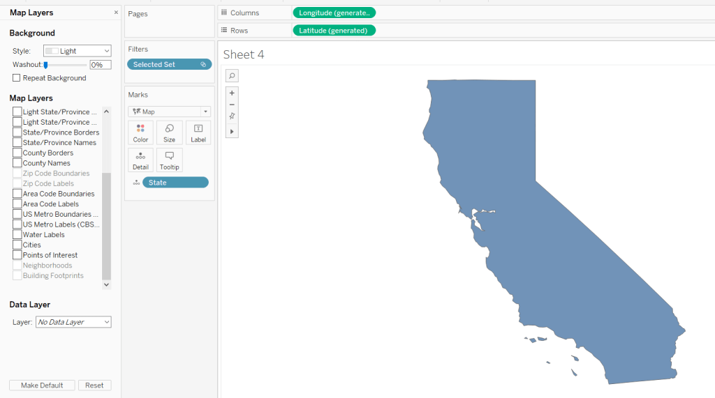
Double click this to create a basic ‘map’ with a single point.

Then drag another instance of Zero onto the canvas and drop on the Add a Marks Layer section that appears

You’ll now have 2 marks layers, which means whatever we now do, we can always add more.

Building the Gauge Background & Legend layer

Note – in building I ended up with more mark layers than Jack suggested. I’ve subsequently seen other versions but am sticking to what I managed for now.

The first layer I’m going to build is the ‘grey’ semi circle of the main gauge and the coloured legend ‘inner’ semi circle.

I want to identify those points only.

Geo: BG-Legend Layer

IF [Point Type] <> ‘Label’ AND [Point Segment ID] IN (‘Background’, ‘Concern’, ‘Failure’, ‘Success’) THEN [Geo] END

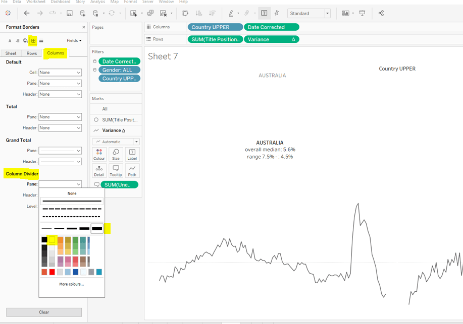
On the Zero marks card, drop this field directly on top of the COLLECT(Zero) to replace it. Add Point ID to Detail, then flip the axis using the switch axis button. Add Point Segment ID to Colour and adjust the colours of the Background, Failure, Concern and Success values to suit.

Change the mark type to polygon, and move Point ID to Path. Name this layer BG & Legend

Building the Actual Layer

Create a new field

Profit Ratio

{FIXED [Manufacturer]: SUM([Profit])/SUM([Sales])}

and format to % with 1 dp.

We need to understand where on the gauge, the Profit Ratio for each Manufacturer falls. We know that the gauge starts at -30% Profit Ratio (ie 0% of the gauge is equivalent to -30% Profit Ratio) and the gauge ends at +30% Profit Ratio (ie 100% of the gauge is equivalent to +30% Profit Ratio). Therefore if the Manufacturer’s Profit Ratio >= 30% it fills 100% of the gauge, anything less needs to be partially through. We can calculate this (using one of Jack’s hints) with

PR % of Gauge

([Profit Ratio] + [Gauge End Profit Ratio]) / ([Gauge End Profit Ratio]- [Gauge Start Profit Ratio])

To then determine the angle in degrees (and again using Jack’s hints), we want to find the proportion of 180 degrees that the PR % of Gauge represents, and then take off 90 degrees based on the gauge rotation.

PR Angle (Degrees)

([PR % of Gauge] * 180)-90

We can then convert this to radians

PR Angle Rads

RADIANS([PR Angle (Degrees)])

This gives us information to help determine a singular point on the gauge we need to ‘draw’ up to. But I want to ‘draw’ a polygon that goes from the left end (-30% mark) to this point, and for this, I need to know all the other points up to that point.

The way I came up with isn’t what Jack did. My result means I don’t get an exactly accurate marker, but it is so close to it’s position, and is ‘good enough’ for the viz type and how it’s being displayed.

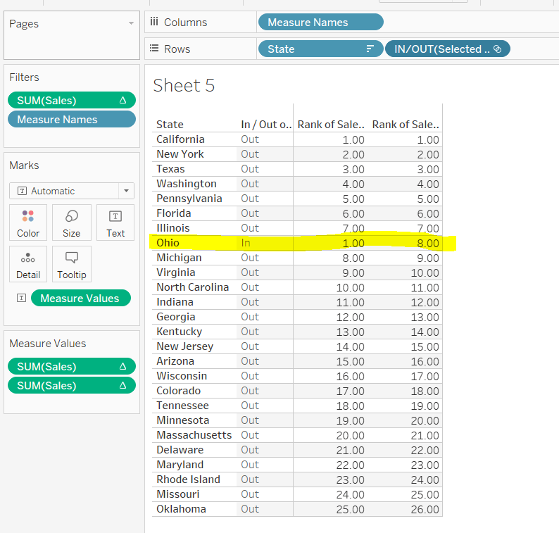
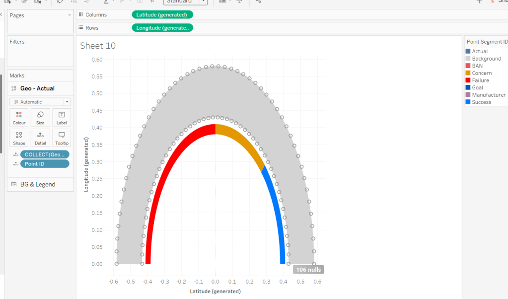
To understand what I did, build out a tabular sheet that is filtered to Manufacturer = Hon and Point Type = Actual, and shows Manufacturer, Point Segment ID and Point ID on Rows with Point Angle Rads, Profit Ratio and PR Angle Rads as measures.

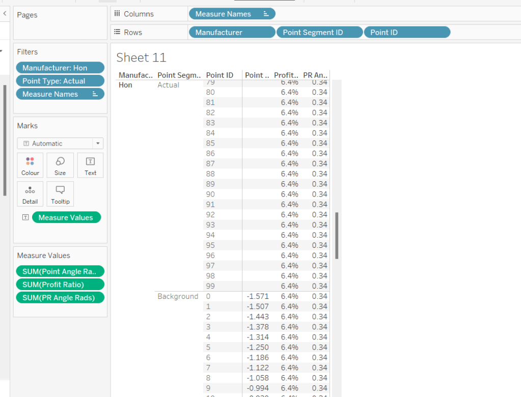
The Profit Ratio for the Manufacturer =Hon is 6.4% which is at an angle of 0.34 radians around the semi circle.

You can also see that while we have values for the Point Angle Radians field associated to the Point Segment ID = Background, we don’t have any for the Point Segment ID = Actual, as this is what we’re trying to find out.

Given that I know that all the Point Angle Radians values associated to the Point Segment ID = Background build a complete semi circle, I figured, to display up to my ‘actual’ Profit Ratio, I just want to get all the points associated to background which are less than the PR Angle Rads value.

PR Point Angle Radians

IF [Point Angle Rads] <= [PR Angle Rads] THEN [Point Angle Rads] END

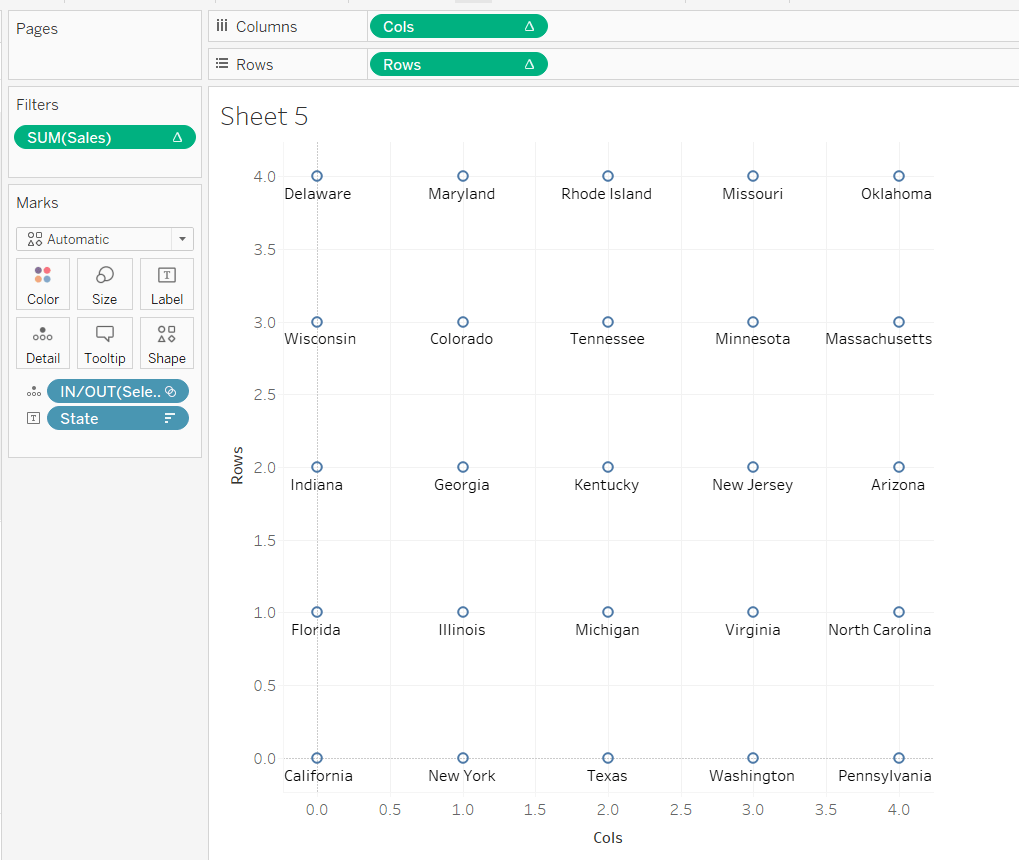
Pop this into the table, and when you scroll down, you’ll see I’ve only got values in my new field up to where the PR Angle Rads is less

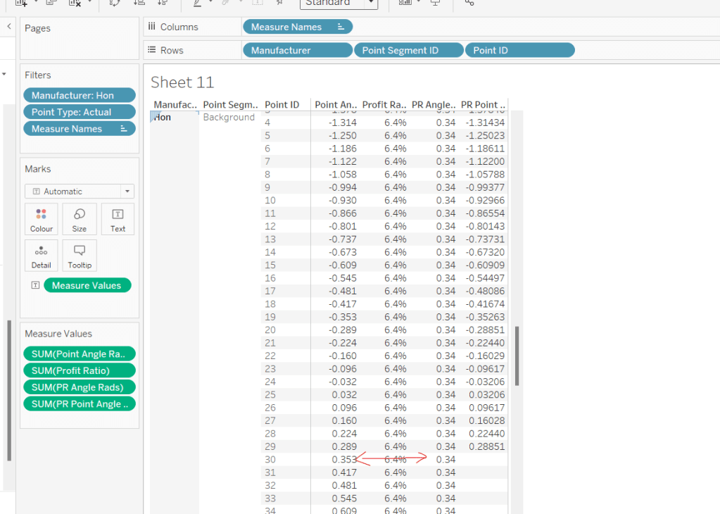
Using this field, I’ll create some new X & Y fields which I can make make into a spatial field

X (actual)

[Point Radius] *SIN([PR Point Angle Radians])

Y (actual)

[Point Radius] * COS([PR Point Angle Radians])
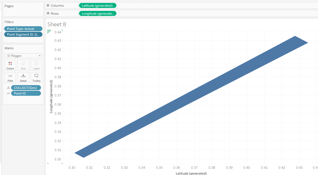
Geo – Actual

IF [Point Type] = ‘Actual’ AND [Point Segment ID] = ‘Background’ THEN
MAKEPOINT([X (actual)], [Y (actual)])
END

On the Zero(2) marks card, Replace the COLLECT(Zero) pill with the Geo – Actual pill by dragging the latter and dropping it directly on the former. Add Point ID to Detail.

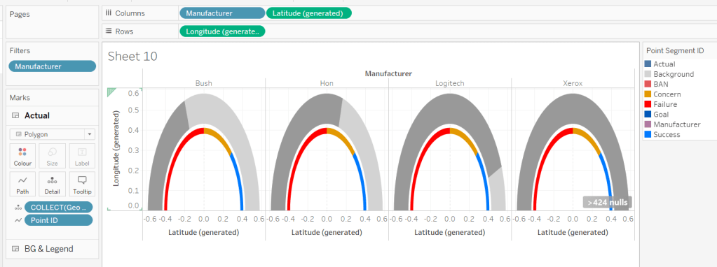
It’s drawing the points for a complete semi-circle, as every Manufacturer is being included. To help get the rest of the display right, for the various permutations, add Manufacturer to filter and filter to Hon, Bush, Logitech and Xerox. Add Manufacturer to Columns too. You should now see the marks stop at various positions around the arc. The filters will be adjusted later when we tackle the trellis.

Change the mark type to polygon and move Point ID to Path. Rename the layer to Actual.

For the colouring, we need to determine the RAG status of each Profit Ratio – where does the PR % of Gauge sit in comparison the constants we know

Actual RAG

IF [PR % of Gauge] <= [Gauge Concern Pct of Gauge] THEN ‘Failure’
ELSEIF [PR % of Gauge] <= [Gauge Success Pct of Gauge] THEN ‘Concern’
ELSE ‘Success’ END

Add this to the Colour shelf and adjust accordingly.

Building the Goal Indicator Layer

Create a new spatial field

Geo: Goal Layer

IF [Point Type] = ‘Actual’ AND [Point Segment ID] = ‘Goal’ THEN [Geo] END

and then drag this onto the canvas and drop on the Add A Marks Layer option.

Change the mark Type to Polygon and add Point ID to path. Add Point Segment ID to Colour and adjust the colour of the Goal value to suit. Rename the layer to Goal.

Building the Label layer

Create a new spatial field

Geo: Labels

IF [Point Type] = ‘Label’ THEN [Geo] END

and then drag this onto the canvas and drop on the Add A Marks Layer option. Add Point Segment ID to Detail. 3 marks should now displayed in the positions we need them

This bit took a bit of time to get right, as I had 3 requirements I wanted to satisfy: 1 – display a text or a numeric field as a label depending on what label I wanted to display (I attempted to have a single ‘label’ field converting numbers to strings with the relevant formatting, but the Profit Ratio % just wouldn’t show how I wanted when converted to string); 2 – adjust the colour of (some) of the labels depending on the RAG status of the profit ratio value; 3 – adjust the size of the Profit Ratio label based on how many gauges were displayed.

I needed several label fields

Label: Goal

IF [Point Segment ID] = ‘Goal’ THEN [Gauge Success Amt] END

formatted to % with 0 dp.

Label: Manufacturer-Fail

IF [Point Segment ID] = ‘Manufacturer’ AND [PR % of Gauge]<=[Gauge Concern Pct of Gauge] THEN [Manufacturer] END

Label: Manufacturer-Concern

IF [Point Segment ID] = ‘Manufacturer’ AND ([PR % of Gauge]<=[Gauge Success Pct of Gauge] AND [PR % of Gauge]>[Gauge Concern Pct of Gauge]) THEN [Manufacturer] END

Label: Manufacturer-Success

IF [Point Segment ID] = ‘Manufacturer’ AND [PR % of Gauge]>[Gauge Success Pct of Gauge] THEN [Manufacturer] END

Label: PR-Fail

IF [Point Segment ID] = ‘BAN’ AND [PR % of Gauge]<=[Gauge Concern Pct of Gauge] THEN [Profit Ratio] END

formatted to % with 1 dp

Label: PR-Concern

IF [Point Segment ID] = ‘BAN’ AND [PR % of Gauge]>[Gauge Concern Pct of Gauge] AND [PR % of Gauge]<= [Gauge Success Pct of Gauge] THEN [Profit Ratio] END

formatted to % with 1 dp

Label: PR-Success

IF [Point Segment ID] = ‘BAN’ AND [PR % of Gauge]>[Gauge Success Pct of Gauge] THEN [Profit Ratio] END

formatted to % with 1 dp

Add all these fields to the Label shelf, and adjust the label so that all are positioned on the same line, with no spaces, and add a carriage return beneath the text. Colour each field accordingly (DO NOT ADJUST THE FONT SIZE).

Change the mark type to text and align the label top centre. Rename the mark type to Labels and Disable Selection

To adjust the size of the labels, create a new parameter which we’ll need for the trellis.

pShowTop

integer parameter, defaulted to 7 which is a range from 5 to 81 with a step size of 1.

Show the parameter.

Create a new field

Label: Size

IF [Point Segment ID] = ‘BAN’ THEN [pShowTop]
ELSEIF [Point Segment ID] = ‘Manufacturer’ THEN 60
ELSE 80 END

We want the size of the BAN label to decrease as the number of manufacturers displayed increases.

Add this filed to the Size shelf as a continuous dimension (green pill, not aggregated).

Edit the Size legend so that sizes vary by range, the range is reversed, and the range starts from 1 to 81. Adjust the mark size range slider to a suitable start and spread.

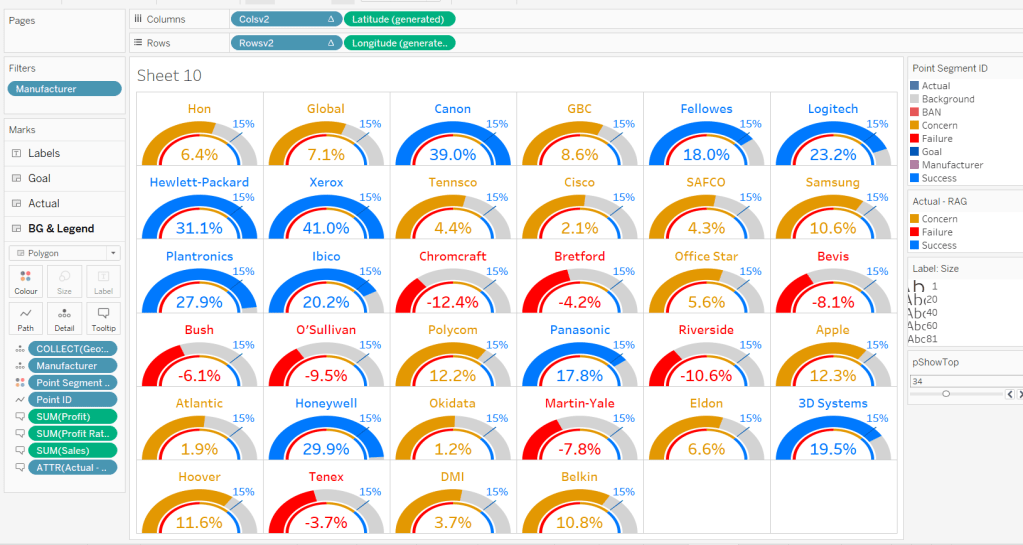
As you change the value of the pShowTop parameter, the Profit Ratio BAN should adjust in size.

Format Sales and Profit to be $ with 0dp and to display as () when negative, then on all marks cards, add Manufacturer to Detail and Sales, Profit, Profit Ratio and Actual RAG to Tooltip, and adjust Tooltip on all the layers to suit.

Finally remove all gridlines/zero lines/axis ticks and hide the longitude & latitude axis. Hide the null indicator.

Building the Trellis

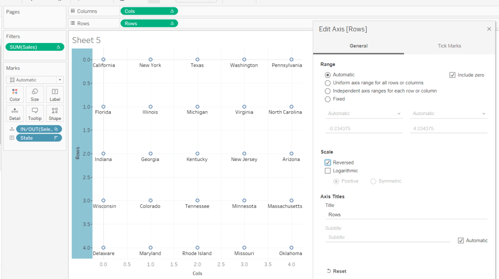
So now we’ve got the core viz nailed, we need to address the layout, which is to show a gauge for each of the top n manufacturers based on Sales. This means we need to have the gauges indexed/ranked from 1 to n based on total Sales, and then arrange in a grid so that top left is the manufacturer with the highest sales, and bottom right is the manufacturer with the lowest sales. For this we need to assign a row and column number against each manufacturer.

There are multiple blog posts about creating trellis charts. My go to post has always been this one by Chris Love, especially when the requirement is for the trellis to be dynamic (the number of rows/columns can vary) depending on the number of items to be displayed.

However in this instance, using the calculations referenced in the blog doesn’t meet the requirement of ensuring there are more columns than rows. This was an area that got me stumped. As a result, I finished the viz with a version that utilises my ‘go to’ calculations (published here), before then looking at Jack’s solution to get the calculations, which are

Cols Count

//If Rounded value = Value without Round then no remainder, use that number
if SIZE()/round(SQRT(SIZE()),0) = int(SIZE()/round(SQRT(SIZE()),0)) THEN SIZE()/round(SQRT(SIZE()),0)
//Otherwise add 1 to the number of columns
ELSE int(SIZE()/round(SQRT(SIZE()),0)) + 1
END

Size() is reflective of the number of items (in this case Manufacturers) to be displayed… as I write this down, for this specific instance, you could probably replace SIZE() with the parameter pShowTop.

Rowsv2

//For Each Manufacturer, what Row should it be in the Trellis?
//Rank the Manufacturer, Find the Integer portion when dividing by # of Columns
int((INDEX()-1)/ [Cols Count])

Colsv2

//For Each Manufacturer, what Column should it be in the Trellis?
//Rank the Manufacturer, Find the Remainder when dividing by # of Columns
int((INDEX()-1) % [Cols Count])

Make both Rowsv2 and Colsv2 discrete.

Add Rowsv2 to Rows and Colsv2 to Columns. Remove Manufacturer from Columns. It’ll look a bit odd, but be patient.

Edit the Manufacturer pill on the Filter shelf. On the General tab, select None, to remove everything from the filter, then on the Top tab adjust to be based on the top pShowTop by Sales

Now edit the table calculation associated to the Rowsv2 pill, so that it computes by specific dimensions and every field except Point ID is selected. Ensure Manufacturer and Point Segment ID are listed at the top in that order. Set the level to be Manufacturer and apply a custom sort based on Sum of Sales descending

As this is a nested table calculation, select the drop down arrow at the top and apply the same settings to the nested Cols Count field.

Then do exactly the same again for the Colsv2 table calculation settings. If all has been applied successfully, then you should get a grid

where you can then adjust the pShowTop parameter

Hide the Rowsv2 and ColsV2 fields from displaying (uncheck show header). Show the Longitude axis, and fix it to start at 0 but end ‘automatic’. Then hide the axis again (this ensures the arc lands on the row divider).

Then add the viz to a dashboard. My published version based on the trellis using Jack’s calculations is published here.

If you’ve made it to the end – well done! It was a bit of a marathon to do the challenge and another to write this blog. I’m sure it’s been quite an effort to read too, but hopefully you’ve learnt something, and I’ll certainly be referencing this again when a map layer and/or gauge based scenario occurs again.

Happy vizzin’!

Donna

Can you create a dynamic small multiple chart?

For this week’s #WOW2023 challenge, Lorna asked us to recreate this small multiple (or trellis) chart which organises the time series charts per Sub-Category into a grid format, where the number of columns is determined by the user.

Whenever I need to build these types of charts, I often end up referencing this blog post by Chris Love from 2014, as this has the basis for the calculations required.

To get started, we need to capture the number of columns based on a parameter

pCols

integer parameter ranging from 1 to 5 with a step size of 1, that is defaulted to 5

On a new sheet, display the parameter, and add Sub-Category to Rows. Apply a sort to Sub-Category based on the field Sum of Sales descending.

Based on the pCols parameter, we need to determine which column and subsequently which row each Sub-Category should be positioned in. We will make use of the index of each entry in the list. Double click into the Rows shelf and manually type in INDEX(). Change the field to be discrete (blue). This will number every Sub-Category row from 1 upwards. To be explicit, edit the table calculation, to explicitly set it to compute using the Sub-Category dimension.

To determine the column for each sub-category

Column

(INDEX()-1)%[pCols]

the % symbol, is the modulo and returns the remainder when the INDEX()-1 is divided by pCols – ie if INDEX() = 12, then 12-1 = 11 and 11 divided by 5 is 2 with 1 left over, so the result is 1.

Add this to the sheet, set it to be discrete (blue) and also edit the table calculation to compute using Sub-Category. You can see that Chairs and Machines are in the same column. If you adjust pCols, the values will adjust too.

To determine which row each Sub-Category will be positioned in we need

Row

INT((INDEX()-1) / [pCols])

This divides INDEX()-1 by pCols and just returns the whole number. ie if INDEX() = 8, then 8-1 = 7, and 7 divided by 5 = 1.4. The integer part of 1.4 is 1.

Add this to Rows and set to be discrete, and adjust the table calculation as before. You can see Chairs and Phones are in the same row (but different columns), which Chairs and Machines are in the same column, but different rows.

Let’s rearrange – Move Column to Columns, Sub-Category to Text and remove INDEX() altogether, and you’ll get the basic grid layout we need.

Create a new field to store the date part we’re going to present

Month Order Date

DATE(DATETRUNC(‘month’,[Order Date]))

Add this to Columns, and set as exact date and add Sales to Rows and move Sub-Category to Detail. At first gland this may look ok, but if you look closely, you’ll notice that there are multiple lines on some of the charts.

This is because there are some states that didn’t sell some of the sub-categories on the month, and this affects the index() calculation when the Month Order Date is set to be a continuous (green) pill (the viz below highlights this better – Accessories is now indexed with 6 and 7…

So to resolve this, add Month Order Date as a discrete (blue) exact date to the Detail shelf underneath the Sub-Category field. Then change the Month Order Date field in the Columns shelf to be a Continuous (green) attribute. Then adjust the table calculation on both the Column and the Row fields, so they are computing over both Sub-Category and Month Order Date, but at the level of Sub-Category.

Format the ATTR(Month Order Date) field on Columns to be the custom format of yyyy, so the axis just display years

and then format the Month Order Date field on the Detail shelf, to be the custom format of mmmm yyyy, so the information in the Tooltip will display the date as March 2001 etc. Adjust the Tooltip to match.

The label for each Sub-Category needs to be positioned based on the y-axis at the maximum sales across the whole display, and on the x-axis at the last point in the date scale ie December 2023. For this we need

Max Sales in Table

WINDOW_MAX(MAX([Sales]))

Label Position

IF LAST()=0 THEN [Max Sales in Table] END

Add Label Position to Rows and adjust the table calculation so the Max Sales in Table nested calculation is computing by both Sub-Category and Month Order Date, and the Label Position nested calculation is computing by Month Order Date only. This should result in a single mark per Sub-Category displaying.

Make the chart dual axis and synchronise the axis. Remove Measure Names from the All marks card. On the Label Position marks card, change the Mark type to shape and select a transparent shape (see this post for details on how to get this set up). Move Sub-Category to Label and align top right.

Finalise the display by hiding the Column and Row fields (uncheck show header), hiding the right hand axis (uncheck show header). Format to remove all gridlines & zero lines and hide the null indicator. Remove the axis title.

You should then be able to just add this to a dashboard. My published viz is here.

Happy vizzin’!

Donna

Can you use dynamic axis titles?

Lorna used this week’s challenge to showcase a new feature in Tableau v2023.1 – dynamic axis titles. As you can expect, you’ll therefore need this version of Desktop (or later if you’re reading this in the future ;-)) to complete the challenge.

Modelling the data

Download the file Lorna provided and connect to the 2023 sheet. Lorna hinted that a pivot would help, so in the data source canvas, multi-select all the measures (ctrl-click each column – there are several) then right-click and Pivot.

Rename Pivot Field Names to Measure and rename Pivot Field Values to Value.

Building the Basic Scatter Plot

We need 2 parameters to control the selection of the measures we want to display in the scatter plot. Right click on Measure > Create > Parameter

pMeasure1

string parameter defaulted to Metres, and all the possible other values should be listed

Repeat the steps again to create pMeasure2 which is defaulted to Tackles

To determine the value to plot on the axes based on the selections from the parameters we need

X-Axis Value

IF [pMeasure1] = [Measure] THEN
IF [Value] <> 0 THEN [Value] END
END

Note – the additional nested IF was added as I discovered while playing with the Lorna’s solution that marks didn’t display when the value was zero.

Similarly we need

Y-Axis Value

IF [pMeasure2] = [Measure] THEN
IF [Value] <> 0 THEN [Value]END
END

Add X-Axis to Columns, Y-Axis to Rows, Team Name to Rows and Name to Detail. This will give a basic scatter plot.

Change the mark type to circle, adjust the colour, and reduce the opacity to around 70%. Add a grey border to the circles.

The size is based on the number of games the player has played, so we need

Count Games

COUNTD([Game ID])

Add this to the Size shelf.

Adjust the Tooltip so it references the parameters and the other relevant fields

To change the axis titles, edit the x-axis (right click axis > edit axis) and from the menu arrow next to the word ‘custom’, select the pMeasure1 option.

Repeat the same for the y-axis, but select pMeasure2 instead.

Making the small multiples

For this we need to define which row and column each Team Name should sit in. As we’ve only got 12 teams to work with, and that number is static, and we know we’re working with a 3×4 grid, I’m going to ‘hardcode’ this a bit rather than use more dynamic calculations.

To see what’s going on, on a new sheet add Team Name to Rows. Then create a new field

INDEX

INDEX()

and add this to Rows and convert to discrete. It should provider a counter from 1 to 12 for each Team Name.

Based off this INDEX value we’ll work out which row and colum each team will sit.

Column

(INDEX()-1) % 3

Row

IF [INDEX]<=3 THEN 1
ELSEIF [INDEX]<=6 THEN 2
ELSEIF [INDEX]<=9 THEN 3
ELSE 4
END

Add these to the table as blue discrete pills

Back onto the scatter plot sheet, add Row to Rows as a blue discrete pill, add Column to Columns as a discrete pill, and move Team Name to Detail. Modify the table calculation settings of both the Row and the Column pill so that the calculation is computed using Team Name and Name (in that order) and at the level of Team Name

Hide the Column and Row pills (uncheck Show Header)

Adding the Team Name title

Create a new field

Ref Line

WINDOW_MAX(SUM([Y-Axis Value])) * 1.1

and add this to the Rows. This will create a second marks card. Set the table calcuation of the Ref Line pill to compute using Name and Team Name (in that order).

On the Ref Line marks card, remove the pill from the Size shelf, change the mark type to gantt bar, and reduce the size to the smallest possible, set the opacity to 0%, and border to none.

Add Team Name to the Label shelf, then set to label min/max values, by the X-Axis Value field and Label Minimum value only.

Each team name should only be displayed once. Edit the text of the label and add a few spaces to shift the label across and align it better.

Edit the Tooltip of this marks card, and delete all the text. Now make the chart dual axis and synchronise the axis. Then remove Measure Names from the All marks card, and hide the right hand axis.

Finally remove the 0 lines from displaying, and hide the nulls indicator (right click). Add the chart to a dashboard, and position the parameters as floating objects within the text of the title. I just used spaces within the text to leave room for where I wanted to place the parameterss.

And that should be it. My published viz is here.

Happy vizzin’!

Donna

Can you label & sort small multiples?

A colourful #WOW2022 challenge this week set by Kyle Yetter and using his favourite data – Baseball. Let’s jump straight in.

Building the required calculations

First up we need to calculate the core measure the viz is based on – % of wins

Win %

SUM([Wins])/SUM([Games])

I formatted this to 3 decimal places, then applied a custom number format to remove the leading 0 (custom number format looks like ,##.000;-#,##.000).

We also need to know the number of losses as this is part of the tooltip.

Losses

SUM([Games]) – SUM([Wins])

Let’s pop all these out into a table (I formatted all the whole numbers to display without any decimal places).

The viz however isn’t plotting the actual Win%, it’s plotting the difference from 50% (or 0.5), so values less than 50% are negative and those above are positive.

Plot Postion

[Win %] – 0.5

And we also need to know whether the Win% is above 50% or not

Above 50%

[Win %]>0.5

Pop these out onto the table too

The viz also displays the overall Win% for each team, and also uses this to sort the data. As it is used for sorting, we need to use an LoD calculation (rather than a table calculation).

Overall Win% LOD

{FIXED [Team]:SUM([Wins])} / {FIXED [Team]: SUM([Games])}

for each team, get the total wins, and divide by the total games for the team. Format this to 3 dp with no leading 0 as before.

pop this into the view (you’ll see it’s the same value for each row for a single team), and then apply a Sort on the Team field to sort descending by the Overeall Win% LOD.

Now we have the data sorted, we can create the fields needed to build the trellis chart.

I have already blogged challenges relating to trellis charts / small multiples (see here) which in turn reference other blogs in the community, so I’m not going to go into all the details. We just need to build two calculated fields to identify which row and which column each Team will sit in. The table is fixed at 6 columns wide as the data wea re using is static. Some solutions work with a more dynamic layout depending on how many entities you need to display. We’re keeping things simpler.

Cols

FLOAT(INT((INDEX()-1)%6))

Rows

FLOAT(INT((INDEX()-1)/6))

Add both these fields to the table as discrete dimensions (blue pills), and as they are both table calculations, set them both to Compute Using – > Team.

Building the Core Viz

On a new sheet, add Cols to Columns as discrete dimension, Rows to Rows as discrete dimension and Team to Detail. Set both Rows and Cols to Compute Using Team.

Add Year as continuous (green) pill to Columns and Plot Position to Rows and change the mark type to Bar and reduce the size. Sort the Team field based on Overall Win% LOD descending.

Add Wins, Losses, and Win% to the Tooltip shelf and adjust the tooltip to display as required. Add Above 50% to the Colour shelf (you may need to readjust the size). Leave the colours as they are for now – we’ll deal with this later.

Adding the labels

Create a new calculated field

Dummy Plot

FLOAT(IF [Year]=2000 OR Year = 2020 THEN 0.35 END)

This is basically going to position a mark at height 0.35 but only if the year is either 2000 or 2020. These values were all just based on a bit of trial and error as to what worked to get the desired result.

Also create a field

LABEL:Team

IF [Year]=2000 THEN [Team] END

and

LABEL:Win%

IF [Year]=2020 THEN [Overall Win % LOD] END

format this to 3dp and exclude the leading 0.

Add Dummy Plot onto Rows and change the mark type of this measure to circle. Amend the Tooltip of this marks card so it’s empty.

Add LABEL:TEAM and LABEL:Win% to the Label shelf, and adjust the label so both fields sit side by side (only 1 value will only ever actually display). Adjust the table calculation of both the Rows and Cols pills so they now compute using both the Team and the LABEL:Team fields.

Adjust the alignment of the labels so they are positioned bottom centre. Set the font colour to match mark colour and bold.

Then reduce the size of the circle mark to as small as possible, reduce the opacity of the mark colour to 0.

Now make the chart dual axis and synchronise the axis. Remove the Measure Names field that has automatically been added to the All marks card.

Hide all the headers and axis (uncheck Show Header), remove all grid lines, zero line, axis rulers.

Hide the null indicator (bottom right).

Colouring by Team

Copy the colour palette text Kyle provided into your preferences.tps file (usually located in the My Tableau Repository directory). For more information on working with custom colour palettes see this Tableau help article.

You’ll need to save your workbook and re-open for the new palette to be available for use.

In order to prevent having to manually set all the colours (and believe me you don’t want to do this!), perform the following steps in order

  • Add Team to also be on the Colour shelf. Click on the 3 dots (…) that are to the left of the Team pill on the All marks card, and change it to Colour. This means there are now 2 fields on colour. Move the Team field so it is listed above the Above 50% pill. This means your colour legend should be listed as <Team>, <True|False>
  • Adjust the Sort of the Above 50% pill, so it is manually sorted to list True before False.

  • Now change the Sort on the Team field so it is sorted alphabetically ascending instead. This will cause the viz to change its sort order, but don’t worry for now. It also changes the list on the colour legend, so ARI, True is listed first then ARI, False etc.

  • Now edit the Colour Legend and select the new MLB Team Colours palette we added. Click the Assign Palette button to automatically assign the colours. As we’ve made sure the entries listed are in the right order, they should get the correct colours.

  • Change the Sort on the Team field back to be based on Overall Win% LOD descending

And that should be it. You can now add the viz to a dashboard and publish. My published version is here.

Happy vizzin’!

Donna

Let’s build a trellis chart!

It only seems like yesterday I was writing a solution guide, and I’m back at it again. This week Sean asked us to recreate this challenge to build a small multiple / trellis chart using table calculations only.

A note on the data

After downloading and connecting to the provided data source, I found the dates weren’t coming through as intended – they’d been transposed from dd/mm/yyyy to a mm/dd/yyyy so consequently the only dates I was getting were for the first 12 days in January for every year. Rather than trying to solve this at source, I just created a new field which transposed the Date field back so it behaved as I expected

Date Corrected

(MAKEDATE(YEAR([Date]), DAY([Date]),MONTH([Date])))

You may not need to do this if the data pulls in correctly.

Filters

There are two filters that should be applied, which can either be added as data source filters (right click data source > Edit data source filters) or can be applied to the Filter shelf on any sheets created. Ultimately, this challenge only requires 1 sheet, but when building and verifying logic, I tend to have additional ‘check sheets’. I therefore added the filters below to the Filter shelf of the first sheet I started working with, but set them to apply to all worksheets using the data source (right click pill once it’s on the filter shelf -> Apply to Worksheets -> All using this data source).

Gender : All

Date Corrected : starting date = 01 Jan 2012

Setting up the data

As is good practice when working with table calculations, I start by building out the calculations I need and validating them in a tabular format before I build any vizzes. So let’s do that.

All the countries are displayed in capital letters, so we need

Country UPPER

UPPER([Country Name])

Add this to Rows

Additionally, for the purpose of validation and performance only, add this field to the Filter shelf too and just filter to Australia and Austria.

If you haven’t already added them as data source filters, apply the filters mentioned in the section above to this sheet too and set to apply to all worksheets using the data source.

Add Date Corrected to Rows as a discrete (blue pill) exact date. Format the date so it displays in month year format.

Add Unemployment Rate to Text. Format this number to 1 decimal place and add a % as a suffix.

Now for the table calcs

Median

WINDOW_MEDIAN(SUM([Unemployment Rate]))

Format this to display as a % using the same option as above. Add this to the table and set to compute using Date Corrected

You should find that your median value only differs by country.

Now we work out

Variance

SUM([Unemployment Rate]) – [Median]

Format this to display as a % and add to the table, setting the table calc to compute by Date Corrected again. This is the measure that will be used to plot the trend line against.

We also need to display the range of Unemployment rates for each country – ie we need to work out the minimum and maximum values.

Max Unemployment Rate

WINDOW_MAX(MAX([Unemployment Rate]))

Min Unemployment Rate

WINDOW_MIN(MIN([Unemployment Rate]))

Format both of these to display as 5 with 1dp, and add to the table, verifying the calculations are computing by Date Corrected once again. Verify you get the same values for all the rows associated to a single country.

Now we know the calculations are as expected, we can start to build out the viz.

Building the core chart

To start with we’ll just focus on getting the line chart with the associated text displayed for the two countries Australia & Austria. So on a new sheet add Country (UPPER) to Filter and filter to these selections. The other filters should automatically add.

Add Country UPPER and Date Corrected (green continuous exact date) to Columns and Variance to Rows. Set Variance to Compute By Date Corrected.

Add Unemployment Rate to the Tooltip and adjust the text to match.

To add the country title and other displayed text, we’re going to use a ‘fake axis’ and plot a mark at a central date. On hovering over the solution, October 2016 seems to be the appropriate date selected. So we need

Title Position to Plot

IF [Date Corrected] = #2016-10-01# THEN 1 END

Add this to Rows in front of the existing pill. Change the mark type of this measure only to a circle and re-Size to make it as small as possible and adjust the Colour Opacity to 0%. This will make the mark ‘disappear’.

Add Country UPPER, Median, Max Unemployment Rate and Min Unemployment Rate to the Label shelf of this marks card. Ensure all the table calculation fields are set to compute by Date Corrected. Adjust the text as required, and align centre. Ensure the Tooltip is blank for this marks card.

Change the colour of the variance line to grey, then remove all gridlines, row dividers and axis. Set the Column Dividers to be a thick white line (this will help provide a separator between the small multiples later).

Creating the trellis

There are multiple blog posts about creating trellis charts. My go to post has always been this one by Chris Love. It’s a more complex solution that dynamically flexes the number of rows and columns based on the number of members in the dimension you’re visualising. There have also been other Workout Wednesday challenges involving trellis charts, which I’ve blogged about too (see here).

Ultimately we’re aiming to determine a ‘grid position’ for each member of our dimension. In this case the dimension is Country UPPER and its a static list of 36 values, which we can display in a 6 x 6 grid. So Australia needs to be in row 1 column 1, Austria in row 1 column 2….. Costa Rica in row 2 column 1… USA in row 6 column.

As our members are static, the calculations we can use for this can be a bit simpler than those in Chris’ blog.

Firstly, let’s get our data in a tabular layout so we can ‘see’ the values as we go.

Duplicate the data sheet we built up, then move Measure Name and Date Corrected from Rows/Columns to the Detail shelf. Remove the Country UPPER field from the Filter shelf. You should have something like below, showing 1 row per country

Double click into the Rows shelf and type in INDEX(), then change the resulting pill to discrete (blue). You will see that index numbers every row. It’s a table calculation and although working as expected, let’s explicitly set it to compute using County UPPER.

Let’s now create our grid position values.

Cols

FLOAT(INT((INDEX()-1)%6))

This takes the Index value and subtracts 1, and returns the remainder when divided by 6 (%6=modulus of 6 – ie 6%6=0, 7%6=1). 6 is the number of columns we want.

Rows

FLOAT(INT((INDEX()-1)/6))

This takes the Index value and subtracts 1, and returns the integer part of the value when divided by 6. Again we’re using 6 as this is the number of rows we want to display.

Add these to the table, set to be discrete (blue) and compute using Country UPPER.

You can see that the first 6 countries are all in the same row (row 0) but different columns (0-5).

Now that’s understood, we can create the small multiples on the viz.

Duplicate the sheet we created further above which displays the trend graph for Australia & Austria. As we’re now going to make the changes to create the charts for every country, if things go a bit screwy, you can always get back to this one to try again :-).

Add Cols to Columns. Set to discrete and compute using Country UPPER. Add Rows to Rows and do the same thing. Move Country UPPER from Columns to the Detail shelf on the All marks card. Then remove Country UPPER from the Filter shelf.

Hopefully everything worked as expected and you have

Final step is to uncheck Show Header against the Cols and Rows pills so they don’t display and you can add to a dashboard.

My published viz is here.

Happy vizzin’!

Donna

Can you swap States?

Week 49 of #WorkoutWednesday2019 was Luke’s last challenge of the year, so following a poll he posted a ‘notably tough’ challenge.

On the face of it, it didn’t look too bad…. I figured it would involve a trellis chart for the small multiples, set actions (for the state selection), and something table calculation related to crack the ranking. Hovering over the state label for each small multiple, I also figured some dual axis was probably at play. The bit that actually looked most tricky to me initially, was displaying the States just as their shapes.

Single State viz

I decided to build the single state viz first. I created a set (Selected State) based off the [State] field, and selected California as the state ‘in’ the set.

I then started to build the viz simply by double-clicking on State (which automatically adds State to the detail shelf, and the automatically generated Long & Lat fields to the rows & columns. I added the Selected State set to the filter shelf, which immediately restricted the data to California, and I changed the mark type to filled Map.

To isolate the display just to the State itself, I figured would be something to do with the various Map Layer options available (menu Map -> Map Layers); I wasn’t sure exactly what but found by unchecking every pre-selected option, I got a ‘clean’ display.

Changing the opacity of the mark colour to 0 and setting the border to red gave me the desired display.

Maybe the State shape wasn’t going to be as much of an issue as I thought….?

The cities needed to be displayed as circular marks, so I knew this would need a dual axis to make this work. I duplicated the Latitude field (hold ctrl as you click and drag the field) and did the following :

  • changed the mark type of the duplicated field to circle
  • added City to the Detail shelf
  • added Sales to the Size shelf
  • changed the colour of the mark to blue, upped the opacity to 50% and removed the shape border

I then made the chart dual axis and increased the size of the circles to suit.

Finally I added State and Sales to the Label shelf of the Map marks card and adjusted the Label formatting to suit.

Ranking

So the requirement was to show the top 25 states in a ‘grid’ or ‘trellis’ format ordered by the state with the most sales.

However there was a subtlety to this:

  • the grid should always show 25 states
  • the selected state should not display in the grid
  • the overall rank of the state should display, so if the 3rd largest state is selected, the displayed ranking would be 1, 2, 4, 5, 6… up to 26; 3 would be omitted from the list.

The best way to explain how I tackled this, is to show the info in a tabular format.

Firstly, create a table of Sales by State sorting the State by Sales desc

Apply a Quick Table Calculation of Rank to the SUM(Sales) pill. Then edit the table calculation, setting the rank to be unique and fixing the Compute Using to apply over State.

Add the Selected State pill alongside State, and as California is still our selected state, you see we now have two ‘1’s. This is because we fixed the table calculation to State, so its now being applied for each ‘In/Out Selected State’

This is the table calculation we want to use to filter our data to get the ‘top 25’ fields. With ‘California’ selected as being ‘in the set’ and therefore the selected state, we need the next 25 states to the be ones showing in the grid. This being from New York to Oklahoma.

Holding down ctrl and then dragging the Sum(Sales) pill to the filter shelf (ie duplicating the pill), you can set it to show at most 25

However, the ‘rank’ displayed against each row, isn’t the rank we want to show on the viz. New York is the 2nd largest state, so should be labelled no 2, not no 1 as shown above.

We need another version of the Sales rank. Add Sales back into the chart, and again apply a Quick Table Calculation of Rank.

The 2nd rank is now showing values 1 – 26, and if you edit the table calc, you’ll see it automatically has set itself to ‘table down’ which is actually being applied to both State and the In/Out Selected State. Alter the table calc to be unique and fix it to apply to State & In/Out Selected State, which will ensure the values remain the same regardless as to how you move pills around.

This second rank is what is used to display the ‘overall rank.

Finally, we’ve still actually got 26 states shown, when we only want the 25 states ‘out’ of the set displayed. We simply apply the sneaky trick to ‘hide’ the In (click on the ‘In’, right-click and select Hide).

Change the set value to Ohio for example, and re-show the hidden data (click on In/Out Selected Set pill and Show hidden data). You’ll see Ohio is 8th in the overall rank, but is ‘in’ the set so ranked 1 in the ‘top 25’ filter rank.

When I come to build the map trellis later, it is these table calcs and techniques I will have applied.

Trellis Chart

In this instance we have a fixed number of states to display (25), to show in a 5×5 grid; 5 rows and 5 columns. Each of the 25 states we have needs to be assigned a row number and a column number.

Let’s go back to the tabular display to help with this. With the display just showing the 25 States ‘out’ of the set (by hiding the ‘In’), let’s add INDEX() to the view. INDEX() is a table calculation most often used to number rows. INDEX() is set to compute over the State only (so the numbers 1-25 are listed). Note this is giving the same information as the Sales ranking discussed above, and we could reference the same field, but INDEX() is more generic and referenced in many trellis chart solutions, so let’s stick with that.

What we’re looking to achieve, is the first 5 rows listed, to appear in the 1st row, across 5 columns. Rows 6-10 would be in the 2nd row etc etc. I need to build

Cols

FLOAT(INT((INDEX()-1)%5))

This takes the Index value and subtracts 1, and returns the remainder when divided by 5 (%5=modulus of 5). Storing the final output as a float will become clearer later.

Rows

FLOAT(INT((INDEX()-1)/5))

This takes the Index value and subtracts 1, and returns the integer part of the value when divided by 5. Storing the final output as a float will become clearer later.

Adding these on to the table, and again setting the table calculation to compute by State only, you get

and if we shuffle the pills around to create the rows & columns, and keep just the pills we need we get

But it’s all upside-down : we need California top left, not bottom left. We can fix this by editing the Rows axis, and reversing it.

Now by simply changing the mark type to Map, we can get the shape states to show – it’s like magic! You’ll need to increase the size to see them properly.

Side note – this was actually quite a revelation; it took some time for me to get to this, having unsuccessfully had views with Lat & Long displayed (as that’s what a map chart always needs right?), resulting in the state shapes being positioned all over the place. Writing this blog and reproducing steps as I type, has made things seem much simpler, than when I was tackling the challenge initially!

As you can see, things aren’t perfect yet, but we’re on the right track. The axis need editing to extend them. Rows is set from -0.5 to 5, and Cols from -0.5 to 4.5 (this is why we needed to set the field to be FLOATs).

The colour of the mark also needs adjusting to match what we did when building the single state viz.

The label positioning isn’t also right, even if you change the alignment, so move the State from the Text to the Detail shelf and don’t show any labels. Then create an additional axis on the rows by duplicating the Rows field to exist alongside, then ‘type’ into the second instance and change to Rows+0.5

Make this dual axis, synchronise and change mark type to Text. Make sure the opacity on the colour is increased back to 100% and adjust the size of the text.

Now it’s just a case of tidying this view to match the requirements; adding additional fields to the Text shelf, removing axis, row/column lines and gridlines etc.

Once done, both the views can be added to a dashboard, and the ‘select state’ interactivity is achieved using a Set Action dashboard action.

And that’s it. As stated I did have some struggles when building initially, but as most things, it’s down to the path you happen to follow. If I’d initially built based on the order I’ve authored this blog, and the tabular views I’ve built to demonstrate techniques, I wouldn’t have had any problem. But it’s all valuable learning experiences and adds to my understanding!

My version of the viz is published here.

Happy vizzin!

Donna