For this week’s #WOW2020 challenge, Sean Miller stripped things right back and went ‘back to basics’.
This blog should be brief as I’m only going to touch on the bits that I think some people might find a little tricky.
The Map Colours
Use the Red-Black Diverging colour palette, centred at 0 to ensure the colours match exactly (this is most noticeable on the Viz in Tooltip table if it’s not centred at 0).
Map Background
On the Map -> May Layers menu, ensure all the items under the Map Layers section are unchecked
Seaboard States
I used the MIN(1) on the Columns shelf and fixed the axis from 0-1 to fill it up.
Top 10 Products
Orders Count
I dragged Order ID into the ‘measures’ section (below the line on the left hand pane if you’re using later versions of Tableau), and chose the COUNTD aggregation. When I added this to the table, I then changed the alias of the field and called it ‘Orders’
Top 10
Add Product Name to the Filter shelf and select the Top tab.
Colouring the columns
This uses the Legend Per Measure functionality. Add Measure Values to the Colour shelf and select the Use Separate Legends option
This will add 3 colour legends onto the canvas. Set the colours of the Profit measure to the Red – Black diverging as with the map.
For the other 2 legends select any diverging colour palette, then click on the coloured square at each end, and select white from the palette displayed. Change the stepped colour to 2, and you’ll find that the measures now don’t look like they actually have a background colour.
Viz in Tooltip
When adding the sheet as a tooltip, I adjusted the size to 500×350
The size of the Top 10 Products sheet should be set to Entire View to ensure you don’t get a ‘View is too large to display’ message on the tooltip
Getting the Top 10 filtered properly
Once the viz has been added as a ‘viz in tooltip’ a State related filter pill will automatically be added to the Filter shelf of the the Top 10 Products sheet. To ensure the top 10 products gets filtered by the state BEFORE the top 10 products by sales are identified, the filter needs to be Added to Context
Arranging on the Dashboard
I managed to tile all the items, except for the ‘Eastern Seaboard States’ title which I floated.
It’s Community Month over at #WOW HQ this month, which means guest posters, and Kyle Yetter kicked it all off with this challenge. Having completed numerous YoY related workbooks both through work and previous #WOW challenges, this looked like it might be relatively straight forward on the surface. But Kyle threw in some curve balls, which I’ll try to explain within this blog. The points I’ll be focussing on
YoY % calculation for colouring the map
Displaying the circles on the map
Restricting the Date parameter to 1st Jan – 14th July only
Showing Daily or Weekly dates on the viz in tooltip
Restricting to full weeks only (in weekly view)
YoY % calculation
The data provided includes dates from 1st Jan 2019 to 21st July 2020. We need to be able to show Current Year (CY) values alongside Previous Year (PY) values and the YoY% difference. I built up the following calculations for all this
Today
#2020-07-15#
This is just hardcoded based on the requirement. In a business scenario where the data changes, you may use the TODAY() function to get the current date.
Current Year
YEAR([Today])
simply returns 2020, which I could have hardcoded as well, but I prefer to build solutions as if the data were more dynamic.
CY
IF YEAR([Subscription Date]) = [Current Year] THEN [Subscription] END
stores the value of the Subscription field but only for records associated to 2020
PY
IF YEAR([Subscription Date]) = [Current Year]-1 THEN [Subscription] END
stores the value of the Subscription field but only for records associated to 2019 (ie 2020-1)
YoY%
(SUM([CY])- SUM([PY]))/SUM([PY])
format this to a percentage with 0 decimal places. This ultimately is the measure used to colour the map. CY, PY & YoY% are also referenced on the Tooltip.
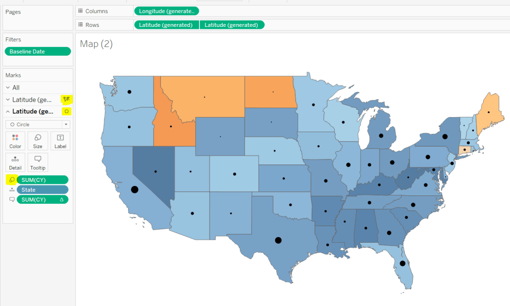
Displaying circles on the map
This is achieved using a dual axis map (via a second instance of the Latitude pill on Rows). One ‘axis’ is a map mark type coloured by the YoY% and the other is a circle mark type, sized by CY, explicitly coloured black.
The Tooltip for the circle mark type also shows the % of Total subscriptions for the current year, which is a Percent of Total Quick Table Calculation
Restricting the Date parameter to 1st Jan – 14th July only
As mentioned the Subscription Date contains dates from 01 Jan 2019 to 21 July 2020, but we can’t simply add a filter restricting this date to 01 Jan 20 to 14 Jul 20 as that would remove all the rows associated to the 2019 data which we need available to provide the PY and YoY% values.
So to solve this we need a new date field, and we need to baseline / normalise the dates in the data set to all align to the same year.
Baseline Date
//set all dates to be based on current year MAKEDATE([Current Year], MONTH([Subscription Date]), DAY([Subscription Date]))
So if the Subscription Date is 01 Jan 2019, the equivalent Baseline Date associated will be 01 Jan 2020. The Subscription Date of 01 Jan 2020 will also have a Baseline Date of 01 Jan 2020.
We also want to ensure we don’t have dates beyond ‘today’
Include Dates < Today
[Baseline Date]< [Today]
Add Include Dates < Today to the Filter shelf, and set to True.
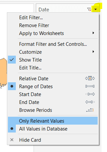
Add Baseline Date to the Filter shelf, choose Range of Dates , and by default the dates 01 Jan 2020 to 14 Jul 2020 should be displayed
Select to Show Filter, and when the filter displays, select the drop down arrow (top right) and change to Only Relevant Values
Whilst you can edit the start and end dates in the filter to be before/after the specific dates, this won’t actually use those dates, and the filter control slider can only be moved between the range we want.
The Baseline Date field should then be custom formatted to mmmm dd to display the dates in the January 01 format.
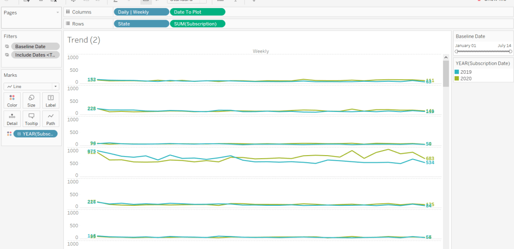
Showing Daily or Weekly dates on the viz in tooltip
The requirements state that if the date range selected is <=30 days, the trend chart shown on the Viz in Tooltip should display daily data, otherwise it should be weekly figures, where the week ‘starts’ on the minimum date selected in the range.
There’s a lot going on to meet this requirement.
First up we need to be able to identify the min & max dates selected by the user via the Baseline Date filter.
This did cause me some trouble. I knew what I wanted, but struggled. A FIXED LOD always gave me the 1st Jan 2020 for the Min Date, regardless of where I moved the slider, whereas a WINDOW_MIN() table calculation function caused issues as it required the data displayed to be at a level of detail that I didn’t want.
A peak at Kyle’s solution and I found he’dadded the date filters to context. This means a FIXED LOD would then return the min & max dates I was after.
Min Date
{MIN([Baseline Date])}
Note this is a shortened notation for {FIXED : MIN([Baseline Date])}
Max Date
{MAX([Baseline Date])}
With these, we can work out
Days between Min & Max
DATEDIFF(‘day’,[Min Date], [Max Date])
which in turn we can categorise
Daily | Weekly
IF [Days between Min & Max]<=30 THEN ‘Daily’ ELSE ‘Weekly’ END
We also need to understand the day the weeks will start on.
Day of Week Min Date
DATEPART(‘weekday’,[Min Date])
This returns a number from 1 (Sunday) to 7 (Saturday) based on the Min Date selected.
Using this we can essentially ‘categorise’ and therefore ‘group’ the Baseline Date into the appropriate week.
Baseline Date Week
CASE [Day of Week Min Date] WHEN 1 THEN DATETRUNC(‘week’,([Baseline Date]),’Sunday’) WHEN 2 THEN DATETRUNC(‘week’,([Baseline Date]),’Monday’) WHEN 3 THEN DATETRUNC(‘week’,([Baseline Date]),’Tuesday’) WHEN 4 THEN DATETRUNC(‘week’,([Baseline Date]),’Wednesday’) WHEN 5 THEN DATETRUNC(‘week’,([Baseline Date]),’Thursday’) WHEN 6 THEN DATETRUNC(‘week’,([Baseline Date]),’Friday’) WHEN 7 THEN DATETRUNC(‘week’,([Baseline Date]),’Saturday’) END
Ideally we want to simplify this using something like DATETRUNC(‘week’, [Baseline Date], DATEPART(‘weekday’, [Min Date])), but unfortunately, at this point, Tableau won’t accept a function as the 3rd parameter of the DATETRUNC function.
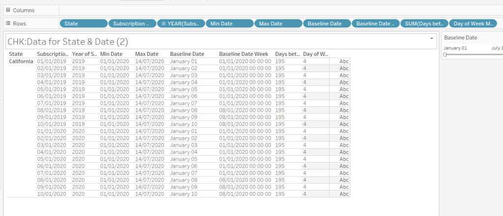
Let’s just have a look at what we’ve got so far
Rows for California only showing the Subscription Dates from 01 Jan 2019 – 10 Jan 2019 and 01 Jan 2020 to 10 Jan 2020. Min & Max date for all rows are identical and matches the values in the filter. The Baseline Date field for both 01 Jan 2019 and 01 Jan 2020 is January 01. The Baseline Date Week for 01 Jan 2019 – 07 Jan 2019 AND 01 Jan 2020 – 07 Jan 2020 is 01 Jan 2020. The other dates are associated with the week starting 08 Jan 20202.
So now we have all this information, we need yet another date field that will be plotted on the date axis of the Viz in Tooltip.
Date to Plot
IF [Days between Min & Max] <=30 THEN ([Baseline Date]) ELSE [Baseline Date Week] END
If you add this field to the tabular display I built out above, you can see how the value changes as you move the filter dates to be within 30 days of each other and out again.
When added to the actual viz, this field is formatted to dd mmm ie 01 Jan, and then is plotted as a continuous, exact date (green pill) field on the Columns alongside the Daily | Weekly field, with State & Subscription on Rows. The YEAR(Subscription Date) provides the separation of the data into 2 lines.
Restricting to full weeks only (in weekly view)
The requirements state only full weeks (ie 7 days of data) should be included when the data is plotted at a weekly level. For this we need to ascertain the ‘week’ the maximum date falls in
Max Date Week
CASE [Day of Week Min Date] WHEN 1 THEN DATETRUNC(‘week’,([Max Date]),’Sunday’) WHEN 2 THEN DATETRUNC(‘week’,([Max Date]),’Monday’) WHEN 3 THEN DATETRUNC(‘week’,([Max Date]),’Tuesday’) WHEN 4 THEN DATETRUNC(‘week’,([Max Date]),’Wednesday’) WHEN 5 THEN DATETRUNC(‘week’,([Max Date]),’Thursday’) WHEN 6 THEN DATETRUNC(‘week’,([Max Date]),’Friday’) WHEN 7 THEN DATETRUNC(‘week’,([Max Date]),’Saturday’) END
so if the maximum date selected is a Thursday (eg Thurs 11th June 2020) but the minimum date happens to be a Tuesday, then the week starts on a Tuesday, and this field will return the previous Tuesday date (eg Tues 9th June 2020).
And then to restrict to complete weeks only…
Full Weeks Only
IF [Daily | Weekly]=’Weekly’ THEN [Date To Plot]< [Max Date Week] ELSE TRUE END
If we’re in the ‘weekly’ mode, the Date To Plot field will be storing dates related to the start of the week, so will return true for all records where the field is less than the week of the max date. Otherwise if we’re in ‘daily’ mode we just want all records.
This field is added to the Filter shelf and set to true.
Hopefully that covers off all the complicated bits you need to know to complete this challenge. My published solution is here.
The #WOW2020 week 31 challenge was combined with a #PreppinData challenge and launched at a virtual live event. I was fortunate enough to be able to join this event for the first hour and had the pleasure of meeting up with some #WOW regulars Sean Miller, Kyle Yetter & Tim Beard, along with #WOW challenge setter Lorna Brown, and #PreppinData setters, Jenny Martin and Tom Prowse. I was gutted I couldn’t stay on for the whole session, but work commitments got in the way – bah!
I did complete the #PreppinData challenge first, and the last time the team ran a combined event, I did blog on how I built both challenges, but I’m struggling for time, and the #WOW has got a fair bit going on, so I’m afraid the Prep challenge won’t make the cut this time – sorry #Preppers!
So onto the #WOW challenge. Part of this challenge was to utilise the new Relationships feature in 2020.2, so you need to be on this version to follow along.
Creating the data source
If you’d completed the #PreppinData challenge, you could use your own outputs as the inputs for #WOW challenge. I did that initially, but as I was building I had a few minor discrepancies from the solution, so chose to replace my data sources with the hyper files that are referenced in the Prep challenge, these being
Host Countries – 1 row per Olympic Host City (and Country) per Year since 1896 to 2016
Country Medals – 1 row per Country attending the Olympics per Year, summarising the number of Bronze, Silver and Gold medals won by that country.
Medalists – For every Country, for every Year, there is 1 row per Athlete who won a Medal including the type of Medal (Bronze, Silver, Gold).
In Tableau Desktop, connect to the Host Countries hyper file and drag the ‘table’ named Extract into the data source pane. If you right click on the table, you can the rename it – I chose Host.
Then Add a connection to the Country Medals hyper file, and again drag the ‘table’ named Extract into the data source pane so it connects to the Host table. Set the relationship to be on Year. I renamed the ‘table’ again to be Medals.
Now add another connection to the Medalists hyper file, and drag the ‘table’ named Extract to connect to the Medals table, this time setting the relationship both on Country and Year. I renamed the ‘table’ again to be Medalists.
Building the Bump Chart
As with many challenges, if I can, I build the data I need into a table to start with, so I can check my calculations, so lets get the basics
Note – depending on the order you connected your tables in the data source, some field names that exist in multiple tables will be suffixed with fieldname (Extract x). I won’t refer to the Extract part, but will reference fields I use in this blog by prefixing with the table name instead.
Drag out Host.Year, Host.Host Country, Medals.Country to Rows. Lets show the number of medals of each type each country won, so we can use this to sense check some calculations later : put Medals.Gold, Medals.Silver, Medals.Bronze into the table
The bump chart we need to build is ranked based on the score of each country which in turn is determined by giving 3 points for each gold medal, 2 for a silver and 1 for a bronze, so we need a calculated field
We need to rank this score, and I’m going to have a calculated field to store this explicitly
Rank Score
RANK_UNIQUE([Score])
Add these 2 fields to the table, and adjust the table calculation of Rank Score so all fields except Year are ticked
Now we could start building out the bump chart now, and I did when I was creating this and would then flit back and forth between doing something on the chart and checking new calcs. However, to keep the blog a bit easier, we’ll continue building out the table.
So first up, we need another rank field. When building out the bump chart initially, I was doing all sorts of things to show the Top 10 only, but whatever I did, I couldn’t stop the lines from joining up between countries when they didn’t exist in consecutive years eg Greece is 1st in 1896, but doesn’t appear in the Top 10 again until 1904. As 1900 was missed, the lines shouldn’t join, but mine were. I was faffing over this for some time, so eventually caved and checked out Lorna’s solution. She’d resolved this simply with
Top 10 Rank Only
IF [Rank Score] < 11 THEN [Rank Score] ELSE NULL END
ie only show the rank if its in the Top 10. Simples really!
Add this onto the table and check the table calculation setting is as previously.
So for the bones of the bump chart we have the two fields we’re going to plot against – Year and Top 10 Rank Only, but before we do that, let’s get the fields we need that are displayed on the tooltip.
# Countries Per Year
{FIXED [Year] : COUNT([Medals])}
This will give us the number of countries that participated in each year. The COUNT([Medals]) comes from dragging the Medals(Count) that is automatically generated as part of the Medals table into the calculated field dialog- in the new Relationships model, this Count field against each table is essentially the equivalent of Number of Records.
A simple tally of the total number of medals won by each country.
Is Host?
[Host Country]=[Country (Extract2)]
where this is checking Host.Host Country against Medals.Country and returns true if they match.
Hosted | Participated
IF [Is Host?] THEN ‘hosted’ ELSE ‘participated’ END
The text on the tooltip differs slightly dependent on whether the country hosted or not.
COLOUR: Country
IF [Is Host?] THEN [Host Country] END
The stars on the bump chart need to be coloured based on country, but we don’t want the circles coloured too, so this field is necessary.
Let’s get all these into our table… you’ll notice (or you may not), but adding some of these fields causes the Rank Score & Top 10 Rank Only to change, so readjust the tableau calculation so only Year remains unchecked.
Now we have everything to build the core bump chart.
Add Host.Year to Columns, Medals.Country to Detail and then add Top 10 Rank Only on Rows. Change the Mark Type to a Line, and verify the table calculation on the Top 10 Rank Only is set to compute by Country only.
Edit the Top 10 Rank Only axis and set the scale to be reversed
Change the Colour to grey and make the Size smaller.
Thenadd another instance of Top 10 Rank Only to site alongside the existing one on the Rows.(I tend to click on the existing pill, hold down ctrl and then drag – this will create a duplicate instance and will retain the table calculation settings).
Now make the chart dual axis & synchronise the axis.
Change the mark type of the second axis to be a shape, and add Is Host? to the Shape shelf. Adjust so that false is a filled circle and true is a filled star.
Also add Is Host? to the Size shelf on this marks card, and adjust the sizes so true is bigger than false.
At this point you will need to adjust the table calculation of the 2nd Top 10 Rank Only pill, to compute by both Country and Is Host?.
Add COLOUR: Country to the Colour shelf, and adjust the colours to use the Hue Circle palette. Set the NULL value to the same shade of grey as the line.
You’ll need to adjust the table calculation again of the 2nd Top 10 Rank By County pill, so only Year is unselected.
All the following fields need to be added to the Tooltip of the All marks card.
Score
# Countries Per Year
Hosted | Participated
Top 10 Rank Only (setting the table calc to compute by everything except Year)
# Medals
Adjust the Tooltip accordingly, then tidy up the formatting of the chart
Hide the Top 10 Rank Only axis
Rotate the labels of the Year
Hide the Year field label
Remove all row & column lines and gridlines/zero lines
Medals Viz in Tooltip
The Bump chart has 2 Viz in Tooltips, one showing the count of the different medals won and the other showing the top 10 athletes. Build the Medals chart by
Host.Year to Rows
Medals.Country to Rows
Medals.Bronze to Columns
Then drag the Medals.Silver pill to the bottom of the chart where the Bronze axis is, and when you see 2 green columns, drop the pill. This should have the effect of Measure Values automatically being added to Columns, and Measure Names being automatically added to Rows and the Filter shelf.
Then add Medals.Gold into the Measure Values pane
Reorgansie the pills in the Measure Values pane so they are listed Gold, Silver, Bronze
Add Measure Names to Colour and adjust accordingly
Show the mark Label
Now hide the Year and the Country columns, and the Value axis at the bottom. Remove all the formatting (the quickest way is to go to the bump chart sheet you should hopefully have formatted already, right click on the tab of the sheet at the bottom, and select Copy Formatting, then go back to the sheet you’re working on, and on the tab, right click & Paste Formatting
If this doesn’t clean everything up enough, just adjust formatting manually.
Finally, set the fit on this sheet to be Entire View. This will squash everything up, but when its referenced from the viz in tooltip, the view will be filtered to the Year and Country. Doing this will remove the ‘this view is too large’ message that may appear on the Viz in Tooltip.
Switch back to the Bump chart and add the sheet to the Tooltip by Insert -> Sheets -> <Select your sheet>. Adjust the maxwidth property to 500 and maxheight property to 100 to make the viz fit better
Top 10 Athletes Viz in Tooltip
Build the initial viz by
Host.Year to Rows
Medals.Country to Rows
Medalists.Athlete to Rows
Medalists,Medal to Columns and manually reorder the columns.
Medalists.Medalists(Count) to Columns
Medalists.Medal to Colour
To work out the Top 10, we need to first work out the score per medal
Medalist Score
CASE [Medal] WHEN ‘Gold’ THEN 3 WHEN ‘Silver’ THEN 2 WHEN ‘Bronze’ THEN 1 END
then calculate the total score per athlete per games, since an athlete can win more than one medal and appear in multiple games
We only want the Top 10 though, so add Athlete to the Filter shelf, and filter by the top 10 of Total Score per Athlete
At this point, things won’t look right, as the filter will be applying over all the data. To get this right, we now need to add the sheet to the Viz in Tooltip, so go back to the Bump chart, and on the tooltip add a reference to this sheet.
Adjust the width and explicitly filter by Host.Year, Medals.Country
If you now return to the Top 10 sheet, an additional filter will have been automatically added to the Filter shelf. Add this filter to context, so it will change to a grey pill.
Now return to the Bump chart and just test out that the chart is presenting correctly when hovering over various fields.
Now return to the Top 10 chart and tidy up all the formatting and hide various fields, and set to Entire View.
The bump chart should now be complete
Building the strip plot
The strip plot is showing a mark for each host with an indicator to show if they finished in the Top 10 or not. Additional information on the tooltip shows the host’s score and medals count. We’ll build this into a table first as below
We ultimately need to show 1 row per year, but the country level data is required to work out the rank. So we’re going to use some more table calculations.
We want to capture the host’s score and medals accrued against all the rows associated with each year.
Score for Host
WINDOW_MAX(IF ATTR([Is Host?]) THEN [Score] END)
Medals for Host
WINDOW_MAX(IF ATTR([Is Host?]) THEN [# Medals] END)
Add these to the table, setting the table calculation to compute over all fields except Year.
We also need to know if the host was in the top 10 or not
Is Host in Top 10?
WINDOW_MAX(IF ATTR([Is Host?]) AND [Rank Score]<=10 THEN 1 ELSE 0 END)
Add this onto the table, and again, sense check the table calculations (this one is nested) to ensure all are computing by all fields except Year
So we have all the bits of data we’ll need, we just need to reduce to 1 row per year.
Index = Size
INDEX() = SIZE()
Add this onto the Filter shelf, and set to true. Check the table calculation again to ensure all fields except Year are set. Recheck the filter is still only selecting true.
This should reduce the data, and just show the last row listed for each country.
For the strip plot, add
Host.Year to Columns
Medals.Country to Detail
Mark Type to Shape
Is Host in Top 10? to Size and to Shape. Adjust the table calcs and shape/size accordingly (you’ll need to reverse the size).
Host Country to Tooltip
Medals for Host to Tooltip (remember table calc)
Score for Host to Tooltip (remember table calc)
Index = Size to Filter set to true (again remember table calc)
Change colour to red
Adjust Tooltip accordingly
Finally adjust the formatting, and remove the header.
Top 10 Countries Viz in Tooltip
Add Host.Year, Host Country and Medals.Country to Rows and Score to Columns, then click the Sort button in the menu to sort the Country descending. Add Rank Score to Rows and change to be discrete (blue pill). Move it to sit in front of the Country field
We need to restrict the rows based on whether the Country in is the top 10 or it’s the host country
Is Host or Top 10?
ATTR([Is Host?]) OR [Rank Score]<=10
Add this onto the Filter shelf and set to true; once again make sure the table calc is computing by all fields other than Year (and double check its still set to true after adjusting). If you scroll to the bottom, you should see 11 rows for 2016, as the host, Brazil, finished 12th.
And now we need to colour the bars
COLOUR:Host
IF [Rank Score] > 10 THEN ‘Red’ ELSEIF ATTR([Is Host?]) THEN ‘Blue’ ELSE ‘Grey’ END
Add to the Colour shelf and adjust accordingly. Then add Score and # Medals to the Text shelf and format the label displayed. Finally hide some of the fields and format the chart to remove axis/gridlines etc.
Finally, set the fit to Entire View.
Go to the strip plot chart and add this sheet to the Tooltip, setting the filter to be on Year
And that should be all the components you need to build the dashboard.