Kyle set the #WOW2025 challenge this week, using a summarised data set based on Superstore that he included in the challenge page.
Building out the core data fields
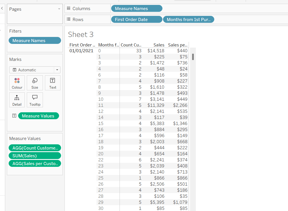
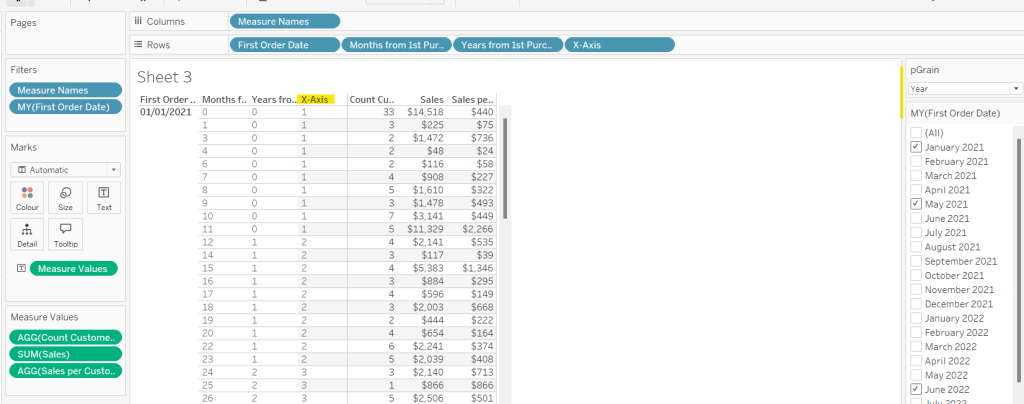
I started this challenge, by building out the data in a tabular format, so I could verify the calculations I needed. I focused on the ‘month’ level to start with before tackling the ‘year’ level which had the added requirement of containing ‘complete years only’, which I did find a bit tricky. Anyway, to start we need to determine the number of months between the First Order Date and the Order Date.
Months from 1st Purchase
DATEDIFF(‘month’, [First Order Date], [Order Date])
and we also need to identify the number of customers
Move this pill into the Dimension section of the left hand pane (drag it up to the top section above the line)
Count Customers
COUNTD([Customer ID])
and calculate the sales per customer
Sales per Customer
SUM([Sales])/[Count Customers]
format this to $ with 0 dp. Also format Sales to $ with 0 dp.
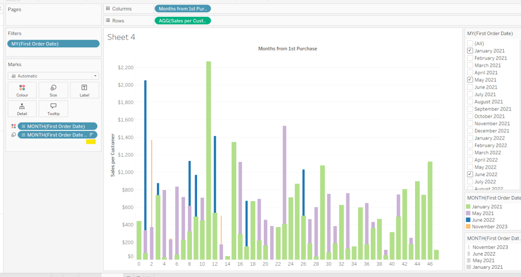
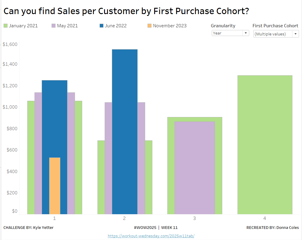
On a new sheet, add First Order Date to Rows as an exact date dimension (blue pill). Add Months from 1st Purchase Date to Rows. Then add Count Customers, Sales and Sales per Customer into the view.
Add First Order Date to the Filter shelf and select the Month/Year format, then select the 4 months Kyle used – Jan 2021, May 2021, Jun 2022, Nov 2023). Show the filter on the sheet.
Building the Month Level Viz
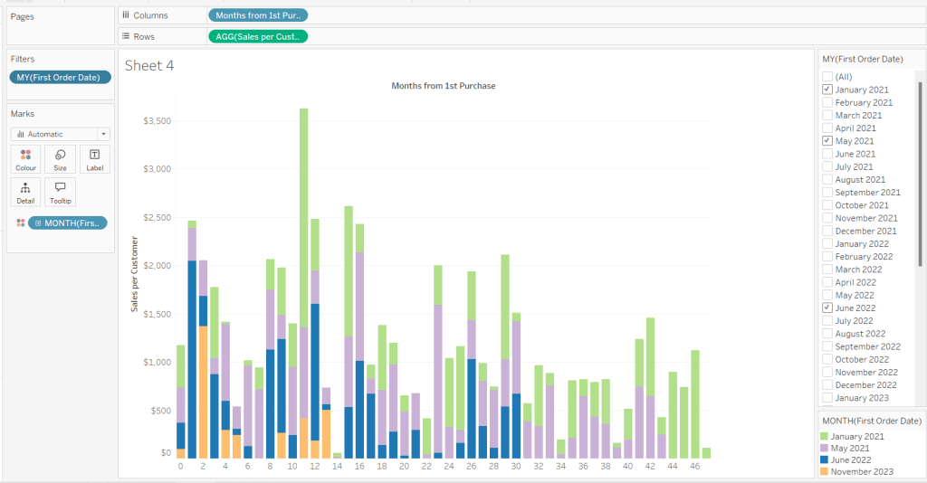
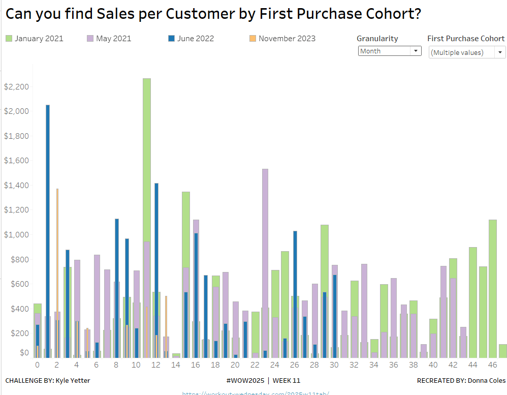
With the information we have, we can build out the viz at the ‘month’ level of granularity.
On a new sheet, add Months from 1st Purchase Date to Columns and Sales per Customer to Rows. Add First Order Date to the Filter shelf at the Month/Year level and restrict to the relevant dates. Show the filter control. Add First Order Date to Colour and set to the Month/Year level as a discrete (blue) pill. Adjust the colours to suit. I used colours from a palette called CB_Paired I had installed.
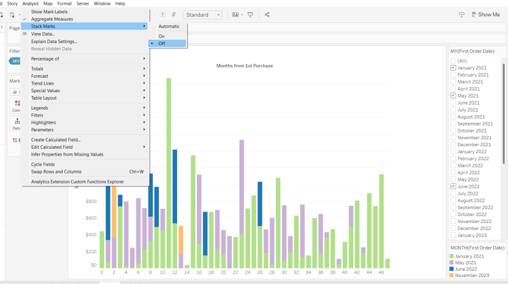
Set Stacked Marks to Off (Analysis Menu > Stack Marks > Off).
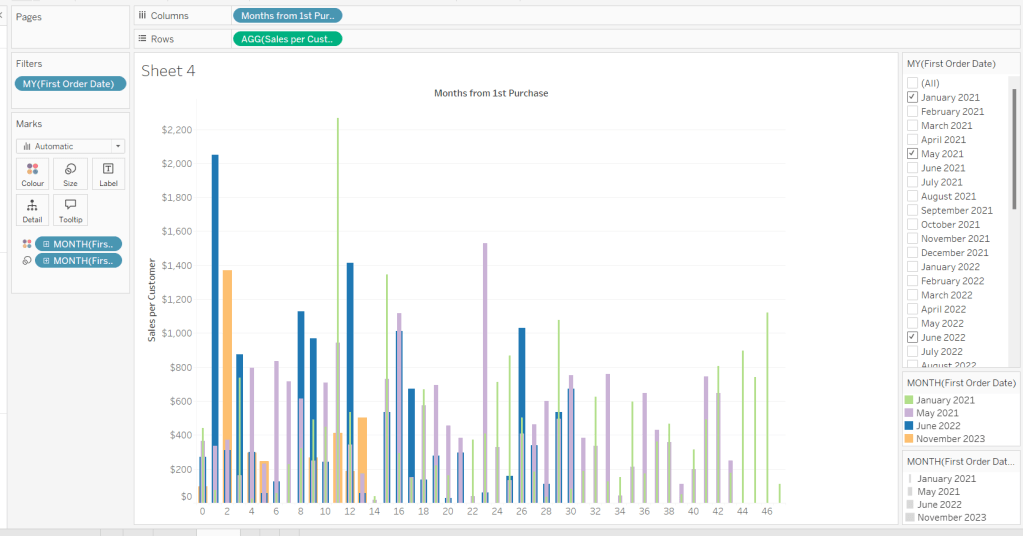
Create another instance of First Order Date (right click the field and select Duplicate) to crate First Order Date (copy). Rename this First Order Date (for Size). Add to the Size shelf, and set it to be at the Month/Year level and discrete (blue) pill.
Adjust the Sort on the First Order Date (for Size) pill to be by Data source order Descending. This now makes January wider than November.
And then add First Order Date to the Detail shelf at the Month/Year level as a discrete (blue) pill. By default this pill is sorted ascending, and has the effect of moving January to the back and November to the front so all the bars (at least for the 0 entry) are visible. This is why we needed a duplicate instance of First Order Date and we needed it to be sorted in one direction to make the correct months at the front, and in another direction to get the required bar widths.
Add Sales and Count Customer to the Tooltip shelf and adjust the Tooltip as required.
Handling the ‘Year’ requirement
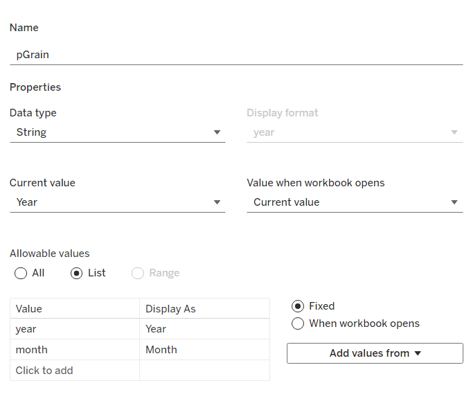
Firstly for this, we need a parameter to drive the change in visual.
pGrain
string parameter listing ‘month; and ‘year’ and defaulted to ‘year’
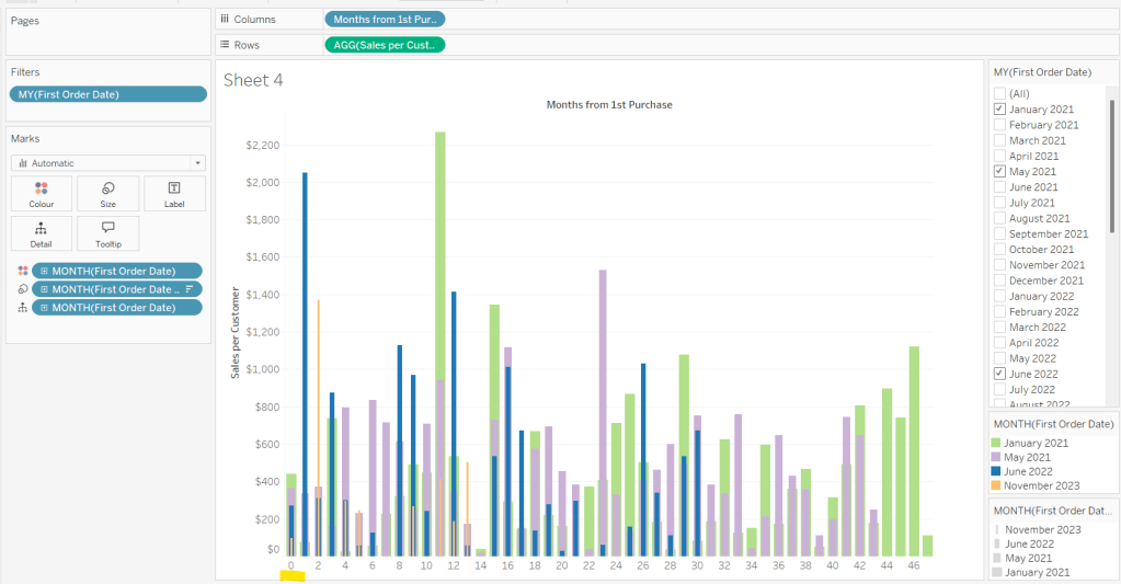
Our Columns is currently listing the Months from 1st Purchase. We need this to be reflective of the years from 1st purchase instead based on the parameter selected.
Years from 1st Purchase
FLOOR([Months from 1st Purchase]/12)
this rounds the calculation down to the nearest whole number.
Move this into the dimension section of the data pane, and add to Rows of our tabular display, so you can see what it’s doing.
Our X-Axis will then be based on either of these 2 fields
X-Axis
IF [pGrain] = ‘month’ THEN [Months from 1st Purchase] ELSE [Years from 1st Purchase]+1 END
Add this into the table, and show the pGrain parameter and see the change as you flip the options.
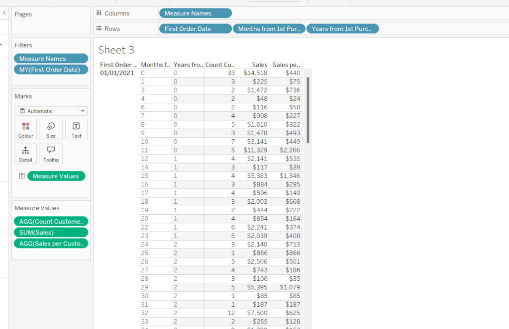
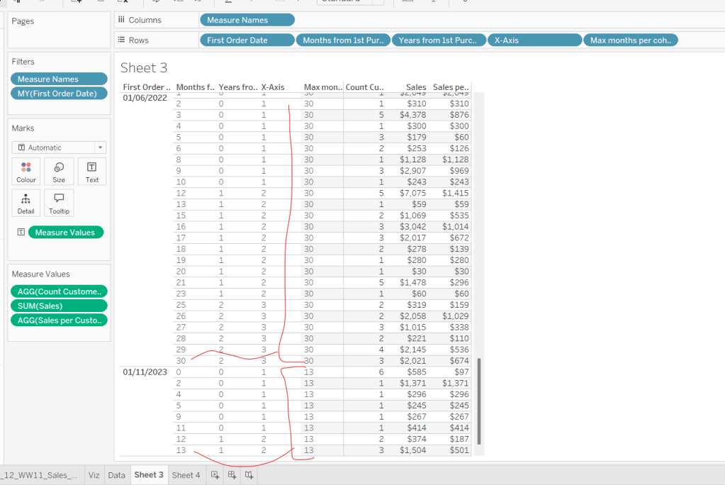
We then need to handle the ‘incomplete year’ requirement. This did take some trial and error, and I’m not totally convinced what I’ve done will work in all scenarios, but it seems to match Kyle’s results for the spot checks I did…
I started by determining the maximum month from 1st purchase in each cohort.
Max months per cohort
{FIXED [First Order Date]: MAX([Months from 1st Purchase])}
Add this into the table as a discrete dimension (blue pill), and each row should match the final Months from 1st Purchase value for each First Order Date
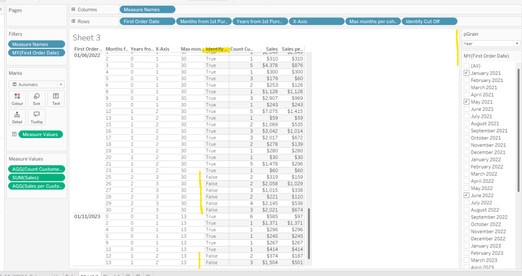
I then created a field to identify which of the rows in the data I wanted to keep. So in the case of the above examples for 01/11/2023, I want the rows where Months from 1st Purchase is from 0 to 11 as these represent a whole year’s worth of data for Years from 1st Purchase = 0 (even though there isn’t a a purchase every month in the year). I ended up doing this with the following calculation
Identify Cut Off
[Months from 1st Purchase] < 12 * (FLOOR(([Max months per cohort]+1)/12))
so based on the above example for 01/11/2023, get me all the rows where Months from 1st Purchaseis less than 12 * (FLOOR((13+1)/12) = 12 * (FLOOR(14/12)) = 12 *1 = 12.
Add this into the table
I then created an additional field to filter by
Records to Display
[pGrain] = ‘month’ OR [Identify Cut Off]
and added this to the Filter shelf and set to True.
When we’re at the ‘month’ level, all rows will be included, otherwise, just those we identified will be.
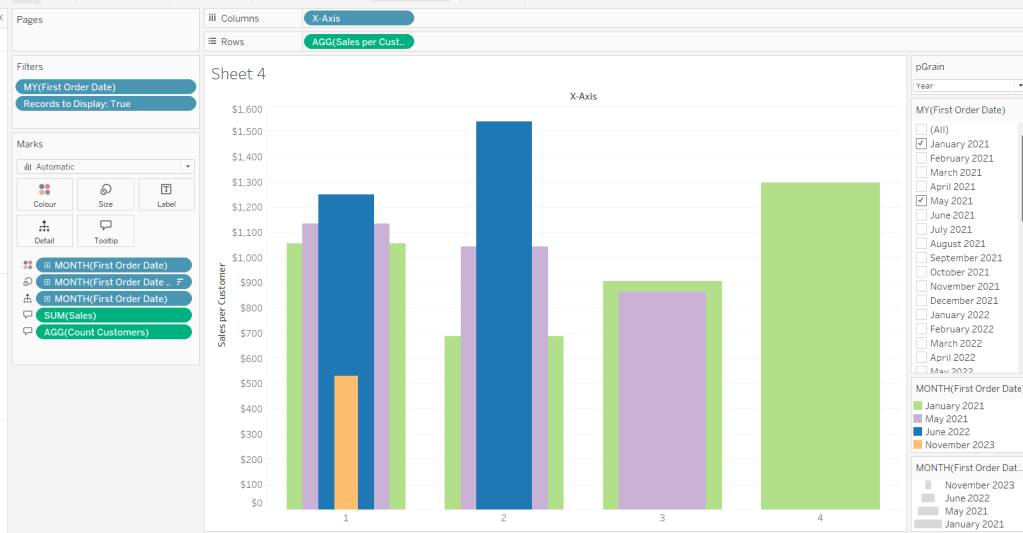
So now we have this, we can adjust the visual (you may choose to take a copy of what was initially built, just in case).
Adjusting the Viz for the Granularity parameter
Show the pGrain parameter on the viz sheet and set to Year. Add Records to Display to the Filter shelf and set to True. Add X-Axis to Columns and remove Months from 1st Purchase Date. Set sheet to Fir Width.
Test changing the parameter and altering the selected dates and verify the behaviour is as expected.
Finally tidy up the formatting – remove all gridlines; edit the axis and remove the title; hide the X-Axis label heading (right click > hide field labels for columns). Add to a dashboard and arrange the colour legend in a single row, and set the First Purchase Date filter to be a multi-value dropdown.
Erica set the challenge this week, and I’m not gonna lie, I found this tough. On the face of it, it looks like something I felt I should be ok at, but nuances cropped up as I was building that meant I often had to change tact and try something different.
My intention was to build each version – Beginner, Intermediate then Advanced, adding to my solution each time, but decisions I made early on, then caused me grief later. For example, I did choose to utilise a lot of table calcs, but that meant when it came to applying the sorting mechanism that I wanted, I couldn’t reference the sort field I needed, as it contained a table calc. So I had to unpick the logic and build with LODs instead which took me a while to get right. Getting single lines to display in each ‘state’ cell also proved tricky at times, and that was even before I’d got to the requirement to pad out the ‘missing values’ with 0s. I also seemed to find that some things only seemed to work if I added pills and applied settings in a particular order. All in all, quite a challenge, and while I did get there in the end, I did have to peek at the solution at times to figure out if I was going nuts, but I found trying to scale back Erica’s solution to the beginner/intermediate version also suffered the same issues I was experiencing. I built with Desktop v2024.1 and there were times I was wondering if something had “broken” in that version, although having finally reached the end, I’ve yet to test that theory.
So, I’m blogging this guide with several caveats – Going from beginner to intermediate is ‘okay’, but when it gets to advanced I had to start again(ish). Some of the calcs I provide will just be ‘as is’. I will do my best to explain what’s going on, but there are times that I just don’t get it, and it’s just been trial and error that got me the results I needed – sorry!
So with all that in mind, let’s get building.
Initial steps
After connecting to the provided hyper file, I found I did have to create the modified sales value
Sales Modified
IF SUM([Sales])<5000 THEN SUM([Sales])*10 ELSE SUM([Sales]) END
I also decided to add a data source filter (right click data source > edit data source filters) to restrict the data to just Country/Region = USA.
The later versions of superstore have Canadian Provinces included too, and I don’t think these were listed in Erica’s solution. It just felt easier all round to exclude these records from source.
Beginner challenge
When building a trellis chart, we need to determine which Row and which Column our specific dimensions (in this case State/Province) will sit in. As the requirements already stated it was to be a 3 column grid, our calculations for this didn’t need to be so complex.
Cols
(INDEX()-1)%3
INDEX() returns an incremental number starting at 1 for whatever dimension or set of dimensions we’re counting over. In this case we’re counting the number of State/Provinces. %3 returns the remainder when the index is divided by 3, so we get values of 0, 1 and 2.
Change this field to be discrete (right click -> convert to discrete)
Add State/Province to Rows then add Cols to Rows. Edit the table calculation so the field is computing by State/Province. You can see that the first 3 rows will be positioned in columns 0, 1,2 respectively and so on.
Create a new field
Rows
INT((INDEX()-1) / 3)
This takes the index value (minus 1), divides by 3 and ’rounds’ to a whole number. Make this discrete too and add to Rows, setting the table calculation as described above. Now we can see the first 3 rows will all actually be in the same row (row 0), then next 3 rows in row 1 and so on.
Shift the pills around so Cols is on Columns, Rows is on Rows and State/Province is on Detail. Add Sales Modified to Rows.
Create a new field
Quarter Date
DATE(DATETRUNC(‘quarter’, [Order Date]))
and add this to Columns setting it as a continuous exact date (green pill). We’ve got a bit of unexpected ‘spaghetti’ going on…
To fix it, do the following ..
Add Quarter Date to Detail as a discrete exact date (blue pill). Change Quarter Date on Columns to be a continuous attribute (green pill – first change to attribute, then change to continuous). Edit the table calculation settings for both the Rows and the Cols fields to be computing by both State/Province and Quarter Date at the level of State/Province.
I had to reference previous challenges and blog posts I’d written to manage this… maybe there is something simpler, as this is pretty taxing for the ‘beginner’ part of the challenge.
Add another instance of ATTR(Quarter Date) to Columns and make dual axis and synchronise the axis. This will create an axis at the top of the chart as well as the bottom.
Format the ATTR(Quarter Date) pill so the axis format is custom formatted to “Q”q “‘”yy
Edit all the axis (top/bottom and left) and update the title. Adjust the Tooltip. Hide the Cols and Rows fields (right click and uncheck show header). Change the Colour of the line to grey.
This should be the Beginner solution. I have published this here.
Intermediate challenge
For this part of the challenge, we need to set up lots of new calculations, so let’s do this first. As usual, I’ll manage this in a tabular format. So on a new sheet, add State/Province and Quarter Date as a discrete exact date (blue pill) to Rows. Add Sales Modified to Text.
We need to get the threshold value for each State/Province, which is the average of the numbers all listed above, multiplied by 2. We’ll use LODs for this
working inside out… get the value of the Sales Modified value for each State/Province and Quarter Date (which is the same as the values you see listed above) and then average this at the State/Province level and multiple the final result by 2. Add this to the table. This is the field we’ll be using for the horizontal reference line.
Next we need to identify the rows where the Sales Modified value exceeds the threshold, and then return the Sales Modified values for only these rows. I’ll do this in 2 stages
Is Above Threshold?
INT([Sales Modified] > SUM([Threshold]))
This returns a 1 or 0 depending on whether the statement is True or False. Using actual numeric values rather than boolean helps later on. Set this field to be discrete and add to the table.
Above Threshold Sales
IF [Is Above Threshold?]=1 THEN [Sales Modified] END
Add this to the table too. For the rows where we have 1’s, a value is displayed. This is the field we’ll be using for the red circles.
Finally we need to determine some fields to help us define a reference band. These need to be dates as they’ll be applied to the date axis, but the band doesn’t stretch to the previous/next quarter, and is only present if the last value is over the threshold.
Again using LODs let’s get the final date in the quarter
Max Quarter Per State
{FIXED [State/Province]: MAX([Quarter Date])}
Add this to the table as a discrete exact date (blue pill).
Now we need to know if the value associated with the final quarter is above the threshold or not
Final Quarter Above Threshold
INT(MIN([Quarter Date]) = MIN([Max Quarter per State]) AND [Is Above Threshold?]=1)
Again this will return a 1 or 0. Change to discrete and pop that into the table too. We can see Colorado is the first state listed where this is true.
Now we want to ‘spread’ that value across every row associated to the state
For each State/Province and Quarter Date, get the Final Quarter Above Threshold value and then get the maximum value of this for each State/Province. This is where having the values as 1’s and 0s helps.
Make discrete and add this to the table. Every row for Colorado has this set to 1
Now we can work out some dates
Ref Band Min
DATE(IF [State Has Final Quarter Above Threshold] = 1 THEN DATEADD(‘month’, -1, [Max Quarter per State]) END)
If the State/Province is over the threshold for it’s final quarter, then get a date and set it to be 1 month less than the final quarter for that state.
Similarly
Ref Band Max
DATE(IF [State Has Final Quarter Above Threshold] = 1 THEN DATEADD(‘month’, 1, [Max Quarter per State]) END)
If the State/Province is over the threshold for it’s final quarter, then get a date and set it to be 1 month more than the final quarter for that state.
Add both of these of the table as discrete exact dates (blue pills).
Now we have all the building blocks to build the next bit of the challenge.
Start by duplicating the Beginner viz.
Add Above Threshold Sales to Rows and make Dual axis and synchronise the axis.. Remove the 2nd instance of the Quarter Date from Columns, so we now have marks cards relating to the 2 measures rather than the 2 dates. Remove Measure Names from the All marks card.
Change the mark type on the Above Threshold Sales marks card to circle and change the colour to red. Adjust size to suit.
Add Threshold to the Detail shelf of the All marks card. Right click on the Sales axis and add reference line. Set it to be per pane and use the Threshold field. Display the value as the Label. Don’t show a Tooltip. Display a dotted black line.
Update the Tooltip to now have a reference to the threshold value too.
Add Ref Band Max and Ref Band Min to the Detail shelf of the All marks card. Set them both to be continuous attributes (green pills).
Right click on the Quarter Date axis and add reference line. Set it to be a bandper pane that goes from the Ref Band Min to the Ref Band Max. Don’t display labels or tooltips or a line. Fill with a pale shade ot red/pink.
Add back in the additional Quarter Date dual axis as described in the Beginner section to get the dates listed the top again.
Hide the right hand axis (uncheck show header) and hide the NULL indicator.
This completes the Intermediate challenge. My version is published here.
Advanced challenge
Go back to the tabular sheet we were using to check the calculations needed for the Intermediate challenge, as we’ll build on this.
Firstly the sorting. We need to sort the states based on whether the final quarter was above the threshold or not, and then by the number of times the state was above the threshold. Let’s get the count to start with
For each State/Province and Quarter Date, get the Is Above Threshold? value and then sum these up for each State/Province. This is where again having the values as 1’s and 0s helps.
Make this discrete and add to the table
then create a field we’ll use for the sort. This is going to be a numeric field
Sort
IF [State Has Final Quarter Above Threshold] = 1 THEN 100000 + [Above Threshold Count Per State] ELSE [Above Threshold Count Per State] END
We’re just using a very large arbitrary number to force those states where the final quarter is over the threshold to be higher in the list. Make this discrete and add to the table too.
We can now apply a Sort to the State/Province field to sort by the Sort field descending
This results in Colorado moving to the top of the list followed by Minnesota, which also has 3 quarters above the threshold, including the last quarter, but alphabetically falls after Colorado so is listed 2nd.
To filter the data, I created another field, just for ease
Filter
IIF([State Has Final Quarter Above Threshold]=1,’Urgent’,’Non-Urgent’)
Add this to the Filter shelf and set to Urgent. The states should now be restricted to just those where the final quarter is above threshold.
For the final requirement of this challenge, we’ll build out another table on another sheet to demonstrate, as we need to work with a different instance of the quarter date.
On a new sheet, add State/Province to Rows and add Order Date at the Quarter (month year) level as a discrete field (blue pill) to Rows. Add Sales Modified to Text
For Alabama, we don’t have a 2020 Q3 or a 2023 Q3. Click on the Quarter(Order Date) pill and select Show Missing Values. These quarters appear but with no Sales Modified value.
We’ve had to use this different way to define the date quarter as if we tried to ‘show missing values’ against the Quarter Date field that is set to ‘exact date’, we send up getting every day that is missing, not just the dates relating to the quarter. Also, the ATTR(Quarter Date) field we’ve used on the previous vizzes, doesn’t allow the Show Missing Dates option.
Anyway, we need to get 0s in to these dates.
Show Modified with 0
ZN(LOOKUP([Sales Modified],0))
Apart from the Rows/Cols calcs needed for the trellis, this is the only table calculation I ended up using. It’s basically looking up it’s own row (LOOKUP([field],0)) and if it can’t find a value (as it’s missing) it’s returning 0 (the ZN() function). Add that to the table.
Ok so now we have the components needed, let’s build the viz. We can use the Intermediate version as a starting point, but will need to reapply some of the features.
Duplicate the Intermediate viz.
Remove the 2nd instance of the ATTR(Quarter Date) pill on Columns. Drag the Sales Modified with 0 pill and drop it directly over the Sales Modified pill so it replaces it. Hopefully the chart should still look the same.
Right click the Order Date field from the left hand data pane, and drag it directly onto the ATTR(Quarter Date) pill. Release the mouse and select the continuous quarter/year option from the dialog that displays.
Things will start to look a bit odd… you’ve lost your lines… Remove the Quarter Date pill from the Detail shelf on the All marks card. Fix the Rows and Cols table calc fields by just updating them to compute by State/Province only. Adjust the table calc of the Sales Modified With 0 field to compute by Quarter of Order Date and State/Province in that order.
Things still look crazy…. but just one more step… Show Missing Values on the Quarter(Order Date) pill.
Now every cell should be associated to a single State/Province with no broken lines, and Wyoming, right at the bottom, should show more than a single dot. This was A LOT of trial and error to fathom all this out.
Add back in the reference band following the instructions above (you should find the reference line for the threshold value will just then appear) and re-update the Tooltip.
Add another instance of Order Date at the quarter/year continuous level (green pill) to Columns and make dual axis and synchronise the axis. Edit the axis titles, and format them to the “Q”q “‘”yy custom format.
Apply the sort to the State/Province field on the Detail shelf so it is sorting by Sort Descending. Add Filter to the Filter shelf and select Urgent.
Add this to a dashboard, and that should be the completed Advanced challenge which I’ve published here.
There really was some black magic going on here at times. Tough one this week!
This week’s #WOW challenge was set by me and born out of a client requirement to compare store locations via selections from a map. I adapted it to use our favourite Superstore dataset (v2022.4).
The core requirement is to be able to make a selection on the map and see how sales compare to the average of all the other states. There is more to this challenge, but it was too much for one week, so I’ve broken it into 2 parts. This is part 1. In a few weeks time, I’ll be building on this solution for a part 2.
Building the basic hex map
The requirements provide a link to here to get the relevant files needed to complete this challenge and build the hex map – this includes the 2022.4 version of Superstore, the Hex map template, the hexagon shape file and a transparent shape file (more on that one later).
Using the hex map template sheet provided, relate the Orders Superstore data to the hex map sheet, relating State/Province to State.
Then on a new sheet add Column to Column, Row to Row and State to Detail. Edit the Row axis, and reverse the scale.
Change the shape of the mark to be a hexagon (use the provided shape if need be and add to a custom shape palette), and increase the size of the marks. Add Sales to Colour and change to use the Grey sequential colour palette, and adjust the opacity to 80%. Add Country/Region to the Filter shelf and select United States. This will remove Alaska and Hawaii that don’t have any sales and aren’t in the Superstore data set.
Add Abbreviation to the Label shelf and align centrally, Adjust the font size if need be.
Identifying the selected state
We need to be able to capture the state that has been selected ‘on click’. This will be driven by a dashboard action.
When I first built this concept for a client, the natural first step was to utilise sets and set actions; that is capture the selected state in a set, and then colour the map, build the other charts and logic based on the existence in the set. However this method does caused some issues when I tried to prevent the highlighting later, so I chose to use a parameter and parameter actions instead.
Firstly we need a parameter that will be used to capture the state selected ‘on click’
pSelectedState
string parameter defaulted to <empty string>
We can then create
Is Selected State
[State] = [pSelectedState]
As we want to retain the colour by sales on the existing map, we need to make a dual axis. Show the pSelectedState parameter and type in ‘Florida’.
Add another instance of Column to Columns. Remove the Abbreviation label from the second marks card, and replace the Sales field on the Colour shelf with the Is Selected State field. Increase the opacity on this mark to 100% Set the colours as follows :
True- teal : #66b3c2
False- pale grey : #d3d3d3
Additionally, add Is Selected State to the Shape shelf of the second marks card. Set the True value to use the same hexagon shape, but set the False option to use a transparent shape (a transparent shape file is provided in the g-drive, and needs to be added as a custom shape).
This should make all the other states look like they disappear.
Make the chart dual axis, and synchronise the axis.
Format the Sales to be $ with 0dp, then add to the Tooltip shelf of the second marks card and adjust the tooltip. Remove all gridlines/row & column dividers and hide the axes.
Adding the Interactivity
Create a dashboard sized 1000 x 600.
Add a vertical container and add a text field to create the title. Below the title, add a horizontal container. Add the hexmap sheet into the horizontal container, then add a blank object to the right of it. Remove any legends etc that automatically get added. Set the width of the hexmap object to be fixed to 600 px
and set the height of the horizontal container the hex map sits within to 445px
Show the colour legend and set it to floating, and position bottom left.
Add a parameter action to set the selected state on click
Set Selected State
On selection of the Hexmap sheet, pass the State field into the pSelectedState parameter. Set the value to <empty string> when the selection is cleared.
If we click around on the dashboard page, we can see the colours being set, but everything is fading out on selection. To prevent this, create 2 calculated fields
True
TRUE
False
FALSE
Add these to the Detail shelf of the All Marks card of the hex map sheet. Then back on the dashboard, add a filter dashboard action
Deselect Map Marks
On select of the hex map object on the dashboard, target the hex map sheet itself, setting selected fields such that True = False. Show all values where selection cleared.
Now if we click on the dashboard, the shapes shouldn’t fade into the background. However we can’t ‘unselect’ the state and get back to its original state. This is because the filter action we added to stop the marks from fading actually unselected the mark, so when we click again, we’re not undoing any selection.
To resolve this, we need another calculated field.
State for Param
IF [State] = [pSelectedState] THEN ” ELSE [State] END
If the state being clicked is the one already captured in the parameter, then set the field to <empty string>, else set the fields to the state being clicked.
Add this to the Detail shelf of the All marks card on the hexmap sheet, and then update the Set Selected State parameter action to pass the State For Param field into the parameter instead of the original State field..
Now when the map is first loaded, the State For Param field contains the name of the state, so that is passed into the parameter on click. As the parameter now has a value, the State For Param field changes for the selected state to be <empty string>, so if the same state is clicked, <empty string> is then passed into the parameter and the view resets.
Building the calculations for the other charts
On a new sheet, add State to Rows, Sales to Text and add Country/Region = United States to Filter.
When a state has been selected, we want to display the state against the selected row, otherwise we want to display the text ‘Other States (Avg)’ .
State Label
IF [Is Selected State] THEN [State] ELSE ‘Other States (Avg)’ END
Now we need to display a different value for the sales measure depending on whether its the selected state or not.
Sales To Display
IF ATTR([Is Selected State]) THEN SUM([Sales]) ELSE SUM([Sales])/COUNTD([State]) END
If the state is the selected one, then use the sales, otherwise average the total sales over the number of states that make up the sales. Format this to $ with 0dp.
Note – in hindsight, this could have just been SUM([Sales])/COUNTD([State]) even for the single state, as since the count of state will be 1, this would just equate to the SUM([Sales]) itself.
Add this to the table, and remove State from the display
Building the bar chart
Duplicate this sheet (as we want to retain the filters), then move Sales To Display to Columns, and add Category to Rows in front of State Label. Add Is Selected State to the Colour shelf.
To ensure the Selected State is always listed first, even if alphabetically it comes after ‘Other States (Avg)’, add Is Selected State to the Rows shelf between Category and State Label. Manually sort it so True is always listed before False, then hide the column (uncheck show header).
Reduce the Size of the bars, remove gridlines and column dividers. Lighten the row dividers. Adjust font sizes. Hide the column labels (hide field labels for rows) and hide the axis.
Remove Sales from the Text shelf, and check Show mark labels instead. Update the Tooltip.
Building the line chart
On a new sheet add Country/Region to Filter and set to United States. Add Order Date to Columns and set to the continuous month level (eg May 2021). Add Sales To Display to Rows, State Label to Detail and Is Selected State to Colour. Manually move the values in the colour legend so that True is listed first. Adjust the tooltip
Remove the axis titles, adjust the axis fonts. Remove row/column dividers and zero lines and axis rulers.
Putting it all together
On the dashboard, add a vertical container between the hexmap and the blank object. Add the line chart and bar chart on top of each other. Remove the title for the bar chart, and update the title of the line chart to reference the pSelectedState parameter.
Remove the blank object to the right of the bar/line charts.
We need to control when the bar and line charts display, so we’ll use dynamic zone visibility for this, and for this we need another boolean field
Show Viz
{FIXED: MAX(IF [Is Selected State] THEN TRUE ELSE FALSE END)}
Is Selected State is a boolean field which essentially is 1 for True and 0 for False. If there is a state selected, the maximum value across all the data records, will be 1, so the field returns true, otherwise its 0, so false.
Use this to control visibility using value for the line and bar chart objects.
Make any further adjustments to the layout required -the size of the hex shapes may need tweaking for example. Then interact with the viz to check all is working as expected.
Sean Miller set this week’s #WOW2022 challenge based on a common requirement – how to allow users to navigate a hierarchy of data while capitalising on the the real estate available to display the data.
The charts required for this challenge are very simple, so I’m not going to spell out how to build these. I created 4 charts
Trend – Sales by Month line chart
by Category – Sales by Category horizontal bar chart
by Sub-Category – Sales by Sub-Category horizontal bar chart
by Product – Sales by Product Name horizontal bar chart
Now all the remaining functionality to drive the navigation through the hierarchy, how the charts are filtered at each level and whether the chart should display or not, will be driven by parameter actions. So for this we will need 3 parameters
pCategorySelected
string parameter defaulted to <nothing> (empty string)
We need similar parameters for pSubCategorySelected and also pProductSelected.
Controlling the sheet swap & filtering the charts
On a dashboard, add the Trend sheet, then below it add a vertical container.
Within the vertical container add the by Category sheet, the by Sub-Category sheet and the by Product sheet. Remove the title from all these sheets. Show the 3 parameters.
We’ll now set up some calculated fields to determine when each of the bar chart sheets should display or not.
Filter: Show Category
[pCategorySelected]=”
If this parameter is empty, we want to show the category bar chart. Add this field to the Filter shelf of the by Category sheet and set to True.
Type the word ‘Furniture’ into the pCategorySelected parameter box and press return. The by Category sheet should disappear from the dashboard.
We now do a similar calculation for the by Sub-Category sheet
Filter: Show Sub-Category
[Category]=[pCategorySelected] AND [pSubCategorySelected]=”
This field is filtering the bar chart based on the selected category
Add this to the Filter shelf of the by Sub-Category and set to True. The bars should now just display the sub-categories associated to the Furniture category.
Now type the word ‘Chairs’ into the pSubCategorySelected parameter box. The by Sub-Category sheet should also now disappear from the dashboard.
Finally we also need to now ensure the by Product sheet is filtered to the relevant Sub-Category.
Filter: Show Product
[Sub-Category]=[pSubCategorySelected]
Add this to the Filter shelf of the by Product sheet and set to True. Only products associated to Chairs should now be listed.
Now we’ve set all this up, we also need to ensure the Trend sheet is getting filtered based on all the selections being made.
Filter : Trend
([Category]=[pCategorySelected] OR [pCategorySelected]=”) AND ([Sub-Category]=[pSubCategorySelected] OR [pSubCategorySelected]=”) AND ([Product Name]=[pProductSelected] OR [pProductSelected]=”)
Add this to the Filter shelf of the Trend sheet and set to True.
Type in an appropriate value into the pProductSelected parameter box (eg Global Task Chair, Black) and see how the trend changes.
Setting the parameters
This will all be done with parameter actions – there’s a few 🙂
+ Drill down to show Subcategories within <Category>
Use the Insert link to add the <Category> field to the action title – this will then be set dynamically based on the bar being selected.
Set the action to apply to the by Category sheet only, and via the Menu option. It should impact the pCategorySelected parameter and retain it’s value when unselected. The Category field should be passed into the parameter.
Delete all the values from the parameter boxes, so they’re all empty. This should reset the dashboard so only the by Category sheet is displayed under the trend. Hover/click on a bar to show the tooltip and click on the link. The pCategorySelected parameter should be populated and the bar chart displayed now changes.
We’re going to create a similar parameter action for the drill down from by Sub-Category to the by Product sheet
+ Drill down to show Products within <Sub-Category>
This time the action applies to the by Sub-Category sheet on the Menu action, and sets the pSubCategorySelected parameter with the Sub-Category value, again retaining the value when cleared.
On this sheet, we also need an action to allow us to ‘drill up’. We need to set the pCategorySelected parameter back to nothing. For this we need an additional calculated field
Level Up : Category
”
Add this field to the Detail shelf on the by Sub-Category sheet.
The back on the dashboard, add a further parameter action
– Drill Up to show all Categories
The action runs on the Menu of the by Sub-Category sheet only, setting the pCategorySelected parameter with the value from the Level Up: Category field. Again the value should be retained when deselected.
Test the functions. The drill down should display the by Product sheet. Then manually delete the value in the pSubCategorySelected parameter, and test the drill up action.
We now need to deal with the actions from the by Product sheet
+ Filter dashboard to <Product Name>
This action runs on the Menu of the by Product sheet only and passes the Product Name field into the pProductSelected parameter. This time though, when the bae is unselected, the parameter should be cleared to ‘blank’.
Next we’ll add the drill up function back to the sub-categories.
Similarly we need to set the pSubCategorySelected parameter back to empty string, so we need
Level Up: Sub-Category
”
Add this to the Detail shelf of the by Product sheet. Also add the Category field to the Detail shelf.
+ Drill Up to show Subcategories within <Category>
The action applies to the Menu of the by Product sheet only, passing the Level Up : SubCategory field into the pSubCategorySelected parameter. The value should be retained when cleared. Note the Category field was required so it could be added to the menu action title.
Test the actions, and verify the behaviour of the parameter boxes as each selection is made.
The dynamic title
The title of the trend line keeps track of the options selected during the navigation. For some reason, I used a separate sheet, but that’s not needed and actually goes against the requirements on 4 sheets only. So I’ll describe how to dynamically set the title on the Trend sheet instead. We’ll need some additional fields
Title – Category
IF [pCategorySelected] <> ” THEN ‘for ‘ + [pCategorySelected] ELSE ” END
Title – Sub-Category
IF [pSubCategorySelected] <> ” THEN ‘-> ‘ + [pSubCategorySelected] ELSE ” END
Title – Product
IF [pProductSelected] <> ” THEN ‘-> ‘ + [pProductSelected] ELSE ” END
Add all these fields to the Detail shelf of the Trend sheet, then update the title
All of this should now mean the core requirements of the challenge have been met.
Bonus – Extending the tooltip width
The bonus step was to extend the width of the tooltip so no word-wrapping existed. I did this by creating a Viz in Tooltip.
On a separate sheet I added Category and Sales to the Text shelf and formatted so they were aligned as required.
This sheet was then referenced from the by Category tooltip where I then adjusted the width to 350 and the height to 75
I repeated this creating similar sheets for Sub-Category and Product Name.
You just now need to tidy up the dashboard – add a text box to act as a title for the bar charts section, format the titles to be grey and remove the parameters from the display. My published viz is here.
This week, Lorna set the challenge to recreate an iconic data viz by the legend, Hans Rosling. You ABSOLUTELY MUST watch the TED talk link from the challenge if you haven’t ever seen this before. Hans is utterly engaging in making this data ‘come to life’!
The challenge involves the following key components
modelling the data
building the scatter chart
displaying the year in the chart
highlighting the regions
Modelling the Data
The data provided consisted of 4 files
Life Expectancy
Population
Income
Region Mapping
The first 3 files are stored as a matrix of Country (rows) by Year (columns) with the appropriate measure in the intersection. This isn’t the ideal format for Tableau so the data needs to pivoted to show 3 columns – Country, Year and the relevant measure (life expectancy, population or income depending on which file is referenced).
In Tableau Desktop, connect to the Life Expectancy file. If you find the column names all seem to nave generic labels, then right click on the ‘object’ in the data source pane, and select Field names are in the first row.
This will change so all the years are now listed as column headings
Now we need to pivot this data; click on the 1800 column, then scroll across to the end, press shift and click on the final column to select all the year columns. While highlighted, right-click and select Pivot.
Your data will be reshaped into 3 columns
I then renamed each column as
Country
Year
Life Expectancy
I also chose to change the datatype of the Year column to be a number (whole), as I knew I’d be needing to relate the data on this field later, and working with numeric data is more efficient than strings.
Now I want to bring in the next file – Population (via the Add connection option). But before following these steps, just read on a bit, as I hit a hurdle, which at the point of writing I’m still a bit unclear about…..
I added the Population file into the data source pane. By default it showed the Edit Relationship dialog, but I had the same issues with the column headings.
So I closed the dialog, and fixed the headings by setting the Field names are the first row option. Trying to apply the pivot at this point wasn’t available – no Pivot option when I selected all the columns. So I then manually edited the relationship and set County = country (population)
This populated the data, but again when I tried to apply the pivot option, it wouldn’t display 😦
I’m not sure whether this is possible (Google hasn’t shown me that it isn’t, but it hasn’t shown me that it is either…). I’ve tried using csv and excel versions of the file…..
So until I see the official solution (or I find out otherwise), I carried out the following approach instead :
I removed Population object, so I was just left with the Life Expectancy object. I then went to sheet 1, right clicked on the data source and selected ExtractData -> Extract and when prompted saved the file as Life Expectancy.hyper.
I then started a new instance of Desktop, and connected to the Population file, and went through the steps outlined above – set the Field names are first row, selected all the years to pivot, renamed the fields, set the datatype of the Year field to a whole number, then extracted and saved as Population.hyper.
I then repeated the exact same process with the Income file.
Once I had the 3 hyper files created, I then instantiated another instance of Desktop, and connected to the Life Expectancy.hyper file.
This automatically added an object called Extract into the pane. I renamed this (via right click) to DS-Life Expectancy. I also found my field names hadn’t been retained, so I renamed these too.
I then added the Population.hyper file. I set the relationships as below (once again I’d lost field names 😦 )
I then renamed the object & columns – note it won’t let you add fields with the same name as in the other object in the data pane, so I suffixed the columns
The process was once again repeated to add the Income data
and finally the Region data was also added matching Country to Name
And now, after all that, I have the data in the format I need to build the scatter. Phew!
[Side Note] – whilst writing this blog, I have been messaging my fellow #WOW participant Rosario Gauna. We often check in with each other, if we’ve noticed something odd with the challenges, to sense check whether its an issue with the data/the requirement, or just our own personal interpretation/development. In this instance we confirmed we were both using v2020.4.2, BUT Rosario had been able to do exactly what I set out to do at the start of this blog!! She had a pivot option on her 2nd connection. We’ve tried to figure it out, but have been unable to… I am using Windows, but Rosario is on a Mac, so there might be something there….. It will be interesting to understand if anyone else encountered my problem…. I really didn’t think the modelling part of the challenge was intended to be as fiddly as I’ve described above.
Building the Scatter Chart
The data we have goes beyond 2021, so we need to filter. Add Year to the Filter shelf and set the condition as below
We also have some countries that aren’t mapped to a region (Eight Regions field), so all add this field to the filter shelf and set to exclude Nulls.
Set both these filters to Apply toAll Using this Datasource as they’re relevant across all sheets that will be built.
Now build the scatter by
Add Year to the Pages shelf
Add Income to Columns and change to Dimension (rather than Sum) – still leave to be Continuous
Add Life Expectancy to Rows and change to Dimension (rather than Sum) – still leave to be Continuous
Add Country to Detail
If you change the Year on the pages control to 2021 you should get something like
It’s roughly the right shape, but not spread as expected.
If you examine the Income axis on the solution, you’ll see the scale isn’t uniform. This is because it’s using a logarithmic scale instead, which you can set by right-clicking on the Income axis -> Edit Axis and selecting the relevant checkbox.
Now we can add Population to Size, change the mark type to circle, and we also want to colour by the region, but we need a new field for this to get it in the format we need for tooltips etc:
Region
UPPER(REPLACE([Eight Regions],’_’,’ ‘))
Add this to Colour and adjust accordingly, reducing the transparency a bit. Format the tooltips and you should have the main chart
Displaying the Year in the Chart
On a new sheet build a very simple view that just shows the Year in the Text shelf, that has been formatted to a very large (72pt) point, centred in the middle, and a pale grey colour.
On the dashboard, add this Year sheet. Then when you add the Scatter sheet, add it as a Floating object and position directly on top of the Year sheet. The Year sheet won’t be visible, so navigate to your Scatter sheet, right click on the canvas and format. Set the background of the worksheet to None ie transparent
If you return to the dashboard, the Year sheet should now be visible.
Note, as you add more objects to your dashboard, you will have to move things around a bit to get the layout as desired.
Highlighting the Regions
Create a simple table that displays the Regions in a row as below (the Show Header on the Region pill on the Columns shelf is unchecked).
Add this to the dashboard, then add a HighlightDashboard Action that sources from the Region view and affects/targets the Scatter chart.
The final comment to make is that you can’t remove the ‘speed control’ from the page control display. However, when published to Tableau Public, it doesn’t show, so I assume is not enabled (or broken) there.
Hopefully this now gives you what’s needed to rebuild this fabulous viz. My published version is here.
Please do let me know if you had issues with your data modelling like I did!
It was Ann’s turn this week to post the weekly #WOW challenge. There’s a fair bit going on here, so let’s get cracking.
Building the main chart
There’s essentially 3 instances of this chart. I’ll walk through the steps to create the Sales version. All the fields just need to be duplicated to build the Orders & Quantity versions.
First up we need a parameter to store the date the user selects. This needs to be a date parameter that allows all dates and is set to 8th May 2019 by default: Order Date Parameter
Based on this parameter value, we need to work out the day of the week of the parameter date, the date 12 weeks ago, and then filter all the dates to just include the dates that match the day of the week. So we need
Day of Week
UPPER(DATENAME(‘weekday’,[Order Date Parameter],’Monday’))
(the UPPER is necessary for the display Ann has stated).
Dates to Include
[Order Date]>=DATEADD(‘day’,-84,[Order Date Parameter]) AND [Order Date]<= [Order Date Parameter]
This identifies the dates in the 12 week period we’re concerned with.
I played around with ‘week’ and ‘day’, as I noticed when playing with Ann’s published solution that sometimes there were 12 dates displayed, other times there were 13, but this is just down to how the number of days in a month fall, and whether there’s actually orders on the days.
Weekdays to Include
[Day of Week] = UPPER(DATENAME(‘weekday’,[Order Date],’Monday’))
This identifies all the dates that are on the same day of the week as the Order Date Parameter.
Add both Dates to Include and Weekdays to Include to the Filters shelf and set both to True.
Add Order Date to Rows and set to be a discrete exact date. Add Sales to Text. Sort Order Date by Sales DESC
The colouring of the cells is based on 4 conditions
being the max value
being above the average value
being the min value
being below the average value
I used table calcs to work this out, giving each condition a numeric value
Colour:Sales
IF SUM([Sales]) = WINDOW_MAX(SUM([Sales])) THEN 1 ELSEIF SUM([Sales]) = WINDOW_MIN(SUM([Sales])) THEN 4 ELSEIF SUM([Sales]) >= WINDOW_AVG(SUM([Sales])) THEN 2 ELSE 3 END
Add this to the Colour shelf and change it to be a continuous (green) pill, which will enable you to select a ‘range’ colour palette rather than a discrete one. Temperature Diverging won’t be available for selection unless the pill is green; on selection, the colours will automatically be set as per the requirement. Change the mark type to Square.
We also need to identify an above & below average split so create
Sales Header
UPPER(IF [COLOUR:Sales]<=2 THEN ‘Above Average’ ELSE ‘Below Average’ END)
Note the carriage return/line break, which is necessary to force the text across 2 lines.
Add this to the Rows shelf in front of Order Date, and format to rotate label
Finally we need to show a triangle indicator against the selected date.
Selected Date
IF [Order Date]=[Order Date Parameter] THEN ‘►’ ELSE ” END
Add this to Rows between Sales Header and Order Date
Format to remove all column & row lines, then add row banding set to the appropriate level, and a mid grey colour
Finally Hide Field Labels for Rows, format the font of the date and set the tooltip.
Now we need to set the title to include the rank of the selected date.
Selected Date Sales Rank
IF ATTR([Order Date])=[Order Date Parameter] THEN RANK_UNIQUE(SUM([Sales]))END
Add this to the Detail shelf, and the field will then be available to reference when you edit the title of the sheet
Name this sheet Sales Rank or similar.
You can now repeat the steps to build versions for Orders (COUNTD(Order ID)) and Quantities (SUM(Quantity)).
Dynamic Title
To build the title that will be displayed on the dashboard, create a new sheet, and add Order Date Parameter and Day of Week to the Text shelf. Then format the text to suit
Building the Dashboard
The ‘extra’ requirement Ann added to this challenge, was to display a ‘grey shadow’ beneath each of the rank tables. This is done using containers, setting background colours and applying padding. When building this took a bit of trial & error. Hopefully in documenting I’ll get the steps in the right order…. fingers crossed…
On a new dashboard, set the background colour to a pale grey.
Add a vertical container.
Add the Title sheet into the container, and remove the sheet title
Add a blank object into the container, beneath the Title sheet.
Add another blank object into the container, between the Title and the blank, set the background of this object to dark grey, reduce the padding to 0 and the edit the height to 2.
This will give the impression of a ‘line’ on the dashboard
Now add a horizontal container beneath the ‘line’ and the blank object at the bottom. You may need to adjust the heights of the objects
Set the outer padding of this object to 5.
Add a blank object into this horizontal container. Blank objects help when organising objects when working with containers, and will be removed later.
Add another horizontal container into this container next to the blank object. Set the background to a dark gray and set the outer padding to left 10, top 5, right 5, bottom 0.
Into this dark grey layout container add the Sales Rank sheet. Set the backgroud of this object to white, and the outer padding as left 0, top 0, right 0, bottom 4. Make sure the sales rank sheet is set to Fit Entire View.
Add another horizontal container to the right of the Sales Rank sheet, between that and the blank object. Set the background to the dark grey, and outer padding to left 5, top 5, right 5, bottom 0.
Add the Orders Rank sheet into this container, again set to Fit Entire View, set the background to white and outer padding to left 0, top 0, right 0, bottom 4.
Add another horizontal container, this time between the Order Rank sheet and the blank object. Set the background to dark grey, and outer padding to left 5, top 5, right 10, bottom 0.
Add the Qty Rank sheet into this container, again set to Fit Entire View, set the background to white and outer padding to left 0, top 0, right 0, bottom 4.
Now delete the blank object to the right, and delete the blank object at the bottom. Also delete the container in the right hand panel that has been automatically added and contains all the legends etc.
Set the dashboard to the required 700 x 450 size.
Select the ‘outer’ horizontal container that has all the charts in it, and Distribute Contents Evenly
You may need to adjust the widths of the columns within the ranking charts to get everything displayed in the right way.
But fingers crossed, you should have the desired display.
Calendar icon date selector
The final requirement, is to show the date selected on click of a calendar icon. This is managed using a floating container to store the Order Date Parameter, and using the Add Show/Hide Button option of the container menu.
Select Edit Button and under Item Hidden choose the calendar icon you can get off the site Ann provided a link for.
You’ll just then have to adjust the position of the container with the parameter and the button to suit.
Note – I did find after publishing on Tableau Public, I had some erroneous horizontal white lines displaying across my ranking charts. I’m putting this down to an issue with rendering on Public, as I can’t see anything causing this, and it’s not visible on Desktop.