Sean set this table calculation based challenge this week. The key to this was for the reference line & bands to change if any of the non-date related filters were change, but for the values to remain constant regardless of the timeframe being reported. Based on this, I figured a table calculation filter would be necessary for the timeframe filter, as these get applied at the end of the ‘order of operations’.
I used the data set Sean provided in the challenge, to ensure I would get the same values to verify my solution. After connecting to the dataset, I did set the date properties on the data source so the week started on a Sunday, again to ensure the numbers aligned (in the UK, my preferences are set to Mondays).
Building out the calculations
Since we’re working with table calcs, I’m going to build the calcs into a table first, so we can verify the figures are behaving. Start by adding Order Date to Rows as a discrete (blue) pill at the Week level. Then add Sales.
Create a new field
Median
WINDOW_MEDIAN(SUM([Sales]))
and add this into the table. The value should the same for every row.
Create a new field
Std D
WINDOW_STDEV(SUM([Sales]))
and add this too – again this should be the same for every row.
But we want to to show the distribution based on +1 or -1 standard deviations, so create
Std Upper
WINDOW_AVG(SUM([Sales])) + [Std D]
and Std Lower
WINDOW_AVG(SUM([Sales])) – [Std D]
and add these to the table.
Each mark needs to be coloured based on whether it is greater than the upper band, so create
Sales above Std Upper
SUM([Sales]) > [Std Upper]
and add to the table on Rows
Add Category, Sub-Category and Segment to the Filter shelf, and show the filters. Adjust them to see that the table calculation fields change, although still remain the same across every row.
To restrict the timeline displayed, we need a parameter
pWeeks
integer parameter defaulted to 18
Show this parameter on the canvas. Then, to identify the weeks to keep, create a new field
Index
INDEX()
and convert it to discrete, then add to Rows to create a ‘row number’ for each row.
But, I want the index to start from 1 from the end of the table, so adjust the tableau calculation on the Index field so that is it computing explicitly by Week of Order Date and is sorted by Min Order Date descending
The first row in the table is now indexed with the greatest number, and if you scroll down, the last row should be indexed with 1.
With this we can now created
Filter – Date
[Index]<=[pWeeks]+1 AND [Index]<>1
I was expecting just to have [Index}<=pWeeks, but Sean’s solution excluded the data associated to the last week, I assume as it wasn’t a full week, so the above calculation resolved that.
Add this to the Filter shelf and set to True.
Changing the value in the pWeeks parameter only should adjust the number of rows displayed, but the values for the table calculated fields shouldn’t change.
Building the viz
On a new sheet, add Order Date as a continuous (green) pill at the week level to Columns and Sales to Rows.
Add another instance of Sales to Rows. Change the mark type of the Sales(2) marks card to circle. Make the chart dual axis and synchronise axis.
On the All marks card, add Median, Std Upper and Std Lower to the Detail shelf.
Add a reference line to the Sales axis, referencing the Median value. Set it to be a thicker darker line.
Then add another reference line but this time set it to be a band and reference the Std Lower and Std Upper fields, selecting a pale grey fill.
On the Sales(2) marks card, add Sales above Std Upper to the Colour shelf, and adjust to suit. Add a border to the circles. If required, adjust the colour and size of the line on the Sales marks card too.
Add the Category, Sub-Category and Segment fields to the Filter shelf, and show the filters. Show the pWeeks parameter. Then add Filter-Date to the Filter shelf. Adjust the table calculation as described above, then re-edit the filter to just show the True values
Finally tidy up by
remove row and column dividers
hide the right hand axis (uncheck show header)
edit the date axis and delete the title
Then add all the information to a dashboard and you’re good to go!
This week’s #WOW challenge is an extension of this challenge which I blogged about here. The premise is to mimic a real world scenario – a dashboard has been built and used, but now, a few months after use, additional functionality is required. I am going to be building on top of the solution I delivered for week 11. If you participated in that week, your solution may not have matched mine, so this guide may not be as coherent.
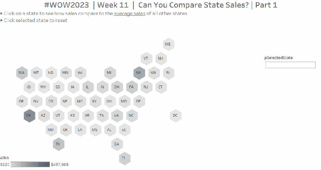
Identifying the selected states
In part 1, we captured the single state selected within a parameter pSelectedState via a parameter dashboard action. We now need to be able to capture multiple states. We’re still going to use the same parameter and a parameter action, but we need to adapt what will be stored within in it.
Instead of a single state being stored in the parameter, we’re now going use this parameter to build up a delimited list of the states selected. We can then interrogate that string to determine the first and the second state selected, and identify if any additional states have been selected.
When using delimited strings, you need to choose a character to separate the field values that isn’t going to appear within the field value itself; ie choose a character that won’t appear within a State name. In this instance I’m choosing | (pipe), and I’m going to build up the parameter as follows
Action
pSelectedState
No states selected
<empty string>
1 state selected eg Arizona
|Arizona|
2 states selected eg Arizona then Utah
|Arizona||Utah|
3 states selected eg Arizona, then Utah, then Colorado
|Arizona||Utah||Colorado|
Existing state is selected again (trigger to reset the view)
<empty string>
Based on the logic above, we need to modify the existing field
State for Param
IF CONTAINS([pSelectedState], [State]) THEN ” //selected state is already in the parameter, so reset back to ” ELSE [pSelectedState] + ‘|’ + [State] + ‘|’ //append current state selected to the existing parameter string END
To see how this is working, go the the dashboard and display the pSelectedState parameter. Click on states and see how the parameter is changing.
As we interact with the hex maps, we can see the list of states building up in the parameter. We’ve obviously lost some of the other functionality now, but that’s ok, we have more things to adapt.
We can now manipulate this string to identify the first two states selected
First Selected State
SPLIT([pSelectedState],’|’,2)
returns the string that comes before the 2nd instance of the ‘|’ (and after the 1st)
Second Selected State
SPLIT([pSelectedStateString],’|’,4)
returns the string that comes before the 4th instance of the ‘|’ (and after the 3rd).
We can then use these fields to set the colour for the map
State Colour
IF [State] = [First Selected State] THEN ‘First’ ELSEIF [State] = [Second Selected State] THEN ‘Second’ ELSE ‘Other’ END
Replace the Is Selected State field that is currently on the Colour shelf and the Shape shelf of the Column (2) marks card, with this new State Colour field. Ensure you have at least 2 states listed in the pSelectedState parameter, so you have options for First, Second, Other all listed in both the colour and shape legends.
Adjust the Shape legend and set the First and Second values to use the same hexagon shape used initially, but set the Other option to use a transparent shape.
Adjust the colours. Increase the opacity on this mark to 100% Set the colours as you wish – I used:
First – teal : #66b3c2
Second – light teal : #bce4d8
Other – pale grey : #d3d3d3
Click around on the dashboard. You should find as you click the first state it is coloured dark teal. Click a second, it is coloured light teal. Click either selected state again, and the map resets. Click more than 2 states, and only the first 2 are coloured, whilst the parameter continues to capture all the states being clicked.
Alerting if more than two states are selected
We will need a field to identify if more than 2 states have been selected.
More than 2 Values Selected?
SPLIT([pSelectedStateString], ‘|’, 6) <> ”
This is looking for a 3rd instance of a value within the delimited string, and returns true if there is one.
As this is a boolean field, we can use it to control the visibility of the message text box we want to display.
We also need to ensure that when the user clicks on the message, it disappears, and the hex map is re-set, ie the pSelectedState parameter gets set back to empty string. Another field will help us with this
State Reset
”
On a new sheet, add State Reset to Text. Then edit the text to the relevant message, and align centrally. Change the tooltip to say ‘click here to reset’. Set the background colour of the sheet to a pale grey. Name the sheet ‘Alert’ or similar.
On the dashboard, delete the contents of the pSelectedState parameter and remove it from the dashboard. Add the Alert sheet as a floating object. Set to fit entire view and remove the title. Add a border to the object.
Select the object, then in the Layout pane, set the Control visibility using value option to the More than 2 Values Selected field.
Then add a dashboard parameter action to reset the parameter when the message is clicked
Reset States
On select of the Alert object, set the pSelectedState parameter to the value stored in the State Reset field.
Click around, selecting more that 2 states and test the behaviour. Now we can move on the adapting the other charts.
Adapting the calculations
To sense check what is going on, on a new sheet, add State to Rows, Sales to Text and add Country/Region = United States to Filter. Add State Label to Rows, and show the pSelectedState parameter.
When only 1 state has been selected, we want to display the state against the selected row, otherwise we want to display the text ‘Other States (Avg)’ . When 2 states have been selected we just want the state names against the 2 relevant rows. Otherwise we want NULL to show. We need to adapt the State Label field as follows
State Label
IF [First Selected State] <> ” AND [Second Selected State] = ” THEN IF [State] = [First Selected State] THEN [State] ELSE ‘Other States (Avg)’ END ELSEIF [First Selected State] <> ” AND [Second Selected State] <> ” THEN IF [First Selected State] = [State] OR [Second Selected State] = [State] THEN [State] END END
Now we need to display a different value for the sales measure depending on whether we have 1 or 2 states selected. So we need to adapt the existing Sales To Display field
Sales To Display
IF CONTAINS([pSelectedState], MIN([State Label])) THEN SUM([Sales]) ELSE SUM([Sales])/COUNTD([State]) END
If the parameter string contains the State Label value, then use the sales, otherwise average the sales over the number of states that make up the sales. Format this to $ with 0dp.
Add this to the table, and remove State from the display
Add State Label to the Filter shelf and exclude NULL. Now remove the second state from the parameter and check the result
Adapting the bar chart
On the existing bar chart sheet, verify the pSelectedState parameter is displayed. Replace Is Selected State on the Colour shelf with the State Colour field and remove Is Selected State from the Rows shelf.
Add another state to compare against. Exclude the NULL values that display (add State Label to Filter and exclude Nulls)
We always want to make sure that the first state selected is listed first.
Sort- State Label
IF [State Label] = [First Selected State] THEN 1 ELSEIF [State Label] = [Second Selected State] THEN 2 ELSE 3 END
Add this field on to Rows as a discrete (blue) pill, between the existing two pills and then hide it.
Adapting the line chart
On the existing line chart sheet, verify the pSelectedState parameter is displayed
Add State Label to Filter and exclude null. Replace Is Selected State on the Colour shelf with the State Colour field.
Displaying the additional charts on click.
The display of the bar and line chart are based on the dynamic zone visibility functionality, and the field Show Viz (if you have downloaded my original solution workbook to build onto, you may need to unhide fields in the data pane for this field to be visible).
Amend Show Viz to
[First Selected State] <> ”
Amending the Chart Title sheet
On the Title sheet, replace the Is Selected State on the Filter shelf with Show Viz = TRUE.
Remove State Label from the Text shelf and add First Selected State and Second Selected State to Text. Additionally create a calculated field
Label:All State
IF [Second Selected State] = ” THEN ‘Other States (Avg)’ ELSE ” END
Add this to Text too.
Adjust the text as below and apply matching colour coding to the fonts. Align the text centrally.
Finally update the title and instructions on the dashboard.
It’s a double whammy this week – a #PreppinData & #WOW2022 combo! And I’m going to attempt to blog a solution guide to both! Wish me luck… it may take some time!
The #PreppinData & #WOW2022 crew combined with the requirement to prep some Salesforce data with Tableau Prep as per the challenge here, and to then use the output to visualise in Tableau Desktop as per the challenge here.
Prepping the Data
Two files were provided for the input: Opportunity provided 1 row per opportunity, and Opportunity History providing multiple rows per Opportunity, where each row indicated the stage in the lifecycle the opportunity goes through.
The first requirement was to pivot the Opportunity data, to get 2 rows per Opportunity; 1 indicating the date opened, and the other indicating the date closed (or expected to be closed).
After connecting to the Opportunity date and adding a Clean step to view the contents, add a Pivot step to transform Columns to Rows, adding the CloseDate and CreatedDate fields to the pivot.
Before adding any further steps, rename Pivot1 Names to Stage and rename Pivot1 Values to Date.
Add a Clean Step.
Change the CloseDate value in the Stage field to be renamed to ExpectedCloseDate, and the change the CreatedDate value in the Stage field to be renamed to Opened. To do this, simply double click on the value and type in.
We then need to further update this field, based on whether the Opportunity record is closed or not. The requirement said to refer to the StageName field for this, even though there is an IsClosed field. I chose to stick with the requirements.
Create a calculated field
Stage
IF CONTAINS([StageName], ‘Closed’) AND [Stage]=’ExpectedCloseDate’ THEN [StageName] ELSE [Stage] END
Having applied this logic, your Stage field should now contain 4 values rather than 2.
Then remove all fields except for Date, Stage, Id and StageName, and rename the step Opportunity.
We now need to combine with the OpportunityHistory data. This data contains a row for each stage the Oppotrunity goes through. What we’re looking to do is to supplement this with a Stage = Opened record, and, in the event the opportunity hasn’t been closed, a Stage = ExpectedCloseDate record.
For this we’ll need a Union step.
Add in the OpportunityHistory data, and add a Clean step. Rename this step to History. To help with the union step, rename the CreatedDate field to Date. In the Opportunity step above, rename Id to OppID.
Add a Union step to the Opportunity path. Then drag History and add it to the Union. Add a Clean step and view the data. If the renaming worked ok, you should have 6 fields.
Update the SortOrder field by creating a new calculated field
SortOrder
If [Stage]=’Opened’ THEN 0 ELSEIF [Stage]=’ExpectedCloseDate’ THEN 11 ELSE [SortOrder] END
Update the Stage fields for those which have null records.
Stage
IF ISNULL([Stage]) THEN [StageName] ELSE [Stage] END
All the records with SortOrder = null are actually duplicates now, as we have them captured as part of the pivoting step we did initially. All these records can therefore be excluded (click on the null value in the SortOrder field, right click and Exclude).
Now remove the redundant fields of Table Naems, Stage Name, and you should be left with 4 columns and 876 rows of data, which you can output to csv or similar.
Building the Viz
Now we’ve got the data sorted, we can build the viz. If you haven’t done the PreppinData challenge, you will need to download the Opportunity.csv input file and the provided Output.csv files from the website.
Modelling the data
In Tableau Desktop, connect to the file generated in the above process (or download the output file from the PreppinData site if you haven’t built your own). My file was called 2022_06_08_SalesOpps.csv.
Then add an additional connection to the Opportunity.csv file you used in the Prep challenge (or again download from the PreppinData site).
Add a relationship from Opp ID to Id
Building the Open Opportunities chart
We need to work out what Lorna has used to identify an ‘open’ opportunity. After a bit of trial and error, I discovered it was any opportunity that had an ExpectedCloseDate stage. To identify these, create a new calculated field
This will return the value 1 against all the rows for an Opp ID which have an ExpectedCloseDate Stage, and 0 for those that don’t.
As you can see below, all the rows for the 1st two Opp IDs listed are flagged with 1 as they have at least 1 stage which is ExpectedCloseDate. For the other Opp IDs listed, they are all 0.
Right click this field and drag to the Filter shelf. When you release the mouse, choose the All values option from the dialog displayed, then Next
Then select 1 to filter the sheet just to the the Opportunity records we care about.
Add Opp ID and Name to Rows. Add Date to Columns as a continuous exact date (green pill).
Change the mark type to Circle and add the Stage field to Colour, and adjust accordingly using the relevant colour palette.
To add the grey lozenge marks, add another instance of Date next to itself. This will create a second marks card called Date2. Remove the Stage field from the Colour.
Change the mark type of the Date2 card to line, and adjust the colour to a light grey and the size to be a bit larger.
Make this chart dual axis and synchronise the axis. Move the lozenge marks ‘to the back’ (right click on the top axis and move marks to back.
We need to identify those with a Close Date in the past. For the purposes of this exercise, I hardcoded ‘today’ into a parameter pToday and set it to 8th June 2022. Otherwise in a ‘live’ situation I would refer to the TODAY() function rather than the parameter.
Add this field to the Rows before the Opp ID field. You won’t get the symbol against every row, but don’t worry about that just yet. Format this circle to be right aligned and red font.
Now we need to mange the sorting. Firstly create a new parameter
pSortBy
an integer containing values 1 and 2, defaulted to 2 where the values displayed are aliased as below
To determine how long an opportunity has been open we need
Days Open
DATEDIFF(‘day’, [Created Date], [Close Date])
We then need a field to utilise this parameter and determine the measure we can use to sort
Sort By
CASE [pSortby] WHEN 1 THEN SUM([Days Open]) * -1 ELSE INT(MIN([Close Date])) END
If we’re sorting based on the Longest Open we’ll use the number of days the opportunity has been open. By default the data will ascend from smallest to largest value but we want the opposite, so we multiple by -1.
If we’re sorting based on the Close Date. then we can just use the Close Date field itself, converted into a integer.
Add Sort By to Rows , change it to be discrete (blue) and then move it to be the first pill on the Rows shelf. The data should now be reordered, and you’ll now get a red circle per row.
Add the pSortBy parameter to the sheet and test the sorting. Once happy, hide the Sort By field (right click and uncheck Show Header), then Hide Field Labels for Rows. Remove row & column dividers and make the first column narrow. You should now have your chart.
Building the legend
Lorna’s decided the legend should be circles rather than the ‘out of the box’ squares, so a custom sheet is required.
On a new sheet, add Sort Order discrete dimension (blue pill) and Stage to Rows. Add Stage to Filter and exclude Closed Lost and Closed Won. We’re going to need to organise these Stages into 2 rows and 3 columns, so we need some fields to help.
Row Index
IF [Sort Order] ❤ THEN 1 ELSE 2 END
Column Index
IF [Sort Order] = 0 OR [Sort Order] = 4 THEN 1 ELSEIF [Sort Order]=2 OR [Sort Order]= 8 THEN 2 ELSE 3 END
Note I’m very much ‘hardcoding’ this as this is acceptable for this view I believe.
Add Row Index as discrete dimension to Rows and Column Index as discrete dimension to Columns, and move Stage to Label.
Type in FLOAT(MIN(0)) into Columns to create a fake axis. Change mark type to circle, and add Stage to Colour. Increase the width of each row if all your text isn’t showing.
Edit the axis so it is fixed to start at -0.1 and end at 0.5 – this will shift the circles to the left.
Uncheck Show Header against the Row Index, Column Index and the MIN(0) axis. Then remove all gridlines and row/column dividers. Turn off tooltips.
The Summary View
Now we need to work on the summary values at the top of the screen. We’re focussing on ‘open’ opportunities in the current month, which is June 2022 (based on the pToday parameter). We need Has Expected Close Date Stage = 1 on Filter, and to identify the current month we use
Now let’s have closer look at the rows of data we’re got so far.
Add Opp ID, Sort Order (discrete dimension) and Stage to Rows and Amount to Text.
What we’re looking for is to aggregate the Amount by Stage, but if we remove the Opp ID and Sort Order fields, we don’t get the right values
This is because we’ve got multiple rows per Opp ID, so the value is counting in multiple Stages. We want to just limit the rows to the latest Stage before the ExpectedCloseDate stage.
First lets work out the maximum Sort Order value for each Opp ID that isn’t the Expected Close Date row (which has a Sort Order = 11).
Max Stage Sort Order
{FIXED [Opp ID]: MAX(IF [Sort Order]<=10 THEN [Sort Order] END)}
Add this to the tabular view as a discrete dimesion. Hopefully you can see from the image below that we’re getting the value we want.
Now let’s identify the matching row
Stage To Keep
[Sort Order] = [Max Stage Sort Order]
Add this to the Filter shelf and set to True.
Now if we remove Sort Order, Max Stage Sort Order and Stage from Rows, we get the correct summarised values.
Move Stage to Columns and add Stage to Text and Colour. Set to Fit Entire View. Align Text centred and remove all row/column dividers. Uncheck Show Header against the Stage field on Rows. Use the Colour Legend to manually sort the values into the correct order.
Update the sheet title.
Past Close Date
This is a bit simpler… add Past Close Date? to Filter and select ●. Add Stage to Filter and select ExpectedCloseDate. Add Amount to Text and the auto generated field Opportunity.csv (Count) to Text.
Format the text and add a title, and you’re all done You just need to add everything to the dashboard now.
Ann Jackson set this week’s #WOW2021 challenge, based on a recent ‘real world’ situation she had encountered.
Analysing Ann’s solution (by interacting with her published solution), I deduced we’d need to use set actions to add and remove the selected Sub-Categories into and out of the set (I hadn’t noticed Ann had tagged the challenge on the main page with Set Actions 🙂 ). I also realised the initial visual in the first column, wasn’t using reference lines to depict the target, as the tooltip displayed on hover, was much more detailed than what you can add to a reference line tooltip.
So armed with this knowledge, I set about building what was required.
Defining the required calculations
Building the BANs
Building the viz
Adding the interactivity
Defining the required calculations
This is one of those challenges where I want to get all the calcs sorted up front in a tabular view, before even attempting the viz. I’ll go through what I ended up with, but be assured this did take a bit of time and change of direction to get what I needed.
Let’s start with parameters. Firstly I created a parameter to simulate ‘today’, that is hardcoded to 9th June 2021
I then created a parameter to store the % uplift we want to use for one of the goal options. I default this to 0.1 (ie 10%)
We need to work out the sales so far this year (ie the sales in 2021 up to and including 9th June 2021), and the equivalent sales for the previous year (ie the sales in 2020 up to and including 9th June 2020).
SALES YTD by Sub Cat
IF YEAR([Order Date]) = YEAR([pToday]) AND [Order Date] <= [pToday] THEN [Sales] END
SALES LY YTD by Sub Cat
IF YEAR([Order Date]) = YEAR([pToday])-1 AND [Order Date] <= DATEADD(‘year’,-1,[pToday]) THEN [Sales] END
Let’s pop these into a table with the Category and Sub-Category fields, and add grand totals, so we can see what figures we need to be aiming for the BANs at the top.
Now let’s work out the values for the goals.
One goal is based on finding the average sales per day in 2021, then extrapolating this across the whole year.
So firstly, we need to know how many days in the year up to ‘today’.
This finds the number of days between 01 Jan 2021 and 01 Jan 2022.
These methods ensure the right number of days is recorded if the ‘current’ year happens to be a leap year.
We can now work out one of the goals
Same Pace Goal
(SUM([SALES YTD by Sub Cat])/[# Days So Far This Year]) * [# Days In Year]
Add up the Sales so far this year and divide by the number of days so far to get the average sales value per day, then multiply by the total number of days in the year.
For the other goal, we need to determine the sales for the whole of the previous year, and multiple by the uplift %.
SALES LY
IF YEAR([Order Date]) = YEAR([pToday])-1 THEN [Sales] END
This gives the total sales for 2020.
LY + Percent Increase
SUM([SALES LY])*(1+[pPercentIncrease])
This applies the % increase parameter to the total sales for 2020.
Now we want to decide which of the goal values to use based on ‘selection’. To define the selected Sub-Categories, we’re going to use a set. Right-click on Sub-Category > Create > Set, name accordingly and select ‘Phones’ as the initial value in the set.
Use Last Year With Increase
Now we can use whether the record is in or out of the set in the logic to determine the goal to use
YEAR_END GOAL per Sub-Cat
IF ATTR([Use Last Year With Increase]) then [LY + Percent Increase Goal] ELSE [Same Pace Goal] END
Add the set and the goal field to the table, and you’ll see the value in the final column is matching the relevant previous columns, depending on whether the Sub-Category is IN or OUT of the set.
NOTE – when you do this, you’ll get In or Out displayed against each row. To get the description as I’ve got displayed, right click on the text In or Out and Edit Alias.
These data fields are going to be used to build out the central viz. There’s a couple of other fields we need to finish off the data requirements for the viz
Value to Goal
[YEAR-END GOAL Per Sub Cat]-SUM([SALES YTD by Sub Cat])
and
% of Goal
SUM([SALES YTD by Sub Cat])/[YEAR-END GOAL Per Sub Cat]
This field needs to be formatted to percentage with 0 dp (all other monetary fields need to be formatted to $ with 0 dp).
So now we have the core fields stored against each row that will help us build out the main viz. You can edit the set and add further sub-categories, so you can validate how the values change.
Now we want to work on the data we need for the BANs. You may think the grand totals sum up all the rows above, however while this works fine for the SALES YTD by Sub Cat and SALES LY YTD by Sub Cat columns, it isn’t the case for the YEAR-END GOAL by Sub Cat column.
If we select all the rows in that column, and examine the tooltip that appears on hover, the total of the selected columns differs from the total at the bottom of the column.
The value in the hover text is what we need. The discrepancy with the column grand total is because it’s working across the whole data and not row by row. Because at least 1 record is in the set, its taking the logic to use the same pace goal. You’ll notice the total of this column matches the total of the Same Pace Goal column. In fact as you add more values to the set, the total will match the Same Pace Goal total up until all values are in the set. At that point the total will match the LY + Percent Increase column.
So back to the summary measures. We’re going to use table calcs to solve this.
SALES YTD
WINDOW_SUM(SUM([SALES YTD by Sub Cat]))
SALES LY YTD
WINDOW_SUM(SUM([SALES LY YTD by Sub Cat]))
YEAR-END GOAL
WINDOW_SUM([YEAR-END GOAL Per Sub Cat])
These are all basically summing up the values displayed in the rows on the screen. Add them to the table, and you can see the same values are displayed on each row which tally to other data in the table
Right, we have all the data fields we need, let’s start building.
Building the BANs
On a new sheet, add the fields as below
We want to turn this into 1 row.
Create a field called
Index
INDEX()
and add this to the Rows shelf and change to be discrete (blue pill). Each row should be numbered from 1 to 17.
Now drag the Index field from the Rows shelf onto the Filter shelf and when prompted select 1.
You’ve now got 1 row displayed, but the data associated to all the rows is being included in the calcs (if you’d filtered just to Sub Category = Accessories for example, the date would be just related to the rows with the Accessories value).
Now we can tidy this to look how we want
Add Measure Names to Text shelf (change display to entire view if need be).
Hide Sub-Category from displaying (uncheck Show Header)
Right Click on each column title and Edit Alias to remove the ‘along…’ text
Format the text appropriately and align centrally
Adjust the tooltip to remove the Sub-Category info
Hide the Measure Names from displaying (uncheck Show Header).
Format the Row Dividers to be thick
Building the Viz
Add Category and Sub-Category to the Rows shelf on a new sheet. Change the sort of the Category field to sort by data source order, descending. Change the sort of the Sub-Category field to sort as below
Add SALES YTD by Sub Cat to Columns, then drag SALES LY YTD by Sub Cat onto the canvas and drop onto the SALES YTD by Sub Cat axis when you see the 2 columns appear
Drag Measure Names from the Rows shelf to the Size shelf. Add Measure Names to the Colour shelf. Adjust sizes and colours accordingly. Add a white border to the bars on the colour shelf.
Turn stack marks off (Analysis > Stack Marks > Off) to allow the bars to overlay each other.
Add both SALES YTD by Sub Cat and SALES LY YTD by Sub Cat to the Tooltip shelf, so you can reference both values regardless which bar you’re hovering over.
Add YEAR-END GOAL by Sub Cat to the Columns shelf and set to dual axis and synchronise axis. Reset the mark type of the Measure Values card to bar, and of the YEAR-END GOAL by Sub Cat card to Gantt.
Remove the Measure Names from the Size and Colour on the YEAR-END GOAL by Sub Cat card. Set the colour of this mark to black.
On the All marks card, add YEAR-END GOAL by Sub Cat to the Tooltip shelf so once again it’s value can be referenced by all marks.
Adjust the tooltip on the All marks card to match.
‘Type in’ MIN(0) to the Columns shelf (double click in the space next to the pills to enable the text edit feature). On this MIN(0) marks card, change mark type to Text and add Value to Goal to the Text shelf. Adjust the text to include the additional wording and adjust size too if need be. Adjust tooltip too.
Repeat this process for the % of Goal field too.
For the circles, create another MIN(0) column in the same way, but this time change mark type to circle, and add Use Last Year with Increase set to the Colour shelf and adjust. Adjust tooltips.
Format axes/gridlines/text/row banding accordingly and rotate text of the Category field.
Adding the interactivity
Add the sheets to a dashboard. Add a set action to add Sub-Categories to the set on click (Dashboard > Action > Add Action > Change Set Values). Set the action to run on select (on click) of the chart viz, to add values to the Use Last Year with Increase set.
We then need another set action to remove the Sub-Categories, but this needs to work by clicking a link in the tooltip which displays. The name of this action will display on the tooltip.
And fingers crossed.. that should be it! My published viz is here.
When Luke’s #WOW2020 challenge landed this week, I did a little happy dance inside, as I was pretty sure I was going to be able to crack this fairly quickly with minimal head scratching effort. This isn’t because I create these types of charts often, but because this type of side-by-side bar formed the basis of a #WorkoutWednesday challenge way back in 2017, and is a technique I can still recall – I didn’t even have to check my published workbook for a reminder… there’s just some techniques that just ‘stick’.
There may well be other ways to solve this challenge, but the technique I know is based on ‘normalising’ and ‘jittering’ dates, and is one I recall I picked up from Zen Master Jonathan Drummey’s Bars & Lines Blog post and associated workbook which can be downloaded from the blog.
So let’s gets started & hopefully, all will become clear.
Building the chart
In the dataset we’re using we have 4 years worth of orders, and need to plot the value of sales per month, per year in a bar chart which ‘groups’ the yearly bars for the same month together.
We’re going to plot the dates on a continuous axis (green pill), which typically would give a bar chart that looks like this, where Year(Order Date) is also added to the Colour shelf (Note I’ve also adjusted the colours to match the requirements).
We have 1 bar per month per year, but the months are ‘grouped’ in their sequential years.
So the first thing we want to do, is ‘normalise’ the dates as if they all occurred in the same year – any year is fine, I’m going to baseline them all to 2019
As you can see if plotting Order Date alongside Date Normalised this is simply transposing 03 Jan 2016 to 03 Jan 2019, 03 Jan 2017 would also be transposed to 03 Jan 2019
Replacing Order Date with Date Normalised on our initial chart gives us
But we want the bars side by side.
When using the automatic date hierarchy to plot dates at the month level, what Tableau is doing ‘under the bonnet’, is ‘truncating’ each date to the 1st of the month; so 3rd Jan 2019 and 18th Jan 2019 etc, are both actually plotted at 1st Jan 2019, and so on.
And when a bar chart is used to plot on a date axis, the left hand side of the bar is plotted at the 1st of the month point.
So with all this in mind, what we’re going to is ‘jitter’ the dates for each year to be clustered before the 1st of the month (for 2016 & 2017) and on/after 1st of the month (for 2018 & 2019).
Date Jitter
CASE YEAR([Order Date]) WHEN 2016 THEN DATEADD(‘day’,-9, DATETRUNC(‘month’, [Date Normalised])) WHEN 2017 THEN DATEADD(‘day’,-4, DATETRUNC(‘month’, [Date Normalised])) WHEN 2018 THEN DATEADD(‘day’,1, DATETRUNC(‘month’, [Date Normalised])) WHEN 2019 THEN DATEADD(‘day’,6, DATETRUNC(‘month’, [Date Normalised])) END
If the year of the original Order Date is 2016, then truncate the normalised (2019) version of the date to the 1st of the month, but subtract 9 days. So if the OrderDate is 03 Jan 2016, then transpose it to 03 Jan 2019, then truncate to 1st of month, 01 Jan 2019, then subtract 9 days to 23 Dec 2018
03 Jan 2016 -> 03 Jan 2019 -> 01 Jan 2019 -> 23 Dec 2018
Depending on the year depends on whether dates are subtracted or added, and they have a suitable spacing between. The table below shows the relationship between the Order Date, the Normalised Date and the Date Jitter
Replacing Date Normalised with Date Jitter like for like, gives us the same view though, since it’s automatically rolled up to ‘month’
Change the Date Jitter to Exact Date
and ta-dah! you have your side-by-side chart. Each bar is being plotted at the exact date. If we just filter to look at May for example, we can see this clearer
The bars are obviously thinner than we want, so adjust the Size to be Fixed with a value of 4
To get the Tooltip to display the correct month and year, you need to add Order Date to the Detail shelf and change it to the discrete Month level (blue pill), then format the pill to display as an abbreviated month.
To get the axis to display an abbreviated month name, format that too and set to custom formatting of mmm.
Finally, to get the bottom axis and axis ticks to be darker, adjust the Columns Axis Ruler and Axis Ticks to be a solid dark line, then edit the axis, and delete the axis title
Your bar chart should be complete
Building the Legend
F0r the legend, I simply created a very simple existence chart using the circle mark type as below
And that’s it (once added to a dashboard of course!). The date jittering is a useful technique to be aware of – I’m pretty sure I’ve used it in other challenges too, but not necessarily for a side by side bar chart.
Note, my Date Normalised & Date Jitter fields in my published viz aren’t exactly as detailed above, because I decided to jitter then normalise originally, which meant I had to make an additional adjustment in my normalisation calculation. It’s only when typing this blog out and essentially rebuilding as I go, that I realised it was so much simpler the other way round!