Filter for One Value OR All Others

Erica set the latest challenge, testing us on our ability to master tricky filter scenarios – in this case either show the info for one specific value of a field, or only show the other values, but allow them to be filtered themselves too. The challenge had two parts – the main challenge and a bonus option. I managed to complete both, so will blog both too.

Main challenge – Building the basic viz

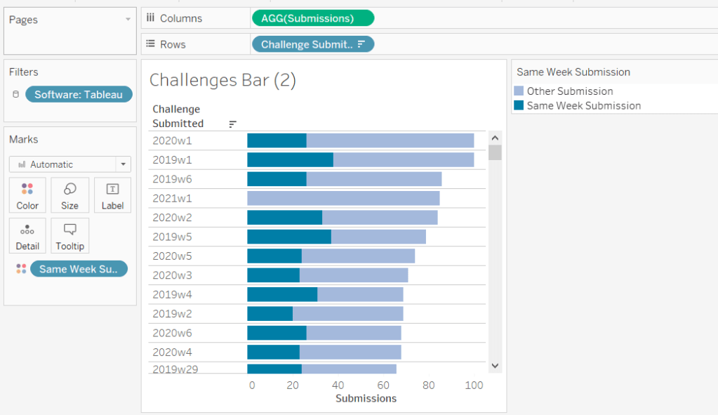
On a new sheet add Region and Category to Rows and Sales to Columns. Add Region to Colour and adjust accordingly.

Sort Region by Sales descending

and then click the descended sort button on the toolbar to sort the Category field by Sales too.

Format Sales to be $ with 0 dp. Remove column dividers, and widen each row slightly.

Main challenge – Apply the filtering

Create a parameter

pRegionType

string parameter with 2 options : Not West and West, defaulted to Not West

Create a calculated field to determine whether to display the West Region only, or the other Regions

Filter Region West or Not v1

([pRegionType] = ‘West’ AND [Region] = ‘West’)
OR
([pRegionType] = ‘Not West’ AND [Region] <> ‘West’)

Add this to the Filter shelf and set to True. This is essentially the ‘first level’ filter. Show the parameter and switch between the two values to see the behaviour

Now we need a ‘second’ filter, to allow the relevant Regions to be selected. For this, add Region to the Filter shelf, but select the Use all option

and then show the Region filter list on the canvas, and adjust the settings so only relevant values are displayed

This means when the pRegionType parameter is West, only West will be displayed in the Region filter, but when Not West is selected, all regions except West will display, and the filter can be interacted with in the normal manner.

Main challenge – Building the dashboard

Arrange the viz and the parameters on the dashboard as required, using layout containers, padding and background colours to help organise the content and display required.

We only want the Region selection filter to display when the pRegionType parameter is set to Not West. We can use dynamic zone visibility for this. Create a calculated field

DMZ – Display Filter Control

[pRegionType] = ‘Not West’

and then on the dashboard, select the Region filter and check the Control visibility using value option and select the DMZ – Display Filter Control field.

Bonus Challenge – Building the Viz

Recreate the viz as described above (or duplicate the sheet of the original viz, and remove all the pills from the Filter shelf.

Bonus challenge – Apply the filtering

Create a parameter

pSelectedRegion

string parameter, defaulted to <empty string>

This parameter is going to contain a string that can contain one or more Regions in a delimited format eg | East | or |East||South| etc. The contents of this string will determine how we filter the chart to mimic the required behaviour.

Firstly, we want the ‘1st level’ filter to determine whether we’re displaying just the West Region or all the other Regions.

Filter Region West or Not v2

(CONTAINS([pSelectedRegion],’West’) AND [Region] = ‘West’)
OR
(NOT CONTAINS([pSelectedRegion], ‘West’) AND [Region] <> ‘West’)

Add this to the Filter shelf and set to True. Show the pSelectedRegion parameter. With the parameter empty, the West Region should not display.

Type the word West into the parameter. Now the just the West Region should display.

And if you enter additional text alongside the word ‘West’, still the ‘West’ Region should display

But if you remove the ‘West’ text, all the Regions should display whatever the text is contained.

This behaviour is essentially simulating that of the ‘West’ | ‘Not West’ parameter selection in the previous version.

Now we want to control the 2nd level of filtering where the same parameter is used to drive which of the ‘other’ Regions display.

Filter Other Regions v2

CONTAINS([pSelectedRegion], ‘West’) OR
NOT CONTAINS([pSelectedRegion],[Region])

Set the pSelectedRegion parameter to empty so all Regions are displayed. Add Filter Other Regions v2 to the Filter shelf and set to True.

Enter the text East into the parameter. The East option should disappear.

Add the text ‘South’. That too should disappear

Add the text ‘West’ and only the West Region will show

Play around entering multiple combinations of Regions. Ultimately if the text ‘West’ is present anywhere in the parameter string, only the West Region will display. If West is not present, then any other Region in the string will not be presented in the display. All sounds a bit backwards, but it works 🙂

So now we need to actually control how the pSelectedRegion parameter will get populated. And this will be via a parameter action fired from the selection made from a ‘custom’ legend sheet.

Bonus challenge – Building the filter control

On a new sheet, add Region to Rows and manually type in MIN(0.0) into Columns. Change the mark type to shape. Add Region to Label and show the labels (widen each row slightly). Edit the MIN(0.0) axis to be fixed from -0.1 to 0.5 which will shift the display to the left.

Sort the Region field by Sales descending.

Hide the axis, stop the Tooltip from displaying, hide the Region header, remove all gridlines/ axis rulers/ zero lines, row/column dividers. Set the background colour to light grey.

The Colour and the Shape (filled or unfilled) is determined based on the entries we have captured in the pSelectedRegion parameter, but the logic for each attribute is different.

Colour v2

If [pSelectedRegion] = ‘|West|’ THEN ‘West’ ELSE [Region] END

Show that parameter and make it empty. Add Colour v2 to the Colour shelf. Adjust colour to suit if not already set.

Then enter the text |West| – all the symbols should now all be Navy (or whatever colour you have chosen for West).

For the shape, create

Shape v2

IF CONTAINS([pSelectedRegion] , ‘West’) AND [Region] = ‘West’ THEN ‘Fill’
ELSEIF CONTAINS([pSelectedRegion], ‘West’) AND [Region] <> ‘West’ THEN ‘Empty’
ELSEIF ([Region] <> ‘West’) AND [pSelectedRegion]=” THEN ‘Fill’
ELSEIF ([Region] <> ‘West’) AND NOT CONTAINS([pSelectedRegion],[Region]) THEN ‘Fill’
ELSE ‘Empty’
END

and add to the Shape shelf. Note – this logic took a lot of trial and error to get the desired result.

Whenever the text West exists in the parameter, then the West Region should be a filled circle and all the other regions should be empty (the first 2 lines of the logic statement). If the parameter is empty, we want all the regions (except West) to be filled (so West will be empty). And if the parameter contains a Region(s) that isn’t West, we want that Region to be empty as well – only non-West Regions that aren’t in the parameter should be filled.

To control the text being passed into the pSelectedRegion parameter, we need a field

Region for Param

IF CONTAINS([pSelectedRegion],’West’) THEN ” //West has been selected again so reset parameter to empty
ELSEIF CONTAINS([pSelectedRegion], [Region]) THEN REPLACE([pSelectedRegion], ‘|’ + [Region] + ‘|’ ,”) //selected region is already in the parameter, so remove it ”
ELSE [pSelectedRegion]+ ‘|’ + [Region] + ‘|’ //append current region selected to the existing parameter string
END

Add this to the Detail shelf.

Finally, we will want to ensure the marks aren’t highlighted on selection, so create fields

True

TRUE

False

FALSE

and add these to the Detail shelf too.

Bonus challenge – adding the interactivity

Build the dashboard again using layout containers and background colours and padding

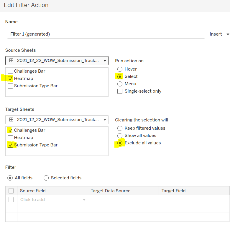
Create a dashboard parameter action

Set Region

On selection of the Filter Control viz, set the pSelectedRegion parameter passing in the value from the Region for Param field. Set the field to <empty string> when deselected

Create a dashboard filter action

Deselect Marks

On select of the Filter Control viz on the dashboard, target the Filter Control sheet itself, passing in the specific fields of True = False.

And this should complete the required elements. My published viz is here.

Happy vizzin’!

Donna

Elf Economics

For the penultimate challenge of 2023, Erica set this fun Christmas themed challenge to visualise the toy production in Santa’s workshop. It was a collaboration with the #PreppinData crew, where you were encouraged to complete their challenge to prep the data for this one. I did do that, but to ensure no discrepancies or field name differences, I used the outputs from the challenge itself as the source for my viz.

Building the Line Chart

This needs to show the quota vs the cumulative number of toys produced for each production manager/toy and uses the data from the Output 1 of the Prep challenge.

Add Week to Columns and change to exact date. Format the Week pill on the Columns to show as custom format yyyy on the axis

then edit the axis and set the tick marks to be fixed from 01 Jan 2023 with an interval of 1 year. This will result in just 2 axis labels displayed, one for 2023 and one for 2024

Add Production Manager and Toy to Rows and then add Quota to Rows too. Then drag Toys Produced onto the Quota axis and drop it when the double green column icon appears.

This will convert the viz to have Measure Values on the Rows instead, and the Quota and Toys Produced pills sitting in the Measure Values section on the left.

Add a Running Total quick table calculation against the Toys Produced pill. Then edit the Value axis, so that the axis are independent axis ranges for each row & column.

The colour of the running total line needs to change based on whether the overall value is above or below the quota. Erica asked us not to use LODs in this challenge, so to determine this, we need

Colour – Over | Under

IF WINDOW_MAX(RUNNING_SUM(SUM([Toys Produced]))) > WINDOW_MAX(SUM([Quota])) THEN ‘Over’ ELSE ‘Under’ END

The WINDOW_MAX function is taking the highest value of the measure and essentially ‘spreads’ that across every row of data being plotted (in this case every week).

Add this field to the Detail shelf and then click on the 3 dot symbol to the left of the pill and change it to the Colour symbol. This allows multiple pills to be on the Colour shelf – Measure Names and Colour – Over | Under, resulting in 4 different colours in the colour legend.

Adjust the legend colours, so the two relating to the Quota are the same colour and the others coloured based on whether the value is Over or Under.

On the Label shelf, check the show mark labels option, and then select most recent. Adjust the font to be bold and match mark colour. Format both the pills sitting in the Measure Values section to be Millions with 1 dp.

Add Week to the Tooltip shelf and format to be in the <day of week>, <day> <month> <year> style. Adjust the tooltip accordingly.

Hide the Production Manager and Toy fields (uncheck show header). Edit the title of the Value axis and the Week axis. Remove all gridlines, zero lines, row & column dividers, but ensure the axis are displayed. Change the worksheet background colour.

Update the Title of the sheet to reference the Toy, then name the sheet Line or similar.

Building the KPIs

We’re still using the data from Output 1. We’re going to do this in 2 sheets, as we want to format the text of the PM name differently. To start, we need some additional calculated fields.

Rate of Production

AVG([Toys Produced])

Then we need to work out for those Production Managers who were under their quota, how far off they were and how long, based on their production rate, it would take for them to fulfil that difference. So first we need

Difference

AVG([Quota]) – SUM([Toys Produced])

This gives us how far under (or over) the PM was from their target quota.

We can then calculate

Weeks Needed to Meet Quota

IF MIN([Over or Under Quota?]) = ‘Over’ THEN 0 ELSE
CEILING([Difference] /[Rate of Production])
END

If the PM has exceeded their quota, then 0, as there’s nothing to build, otherwise determine the number of whole weeks. The CEILING function ensures even if the result is only a fraction over a number, the result is ’rounded up’ the next whole number so 12.1 weeks and 12.9 weeks are both reported as 13 weeks.

Add Production Manager and the 2 fields above onto a new sheet and display in tabular form.

Set the sheet to Entire View and adjust the text to be larger (I used bold 18pt font). Format the column headings to be larger too (I used 12pt). Stop the tooltips from displaying, remove row/column dividers and row banding. Set the background colour of the worksheet and hide the Production Manager column (uncheck show header).

Name this sheet KPI or similar.

On a new sheet, add Production Manager to Rows and add Production Manager to the Text shelf too. Double click in to the Columns shelf and type ‘Production Manager’ to create a heading for the text column.

Set the sheet to Entire View, then adjust the font of the Text shelf. I chose a handwriting script font and set to 18pt and bold. The hide the Production Manager field on Rows, and hide the ‘Production Manager’ column label heading (right click – hide field labels for columns). Adjust the font of the column heading and remove all row/column dividers and row banding, Set the background colour. Hide the tooltip.

Name the sheet PM Name or similar.

Building the bar chart

For this, we’re now using the data from Output 2.

We’re plotting 2 measures for the bars – the amount under or over the quota which is a +ve (over) or -ve (under) number which will be plotted either side of a zero line as you would expect. The Toys Over/Under Quota field has this value.

We also need to plot the amount of toys produced, but while this is a positive number, it is displayed on the bar chart on the negative side of the zero line. So to enable this we need

Toys Produced to Plot

-1 * [Toys Produced]

ON a new sheet, add List and Toy to Rows. Then add Toys Produced to Plot to Columns, and then drag Toys Over/Under Quota onto the axis and drop when the 2 green column icon appears. This will result in the following display where Measure Names and Measure Values are automatically added.

Move Measure Names from Rows onto Colour, then change the order of the pills listed in the Measure Values section, so Toys Produced to Plot is listed first.

Create a new field

Colour – Over | Under

IF [Toys Over/Under Quota] < 0 THEN ‘under’ ELSE ‘over’ END

and add to the Detail shelf, then adjust the symbol to add this field to the Colour shelf as well to give you 4 colours on the legend. Adjust accordingly. Add Quota, Toys Produced and Toys Over/Under Quota to Tooltip and adjust.

For the label to display against each bar, we need to plot another measure, which is either 0 for those which were under production, or the value of the over production.

Label Value to Plot

IF SUM([Toys Over/Under Quota]) < 0 THEN 0 ELSE SUM([Toys Over/Under Quota]) END

Add this to Columns. On the Label Value to Plot marks card, change the mark type to circle and remove Measure Names from colour.

Create a new field

% Difference

SUM([Toys Over/Under Quota]) / SUM([Quota])

and apply a custom number format of 0%;0% which means -ve numbers will display as +ve.

Add this to the Label shelf along with Colour – Over | Under. Adjust the label text so the labels are displayed on a single line, are aligned middle right and the font matches mark colour and is bold. Make the chart dual axis and synchronise the axis (set the mark type of Measure Values to a bar if the display changes). On the Label Value to Plot marks card, reduce the opacity of the circle colour to 0% and reduce the size to the smallest possible. Remove all the text from the Tooltip.

To ensure the label text doesn’t overlap the bars, we can extend the axis by creating

Ref Line

WINDOW_MAX([Label Value to Plot]) *2

Add this to the Detail shelf of the Label Value to Plot marks card. Then right click on the top axis and Add Reference Line that refers to the maximum of the Ref Line field. Apply settings as below so the line is invisible.

Finally hide both axis, remove all gridlines, zero lines, axis and column dividers. Adjust the row dividers to be thick grey dashed lines. Update the title of the sheet.

Name the sheet Bar or similar.

Adding the interactivity

Using layout containers, add the sheets to a dashboard so they are arranged in the format required. Then add a dashboard filter action

Select PM

on select of the Bar sheet, target the KPI, Line and PM Name sheets. When the selection is cleared, keep filtered values Only allow 1 selection to be made at a time.

Click the bar against Barbie Doll to set the other charts to filter just to that toy, then unclick the bar again. The remaining charts should stay filtered.

And that should be it. Obviously you can add imagery as you wish but I didn’t go down that route – I just chose to set coloured borders on the layout containers.

My published viz is here.

Happy vizzin’! and enjoy the festive season.

Donna

Let’s show quarterly sales with end-user flexibility

It was Sean’s final #WOW2022 challenge of the year, and he set this task to provide alternative options for visualising time series across dimensions with high cardinality.

I had a play with Sean’s viz before I started tackling the challenge and noticed the following behaviour in addition to the requirements listed, which may or may not have been intentional.

When the cardinality of the dimension to display was more than 1 higher than the top n parameter, and the Show Others? option was set to Group By, the sales value to display was based on average sales rather than sum (as indicated in the requirements), and all the values not in the top n, were grouped under an ‘Other (Avg)’ label. But if the cardinality of the dimension was only 1 more than the top n parameter (so there was essentially only 1 value within ‘other’), then this value would display as itself (ie not labelled ‘other’) and the sales values would be summed rather than averaged (eg if the lines were to be split based on Ship Mode, and the top n was set to top 3 and Show Others? set to Group By, all four ship modes would display with the sum of sales rather than average).

This observation meant some of the calculations were slightly more complex than what I thought they would need to be initially, as I had to build in logic based on the number of values within a dimension.

So with that understood, let’s build the calcs…

Defining the calculations

Firstly we need some parameters

pDimensionToDisplay

String parameter defaulted to Subcategory, with the list of possible dimensions to split the chart by

pTop

integer parameter defaulted to 5

pShowOthers

I used an integer parameter with values 0 and 1 which I ‘aliased’ to the relevant values, defaulted to ‘Group Others’

I then needed to determine which dimension to be used based on the selected from the pDimensionToDisplay parameter.

DimensionSelected

CASE [pDimensionToDisplay]
WHEN ‘Subcategory’ THEN [Sub-Category]
WHEN ‘State’ THEN [State/Province]
WHEN ‘Ship Mode’ THEN [Ship Mode]
WHEN ‘Segment’ THEN [Segment]
ELSE ‘All’
END

From this, I could then use a Set to determine which of the values would be in the top n. Create a set of off DimensionSelected (right click -> Create -> Set)

Dimension Selected Set

select the Top tab, and create set based on the pTop parameter of Sales

To check this is working as expected, on a sheet, add DimensionSelected and Dimension Selected Set to Rows, add Sales to Text and sort by Sales descending. Show the pTop and pDimensionToDisplay parameters. Change the parameters and observe the results behave as expected.

Now we need to determine how many values are not in the set, ie, how many of the DimensionSelected values display as ‘Out’ in the above image.

Count Non-Set Items

{FIXED:COUNTD(IF NOT([Dimension Selected Set]) THEN [DimensionSelected] END)}

If the entry is not in the set, then return the entry, and the count the number of distinct entries we have. Using the FIXED level of detail calculation, wraps the value across every row.

Now this is understood, we need to work out whether we want to group the ‘non-set’ values under ‘other’

Dimension To Display

IF [pShowOthers]=0 AND NOT([Dimension Selected Set]) AND [Count Non-Set Items]>1 THEN ‘Other (Avg)’
ELSE [DimensionSelected]
END

If we’re opting to ‘group’ the values, and the entry isn’t in the set, and we’ve got more than 1 entry that isn’t in the set, then we can label as ‘Other (Avg)’, otherwise, we just want the dimension value.

We use similar logic to determine whether to display the SUM or AVG Sales.

Sales to Display

IF [pShowOthers]=0 AND SUM([Count Non-Set Items]) > 1 THEN AVG([Sales])
ELSE SUM([Sales]) END

Format this to $ with 0 dp.

We can then remove the DimensionSelected from our view, and test the behaviour, switching the pShowOthers parameter

Building the core viz

On a new sheet, add Order Date set to continuous quarters (green pill) to Columns and Sales To Display to Rows and Dimension To Display to Label. Show all the parameters.

Create a new field

Colour

[pShowOthers]=0 AND NOT([Dimension Selected Set]) AND [Count Non-Set Items]>1

add add to Colour shelf, and set colours accordingly.

Add Sub-Category, Ship Mode, State and Segment to the Filter shelf. Show them all, and then test the behaviour is as expected.

Extending the date axis

The date axis in the solution goes beyond 2022 Q4, and means the labels have a bit more ‘breathing space’. To extend the axis, click on Order Date pill in the Columns, and select Extend Date Range -> 6 months.

Then double click into the space next to the Sales To Display pill on the Rows and type MIN(0). This will create a second axis, and the date axis should now display to 2023 Q2

On the MIN(0) marks card, remove the Colour and Dimension To Display pills. Reduce the Size to as small as possible, and set the Colour opacity to 0%. Set the chart to dual axis, and synchronise the axis.

Finally tidy up the chart – hide the right hand axis, remove the title from the date axis, change the title on the left axis. Remove all row and column divider lines, but ensure the axis rulers are displayed. Title the viz referencing the pDimensionToDisplay parameter.

Building the dashboard

When putting the dashboard together, you need to ensure that the filters, parameters and main viz are all contained within a vertical container to ensure the viz ‘fills up’ the space when the controls section is collapsed.

The controls section itself is also a vertical container, which consists of 2 horizontal containers, one of which contains all the filters, and one which contains the parameters.

The layout tab shows how I managed this (I also like to rename the objects to keep better control).

The green Base vertical container is the first container. This essentially contains 3 ‘rows’ – the title, the User Controls vertical container and the viz itself.

The User Controls vertical container, then contains 2 rows itself – the Filters horizontal container (which has a pale grey background colour) and the Fine Tune horizontal container (which has a slightly darker grey background colour).

The User Controls vertical container is then set to ‘hide/show’ by selecting the whole container (click on the object in the item hierarchy on the left), and then selecting Add Show/Hide Button from the context menu. Adjust the button settings as required (I just altered the text displayed on hover) and then position accordingly.

It can take a bit of trial and error to get this right, and to get your containers working as expected. My published viz is here.

Happy vizzin’!

Donna

Let’s visualise #WorkoutWednesday submissions

Sean Miller decided to use the data gathered by the #WorkoutWednesday team in this week’s challenge, to visualise how people use the submission tracker. I try to fill it in immediately after publishing and tweeting my solution, which is usually within the same week as when the challenge is set, unless I’m on holiday. Sometimes I do forget and as I know I’ve completed every challenge, I will fill it in if I see gaps in the tracker. However, I do think there’s something a bit awry with my submission data as there’s a few holes that don’t seem to tally properly with the weeks in the month…. there’s probably a typo or duplication in my data (if any of the team happen to read this, could you have a look.. or let me see my data to see if I can find the problem 😉 )

Anyway onto the challenge – we’re going to build a heat map and 2 bar charts and then add some interactivity between the two – nothing majorly taxing this week, so hopefully this blog won’t take too long to write… I’m prepping for Christmas so have lots to do 🙂

Building the heat map

The heat map displays the week number in the year across the top, and year and day of week down the side. We need to create some calculated fields to extract some of these values from the Timestamp date field provided (note if your Timestamp field doesn’t import automatically as a date, then right click > Change Data Type > Date to convert it).

Week Submitted

DATEPART(‘week’,[Timestamp])

Format this to custom format of 00, so you display 01 rather than 1. Drag the pill into the top half of the data pane, so it’s stored as a dimension.

Weekday Submitted

LEFT(DATENAME(‘weekday’,[Timestamp]),3)

Add Week Submitted to Columns and then YEAR(Timestamp) and Weekday Submitted to Rows.

To get the numbers and display to match Sean, you will need to ensure your week starts on a Sunday. If you’re in the UK like me, you may have it set to Monday. To change this right-click on the data source > Date Properties > Week start = Sunday.

To colour the cells, we need

Submissions

COUNT([2021-12-22-WW51-WOW_Challenge_Tracker.txt])

where the field referenced is automatically generated field that is created (ie what used to be Number of Records).

And then we need to calculate the Rank Percentile, which isn’t as scary as it sounds – there’s a handy function…

Percentile of Submissions

RANK_PERCENTILE([Submissions])

Format to a percentage with 1 dp.

Add this onto the Colour shelf, and adjust the table calculation so it is computing by all the fields.

Edit the colour range to use the one specified, and adjust the settings so it only uses 4 colours, and ranges from 0 to 1

Add Software to the Filter shelf and select Tableau

This is the core of the chart complete. Add column and row dividers, rotate the Year headings, narrow the columns and hide the row label headings.

Now we just need to sort the Tooltip. Add Timestamp to the Detail shelf, and change to the Day May 8, 2015 display. This will change the viz, but don’t panic. Re-edit the table calculation so Day of Timestamp is also checked.

Then add Submissions to Tooltip and adjust the tooltip text as required.

Finally, also add Submissions to the Label shelf and edit so the value on shows on selection.

Building the bar charts

Firstly, amend the Software filter on the heatmap so it is set to apply to worksheets > all using this data source.

Next wee need to identify whether the challenge was submitted in the same wee as it was set

Same Week Submission

([Challenge Week]=[Week Submitted]) AND ([Challenge Year]=YEAR([Timestamp]))

This returns a boolean of true or false, but we can alias these values (right click field > Aliases) to give the displayed options

Now add Same Week Submssions to Columns, Submissions to Rows and Same week Submissions to Colour and adjust accordingly. Amend gridelines, borders etc to get the required display format

For the next bar chart we need to build the text for

Challenge Submitted

STR([Challenge Year])+’w’+STR([Challenge Week])

Add this to Rows and Submissions to Columns and add Same Week Submission to Colour. Again adjust formatting accordingly.

Adding the Interactivity

On a dashboard, add a Vertical container. Drop the Heat map into it. Then underneath, still within the Vertical container, add a Horizontal container. Add the two bar charts side by side. You may have other objects, but part of your layout hierarchy should look like

Add a dashboard filter action to the heatmap chart that on select affects the two bar charts, but when unselecting, excludes all values.

As you click on the heatmap and then unclick, the bar charts should disappear and the heat map should fill out the space.

Finalise the dashboard adding a title, supplementary text, the software filter and colour legend.

My published viz is here.

Happy vizzin’!

Donna

Can you build a divergent histogram?

It was Ann Jackson’s last #WOW2020 challenge of the year, to build this divergent histogram depicting the average life expectancy by gender, with each bar indicating the number of countries with that life expectancy.

Ann hinted that reshaping the data may help, so I chose to do this by pivoting the data. To do this, in the data pane, I selected both the Life Expectancy Male and Life Expectancy Female columns, then right-clicked and selected Pivot.

This results in the number of rows in the data set being doubled, with a field called Pivot Field Names containing the values Life Expectancy Male and Life Expectancy Female, and then a field called Pivot Field Values which contains the life expectancy value. This field I renamed to Life Expectancy Age and moved it to the top section of the fields pane (above the line), so it is treated like a dimension rather than a measure.

We need to count the countries, so I created

Country Count

COUNTD([Country/Region])

Let’s see what this all looks like

Filtering by Year (2012), adding Life Expectancy Age to Rows, Pivot Field Names to Columns and Country Count to Text we get

Filtering out the Null and we have the basic data we want to plot, which we can do by

  • Year on Filter set to 2012
  • Life Expectancy Age on Filter set to exclude Null
  • Pivot Field Names on Columns
  • Life Expectancy Age on Columns (continuous)
  • Country Count on Rows
  • Mark Type set to Bar
  • Size set to Fixed

If we move Pivot Field Names from Columns to Colour, we get an overlapping bar.

But we want the males to be going down the chart, so let’s change the Country Count field to be

Country Count

IF CONTAINS(ATTR([Pivot Field Names]),’Female’) THEN COUNTD([Country/Region]) ELSE COUNTD([Country/Region])*-1 END

which is basically inverting the values for the male, and is pretty much the crux of the challenge 🙂

We need to label the max bar for each gender, or in this case the max & min. So showing mark labels and setting to just label the max and min values, we have a couple of issues….

… the labels are positioned in the centre, and males is labelled -13, rather than 13. To fix the positioning, we need to turn stacked marks off via the Analysis menu (took a bit of while to figure this one out).

To resolve the negative labelling, I formatted the County Count field to custom format to #,##0;#,##0

The final requirement is to ensure the axis range is identical. To do this I created reference lines based on the maximum value

Max Count Ref Line

WINDOW_MAX([Country Count])

which I then copied

Max Count Ref Line (Copy)

WINDOW_MAX([Country Count]) *-1

Adding both of these to the Detail shelf, and setting the table calculation to compute by the fields below

And apart from some formatting and the tooltips, that should be complete. My published viz is here. When I looked at Ann’s version, she tackled it differently, which is the beauty of these challenges – there’s often more than one solution.

Happy vizzin’! Stay Safe!

Donna