This week’s challenge uses data I collated from the stats vest my daughter wears during her football matches and training sessions. The data provided is already pre-filtered to the 2024-25 season and her Reading U15 team.
If you want to watch a video which demonstrates the concept then this video by Andy Kriebel will help. But if you prefer to read, then carry on 🙂
Building out the calculations
In creating this chart we need to normalise all the different stats we want to show; that is we want to convert every measure into a spread between 0 and 1. To do this we calculate the difference between the value and the minimum value as a proportion of the full range of values (that is the difference between the min and max values). We use table calculations for this.
Total Distance (km)
(SUM([Distance – Total (KM)]) – WINDOW_MIN(SUM([Distance – Total (KM)]))) / (WINDOW_MAX(SUM([Distance – Total (KM)])) – WINDOW_MIN(SUM([Distance – Total (KM)])) )
format to 4 dp
Distance / Min (m)
(SUM([Distance per Min]) – WINDOW_MIN(SUM([Distance per Min]))) / (WINDOW_MAX(SUM([Distance per Min])) – WINDOW_MIN(SUM([Distance per Min])) )
format to 4 dp
HSR Distance (m)
(SUM([HSR – Total (M)]) – WINDOW_MIN(SUM([HSR – Total (M)]))) / (WINDOW_MAX(SUM([HSR – Total (M)])) – WINDOW_MIN(SUM([HSR – Total (M)])) )
format to 4 dp
HI Distance (m)
(SUM([HI Distance – Total (M)]) – WINDOW_MIN(SUM([HI Distance – Total (M)]))) / (WINDOW_MAX(SUM([HI Distance – Total (M)])) – WINDOW_MIN(SUM([HI Distance – Total (M)])) )
format to 4 dp
Max Speed (m/s)
(SUM([Speed – Max (m/s)]) – WINDOW_MIN(SUM([Speed – Max (m/s)]))) / (WINDOW_MAX(SUM([Speed – Max (m/s)])) – WINDOW_MIN(SUM([Speed – Max (m/s)])) )
format to 4 dp
NOTE – in my solution I called these fields Norm – xxxx . After putting on the chart, I aliased them to the names above. Creating with the actual names I used is the simpler solution 🙂 I don’t know why I didn’t just rename them…
On a new sheet, add Game ID to Rows, and then add all the original key measures and their associated normalised values into the table, so each original measure is next to its normalised value. If you sort by one of the original measures from largest to smallest, you should see that the associated normalised value is distributed from 1 at the top of the list to 0 at the bottom.
The other key requirement for this viz is to identify a selected opposition. For this we create a parameter based on the Opposition field. Right click on Opposition > Create > Parameter and the following dialog with the list of opposition teams pre-populated will display. I set the default as Chelsea Ladies U14
Opposition Parameter
The create a new field
Highlight Match
[Opposition] = [Opposition Parameter]
Show the Opposition Parameter control and add Highlight Match to Rows.
Now we can start building the viz.
Building the chart
On a new sheet, add Game ID to Detail, then add Total Distance (km) to Rows. Adjust the table calculation of the field to be computing by Game ID.
Then add Distance / Min (m) onto the sheet, by dragging the field and dropping it on the y-axis when the 2-column icon appears
This will automatically add Measure Names and Measure Values into the display, including a Measure Values ‘box’
Adjust the table calc of the Distance / Min (m) field to compute by Game ID. Reorder the fields in the Measure Values box, and then change the mark type to line. Set to Fit Width.
Add the other 3 normalised fields into the view, by adding the field into the Measure Values box, and adjusting the table calc each time.
We now have the core viz, we just need to format it and add the additional features.
Show the Opposition Parameter control. Add Highlight Match to the Colour shelf. Adjust colours and re-order so True is listed first. Adjust all the table calcs in the 5 measures so they are also now computing by both Game ID and Highlight Match.
Now add H/A to the Detail shelf and change to be an Attribute (this means by default it is excluded from the table calcs, so we don’t need to make all those adjustments again). Then change the icon to the left of the pill from Detail to Colour, so there are now two fields on the Colour shelf. Adjust to suit.
Add Highlight Match to the Size shelf, and then adjust the size to be reversed, so the True lines are thicker.
Create a new field
Label: Opposition
IF [Highlight Match] THEN [Opposition] END
And add this to the Label shelf and set to be an Attribute. Adjust the Label property so it’s just labelling the line ends and label end of line. Ensure labels set to overlap to, and set font to bold and to match mark colour and align top right.
Alias the field H/A (right click field > aliases) so they display as Home and Away. Then add the following fields to the Tooltip : Category, Cup/League, H/A, Opposition, Round and Date. Also add the following measures to the Tooltip : Distance – Total (KM), Distance per Min, HI Distance – Total (M), HSR – Total (M), Speed – Max (m/s). Then adjust and format the Tooltip
To create the vertical lines, add another copy of Measure Values to the Rows which will create a Measure Values (2) marks card. Remove all the fields from this card except the Game ID. And then move Game ID to the Path shelf which has the effect of creating the vertical lines
Adjust the Colour of the line and then add Measure Names to the Label shelf. Set the label to Min/Max by pane, for the Measure Values field. Align centrally.
Set the chart to dual axis and synchronise the axis. Hide all the axis, and the Measure Names labels at the bottom (uncheck show header against the pills). Remove all row/column dividers and gridlines/zero lines etc. Set the background colour (if desired).
Adding the interactivity
Add the chart to a dashboard then create a dashboard parameter action
Set Opposition
On select of the viz, set the Opposition Parameter parameter, with the value from the Opposition field. Set the value to <empty> when cleared.
Adding the information panel
Add a floating Text object onto the dashboard. Copy and paste the information from the challenge page. Resize and reposition the text box as required. Set the background of the text object and add a border to make it prominent. Then from the context menu of the object, select the Add Show/Hide Button option. The Show/Hide object will appear as an X. Move this into the required position and re-adjust the text object to suit too.
And that should then be it. My published viz is here.
After connecting to the data, add Team to Rows and Timestamp as a continuous (green) pill at the Day level to Columns. Create a new field
Call Count
COUNT([synthetic_call_center_data.csv])
and then add this to Rows.
Add Timestamp to Filter, and select relative date. Set the options to Last 3 weeks, and then additionally check the anchor relative to check box and enter 23 Dec 2024. This is because the data set only goes up to the end of December 2024. Not setting this field will apply the date filter based on ‘today’ so it’s unlikely anything will appear.
(Note – you may also need to update the date properties of the data set to ensure a week starts on a Sunday to get matching numbers: right click the data source and select the date properties option).
To add a marker to the last point, create a field
Call Count – Most Recent
IF LAST()=0 THEN [Call Count] END
Add this to Rows and adjust the table calc setting so it is computing specifically by Day of Timestamp only. By default it was doing this via the Table (across) option, but I tend to always prefer to always explicitly fix what the calculation is computing over, as it won’t then matter where I then move that field too if I choose to change the layout of the viz.
Set the mark type on the Call Count marks card to line, and then adjust the colour to grey and reduce the size. Set the mark type of the Call Count – Most Recent marks card to circle, set the colour to blue and increase the size. Hide the null indicator (right click > hide).
Set the chart to dual axis, synchronise the axis and then remove the Measure Names field from the All marks card.
remove both the axis titles (right click axis > edit axis), hide the right hand axis (right click, untick show header), and format to remove the column divider from the header section only.
Now we’ve got the core display, we need to create the following fields
No. of Calls
WINDOW_SUM([Call Count])
Highest Call Vol
WINDOW_MAX([Call Count])
Lowest Call Vol
WINDOW_MIN([Call Count])
Avg Call Vol
WINDOW_AVG([Call Count])
format this to a number with 0 dp
Calls this period
WINDOW_MAX([Call Count – Most Recent])
the window_max is required here, as the data set we’re displaying at the day level, has 2 values – the latest value and null. We only want to return 1 value, which is the maximum of these.
Previous Period
WINDOW_MAX(IF LAST()=1 THEN [Call Count] END)
LAST()=1 returns the value of the next to last record, and the window_max is again applied, as the nested IF clause will return null for all others records.
Period Var
[Calls this period] – [Previous Period]
Add each of these fields, one by one, to Rows following the steps below
Add to rows (it will automatically display as a green continuous pill).
change to discrete (right click on the pill and select discrete – the pill will turn blue and move to before the green pills)
Explicitly set the table calc to be computing by Timestamp (as above)
Once, you should have something that looks like this
but I noticed, that the display in the solution is sorted based on the total number of calls and not by Team, so add a Sort to the Team pill to sort by Call Count descending
Update the Tooltip if you wish, and then add the viz to a dashboard, floating the Timestamp filter.
Yusuke set this interesting challenge : to combine a ‘bump’/’slope’ chart visualising the change in rank whilst also visually displaying the Sales value for the relevant Sub-Category in the ranked position.
Defining the calculations
This challenge will involve table calculations, so I’m going to start by building out the various calculations that will be required and displaying in a tabular view.
Add Category to Filter and select Office Supplies. Then add Sub-Category and Order Date at the Year level as a discrete (blue) pill to Rows. Add Sales to Text.
Create a new field
Sales Rank
RANK(SUM([Sales]))
And add to the table, and verify the table calculation is set to compute by Sub-Category only.
We will need to ‘colour’ the viz based on the rank compared to the previous year. For this create
Is Min Year
{MIN(YEAR([Order Date]))} = YEAR([Order Date])
which will return true for the first year in the data (in this instance 2022) and then create
Colour
IF [Sales Rank] = LOOKUP([Sales Rank],-1) OR ATTR([Is Min Year]) THEN ‘Same as last year’ ELSE ‘Different from last year’ END
If the rank is the same as the previous one, or it’s the first year, then treat as the same, otherwise treat as different.
Add the Colour field to the table, and this time make sure the table calculation for Colour is computing by Year of Order Date only (while the nested calc for Sales Rank should still be computed by Sub-Category only)
The labels on the viz only want to show in certain scenarios – if it’s the first record (ie for 2022) or there has been a change in rank. We need
Label : Rank & Sub Cat
IF ATTR([Is Min Year]) OR [Colour] = ‘Different from last year’ THEN STR([Sales Rank]) + ‘ | ‘ + MIN([Sub-Category]) END
and
Label : Sales
IF ATTR([Is Min Year]) OR [Colour] = ‘Different from last year’ THEN SUM([Sales]) END
format this to $ with 0dp
Add these to the sheet, and double check the nested table calculations on each pill are computing as required (Sales Rank by Sub-Category only, Colour by Year Order Date only)
Now we have all this, we can start building
Creating the Viz
On a new sheet, add Category to Filter and select Office Supplies. The add Order Date to Columns, but set to be continuous (green) pill at the Year level. Add Sub-Category to Detail and add Sales Rank to Rows as a discrete (blue) pill. Verify the table calculation setting against the Sales Rank pill is by Sub-Category only.
Change the mark type to line and then add Order Date to Path. By default it should be at the Year level as a discrete pill.
This is the ‘bump’ chart.
Now add another instance of Order Date to Columns as a continuous pill at the Year level to essentially duplicate the display. On the 2nd marks card, change the mark type to Gantt
This gives us the ‘starting point’ for each ‘bar’. But we need to determine the size for each bar. First we’re going to ‘normalise’ the sales values for all the sales being displayed so we get a value between 0 and 1, where 0 is the smallest sale, and 1 is the largest.
To see what this is doing, format the field to 2dp, then add the field to the tabular view, and ensure the table calculation is computing by both Sub-Category and Year Order Date.
But the ‘axis’ we want to plot the bar length against is in years, so we need to adjust this size to be a proportion of a year (ie 365 days)
Gantt Size
//proportion of a year [Normalised Sales] * 365
Add this to the Size shelf on the 2nd marks card on the viz. Adjust the table calc setting so it is computing by all the fields listed.
We now have the core concept so now we can start finalising the display.
Make the chart dual axis and synchronise the axis.
Set the view to fit height.
On the 1st marks card (that represents the line)
change the line style to dotted (via the Path shelf)
reduce the Size to suit
change the colour to pale grey
Add Label : Sales and Label : Rank & Sub Cat to the Label shelf.
Adjust the table calc settings of each so the nested table calcs in each have Sales Ranks by Sub Category only and Colour by both the Year Order Date fields only.
Adjust the layout of the text as required
Align the font to be top right
Change the font style (bold & black)
Ensure the Label is set to ‘allow labels to overlap marks’
Remove the Tooltip
On the 2nd marks card, the gantt bar
Add Colour to the Colour shelf and adjust the colours accordingly.
Verify the table calc settings are as expected
I chose to reduce the opacity slightly, so I could see the dotted line underneath (set to 70%)
Add Sales to Tooltip (format to $ with 0 dp) and the adjust Tooltip as required
Then we just ned to finalise the formatting/display
Set the font of the years and rank numbers to black & bold.
hide the Sales Rank label heading (right click > hide field labels for rows)
remove row & column dividers
Add black column gridlines (I set to the 2nd thickness level), and remove any row gridlines
Edit the top axis to have a fixed start (use default option) and end at 31/12/2025 so the 2026 label and line disappears.
Remove the title from the top axis.
Edit the bottom axis – remove the tile, and then set the tick marks to None, so the bottom axis now looks empty.
And that should be it. Now add the sheet to a dashboard and display the category filter as a single select, customising the remove the ‘all’ option.
I set this week’s challenge and I tried to deliver something to hopefully suit everyone wherever they are on their Tableau journey. The primary focus for this challenge is on table calculations, but there’s a few other features/functionality included too.
I love football – all the family are involved in it in some way, so thought I’d see what I could get from a different data set this week. The data set contains the results of matches played in the English Premier League for the last five seasons – from the 2020-21 season to the current season 2024-25. Matches up to the end of 2024 only are included.
As I wrote the challenge in such a way that should allow it to be ‘built upon’ from the beginner challenge, I’m going to author this blog in the same way. I’ll describe how to build the beginner challenge first, then will adapt /add on to that solution. Obviously, as in most cases, this is just how I built my solution – there may well be other ways to achieve the same result.
Beginner Challenge
Modelling the data
The data set provided displays 1 row per match with the teams being displayed in the Home and the Away columns respectively, and the FTR (full time result) column indicating if the Home team won (H), the Away team won (A) or if the match was a draw (D).
The first thing we need to do is pivot this data so we have 2 rows per match, with a column displaying the Team and another indicating if the team is the Home or Away team. To do this, in the data source window, select the Home and the Away columns (Ctrl-Click to multi-select – they’ll be highlighted in blue), then from the context menu on either column, select the Pivot option.
This will duplicate the rows, and generate two new fields called Pivot Field Names and Pivot Field Values. Rename the fields by double-clicking into the field heading
Pivot Field Names to Homeor Away
Pivot Field Values to Team
Creating the points calculation
We need to determine how many points each team gained out of the match which is based on whether they won (3pts), lost (0pts) or drew (1pt). Create a calculated field
Pts
IF [Home or Away] = ‘Home’ AND [FTR] = ‘H’ THEN 3 ELSEIF [Home or Away] = ‘Away’ AND [FTR] = ‘A’ THEN 3 ELSEIF [FTR] = ‘D’ THEN 1 ELSE 0 END
Creating the cumulative points line chart
We want to create a line chart that displays the cumulative number of points each team has gained by each week in each season.
Start by adding Wk to Columns and Pts to Rows as these are the core 2 fields we want to plot. But we need to split this by Team and by season, so add Team and Season End Year to the Detail shelf.
This gives us all the data points we need, but at the moment, it’s currently just showing how many points each team gained per week in each season.
To get the cumulative value, we add a running total quick table calculation to the Pts field.
which gives us the display we need
While we can leave the SUM(Pts) field as is in the Rows, I tend to like to ‘bake’ this field into the data set, so I have a dedicated field representing the running total. I can create this field in 2 ways
Create a calculated field called Cumulative Points Per Season which contains the text RUNNING_SUM(SUM([Pts])). Add this field to Rows instead of just Pts.
Hold down Ctrl and then click on the SUM([Pts]) pill in Rows and drag into the left hand data pane and then release the mouse. This will automatically create a new field which you can rename to Cumulative Points Per Season. The field will already contain the text from the calculation used within the quick table calculation, and the field on Rows will automatically be updated.
Filtering the data
Add Team to the Filter shelf and when prompted just select a single entry eg Arsenal.
Show the Filter control. From the context menu, change the control to be a single value (list) display, and then select customise and uncheck the show all value option, so All can’t be selected.
Format the line
To make the line stepped, click the path button and select the step option
To identify the latest season without hardcoding, we can create
Is Latest Season
[Season End Year] = {MAX([Season End Year])}
The {MAX([Season End Year])} is a FIXED LOD (level of detail) calculation, and is a shortened notation for {FIXED: MAX([Season End Year])} which basically returns the latest value of Season End Year across every row in the data set. This calculation returns true if the Season End Year value of the row matches the overall value.
Add this field to the Colour shelf and adjust colours to suit. Also add the same field to the Size shelf
The line for the latest season is being displayed ‘behind’ the other seasons. To fix this, drag the True value in either the colour or size legend to be listed before the False value. Then edit the sizes from the context menu of the size legend, and check the reversed checkbox to make True the thicker line.
If the thick line seems too thick, adjust the mark size range to get it as you’d prefer
Label the line
Add Season End Year to the Label shelf. Align middle right. Allow labels to overlap marks. And match mark colour.
Create the Tooltip
We need an additional calculated field for this, as we want to display the season in the tooltip in the format 2024-2025 and not just the ending year of the season.
Season Start Year
[Season End Year]-1
Add this field to the Tooltip shelf, and then edit the Tooltip to build up the text in the required format. Use the Insert button on the tooltip to add referenced fields.
Final Formatting
To tidy up the display we want to
Change the axis titles
Right click on each axis and Edit Axis then adjust the title (or remove altogether if you don’t want a title to display)
Remove gridlines and axis ruler
Right click anywhere on the chart canvas, and select Format. In the left hand pane, select the format lines option and set grid Lines to None and axis rulers to None.
Set all text to dark purple
Select the Format menu option at the top of the screen and select Workbook. The under the All fonts section, change the colour to that required
Update the title to reference the selected team
double click in to the title of the sheet and amend accordingly, using the Insert option to add relevant fields.
Intermediate Challenge
For this part of the challenge we’re looking at using a dual axis to display another set of marks – these ones are circular and only up to 1 mark per season should display. As this now takes a bit more thought, and to help verify the calculations required, I’m going to build up the calculations I need in a tabular form first.
Defining the additional mark to plot
On a new sheet add Team, Season End Year and Wk to Rows. Set the latter 2 fields to be discrete (blue) pills. Add Cumulative Points Per Season to Text. Add Team to Filter and select Arsenal.
We need to identify the date of the last match played by each team, so we can use an LOD for this
Latest Date Per Team
{FIXED [Team] : MAX([Date])}
Add this to Rows as a discrete (blue pill) exact date. For Arsenal, the last match was on 27 Dec 2024, whereas for Chelsea it’s 22 Dec 2024.
With this, we can work out what the latest points are for each team in the current season.
Latest Points Per Team
WINDOW_MAX(IF MIN([Date]) = MIN([Latest Date Per Team]) THEN [Cumulative Points Per Season] END)
Breaking this down : the inner part of the statement says “if the date associated to the row matches the latest date, then return the points associated with that row”. Only 1 row in the table of data has a value at this point, all the rest of the rows are ‘nothing’. The WINDOW_MAX statement, then essentially ‘floods’ that value across every row in the data, because the ‘value’ returned by the inner statement is the maximum value (it’s higher than nothing). Add this field into the table.
We’re trying to identify the week in each season where the points are at least the same as the latest points. We’re going to capture the previous week’s points against every row.
Previous Points
LOOKUP([Cumulative Points Per Season],-1)
This is a table calculation that returns the value of the Cumulative Points Per Season from the previous row (-1). If we wanted the next row, the function parameter would be 1. 0 identifies the ‘current row’.
Add this to the table.
We can see the behaviour – The Previous Points associated to 2025 week 18 for Arsenal is 33, which is the value associated to Cumulative Points Per Season for week 17. But we can also see that week 38 from season 2024 is being reported as the previous points for week 1 of season 2025, which is wrong – we don’t want a previous value for this row.
To resolve, edit the table calculation of the Previous Points field and adjust so the calculation for Previous Points is just computing by the Wk field only.
With this we can identify the week in each season we want to ‘match’ against. In the case of the latest season, we just want the last row of data, but for previous seasons, we want to identify the first row where the number of points was at least the same as the latest points; the row where the points in the row are the same or greater than the latest points, and the points in the previous row are less.
Matching Week
//for latest season, just label latest record, otherwise find the week where the team had scored at least the same number of points as the current season so far IF MIN([Is Latest Season]) AND LAST()=0 THEN TRUE ELSE IF NOT(MIN([Is Latest Season])) AND [Cumulative Points Per Season]>= [Latest Points Per Team] AND [Previous Points] < [Latest Points Per Team] THEN TRUE ELSE FALSE END END
Add this to Rows and check the data. In the example below, in Season 2020-21, in week 26, Arsenal had 37 points. The previous week they had 34 points. Arsenal’s latest points are 36, so since 37 >=36 and 34 < 36, then week 26 is the matching week.
Looking at season 2023-24, in both week 15 and 16, Arsenal had 36 points. But only week 15 is highlighted as the match, as in week 14, Arsenal had 33 points so 36 >=36 and 33 <36, but for week 16, as the previous week was also 36, the 2nd half of the logic isn’t true : 36 is not less than 36.
So now we’ve identified the row in each season we want to display on the viz, we need to get the relevant points isolated in their own field too.
Matching Week Points
IF [Matching Week] THEN [Cumulative Points Per Season] END
Add this to the table
We now have data in a field we can plot.
Visualise the additional mark
If you want to retain your ‘Beginner’ solution, then the first step is to duplicate the Beginner worksheet, other wise, just build on what you have.
Add Matching Week Points to Rows to create an additional axis. By default only 1 mark may have displayed. Adjust the table calculation setting of the field, so the Latest Points Per Team calculation is computing by all fields except the Team field.
Change the mark type of the Matching Week Points marks card to Circle and remove Season End Year from the Label shelf (simply drag the pill against the T symbol off off the marks card)
Size the circles
We want the circles to be bigger, but if we adjust the Size, the lines change too, as the Size is being set based on the Is Latest Year pill on both marks cards. To resolve this, create a duplicate instance of Is Latest Year (right click pill and duplicate). This will automatically create Is Latest Season (copy) in the dimensions pane. Drag this onto the size shelf of the Matching Week Points marks card instead to make the sizing independent (you will probably find you need to readjust the table calculation for the Matching Week Points pill to include Is Latest Season (copy)). Then adjust the sizes as required.
Label the circles
Add Latest Points Per Team to the Label shelf of the Matching Week Points marks card. Adjust the table calculation setting, so the Latest Points Per Team calc is computing just by Wk only, so only the latest value displays.
Then format the Label so the text is aligned middle centre, is white & bold and slightly larger font.
Adjust the Tooltip text on the Matching Week Points mark, so it reads the same as on the line mark. You will need to reference the Matching Week Points value instead.
Then make the chart dual axis and synchronise the axis. Remove the Measure Names field that has automatically been added to the All marks card
Remove Label for Latest Season
We don’t want the season label to display for the current year, so create a new field
Label:Season
IF NOT([Is Latest Season]) THEN [Season End Year] END
Replace the Season End Year pill on the Label shelf of the Cumulative Points Per Season marks card, with this one instead.
Final Formatting
To tidy up
Remove right hand axis
right click on axis and uncheck show header
Remove 165 nulls indicator
right click on indicator and hide indicator
Remove row & column dividers
Right click on the canvas and Format. Select Format Borders and set Row and Column Divider values to None
Advanced Challenge
For the final part of the challenge we want to add some additional text to the tooltip and adjust the filter control. As before either duplicate the Intermediate challenge sheet or just build on.
We’ll start with the tooltip text.
Expand the Tooltip Text
For this, we’ll go back to the data table sheet we were working with to validate the calculations required.
We want to calculate the difference in the number of weeks between the latest week of the current season, and the week number of the matching record from previous seasons. So first, we want to identify the latest week of the current season, and ‘flood’ that over every row.
Latest Week Number Per Team
WINDOW_MAX(MAX(IF ([Date]) = ([Latest Date Per Team]) THEN [Wk] END))
This is the same logic we used above when getting the Latest Points Per Team, although as this time the Wk field isn’t already an aggregated field like Cumulative Points Per Season is, we have to wrap the conditional statement with an aggregation (eg MAX) before applying the WINDOW_MAX.
Add this to the table.
And then we need, the week number in each season where the match was found, but this needs to be spread across every row associated to that season.
Matching Week No Per Team and Season
WINDOW_MAX(IF [Matching Week] THEN MIN([Wk]) END)
Add to the table, but adjust the table calculation so the field is computing by all fields except the Season End Year.
Now we have these 2 fields, we can compute the difference
Week Difference
[Latest Week Number Per Team] – [Matching Week No Per Team and Season]
Add to the table. With this we can then define what this means for the text in the tooltip
Less/More
IF [Week Difference]<0 THEN ‘more’ ELSEIF [Week Difference]>0 then ‘less’ ELSE ” END
and also build the tooltip text completely
Tooltip- other seasons
IF NOT(MIN([Is Latest Season])) THEN IF [Week Difference] = 0 THEN ‘It took the same amount of weeks to accrue at least the same number of points as the current season’ ELSE ‘It took ‘ + STR(ABS([Week Difference])) + ‘ weeks ‘ + [Less/More] + ‘ to accrue at least the same number of points as the current season’ END END
Add this to the Tooltip shelf of the Matching Week Points marks card. Adjust the Tooltip to reference the field.
Adjust the Tooltip – other seasons table calculation, so the Latest Points Per Team nested calculation is computing for all fields except Team (this will make the circles reappear)
and also adjust the Latest Week Number Per Team nested calculation to compute by all fields except Team. This should make the text in the tooltip appear.
Filtering by teams in the current season only
We need to get a list of the teams in the current season only, which we can define by
Filter Team
IF {FIXED [Team]: MAX([Season End Year])} = {MAX([Season End Year])} THEN [Team] END
Breaking this down: {FIXED [Team]: MAX([Season End Year])} returns the maximum season for each team, which is compared against the maximum season in the data set. So if there is a match, then name of the team is returned. Listing this out in a table we get Null for all the teams whose latest season didn’t match the overall maximum
We can then build a set off of this field. Right click on the Filter Team field Create > Set and click the Null field and select Exclude
Then add this to the Filter shelf, and the list of teams displayed in the Team filter display will be reduced.
And with that the challenge is completed. My published viz is here.
Yusuke set this week’s challenge which is pretty tough-going. I got there eventually, but it wasn’t smooth sailing, and had a lot of false starts and changes to calculations throughout to get to the end. I will endeavour to explain where I had difficulties, but some of the calculations I came up with were more down to trial and error ( eg I wonder if this will work…?) rather than a known direction.
Modelling the data
We were provided with a version of Superstore and a State Abbreviations data set. I chose to use the Superstore Excel file I already had. I combined the two data sets in the data source pane using a relationship where State/Province in the Orders table of the Superstore excel file matched with the Full Name field in the State Abbreviations csv file.
As the data was just related to 2024, I added this as a data source filter (Year of Order Date = 2024)
Identifying the month
I decided I was going to use a parameter to select the month to filter. I first created
Order Date MY
DATE(DATETRUNC(‘month’,[Order Date]))
and then created a parameter
pOrderDate
date parameter defaulted to 01 Dec 2024, that I populated as a list using the values from the Order Date MY field. I set the display format to be a custom format of mmmm yyyy
Examining the data
On a new sheet, add State/Province and Abbreviation to Rows and Category to Columns to create a very simple ‘existence table’.
The presence of the Abc in the text table, shows that at least 1 record exists for the State/Category combination during 2024.
We can see some states, such as Arkansas, District of Colombia, Kansas etc don’t have any records at all for some Categories. However, when we look at the viz, we can see markers and labels associated to these Categories. In the image below, Kansas shows markers and labels against Furniture and Technology, when there are no records for these combinations at any point in 2024.
Handling this situation is the reason some of the calculations that follow are more complicated than you might expect.
Building the Trellis/Panel Chart calculations
Now when I built the viz, putting it into a trellis display was the last thing I did, but in rebuilding in order to write the blog, I’m finding that the table calcs needed start to help with the missing marks discussed above.
We need to count the number of States. For this create
State Count
SIZE()
Make this discrete and add to Rows. Adjust the table calculation to compute by State/Province and Abbreviation. 47 should be listed against every row in the column which is the number of rows displayed, and an Abc mark now exists for every State/Category combination.
We’ll also create
Index
INDEX()
make this discrete and add to Rows as well adjusting the table calculation to also compute by State/Province and Abbreviation
This has the effect of providing a counter for every row from 1-47.
We also need a parameter to define how many columns the display will be over
pCols
integer parameter defaulted to 8 which displays a range from 1 – 15 with a step of 1
With these fields, we can now define which row each record will sit on based on the counter for each State (the Index) and the number of columns to display (pCols).
Rows
INT(([Index]-1)/[pCols])
and we can also work out which column each record will sit in
Cols
([Index]-1)%[pCols]
Make both these fields discrete and add to Rows. Verify the table calc setting is as before. Show the pCols parameter, and test changing it and observe how the Rows and Cols values change
Remove State Count and Index from Rows. These won’t be needed in the final viz, as they’re just building blocks for other calculated fields.
Calculating the Profit Ratios
We need two Profit Ratio values – one for each State and Category per month and one ‘overall’ for each State by month
At the State/Category level, create
Monthly Sales
IF [Order Date MY] = [pOrderDate] THEN [Sales] ELSE 0 END
and
Monthly Profit
IF [Order Date MY] = [pOrderDate] THEN [Profit] ELSE 0 END
and from this create
Monthly PR
ZN(SUM([Monthly Profit])/SUM([Monthly Sales]))
custom format this to 0.0%;-0.0%;N/A which will then display the text N/A whenever the value is 0. Add this to the Text shelf.
Some additional State/Province records have appeared at this point with no Abbreviation (null). Filter these out.
To get the Overall profit ratio for the State, I created
State Sales for Month
{FIXED [State/Province]: SUM( IF [Order Date MY] = [pOrderDate] THEN [Sales] ELSE 0 END) }
and
State Profit for Month
{FIXED [State/Province]: SUM( IF [Order Date MY] = [pOrderDate] THEN [Profit] ELSE 0 END) }
and then created
PR for Month
SUM([State Profit for Month])/SUM([State Sales for Month])
and formatted this to a % with 1 dp.
Add PR for Month into the table and then apply a Sort to the State/Province field to sort by PR for Month descending
We’ve still got some gaps – we want to see the PR for Month value populated against every Category which have a profit ratio. For this create
State PR for Month
WINDOW_MAX([PR for Month])
Add this to the table and apply the table calculation to compute by Category only – we now have the overall profit ratio for each State plotted against every Category.
Note – we needed both PR for Month and State PR for Month as the latter is a table calculation and we can’t apply sorting on a table calc.
Building the panel chart
In building this I referred to my own blog post on a previous challenge, as the bar chart we need to build, isn’t a typical bar chart.
On a new sheet, add State/Province, Abbreviation and Category to Rows. Add Monthly PR to Text. Move the Abbreviation pill from Rows to Filters and exclude Null. Sort the State/Province field by PR for Month descending. Show the pOrderDate and pCols parameters.
Add Cols to Columns and Rows to Rows, so it’s the first pill listed. Move State/Province to Detail. Adjust the table calculations of both the Rows and Cols fields to be computing by State/Province and Category (listed in that order), and at the level of State/Province.
To build the bars, we’re using ‘fake axis’ on both the x & y axis to position the marks we want to display. We need
PR Bar Axis
ZN(LOOKUP(MIN(0.0),0))
and
Y-Axis
IFNULL(LOOKUP(MIN(0.5),0),0.5)
As alluded to above, these evolved as I played around to get the behaviour required.
Add Y-Axis to Rows and adjust the table calculation to compute by State/Province and Category (in that order) at the level of State/Province. Edit the axis to be fixed from -1 to 4.
Add PR Bar Axis to Columns. Again adjust the table calculation setting to be as the others. Change the mark type to Bar. Add another instance of Monthly PR to the Size shelf, and then adjust the Size to be Fixed and aligned Left.
Add Monthly PR to the Colour shelf, and adjust the colour legend to be fixed from -1.5 to 1.5 and centred at 0.
Edit the PR Bar Axis axis to be fixed from -1.25 to 1.25, to ensure the bars remain centred aligned regardless of the month selected.
Adjust the Tooltip as required.
Format the chart to remove all gridlines, remove the zero line for rows, and make the zero line for columns more prominent – dashed and darker. Remove all axis ticks. Add dark row and column dividers against the pane only and at the appropriate level so the information for a single State is contained within the boundaries.
Add row banding against the pane only at the appropriate band size and level
Reduce the width of each row, and widen each column to get a ‘squarer’ display.
Now we need to add the State/overall profit square. for this we need to ‘position’ a mark on the viz
Square Point
IF LAST()=0 THEN 0.9 ELSE NULL END
Add this to Columns. Edit the table calculation so it’s just computing by Category, then make the chart dual axis and synchronise axis.
This has created a second marks card, and essentially ‘duplicated’ the information for the ‘last’ Category only in each State.
Change the mark type to square. Remove Monthly PR from Colour and Size and Label . Add State PR for Month to Label and Colour instead. Adjust the table calculations to be computing by Category only. Align the label to be middle centre. Increase the Size of the mark so it’s roughly square.
Adjust the Colour legend of the State PR for Month so it ranges from -1.5 to 1.5 like the other one.
Adding Abbreviation to Label doesn’t work for every cell, so we need
Label – Abbreviation
WINDOW_MAX(MAX([Abbreviation]))
Add to Label and adjust the table calculation to be computing by Category only. Adjust the layout of the Label to match.
Update the Tooltip to reference State PR for Month instead. Hide the null indicator.
Finally hide the axis and the Cols and Rows pills (right click, uncheck show header). Hide the Category column title. Name the sheet.
And that should be the main viz. Add to a dashboard and only show one of the colour legends, renamed accordingly.
Yoshi set this week’s challenge to build a page navigator, but there was so much more in it too, so this could be a bit lengthy 🙂
Note, I’m blogging based on the full ‘advanced’ challenge, to include an ‘apply all’ button as well. I built the following sheets to build this via and I’ll talk through the basics of each of them in turn
List of State names
Bar chart of total State sales
Line chart of monthly State sales
Jitter plot of State sales by order
Navigation page number buttons
Back arrow
Forward arrow
Filter summary
Apply button
Preparing the data
The data being presented is only applicable to the states of the US. In the latest versions of Superstore, information for both Canada and the US is included, so I started by adding a data source filter to include only Country/Region = United States (right click data source -> Add Data Source Filter).
Building the list of State names
Add State/Province to Rows, and apply a sort to sort by the field Salesdescending
Add State/Province to Text and to Colour. Adjust font to be bold and widen each row.
Create a new field
Index
INDEX()
and add to Rows before State/Province. Set the table calculation to be explicitly computing by State/Province. Index is essentially ranking each State from 1 to 49, as we’ve already sorted the listing of the states.
The requirement is to show up to 7 states on a page, so create
Page No
INT(((INDEX()-1) /7)) +1
Set to be a discrete field and add to Rows in front of Index. Again explicitly set the table calculation to compute by State/Province. This shows us which states are on which page.
We’re going to identify the page we’re on based on a parameter
pPageSelected
integer parameter defaulted to 1
Show the parameter, then create a new field
Is Selected Page
[pPageSelected] = [Page No]
Add to the Filter shelf. Initially select All. Then adjust/verify the table calculation is explicitly set to compute using State/Province. Then edit the filter to just show values that are True.
Adjust the pPageSelected parameter to test the functionality.
Hide the Page No, Index, and State/Province field from Rows (uncheck show header). Remove column dividers and don’t show the tooltip. Name this sheet States.
Building the bar chart
Note – to get the labelling and the spacing between the bars, this isn’t a ‘standard bar chart’. This is a technique that has been included in previous WOW challenges.
On a new sheet, add State/Province to Rows and sort by Sales descending. Add Sales to Columns and Add State/Province to Colour. Add a grey border to the bars (via Colour shelf).
Double click into Rows and manually type MIN(1.0) and change the Mark Type to bar. Add Sales to Size, then click on the Size button and adjust the size from Manual to Fixed and align right.
Add Sales to Label and align top left. Adjust the Tooltip. Add Index to the front of Rows and adjust the table calculation to be computing by State/Province.
Add Page No to the front of Rows and adjust to computing by State/Province.
Set the page to Fit Width. Show the pPageSelected parameter and add Is Selected Page to the Filter shelf and set to True. Verify the table calculation is set to compute using State/Province. If not adjust, and then recheck the filter is just showing True value.
Change the parameter to show page 2. You’ll notice the axis has now adjusted from 0 – $80,000 whereas on page 1 it went up to $450,000. We want to retain the axis scale across the pages. For this, create
Max Sales
WINDOW_MAX(SUM([Sales]))
Add this to the Detail shelf and ensure the table calculation is computing by State/Province.
Add a reference line to the bottom Sales axis (right click axis > add reference line) and set it to cover the entire table, using the average Max Sales value. Don’t show any label., tooltip or line
The axis will now have readjusted and display up to 450,000 regardless of the page you’re on.
Adjust the Min(1.0) axis to be fixed from -0.5 to 2 to add some white space around the bars.
Hide both axis, the Page No, Index and State/Province fields in Rows. Remove all gridlines, zero lines, axis rulers & tick marks. Remove column dividers. Add Row Banding.
Name the sheet Total Sales.
Building the line chart
On a new sheet, add State/Province to Rows and sort by Sales descending. Add Index and Page No to Rows too and adjust both table calcs to be explicitly computing by State/Province.
Add Order Date to Columns and adjust to be at the continuous Month/Year level (green pill ). You’ll notice the page numbering & indexes start to look odd – ie multiple states have same index.
Adjust the Order Date field to Show Missing Values, and our numbers are all aligned again.
If we just add Sales to Rows though, the indexes all mess up again due to the there being no values for some points.
To fix this create
Sales to Plot
ZN(LOOKUP(SUM([Sales]),0))
This returns 0 if there is no value for the date / state combination. Add this to Rows instead and adjust the table calculation so it is computing by both State/Province and Month Order Date.
Edit the Sales to Plot axis, so it is displays an independent axis range for each row or column – this makes the records near the bottom show peaks, rather than just a straight line.
Add Is Selected Page to the Filter shelf and set to True. Verify the table calculation is set to compute using State/Province. If not adjust, and then recheck the filter is just showing True value.
Add State/Province to Colour. Adjust Tooltip. Reduce the Size of the line.
Hide both axis, the Page No, Index and State/Province fields in Rows. Remove all gridlines, zero lines, axis rulers & tick marks. Remove column dividers. Add Row Banding.
Building the Jitter Plot
On a new sheet, add State/Province to Rows and sort by Sales descending. Add Index and Page No to Rows too and adjust both table calcs to be explicitly computing by State/Province. Add Sales to Columns and Order ID to Detail. Change mark type to circle.
Readjust the table calc settings of Page No& Index to also include Order ID, but also set the leval at State/Province.
Add State/Province to Colour, and reduce the opacity.
To get the marks to not overlap so much, create a new field
Jitter
RANDOM()
add add to Rows as a dimension. Again adjust the table calcs so Jitter is also included in the settings.
Add Max Sales to Detail and adjust the table calc settings to be computing over all 3 fields – State/Province, Jitter & Order ID.
Add a Reference line to the Sales axis across the entire table, using the average of Max Sales and don’t display any label/tooltip or line.
Add Is Selected Page to the Filter shelf and set to True. Verify the table calculation is set to compute using all fields and at the level of State/Province. If not adjust, and then recheck the filter is just showing True value.
Adjust the Tooltip. Hide both axis, the Page No, Index and State/Province fields in Rows. Remove all gridlines, zero lines, axis rulers & tick marks. Remove column dividers. Add Row Banding.
Name the sheet Sales by Order.
Building the Navigation Number Buttons
On a new sheet add State/Province to Rows and sort by Sales descending. Add Index to Rows and set the table calc to compute by State/Province. Move Index to Columns and State/Province to Detail.
Change the mark type to square and add Index to Label, aligning middle centre.
Create a new field
Colour – Page No
[Index] = [pPageSelected]
and add to the Colour shelf. Verify table calc is set to compute by State/Province. Adjust colours to suit and add a dark border.
We only want to show the indexes relating to the number of pages we have, which in turn is going to be based on what the data has been filtered by. So firstly we want to understand what the maximum number of pages is
Max Pages
IF SIZE()%7 = 0 THEN INT(SIZE()/7) ELSE INT(SIZE()/7)+1 END
If the number of results (ie number of states after filtering has occurred – the SIZE()) is exactly divisible by 7 (%7 = 0) then divide the results by 7 to get the max number of pages, otherwise, increment this value by 1. Eg if 14 results, it’ll be 2 pages, but 15 results will require 3 pages.
Now we know that, we can create
Pages to Show
INDEX() <= [Max Pages]
Add this to the Filter shelf.Set the True, Then adjust the table calc settings to be explicitly computing by State/Province for all nested calcs too.
Re-edit the filter to ensure it just shows True results.
Hide the Index from Rows and don’t show row/column dividers. Don’t show the tooltip. Name the sheet Page Nos.
Building the back arrow
On a new sheet, show the pPageSelected parameter, and change the mark type to Shape.
Create a new field
Show Page Back
[pPageSelected]>1
Add to the Shape shelf. If pPageSelected = 1, then False should display and adjust the shape to use a transparent shape (refer to this blog on how to set this up). Change the pPageSelected parameter to 2 and adjust the shape of the True option to be a filled arrow. Change colour to black.
On the dashboard ,we will need to define what page is being navigated to on click, so we need
Page Back
IF [pPageSelected]>1 THEN [pPageSelected]-1 END
Add this to the Detail shelf as a dimension.
Name the sheet Page Back.
Building the Forward Arrow
This is slightly more tricky than the back arrow, as we need to know how many pages are being displayed to know when we no longer need to show the arrow.
On a new sheet, add State/Province to Detail and sort by Sales descending. Remove the Lat/Long fields that automatically get added and change the mark type to shape. Create a new field
Show Page Forward
[pPageSelected]<[Max Pages]
and add to the Shape shelf. Set the table calc to be computing by State/Province explicitly. Set the mark type for ‘True’ to be a filled arrow and adjust colour to black.
Show the pPageSelected parameter and set to 7. Adjust the ‘False’ option to be a transparent shape.
Once again, on the dashboard, we will need to define what page is being navigated to on click, so we need
Page Forward
IF [pPageSelected]<[Max Pages] THEN [pPageSelected]+1 END
Add this to the Detail shelf as a dimension, and verify table calc is set to compute by State/Province explicitly.
We only want 1 arrow to show at most, so add Index to filter. Set to 1, then adjust table calc so it is set to compute by State/Province explicitly, and then re-edit filter to just select 1 again. Name the sheet Page Forward
Building the Filter Summary
On a new sheet add Category, Segment and Ship Mode to the Detail shelf and change the mark type to polygon..
Edit the Title of sheet and update as required
Name the sheet Filter Summary
Building the Apply Button
The basic outline for this is documented in this Tableau KB article here.
Create a calculated field
Apply
‘Apply Filters’
and add to Rows on a new sheet.
Add Category, Segment and Ship Mode to the Detail shelf and to the Filter shelf (set to All for each). Change the mark type to polygon. Right click the work ‘Apply’ in the column header and select hide field labels for rows.
Right click on the words ‘Apply Filters’ and select Format – set the shading of the header to teal.
As well as applying filters when the button is clicked, the page needs to reset to the first page. For this create
Reset Page 1
1
Add this to the Detail shelf as a dimension.
Adjust the size and colour of the font. Remove row dividers. Set the background of the worksheet to light grey. Remove the Tooltip. Name the sheet Apply Button.
Creating the dashboard
Now we have all the components, we can arrange the objects on a dashboard.
I added the 4 sheets making up the main viz int a horizontal container. All the sheets had the titles hidden, were set to fit entire view and had 0 padding, which gives the illusion of them all being a single viz. I added some outer padding to the container itself.
I used another horizontal container positioned above this one to add text boxes to give the viz headings.
Another horizontal container was placed above the title one. IN the left hand side I placed the Filter Summary viz., and in the right, I added a vertical container.
The vertical container had a blank and then a horizontal container underneath the blank object. The horizontal container then stored the page back, the page nos and the page forward sheets.
Another horizontal container was place above all this and I add the Apply Button sheet. I then moved the 3 filter objects automatically added to the sheet into this horizontal container too. I set the background of this container to light grey
Adding the interactivity
Multiple dashboard actions are needed to get the page to function as required. Now, I did have issues getting somethings to behave as I wanted, and I believe it was something to do with the order in which the actions were added. I can’t prove this… all I know is that I spent a long time trying to figure out why the filters I selected were getting reset when I pressed a page number, but removing all actions and adding again worked…
You need these actions
Apply Filters
Filter action that on select of the Apply Button sheet, targets all other sheets. Clearing the selection keeps filtered values. Category, Segment and Ship Mode should be passed through as selected fields.
Set Page No from Square
Parameter action that on select of the Page Nos sheet, sets the pPageSelected parameter passing in the value from the Index field that is not aggregated. Clearing the selection, keeps the current value.
Reset to Page 1
Parameter action that on select of the Page Nos sheet, sets the pPageSelected parameter passing in the value from the Reset Page 1 field that is not aggregated. Clearing the selection, keeps the current value.
Prev Page From Arrow
Parameter action that on select of the Page Back sheet, sets the pPageSelected parameter passing in the value from the Page Back field that is not aggregated. Clearing the selection, keeps the current value.
Next Page From Arrow
Parameter action that on select of the Page Forward sheet, sets the pPageSelected parameter passing in the value from the Page Forward field that is not aggregated. Clearing the selection, keeps the current value.
With these actions, you should be able to test the functionality, but you will find some fields become greyed out/ need clicking twice. We need to automatically ‘deselect’ them on click. For this I applied the basic principles discussed here.
Create new calculated fields
True
TRUE
False
FALSE
Add both these fields to the Detail shelf of the Page Back, Page Forward, Page Nos, and Apply Button sheets. Then add a dashboard filter action for each sheet.
Deselect Apply
On select of the Apply Button sheet on the dashboard, target the Apply Button sheet itself (ie not the object on the dashboard), passing the selected fields of True = False. Show all values when the selection is cleared.
Repeat the above for the Page Back, Page Forward and Page Nos sheets.
Hopefully with all this you have a fully functioning dashboard. My published viz is here.
Lorna set a table calculation filled challenge this week to recreate some KPI cards using an aggregated and amended version of the Superstore data set.
Lorna purposefully used a string Period field to define the timeframe to encourage the use of table calculations. No doubt, there are ways you could use string functions/regex to extract the relevant year and month number to come up with a different solution, but I’m going to head down the intended route.
And as with any table calculation based challenge, I find it best to always build out all the calculations I need into a tabular display to start with before building the viz. So let’s get started…
Building out the Calculations
We need to have a handle on more of the data than just that associated to the Period we’re interested in, so we can’t use a simple Quick Filter on the Period field to restrict the data, otherwise we can’t ‘access’ data for the previous period. So to manage which Period we want to focus on, I created a parameter
pSelectedPeriod
string field that uses a list where the values are added from the Period field. Default to P12 Y2022/23
On a new sheet, add Period to Rows and then add the Sales , Profit and Quantity measures to Text. Show the pSelectedPeriod parameter
What we’re going to do is get the values for each measure that is associated to the pSelectedPeriod, and display that value over every row.
Curr Sales
WINDOW_MAX(SUM(IF [Period] = [pSelectedPeriod] THEN [Sales] END))
If the Period matches that in the parameter, then get the Sales value and then use Window_MAX to ‘spread’ that value over every row
Add this to the table, and edit the table calculation to ensure the value is being computed by Period.
Repeat the same for Profit and Quantity
Curr Profit
WINDOW_MAX(SUM(IF [Period] = [pSelectedPeriod] THEN [Profit] END))
Curr Qty
WINDOW_MAX(SUM(IF [Period] = [pSelectedPeriod] THEN [Quantity] END))
If you change the parameter, you should see all the values in the last 3 columns changing to reflect the value from the first 3 columns of the relevant row.
Now we need to get the value from the previous period, ie the data from the previous row
Prev Sales
WINDOW_MAX(IF MIN([Period]) = [pSelectedPeriod] THEN LOOKUP(SUM([Sales]),-1) END)
The LOOKUP function is taking the Sales value from the previous 1 row (-1), and then WINDOW_MAX is once again ‘spreading’ this value across every row. We also need
Prev Profit
WINDOW_MAX(IF MIN([Period]) = [pSelectedPeriod] THEN LOOKUP(SUM([Profit]),-1) END)
Prev Qty
WINDOW_MAX(IF MIN([Period]) = [pSelectedPeriod] THEN LOOKUP(SUM([Quantity]),-1) END)
Add these to the table, and again adjust the table calc settings for every field to compute by Period.
Now we have the current and previous values for each measure, we can work out the % difference
Diff Sales %
([Curr Sales]-[Prev Sales])/[Prev Sales]
Format this to a % with 1 dp
Diff Profit %
([Curr Profit]-[Prev Profit])/[Prev Profit]
Diff Qty %
([Curr Qty]-[Prev Qty])/[Prev Qty]
Add all these onto the sheet, and remember the table calc settings (for these, there are nested table calcs, so make sure both are set properly).
We now need an arrow indicator to display up or down depending on the % value, and this needs to display as a different colour, so we need two fields per measure.
Add these to the sheet if you wish too (apply the table calc settings), but you’ll only get a value for one or the other field depending on whether the difference was +ve or -ve. Below I’ve just added the two Sales indicators
The Tooltip displays the value of the two Periods being compared. One of these is in the parameter, but we need to capture the other
Previous Period
WINDOW_MAX(IF [pSelectedPeriod] = MIN([Period]) THEN LOOKUP(MIN([Period]),-1) END)
So now we have all the values we need for the KPIs captured against every row in the dataset. So now we want to just show a single row. It could be the first, it could be the last… based on Lorna’s hint, let’s filter to just show the row related to the pSelectedPeriod value.
Filter Selected Period
[pSelectedPeriod] = LOOKUP(MIN([Period]),0)
Using the offset of 0 with the LOOKUP, returns the value for the row you’re on, so adding this to the FIlter shelf and selecting True, filters the display to the row where the Period matches the parameter. NOTE if you adjust the table calc settings of this field after adding to the filter shelf, you’ll need to reselect the option to filter to True.
As this is a table calculation, the ‘filter’ is applied later in the order of operations, so information about the other rows in the table can be referenced. Filtering just by Period as a quick filter, is essentially a dimension filter and that happens earlier on in the process, meaning the data about the other rows would be inaccessible.
So we have all the fields, now build the cards.
Building the KPI Cards
On a new sheet, double click into Columns and type in MIN(0). Repeat this 2 more times. This gives us 3 axis to build each of the 3 cards.
On the All marks card, add Period to the Detail shelf. Show the pSelectedPeriod parameter. Add the Filter Selected Period to the Filter shelf and set to true (adjusting the table calc and resetting the filter value as required).
Change the mark type of the All marks card to shape and select a transparent shape (see here for more details).
On the first MIN(0) marks card, add Curr Sales, Prev Sales, Diff Sales %, Diff Sales Indicator +ve and Diff Sales Indicator -ve to the Label shelf. Remember to apply the table calc settings for all of the fields!
Adjust the text within the label, so it is formatted and positioned as required and then align middle centre.
On the middle MIN(0) marks card, do similar by adding the equivalent profit fields onto the Label shelf, and then repeat again for the bottom MIN(0) marks card, adding the quantity fields to the Label shelf.
On the All marks card, add Previous Period, Curr Sales, Curr Profit, Curr Qty Prev Sales, Prev Profit, Prov Qty, Diff Sales %, Diff Profit % and Diff Qty % to the Tooltip shelf (remember to set those table calc settings!) Then adjust the Tooltip to display the text as required. I used the ruler to shift the starting position, along with tabs (the tab keyboard button) to ‘try’ to get everything to align, and it works for most circumstances….
Finally format the KPI card
Set the worksheet background colour to light grey
Remove all gridlines, zero line, axis lines
Set the column divider to be a thick white line
Set the row divider to be a thick white line
Hide the axis
Add the sheet onto a dashboard, and you should be done.
Community Challenge month continues this week, and Yusuke Nakanishi set this challenge where the concept is to engage the audience by providing some automated highlighting of the dimensions in the viz.
This challenge did take a bit of thinking, and what I document below is ultimately what you’ll need to build it as I did; however it took me a bit of ‘back and forth’ to get there.
Modelling the data
The viz essentially ‘ranks’ the Sub-Categories based on their Sales in 2023 (Note – I used the version of Superstore shipped with v2023.1, so I filtered to 2023 to get the same data as presented in the solution). The page control cycles through the rankings, highlighting the Sub-Category with the matching rank. Adding pills to the Page shelf essentially applies a filter to the data, so I couldn’t use the ranking calculation I created, as that would filter out all other data. I therefore created a ‘scaffold’ data source in Excel, which contained a single column called Number and contained a row for each number from 1 to 50 (I didn’t want to limit it to the number of Sub-Categories I knew existed, so I could demonstrate a more ‘generic’ solution).
I then related the Superstore data set to the excel sheet using a calculated relationship of 1=1
Creating the core calculations
We’ll work against a tabular view of the data to start with, so add Order Date to Filter and filter to the latest year in the data set you’re using (for me this was 2023, but it might be 2022 for you). Then add Category and Sub-Category to Rows and Sales to Text. Sort by Sales descending. Format Sales to $ with 0 dp.
We need to calculate two different rankings. One is the overall rank of each Sub-Category and is used in the highlighting via the page shelf. The other is the rank of each Sub-Category per Category and is needed so the bars can be displayed in the right places.
Overall Rank
RANK(SUM([Sales]))
Add this to the table, and set the table calculation properties to compute using both Category and Sub-Category, so the ranking runs from 1 to 17
Rank by Category
RANK(SUM([Sales]))
Add this to the sheet, and while this is the same calculation as the overall rank, apply the table calculation to compute by Sub-Category only. This means the ranking will restart for each Category
We need to capture the total number of Sub-Categories
At this point, the only data we’ve referred to in the calculations is the data from the Superstore data set. If we now add Number to Rows, we get every row duplicated 50 times. We need the Number to help with the paging, but we only want to page through 17 items (the number of Sub-Categories). To restrict this we need
Index to Include
[Number]<=[Total Sub Cats]
Add this to the Filter shelf and set to True. This will limit the duplicate rows to 17.
Now add Number to the Pages shelf. The page control will automatically be set to 1, and you’ll see all the data not related to Number =1 disappear.
We need to be able to identify/highlight the Sub-Category whose overall rank matches the value in the page control.
Rank to Highlight
[Overall Rank] = SUM([Number])
Add this to Rows and verify the table calculation is set to compute by Category & Sub-Category only. There should only be 1 row that is True per Sub-Category, and only 1 row in all the data that has Rank to Highlight = True and has data displayed in the other columns.
Move Rank to Highlight to the Colour shelf and remove the Number field from Rows. You should now only have 1 row per Sub-Category and as youcycle through the page control, the relevant row is highlighted in a different colour.
The above calculations are enough for us to build the bar chart, but we also need to be able to identify the selected Category to highlight on the BANs.
Category to Highlight
MIN([Category]) = WINDOW_MAX(IF [Rank to Highlight] THEN MIN([Category]) END)
Breaking this down: If the row is the rank we want to highlight, then return the Category associated to this row, and ‘spread’ it across all other rows (via the WINDOW_MAX function). If the Category for the row, matches this value, then return True.
To see how this is working, add the field the the Tooltip shelf of the table of data, and set the table calculations to compute by Category and Sub-Category (note there are two nested calculations within this calculation and both need setting).
If you hover over any row that has the same Category as the row that is highlighted, the Category to Highlight value will be True, but hovering over rows in the other Categories, will return False.
Building the Bar Chart
On a new sheet add Category to Columns, Sales to Columns and Sub-Category to Detail. Then add Rank By Category as a blue discrete pill to Rows. Verify the table calculation is set to compute by Sub-Category only.
Add Order Date to Filter and restrict to the latest year. Add Index to Include to Filter and set to True.
Double click into the Columns shelf and manually type MIN(0) to create another axis.
Change the mark of the MIN(0) marks card to be Gantt Bar and set the Size to be as small as possible. Add Sub-Category andSales to the Label shelf of the MIN(0) marks card, and adjust the label so the text is arranged as required. Add Measure Names to the Rows shelf to create a row per Measure.
Make the chart Dual Axis and Synchronise the axis. Change the mark type of the Sales marks card back to a bar, and remove Measure Names from the All marks card.
Add Number to the Pages shelf, then add Rank to Highlight to the Colour shelf of the All marks card. Adjust the table calculation so it is computing by both Category and Sub-Category, then adjust the colours to suit.
Edit the Label of the MIN(0) marks card, so the font is bigger/bolder (I used Tableau Medium Bold 10pt) and set the font to match mark colour.
Hide the MIN(0) top axis, the Category headings and the Measure Names column (uncheck show header). Edit the Sales axis: remove the title, fix the axis from 0 to 199,000, and fix the axis ticks every 100,000. Format the Sales axis, so the tick marks are labelled in $k format. Format the Rank by Category column so the text is bolder and larger (I used Tableau Medium 12pt). Hide the column label (hide field labels for rows), and make the column narrower
Format the sheet, so the background is grey, remove all row dividers, set the column dividers to be thicker, to not apply to the header, and to be at Level 2
Adjust the colour of the column grid lines so they show up on the grey background. Adjust the formatting of the Sales axis labels. Remove all tooltips. Scroll through the page control and verify the highlighted dimensions change.
Building the BANs
On a new sheet, add Category to Columns and Sub-Category to rows. Add Order Date to Filter and restrict to the latest year. Add Index to Include to filter and set to True. Create a new field
Add Rank By Category as a blue discrete pill to the Rows shelf, and move Sub-Category to Detail. Verify the Rank by Category table calculation is set to compute by Sub-Category only.
Add Number to the Pages shelf, and then add Category to Highlight to the Colour shelf. Verify both the nested table calculations are set to compute by Category and Sub-Category only, then adjust the colour accordingly.
Move the Rank by Category field from the Rows shelf to the Filter shelf and set to filter to 1, so only the first row displays. Add Category to the Text shelf, and adjust the text positioning and size as required, and align centrally. If you wish, change the mark type to Shape and set to use a transparent shape. (this just gives a nicer user experience when clicking/hovering on the text – see this post for information). If you do this, you’ll need to adjust the Label to match mark colour. Hide the Category header, remove row dividers and format the background to be light grey. Remove the tooltip and update the title.
Building the Summary Ranking
While the requirements suggested the viz should be built using 2 sheets, I couldn’t manage this (I was hoping to use the Caption feature on the bar chart, but as I used table calculations, the values wouldn’t retain). So I built this section with a 3rd sheet, and checking the solution after posting, found that it also had 3 sheets.
On a new sheet, add Order Date to Filter and set to the latest year, and add Index to Include to filter and set to True. Add Sub-Category to Detail, Number to the Pages shelf and then add Rank to Highlight to Filter and set to True. Verify the table calculation is set to compute by Sub-Category only, and if adjusted, recheck the filter is set to just True. You should have 1 mark displayed, and on hover, it should list the Sub-Category with the rank that matches the number of the page.
Add Overall Rank (set to compute by Sub-Category only), Total Sub Cats and Sub-Category to the Text shelf. Adjust the size and format of the text and align centrally. Again if preferred, change the mark to Shape and use a transparent shape.
Set the background to light grey, hide the tooltip, and verify the display changes as you cycle through the pages.
Now arrange all the sheets onto a dashboard using padding if required to provide some spacing.
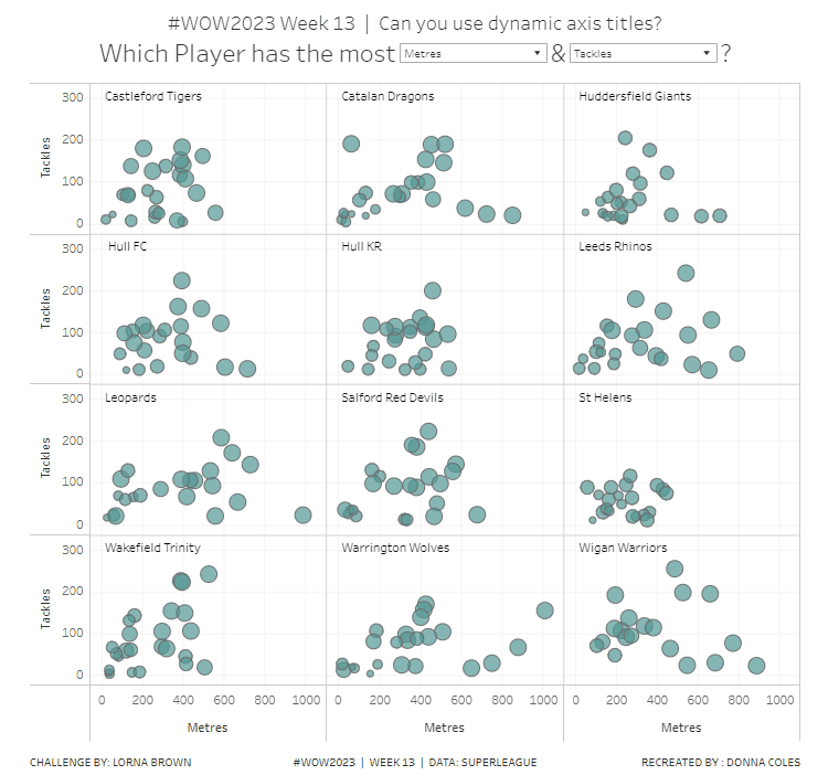
Lorna used this week’s challenge to showcase a new feature in Tableau v2023.1 – dynamic axis titles. As you can expect, you’ll therefore need this version of Desktop (or later if you’re reading this in the future ;-)) to complete the challenge.
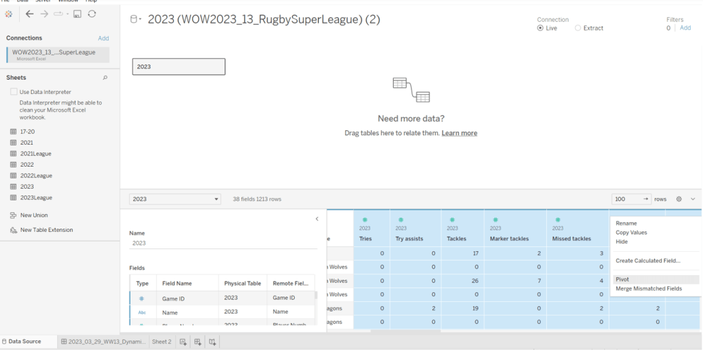
Modelling the data
Download the file Lorna provided and connect to the 2023 sheet. Lorna hinted that a pivot would help, so in the data source canvas, multi-select all the measures (ctrl-click each column – there are several) then right-click and Pivot.
Rename Pivot Field Names to Measure and rename Pivot Field Values to Value.
Building the Basic Scatter Plot
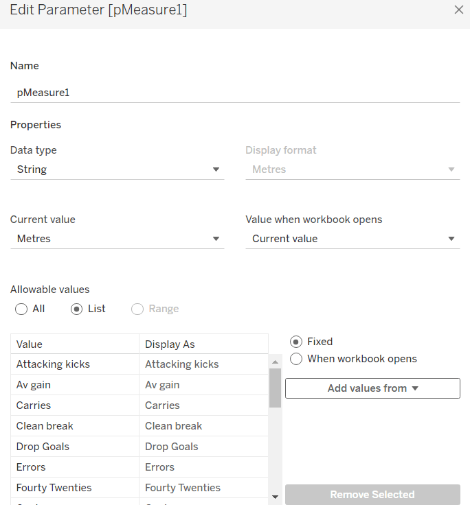
We need 2 parameters to control the selection of the measures we want to display in the scatter plot. Right click on Measure > Create > Parameter
pMeasure1
string parameter defaulted to Metres, and all the possible other values should be listed
Repeat the steps again to create pMeasure2 which is defaulted to Tackles
To determine the value to plot on the axes based on the selections from the parameters we need
X-Axis Value
IF [pMeasure1] = [Measure] THEN IF [Value] <> 0 THEN [Value] END END
Note – the additional nested IF was added as I discovered while playing with the Lorna’s solution that marks didn’t display when the value was zero.
Similarly we need
Y-Axis Value
IF [pMeasure2] = [Measure] THEN IF [Value] <> 0 THEN [Value]END END
Add X-Axis to Columns, Y-Axis to Rows, Team Name to Rows and Name to Detail. This will give a basic scatter plot.
Change the mark type to circle, adjust the colour, and reduce the opacity to around 70%. Add a grey border to the circles.
The size is based on the number of games the player has played, so we need
Count Games
COUNTD([Game ID])
Add this to the Size shelf.
Adjust the Tooltip so it references the parameters and the other relevant fields
To change the axis titles, edit the x-axis (right click axis > edit axis) and from the menu arrow next to the word ‘custom’, select the pMeasure1 option.
Repeat the same for the y-axis, but select pMeasure2 instead.
Making the small multiples
For this we need to define which row and column each Team Name should sit in. As we’ve only got 12 teams to work with, and that number is static, and we know we’re working with a 3×4 grid, I’m going to ‘hardcode’ this a bit rather than use more dynamic calculations.
To see what’s going on, on a new sheet add Team Name to Rows. Then create a new field
INDEX
INDEX()
and add this to Rows and convert to discrete. It should provider a counter from 1 to 12 for each Team Name.
Based off this INDEX value we’ll work out which row and colum each team will sit.
Column
(INDEX()-1) % 3
Row
IF [INDEX]<=3 THEN 1 ELSEIF [INDEX]<=6 THEN 2 ELSEIF [INDEX]<=9 THEN 3 ELSE 4 END
Add these to the table as blue discrete pills
Back onto the scatter plot sheet, add Row to Rows as a blue discrete pill, add Column to Columns as a discrete pill, and move Team Name to Detail. Modify the table calculation settings of both the Row and the Column pill so that the calculation is computed using Team Name and Name (in that order) and at the level of Team Name
Hide the Column and Row pills (uncheck Show Header)
Adding the Team Name title
Create a new field
Ref Line
WINDOW_MAX(SUM([Y-Axis Value])) * 1.1
and add this to the Rows. This will create a second marks card. Set the table calcuation of the Ref Line pill to compute using Name and Team Name (in that order).
On the Ref Line marks card, remove the pill from the Size shelf, change the mark type to gantt bar, and reduce the size to the smallest possible, set the opacity to 0%, and border to none.
Add Team Name to the Label shelf, then set to label min/max values, by the X-Axis Value field and Label Minimum value only.
Each team name should only be displayed once. Edit the text of the label and add a few spaces to shift the label across and align it better.
Edit the Tooltip of this marks card, and delete all the text. Now make the chart dual axis and synchronise the axis. Then remove Measure Names from the All marks card, and hide the right hand axis.
Finally remove the 0 lines from displaying, and hide the nulls indicator (right click). Add the chart to a dashboard, and position the parameters as floating objects within the text of the title. I just used spaces within the text to leave room for where I wanted to place the parameterss.
In the final week of ‘alternative charts month’, Luke set this challenge as different way of presenting data that you might typically see in a side-by-side bar chart.
Luke had indicated on the #WOW splash screen, that this challenge was ‘easy’, but that’s always dependent on your level of Tableau. He also added a note in the requirements that if you wanted to be ‘advanced’ to solve it with Table Calcs only.
I figured I’d just start and see what I ended up with (sometimes, my natural brain thinking takes me down a table calc route..)
In a change to my usual starting point, I started trying to remember what I needed to do to get the comet… I felt pretty sure that path would be involved somewhere.
So, I added Order Date to the Filter shelf and filtered to years 2021 and 2022 only.
Then I added Sub-Category to Rows, Sales to Columns and Order Date (which defaulted to YEAR(Order Date)) to Detail. I changed the mark type to circle initially.
Ok – I had what I was expecting – 2 circles per row, one for each year.
So then I change the mark type to line and moved YEAR([Order Date]) from Detail to Path. This meant my lines were joined.
I then added Order Date to Size, and reset Order Date to be at the YEAR level. Hey presto! My comet shapes appeared.
I now wanted to show a white circle mark just for the 2022 sales, so I created
Max Year Sales LOD
{FIXED [Sub-Category]:SUM(IF YEAR([Order Date]) = {FIXED:MAX(YEAR([Order Date]))} THEN [Sales] END)}
this looks a bit long-winded ( I do usually break this up)… so let’s review what’s going on…
{FIXED:MAX(YEAR([Order Date]))} returns the latest year in the data set (ie 2022) and spreads that across every row of data. So the formula is comparing each row, and if the Order Date year matches 2022, the value of the Sales is returned. This is then all aggregated and totalled for each Sub-Category.
Add this field to Columns, make dual axis and synchronise axis.
Remove Measure Names from the All marks card and change the mark type of the Max Years Sales LOD card to circle. Colour white.
Remove the YEAR([Order Date]) pill from the Size shelf of the Max Years Sales LOD card, so the size of the comet (the Sales card) and the circle can be adjusted independently. Adjust the sizes enough so the comet is visible around the circle.
Sort the Sub-Category field by Max Year Sales LOD descending
Next we need to colour the comets based on whether Sales increased or decreased.
Prev Year Sales LOD
{FIXED [Sub-Category]: SUM( IF YEAR([Order Date]) = {FIXED:MAX(YEAR([Order Date]))} -1 THEN [Sales] END)}
is doing similar to the above calculation, but {FIXED:MAX(YEAR([Order Date]))} -1 returns 2021 instead.
and with this we can created
Sales Increased? LOD
[Max Year Sales LOD] > [Prev Year Sales LOD]
Add this to the Colour shelf of the Sales marks card, and adjust accordingly.
To label the comets, check the show mark labels checkbox on the Label shelf dialog, and set to line ends and label end of line. You may need to check the allow labels to overlap option too if you’re not seeing all the labels.
The dashboard shows a circular size legend which is related to the circle mark, so I created
Order Date (Years)
YEAR([Order Date])
and added this to the Size shelf of the Max Year Sales LOD marks card.
Add Sales to the Tooltip shelf of the Max Year Sales LOD marks card too and adjust the tooltips.
Add row dividers, and remove all column dividers, gridlines and axis. Adjust the formatting of the Sub-Category row labels and hide the column title. Set the background of the worksheet to a grey colour.
And so that ended up being the LOD version of the chart, which is accessible from here.
But I had time, so I figured I’d see if I could crack the Table calcs version…
Building the Table Calculation Solution
This starts by repeating the intial steps above to get a basic single axis comet chart for Sales, split by Year.
We now need to get the sales for 2022 only. For starters, let’s identify the latest year
Latest Year
WINDOW_MAX(MAX(YEAR([Order Date])))
and let’s build up a table, so we can start to sense check what’s going on, as table calcs can be pesky!
Our Latest Year table calc is returning 2022 for every row in our table. To get the sales just for 2022
Window Max Year Sales
WINDOW_MAX(IF MIN(YEAR([Order Date]))=[Latest Year] THEN SUM([Sales]) END)
if the order date year is 2022, then return Sales (otherwise null) and spread the maximum value across the rows. When we add this into the table, we need to set the table calculation to compute using Year or Order Date, so that it is calculating the WINDOW_MAX for each Sub-Category
Add this field to Columns on the comet chart, and adjust the table calculation so Window Max Year Sales is computing by Year of Order Date only, and Latest Year by both fields (see the Nested Calculations dropdown)
Make the chart dual axis, and synchronise the axis. Make the adjustments to the mark types and sizes as described above.
We can’t sort the Sub-Category field in the way we did above, as table calculation fields aren’t accessible in the sort dialog. Instead add Window Max Year Sales to Rows and change it to be discrete (blue pill) and move it to be in front of Sub_Category. Adjust the table calc settings to match that described above. This should make the chart sort ascending.
To reverse, double click into the blue Window Max Year Sales pill on Rows and add * -1 to the end
Annoyingly this will revert it back to a measure, so reapply the steps above, and you should end up with a correctly sorted display. Hide the Window Max Year Sales blue pill.
Now to colour the comet.
Back to the tabular view. Add a Difference quick table calculation to the Sales pill and edit the table calculation to compute using Year(Order Date) only.
Drag the Sales pill with the difference table calc from the Measure Values section and drop into the left hand data pane. This will create a dedicated instance of the calculation. Rename it to
Sales Diff – TC
ZN(SUM([Sales])) – LOOKUP(ZN(SUM([Sales])), -1)
If you examine it, it should contain the above calculation.
With this we can then work out if sales have increased or not
Adding this into the table, and setting the nested table calcs to both compute by Year Order Date, you can see that the values for each Sub-Category are either 1 or 0.
Add this to the Colour shelf of the Sales marks card. Make sure the field is discrete and the table calcs are set to compute by Year Order Date. Adjust the colours.
Finally make adjustments for the tooltip and adjust the formatting to clean up the chart. My table calc version of the viz is here.