Indeed! What is the time-weighted return? It’s not a term I’d ever heard of until Luke set the challenge this week. Fortunately he provided a link to a web page to explain all about it – phew!
I actually approached the challenge initially by downloading the data source, copying the contents of sheet2 into a separate excel workbook, and then stepping through the example in the web page, creating new columns in the excel sheet for each part of the calculation. I didn’t apply any rounding and ended up with slightly different figures from Luke. However after a chat with my fellow WOW participant Rosario Gauna, we were both aligned, so I was happy. I’d understood the actual calculation itself, so I then cracked open Desktop to begin building. This bit didn’t really take that long – most of the time on this challenge was actually spent in Excel, but shhhhh! don’t tell anyone 🙂
Building the calculations
I’m going to build lots of calculated fields for this, primarily because I like to do things step by step and validate I’m getting what I expect at each stage. You could probably actually do this in just 2 or 3 calcs. As I built each calc, I added it into a tabular view of the data. I’m not going to screen shot what the table looks like after every calc though.
To start though, I chose to rename some of the existing fields as follows :
- Flows -> A: Flows
- Start Value -> B: Start Value
- End Value -> C: End Value
I did this because I have several new fields to make, and coming up with a meaningful name for each was going to be tricky – you’ll understand as you read on 🙂
First up, create a sheet and add Reporting Date as an exact date discrete blue pill to Rows then add the above 3 fields.

Now onto the calculations, and this all just comes from the website. Each calc builds on from the previous. I chose to add inline comments as a reminder. After I built each calc I added to the table.
D: A+B
//sum flow + start point
SUM([A: Flows]) + SUM([B: Start Value])
E: C-D
//difference between end value and (flow+start)
SUM([C: End Value]) – [D: A+B]
F: E/D
//Difference as a proportion of (start + flow)
[E: C-D]/ [D: A+B]
I formatted this one to 3 decimal places so the figure showed on screen, but ‘under the bonnet’ Tableau will use the full number in the onward calcs.

At this point now, F: E/D stores what the article describes as the ‘HP’ value for each date. Now we need to start building the calcs we need to compute the TWR value.
G: 1+F
1+[F: E/D]
formatted to 3 dp
H: Multiply G values
//Running Product of column G
[G: 1+F]*PREVIOUS_VALUE(1)
This is the core calculation for this challenge. This takes the value of the G: 1+F field in each row, and multiples it by the value of the G: 1+F field in the previous row. As each row ends being the product of itself and the former row, this ultimately builds up a ‘running product’ value.
Add these fields onto the table and explicitly set the table calculation of the H: Multiply G values field to compute using Reporting Date.

And finally we can create
I: TWR
//subtract 1 from the running product -1
[H: Multiply G values]-1
format this to be a % with 0dp. Add to the table and again ensure the table calc (and all nested calcs) are set to compute using Reporting Date

The final calculation needed is one to use to display the TWR value for the last date.
J: Latest TWR Value
//get the last value computed
WINDOW_MAX([I:TWR])
format this to be a % with 0dp.
This function looks for the highest number across the whole table, and spreads that value across every row. Since the I: TWR field is cumulative, the highest number will be the last value. Add this onto the table and verify all the tab calcs are set to compute by Reporting Date.

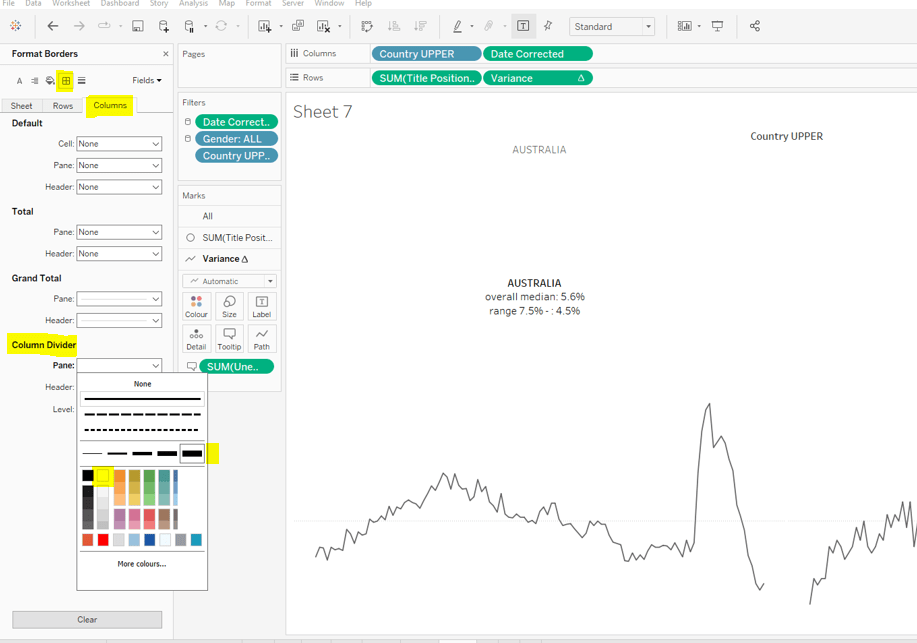
And now you can build the viz
Building the Viz
Add Reporting Date as an exact date continuous green pill to Columns and I:TWR to Rows, setting the compute by of the table calculation as described above. Add J:Latest TWR Value to Detail, and again set the compute by.

Then update the title of the sheet to reference the J:Latest TWR Value field, amend the tooltips and update the label on the y-axis. Add to a dashboard and you’re done 🙂
My published viz is here.
Happy vizzin’!
Donna