This week’s challenge uses data I collated from the stats vest my daughter wears during her football matches and training sessions. The data provided is already pre-filtered to the 2024-25 season and her Reading U15 team.
If you want to watch a video which demonstrates the concept then this video by Andy Kriebel will help. But if you prefer to read, then carry on 🙂
Building out the calculations
In creating this chart we need to normalise all the different stats we want to show; that is we want to convert every measure into a spread between 0 and 1. To do this we calculate the difference between the value and the minimum value as a proportion of the full range of values (that is the difference between the min and max values). We use table calculations for this.
Total Distance (km)
(SUM([Distance – Total (KM)]) – WINDOW_MIN(SUM([Distance – Total (KM)]))) / (WINDOW_MAX(SUM([Distance – Total (KM)])) – WINDOW_MIN(SUM([Distance – Total (KM)])) )
format to 4 dp
Distance / Min (m)
(SUM([Distance per Min]) – WINDOW_MIN(SUM([Distance per Min]))) / (WINDOW_MAX(SUM([Distance per Min])) – WINDOW_MIN(SUM([Distance per Min])) )
format to 4 dp
HSR Distance (m)
(SUM([HSR – Total (M)]) – WINDOW_MIN(SUM([HSR – Total (M)]))) / (WINDOW_MAX(SUM([HSR – Total (M)])) – WINDOW_MIN(SUM([HSR – Total (M)])) )
format to 4 dp
HI Distance (m)
(SUM([HI Distance – Total (M)]) – WINDOW_MIN(SUM([HI Distance – Total (M)]))) / (WINDOW_MAX(SUM([HI Distance – Total (M)])) – WINDOW_MIN(SUM([HI Distance – Total (M)])) )
format to 4 dp
Max Speed (m/s)
(SUM([Speed – Max (m/s)]) – WINDOW_MIN(SUM([Speed – Max (m/s)]))) / (WINDOW_MAX(SUM([Speed – Max (m/s)])) – WINDOW_MIN(SUM([Speed – Max (m/s)])) )
format to 4 dp
NOTE – in my solution I called these fields Norm – xxxx . After putting on the chart, I aliased them to the names above. Creating with the actual names I used is the simpler solution 🙂 I don’t know why I didn’t just rename them…
On a new sheet, add Game ID to Rows, and then add all the original key measures and their associated normalised values into the table, so each original measure is next to its normalised value. If you sort by one of the original measures from largest to smallest, you should see that the associated normalised value is distributed from 1 at the top of the list to 0 at the bottom.
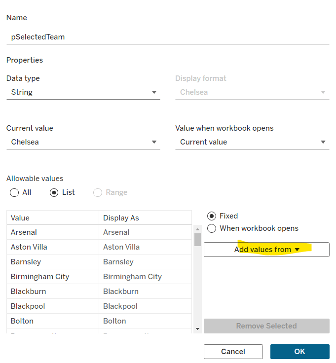
The other key requirement for this viz is to identify a selected opposition. For this we create a parameter based on the Opposition field. Right click on Opposition > Create > Parameter and the following dialog with the list of opposition teams pre-populated will display. I set the default as Chelsea Ladies U14
Opposition Parameter
The create a new field
Highlight Match
[Opposition] = [Opposition Parameter]
Show the Opposition Parameter control and add Highlight Match to Rows.
Now we can start building the viz.
Building the chart
On a new sheet, add Game ID to Detail, then add Total Distance (km) to Rows. Adjust the table calculation of the field to be computing by Game ID.
Then add Distance / Min (m) onto the sheet, by dragging the field and dropping it on the y-axis when the 2-column icon appears
This will automatically add Measure Names and Measure Values into the display, including a Measure Values ‘box’
Adjust the table calc of the Distance / Min (m) field to compute by Game ID. Reorder the fields in the Measure Values box, and then change the mark type to line. Set to Fit Width.
Add the other 3 normalised fields into the view, by adding the field into the Measure Values box, and adjusting the table calc each time.
We now have the core viz, we just need to format it and add the additional features.
Show the Opposition Parameter control. Add Highlight Match to the Colour shelf. Adjust colours and re-order so True is listed first. Adjust all the table calcs in the 5 measures so they are also now computing by both Game ID and Highlight Match.
Now add H/A to the Detail shelf and change to be an Attribute (this means by default it is excluded from the table calcs, so we don’t need to make all those adjustments again). Then change the icon to the left of the pill from Detail to Colour, so there are now two fields on the Colour shelf. Adjust to suit.
Add Highlight Match to the Size shelf, and then adjust the size to be reversed, so the True lines are thicker.
Create a new field
Label: Opposition
IF [Highlight Match] THEN [Opposition] END
And add this to the Label shelf and set to be an Attribute. Adjust the Label property so it’s just labelling the line ends and label end of line. Ensure labels set to overlap to, and set font to bold and to match mark colour and align top right.
Alias the field H/A (right click field > aliases) so they display as Home and Away. Then add the following fields to the Tooltip : Category, Cup/League, H/A, Opposition, Round and Date. Also add the following measures to the Tooltip : Distance – Total (KM), Distance per Min, HI Distance – Total (M), HSR – Total (M), Speed – Max (m/s). Then adjust and format the Tooltip
To create the vertical lines, add another copy of Measure Values to the Rows which will create a Measure Values (2) marks card. Remove all the fields from this card except the Game ID. And then move Game ID to the Path shelf which has the effect of creating the vertical lines
Adjust the Colour of the line and then add Measure Names to the Label shelf. Set the label to Min/Max by pane, for the Measure Values field. Align centrally.
Set the chart to dual axis and synchronise the axis. Hide all the axis, and the Measure Names labels at the bottom (uncheck show header against the pills). Remove all row/column dividers and gridlines/zero lines etc. Set the background colour (if desired).
Adding the interactivity
Add the chart to a dashboard then create a dashboard parameter action
Set Opposition
On select of the viz, set the Opposition Parameter parameter, with the value from the Opposition field. Set the value to <empty> when cleared.
Adding the information panel
Add a floating Text object onto the dashboard. Copy and paste the information from the challenge page. Resize and reposition the text box as required. Set the background of the text object and add a border to make it prominent. Then from the context menu of the object, select the Add Show/Hide Button option. The Show/Hide object will appear as an X. Move this into the required position and re-adjust the text object to suit too.
And that should then be it. My published viz is here.
After connecting to the data, add Team to Rows and Timestamp as a continuous (green) pill at the Day level to Columns. Create a new field
Call Count
COUNT([synthetic_call_center_data.csv])
and then add this to Rows.
Add Timestamp to Filter, and select relative date. Set the options to Last 3 weeks, and then additionally check the anchor relative to check box and enter 23 Dec 2024. This is because the data set only goes up to the end of December 2024. Not setting this field will apply the date filter based on ‘today’ so it’s unlikely anything will appear.
(Note – you may also need to update the date properties of the data set to ensure a week starts on a Sunday to get matching numbers: right click the data source and select the date properties option).
To add a marker to the last point, create a field
Call Count – Most Recent
IF LAST()=0 THEN [Call Count] END
Add this to Rows and adjust the table calc setting so it is computing specifically by Day of Timestamp only. By default it was doing this via the Table (across) option, but I tend to always prefer to always explicitly fix what the calculation is computing over, as it won’t then matter where I then move that field too if I choose to change the layout of the viz.
Set the mark type on the Call Count marks card to line, and then adjust the colour to grey and reduce the size. Set the mark type of the Call Count – Most Recent marks card to circle, set the colour to blue and increase the size. Hide the null indicator (right click > hide).
Set the chart to dual axis, synchronise the axis and then remove the Measure Names field from the All marks card.
remove both the axis titles (right click axis > edit axis), hide the right hand axis (right click, untick show header), and format to remove the column divider from the header section only.
Now we’ve got the core display, we need to create the following fields
No. of Calls
WINDOW_SUM([Call Count])
Highest Call Vol
WINDOW_MAX([Call Count])
Lowest Call Vol
WINDOW_MIN([Call Count])
Avg Call Vol
WINDOW_AVG([Call Count])
format this to a number with 0 dp
Calls this period
WINDOW_MAX([Call Count – Most Recent])
the window_max is required here, as the data set we’re displaying at the day level, has 2 values – the latest value and null. We only want to return 1 value, which is the maximum of these.
Previous Period
WINDOW_MAX(IF LAST()=1 THEN [Call Count] END)
LAST()=1 returns the value of the next to last record, and the window_max is again applied, as the nested IF clause will return null for all others records.
Period Var
[Calls this period] – [Previous Period]
Add each of these fields, one by one, to Rows following the steps below
Add to rows (it will automatically display as a green continuous pill).
change to discrete (right click on the pill and select discrete – the pill will turn blue and move to before the green pills)
Explicitly set the table calc to be computing by Timestamp (as above)
Once, you should have something that looks like this
but I noticed, that the display in the solution is sorted based on the total number of calls and not by Team, so add a Sort to the Team pill to sort by Call Count descending
Update the Tooltip if you wish, and then add the viz to a dashboard, floating the Timestamp filter.
Yusuke set this interesting challenge : to combine a ‘bump’/’slope’ chart visualising the change in rank whilst also visually displaying the Sales value for the relevant Sub-Category in the ranked position.
Defining the calculations
This challenge will involve table calculations, so I’m going to start by building out the various calculations that will be required and displaying in a tabular view.
Add Category to Filter and select Office Supplies. Then add Sub-Category and Order Date at the Year level as a discrete (blue) pill to Rows. Add Sales to Text.
Create a new field
Sales Rank
RANK(SUM([Sales]))
And add to the table, and verify the table calculation is set to compute by Sub-Category only.
We will need to ‘colour’ the viz based on the rank compared to the previous year. For this create
Is Min Year
{MIN(YEAR([Order Date]))} = YEAR([Order Date])
which will return true for the first year in the data (in this instance 2022) and then create
Colour
IF [Sales Rank] = LOOKUP([Sales Rank],-1) OR ATTR([Is Min Year]) THEN ‘Same as last year’ ELSE ‘Different from last year’ END
If the rank is the same as the previous one, or it’s the first year, then treat as the same, otherwise treat as different.
Add the Colour field to the table, and this time make sure the table calculation for Colour is computing by Year of Order Date only (while the nested calc for Sales Rank should still be computed by Sub-Category only)
The labels on the viz only want to show in certain scenarios – if it’s the first record (ie for 2022) or there has been a change in rank. We need
Label : Rank & Sub Cat
IF ATTR([Is Min Year]) OR [Colour] = ‘Different from last year’ THEN STR([Sales Rank]) + ‘ | ‘ + MIN([Sub-Category]) END
and
Label : Sales
IF ATTR([Is Min Year]) OR [Colour] = ‘Different from last year’ THEN SUM([Sales]) END
format this to $ with 0dp
Add these to the sheet, and double check the nested table calculations on each pill are computing as required (Sales Rank by Sub-Category only, Colour by Year Order Date only)
Now we have all this, we can start building
Creating the Viz
On a new sheet, add Category to Filter and select Office Supplies. The add Order Date to Columns, but set to be continuous (green) pill at the Year level. Add Sub-Category to Detail and add Sales Rank to Rows as a discrete (blue) pill. Verify the table calculation setting against the Sales Rank pill is by Sub-Category only.
Change the mark type to line and then add Order Date to Path. By default it should be at the Year level as a discrete pill.
This is the ‘bump’ chart.
Now add another instance of Order Date to Columns as a continuous pill at the Year level to essentially duplicate the display. On the 2nd marks card, change the mark type to Gantt
This gives us the ‘starting point’ for each ‘bar’. But we need to determine the size for each bar. First we’re going to ‘normalise’ the sales values for all the sales being displayed so we get a value between 0 and 1, where 0 is the smallest sale, and 1 is the largest.
To see what this is doing, format the field to 2dp, then add the field to the tabular view, and ensure the table calculation is computing by both Sub-Category and Year Order Date.
But the ‘axis’ we want to plot the bar length against is in years, so we need to adjust this size to be a proportion of a year (ie 365 days)
Gantt Size
//proportion of a year [Normalised Sales] * 365
Add this to the Size shelf on the 2nd marks card on the viz. Adjust the table calc setting so it is computing by all the fields listed.
We now have the core concept so now we can start finalising the display.
Make the chart dual axis and synchronise the axis.
Set the view to fit height.
On the 1st marks card (that represents the line)
change the line style to dotted (via the Path shelf)
reduce the Size to suit
change the colour to pale grey
Add Label : Sales and Label : Rank & Sub Cat to the Label shelf.
Adjust the table calc settings of each so the nested table calcs in each have Sales Ranks by Sub Category only and Colour by both the Year Order Date fields only.
Adjust the layout of the text as required
Align the font to be top right
Change the font style (bold & black)
Ensure the Label is set to ‘allow labels to overlap marks’
Remove the Tooltip
On the 2nd marks card, the gantt bar
Add Colour to the Colour shelf and adjust the colours accordingly.
Verify the table calc settings are as expected
I chose to reduce the opacity slightly, so I could see the dotted line underneath (set to 70%)
Add Sales to Tooltip (format to $ with 0 dp) and the adjust Tooltip as required
Then we just ned to finalise the formatting/display
Set the font of the years and rank numbers to black & bold.
hide the Sales Rank label heading (right click > hide field labels for rows)
remove row & column dividers
Add black column gridlines (I set to the 2nd thickness level), and remove any row gridlines
Edit the top axis to have a fixed start (use default option) and end at 31/12/2025 so the 2026 label and line disappears.
Remove the title from the top axis.
Edit the bottom axis – remove the tile, and then set the tick marks to None, so the bottom axis now looks empty.
And that should be it. Now add the sheet to a dashboard and display the category filter as a single select, customising the remove the ‘all’ option.
For this week’s challenge, Lorna visualised the output of a crazy golf game she had with the latest Data School cohort, and thought it would be a fun challenge to share.
While the data set is very small, there’s several core calculations required, which we’ll start off creating.
Defining the core calculations
After connecting to the data, I initially dragged the Hole field from Measures to Dimensions (dragged it to be above the line on the data pane).
We need to know the average score per person (across all 11 holes)
Overall Average Score
{FIXED [Person]: AVG([Score])}
format this to 1dp
We also need the average score per hole
Avg Score Per Hole
{FIXED [Hole]: AVG([Score])}
format this to 1 dp
We need each person’s score up to 9 holes
Score up to 9
{FIXED [Person]:SUM( IF [Hole]<=9 THEN [Score] END)}
We need the tie break score for the 10th & 11th holes
Tie Break
{FIXED [Person]:SUM( IF [Hole]>9 THEN [Score] ELSE 0 END)}
We need the average score across 9 holes
Avg Score
[Score up to 9]/9
format to 1 dp
We need to the lowest score per person
Lowest
{FIXED [Person]: MIN([Score])}
With this information, we can then define a field we can use for sorting which is a numeric field that is a combination of multiple fields as stated in the requirements
Sort
(SUM([Score up to 9])*10000) + (SUM([Tie Break]) * 1000) + (SUM([Avg Score]) * 100)+ SUM([Lowest])
Building the Heat Map
On a new sheet add Score up to 9 to Rows and change it to be discrete. Repeat the same for Tie Break, Avg Score and Lowest. Then add Person to Rows and Hole to Columns.
Double click into Columns and manually type MIN(1.0) to create a ‘fake axis’. Change the mark type to bar and increase the Size to the maximum. Edit the axis to be fixed from 0 to 1 and the hide the axis. Manually increase the width of each row and set the chart to fit width.
Add Score to Colour and choose a diverging colour palette and then manually change the start & end colours to match the solution (or define your own colour style). I used #62a14b (green) and #13316d (dark blue). Check the box to use full colour range
Update the Tooltip as required.
We then need to include some indicators on the heat map. To determine the arrow indicator we first need
Previous Score
LOOKUP(SUM([Score]),-1)
and then create
Change Indicator
IF SUM([Score]) > [Previous Score] THEN ‘↗’ ELSEIF SUM([Score]) < [Previous Score] THEN ‘↘’ ELSEIF SUM([Score]) = [Previous Score] THEN ‘→’ END
Add these to Label too and adjust label so it is aligned bottom centre, and coloured white. You may need to adjust size of font for each label item, and increase the height of each row to get the information to display.
Finalise the formatting by
Set the background colour of the whole sheet to #7299aa
Set the font of all the column headings and label headings to Tableau Medium, 9pt, white
Hide the Hole label heading (right click the label and hide field labels for columns)
Add a white border to the bars via the Colour shelf
Remove all column dividers
Remove row dividers from the pane only, ensure the row dividers for the headers remain.
Remove all gridlines , zero lines, axis rulers & ticks
Name the sheet HeatMap or similar.
Building the Average Score Per Person bar chart
On a new sheet, add Person to Rows and Overall Avg Score to Columns. Add a Sort to the Person pill that references the Sort field ascending
Add Overall Avg Score to the Colour shelf, and then adjust the colour scale so it uses a diverging colour scale which is then edited to use the same colour range as before and spans the same range, which means explicitly stating the start (-1) , middle (0) and end (10) values
We want to display a * against the winner
Winner Icon
IF SUM([Overall Avg Score]) = WINDOW_MIN(SUM([Overall Avg Score])) THEN ‘★’ ELSE ” END
Add this to Rows and adjust the table calculation so it is explicitly computing by Person only.
Create
Winner Label
IF SUM([Overall Avg Score]) = WINDOW_MIN(SUM([Overall Avg Score])) THEN ‘Coach Always Wins!’ END
and add this to Label along with Overall Avg Score. Increase the width of the bars to see the text and align middle left and change the font to white. Adjust the Tooltip.
Format the sheet
Set the worksheet background colour
Hide the Person column (uncheck Show Header)
Hide the Overall Avg Score axis (uncheck Show Header)
Remove all column/row dividers, gridlines, axis lines, zero lines
Add a white border around the bars (via the Colour shelf)
Increase the Size of the bars so there is a small gap between
Format the * to be white font
Hide the Winner Icon label (right click > hide field labels for rows)
Make the Winner Icon column as narrow as possible
Name the Sheet Avg Per Person or similar.
Building the Average Score Per Hole bar chart
On a new sheet, add Hole to Columns and Avg Score Per Hole to Rows. Add Avg Score Per Hole to Colour and adjust the scale as we did above so it ranges from green to blue and -1 to 10.
Show mark labels, adjust the tooltip. Set the background colour of the worksheet and remove all gridlines, zero lines, row/column dividers etc. Hide the Avg Score Per Hole axis and the hole labels (uncheck show header on the Hole pill). Adjust the font of the labels to be Tableau Medium and white. Add a white border around the bars. Increase the Size to leave a small gap.
Name the sheet Avg Per Hole or similar.
Building the dashboard
Set the background of the dashboard to the same colour of the worksheets.
Using containers, add a horizontal container and add a text object (for the title), the Avg Per Hole sheet and then a blank object. Remove the container that gets added with the colour legend.
Add another Horiztonal container beneath and add the Heatmap sheet and the Avg Per Person sheet.
Remove all padding. Remove all titles from the sheets. Set all the charts to fit entire view. Manually line up everything, but you’ll find you have an issue getting your horizontal bar chart to align to the player rows due to the header in the heatmap
(Note – you may notice your labels on the heat map aren’t displaying due to the space available). You can continue to adjust on Desktop so they do appear (make the heatmap have more vertical space), or wait until you’ve published to Tableau Public and see if you get the desired result… although at the point of writing , Tableau Public is having issues with the table calcs and causing odd behaviour with the display).
To fix this, go back to the Avg Per Person sheet and double click into column and manually type “” to create a dummy header row with no text. Hide the “” label (right click > hide field labels for columns). You can then adjust the height of this header label section to help get the alignment right.
Then make any final adjustments required – add the title, and any imagery etc. My published viz is here.
Erica set this fun and incredibly useful challenge this week, based on the TC25 talk by Lorna Brown & Robbin Vernooij, to showcase different methods of normalising data when comparing measures which have drastically different scales.
Building the Raw Values chart
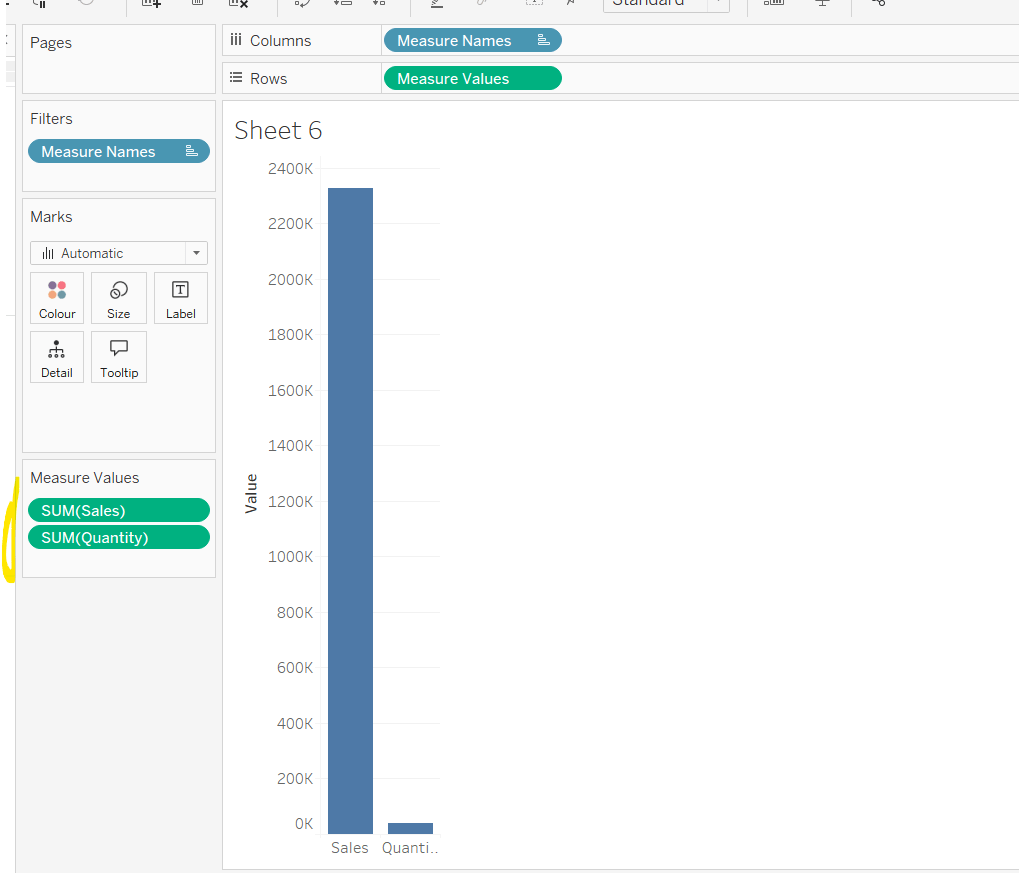
Add Sales to Rows. Then drag Quantity on to the canvas and drop the pill on the Sales axis (when you see the ‘2 column’ icon appear). This has the affect of adding the fields onto a shared axis, and the sheet will update to automatically reference Measure Names and Measure Values. Swap Quantity so it is displayed below Sales in the Measure Values section.
Add Region and Category to Detail and change the Mark type to Circle.
I’m going to incorporate the last requirement at this stage, as it helps with the build, so create parameters
pSelectedRegion
string parameter, defaulted to West
pSelectedCategory
string parameter, defaulted to Furntiture
show both these parameters on the sheet.
Create a new field
Is Selected Region & Category
[pSelectedCategory]=[Category] AND [pSelectedRegion]=[Region]
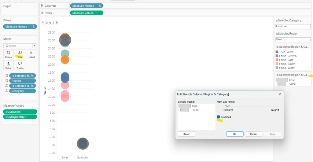
Add this field to Colour, and swap the values in the legend, so True is listed first. Then change the Region on the Detail shelf, so it is also on colour, by adjusting the icon to the left of the pill. Adjust the colours as required and then reduce the opacity on colour to 80%.
Manually update the entry in the pSelectedRegion parameter to each Region, so the True-<Region> colour combination can be updated to the dark grey.
Add Is Selected Region & Category to Size. Edit the size so they are reversed and the range in size is closer than the default. Once done, then manually adjust the dial on the Size shelf.
Show mark labels, selecting the option to only show the min & max values per cell and aligning middle right
Update the Tooltip. Then create fields True = TRUE and False = FALSE and add both of these to the Detail shelf. We’ll need these to disable the default highlighting later (adding now, as for all the other sheets, we’ll duplicate this one, so makes things easier).
Show the caption (Worksheet menu > show caption) and update the caption to reference the website Erica refers to. Then update the title of the sheet, and name the tab Raw or similar.
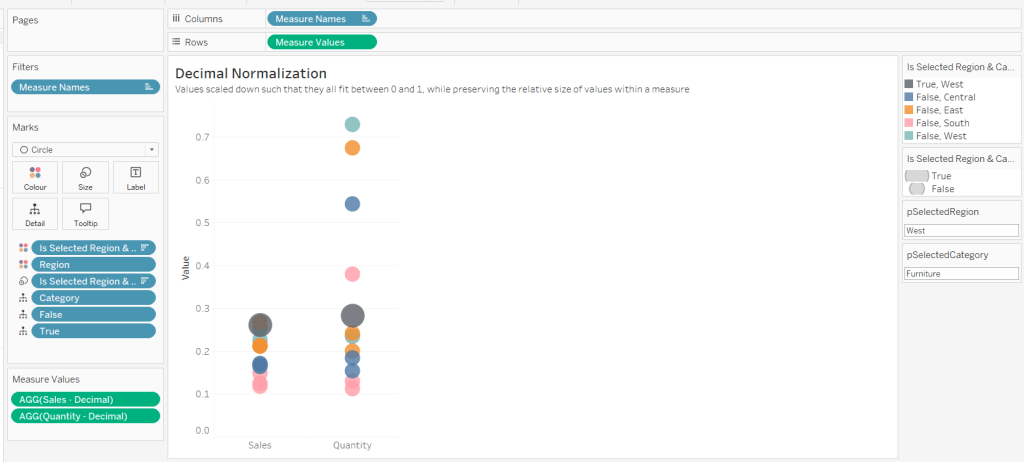
Building the Decimal Normalisation chart
Duplicate the Raw sheet, and name Decimal or similar. Update the title.
Create new fields
Sales – Decimal
SUM([Sales]) / 10^6
Quantity– Decimal
SUM([Quantity]) / 10^4
Drag Sales – Decimal onto the canvas and drop directly over the existing Sales pill in the Measure Values section, so it replaces it. Do the same with the Quantity – Decimal pill. Uncheck Show Labels.
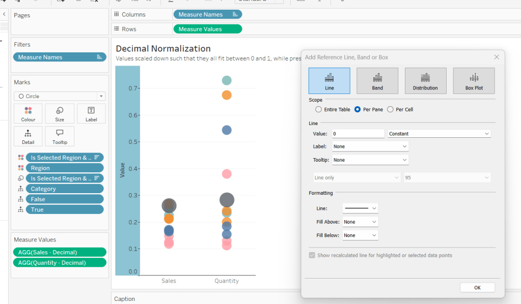
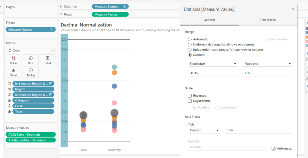
Add constantreference line of 0 that displays as a black solid line at 100% opacity
Repeat and create a constant reference line with value of 1. Edit the axis and fix from -0.05 to 1.05 and remove the axis title.
Update the text in the caption.
Building the Max-Min Normalisation Chart
Duplicate the Decimal sheet and rename Max-Min or similar. Update the title.
Drag Sales – Max-Min onto the canvas and drop directly over the existing Sales – Decimal pill in the Measure Values section, so it replaces it. Do the same with the Quantity – Max-Min pill.
Adjust the table calculation setting for each of the measures so they are computing by Category, Region and Is Selected Region & Category.
Adjust the Tooltip if required. Right click on the bottom column headings and Edit Alias to update the text- you may not be able to rename Sales – Max-Min along xyz… just to ‘Sales’, so you may need to be creative and add spaces eg ‘ Sales ‘ or similar. Update the caption.
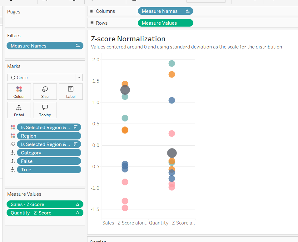
Building the Z-Score Normalisation Chart
Duplicate the Max-Min sheet, and name Z-Score or similar. Update the title.
Drag Sales – Z-Score onto the canvas and drop directly over the existing Sales – Max-Min pill in the Measure Values section, so it replaces it. Do the same with the Quantity – Z-Score pill.
Adjust the table calculation setting for each of the measures so they are computing by Category, Region and Is Selected Region & Category. Remove the reference line for the constant value of 1. Edit the axis, so the range is now Automatic rather than fixed.
As before, adjust the Tooltip again if required, edit the column labels using the alias feature, and update the caption.
Creating the dashboard and adding the interactivity
Add all 4 charts onto a dashboard, using a horizontal container to arrange the charts side by side. From the object context menu on the dashboard, select the option to show the caption
To disable the default highlighting ‘on click’ create a dashboard filter action based on the True/False method described here – you’ll need to create an action per sheet.
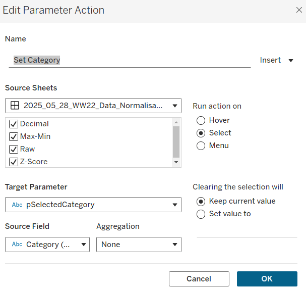
To set the parameters, create a parameter action
Set Category
On select of all the sheets, set the pSelectedCategory parameter passing in the value from the Category field.
Create another similar action called Set Region which sets the pSelectedRegion parameter with the value from the region field.
Finally, add a text section to the top right of the dashboard that references the pSelectedRegion and pSelectedCategory parameters.
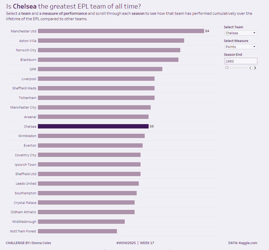
It’s back to the EFL this week for my #WOW challenge. Once again I’ve tried to provide a multi-level challenge – a version that uses some core skills and features, and a version that just pushes the display a bit further, just for fun. I’ll start with the core build and then use that as the base for the bonus challenge.
Setting up the parameters
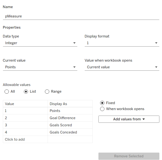
The main crux of this challenge is measure swapping, so for this we need a parameter
pMeasure
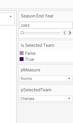
integer parameter listing values 1 to 4 which are aliased as per the screen shot below. Default value is 1 (Points).
Note – you can use a string parameter with the actual words. I just chose to use this method to demonstrate the aliasing ability. Also when referencing this parameter in a CASE statement (which we’ll do shortly), using integer values for comparisons is slightly more efficient than string comparisons.
We also need the user to have the ability to select the team they want to track
pSelectedTeam
string parameter defaulted to your preferred team (I chose Chelsea). This is a List parameter that is populated from the Team field via the Add values from button
Building the calculations
We need to determine the measure to display based on the parameter selection
Measure to Display
CASE [pMeasure] WHEN 1 THEN SUM([Cumulative Points]) WHEN 2 THEN SUM([Cumulative Goal Difference]) WHEn 3 THEN SUM([Cumulative Goals For]) WHEN 4 THEN SUM([Cumulative Goals Against]) END
We also will need to colour the bars based on the selected team
Is Selected Team
[Team]=[pSelectedTeam]
and we need to sort the data based on best to worst, but need to consider that for Goals Conceded, the higher the value the worse the team is.
Sort Measure
IF [pMeasure] = 4 THEN [Measure to Display]*-1 ELSE [Measure to Display] END
We only want to show teams once they start participating in a Season. For this, we need to identify the team’s 1st season in the EFL
1st Season per Team
{FIXED [Team]: MIN(IF [Cumulative Points] > 0 THEN [Season End Year] END)}
and then we can create a field we can filter on, based on this
Show Team
[Season End Year]>=[1st Season per Team]
We only want to show a label against the 1st team and the selected team, so create
Label to display
IF MIN([Is Selected Team]) OR FIRST()=0 THEN [Measure to Display] END
and finally, we need to display the value of the current season’s measure on the tooltip, as well as the cumulative value, so we need another case statement
Tootltip Measure
CASE [pMeasure] WHEN 1 THEN SUM([Points]) WHEN 2 THEN SUM([Goal Difference]) WHEn 3 THEN SUM([Goals For]) WHEN 4 THEN SUM([Goals Against]) END
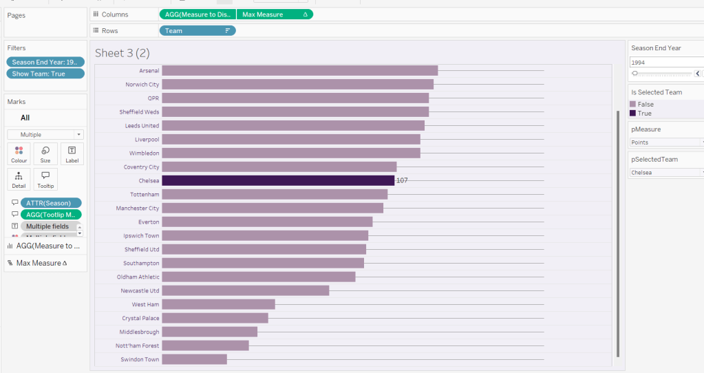
Building the core bar chart
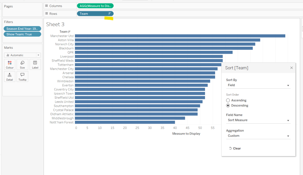
On a new sheet, add Team to Rows and Measure to Display to Columns. Add Season End Year to Filter and select 1993. Add Show Team to Filter and select True. Apply a sort to the Team field to sort by the field Sort Measure descending.
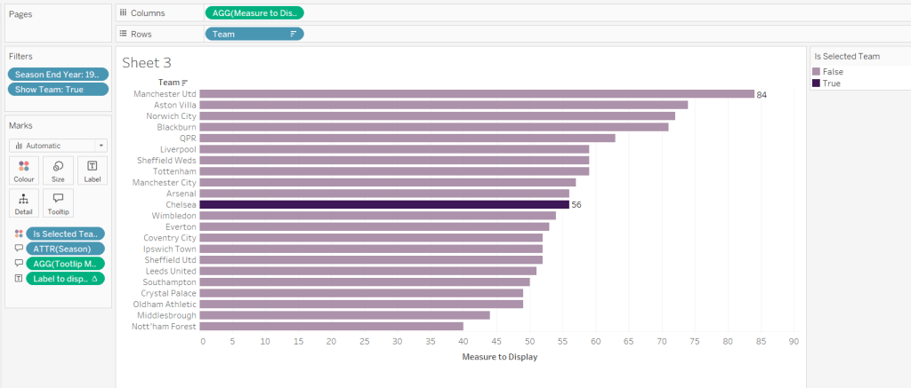
Add Is Selected Team to Colour and adjust accordingly. Add Label to display to Label. Add Season and Tooltip Measure to Tooltip and update accordingly,
Show the pMeasure and pSelectedTeam parameters and the Season End Year Filter. Adjust the Season End Year filter control so that the All option isn’t available and it displays as a single value slider control.
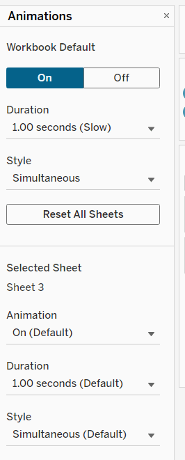
Move the Season End Year filter control on by one value and notice how the chart transitions. Adjust the Animations settings (Format menu > Animations) to be sequential and slow
Finally tidy up the display by
hiding the Measure to Display axis (right click > uncheck show header)
hiding the Team row label (right click > hide field labels for rows)
widen each row a bit
hide gridlines, zero lines, axis rulers and axis ticks
add pale grey row dividers
set the background colour of the worksheet
adjust the font of the row labels – I used Tableau Book 8pt in colour #3e1756 (dark purple)
Name the sheet Core or similar and add to a dashboard setting it to Fit Entire View
Add a title to the dashboard that references the pSelectedTeam parameter.
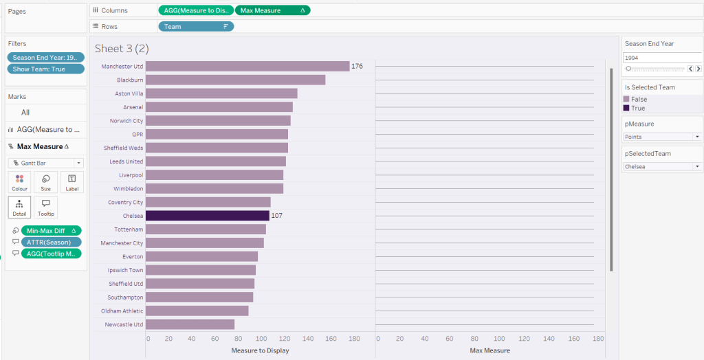
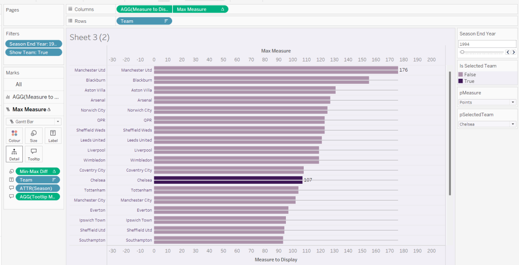
We’re going to use a gantt bar to simulate a central line for each row. This bar needs to extend to the largest measure in the table for every row, so this is the point we’ll plt
Max Measure
WINDOW_MAX([Measure to Display])
Add this to the Columns shelf, and on the Ma Measure markls card that gets added, remove the Is Selected Team from the Colour shelf, and change the mark type to gantt bar.
The bar needs to extend to the 0 or the minimum value in the window (if its less than 0), so we need a field to show the difference between the max and the minimum of 0 or the ‘window min’, but we need to multiple by -1 so the size extends in the right direction.
Max-Min Diff
([Max Measure] – MIN(WINDOW_MIN([Measure to Display]),0)) * -1
Add this to the Size shelf, and then update the size to be as small as possible. Remove Label to Display from the marks card and add a border the same colour as the background to the Gantt bar (via the Colour shelf) to make the line very narrow.
Add Team to the Label shelf and align centre left. Format the label text to be 8pt and dark purple. Then make the chart dual axis and synchronise the axis.
Right click the top axis and select move marks to back. Then hide both axis (right click, uncheck show header) and hide the Team pill on Rows too (again uncheck show header)
Verify the Tooltip on the gantt bar displays the same as on the main bar. If not add the relevant fields and adjust to match.
Tidy up the formatting by removing the row and column dividers. If need be adjust the colour of the Gantt bar to be a paler grey.
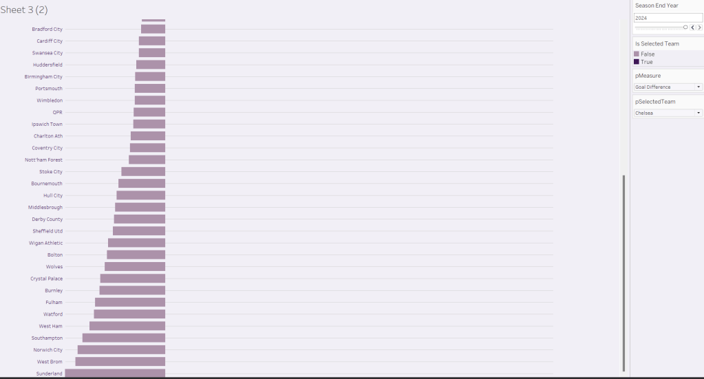
Change the measure value to Goal Difference and adjust the year to 2024 and check the display looks as expected, especially at the bottom – the gap between the label of the team at the bottom and the bar is minimal.
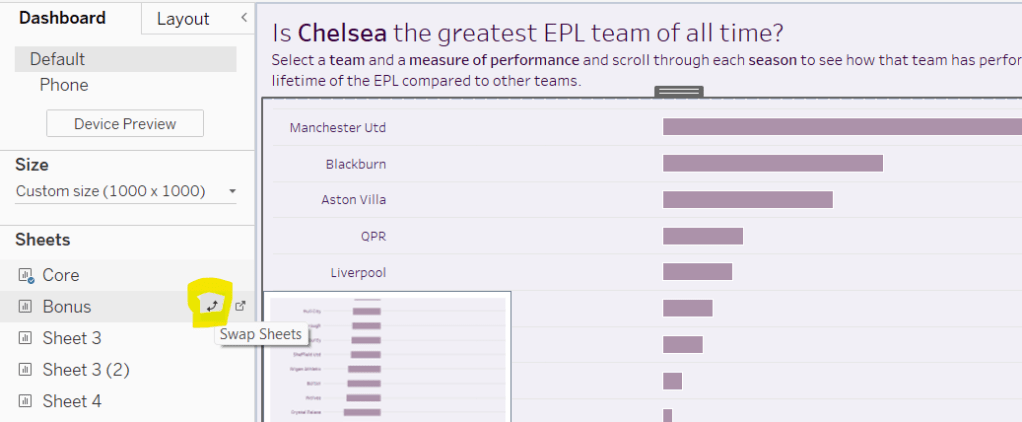
Add the chart to a dashboard – the simplest way is to duplicate the core dashboard and then use the swap sheets feature to quickly swap the main vizzes.
For the next few Workout Wednesdays, the coaches will be revisiting old challenges – retro month! Erica kicked the month off with this challenge, to recreate Ann Jackson’s challenge from 2018 Week 38. I completed this challenge at the time (see here), but the additions and changes to the visual display Erica incorporated meant I couldn’t just republish it 🙂
So I built it from scratch using the data source from the google drive Erica referenced in the requirements (which I believe may be why my summary KPIs didn’t actually match Erica’s).
There’s a heck of a lot going on in this challenge – it certainly took some time to complete, which may mean this blog becomes quite lengthy… I will endeavour to be as succinct as I can, which may mean I don’t explicitly state every step, or show lots of screen shots.
Setting up the parameters
I used parameters and subsequently dashboard parameter actions to build my solution. Erica mentions set actions, but I chose not use any sets.
As a result there’s lots of parameters that need creating
pAggregate
This is a string parameter that contains the list of possible dimensions to define the lowest level of detail to show on the scatter plot (ie what each dot represents). Default to Sub-Category. Note how the Display As field differs from the Value field.
pColour Dimension
This is a string parameter that will contain the value of the dimension used to split the display into rows (where each row is coloured). This will get set by a parameter action from interactivity on the dashboard, so no list of options is displayed. Default to Segment.
pSplit-Colour
boolean parameter to control whether the chart should be split with a row per ‘colour’ dimension, or just have a single row. The values are aliased to Yes/No
pSplit-Year
another boolean parameter to control whether the chart should be split with a column per year or just have a single column. The values are aliased to Yes/No (essentially similar to above)
pX-Axis
string parameter that contains the value of the measure to display on the x-axis. This will be set by a dashboard parameter action, so no list is required. Default to Sales.
pY-Axis
Similar to above, a string parameter that contains the value of the measure to display on the y-axis. This will be set by a dashboard parameter action, so no list is required. Default to Profit.
pSelectedDimensionValue
string parameter that contains the dimension value associated to the mark that a user clicks on when interacting with the scatter plot, and then causes other marks to be highlighted, or a line to be drawn to connect the marks. This will be set by a dashboard parameter action, so no list is required. Default to <nothing>/empty string.
Building the basic Scatter Plot
The scatter plot will display information based on the measures defined in the pX-Axis and pY-Axis parameters. We need to translate exactly what the measures will be based on the text strings
X-Axis
CASE [pX-Axis] WHEN ‘Profit’ THEN SUM([Profit]) WHEN ‘Sales’ THEN SUM([Sales]) WHEN ‘Quantity’ THEN SUM([Quantity]) END
Y-Axis
CASE [pY-Axis] WHEN ‘Profit’ THEN SUM([Profit]) WHEN ‘Sales’ THEN SUM([Sales]) WHEN ‘Quantity’ THEN SUM([Quantity]) END
We also need to define which field will control the lowest level of detail based on the pAggregate dimension
Dimension Detail
CASE [pAggregate] WHEN ‘Category’ THEN [Category] WHEN ‘Sub-Category’ THEN [Sub-Category] WHEN ‘Product’ THEN [Product Name] WHEN ‘Region’ THEN [Region] WHEN ‘State’ THEN [State] WHEN ‘City’ THEN [City] END
Similarly we need to know which field to split our rows by (the colour)
Dimension Row
CASE [pColour Dimension] WHEN ‘Segment’ THEN [Segment] WHEN ‘Category’ THEN [Category] WHEN ‘Region’ THEN [Region] WHEN ‘Ship Mode’ THEN [Ship Mode] END
but as we need different behaviour depending on whether the pSplit-Colour field is yes or no, we need
Row Display
IF [pSplit-Colour] THEN [Dimension Row] ELSEIF [pColour Dimension] = ‘Category’ THEN ‘All Categories’ ELSE ‘All ‘ + [pColour Dimension] + ‘s’ END
If the parameter is true, then just show the value from the Dimension Row, otherwise display as ‘All Categories’ or ‘All Segments’ or ‘All Regions’ etc.
Similarly, as the columns can be split by years or not, we need
Years
IF [pSplit-Year] THEN STR(YEAR([Order Date])) ELSE ” END
Add the fields to a sheet with
Years & X-Axis on Columns
Row Display & Y-Axis on Rows
Dimension Detail on Detail
Dimension Row on Colour
Set the mark type to circle and reduce colour opacity
Edit the axes, so the titles are sourced from the pX-Axis and pY-Axis parameters
Show all the parameters and manually edit the values/change the selections to test the functionality.
Highlighting corresponding marks
Show the pSelectedDimension parameter and hover over a mark in the scatter plot to read the value of the Dimension Detail field. Enter than value into the pSelectedDimension parameter (eg based on what is displayed above, each mark is a Sub-Category, so I’ll set the field to ‘Phones’).
We need to determine whether the value in the parameter matches the dimension in the detail
Highlight Mark
[pSelectedDimensionValue] = [Dimension Detail]
This returns True or False. Add this field to the Detail shelf, then add it as second field on the Colour shelf.
Adjust the default sorting of the Highlight Mark field, so the True is listed before False (sorted descending) – right click on the field > Default Properties > Sort. And ensure the colour fields on the shelf are listed so Dimension Row is above Highlight Mark. If all this is done, then the colour legend show look similar to below, where the Dimension Row is listed before the True/False, and the Trues are listed above the Falses, so the True is a darker shade of the colour.
Add Highlight Mark to the Size shelf and then edit the size legend to be reversed and adjust the sizes so the smaller ones aren’t too small, but you can differentiate (you may need to adjust the overall size slider on the size shelf too).
Making a connected dot plot
Add Order Date at the Year level (blue discrete pill) to the Detail shelf of the scatter plot.
To make the lines join up when the viz isn’t split by year, we need a field
Y-Axis Line
IF NOT [pSplit-Year] AND [pSelectedDimensionValue] = MIN([Dimension Detail]) THEN [Y-Axis] END
This will only return a value to plot on the Y-Axis if pSplit-Year = No and a user has clicked on a mark.
Set the pSplit-Year parameter to No, then add Y-Axis Line to Rows. On the Y-Axis Line marks card, remove Highlight Mark from colour and size and also remove Dimension Row from Colour. Add Order Date at the Year level (blue discrete pill) to Detail. Change the mark type to Line then add Year(Order Date) to Path instead of Detail.
Make the chart dual axis and synchronise the axis.
Play around changing the pSplit-Year parameter and the value in the pSelectedDimension parameter to test the functionality.
Tidy the scatter plot by adjusting font sizes, removing the right hand axis & the gridlines, lightening the row & column dividers, removing row & column label headings. Tidy up tooltips. Add a title that references the parameter values.
Building the Total Marks KPI
Create a new field
Count Marks
SIZE()
and a field
Index
INDEX()
Set this field to be a discrete dimension (right click > convert to discrete)
On a new sheet, add Dimension Row, Dimension Detail and Order Date (set to Year level as blue discrete pill) to the Detail shelf. Add Count Marks to Text. Adjust the table calculation setting of Count Marks so that all the fields are selected.
Add Index to the Filter shelf and select 1. Then adjust the table calculation setting of this field so it is also computing by all fields. Re-edit the filter, and adjust so only 1 is selected. This should leave you with 1 mark. Change the mark type to shape and set to use a transparent shape.
Adjust font size & style, set background colour of worksheet to grey, adjust title, hide tooltips.
Building the X-Axis KPI
For this we need
Total X-Axis
TOTAL([X-Axis ])
Min X-Axis
WINDOW_MIN([X-Axis ])
Max X-Axis
WINDOW_MAX([X-Axis ])
On a new sheet add Dimension Row, Dimension Detail, YEAR(Order Date) to Detail. Add pX-Axis, Total X-Axis, Min X-Axis & Max X-Axis to Text. Adjust all the table calcs of the Total, Min, Max fields to compute using all dimensions listed. Add Index to filter and again set to 1, then adjust the table calc and re-edit so it is just filtered to be 1. Set the mark type to shape and use a transparent shape. Adjust the layout & font of the text on the label. Set background colour of worksheet to grey, adjust title, hide tooltips.
Building the Y-Axis KPI
Repeat the steps above, creating equivalent Total, Min & Max fields referencing the Y-Axis.
Creating the Y-Axis ‘buttons’
We’ll start with creating a Profit button
Create a field
Label: Profit
“Profit”
and
Y-Axis is Profit
[pY-Axis] = ‘Profit’
We will also need the field below for later on
Y-Axis not Profit
[pY-Axis] <> ‘Profit’
On a new sheet double click on Columns and manually type in MIN(1). Add Label: Profit to Text and Y-Axis is Profit to Colour. Change the mark type to bar.
Set the Size of the bar to maximum, adjust the axis to be fixed from 0-1 and hide the axis. Remove all column/row banding, axis line, gridlines etc.
Show the pY-Axis parameter. If the colour legend is set to True (as pY-Axis contains Profit), then adjust the colour to a dark grey. Then change the value of the pY-Axis parameter, which should then display False in the colour legend. Adjust this to light grey. You may need to do this the other way round. Hide tooltips.
Repeat the same process to create separate sheets for Sales and Quantity with equivalent calculated fields (I found the easiest way was to duplicate the sheet and then swap out the fields).
Creating the X-Axis ‘buttons’
Again, just duplicate the above steps but reference the pX-Axis parameter instead.
You should end up with 6 sheets (1 per measure – Sales, Profit, Quantity – per axis), and 18 calculated fields (3 per measure & axis) as a result.
Creating the ‘Select Colour’ buttons
For the Category button, create
Label: Category
‘Category’
and
Colour is Category
[pColour Dimension] = ‘Category’
Build a ‘button’ as a bar chart, using the same principals as above. You will need to show the pColour Dimension parameter to test changing the value to set the different colours.
Repeat the same steps to build 3 further sheets for Region, Segment and Ship Mode.
Building the dashboard
You will need to use layout containers to arrange all the objects in. The main body of the dashboard consists of a horizontal layout container, which contains 3 objects: a vertical container (left column with configuration options), the scatter plot in the middle and then another vertical container (right column with KPIs).
The left hand ‘Configure Your Chart’ vertical container consists of text objects, parameters, the X-Axis ‘button’ sheets, the Y-Axis ‘button’ sheets and the Colour ‘button’ sheets.
For each of the X-Axis and Y-Axis button sheets, a parameter action needs to be created like below
Set Y-Axis to Profit
On select of the Y-Axis Profit sheet (or whatever you have named the sheet), set the pY-Axis parameter with the value from the Label:Profit field.
You should end up with 6 different parameter actions for these fields – 1 per measure per axis .
For each of the ‘Colour’ buttons, a similar parameter action is also required
Set Colour to Category
On select of the Colour-Category sheet (or whatever you have named the sheet), set the pColour Dimension parameter with the value from the Label:Category field.
You should end up with 4 parameter actions like this.
The Y-Axis and X-Axis buttons should only display 2 options at a time, so you can’t select the same measure for both axis.
Assuming Profit is currently selected on the Y-Axis, then select the object that displays the Profit X-Axis ‘button’ and from the Layout tab, set to control visibility using value and select the Y-Axis not Profit calculated field. As the Y-Axis is set to Profit, the Profit X-Axis button will disappear.
Repeat these steps for each of the X & Y Axis button sheets. Note, sometimes it’s easier to select the object via the Item Hierarchy section of the Layout tab.
For the scatter plot, the user needs the ability to select a mark and the others be highlighted/connected depending on the current settings. This needs another parameter action
Select Dimension Value
On select of the scatter plot, set the pSelectedDimensionValue parameter with the value from the Dimension Detail field.
For the right hand KPI nav, the vertical container consists of text objects, and the KPI sheets.
To make horizontal line separators, set the padding on a blank object to 0, the background colour to the colour you want, and then edit the height of the blank object to 2pt.
For the Info ‘button’, add a floating text box containing the relevant text and position it where you want it to display. Give the object a border and set the background to white. Then select the object and choose the Add Show/HideButton from the context menu. Edit the button to display an info icon when hidden. Ensure the button is also floating and position where you want.
I used additional floating text boxes to display some of the other text information on the dashboard.
No doubt you’ll need to spend some time adjusting padding and layout to get everything where you want, but this should get you the core functionality.
It only seems like yesterday I was writing a solution guide, and I’m back at it again. This week Sean asked us to recreate this challenge to build a small multiple / trellis chart using table calculations only.
A note on the data
After downloading and connecting to the provided data source, I found the dates weren’t coming through as intended – they’d been transposed from dd/mm/yyyy to a mm/dd/yyyy so consequently the only dates I was getting were for the first 12 days in January for every year. Rather than trying to solve this at source, I just created a new field which transposed the Date field back so it behaved as I expected
You may not need to do this if the data pulls in correctly.
Filters
There are two filters that should be applied, which can either be added as data source filters (right click data source > Edit data source filters) or can be applied to the Filter shelf on any sheets created. Ultimately, this challenge only requires 1 sheet, but when building and verifying logic, I tend to have additional ‘check sheets’. I therefore added the filters below to the Filter shelf of the first sheet I started working with, but set them to apply to all worksheets using the data source (right click pill once it’s on the filter shelf -> Apply to Worksheets -> All using this data source).
Gender : All
Date Corrected : starting date = 01 Jan 2012
Setting up the data
As is good practice when working with table calculations, I start by building out the calculations I need and validating them in a tabular format before I build any vizzes. So let’s do that.
All the countries are displayed in capital letters, so we need
Country UPPER
UPPER([Country Name])
Add this to Rows
Additionally, for the purpose of validation and performance only, add this field to the Filter shelf too and just filter to Australia and Austria.
If you haven’t already added them as data source filters, apply the filters mentioned in the section above to this sheet too and set to apply to all worksheets using the data source.
Add Date Corrected to Rows as a discrete (blue pill) exact date. Format the date so it displays in month year format.
Add Unemployment Rate to Text. Format this number to 1 decimal place and add a % as a suffix.
Now for the table calcs
Median
WINDOW_MEDIAN(SUM([Unemployment Rate]))
Format this to display as a % using the same option as above. Add this to the table and set to compute using Date Corrected
You should find that your median value only differs by country.
Now we work out
Variance
SUM([Unemployment Rate]) – [Median]
Format this to display as a % and add to the table, setting the table calc to compute by Date Corrected again. This is the measure that will be used to plot the trend line against.
We also need to display the range of Unemployment rates for each country – ie we need to work out the minimum and maximum values.
Max Unemployment Rate
WINDOW_MAX(MAX([Unemployment Rate]))
Min Unemployment Rate
WINDOW_MIN(MIN([Unemployment Rate]))
Format both of these to display as 5 with 1dp, and add to the table, verifying the calculations are computing by Date Corrected once again. Verify you get the same values for all the rows associated to a single country.
Now we know the calculations are as expected, we can start to build out the viz.
Building the core chart
To start with we’ll just focus on getting the line chart with the associated text displayed for the two countries Australia & Austria. So on a new sheet add Country (UPPER) to Filter and filter to these selections. The other filters should automatically add.
Add Country UPPER and Date Corrected (green continuous exact date) to Columns and Variance to Rows. Set Variance to Compute By Date Corrected.
Add Unemployment Rate to the Tooltip and adjust the text to match.
To add the country title and other displayed text, we’re going to use a ‘fake axis’ and plot a mark at a central date. On hovering over the solution, October 2016 seems to be the appropriate date selected. So we need
Title Position to Plot
IF [Date Corrected] = #2016-10-01# THEN 1 END
Add this to Rows in front of the existing pill. Change the mark type of this measure only to a circle and re-Size to make it as small as possible and adjust the Colour Opacity to 0%. This will make the mark ‘disappear’.
Add Country UPPER, Median, Max Unemployment Rate and Min Unemployment Rate to the Label shelf of this marks card. Ensure all the table calculation fields are set to compute by Date Corrected. Adjust the text as required, and align centre. Ensure the Tooltip is blank for this marks card.
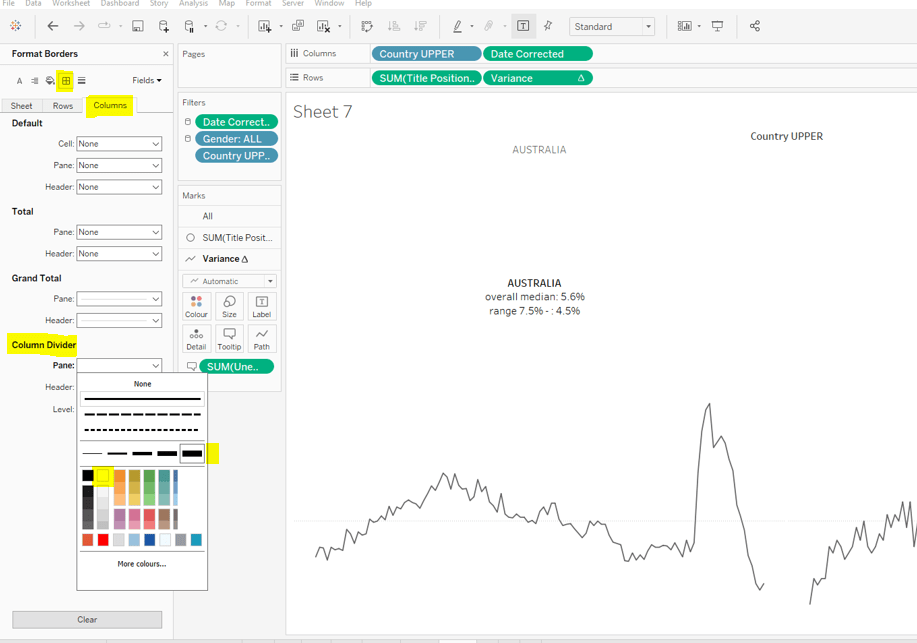
Change the colour of the variance line to grey, then remove all gridlines, row dividers and axis. Set the Column Dividers to be a thick white line (this will help provide a separator between the small multiples later).
Creating the trellis
There are multiple blog posts about creating trellis charts. My go to post has always been this one by Chris Love. It’s a more complex solution that dynamically flexes the number of rows and columns based on the number of members in the dimension you’re visualising. There have also been other Workout Wednesday challenges involving trellis charts, which I’ve blogged about too (see here).
Ultimately we’re aiming to determine a ‘grid position’ for each member of our dimension. In this case the dimension is Country UPPER and its a static list of 36 values, which we can display in a 6 x 6 grid. So Australia needs to be in row 1 column 1, Austria in row 1 column 2….. Costa Rica in row 2 column 1… USA in row 6 column.
As our members are static, the calculations we can use for this can be a bit simpler than those in Chris’ blog.
Firstly, let’s get our data in a tabular layout so we can ‘see’ the values as we go.
Duplicate the data sheet we built up, then move Measure Name and Date Corrected from Rows/Columns to the Detail shelf. Remove the Country UPPER field from the Filter shelf. You should have something like below, showing 1 row per country
Double click into the Rows shelf and type in INDEX(), then change the resulting pill to discrete (blue). You will see that index numbers every row. It’s a table calculation and although working as expected, let’s explicitly set it to compute using County UPPER.
Let’s now create our grid position values.
Cols
FLOAT(INT((INDEX()-1)%6))
This takes the Index value and subtracts 1, and returns the remainder when divided by 6 (%6=modulus of 6 – ie 6%6=0, 7%6=1). 6 is the number of columns we want.
Rows
FLOAT(INT((INDEX()-1)/6))
This takes the Index value and subtracts 1, and returns the integer part of the value when divided by 6. Again we’re using 6 as this is the number of rows we want to display.
Add these to the table, set to be discrete (blue) and compute using Country UPPER.
You can see that the first 6 countries are all in the same row (row 0) but different columns (0-5).
Now that’s understood, we can create the small multiples on the viz.
Duplicate the sheet we created further above which displays the trend graph for Australia & Austria. As we’re now going to make the changes to create the charts for every country, if things go a bit screwy, you can always get back to this one to try again :-).
Add Cols to Columns. Set to discrete and compute using Country UPPER. Add Rows to Rows and do the same thing. Move Country UPPER from Columns to the Detail shelf on the All marks card. Then remove Country UPPER from the Filter shelf.
Hopefully everything worked as expected and you have
Final step is to uncheck Show Header against the Cols and Rows pills so they don’t display and you can add to a dashboard.
Following the #WOW survey where practice in table calculations was the most requested feature, Lorna continues with the theme in this challenge, where the focus is on the moving average table calculation, plus a couple of extra features thrown in.
Moving average
This is based on the values of data points before and after the ‘current’ point, as defied by the parameters which will need to be created.
pPrior
Integer parameter ranging from 1 to 6 and defaulted to 3. You need to explicitly set the Step size to 1 to ensure the step control slider appears when you add the parameter to the dashboard. This will be used to define the number of data points prior to the current to use in the calculation.
Create an identical parameter pPost to define the number of data points to use after the current one.
With these parameters, we can now create the core calculation
As the requirement states that the ‘prior’ parameter needs to include the ‘current’ value, then we need to adjust the calculation – ie if the parameter is 3, we actually only want to include 2 prior data points, as the 3rd will be the current point itself. This is what the +1 is doing in the 2nd argument of the function.
Lorna has stated that 3 Sub-Categories are grouped to form a Misc category, so we need to create a group off of Sub-Category (right click Sub-Category -> Create -> Group).
Multi-select the 4 options that need to be grouped (hold down Ctrl as you select), and then group, and rename the group Misc.
Now we can check what the calculation is doing. If you add the fields onto the view as below, and set the Moving Avg table calculation to compute using Month of Order Date only (see further below), you should be able to see that each month’s moving avg value is calculated based on the sales value of the set of previous & post months as defined by your parameters. In the image below the Moving Avg for Accessories in June 2018, is the average of the Sales values from April 2018 – Sept 2018.
With this you can start the beginnings of the viz – don’t forget to set the table calc as above.
Colouring the lines
This will be managed by using a set.
Right click on the Sub-Category (group) field -> Create -> Set. Initially select all values. Add this field to the Colour shelf. Additionally, click the Detail symbol (…) to the left of the Sub-Category (group), and select the Colour symbol, so this field is also added to the Colour shelf.
The resulting colour legend will look something like thisEdit the colour legend, then choose Hue Circle and select Assign Palette to randomly assign colours to all the options
To show the set values, click on the context menu of the Sub-Category (Group) field on the Colour shelf, and Show Set.
This will add the list of options for selection
Uncheck All so none are selected, which will change the colour legend to read ‘Out, xxx’. Edit the colour legend again, and control-click to multi select all options, then set to a single grey
Now if you select a few options, the ones selected will be coloured, while the others remain grey
Additionally add the set field onto the Size shelf and make the In option bigger than the Out.
Shading the background
For this we need to create an unstacked area chart with one measure representing the maximum moving average value for the month, and the other representing the minimum moving average value for the month. We’ll need new calculated fields for this:
Window Max Avg
WINDOW_MAX([Moving Avg])
Window Min Avg
WINDOW_MIN([Moving Avg])
If you’ve still got your data sheet available, then move Sub-Category (Group) onto Rows, then add the two newly created fields.
In this case there are ‘nested’ table calcs. You need to ensure the setting related to the Moving Avg is computing by Month Order Date only, but the setting related to the Window Max Avg (or Window Min Avg)is computing by Sub-Category (Group).
If set properly, you should see that for each month the max / min values are displayed against every row.
Back to your chart viz sheet, and add Window Max Avg to Rows. Set the table calc settings as described above, then remove the Sub-Category (group) Set field from the Colour shelf of this measure, and change the Sub-Category (group) to be on the Detail rather than Colour shelf.
Change the mark type to Area, set the Opacity of the colour to 100% and set stack Marks to be Off (Analysis Menu -> Stack Marks -> Off).
Now drag Window Min Avg onto the Window Max Avg axis and drop it when the ‘2 columns’ image appears.
This will change the view so Measure Values is now on the Rows shelf and Window Min Avg is now displayed in the Measure Values section on the left hand side.
Adjust the table calc setting of Window Min Avg to be similar to how we set the Max field. And now drag the fields so Window Min Avg is listed before Window Max Avg. Measure Names will now be on the Colour shelf of this marks card, so adjust so Window Min Avg is white and Window Max Avg is pale grey.
Now make the chart dual axes, synchronise the axes, and set the Measure Values axis to the ‘back’.
Everything else is now just formatting and adding onto a dashboard. My published viz is here.