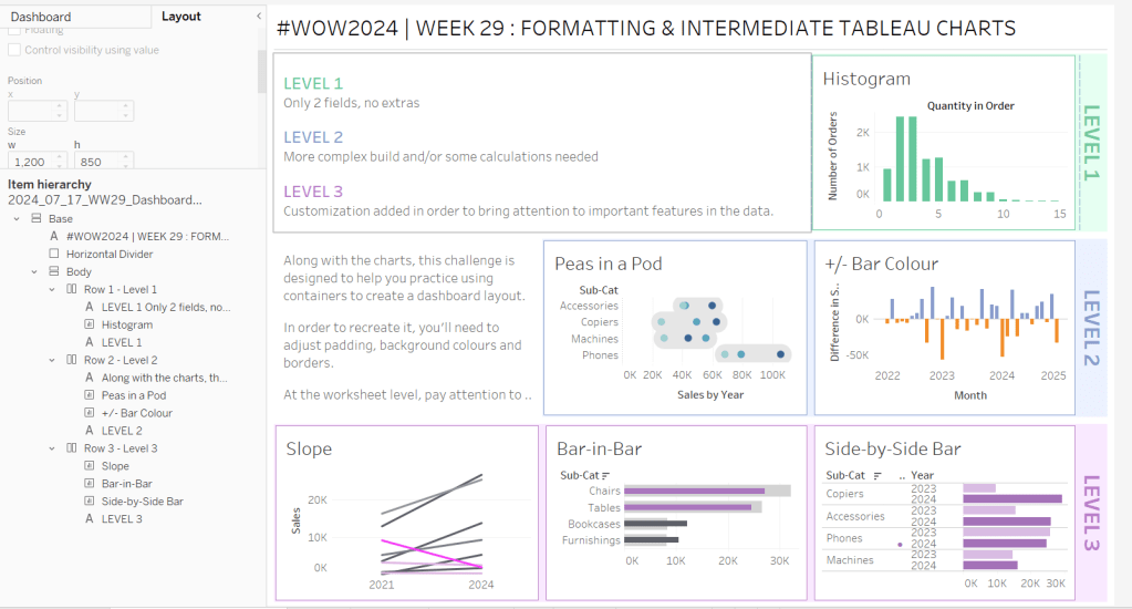
Erica set this challenge primarily aimed at building a beautifully presented dashboard, with the requirement to consider the use of layout containers and padding. She threw in creating some very specific chart types too. The easiest way to blog this, is by chart type.
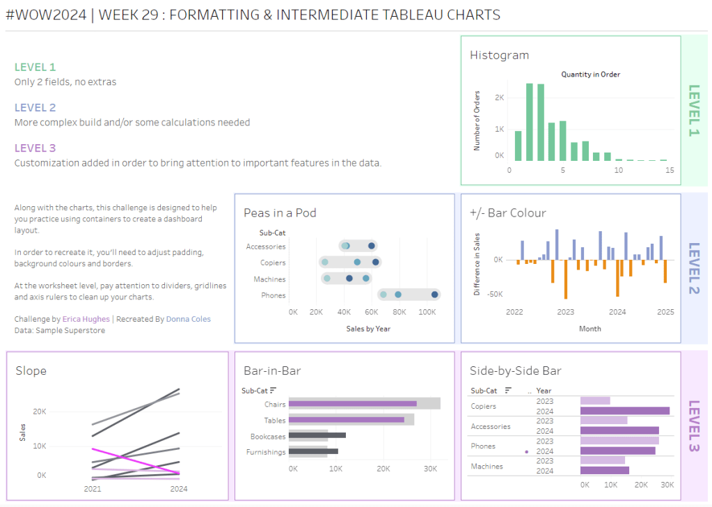
Building the Histogram
Add Quantity to Columns as continuous dimension (green unaggregated pill) and add Order ID as a measure using the CNT aggregation to Rows. The easiest way to do this is right click and drag Order ID from the left hand date pane and drop onto rows. When you release the mouse, the option to select the aggregation should be available.
Change the mark type to bar and adjust the colour. Edit the title of the y-axis and remove the title from the x-axis. Update the Tooltip.
Double -click into Columns and manually type ‘Quantity in Order’ (including the quotes). Right click on the first text displayed and hide field labels for columns. Adjust the font of the Quantity in Order label that remains.
Remove row and column dividers and column gridlines. Remove Row axis rulers.
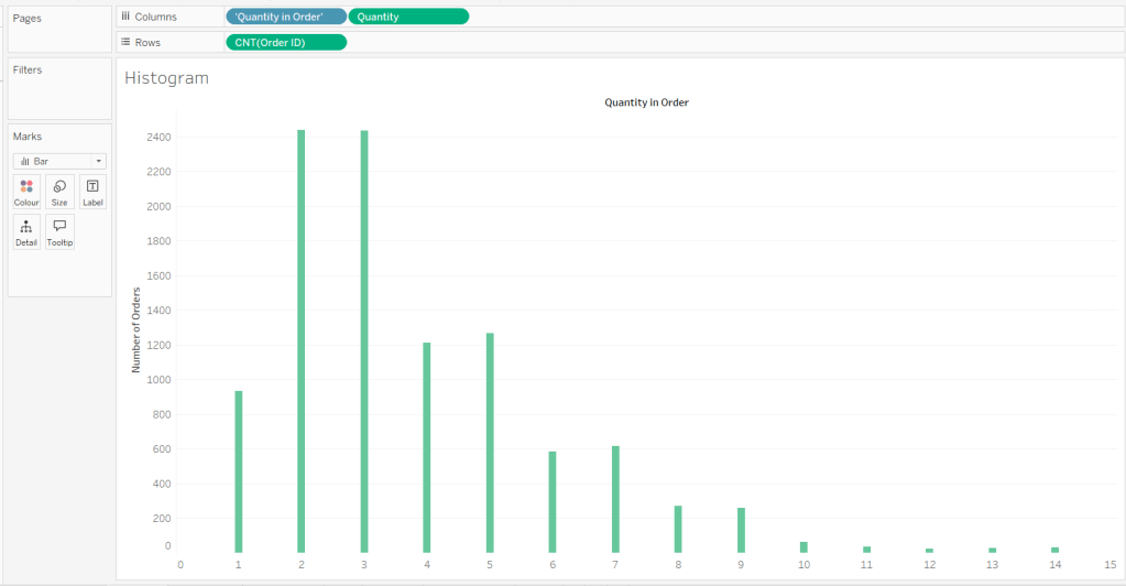
Note, when you add to the dashboard , you may find you want to adjust the Size of the bars.
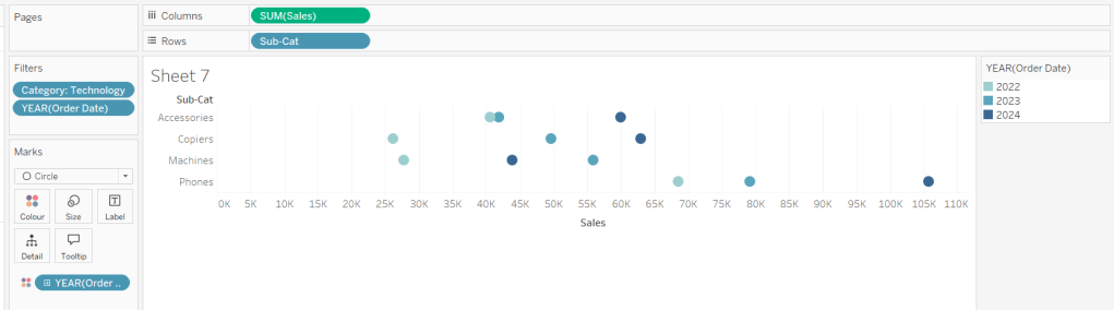
Building the Peas in a Pod chart
On a new sheet, add Category to Filter and select Technology. Add Order Date to Filter and select Years then choose 2022,2023 and 2024.
Rename the Sub-Category field to Sub-Cat and add to Rows. Add Sales to Columns. Change the mark type to circle. Add Order Date to Colour. By default it should display YEAR(Order Date). Adjust colours to suit. Widen each row a bit.
Add another instance of Sales to Columns.
On the Sale (2) marks card change the mark type to line and move YEAR(Order Date) to Path. Increase the size and adjust the colour so it’s a grey lozenge.
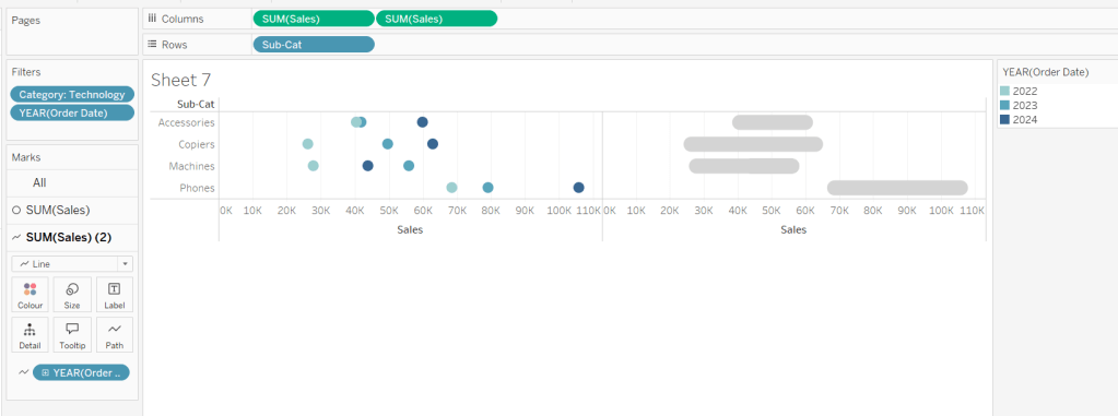
Make the chart dual axis and synchronise the axis. Right click the top axis and move marks to back. Adjust the Tooltip. Edit the title of the x-axis.
Hide the top axis. Remove row and column dividers. Remove row gridlines. Remove axis rulers for both columns and rows.
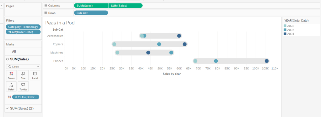
Note, when you add to the dashboard , you may find you want to adjust the Size of the circles and the line. I found it was best adjusted on the web after I published to Tableau Public.
Building the +/- Bar Chart
On a new sheet add Order Date to Filter and select Years then choose 2022,2023 and 2024. Add Order Date to Columns and select to be at the continuous month level (green pill, May 2015 format). Add Sales to Rows and change the mark type to bar.
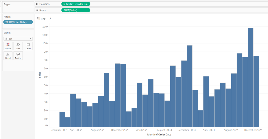
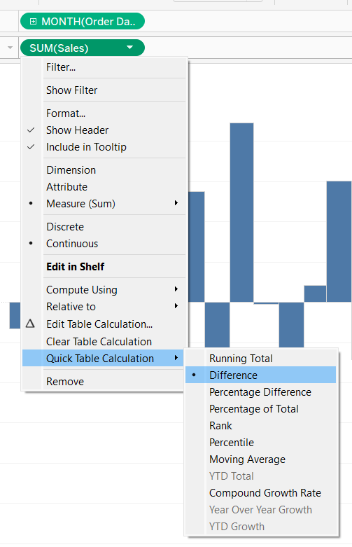
Add a quick table calculation of Difference to the Sales pill.
Adjust the size of the bars (select manual over fixed and adjust the slider).
Create a new calculated field
Diff is +ve
ZN(SUM([Sales])) – LOOKUP(ZN(SUM([Sales])), -1) > 0
and add to the Colour shelf. Adjust colours to suit. Hide the null indicator. Adjust the Tooltip. Adjust the title of the x-axis.
Remove all gridlines and axis rulers. Remove the columns zero line. Set the rows zero line to be a continuous unbroken line.
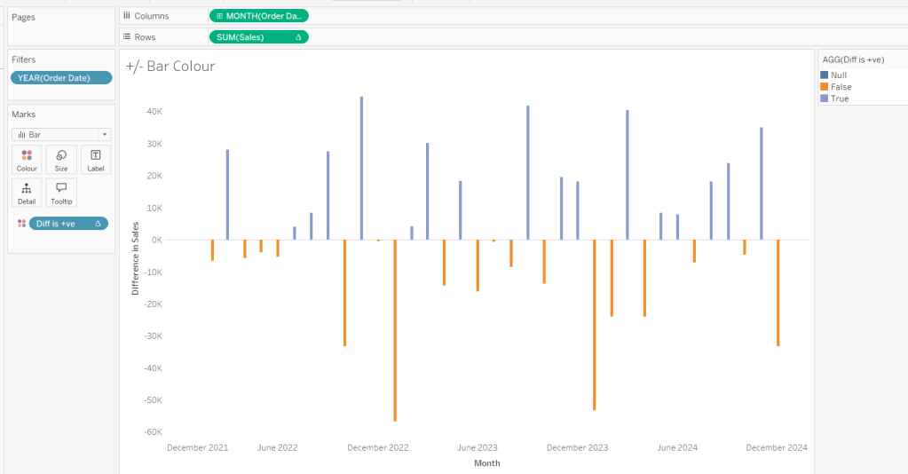
Note – once again the size may need further adjusting once on the dashboard and/or after publishing.
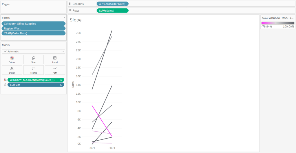
Building the slope chart
Add Category to filter and select Office Supplies. Add Region to filter and select West. Add Order Date to filter and select Years then choose 2021 and 2024 only.
Add Order Date to Columns and Sales to Rows. Add Sub-Cat to Detail.
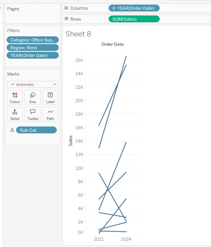
Add Sales to Colour then add a quick table calculation of Percentage Difference. This only sets a value against the 2024 marks though, whereas we want a value for the whole line for each Sub-Cat.
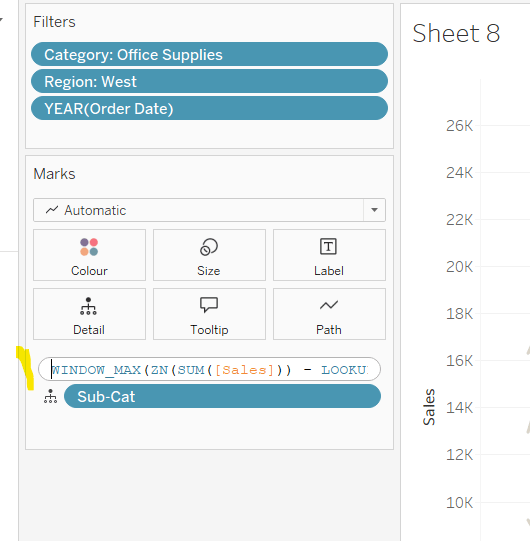
Double-click into the Sales pill on Colour to edit it, and wrap the whole calculation in a WINDOW_MAX() function – the whole calculation should look like
WINDOW_MAX((ZN(SUM([Sales])) – LOOKUP(ZN(SUM([Sales])), -1)) / ABS(LOOKUP(ZN(SUM([Sales])), -1)))
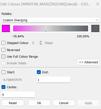
Adjust the colour legend. I set the start & end colours to #ff00ff (hot pink) and #5d6068 (dark grey) and then applied an upper limit to the range and centred at 0 as below.
Hide the Order Date heading at the top of the chart. Adjust the Tooltip.
Remove column gridlines, zero lines and axis rulers.
Create new fields
2021 Sales
IF YEAR([Order Date]) = 2021 THEN [Sales] END
and
2024 Sales
IF YEAR([Order Date]) = 2024 THEN [Sales] END
then create
% Difference
(SUM([2024 Sales]) – SUM([2021 Sales]))/SUM([2021 Sales])
Edit the Sort of the Sub-Cat pill on the Detail shelf, so it is sorting by % Difference ascending. This will ensure the lines are displayed overlapping in the expected manner.
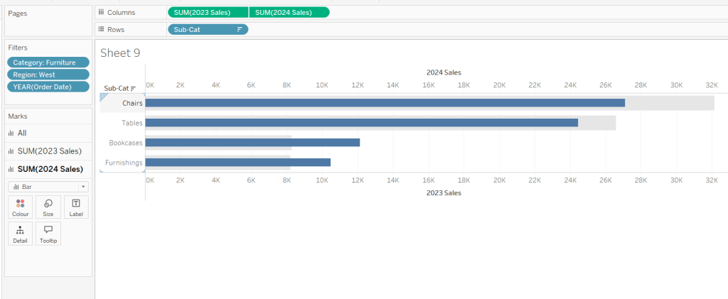
Building the Bar-in-Bar Chart
On a new sheet, add Category to filter and select Furniture. Add Region to filter and select West. Add Order Date to filter and select Years then choose 2023 and 2024 only.
Create a new field
2023 Sales
IF YEAR([Order Date]) = 2023 THEN [Sales] END
Add Sub Cat to Rows and 2023 Sales to Columns. Add a sort to the Sub-Cat pill to sort by 2024 Sales descending. Add 2024 Sales to Columns. Make the chart dual axis and synchronise the axis. Change the mark type on the All marks card to bar. Remove Measure Names from the Colour shelf on the All marks card. Set the colour of the 2023 Sales marks card to light grey. Increase the width of each row, then reduce the size of the bar on the 2024 Sales marks card.
Create a new field
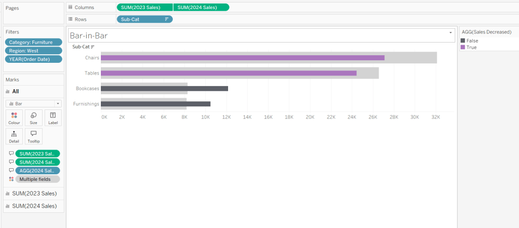
Sales Decreased
SUM([2024 Sales]) < SUM([2023 Sales])
and add to the Colour shelf of the 2024 Sales marks card. Adjust colours to suit.
In the solution, the Tooltip shows an indicator – I’m not sure if this was necessary, but I added it just in case
2024 Sales > 2023 Sales
IF [Sales Decreased] THEN ‘●’ END
Add this to the Tooltip shelf of the All marks card, along with the 2023 Sales and 2024 Sales fields. Adjust the Tooltip accordingly.
Hide the top axis. Remove the title of the x-axis.
Remove row and column dividers. Remove row gridlines and row axis rulers and ticks. Remove all zero lines.
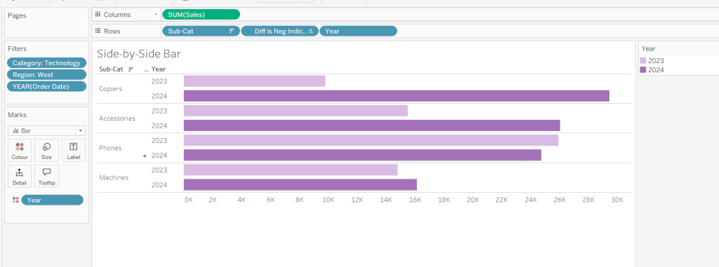
Building the side-by-side bar chart
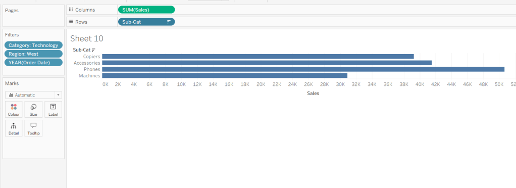
On a new sheet, add Category to filter and select Technology. Add Region to filter and select West. Add Order Date to filter and select Years then choose 2023 and 2024 only.
Add Sub Cat to Rows and Sales to Columns. Apply a Sort to Sub-Cat based on 2024 Sales descending.
Create a new field
Year
YEAR([Order Date])
And add to Rows and Colour. Adjust colour to suit. Widen each row.
Create new field
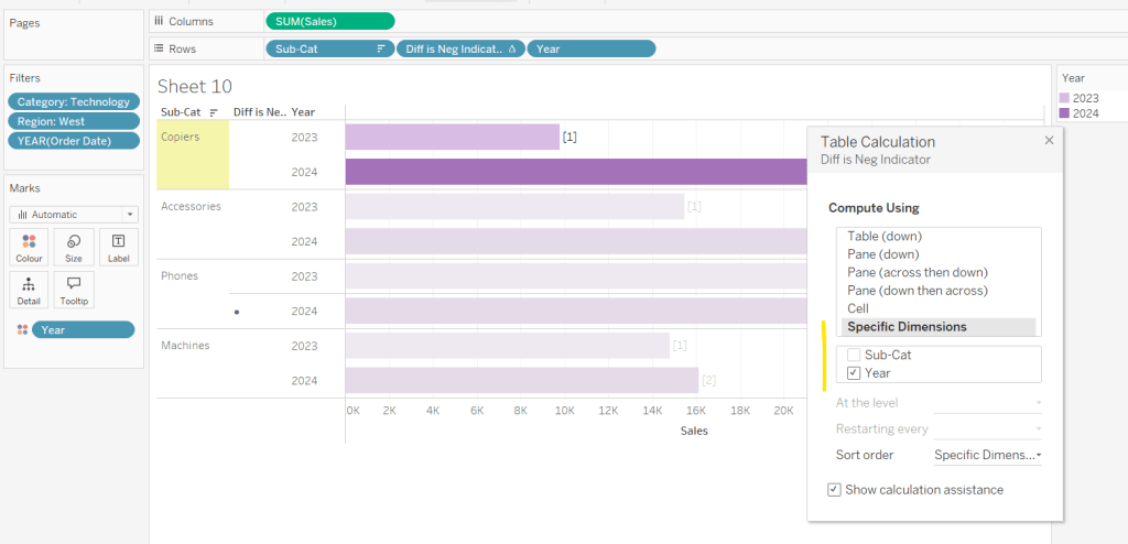
Diff is Neg Indicator
IF NOT([Diff is +ve]) THEN ‘●’ ELSE ” END
Add to Rows before Year and then adjust the table calculation setting so it is just computing by Year only.
Adjust the alignment of the Sub-Cat column so it is aligned middle right. Narrow the width of the Diff is Neg Indicator column to try to remove all the column heading text. If some still shows, rename the field so it is padded with some spaces at the front. Adjust the Tooltip.
Remove the x-axis title. Remove Column dividers. Adjust the row dividers so they are at level 1 and are partitioning each Sub Cat only and not splitting the Year column.
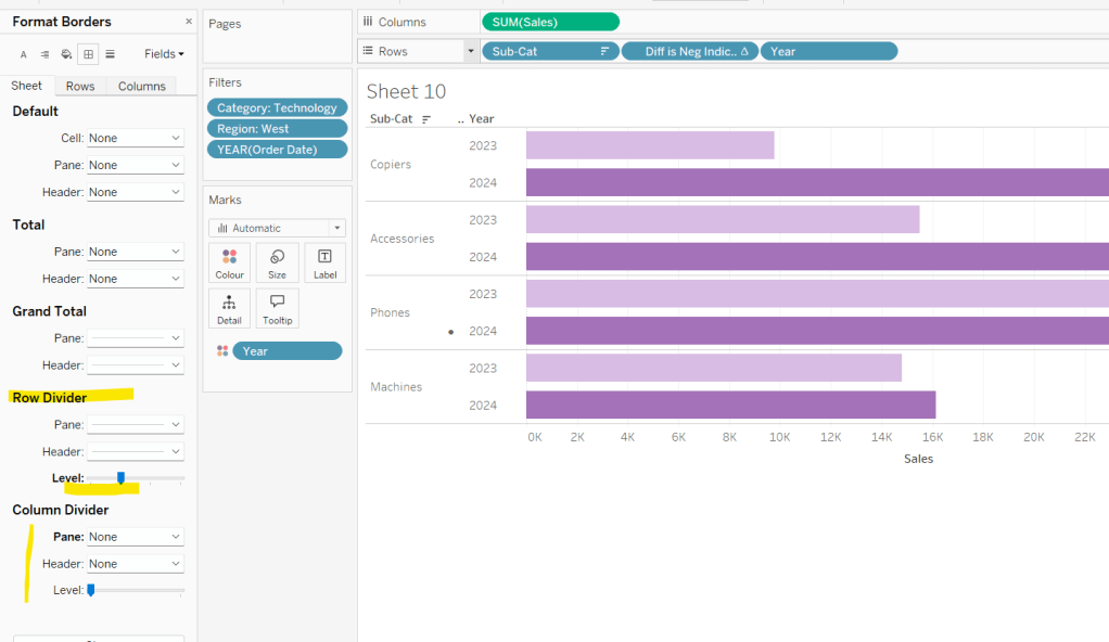
Remove all gridlines
Building the dashboard
It’s always hard to walk through the steps for placing objects on a dashboard in the specified places. My general rules are
- Start with a floating vertical container that is positioned 0,0 and set to the dashboard height and width. I name this Base.
- Then add tiled objects such as a text object for the title, blank objects, other containers, charts etc.
- When you add a container, add a blank object initially to help get everything into place. Remove once you have at least 2 objects side by side / on top of each other depending on the direction you’re organising.
- The item hierarchy shouldn’t have any containers of type Tiled listed.
- Try to name your containers to help maintenance in the future
Below is a picture of the item hierarchy I ended up with using this approach
I created a floating vertical container called Base, positioned 0,0 and 1200 x 850. Background set to None, no border and inner and outer padding all 0.
I added a text object to contain the title. Background set to None and no border. Outer padding set to 10 all round, and inner padding 0.
I added a blank object, which I renamed Horizontal divider. Background set to light grey, no border. Outer padding set to left and right 10 and top and bottom 0. Inner padding all 0. Height set to 2.
I added another Vertical container, which I renamed Body. Background set to None, no border and all inner and outer padding set to 0.
I added 3 horizontal containers on top of each other, and set the property of the Body vertical container to distribute contents evenly so each horizontal container was the same height.
1st horizontal container
I named Row 1 – Level 1. I set the background to the pale green. No border. Outer padding set to left & right 10, top & bottom 5. Inner padding all 0.
Into this I added a text field to describe the levels. Background of this was white, no border and outer padding set to 0 (so the green background disappears). Inner padding was set to top: 20 and 10 for the rest.
Next the Histogram chart. Border set to green. Background white. Outer padding right:5, rest 2. Inner padding set to 10 all round. Width of chart fixed to 380 px.
Next the Level 1 text object. No border, no background. Outer padding 4 all round; inner padding 0. Formatted text object to rotate text. Width of object set to 40 px.
2nd horizontal container
I named Row 2- Level 2. I set the background to the pale blue. No border. Outer padding set to left & right 10, top & bottom 5. Inner padding all 0.
Into this I added a text field to describe the challenge. Background of this was white, no border and outer padding set to 0 (so the blue background disappears). Inner padding was set to 10 all round. Width of object set to 380px.
Next the Peas in a Pod chart. Border set to blue. Background white. Outer padding right:5, rest 2. Inner padding set to 10 all round.
Next the +/- bar chart. Border set to blue. Background white. Outer padding right and left 5, top & bottom 2. Inner padding set to 10 all round. Width of object set to 380px.
Next the Level 2 text object. No border, no background. Outer padding 4 all round; inner padding 0. Formatted text object to rotate text. Width of object set to 40 px.
3rd horizontal container
I named Row 3- Level 3. I set the background to the pale purple. No border. Outer padding set to left & right 10, top & bottom 5. Inner padding all 0.
I added the Slope chart. Border set to purple. Background white. Outer padding right:5, rest 2. Inner padding set to 10 all round. Width of object set to 380px.
Next the bar-in -bar chart. Border set to purple. Background white. Outer padding right & left 5, top & bottom 2. Inner padding set to 10 all round.
Next the side-by-side bar chart. Border set to purple. Background white. Outer padding right and left 5, top & bottom 2. Inner padding set to 10 all round. Width of object set to 380px.
Next the Level 3 text object. No border, no background. Outer padding 4 all round; inner padding 0. Formatted text object to rotate text. Width of object set to 40 px.
It was a bit of trial and error to get the spacing as required, and a few calculations to work out how wide I wanted each chart to be, based on the width of the dashboard and the other items in each row.
Anyway, my published viz is here.
Happy vizzin’!
Donna
