It was Lorna’s turn to set the challenge this week, based on a real world scenario she’s encountered with a colleague. The premise was to be able to show the progress, by country, against a maximum of 6 goals selected by the user. Placeholders for the 6 options had to remain visible at all times (unless the user selected more than 6, in which case a message should appear).
Building the core viz
As Lorna alludes to in the requirements, we will use sets to capture the goals the user can select.
SDG Name Set
Right click on SDG Name > Create > Set. Select up to 4 options.
On a new sheet, add SDG Name Set and SDG Name to Columns, Country to Rows and add Country to the filter shelf, and limit to Australia, Finland, UK & USA. Right click on the SDG Name Set field in the data pane and select Show Set
We need the SDG Name value to only display for the values selected
SDG Name Header Label
IF [SDG Name Set] THEN [SDG Name] ELSE ” END
Add this to Columns before the SDG Name field.
Now we need to always display 6 columns of data, ie in this case, all the SDG Name values In the set and the first SDG Name values not in the set. We will use the INDEX() function to help us label the columns position.
INDEX
INDEX()
Right click this field and Convert to discrete, then add it to the Columns after SDG Name.
Edit the table calculation (click on the triangle symbol on the blue INDEX pill), and adjust so it is computing by Specific Dimensions. This should be all the fields except Country. The columns should be labelled sequentially from 1 to 17.
Add INDEX to the Filter shelf as well. Initially just select 1. Then adjust the table calculation of this field to match above, and once done, edit filter and select values 1 through to 6. This should leave you with 6 columns
Now we have the structure, we can start building the core contents of the table. For this we’ll be using what I refer to as ‘fake axis’.
Double click in the Rows shelf and manually type in MIN(0.2), then double click again and manually type in MIN(0.6). This results in the creation of a MIN(0.2) and a MIN(0.6) marks card on the left hand side.
The MIN(0.2) marks card is going to be used to show the information about how the goal is trending (ie the arrow symbol), while the MIN(0.6) marks card will be used to show the status of the goal (the text displayed). We need new fields for this, so the values only display for the selected goals.
Trend
IF [SDG Name Set] THEN [SDG Trend] END
Goal
IF [SDG Name Set] THEN [SDG Value] END
Click on the MIN(0.2) marks card. Change the mark type to shape. Add Trend to the Shape card. Right click on the Trend pill and change the field from a Dimension to an Attribute.
Doing this stops the field from impacting the table calculation, and you should get back to having 6 columns displayed.
Adjust the shapes using the Arrows shape palette. For the Null value, I set it to use a transparent shape, a custom shape added to my shape palette. See this blog for more information on doing this.
Also add Trend to the Colour shelf. Once again, adjust the pill to be Attribute and then adjust the colours.
Now click on the MIN(0.6) marks card. Adjust the Mark Type to be Text. Add Goal to the Text shelf and change to be and Attribute. Add Goal to the Colour shelf, change to be Attribute and adjust colours to suit. I also adjusted the font to be bold & size 10pt.
Set the chart to be dual axis and synchronise the axis. Edit the axis (Right click on the left hand axis) and fix the axis from 0 to 1.
Hide the axis, the IN/OUT SDG Name Set pill, the SDG Name and INDEX pills (right click the pills and uncheck Show header).
Right click on the Country row label and the SDG Name Header Label column label in the viz and hide field labels for rows/columns.
Right click within the viz to format. Set the background colour of the pane to light grey.
Remove all gridlines, axis rules, zero lines. Set the column and row dividers to thick white lines
Click the Tooltip button on the All marks card, and uncheck show tooltips. Set the viz to Fit width.
Building the Goal legend
On a new sheet, add SDG Value to Columns. Change the mark type to Circle then add SDG Value to Label and Colour. Manually re-order the columns and adjust the colours as required.
Double click in the Columns shelf and type in MIN(0.0). Edit the axis and fix from -0.1 to 0.5 – this will shift the symbols and text to the left.
Adjust the size of the circle shape to suit, and set the font of the label to match mark colour. I also set it to be bold.
Remove all gridlines, axis ruler, zero lines. Set the background of the pane to be grey and the row/column dividers to be thick white lines. Hide the axis and the column headers, and uncheck show tooltips.
Double click into the Rows shelf, and type the text ‘Goal’ (including the quotation marks). Hide the ‘Goal’ label that then displays.
Building the Trend legend
Repeat similar steps for above but add the SDG Trend field to the Colour, Label and Shape shelf. Adjust the shape & colours to those used before.
Handling more than 6 selections
For this requirement, we need to determine the number of items in the set.
Count Set Members
{COUNTD(IF [SDG Name Set] THEN [SDG Name] END)}
and then use this to create some boolean fields
More than 6 Selected
[Count Set Members] > 6
Less than 6 Selected
[Count Set Members] <= 6
Ensuring that less than 6 items are selected, add the Less than 6 Selected field to the Filter shelf of the main table viz and set to True.
If you select more than 6 goals, the viz should disappear.
On a new sheet, double click into the space beneath the marks card where the pills usually sit, and type ‘Dummy’ (with quotes). Change the mark type to shape and set to use the transparent custom shape. Move the Dummy pill to the label shelf, then edit the label and change the text to the error message.
Align the text middle centre and fit to entire view. Uncheck show tooltips. Add More than 6 Selected to the filter shelf and select true (if true isn’t an option, go back to the main viz, and select more options sp the viz disappears, then come back to this sheet and try again).
All the sheets can now be added to the dashboard. Ensure the core table viz and the error sheets are added to a vertical container without the title showings – the charts should expand and collapse as the selections are made – this can be a bit tricky to get right.
For the challenge this week, Kyle asked us to recreate the visualisation above using an adapted version of Superstore which had a customer count metric for 3 dimensions (Category, Segment and Region) along with ‘no’ dimension (null) pre-aggregated at a Yearly or Monthly Level.
By this I mean that, at a Yearly level, when the date was 1st Jan 2019 say, a row of data existed for the (distinct) customer count of all the combinations of the 3 dimensions and null. In total 80 rows for the one date.
As the data was pre-aggregated, it made no sense to say the customer count for Technology is the sum of all the rows where Category = Technology and this would mean data was being double counted.
Pivoting the data also wouldn’t yield the desired result. So the aim of this challenge was to be able to identify the relevant rows of data that needed to be displayed based on the options selected by the user.
Building the calculations
Parameters will be driving the user selections, so these need to be set up
pDateGrain
string parameter with a list of 2 options: Monthly and Yearly. Defaulted to Monthly.
pColour
string parameter with a list of 4 options : Category, Region, Segment, None. Defaulted to Segment
Similarly, create pXAxis and pYAxis parameters similar to above, but default both to None.
On a new sheet build a tabular view with
Table Names, Category, Segment and Region on Rows
Order Date set to discrete (blue pill) exact date on Columns
Customer Count on Text
Show all 4 parameters created
The rows of data need to be filtered by Table Name (as defined by the pDateGrain parameter) and a combination of Category, Segment and Region based on the options selected in the other 3 parameters.
To filter by the Table Name we need
Filter – Date Grain
[pDateGrain] = [Table Names]
Add this to the Filter shelf and set to True.
Change the pDateGrain parameter to Yearly as there is less data to see/check.
Based on the options selected in any of the other 3 parameters, we need to find matching rows.
For example, if pColour is Segment and the other parameters are None, we are looking for the rows where the Segment column is not null, but the Region and Category columns are (we would be after the same rows if pXAxis was set to Segment, and the other parameters were None or, if pYAxis is Segment and the other parameters were None).
In this case, we’re looking for 3 rows of data – those highlighted below
If instead any two of the parameters were set to Segment and Category and the other None, then we’d be looking for rows where Segment is not null, Category is not null and Region is null. This would be 9 rows in total (a snippet of which is shown below).
We also need to deal with scenarios where all three parameters were set to something different, or all set to None as well as handle if multiple parameters are set to the same thing.
Now to do this, I ended up building a single field to use as filter that contains all the scenarios. As I was building it up, I figured there should be a slicker way, and there is (check out Kyle’s solution), but if your brain is wired the same way as mine, then you’ll end up with this
Filter – Rows to Include
IF [pColour] = ‘None’ AND [pXAxis] = ‘None’ AND [pYAxis] = ‘None’ THEN //no options selected IF ISNULL([Region]) AND ISNULL([Category]) AND ISNULL([Segment]) THEN TRUE END ELSEIF (([pColour] <> ‘None’ AND [pXAxis] = ‘None’ AND [pYAxis] = ‘None’) OR ([pColour] = ‘None’ AND [pXAxis] <> ‘None’ AND [pYAxis] = ‘None’) OR ([pColour] = ‘None’ AND [pXAxis] = ‘None’ AND [pYAxis] <> ‘None’)) THEN // one of the 3 options selected, so work out which dimension IF [pColour] = ‘Category’ OR [pXAxis] = ‘Category’ OR [pYAxis] = ‘Category’ THEN IF ISNULL([Region]) AND ISNULL([Segment]) AND NOT ISNULL([Category]) THEN TRUE END ELSEIF [pColour] = ‘Segment’ OR [pXAxis] = ‘Segment’ OR [pYAxis] = ‘Segment’ THEN IF ISNULL([Region]) AND NOT ISNULL([Segment]) AND ISNULL([Category]) THEN TRUE END ELSEIF [pColour] = ‘Region’ OR [pXAxis] = ‘Region’ OR [pYAxis] = ‘Region’ THEN IF NOT ISNULL([Region]) AND ISNULL([Segment]) AND ISNULL([Category]) THEN TRUE END END ELSEIF (([pColour] <> ‘None’ AND [pXAxis] <> ‘None’ AND [pYAxis] = ‘None’) OR ([pColour] <> ‘None’ AND [pXAxis] = ‘None’ AND [pYAxis] <> ‘None’) OR ([pColour] = ‘None’ AND [pXAxis] <> ‘None’ AND [pYAxis] <> ‘None’)) THEN // two options selected, so work out which dimensions we need IF ([pColour] = ‘Category’ OR [pXAxis] = ‘Category’ OR [pYAxis] = ‘Category’) AND ([pColour] = ‘Segment’ OR [pXAxis] = ‘Segment’ OR [pYAxis] = ‘Segment’) THEN IF ISNULL([Region]) AND NOT ISNULL([Segment]) AND NOT ISNULL([Category]) THEN TRUE END ELSEIF ([pColour] = ‘Category’ OR [pXAxis] = ‘Category’ OR [pYAxis] = ‘Category’) AND ([pColour] = ‘Region’ OR [pXAxis] = ‘Region’ OR [pYAxis] = ‘Region’) THEN IF NOT ISNULL([Region]) AND ISNULL([Segment]) AND NOT ISNULL([Category]) THEN TRUE END ELSEIF ([pColour] = ‘Segment’ OR [pXAxis] = ‘Segment’ OR [pYAxis] = ‘Segment’) AND ([pColour] = ‘Region’ OR [pXAxis] = ‘Region’ OR [pYAxis] = ‘Region’) THEN IF NOT ISNULL([Region]) AND NOT ISNULL([Segment]) AND ISNULL([Category]) THEN TRUE END //or the two options selected are the same dimension ELSEIF ([pColour] = ‘Category’ OR [pXAxis] = ‘Category’ OR [pYAxis] = ‘Category’) AND ([pColour] = ‘Category’ OR [pXAxis] = ‘Category’ OR [pYAxis] = ‘Category’) THEN IF ISNULL([Region]) AND ISNULL([Segment]) AND NOT ISNULL([Category]) THEN TRUE END ELSEIF ([pColour] = ‘Segment’ OR [pXAxis] = ‘Segment’ OR [pYAxis] = ‘Segment’) AND ([pColour] = ‘Segment’ OR [pXAxis] = ‘Segment’ OR [pYAxis] = ‘Segment’) THEN IF ISNULL([Region]) AND NOT ISNULL([Segment]) AND ISNULL([Category]) THEN TRUE END ELSEIF ([pColour] = ‘Region’ OR [pXAxis] = ‘Region’ OR [pYAxis] = ‘Region’) AND ([pColour] = ‘Region’ OR [pXAxis] = ‘Region’ OR [pYAxis] = ‘Region’) THEN IF NOT ISNULL([Region]) AND ISNULL([Segment]) AND ISNULL([Category]) THEN TRUE END END ELSE //all three selected, but they could be all the same dimension or 2 of the three the same IF ([pColour] = ‘Category’ OR [pXAxis] = ‘Category’ OR [pYAxis] = ‘Category’) AND ([pColour] = ‘Segment’ OR [pXAxis] = ‘Segment’ OR [pYAxis] = ‘Segment’) AND ([pColour] = ‘Region’ OR [pXAxis] = ‘Region’ OR [pYAxis] = ‘Region’) THEN //all three different IF NOT ISNULL([Region]) AND NOT ISNULL([Segment]) AND NOT ISNULL([Category]) THEN TRUE END ELSEIF ([pColour] = ‘Category’ OR [pXAxis] = ‘Category’ OR [pYAxis] = ‘Category’) AND ([pColour] = ‘Region’ OR [pXAxis] = ‘Region’ OR [pYAxis] = ‘Region’) THEN IF NOT ISNULL([Region]) AND ISNULL([Segment]) AND NOT ISNULL([Category]) THEN TRUE END ELSEIF ([pColour] = ‘Category’ OR [pXAxis] = ‘Category’ OR [pYAxis] = ‘Category’) AND ([pColour] = ‘Segment’ OR [pXAxis] = ‘Segment’ OR [pYAxis] = ‘Segment’) THEN IF ISNULL([Region]) AND NOT ISNULL([Segment]) AND NOT ISNULL([Category]) THEN TRUE END ELSEIF ([pColour] = ‘Region’OR [pXAxis] = ‘Region’ OR [pYAxis] = ‘Region’) AND ([pColour] = ‘Segment’ OR [pXAxis] = ‘Segment’ OR [pYAxis] = ‘Segment’) THEN IF NOT ISNULL([Region]) AND NOT ISNULL([Segment]) AND ISNULL([Category]) THEN TRUE END ELSEIF [pColour] = ‘Category’ OR [pXAxis] = ‘Category’ OR [pYAxis] = ‘Category’ THEN IF ISNULL([Region]) AND ISNULL([Segment]) AND NOT ISNULL([Category]) THEN TRUE END ELSEIF [pColour] = ‘Segment’ OR [pXAxis] = ‘Segment’ OR [pYAxis] = ‘Segment’ THEN IF ISNULL([Region]) AND NOT ISNULL([Segment]) AND ISNULL([Category]) THEN TRUE END ELSEIF [pColour] = ‘Region’ OR [pXAxis] = ‘Region’ OR [pYAxis] = ‘Region’ THEN IF NOT ISNULL([Region]) AND ISNULL([Segment]) AND ISNULL([Category]) THEN TRUE END END
END
Blimey! A bit monolithic I know, but it just grew organically as I tried out the different scenarios step by step. Unfortunately the above doesn’t copy over the formatting nicely, as there are nested (tabbed) IF statements which makes it (a bit) easier to read.
Suffice to say, I’m not going to walk through step by step, but it’s checking for all the different permutations are discussed above, and marking the relevant rows as True. This field can then be added to the Filter shelf and set to True.
Kyle’s solution, essentially replaces this one calculated field, with 3 calculated fields – 1 per parameter – which are all then added to the filter shelf. It’s much neater 🙂
So now we’ve identified the rows we want based on parameters, but there is also the ability to filter the rows further based on the values of the Category, Segment or Region.
Add each of the 3 fields to the Filter shelf and select the All option, then show the filters on the view. For each of the Category, Segment and Region filters, set the option to show Only Relevant Values. This will prevent the NULLs from showing as an option when the relevant dimension is listed as one of the parameter selections
As you can see from the above image though, Region is only showing Null, and this is because in the example above, Region isn’t selected as an option for the pColour, pXAxis or pYAxis parameters. When it comes to the dashboard, we don’t want the Region filter to be visible in this case. To help with this, we need 3 further calculated fields.
Show Filter – Region
[pColour] = ‘Region’ OR [pXAxis] = ‘Region’ OR [pYAxis] = ‘Region’
This returns True if one of the 3 parameters contains the value ‘Region’. Similarly, create Show Filter – Category and Show Filter – Segment fields.
The final calculated fields we need are to help build the ‘cross tab’ view.
X-Axis
CASE [pXAxis] WHEN ‘Category’ THEN [Category] WHEN ‘Region’ THEN [Region] WHEN ‘Segment’ THEN [Segment] ELSE ” END
Y-Axis
CASE [pYAxis] WHEN ‘Category’ THEN [Category] WHEN ‘Region’ THEN [Region] WHEN ‘Segment’ THEN [Segment] ELSE ” END
Colour
CASE [pColour] WHEN ‘Category’ THEN [Category] WHEN ‘Region’ THEN [Region] WHEN ‘Segment’ THEN [Segment] ELSE ” END
Now we’ve got all the fields needed to build the viz.
Building the viz
The quickest way is to duplicate the sheet we’ve built, as all the filters need to apply, so
Duplicate the sheet
Remove all the fields from Rows
Change the Order Date field on Columns to be continuous (green pill)
Add X-Axis to Columns
Add Y-Axis to Rows
Move Customer Count to Rows
Add Colour to the Colour shelf.
Adjust the colours to suit.
Change the value of the option in the pColour parameter, and readjust the colours. Repeat so that colours are set for Category, Segment and Region.
Add Colour to the Label shelf
Remove all gridlines, axis and zero lines. Remove the Y-Axis and X-Axis row/column labels by right clicking the text and selecting Hide field labels for rows/columns. Edit the Order Date axis (right click axis -> Edit) and remove the axis title.
Add Order Date to Tooltip and format it to the ‘March 2001’ date format. Adjust the tooltip as below
Hiding the filters
Add the viz to a dashboard and arrange the parameters and filter controls in the relevant location. I used layout containers to help with the organisation.
Select the Category filter and on the Layout tab, select the Control visibility using value checkbox and select the Show Filter – Category field.
Repat the same steps for the Region and Segment filters, selecting the equivalent calculated fields.
This week’s #WOW2023 challenge was inspired by Sam Parson’s TC presentation where he demonstrated the concept of an interactive Viz in Tooltip (the workbook he presented is here).
I was aware when I set this challenge, that this was likely to be on the higher end of the difficulty scale, but WOW challenges to me have have always provided a source of inspiration and ideas to take forward into my day job. And by blogging the solutions, I provide myself with a guide to refer to when the need arises. When Sam presented the concept, I immediately wanted to understand how he’d done it, and by setting it as a challenge it provided me with the opportunity to dig into it, and get that documented ‘how to’ guide 🙂
As mentioned in the requirements, I built this using multiple sheets, so we’ll start by just building out most of those sheets.
Building the Scatter Plot
We’re only concerned with data over the last 2 years, so we need to define some measures relevant to these years
Current Year
ZN(IF YEAR([Order Date]) = YEAR({MAX([Order Date])}) THEN [Sales] END)
{MAX([Order Date]} is a Fixed Level of Detail calculation which returns the maximum date in the data set. This calculation is then comparing the Year associated to that date with the Year of each Order Date, and if they match, return the Sales. Wrapping in a ZN ensures a value of 0 in the event there are no Sales.
Prior Year
ZN(IF YEAR([Order Date]) = YEAR({Max([Order Date])}) -1 THEN [Sales] END)
YEAR({Max([Order Date])}) -1 returns the year associated to the latest date then decrements by 1 to get the value of the previous year.
We also need to calculate the difference between the sales across the 2 years and categorise based on the difference
Sales Performance
IF SUM([Current Year]) / SUM([Prior Year]) > 1.1 THEN ‘Increasing’ ELSEIF SUM([Current Year]) / SUM([Prior Year]) < 0.9 THEN ‘Decreasing’ ELSE ‘Static’ END
If the current year sales > 10% of the previous year sales then flag as ‘increasing’, else if current month sales < 90% of the previous year sales then flag as ‘decreasing’ else flag as ‘static’.
Add Prior Year to Columns and Current Year to Rows. Add Manufacturer, Sub-Category and Category to Detail. Change the mark type to Circle. Add Sales Performance to Colour, adjust colours to match and reduce opacity to around 80%. Re-order the colour legend to display Increasing at the top and Decreasing at the bottom. Name the sheet Scatter.
Building the bar chart
On a new sheet add Order Date at the discrete (blue) Month level to Columns. Add Current Year to Rows. Change the mark type to bar and add Sales Performance to Colour. Reduce the opacity of the colour to 80%.
Add Prior Year to Rows. Change the mark type on the Prior Year marks card to gantt bar. Remove the Sales Performance pill from the colour shelf on this marks card. Adjust the colour to black.
Make the chart dual axis and synchronise axis.
Hide the axis, remove all gridlines & row/column dividers. Format the months to be abbreviated to the first letter. Right click on the Order Date label at the top and hide field labels for columns. Set the sheet to Entire View. Name the sheet Bar.
Building the KPI
On a new sheet add Current Year to Text. Adjust the format (size & colour of font) and align middle centre. Set the sheet to Entire View. Name the sheet KPI.
Building the % Change Indicator
Firstly we need to capture the value of the % change in sales
On a new sheet, add Sales Performance % Change and Prior Year to Text. Change the mark type to square and increase the size to as large as possible. Set to Entire View. Adjust the font size of the text to match the display and align middle centre. Add Sales Performance to Colour. Name the sheet % Change
Identifying the data to filter
The final sheet we need is one to serve the title of the Viz in Tooltip (ViT). It includes references to information related to the mark selected on the scatter plot, namely the Category, the Sub-Category and the Maufacturer. Before building this title sheet though, we need to understand how we’re going to identify the mark selected so we can filter other sheets based on it.
Typically, for most use cases, when you add a worksheet to the tooltip of another sheet, you want to ‘filter’ what’s displayed in the ViT based on the mark you’re hovering/clicking on.
So by default, when you add a worksheet via the Viz in Tooltip functionality (see Tableau KB here for more info), the markup that’s automatically added looks like below
<Sheet name=”My ViT Sheet” maxwidth=”300″ maxheight=”300″ filter=”<All Fields>”>
where the filter property is set to <All Fields> which is the instruction to pass information from the ‘parent’ sheet through to the ViT sheet.
For this challenge however, when a user first hovers on a mark on the scatter plot (the parent sheet), the information displayed in the Viz in Tooltip (ViT) sheets is for the whole unfiltered data set (ie display information related to the Current Year and Prior Year Sales across all manufacturers, sub-categories & categories). But once selected (clicked on) the information displayed in the ViT should be filtered just to that mark.
For this to work, we can’t use the filter property of the ViT markup. That property needs to be set to “” to ensure the resulting sheets aren’t filtered ‘on hover’. So we need another way to drive the filtering behaviour.
We need to use sets.
We’re going to use sets to capture the Manufacturer, Sub-Category and Category of the mark that is clicked on. So to start, right click on Manufacturer > Create > Set and select all values.
Manufacturer Set
Repeat the same steps to create a Category Set and a Sub-Category Set.
Create a dashboard and add the Scatter sheet to the dashboard. Then create dashboard set actions (Dashboard Menu > Actions > Add Action > Change Set Values)
Select Manufacturer
On select of the Scatter sheet on the dashboard, target the Manufacturer Set, assigning values to the set when the action is initiated, and adding all values to the set when the action is cleared.
Note – ‘assign value to set’ will replace any values already in the set (ie all values) with the relevant value based on the selection made, whereas ‘add values to set’ just appends the selected value to the values already in the set.
Repeat the above steps to create set actions for the Category Set and the Sub-Category Set
Navigate to the Bar sheet. Add Category Set, Sub-Category Set and Manufacturer Set to the Filter shelf, and click on each pill and Show Set to list the sets and their selected values on the left hand side (this is just so you can see what’s going on).
Initially you can see all values in all the sets are selected. Now navigate back to the dashboard and click on a single mark. Then come back to the bar sheet and check the results…
You should see a change to the bars as they are now being filtered by only the values which have been assigned to the set via the ‘on click’ action.
Building the title sheet
Now we have the sets established, we can build on these to generate the information needed for the title sheet.
To start with, we need to understand how many values have been captured in each set.
Count Categories
COUNTD([Category])
Count Sub-Categories
COUNTD([Sub-Category])
Count Manufacturers
COUNTD([Manufacturer])
Then we need to build up a title based on what’s been selected
Title
IF [Count Manufacturers] = 1 THEN MIN([Manufacturer]) ELSEIF [Count Sub-Categories] = 1 THEN ‘All ‘ + MIN([Sub-Category]) ELSEIF [Count Categories] = 1 THEN ‘All ‘ + MIN([Category]) ELSE ‘All Manufacturers’ END
and a sub title
Sub Title
IF [Count Manufacturers] = 1 AND [Count Sub-Categories] = 1 AND [Count Categories] = 1 THEN ‘(‘ + MIN([Category]) + ‘ > ‘ + MIN([Sub-Category]) + ‘)’ ELSE ‘* ‘ + STR([Count Manufacturers]) + ‘ Manufacturers across ‘ + STR([Count Sub-Categories]) + ‘ Sub-Categories’ END
On a new sheet, add Title and Sub Title to Text. Format the background of the worksheet to be orange, set to Entire View, then adjust the text and font format and align top left. Name the sheet Title.
Now navigate back to the Bar sheet, and for each of the fields in the Filter shelf (the set ones), make them apply to selected worksheets, KPI, % Change, and Title
As a result, across all 4 sheets (not the Scatter one), you should have the 3 set fields as filters with the ‘multiple worksheet’ symbol indicating a shared filter.
If you go back to the dashboard and click on a mark then check the Title sheet, the information displayed should update.
Building the Viz In Tooltip
Now we have (most of) the components we need, let’s start to put together the actual ViT.
On the Scatter sheet, click on the Tooltip button to open the Edit Tooltip dialog.
Start by deleting all the text.
Then from the toolbar, click Insert > Sheets > Title to add the Title sheet to the tooltip. You should have something like
The key to getting the tooltip to display ‘nicely’ is to consider the height and widths, and align the markup text. Sometimes this does take a bit of trial & error and can also look differently when published to Tableau Public.
Adjust the above, so the maxwidth =500 and maxheight = 100, filter = “” and the whole line of text is centred.
Then add the other 3 sheets, using carriage returns to add space between the sheets as required, and adjusting the heights and widths.
If you go back to the dashboard and hover on a mark, you should see the display below for All Manufacturers
and if you then click on a mark, the display should adjust to filter
Making the ViT interactive
Edit the Tooltip on the Scatter sheet, and add a section at the bottom that references the Category , Sub-Category and Manufacturer fields (add via the Insert menu again). Style the font as you wish
Now if you go back to the dashboard and click on a mark, you can then also click on one of the links added at the bottom. In this instance I clicked on the Chairs link and all the marks in the scatter plot related to chairs were highlighted and the ViT data all updated to show the values associated to the Chairs Sub-Category
This is happening ‘automatically’ due to the fact the Allow selection by category option on the Tooltip is checked. This is a feature (along with Include command buttons) I personally often switch off.
Now ideally, we’d be finished at this point, but we just need to add a final feature, due to the fact that some Manufacturers exist across multiple Sub-Categories. For example, below while I have clicked a mark that is related to the Global Manufacturer in Chairs, clicking Global in the links at the bottom highlight all the Global Manufacturers across all Sub-Categories, so we can’t get back to seeing the information just about the selected mark.
Adding the ‘Current Mark’ selection
We need to capture the ‘product hierarchy’ for each mark into a single field
Add this to the Detail shelf of the Scatter sheet.
We will need a parameter to then capture the ‘product hierarchy’ for the selected mark
pSelectedMarkIdentifier
string parameter set to ”” ie empty string
On the dashboard, add a parameter action
Identify Current Mark
On hover of the scatter sheet on the dashboard, set the pSelectedMarkIdentifier parameter to the value stored in the Category | Sub Cat | Manu field. Keep the current value when the selection is cleared.
Finally, we need to have a link to select in the tooltip, so we need
Current Mark Identifier
IF [pSelectedMarkIdentifier] = [Category | Sub Cat | Manu] THEN ‘Current Mark’ ELSE ” END
Add this to the Detail shelfof the Scatter sheet, and then update the Tooltip and add a reference to the Current Mark Identifier field
If you now go back to the dashboard and test by clicking on a mark associated to the Global Manufacturer, you should be able to click on Current Mark using the link in tooltip after clicking other links, and get back to what you would have seen in the tooltip when you first clicked on the mark.
It should just now be a case of sorting out the layout on the dashboard.
Congratulations on getting this far! My published viz is here.
I’m back from my holibobs, so back to solving #WOW2023 challenges and writing up the solutions – it’s tough to get back into things after a couple of weeks of sunshine and cocktails!
Anyway, this week, Sean set this challenge from Felicia Styler to build a scatterplot / heat map combo chart, affectionally termed the ‘scatterbox’.
Phew! This took some thinking… I certainly wasn’t gently eased back into a challenge!
Modelling the data
We were given a hint that the data needed to be unioned to build this viz. I connected to the Sample-Superstore.xls file shipped with 2023.2 instance of Tableau Desktop. After adding the Orders sheet to the canvas, I then added another instance, dragging the second instance until the Union option appeared to drop it on.
The union basically means the rows in the Orders data set are all duplicated, but an additional column called Table Name gets automatically added
This field contains the value Orders and Orders1 which provides the distinction between the duplicated fields caused by the union. It is this field that will be used to determine which data is used to build the scatter plot and which to build the heat map.
Building out the calculated fields
Let’s start just by seeing how the data looks with the measures we care about.
Onto a sheet add Product ID, Product Name and Table Name to Rows (Note – there are multiple Product Names with the same Product ID, so I’m treating the combination as a unique product). Then add Quantity to Text. The drag Discount and drop onto the table when it says ‘Show Me’, which should automatically add Measure Name/Measure Values into the view. Aggregate Discount to AVG. We can see that we’re getting the same values for each Table Name, which is expected.
When plotting the scatter plot, we’re plotting at the Product level, so the values above is what we’ll want to plot. But when building the heatmap, we need to ‘bin’ the values.
For the Quantity, we’re grouping into bins of size 10, where if the Quantity is from 0-9 the bin value is 0, 10-19, the bin value is 10 etc.
The LoD (the bit between the {} is returning the same values listed above, but we’re using an LoD, as when we build the heat map, we don’t want the Product fields in the view, but we need to calculate the Quantity values at the product level (ie at a lower level of detail than the view we’ll build). Dividing the value by 10, then allows us to get the FLOOR value, which ’rounds’ the value to the integer of equal or lesser value (ie with FLOOR, 0.9 rounds to 0 rather than 1). Then the result is re-multiplied by 10 to get the bin value.
So if the Quantity is 9, dividing by 10 returns 0.9. Taking the FLOOR of 0.9 gives us 0. Multiplying by 10 returns 0.
But if the Quantity is 27, dividing by 10 returns 2.7. The FLOOR of 2.7 is 2, which when multiplied by 10 is 20.
We apply a similar technique for the Discount bins, which are binned into groups of 0.1 instead.
Add these into the table to sense check the results are as expected.
Next we’re going to determine the values we want based on whether we’re building the scatter or the heat map.
Qty – Scatter
IF [Table Name] = ‘Orders’ THEN {FIXED [Product ID], [Product Name], [Table Name]: SUM([Quantity])} END
ie only return the Quantity value for the data from the Orders table and nothing for the data from the Orders1 table.
Qty – Heatmap
IF [Table Name] = ‘Orders1’ THEN [Quantity Bin] + 5 END
so, this time, we’re only returning data for the Orders1 table and nothing for the Orders table. But we’re also adjusting the value by 5. This is because by default, when using the square mark type which we’ll use for the heatmap, the centre of the square is positioned at the plot point. So if the square is plotted at 10, the vertical edges of the square will be above and below 10. However, we need the square to be centred between the bin range points, so we shift the plot point by half of the bin size (ie 5).
Adding these into the table, and aggregating to AVG we can see how these values are behaving.
As we’re building a dual axis, one of the axis will need to be combined within a single measure, so we create
Qty to Plot
IF ([Table Name]) = ‘Orders’ THEN ([Qty – Scatter]) ELSE ([Qty – Heatmap]) END
Now we move onto the Discount values, which we apply similar logic to
Discount – Scatter
IF [Table Name] = ‘Orders’ THEN {FIXED [Product ID], [Product Name],[Table Name]: AVG([Discount])} END
Discount – Heatmap
IF [Table Name] = ‘Orders1’ THEN [Discount Bin] + 0.05 END
We’ll need is to be able to compute the number of unique products to colour the heatmap by. As mentioned earlier, I’m determining a unique product based on the combination of Product Id and Product Name. To count these we first need
Product ID & Name
[Product ID] + ‘-‘ + [Product Name]
and then we can create
Count Products
COUNTD([Product ID & Name])
The final calculations we need are required for the heatmap tooltips and define the range of the bins.
Qty Range Min
[Qty To Plot] – 5
Qty Range Max
[Qty To Plot] + 5
Discount Range Min
[Discount – Heatmap] – 0.05
Discount Range Max
[Discount – Heatmap] + 0.05
Now we can build the viz
Building the Scatterbox
On a new sheet, add Qty to Plot to Columns and change to be a dimension (so not aggregated to SUM) and Discount – Scatter (set to AVG) to Rows. Add Product ID and Product Name to Detail. Change the mark type to Circle and adjust the size. Adjust the Colour and reduce the opacity (I used #4a9aab at 50%)
Adjust the Tooltip.
Then add Discount – Heatmap to Rows. This creates a 2nd marks card. Change to be a dimension, and change the mark type to square. Remove Product ID and Product Name from the Detail shelf
Add Count Products to Colour and ensure the opacity is 100%. Adjust the sequential colour palette to suit and set the end of the range to be fixed to 300
Add Qty Range Min, Qty Range Max, Discount Range Min, Discount Range Max to the Tooltip shelf of the heatmap marks card. Set all to aggregate to AVG and adjust tooltip to suit.
Then make the chart dual axis and synchronise axis. Increase the size of the square heat map marks (note don’t worry how these look at this point, the layout will adjust when added to the dashboard. Right click on the Discount – Heatmap axis on the right and move marks to back. Hide that axis too.
Edit the Qty to Plot axis so the tick marks are fixed to increment every 10 units.
Adjust axis titles, remove row/column dividers and hide the null indicator.
Then add the sheet to an 800 by 800 sized dashboard. You will need to make tweaks to the padding and potentially sizing of the heat map marks again to get the squares to position centrally with white surround. I added inner padding of 60px to the left & right of the chart on the dashboard, to help make the chart itself squarer.
Lorna’s challenge this week involved the use of nested LoDs (level of detail calculations) and ViT (viz in tooltip). The requirements were very brief (just 4 bullet points), but that didn’t mean this would be simple!
Each bar in the bar chart represents the number of states where the labelled sub-category had the most sales. ie there were 13 states where Phones was the sub-category with the most sales.
Let’s just look at the data : on a sheet add State/Province and Sub-Category to Rows and Sales to Text. Sort the list descending. From the screen shot below, we can see that for Alabama, Chairs has the most sales, in Alberta it’s Fasteners and for Arizona it’s Phones.
We need to get to a point where we can display a single row for each State/Province and the most popular Sub-Category.
We’ll start by creating a field that stores the sales for the State/Province & Sub-Category combination
Sales for State & Sub Cat
{FIXED [State/Province], [Sub-Category]: SUM ([Sales])}
On the table view above, add this field to Text instead of the Sales pill. The data displayed should be the same.
What we then need to do is to identify the maximum sales value for each State/Province. We do this with another Fixed LoD which references the above Fixed LoD (ie a nested LoD expression)
Max Sales for State & Sub Cat
//This returns the value of sales for the subcategory with the largest sales per state {FIXED [State/Province] : MAX([Sales for State & Sub Cat])}
Pop this into the table and you should see that the value for every row in this field is the same for each State/Province and matches the value of the first row in each pane
We can then use this to identify the Sub-Category where the values in the two columns match
Sub Cat with Max Sales for State
IF ([Sales for State & Sub Cat]) = ([Max Sales for State & Sub Cat]) THEN ([Sub-Category]) END
Add this onto Rows and the Sub-Category with the largest sales per State/Province is only listed once per pane.
Now remove Sub-Category from the view and you get 2 rows per State/Province – one Null, and one with the Sub-Category name we want.
Filter out the Nulls, by adding Sub Cat with Max Sales for State to the Filter shelf and excluding NULL. We’ve now got 1 row per State/Province with the appropriate Sub-Category
Let’s shift the data around – remove the fields from the Text shelf, and swap the order of the fields in the Rows so Sub Cat with Max Sales for State is listed first.
You can now see that for each Sub-Category we have the list of State/Provinces which we can just count using a new field.
Count States
COUNTD([State/Province])
Add this to Text and remove State/Province from Rows and sort descending and we have the data we need to build the bar chart.
Building the bar chart
Add Sub Cat with Max Sales for State to Rows
Add Count States to Columns and Label
Add Sub Cat with Max Sales for State to Filter and exclude Null
Sort Descending
Adjust colour of bars
Hide axis, Remove all gridlines, zero line etc
Adjust format of heading labels
Hide field labels for Rows to remove the Sub-Category label
Update the title
Adjust width of each row and size of bars as desired
Building the Map
To create the map, we need to be able to identify which Sub-Category we’re hovering on in the bar. For this we’re going to capture the value into a parameter
pSelecteSub-Cat
string parameter defaulted to ” / empty string
and the we need to identify the State/Provinces where the selected Sub-Category has the maximum sales
Selected States
[Sub Cat with Max Sales for State] = [pSelectedSub-Cat]
this returns a boolean true/false value based on whether the fields match or not.
On a new sheet, double click on State/Province to which should automatically generate a map. Make sure the location(Map menu > Edit Locations) is set to reference the Country/Region field, so both the US and Canadian provinces are all picked up
Change the mark type to be a filled map. Update the washout of the background layer to be 100% (Map menu > background layers) and then set the border property on the Colour shelf to be white.
Add Selected States to the Colour shelf and exclude the Nulls (right click Null in the colour legend and exclude). Add the pSelectedSub-Cat to the sheet and manually enter a value, eg Phones. Adjust the colours associated to the True & False values.
Adding the Viz in Tooltip
Back onto the bar chart sheet and edit the Tooltip. Include some introductory text that references the Sub-Category and the number of States (or leave with the default values if you wish). Then add the map sheet via Insert > Sheets > <select relevant sheet>
Edit this text adjusting the height and width as appropriate and removing the <All values>text (we don’t want to filter the map to just show the states with the associated Sub-Category, we need all states to be visible, we’re just colouring based on the parameter).
My tooltip dialog looks like
Setting the parameter
Add the bar chart to a dashboard then add a dashboard parameter action (Dashboard menu > Actions > Add Action >Change Parameter)
Set Sub Cat
on hover of the bar chart on the dashboard, update the pSelectedSub-Cat parameter with the value from the Sub-Cat with Max Sales for State field.
Now if you hover over a bar, you should get a map with the associated States highlighted.
Retro month continues, with Kyle setting this challenge to recreate Andy Kriebel’s WOW challenge from 2017. A lot has moved on with the product since 2017 and this is a great example of how it can be simplified.
I completed the original challenge (see here) and was having a look to refresh myself… boy! it took a LOT more effort – sometimes I surprise myself that I managed it!
Now that we have parameters and parameter actions, the solution is WAY more simpler.
So let’s crack on…
As alluded to above, we’re going to need a parameter which is going to store the name of the state ‘on click’
pSelectedState
string parameter defaulted to ” (ie empty string)
We also need to display either the name of a State or a City dependent on the value of this parameter
Display Name
IF [pSelectedState] = ” THEN [State] ELSE [City] END
Pop these into a tabular view with Sales and Profit and show the pSelectedState parameter so we can test things out.
When the pSelectedState is empty, a row is displayed per State
but when pSelectedState contains the name of a State (or any text to be honest), a row is displayed per City (note all Cities are displayed, at this point, not just those for the State).
To restrict the list of Cities just to those that match the State in the pSelectedState parameter, we need
Records to Filter
[pSelectedState] = ” OR [pSelectedState] = [State]
Add this to the Filter shelf and set to True. Now the list should be restricted to the Cities in the State.
So lets’ start to build the basic viz.
Set the pSelectedState parameter to empty, then add Sales to Columns, Profit to Rows and Display Name to Text. Add Records to Filter To Filter and set to True. Change the mark type to Circle.
Create a new field
Profit Ratio
SUM([Profit]) / SUM([Sales])
format to % with 1 dp and then add this to the Colour shelf.
Add this sheet to a dashboard, then add a dashboard parameter action
Set State
on select of a mark on the scatter plot chart, set the pSelectedState parameter with the value from the Display Name field.
If we now click on a state, the cities should be displayed instead – great! But if we now click a city, we don’t get what we want – boo! This is because the selection of a City has passed the name of the City which is stored in the Display Name field into the parameter, so the scatter is trying to display records relating to a State = City Name which doesn’t exist.
To resolve this, we need to pass a different field into the parameter action
Drill Value
IF [pSelectedState] = ” THEN [State] ELSE ” END
Add this to the Detail shelf of the Scatter plot viz, then update the dashboard action to pass this field into the pSelectedState parameter instead
Reset the pSelectedState parameter to empty string, and then test again – clicking on a state and then clicking on a city should get you back to the states.
And that’s the core functionality achieved with 1 parameter, and 2 calculated fields!
We just need some additional fields to provide the relevant display for the title & sub title
Title text
IF [pSelectedState] = ” THEN ‘by State’ ELSE ‘for ‘ + [pSelectedState] END
Subtitle
IF [pSelectedState] = ” THEN ‘Click a State to drill down to City level’ ELSE ‘Click a City to drill up to State level’ END
Add these to the Detail shelf of the scatter viz, and then update the title of the sheet to reference the fields
Update the Tooltip and adjust the size of the axis fonts, and tidy up the dashboard layout, and you should be good to go!. My published viz is here.
This week, it was my turn to set the #WOW2023 challenge for ‘retro’ month, and I chose to revisit a challenge from May 2017, that was originally set by one of the original ‘founders’ of WorkoutWednesday, Emma Whyte.
The original challenge looked like this :
As I said in the challenge post, I chose this I this challenge as it’s a different type of visual we don’t often see in WOW; it uses a different dataset that interests me – wine!; and as Emma’s website, where she hosted the original requirements for her challenges, is no longer active, it’s possible many won’t know of the existence of this challenge (it pre-dates the current WOW tracking data we have).
Building the core viz
Firstly, we want to build out the basic grid. For that we need a couple of calculated fields
Right click on the Icon field and select Image Role > URL
Add Wine Type, Wine and Icon to Columns and Display:Taster to Rows
Change the mark type to square.
Here we’re making use of the image role functionality in the header of the table to display images stored on the web, without the need to download them locally.
Create a new field
Colour
IF [Score] = 1 THEN [Wine Type] ELSEIF Score = 0 THEN ‘Grey’ ELSE ‘Neutral’ END
Add this to the Colour shelf and adjust colours accordingly. Increase the size of the squares so they fill the space better, but still have separation between them.
Set the background colour of the worksheet to the grey/beige (#f6f6f4).
Note – I noticed later on that the colour legend in the screen shots has the words ‘correct’ and incorrect’ rather than ‘red’ and ‘grey’. This was due to an un-needed alias I had set against the field, so please ignore
Via the Analysis -> Totals menu, add all subtotals & also show row grand totals. This will make the display look a bit odd initially.
Right-click on the Wine pill in the Columns and uncheck the Subtotals option. This should mean there are 3 additional columns only – a total for each wine type and the grand total.
To get a single square to display in the totals columns, right-click on the Colour field in the marks card area, and change from a dimension to an attribute. The field will change from displaying Colour to ATTR(Colour) and an additional option for * will display in the colour legend – set this to be white
To change the word ‘Total’ in the heading to ‘Score’, right click on the word ‘Total’ and select format. In the left hand pane, change the Label of the Totals section to Score. Repeat for the ‘Grand Totals’ by right clicking on ‘Grand Totals’ in the table, selecting format and changing the label for that too to ‘Overall Score’.
We need to label the totals with the score. For this we first need to get a score for each taster per wine
Score Per Taster
{FIXED [Taster], [Wine Type]:SUM([Score])}
If we just added this to the Label shelf, every square gets labelled with the total, which isn’t what we want.
We need to work out a way to just show the label on the total columns only. For this we can make use of the SIZE() table calculation.
To see how we’re going to use this, double click into the Columns and type SIZE(), then change the field to be a blue discrete pill. Edit the table calculation and set the field to compute by Wine and Icon only.
You’ll see that the SIZE() field in the Columns has added the number 12 as part of the heading, which is the count of wines associated to the wine type (ie 12 red wines and 12 white wines). There is no SIZE() value displayed under the total columns, but these actually have a size of 1, so we’re going to exploit this to display the labels (note – this approach wouldn’t work if where was only 1 wine for one of the wine types).
Score on Total
IF SIZE() = 1 THEN SUM([Score Per Taster]) END
Set the default number format of this field to be Standard, which means the result will display either whole or decimal numbers.
Add this onto the Label shelf instead of the other field, and adjust the table calculation as described above to compute by Wine and Icon only.
You can now remove the SIZE() field from the Columns.
Align the scores centrally.
Remove row & column dividers from each cell, and the totals, but set a white column divider for both the pane & header of the Grand Total column.
Format the text for the Wine Type and Wine and Totals fields. Align the text for the Wine field to the Top.
Hide field labels for rows and columns.
Applying the Tooltip
The text when hovering over each square needs to display different wording depending on the score.
Tooltip – Score Text
IF [Score] = 1 THEN ‘correctly identified’ ELSEIF [Score] = 0.5 THEN ‘partially identified’ ELSE ‘was unable to identify’ END
Add this to the Tooltip shelf along with the Score Type field. Modify the text accordingly
Applying the sort
To control the sorting, we need a parameter
pSort
string parameter with list options, defaulted to ‘Overall Score’
and we also need fields to capture the different scores for each type of wine per taster
Red Score
{FIXED [Taster]:SUM( IF [Wine Type] = ‘Red’ THEN [Score] END)}
White Score
{FIXED [Taster]:SUM( IF [Wine Type] = ‘White’ THEN [Score] END)}
Overall Score
[White Score] + [Red Score]
Then we need a calculated field to drive sorting based on the option selected and the fields above
Sort By
CASE [pSort] WHEN ‘Overall’ THEN [Overall Score] WHEN ‘Red’ THEN [Red Score] ELSE [White Score] END
Then right click on the Display:Taster field on the Rows and select Sort, and amend the values to sort by field Sort By descending
Building the legend
I did this using 2 sheets. First I created a new field
Legend Text
IF [Score] = 1 THEN ‘Correct’ ELSEIF Score = 0 THEN ‘Incorrect’ ELSE ‘Partially Correct’ END
Then I create a viz as follows
Add Legend Text and Wine Type to Columns
Add Legend Text to Filter and set to ‘Correct’
Change Mark type to Square and increase size
Add Colour to Colour shelf
Add Score as AVG to Label and format to number standard. Align centrally
Uncheck show header against the Wine Type field , and hide field labels for columns against the ‘legend Text’ column heading.
Remove all column/row dividers and set the worksheet background colour.
Turn off tooltips
Duplicate the sheet, and edit the filter so it excludes Correct instead. Remove Wine Type from the columns shelf. Reorder the columns.
Building the dashboard
When building the dashboard, I just used a floating image object to add the bottle & glass image in the top left of the dashboard.
I set the background colour of the whole dashboard to match that I’d set on the worksheets too.
To stop the tooltips from displaying when hovering over the Scores, I simply placed floating blank objects over the score columns – this is a simple, but effective trick – you just need to be mindful of the placement if you ever revisit the dashboard and move objects around. I placed a floating blank over the legends too to stop them being clicked on.
Sean chose to revisit the first challenge he participated in as part of retro-month at WOW HQ. Since the original challenge in 2018, there have been a significant number of developments to the product which makes it simpler to fulfil the requirements. The latest challenge we’re building against is here.
Building the KPIs
This is a simple text display showing the values of the two measures, Sales and Profit. Both fields need to be formatted to $ with 0dp.
Add Measure Names to Columns
Add Measure Names to Filter and limit to just Sales and Profit
Add Measure Values and Measure Names to Text
Format the text so it is centrally aligned and styled apprpriately
Uncheck ‘show header’ to hide the column label headings
Remove row/column dividers
Uncheck ‘show tooltip’ so it doesn’t display
Building the map
The map needs to display a different measure depending on what is clicked on in the KPIs. We will capture this measure in a parameter
pMeasure
string parameter defaulted to Profit
Then we need to determine the actual measure to use based on this parameter
Measure to Display
If [pMeasure] = ‘Profit’ THEN SUM([Profit]) ELSE SUM([Sales]) END
format this to $ with 0 dp
Double click on State/Province to automatically generate a map with Longitude & Latitude fields. Add Measure to Display to Colour. Adjust Tooltips.
Remove the map background via the map ->background layers menu option, and setting the washout property to 0%. Hide the ‘unknown’ indicator.
Update the title of the sheet and reference the pMeasure parameter, so the title changes depending on what measure is selected.
Show the pMeasure parameter and test typing in Sales or Profit and see how the map changes
Building the bar chart
Add Sub-Category to Rows and Measure to Display to Columns. Sort descending. Adjust the tooltip.
Edit the axis so the title references the value from the pMeasure parameter, and also update the sheet title to be similar.
Building the dimension selector control
The simplest way of creating this type of control is to use a parameter containing the values ‘State’ and ‘Sub-Category’. But you are very limited as to how the parameter UI looks.
So instead, we need to be build something bespoke.
As we don’t have a field which contains values ‘State’ and ‘Sub-Category’, we’re going to use another field that is in the data set, but isn’t relevant to the rest of the dashboard, and alias some of it’s values. In this instance I’m using Region.
Right click on the Region field in the data pane and select Aliases. Alias Central -> State and East -> Sub-Category.
On a new sheet add Region to Rows and also to Filter and filter to State & Sub-Category. Manually type in MIN(0.0) into the Columns shelf. Add Region to the Label shelf and align right. Edit the axis to be fixed from -0.05 to 1, so the marks are shifted to the left of the display.
We will need to capture the ‘dimension’ selected, and we’ll store this in a parameter
pDimension
string parameter defaulted to Central
(note – although the fields are aliased, this is just for display – the values passed around are still the underlying core values).
To know capture which dimension has been set we need
State is Selected
[Region] = [pDimension]
Change the mark type to Shape and add State is Selected to the Shape shelf, adjusting so ‘true ‘ is represented by a filled circle, and ‘false’ by open circle. Set the colour to dark grey.
Change the background colour to grey, amend the text style, hide the Region column and the axis, remove all gridlines/row dividers.
Finally, we will need to stop the field from being ‘highlighted’ on selection. So create two fields
True
TRUE
False
FALSE
and add both of these to the Detail shelf. We’ll apply the required interactivity later.
Building the dashboard
You will need to make use of containers in order to build this dashboard. I use a vertical container as a ‘base’ which consists of the rows showing the title, then BANs, a horizontal container for the main body, and a footer horizontal container.
In the central horizontal container, the map and the bar chart should be displayed side by side. We need each to disappear depending on the dimension selected. For this we need
Show Map
[pDimension] = ‘Central’
and
Show Bar
[pDimension] = ‘East’
On the dashboard, select the Map object and then from the Layout tab, select the control visibility using value checkbox and select the Show Map field.
Do the same for the Bar chart but select the Show Bar field instead.
Select the colour legend that should be displayed and make it a floating object. Position where you want, and also use the Show Map field to select the control visibility using value checkbox.
Adding the interactivity
To select the different measure on click of the KPI, we need a parameter action
Set Measure
On select of the KPI chart, set the pMeasure parameter passing in the value from the Measure Names field.
And to select the dimension to allow the charts to be swapped, another parameter action
Set Dimension
On select of the Dimension Selector sheet, set the pDimension parameter, passing in the value from the Region field
Finally, to ensure the dimension selector sheet doesn’t stay ‘highlighted’, add a filter action
Unhighlight Dimension Selector
On select of the Dimension Selector sheet on the dashboard, target the Dimension Selector sheet directly, and pass values setting True = False
Hopefully this is everything you need to get the dashboard functioning. My published viz is here.
For the next few Workout Wednesdays, the coaches will be revisiting old challenges – retro month! Erica kicked the month off with this challenge, to recreate Ann Jackson’s challenge from 2018 Week 38. I completed this challenge at the time (see here), but the additions and changes to the visual display Erica incorporated meant I couldn’t just republish it 🙂
So I built it from scratch using the data source from the google drive Erica referenced in the requirements (which I believe may be why my summary KPIs didn’t actually match Erica’s).
There’s a heck of a lot going on in this challenge – it certainly took some time to complete, which may mean this blog becomes quite lengthy… I will endeavour to be as succinct as I can, which may mean I don’t explicitly state every step, or show lots of screen shots.
Setting up the parameters
I used parameters and subsequently dashboard parameter actions to build my solution. Erica mentions set actions, but I chose not use any sets.
As a result there’s lots of parameters that need creating
pAggregate
This is a string parameter that contains the list of possible dimensions to define the lowest level of detail to show on the scatter plot (ie what each dot represents). Default to Sub-Category. Note how the Display As field differs from the Value field.
pColour Dimension
This is a string parameter that will contain the value of the dimension used to split the display into rows (where each row is coloured). This will get set by a parameter action from interactivity on the dashboard, so no list of options is displayed. Default to Segment.
pSplit-Colour
boolean parameter to control whether the chart should be split with a row per ‘colour’ dimension, or just have a single row. The values are aliased to Yes/No
pSplit-Year
another boolean parameter to control whether the chart should be split with a column per year or just have a single column. The values are aliased to Yes/No (essentially similar to above)
pX-Axis
string parameter that contains the value of the measure to display on the x-axis. This will be set by a dashboard parameter action, so no list is required. Default to Sales.
pY-Axis
Similar to above, a string parameter that contains the value of the measure to display on the y-axis. This will be set by a dashboard parameter action, so no list is required. Default to Profit.
pSelectedDimensionValue
string parameter that contains the dimension value associated to the mark that a user clicks on when interacting with the scatter plot, and then causes other marks to be highlighted, or a line to be drawn to connect the marks. This will be set by a dashboard parameter action, so no list is required. Default to <nothing>/empty string.
Building the basic Scatter Plot
The scatter plot will display information based on the measures defined in the pX-Axis and pY-Axis parameters. We need to translate exactly what the measures will be based on the text strings
X-Axis
CASE [pX-Axis] WHEN ‘Profit’ THEN SUM([Profit]) WHEN ‘Sales’ THEN SUM([Sales]) WHEN ‘Quantity’ THEN SUM([Quantity]) END
Y-Axis
CASE [pY-Axis] WHEN ‘Profit’ THEN SUM([Profit]) WHEN ‘Sales’ THEN SUM([Sales]) WHEN ‘Quantity’ THEN SUM([Quantity]) END
We also need to define which field will control the lowest level of detail based on the pAggregate dimension
Dimension Detail
CASE [pAggregate] WHEN ‘Category’ THEN [Category] WHEN ‘Sub-Category’ THEN [Sub-Category] WHEN ‘Product’ THEN [Product Name] WHEN ‘Region’ THEN [Region] WHEN ‘State’ THEN [State] WHEN ‘City’ THEN [City] END
Similarly we need to know which field to split our rows by (the colour)
Dimension Row
CASE [pColour Dimension] WHEN ‘Segment’ THEN [Segment] WHEN ‘Category’ THEN [Category] WHEN ‘Region’ THEN [Region] WHEN ‘Ship Mode’ THEN [Ship Mode] END
but as we need different behaviour depending on whether the pSplit-Colour field is yes or no, we need
Row Display
IF [pSplit-Colour] THEN [Dimension Row] ELSEIF [pColour Dimension] = ‘Category’ THEN ‘All Categories’ ELSE ‘All ‘ + [pColour Dimension] + ‘s’ END
If the parameter is true, then just show the value from the Dimension Row, otherwise display as ‘All Categories’ or ‘All Segments’ or ‘All Regions’ etc.
Similarly, as the columns can be split by years or not, we need
Years
IF [pSplit-Year] THEN STR(YEAR([Order Date])) ELSE ” END
Add the fields to a sheet with
Years & X-Axis on Columns
Row Display & Y-Axis on Rows
Dimension Detail on Detail
Dimension Row on Colour
Set the mark type to circle and reduce colour opacity
Edit the axes, so the titles are sourced from the pX-Axis and pY-Axis parameters
Show all the parameters and manually edit the values/change the selections to test the functionality.
Highlighting corresponding marks
Show the pSelectedDimension parameter and hover over a mark in the scatter plot to read the value of the Dimension Detail field. Enter than value into the pSelectedDimension parameter (eg based on what is displayed above, each mark is a Sub-Category, so I’ll set the field to ‘Phones’).
We need to determine whether the value in the parameter matches the dimension in the detail
Highlight Mark
[pSelectedDimensionValue] = [Dimension Detail]
This returns True or False. Add this field to the Detail shelf, then add it as second field on the Colour shelf.
Adjust the default sorting of the Highlight Mark field, so the True is listed before False (sorted descending) – right click on the field > Default Properties > Sort. And ensure the colour fields on the shelf are listed so Dimension Row is above Highlight Mark. If all this is done, then the colour legend show look similar to below, where the Dimension Row is listed before the True/False, and the Trues are listed above the Falses, so the True is a darker shade of the colour.
Add Highlight Mark to the Size shelf and then edit the size legend to be reversed and adjust the sizes so the smaller ones aren’t too small, but you can differentiate (you may need to adjust the overall size slider on the size shelf too).
Making a connected dot plot
Add Order Date at the Year level (blue discrete pill) to the Detail shelf of the scatter plot.
To make the lines join up when the viz isn’t split by year, we need a field
Y-Axis Line
IF NOT [pSplit-Year] AND [pSelectedDimensionValue] = MIN([Dimension Detail]) THEN [Y-Axis] END
This will only return a value to plot on the Y-Axis if pSplit-Year = No and a user has clicked on a mark.
Set the pSplit-Year parameter to No, then add Y-Axis Line to Rows. On the Y-Axis Line marks card, remove Highlight Mark from colour and size and also remove Dimension Row from Colour. Add Order Date at the Year level (blue discrete pill) to Detail. Change the mark type to Line then add Year(Order Date) to Path instead of Detail.
Make the chart dual axis and synchronise the axis.
Play around changing the pSplit-Year parameter and the value in the pSelectedDimension parameter to test the functionality.
Tidy the scatter plot by adjusting font sizes, removing the right hand axis & the gridlines, lightening the row & column dividers, removing row & column label headings. Tidy up tooltips. Add a title that references the parameter values.
Building the Total Marks KPI
Create a new field
Count Marks
SIZE()
and a field
Index
INDEX()
Set this field to be a discrete dimension (right click > convert to discrete)
On a new sheet, add Dimension Row, Dimension Detail and Order Date (set to Year level as blue discrete pill) to the Detail shelf. Add Count Marks to Text. Adjust the table calculation setting of Count Marks so that all the fields are selected.
Add Index to the Filter shelf and select 1. Then adjust the table calculation setting of this field so it is also computing by all fields. Re-edit the filter, and adjust so only 1 is selected. This should leave you with 1 mark. Change the mark type to shape and set to use a transparent shape.
Adjust font size & style, set background colour of worksheet to grey, adjust title, hide tooltips.
Building the X-Axis KPI
For this we need
Total X-Axis
TOTAL([X-Axis ])
Min X-Axis
WINDOW_MIN([X-Axis ])
Max X-Axis
WINDOW_MAX([X-Axis ])
On a new sheet add Dimension Row, Dimension Detail, YEAR(Order Date) to Detail. Add pX-Axis, Total X-Axis, Min X-Axis & Max X-Axis to Text. Adjust all the table calcs of the Total, Min, Max fields to compute using all dimensions listed. Add Index to filter and again set to 1, then adjust the table calc and re-edit so it is just filtered to be 1. Set the mark type to shape and use a transparent shape. Adjust the layout & font of the text on the label. Set background colour of worksheet to grey, adjust title, hide tooltips.
Building the Y-Axis KPI
Repeat the steps above, creating equivalent Total, Min & Max fields referencing the Y-Axis.
Creating the Y-Axis ‘buttons’
We’ll start with creating a Profit button
Create a field
Label: Profit
“Profit”
and
Y-Axis is Profit
[pY-Axis] = ‘Profit’
We will also need the field below for later on
Y-Axis not Profit
[pY-Axis] <> ‘Profit’
On a new sheet double click on Columns and manually type in MIN(1). Add Label: Profit to Text and Y-Axis is Profit to Colour. Change the mark type to bar.
Set the Size of the bar to maximum, adjust the axis to be fixed from 0-1 and hide the axis. Remove all column/row banding, axis line, gridlines etc.
Show the pY-Axis parameter. If the colour legend is set to True (as pY-Axis contains Profit), then adjust the colour to a dark grey. Then change the value of the pY-Axis parameter, which should then display False in the colour legend. Adjust this to light grey. You may need to do this the other way round. Hide tooltips.
Repeat the same process to create separate sheets for Sales and Quantity with equivalent calculated fields (I found the easiest way was to duplicate the sheet and then swap out the fields).
Creating the X-Axis ‘buttons’
Again, just duplicate the above steps but reference the pX-Axis parameter instead.
You should end up with 6 sheets (1 per measure – Sales, Profit, Quantity – per axis), and 18 calculated fields (3 per measure & axis) as a result.
Creating the ‘Select Colour’ buttons
For the Category button, create
Label: Category
‘Category’
and
Colour is Category
[pColour Dimension] = ‘Category’
Build a ‘button’ as a bar chart, using the same principals as above. You will need to show the pColour Dimension parameter to test changing the value to set the different colours.
Repeat the same steps to build 3 further sheets for Region, Segment and Ship Mode.
Building the dashboard
You will need to use layout containers to arrange all the objects in. The main body of the dashboard consists of a horizontal layout container, which contains 3 objects: a vertical container (left column with configuration options), the scatter plot in the middle and then another vertical container (right column with KPIs).
The left hand ‘Configure Your Chart’ vertical container consists of text objects, parameters, the X-Axis ‘button’ sheets, the Y-Axis ‘button’ sheets and the Colour ‘button’ sheets.
For each of the X-Axis and Y-Axis button sheets, a parameter action needs to be created like below
Set Y-Axis to Profit
On select of the Y-Axis Profit sheet (or whatever you have named the sheet), set the pY-Axis parameter with the value from the Label:Profit field.
You should end up with 6 different parameter actions for these fields – 1 per measure per axis .
For each of the ‘Colour’ buttons, a similar parameter action is also required
Set Colour to Category
On select of the Colour-Category sheet (or whatever you have named the sheet), set the pColour Dimension parameter with the value from the Label:Category field.
You should end up with 4 parameter actions like this.
The Y-Axis and X-Axis buttons should only display 2 options at a time, so you can’t select the same measure for both axis.
Assuming Profit is currently selected on the Y-Axis, then select the object that displays the Profit X-Axis ‘button’ and from the Layout tab, set to control visibility using value and select the Y-Axis not Profit calculated field. As the Y-Axis is set to Profit, the Profit X-Axis button will disappear.
Repeat these steps for each of the X & Y Axis button sheets. Note, sometimes it’s easier to select the object via the Item Hierarchy section of the Layout tab.
For the scatter plot, the user needs the ability to select a mark and the others be highlighted/connected depending on the current settings. This needs another parameter action
Select Dimension Value
On select of the scatter plot, set the pSelectedDimensionValue parameter with the value from the Dimension Detail field.
For the right hand KPI nav, the vertical container consists of text objects, and the KPI sheets.
To make horizontal line separators, set the padding on a blank object to 0, the background colour to the colour you want, and then edit the height of the blank object to 2pt.
For the Info ‘button’, add a floating text box containing the relevant text and position it where you want it to display. Give the object a border and set the background to white. Then select the object and choose the Add Show/HideButton from the context menu. Edit the button to display an info icon when hidden. Ensure the button is also floating and position where you want.
I used additional floating text boxes to display some of the other text information on the dashboard.
No doubt you’ll need to spend some time adjusting padding and layout to get everything where you want, but this should get you the core functionality.
It was Luke’s turn to set the #WOW2023 challenge this week and he chose to focus on remaking a visualisation relating to the change in the Antarctic Sea Ice, inspired by charts created by Zach Labe.
The challenge involved the use of extensive calculations, which at times I found hard to validate due to the steps involved in reaching the final number, and only having visibility of the final number on hover on a point on the chart. If it didn’t match, it became a bit of a puzzle to figure out where in the process I’d gone wrong.
Getting the data for the faded yearly line charts was ok, but I ended up overthinking how the decade level darker line chart was calculating and couldn’t get matches. Anyway, after sleeping on it, I realised my error, and found I didn’t need half the calculations I’d been playing with.
So let’s step through this. As we’re working with moving averages, we’re looking at using table calculations, so the starting point is to build out the data and the calculations required into a tabular form first.
Setting up the calculations
I used the data stored in the Google sheet that was linked to in the challenge, which I saved down as a csv file. After connecting to the file, I had separate fields for Day, Month and Year which I changed to be discrete fields (right click on field and Convert to discrete).
We need to create two date fields from these fields. Firstly
Actual Date
MAKEDATE([Year],[Month],[Day])
basically combines the 3 separate fields into a proper date field. I formatted this to “14 March 2001” format.
Secondly, we’ll be plotting the data on an axis to span a single year. We can’t use the Actual Date field for that as it will generate an axis that runs from the earliest date to the latest. Instead we need a date field that is ‘normalised’ across a single year
Date Normalise
MAKEDATE({max([Year])}, [Month], [Day])
the {max([Year])} notation is a short cut for {FIXED: MAX([Year])} which is a level of detail (LoD) expression which returns the greatest value of the Year field in the data set. In this case it returns 2023. So the Date Normalise field only contains date for the year 2023. Ie if the Actual Date is 01 Jan 2018 or the Actual Date is 01 Jan 2020, the equivalent Date Normalise for both records will be 01 Jan 2023.
Let’s start to put some of this out into a table.
Put Year on Columns, and Date Normalise as a blue (discrete) exact date field on Rows. Add Area(10E6M2) to Text and change to be Average rather than Sum (in leap years, the 29 Feb seems to have been mapped to 01 March, so there are multiple entries for 01 March). This gives us the Area of the Ice for each date in each year.
We need to calculate the 7 day moving average of this value. The easiest was to do this is add a Moving Average Quick Table Calculation to the pill on the Text shelf.
Once done, edit the table calculation, and set so that is average across the previous 6 entries (including itself means 7 entries in total) and it computes down the table (or explicitly set to compute by Date Normalise).
It is best to create an explicit instance of this field, so if you click on the field and press ctrl while you drag and drop it into the data pane on the left hand side, you can then rename the field. I named mine
Moving Avg: Area
WINDOW_AVG(AVG([Area (10E6M2)]), -6, 0)
It should contain the above syntax as that’s what the table calculation automatically generates. If you’re struggling, just create manually and then add this into the table instead.
Add Area (10E6M2) back into the table too. You should have the below, and you should be able to validate the moving average is behaving as expected
Now we need to work out the data related to the ‘global’ average which is the average for all years across a single date.
Average for Date
{FIXED [Date Normalise]: AVG([Area (10E6M2)])}
for each Date Normalise value. return the average area.
Pop this into the table, and you should see that you have the same value for every year across each row.
We can then create a moving average off of this value, by repeating similar steps above. In this instance you should end up with
Moving Avg Date
WINDOW_AVG(SUM([Average For Date]), -6, 0)
Add into the table, and ensure the table calculation is computing by Date Normalise and again you should be able to validate the moving average is behaving as expected
Note – you can also filter out Years 1978 & 1979 as they’re not displayed in the charts
So now we have the moving average per date, and the global moving average, we can compute the delta
Ice Extent vs Normal
[Moving Avg: Area] -[Moving Avg Date]
Format this to 3 dp and add to the table. You should be able to do some spot check validation against the solution by hovering over some of the points on the faded lines and comparing to the equivalent date for the year in the table.
This is the data that will be used to plot the faded lines. For the bolder lines, we need
Decade
IF [Year] = {max([Year])} THEN STR([Year]) ELSE STR((FLOOR([Year]/10))*10) + ‘s’ END
and we don’t need any further calculations. To verify, simply duplicate the above sheet, and then replace the Year field on Columns with the Decade field. You should have the same values in the 2023 section as on the previous sheet, and you should be able to reconcile some of the values for each decade against marks on the thicker lines.
Basically, the ‘global’ values to compare the decade averages against are based on the average across each individual year, and not some aggregation of aggregated data (this is where I was overthinking things too much).
Building the viz
On a new sheet add Date Normalise as a green continuous exact date field to Columns, and Ice Extent vs Normal to Rows. Add Year to Detail and Decade to Colour. Adjust colours to suit and reduce to 30% opacity. Reduce the size to as small as possible. Add Decade to Filter and exclude 1970s. Ensure both the table calculations referenced within the Ice Extent vs Normal field are computing by Date Normalise only.
Add Actual Date to the Tooltip and and adjust the tooltip to display the date and the Ice Extent vs Normal field in MSM.
Now add a second instance of Ice Extent vs Normal to Rows. On the 2nd marks card that is created, remove Year from Detail and Actual Date from Tooltip. Increase the opacity back up to 100% and increase the Size of the line. Sort the colour legend to be data source order descending to ensure the lines for the more recent decades sit ‘on top’ of the earlier ones.
Modify the format of the Date Normalise field to be dd mmmm (ie no year). Adjust the Tooltip as below
Make the chart dual axis and synchronise the axis. Remove the right hand axis.
Edit the axis titles, remove row and column dividers and add row & column gridlines.
Adding the labels
We want the final point for date 18 June 2023 to be labelled with the actual Area of ice on that date and the difference compared to the average of that date (not the moving average). I create multiple calculated fields for this label, using conditional logic to ensure the value only returns for the maximum date in the data
Max Date
{max([Actual Date])}
Label:Date
IF MIN([Decade])=’2023′ AND MIN([Actual Date])=MIN([Max Date]) THEN MIN([Max Date]) END
Label: Area
IF MIN([Decade])=’2023′ AND MIN([Actual Date])=MIN([Max Date]) THEN AVG([Area (10E6M2)]) END
Label:Ice Extent v Avg for Date
IF MIN([Decade])=’2023′ AND MIN([Actual Date])=MIN([Max Date]) THEN AVG([Area (10E6M2)]) – SUM([Average For Date]) END
Label:unit of measure
IF MIN([Decade])=’2023′ AND MIN([Actual Date])=MIN([Max Date]) THEN ‘MSM’ END
Label: unit of measure v avg
IF MIN([Decade])=’2023′ AND MIN([Actual Date])=MIN([Max Date]) THEN ‘MSM vs. avg’ END
All these fields were then added to the Text shelf of the 2nd marks card and arranged as below, formattign each field accordingly
And this sheet can then be added to the dashboard. The legend needs be adjusted to arrange the items in a single row.
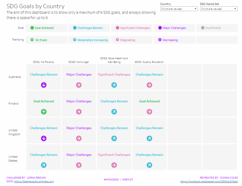


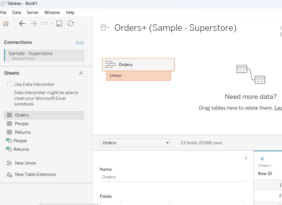
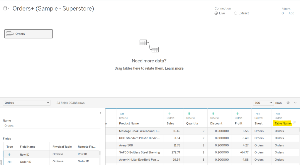

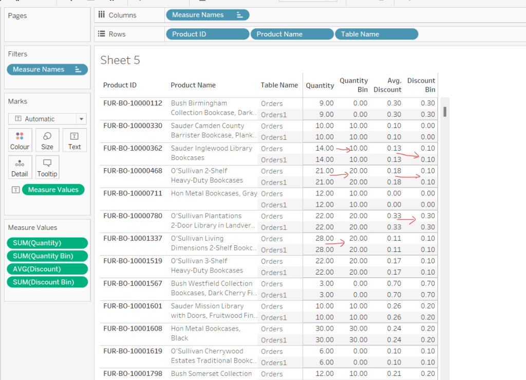
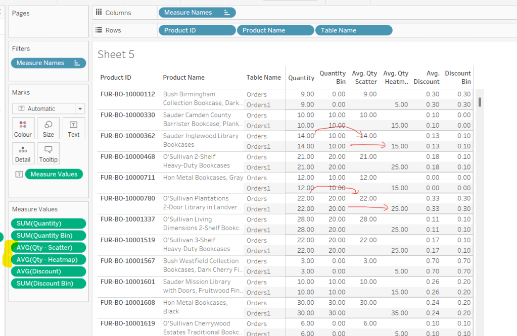
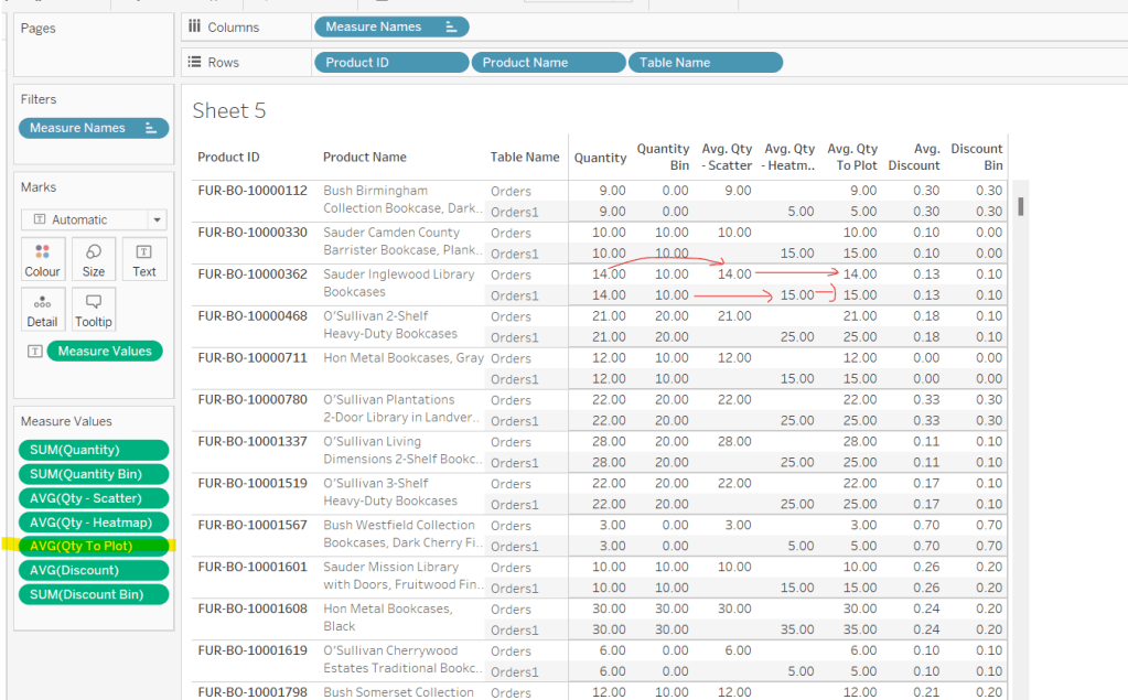
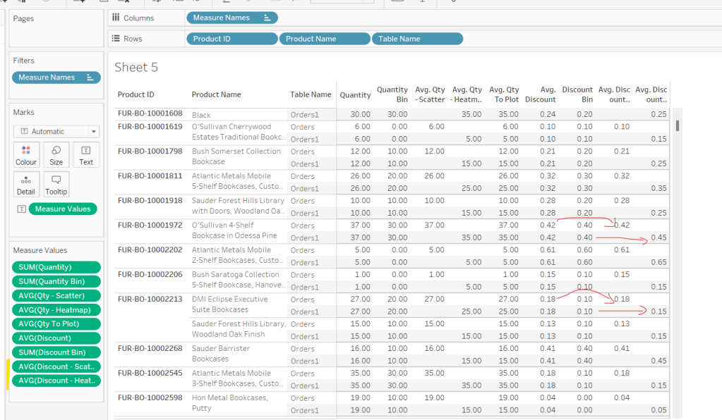
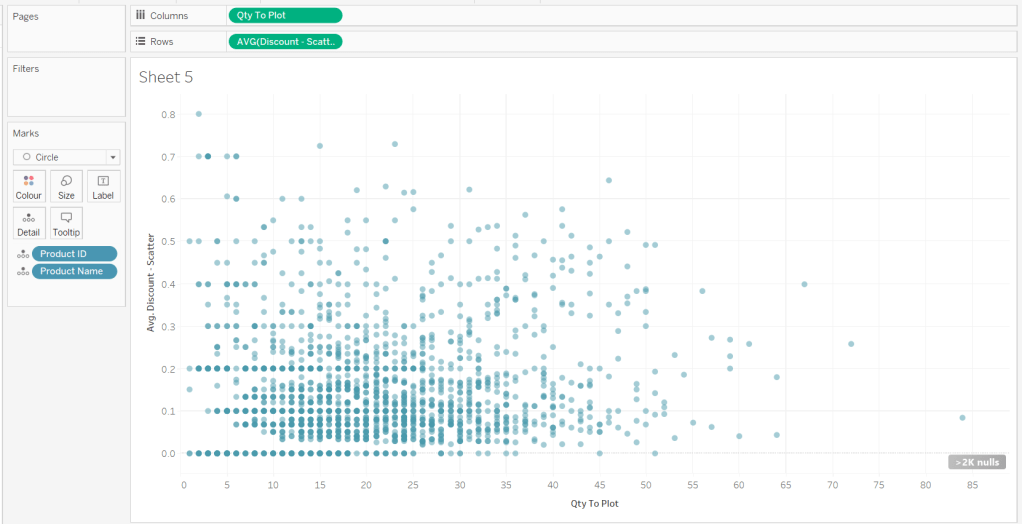
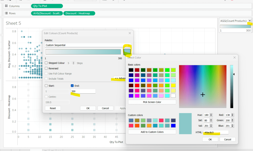
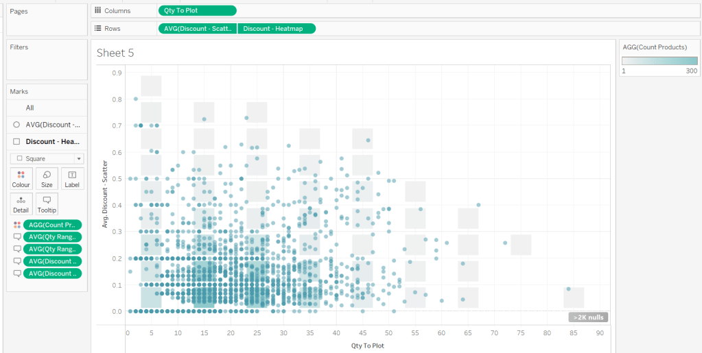
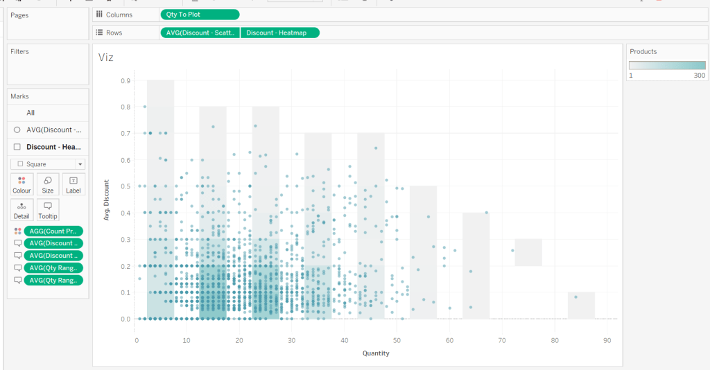


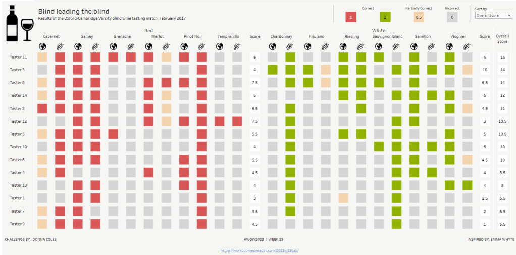
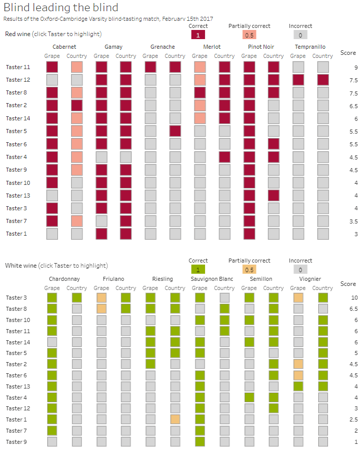

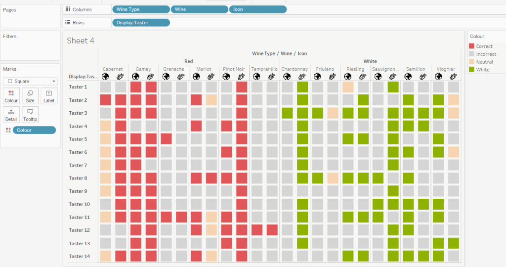
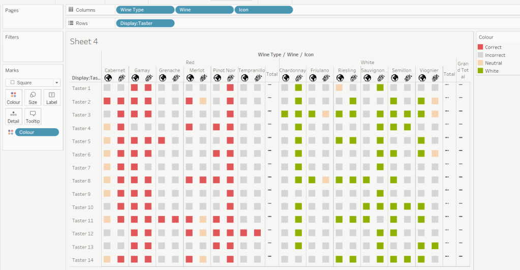
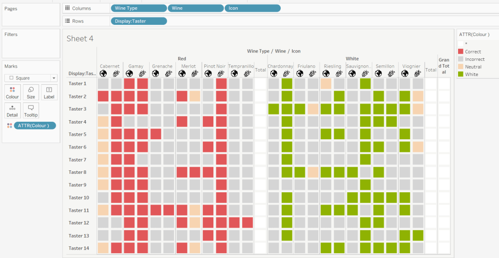
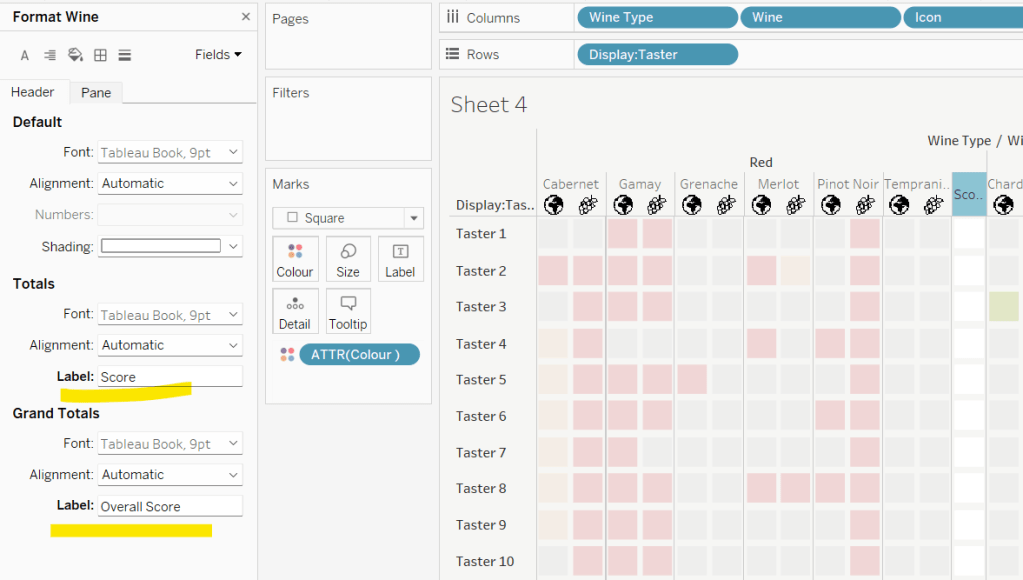
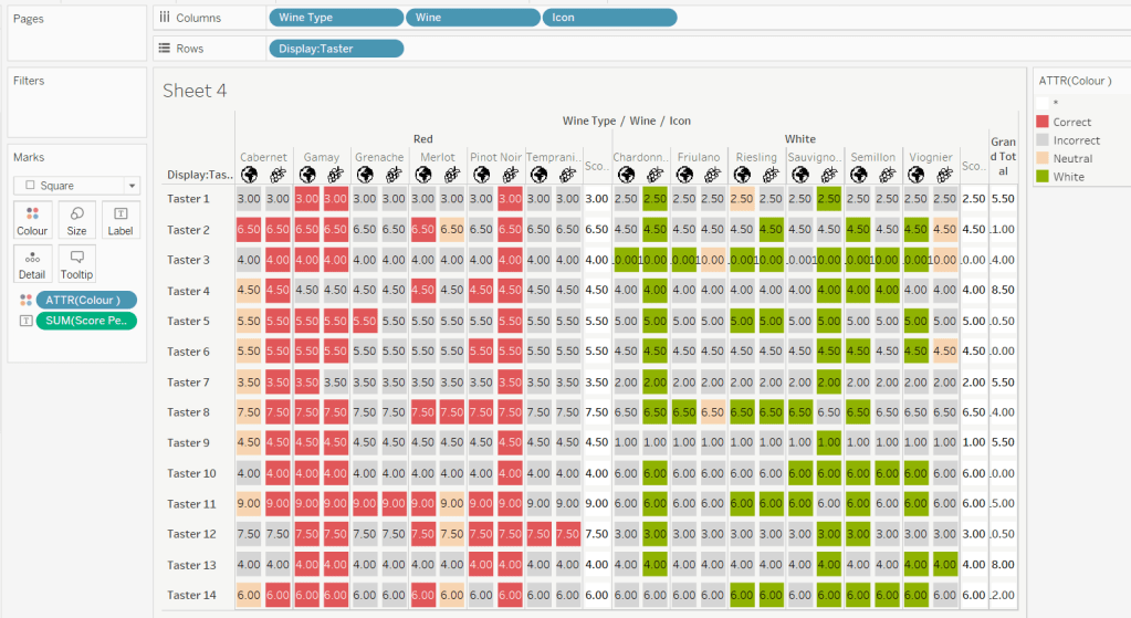

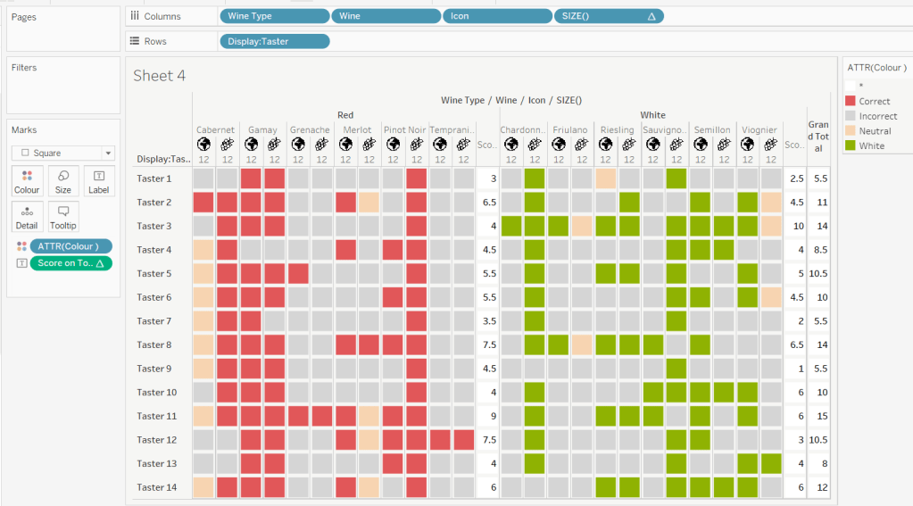
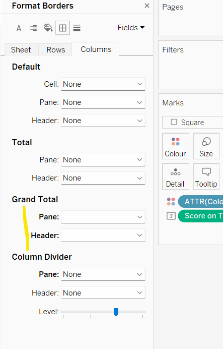
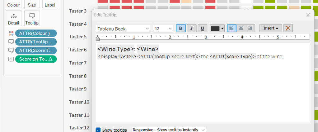
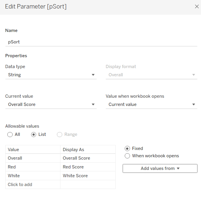
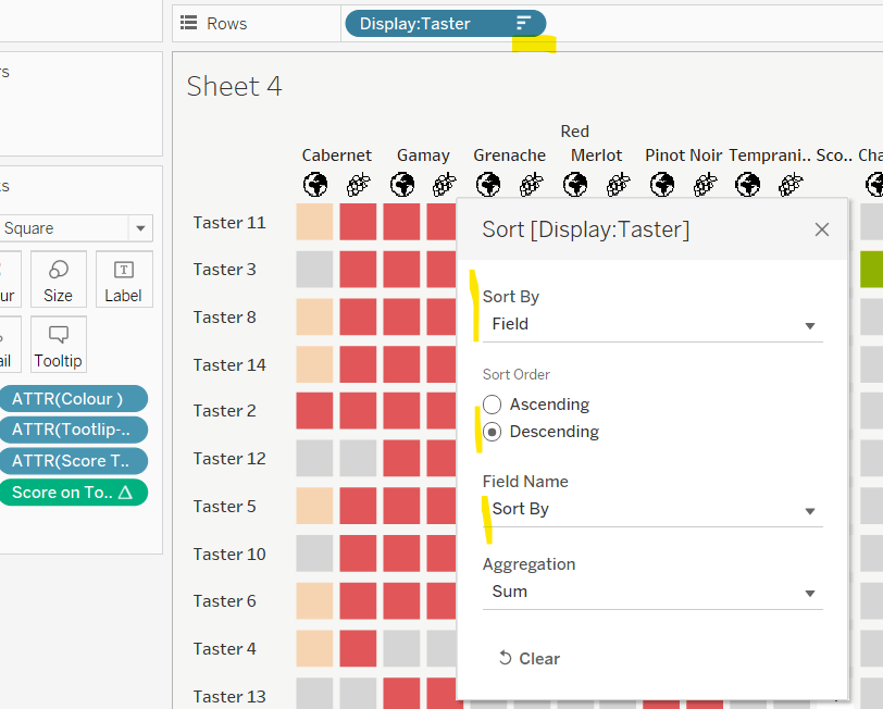
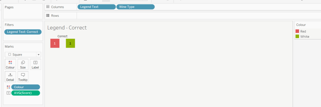
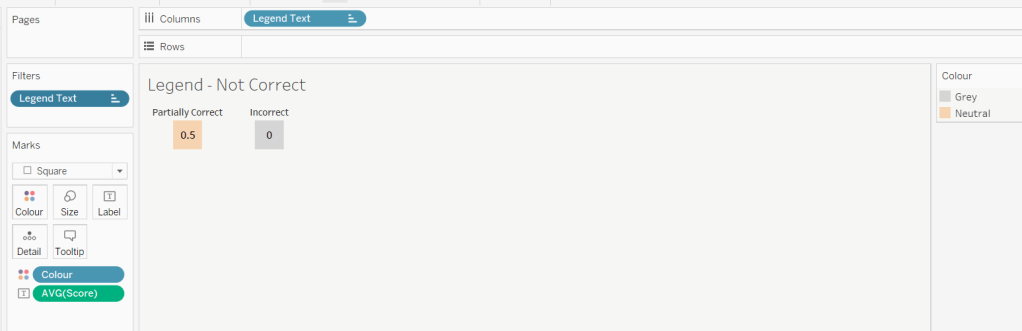
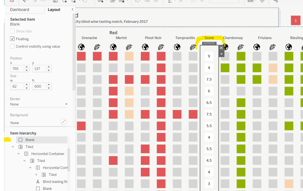


 Donna + DataViz