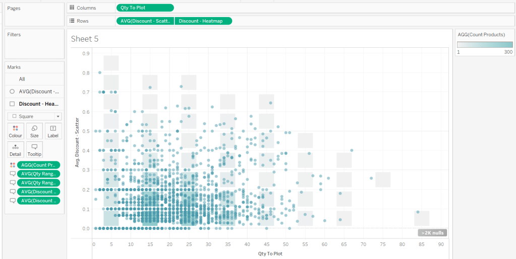
For the bikes, we need to know how much charge it has left
Charge %
SUM([Current Range Meters]) / SUM([Max Range Meters])
format this to % with 0 dp
Add Bike Location to a new sheet. Add Bike Id to Detail and change the mark type to circle. Add Charge % to Colour, and adjust the colour palette as required, and also edit so it is fixed to range from 0 to 1 (ie 0-100%).
Adjust the opacity of the colour to around 70% and add a pale grey border around the circles. Click on the 1 null indicator to the bottom left and select filter data to exclude that record from the display.
Select Map > Map Options from the menu and uncheck all the values to prevent the map from bing manually zoomed in/ changed. Then select Map >Background Layers from the menu, and set the Style to dark and click the Streets,Highways etc map option.
Drag Station Location onto the canvas and drop when the Add a Marks Layer option appears. Add Name the Detail shelf and Num Bikes Available to Colour. Change the mark type to square and adjust the colour palette as required and fix to range from 0 to 50.
Adjust the opacity of the colour to around 70% and add a pale grey border around the circles. Then move the stations marks card so it is listed below the bikes marks card. This means the bikes are displayed ‘on top’
Identifying the selected bike
Create 3 parameters
pSelectedBike
string parameter defaulted to <empty string>
pLat
float parameter, defaulted to 38.9358 (this is the central point mentioned in the requirements)
pLon
float parameter defaulted to -77.1069 (this is the central point mentioned in the requirements)
Note – originally I planned to just capture the ID of the selected bike then determine the lat & lon of that bike using a FIXED LOD to in turn determine the selected bike’s location, but that really hampered the performance, so I just used the parameter action to capture the required Lat & Lon directly
Show the 3 parameters on the sheet.
Update the 3 entries with a Bike Id and its associated Lat & Lon values (eg Bike Id = 8ec444bc696c2c8837ca0dcad39de819 , Lat = 38.8965 , Lon = -77.0334)
We need to identify the selected bike on the map
Is Selected Bike
[Bike Id]=[pSelectedBike]
Add this to the Size shelf on the bikes marks card. Adjust the sizes so True is listed before False and the sizes are therefore reversed. You may need to adjust the slider on the Size shelf too.
Zooming in to the selected bike
Create a new field
Selected Bike Location
MAKEPOINT([pLat],[pLon])
then create a buffer of 2000m around this (the requirements state 1000m, but I found that there were free bikes that were over 1000m from their nearest station, and if they were clicked on in the grid, the map didn’t display).
Selected Bike Buffer
BUFFER([Selected Bike Location],2000,’m’)
We want the map to ‘zoom’ into this buffer area if a bike has been selected, but show all bikes & stations so we need
Within 2000m
([pSelectedBike]=”) OR ((INTERSECTS([Bike Location],[Selected Bike Buffer])) AND (INTERSECTS([Station Location],[Selected Bike Buffer])))
Add this to the Filter shelf and select True
The map should zoom in, and the bike selected should be quite central to the display (the middle point of the buffer). To verify this, create
Buffer for Zoom
IF [pSelectedBike] <> ” THEN [Selected Bike Buffer] END
Add this to the map as another marks layer, and the circular buffer ‘zone’ will be displayed (we’ll keep this here for now for validation purposes).
Reset the pSelectedBike to <empty> and set pLat and pLon back to their default values – the buffer circle disappears.
Kyle hinted that we need to make sure that on ‘zooming out’ the display should be centred on the default values. To ensure this, we want to create a buffer around that central point that encapsulates all the stations and bikes. So we need
Default Location
MAKEPOINT(38.9358,-77.1069)
Default Buffer
BUFFER([Default Location],30,’km’)
Choosing a 30km buffer was just trial and error.
Now update the Buffer for Zoom field to
IF [pSelectedBike] = ” // then we’re in the default ‘show all’ view THEN [Default Buffer] ELSE [Selected Bike Buffer] END
A buffer zone for the whole display is now shown
Ensure the buffer marks card is displayed at the bottom, reduce the opacity of the colour to 0 and remove any border to make the circle disappear. Then click on the eye symbol to the left of the marks card name to make the map layer disabled, so it doesn’t show up on hover.
Finally adjust the Tooltips on the relevant marks cards and then name the sheet Map or similar.
Building the Bike Selector Grid
To build this we will need to identify the closest station to each bike. First we need the distance between each bike and each station
Distance Bike to Station
DISTANCE([Bike Location], [Station Location],’m’)
and then we can create
Distance Bike to Closest Station
{FIXED [Bike Id]:MIN([Distance Bike to Station])}
On a new sheet add Bike Id to Detail and Distance Bike to Closet Station to Colour. Change the mark type to square. Sort the Bike Id by the field Distance Bike to Closet Station ascending.
Add Lat and Lon to the Detail shelf, and update the Tooltip as required. Name the sheet Bike Grid or similar.
Adding the interactivity
Add the two sheets onto a dahsboard, then create 3 dashboard parameter actions
Select Bike
On select of the Bike Grid sheet, set the pSelectedBike parameter with the value from the Bike Id field. When the selection is cleared, reset to <empty string>
Set Bike Lat
On select of the Bike Grid sheet, set the pLat parameter with the value from the Lat field. When the selection is cleared, reset to 38.9358
Set Bike Lon
On select of the Bike Grid sheet, set the pLon parameter with the value from the Lon field. When the selection is cleared, reset to -77.1069
And with that, hopefully the map should zoom in and out as required, albeit a bit slowly… (gif below recorded on Desktop)
Yoshi chose to challenge us this week to try using the multi-fact relationship model, something I hadn’t used before so I was keen to have a go.
I have to admit, I did ultimately find the challenge a bit tricky… I did have to look at the hint in the challenge to see how Yoshi had folded in the additional month data source, and then when building the vizzes, I was getting slightly different numbers on occasion. I wasn’t sure whether this was due to differences in how I’d applied the actual relationship fields between the tables in the model, but can’t actually get to Yoshi’s data model in the solution to tell. I used the information on the help article to determine the linking fields, so I think it’s right…
I also struggled with the final requirement – to always show all the libraries in the display, even when there were no copies of the selected book. As soon as I restricted the display to just show the data for the selected book, the libraries which didn’t stock the book disappeared, which with relationships is what I expected as they act like ‘inner joins’. Even looking at Yoshi’s solution, I can’t see what magic trick has been applied, unless there’s something in the model I haven’t applied..
So I’ll explain what I did, and if you can figure out where I may have gone wrong, or if you concur with my set up, then please let me know 🙂
Modelling the data
Download the 3 data sources from Yoshi’s link.
Connect to the Bookshop excel file. Drag Checkouts onto the canvas first – this is one of the base tables.
Drag Book onto the canvas and verify the tables are related by the Book ID field from each table.
Drag Author onto the canvas after Book and verify the tables are related on the Auth ID fields.
Drag Award onto the canvas after Book and verify the tables are related on the Title fields.
Drag Edition onto the canvas after Book and verify the tables are related on Book ID
Drag Info onto the canvas after Book. This time you’ll need to join Book ID from Book to a relationship calculation from Info of [BookID1]+[BookID2]
Drag Ratings onto the canvas after Book and verify the tables are related on Book ID
Add a new connection to the BookshopLibraries excel file and then drag in Catalog after Edition and verify the tables are related on ISBN
Drag in Library Profile after Catalog and verify the tables are related on Library ID
Next from the Bookshop excel data source, add Sales Q1 onto the canvas and drop when the New BaseTable option appears
Multi select the Sales Q2, Sales Q3 and Sales Q4 tables then drag onto the canvas and drop onto the Sales Q1 table when the Union option appears
Right click on the Sales Q1 unioned object and rename to Sales. Add a relationship from Sales to Edition verifying the tables are related on ISBN.
Add a new connection to the Months csv file, then add the Month.csv object onto the canvas so it is related to the Sales table. This time you’ll need to create a relationship calculation on Sales as DATEPART(‘month’, [Sale Date]) and join to Month
Finally also add a relationship from Checkouts to Month.csv, creating a relationship on Checkout Month to Month.
Now we have a model, we can start building the vizzes.
Building the scatter plot
To start, to verify I’m getting the data I expect, I’ll build out a table
Add BookID (Book) and Title to Rows. We need to indicate if the book has won an award.
Awarded?
COUNT([Award])>0
Add this to Rows.
We will be plotting the average number of checkouts per month against the average number of orders per month., so create
Avg Checkouts per Month
SUM([Number of Checkouts])/COUNTD([Checkout Month])
Then create
Avg Orders per Month
COUNT([Order ID])/COUNTD(MONTH([Sale Date]))
Add into the table. The number won’t be correct though, as we are displaying data from the Checkouts base table and the Sales base table without including any field from any tables that link them. To resolve this add BookID (Edition) onto Rows, and if you spot check some of the numbers against the scatter plot solution, they should match (or be very close). – figures for Portmeirion matched for me.
We also need to highlight which book is selected, so create a parameter
pSelectedBookID
string parameter defaulted to <emptystring>
Then create field
Is Selected Book
[BookID (Edition)] = [pSelectedBookID]
Show the parameter and enter the string PP866 (for Portmeirion). Add Is Selected Book to Rows to verify true is displayed against this row.
On a new sheet, add Avg Checkouts per Month to Columns and Average Orders per Month to Rows. Add Book ID (Edition) to Detail. Add Awarded to Shape and adjust shapes as required. Add Awarded to Size and adjust. Add Is Selected Book to Colour and adjust to suit. Make sure True is listed before False for the Colour legend to ensure the selected book mark is always ‘on top’. Hide the null indicator
Create a new field
Label: Selected Title
IF [Is Selected Book] THEN [Title] END
Add this to Label, adjust the font style, match mark colour and align top centre. Adjust the tooltip. Update the title and name the sheet Scatter or similar.
Building the Ratings Bar
Add Rating as a discrete dimension (blue disaggregated field) to Rows. Add Is Selected Book to Columns and add Ratings (Count) to Text. Exclude the Null column that appears (Filter for Is Selected Book). Add a percent of totalquick table calculation to CNT(Ratings) and adjust to compute using Rating.
Duplicate the sheet. Move CNT(Ratings) to Columns and Is Selected Book to Colour. Adjust colours to suit. Unstack the marks (Analysis menu > stack marks off). Add Is Selected Book to Size. Adjust so that True is listed first on the size legend, so it is both narrower than false, and will also now be ‘in front’. Update the tooltip and hide the Rating label heading (right click > hide field labels for rows).
Create a new field
Selected Book Ratings
IF [Is Selected Book] THEN {FIXED [Title]: COUNT([Ratings])} END
and add to Detail. Then update the title of the sheet adding a reference to this field. Exclude the Null option that now appears (Rating is added to the Filter shelf). Name the sheet Ratings Bar or similar.
Build the trend line
We need to show the average number of books ordered and the average number of books checked out each month. For this we need
Avg Orders per Book
COUNTD([Order ID])/COUNTD([BookID (Edition)])
and
Avg Checkouts per Book
SUM([Number of Checkouts])/COUNTD([BookID (Edition)])
On a new sheet, add Month (from Months.csv) to Rows as a discrete dimension (blue pill) and add Avg Checkouts per Book and Avg Orders per Book into the table text. Then add Is Selected Book to Columns.
This is where some of my numbers don’t align with the values in Yoshi’s solution, but it’s not clear why… Exclude the Null columns (Is Selected Book added to Filter).
We’re going to want to display the month numbers as the month names, so create a new field to create a ‘date’ out of the number
Month Name
//convert to a date, then use month/formatting functions in display MAKEDATE(2000, [Month],1)
On a new sheet add Month Name to Columns as a continuous pill at the month (May) level (green pill). Add Avg Orders per Book and Avg Checkouts per Book to the Rows and add Is Selected Book to the Colour shelf of the All marks card. Adjust colour if needed, and ensure True is listed first (on top).
Adjust the y-axis titles, and update tooltip if required. Remove the title from the x-axis. Format the x-axis so the scale uses abbreviated month names
Add Is Selected Book to Filter and exclude Null. Update the sheet title, Name the sheet Monthly Trend or similar.
Building the Library Bar
Add Library to Rows and Number of Copies to Columns. Add Is Selected Book to Filter and set to True. Show mark labels, and adjust to match mark colour. Hide the x-axis. Hide the Library row header. Apply row banding so every other row is shaded. Update the tooltip and sheet title. Name the sheet Library Bar or similar.
Creating the title sheet
On a new sheet add Is Selected Book to Filter and set to True. Then add Title, First Name, Last Name and Genre to Text. Set the mark type to shape and select a transparent shape (see here for info on how to set this up). Set the sheet to Entire View. Organise the text as required and align middle left. Stop the tooltip from showing. Name the sheet Title or similar.
Building the dashboard and interactivity
Use layout containers to position the objects onto the dashboard, and use padding to provide the relevant spacing between objects.
The Title, Ratings Bar, Monthly Trend and Library Bar sheets should all be in a single vertical container which has a dotted blue border surrounding it.
Create a dashboard parameter action
Set Book
on select of the Scatter sheet, set the pSelectedBookID parameter with the value from the BookID (Editiion) field. When the selection is cleared, retain the value.
The layout of my dashboard including the item hierarchy is below
I set this week’s challenge and I tried to deliver something to hopefully suit everyone wherever they are on their Tableau journey. The primary focus for this challenge is on table calculations, but there’s a few other features/functionality included too.
I love football – all the family are involved in it in some way, so thought I’d see what I could get from a different data set this week. The data set contains the results of matches played in the English Premier League for the last five seasons – from the 2020-21 season to the current season 2024-25. Matches up to the end of 2024 only are included.
As I wrote the challenge in such a way that should allow it to be ‘built upon’ from the beginner challenge, I’m going to author this blog in the same way. I’ll describe how to build the beginner challenge first, then will adapt /add on to that solution. Obviously, as in most cases, this is just how I built my solution – there may well be other ways to achieve the same result.
Beginner Challenge
Modelling the data
The data set provided displays 1 row per match with the teams being displayed in the Home and the Away columns respectively, and the FTR (full time result) column indicating if the Home team won (H), the Away team won (A) or if the match was a draw (D).
The first thing we need to do is pivot this data so we have 2 rows per match, with a column displaying the Team and another indicating if the team is the Home or Away team. To do this, in the data source window, select the Home and the Away columns (Ctrl-Click to multi-select – they’ll be highlighted in blue), then from the context menu on either column, select the Pivot option.
This will duplicate the rows, and generate two new fields called Pivot Field Names and Pivot Field Values. Rename the fields by double-clicking into the field heading
Pivot Field Names to Homeor Away
Pivot Field Values to Team
Creating the points calculation
We need to determine how many points each team gained out of the match which is based on whether they won (3pts), lost (0pts) or drew (1pt). Create a calculated field
Pts
IF [Home or Away] = ‘Home’ AND [FTR] = ‘H’ THEN 3 ELSEIF [Home or Away] = ‘Away’ AND [FTR] = ‘A’ THEN 3 ELSEIF [FTR] = ‘D’ THEN 1 ELSE 0 END
Creating the cumulative points line chart
We want to create a line chart that displays the cumulative number of points each team has gained by each week in each season.
Start by adding Wk to Columns and Pts to Rows as these are the core 2 fields we want to plot. But we need to split this by Team and by season, so add Team and Season End Year to the Detail shelf.
This gives us all the data points we need, but at the moment, it’s currently just showing how many points each team gained per week in each season.
To get the cumulative value, we add a running total quick table calculation to the Pts field.
which gives us the display we need
While we can leave the SUM(Pts) field as is in the Rows, I tend to like to ‘bake’ this field into the data set, so I have a dedicated field representing the running total. I can create this field in 2 ways
Create a calculated field called Cumulative Points Per Season which contains the text RUNNING_SUM(SUM([Pts])). Add this field to Rows instead of just Pts.
Hold down Ctrl and then click on the SUM([Pts]) pill in Rows and drag into the left hand data pane and then release the mouse. This will automatically create a new field which you can rename to Cumulative Points Per Season. The field will already contain the text from the calculation used within the quick table calculation, and the field on Rows will automatically be updated.
Filtering the data
Add Team to the Filter shelf and when prompted just select a single entry eg Arsenal.
Show the Filter control. From the context menu, change the control to be a single value (list) display, and then select customise and uncheck the show all value option, so All can’t be selected.
Format the line
To make the line stepped, click the path button and select the step option
To identify the latest season without hardcoding, we can create
Is Latest Season
[Season End Year] = {MAX([Season End Year])}
The {MAX([Season End Year])} is a FIXED LOD (level of detail) calculation, and is a shortened notation for {FIXED: MAX([Season End Year])} which basically returns the latest value of Season End Year across every row in the data set. This calculation returns true if the Season End Year value of the row matches the overall value.
Add this field to the Colour shelf and adjust colours to suit. Also add the same field to the Size shelf
The line for the latest season is being displayed ‘behind’ the other seasons. To fix this, drag the True value in either the colour or size legend to be listed before the False value. Then edit the sizes from the context menu of the size legend, and check the reversed checkbox to make True the thicker line.
If the thick line seems too thick, adjust the mark size range to get it as you’d prefer
Label the line
Add Season End Year to the Label shelf. Align middle right. Allow labels to overlap marks. And match mark colour.
Create the Tooltip
We need an additional calculated field for this, as we want to display the season in the tooltip in the format 2024-2025 and not just the ending year of the season.
Season Start Year
[Season End Year]-1
Add this field to the Tooltip shelf, and then edit the Tooltip to build up the text in the required format. Use the Insert button on the tooltip to add referenced fields.
Final Formatting
To tidy up the display we want to
Change the axis titles
Right click on each axis and Edit Axis then adjust the title (or remove altogether if you don’t want a title to display)
Remove gridlines and axis ruler
Right click anywhere on the chart canvas, and select Format. In the left hand pane, select the format lines option and set grid Lines to None and axis rulers to None.
Set all text to dark purple
Select the Format menu option at the top of the screen and select Workbook. The under the All fonts section, change the colour to that required
Update the title to reference the selected team
double click in to the title of the sheet and amend accordingly, using the Insert option to add relevant fields.
Intermediate Challenge
For this part of the challenge we’re looking at using a dual axis to display another set of marks – these ones are circular and only up to 1 mark per season should display. As this now takes a bit more thought, and to help verify the calculations required, I’m going to build up the calculations I need in a tabular form first.
Defining the additional mark to plot
On a new sheet add Team, Season End Year and Wk to Rows. Set the latter 2 fields to be discrete (blue) pills. Add Cumulative Points Per Season to Text. Add Team to Filter and select Arsenal.
We need to identify the date of the last match played by each team, so we can use an LOD for this
Latest Date Per Team
{FIXED [Team] : MAX([Date])}
Add this to Rows as a discrete (blue pill) exact date. For Arsenal, the last match was on 27 Dec 2024, whereas for Chelsea it’s 22 Dec 2024.
With this, we can work out what the latest points are for each team in the current season.
Latest Points Per Team
WINDOW_MAX(IF MIN([Date]) = MIN([Latest Date Per Team]) THEN [Cumulative Points Per Season] END)
Breaking this down : the inner part of the statement says “if the date associated to the row matches the latest date, then return the points associated with that row”. Only 1 row in the table of data has a value at this point, all the rest of the rows are ‘nothing’. The WINDOW_MAX statement, then essentially ‘floods’ that value across every row in the data, because the ‘value’ returned by the inner statement is the maximum value (it’s higher than nothing). Add this field into the table.
We’re trying to identify the week in each season where the points are at least the same as the latest points. We’re going to capture the previous week’s points against every row.
Previous Points
LOOKUP([Cumulative Points Per Season],-1)
This is a table calculation that returns the value of the Cumulative Points Per Season from the previous row (-1). If we wanted the next row, the function parameter would be 1. 0 identifies the ‘current row’.
Add this to the table.
We can see the behaviour – The Previous Points associated to 2025 week 18 for Arsenal is 33, which is the value associated to Cumulative Points Per Season for week 17. But we can also see that week 38 from season 2024 is being reported as the previous points for week 1 of season 2025, which is wrong – we don’t want a previous value for this row.
To resolve, edit the table calculation of the Previous Points field and adjust so the calculation for Previous Points is just computing by the Wk field only.
With this we can identify the week in each season we want to ‘match’ against. In the case of the latest season, we just want the last row of data, but for previous seasons, we want to identify the first row where the number of points was at least the same as the latest points; the row where the points in the row are the same or greater than the latest points, and the points in the previous row are less.
Matching Week
//for latest season, just label latest record, otherwise find the week where the team had scored at least the same number of points as the current season so far IF MIN([Is Latest Season]) AND LAST()=0 THEN TRUE ELSE IF NOT(MIN([Is Latest Season])) AND [Cumulative Points Per Season]>= [Latest Points Per Team] AND [Previous Points] < [Latest Points Per Team] THEN TRUE ELSE FALSE END END
Add this to Rows and check the data. In the example below, in Season 2020-21, in week 26, Arsenal had 37 points. The previous week they had 34 points. Arsenal’s latest points are 36, so since 37 >=36 and 34 < 36, then week 26 is the matching week.
Looking at season 2023-24, in both week 15 and 16, Arsenal had 36 points. But only week 15 is highlighted as the match, as in week 14, Arsenal had 33 points so 36 >=36 and 33 <36, but for week 16, as the previous week was also 36, the 2nd half of the logic isn’t true : 36 is not less than 36.
So now we’ve identified the row in each season we want to display on the viz, we need to get the relevant points isolated in their own field too.
Matching Week Points
IF [Matching Week] THEN [Cumulative Points Per Season] END
Add this to the table
We now have data in a field we can plot.
Visualise the additional mark
If you want to retain your ‘Beginner’ solution, then the first step is to duplicate the Beginner worksheet, other wise, just build on what you have.
Add Matching Week Points to Rows to create an additional axis. By default only 1 mark may have displayed. Adjust the table calculation setting of the field, so the Latest Points Per Team calculation is computing by all fields except the Team field.
Change the mark type of the Matching Week Points marks card to Circle and remove Season End Year from the Label shelf (simply drag the pill against the T symbol off off the marks card)
Size the circles
We want the circles to be bigger, but if we adjust the Size, the lines change too, as the Size is being set based on the Is Latest Year pill on both marks cards. To resolve this, create a duplicate instance of Is Latest Year (right click pill and duplicate). This will automatically create Is Latest Season (copy) in the dimensions pane. Drag this onto the size shelf of the Matching Week Points marks card instead to make the sizing independent (you will probably find you need to readjust the table calculation for the Matching Week Points pill to include Is Latest Season (copy)). Then adjust the sizes as required.
Label the circles
Add Latest Points Per Team to the Label shelf of the Matching Week Points marks card. Adjust the table calculation setting, so the Latest Points Per Team calc is computing just by Wk only, so only the latest value displays.
Then format the Label so the text is aligned middle centre, is white & bold and slightly larger font.
Adjust the Tooltip text on the Matching Week Points mark, so it reads the same as on the line mark. You will need to reference the Matching Week Points value instead.
Then make the chart dual axis and synchronise the axis. Remove the Measure Names field that has automatically been added to the All marks card
Remove Label for Latest Season
We don’t want the season label to display for the current year, so create a new field
Label:Season
IF NOT([Is Latest Season]) THEN [Season End Year] END
Replace the Season End Year pill on the Label shelf of the Cumulative Points Per Season marks card, with this one instead.
Final Formatting
To tidy up
Remove right hand axis
right click on axis and uncheck show header
Remove 165 nulls indicator
right click on indicator and hide indicator
Remove row & column dividers
Right click on the canvas and Format. Select Format Borders and set Row and Column Divider values to None
Advanced Challenge
For the final part of the challenge we want to add some additional text to the tooltip and adjust the filter control. As before either duplicate the Intermediate challenge sheet or just build on.
We’ll start with the tooltip text.
Expand the Tooltip Text
For this, we’ll go back to the data table sheet we were working with to validate the calculations required.
We want to calculate the difference in the number of weeks between the latest week of the current season, and the week number of the matching record from previous seasons. So first, we want to identify the latest week of the current season, and ‘flood’ that over every row.
Latest Week Number Per Team
WINDOW_MAX(MAX(IF ([Date]) = ([Latest Date Per Team]) THEN [Wk] END))
This is the same logic we used above when getting the Latest Points Per Team, although as this time the Wk field isn’t already an aggregated field like Cumulative Points Per Season is, we have to wrap the conditional statement with an aggregation (eg MAX) before applying the WINDOW_MAX.
Add this to the table.
And then we need, the week number in each season where the match was found, but this needs to be spread across every row associated to that season.
Matching Week No Per Team and Season
WINDOW_MAX(IF [Matching Week] THEN MIN([Wk]) END)
Add to the table, but adjust the table calculation so the field is computing by all fields except the Season End Year.
Now we have these 2 fields, we can compute the difference
Week Difference
[Latest Week Number Per Team] – [Matching Week No Per Team and Season]
Add to the table. With this we can then define what this means for the text in the tooltip
Less/More
IF [Week Difference]<0 THEN ‘more’ ELSEIF [Week Difference]>0 then ‘less’ ELSE ” END
and also build the tooltip text completely
Tooltip- other seasons
IF NOT(MIN([Is Latest Season])) THEN IF [Week Difference] = 0 THEN ‘It took the same amount of weeks to accrue at least the same number of points as the current season’ ELSE ‘It took ‘ + STR(ABS([Week Difference])) + ‘ weeks ‘ + [Less/More] + ‘ to accrue at least the same number of points as the current season’ END END
Add this to the Tooltip shelf of the Matching Week Points marks card. Adjust the Tooltip to reference the field.
Adjust the Tooltip – other seasons table calculation, so the Latest Points Per Team nested calculation is computing for all fields except Team (this will make the circles reappear)
and also adjust the Latest Week Number Per Team nested calculation to compute by all fields except Team. This should make the text in the tooltip appear.
Filtering by teams in the current season only
We need to get a list of the teams in the current season only, which we can define by
Filter Team
IF {FIXED [Team]: MAX([Season End Year])} = {MAX([Season End Year])} THEN [Team] END
Breaking this down: {FIXED [Team]: MAX([Season End Year])} returns the maximum season for each team, which is compared against the maximum season in the data set. So if there is a match, then name of the team is returned. Listing this out in a table we get Null for all the teams whose latest season didn’t match the overall maximum
We can then build a set off of this field. Right click on the Filter Team field Create > Set and click the Null field and select Exclude
Then add this to the Filter shelf, and the list of teams displayed in the Team filter display will be reduced.
And with that the challenge is completed. My published viz is here.
This week’s #WOW2024 challenge was run live at the #Datafam Europe event in London and was a combo with the #PreppinData crew. If you want to have a go at shaping the data required for this challenge yourself, then check out the PreppinData challenge here. Otherwise, you can use the data provided in the excel workbook from the link in the #WOW2024 challenge (I’m building based on this).
Modelling the data
There are 3 data sources for this challenge which we need to relate together. We have
Attraction Locations – a list of attractions in London with their lat and long coordinates
Tube Locations – a list of tube stations in London with their lat & long coordinates
Attraction Footfall – a list of attractions with their annual footfall
Connect to the Excel file and add Attraction Locations to the canvas. Then add Tube Locations and then create a relationship calculation of 1=1 to essentially map every attraction to every tube station.
Then add Attraction Footfall to the canvas and relate it to Attraction Locations by setting Attraction Name = Attraction
Finally, in the viz we have to understand the distance between a selected attraction (the start point) and other attractions (the end point), so we need to have an additional instance of Attraction Locations to be able to generate the information we will need between the start and end. So add another instance of Attraction Locations and set the relationship as Attraction Name <> Attraction Name
To make things a bit easier for reference purposes, rename Attraction Locations to Selected Attraction and Attraction Locations1 to Other Attractions (just right click on the data connection in the canvas to do this).
Building the Footfall Bar Chart
On a new sheet add Attraction Name (from Selected Attraction) to Rows and add 5 Year Avg Footfall to Columns. Change this from SUM to AVG (as the data consists of multiple rows per year and this value is the same for each row associated to an attraction). Sort the chart descending.
Click on the 2 nulls indicator and select to filter the data which will remove the bottom two rows and automatically add 5 Year Avg Footfall to the Filter shelf.
Manually increase the width of each row. Set the format of the 5 Year Avg Footfall to be in millions (M) to 2dp, and then show mark labels and align middle left.
Create a parameter to capture the selected attraction
pSelectedAttraction
string parameter defaulted to St Paul’s Cathedral
show the parameter on the screen.
We need to identify which attraction has been selected, so create
Is Selected Attraction
[Attraction Name]=[pSelectedAttraction]
and then add this to the Colour shelf. Adjust the colours accordingly and set an orange border. Then add Attraction Rank to Rows. Set it to be a discrete dimension (blue pill) and move it to be in front of Attraction Name.
Set the font of the row labels to be navy, hide the row label names (hide field labels for rows), hide the axis (uncheck show header), don’t show tooltips, and remove all row/column dividers, gridlines and zero/axis lines. Set the background of the worksheet to be None (ie transparent). Update the title of the sheet and then name the sheet Footfall or similar.
Building the map
We’re going to use map layers for this, and will build 4 layers
the selected attraction
the other attractions
the tube stations
the buffer circle
When using map layers we want to work with spatial data, so we’ll start by creating a point for the selected attraction
Double click on this and it will automatically generate a map. Add Is Selected Attraction to the Filter shelf and set to True so only 1 mark should display, Add Attraction Name to Detail. Show the pSelectedAttraction parameter. Change the mark type to shape and select a filled star. Set the Colour of the shape to navy and add an orange halo. Update the Tooltip.
For the buffer, we need another parameter
pDistance(miles)
float parameter defaulted to 1 that ranges from 0.5 to 2 with a step size of 0.5
And drag this onto the canvas and drop when the Add Marks Layer option appears
This will create a new marks layer, which we can rename to Buffer. Reduce the opacity of the colour to 0%. Move the marks layer so it is at the bottom (below the other marks card) , and set the disable selection option so when you move the cursor over the map the buffer circle does not highlight.
Adjust the background layers of the map so only the Postcode Boundaries are visible.
To add the tube stations, we first need to create
Tube Station Point
MAKEPOINT([Station Latitude],[Station Longitude])
Then drag this onto the canvas to create a new marks layer. Add Station to the Detail shelf of this new marks card, and move the marks card so it is below the Selected Attraction marks card.
We don’t want all the stations to display. We just need to show those up to 1.5x the buffer distance, so we need
Distance to Tube Station
DISTANCE([Selected Attraction Point], [Tube Station Point], ‘mi’)
format to a number with 2 dp and then create
Tube Station Within Range
[Distance to Tube Station]<= 1.5 * [pDistance(miles)]
Add this to the Filter shelf and set to True.
We want the size of the displayed stations to differ depending on whether they’re inside the buffer or not, so create
Tube Station Within Buffer
[Distance to Tube Station] <= [pDistance(miles)]
and add this to Size. Change the mark type to circle, then adjust the size as required. Change the colour to orange and add a white border. Add Distance to Tube Station to Tooltip and update. You may want to adjust the size of the shape on the Selected Attraction marks card too, so it’s bigger than the tube stations.
The stations need to be labelled based on the closest x number of stations that are within the buffer. For this we need a parameter
pTop
integer parameter defaulted to 5 that ranges from 5 to 20 with a step size of 1.
We need to rank the stations based on the distance, so create
Station Rank
RANK(SUM([Distance to Tube Station]), ‘asc’)
We’re also going to label the stations with a letter based on their rank
Rank Stations as Letters
CHAR([Station Rank] + 64)
but we only want to show labels for the ‘top’ ranked stations, so create
Label Stations
IF MIN([Tube Station Within Buffer]) AND [Station Rank]<=[pTop] THEN [Rank Stations as Letters] END
and add this to the Label shelf. Adjust the table calculation settings, so the calculation is computing by both Station and Tube Station Within Buffer.
Set the labels to be aligned middle centre, and allow labels to overlap other marks. If things are working as expected, then if you increase the buffer distance to 1.5 miles and the pTop parameter to 20, you should see that not all stations within the buffer circle are labelled
To add the other attractions, we need to create
Other Attraction Point
MAKEPOINT([Attraction Latitude (Attraction Locations1)],[Attraction Longitude (Attraction Locations1)])
and drag this onto the canvas to Add a marks layer. Move this layer so it is beneath the Selected Attraction marks card, and add Attraction Name (from the Other Attractions) section to Detail
Once again, we want to limit what attractions display, so need
[Distance to Other Attraction]<= 1.5 * [pDistance(miles)]
and add this to the Filter shelf and set to True.
Add Distance to Other Attraction to the Tooltip shelf and update. Change the mark type to shape. The shape needs to differ whether it’s within the top x closest attractions that’s inside the buffer or not. So we need
Rank Other Attractions
RANK(SUM([Distance to Other Attraction]), ‘asc’)
and then
Top X Attraction in Buffer
IF [Rank Other Attractions] <= [pTop] AND MIN([Other Attraction within Buffer]) THEN MIN([Attraction Name (Attraction Locations1)]) ELSE ‘Not Top X’ END
Add this to the Shape shelf. Set the table calculation so it is computing explicitly by both Attraction Name and Other Attraction Within Buffer. Setting the specific shape for each of the named attractions that could show is fiddly, so I just chose to leave as per the default values listed. The only shape I explicitly set was the Not Top X which I set to a filled circle. I set the colour of the shapes to dark grey and added a halo of the same colour to make the shape more prominent. The shapes also need to differ in size based on whether they are in the buffer or not, so need
Other Attraction Within Buffer
[Distance to Other Attraction] <= [pDistance(miles)]
Add to the Size shelf and then adjust sizes to suit.
Set the background of the worksheet to None, remove all row/column dividers and name the sheet Map or similar. Finally remove all the Map Options (Map > Map Options > uncheck all selections) to prevent to toolbar from displaying on hover. Test the map functionality by changing the various parameters and entering a new starting location.
Note– in subsequent testing I found that for some attractions where there were either no tube stations or other attractions within the range, the map would disappear. If I get time I’m going to try to work on a solution for this, but I’ll leave as is for now (Lorna’s published solution has the same issue).
Building the Tube Station Rank Bar
On a new sheet add Station to Rows and Distance to Tube Station to Columns. Add Is Selected Attraction to Filter and set to True. Sort the chart ascending, so closet is listed first.
We only want to display the stations that are within the buffer, so add Tube Station Within Buffer to Filter and set to True.
We also want to restrict this list to just those that are the closest ‘x’ to the attraction based on the pTop parameter. Add Station to the Filter shelf and on the General tab, select Use all and then select the Top tab and add the condition to display the bottompTop by Distance to Tube Station.
However, this doesn’t quite show the correct results, as the Top n filtering has been applied BEFORE the other filters on the shelf. To resolve this we need to add Is Selected Attraction and Tube Station Within Buffer to context (right click each pill on the filter shelf).
Add Station and Distance to Tube Station to the Label shelf, and adjust the label to display the text as required and align middle left. Change the mark type to bar and manually widen the width of each row so the labels are readable. Adjust the colour of the bars.
For the circle labels, we need a ‘fake’ axis – double click into Columns and manually type MIN(-0.05). Move the pill that is created to be in front of the Distance to Tube Station pill.
Change the mark type of the MIN(-0.05) pill to circle and remove the fields from the Label shelf. Add Rank Stations as Letters to the Label shelf instead and adjust the table calculation so it is explicitly computing by Station. Format the label and align middle centre.
Make the chart dual axis and synchronise the axis. Remove Measure Names from the All marks card.
Don’t show the Tooltip, remove all row/column dividers, hide the axis and the Station column. Hide all gridlines, axis lines, zero lines. Format the background of the workbook to be None (ie transparent).
Update the title of the sheet referencing the parameters as required, and name the sheet Tube Station Rank Bar or similar.
Building the Tube Station Rank Bar
On a new sheet add Attraction Name (from the Other Attractions data set) to Rows and Distance to Other Attraction to Columns. Add Is Selected Attraction to Filter and set to True. Sort the chart ascending, so closet is listed first.
We only want to display the other attractions that are within the buffer, so add Other Attraction Within Buffer to Filter and set to True.
We also want to restrict this list to just those that are the closest ‘x’ to the attraction based on the pTop parameter. Add Attraction Name to the Filter shelf, on the General tab, select Use all and then select the Top tab and add the condition to display the bottompTop by Distance to Other Attraction.
Add Is Selected Attraction and Other Attraction Within Range to context.
Add Attraction Name (from the Other Attractions data set) and Distance to Other Attraction to the Label shelf, and adjust the label to display the text as required and align middle left. Change the mark type to bar and manually widen the width of each row so the labels are readable. Adjust the colour of the bars.
Double click into Columns and manually type MIN(-0.1). Move the pill that is created to be in front of the Distance to Other Attraction pill.
Change the mark type of the MIN(-0.1) pill to shape and remove the fields from the Label shelf. Add Attraction Name to the Shape shelf. Set the colour of the shape. Edit the shape for each Attraction so it matches the shapes assigned to the attractions on the Map sheet. Unfortunately, this is a bit fiddly and just a case of trial and error which involves changing the parameters to try to ensure all the options are presented at least once of each of the charts. There is probably a better way, but I’d have to rebuild something so sorry!
Make the chart dual axis and synchronise the axis. Remove Measure Names from the All marks card.
Don’t show the Tooltip, remove all row/column dividers, hide the axis and the Attraction Name column. Hide all gridlines, axis lines, zero lines. Format the background of the workbook to be None (ie transparent).
Update the title of the sheet referencing the parameters as required, and name the sheet Tube Attraction Rank Bar or similar.
Adding the interactivity
Add the sheets onto the dashboard making use of layout containers to get the objects positioned where required. Format the dashboard to set the background to the light peach colour. How I’ve organised the content is show by the item hierarchy below
Create a parameter dashboard action
Select attraction
On select of the footfall bar chart, set the pSelectedAttraction parameter with the value from the Attraction Name field. Keep the value when the mark is deselected.
And at this point, you should hopefully now have a functioning dashboard. My published version is here.
As we’re in the midst of the 33rd Summer Olympics, I set an Olympic-ish themed challenge this week which was a recreation of a Viz built by my Biztory colleague, James Newton (Twitter|X / Linked In).
Whilst fun, I knew this was likely to be a bit tricky, so I tried to provide a lot of pointers, and several hints – hopefully they helped, but obviously this guide should clarify further 🙂
Modelling the data
3 csv data sets were provided, and I advised how they needed to be joined using the physical model rather than using logical relations.
Connect to the points.csv file, then click on the context menu and select Open to ‘open’ the physical layer.
Then add the Records data to the canvas and join as a left join on Lane and Event
Then add in the Scaffold data and join to Points with a left join on the Events field.
Define the parameters
Lanes 5 and 6 will be defined via user inputs, so we need parameters to capture this information
pRunner1
string parameter defaulted to any name (eg Donna)
pRunner2
string parameter defaulted to another name (eg Lorna)
pRunner1Time
string parameter defaulted to a time (in seconds) that it may take the 1st runner to run 100m eg 17.5. Note this is a string parameter as we need to handle a value for when there is no value any numeric value like 0 isn’t going to work in this situation.
pRunner2Time
string parameter defaulted to a time (in seconds) that it may take the 2nd runner to run 100m eg 20
Defining the calculations
Let’s start by adding some data to a table to help validate the calculations we need to build.
From the Points data, add Event and Lane to Rows. Then add X Start, X End, Y Start and Y End to Rows as discrete dimensions (unaggregated blue pills).
As we can see, the X coordinates are the same for each lane, as the race starts and finishes at the same points along the x-axis for every runner. The Y coordinates differ per runner as this reflects the ‘lane’ they’re in, but the values are the same for both the start & end points.
So first off, we want to calculate the ‘distance’ of the race
Start to End Distance
[X End] – [X Start]
Make this a dimension then add to Rows as a discrete (blue) field.
The 330 ‘points’ between the X Start and the X End essentially represent the 100 metres to be ‘run’.
To enable the effect of ‘running’ the 100 metre race, the 100m is split into ‘markers’ where we will plot the position of a runner as it ‘runs’. The number of markers (50) is defined within the Scaffold data, but rather than ‘hardcode’ the value, I calculated the number via
Count Markers
{FIXED: MAX([Marker])}
Doing this, means you can adjust the number of markers in the Scaffold data if you wish. From this, we can then work out how much distance is covered per marker
Distance per Marker
[Start to End Distance]/[Count Markers]
Add this into the table as a discrete dimension.
Next we want to establish the time of the slowest runner, but first we need to get a handle on the times of the runners from the parameters.
As we captured the times as strings in the parameters we can now convert to a numeric float value, and capture a NULL if no data is provided.
Now we can work out the slowest time, which is the maximum of the times provided for lanes 1-4 and the times in the parameters. I’ve managed this in a single calculation
Most of the time when we use the MAX() function we are just passing a single expression eg MAX([Sales}) to get the maximum value from the [Sales] field. But you can also use MAX() to compare the maximum values from two expressions eg MAX([Value1], [Value2]) will get all the values stored in both the [Value1] and [Value2] fields and return the overall maximum of both.
So breaking down the expression above, we’re replacing any null values for Runner 1 and 2 with 0, then returning the maximum of these two runners via the inner MAX expression ie
Max of parameters : MAX(IFNULL([Runner 1 Time],0), IFNULL([Runner 2 Time],0))
and then comparing this with the Time of the runners from lanes 1-4
(MAX([Time], <Max of parameters>)
This is all then wrapped in a FIXED Level of Detail calc as we want the value to perpetuate across every row of data. Note, the outer MAX that forms part of the FIXED calc could just as easily be a MIN or AVG.
Add this to the table as a discrete dimension. In this instance the value is 20 as the largest value comes from one of the parameters. You can set these to empty or change the timings to see how the field changes.
Now we compare each runner’s time against the slowest time. Add in Time from the Records data source to the table as a discrete dimension.
Lanes 4 & 5 are Null, so we need to get a field that stores the runner’s time for every lane
Lane Time
IFNULL([Time], (IF [Lane] = 5 THEN [Runner 1 Time] ELSEIF [Lane] = 6 THEN [Runner 2 Time] END) )
Use the Time field, but if null, get the relevant time associated to the Lane. Format this to a number with 2dp and add to the table as a discrete dimension.
Next we calculate the proportion of time for each Lane (runner) compared to the slowest runner
Time % of Slowest Time
[Lane Time]/[Slowest Time]
Again add to the table as a discrete dimension
Now, if we assume the slowest runner (in this case Lane 6 at 20s) covers the Distance per Marker (6.6 ‘points’) for every marker in the whole of the ’50 point’ race, then we can assume that faster runners, cover a greater distance for each marker, and that is based on the time proportion calculated above. Eg if a runner took 10s (half the time), we would expect them to cover double the distance (13.2 points) for each marker.
Distance per Marker per Lane
[Distance per Marker] / [Lane Time % of Slowest Time]
Add this to the table too as a discrete dimension. This is essentially a ‘constant’ value per runner
Now we can work out the x-coordinate for each marker. So add Marker from the Scaffold data into the table, so we now have 51 rows per lane, and then create
X to Plot
MIN(([X Start] + ([Marker] * [Distance per Marker per Lane])), [X End])
As we need the runner to stop once they reach the end, we are using the MIN([Value1],[Value2]) functionality again to just return the end position of the race. Add this field to Text.
We can see that for Lane 1, they have reached the end of the race at the 24th marker, and the X to Plot has incremented by 13.78 ‘points’ for each marker. While if you look at Lane 6, the slowest runner, X to Plot increments by 6.6 ‘points’ and reaches the end on the last marker.
We now have the core of the data we need to build the viz.
Creating the race
On a new sheet, add X to Plot as a continuous dimension (green unaggregated pill) to Columns and Y Start to Rows (also as a continuous dimension)
Change the mark type to shape and assign the custom runner shape (see here for info on how to do this). Add Lane to Colour and adjust accordinglt. Increase the Size a bit.
Add the background image (Maps > Background Images > <Datasource Name> > Add Image). Browse to the image file you should have saved and then adjust the values to reflect the size of the image (500 wide by 288 high), so X field that references X to Plot goes from 0 to 500, and the Y Field that references Y Start goes from 0 to 288.
Then fix the X to Plot axis to range from 0 to 500,and the Y Start axis from 0 to 288.
This should make the runners appear to be in each lane.
Add Marker to the Pages shelf. The page control should display starting at 0 and only 1 runner image per lane should display. Adjust the Size of each runner if need be.
Press the ‘play’ button on the control, and set the speed to max and you should see the runners move down the track.
Labelling the viz
We need to get the name of runner in each lane, which is sourced either from the parameters for lanes 5 & 6 or from the Records data, BUT we only want the label to display at the start or end of the race.
Label – Runner
IF [Marker] = 0 THEN IF [Lane] = 5 THEN [pRunner1] ELSEIF [Lane] = 6 THEN [pRunner2] ELSE [Record (Records.csv1)] + ” ” + [Gender (Records.csv1)] END ELSEIF [Marker] = [Count Markers] THEN IF [Lane] = 5 THEN [pRunner1] ELSEIF [Lane] = 6 THEN [pRunner2] ELSE [Record (Records.csv1)] + ” ” + [Gender (Records.csv1)] END END
We also want the runner’s Time to display on the label, but only at the end of the race
Label – Time
IF [Marker] = [Count Markers] THEN [Lane Time] END
Format this to a number with 2 dp and suffixed with ‘s’
Add both these fields to the Label shelf and arrange accordingly. Set the font to match mark colour and align label middle left.. Test the labels display as expected by setting the marker value back to 0 and playing the race through again.
Adding Tooltips
Create the field
Tooltip – Athlete
IF [Lane] = 5 THEN [pRunner1] ELSEIF [Lane] = 6 THEN [pRunner2] ELSE [Athlete (Records.csv1)] END
Then add this field, Lane Time, Gender and Record to the Tooltip shelf and adjust accordingly.
Tidying up
Finally remove all gridlines, zero lines, axis rulers & ticks, row/column dividers and hide the axes.
Add the sheet to a dashboard and arrange the objects as required, using containers to help organise the parameters and controls, and setting a background colour to some objects when required.
Customise the page control object so it only shows the slider and playback controls. Unfortunately, when you publish to Tableau Public, the speed controls won’t display, so the runners won’t ‘run’ as fast on Public 😦
My published viz is here. I hope you enjoyed it, and didn’t find it too complicated!
The first part of the challenge involves modelling the data. Since I’d blogged a solution guide to the original 2021 challenge here, I thought I’d refer myself to my own blog. Re-reading it though, I found I originally had some issues getting all the data sources pivoted in the way I needed, and ended up having to create the csv files as extracted hyper files separately before putting them together. I encountered the same issues again (I was hoping that ‘maybe’ it had been a version problem).
However, I then watched the solution guide that was posted on the old blog page that Lorna had provided, and I found where the problem was.
When I was trying to add connections to the additional data sources into Tableau, I was using the Add option, browsing for the file, and then dragging it into the pane, where I was then unable to pivot it
However, as the csv files I needed are all located in the same directory, the files were already listed on the left hand pane, and dragging from there allowed me to do what I needed, and I’ll talk through that now. Why, adding via the Add button does not work, I don’t know….
The data provided consists of 4 files
Life Expectancy csv
Population csv
Income csv
Geographies (Region Mapping) excel file
The first 3 files are stored as a matrix of Country (rows) by Year (columns) with the appropriate measure in the intersection. This isn’t the ideal format for Tableau so the data needs to pivoted to show 3 columns – Country, Year and the relevant measure (life expectancy, population or income depending on which file is referenced).
In Tableau Desktop, connect to the Life Expectancy file and check the Use Data Interpreter checkbox, so the top row of the file is understood to be the column headings.
Now we need to pivot this data; click on the 1800 column, then scroll across to the end, press shift and click on the final column to select all the year columns. While highlighted, right-click and select Pivot. Your data will be reshaped into 3 columns.
I then renamed each column as
Country
Year
Life Expectancy
Change the datatype of the Year column to be a number (whole), as we’ll need to relate the data on this field later, and working with numeric data is more efficient than strings.
Now from the left hand Files pane, drag in the Population file. By default it will pick up a relationship based on the Country field in each file
Once again, multi-select the columns from 1800 across to 2100, and pivot. Rename the fields to Year – Population and Population and change the datatype of the Year – Population field to a whole number. Add an additional relationship on Year = Year – Population
Next, drag in the Income file from the left hand pane and link to the Life Expectancy file. By default it should pick up a relationship based on the Country field in each file (if not add it). Once again pivot the date fields, and rename the fields Year – Income and Income. Change the data type of the Year – Income field to a whole number, and add an additional relationship on the Year fields.
Finally, using the Add option, add a connection to the Geographies/Region excel file and drag the list-of-countries-etc sheet onto the canvas and link to the Life Expectancy file. Add a relationship from County to Name.
Now the data is modelled, we can build out the viz.
Building the Scatter Plot
We only need to show information for the years up to the ‘current’ year. I created a parameter to represent ‘Today’, essentially hard coding a date.
pToday
date parameter defaulted to 16 Jan 2024
I then created a field
Year <= Current Year
[Year] <= YEAR([pToday])
and added this to the Filter shelf of a new worksheet and set the value to True.
Change the Year field to be discrete (right click > convert to discrete),then add to the Filter shelf, select All Values and then select 2024 from the list. Show the filter on the canvas, and change to a single value (dropdown) that displays only relevant values. Also Customise so the ‘All’ value does not show. Only options from 1800 – 2024 should be listed.
Create a new field to get the regions in the correct format
Region
UPPER(REPLACE([Eight Regions],’_’, ‘ ‘))
Now add Income to Columns and Life Expectancy to Rows and add Country to Detail and Region to Colour and adjust accordingly. Change the mark type to circle. Add Population to Size and adjust. Set the opacity of the colour to around 70%.
If you examine the Income axis on the solution, you’ll see the scale isn’t uniform. This is because it’s using a logarithmic scale instead, which you can set by right-clicking on the Income axis -> Edit Axis and selecting the relevant checkbox. Also, untick the Include zero checkbox, and the display should now start looking more like what’s expected.
Add Year to the Tooltip shelf and update the tooltip. Format the Year field so it’s a number with 0dp that does not include the thousand separators.
Also format the Population field to be a number with 1dp displayed in millions, and format the Life Expectancy field to be a number to 1dp.
Adjust the display of the Life Expectancy axis so that it is displayed without the decimal place. Right click on the axis > format, and on the axis tab on the left hand side, format the numbers to be Number standard
We need to be able to adjust the axis based on selection, so need to set the axis to be able to adjust. For this we will need parameters.
pIncomeMin
integer parameter defaulted to 500
pIncomeMax
integer parameter defaulted to 100,000
pLifeExpectancyMin
integer parameter defaulted to 0
pLifeExpectancyMax
integer parameter defaulted to 100
Right click on the Income axis and edit and set the range to be custom, selecting the pIncomeMin and pIncomeMax parameters
Do the same for the Life Expectancy axis, selecting the relevant parameters.
Hide the null indicator and name the sheet Scatter or similar.
Building the Viz in Tooltip
On a new sheet, add the Year <= Current Year field to Filter and set to True.
Then add Year as a continuous dimension field (green pill) to Columns and Country, Income, Life Expectancy and Population to rows. Add Region to Colour.
Edit each of the Income, Life Expectancy and Population axis in turn and select the Independent axis range for each row or column option.
Hide the Country column (uncheck show header) and remove all gridlines, zero lines, axis lines. Set the display to Entire View and name the sheet VIT or similar.
Back on the Scatter worksheet, edit the Tooltip and add a reference to VIT sheet, adjusting the height and width of the sheet to suit (after a bit of trial and error I used 700 x 450) and setting the filter to Country.
When you hover over a mark, the VIT chart should also be displayed, filtered to the country related to the mark hovered on.
Building the Legend
Create a simple ‘table’ with Region on Columns, Colour and Text. Hide the column heading (uncheck show header) and remove all row & column dividers. Align the text centrally and adjust the font to suit.
Name the sheet Regions or similar.
Adding the interactivity
Arrange the sheets on a dashboard and ensure the Year filter is displayed as a single value drop down that only shows relevant values and doesn’t show the All option.
To filter the chart by the Region, add a filter dasboard action
Filter Region
On select of the Region sheet on the dashboard, target the Scatter sheet on the dashboard, passing the selected fields of Region only. Show all values when the region is unselected.
To allow the chart to zoom in, we need to set the parameters referenced in the axis by using parameter actions.
Income-MinSelected
On selection of marks on the Scatter sheet, update the pIncomeMin parameter using the Minimum value of the Income field. When the selection is cleared, reset the field to 500.
Income-Max Selected
On selection of marks on the Scatter sheet, update the pIncomeMax parameter using the Maximum value of the Income field. When the selection is cleared, reset the field to 100,000.
Create 2 further parameter actions similar to above but referencing the pLifeExpectancyMin and Max parameters and resetting to their defaults of 0 and 100 accordingly.
Once done, the viz should be complete. My published version is here.
Note – I found that after publishing from Desktop to Tableau Public, the ‘zoom’ interactivity was lost, and when I edited my viz on Tableau Public the axis had lost their references to the parameters. I updated and republished the viz from Tableau Public. I don’t know why this happened, and whether it’s a known issue, but thought worth noting in case you encountered the same issue.
For this week’s #WOW2023 challenge, guest poster Ervin Vinzon asked us to rebuild this visualisation based on data from his home country, The Philippines.
I have to admit, I did find this a bit tough this week – there was a lot going on and maps don’t come naturally to me. I actually wasn’t sure initially whether both the files were needed, as the requirements were a little bit sparse, and I managed to build pretty much the whole solution not using the zip file. I just couldn’t get the map label annotation to work, so ended up having to had to revisit and start again.
Modelling the data
You will need to download both the excel file and the zip file from the Ervin’s shared area.
In the data pane, connect to the Ph Pop 2020 excel file and add the Philippine Population sheet to the canvas.
Then add a connection to a spatial file and point to the zip file. Tableau will automatically identify the file it can use. Add the Provinces file to the canvas.
Create a relation that uses relationship calculations that maps from the Philippine Population sheet :
IIF([Province] = “Maguindanao del Norte” OR [Province] = “Maguindanao del Sur”, “Maguindanao”, [Province])
to the the Provinces sheet
IIF([ADM1_EN] = “National Capital Region”, “Metro Manila”, [ADM2_EN])
Thanks to Rosario Gauna for helping me with this logic, as I couldn’t figure out how the data needed to be related. I think this really needed to be included in the requirements… (Note the logic has been adjusted since I took the image below)
Building the Measure Selector
We can’t use a parameter directly for this, as the design of the ‘radio button’ is more fancy than just what you get with the basic parameter selection functionality.
So we need to ‘fake’ the selection and can use existing fields in our data set to help with this. The Island Group field contains 3 values, so we’re going to draw on these and build
Measure Selector
CASE [Island group] WHEN ‘Luzon’ THEN ‘By Population’ WHEN ‘Mindarao’ THEN ‘By Population Density’ ELSE ‘By Area’ END
Add to Columns and manually reorder. In the Rows shelf, double click and manually type MIN(0)Change the mark type to circle and add Measure Selector to the Label shelf. Resize the circles, and adjust the label to be aligned middle right. Change the view to Fit Width to see all the labels.
Create a parameter to capture the selected measure when this view is interacted with
pMeasureSelected
string parameter defaulted to By Population
Show the parameter on the sheet. Then create a calculated field
Is Selected Measure
[pMeasureSelected] = [Measure Selector]
and add to the Colour shelf. Adjust the colours to suit and add a grey border on the circles (via the colour shelf).
Stop the Tooltip from showing, hide the MIN(0) axis and the Measure Selector header and remove all gridlines/zero lines and any dividers. Name the sheet Measure Selection.
Building the bar chart
Firstly, we need to determine which measure we’re going to be displaying, so need
Measure to Display
CASE [pMeasureSelected] WHEN ‘By Population’ THEN SUM([Population]) WHEN ‘By Population Density’ THEN SUM([Density]) ELSE SUM([Area (sq km)]) END
Show the pMeasureSelected parameter on a new sheet, then add Island Group and Province to Rows and Measure to Display to Text. Sort the data descending.
Create a new calculated field
Measure Rank
RANK_UNIQUE([Measure to Display])
Change the Measure Rank field in the left hand data pane to be discrete. Add to the Rows and adjust the table calculation so it is computing by Province only. The Measure Rank should show sequential numbers from 1 upwards, but restart at the next Island Group.
Add another instance of Measure Rank to the Filter shelf. Select All intially to select all the numbers. Then adjust the table calculation to compute by Province only as above. Then re-edit the filter and just select numbers 1-10.
The bar visual displays the actual value in a coloured bar, along with the maximum value for the measure in a grey bar. So we need
Max Value
WINDOW_MAX([Measure to Display])
Add this to the table and adjust the table calculation to compute by Province.
Finally, we need some information to help with the labels
Label Strapline
CASE [pMeasureSelected] WHEN ‘By Population’ THEN ” WHEN ‘By Population Density’ THEN ‘persons per sq km’ ELSE ‘sq km’ END
Add this to Rows and then test the behaviour by adjusting the value of the pMeasureSelected parameter.
We now have the data needed to build the bars.
Move Island Group to Columns and manually reorder to be Luzon, Visayas, Mindanao. Move Province and Label strapline to Text. Move Measure to Display and Max Value to Columns. Set sheet to fit Entire View. Reduce the size of the bar to be relatively thin.
On the Measure to Display marks card, add Island Group to Colour and adjust to suit.
Set the colour of the bar on the Max Value marks card to be pale grey and remove the bar border. Remove the Label Strapline field and move the Province from label to Detail.
Make the chart dual axis and synchronise the axis. Adjust the axis (right click > edit axis) to be independent axis ranges for each row or column.
On the Measure to Display marks card, add Measure Rank and Measure To Display to the Label shelf. adjust the table calculation settings of the Measure Rank field to compute by Province only.
Adjust the label to be aligned top left, and then format the label text box, so the label is laid out as required (I used bold 8pt font). To make the label sit ‘above’ the bar, add carriage returns after the text in the label edit box (thanks to Sam Parsons for spotting this sneaky method – my original build was using a much more complex method to get the text sitting on top of the bars!).
Finally hide the axis and the Measure Rank and Island Group fields. Remove all gridlines/zero lines/axis & row and column dividers. Stop the tooltips from showing. Name the sheet Bars.
Building the Bar Header
On a new sheet, add IslandGroup to Columns and manually re-order. Then double click in Columns and manually type MIN(0.1). Set the mark type to Bar and set the view to fit Entire View. Add Island Group to Colour. Reduce the Size of the bar. Edit the axis and fix to end at 0.7. Add Island Group to the Label shelf, and align bottom left. Adjust the size of the font to be larger and then add multiple carriage returns above the label text to shift the label to sit under the bar.
Remove all headers/axis and row/column dividers and gridlines. Stop the tooltip from showing.
Adjust the title of the sheet to reference the pMeasureSelected parameter.
Name the sheet Bar Header.
Building the map
We will need another parameter to store the selected Province value.
pSelectedProvince
string parameter defaulted to nothing
On. a new sheet, double click on the Geometry field. This will automatically display a map of the Philippines. Remove all the unnecessary detail via Map > Background Layers and unchecking all the options.
Add Province to the Detail shelf and Region and Island Group to the Tooltip. Adjust the Tooltip.
Show the pSelectedProvince parameter and manually enter the province Leyte.
Create a new field
Is Selected Province
[pSelectedProvince] = [Province]
and then add to the Colour shelf. Adjust the colours to suit (set the NULL field to the same as False).
We need to capture the ‘geometry’ of the selected Province
Drag this field onto the canvas and drop it on the Add a marks layer section that displays. This will create a second marks card. Change the mark type to Circle and adjust the colour as required. Add pSelectedProvince to the Detail shelf.
Select the circle mark, and add an annotation against the mark (right click > Annotate > Mark). Reference the parameter pSelectedProvince in the dialog window.
Providing the pSelectedProvince is on the Detail shelf and is referenced in the Annotation, then changing the value of the pSelectedProvince parameter to Samar or any other province, should retain the annotation. Once again, thanks to Sam for figuring this out as I could just not see it, even when I looked at the solution.
Remove row & column dividers. Stop the map options from displaying (Map > Map Options and uncheck all selections). Update the title of the sheet, and then name the sheet Map.
Adding the interactivity
Add the sheets to a dashboard using horizontal and vertical layout containers to arrange the objects.
Update the title of the Measure Selection sheet and the Bar Header sheet to match the text being displayed.
Create a dashboard parameter action to define the measure selection on click
Set Measure
On selection of the Measure Selection sheet, set the pMeasureSelected parameter, passing through the value from the Measure Selector field.
Create another action for the Province
Select Province
On selection of the Bars sheet, set the pSelectedProvince parameter, passing through the value from the Province field. When the selection is cleared, reset to nothing.
To stop the Bar Heading sheet from being clicked on, just float a blank object over the top.
To prevent the other bars and the measure selections from all fading when clicked on, create a new field
HL
‘HL’
and add to the Detail shelf of the Bars sheet and the Measure Selection sheet.
Then back on the dashboard add a dashboard highlight action
Unhighlight
On selection of the Bars sheet and the Measure Selection sheet, target the Bars and the Measure Selection sheets using the HL selected field only.
Now when a bar is clicked, it will look ‘selected’ (has a black bar around it), but the other bars won’t become faded/greyed out. Similarly when a measure is selected, the other circles won’t fade.
Phew! That should be it. There’s a fair amount going on here and lots of tricky ‘gotchas’. My published viz is here .
As we continue global recognition month for #WOW2023, Flavio Matos introduced this challenge which displays a unit chart of wines by type.
An added twist was to provide the ability for the user to switch between English (UK) and Portuguese (Brazil) languages, and the excel data set provided a sheet with the data per language.
After completing my solution, I checked out Flavio, and found he built the chart for each language (and so data source) in 2 separate sheets, added to 2 different dashboards and used navigation button with a flag image to switch between 2 dashboards. I chose to go a different route, one that didn’t mean duplicating the viz. This means that if I had to alter the viz in future for some reason, I’m only doing it once.
Modelling the data
To build in a single sheet, I needed to have the data for two languages combined into one table. Connect to the excel workbook and add the Wine sheet to the canvas, then add a relation to the Vinho sheet and set the relationship to match on the Wine field from each sheet.
Building the Viz
We need a parameter to manage the language selection
pCountry
string parameter defaulted to ‘UK’
This parameter is then used to determine which of the fields we need to use on the viz, and these are determined through calculated fields.
Country to Display
IIF([pCountry]=’UK’, [Category],[Family])
Add this to Rows then add Abreviation to the Detail shelf. Sort the Country To Display field by the count of the Abbreviation field descending.
Change the Mark type to Square then add Abreviation to the Label shelf. Adjust the sheet to Entire View and then align the label to be middle centre.
Create a parameter to store the list of English options that can be selected
pOptions-UK
string parameter containing the list of options (taken from the requirements page), with All listed first. Default to All.
Then create a version to store the Portuguese options
pOptions-Portuguese
string parameter containing the list of options (taken from the requirements page), with Todos listed first. Default to Todos.
To flag the wines that are related to the options selected, we need
Wine has Tag
IF [pCountry] = ‘UK’ THEN IF [pOptions-UK] = ‘All’ THEN TRUE ELSEIF CONTAINS([Tags],[pOptions-UK]) THEN TRUE ELSE FALSE END ELSE IF [pOptions-Portuguese]=’Todos’ THEN TRUE ELSEIF CONTAINS([Tags (Vinho)],[pOptions-Portuguese]) THEN TRUE ELSE FALSE END END
This returns true or false based on what country has been selected, and in turn what country specific option has been selected. If the wine is tagged with that option, or all wines have been selected then true is returned, otherwise false.
And then using this field we can determine how to colour the squares.
Colour
IF [Wine has Tag] THEN IF [pCountry]=’UK’ THEN [Type] ELSE IF [Type] = ‘Red’ THEN ‘Tinto’ ELSEIF [Type] = ‘Sparkling’ THEN ‘Espumante’ ELSEIF [Type] = ‘White’ THEN ‘Branco’ ELSE [Type] END END ELSE IIF([pCountry]=’UK’, ‘No Highlight’,’Nao Harmoniza’) END
This is slightly more detailed as the Type field in each of the excel sheets are both stored in English, but the legend in the viz shows the types in Portuguese when that language is selected. Ideally the Type should have just come straight from the data source.
Add the 3 parameters to the view, and then add Colour to the Colour shelf. Set the pCountry parameter to UK, and choose Appetizers from the pOptions-UK parameter. Adjust the colours to suit. Manually sort the colour legend options, so the colours are listed Red > Rose > Sparkling > White > No Highlight.
Then clear the pCountry parameter (or set it to any value other than UK) and set the pOptions-Portuguese parameter to Aperitivos. Once again adjust colours as required and re-order.
The tooltips need to be language specific, and only display for the wines that match the options chosen. For these we need the following calculated fields
Tooltip – Wine
IF [Wine has Tag] THEN [Wine (Wine)] ELSE ” END
Tooltip – Food Pairing
IF [Wine has Tag] THEN IIF([pCountry]=’UK’,[Food pairing],[Food pairing (Vinho)]) ELSE ” END
Tooltip – Food Pairing Label
IF [Wine has Tag] THEN IIF([pCountry]=’UK’,’Food pairing:’, ‘Harmoniza com:’) ELSE ” END
Tooltip – Notes
IF [Wine has Tag] THEN IIF([pCountry]=’UK’,[Notes],[Notes (Vinho)]) ELSE ” END
Add all four of these fields to the Tooltip shelf and adjust accordingly
Finally tidy up the formatting by removing row dividers and hiding the Country to Display column heading (hide field labels for rows).
Building the Country Selector
For this I needed to add the UK and Brazilian flags a custom shapes to my Tableau repository. I just sourced some images via my favourite search engine and added them to my repository as per the instructions here.
On a new sheet I then added Abreviation to Columns and also to Filter and just filtered to the first 2 options Ab and Ag. I changed the mark type to shape. I then created the field
Country Selector
IIF([Abreviation]=’Ab’,’UK’,’Brazil’)
and added this to the Shape shelf, and selected the two flags.
Remove the row dividers and hide the header (uncheck show header on the Abreviation pill).
Building the dashboard
Add the sheets to your dashboard and display both the options parameter and the colour legend. I used layout containers for most of the arrangement, but floated the colour selector viz. I then added the title in English and Portuguese in two separate text boxes. I also hid the title of the colour legend, and add 2 different text boxes with the colour legend title in English and Portuguese. My layout looked like
To only show the sections based on the language selected, we need the following fields
Country is UK
[pCountry]=’UK’
Country is Brazil
[pCountry]<>’UK’
On the dashboard, select the text box which contains the English title, then on the Layout tab, select the Control visibility using value checkbox, and choose the Country is UK field.
Repeat this for all the other objects – the other title, the food selector parameters and the colour legend titles, choosing the Country is UK or the Country is Brazil option as appropriate.
To switch the language, we need to add a dashboard parameter action
Select Country
On selection of the Country Selector viz, set the pCountry parameter by passing in the value from the Country Selectior field.
The final step is to stop the country flags from being ”greyed out’ ‘highlighted’ when one is selected (ie the other flag ‘greying out’).
Create a fields
True
TRUE
False
FALSE
and add these 2 fields to the Detail shelf of the Country Selector worksheet.
The back on the dashboard, add a dashboard filter action
Country Selector – Unhighlight
on selection of the Country Selector sheet on the dashboard, target the Country selector sheet directly, passing the fields True = False. Show all values if the selection is cleared.
And with that, the viz should be complete. My published version is here.
The requirement involved both the use of the Superstore data set and a custom Target data set, so these need to be combined. In the data pane, relate the two data sets together applying the fields below in the screen shots as the relationship fields (not you’ll need to create a relationship calculation to build the 3rd relationship.
Building the table
The table displays Category & Sub-Category along with a 3rd dimension which will differ depending on user selection. So we need to enable this choice.
pBreakdown
string parameter containing a list of options, defaulted to Ship Mode
Then create a calculated field to determine the actual field to show based on the parameter selection
Breakdown Dimension
CASE [pBreakdown] WHEN ‘Segment’ THEN [Segment] WHEN ‘Region’ THEN [Region] WHEN ‘Ship Mode’ THEN [Ship Mode] END
The user will also need to select a month. I chose to use a calculated field and parameter to drive this.
Month
DATE(DATETRUNC(‘month’, [Order Date]))
and this then feeds the parameter
pMonth
date parameter, formatted to custom date format of mmmm yyyy (to display September 2023). The list is populated when the workbook opens from the Month calculated field created above. Default date is 01 Sept 2023.
The report will need to be filtered based on the date selected in the parameter, so create
Filter Date
[Month] = [pMonth]
On a new sheet, add Category & Sub-Category (from the Orders data set) and Breakdown Dimension to Rows. Show the parameters. Add Filter Date to the Filter shelf and set to True.
Now, the table shows some conditional formatting, which is a clue that we’re not going to building this table in the basic way. Instead we’ll be using what I refer to as ‘fake axis’ to define placeholder columns, which we can then use to have more flexibility on how the data is displayed.
Double click into the Columns shelf and type MIN(0.0).
Change the mark type to Shape and use a transparent shape (see this blog for more information on doing this). Add Sales to the Label shelf and align left. Add all subtotals (Analysis > Totals > Add All Subtotals) and then set the all to display at the top (Analysis > Totals > Column Totals to Top).
Adjust the formatting, so the row dividers are at the highest level
and the row banding is also at the total pane/header level
Type in another instance of MIN(0.0). This will create a second marks card. Adjust the Sales pill and apply a quick table calculation of percent of total. Set to compute using the Breakdown Dimension field. Format the field to % with 0dp.
To stop the % displaying on the Total rows, click the table calc field and select Total using > Hide
Add another instance of MIN(0.0) and this time add Sales Target value from the Sheet1 data set to the Label shelf.
You can see the target values fill down against the Breakdown Display rows, but we don’t want this.
So to work out whether we’re on a Total row or not, we’re going to make use of the SIZE() table calculation.
We want to count the number of Breakdown Dimension rows being shown.
Count Breakdown Dimension Rows
SIZE()
change this to be discrete, add this to Rows and adjust the table calculation so it is compute using the Breakdown Dimension field. You can see the value against each row represents the number of (in this case)different Ship Mode values.
What isn’t visible is the fact that the SIZE() values against the Total rows are actually 1. Move the Count Breakdown Dimension Rows to the Tooltip shelf on the All marks card. If you now hover over the rows of data, the tooltip should display 1 against this field when it’s a total row and the count otherwise. We’ll use this to identify the Total rows.
This is a common technique that is used. Note though, that if the ‘variable’ you’re counting over only has 1 value, then any logic based on this will apply to that row too (see the Copiers row for Ship Mode & Sept 2023).
So to display the Target Sales as we want, we need
Sales Target to Display
IF [Count Breakdown Dimension Rows] = 1 THEN SUM([Sales Target]) END
ie only show the value of the target on the total rows (or when there’s only 1 value in the dimension being counted).
Replace the Sales Target pill on the 3rd MIN(0.0) marks card with this Sales Target to Display field. Make sure the table calculation is set to compute using Breakdown Dimension
Now we need the variance
Variance
(SUM(Sales)-[Sales Target to Display])/SUM([Sales])
Format this to ▲0.0%;▼0.0%
and we need to identify if it’s +ve or -ve
Variance is +ve
[Variance] >=0
Create another instance of MIN(0.0). Add the Variance field to the Label shelf and verify it is computing by Breakdown Dimension
Add Variance is +ve to the Colour shelf. Adjust the colours, then on the Label shelf, set the font to match mark colour.
To change the ‘Total’ labels to ‘All’, right click on one of the labels, and change the label in the left hand pane.
Finally, adjust the formatting – I set the font throughout to be a darker colour, set the All labels to be bold, removed all gridlines, zero lines and column dividers, hid the MIN(0) axes and also hide field labels for rows. Turn off tooltips for the whole table.
Building the dashboard
I then added the sheet to a dashboard, and placed it within a vertical container. Above the vertical container, I used a horizontal container in which I added text boxes for the column headers. The text box for the variable dimension, referenced the pBreakdown parameter value. I also then used a floating blank set to a height of 2px with a background colour of grey to give the appearance of a line above the column headings.
In the dashboard heading, refer to the pMonth parameter to display the date.
Once published, I did have to tweak the width of the heading text boxes and the position of the floating line within the web edit view.
I essentially ‘faked’ the table header row but I still only used 1 sheet to build the table and I was able to dynamically change the title of the dimension column, so hey I hit the brief 🙂 If you want to understand how to build the header row into the actual table itself, then check out Rosario Gauna’s blog.
I’m back from my holibobs, so back to solving #WOW2023 challenges and writing up the solutions – it’s tough to get back into things after a couple of weeks of sunshine and cocktails!
Anyway, this week, Sean set this challenge from Felicia Styler to build a scatterplot / heat map combo chart, affectionally termed the ‘scatterbox’.
Phew! This took some thinking… I certainly wasn’t gently eased back into a challenge!
Modelling the data
We were given a hint that the data needed to be unioned to build this viz. I connected to the Sample-Superstore.xls file shipped with 2023.2 instance of Tableau Desktop. After adding the Orders sheet to the canvas, I then added another instance, dragging the second instance until the Union option appeared to drop it on.
The union basically means the rows in the Orders data set are all duplicated, but an additional column called Table Name gets automatically added
This field contains the value Orders and Orders1 which provides the distinction between the duplicated fields caused by the union. It is this field that will be used to determine which data is used to build the scatter plot and which to build the heat map.
Building out the calculated fields
Let’s start just by seeing how the data looks with the measures we care about.
Onto a sheet add Product ID, Product Name and Table Name to Rows (Note – there are multiple Product Names with the same Product ID, so I’m treating the combination as a unique product). Then add Quantity to Text. The drag Discount and drop onto the table when it says ‘Show Me’, which should automatically add Measure Name/Measure Values into the view. Aggregate Discount to AVG. We can see that we’re getting the same values for each Table Name, which is expected.
When plotting the scatter plot, we’re plotting at the Product level, so the values above is what we’ll want to plot. But when building the heatmap, we need to ‘bin’ the values.
For the Quantity, we’re grouping into bins of size 10, where if the Quantity is from 0-9 the bin value is 0, 10-19, the bin value is 10 etc.
The LoD (the bit between the {} is returning the same values listed above, but we’re using an LoD, as when we build the heat map, we don’t want the Product fields in the view, but we need to calculate the Quantity values at the product level (ie at a lower level of detail than the view we’ll build). Dividing the value by 10, then allows us to get the FLOOR value, which ’rounds’ the value to the integer of equal or lesser value (ie with FLOOR, 0.9 rounds to 0 rather than 1). Then the result is re-multiplied by 10 to get the bin value.
So if the Quantity is 9, dividing by 10 returns 0.9. Taking the FLOOR of 0.9 gives us 0. Multiplying by 10 returns 0.
But if the Quantity is 27, dividing by 10 returns 2.7. The FLOOR of 2.7 is 2, which when multiplied by 10 is 20.
We apply a similar technique for the Discount bins, which are binned into groups of 0.1 instead.
Add these into the table to sense check the results are as expected.
Next we’re going to determine the values we want based on whether we’re building the scatter or the heat map.
Qty – Scatter
IF [Table Name] = ‘Orders’ THEN {FIXED [Product ID], [Product Name], [Table Name]: SUM([Quantity])} END
ie only return the Quantity value for the data from the Orders table and nothing for the data from the Orders1 table.
Qty – Heatmap
IF [Table Name] = ‘Orders1’ THEN [Quantity Bin] + 5 END
so, this time, we’re only returning data for the Orders1 table and nothing for the Orders table. But we’re also adjusting the value by 5. This is because by default, when using the square mark type which we’ll use for the heatmap, the centre of the square is positioned at the plot point. So if the square is plotted at 10, the vertical edges of the square will be above and below 10. However, we need the square to be centred between the bin range points, so we shift the plot point by half of the bin size (ie 5).
Adding these into the table, and aggregating to AVG we can see how these values are behaving.
As we’re building a dual axis, one of the axis will need to be combined within a single measure, so we create
Qty to Plot
IF ([Table Name]) = ‘Orders’ THEN ([Qty – Scatter]) ELSE ([Qty – Heatmap]) END
Now we move onto the Discount values, which we apply similar logic to
Discount – Scatter
IF [Table Name] = ‘Orders’ THEN {FIXED [Product ID], [Product Name],[Table Name]: AVG([Discount])} END
Discount – Heatmap
IF [Table Name] = ‘Orders1’ THEN [Discount Bin] + 0.05 END
We’ll need is to be able to compute the number of unique products to colour the heatmap by. As mentioned earlier, I’m determining a unique product based on the combination of Product Id and Product Name. To count these we first need
Product ID & Name
[Product ID] + ‘-‘ + [Product Name]
and then we can create
Count Products
COUNTD([Product ID & Name])
The final calculations we need are required for the heatmap tooltips and define the range of the bins.
Qty Range Min
[Qty To Plot] – 5
Qty Range Max
[Qty To Plot] + 5
Discount Range Min
[Discount – Heatmap] – 0.05
Discount Range Max
[Discount – Heatmap] + 0.05
Now we can build the viz
Building the Scatterbox
On a new sheet, add Qty to Plot to Columns and change to be a dimension (so not aggregated to SUM) and Discount – Scatter (set to AVG) to Rows. Add Product ID and Product Name to Detail. Change the mark type to Circle and adjust the size. Adjust the Colour and reduce the opacity (I used #4a9aab at 50%)
Adjust the Tooltip.
Then add Discount – Heatmap to Rows. This creates a 2nd marks card. Change to be a dimension, and change the mark type to square. Remove Product ID and Product Name from the Detail shelf
Add Count Products to Colour and ensure the opacity is 100%. Adjust the sequential colour palette to suit and set the end of the range to be fixed to 300
Add Qty Range Min, Qty Range Max, Discount Range Min, Discount Range Max to the Tooltip shelf of the heatmap marks card. Set all to aggregate to AVG and adjust tooltip to suit.
Then make the chart dual axis and synchronise axis. Increase the size of the square heat map marks (note don’t worry how these look at this point, the layout will adjust when added to the dashboard. Right click on the Discount – Heatmap axis on the right and move marks to back. Hide that axis too.
Edit the Qty to Plot axis so the tick marks are fixed to increment every 10 units.
Adjust axis titles, remove row/column dividers and hide the null indicator.
Then add the sheet to an 800 by 800 sized dashboard. You will need to make tweaks to the padding and potentially sizing of the heat map marks again to get the squares to position centrally with white surround. I added inner padding of 60px to the left & right of the chart on the dashboard, to help make the chart itself squarer.