This week’s #WOW2024 challenge was set by Yusuke, challenging us to create a filter for the line chart, using selections from the bar chart. The main aim was to make it as easy to select months with low sales as it is to select months with higher sales.
Building the bar chart
Create a new field
Monthly Sales
[Sales]
and format to $ Thousands (K) with 0 dp.
Also create
Order Date Month
DATE(DATETRUNC(‘month’, [Order Date]))
Add Order Date Month to Columns at the continuous month level (green pill) and add Monthly Sales to Rows. Change the mark type to Bar and set the size of the bar to as wide as possible. Edit the date axis, and remove the title, then fix the tick marks to start on 1st Jan 2021 with an interval of every 1 year.
Create a set call Order Date Month Set, based off of the Order Date Month field (right click the field > create > set, and select a set of dates). Add Order Date Month Set to the Colour shelf and adjust the colours accordingly. Add a dark grey border to the bars too. Modify the Tooltip to suit.
Create a new field
Max Monthly Sales
{MAX({FIXED [Order Date Month]: SUM([Sales])})}
(for each month, get the sum of sales, then return the maximum of all these).
Add this field to Rows. On the Max Monthly Sales marks card, reduce the opacity to 25% and remove the border (all on the Colour shelf)
Set the char to Dual Axis and synchronise the axis. Remove the Measure Names field from the All marks card.
Hide the right hand axis, remove all row and column dividers. Darken the row gridlines slightly, and add the instructional text as the title of the sheet.
We are ultimately going to make use of set actions to define the dates selected by the user. For this we will need to pass the exact date selected, so add Order Date Month to the Detail shelf of the All marks card as a continuous exact date (green pill).
We’re also going to not want the bars to be ‘highlighted’ when selected, so create fields
True
TRUE
and
False
FALSE
and add both to the Detail shelf of the All marks card.
Building the Line Chart
Create a new field
Selected Sales
IF [Order Date Month Set] THEN [Sales] END
and format to $ Thousands to 2dp.
On a new sheet add Order Date to Columns at the continuous day level (green pill), add Region to Rows and add Selected Sales to Rows.
Change the colour of the line and set line markers (via the colour shelf) and reduce the size of the line. Show mark labels, and set to just label the maximum value per pane.
Adjust the row banding so the band size is set to 1
Remove the column dividers, but set the row dividers to be darker grey. Adjust the row gridlines to be a slightly darker grey. Adjust the title of the Selected Sales axis, and remove the title from the date axis. Format the data axis, so it displays a custom date format of mmm dd. Right click the Region label at the top of the chart and hide field labels for rows.
Create fields
Min Date
{MIN(IF [Order Date Month Set] THEN [Order Date Month] END)}
which will return the date of the earliest month selected in the set and
Max Date
DATE(DATEADD(‘day’, -1, DATEADD(‘month’, 1, {MAX(IF [Order Date Month Set] THEN [Order Date Month] END)}) ))
which finds the maximum month selected in the set (which will be 1st of the max month), adds on a month, and takes off a day to get the last day of the maximum month.
Add these to the Detail shelf as continuous exact dates, and then update the Title of the sheet to reference the fields.
Then create
Tooltip: Date
[Order Date]
and add to the Tooltip and adjust the Tooltip to suit.
Finally, depending how the user selects the dates, there may end up being a break in dates. Right click on the Order Date MonthSet and select Show Set. Adjust the dates, so there is at least 1 unselected value between the dates.
To make a continuous line between the dates, click the context menu against the Selected Sales pill on Rows and select Format. On the options on the left hand side, select Pane and at the Special Values option, select Marks: Hide (Connect Lines).
Adding the interactivity
Put the 2 sheets onto a dashboard. Create a dashboard set action
Select Months
On select of the bar chart, target the Order Date Month Set by assigning values to the set when the action is run, and keeping set values when the selection is cleared.
To stop the bars from highlighting on selected, create a dashboard filter action
Deselect Marks
On select of the bar chart on the dashboard, target the Bar Chart sheet, passing in the fields True = False.
And this should now complete the challenge. My published viz is here.
For this week’s #WOW2024 challenge, Kyle simulated a real-world challenge he’s faced at work where he wanted the ability to select multiple parameters as he was sourcing data from multiple data sources, so using traditional filters didn’t work.
Connecting to the data
The challenge required connecting to the Superstore data twice but applying a data source filter to each connection to restrict the Order Date to Year 2023 or 2024.
After making the 1st connection and filtering to 2023, I renamed the data source and appended 2023.
I then added a data source and made the 2nd connection to Superstore, this time adding a data source filter to 2024. I then renamed this data source and appended 2024. So I ended up with 2 data sources at the top of the data pane window.
Building the line charts
Starting with the Superstore – 2023 data source, put Order Date on columns and change to be the continuous (green) Week number option. Add Sales to Rows.
Then
format Sales to be $ with 0 dp
format Order Date to be mmm dd custom date format
to match the solution, set the Date Property of the data source to start a week on Sunday (right click data source > date properties)
Remove the titles against both axis
adjust the Tooltip
Remove all gridlines, zero lines, axis rulers & axis ticks
Name the sheet 2023 Sales
Create a new sheet, and the repeat all the steps but source the fields from the Superstore 2024 data source.
Building the Category Selection
On a new sheet, manually type MIN(1) into the Columns and add Category from the Superstore 2023 data source to Rows. Amend the axis to fix it from 0 to 1. Set to Entire View. Increase the Size to 100%. Add Category to Label. Adjust the font and align centrally. Hide the Category headers and the Min(1) axis. Remove the Tooltip.
To build the multi-select parameters, we’re going to use a sheet to capture the interactions the user makes into a parameter that will store a delimited string of selected values. This is using the same principles discussed in a previous challenge I created and blogged about here.
We need a parameter
pSelectedCategories
string parameter defaulted to empty string
We’ll use a parameter action to capture the user selection and add it into the pSelectedCategories parameter.
When using delimited strings, you need to choose a character to separate the field values that isn’t going to appear within the field value itself; ie choose a character that won’t appear within a Category name. In this instance I’m choosing | (pipe), and I’m going to build up the parameter as follows
Action
pSelectedCategories
Display
Initial state
<empty string>
All Categories selected – coloured green
1 category selected eg Furniture
|Furniture|
Furniture is green, others categories grey
2 categories selected eg Furniture then Office Supplies
|Furniture||Office Supplies|
Furniture & Office Supplies are green, Technology is grey
3 categories selected eg Furniture, then Office Supplies, then Technology
|Furniture||Office Supplies||Technology|
All Categories selected – coloured green
Existing category is selected again eg Office Supplies
|Furniture||Technology|
Furniture & Technology are green, Office Supplies is grey
We need a calculated field to populate the parameter, which will get modified by comparing what’s already in the parameter with the Category being selected.
In the Superstore 2023 data source create
Category for Param
IF CONTAINS([pSelectedCategories], [Category]) THEN REPLACE([pSelectedCategories],’|’ + [Category] + ‘|’, ”) //selected category is already in the parameter, so remove it ELSE [pSelectedCategories] + ‘|’ + [Category] + ‘|’ //append current category selected to the existing parameter string END
Add Category for Param to the Detail shelf.
We need to set the colour of the bars. Show the pSelectedCategories parameter and manually type in |Furniture|
Then create
Category is Selected
[pSelectedCategories] = ” OR CONTAINS([pSelectedCategories], [Category])
Add this to the colour shelf, and adjust the colours accordingly
Remove the text from the pSelectedCategories parameter, and all the bars should be green.
Format the bars so there is a light grey thick row divider, and set the background of the worksheet to the same light grey. Reduce the Size slightly, so there is a noticeable gap between the bars.
When added to the dashboard, we won’t want the unselected bars to ‘fade’, so we’ll use the True/False trick, which means we’ll need to create
True
TRUE
False
FALSE
and add both these fields to the Detail shelf.
Name the sheet Category.
Building the Region and Ship Mode Selections
Basically repeat the above steps on a separate sheet for each selector. You may find it easier to duplicate the Category sheet and then replace the various fields.
You’ll need to create a pSelectedRegions and a pSelectedShipModes parameter, and calculated Region for Param, Region Is Selected and Ship Mode for Param and ShipMode Is Selected calculated fields.
Name the new sheets Region and Ship Mode.
Filtering the line charts
On the 2023 Sales sheet, add Category Is Selected, Region Is Selected and Ship Mode Is Selected to the Filter shelf, and set all to be True.
Switch to the 2024 Sales sheet.
Recreate the 3 ‘Is Selected’ fields in the Superstore 2024 data source. You can either do this manually, or select the fields in the Superstore 2023 data source (ctl-click to multi-select), the right click and Copy
then switch to the 2024 Sales sheet, and right-click anywhere in the right hand data pane and paste.
Then add each of the fields to the filter shelf and set to True.
Adding the interactivity
Make sure all the parameters are empty, then add all the objects to a dashboard. I used a vertical layout container to place the Selector objects, as I could then set them to be distributed evenly. I also set the background of the layout container to the same light grey as the worksheet, and centrally aligned all the sheet titles.
6 dashboard actions are required, 2 for each selector.
Select Categories
Parameter action that on select of the Category sheet, sets the pSelectedCategories parameter with the value from the Category for Param field.
Deselect Categories
Filter dashboard action that on select of the Category sheet on the dashboard, targets the actual Category sheet, passing the values of True = False.
Create a version of each of these dashboard actions for the Region sheet and the Ship Mode sheet, and that should complete the challenge.
For this week’s challenge, Kyle looked to solve a problem that he’s seen discussed within another blog – how to solve a highlighting problem when filtering donut charts.
I’ve been away on a little holiday abroad for a family wedding, so am on catch up this week. So I’m going to make this as brief as I can as time is limited.
Building the donut charts
Use the steps described in this blog post I wrote for my company to build a donut chart using the dual axis method.
For the Category donut chart, you will need Category on Colour and Sales on Angle of the outer Pie Chart. For the inner circle, you will need to add Sales to Text. Adjust the text as required. Sales needs to be formatted to $ with 0 dp.
For the Sub-Category donut chart, you will need to add Category to Colour. Then add Sub-Category to Detail and click on the 3 dots to the left of the Sub-Category pill and change to also add to Colour.
To adjust the colours, edit the colour legend, select all the options within the same Category. Select a sequential colour palette that matches the core colour for the category, then select Assign Palette. The colours should change to a range of that colour.
Create a new field
# Products
COUNTD([Product ID])
and add this to the Angle shelf. Add Sales to the Tooltip shelf and adjust the tooltip.
For the inner circle, add #Products to Text. Adjust the text as required
Filtering the donut
Add the two sheets to a dashboard. Add a dashboard filter action
Filter Cat
On select of the Category donut, target the Sub-Category donut chart passing in all fields. Keep filtered values when selection cleared.
Stopping the Category donut from being highlighted
Create new fields
True
TRUE
False
FALSE
and add these to the Detail shelf on the All Marks card of the Category donut sheet.
Then create a dashboard filter action
Unhighlight
On select of the Category donut on the dashboard, target the Category donut sheet itself, passing in the fields Tue = False. Show all values when selection cleared.
Now when the Category donut is clicked on, the other segments won’t fade. However, the selection is still visible – the edges of the pie are displayed.
Stop showing the selected section of the pie
For this we employ a trick mentioned in the blog post referenced in the challenge. Create a new field
Dummy
‘Dummy’
and add this the Detail shelf of a new sheet. Change the mark type to polygon so nothing is visible.
Add this to the dashboard as a floating object – make it small and place somewhere inconspicuous
Whilst the selections will still be visible when testing on Desktop, once published to Tableau Public, the presence of the polygon forces the whole dashboard to be rendered server side rather than client side. This reduces the amount of interactivity, and consequently the pie chart segments don’t display when clicked.
Yoshi set this week’s challenge to build a page navigator, but there was so much more in it too, so this could be a bit lengthy 🙂
Note, I’m blogging based on the full ‘advanced’ challenge, to include an ‘apply all’ button as well. I built the following sheets to build this via and I’ll talk through the basics of each of them in turn
List of State names
Bar chart of total State sales
Line chart of monthly State sales
Jitter plot of State sales by order
Navigation page number buttons
Back arrow
Forward arrow
Filter summary
Apply button
Preparing the data
The data being presented is only applicable to the states of the US. In the latest versions of Superstore, information for both Canada and the US is included, so I started by adding a data source filter to include only Country/Region = United States (right click data source -> Add Data Source Filter).
Building the list of State names
Add State/Province to Rows, and apply a sort to sort by the field Salesdescending
Add State/Province to Text and to Colour. Adjust font to be bold and widen each row.
Create a new field
Index
INDEX()
and add to Rows before State/Province. Set the table calculation to be explicitly computing by State/Province. Index is essentially ranking each State from 1 to 49, as we’ve already sorted the listing of the states.
The requirement is to show up to 7 states on a page, so create
Page No
INT(((INDEX()-1) /7)) +1
Set to be a discrete field and add to Rows in front of Index. Again explicitly set the table calculation to compute by State/Province. This shows us which states are on which page.
We’re going to identify the page we’re on based on a parameter
pPageSelected
integer parameter defaulted to 1
Show the parameter, then create a new field
Is Selected Page
[pPageSelected] = [Page No]
Add to the Filter shelf. Initially select All. Then adjust/verify the table calculation is explicitly set to compute using State/Province. Then edit the filter to just show values that are True.
Adjust the pPageSelected parameter to test the functionality.
Hide the Page No, Index, and State/Province field from Rows (uncheck show header). Remove column dividers and don’t show the tooltip. Name this sheet States.
Building the bar chart
Note – to get the labelling and the spacing between the bars, this isn’t a ‘standard bar chart’. This is a technique that has been included in previous WOW challenges.
On a new sheet, add State/Province to Rows and sort by Sales descending. Add Sales to Columns and Add State/Province to Colour. Add a grey border to the bars (via Colour shelf).
Double click into Rows and manually type MIN(1.0) and change the Mark Type to bar. Add Sales to Size, then click on the Size button and adjust the size from Manual to Fixed and align right.
Add Sales to Label and align top left. Adjust the Tooltip. Add Index to the front of Rows and adjust the table calculation to be computing by State/Province.
Add Page No to the front of Rows and adjust to computing by State/Province.
Set the page to Fit Width. Show the pPageSelected parameter and add Is Selected Page to the Filter shelf and set to True. Verify the table calculation is set to compute using State/Province. If not adjust, and then recheck the filter is just showing True value.
Change the parameter to show page 2. You’ll notice the axis has now adjusted from 0 – $80,000 whereas on page 1 it went up to $450,000. We want to retain the axis scale across the pages. For this, create
Max Sales
WINDOW_MAX(SUM([Sales]))
Add this to the Detail shelf and ensure the table calculation is computing by State/Province.
Add a reference line to the bottom Sales axis (right click axis > add reference line) and set it to cover the entire table, using the average Max Sales value. Don’t show any label., tooltip or line
The axis will now have readjusted and display up to 450,000 regardless of the page you’re on.
Adjust the Min(1.0) axis to be fixed from -0.5 to 2 to add some white space around the bars.
Hide both axis, the Page No, Index and State/Province fields in Rows. Remove all gridlines, zero lines, axis rulers & tick marks. Remove column dividers. Add Row Banding.
Name the sheet Total Sales.
Building the line chart
On a new sheet, add State/Province to Rows and sort by Sales descending. Add Index and Page No to Rows too and adjust both table calcs to be explicitly computing by State/Province.
Add Order Date to Columns and adjust to be at the continuous Month/Year level (green pill ). You’ll notice the page numbering & indexes start to look odd – ie multiple states have same index.
Adjust the Order Date field to Show Missing Values, and our numbers are all aligned again.
If we just add Sales to Rows though, the indexes all mess up again due to the there being no values for some points.
To fix this create
Sales to Plot
ZN(LOOKUP(SUM([Sales]),0))
This returns 0 if there is no value for the date / state combination. Add this to Rows instead and adjust the table calculation so it is computing by both State/Province and Month Order Date.
Edit the Sales to Plot axis, so it is displays an independent axis range for each row or column – this makes the records near the bottom show peaks, rather than just a straight line.
Add Is Selected Page to the Filter shelf and set to True. Verify the table calculation is set to compute using State/Province. If not adjust, and then recheck the filter is just showing True value.
Add State/Province to Colour. Adjust Tooltip. Reduce the Size of the line.
Hide both axis, the Page No, Index and State/Province fields in Rows. Remove all gridlines, zero lines, axis rulers & tick marks. Remove column dividers. Add Row Banding.
Building the Jitter Plot
On a new sheet, add State/Province to Rows and sort by Sales descending. Add Index and Page No to Rows too and adjust both table calcs to be explicitly computing by State/Province. Add Sales to Columns and Order ID to Detail. Change mark type to circle.
Readjust the table calc settings of Page No& Index to also include Order ID, but also set the leval at State/Province.
Add State/Province to Colour, and reduce the opacity.
To get the marks to not overlap so much, create a new field
Jitter
RANDOM()
add add to Rows as a dimension. Again adjust the table calcs so Jitter is also included in the settings.
Add Max Sales to Detail and adjust the table calc settings to be computing over all 3 fields – State/Province, Jitter & Order ID.
Add a Reference line to the Sales axis across the entire table, using the average of Max Sales and don’t display any label/tooltip or line.
Add Is Selected Page to the Filter shelf and set to True. Verify the table calculation is set to compute using all fields and at the level of State/Province. If not adjust, and then recheck the filter is just showing True value.
Adjust the Tooltip. Hide both axis, the Page No, Index and State/Province fields in Rows. Remove all gridlines, zero lines, axis rulers & tick marks. Remove column dividers. Add Row Banding.
Name the sheet Sales by Order.
Building the Navigation Number Buttons
On a new sheet add State/Province to Rows and sort by Sales descending. Add Index to Rows and set the table calc to compute by State/Province. Move Index to Columns and State/Province to Detail.
Change the mark type to square and add Index to Label, aligning middle centre.
Create a new field
Colour – Page No
[Index] = [pPageSelected]
and add to the Colour shelf. Verify table calc is set to compute by State/Province. Adjust colours to suit and add a dark border.
We only want to show the indexes relating to the number of pages we have, which in turn is going to be based on what the data has been filtered by. So firstly we want to understand what the maximum number of pages is
Max Pages
IF SIZE()%7 = 0 THEN INT(SIZE()/7) ELSE INT(SIZE()/7)+1 END
If the number of results (ie number of states after filtering has occurred – the SIZE()) is exactly divisible by 7 (%7 = 0) then divide the results by 7 to get the max number of pages, otherwise, increment this value by 1. Eg if 14 results, it’ll be 2 pages, but 15 results will require 3 pages.
Now we know that, we can create
Pages to Show
INDEX() <= [Max Pages]
Add this to the Filter shelf.Set the True, Then adjust the table calc settings to be explicitly computing by State/Province for all nested calcs too.
Re-edit the filter to ensure it just shows True results.
Hide the Index from Rows and don’t show row/column dividers. Don’t show the tooltip. Name the sheet Page Nos.
Building the back arrow
On a new sheet, show the pPageSelected parameter, and change the mark type to Shape.
Create a new field
Show Page Back
[pPageSelected]>1
Add to the Shape shelf. If pPageSelected = 1, then False should display and adjust the shape to use a transparent shape (refer to this blog on how to set this up). Change the pPageSelected parameter to 2 and adjust the shape of the True option to be a filled arrow. Change colour to black.
On the dashboard ,we will need to define what page is being navigated to on click, so we need
Page Back
IF [pPageSelected]>1 THEN [pPageSelected]-1 END
Add this to the Detail shelf as a dimension.
Name the sheet Page Back.
Building the Forward Arrow
This is slightly more tricky than the back arrow, as we need to know how many pages are being displayed to know when we no longer need to show the arrow.
On a new sheet, add State/Province to Detail and sort by Sales descending. Remove the Lat/Long fields that automatically get added and change the mark type to shape. Create a new field
Show Page Forward
[pPageSelected]<[Max Pages]
and add to the Shape shelf. Set the table calc to be computing by State/Province explicitly. Set the mark type for ‘True’ to be a filled arrow and adjust colour to black.
Show the pPageSelected parameter and set to 7. Adjust the ‘False’ option to be a transparent shape.
Once again, on the dashboard, we will need to define what page is being navigated to on click, so we need
Page Forward
IF [pPageSelected]<[Max Pages] THEN [pPageSelected]+1 END
Add this to the Detail shelf as a dimension, and verify table calc is set to compute by State/Province explicitly.
We only want 1 arrow to show at most, so add Index to filter. Set to 1, then adjust table calc so it is set to compute by State/Province explicitly, and then re-edit filter to just select 1 again. Name the sheet Page Forward
Building the Filter Summary
On a new sheet add Category, Segment and Ship Mode to the Detail shelf and change the mark type to polygon..
Edit the Title of sheet and update as required
Name the sheet Filter Summary
Building the Apply Button
The basic outline for this is documented in this Tableau KB article here.
Create a calculated field
Apply
‘Apply Filters’
and add to Rows on a new sheet.
Add Category, Segment and Ship Mode to the Detail shelf and to the Filter shelf (set to All for each). Change the mark type to polygon. Right click the work ‘Apply’ in the column header and select hide field labels for rows.
Right click on the words ‘Apply Filters’ and select Format – set the shading of the header to teal.
As well as applying filters when the button is clicked, the page needs to reset to the first page. For this create
Reset Page 1
1
Add this to the Detail shelf as a dimension.
Adjust the size and colour of the font. Remove row dividers. Set the background of the worksheet to light grey. Remove the Tooltip. Name the sheet Apply Button.
Creating the dashboard
Now we have all the components, we can arrange the objects on a dashboard.
I added the 4 sheets making up the main viz int a horizontal container. All the sheets had the titles hidden, were set to fit entire view and had 0 padding, which gives the illusion of them all being a single viz. I added some outer padding to the container itself.
I used another horizontal container positioned above this one to add text boxes to give the viz headings.
Another horizontal container was placed above the title one. IN the left hand side I placed the Filter Summary viz., and in the right, I added a vertical container.
The vertical container had a blank and then a horizontal container underneath the blank object. The horizontal container then stored the page back, the page nos and the page forward sheets.
Another horizontal container was place above all this and I add the Apply Button sheet. I then moved the 3 filter objects automatically added to the sheet into this horizontal container too. I set the background of this container to light grey
Adding the interactivity
Multiple dashboard actions are needed to get the page to function as required. Now, I did have issues getting somethings to behave as I wanted, and I believe it was something to do with the order in which the actions were added. I can’t prove this… all I know is that I spent a long time trying to figure out why the filters I selected were getting reset when I pressed a page number, but removing all actions and adding again worked…
You need these actions
Apply Filters
Filter action that on select of the Apply Button sheet, targets all other sheets. Clearing the selection keeps filtered values. Category, Segment and Ship Mode should be passed through as selected fields.
Set Page No from Square
Parameter action that on select of the Page Nos sheet, sets the pPageSelected parameter passing in the value from the Index field that is not aggregated. Clearing the selection, keeps the current value.
Reset to Page 1
Parameter action that on select of the Page Nos sheet, sets the pPageSelected parameter passing in the value from the Reset Page 1 field that is not aggregated. Clearing the selection, keeps the current value.
Prev Page From Arrow
Parameter action that on select of the Page Back sheet, sets the pPageSelected parameter passing in the value from the Page Back field that is not aggregated. Clearing the selection, keeps the current value.
Next Page From Arrow
Parameter action that on select of the Page Forward sheet, sets the pPageSelected parameter passing in the value from the Page Forward field that is not aggregated. Clearing the selection, keeps the current value.
With these actions, you should be able to test the functionality, but you will find some fields become greyed out/ need clicking twice. We need to automatically ‘deselect’ them on click. For this I applied the basic principles discussed here.
Create new calculated fields
True
TRUE
False
FALSE
Add both these fields to the Detail shelf of the Page Back, Page Forward, Page Nos, and Apply Button sheets. Then add a dashboard filter action for each sheet.
Deselect Apply
On select of the Apply Button sheet on the dashboard, target the Apply Button sheet itself (ie not the object on the dashboard), passing the selected fields of True = False. Show all values when the selection is cleared.
Repeat the above for the Page Back, Page Forward and Page Nos sheets.
Hopefully with all this you have a fully functioning dashboard. My published viz is here.
For this week’s challenge, Sean Miller introduced multiple ways to get insight from a stacked bar chart. I managed this using 5 sheets and 1 dashboard.
Preparing the data
As the requirement stated only 2024 was to be considered, I chose to add a data source filter (right click data source -> Add Data Source Filter) where the Order Date Year = 2024.
Option 1 : The Analytics Pane
On a new sheet, add Order Date to Columns as a discrete month (blue pill) and Sales to Rows. Format Sales to $ with 0 dp. Change the mark type to bar and add Ship Mode to the Colour shelf.
Format MONTH(Order Date) to display the dates as Abbreviation. Manually move Ship Mode = Same Day in the colour legend so it is listed first. Hide the Order Date heading (right click -> hide field labels for columns).
Add a reference line (right click Sales axis -> add reference line) that sets a reference line per cell to the sum of Sales and displays the Value on the label.
Format the reference line (right click on one of the lines) and align the label top centre. Adjust the Tooltip if required. Add a white border around the bars (via the colour shelf).
Right click on the Ship Mode pill on the Colour shelf and check the Show Highlighter option to display the highlight input box. Test that selecting an option in the highlight box shows a recalculated reference line.
Name this sheet Option 1 or similar.
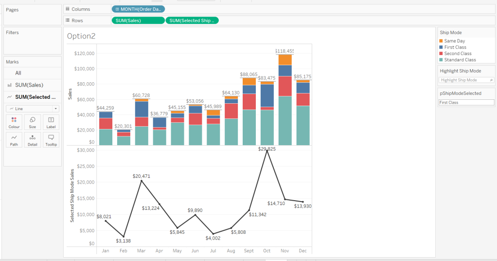
Option 2 – Dual Axis
Duplicate the Option 1 sheet and rename to Option 2 or similar.
We will capture the selected ship mode in a parameter.
pShipModeSelected
string parameter defaulted to empty string.
Show the parameter and then enter the text ‘First Class’
Create a new calculated field
Selected Ship Mode Sales
IF [Ship Mode] = [pShipModeSelected] THEN [Sales] END
format this to $ with 0dp.
Add Selected Ship Mode Sales to Rows. Change the mark type on the associated marks card to line and remove Ship Mode from the Colour shelf. Adjust the colour of the line to a dark grey/black and show mark labels.
Make the chart dual axis and synchronise the axis. Hide the right hand axis (uncheck show header) and remove column and row dividers.
Change the text in the parameter to Same Day. You should now get a broken line. Right click on the Selected Ship Mode Sales pill and format. Set the marks for special values to Hide (Connect Lines).
Option 3 – Dynamic Stacks
Duplicate the Option1 sheet again and rename to Option3. Show the pShipModeSelected parameter and enter text ‘Same Day’.
Create a new calculated field
Sort
IIF([Ship Mode]=[pShipModeSelected],1,0)
and drag it into the ‘dimension’ section of the data pane (above the line).
Right click on the Ship Mode pill on the Colour shelf and select Sort.. Change the Sort By option to Field ascending and Field Name = Sort. This will push the bars related to Same Day to the bottom of the stacked bar.
Building the Ship Mode Selector
On a new sheet, add Ship Mode to Columns and then double click into Columns and manually type MIN(1). Change the mark type to bar and edit the MIN(1) axis to fix it from 0 to 1.
Add Ship Mode to Colour and to Label (you may have to widen the bars to make the label visible). Align the label middle centre and bold the font. Adjust the size to the largest possible.
Hide the axis and the Ship Mode headings (uncheck show header). Remove all column/row dividers. Hide the Tooltip from displaying. Name the sheet accordingly.
Building the Navigation selector
I chose to add all the sheets onto a single dashboard (rather than separate dashboards), so created a navigation sheet.
To help with this, I basically utilised the Segment field that wasn’t being used, and essentially translated the values to repurpose them for the navigation options.
Navigation
CASE [Segment] WHEN ‘Consumer’ THEN ‘Option 1: The Analytics Pane’ WHEN ‘Corporate’ THEN ‘Option 2: Dual Axis’ ELSE ‘Option 3: Dynamic Stacks’ END
Add this field to Columns and type in a MIN(1) in Columns too. Change mark type to bar, fix the axis from 0-1. Make the Size as large as possible. Add Navigation to Label and align middle centre and set the font to white. Adjust the column divider to be a thick white line and remove row divider. Hide the axis and the Navigation headings.
Create a new parameter to capture the navigation selection.
pSelectedDisplay
string parameter defaulted to : Option 1: The Analytics Pane
Show the parameter. Create a new field
Is Selected Display
[Navigation] = [pSelectedDisplay]
and add to the Colour shelf. Adjust to suit. Adjust Tooltip as required and rename the sheet.
Building the Dashboard
Create a dashboard and arrange all the objects on the dashboard, with the different options placed above each other. Use containers if need be. You’ll have something like this – it’ll look a little messy but don’t worry.
We’ll be using Dynamic Zone Visibility to control which object displays based on which option from the Navigation sheet is selected.
First, let’s set the interactivity to control the navigation selection. Add a parameter action
Select Display
on select of the Navigation sheet, set the pSelectedDisplay parameter, passing in the value from the Navigation field. Keep current value when deselected.
Clicking on the different options in the Navigation control will now change the parameter value, but this won’t do anything yet. We need several calculated fields
Option 1 Selected
[pSelectedDisplay] = ‘Option 1: The Analytics Pane’
Option 2 Selected
[pSelectedDisplay] = ‘Option 2: Dual Axis’
Option 3 Selected
[pSelectedDisplay] = ‘Option 3: Dynamic Stacks’
Option 2 or 3 Selected
[pSelectedDisplay] <> ‘Option 1: The Analytics Pane’
All of these fields will return True if the condition is met, so we can use these to control which objects display.
Back on the dashboard, select the Highlight Ship Mode object, and from the Layout pane, check the Control visibility using value and choose the Option 1 Selected field.
Select the Option1 bar chart and apply the same settings.
Now select the Ship Mode Selection sheet, but this time, choose the Option 2 or 3 Selected field to control visibility. It’s likely this field will now disappear.
Select the Option2 bar chart and choose Option 2 Selected field. This will disappear.
Select the Option3 bar chart and choose Option 3 Selected field. This will disappear.
Now click on the different options in the Navigation control and the different charts should display.
(Note – I actually chose to contain the highlight selector and the option1 bar chart within their own layout container, which meant I could then just apply the setting to control visibility of the layout container rather than the individual objects).
Ensure either Option2 or 3 on the navigation bar is selected so the Ship Mode selector is displayed. Create another parameter action
Set Ship Mode
On select of the Option 2 & 3 Selector sheet, set the pShipModeSelected parameter, passing in the value from the Ship Mode field. When clearing the selection, set the value to <empty string>.
Clicking on a ship mode should now display the line or reorder the stack depending what Option you were on.
In clicking the nav or the ship mode selector, you will probably have noticed that the other options become ‘greyed out’ or ‘faded’ To stop this from happening, use a highlight dashboard action.
Create a new field, mine happened to be
True
TRUE
but it could just as easily be named anything containing any string. Add this field to the Detail shelf of the Navigation sheet and the Ship Mode Selection sheet.
Back on the dashboard create a new highlight dashboard action
Deselect Ship Mode Selector
On select of the Option 2&3 Selector sheet, target itself but using the selected field of True.
Create another highlight dashboard action apply the same principals for the Navigation sheet (for more information and worked examples on ‘deselecting marks’, see this blog.
And hopefully you should now have a working solution. My published workbook is here.
It was my turn this week to set the challenge which I based on an example of a viz that I’d seen at work.
I built the viz using 3 sheets and using techniques similar to that described in a previous challenge documented here where I used parameter actions. It’s likely set actions can be used too, although I haven’t tested this out.
Building the bar chart
Format Sales to $ with 0dp, then add State/Province to Rows and Sales to Columns and sort descending. Add State/Province to Filter and filter by Top 5 based on Sales.
Double click on the Columns shelf and manually type MIN(0) to create a second axis. Make the chart dual axis and synchronise the axis. Change the mark type of the Sales marks card to Bar and the mark type of the MIN(0) axis to Gantt. Add Measure Names to Rows.
Remove Measure Names from the Colour shelf of both marks cards. Then add State/Province and Sales the Label shelf of the MIN(0) marks card. Arrange the text to match.
Reduce the size of the MIN(0) gantt bar to as small as possible, and reduce the opacity of the mark (via the Colour shelf) to 0%.
Update the Tooltip on the Sales marks card to match, but delete all text from the Tooltip of the MIN(0) marks card.
Add State/Province to the Colour shelf of the Sales marks card, and adjust accordingly. I chose to set the opacity to 50% based on the colours I chose.
Hide both axis, and both row heading (uncheck show header). Remove all gridlines, row/column dividers, axis ruler etc.
Name the sheet Bar or similar. We’ll come back to this later.
Building the trend line
On a new sheet, add Order Date to Columns set to a continuous monthly level (green pill) and Sales to Rows. Add State/Province to Colour (and reduce opacity if need be).
Go back to the bar chart sheet, and apply the State/Province filter to the trend line sheet too (right click on the pill in the filter shelf > apply to worksheets > selected worksheets).
Add a Running Total quick table calculation to the Sales pill (right click > quick table calculation > running total).
Add State/Province to the Label shelf, and set the font of the label to match mark colour. Adjust the text in the Tooltip. Format the Running Total Sales pill on the Rows shelf to be in $k with 0 dp. Delete the titles of both axis, and reduce the font size on the axis. Remove axis rulers/tick marks, zero lines, row/column dividers. Name the sheet Trend or similar.
Now, we need to be able to capture which States are being excluded. We need a parameter for this.
pUnselectedStates
string parameter defaulted to empty string/nothing
Show the parameter and manually type ‘Texas’ into the field. Based on what is in this parameter, will determine whether the state is unselected or not.
State is unselected
CONTAINS([pUnSelectedStates], [State/Province])
This returns True if the associated State/Province is listed in the parameter (so shouldn’t be visible) and False if it’s not listed (so should display).
Add State is unselected to the Filter shelf and set to False. The line for Texas will now disappear
Experiment by typing multiple states into the parameter eg Texas California
Building the selection control
On a new sheet add State/Province to Rows and sort by the Sales descending
Set the State/Province filter from another sheet to also apply to this sheet.
Double click into Columns and type MIN(0). Add State/Province to Colour (and apply opacity if required – I set this to 75%). Set the mark type to Shape and add State is unselected to shape. Use the Ratings shape palette to set the options.
We want the Tooltip to say something different, depending on whether the State/Province is selected or not.
Tooltip Include/Exclude
IF [State is unselected] THEN ‘include’ ELSE ‘exclude’ END
Add this to the Tooltip shelf, then update the text
We want to align this sheet with the bar chart, so we need to add another instance of MIN(0) to Columns. Make the chart dual axis and synchronise the axis. Remove Measure Names from the Colour shelf of both marks cards. Add Measure Names to the Rows shelf.
On the first MIN(0) marks card, remove all the fields from the card, reduce the size to as small as possible, and the opacity to 0%. Set the Shape to be a transparent shape (see this post for more details).
Now, we need a way to populate the pUnSelectedStates parameter with values from the selector sheet itself. Given the set of ‘unselected’ states can ‘build’ up, we can’t just pass in a single state from the State/Province field itself. We need to capture a delimited list of the states as they are unselected & reselected. We will use the | character as the delimiter, and will modify the string as follows
Action
pUnSelectedStates
All states selected
<empty string>
1 state unselected eg Texas
|Texas|
2 states unselected eg Texas then California
|Texas||California|
1 state then reselected eg Texas then California unselected, Texas reselected
|California|
1 state reselected again eg Texas then California unselected, Texas reselected, then California reselected
<empty string>
This is captured within this logic
States for Param
IF CONTAINS([pUnSelectedStates], [State/Province]) THEN //state already in parameter, so remove it REPLACE([pUnSelectedStates],’|’ + [State/Province]+ ‘|’,”) ELSE //add state to string [pUnSelectedStates] + ‘|’ + [State/Province] + ‘|’ END
If the State is already stored in the parameter, then remove it, by replacing the text with ” (empty string), otherwise append the state to the existing text in the parameter.
Add this field to the Detail shelf of the first MIN(0) marks card.
Hide all the axis and the row headings. Remove all row/column dividers, gridlines, zero lines, axis rulers etc. Reset the parameter back to an empty string.
Name the sheet Selector or similar.
Identifying if the bars are selected or not
Before we build the dashboard, we can now tweak the bar chart, so the colour of the bars reflects whether the State/Province is selected or not.
Back onto the bar chart sheet, add State is unselected to the Detail shelf of the Sales marks card. Then use the icon next to the pill and change it from Detail to Colour to add a secondary pill to the Colour shelf
Swap the pills around, so the State is unselected pill is above the State/Province pill, and the colour legend should list entries as False, <State>. Readjust the colours if need be.
Now enter ‘Texas’ into the pUnselectedStates parameter. The legend will update so that True,Texas is now listed. Adjust the colour of this option to white, and set a light grey border (via the Colour shelf), so the outline of the bar is visible.
Go through each listed State/Province adding it to the parameter and the adjusting the True, < State> colour legend to white each time.
Once done, set the pUnselectedStates parameter back to empty string.
Building the dashboard and adding the interactivity
Using containers, add the objects to a dashboard. I used a horizontal container to store the 3 charts, but the selector and the bar chart were also then contained within their own horizontal container. All charts were set to fit entire view. This allows for a border to be set around both objects. If everything is set right, you should be able to get the selector circles aligned with the bars.
I also used background colours and padding to get everything displayed as required.
Add a dashboard parameter action to capture the user interactivity
Unselect State
on select of the Selector sheet, update the pUnselectedStates parameter by passing the value of the States for Param field. Keep current value when unselected.
Finally to prevent the selected option from remaining ‘highlighted’ and all the other options becoming ‘faded’ out’, we can use the True/False trick described here.
Let’s get stuck in, by starting with the selector sheets.
Building the Measure Selector
The measure selector will be used to set a parameter which will store the particular measure selected, so we need
pSelectedMeasure
string parameter defaulted to the value Sales
We also need a field to help us ‘draw’ the 3 selection boxes onto a viz, in such a way that we then have a measure value to pass into the parameter on selection. You could build this with its own separate dataset, but I’m going to utilise another field to ‘fake this’, and drive it off the Segment dimension as we don’t need this in the rest of the viz.
Measure Selector Alias
CASE [Segment] WHEN ‘Consumer’ THEN ‘Sales’ WHEN ‘Corporate’ THEN ‘Profit’ ELSE ‘Quantity’ END
Add Segment to Columns. Then double click into Columns and manually type MIN(1). Widen the row and then add Measure Selector Alias onto Label.
Edit the axis, and fix the range to run from 0 to 1. Adjust the label font and align centrally. Hide the axis and the Segment header.
We need to identify which measure has been selected, both through colour and an arrow indicator. So we need
Add this to the Label shelf and adjust so the fields are side by side and the arrow text is coloured red.
Finally, stop the Tooltip from displaying, then hide all gridlines, zero lines, axis and row dividers. Set the column dividers to be thick white lines and make the Size as large as possible.
Name the sheet Measure Selector.
Building the Year Selector
In order to not ‘hardcode’ the latest year, we need
Current Year
{FIXED:MAX(YEAR([Order Date]))}
format this to be a number with 0dp and not to show the thousands separator.
On a new sheet, add Comparison Year to Filter and exclude NULL. Then add Comparison Year to Columns and sort descending, so the latest year is listed first. Double click into Columns and manually type MIN(1).
As before widen the rows, and then add Comparison Year to Label. Edit the axis, and fix the range to run from 0 to 1. Adjust the label font and align centrally. Hide the axis and the Comparison Year header.
We’re going to need a parameter which will capture the year selected
pSelectedYear
integer parameter defaulted to 2022 with the display format set to not include the thousand separator
We need to identify which year has been selected, both through colour and an arrow indicator. So we need
Is Selected Year
[Comparison Year] = [pSelectedYear]
Add to the Colour shelf and adjust to suit.
Then create
Year Selected Arrow
IF [Is Selected Year] THEN ‘►’ END
Add this to the Label shelf and adjust so the fields are side by side and the arrow text is coloured red.
Finally, stop the Tooltip from displaying, then hide all gridlines, zero lines, axis and row dividers. Set the column dividers to be thick white lines and make the Size as large as possible. Name the sheet Year Selector.
Building the Current Year ‘card’
Double click into Columns and manually type MIN(1). Add Current Year to Label. Widen the row. Edit the axis, and fix the range to run from 0 to 1. Adjust the label font and align centrally. Hide the axis. Adjust the Colour to suit. Stop the Tooltip from displaying, then hide all gridlines, zero lines, axis and row dividers. Make the Size as large as possible. Name the sheet Curr Year.
Building the bar chart
Based on the measure selected, we need to get the value of the relevant measure for the current year and for the comparison year, so we need
Measure to Display – Curr Year
IF YEAR([Order Date]) = [Current Year] THEN CASE [pSelectedMeasure] WHEN ‘Sales’ THEN [Sales] WHEN ‘Profit’ THEN [Profit] ELSE [Quantity] END END
and
Measure to Display – Comp Year
IF YEAR([Order Date]) = [pSelectedYear] THEN CASE [pSelectedMeasure] WHEN ‘Sales’ THEN [Sales] WHEN ‘Profit’ THEN [Profit] ELSE [Quantity] END END
On a new sheet, add Sub-Category to Rows and Measure to Display – Curr Year to Columns. Sort descending. Then click and drag Measure to Display – Comp Year to the axis and release when the two green columns display. This will automatically add Measure Names and Measure Values into the view.
Reorder the pills in the Measure Values box, so the current year values are listed first. Add Measure Names to Colour and adjust to suit. Add Current Year, Measure to Display – Curr Year and Measure to Display – Comp Year to Tooltip, and adjust the tooltip so it is referencing those 3 fields along with the pSelectedMeasure and pSelectedYear parameters
So we have the bars, but now we need to add the ‘candlestick’, which we’re going to crate using a gantt bar. We need another ‘measure’ row to show, and need another instance of Measure to Display – Comp Year for this – we can’t use the existing measure, as it will put data on the same ‘row’. So simply duplicate the Measure to Display – Comp Year field, to get the Measure to Display – Comp Year (copy) field. Add this to Columns.
Change the mark type of this to a gantt bar. To get the size and the information we need for the labels and to colour the gantt, we need some more fields.
Difference
SUM([Measure to Display – Curr Year]) – SUM([Measure to Display – Comp Year])
custom format this to +#,##0;-#,##0 and add this field to both the Size and the Label shelf.
% Difference
IF (SUM([Measure to Display – Curr Year])>=0 AND SUM([Measure to Display – Comp Year])>=0) OR (SUM([Measure to Display – Curr Year])<0 AND SUM([Measure to Display – Comp Year])<0) THEN [Difference]/ABS(SUM([Measure to Display – Comp Year])) ELSE 0 END
If both the values are positive or both the values are negative, then calculate the difference, otherwise return 0, and then custom format to ▲0.0%;▼0.0%;- . The first section up to the ; formats the number when it’s positive, the next section formats when negative, and the last section formats when the number is 0, so in this case we’re replacing any 0 with a ‘-‘. Add this to the Label shelf.
Diff is +ve
[Difference]>0
Add this to the Colour shelf (remove Measure Names) and adjust accordingly.
Reduce the Size of the gantt bar, adjust the label so the font is smaller, organised as required, and aligned to the right. Remove all the text from the Tooltip. Then make the chart dual axis and synchronise the axis. Explicitly set the mark type of the Measure Names marks card to a bar.
Finally tidy up by hiding both axis, removing all gridlines, axis lines, zero lines and column dividers. Format the Sub-Category label headings and align middle left. Hide the Sub-Category row heading (hide field labels for rows) and hide the Measure Names field (uncheck show header). Name the sheet Chart.
Adding the interactivity
Using vertical and horizontal containers, arrange the objects on the dashboard. I used a horizonal container to align the Curr Year, Year Selector and Measure Selector sheets, adding blank objects in between. I edited the title of the 3 objects to display the required text. I then floated a blank object over the Current Year box, so it couldn’t be clicked.
To select the year and the measure, I needed parameter actions
Select Year
on select of the Year Selector sheet, set the pSelectedYear parameter, passing in the value from the ComparisonYear field
and
Select Measure
on select of the Measure Selector sheet, set the pSelectedMeasure parameter passing in the value from the Measure Selector Alias field
Finally to stop the years and measure boxes being ‘highlighted’ on click, create fields
True
TRUE
and
False
FALSE
and add both to the Detail shelf of the Year Selector and Measure Selector sheets. Then add dashboard filter action
Deselect Years
On select of the Year Selector sheet on the dashboard, target the Year Selector sheet itself, passing the values True = False.
Create another similar filter action for the Measure Selector sheet, and that should then be it!
As we continue global recognition month for #WOW2023, Flavio Matos introduced this challenge which displays a unit chart of wines by type.
An added twist was to provide the ability for the user to switch between English (UK) and Portuguese (Brazil) languages, and the excel data set provided a sheet with the data per language.
After completing my solution, I checked out Flavio, and found he built the chart for each language (and so data source) in 2 separate sheets, added to 2 different dashboards and used navigation button with a flag image to switch between 2 dashboards. I chose to go a different route, one that didn’t mean duplicating the viz. This means that if I had to alter the viz in future for some reason, I’m only doing it once.
Modelling the data
To build in a single sheet, I needed to have the data for two languages combined into one table. Connect to the excel workbook and add the Wine sheet to the canvas, then add a relation to the Vinho sheet and set the relationship to match on the Wine field from each sheet.
Building the Viz
We need a parameter to manage the language selection
pCountry
string parameter defaulted to ‘UK’
This parameter is then used to determine which of the fields we need to use on the viz, and these are determined through calculated fields.
Country to Display
IIF([pCountry]=’UK’, [Category],[Family])
Add this to Rows then add Abreviation to the Detail shelf. Sort the Country To Display field by the count of the Abbreviation field descending.
Change the Mark type to Square then add Abreviation to the Label shelf. Adjust the sheet to Entire View and then align the label to be middle centre.
Create a parameter to store the list of English options that can be selected
pOptions-UK
string parameter containing the list of options (taken from the requirements page), with All listed first. Default to All.
Then create a version to store the Portuguese options
pOptions-Portuguese
string parameter containing the list of options (taken from the requirements page), with Todos listed first. Default to Todos.
To flag the wines that are related to the options selected, we need
Wine has Tag
IF [pCountry] = ‘UK’ THEN IF [pOptions-UK] = ‘All’ THEN TRUE ELSEIF CONTAINS([Tags],[pOptions-UK]) THEN TRUE ELSE FALSE END ELSE IF [pOptions-Portuguese]=’Todos’ THEN TRUE ELSEIF CONTAINS([Tags (Vinho)],[pOptions-Portuguese]) THEN TRUE ELSE FALSE END END
This returns true or false based on what country has been selected, and in turn what country specific option has been selected. If the wine is tagged with that option, or all wines have been selected then true is returned, otherwise false.
And then using this field we can determine how to colour the squares.
Colour
IF [Wine has Tag] THEN IF [pCountry]=’UK’ THEN [Type] ELSE IF [Type] = ‘Red’ THEN ‘Tinto’ ELSEIF [Type] = ‘Sparkling’ THEN ‘Espumante’ ELSEIF [Type] = ‘White’ THEN ‘Branco’ ELSE [Type] END END ELSE IIF([pCountry]=’UK’, ‘No Highlight’,’Nao Harmoniza’) END
This is slightly more detailed as the Type field in each of the excel sheets are both stored in English, but the legend in the viz shows the types in Portuguese when that language is selected. Ideally the Type should have just come straight from the data source.
Add the 3 parameters to the view, and then add Colour to the Colour shelf. Set the pCountry parameter to UK, and choose Appetizers from the pOptions-UK parameter. Adjust the colours to suit. Manually sort the colour legend options, so the colours are listed Red > Rose > Sparkling > White > No Highlight.
Then clear the pCountry parameter (or set it to any value other than UK) and set the pOptions-Portuguese parameter to Aperitivos. Once again adjust colours as required and re-order.
The tooltips need to be language specific, and only display for the wines that match the options chosen. For these we need the following calculated fields
Tooltip – Wine
IF [Wine has Tag] THEN [Wine (Wine)] ELSE ” END
Tooltip – Food Pairing
IF [Wine has Tag] THEN IIF([pCountry]=’UK’,[Food pairing],[Food pairing (Vinho)]) ELSE ” END
Tooltip – Food Pairing Label
IF [Wine has Tag] THEN IIF([pCountry]=’UK’,’Food pairing:’, ‘Harmoniza com:’) ELSE ” END
Tooltip – Notes
IF [Wine has Tag] THEN IIF([pCountry]=’UK’,[Notes],[Notes (Vinho)]) ELSE ” END
Add all four of these fields to the Tooltip shelf and adjust accordingly
Finally tidy up the formatting by removing row dividers and hiding the Country to Display column heading (hide field labels for rows).
Building the Country Selector
For this I needed to add the UK and Brazilian flags a custom shapes to my Tableau repository. I just sourced some images via my favourite search engine and added them to my repository as per the instructions here.
On a new sheet I then added Abreviation to Columns and also to Filter and just filtered to the first 2 options Ab and Ag. I changed the mark type to shape. I then created the field
Country Selector
IIF([Abreviation]=’Ab’,’UK’,’Brazil’)
and added this to the Shape shelf, and selected the two flags.
Remove the row dividers and hide the header (uncheck show header on the Abreviation pill).
Building the dashboard
Add the sheets to your dashboard and display both the options parameter and the colour legend. I used layout containers for most of the arrangement, but floated the colour selector viz. I then added the title in English and Portuguese in two separate text boxes. I also hid the title of the colour legend, and add 2 different text boxes with the colour legend title in English and Portuguese. My layout looked like
To only show the sections based on the language selected, we need the following fields
Country is UK
[pCountry]=’UK’
Country is Brazil
[pCountry]<>’UK’
On the dashboard, select the text box which contains the English title, then on the Layout tab, select the Control visibility using value checkbox, and choose the Country is UK field.
Repeat this for all the other objects – the other title, the food selector parameters and the colour legend titles, choosing the Country is UK or the Country is Brazil option as appropriate.
To switch the language, we need to add a dashboard parameter action
Select Country
On selection of the Country Selector viz, set the pCountry parameter by passing in the value from the Country Selectior field.
The final step is to stop the country flags from being ”greyed out’ ‘highlighted’ when one is selected (ie the other flag ‘greying out’).
Create a fields
True
TRUE
False
FALSE
and add these 2 fields to the Detail shelf of the Country Selector worksheet.
The back on the dashboard, add a dashboard filter action
Country Selector – Unhighlight
on selection of the Country Selector sheet on the dashboard, target the Country selector sheet directly, passing the fields True = False. Show all values if the selection is cleared.
And with that, the viz should be complete. My published version is here.
Sean chose to revisit the first challenge he participated in as part of retro-month at WOW HQ. Since the original challenge in 2018, there have been a significant number of developments to the product which makes it simpler to fulfil the requirements. The latest challenge we’re building against is here.
Building the KPIs
This is a simple text display showing the values of the two measures, Sales and Profit. Both fields need to be formatted to $ with 0dp.
Add Measure Names to Columns
Add Measure Names to Filter and limit to just Sales and Profit
Add Measure Values and Measure Names to Text
Format the text so it is centrally aligned and styled apprpriately
Uncheck ‘show header’ to hide the column label headings
Remove row/column dividers
Uncheck ‘show tooltip’ so it doesn’t display
Building the map
The map needs to display a different measure depending on what is clicked on in the KPIs. We will capture this measure in a parameter
pMeasure
string parameter defaulted to Profit
Then we need to determine the actual measure to use based on this parameter
Measure to Display
If [pMeasure] = ‘Profit’ THEN SUM([Profit]) ELSE SUM([Sales]) END
format this to $ with 0 dp
Double click on State/Province to automatically generate a map with Longitude & Latitude fields. Add Measure to Display to Colour. Adjust Tooltips.
Remove the map background via the map ->background layers menu option, and setting the washout property to 0%. Hide the ‘unknown’ indicator.
Update the title of the sheet and reference the pMeasure parameter, so the title changes depending on what measure is selected.
Show the pMeasure parameter and test typing in Sales or Profit and see how the map changes
Building the bar chart
Add Sub-Category to Rows and Measure to Display to Columns. Sort descending. Adjust the tooltip.
Edit the axis so the title references the value from the pMeasure parameter, and also update the sheet title to be similar.
Building the dimension selector control
The simplest way of creating this type of control is to use a parameter containing the values ‘State’ and ‘Sub-Category’. But you are very limited as to how the parameter UI looks.
So instead, we need to be build something bespoke.
As we don’t have a field which contains values ‘State’ and ‘Sub-Category’, we’re going to use another field that is in the data set, but isn’t relevant to the rest of the dashboard, and alias some of it’s values. In this instance I’m using Region.
Right click on the Region field in the data pane and select Aliases. Alias Central -> State and East -> Sub-Category.
On a new sheet add Region to Rows and also to Filter and filter to State & Sub-Category. Manually type in MIN(0.0) into the Columns shelf. Add Region to the Label shelf and align right. Edit the axis to be fixed from -0.05 to 1, so the marks are shifted to the left of the display.
We will need to capture the ‘dimension’ selected, and we’ll store this in a parameter
pDimension
string parameter defaulted to Central
(note – although the fields are aliased, this is just for display – the values passed around are still the underlying core values).
To know capture which dimension has been set we need
State is Selected
[Region] = [pDimension]
Change the mark type to Shape and add State is Selected to the Shape shelf, adjusting so ‘true ‘ is represented by a filled circle, and ‘false’ by open circle. Set the colour to dark grey.
Change the background colour to grey, amend the text style, hide the Region column and the axis, remove all gridlines/row dividers.
Finally, we will need to stop the field from being ‘highlighted’ on selection. So create two fields
True
TRUE
False
FALSE
and add both of these to the Detail shelf. We’ll apply the required interactivity later.
Building the dashboard
You will need to make use of containers in order to build this dashboard. I use a vertical container as a ‘base’ which consists of the rows showing the title, then BANs, a horizontal container for the main body, and a footer horizontal container.
In the central horizontal container, the map and the bar chart should be displayed side by side. We need each to disappear depending on the dimension selected. For this we need
Show Map
[pDimension] = ‘Central’
and
Show Bar
[pDimension] = ‘East’
On the dashboard, select the Map object and then from the Layout tab, select the control visibility using value checkbox and select the Show Map field.
Do the same for the Bar chart but select the Show Bar field instead.
Select the colour legend that should be displayed and make it a floating object. Position where you want, and also use the Show Map field to select the control visibility using value checkbox.
Adding the interactivity
To select the different measure on click of the KPI, we need a parameter action
Set Measure
On select of the KPI chart, set the pMeasure parameter passing in the value from the Measure Names field.
And to select the dimension to allow the charts to be swapped, another parameter action
Set Dimension
On select of the Dimension Selector sheet, set the pDimension parameter, passing in the value from the Region field
Finally, to ensure the dimension selector sheet doesn’t stay ‘highlighted’, add a filter action
Unhighlight Dimension Selector
On select of the Dimension Selector sheet on the dashboard, target the Dimension Selector sheet directly, and pass values setting True = False
Hopefully this is everything you need to get the dashboard functioning. My published viz is here.
For week 24 of #WOW2023, Kyle set this challenge involving dynamic zone visibility to build a mobile friendly KPI visual.
The charts being displayed are relatively simple, and use techniques applied several times in other challenges. Let’s tackle the charts for each ‘page’ one by one.
The Home page
For the Sales KPI
Double click into Columns and type MIN(1)
Add Sales to Label.
Set to Entire View
Adjust the MIN(1) axis to be fixed from 0-1
Adjust the text in the Label dialog to include the word Sales and resize fonts.
Align the label middle centre
Increase the size to the maximum value
Adjust the colour
Format the Sales measure to be $ with 0 dp.
Uncheck the show tooltip option from the Tooltip dialog
Hide the Min(1) axis
Ensure no row/column divider lines are displayed and remove all gridlines, zero lines, axis ticks etc
Duplicate this sheet and create equivalent ones for Profit and Orders – you’ll need to create a field
Count Orders
COUNTD([Order ID])
for the orders KPI.
For the Sales Sparkline
Add Sales to Rows
Add Order Date as a continuous (green) pill set at the Month level.
Adjust the colour
Hide both the axis
Remove all gridlines, zero lines, axis lines, row/column dividers
Adjust the tooltip
Format the background of the worksheet to light grey (#f5f5f5).
Duplicate the sheet and create equivalent ones for Profit and Orders.
You should have 6 sheets for the home page.
The Category Page
The Category page is displaying values for the last 12 months based on ‘today’. If building this in a business environment, I would make use of the TODAY() function. But to ensure the viz doesn’t break in future, I’ll hardcode today within a parameter
pToday
date parameter defaulted to 14 June 2023
I then need a field to restrict the records to report over
Last 12 monthsonly
[Order Date]>= DATEADD(‘month’, -12, DATETRUNC(‘month’,[pToday])) AND [Order Date]<DATEADD(‘month’, 1,DATETRUNC(‘month’,[pToday]))
this will return true if the Order Date associated to the record is greater than or equal to the 1st of the month, 12 months ago, based on the pToday parameter, and the Order Date is less that the 1st of next month, based on pToday.
For the Category KPI sheet
Add Last 12 months only to the filter shelf and set to true
Add Category to Rows
Double click on Columns and type in MIN(1)
Add Sales and Category to Label
Set to Entire View
Adjust the MIN(1) axis to be fixed from 0-1
Adjust the text in the Label dialog and resize fonts.
Align the label middle centre
Increase the size to the maximum value
Adjust the colour
Uncheck the show tooltip option from the Tooltip dialog
Hide the Min(1) axis
Hide the Category column
Ensure no row/column divider lines are displayed and remove all gridlines, zero lines, axis ticks etc
For the Category trend
Add 12 months only to filter and set to true.
Add Category and Sales to Rows
Add Order Date as a continuous (green) pill set at the Month level.
Adjust the colour
Add Sales to Label and show the min & max labels for each Category pane
Hide both the axis
Remove all gridlines, zero lines, axis lines, column dividers
Adjust the tooltip
Format the background of the worksheet to light grey (#f5f5f5).
The Segment Page
Repeat the same steps as described above for the Category Page, but replace any reference to Category with Segment.
Sales by State Page
Add State/Province to Rows
Add Sales to Columns
Sort by Sales descending
Adjust the Colour
Click on the Label shelf and Show mark labels
Remove all gridlines, zero lines, axis lines, row/column dividers
Adjust the tooltip
Format the background of the worksheet to light grey (#f5f5f5).
Building the navigator
I went down a slightly longwinded route for this, but its still an acceptable method. I knew deep down it could be done in 1 sheet, but my brain just wasn’t quite wired up properly when I built it.
I basically ended up building 2 sheets per symbol.
Firstly, you’ll need to add the symbol images into your shapes palette.
Create a new field
Selection – Home
“Home”
Also create fields
True
TRUE
and
False
FALSE
Add Selection – Home to the Text shelf.
Change the mark type to Shape and select the ‘home’ shape from your custom shape palette.
Set to Entire View, then adjust the Label alignment to be bottom centre.
Uncheck the show tooltip option from the Tooltip dialog
Format the background of the worksheet to medium grey
Add True and False to the Detail shelf.
Name the sheet Home – Unselected or similar
Duplicate sheet and change the background colour to teal or similar. Name this sheet Home – Selected or similar.
Repeat the process building 2 sheets for each image – you’ll need to create a Selection– Category field, a Selection – Segment field and a Selection – State field.
Building the calcs for Dynamic Zone Visibility
In order to hide and show various content ‘on click’ we will be making use of dynamic zone visibility. For this we need several boolean fields created along with a parameter
pSelection
string parameter, defaulted to Home
We then need
Is Home Selected
[pSelection] =’Home’
Is Home Not Selected
[pSelection] <>’Home’
Is Category Selected
[pSelection] =’Category’
Is Category Not Selected
[pSelection] <>’Category’
Is Segement Selected
[pSelection] =’Segment’
Is Segement Not Selected
[pSelection] <>’Segment’
Is State Selected
[pSelection] =’State’
Is State Not Selected
[pSelection] <>’State’
Building the Dashboard
We need to make use of multiple (nested) containers in order to get all the content positioned in the right place. I’m not going to go through step by step which containers to place where, but just summarise the key points.
For the ‘navigator’ strip, all 8 sheets need to be placed side by side in a horizontal container, and should be ordered so the ‘home’ sheets are first, then the ‘category’ ones etc. I adjusted the padding around each object to be 1px, and obviously didn’t show the title.
For each sheet, determine whether it should display or not by using the control visibility using value option on the layout tab, and selecting the appropriate field based on which ‘page’ the sheet relates to , and whether it’s the ‘active’ / selected sheet or not.
Eg for the teal Home – Selected sheet, the control visibility using value option should be driven based on the value of the Is Home Selected field, while the grey Home – Unselected sheet should be based on the value of the Is Home Not Selected field.
If all these are set correctly, only 4 of the 8 sheets should be visible at any one time – 1 teal and 3 grey.
For the ‘pages’ ie the set of sheets visible based on the selection in the navigator, a Horizontal Container should be used which in turn consists of 1 vertical container (for the sheets relating to the Home page), 2 horizontal containers (1 containing the 2 sheets side by side for the Category page, and 1 containing the 2 sheets side by side for the Segment page), and finally the Sales by State sheet should be added to the main horizontal container.
The Sales by State sheet should be visible based on the Is State Selected field. Each of the other containers should be visible based on their relevant field.
When putting all this together, the dashboard might look crowded and disorganised, but once the settings have been applied, only 1 page’ should be visible and then you can tweak padding and positioning if need be.
Capturing the selection
We need parameter actions to determine which card should display
Select Home
This parameter action should be applied when the Home – Selected or Home- Unselected sheets are clicked on, and it should set the pSelection parameter, passing in the Selection – Home field.
Equivalent parameter actions should then be created for each of the other Selected/Unselected sheets, passing in the appropriate Selection – xxx field.
Finally to ensure the navigation options don’t remain ‘selected’ on click (the images look darker) we need to apply filter actions to set the true field to false on each of the navigation buttons – this means 8 filter actions, which should look similar to this…
The source sheet selected on the dashboard should target the actual sheet itself (not the one on the dashboard).
Add a title and any other content onto the dashboard. Finally to ensure the viz works properly on a mobile, delete the phone layout option that is automatically listed on the dashboard tab.
My published instance is here. Check out Kyle’s solution to see the 1-sheet navigator.


 Donna + DataViz