For the bikes, we need to know how much charge it has left
Charge %
SUM([Current Range Meters]) / SUM([Max Range Meters])
format this to % with 0 dp
Add Bike Location to a new sheet. Add Bike Id to Detail and change the mark type to circle. Add Charge % to Colour, and adjust the colour palette as required, and also edit so it is fixed to range from 0 to 1 (ie 0-100%).
Adjust the opacity of the colour to around 70% and add a pale grey border around the circles. Click on the 1 null indicator to the bottom left and select filter data to exclude that record from the display.
Select Map > Map Options from the menu and uncheck all the values to prevent the map from bing manually zoomed in/ changed. Then select Map >Background Layers from the menu, and set the Style to dark and click the Streets,Highways etc map option.
Drag Station Location onto the canvas and drop when the Add a Marks Layer option appears. Add Name the Detail shelf and Num Bikes Available to Colour. Change the mark type to square and adjust the colour palette as required and fix to range from 0 to 50.
Adjust the opacity of the colour to around 70% and add a pale grey border around the circles. Then move the stations marks card so it is listed below the bikes marks card. This means the bikes are displayed ‘on top’
Identifying the selected bike
Create 3 parameters
pSelectedBike
string parameter defaulted to <empty string>
pLat
float parameter, defaulted to 38.9358 (this is the central point mentioned in the requirements)
pLon
float parameter defaulted to -77.1069 (this is the central point mentioned in the requirements)
Note – originally I planned to just capture the ID of the selected bike then determine the lat & lon of that bike using a FIXED LOD to in turn determine the selected bike’s location, but that really hampered the performance, so I just used the parameter action to capture the required Lat & Lon directly
Show the 3 parameters on the sheet.
Update the 3 entries with a Bike Id and its associated Lat & Lon values (eg Bike Id = 8ec444bc696c2c8837ca0dcad39de819 , Lat = 38.8965 , Lon = -77.0334)
We need to identify the selected bike on the map
Is Selected Bike
[Bike Id]=[pSelectedBike]
Add this to the Size shelf on the bikes marks card. Adjust the sizes so True is listed before False and the sizes are therefore reversed. You may need to adjust the slider on the Size shelf too.
Zooming in to the selected bike
Create a new field
Selected Bike Location
MAKEPOINT([pLat],[pLon])
then create a buffer of 2000m around this (the requirements state 1000m, but I found that there were free bikes that were over 1000m from their nearest station, and if they were clicked on in the grid, the map didn’t display).
Selected Bike Buffer
BUFFER([Selected Bike Location],2000,’m’)
We want the map to ‘zoom’ into this buffer area if a bike has been selected, but show all bikes & stations so we need
Within 2000m
([pSelectedBike]=”) OR ((INTERSECTS([Bike Location],[Selected Bike Buffer])) AND (INTERSECTS([Station Location],[Selected Bike Buffer])))
Add this to the Filter shelf and select True
The map should zoom in, and the bike selected should be quite central to the display (the middle point of the buffer). To verify this, create
Buffer for Zoom
IF [pSelectedBike] <> ” THEN [Selected Bike Buffer] END
Add this to the map as another marks layer, and the circular buffer ‘zone’ will be displayed (we’ll keep this here for now for validation purposes).
Reset the pSelectedBike to <empty> and set pLat and pLon back to their default values – the buffer circle disappears.
Kyle hinted that we need to make sure that on ‘zooming out’ the display should be centred on the default values. To ensure this, we want to create a buffer around that central point that encapsulates all the stations and bikes. So we need
Default Location
MAKEPOINT(38.9358,-77.1069)
Default Buffer
BUFFER([Default Location],30,’km’)
Choosing a 30km buffer was just trial and error.
Now update the Buffer for Zoom field to
IF [pSelectedBike] = ” // then we’re in the default ‘show all’ view THEN [Default Buffer] ELSE [Selected Bike Buffer] END
A buffer zone for the whole display is now shown
Ensure the buffer marks card is displayed at the bottom, reduce the opacity of the colour to 0 and remove any border to make the circle disappear. Then click on the eye symbol to the left of the marks card name to make the map layer disabled, so it doesn’t show up on hover.
Finally adjust the Tooltips on the relevant marks cards and then name the sheet Map or similar.
Building the Bike Selector Grid
To build this we will need to identify the closest station to each bike. First we need the distance between each bike and each station
Distance Bike to Station
DISTANCE([Bike Location], [Station Location],’m’)
and then we can create
Distance Bike to Closest Station
{FIXED [Bike Id]:MIN([Distance Bike to Station])}
On a new sheet add Bike Id to Detail and Distance Bike to Closet Station to Colour. Change the mark type to square. Sort the Bike Id by the field Distance Bike to Closet Station ascending.
Add Lat and Lon to the Detail shelf, and update the Tooltip as required. Name the sheet Bike Grid or similar.
Adding the interactivity
Add the two sheets onto a dahsboard, then create 3 dashboard parameter actions
Select Bike
On select of the Bike Grid sheet, set the pSelectedBike parameter with the value from the Bike Id field. When the selection is cleared, reset to <empty string>
Set Bike Lat
On select of the Bike Grid sheet, set the pLat parameter with the value from the Lat field. When the selection is cleared, reset to 38.9358
Set Bike Lon
On select of the Bike Grid sheet, set the pLon parameter with the value from the Lon field. When the selection is cleared, reset to -77.1069
And with that, hopefully the map should zoom in and out as required, albeit a bit slowly… (gif below recorded on Desktop)
For this week’s challenge, we’re using the data from a previous challenge and visualising it using Sam Parson’s ‘satellite’ chart idea – see here.
Modelling the data
Connect to the Food Self-Sufficiency csv file then add another connection to the Circle_Scaffold excel file. Relate the two together using a relationship calculation where 1 = 1 (ie relate every row in left hand data source to every row in the right hand).
Since we only care about data from FY2019, add a data source filter to set Fiscal Year = FY2019.
This saves us from having to apply that filter to each sheet we build.
Building a single spiral
On a new sheet, add Prefecture to the Filter shelf and select Akita-ken (which is near the top of the list and has a % value over 200%).
Create a parameter
pMinRadius
integer parameter defaulted to 500
To build the spiral, we need to plot a mark for every percentage point from 0 up to the Food Self-Sufficiency % value. For this we will need to determine an (x,y) coordinate value for each point, which will require some trigonometry, based on the diagram below
For each point on the circle, we will need to identify the x & y position of where the radius intersects the edge of the circle. As we are building a spiral, the radius of the circle will increase as we move around each percentage point, so we need
Radius
[pMinRadius]+[Path Percent Point]
We then need to determine the angle θ. As a circle is 360°, and a complete circle represents 100%, then 1% is 360/100, so the angle (in radians) for each % point plotted round the circle can be calculated as
Angle
RADIANS([Path Percent Point] * (360/100))
X
(SIN([Angle]) * [Radius])/360
Y
(COS([Angle]) * [Radius])/360
Now create the point
Spiral Point
MAKEPOINT([X],[Y])
Note– the X & Y values are divided by 360 due to the spiral we’re building and the increasing radius when displayed using map layers. If we were just plotting X against Y and not using map layers, this wouldn’t be required.
Double click on Spiral Point to automatically add Longitude and Latitude fields to the sheet.
Change the mark type to line and then add Path Percent Point to the Path shelf.
Add Prefecture to the Detail shelf, as it’ll be needed later when we build the trellis and remove the filter.
At this point, the spiral is showing 3 complete revolutions, as the data in the circle_scaffold data set contains info for up to 300%. We need to restrict it so we only show up to the Self-sufficiency ratio… so we need
Filter Percent PointDisplayed
[Path Percent Point] <=[Self-sufficiency ratio for food in calorie base 【%】]
Add this to Filter shelf and set to True.
We now want to colour the spiral based on the percentage point associated to each mark plotted being <100%, between 100% & 199% or >= 200%, so we can use
Colour – Spiral
FLOOR([Path Percent Point]/100)
which will return an integer of 0, 1, or 2
Change this field to be discrete and then add it to the colour shelf and adjust colours accordingly.
Now obviously, you might be thinking things aren’t quite right – we’re not starting at the top and rotating differently. Simply pressing the swap rows and columns icon in the menu bar will resolve this, but if we do that too early, we lose the ability to add map layers, so leave as is for now.
Add the label map layer
Create a 0 point
Zero
MAKEPOINT(0,0)
Drag this onto the canvas and drop when the Add a Marks Layer option appears
This has the effect of creating a 2nd marks card
and now we have this, we can press the swap rows and columns icon in the menu bar to get the start of the spiral at X=0
Change the mark type to circle and add Self-sufficiency ratio… and Prefecture to the Label shelf. Adjust the font style and align centrally. Set the colour of the circle to white and increase the size. Move the Zero marks card to be below the Spiral Point marks card.
Rename the marks cards if you wish.
Add the starting point map layer
We need to create a point for the start of each line which is at the 0% mark
Start Point
MAKEPOINT((IF [Path Percent Point] = 0 THEN [X] END), (IF [Path Percent Point] = 0 THEN [Y] END))
Add this as a new marks layer. Change the mark type to circle and increase the size a bit. Colour the mark to the same base colour you used for your <100% range and remove the border. Rename the marks card to 3.Start Point
Add the end point map layers
Create a new point to represent the end of each line
End Point
MAKEPOINT((IF [Path Percent Point]= [Self-sufficiency ratio for food in calorie base 【%】] THEN [X] END), (IF [Path Percent Point]= [Self-sufficiency ratio for food in calorie base 【%】] THEN [Y] END))
Add this as a new marks layer. Change the mark type to circle and increase the size a bit. Add Colour-Spiral to the Colour shelf as a discrete dimension (blue disaggregated pill) and remove the border. Rename the marks card to 4.End Point Outer.
Add another instance of End Point as another marks layer. Again change the mark type to circle and adjust the size so it is smaller than the previous circle, and set the Colour to white. Rename the marks card to 5.End Point Inner.
Tidy up by
removing the Tooltip from each layer
disabling selection of each map layer (so nothing happens when you hover over it)
Hide the axis
Remove axis rulers and gridlines, but make sure the zero lines are shown
Hide the null indicator
Name the sheet Single Spiral or similar.
Building the trellis
Duplicate the single spiral (so if things go awry, you can get back to this). Then start by adding Prefecture to the Detail sheet of all the marks card.
When creating trellis charts, we need to create fields that represent which row and which column each Prefecture should sit in. There’s lots of blogs on creating trellis charts. As we know the number of rows and columns we need, I created
Cols
INT((INDEX()-1)%10)
Rows
INT((INDEX()-1)/10)
and make both fields discrete.
Add Cols to Columns and Rows to Rows. Adjust the table calculation setting of each field so it is computing by Prefecture only, and custom sorted descending by Self-sufficiency ratio…
Then show the Prefecture filter and select all values to display the ordered set of Prefectures.
Hide the Rows and Cols fields, remove row & column dividers. Adjust the size of the start and end point circles to suit, and if the zero lines aren’t showing, reduce the size of the label circle map layer and fit to Entire View.
Then name this sheet Trellis or similar and add to the dashboard.
For this week’s #WOW2025 challenge, I looked to recreate part of Kathryn McCrindle’s TC25 Iron Viz Final dashboard. The main focus was building the ‘cockpit dials’ – the concentric donut charts, but I also wanted to use the challenge to highlight a couple of techniques Iron Viz finalists use to make the build quicker – background images and custom themes, a new feature introduced in v2025.1. I provided 3 files for this challenge, accessible from here.
A simplified dataset
An image for the background
A json file for the custom theme.
Checking the numbers
To start, we’ll build out some of the calculations needed to sense check the logic.
After connecting to the data, make sure all the fields are defined as dimensions (above the Measure Names line on the data pane) – if they aren’t drag them up. The only field in the Measure Values section should be the count of the records.
We first need to identify how many times each part was recorded in a strike (or not). Drag Part to Rows and Struck? to Columns. Create a new field
# Strikes
COUNTD([Strike ID])
Add to Text. This gives our basis for the inner ring.
The True values above, form the basis for which we then want to understand the split between whether the struck part was then damaged or not. On a new sheet, add Part to Rows and Damaged? to Columns, then create field
# Struck
COUNTD([Strike ID – Is Struck])
and add to Text. Additionally add row grand totals (Analysis menu > Totals > Show Row grand totals). The total for each row should match the True value from the previous sheet (pop the sheets side by side on a dashboard to sense check).
Once again, the Damaged? =True values, form the basis for which we then want to understand the split between whether the struck part was then substantially damaged or not. On a new sheet, add Part to Rows and Substantially Damaged and Part Damaged? to Columns, then create field
# Damaged
COUNTD([Strike ID – Is Damaged])
and add to Text and show row grand totals. Add this sheet to the dashboard too. The total for this sheet should match the True values from the Damaged sheet.
Building the Donuts
Now we’re happy with the numbers, we can start to build the viz. We’ll be using map layers for this, but as we don’t actually have a geometric datatype field in the data set, we need to create one. I’ll be following the core principles discussed in this blog post I wrote for the company I work for, Biztory. In the blog post, we’re just building 1 donut chart, so created a Zero point using MAKEPOINT(0,0). In this instance, I want multiple donuts arranged in rows and columns. This can be done in 2 ways:
use the MAKEPOINT(0,0) method and then create 2 dimension fields added to Rows and Columns that represent the row and column for each Part (akin to what we do when building trellis/ small multiple charts) or
use the MAKEPOINT method to define the point to position the donut. This is the method I’m using, but will break the fields required down, so it’s clear.
Create a new field
Row
CASE [Part] WHEN ‘Engine’ THEN 1 WHEN ‘Nose’ THEN 1 WHEN ‘Windshield’ THEN 1 WHEN ‘Lights’ THEN 2 WHEN ‘LandingGear’ THEN 2 WHEN ‘Radome’ THEN 2 WHEN ‘WingOrRotor’ THEN 3 WHEN ‘Fuselage’ THEN 3 WHEN ‘Propellor’ THEN 3 WHEN ‘Tail’ THEN 4 WHEN ‘Other’ THEN 4 END
Column
CASE [Part] WHEN ‘Engine’ THEN 1 WHEN ‘Nose’ THEN 2 WHEN ‘Windshield’ THEN 3 WHEN ‘Lights’ THEN 1 WHEN ‘LandingGear’ THEN 2 WHEN ‘Radome’ THEN 3 WHEN ‘WingOrRotor’ THEN 1 WHEN ‘Fuselage’ THEN 2 WHEN ‘Propellor’ THEN 3 WHEN ‘Tail’ THEN 1 WHEN ‘Other’ THEN 2 END
Ensure both of these are dimensions, by dragging above the Measure Names on the data pane if required. These fields are simply ‘hardcoding’ the position of each Part (and can be used if adopting the ‘trellis’ route).
Then create a field
Grid Position
MAKEPOINT([Column],[Row])
On a new sheet, add Grid Position to Detail and for now, add Part to the Label shelf so we can see what Part each mark represents.
Change the mark type to Circle.
Drag another instance of Grid Position on to the canvas and drop when you see the option Add a Marks Layer. This will create another marks card called Grid Position (2).
Now we have 2 layers, we can reposition the marks. Note – doing the next steps before adding a 2nd marks layer, won’t let you then create any layers.
Use the swap axis button to change the axis so Latitude is on Columns and Longitude on Rows. Edit the Longitude axis (y-axis) and set the scale to be reversed. The Parts should all now be in the right place.
Now we can start to make the donuts. When using map layers, its good practice to rename the marks cards, so start by renaming the marks card Grid Position to be Centre and Grid Position (2) to be Struck Ring.
On the Centre marks card, change the colour to be dark grey (#44505b) and increase the size. Create a new field
Label – # Substantially Damaged
COUNTD(IF [Substantially Damaged and Part Damaged] THEN [Strike ID – Is Damaged] END)
Add this to the Label shelf and move Part to Detail instead. Position the label middle centre, but don’t adjust the font style in any way.
Create new fields
Tooltip – #Damaged
COUNTD(IF [Damaged?] THEN [Strike ID – Is Struck] END)
and
Tooltip – #Struck
COUNTD(IF [Struck?] THEN [Strike ID] END)
and add these to the tooltip shelf of the Centre marks card, and adjust Tooltip text – again don’t adjust the font style.
Click on the Struck Ring marks card. Drag it so it is under the Centre marks card. Add Part to Detail. Increase the Size until you can see a ring larger than the centre circle. Change the Mark Type to Pie and add #Strikes to the Angle shelf. Add Struck? to Colour. Adjust the colours, and re-order the colour legend so True is listed first.
Disable Selection on the Struck Ring marks card
Add another layer by dragging Grid Position on to the canvas. Rename this marks card to Inner Dark Grey Ring and move the card to the bottom. Add Part to Detail and then increase the Size. Change the mark type to Circle and set the colour to dark grey. Disable selection of the card.
Add another layer by dragging Grid Position on to the canvas. Rename this marks card to Damaged Ring and move the card to the bottom. Add Part to Detail and then increase the Size. Change the mark type to Pie, add #Struck to Angle and add Damaged? to Colour and adjust. Reorder the colour legend so True is listed first. Disable selection of the card.
Add another layer by dragging Grid Position on to the canvas. Rename this marks card to Outer Dark Grey Ring and move the card to the bottom. Add Part to Detail and then increase the Size. Change the mark type to Circle and set the colour to dark grey. Disable selection of the card.
Add the final layer by dragging Grid Position on to the canvas. Rename this marks card to Substantial Damage Ring and move the card to the bottom. Add Part to Detail and then increase the Size. Change the mark type to Pie, add #Damaged to Angle and add SubstantiallyDamaged and Part Damaged? to Colour and adjust. Reorder the colour legend so True is listed first. Disable selection of the card.
Note – you may find you have to tweak the sizes of each layer – when published to Tableau Public, you can do this more accurately by setting a size % – on Desktop you just have to guess the slider position
Add in the custom theme
On the Format menu, select import custom theme and select the json file provided. When prompted select Override to apply the theme.
The font style and other properties of the chart should immediately update
Hide the axis, remove axis rulers and re-name the sheet.
Create the dashboard
Create a dashboard and set it to 1000 x 900. Add an Image object onto the dashboard, and select the background image provided, setting it to fit and centred. Remove the outer padding from both the image object, and the tiled container, so that the image object is exactly 1000 x 900.
You can see, that the labels for each donut, are actually part of the background image. So we now need to add the viz so it is positioned in the right place.
Change the dashboard objects to be ‘floating’ and add the Donut viz. Remove the Title, and delete the colour legends. Adjust the position and height/width to be x=448, y=104 and width=516 and height = 762 (this was done by trial and error – Iron Vizzers will have practiced so many times, they will know what they want these numbers).
But the background isn’t visible through the chart, so right click on the Donut sheet (while its on the dashboard), and Format and then set the background to be set to None.
And that is the crux of the challenge. I then added a floating title along with my standard footer. My published viz is here.
This week’s #WOW2024 challenge was run live at the #Datafam Europe event in London and was a combo with the #PreppinData crew. If you want to have a go at shaping the data required for this challenge yourself, then check out the PreppinData challenge here. Otherwise, you can use the data provided in the excel workbook from the link in the #WOW2024 challenge (I’m building based on this).
Modelling the data
There are 3 data sources for this challenge which we need to relate together. We have
Attraction Locations – a list of attractions in London with their lat and long coordinates
Tube Locations – a list of tube stations in London with their lat & long coordinates
Attraction Footfall – a list of attractions with their annual footfall
Connect to the Excel file and add Attraction Locations to the canvas. Then add Tube Locations and then create a relationship calculation of 1=1 to essentially map every attraction to every tube station.
Then add Attraction Footfall to the canvas and relate it to Attraction Locations by setting Attraction Name = Attraction
Finally, in the viz we have to understand the distance between a selected attraction (the start point) and other attractions (the end point), so we need to have an additional instance of Attraction Locations to be able to generate the information we will need between the start and end. So add another instance of Attraction Locations and set the relationship as Attraction Name <> Attraction Name
To make things a bit easier for reference purposes, rename Attraction Locations to Selected Attraction and Attraction Locations1 to Other Attractions (just right click on the data connection in the canvas to do this).
Building the Footfall Bar Chart
On a new sheet add Attraction Name (from Selected Attraction) to Rows and add 5 Year Avg Footfall to Columns. Change this from SUM to AVG (as the data consists of multiple rows per year and this value is the same for each row associated to an attraction). Sort the chart descending.
Click on the 2 nulls indicator and select to filter the data which will remove the bottom two rows and automatically add 5 Year Avg Footfall to the Filter shelf.
Manually increase the width of each row. Set the format of the 5 Year Avg Footfall to be in millions (M) to 2dp, and then show mark labels and align middle left.
Create a parameter to capture the selected attraction
pSelectedAttraction
string parameter defaulted to St Paul’s Cathedral
show the parameter on the screen.
We need to identify which attraction has been selected, so create
Is Selected Attraction
[Attraction Name]=[pSelectedAttraction]
and then add this to the Colour shelf. Adjust the colours accordingly and set an orange border. Then add Attraction Rank to Rows. Set it to be a discrete dimension (blue pill) and move it to be in front of Attraction Name.
Set the font of the row labels to be navy, hide the row label names (hide field labels for rows), hide the axis (uncheck show header), don’t show tooltips, and remove all row/column dividers, gridlines and zero/axis lines. Set the background of the worksheet to be None (ie transparent). Update the title of the sheet and then name the sheet Footfall or similar.
Building the map
We’re going to use map layers for this, and will build 4 layers
the selected attraction
the other attractions
the tube stations
the buffer circle
When using map layers we want to work with spatial data, so we’ll start by creating a point for the selected attraction
Double click on this and it will automatically generate a map. Add Is Selected Attraction to the Filter shelf and set to True so only 1 mark should display, Add Attraction Name to Detail. Show the pSelectedAttraction parameter. Change the mark type to shape and select a filled star. Set the Colour of the shape to navy and add an orange halo. Update the Tooltip.
For the buffer, we need another parameter
pDistance(miles)
float parameter defaulted to 1 that ranges from 0.5 to 2 with a step size of 0.5
And drag this onto the canvas and drop when the Add Marks Layer option appears
This will create a new marks layer, which we can rename to Buffer. Reduce the opacity of the colour to 0%. Move the marks layer so it is at the bottom (below the other marks card) , and set the disable selection option so when you move the cursor over the map the buffer circle does not highlight.
Adjust the background layers of the map so only the Postcode Boundaries are visible.
To add the tube stations, we first need to create
Tube Station Point
MAKEPOINT([Station Latitude],[Station Longitude])
Then drag this onto the canvas to create a new marks layer. Add Station to the Detail shelf of this new marks card, and move the marks card so it is below the Selected Attraction marks card.
We don’t want all the stations to display. We just need to show those up to 1.5x the buffer distance, so we need
Distance to Tube Station
DISTANCE([Selected Attraction Point], [Tube Station Point], ‘mi’)
format to a number with 2 dp and then create
Tube Station Within Range
[Distance to Tube Station]<= 1.5 * [pDistance(miles)]
Add this to the Filter shelf and set to True.
We want the size of the displayed stations to differ depending on whether they’re inside the buffer or not, so create
Tube Station Within Buffer
[Distance to Tube Station] <= [pDistance(miles)]
and add this to Size. Change the mark type to circle, then adjust the size as required. Change the colour to orange and add a white border. Add Distance to Tube Station to Tooltip and update. You may want to adjust the size of the shape on the Selected Attraction marks card too, so it’s bigger than the tube stations.
The stations need to be labelled based on the closest x number of stations that are within the buffer. For this we need a parameter
pTop
integer parameter defaulted to 5 that ranges from 5 to 20 with a step size of 1.
We need to rank the stations based on the distance, so create
Station Rank
RANK(SUM([Distance to Tube Station]), ‘asc’)
We’re also going to label the stations with a letter based on their rank
Rank Stations as Letters
CHAR([Station Rank] + 64)
but we only want to show labels for the ‘top’ ranked stations, so create
Label Stations
IF MIN([Tube Station Within Buffer]) AND [Station Rank]<=[pTop] THEN [Rank Stations as Letters] END
and add this to the Label shelf. Adjust the table calculation settings, so the calculation is computing by both Station and Tube Station Within Buffer.
Set the labels to be aligned middle centre, and allow labels to overlap other marks. If things are working as expected, then if you increase the buffer distance to 1.5 miles and the pTop parameter to 20, you should see that not all stations within the buffer circle are labelled
To add the other attractions, we need to create
Other Attraction Point
MAKEPOINT([Attraction Latitude (Attraction Locations1)],[Attraction Longitude (Attraction Locations1)])
and drag this onto the canvas to Add a marks layer. Move this layer so it is beneath the Selected Attraction marks card, and add Attraction Name (from the Other Attractions) section to Detail
Once again, we want to limit what attractions display, so need
[Distance to Other Attraction]<= 1.5 * [pDistance(miles)]
and add this to the Filter shelf and set to True.
Add Distance to Other Attraction to the Tooltip shelf and update. Change the mark type to shape. The shape needs to differ whether it’s within the top x closest attractions that’s inside the buffer or not. So we need
Rank Other Attractions
RANK(SUM([Distance to Other Attraction]), ‘asc’)
and then
Top X Attraction in Buffer
IF [Rank Other Attractions] <= [pTop] AND MIN([Other Attraction within Buffer]) THEN MIN([Attraction Name (Attraction Locations1)]) ELSE ‘Not Top X’ END
Add this to the Shape shelf. Set the table calculation so it is computing explicitly by both Attraction Name and Other Attraction Within Buffer. Setting the specific shape for each of the named attractions that could show is fiddly, so I just chose to leave as per the default values listed. The only shape I explicitly set was the Not Top X which I set to a filled circle. I set the colour of the shapes to dark grey and added a halo of the same colour to make the shape more prominent. The shapes also need to differ in size based on whether they are in the buffer or not, so need
Other Attraction Within Buffer
[Distance to Other Attraction] <= [pDistance(miles)]
Add to the Size shelf and then adjust sizes to suit.
Set the background of the worksheet to None, remove all row/column dividers and name the sheet Map or similar. Finally remove all the Map Options (Map > Map Options > uncheck all selections) to prevent to toolbar from displaying on hover. Test the map functionality by changing the various parameters and entering a new starting location.
Note– in subsequent testing I found that for some attractions where there were either no tube stations or other attractions within the range, the map would disappear. If I get time I’m going to try to work on a solution for this, but I’ll leave as is for now (Lorna’s published solution has the same issue).
Building the Tube Station Rank Bar
On a new sheet add Station to Rows and Distance to Tube Station to Columns. Add Is Selected Attraction to Filter and set to True. Sort the chart ascending, so closet is listed first.
We only want to display the stations that are within the buffer, so add Tube Station Within Buffer to Filter and set to True.
We also want to restrict this list to just those that are the closest ‘x’ to the attraction based on the pTop parameter. Add Station to the Filter shelf and on the General tab, select Use all and then select the Top tab and add the condition to display the bottompTop by Distance to Tube Station.
However, this doesn’t quite show the correct results, as the Top n filtering has been applied BEFORE the other filters on the shelf. To resolve this we need to add Is Selected Attraction and Tube Station Within Buffer to context (right click each pill on the filter shelf).
Add Station and Distance to Tube Station to the Label shelf, and adjust the label to display the text as required and align middle left. Change the mark type to bar and manually widen the width of each row so the labels are readable. Adjust the colour of the bars.
For the circle labels, we need a ‘fake’ axis – double click into Columns and manually type MIN(-0.05). Move the pill that is created to be in front of the Distance to Tube Station pill.
Change the mark type of the MIN(-0.05) pill to circle and remove the fields from the Label shelf. Add Rank Stations as Letters to the Label shelf instead and adjust the table calculation so it is explicitly computing by Station. Format the label and align middle centre.
Make the chart dual axis and synchronise the axis. Remove Measure Names from the All marks card.
Don’t show the Tooltip, remove all row/column dividers, hide the axis and the Station column. Hide all gridlines, axis lines, zero lines. Format the background of the workbook to be None (ie transparent).
Update the title of the sheet referencing the parameters as required, and name the sheet Tube Station Rank Bar or similar.
Building the Tube Station Rank Bar
On a new sheet add Attraction Name (from the Other Attractions data set) to Rows and Distance to Other Attraction to Columns. Add Is Selected Attraction to Filter and set to True. Sort the chart ascending, so closet is listed first.
We only want to display the other attractions that are within the buffer, so add Other Attraction Within Buffer to Filter and set to True.
We also want to restrict this list to just those that are the closest ‘x’ to the attraction based on the pTop parameter. Add Attraction Name to the Filter shelf, on the General tab, select Use all and then select the Top tab and add the condition to display the bottompTop by Distance to Other Attraction.
Add Is Selected Attraction and Other Attraction Within Range to context.
Add Attraction Name (from the Other Attractions data set) and Distance to Other Attraction to the Label shelf, and adjust the label to display the text as required and align middle left. Change the mark type to bar and manually widen the width of each row so the labels are readable. Adjust the colour of the bars.
Double click into Columns and manually type MIN(-0.1). Move the pill that is created to be in front of the Distance to Other Attraction pill.
Change the mark type of the MIN(-0.1) pill to shape and remove the fields from the Label shelf. Add Attraction Name to the Shape shelf. Set the colour of the shape. Edit the shape for each Attraction so it matches the shapes assigned to the attractions on the Map sheet. Unfortunately, this is a bit fiddly and just a case of trial and error which involves changing the parameters to try to ensure all the options are presented at least once of each of the charts. There is probably a better way, but I’d have to rebuild something so sorry!
Make the chart dual axis and synchronise the axis. Remove Measure Names from the All marks card.
Don’t show the Tooltip, remove all row/column dividers, hide the axis and the Attraction Name column. Hide all gridlines, axis lines, zero lines. Format the background of the workbook to be None (ie transparent).
Update the title of the sheet referencing the parameters as required, and name the sheet Tube Attraction Rank Bar or similar.
Adding the interactivity
Add the sheets onto the dashboard making use of layout containers to get the objects positioned where required. Format the dashboard to set the background to the light peach colour. How I’ve organised the content is show by the item hierarchy below
Create a parameter dashboard action
Select attraction
On select of the footfall bar chart, set the pSelectedAttraction parameter with the value from the Attraction Name field. Keep the value when the mark is deselected.
And at this point, you should hopefully now have a functioning dashboard. My published version is here.
It was Kyle’s turn to set the challenge this week. Like him, I don’t have a need to use map / spatial data much, so whenever there’s a WOW challenge involving them it always makes me think a bit harder (and usually refer to some documentation).
Connecting to & modelling the data
I followed the links in the challenge requirements and downloaded the Shapefile option from each page
This downloaded zip files (one did take some time to download). I then extracted the zip files which generated several files.
In Desktop, I then chose to connect to the Spatial file option and when I navigated to the file location where I had unzipped the data, only the .shp file was available for selection.
I connected to the School District Characteristics data source first, then clicked the ‘carrot’ to access the context menu of the data source, and selected open to access the physical layer of the data canvas
I then clicked Add against the connections section to add another spatial file data source, selecting the School Neighbourhood Poverty file this time and changed the join type between the two data source fields to use the intersects option.
Building the bar chart
On a new sheet add Statename to the Filter shelf, and select Washington. Add Lea Name to the Rows. Create a new field
and add this to Columns and sort descending. Widen each row slightly, and increase the width of the Lea Name column a bit. Remove all gridlines, and remove the axis title, and hide the Lea Name column heading. Update the Tooltip as required and update the sheet title.
Building the map
Create a new sheet. Add the Geometry field from the School District Characteristicsset of data to the Detail shelf.
Go back to the bar chart sheet, and update the Satename filter so that it also applies to the sheet you’re building the map on. The map should now be filtered to Washington too. Add Lea Name to the Detail shelf and # Schools to the Tooltip and adjust accordingly.
From the Map > Background Layers menu option, uncheck the options on the Background Map Layers section, so just the Cities and Streets, Highways/Motorways.. options remain selected. Adjust the Colour of the map (via the colour shelf)
Then drag the Geometry field from the School Neighbourhood Poverty data source section onto the canvas and drop it when the Add a Marks Layer section appears
This will add a second marks card. Name this marks card Schools and the other one Districts.
On the Schools marks card, add Name to the Detail shelf and then update the tooltip as required. Remove the row & column dividers.
Adding the interactivity
Add the 2 sheets onto a dashboard side by side and show the Statename filter. Add a dashboard filter action
Filter District
On Select of the bar chart, target the Map passing all fields. Show all values when selection is cleared.
Clicking on a bar should now filter the map and ‘zoom in’ just to that district with the relevant school marks visible.
For those of you who are regular readers of my blog, you’ll know that working with maps and spatial data isn’t something I do often, so challenges like this always start with me feeling a little bit daunted by what’s required.
Side Note – I originally built this challenge using Tableau Desktop v2024.1, but encountered some issues with getting the data on the map updated as I made changes to the selections – the selection changes were visible on other tabular sheets, just not on the map, unless I forcibly refreshed the data source. Recreating in Tableau Desktop v2023.3 was fine. And the version published from v2024.1 to Tableau Public also worked fine on Tableau Public. I have raised this to Tableau via Slack channels I have access to, so if you experience similar issues, that may be why…
Understanding the data and the requirement
I initially spent some time trying to understand how the data matched up to the information I could see on the viz, specifically what was being listed in the Arrival Station selection box.
I found, every Station was associated with a Line, but the Station could be associated to more than one Line. Every Line was associated to a Branch, but again, the Line could be associated with more that one Branch. Picking some specific Stations as an example…
Amersham Station is associated to 1 Line (Metropolitan) which is associated to 1 Branch (Metropolitan Line Branch 0) – so Amersham is associated to 1 Branch
Bank Station is asscociated to 3 Lines (Central, Northern, Waterloo) which in turn are only associated to 1 Branch each – so Bank is associated to 3 Branches
Acton Town Station is associated to 2 Lines (District and Piccadilly); District is associated to 1 Branch which Piccadilly is associated to 2 Branches – so therefore Acton Town is associated to 3 Branches.
The list of possible Arrival Stations is based on the set of Stations associated to any of the Branches the Starting Station is associated to.
So for Amersham, we’re looking for all those Stations on the metropolitan branch 0 Branch
For Bank we’re looking at Stations on the central 0, northern 1 and waterloo 0 Branches
and for Acton Town, we’re looking at stations on the district 0, piccadilly 0 and piccadilly 1 Branches.
So first we need to find a way to
Identify the Starting Station
Identify the Branches the Starting Station is associated with
Identify the Stations associated to these Branches.
Identifying the Arrival Stations
To start with, we need to capture the starting station, which we can do with a parameter
pStart
String parameter which is a List object that populates from the Station field when the work book is opened, and is defaulted to Bank.
For the rest, we’ll build up what we need step by step, so on a new sheet add Branch and Station to Rows and display the pStart parameter.
I’m first going to identify the possible Branches associated to the pStart station, and ‘spread’ this across all the stations in that Branch
Possible Branches
{FIXED [Branch] : MIN(IF [Station] = [pStart] THEN [Branch] END)}
If the Station in the row matches that in pStart, then get the Branch for that row, then ‘spread’ that across all the rows with the same Branch (via the {FIXED [Branch]: …. } statement.
Add this onto Rows and you’ll see the name of the Branch is listed against all the stations associated to the branch that the pStart station is related to
Now we can define a field to capture the stations that have a Possible Branch
Possible Destination Stations
IF NOT ISNULL([Possible Branches]) THEN [Station] END
Add this to Rows too, and stations should only be listed against those rows with a Possible Branch
We can use this field to then create a Set. Right click on Possible Destination Stations > Create > Set
Destination Stations Set
Select Epping from the list displayed
Add the field to the Colour shelf (the Epping row should be coloured IN the set). Then click on the pill on the Colour shelf and select Show Set
The list of possible options in the Destination Stations Set should be displayed. Change the control type to be single value dropdown
Now test the behaviour of the set by changing the value of the pStart parameter eg select Amersham. Epping remains selected but is now contained in ( ) as it’s not a valid value. The other options to select though should all now have changed.
This is the ‘relative values’ only type behaviour required.
Determining the number of stops
While we’re working with a ‘check sheet’, let’s finalise the other calculations we’re going to need to build the final viz; firstly the number of stops between the two selected stations. We’re going to use the Path Order field to help with this.
Firstly, if it’s appearing as a string in the data set, convert it to a numeric whole number field, then add it to Rows between Branch and Station It should be a discrete dimension (blue disaggregated field). A unique number should be listed against each record; this record is effectively an index defining the order of the Stations on the Branch.
Let’s reset the station parameters to start at Bank and end at Epping These stations are on the Central 0 Branch, and Bank is at Path Order 47 and Epping at 61
The number of stations is the absolute difference between these two numbers. To determine this, we need to capture the Path Order for the starting station against every row.
Now, it’s possible that the stations are on multiple branches, so we need to make sure we have a handle on the Branch we care about
Selected Branch
{FIXED: MIN(IF [Destination Stations Set] THEN [Branch] END)}
Get the Branch associated to the selected destination station, and then ‘spread this’ across all rows.
Add this to Rows.
Now we can get the number associated to the pStart station on the Selected Branch, and spread this across every row
Starting Station Path No
INT({FIXED: MIN(IF [pStart] = [Station] AND [Branch] = [Selected Branch] THEN [Path Order] END)})
as well as
Destination Station Path No
INT({FIXED: MIN(IF [Destination Stations Set] AND [Branch]=[Selected Branch] THEN [Path Order] END)})
Add both of these as discrete dimensions to Rows
Then we can create
No. of Stops
ABS([Starting Station Path No] – [Destination Station Path No])
which is just the absolute difference between the two
Identifying the stations between start & end
The final piece of the puzzle, that we’re going to need is just to isolate all the Stations on the Branch that lie between the pStart station and the station in the Destinations Station Set. As this is going to be used to highlight the section of line on the map, I called this
Highlight Line
[Path Order] >= MIN([Starting Station Path No],[Destination Station Path No]) AND [Path Order] <= MAX([Starting Station Path No], [Destination Station Path No])
Here I utilised the rarely used (at least in my case) feature of the MIN and MAX functions, that allows you to supply multiple values and return a single value – the MIN or the MAX of the options provided. So in this case, I want to flag all the rows as being true if the Path Order sits between the Starting Station Path No and the Destination Station Path No. Add this onto Colour instead of the In/Out set and we can see all the rows between the two endpoints are highlighted.
Test by trying different start and ends, so you’re happy how the behaviour is working.
Building the tube map
This did take a bit of time to get right, and I did end up referring to Tableau’s own KB article on creating paths between origin and destination to get some pointers (although I didn’t follow it to the letter…)
Create a new sheet, then create a spatial field
Station Location
MAKEPOINT([Right Latitude], [Right Longitude])
and double click to automatically add the field to the new sheet. Longitude and Latitude fields are automatically generated and a basic layout is immediately visible
Add Branch to Detail then change the mark type to Line.
Add Path Order to Path. The lines should all now join up as expected
Delete all the text from the Tooltip, but ensure Show Tooltip is still enabled.
Set the background of the map to dark (Map menu > Background Maps > Dark). Adjust the Colour of the line to whatever suits (I used #01e6ff)
Add a 2nd map layer – drag Station Location onto the canvas and drop when the Add a marks layer option appears
Change the Mark type of this 2nd marks card to circle, then add Station and Line to the Detail shelf. Change the colour to same as the line and adjust the Size if required. Update the Tooltip as required.
To highlight the stations between those selected, create a new spatial field, just for those stations
Selected Stations
IF [Highlight Line] THEN [Station Location] END
Drag this on to the canvas to make a 3rd marks layer.
Add Branch to Detail, change the Mark type to line and add Path Order to Path. Change the Colour to something contrasting (I chose #ff00ff). Adjust the Size so the line is a bit thicker than the other lines.
To label the start & end station, create
Label – Stations
IF [Station] = [pStart] OR [Destination Stations Set] THEN [Station] END
Add to the Label shelf, and change to be an attribute (rather than dimension) so it doesn’t break up the line. Adjust the font accordingly. I set it to Tableau Medium 8pt bold in white, aligned top centre. All the labels to overlap other marks.
Show the pStart parameter and the Destination Stations Set list (just right click on the field in the data pane on the left and select Show Set – this is now an option as there are fields already on the viz that reference that set). Test the display by changing the options.
Add No of Stops to the Detail shelf, then update the title to reference the field. Set the font to white and align right.
Format the background of the whole worksheet to black, remove row/column dividers. Hide the null indicator field, and remove all map options (Map menu > map options, uncheck all the fields).
The viz should now be ready.
Add it onto a dashboard, which is also formatted to have a black background. Display the pStart parameter and the Destination Stations Set as floating objects. Update the title of each and format the latter so it has a black shading to the body of the control. Remove the ‘all’ option from the arrival station control (customise > uncheck show ‘all’ value).
My published version is here. Hopefully I’ve built it in a way that supports the impending Part 2…
As community month draws to a close, long term participant Deborah Simmonds set us a map based challenge based on TC23 data.
I chose to use the data that was associated to the solution workbook, rather than take the direct source, so bear that in mind if you’re following along.
Examining the data
As there were quite a few fields in the data set which were directly related to the solution, I just wanted to familiarise myself with what I was working with initially. Essentially we have a row per person (Names Full) with the hotel they stayed at (Label Hotels), and how many steps (Steps) they took each day (Date). The details of the convention centre (Label Convention Centre) exist against every row.
The LAT and LON fields contain the location details of the hotels, while Convention LAT and Convention LON contain the location details of the Mandalay Bay Convention Centre.
Names Full already had the logic applied to create names for users based on their User ID if the Name was NULL, so I didn’t need to do anything for that requirement.
We only want to consider records relating to those people who attended ‘In Person’ and who had provided a hotel. Consequently I added the following as data source filters (right click data source -> edit data source filters) to exclude unrequired records from the whole analysis.
Did you attend in person or virtual? : In person
Label Hotels : excludes NULL
Building the BANs
The BANs have 3 metrics – the number of attendees, the number of steps, and the distance in metres (based on the logic that 1 step = 0.75m).
Attendees
COUNTD([User ID])
Distance (m)
[Steps] * 0.75
On a new sheet add Date to Filter as a range of dates and show the filter control. Add Attendees, Steps and Distance (m) so the measures are displayed in a row.
Change the mark type to shape and add a transparent shape (see this blog for more details). Add Measure Names to Label too and then adjust label accordingly and align centrally.
Hide the header row (uncheck show header), remove row dividers and don’t show tooltips. Name the sheet BANs or similar. Adjust the date slider and the values should adjust.
Building the bar chart (viz in tooltip)
On a new sheet add Names Full to Rows and Steps to Columns. Apply the same Date filter (from the BANs worksheet, set the filter to apply to this new worksheet too).
The viz needs to display a reference line showing the overall average of the steps per person across the selected dates, regardless as to whether the records are filtered to a hotel or not.
What do I mean by this… well if I add a standard average reference line to the viz above, the average for the whole table is 78.2k steps.
If I now filter this by a Label Hotel, then the average changes, and I don’t want that – I still want to see 78.2k.
But the average does need to change if the date range changes
This took a bit of effort to get right, but I needed
Format this as a number with 1dp set to the K (thousandths) level
and I also needed to add the Date field on the Filter shelf to context.
So reverting back to the initial view of the bar chart… right click on the Date filter and Add to Context. Add Avg Steps to the Detail shelf. Then add a reference line (right click the Steps axis > add reference line) that displays the Avg Steps with a dark dashed line with a custom label.
Format the reference line to position the label at the top and adjust the font style.
To colour the bars we need
Steps above average
SUM([Steps]) >=[Avg Steps]
Add this to the Colour shelf, change the colours and adjust the opacity to about 75%.
Hide the column heading, and adjust the font size of the names and the axis. Name the sheet Bars or similar.
Building the initial map
I decided to create 2 maps – one for the initial display of all the hotels and the convention centre, and then one for the selected location and buffer.
To plot the hotels on the map I created
Hotel Locations
MAKEPOINT([LAT],[LON])
On a new sheet, add this to the Detail shelf. A map will automatically generate with Latitude and Longitude fields. Change the Mark Type to Circle, then add Label Hotels to Label and align left middle. Edit the map Background Layers (via the map menu) to add Streets, Highways etc to the display
Add Steps, Attendees and Distance(m) to the Tooltip. Add Attendees to the Size shelf and adjust the size to vary by range
Apply the Date filter from the other worksheets to this sheet too. For the tooltip, We need to know about the min and max dates in the range selected. Create
Min Date
MIN([Date])
and custom format simply as dd (the day only)
Also create
Max Date
MAX([Date])
and custom form this as dd mmm yyyy
Add both of these fields to the Tooltip shelf. Adjust the text in the Tooltip and add a reference to the Bars sheet as a viz in tooltip (Insert > sheets > ). Adjust the height of the sheet to be 900.
The viz in tooltip should now display nicely on hover
To add the mark for the convention centre, we need
Conf Location
MAKEPOINT([Convention LAT], [Convention LON])
Drag this onto the map, and drop it when Add A Marks Layer displays
This will create a 2nd marks card. Change the mark type to shape and select the Tableau sparkle image if you have it stored. If not, just use another shape or circle (coloured differently).
Add Attendees to Size and add Label Convention Centre to Label and align left middle. Add Steps and Distance(m) to Tooltip and adjust to suit. Hide all the map options (map menu -> map options -> uncheck all the selections). Name the sheet Map – Initial or similar.
Building the ‘selected’ map
This will use parameters to identify what’s been selected – a hotel or the convention centre, so we need
pSelectedHotel
string parameter defaulted to empty string
and
pSelectedCentre
string parameter defaulted to empty string, just like above
The intention is that either both these parameters will be empty or only one will be populated.
To plot on a map we need
Selected Hotel Location
IF [pSelectedHotel] = [Label Hotels] AND [pSelectedCentre] =” THEN [Hotel Locations] END
and
Selected Centre Location
IF [pSelectedHotel] = ” AND [pSelectedCentre] =[Label Convention Centre] THEN [Conf Location] END
Duplicate the initial map sheet and name it Map – Selection. Show the two parameters and verify both are empty.
On the Hotel Locations marks card, drag the Selected Hotel Location field and drop it straight onto the Hotel Locations field. On the Conf Location marks card, drag Selected Centre Location and drop straight onto the Conf Locations field. Your map shouldn’t display anything…
Manually type ‘Luxor’ into the pSelectedHotel parameter. A mark should display. Adjust the Label of the Selected Hotel marks card so it is larger font, and aligned top middle. Set the colour to orange and remove the halo.
Remove the text from the pSelectedHotel parameter and manually type ‘Mandalay Bay Convention Centre’ into the pSelectedCentre parameter. A mark should display. Adjust the Label of the Selected Centre marks card so it is larger font, and aligned top middle. Remove the halo from the Colour shelf.
To create the buffer circle, we need to define the buffer radius, which is the attendee steps in metres.
Buffer Distance (m)
{FIXED : SUM(IF [pSelectedHotel] = [Label Hotels] OR [pSelectedCentre] = [Label Convention Centre] THEN [Steps] END)} * 0.75
and then we create
Buffer
IF [pSelectedHotel] <> ” THEN BUFFER([Selected Hotel Location], [Buffer Distance (m)], ‘m’) ELSEIF [pSelectedCentre] <> ” THEN BUFFER([Selected Centre Location], [Buffer Distance (m)], ‘m’) END
Add this as another marks layer.
Reduce the opacity on the colour shelf to 0% and set the border to be orange. We don’t want to allow any interactivity with the buffer, so disable selection of the layer, and also move down so it is listed at the bottom of the 3 map layers.
Show the Date filter control and adjust the dates to see the buffer adjusting. Test the behaviour with a hotel too (you may find you want to add some more detail to the background layers of the map).
We will use dynamic zone visibility on the dashboard to decide whether to display the initial or the selected map. To control this, we need
Show Initial Map
[pSelectedCentre]=” and [pSelectedHotel]=”
and
Show Selected Map
[pSelectedHotel]<>” OR [pSelectedCentre]<>”
Adding the interactivity
Create a dashboard, add the BANs and both the map sheets.
Create a dashboard parameter action
Set Hotel
On selection of the Initial Map set the pSelectedHotel parameter passing in the value from the Label Hotels field. When the selection is cleared, reset to ”.
and another parameter action
Set Conv Centre
On selection of the Initial Map set the pSelectedCentre parameter passing in the value from the Label Convention Centre field. When the selection is cleared, reset to ”.
Select the Initial Map object, and from the Layout tab, set the visibility to be controlled by the Show Initial Map field
Then select the Selected Map object, and set the visibility to be controlled by the Show Selected Map field. Only one of the maps should display based on the interactivity.
This is all the core functionality of the map, but Deborah threw in a couple of extra asks…
Building the Distance Legend
We’re using map layers again for this. Create a new field
Zero
MAKEPOINT(0,0)
Add it to the Detail shelf of a new worksheet to create the 1st map layer, then immediately add another map layer, by adding another instance of Zero to the sheet.
Switch the axis, and the map will disappear, and you’ll have axis displayed instead. Change the mark type of the first map layer to circle and colour orange.
Change the mark type of the 2nd map later to circle and colour pale grey with an orange border. Increase the Size of this circle so it appears as a ring around the filled orange circle. Move the 2nd marks layer down to the bottom and disable both marks from being selectable.
Hide the axis and gridlines/zero lines.
Right click on the central circle and annotate point. Don’t enter any text into the annotation box, just click OK. You should get the annotation box with a line.
Move the box so the connector line is horizontal, then format the annotation so the shading is set to none and the line is formatted to be a darker dashed line. Update the title of the sheet.
Building the Size Legend
Apply a similar process to that described above, but this time create 3 mark layers where the mark type is an open circle shape which is coloured blue, and for each layer, the size of the circle is slightly bigger. This time show the zero lines.
Set the background of both the legend sheets to be none (ie transparent), then add them as floating objects onto the dashboard. Use the control visibility feature to only display the Size legend when Show Initial Map is set, and only display the Distance legend when Show Selected Map is set. Set a background against each object of light grey, that is then set to 80% transparency.
With this you should have a completed challenge. My published version is here.
It’s Community Month at #WOW2024 HQ, and for the first challenge, Jack Hineman (a long time participant of WOW) asked us to create gauge charts using map layers. Not only that, he wanted them displayed in a trellis format, with a specific requirement to ensure the number of columns was always >= number of rows displayed. Errr…..
This was tough! I tried to start the challenge one evening and after pouring through Ken Flerlages’s blog post that was referenced, reading the hints, and looking at Jessica Moon’s Tableau Public page referenced, I was none the wiser. The blog post did not mention map layers at all in building a gauge, and was purely mentioned as inspiration for the design of the gauge.
I happen to have some time off work, so reattempted the challenge the next day. After several hours, I got there, somehow! I did another google : “Gauge charts in Tableau” and hit upon this blog, which gave me a few pointers, although most of the time it really was a lot of trial and error based on Jack’s hints, and to be honest I surprised myself that I actually hit all the requirements, except one, without the need to look at the solution.
The one thing I had to look at was the calculations required to get the trellis to always have more columns than rows. My ‘go to’ formula didn’t work. More on that later.
As for my solution… well it’s a solution…. how elegant/efficient it is – who knows. It was something built very much in stages as I tried to get my head around what was being asked. As I rebuild as part of the process I go through when writing this blog, I may find ways of improving what I did to start with. I will do my best to explain what I think is going on, what my thought process was, but apologise in advance if you get to the end of all this, and still don’t have a ‘scooby’ 😦
Strap yourself in! This is going to be a long one!!!!
Modelling the data
Connect to the provided data source and create relationship calculations to relate Manufacturers to Gauge_Definition with 1=1 and Gauge_Definition to Gauge_Points with 1=1 as well.
Understanding the data
Let’s start by looking at the data provided. Jack provided 3 data sets:
Manufacturers
A simplified instance of Superstore just listing Manufacturers with Sales & Profit data.
Gauge Definition
A data set of 1 row essentially containing some ‘constants’ to be referenced within the challenge
Gauge Success Amount = 0.15
Profit Ratios >= to 0.15 (15%) are deemed successful. This is essentially the Goal indicator value.
Gauge Concern Amount = 0
Profit Ratios >=0 (but < 0.15) are deemed a concern
Gauge Start Profit Ratio = -0.3
The left hand point on the semi-circular gauge should indicate a -30% profit ratio
Gauge End Profit Ration = 0.3
The right hand point on the semi-circular gauge should indicate a 30% profit ratio
Gauge Success Pct of Gauge = 0.75
15% Profit Ratio represents 75% of the gauge displayed (ie 0% of gauge = -30% Profit Ratio and 100% of gauge = 30% profit ratio)
Gauge Concern Pct of Gauge = 0.5
0% Profit Ratio represents 50% of the gauge displayed.
Gauge Points
This is essentially a template/scaffold to help build the gauge and the various features on the gauge. It defines all the points that need to be plotted and in most cases then connected to create the various ‘shapes’ displayed eg the gauge semi circle for the actual profit ratio and the legend indicator; the small angled rectangle that represents the goal ‘reference line’; the positions for the 3 labels.
To start getting an understanding, let’s just focus on Point Type = Actual and Point Segment ID = Background
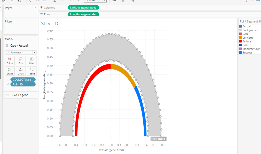
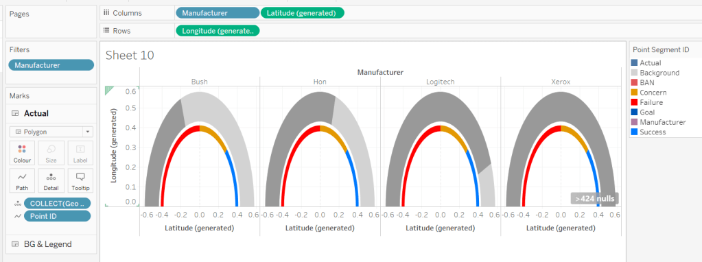
This is the data to build the complete grey semi circle of the main gauge. 50 rows represent points on the inner arc of the semi circle (Point Arc = In). They all have a Point Radius = 0.43 (ie the distance from the 0,0 centre position of a circle to the bottom edge of the gauge is 0.43). The other 50 rows represent points on the outer arc of the semi circle (Point Arc = Out). They all have a Point Radius = 0.58 (ie the distance from the 0,0 centre position of a circle to the top edge of the gauge is 0.58). Point Angle Rads defines the angle in radians (rather than degrees) from the circle centre to edge of the circle. The Point ID defines the order to ‘join the dots’ when the points are made into a polygon.
Here’s a diagram to help try and explain the maths we’re going to need to use based on the data we have
For each point on the circle, we will need to identify the x & y position of where the radius intersects the edge of the circle. We know the angle, and we know the radius, so we can use trigonometry to work that out, and then use the MAKEPOINT() function in Tableau to covert that into a spatial/geometric field to use on a map.
Let’s do this in Tableau.
Create field
X
[Point Radius] *SIN([Point Angle Rads])
Y
[Point Radius] * COS([Point Angle Rads])
Note – based on my diagram above, X = a and would be derived from the Cosine of the angle, while Y = o and be based on the Sine of the angle. However, Jack gave hints based on the above calcs which hold true if you adjust the diagram and assume the angle is positioned between the y-axis and the radius, rather than the x-axis and the radius.
Now create the point
Geo
MAKEPOINT([X],[Y])
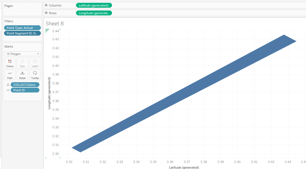
On a sheet, add Point Type to Filter and set to Actual, and add Point Segment ID to Filter and set to Background.
Double click on Geo to automatically add Longitude and Latitude fields to the sheet.
We have the basics of a semi-circle… not in the right direction, but it’s something… Add Point ID to Detail, then click the Swap Axis button and hey presto…
It appears a bit more ‘ovel’ than circular as the axis aren’t aligned, so don’t worry about this – set the display to Entire View will help. Then change the mark type to Line, move Point ID to Path and then change mark type to Polygon.
We now have a filled semi circle. We’re not going to use this sheet, but hopefully, this has helped a bit with some fundamental understanding.
When building we’re going to be using map layers (and at this point, we can’t add a layer to this sheet). We’ll also be defining calculations based on which feature of the viz we’re focussed on, as we can’t apply filters to the sheet (if you remove the ones applied, it will look a little crazy!). But if you change the Point Segment ID filter to Goal, you’ll get the shape of the goal indicator ‘reference line’.
You might want to play around with the filters to examine the behaviour.
Are you still with me…? Take a break, grab a cuppa, we haven’t even started building yet, but I’ll still be here when you get back 🙂
Setting up the map layers
Using Jack’s hints, create a field to help ‘initialise’ the map layers
Zero
MAKEPOINT(0,0)
Double click this to create a basic ‘map’ with a single point.
Then drag another instance of Zero onto the canvas and drop on the Add a Marks Layer section that appears
You’ll now have 2 marks layers, which means whatever we now do, we can always add more.
Building the Gauge Background & Legend layer
Note – in building I ended up with more mark layers than Jack suggested. I’ve subsequently seen other versions but am sticking to what I managed for now.
The first layer I’m going to build is the ‘grey’ semi circle of the main gauge and the coloured legend ‘inner’ semi circle.
I want to identify those points only.
Geo: BG-Legend Layer
IF [Point Type] <> ‘Label’ AND [Point Segment ID] IN (‘Background’, ‘Concern’, ‘Failure’, ‘Success’) THEN [Geo] END
On the Zero marks card, drop this field directly on top of the COLLECT(Zero) to replace it. Add Point ID to Detail, then flip the axis using the switch axis button. Add Point Segment ID to Colour and adjust the colours of the Background, Failure, Concern and Success values to suit.
Change the mark type to polygon, and move Point ID to Path. Name this layer BG & Legend
We need to understand where on the gauge, the Profit Ratio for each Manufacturer falls. We know that the gauge starts at -30% Profit Ratio (ie 0% of the gauge is equivalent to -30% Profit Ratio) and the gauge ends at +30% Profit Ratio (ie 100% of the gauge is equivalent to +30% Profit Ratio). Therefore if the Manufacturer’s Profit Ratio >= 30% it fills 100% of the gauge, anything less needs to be partially through. We can calculate this (using one of Jack’s hints) with
PR % of Gauge
([Profit Ratio] + [Gauge End Profit Ratio]) / ([Gauge End Profit Ratio]- [Gauge Start Profit Ratio])
To then determine the angle in degrees (and again using Jack’s hints), we want to find the proportion of 180 degrees that the PR % of Gauge represents, and then take off 90 degrees based on the gauge rotation.
PR Angle (Degrees)
([PR % of Gauge] * 180)-90
We can then convert this to radians
PR Angle Rads
RADIANS([PR Angle (Degrees)])
This gives us information to help determine a singular point on the gauge we need to ‘draw’ up to. But I want to ‘draw’ a polygon that goes from the left end (-30% mark) to this point, and for this, I need to know all the other points up to that point.
The way I came up with isn’t what Jack did. My result means I don’t get an exactly accurate marker, but it is so close to it’s position, and is ‘good enough’ for the viz type and how it’s being displayed.
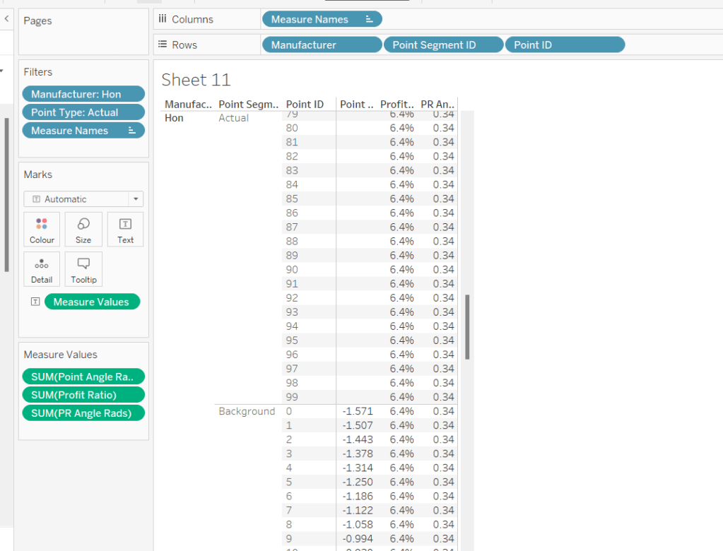
To understand what I did, build out a tabular sheet that is filtered to Manufacturer = Honand Point Type = Actual, and shows Manufacturer, Point Segment ID and Point ID on Rows with Point Angle Rads,Profit Ratio and PR Angle Rads as measures.
The Profit Ratio for the Manufacturer =Hon is 6.4% which is at an angle of 0.34 radians around the semi circle.
You can also see that while we have values for the Point Angle Radians field associated to the Point Segment ID = Background, we don’t have any for the Point Segment ID = Actual, as this is what we’re trying to find out.
Given that I know that all the Point Angle Radians values associated to the Point Segment ID = Background build a complete semi circle, I figured, to display up to my ‘actual’ Profit Ratio, I just want to get all the points associated to background which are less than the PR Angle Rads value.
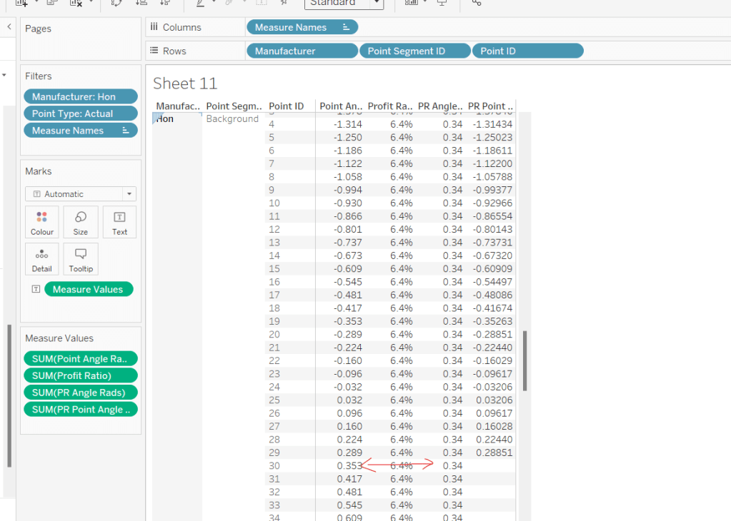
PR Point Angle Radians
IF [Point Angle Rads] <= [PR Angle Rads] THEN [Point Angle Rads] END
Pop this into the table, and when you scroll down, you’ll see I’ve only got values in my new field up to where the PR Angle Rads is less
Using this field, I’ll create some new X & Y fields which I can make make into a spatial field
X (actual)
[Point Radius] *SIN([PR Point Angle Radians])
Y (actual)
[Point Radius] * COS([PR Point Angle Radians])
Geo – Actual
IF [Point Type] = ‘Actual’ AND [Point Segment ID] = ‘Background’ THEN MAKEPOINT([X (actual)], [Y (actual)]) END
On the Zero(2) marks card, Replace the COLLECT(Zero) pill with the Geo – Actual pill by dragging the latter and dropping it directly on the former. Add Point ID to Detail.
It’s drawing the points for a complete semi-circle, as every Manufacturer is being included. To help get the rest of the display right, for the various permutations, add Manufacturer to filter and filter to Hon, Bush, Logitech and Xerox. Add Manufacturer to Columns too. You should now see the marks stop at various positions around the arc. The filters will be adjusted later when we tackle the trellis.
Change the mark type to polygon and move Point ID to Path. Rename the layer to Actual.
For the colouring, we need to determine the RAG status of each Profit Ratio – where does the PR % of Gauge sit in comparison the constants we know
Actual RAG
IF [PR % of Gauge] <= [Gauge Concern Pct of Gauge] THEN ‘Failure’ ELSEIF [PR % of Gauge] <= [Gauge Success Pct of Gauge] THEN ‘Concern’ ELSE ‘Success’ END
Add this to the Colour shelf and adjust accordingly.
Building the Goal Indicator Layer
Create a new spatial field
Geo: Goal Layer
IF [Point Type] = ‘Actual’ AND [Point Segment ID] = ‘Goal’ THEN [Geo] END
and then drag this onto the canvas and drop on the Add A Marks Layer option.
Change the mark Type to Polygon and add Point ID to path. Add Point Segment ID to Colour and adjust the colour of the Goal value to suit. Rename the layer to Goal.
Building the Label layer
Create a new spatial field
Geo: Labels
IF [Point Type] = ‘Label’ THEN [Geo] END
and then drag this onto the canvas and drop on the Add A Marks Layer option. Add Point Segment ID to Detail. 3 marks should now displayed in the positions we need them
This bit took a bit of time to get right, as I had 3 requirements I wanted to satisfy: 1 – display a text or a numeric field as a label depending on what label I wanted to display (I attempted to have a single ‘label’ field converting numbers to strings with the relevant formatting, but the Profit Ratio % just wouldn’t show how I wanted when converted to string); 2 – adjust the colour of (some) of the labels depending on the RAG status of the profit ratio value; 3 – adjust the size of the Profit Ratio label based on how many gauges were displayed.
I needed several label fields
Label: Goal
IF [Point Segment ID] = ‘Goal’ THEN [Gauge Success Amt] END
formatted to % with 0 dp.
Label: Manufacturer-Fail
IF [Point Segment ID] = ‘Manufacturer’ AND [PR % of Gauge]<=[Gauge Concern Pct of Gauge] THEN [Manufacturer] END
Label: Manufacturer-Concern
IF [Point Segment ID] = ‘Manufacturer’ AND ([PR % of Gauge]<=[Gauge Success Pct of Gauge] AND [PR % of Gauge]>[Gauge Concern Pct of Gauge]) THEN [Manufacturer] END
Label: Manufacturer-Success
IF [Point Segment ID] = ‘Manufacturer’ AND [PR % of Gauge]>[Gauge Success Pct of Gauge] THEN [Manufacturer] END
Label: PR-Fail
IF [Point Segment ID] = ‘BAN’ AND [PR % of Gauge]<=[Gauge Concern Pct of Gauge] THEN [Profit Ratio] END
formatted to % with 1 dp
Label: PR-Concern
IF [Point Segment ID] = ‘BAN’ AND [PR % of Gauge]>[Gauge Concern Pct of Gauge] AND [PR % of Gauge]<= [Gauge Success Pct of Gauge] THEN [Profit Ratio] END
formatted to % with 1 dp
Label: PR-Success
IF [Point Segment ID] = ‘BAN’ AND [PR % of Gauge]>[Gauge Success Pct of Gauge] THEN [Profit Ratio] END
formatted to % with 1 dp
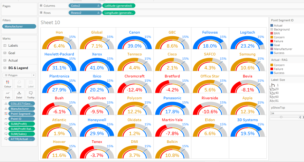
Add all these fields to the Label shelf, and adjust the label so that all are positioned on the same line, with no spaces, and add a carriage return beneath the text. Colour each field accordingly (DO NOT ADJUST THE FONT SIZE).
Change the mark type to text and align the label top centre. Rename the mark type to Labels and Disable Selection
To adjust the size of the labels, create a new parameter which we’ll need for the trellis.
pShowTop
integer parameter, defaulted to 7 which is a range from 5 to 81 with a step size of 1.
Show the parameter.
Create a new field
Label: Size
IF [Point Segment ID] = ‘BAN’ THEN [pShowTop] ELSEIF [Point Segment ID] = ‘Manufacturer’ THEN 60 ELSE 80 END
We want the size of the BAN label to decrease as the number of manufacturers displayed increases.
Add this filed to the Size shelf as a continuous dimension (green pill, not aggregated).
Edit the Size legend so that sizes varyby range, the range is reversed, and the range starts from 1 to 81. Adjust the mark size range slider to a suitable start and spread.
As you change the value of the pShowTop parameter, the Profit Ratio BAN should adjust in size.
Format Sales and Profit to be $ with 0dp and to display as () when negative, then on all marks cards, add Manufacturer to Detail and Sales, Profit, Profit Ratio and Actual RAG to Tooltip, and adjust Tooltip on all the layers to suit.
Finally remove all gridlines/zero lines/axis ticks and hide the longitude & latitude axis. Hide the null indicator.
Building the Trellis
So now we’ve got the core viz nailed, we need to address the layout, which is to show a gauge for each of the top n manufacturers based on Sales. This means we need to have the gauges indexed/ranked from 1 to n based on total Sales, and then arrange in a grid so that top left is the manufacturer with the highest sales, and bottom right is the manufacturer with the lowest sales. For this we need to assign a row and column number against each manufacturer.
There are multiple blog posts about creating trellis charts. My go to post has always been this one by Chris Love, especially when the requirement is for the trellis to be dynamic (the number of rows/columns can vary) depending on the number of items to be displayed.
However in this instance, using the calculations referenced in the blog doesn’t meet the requirement of ensuring there are more columns than rows. This was an area that got me stumped. As a result, I finished the viz with a version that utilises my ‘go to’ calculations (published here), before then looking at Jack’s solution to get the calculations, which are
Cols Count
//If Rounded value = Value without Round then no remainder, use that number if SIZE()/round(SQRT(SIZE()),0) = int(SIZE()/round(SQRT(SIZE()),0)) THEN SIZE()/round(SQRT(SIZE()),0) //Otherwise add 1 to the number of columns ELSE int(SIZE()/round(SQRT(SIZE()),0)) + 1 END
Size() is reflective of the number of items (in this case Manufacturers) to be displayed… as I write this down, for this specific instance, you could probably replace SIZE() with the parameter pShowTop.
Rowsv2
//For Each Manufacturer, what Row should it be in the Trellis? //Rank the Manufacturer, Find the Integer portion when dividing by # of Columns int((INDEX()-1)/ [Cols Count])
Colsv2
//For Each Manufacturer, what Column should it be in the Trellis? //Rank the Manufacturer, Find the Remainder when dividing by # of Columns int((INDEX()-1) % [Cols Count])
Make both Rowsv2 and Colsv2 discrete.
Add Rowsv2 to Rows and Colsv2 to Columns. Remove Manufacturer from Columns. It’ll look a bit odd, but be patient.
Edit the Manufacturer pill on the Filter shelf. On the General tab, select None, to remove everything from the filter, then on the Top tab adjust to be based on the top pShowTop by Sales
Now edit the table calculation associated to the Rowsv2 pill, so that it computes by specific dimensions and every field except Point ID is selected. Ensure Manufacturer and Point Segment ID are listed at the top in that order. Set the level to be Manufacturer and apply a custom sort based on Sum of Sales descending
As this is a nested table calculation, select the drop down arrow at the top and apply the same settings to the nested Cols Count field.
Then do exactly the same again for the Colsv2 table calculation settings. If all has been applied successfully, then you should get a grid
where you can then adjust the pShowTop parameter
Hide the Rowsv2 and ColsV2 fields from displaying (uncheck show header). Show the Longitude axis, and fix it to start at 0 but end ‘automatic’. Then hide the axis again (this ensures the arc lands on the row divider).
Then add the viz to a dashboard. My published version based on the trellis using Jack’s calculations is published here.
If you’ve made it to the end – well done! It was a bit of a marathon to do the challenge and another to write this blog. I’m sure it’s been quite an effort to read too, but hopefully you’ve learnt something, and I’ll certainly be referencing this again when a map layer and/or gauge based scenario occurs again.
Erica set the #WOW2024 challenge this week, asking us to recreate this ‘drillable’ functionality within a single dashboard.
To achieve this, I used 4 sheets
A large map
A small map
A table of data
A navigational control
along with parameter actions to drive the interactivity, and dynamic zone visibility to control what displayed when.
Building the large map
On a new sheet, double click on State/Province to automatically generate a map of the United States – if this doesn’t display by default, then make sure the location of your map settings are referencing the USA (Map menu > Edit Locations). Hide the ‘unknown’ indicator displayed bottom right. Change the mark type to map to create a filled map. Change the colour to a grey (I used #c0c0c0). Add State/Province to the Filter shelf and select Arkansas. Show the filter.
Click on the Tooltip button, and delete all the text in the dialog.
Now drag City onto the map and drop it on the section that appears labelled Add a Marks Layer. On the ‘City’ marks card that now appears, change the mark type to circle. Move City to the Label shelf and then also add State/Province to Detail. Change the colour of the circles to dark grey (I used #767f8b).
Update the Tooltip on the City marks card. Turn off all the map options to stop the pan/zoom map control options from appearing (map menu -> map options -> deselect all the options). Remove all row/column dividers.
Name the sheet Map-Large or similar.
Building the Small Map
Duplicate the Map-Large sheet, and name the new sheet Map-Small. Remove all background layers so just the state outline remains (Map menu -> background layers -> set washout to 100%).
On the Label shelf of the City marks card, uncheck show mark layers so the name of the city is not displayed and click on the Tooltip shelf and uncheck show tooltips, so they aren’t displayed either.
On this map, we need to highlight a selected City. For this we need a parameter to capture the City, and a calculated field to identify which City has been selected. We will also need a parameter to capture the State/Province to ensure the interactivity works as required.
pSelectedState
string parameters defaulted to ” (ie empty string)
pSelectedCity
string parameter defaulted to ” (ie empty string)
Is Selected City
[City] = [pSelectedCity]
Add Is Selected City to the Colour shelf of the City marks card.
Show the pSelectedCity parameter and type in ‘Fayetteville’. The colour legend should display values for True & False. Adjust colours to suit.
Also add Is Selected City to the Size shelf and adjust the sizes accordingly.
Building the table
On a new sheet, add
State/Province to Filter and filter to ‘Arkansas’
Add Is Selected City to Filter and filter to True
Add Customer Name, Order ID and Product Name to Rows
Right-click on the State/Province field in the Filter shelf and apply to worksheets > selected worksheets and select the Large Map & Small Map sheets. This makes the filter shared between all those sheets.
Create a new field
Unit Price
SUM([Sales])/SUM([Quantity])
and add to Text.
Drag Quantity onto the canvas and drop on the ‘unit price’ column when you see show me appear. This will automatically add Measure Values to Columns and Measure Names to Filter.
Do the same for Sales. Reorder the pills in the MeasureValues box so they are arranged as required.
Add subtotals (Analysis menu > Totals > Add all subtotals), then display at the top (Analysis menu > Totals > Column Totals to Top).
Right-click on the Customer Name pill in Rows and uncheck Subtotals from the context menu.
Format the table: set the worksheet background colour to light grey and set the total (pane & header) background colour to a shade darker.
Adjust the width and height of the columns and rows to suit.
Uncheck show tooltip from the Tooltip shelf, and name the sheet Table or similar.
Building the Navigation sheet
The ‘back to main map’ navigational display is actually a worksheet rather than a navigational object on a dashboard, as we need to apply parameter actions to it in order to reset some parameters.
On a new sheet, double click into the space on the marks card below the shelf buttons, and type ‘X’
Change the mark type to Text and move the X field to the Text shelf. Update the text to include the additional words, adjust the font size and then align middle centre. Uncheck Show tooltip.
Create the following fields
City – Reset
”
State – Reset
”
and add both to the Detail shelf. Name the sheet Navigation or similar.
Building the dashboard
Using horizontal and vertical layout containers, arrange all the objects on a dashboard. You will need to adjust the background colour of some objects and the padding to get everything looking as expected. This can be quite tricky and is very hard to explain in a blog. The item hierarchy in the image below will help give you an idea
To draw horizontal or vertical lines, add a blank object to the layout container, change the background colour, reduce the padding to 0 and then adjust the height or width of the object so it is very narrow.
These are the properties associated with the red ‘tab’ in the heading – the background colour is red, inner and outer padding is 0, width is 4px and the object is contained within a horizontal container
For the City/State title, reference the pSelectedState and pSelectedCity parameters, along with a unicode symbol which I copy and past from here.
Adding the interactivity
Add the following dashboard actions
Set State
on select of the Map-Large sheet, set the pSelectedState parameter passing in the value of the State/Province field. When the selection is cleared, retain that value.
Set City
on select of the Map-Large sheet, set the pSelectedCity parameter passing in the value of the City field. When the selection is cleared, retain that value.
Reset State
On select of the Navigation sheet, set the pSelectedState parameter passing in the value of the State – Reset field. When the selection is cleared, retain that value.
Reset City
On select of the Navigation sheet, set the pSelectedCity parameter passing in the value of the City- Reset field. When the selection is cleared, retain that value.
Click around on the dashboard and sense check the parameters appear to be behaving – ie if you click on a city on the large map sheet, the table and small map should update, and if you then click the navigation sheet, the table shouldn’t show anything, and the small map shouldn’t show anything highlighted.
Hide and show the objects
Finally, we need to only show the required objects depending on the actions taken. For this we need some additional calculated boolean fields. Go back to any sheet, and create the following calculated fields
City is Selected
[pSelectedCity]<>”
City Not Selected
[pSelectedCity]=”
Note, these fields just have to exist, they don’t need adding to any sheet.
Navigate back to the dashboard.
Click on the Map-Large object, and on the Layout tab, check the control visibility using value option, and choose the City Not Selected value.
This means that when City Not Selected is true (ie the pSelectedCity parameter is empty), this object will display. When City Not Selected is false (ie the pSelectedCity parameter has a value), this object will be hidden.
Depending on what you’ve been clicking, this object might disappear immediately.
Click on the Table object, and do the same steps, but this time choose the City is Selected field. This means the table will only show then the pSelectedCity parameter has a value.
Apply the same settings so the small map, the table title, and the navigation sheet only show when City is Selected. Note – depending on how you have built the dashboard, you may find you can apply the setting once against a container which contains all the objectsyou want to hiderather than against each individual object.
I also chose to only display the Select a State filter control when the City Not Selected was true.
And hopefully, that should be it. My published viz is here.
For this week’s #WOW2023 challenge, guest poster Ervin Vinzon asked us to rebuild this visualisation based on data from his home country, The Philippines.
I have to admit, I did find this a bit tough this week – there was a lot going on and maps don’t come naturally to me. I actually wasn’t sure initially whether both the files were needed, as the requirements were a little bit sparse, and I managed to build pretty much the whole solution not using the zip file. I just couldn’t get the map label annotation to work, so ended up having to had to revisit and start again.
Modelling the data
You will need to download both the excel file and the zip file from the Ervin’s shared area.
In the data pane, connect to the Ph Pop 2020 excel file and add the Philippine Population sheet to the canvas.
Then add a connection to a spatial file and point to the zip file. Tableau will automatically identify the file it can use. Add the Provinces file to the canvas.
Create a relation that uses relationship calculations that maps from the Philippine Population sheet :
IIF([Province] = “Maguindanao del Norte” OR [Province] = “Maguindanao del Sur”, “Maguindanao”, [Province])
to the the Provinces sheet
IIF([ADM1_EN] = “National Capital Region”, “Metro Manila”, [ADM2_EN])
Thanks to Rosario Gauna for helping me with this logic, as I couldn’t figure out how the data needed to be related. I think this really needed to be included in the requirements… (Note the logic has been adjusted since I took the image below)
Building the Measure Selector
We can’t use a parameter directly for this, as the design of the ‘radio button’ is more fancy than just what you get with the basic parameter selection functionality.
So we need to ‘fake’ the selection and can use existing fields in our data set to help with this. The Island Group field contains 3 values, so we’re going to draw on these and build
Measure Selector
CASE [Island group] WHEN ‘Luzon’ THEN ‘By Population’ WHEN ‘Mindarao’ THEN ‘By Population Density’ ELSE ‘By Area’ END
Add to Columns and manually reorder. In the Rows shelf, double click and manually type MIN(0)Change the mark type to circle and add Measure Selector to the Label shelf. Resize the circles, and adjust the label to be aligned middle right. Change the view to Fit Width to see all the labels.
Create a parameter to capture the selected measure when this view is interacted with
pMeasureSelected
string parameter defaulted to By Population
Show the parameter on the sheet. Then create a calculated field
Is Selected Measure
[pMeasureSelected] = [Measure Selector]
and add to the Colour shelf. Adjust the colours to suit and add a grey border on the circles (via the colour shelf).
Stop the Tooltip from showing, hide the MIN(0) axis and the Measure Selector header and remove all gridlines/zero lines and any dividers. Name the sheet Measure Selection.
Building the bar chart
Firstly, we need to determine which measure we’re going to be displaying, so need
Measure to Display
CASE [pMeasureSelected] WHEN ‘By Population’ THEN SUM([Population]) WHEN ‘By Population Density’ THEN SUM([Density]) ELSE SUM([Area (sq km)]) END
Show the pMeasureSelected parameter on a new sheet, then add Island Group and Province to Rows and Measure to Display to Text. Sort the data descending.
Create a new calculated field
Measure Rank
RANK_UNIQUE([Measure to Display])
Change the Measure Rank field in the left hand data pane to be discrete. Add to the Rows and adjust the table calculation so it is computing by Province only. The Measure Rank should show sequential numbers from 1 upwards, but restart at the next Island Group.
Add another instance of Measure Rank to the Filter shelf. Select All intially to select all the numbers. Then adjust the table calculation to compute by Province only as above. Then re-edit the filter and just select numbers 1-10.
The bar visual displays the actual value in a coloured bar, along with the maximum value for the measure in a grey bar. So we need
Max Value
WINDOW_MAX([Measure to Display])
Add this to the table and adjust the table calculation to compute by Province.
Finally, we need some information to help with the labels
Label Strapline
CASE [pMeasureSelected] WHEN ‘By Population’ THEN ” WHEN ‘By Population Density’ THEN ‘persons per sq km’ ELSE ‘sq km’ END
Add this to Rows and then test the behaviour by adjusting the value of the pMeasureSelected parameter.
We now have the data needed to build the bars.
Move Island Group to Columns and manually reorder to be Luzon, Visayas, Mindanao. Move Province and Label strapline to Text. Move Measure to Display and Max Value to Columns. Set sheet to fit Entire View. Reduce the size of the bar to be relatively thin.
On the Measure to Display marks card, add Island Group to Colour and adjust to suit.
Set the colour of the bar on the Max Value marks card to be pale grey and remove the bar border. Remove the Label Strapline field and move the Province from label to Detail.
Make the chart dual axis and synchronise the axis. Adjust the axis (right click > edit axis) to be independent axis ranges for each row or column.
On the Measure to Display marks card, add Measure Rank and Measure To Display to the Label shelf. adjust the table calculation settings of the Measure Rank field to compute by Province only.
Adjust the label to be aligned top left, and then format the label text box, so the label is laid out as required (I used bold 8pt font). To make the label sit ‘above’ the bar, add carriage returns after the text in the label edit box (thanks to Sam Parsons for spotting this sneaky method – my original build was using a much more complex method to get the text sitting on top of the bars!).
Finally hide the axis and the Measure Rank and Island Group fields. Remove all gridlines/zero lines/axis & row and column dividers. Stop the tooltips from showing. Name the sheet Bars.
Building the Bar Header
On a new sheet, add IslandGroup to Columns and manually re-order. Then double click in Columns and manually type MIN(0.1). Set the mark type to Bar and set the view to fit Entire View. Add Island Group to Colour. Reduce the Size of the bar. Edit the axis and fix to end at 0.7. Add Island Group to the Label shelf, and align bottom left. Adjust the size of the font to be larger and then add multiple carriage returns above the label text to shift the label to sit under the bar.
Remove all headers/axis and row/column dividers and gridlines. Stop the tooltip from showing.
Adjust the title of the sheet to reference the pMeasureSelected parameter.
Name the sheet Bar Header.
Building the map
We will need another parameter to store the selected Province value.
pSelectedProvince
string parameter defaulted to nothing
On. a new sheet, double click on the Geometry field. This will automatically display a map of the Philippines. Remove all the unnecessary detail via Map > Background Layers and unchecking all the options.
Add Province to the Detail shelf and Region and Island Group to the Tooltip. Adjust the Tooltip.
Show the pSelectedProvince parameter and manually enter the province Leyte.
Create a new field
Is Selected Province
[pSelectedProvince] = [Province]
and then add to the Colour shelf. Adjust the colours to suit (set the NULL field to the same as False).
We need to capture the ‘geometry’ of the selected Province
Drag this field onto the canvas and drop it on the Add a marks layer section that displays. This will create a second marks card. Change the mark type to Circle and adjust the colour as required. Add pSelectedProvince to the Detail shelf.
Select the circle mark, and add an annotation against the mark (right click > Annotate > Mark). Reference the parameter pSelectedProvince in the dialog window.
Providing the pSelectedProvince is on the Detail shelf and is referenced in the Annotation, then changing the value of the pSelectedProvince parameter to Samar or any other province, should retain the annotation. Once again, thanks to Sam for figuring this out as I could just not see it, even when I looked at the solution.
Remove row & column dividers. Stop the map options from displaying (Map > Map Options and uncheck all selections). Update the title of the sheet, and then name the sheet Map.
Adding the interactivity
Add the sheets to a dashboard using horizontal and vertical layout containers to arrange the objects.
Update the title of the Measure Selection sheet and the Bar Header sheet to match the text being displayed.
Create a dashboard parameter action to define the measure selection on click
Set Measure
On selection of the Measure Selection sheet, set the pMeasureSelected parameter, passing through the value from the Measure Selector field.
Create another action for the Province
Select Province
On selection of the Bars sheet, set the pSelectedProvince parameter, passing through the value from the Province field. When the selection is cleared, reset to nothing.
To stop the Bar Heading sheet from being clicked on, just float a blank object over the top.
To prevent the other bars and the measure selections from all fading when clicked on, create a new field
HL
‘HL’
and add to the Detail shelf of the Bars sheet and the Measure Selection sheet.
Then back on the dashboard add a dashboard highlight action
Unhighlight
On selection of the Bars sheet and the Measure Selection sheet, target the Bars and the Measure Selection sheets using the HL selected field only.
Now when a bar is clicked, it will look ‘selected’ (has a black bar around it), but the other bars won’t become faded/greyed out. Similarly when a measure is selected, the other circles won’t fade.
Phew! That should be it. There’s a fair amount going on here and lots of tricky ‘gotchas’. My published viz is here .