For #WOW2024 Week 6, Sean challenged us to create a viz depicting the top and bottom entries based on a variable set by the user. He instructed that no LoDs (level of detail calculations) should be used, and then also added a bonus to complete the challenge without using sets either (and so hinting that sets would solve the problem). I built both, and will provide the solution for both.
Setting up the common fields
Regardless of the solution, various calculated fields and parameters are required.
pTop
integer parameter defaulted to 12, which is used to drive how many entities to display in our top & bottom cohorts.
For the user to select a month, I first created a new field
Month of Order Date
DATE(DATETRUNC(‘month’, [Order Date]))
and I changed the default sort order of this field to descending (right click the field > default properties > sort > choose descending in the disalog box).
I then created a parameter
pSelectedMonth
date field that selects from a list that is populated when the workbook opens from the Month of Order Date field. Default to July 2021 and format the display to a custom format of mmmm yyyy – having defined the sort order to be descending, the most recent month will be at the top (this wasn’t in the requirements, but is just a useful trick to know).
Now we have a handle on the month we want to report over, we can create
Selected Month Sales
ZN(IF [Month of Order Date] = [pSelectedMonth] THEN [Sales] END)
Return the sales only if the month is that selected, otherwise return 0 (this is what the ZN function will do)
Format this to $ with 0dp.
Previous Month Sales
ZN(IF [Month of Order Date] = DATEADD(‘month’, -1, [pSelectedMonth]) THEN [Sales] END)
Return the sales only if the month matches the previous month to that selected, otherwise return 0.
Pop all these into a table sorted by Difference in Sales ascending to see what it all looks like.
Solution 1 – Using sets
Right click on the State/Province field and create > set
Top States
using the Top condition to get the Top n States where n is the value from the pTop parameter, based on the Difference in Sales field.
and then create another set
Bottom States
using the Top condition to get the Bottom n States where n is the value from the pTop parameter, based on the Difference in Sales field.
Then right click on one of these states and create combined set
Top & Bottom
shows all members in both the Top States and the Bottom States sets
Add Top & Bottom to the Filter shelf. By default only the records ‘in’ either of the sets will display. Modify the pTop parameter to see the list change.
To build the viz
add State/Province to Rows
Add Difference in Sales to Columns and sort ascending
Add Top & Bottom to Filter
Add Colour – Dff > 0 to Colour and adjust accordingly.
Add Selected Month Sales to Tooltip and adjust
Show the pTop and pSelectedMonth parameters
To display the name of the month selected as a column header, create
Selected Month
[pSelectedMonth]
and add to Columns as a discrete (blue) pill at the month-year level. Hide field labels for rows and columns, remove all row/column dividers, zero lines, axis rules & tick marks.
Solution 2 – not using sets
This solution involves using the Rank table calculation
Create a new field
Asc
RANK_UNIQUE([Difference in Sales],’asc’)
and another called
Desc
RANK_UNIQUE([Difference in Sales],’desc’)
Revert back to the data table we built and remove the Top & Bottom set filter. Now add Asc and Desc to the output.
There are now two fields indexing each row; one which starts at 1 and increments, and the other that decrements so the last row is 1. We can now use these to filter just to the records we want
Records to Include
[Asc]<= [pTop] OR [Desc]<=[pTop]
Add this to the Filter shelf and set to True, and we can now see our top 12 and bottom 12 listed
Build the viz exactly as described above, but this time, add the Records to Include field onto the Filter shelf instead.
For the penultimate challenge of 2023, Erica set this fun Christmas themed challenge to visualise the toy production in Santa’s workshop. It was a collaboration with the #PreppinData crew, where you were encouraged to complete their challenge to prep the data for this one. I did do that, but to ensure no discrepancies or field name differences, I used the outputs from the challenge itself as the source for my viz.
Building the Line Chart
This needs to show the quota vs the cumulative number of toys produced for each production manager/toy and uses the data from the Output 1 of the Prep challenge.
Add Week to Columns and change to exact date. Format the Week pill on the Columns to show as custom format yyyy on the axis
then edit the axis and set the tick marks to be fixed from 01 Jan 2023 with an interval of 1 year. This will result in just 2 axis labels displayed, one for 2023 and one for 2024
Add Production Manager and Toy to Rows and then add Quota to Rows too. Then drag Toys Produced onto the Quota axis and drop it when the double green column icon appears.
This will convert the viz to have Measure Values on the Rows instead, and the Quota and Toys Produced pills sitting in the Measure Values section on the left.
Add a Running Total quick table calculation against the Toys Produced pill. Then edit the Value axis, so that the axis are independent axis ranges for each row & column.
The colour of the running total line needs to change based on whether the overall value is above or below the quota. Erica asked us not to use LODs in this challenge, so to determine this, we need
Colour – Over | Under
IF WINDOW_MAX(RUNNING_SUM(SUM([Toys Produced]))) > WINDOW_MAX(SUM([Quota])) THEN ‘Over’ ELSE ‘Under’ END
The WINDOW_MAX function is taking the highest value of the measure and essentially ‘spreads’ that across every row of data being plotted (in this case every week).
Add this field to the Detail shelf and then click on the 3 dot symbol to the left of the pill and change it to the Colour symbol. This allows multiple pills to be on the Colour shelf – Measure Names and Colour – Over | Under, resulting in 4 different colours in the colour legend.
Adjust the legend colours, so the two relating to the Quota are the same colour and the others coloured based on whether the value is Over or Under.
On the Label shelf, check the show mark labels option, and then select most recent. Adjust the font to be bold and match mark colour. Format both the pills sitting in the Measure Values section to be Millions with 1 dp.
Add Week to the Tooltip shelf and format to be in the <day of week>, <day> <month> <year> style. Adjust the tooltip accordingly.
Hide the Production Manager and Toy fields (uncheck show header). Edit the title of the Value axis and the Week axis. Remove all gridlines, zero lines, row & column dividers, but ensure the axis are displayed. Change the worksheet background colour.
Update the Title of the sheet to reference the Toy, then name the sheet Line or similar.
Building the KPIs
We’re still using the data from Output 1. We’re going to do this in 2 sheets, as we want to format the text of the PM name differently. To start, we need some additional calculated fields.
Rate of Production
AVG([Toys Produced])
Then we need to work out for those Production Managers who were under their quota, how far off they were and how long, based on their production rate, it would take for them to fulfil that difference. So first we need
Difference
AVG([Quota]) – SUM([Toys Produced])
This gives us how far under (or over) the PM was from their target quota.
We can then calculate
Weeks Needed to Meet Quota
IF MIN([Over or Under Quota?]) = ‘Over’ THEN 0 ELSE CEILING([Difference] /[Rate of Production]) END
If the PM has exceeded their quota, then 0, as there’s nothing to build, otherwise determine the number of whole weeks. The CEILING function ensures even if the result is only a fraction over a number, the result is ’rounded up’ the next whole number so 12.1 weeks and 12.9 weeks are both reported as 13 weeks.
Add Production Manager and the 2 fields above onto a new sheet and display in tabular form.
Set the sheet to Entire View and adjust the text to be larger (I used bold 18pt font). Format the column headings to be larger too (I used 12pt). Stop the tooltips from displaying, remove row/column dividers and row banding. Set the background colour of the worksheet and hide the Production Manager column (uncheck show header).
Name this sheet KPI or similar.
On a new sheet, add Production Manager to Rows and add Production Manager to the Text shelf too. Double click in to the Columns shelf and type ‘Production Manager’ to create a heading for the text column.
Set the sheet to Entire View, then adjust the font of the Text shelf. I chose a handwriting script font and set to 18pt and bold. The hide the Production Manager field on Rows, and hide the ‘Production Manager’ column label heading (right click – hide field labels for columns). Adjust the font of the column heading and remove all row/column dividers and row banding, Set the background colour. Hide the tooltip.
Name the sheet PM Name or similar.
Building the bar chart
For this, we’re now using the data from Output 2.
We’re plotting 2 measures for the bars – the amount under or over the quota which is a +ve (over) or -ve (under) number which will be plotted either side of a zero line as you would expect. The Toys Over/Under Quota field has this value.
We also need to plot the amount of toys produced, but while this is a positive number, it is displayed on the bar chart on the negative side of the zero line. So to enable this we need
Toys Produced to Plot
-1 * [Toys Produced]
ON a new sheet, add List and Toy to Rows. Then add Toys Produced to Plot to Columns, and then drag Toys Over/Under Quota onto the axis and drop when the 2 green column icon appears. This will result in the following display where Measure Names and Measure Values are automatically added.
Move Measure Names from Rows onto Colour, then change the order of the pills listed in the Measure Values section, so Toys Produced to Plot is listed first.
Create a new field
Colour – Over | Under
IF [Toys Over/Under Quota] < 0 THEN ‘under’ ELSE ‘over’ END
and add to the Detail shelf, then adjust the symbol to add this field to the Colour shelf as well to give you 4 colours on the legend. Adjust accordingly. Add Quota, Toys Produced and Toys Over/Under Quota to Tooltip and adjust.
For the label to display against each bar, we need to plot another measure, which is either 0 for those which were under production, or the value of the over production.
Label Value to Plot
IF SUM([Toys Over/Under Quota]) < 0 THEN 0 ELSE SUM([Toys Over/Under Quota]) END
Add this to Columns. On the Label Value to Plot marks card, change the mark type to circle and remove Measure Names from colour.
Create a new field
% Difference
SUM([Toys Over/Under Quota]) / SUM([Quota])
and apply a custom number format of 0%;0% which means -ve numbers will display as +ve.
Add this to the Label shelf along with Colour – Over | Under. Adjust the label text so the labels are displayed on a single line, are aligned middle right and the font matches mark colour and is bold. Make the chart dual axis and synchronise the axis (set the mark type of Measure Values to a bar if the display changes). On the Label Value to Plot marks card, reduce the opacity of the circle colour to 0% and reduce the size to the smallest possible. Remove all the text from the Tooltip.
To ensure the label text doesn’t overlap the bars, we can extend the axis by creating
Ref Line
WINDOW_MAX([Label Value to Plot]) *2
Add this to the Detail shelf of the Label Value to Plot marks card. Then right click on the top axis and Add Reference Line that refers to the maximum of the Ref Line field. Apply settings as below so the line is invisible.
Finally hide both axis, remove all gridlines, zero lines, axis and column dividers. Adjust the row dividers to be thick grey dashed lines. Update the title of the sheet.
Name the sheet Bar or similar.
Adding the interactivity
Using layout containers, add the sheets to a dashboard so they are arranged in the format required. Then add a dashboard filter action
Select PM
on select of the Bar sheet, target the KPI, Line and PM Name sheets. When the selection is cleared, keep filtered values Only allow 1 selection to be made at a time.
Click the bar against Barbie Doll to set the other charts to filter just to that toy, then unclick the bar again. The remaining charts should stay filtered.
And that should be it. Obviously you can add imagery as you wish but I didn’t go down that route – I just chose to set coloured borders on the layout containers.
For this week’s challenge, Luke asked us to recreate this KPI card on a single sheet.
We needed to display data for the last 2 years up to the latest complete month. If this was being built for a business situation, we’d make use of the TODAY() function to get a handle on the current date. Since this is being built with a static dataset which includes data up until 31st Dec 2023, I am using a parameter to ‘hardcode’ the ‘today’ date, as I want this viz to still present the relevant data on my public profile if it’s accessed in a year’s+ time.
pToday
date parameter defaulted to 12th Dec 2023
With this I can the define the data I want to include within the viz
based on pToday = 12th Dec 2023, this includes records where the Order Date is less than 01 Dec 2023 and greater or equal to 01 Dec 2021.
Add this to the Filter shelf and set to True. Then add Order Date set to the Continuous Month level (green pill) to Columns and Sales to Rows.
The add another instance of Sales to Rows and change the Mark type on the ‘Sales 2’ marks card to Area. Make the chart dual axis and synchronise the axis. Adjust the opacity of the area chart via the Colour shelf as required, and amend the Tooltip on the All marks card to display the month and sales value in the relevant format.
This has formed the basis of the sparkline. Now we need to determine the calculations we need which are displayed in the text.
The text displays information related to the month the user ‘selects’ by hovering over the sparkline. By default the information for the latest full month (in this case Nov 2023) is displayed. We need to capture this latest month in a field
To sense check what we’ve got, on a new sheet display the pSelectedMonth parameter then build a sheet as below
with the parameter set to 01 Nov 2023 we can see the values for Nov 2023 and Nov 2022 and captured in the relevant fields, and then the % change between the two also reflected.
But the % change is displayed on the KPI in different coloured text depending on whether the field is +ve or -ve. FOr this we need
Change from PY +ve
IF [Change from PY] >=0 THEN [Change from PY] END
and
Change from PY -ve
IF [Change from PY] <0 THEN [Change from PY] END
apply a custom number format to both fields of ↑0%;↓0% and add both fields to the sheet. Only 1 of these columns will ever be populated. If you change the parameter to 01 Aug 2022, you’ll see a negative change.
Now we have these fields, we can start to add the text element to the sparkline chart.
We’re going to plot a ‘mark’ against the first point in the x-axis, in this instance the point associated to the 1st Dec 2021. But we don’t want to ‘hardcode’ this date, so we can use
Dummy Y-Axis
IF FIRST() = 0 THEN 1 END
where FIRST() is a table calculation that is 0 for the first point on the month axis.
Add this to Rows before the Sales pills.
We have a single mark plotted for 1st Dec 2021 on a second Y-axis at position 1 on the axis. But no other marks. Change this mark type to shape and use a transparent shape (see this blog for details on how to do this).
Add Selected Month as an exact date to the Label shelf, along with Selected Month Sales, Change from PY +ve and Change from PY -ve. We also need
Previous Year
YEAR(DATEADD(‘year’,-1,[Selected Month]))
convert this to a dimension (drag to be above the line in the left hand data pane) and then add to Label too. Adjust the layout of the label as below and align top left. Note I added some spaces to the front on each line of text.
You should have something that looks similar to
To get the vertical line to display on hover, we need to create
Ref Line
IF [pSelectedMonth]<>#1900-01-01# THEN [pSelectedMonth] END
Add this to the Detail shelf of the Area chart sales marks card and set to be exact date (green pill). The right click on the date axis and Add Reference Line
Changing the pSelectedMonth parameter the line will display
Finally clean up the chart by hiding all the axis, removing all row & column dividers, gridlines, axis lines and zero lines. Hide the ‘null’ indicator.
Add the sheet to a dashboard, then create a parameter action
Select Month
on hover of the KPI card,update the pSelectedMonth parameter with the value from the Month(Order Date) field. When the selection is cleared, set the value to 01 Jan 1900.
Note – you may find that based on the size of the dashboard, you don’t get the text part to display. This is an annoyance in Desktop, that it isn’t completely WYSIWIG (what you see is what you get). I spent time adjusting font sizes etc to make the text display in Desktop, but once published to Tableau Public, it all looked too small. After setting it all back to the sizes I wanted in Desktop and re-publishing, I found it did actually display ok on Public. So you may find you just need to play around a bit to get the display as you want.
Global Recognition month continued this week for #WOW2023, and I was able to enlist Norbert Borbas to set the challenge this week, which was published in both Norbert’s native Hungarian, as well as English.
Norbert provided a challenge based on a solution he had implemented at his company, and involved the creation of 2 dashboards with interactivity between them both. There’s a fair amount going on with this one, so let’s get cracking.
Building the Sales KPI
For this viz, we need to get information about the latest year sales in conjunction with the previous year. Rather than hardcode any years relating to the data, I created
Latest Year
{MAX(YEAR([Order Date]))}
which for the data set I was using, returns 2022. Drag this field into the ‘dimensions’ section of the left hand data pane (ie above the line).
With this I then created
LY Sales
IF YEAR([Order Date]) = [Latest Year] THEN [Sales] END
to the sales for 2022. Format this to $ with 0 dp.
To get the sale for the previous year (ie 2021) I created
Previous Year
[Latest Year]-1
Drag this field into the ‘dimensions’ section of the left hand data pane (ie above the line), and then create
PY Sales
IF YEAR([Order Date]) = [Previous Year] THEN [Sales] END
Format this to $ with 0 dp.
We then needed the % difference between these values
The line chart needs to change based on whether the Sales KPI or the Profit KPI sheet has been selected. We need a parameter to capture this ‘decision’.
pMeasureToShow
string parameter defaulted to Sales
To the determine which actual value to display we need
Line – Measure to Display
IF [pMeasureToShow] = ‘Sales’ THEN [Sales] ELSE [Profit] END
format this to $ with 0dp.
I also created
Line – Measure to Display Axis (k)
IF [pMeasureToShow] = ‘Sales’ THEN [Sales] ELSE [Profit] END
ie the same field, but this was formatted to $ with 0 dp but display units of Thousands (k).
Having the two fields means that the axis can display in one format while the tooltip can show the more detailed value.
On a new sheet add Order Date to Columns and change to the discrete ‘month’ level (blue pill – May). Add Line – Measure to Display Axis (k) to Rows. Add Order Date to Colour. This will default to the Year level, and show all years from the data set, but we only want the latest 2 years. So create
Filter Years
YEAR([Order Date]) >= [Previous Year]
and add to the Filter shelf and set to True. Adjust colours to suit.
Add Order Date to the Label shelf and change to the Year level. By default the lines should be labelled. Edit the label and set the font to match mark colour. I also set the font to be Tableau Medium and bold. Adjust the order of the years in the colour legend, so 2022 is listed first which makes the line for 2022 sit ‘on top’ of the 2021 line.
Remove all gridlines/row column dividers, and set the axis lines to be bolder. Hide the Order Date label (right click > hide field labels for columns). Adjust the formatting of the Order Date axis, to display the months in an abbreviated form. Adjust the title of the y-axis to reference the pMeasureToShow parameter (right click the axis > edit).
Add Line – Measure to Display to the Tooltip shelf.
Adjust the Tooltip to display as
Finally, to help with the interactivity later, we will need
Month Order Date
DATEPART(‘month’, [Order Date])
This returns the number of the month ie 1 for January, 2 for February etc. Move this to the ‘dimensions’ section of the left hand data pane (drag above the line), and then add this to the Detail shelf. Change the field to be a discrete attribute
Name the sheet Line Chart.
Building the Symbol Chart
On a new sheet add Filter Years to the Filter shelf and set to True. Add Order Date to Columns and change to be at the discrete month level. Double click into the Rows shelf and manually type in MIN(0). Add Month Order Date to the Detail shelf.
We need to display coloured arrows depending on whether the change is up or down. For this we need
Symbol – Difference to Display is +ve
IF [pMeasureToShow] = ‘Sales’ THEN IIF([% Diff Sales From PY]>=0,TRUE,FALSE) ELSE IIF([% Diff Profit From PY]>=0,TRUE,FALSE) END
If the measure to display is Sales, and the difference in Sales from previous year is +ve, then return true, otherwise false, Else if the measure to display is Profit and the difference in Profit from the previous year is +ve, then return true, else false.
Change the mark type to Shape and then add this field to both the Colour shelf and the Shape shelf. Adjust colours and shapes accordingly.
Edit the axis and delete the title and set the major and minor tick marks to None. We need the axis to remain as we will need to ‘line up’ this chart with the line chart, and having a left hand axis will help.
Hide the months from showing (uncheck show header against the pill on Columns. Hide all gridlines, axis lines, zero lines & row/column dividers.
Name the sheet Symbol Chart.
Building the Main dashboard
Using horizontal and vertical layout containers, position the sheets in the required locations along with the title and the instructional text. Use background colours and inner & outer padding to give space between the objects.
For the line chart and symbol chart, these were placed in a vertical container, and the width of the ‘blank’ y-axis on the symbol chart widened to be in line with the axis on the line chart. The hierarchy of objects I used is pictured.
To make the Sales display on the line chart when the Sales KPI sheet is clicked, create a dashboard parameter action
Show Sales Line
On select of the Sales KPI sheet, set the pMeasureToShow parameter, passing in the value from the Sales Label field. When the selection is cleared, keep the parameter set to the current value.
And create a similar action to show the profit
Show Profit Line
On select of the Profit KPI sheet, set the pMeasureToShow parameter, passing in the value from the Profit Label field. When the selection is cleared, keep the parameter set to the current value.
We will need to return to this later, to add more interactivity, but for now we’ll move onto the analysis/drill down sheet.
Building the drill down table
We’re going to need a few more fields to build this type of display. Firstly, for the first bar chart column we need
Bar – LY Measure to Display
IF [pMeasureToShow] = ‘Sales’ THEN [LY Sales] ELSE [LY Profit] END
Bar – PY Measure to Display
IF [pMeasureToShow] = ‘Sales’ THEN [PY Sales] ELSE [PY Profit] END
Format both these fields to $ with 0dp.
Add State/Province to Rows and Bar – LY Measure to Display to Columns. Sort the states by the measure descending. Adjust the colour of the bar to suit. Add Bar – PY Measure to Display to the Detail shelf and add a reference line per cell that displays the average of this measure.
Show mark labels and adjust the font of the labels to be size 8pt. Widen each row, and align the State labels to the left, and change the font to be bold & black. Reduce the Size of the bars. Remove gridlines, but add row dividers.
Double click into the columns shelf and manually type MIN(0) to create a ‘fake’ axis and generate a MIN(0) marks card.
Create a new field
Measure Rank LY
RANK(SUM([Bar – LY Measure to Display]))
and add this to the Label shelf of the MIN(0) marks card. Adjust the table calculation so it is explicitly set to Compute by State/Province. Remove the Bar – PY Measure to Display field from the Detail shelf. Change the mark type to shape.
To determine what type of shape and what colour to apply, we need
Measure Rank PY
RANK(SUM([Bar -PY Measure to Display]))
and then
Measure Rank Change
IF [Measure Rank LY] < [Measure Rank PY] THEN ‘Up’ ELSEIF [Measure Rank LY] > [Measure Rank PY] THEN ‘Down’ ELSEIF ISNULL([Measure Rank LY]) THEN NULL ELSE ‘N/A’ END
Add this field to both the Shape and the Colour shelf, and adjust the table calculation so it is explicitly set to Compute by State/Province.
Adjust the shapes, and use a transparent shape against the Null option (see here for details). Adjust colours to suit. Increase the size of the shape, and align the label to the left.
For the next column, create
Bar – Measure Difference
SUM([Bar – LY Measure to Display]) – SUM([Bar -PY Measure to Display])
and custom format to +”$”#,##0;-“$”#,##0
Add to the Columns shelf, and labels should automatically get added.
Create a field
Bar – Measure Diff is +ve
[Bar – Measure Difference] >=0
and add to the Colour shelf of this marks card. Adjust colours to suit.
For the final column, we need to separately identify the values when the YoY measure difference is positive from those that are negative, and then apply ranking to each of these fields. So we need
+ve Measure Diff
IF [Bar – Measure Diff is +ve] THEN [Bar – Measure Difference] END
-ve Measure Diff
IF NOT([Bar – Measure Diff is +ve]) THEN [Bar – Measure Difference]*-1 END
Note, as the difference in this instance is negative, the values returned will also be negative, but when it comes to ranking, we want the record with the biggest negative difference to be ranked 1st ie if one value had a difference of -10 and another had a value of -100, in typical ranking, -10 is ‘higher’ than -100, so -10 would be ranked 1 and -100 2. But we want -100 to be ranked 1. So by multiplying the values by -1 in the calculation we actually return values 10 and 100. So when we rank them later, 100 is ranked 1 as it is bigger than 10.
Ranke +ve Measure Diff
RANK_UNIQUE([+ve Measure Diff])
Rank -ve Measure Diff
RANK_UNIQUE([-ve Measure Diff])
We will be displaying the information for the positive and negative ranks in separate ‘columns’ which we can do with
Rank YoY X-axis
IIF([Bar – Measure Diff is +ve], 1,2)
Add this field to columns and change the mark type to Circle. Add Bar – Measure Diff is +ve to Colour. Add Rank +ve Measure Diff and Rank -ve Measure Diff to Label. Ensure the table calculations for both fields are explicitly set to Compute by State/Province. Increase the Size of the circle, and align the label to be middle centre using a bold white font.
Now we have all the information displayed, we need to sort the tooltips.
This sheet, will be accessed through interaction and will be ‘filtered’ to just a specific month. For now, we’ll ‘hardcode’ the month by adding Month Order Date to the Filter shelf and selecting 3 (for March).
On the All marks card, add Latest Year, Previous Year,Month Order Date, Measure Rank PY to the Tooltip shelf.
We will also need
TOOLTIP – Rank statement decrease
IF [Measure Rank Change] <> ‘Up’ THEN MIN([State/Province]) + “‘s ” + [pMeasureToShow] + ‘ Rank decreased vs. same month last year.’ END
TOOLTIP – Rank statement increase
IF [Measure Rank Change] = ‘Up’ THEN MIN([State/Province]) + “‘s ” + [pMeasureToShow] + ‘ Rank increased vs. same month last year.’ END
TOOLTIP – Rank YoY Statement Negative
IF NOT([Bar – Measure Diff is +ve]) THEN MIN([State/Province]) + ‘ is a negative (Rank: ‘ + STR([Rank -ve Measure Diff]) + ‘) contributor to the overall YOY increment in the selected month.’ END
TOOLTIP – Rank YoY Statement Positive
IF [Bar – Measure Diff is +ve] THEN MIN([State/Province]) + ‘ is a positive (Rank: ‘ + STR([Rank +ve Measure Diff]) + ‘) contributor to the overall YOY increment in the selected month.’ END
Add all 4 of these fields to the Tooltip shelf of the All marks card. Ensure all the table calculation fields are set to explicitly Compute by State/Province.
Now adjust the tooltip with all the relevant fields, applying colouring as required
Hide the axis and hide the null indicator. Hide the State/Province column label heading. Finally, remove the Month Order Date field from the Filter shelf. The tooltip will look a bit funny at this point, but that will get sorted later.
Name the sheet Drill Down Table.
Building the drill down dashboard
Again using vertical and horizontal containers, arrange the sheet on a dashboard along with the title. Use text boxes arranged in a horizontal container directly above the Drill Down Table sheet to display the column headings.
As I didn’t want to hardcode any years, I created the following parameters
pLatestYear
integer parameter defaulted to 2022 and with a display format that did not include thousand separators.
and
pPreviousYear
integer parameter defaulted to 2021 and with a display format that did not include thousand separators.
and
pMonth
integer parameter defaulted to 3 and with a display format that did not include thousand separators.
When building the column headings, I referenced all these parameters instead.
To ‘set’ these parameters, I added Previous Year and Latest Year to the Detail shelf of both the Line Chart and Symbol Chart sheets.
I then added 3 dashboard parameter actions to the main dashboard which on select of the Line Chart or Symbol Chart sheet, set the relevant parameter with the value from the appropriate field.
To ensure the drill down gets ‘filtered’ to the month selected on the main dashboard, add a dashboard filter action
Drill down
On select of the Line Chart or the Symbol Chart, target the Drill Down Table sheet on the Drill Down dashboard, passing the selected field of MONTH(Order Date) only. Exclude all values when selection is cleared.
The final step is to add a Navigation Button to the drill down dashboard which displays the text ‘Go back to landing page’ and navigates back to the main dashboard.
And hopefully, with all that, you have a completed interactive navigational dashboard! My published version is here.
For this week’s #WOW2023 challenge, guest poster Ervin Vinzon asked us to rebuild this visualisation based on data from his home country, The Philippines.
I have to admit, I did find this a bit tough this week – there was a lot going on and maps don’t come naturally to me. I actually wasn’t sure initially whether both the files were needed, as the requirements were a little bit sparse, and I managed to build pretty much the whole solution not using the zip file. I just couldn’t get the map label annotation to work, so ended up having to had to revisit and start again.
Modelling the data
You will need to download both the excel file and the zip file from the Ervin’s shared area.
In the data pane, connect to the Ph Pop 2020 excel file and add the Philippine Population sheet to the canvas.
Then add a connection to a spatial file and point to the zip file. Tableau will automatically identify the file it can use. Add the Provinces file to the canvas.
Create a relation that uses relationship calculations that maps from the Philippine Population sheet :
IIF([Province] = “Maguindanao del Norte” OR [Province] = “Maguindanao del Sur”, “Maguindanao”, [Province])
to the the Provinces sheet
IIF([ADM1_EN] = “National Capital Region”, “Metro Manila”, [ADM2_EN])
Thanks to Rosario Gauna for helping me with this logic, as I couldn’t figure out how the data needed to be related. I think this really needed to be included in the requirements… (Note the logic has been adjusted since I took the image below)
Building the Measure Selector
We can’t use a parameter directly for this, as the design of the ‘radio button’ is more fancy than just what you get with the basic parameter selection functionality.
So we need to ‘fake’ the selection and can use existing fields in our data set to help with this. The Island Group field contains 3 values, so we’re going to draw on these and build
Measure Selector
CASE [Island group] WHEN ‘Luzon’ THEN ‘By Population’ WHEN ‘Mindarao’ THEN ‘By Population Density’ ELSE ‘By Area’ END
Add to Columns and manually reorder. In the Rows shelf, double click and manually type MIN(0)Change the mark type to circle and add Measure Selector to the Label shelf. Resize the circles, and adjust the label to be aligned middle right. Change the view to Fit Width to see all the labels.
Create a parameter to capture the selected measure when this view is interacted with
pMeasureSelected
string parameter defaulted to By Population
Show the parameter on the sheet. Then create a calculated field
Is Selected Measure
[pMeasureSelected] = [Measure Selector]
and add to the Colour shelf. Adjust the colours to suit and add a grey border on the circles (via the colour shelf).
Stop the Tooltip from showing, hide the MIN(0) axis and the Measure Selector header and remove all gridlines/zero lines and any dividers. Name the sheet Measure Selection.
Building the bar chart
Firstly, we need to determine which measure we’re going to be displaying, so need
Measure to Display
CASE [pMeasureSelected] WHEN ‘By Population’ THEN SUM([Population]) WHEN ‘By Population Density’ THEN SUM([Density]) ELSE SUM([Area (sq km)]) END
Show the pMeasureSelected parameter on a new sheet, then add Island Group and Province to Rows and Measure to Display to Text. Sort the data descending.
Create a new calculated field
Measure Rank
RANK_UNIQUE([Measure to Display])
Change the Measure Rank field in the left hand data pane to be discrete. Add to the Rows and adjust the table calculation so it is computing by Province only. The Measure Rank should show sequential numbers from 1 upwards, but restart at the next Island Group.
Add another instance of Measure Rank to the Filter shelf. Select All intially to select all the numbers. Then adjust the table calculation to compute by Province only as above. Then re-edit the filter and just select numbers 1-10.
The bar visual displays the actual value in a coloured bar, along with the maximum value for the measure in a grey bar. So we need
Max Value
WINDOW_MAX([Measure to Display])
Add this to the table and adjust the table calculation to compute by Province.
Finally, we need some information to help with the labels
Label Strapline
CASE [pMeasureSelected] WHEN ‘By Population’ THEN ” WHEN ‘By Population Density’ THEN ‘persons per sq km’ ELSE ‘sq km’ END
Add this to Rows and then test the behaviour by adjusting the value of the pMeasureSelected parameter.
We now have the data needed to build the bars.
Move Island Group to Columns and manually reorder to be Luzon, Visayas, Mindanao. Move Province and Label strapline to Text. Move Measure to Display and Max Value to Columns. Set sheet to fit Entire View. Reduce the size of the bar to be relatively thin.
On the Measure to Display marks card, add Island Group to Colour and adjust to suit.
Set the colour of the bar on the Max Value marks card to be pale grey and remove the bar border. Remove the Label Strapline field and move the Province from label to Detail.
Make the chart dual axis and synchronise the axis. Adjust the axis (right click > edit axis) to be independent axis ranges for each row or column.
On the Measure to Display marks card, add Measure Rank and Measure To Display to the Label shelf. adjust the table calculation settings of the Measure Rank field to compute by Province only.
Adjust the label to be aligned top left, and then format the label text box, so the label is laid out as required (I used bold 8pt font). To make the label sit ‘above’ the bar, add carriage returns after the text in the label edit box (thanks to Sam Parsons for spotting this sneaky method – my original build was using a much more complex method to get the text sitting on top of the bars!).
Finally hide the axis and the Measure Rank and Island Group fields. Remove all gridlines/zero lines/axis & row and column dividers. Stop the tooltips from showing. Name the sheet Bars.
Building the Bar Header
On a new sheet, add IslandGroup to Columns and manually re-order. Then double click in Columns and manually type MIN(0.1). Set the mark type to Bar and set the view to fit Entire View. Add Island Group to Colour. Reduce the Size of the bar. Edit the axis and fix to end at 0.7. Add Island Group to the Label shelf, and align bottom left. Adjust the size of the font to be larger and then add multiple carriage returns above the label text to shift the label to sit under the bar.
Remove all headers/axis and row/column dividers and gridlines. Stop the tooltip from showing.
Adjust the title of the sheet to reference the pMeasureSelected parameter.
Name the sheet Bar Header.
Building the map
We will need another parameter to store the selected Province value.
pSelectedProvince
string parameter defaulted to nothing
On. a new sheet, double click on the Geometry field. This will automatically display a map of the Philippines. Remove all the unnecessary detail via Map > Background Layers and unchecking all the options.
Add Province to the Detail shelf and Region and Island Group to the Tooltip. Adjust the Tooltip.
Show the pSelectedProvince parameter and manually enter the province Leyte.
Create a new field
Is Selected Province
[pSelectedProvince] = [Province]
and then add to the Colour shelf. Adjust the colours to suit (set the NULL field to the same as False).
We need to capture the ‘geometry’ of the selected Province
Drag this field onto the canvas and drop it on the Add a marks layer section that displays. This will create a second marks card. Change the mark type to Circle and adjust the colour as required. Add pSelectedProvince to the Detail shelf.
Select the circle mark, and add an annotation against the mark (right click > Annotate > Mark). Reference the parameter pSelectedProvince in the dialog window.
Providing the pSelectedProvince is on the Detail shelf and is referenced in the Annotation, then changing the value of the pSelectedProvince parameter to Samar or any other province, should retain the annotation. Once again, thanks to Sam for figuring this out as I could just not see it, even when I looked at the solution.
Remove row & column dividers. Stop the map options from displaying (Map > Map Options and uncheck all selections). Update the title of the sheet, and then name the sheet Map.
Adding the interactivity
Add the sheets to a dashboard using horizontal and vertical layout containers to arrange the objects.
Update the title of the Measure Selection sheet and the Bar Header sheet to match the text being displayed.
Create a dashboard parameter action to define the measure selection on click
Set Measure
On selection of the Measure Selection sheet, set the pMeasureSelected parameter, passing through the value from the Measure Selector field.
Create another action for the Province
Select Province
On selection of the Bars sheet, set the pSelectedProvince parameter, passing through the value from the Province field. When the selection is cleared, reset to nothing.
To stop the Bar Heading sheet from being clicked on, just float a blank object over the top.
To prevent the other bars and the measure selections from all fading when clicked on, create a new field
HL
‘HL’
and add to the Detail shelf of the Bars sheet and the Measure Selection sheet.
Then back on the dashboard add a dashboard highlight action
Unhighlight
On selection of the Bars sheet and the Measure Selection sheet, target the Bars and the Measure Selection sheets using the HL selected field only.
Now when a bar is clicked, it will look ‘selected’ (has a black bar around it), but the other bars won’t become faded/greyed out. Similarly when a measure is selected, the other circles won’t fade.
Phew! That should be it. There’s a fair amount going on here and lots of tricky ‘gotchas’. My published viz is here .
For this week’s #WOW2023 challenge, Lorna asked us to recreate this small multiple (or trellis) chart which organises the time series charts per Sub-Category into a grid format, where the number of columns is determined by the user.
Whenever I need to build these types of charts, I often end up referencing this blog post by Chris Love from 2014, as this has the basis for the calculations required.
To get started, we need to capture the number of columns based on a parameter
pCols
integer parameter ranging from 1 to 5 with a step size of 1, that is defaulted to 5
On a new sheet, display the parameter, and add Sub-Category to Rows. Apply a sort to Sub-Category based on the field Sum of Sales descending.
Based on the pCols parameter, we need to determine which column and subsequently which row each Sub-Category should be positioned in. We will make use of the index of each entry in the list. Double click into the Rows shelf and manually type in INDEX(). Change the field to be discrete (blue). This will number every Sub-Category row from 1 upwards. To be explicit, edit the table calculation, to explicitly set it to compute using the Sub-Category dimension.
To determine the column for each sub-category
Column
(INDEX()-1)%[pCols]
the % symbol, is the modulo and returns the remainder when the INDEX()-1 is divided by pCols – ie if INDEX() = 12, then 12-1 = 11 and 11 divided by 5 is 2 with 1 left over, so the result is 1.
Add this to the sheet, set it to be discrete (blue) and also edit the table calculation to compute using Sub-Category. You can see that Chairs and Machines are in the same column. If you adjust pCols, the values will adjust too.
To determine which row each Sub-Category will be positioned in we need
Row
INT((INDEX()-1) / [pCols])
This divides INDEX()-1 by pCols and just returns the whole number. ie if INDEX() = 8, then 8-1 = 7, and 7 divided by 5 = 1.4. The integer part of 1.4 is 1.
Add this to Rows and set to be discrete, and adjust the table calculation as before. You can see Chairs and Phones are in the same row (but different columns), which Chairs and Machines are in the same column, but different rows.
Let’s rearrange – Move Column to Columns, Sub-Category to Text and remove INDEX() altogether, and you’ll get the basic grid layout we need.
Create a new field to store the date part we’re going to present
Month Order Date
DATE(DATETRUNC(‘month’,[Order Date]))
Add this to Columns, and set as exact date and add Sales to Rows and move Sub-Category to Detail. At first gland this may look ok, but if you look closely, you’ll notice that there are multiple lines on some of the charts.
This is because there are some states that didn’t sell some of the sub-categories on the month, and this affects the index() calculation when the Month Order Date is set to be a continuous (green) pill (the viz below highlights this better – Accessories is now indexed with 6 and 7…
So to resolve this, add Month Order Date as a discrete (blue) exact date to the Detail shelf underneath the Sub-Category field. Then change the Month Order Date field in the Columns shelf to be a Continuous (green) attribute. Then adjust the table calculation on both the Column and the Row fields, so they are computing over both Sub-Category and Month Order Date, but at the level of Sub-Category.
Format the ATTR(Month Order Date) field on Columns to be the custom format of yyyy, so the axis just display years
and then format the Month Order Date field on the Detail shelf, to be the custom format of mmmm yyyy, so the information in the Tooltip will display the date as March 2001 etc. Adjust the Tooltip to match.
The label for each Sub-Category needs to be positioned based on the y-axis at the maximum sales across the whole display, and on the x-axis at the last point in the date scale ie December 2023. For this we need
Max Sales in Table
WINDOW_MAX(MAX([Sales]))
Label Position
IF LAST()=0 THEN [Max Sales in Table] END
Add Label Position to Rows and adjust the table calculation so the Max Sales in Table nested calculation is computing by both Sub-Category and Month Order Date, and the Label Position nested calculation is computing by Month Order Date only. This should result in a single mark per Sub-Category displaying.
Make the chart dual axis and synchronise the axis. Remove Measure Names from the All marks card. On the Label Position marks card, change the Mark type to shape and select a transparent shape (see this post for details on how to get this set up). Move Sub-Category to Label and align top right.
Finalise the display by hiding the Column and Row fields (uncheck show header), hiding the right hand axis (uncheck show header). Format to remove all gridlines & zero lines and hide the null indicator. Remove the axis title.
You should then be able to just add this to a dashboard. My published viz is here.
The requirement involved both the use of the Superstore data set and a custom Target data set, so these need to be combined. In the data pane, relate the two data sets together applying the fields below in the screen shots as the relationship fields (not you’ll need to create a relationship calculation to build the 3rd relationship.
Building the table
The table displays Category & Sub-Category along with a 3rd dimension which will differ depending on user selection. So we need to enable this choice.
pBreakdown
string parameter containing a list of options, defaulted to Ship Mode
Then create a calculated field to determine the actual field to show based on the parameter selection
Breakdown Dimension
CASE [pBreakdown] WHEN ‘Segment’ THEN [Segment] WHEN ‘Region’ THEN [Region] WHEN ‘Ship Mode’ THEN [Ship Mode] END
The user will also need to select a month. I chose to use a calculated field and parameter to drive this.
Month
DATE(DATETRUNC(‘month’, [Order Date]))
and this then feeds the parameter
pMonth
date parameter, formatted to custom date format of mmmm yyyy (to display September 2023). The list is populated when the workbook opens from the Month calculated field created above. Default date is 01 Sept 2023.
The report will need to be filtered based on the date selected in the parameter, so create
Filter Date
[Month] = [pMonth]
On a new sheet, add Category & Sub-Category (from the Orders data set) and Breakdown Dimension to Rows. Show the parameters. Add Filter Date to the Filter shelf and set to True.
Now, the table shows some conditional formatting, which is a clue that we’re not going to building this table in the basic way. Instead we’ll be using what I refer to as ‘fake axis’ to define placeholder columns, which we can then use to have more flexibility on how the data is displayed.
Double click into the Columns shelf and type MIN(0.0).
Change the mark type to Shape and use a transparent shape (see this blog for more information on doing this). Add Sales to the Label shelf and align left. Add all subtotals (Analysis > Totals > Add All Subtotals) and then set the all to display at the top (Analysis > Totals > Column Totals to Top).
Adjust the formatting, so the row dividers are at the highest level
and the row banding is also at the total pane/header level
Type in another instance of MIN(0.0). This will create a second marks card. Adjust the Sales pill and apply a quick table calculation of percent of total. Set to compute using the Breakdown Dimension field. Format the field to % with 0dp.
To stop the % displaying on the Total rows, click the table calc field and select Total using > Hide
Add another instance of MIN(0.0) and this time add Sales Target value from the Sheet1 data set to the Label shelf.
You can see the target values fill down against the Breakdown Display rows, but we don’t want this.
So to work out whether we’re on a Total row or not, we’re going to make use of the SIZE() table calculation.
We want to count the number of Breakdown Dimension rows being shown.
Count Breakdown Dimension Rows
SIZE()
change this to be discrete, add this to Rows and adjust the table calculation so it is compute using the Breakdown Dimension field. You can see the value against each row represents the number of (in this case)different Ship Mode values.
What isn’t visible is the fact that the SIZE() values against the Total rows are actually 1. Move the Count Breakdown Dimension Rows to the Tooltip shelf on the All marks card. If you now hover over the rows of data, the tooltip should display 1 against this field when it’s a total row and the count otherwise. We’ll use this to identify the Total rows.
This is a common technique that is used. Note though, that if the ‘variable’ you’re counting over only has 1 value, then any logic based on this will apply to that row too (see the Copiers row for Ship Mode & Sept 2023).
So to display the Target Sales as we want, we need
Sales Target to Display
IF [Count Breakdown Dimension Rows] = 1 THEN SUM([Sales Target]) END
ie only show the value of the target on the total rows (or when there’s only 1 value in the dimension being counted).
Replace the Sales Target pill on the 3rd MIN(0.0) marks card with this Sales Target to Display field. Make sure the table calculation is set to compute using Breakdown Dimension
Now we need the variance
Variance
(SUM(Sales)-[Sales Target to Display])/SUM([Sales])
Format this to ▲0.0%;▼0.0%
and we need to identify if it’s +ve or -ve
Variance is +ve
[Variance] >=0
Create another instance of MIN(0.0). Add the Variance field to the Label shelf and verify it is computing by Breakdown Dimension
Add Variance is +ve to the Colour shelf. Adjust the colours, then on the Label shelf, set the font to match mark colour.
To change the ‘Total’ labels to ‘All’, right click on one of the labels, and change the label in the left hand pane.
Finally, adjust the formatting – I set the font throughout to be a darker colour, set the All labels to be bold, removed all gridlines, zero lines and column dividers, hid the MIN(0) axes and also hide field labels for rows. Turn off tooltips for the whole table.
Building the dashboard
I then added the sheet to a dashboard, and placed it within a vertical container. Above the vertical container, I used a horizontal container in which I added text boxes for the column headers. The text box for the variable dimension, referenced the pBreakdown parameter value. I also then used a floating blank set to a height of 2px with a background colour of grey to give the appearance of a line above the column headings.
In the dashboard heading, refer to the pMonth parameter to display the date.
Once published, I did have to tweak the width of the heading text boxes and the position of the floating line within the web edit view.
I essentially ‘faked’ the table header row but I still only used 1 sheet to build the table and I was able to dynamically change the title of the dimension column, so hey I hit the brief 🙂 If you want to understand how to build the header row into the actual table itself, then check out Rosario Gauna’s blog.
It was Lorna’s turn to set the challenge this week, based on a real world scenario she’s encountered with a colleague. The premise was to be able to show the progress, by country, against a maximum of 6 goals selected by the user. Placeholders for the 6 options had to remain visible at all times (unless the user selected more than 6, in which case a message should appear).
Building the core viz
As Lorna alludes to in the requirements, we will use sets to capture the goals the user can select.
SDG Name Set
Right click on SDG Name > Create > Set. Select up to 4 options.
On a new sheet, add SDG Name Set and SDG Name to Columns, Country to Rows and add Country to the filter shelf, and limit to Australia, Finland, UK & USA. Right click on the SDG Name Set field in the data pane and select Show Set
We need the SDG Name value to only display for the values selected
SDG Name Header Label
IF [SDG Name Set] THEN [SDG Name] ELSE ” END
Add this to Columns before the SDG Name field.
Now we need to always display 6 columns of data, ie in this case, all the SDG Name values In the set and the first SDG Name values not in the set. We will use the INDEX() function to help us label the columns position.
INDEX
INDEX()
Right click this field and Convert to discrete, then add it to the Columns after SDG Name.
Edit the table calculation (click on the triangle symbol on the blue INDEX pill), and adjust so it is computing by Specific Dimensions. This should be all the fields except Country. The columns should be labelled sequentially from 1 to 17.
Add INDEX to the Filter shelf as well. Initially just select 1. Then adjust the table calculation of this field to match above, and once done, edit filter and select values 1 through to 6. This should leave you with 6 columns
Now we have the structure, we can start building the core contents of the table. For this we’ll be using what I refer to as ‘fake axis’.
Double click in the Rows shelf and manually type in MIN(0.2), then double click again and manually type in MIN(0.6). This results in the creation of a MIN(0.2) and a MIN(0.6) marks card on the left hand side.
The MIN(0.2) marks card is going to be used to show the information about how the goal is trending (ie the arrow symbol), while the MIN(0.6) marks card will be used to show the status of the goal (the text displayed). We need new fields for this, so the values only display for the selected goals.
Trend
IF [SDG Name Set] THEN [SDG Trend] END
Goal
IF [SDG Name Set] THEN [SDG Value] END
Click on the MIN(0.2) marks card. Change the mark type to shape. Add Trend to the Shape card. Right click on the Trend pill and change the field from a Dimension to an Attribute.
Doing this stops the field from impacting the table calculation, and you should get back to having 6 columns displayed.
Adjust the shapes using the Arrows shape palette. For the Null value, I set it to use a transparent shape, a custom shape added to my shape palette. See this blog for more information on doing this.
Also add Trend to the Colour shelf. Once again, adjust the pill to be Attribute and then adjust the colours.
Now click on the MIN(0.6) marks card. Adjust the Mark Type to be Text. Add Goal to the Text shelf and change to be and Attribute. Add Goal to the Colour shelf, change to be Attribute and adjust colours to suit. I also adjusted the font to be bold & size 10pt.
Set the chart to be dual axis and synchronise the axis. Edit the axis (Right click on the left hand axis) and fix the axis from 0 to 1.
Hide the axis, the IN/OUT SDG Name Set pill, the SDG Name and INDEX pills (right click the pills and uncheck Show header).
Right click on the Country row label and the SDG Name Header Label column label in the viz and hide field labels for rows/columns.
Right click within the viz to format. Set the background colour of the pane to light grey.
Remove all gridlines, axis rules, zero lines. Set the column and row dividers to thick white lines
Click the Tooltip button on the All marks card, and uncheck show tooltips. Set the viz to Fit width.
Building the Goal legend
On a new sheet, add SDG Value to Columns. Change the mark type to Circle then add SDG Value to Label and Colour. Manually re-order the columns and adjust the colours as required.
Double click in the Columns shelf and type in MIN(0.0). Edit the axis and fix from -0.1 to 0.5 – this will shift the symbols and text to the left.
Adjust the size of the circle shape to suit, and set the font of the label to match mark colour. I also set it to be bold.
Remove all gridlines, axis ruler, zero lines. Set the background of the pane to be grey and the row/column dividers to be thick white lines. Hide the axis and the column headers, and uncheck show tooltips.
Double click into the Rows shelf, and type the text ‘Goal’ (including the quotation marks). Hide the ‘Goal’ label that then displays.
Building the Trend legend
Repeat similar steps for above but add the SDG Trend field to the Colour, Label and Shape shelf. Adjust the shape & colours to those used before.
Handling more than 6 selections
For this requirement, we need to determine the number of items in the set.
Count Set Members
{COUNTD(IF [SDG Name Set] THEN [SDG Name] END)}
and then use this to create some boolean fields
More than 6 Selected
[Count Set Members] > 6
Less than 6 Selected
[Count Set Members] <= 6
Ensuring that less than 6 items are selected, add the Less than 6 Selected field to the Filter shelf of the main table viz and set to True.
If you select more than 6 goals, the viz should disappear.
On a new sheet, double click into the space beneath the marks card where the pills usually sit, and type ‘Dummy’ (with quotes). Change the mark type to shape and set to use the transparent custom shape. Move the Dummy pill to the label shelf, then edit the label and change the text to the error message.
Align the text middle centre and fit to entire view. Uncheck show tooltips. Add More than 6 Selected to the filter shelf and select true (if true isn’t an option, go back to the main viz, and select more options sp the viz disappears, then come back to this sheet and try again).
All the sheets can now be added to the dashboard. Ensure the core table viz and the error sheets are added to a vertical container without the title showings – the charts should expand and collapse as the selections are made – this can be a bit tricky to get right.
This week, it was my turn to set the #WOW2023 challenge for ‘retro’ month, and I chose to revisit a challenge from May 2017, that was originally set by one of the original ‘founders’ of WorkoutWednesday, Emma Whyte.
The original challenge looked like this :
As I said in the challenge post, I chose this I this challenge as it’s a different type of visual we don’t often see in WOW; it uses a different dataset that interests me – wine!; and as Emma’s website, where she hosted the original requirements for her challenges, is no longer active, it’s possible many won’t know of the existence of this challenge (it pre-dates the current WOW tracking data we have).
Building the core viz
Firstly, we want to build out the basic grid. For that we need a couple of calculated fields
Right click on the Icon field and select Image Role > URL
Add Wine Type, Wine and Icon to Columns and Display:Taster to Rows
Change the mark type to square.
Here we’re making use of the image role functionality in the header of the table to display images stored on the web, without the need to download them locally.
Create a new field
Colour
IF [Score] = 1 THEN [Wine Type] ELSEIF Score = 0 THEN ‘Grey’ ELSE ‘Neutral’ END
Add this to the Colour shelf and adjust colours accordingly. Increase the size of the squares so they fill the space better, but still have separation between them.
Set the background colour of the worksheet to the grey/beige (#f6f6f4).
Note – I noticed later on that the colour legend in the screen shots has the words ‘correct’ and incorrect’ rather than ‘red’ and ‘grey’. This was due to an un-needed alias I had set against the field, so please ignore
Via the Analysis -> Totals menu, add all subtotals & also show row grand totals. This will make the display look a bit odd initially.
Right-click on the Wine pill in the Columns and uncheck the Subtotals option. This should mean there are 3 additional columns only – a total for each wine type and the grand total.
To get a single square to display in the totals columns, right-click on the Colour field in the marks card area, and change from a dimension to an attribute. The field will change from displaying Colour to ATTR(Colour) and an additional option for * will display in the colour legend – set this to be white
To change the word ‘Total’ in the heading to ‘Score’, right click on the word ‘Total’ and select format. In the left hand pane, change the Label of the Totals section to Score. Repeat for the ‘Grand Totals’ by right clicking on ‘Grand Totals’ in the table, selecting format and changing the label for that too to ‘Overall Score’.
We need to label the totals with the score. For this we first need to get a score for each taster per wine
Score Per Taster
{FIXED [Taster], [Wine Type]:SUM([Score])}
If we just added this to the Label shelf, every square gets labelled with the total, which isn’t what we want.
We need to work out a way to just show the label on the total columns only. For this we can make use of the SIZE() table calculation.
To see how we’re going to use this, double click into the Columns and type SIZE(), then change the field to be a blue discrete pill. Edit the table calculation and set the field to compute by Wine and Icon only.
You’ll see that the SIZE() field in the Columns has added the number 12 as part of the heading, which is the count of wines associated to the wine type (ie 12 red wines and 12 white wines). There is no SIZE() value displayed under the total columns, but these actually have a size of 1, so we’re going to exploit this to display the labels (note – this approach wouldn’t work if where was only 1 wine for one of the wine types).
Score on Total
IF SIZE() = 1 THEN SUM([Score Per Taster]) END
Set the default number format of this field to be Standard, which means the result will display either whole or decimal numbers.
Add this onto the Label shelf instead of the other field, and adjust the table calculation as described above to compute by Wine and Icon only.
You can now remove the SIZE() field from the Columns.
Align the scores centrally.
Remove row & column dividers from each cell, and the totals, but set a white column divider for both the pane & header of the Grand Total column.
Format the text for the Wine Type and Wine and Totals fields. Align the text for the Wine field to the Top.
Hide field labels for rows and columns.
Applying the Tooltip
The text when hovering over each square needs to display different wording depending on the score.
Tooltip – Score Text
IF [Score] = 1 THEN ‘correctly identified’ ELSEIF [Score] = 0.5 THEN ‘partially identified’ ELSE ‘was unable to identify’ END
Add this to the Tooltip shelf along with the Score Type field. Modify the text accordingly
Applying the sort
To control the sorting, we need a parameter
pSort
string parameter with list options, defaulted to ‘Overall Score’
and we also need fields to capture the different scores for each type of wine per taster
Red Score
{FIXED [Taster]:SUM( IF [Wine Type] = ‘Red’ THEN [Score] END)}
White Score
{FIXED [Taster]:SUM( IF [Wine Type] = ‘White’ THEN [Score] END)}
Overall Score
[White Score] + [Red Score]
Then we need a calculated field to drive sorting based on the option selected and the fields above
Sort By
CASE [pSort] WHEN ‘Overall’ THEN [Overall Score] WHEN ‘Red’ THEN [Red Score] ELSE [White Score] END
Then right click on the Display:Taster field on the Rows and select Sort, and amend the values to sort by field Sort By descending
Building the legend
I did this using 2 sheets. First I created a new field
Legend Text
IF [Score] = 1 THEN ‘Correct’ ELSEIF Score = 0 THEN ‘Incorrect’ ELSE ‘Partially Correct’ END
Then I create a viz as follows
Add Legend Text and Wine Type to Columns
Add Legend Text to Filter and set to ‘Correct’
Change Mark type to Square and increase size
Add Colour to Colour shelf
Add Score as AVG to Label and format to number standard. Align centrally
Uncheck show header against the Wine Type field , and hide field labels for columns against the ‘legend Text’ column heading.
Remove all column/row dividers and set the worksheet background colour.
Turn off tooltips
Duplicate the sheet, and edit the filter so it excludes Correct instead. Remove Wine Type from the columns shelf. Reorder the columns.
Building the dashboard
When building the dashboard, I just used a floating image object to add the bottle & glass image in the top left of the dashboard.
I set the background colour of the whole dashboard to match that I’d set on the worksheets too.
To stop the tooltips from displaying when hovering over the Scores, I simply placed floating blank objects over the score columns – this is a simple, but effective trick – you just need to be mindful of the placement if you ever revisit the dashboard and move objects around. I placed a floating blank over the legends too to stop them being clicked on.
For the next few Workout Wednesdays, the coaches will be revisiting old challenges – retro month! Erica kicked the month off with this challenge, to recreate Ann Jackson’s challenge from 2018 Week 38. I completed this challenge at the time (see here), but the additions and changes to the visual display Erica incorporated meant I couldn’t just republish it 🙂
So I built it from scratch using the data source from the google drive Erica referenced in the requirements (which I believe may be why my summary KPIs didn’t actually match Erica’s).
There’s a heck of a lot going on in this challenge – it certainly took some time to complete, which may mean this blog becomes quite lengthy… I will endeavour to be as succinct as I can, which may mean I don’t explicitly state every step, or show lots of screen shots.
Setting up the parameters
I used parameters and subsequently dashboard parameter actions to build my solution. Erica mentions set actions, but I chose not use any sets.
As a result there’s lots of parameters that need creating
pAggregate
This is a string parameter that contains the list of possible dimensions to define the lowest level of detail to show on the scatter plot (ie what each dot represents). Default to Sub-Category. Note how the Display As field differs from the Value field.
pColour Dimension
This is a string parameter that will contain the value of the dimension used to split the display into rows (where each row is coloured). This will get set by a parameter action from interactivity on the dashboard, so no list of options is displayed. Default to Segment.
pSplit-Colour
boolean parameter to control whether the chart should be split with a row per ‘colour’ dimension, or just have a single row. The values are aliased to Yes/No
pSplit-Year
another boolean parameter to control whether the chart should be split with a column per year or just have a single column. The values are aliased to Yes/No (essentially similar to above)
pX-Axis
string parameter that contains the value of the measure to display on the x-axis. This will be set by a dashboard parameter action, so no list is required. Default to Sales.
pY-Axis
Similar to above, a string parameter that contains the value of the measure to display on the y-axis. This will be set by a dashboard parameter action, so no list is required. Default to Profit.
pSelectedDimensionValue
string parameter that contains the dimension value associated to the mark that a user clicks on when interacting with the scatter plot, and then causes other marks to be highlighted, or a line to be drawn to connect the marks. This will be set by a dashboard parameter action, so no list is required. Default to <nothing>/empty string.
Building the basic Scatter Plot
The scatter plot will display information based on the measures defined in the pX-Axis and pY-Axis parameters. We need to translate exactly what the measures will be based on the text strings
X-Axis
CASE [pX-Axis] WHEN ‘Profit’ THEN SUM([Profit]) WHEN ‘Sales’ THEN SUM([Sales]) WHEN ‘Quantity’ THEN SUM([Quantity]) END
Y-Axis
CASE [pY-Axis] WHEN ‘Profit’ THEN SUM([Profit]) WHEN ‘Sales’ THEN SUM([Sales]) WHEN ‘Quantity’ THEN SUM([Quantity]) END
We also need to define which field will control the lowest level of detail based on the pAggregate dimension
Dimension Detail
CASE [pAggregate] WHEN ‘Category’ THEN [Category] WHEN ‘Sub-Category’ THEN [Sub-Category] WHEN ‘Product’ THEN [Product Name] WHEN ‘Region’ THEN [Region] WHEN ‘State’ THEN [State] WHEN ‘City’ THEN [City] END
Similarly we need to know which field to split our rows by (the colour)
Dimension Row
CASE [pColour Dimension] WHEN ‘Segment’ THEN [Segment] WHEN ‘Category’ THEN [Category] WHEN ‘Region’ THEN [Region] WHEN ‘Ship Mode’ THEN [Ship Mode] END
but as we need different behaviour depending on whether the pSplit-Colour field is yes or no, we need
Row Display
IF [pSplit-Colour] THEN [Dimension Row] ELSEIF [pColour Dimension] = ‘Category’ THEN ‘All Categories’ ELSE ‘All ‘ + [pColour Dimension] + ‘s’ END
If the parameter is true, then just show the value from the Dimension Row, otherwise display as ‘All Categories’ or ‘All Segments’ or ‘All Regions’ etc.
Similarly, as the columns can be split by years or not, we need
Years
IF [pSplit-Year] THEN STR(YEAR([Order Date])) ELSE ” END
Add the fields to a sheet with
Years & X-Axis on Columns
Row Display & Y-Axis on Rows
Dimension Detail on Detail
Dimension Row on Colour
Set the mark type to circle and reduce colour opacity
Edit the axes, so the titles are sourced from the pX-Axis and pY-Axis parameters
Show all the parameters and manually edit the values/change the selections to test the functionality.
Highlighting corresponding marks
Show the pSelectedDimension parameter and hover over a mark in the scatter plot to read the value of the Dimension Detail field. Enter than value into the pSelectedDimension parameter (eg based on what is displayed above, each mark is a Sub-Category, so I’ll set the field to ‘Phones’).
We need to determine whether the value in the parameter matches the dimension in the detail
Highlight Mark
[pSelectedDimensionValue] = [Dimension Detail]
This returns True or False. Add this field to the Detail shelf, then add it as second field on the Colour shelf.
Adjust the default sorting of the Highlight Mark field, so the True is listed before False (sorted descending) – right click on the field > Default Properties > Sort. And ensure the colour fields on the shelf are listed so Dimension Row is above Highlight Mark. If all this is done, then the colour legend show look similar to below, where the Dimension Row is listed before the True/False, and the Trues are listed above the Falses, so the True is a darker shade of the colour.
Add Highlight Mark to the Size shelf and then edit the size legend to be reversed and adjust the sizes so the smaller ones aren’t too small, but you can differentiate (you may need to adjust the overall size slider on the size shelf too).
Making a connected dot plot
Add Order Date at the Year level (blue discrete pill) to the Detail shelf of the scatter plot.
To make the lines join up when the viz isn’t split by year, we need a field
Y-Axis Line
IF NOT [pSplit-Year] AND [pSelectedDimensionValue] = MIN([Dimension Detail]) THEN [Y-Axis] END
This will only return a value to plot on the Y-Axis if pSplit-Year = No and a user has clicked on a mark.
Set the pSplit-Year parameter to No, then add Y-Axis Line to Rows. On the Y-Axis Line marks card, remove Highlight Mark from colour and size and also remove Dimension Row from Colour. Add Order Date at the Year level (blue discrete pill) to Detail. Change the mark type to Line then add Year(Order Date) to Path instead of Detail.
Make the chart dual axis and synchronise the axis.
Play around changing the pSplit-Year parameter and the value in the pSelectedDimension parameter to test the functionality.
Tidy the scatter plot by adjusting font sizes, removing the right hand axis & the gridlines, lightening the row & column dividers, removing row & column label headings. Tidy up tooltips. Add a title that references the parameter values.
Building the Total Marks KPI
Create a new field
Count Marks
SIZE()
and a field
Index
INDEX()
Set this field to be a discrete dimension (right click > convert to discrete)
On a new sheet, add Dimension Row, Dimension Detail and Order Date (set to Year level as blue discrete pill) to the Detail shelf. Add Count Marks to Text. Adjust the table calculation setting of Count Marks so that all the fields are selected.
Add Index to the Filter shelf and select 1. Then adjust the table calculation setting of this field so it is also computing by all fields. Re-edit the filter, and adjust so only 1 is selected. This should leave you with 1 mark. Change the mark type to shape and set to use a transparent shape.
Adjust font size & style, set background colour of worksheet to grey, adjust title, hide tooltips.
Building the X-Axis KPI
For this we need
Total X-Axis
TOTAL([X-Axis ])
Min X-Axis
WINDOW_MIN([X-Axis ])
Max X-Axis
WINDOW_MAX([X-Axis ])
On a new sheet add Dimension Row, Dimension Detail, YEAR(Order Date) to Detail. Add pX-Axis, Total X-Axis, Min X-Axis & Max X-Axis to Text. Adjust all the table calcs of the Total, Min, Max fields to compute using all dimensions listed. Add Index to filter and again set to 1, then adjust the table calc and re-edit so it is just filtered to be 1. Set the mark type to shape and use a transparent shape. Adjust the layout & font of the text on the label. Set background colour of worksheet to grey, adjust title, hide tooltips.
Building the Y-Axis KPI
Repeat the steps above, creating equivalent Total, Min & Max fields referencing the Y-Axis.
Creating the Y-Axis ‘buttons’
We’ll start with creating a Profit button
Create a field
Label: Profit
“Profit”
and
Y-Axis is Profit
[pY-Axis] = ‘Profit’
We will also need the field below for later on
Y-Axis not Profit
[pY-Axis] <> ‘Profit’
On a new sheet double click on Columns and manually type in MIN(1). Add Label: Profit to Text and Y-Axis is Profit to Colour. Change the mark type to bar.
Set the Size of the bar to maximum, adjust the axis to be fixed from 0-1 and hide the axis. Remove all column/row banding, axis line, gridlines etc.
Show the pY-Axis parameter. If the colour legend is set to True (as pY-Axis contains Profit), then adjust the colour to a dark grey. Then change the value of the pY-Axis parameter, which should then display False in the colour legend. Adjust this to light grey. You may need to do this the other way round. Hide tooltips.
Repeat the same process to create separate sheets for Sales and Quantity with equivalent calculated fields (I found the easiest way was to duplicate the sheet and then swap out the fields).
Creating the X-Axis ‘buttons’
Again, just duplicate the above steps but reference the pX-Axis parameter instead.
You should end up with 6 sheets (1 per measure – Sales, Profit, Quantity – per axis), and 18 calculated fields (3 per measure & axis) as a result.
Creating the ‘Select Colour’ buttons
For the Category button, create
Label: Category
‘Category’
and
Colour is Category
[pColour Dimension] = ‘Category’
Build a ‘button’ as a bar chart, using the same principals as above. You will need to show the pColour Dimension parameter to test changing the value to set the different colours.
Repeat the same steps to build 3 further sheets for Region, Segment and Ship Mode.
Building the dashboard
You will need to use layout containers to arrange all the objects in. The main body of the dashboard consists of a horizontal layout container, which contains 3 objects: a vertical container (left column with configuration options), the scatter plot in the middle and then another vertical container (right column with KPIs).
The left hand ‘Configure Your Chart’ vertical container consists of text objects, parameters, the X-Axis ‘button’ sheets, the Y-Axis ‘button’ sheets and the Colour ‘button’ sheets.
For each of the X-Axis and Y-Axis button sheets, a parameter action needs to be created like below
Set Y-Axis to Profit
On select of the Y-Axis Profit sheet (or whatever you have named the sheet), set the pY-Axis parameter with the value from the Label:Profit field.
You should end up with 6 different parameter actions for these fields – 1 per measure per axis .
For each of the ‘Colour’ buttons, a similar parameter action is also required
Set Colour to Category
On select of the Colour-Category sheet (or whatever you have named the sheet), set the pColour Dimension parameter with the value from the Label:Category field.
You should end up with 4 parameter actions like this.
The Y-Axis and X-Axis buttons should only display 2 options at a time, so you can’t select the same measure for both axis.
Assuming Profit is currently selected on the Y-Axis, then select the object that displays the Profit X-Axis ‘button’ and from the Layout tab, set to control visibility using value and select the Y-Axis not Profit calculated field. As the Y-Axis is set to Profit, the Profit X-Axis button will disappear.
Repeat these steps for each of the X & Y Axis button sheets. Note, sometimes it’s easier to select the object via the Item Hierarchy section of the Layout tab.
For the scatter plot, the user needs the ability to select a mark and the others be highlighted/connected depending on the current settings. This needs another parameter action
Select Dimension Value
On select of the scatter plot, set the pSelectedDimensionValue parameter with the value from the Dimension Detail field.
For the right hand KPI nav, the vertical container consists of text objects, and the KPI sheets.
To make horizontal line separators, set the padding on a blank object to 0, the background colour to the colour you want, and then edit the height of the blank object to 2pt.
For the Info ‘button’, add a floating text box containing the relevant text and position it where you want it to display. Give the object a border and set the background to white. Then select the object and choose the Add Show/HideButton from the context menu. Edit the button to display an info icon when hidden. Ensure the button is also floating and position where you want.
I used additional floating text boxes to display some of the other text information on the dashboard.
No doubt you’ll need to spend some time adjusting padding and layout to get everything where you want, but this should get you the core functionality.


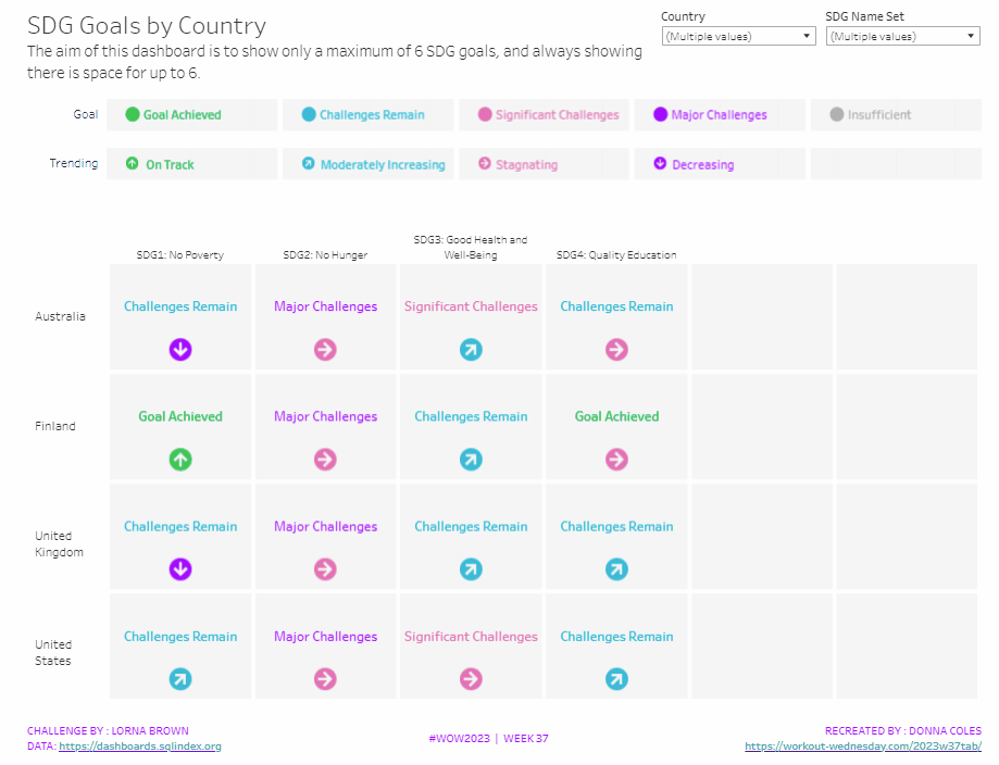


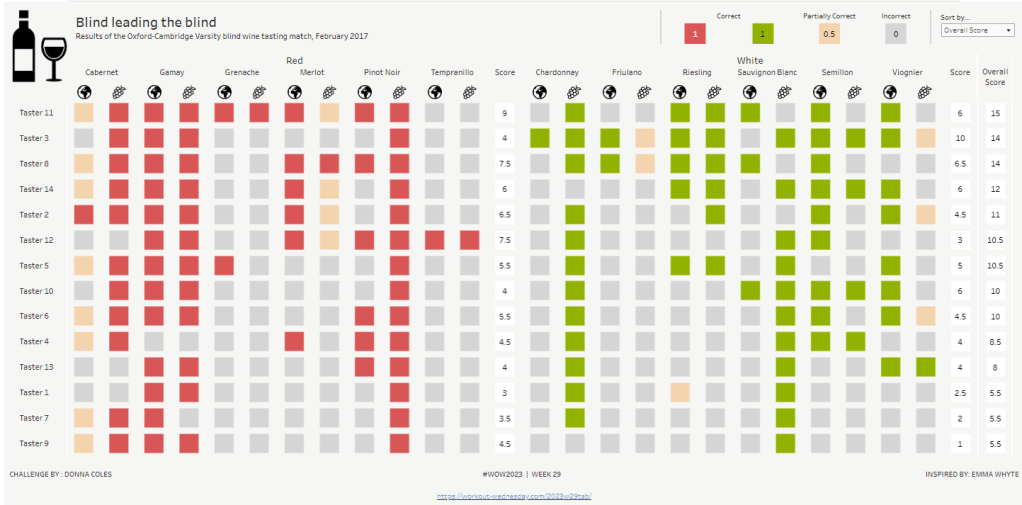
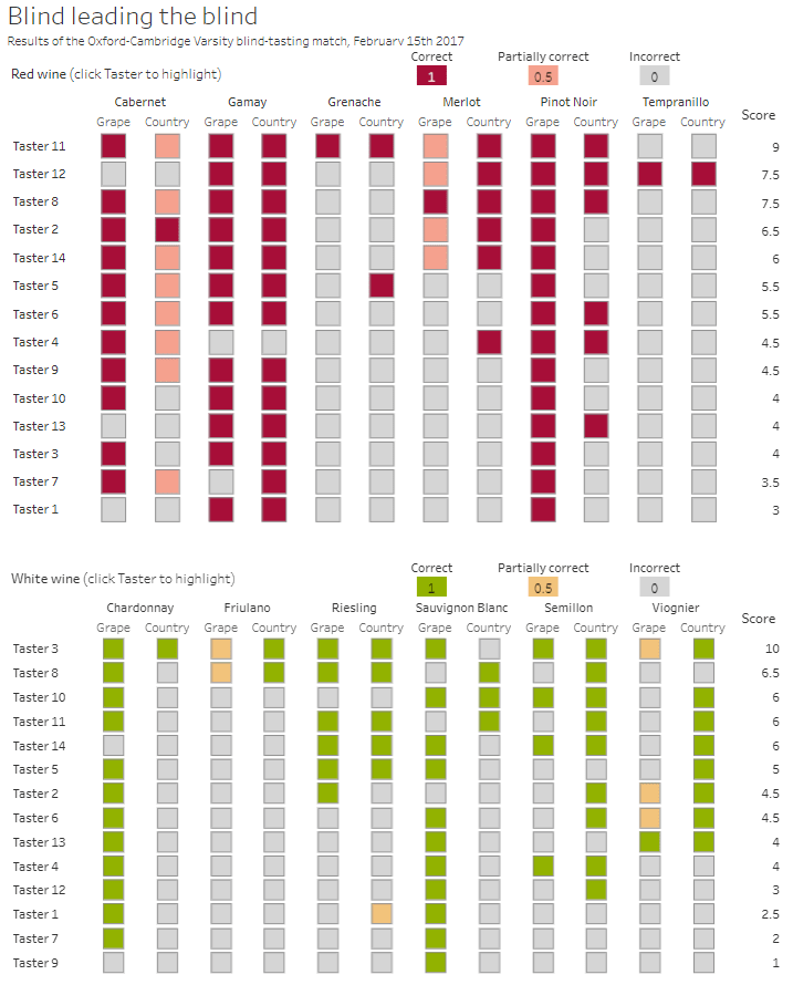

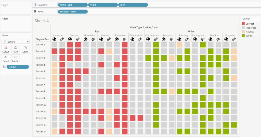
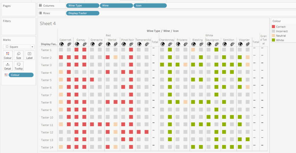
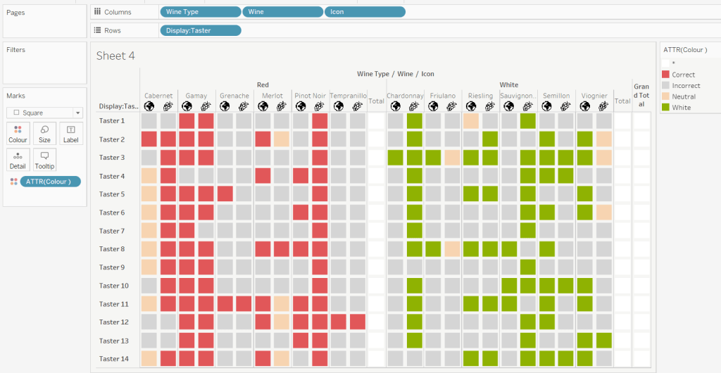
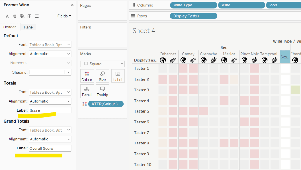
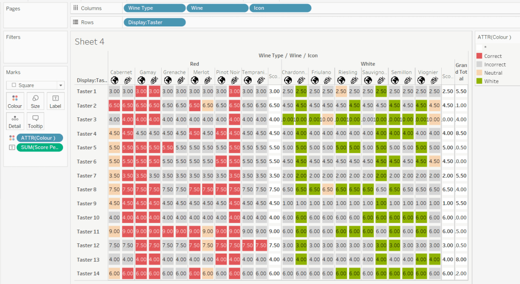

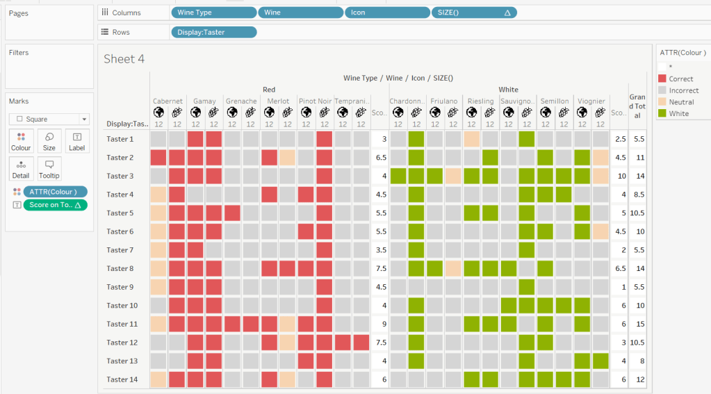
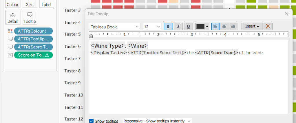
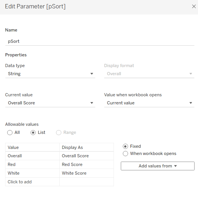
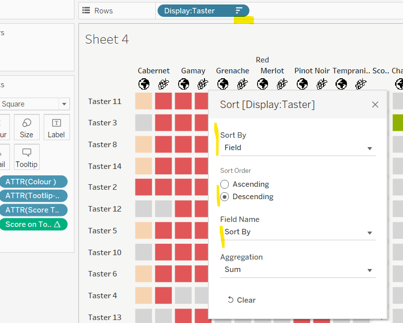
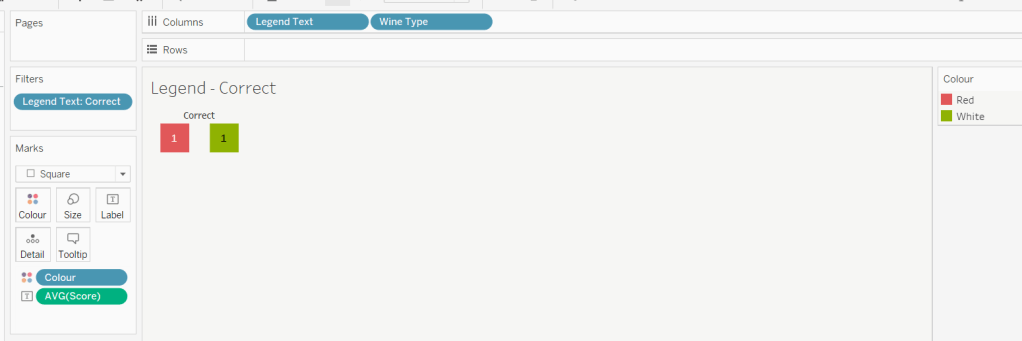
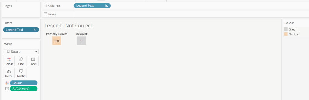
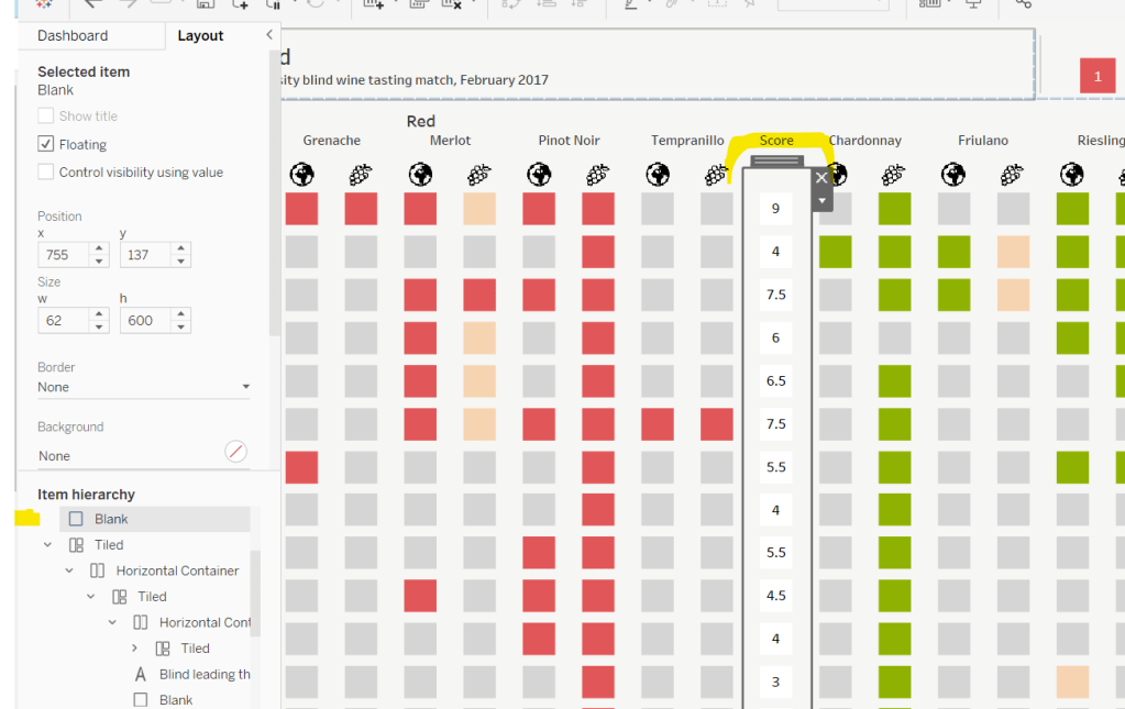


 Donna + DataViz