Can you show the top X customers in EACH of the last 3 years and their contributions to Sales?

For Community Month at #WOW2025 towers, Lorna presented a challenge one of her colleagues had brought to her which they solved together. The need is to identify the top X customers in each year (which may not contain the same set of customers each year), and then present the sales contribution, either as a group or individually compared to the rest. Lorna gave a hint in the challenge that sets would help : “Your job is to figure out the best way to SET this up with the last 3 years dynamically”.

It took me a bit of a while to figure out how to make this work, and at the point of writing, haven’t looked at the solution to know if there was a better way. I ultimately ended up creating 3 sets to fulfil this challenge.

Setting up the parameters

This challenge requires 3 parameters
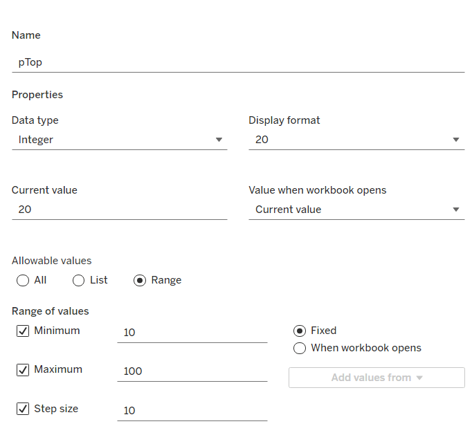
pTop

This identifies how many ‘top’ customers we want to consider. Defined as an integer from 10 to 100, defaulted to 20, that increments every 10 units
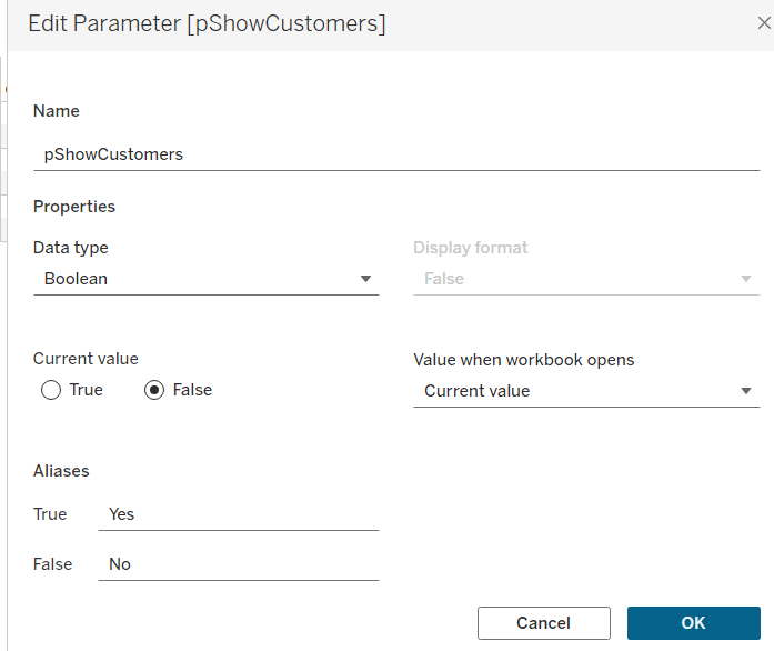
pShowCustomers

Determine whether the top customers’ contributions are displayed individually or as a group. Defined as a boolean, defaulted to False, and aliased to Yes or No
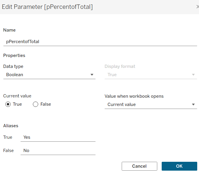
pPercentofTotal

Indicate whether the information is displayed as a % of total sales for that year, or as absolute sales values. Defined as a boolean, defaulted to True, and aliased to Yes or No.

Defining the core calculations

The requirement states to be able to determine the last 3 years ‘dynamically’. For this I created

Max Date

{FIXED: MAX([Order Date])}

to return the maximum Order Date in the whole data set.

We want to be able to restrict the data to the last 3 years, so create

Records to Show

DATEDIFF(‘year’, [Order Date], [Max Date]) <=2

I need to create a set for each of the 3 cohorts – the top customers for the latest year, the top for the previous year and the top for the year before that. For this I first need to determine the Sales for each of those timeframes.

The sales for the current year

Sales – CY

IF YEAR([Order Date]) = YEAR([Max Date]) THEN [Sales] END

The sales for the previous year

Sales – PY

IF YEAR([Order Date]) = YEAR([Max Date])-1 THEN [Sales] END

and the sales for the previous previous year

Sales – PPY

IF YEAR([Order Date]) = YEAR([Max Date])-2 THEN [Sales] END

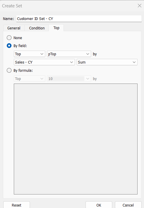
I can then create the sets of customer I need (right click on Customer ID > Create > Set)

Customer ID Set – CY

get the Top number of records using the pTop parameter, and based on the sum of the Sales – CY field

Repeat the same process to create

Customer ID Set – PY

get the Top number of records using the pTop parameter, and based on the sum of the Sales – PY field

and

Customer ID Set – PPY

get the Top number of records using the pTop parameter, and based on the sum of the Sales – PPY field

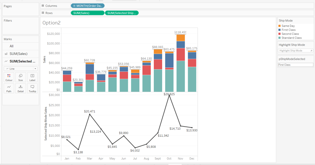
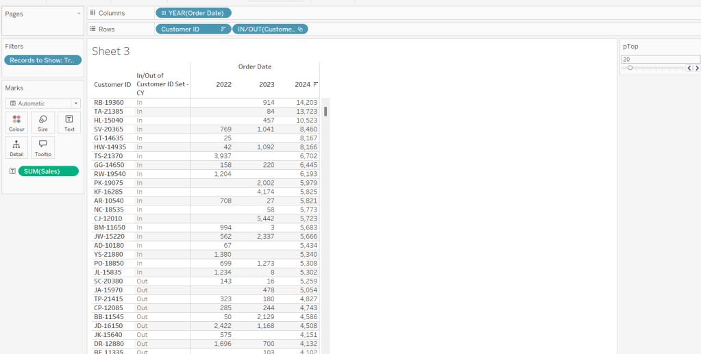
To verify/understand what we’ve created, on a new sheet

  • Add Customer ID to Rows
  • Add Order Date to Columns at the Year level as a discrete (blue) pill
  • Add Records to Show to Filter and set to True.
  • Add Sales to Text.
  • Sort by the 2024 Sales value descending.
  • Add Customer ID Set – CY to Rows.

You should see the first 20 rows (assuming you haven’t changed the pTop value, display as In

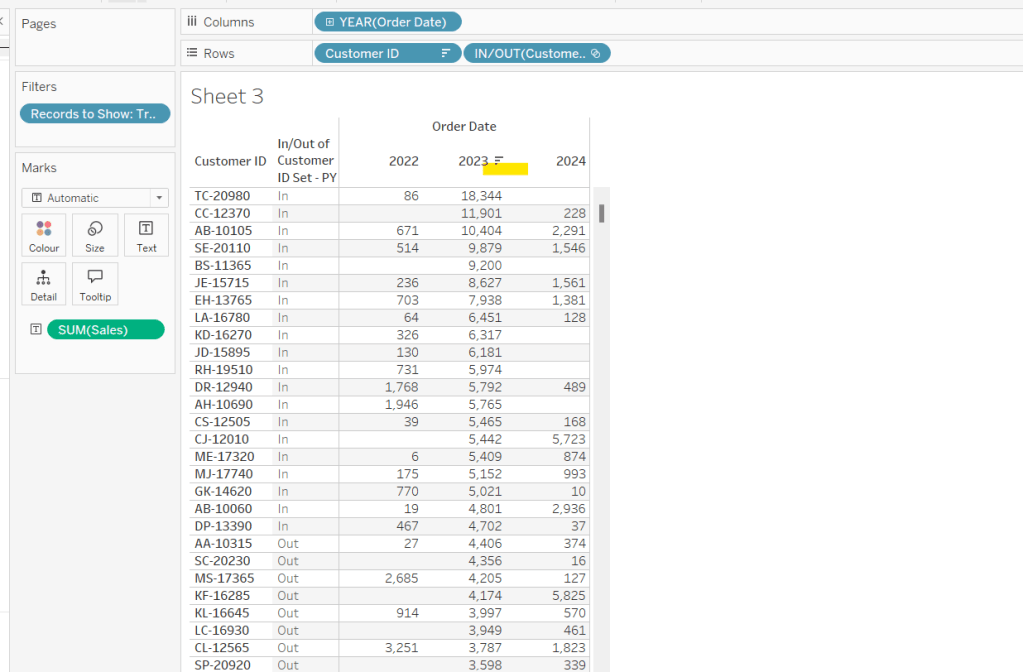
If you now change the sort to sort by 2023 Sales descending, and swap the Customer ID Set – CY with the Customer ID Set – PY, you’ll get the same

So now that’s understood, we want to tag each of our customers based on the year of the order, whether they’re in the top n or not, and whether we want to display the customers individually or not

Group – Detail

IF (YEAR([Order Date]) = YEAR([Max Date]) AND [Customer ID Set – CY]) THEN
IF [pShowCustomers] THEN [Customer ID]
ELSE ‘Top N’
END
ELSEIF (YEAR([Order Date]) = YEAR([Max Date])-1 AND [Customer ID Set – PY]) THEN
IF [pShowCustomers] THEN [Customer ID]
ELSE ‘Top N’
END
ELSEIF (YEAR([Order Date]) = YEAR([Max Date])-2 AND [Customer ID Set – PPY]) THEN
IF [pShowCustomers] THEN [Customer ID]
ELSE ‘Top N’
END
ELSE
‘Other’
END

We’re also going to want to count customers, so need

Count Customers

COUNTD([Customer ID])

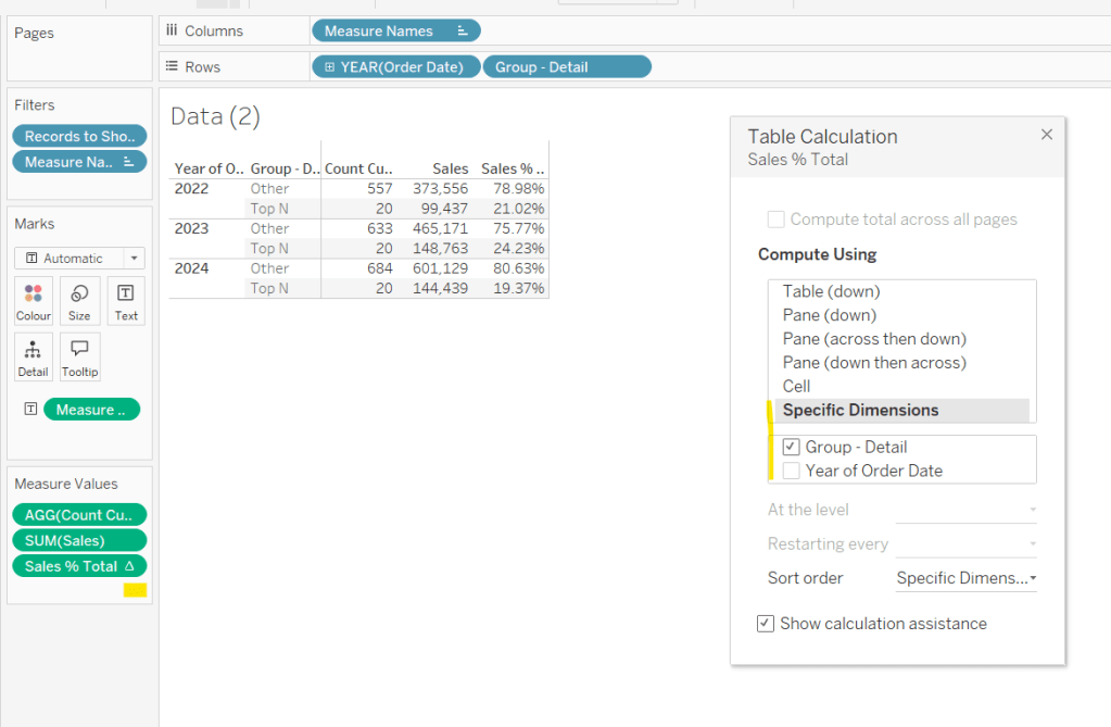
On a new sheet add Order Date at the year level as a discrete (blue) to Rows and add Group Detail to Rows too. Add Records to Display to Filter and set to True. Add Sales and Count Customers into the table. Show the pTop and pShowCustomers parameters

When pShowCustomers is set to No, you should just see 2 groupings per year

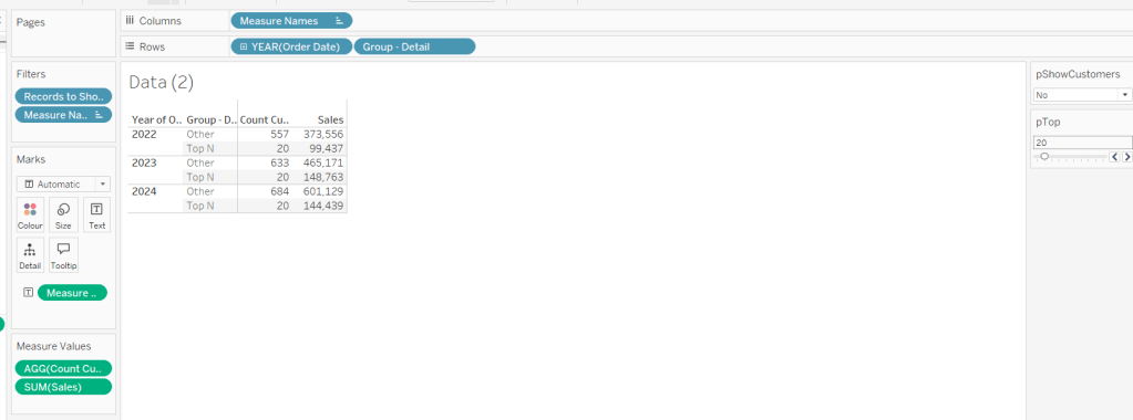
When set to Yes, you’ll get the Customer IDs listed

Note – the Sales numbers should reconcile to the solution – the count might not, which I believe is due to the solution counting distinct Customer Names rather than Customer ID.

To finalise the core calculations we need to build the initial viz, we have a different display depending whether we’re displaying the absolute or % Sales values.

Create

Sales % Total

SUM([Sales]) / TOTAL(SUM([Sales]))

format to decimal to 2 dp and add into table, adjusting the table calculation so it is computing by the Group – Detail only, so the percentage per year is being displayed.

Then we need

Measure to Plot

IF [pPercentofTotal] THEN [Sales % Total]
ELSE SUM([Sales])
END

format this to a number to 2 dp (just so you can see it has a value) and add to the table, applying the same table calculation settings. Display the pPercentofTotal parameter and flip between to see the column change.

Building the Viz

On a new sheet, add Records to Show to filter and set to True. Add Order Date at the year level as a discrete (blue) pill to Rows. Add Group – Detail to Detail. Change the mark type to bar. Add Measure to Plot to Columns and adjust the table calculation, so it’s computing just by Group-Detail.

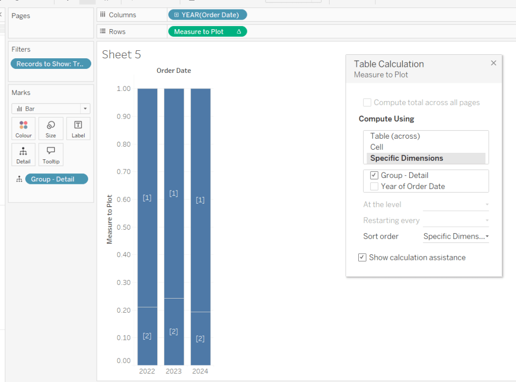
Ste the sheet to fit width and show the 3 parameters.
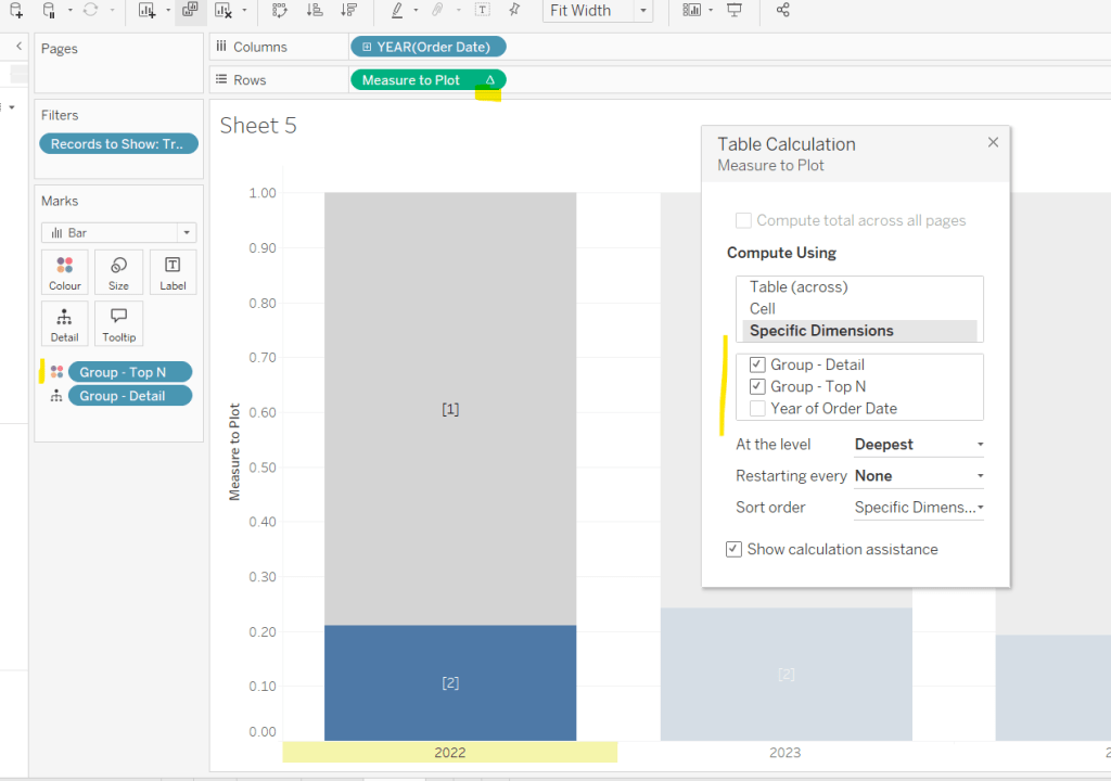
Create a new field

Group – Top N

IF (YEAR([Order Date]) = YEAR([Max Date]) AND [Customer ID Set – CY]) THEN ‘Top N’
ELSEIF (YEAR([Order Date]) = YEAR([Max Date])-1 AND [Customer ID Set – PY]) THEN ‘Top N’
ELSEIF (YEAR([Order Date]) = YEAR([Max Date])-2 AND [Customer ID Set – PPY]) THEN ‘Top N’
ELSE ‘Other’
END

and add to Colour, adjusting the colours to suit. You’ll then need to update the table calculation of the Measure to Plot field to ensure Group – Top N is also checked.

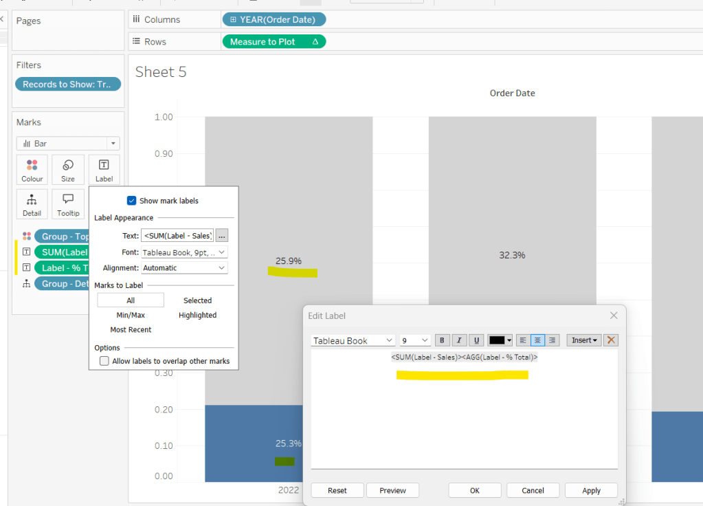
We need to display labels, but these need to differ based what measure we’re showing, and the format is different, so create

Label – % Total

IF [pPercentofTotal] THEN [Sales % Total] END

format this to % with 1 dp and

Label – Sales

IF NOT([pPercentofTotal]) THEN [Sales] END

format this $ K to 1 dp.

Add both of these to the Label shelf and ensure they are listed directly side by side. Only 1 will ever actually display.

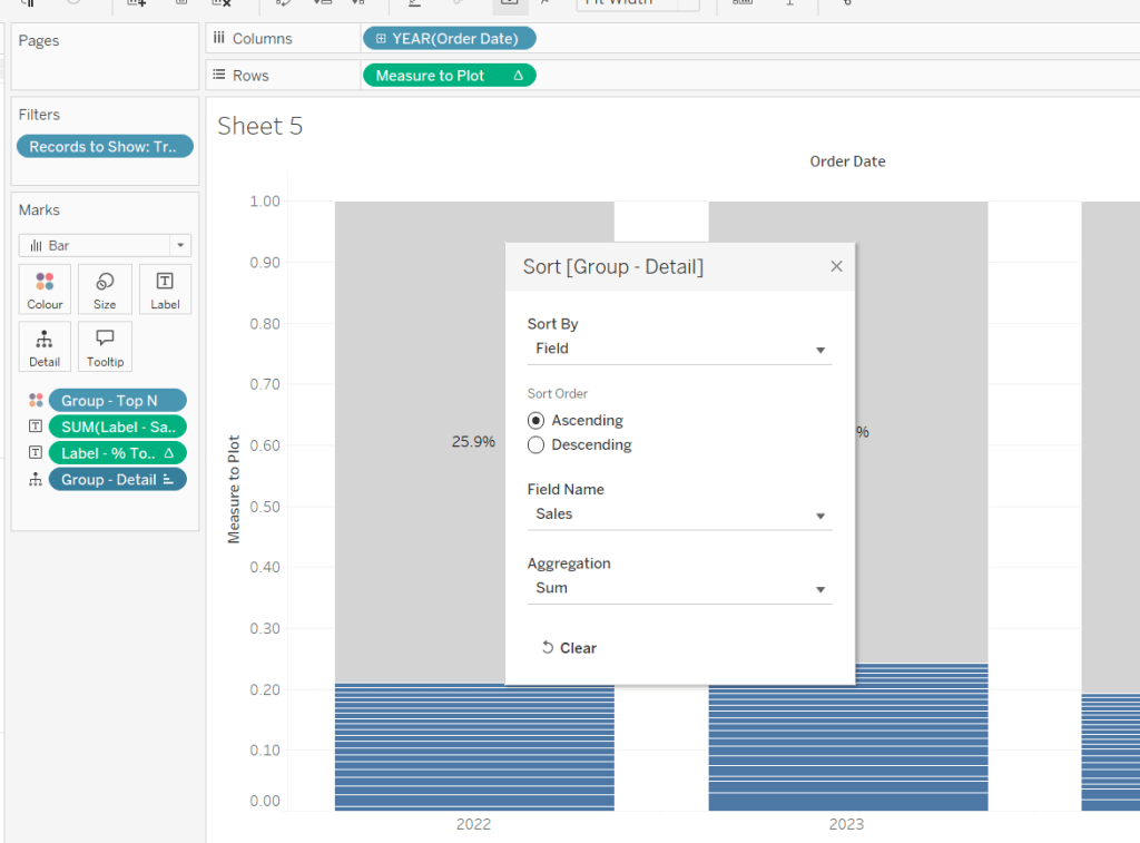
Change the pShowCustomers to Yes, and then add a white border via the Colour shelf. Add a Sort to the Group – Detail pill to sort by Sales ascending.

Add Sales, Sales % Total and Count Customers to the Tooltip shelf. additionally create

Tooltip – Customer

IF [pShowCustomers] AND [Group – Detail] <> ‘Other’ THEN [Customer Name] END

and add this to Tooltip too. Adjust the Tooltip to suit (make sure Sales % Total) is computing by both Group – Top N and Group – Detail so has the correct numbers.

Finally, hide the axis (uncheck show header on the Measure to Plot pill) and hide the Order Date label (right click and hide field label for columns).

Then add the sheet to a dashboard, and arrange the parameters suitably.

My published viz is here.

Happy vizzin’!

Donna

Playing with Stacks

For this week’s challenge, Sean Miller introduced multiple ways to get insight from a stacked bar chart. I managed this using 5 sheets and 1 dashboard.

Preparing the data

As the requirement stated only 2024 was to be considered, I chose to add a data source filter (right click data source -> Add Data Source Filter) where the Order Date Year = 2024.

Option 1 : The Analytics Pane

On a new sheet, add Order Date to Columns as a discrete month (blue pill) and Sales to Rows. Format Sales to $ with 0 dp. Change the mark type to bar and add Ship Mode to the Colour shelf.

Format MONTH(Order Date) to display the dates as Abbreviation. Manually move Ship Mode = Same Day in the colour legend so it is listed first. Hide the Order Date heading (right click -> hide field labels for columns).

Add a reference line (right click Sales axis -> add reference line) that sets a reference line per cell to the sum of Sales and displays the Value on the label.

Format the reference line (right click on one of the lines) and align the label top centre. Adjust the Tooltip if required. Add a white border around the bars (via the colour shelf).

Right click on the Ship Mode pill on the Colour shelf and check the Show Highlighter option to display the highlight input box. Test that selecting an option in the highlight box shows a recalculated reference line.

Name this sheet Option 1 or similar.

Option 2 – Dual Axis

Duplicate the Option 1 sheet and rename to Option 2 or similar.

We will capture the selected ship mode in a parameter.

pShipModeSelected

string parameter defaulted to empty string.

Show the parameter and then enter the text ‘First Class’

Create a new calculated field

Selected Ship Mode Sales

IF [Ship Mode] = [pShipModeSelected] THEN [Sales] END

format this to $ with 0dp.

Add Selected Ship Mode Sales to Rows. Change the mark type on the associated marks card to line and remove Ship Mode from the Colour shelf. Adjust the colour of the line to a dark grey/black and show mark labels.

Make the chart dual axis and synchronise the axis. Hide the right hand axis (uncheck show header) and remove column and row dividers.

Change the text in the parameter to Same Day. You should now get a broken line. Right click on the Selected Ship Mode Sales pill and format. Set the marks for special values to Hide (Connect Lines).

Option 3 – Dynamic Stacks

Duplicate the Option1 sheet again and rename to Option3. Show the pShipModeSelected parameter and enter text ‘Same Day’.

Create a new calculated field

Sort

IIF([Ship Mode]=[pShipModeSelected],1,0)

and drag it into the ‘dimension’ section of the data pane (above the line).

Right click on the Ship Mode pill on the Colour shelf and select Sort.. Change the Sort By option to Field ascending and Field Name = Sort. This will push the bars related to Same Day to the bottom of the stacked bar.

Building the Ship Mode Selector

On a new sheet, add Ship Mode to Columns and then double click into Columns and manually type MIN(1). Change the mark type to bar and edit the MIN(1) axis to fix it from 0 to 1.

Add Ship Mode to Colour and to Label (you may have to widen the bars to make the label visible). Align the label middle centre and bold the font. Adjust the size to the largest possible.

Hide the axis and the Ship Mode headings (uncheck show header). Remove all column/row dividers. Hide the Tooltip from displaying. Name the sheet accordingly.

Building the Navigation selector

I chose to add all the sheets onto a single dashboard (rather than separate dashboards), so created a navigation sheet.

To help with this, I basically utilised the Segment field that wasn’t being used, and essentially translated the values to repurpose them for the navigation options.

Navigation

CASE [Segment]
WHEN ‘Consumer’ THEN ‘Option 1: The Analytics Pane’
WHEN ‘Corporate’ THEN ‘Option 2: Dual Axis’
ELSE ‘Option 3: Dynamic Stacks’
END

Add this field to Columns and type in a MIN(1) in Columns too. Change mark type to bar, fix the axis from 0-1. Make the Size as large as possible. Add Navigation to Label and align middle centre and set the font to white. Adjust the column divider to be a thick white line and remove row divider. Hide the axis and the Navigation headings.

Create a new parameter to capture the navigation selection.

pSelectedDisplay

string parameter defaulted to : Option 1: The Analytics Pane

Show the parameter. Create a new field

Is Selected Display

[Navigation] = [pSelectedDisplay]

and add to the Colour shelf. Adjust to suit. Adjust Tooltip as required and rename the sheet.

Building the Dashboard

Create a dashboard and arrange all the objects on the dashboard, with the different options placed above each other. Use containers if need be. You’ll have something like this – it’ll look a little messy but don’t worry.

We’ll be using Dynamic Zone Visibility to control which object displays based on which option from the Navigation sheet is selected.

First, let’s set the interactivity to control the navigation selection. Add a parameter action

Select Display

on select of the Navigation sheet, set the pSelectedDisplay parameter, passing in the value from the Navigation field. Keep current value when deselected.

Clicking on the different options in the Navigation control will now change the parameter value, but this won’t do anything yet. We need several calculated fields

Option 1 Selected

[pSelectedDisplay] = ‘Option 1: The Analytics Pane’

Option 2 Selected

[pSelectedDisplay] = ‘Option 2: Dual Axis’

Option 3 Selected

[pSelectedDisplay] = ‘Option 3: Dynamic Stacks’

Option 2 or 3 Selected

[pSelectedDisplay] <> ‘Option 1: The Analytics Pane’

All of these fields will return True if the condition is met, so we can use these to control which objects display.

Back on the dashboard, select the Highlight Ship Mode object, and from the Layout pane, check the Control visibility using value and choose the Option 1 Selected field.

Select the Option1 bar chart and apply the same settings.

Now select the Ship Mode Selection sheet, but this time, choose the Option 2 or 3 Selected field to control visibility. It’s likely this field will now disappear.

Select the Option2 bar chart and choose Option 2 Selected field. This will disappear.

Select the Option3 bar chart and choose Option 3 Selected field. This will disappear.

Now click on the different options in the Navigation control and the different charts should display.

(Note – I actually chose to contain the highlight selector and the option1 bar chart within their own layout container, which meant I could then just apply the setting to control visibility of the layout container rather than the individual objects).

Ensure either Option2 or 3 on the navigation bar is selected so the Ship Mode selector is displayed. Create another parameter action

Set Ship Mode

On select of the Option 2 & 3 Selector sheet, set the pShipModeSelected parameter, passing in the value from the Ship Mode field. When clearing the selection, set the value to <empty string>.

Clicking on a ship mode should now display the line or reorder the stack depending what Option you were on.

In clicking the nav or the ship mode selector, you will probably have noticed that the other options become ‘greyed out’ or ‘faded’ To stop this from happening, use a highlight dashboard action.

Create a new field, mine happened to be

True

TRUE

but it could just as easily be named anything containing any string. Add this field to the Detail shelf of the Navigation sheet and the Ship Mode Selection sheet.

Back on the dashboard create a new highlight dashboard action

Deselect Ship Mode Selector

On select of the Option 2&3 Selector sheet, target itself but using the selected field of True.

Create another highlight dashboard action apply the same principals for the Navigation sheet (for more information and worked examples on ‘deselecting marks’, see this blog.

And hopefully you should now have a working solution. My published workbook is here.

Happy vizzin’!

Donna

Can you build a dashboard using containers?

For this week’s challenge, Kyle got us to look at dashboard layout, specially using containers to arrange the charts and KPIs. He added in a sprinkling of interactivity to make the challenge more complete.

The charts aren’t overly complex, so I won’t go into too much detail on building them all out. I used the latest version of Superstore, v2023.1.

Building the KPIs

When I first did this, I built the KPIs on a single sheet, then realised that wouldn’t work to get the layout required, so I ended up with 3 sheets.

  • Rename Sales to SALES and format to $ with 0 dp.
  • Add Measure Names to Filter and select SALES only.
  • Add Measure Names and Measure Values to the Text shelf.
  • Align centrally and format the text (I used font size 12pt and 20pt).
  • Add Category to the Filter shelf, and select all. Set the filter to apply to worksheets > all using this data source
  • Add Order Date to Filter and select Range of Dates. The Order Date pill will be ‘green’. Click on the context menu of the pill and select the Month (May 2015) option, so the range of dates will change at monthly intervals rather than daily. Set the filter to apply to worksheets > all using this data source
  • Create a field called True containing the value TRUE and False containing the value FALSE and add both these fields to the Detail shelf. These will be needed later to stop the sheet from remaining highlighted on selection.
  • Stop the Tooltip from displaying.
  • Name the sheet Sales

Repeat the steps for the Profit Ratio measure – if this doesn’t exist, create the field

PROFIT RATIO

SUM([Profit])/SUM([Sales])

and format this to % with 1 dp.

For the Orders measure create

ORDERS

COUNTD([Order ID])

If need be, you can simply duplicate the Sales sheet and just change the Measure Names filter to the appropriate measure.

Creating the Line Chart

Create a parameter to store the name of the selected measure.

pSelectedKPI

string parameter defaulted to the word ‘ORDERS’

Create a field to store the measure to display based on the value of the parameter

Measure to Display

CASE [pSelectedKPI]
WHEN ‘ORDERS’ THEN [ORDERS]
WHEN ‘SALES’ THEN SUM([SALES])
WHEN ‘PROFIT RATIO’ THEN [PROFIT RATIO]
END

On a new sheet, add Order Date to Columns and set to be a green (continuous) month level and Measure to Display to Rows.

I wanted to make my tooltips and labels reflect the measure selected (this isn’t actually part of the challenge). I created

Label – Orders

IF [pSelectedKPI] = ‘ORDERS’ THEN [ORDERS] END

format this to a number with 0 dp.

Label – Profit Ratio

IF [pSelectedKPI] = ‘PROFIT RATIO’ THEN [PROFIT RATIO] END

format this to % with 1 dp

Label – Sales

IF [pSelectedKPI] = ‘SALES’ THEN SUM([SALES]) END

format this to $ with 0 dp.

Add all 3 fields to the Tooltip shelf.

Also create

Chart Label

PROPER([pSelectedKPI])

this is a new function introduced in v2023.1 and will convert ‘ORDERS’ to ‘Orders’ and ‘PROFIT RATIO’ to ‘Profit Ratio’ etc. Add this to Tooltip too.

Modify the Tooltip as below – the 3 Label fields should be directly side by side with no spacing. Only one field will have a value at any time.

Remove the titles from the axes, and remove all gridlines. Name the sheet Line.

Building the Bar Chart

Add Category to Rows and Measure to Display to Columns. Sort descending. Add the 3 Label fields to the Label shelf, and arrange side by side.

Add Chart Label to Tooltip and adjust the tooltip.

Hide the axes, remove all gridlines/axis rulers etc and hide the Category label. Adjust the formatting of the fonts as required. Name the sheet Bar.

Building the dashboard

Describing using layout containers can be quite tricky – objects move around as you place things in. I’m going to do my best to describe the set up/structure I have and hope that it gets you what you need.

My preference is to always start with a floating container sized as per the dashboard. I then add tiled objects into that. I also have a habit of trying to rename my containers in the navigation layout pane to help me find the right section.

So let’s start. Create a new dashboard and set it to to 1200 x 900px.

Click the Floating button at the bottom of the left hand pane, and add a Horizontal container. Set the x & y position to be 0,0 and the width to 1200px and height to 900px. Rename the container to Base.

From the Objects list on the Dashboard pane, click Tiled and add a Text object. Enter the text for the dashboard title. Add a blank object beneath the text object.

When working with containers, it’s always good to add blank objects as a ‘starting point’ These all then get removed.

Now add a vertical container between the Title and Blank object. Name this container Main Body. Add a blank object into that container.

Add a vertical container to the left of the blank object in the Main Body container. Name this container Left Nav. Add a Text object into the Left Nav container and enter the instructional text. Add a blank object above the instructional text.

Add another vertical container to the right of the Left Nav container within the Main Body container. Add the Bar and the Line chart into this container, one above the other. Call this container Charts.

At this point a Tiled container object will have been automatically added containing the parameter.

Leave this for now – we’ll address this shortly.

We can remove some of the blanks now too. Remove the blank within the Main Body container, that is to the right of the Charts container. You can select the object on the item hierarchy layout, right click and remove from Dashboard.

You can also remove the blank object at the bottom of the Base container, below the Main Body container. Your item hierarchy should look something like

Now add another Horizontal container to the charts container, above the bar chart. Add the 3 KPI sheets into this container, position side by side. Name the container KPIs. Select the KPIs container, and use the context menu to Distribute Contents Evenly.

If they haven’t already appeared, the select one of the charts/KPIs and from the context menu select Filters > Category and then Filters > Month of Order Date to get the filter controls visible on the dashboard. They should appear on the right hand side, within that Tiled container (underneath the viz).

From the item hierarchy section, expand the Tiled container until you find the controls listed (see how many containers that got automatically added!).

Select the Category filter (easiest to do this by clicking on the object in the item hierarchy), and then move that object and position it above the blank object in the Left Nav container. Then delete the blank object. Select the Month of Order Date filer object and do the same.

Now we’ve got everything we want , we can remove the Tiled container and all of the objects it contains from the dashboard. Just right click on the first Tiled container in the item hierarchy and Remove From Dashboard (say yes/ok to any prompt that appears). You should have something that looks a bit like this – not the item hierarchy layout.

Now you’ve got everything needed on the dashboard in the right containers, we need to tidy it all up.

  • Fix the width of the Left Nav container to around 205 px.
  • Change the Category filter to single value dropdown, defaulted to All
  • Fix the height of the KPIs container to around 175 px
  • Remove the titles from all the KPI objects, and ensure all set to fit entire view
  • Amend the titles of the bar and line charts to reference the Chart Label field.
  • Fix the height of the bar chart to around 340px and set to fit entire view.

  • Set the background colour of the whole dashboard to grey (Format menu -> Dashboard – Dashboard Shading)
  • Set the background colour of the bar and line chart to White and add a grey border (slightly darker than the background colour)
  • Add borders round the 3 KPI charts too.
  • Set padding around all the objects – I tend to use both inner and outer padding. The key is consistency to ensure the spaces between the objects are the same. I typically start with 10 px outer padding all round, and then adjust as required. Sometimes you may add padding to the container and not to the objects themselves, other times you may set the container padding to 0 and apply to the objects, or a combination of both.

Adding the Interactivity

To set the category bar chart to work as a filter, simply select the object and from the context menu select use as filter. Then go to the Actions list (Dashboard > Actions) and edit the ‘Filter 1 (generated)’ action and rename it to something more useful eg Filter bu Category.

For the bar & line chart to update ‘on click’ of a KPI, add a parameter action

Select KPI

On selection of the Orders, Profit Ratio or Sales sheet, set the pSelected KPI parameter, passing the value from the Measure Names field. Keep current value when selection is cleared.

Finally to prevent the KPIs from remaining highlighted in blue on selection, add 3 filter actions (1 per KPI) set up as follows

Deselect Sales KPI

On selection of the Sales sheet on the dashboard, target the Sales sheet directly, and set the fields as Source = True to Target = False.

Finally, to collapse the left hand nav section, select the Left Nav container and from the context menu, select add Show/hide button. A X button will appear which is floating by default. Move this to where you choose (you might need to add some additional left padding to the title to make space.

Load the dashboard in presentation mode to easily test the hide/show functionality.

And hopefully that should be it! Phew!

My published viz is here.

Once you’ve grasped the concept of containers, they really are the best way of controlling the behaviour and layout of objects on your dashboard. When I’m building something formal, I personally never want to have a Tiled container on my dashboard – this is an object that gets automatically added, and you can see from above, how many nested containers it ended up adding through a single action I took. If you’re not careful, you can end up with such a nest of containers, that it can get really hard to unpick.

Happy vizzin’!

Donna

Can you create a jittered box plot?

It was Kyle’s turn to set this jittered box plot challenge this week. While it may sound complicated, this is quite a straightforward challenge this week, made more so as Kyle very kindly provides references to other blogs which help you.

So let’s build…

Firstly you need to download the 2 excel files Kyle provides, then relate them via the Team field (this should happen automatically).

On a new sheet add Team to Columns, Age to Rows and Player Code to Detail. Change the mark type to circle, and reduce the Size slightly.

From the Analytics pane, drag box plot onto the sheet and drop onto the Cell image that displays.

Create a new field which is the key field for the jittering functionality

Jitter

RANDOM()

This just generates a random number between 0 and 1.

Add this to Columns and change the view to Entire View so its not all squashed up.

We’ve got our jittered box plot. Now we just have to add in the additional functionality required.

Drag the Playoffs field so that it’s above the line in the data pane on the right hand side (ie change it from a measure to a dimension). Then right click > Aliases to alias to 0 and 1 values to the labels required

Add this field to the Columns in front of the Team field. Re-order so ‘Playoff Teams’ is listed first (I just click on the field name and drag it to the left).

We also need to sort the data based on the median value per team. We need a new field for this.

Median Age per Team

{FIXED [Team]:MEDIAN([Age])}

Add a sort to the Team field, so it sorts by the Median Age per Team descending

Add League to the Filter shelf and set to AL.

Format the worksheet and set the Column Banding to be level 0 and band size 1 to shade the sections as required.

Then adjust the format of the gridlines to remove all row and column gridlines.

Finally, add Name to the Tooltip and adjust accordingly. Then hide the Jitter axes (uncheck Show Header) and adjust the Age axis so it is fixed to start at 18.

You can now add this to a dashboard and you’re done! My published viz is here.

Happy vizzin!

Donna

Can you do Comparative Quantity Analysis?

For this week’s challenge, Sean wanted to test us on a particular aspect of Tableau – the use of INCLUDE & EXCLUDE LOD expressions, although he then finished off the challenge intro with the statement “You can complete this challenge however you like but just DON’T USE A FIXED LOD”.

Like many, I am pretty comfortable using a straightforward FIXED LoD, but rarely get INCLUDE & EXCLUDE ‘out of my toolbox’. I usually end up using them because I’ve followed an example online to achieve a specific task. With this challenge, I had every intention of trying to make use of these ‘lesser used’ LoDs when I started out.

However I did struggle. I got to a point where I knew what I’d do with table calculations, but however I tried with various LoD statements, I couldn’t get the behaviour I desired. And at this point, I had a working solution that hadn’t used FIXED LoDs either, so based on Sean’s closing statement, I had achieved a result. When doing these challenges, I do have to consider how much of my time to devote to them (although COVID restrictions does mean my home/family/social life if not as busy at the moment), so I chose to publish so I could feel content I had completed the challenge. However, there was a niggle, that I hadn’t managed to apply the functions the challenge was really testing for.

A twitter post the next day from a fellow #WOW participant Nik Eveleigh, calling out how helpful Tim Ngwena‘s Include LoD YouTube video was, piqued my interest, and that evening I set about watching the video, and subsequently managing to create another solution using the required INCLUDE & EXCLUDE LoDs, without any table calculations either.

So for this blog, you’re gonna get two solutions 🙂 I’ll explain the various fields required for each solution, and build out a tabular view to demonstrate. Building the view is then pretty much the same.

  • Getting Started
  • The Table Calculation Solution
  • The LoD Solution
  • Building the Viz
  • Adding the dashboard interactivity

Getting Started

First up, just a note about the data set. You need to use the Superstore dataset, but need a version that includes the Manufacturer field. This doesn’t seem to exist by default in the excel file included as part of Tableau’s install. So I used the data provided by Sean on data.world.

Secondly, once connected to the data source, we’re going to need a parameter that is ultimately going to be used to drive the dashboard interactivity later on. The parameter needs to store the value of the Sub-Category the user has selected on the chart. The parameter is required regardless of which solution you choose to follow.

pSelectedSubCat

This is a string parameter that contains the text Fasteners by default. Create this and then show it on the view.

The Table Calculation Solution

The first measure being displayed on the viz is the average Quantity by Manufacturer for each Sub-Category; that is for the total quantity of goods sold against each sub-category, how much on average did each manufacturer order?

Count Manufacturer

COUNTD([Manufacturer])

Identifies the distinct number of manufacturers

Avg Qty

SUM([Quantity])/[Count Manufacturer]

Lets put these fields out into a table, so we can see the values. I’ve sorted the rows by Avg Qty descending, and you can see the values match the required output.

Now we need to identify the Avg Qty associated to the selected Sub-Category.

Selected Avg

IF [pSelectedSubCat]=MIN([Sub-Category]) THEN [Avg Qty] ELSE 0 END

This will return the value we want for the row that matches the value of the parameter, and 0 otherwise. The Sub-Category dimension is wrapped in MIN as Avg Qty is an aggregated value, so the dimensions also need to be aggregated. MAX or ATTR will work as well.

Pop this field onto the table.

For the next step, we need to find a way to ‘replicate’ this 152 value across all the rows displayed. When building, I knew exactly what I would do next with a table calc, but I thought this is where the LoD needed to be used, and despite my best efforts I just couldn’t figure it, but more on that later. For now, we’re going to use a table calculation to replicate the value across the whole ‘window’.

Avg of Selected Sub Cat

WINDOW_MAX([Selected Avg])

This is basically looking for the maximum value of the Selected Avg field, which is 152 (as all the other values are 0).

Add this to the view, and set the table calculation to compute using Sub-Category. This is just good practice when using table calcs, as it means wherever the pill gets moved to in the view, it will retain the same computation.

Variance

[Avg Qty]-[Avg of Selected Sub Cat]

Add this onto the table, and again set the table calculation to compute by Sub-Category.

If you change the value in the pSelectedSubCat parameter, you’ll see the last 3 columns change.

So now we’ve just got a few more fields to create that we’ll need on the viz.

We need to be able to identify the selected Sub-Category which will be used to colour the bars.

Is Selected Sub Cat?

[Sub-Category]=[pSelectedSubCat]

The tooltip also shows the text ‘more’ or ‘less’ when describing the display, so we need a field for this

TOOLTIP: more or less

IF [Variance] <= 0 THEN ‘less’ ELSE ‘more’ END

And finally, the tooltip displays the variance as an absolute number, so we need a field for this too

TOOLTIP:Variance

ABS([Variance])

So this is all the core fields you’ll need to build the solution, so if you’re not interested in the LoD route, skip over the next bit 🙂

The LoD Solution

After watching Tableau Tim’s video, I realised why I had struggled to get an LoD solution to work. I needed to revisit my approach to calculating the average quantity, a step I hadn’t originally considered.

Now in the interest of time, I’m not going to write out why the calculation below works in detail when Tim demonstrates it so eloquently in his video 🙂

Qty Inc Manufacturer

{INCLUDE [Manufacturer] : SUM([Quantity])}

This field is going to help us get our ‘average quantity’ value.

Add Sub-Category, Quantity and Qty Inc Manufacturer into a tabular view, and change the aggregation of the Qty Inc Manufacturer pill from SUM to AVG. Order by this field descending, and you can see we have the same values as the Avg Qty field I created in the above solution.

This time, I’m going to start with the field to identify the selected Sub Category.

Is Selected Sub Cat

[pSelectedSubCat]=[Sub-Category]

Then we need to identify the value associated to the selected sub category, and will do this with two fields

Selected Qty

IF [Is Selected SubCat] THEN [Quantity] END

Selected Qty Inc Manufacturer

{INCLUDE [Manufacturer] :SUM([Selected Qty])}

Add these onto the view, and you can see the behaviour. Note this time I chose not to bother with an ‘Else 0’ statement (it wasn’t necessary for the above either).

Now we want to be able to ‘spread’ this value across all rows, and the Comparative Sales Analysis example in this Tableau blog post helps here (and I’ve just seen that Tableau Tim has produced an EXCLUDE LoD video too, which I’m sure will explain things very well).

Overall Selected Qty Inc Manufacturer

{EXCLUDE [Sub-Category], [Is Selected SubCat]: AVG([Selected Qty Inc Manufacturer])}

Note – I found I needed to add the Is Selected SubCat dimension into the statement, to get the tooltips working on both the bar charts.

And once again, we can now compute the variance, and the variance required for the tooltip, and the more or less values:

Variance

AVG([Qty Inc Manufacturer]) – MIN([Overall Selected Qty Inc Manufacturer])

TOOLTIP:Variance

ABS([Variance])

TOOLTIP : more or less

IF [Variance] <= 0 THEN ‘less’ ELSE ‘more’ END

Building the Viz

To build the viz

  • Add Sub-Category to Rows
  • Add Avg Qty (or Qty Inc Manufacturer set to AVG) to Columns. Sort by the field descending.
  • Add Variance to Columns
  • On the Avg Qty marks card, add Is Selected Sub Cat to the Colour shelf and adjust accordingly
  • On the Variance marks card, add Variance to the Colour shelf, and notch down the transparency to about 75%
  • Add TOOLTIP:Variance and TOOLTIP:more or less to the Tooltip shelf of the All marks card
Then it’s just a case of formatting the display and the tooltips.

Remember – if you’re working with the table calc solution, make sure all the table calculation fields in the display (those with the triangle symbol) have all been set to compute by Sub-Category.

Adding the dashboard interactivity

When you click on a Sub-Category, the variance needs to change. This is managed via a Parameter Dashboard Action. Once the viz has been added to a dashboard then add a dashboard action that on select of the viz, sets the pSelectedSubCat parameter, with the value of the field from the Sub-Category dimension.

There’s also an additional feature in this dashboard that stops the selected field from being highlighted on click. To stop this from happening, create 2 new fields

True

True

False

False

Add both of these to the Detail shelf on the All marks card of the chart viz.

Then on the dashboard, add a dashboard filter action, which on select targets the chart sheet, and maps True to False. As this is never a match ie ‘true’, the filter doesn’t apply.

Hopefully I’ve covered everything. My published vizzes are here

Happy vizzin’! Stay Safe!

Donna

Can you show missing selected periods and autosize bars?

Newly wed Lorna Brown (previously known as Lorna Eden 😉 ) returned for this week’s #WOW challenge.

The requirement was to create a bar chart showing number of orders per subcategory per day/week/month over a user defined number of years. The chart is coloured based on Profit. The bars also need to change size based on what date part was being displayed Lorna already hinted they’d be parameters and set actions involved.

Building the chart

First off let’s create the parameters we need to drive the dates we need to include in the viz.

Select Period

A string parameter listing Daily, Weekly, Monthly. The trick here is to store the datepart of day, week, month as the value, while displaying the required text for selection. Default to Weekly.

Doing this means later we can refer directly to the parameter when we need some date manipulation.

Number of Years

A range integer parameter starting from 1 to 4, defaulting to 2

With these, we can define the Date field that we need to plot on our axis

Date to Plot

DATE(DATETRUNC([Select Period],[Order Date],’Sunday’))

This has the effect of truncating every order date to the 1st day of the relevant month or week or just to the day, so for example if ‘month’ is selected all the orders placed in May 2019 will be grouped together under 01 May 2019 etc.

Dates to Include

YEAR([Order Date])>={MAX(Year([Order Date]))}-([Number of Years]-1)

{MAX(Year([Order Date]))} is a shortened notation for the level of detail calculation (LoD)

{FIXED : MAX(Year([Order Date]))}

which basically returns the highest year in the data set, which in this case is 2019. If the [Number of Years] parameter is set to 1 for example, we would expect all of 2019 to display, hence we need to subtract 1 in the formula so we get all orders in 2019.

Adding this to the Filter shelf and set to true will limit the orders to the dates in the years required.

Finally we need the measure

Number of Orders

COUNTD([Order ID])

Right, with those parameters set, we can now build the basic bar chart. For now we’ll just restrict the data to a single Sub-Category directly – we’ll look to adjust this later.

  • Add Dates to Include = True to Filter
  • Add Sub-Category = Tables to Filter
  • Add Date to Plot as a continuous exact date to Rows (green pill)
  • Add Number of Orders to Columns
  • Add Profit to Colour
  • Set Mark Type to Bar
  • Adjust the Tooltip to match
  • Show the Select Period & Number of Years parameters
  • Adjust the Sheet Title to reference the Select Period parameter

Sizing the bars

You’ll see the bars all look a bit overlapped. You might be tempted to adjust the bar size by moving the slider to reduce the overlap, which may well work, but as you change the Select Period parameter you’ll find that what you’re doing is setting the bar width to set width that is the same whether you have 24 marks displayed (monthly for 2 years) or 156 marks (daily for 2 years). The requirement is for the bar to adjust in width, so it’s wider when there’s less marks.

To do this, we need a calculated field

Size

CASE [Select Period]
WHEN ‘day’ THEN 1
WHEN ‘week’ THEN 5
WHEN ‘month’ THEN 10
END

These are just arbitrary values I chose, and you can play around with the values to suit, but the key is you’re choosing a range of numbers with the smallest for ‘day’ and the largest for ‘month’.

Add this field to the Size shelf. and change it to be a Continuous Dimension ie a green pill of just Size rather than SUM([Size]).

Then click on the Size shelf and change from Manual to Fixed, and set the alignment to Centre.

Changing the Select Period parameter you’ll see the bars adjust their width from being very narrow for Daily, wider for Weekly, and wider again for Monthly.

Sub Category Selector

This is based on techniques that have cropped up in a few #WOWs this year.

We’re going to be using Set Actions for this bit, so to start we need a Set.

Right click on Sub-Category -> Create Set. Name the set Selected Sub-Category and just select a single value, Tables for now.

Now on a new sheet, add MIN(0.0) to Columns (type directly in) and Sub-Category to Rows.

  • Change the Mark Type to Shape
  • Add Sub-Category to Label
  • Add Selected Sub Category set to Shape, and adjust the shape and colour to suit
  • Create a calculated field called True and another called False, each containing the value True and False respectively – add these to the Detail shelf.
  • Edit the Axis to be Fixed to start at -0.07 to 1. This is to shift everything to the left.
  • Turn off Tooltips
  • Format to remove all column, row, zero & grid lines & axis rulers.
  • Uncheck Show Header on Sub-Category and MIN(0.0)

Building the dashboard

First up, now we’ve got a Set to store the Selected Sub-Category, remove, the Sub-Category field from the Filter shelf of the bar chart. Add the Selected Sub-Category set to the Filter shelf instead.

Now create a new dashboard sheet and add the bar chart to it.

By default, the Profit colour legend and parameters will be displayed in a vertical layout container to the right of the bar chart.

Remove the colour legend, and position the Select Period parameter above the Number of Years.

Then add the Selector sheet between the two parameters, and remove any additional legends that get added.

Add a dashboard action Deselect against the Selector sheet to stop the un-selected Sub-Categories from fading out.

Add a further dashboard action Select Sub Cat against the Selector sheet to set the value of the Selected Sub-Category set on selection. The dashboard action should be set flagged to Run on single select only, so multiple values can’t be chosen.

Change the vertical layout container to be floating, then adjust the height and set the background colour to white.

Use the Add Show/Hide Button option on the Layout container to enable the collapsible container functionality.

You’ll just need to move things around a bit, adjust the sizes to suit, but that should be pretty much it.

My published version is here.

Keep safe & Happy vizzin’!

Donna