string list parameter containing values week, month and quarter; defaulted to month. Note the capitalisation of the display as value. The value itself should all be lowercase as it will be referenced in calculations later.
pTimeFrame
integer parameter ranging from 12 to 36, with a step-size of 6 and defaulted to 24
pMoveAvg
integer parameter ranging from 3 to 12 with a step size of 3 and defaulted to 3
Creating the calculations
The viz needs to display a dynamic date based on thevalue of the pTimePortion parameter.
Display Date
DATE(DATETRUNC([pTimePortion],[Order Date]))
It also displays the moving average of Sales based on the pMoveAvg parameter.
Moving Avg
WINDOW_AVG(SUM([Sales]), -1*([pMoveAvg]-1), 0)
Note, as the moving average is to include the Sales value of the ‘current’ date, then we need to subtract 1 from the pMoveAvg parameter. Ie if the pMoveAcg parameter = 3, then we want to calculate the moving average over the ‘current’ mark plus the previous 2 marks, so -2 needs to be fed into the calculation.
Finally, we need to restrict the dates being displayed in the viz. For this I calculated
ie only include records where the Order Date is greater than pTimeFrame weeks/months/quarters prior to the Latest Date.
Building the viz
On a new sheet, display all the 3 parameters. The add Display Date as a continuous exact date (green pill) to columns and Sales to rows.
Add Moving Avg to rows, make dual axis and synchronise the axis. Adjust colours of the marks to suit.
Add Date to Display to the Filter shelf and set to True. Then add Sales and Moving Avg to the Tooltip of the All marks card, and adjust Tooltip accordingly.
Update the title of the sheet so it references the various parameters
Finally, tidy up by
removing row and column dividers
hiding the right hand axis (right click, uncheck show header)
editing the Display Date axis, so the title of the axis references the pTimePortion parameter (Note – I did find this gets ‘lost’ when publishing to Tableau Public, so I had to re-edit my viz after publishing to reapply this setting).
Then add to a dashboard, and use a horizontal layout container to organise the parameters across the top. My published viz is here.
Erica set this week’s challenge, focusing on the ability to compare specific entities against themselves and ‘the whole’ without resulting in a mess of coloured spaghetti. 3 levels of difficulty were provided. As it stated the levels didn’t necessarily follow on from each, I just built (and am therefore blogging about) level 3 – the advanced challenge.
Defining the core parameters
For the user to select the main element they want to analyse we need
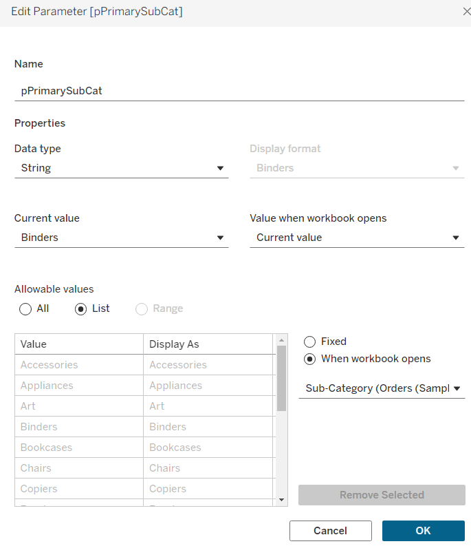
pPrimarySubCat
string parameter, that is sourced from a List based on the Sub-Category field when the workbook opens. Default to Binders.
This parameter will be visible to the user to select from a drop down list control.
To capture the secondary element to compare against, we need
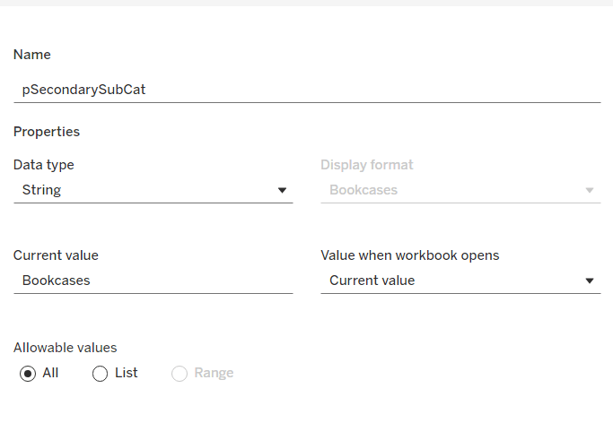
pSecondarySubCat
string parameter defaulted to Bookcases.
This is just a ‘type in’ field, that won’t ultimately be displayed to the user, but populated via a dashboard parameter action on select of a line in the chart.
To control the different type of display options, we need
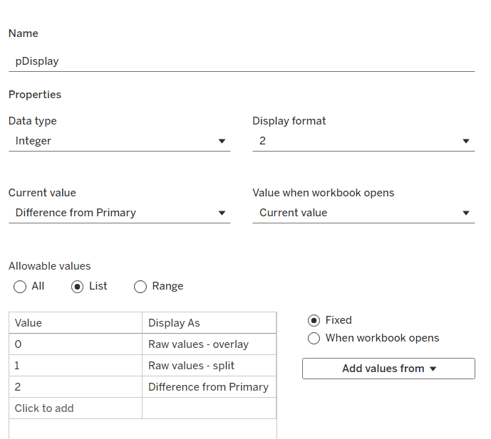
pDisplay
integer parameter sourced from a manual list which aliases the integer values for the displayed text strings. Defaulted to 2 (Difference from Primary)
Defining the additional calculations
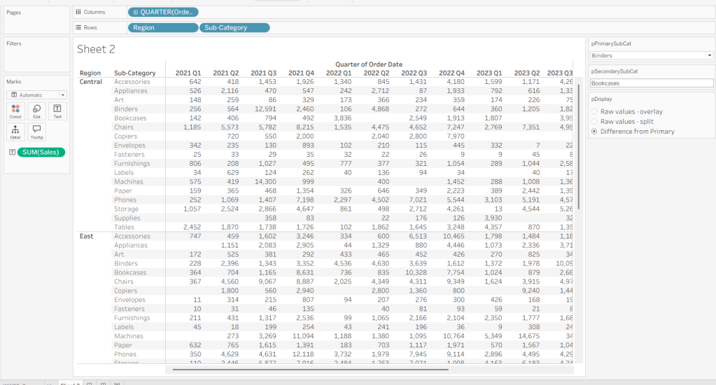
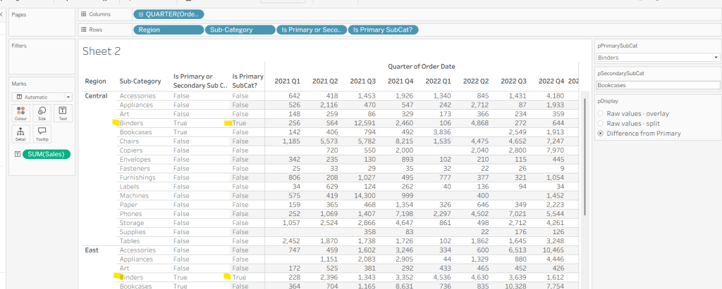
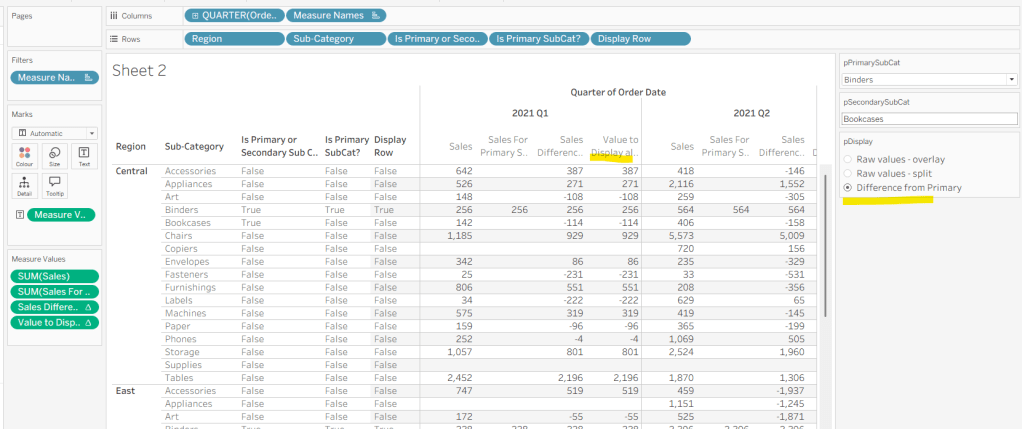
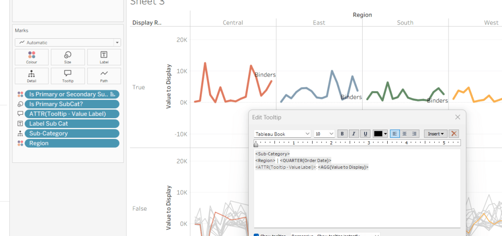
As I often do, we’ll build out a tabular display to determine all the calcs required. On a new sheet, add Region and Sub-Category to Rows, then add Order Date at the Quarter level as a discrete (blue) pill to Columns. Add Sales to Text. Show the 3 parameters created above.
We need to identify which Sub-Categories will be coloured. This is based on whether they are a primary or secondary Sub-Category.
Is Primary or Secondary Sub Cat
[pPrimarySubCat] = [Sub-Category] OR [pSecondarySubCat] = [Sub-Category]
Add this to Rows. Based on existing selections, the rows for Binders and Bookcases should be set to True.
We will also need to identify which is the the Primary Sub-Category only to help determine how many rows are displayed, so create
Is Primary SubCat?
[pPrimarySubCat] = [Sub-Category]
Add to rows. In this case just Binders should be True at this point.
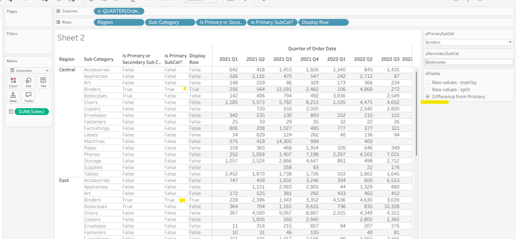
With this field, we can then work out how many ‘rows’ are going to be in our final viz display.
Display Row
IIF([pDisplay] = 0, TRUE, [Is Primary SubCat?])
ie, if the pDisplay parameter is ‘Raw values – overlay’ , then we’ll just display 1 row (so all rows set to True), otherwise there will be 2 rows, split based on whether the Sub-Category is the selected value in the pPrimarySubCat parameter or not.
Add this to Rows, and change the pDisplay parameter to see how this field changes.
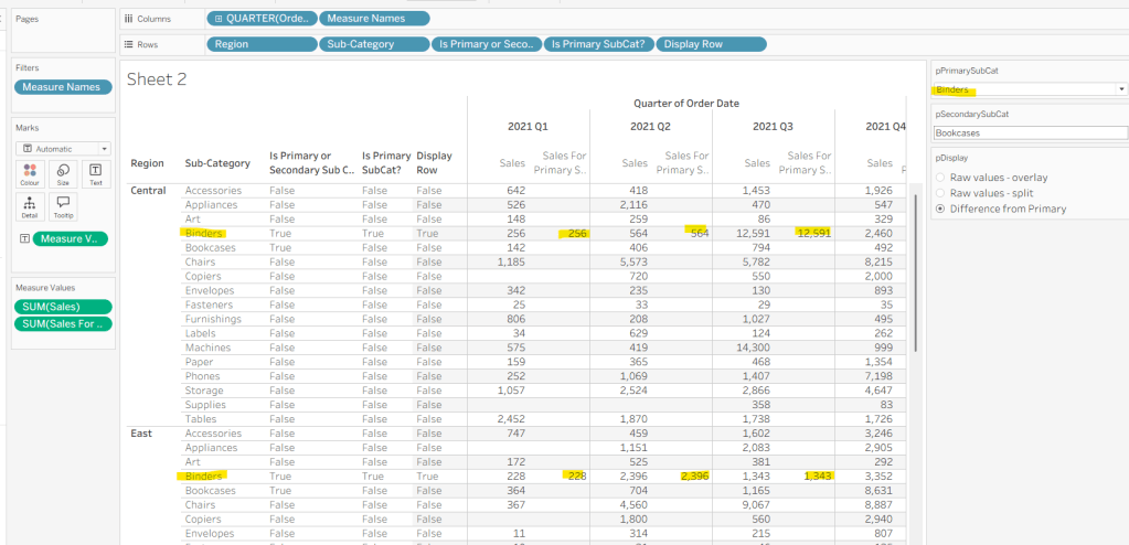
We also need to display different values depending on what pDisplay option is selected. When the ‘Difference from Primary’ option is selected, then we need to show the Sales value for theprimary Sub Category, but the difference from this value for all others. For this we first need to capture just the sales for the primary Sub-Category
Sales For Primary Sub Cat
IF [Is Primary SubCat?] THEN [Sales] END
Add to the table and adjust Measure Names so it is displayed after the Order Date field. Rows for this column will only have values when the Sub-Category is the primary one selected.
Now we calculate the difference, but only if it’s not the primary Sub-Category; we want Sales in that instance
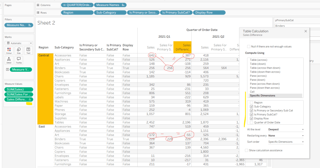
Sales Difference
IF MIN([Is Primary SubCat?]) THEN SUM([Sales]) ELSE SUM([Sales]) – WINDOW_MAX(SUM([Sales For Primary Sub Cat])) END
Here we’re using a WINDOW_MAX table calc to essentially ‘spread’ the value in the Sales for Primary Sub Cat column across all rows associated to the Region. Add this to the table, and adjust the table calculation setting of the pill, so it is computing by all fields except Region and Order Date
Finally, we need a field that will decide whether we’re displaying Sales or Sales Difference based on the pDisplay selection
Again, add to the table, adjust the table calc as above and then test the output of the field, as you adjust the pDisplay parameter.
While we’re here, we’ll just define another couple of calcs needed for the viz
Label Sub Cat
IF [Is Primary or Secondary Sub Cat] THEN [Sub-Category] END
Used to only display a label for either of the two selected Sub-Categories.
Tooltip – Value Label
IIF([pDisplay]=2 AND NOT([Is Primary SubCat?]), “Difference from ” + [pPrimarySubCat] + ” Sales”, “Sales”)
Will be used on the Tooltip to ensure the correct text is displayed depending on type of display selected.
Building the Viz
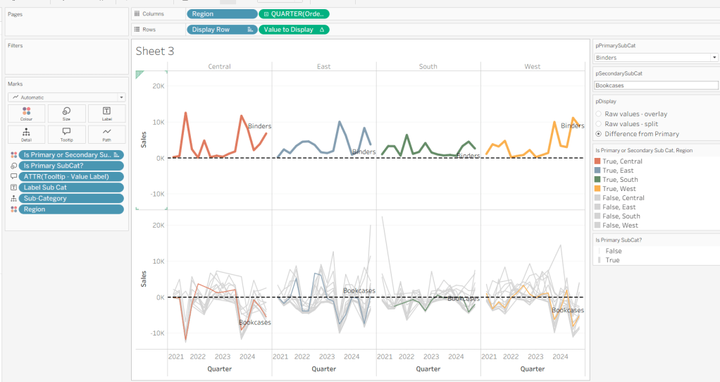
On a new sheet, show the 3 parameters and set them to the defaults (ie Binders, Bookcases and Difference from Primary).
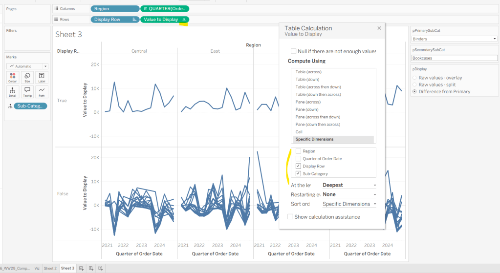
Add Region to Columns, then add Order Date at the Quarter level as a continuous (green) pill to Columns. Add Display Row to Rows and adjust the Sort on the pill to be a manual sort, where True is listed first. Add Sub-Category to Detail, then add Value to Display to Rows and adjust the table calc so all fields except from Region and Order Date are selected.
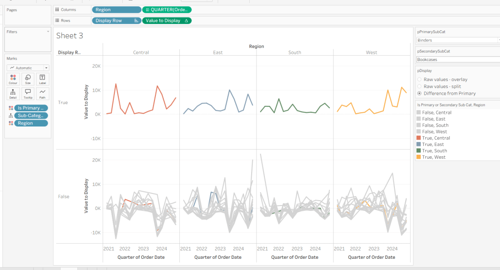
Add Is Primary or Secondary Sub Cat to Colour. Some lines will disappear, but don’t worry. Then add Region to Detail, and then select the ‘detail’ icon to the left of the pill on the marks shelf, and change it to Colour so 2 pills are now on the Colour shelf. Adjust the table calculation setting of the Value to Display pill to ensure the Is Primary or Secondary Sub Cat field is also now checked – this should make all the lines reappear.
Then adjust the colours in the colour legend so all the entries that start ‘False’ are grey and the others are as required.
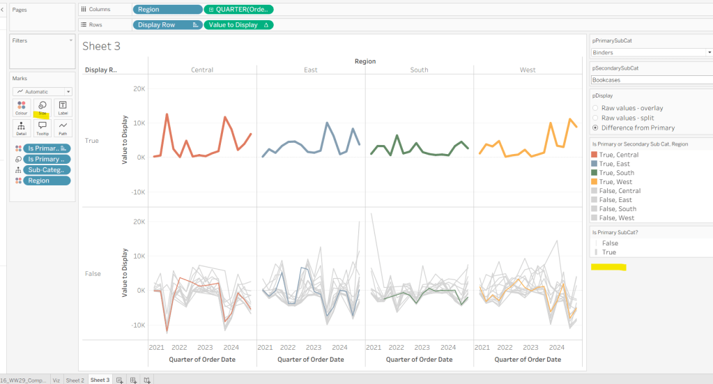
Adjust the sort on the Is Primary or Secondary Sub Cat pill on the marks card, so it is manually sorted with True first. This ensures the coloured lines are ‘on top’ and always visible. Add Is Primary SubCat? to Size shelf. Readjust the table calc on Value to Display again, and then adjust the Size so it is visibly thicker than the rest of the lines, which will probably be by adjusting both the range in the Size legend, and adjusting the slider on the Size shelf.
Add Label Sub Cat to the Label shelf (adjust table calc again), and set label to allow labels to overlap other marks. Add Tooltip – Value Label to tooltip and update the Tooltip as required
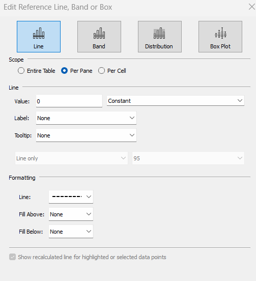
Add a reference line to the Value to Display axis, and set to be a constant of 0 displayed as a black dashed line
Edit both axis to update the axis titles on each, hide the Display Row pill (uncheck show header on the pill) and hide the Region column label (right click > hide field labels for columns).
Building the dashboard
Use layout containers to construct the dashboard as required
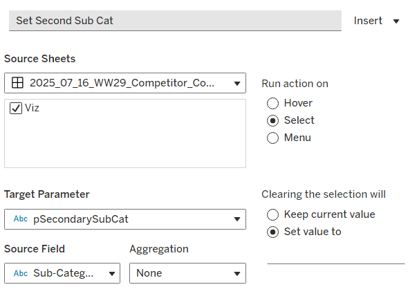
Create a dashboard parameter action to capture the value of the secondary Sub-Category
Set Second Sub Cat
On select of the Viz, set the pSecondarySubCat parameter with the value sourced from the Sub-Category field. When selection is cleared, set it <none>
Clicking one of the grey lines should now change the comparison Sub-Category. But you’ll notice the rest of the unselected lines are ‘faded’ and your selection is ‘highlighted’. We don’t want this to happen. To resolve, create new calculated field
HL
‘Dummy’
and add to the Detail shelf on the viz sheet itself.
Then add a dashboard highlight action
Un-Highlight
On selection of the Viz sheet on the dashboard, target the viz sheet on the dashboard, selecting the HL field only.
As all the marks have the HL ‘dummy’ field associated to them, they all become ‘highlighted’, giving the appearance of nothing actually being highlighted.
Finally, we need to make the title of the dashboard ‘dynamic’ and reflective of the selections made in the primary and secondary Sub-Category parameters. But the secondary one can be empty, so the text needs to handle this. An additional ‘ and ‘ needs to display if the secondary Sub-Category is set. I chose to use a parameter to help with this, as text objects on a dashboard can reference parameters.
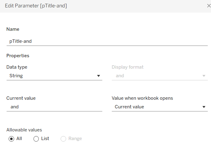
Create a new parameter
pTitle-and
string field defaulted to the text <space>and<space>
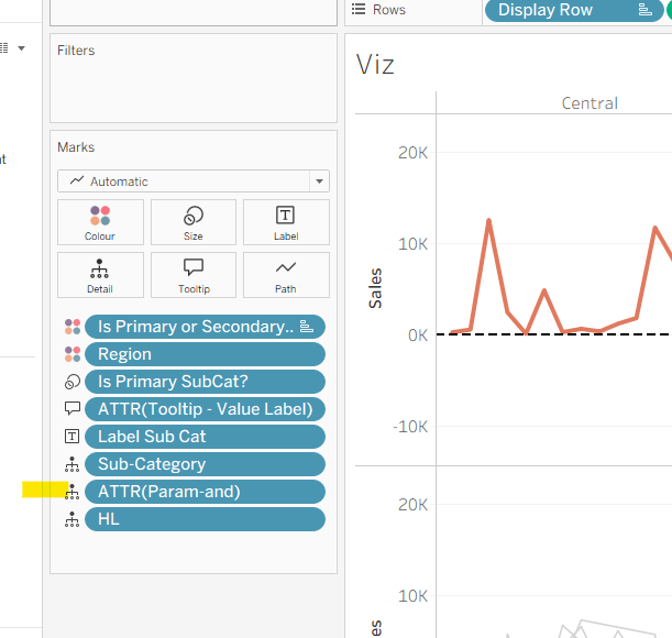
Create a calculated field
Param-and
‘ and ‘
and add to the Detail shelf on the viz. Set it to be an attribute (this won’t impact the table calc).
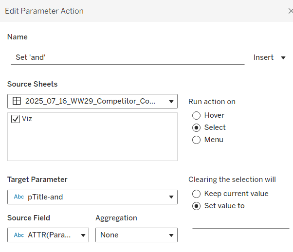
Back on the dashboard, create another dashboard parameter action
Set ‘and’
on select of the Viz, set the pTitle-and parameter passing in the value from the Param-and field. When the selection is cleared, set to <none>.
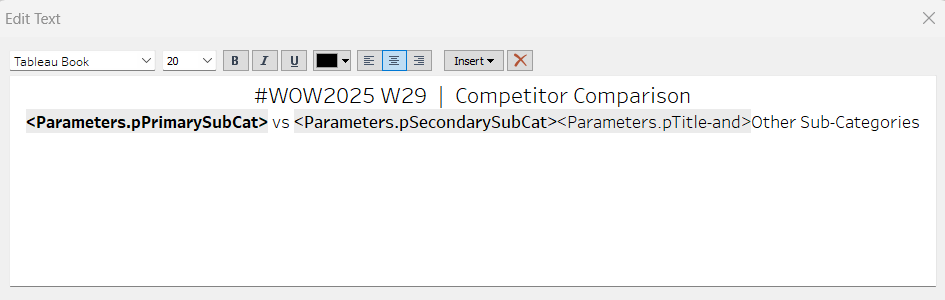
Then create (or adjust) the title text object so it references the relevant parameters (notice the spacing – or lack of – between some of the fields)
Erica set this fun and incredibly useful challenge this week, based on the TC25 talk by Lorna Brown & Robbin Vernooij, to showcase different methods of normalising data when comparing measures which have drastically different scales.
Building the Raw Values chart
Add Sales to Rows. Then drag Quantity on to the canvas and drop the pill on the Sales axis (when you see the ‘2 column’ icon appear). This has the affect of adding the fields onto a shared axis, and the sheet will update to automatically reference Measure Names and Measure Values. Swap Quantity so it is displayed below Sales in the Measure Values section.
Add Region and Category to Detail and change the Mark type to Circle.
I’m going to incorporate the last requirement at this stage, as it helps with the build, so create parameters
pSelectedRegion
string parameter, defaulted to West
pSelectedCategory
string parameter, defaulted to Furntiture
show both these parameters on the sheet.
Create a new field
Is Selected Region & Category
[pSelectedCategory]=[Category] AND [pSelectedRegion]=[Region]
Add this field to Colour, and swap the values in the legend, so True is listed first. Then change the Region on the Detail shelf, so it is also on colour, by adjusting the icon to the left of the pill. Adjust the colours as required and then reduce the opacity on colour to 80%.
Manually update the entry in the pSelectedRegion parameter to each Region, so the True-<Region> colour combination can be updated to the dark grey.
Add Is Selected Region & Category to Size. Edit the size so they are reversed and the range in size is closer than the default. Once done, then manually adjust the dial on the Size shelf.
Show mark labels, selecting the option to only show the min & max values per cell and aligning middle right
Update the Tooltip. Then create fields True = TRUE and False = FALSE and add both of these to the Detail shelf. We’ll need these to disable the default highlighting later (adding now, as for all the other sheets, we’ll duplicate this one, so makes things easier).
Show the caption (Worksheet menu > show caption) and update the caption to reference the website Erica refers to. Then update the title of the sheet, and name the tab Raw or similar.
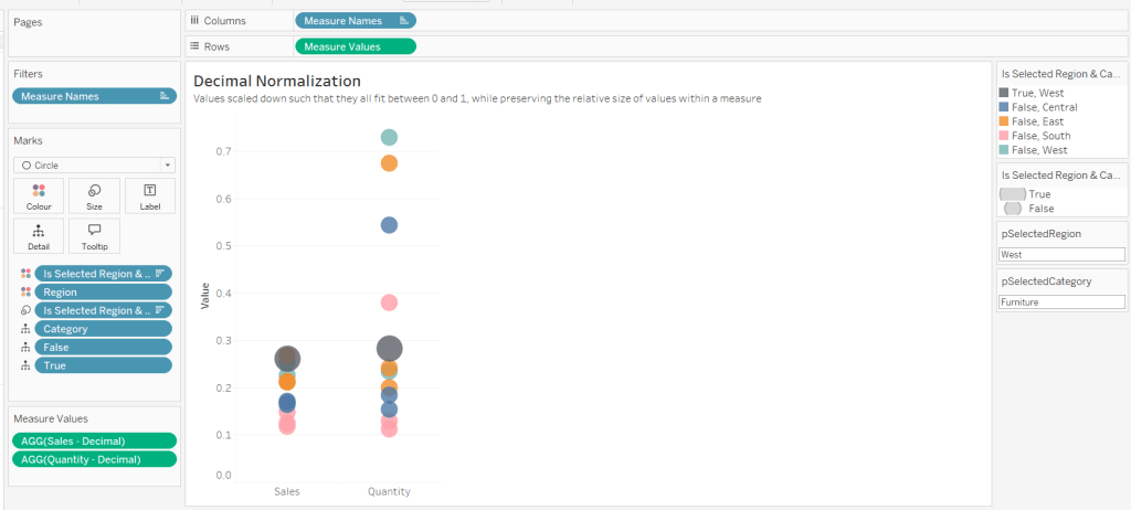
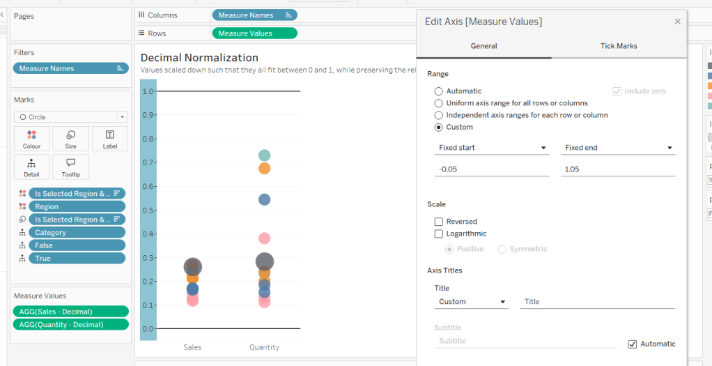
Building the Decimal Normalisation chart
Duplicate the Raw sheet, and name Decimal or similar. Update the title.
Create new fields
Sales – Decimal
SUM([Sales]) / 10^6
Quantity– Decimal
SUM([Quantity]) / 10^4
Drag Sales – Decimal onto the canvas and drop directly over the existing Sales pill in the Measure Values section, so it replaces it. Do the same with the Quantity – Decimal pill. Uncheck Show Labels.
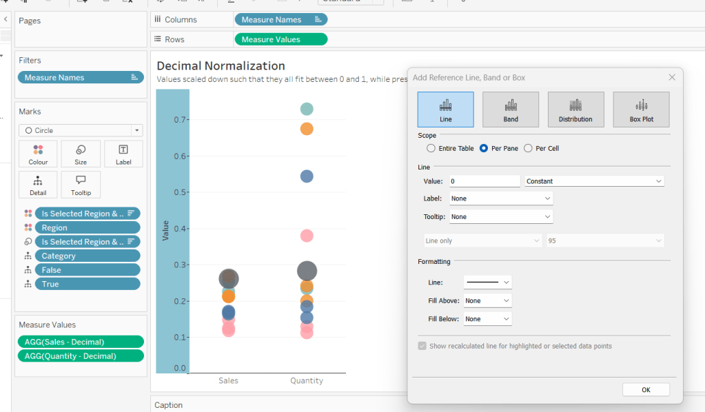
Add constantreference line of 0 that displays as a black solid line at 100% opacity
Repeat and create a constant reference line with value of 1. Edit the axis and fix from -0.05 to 1.05 and remove the axis title.
Update the text in the caption.
Building the Max-Min Normalisation Chart
Duplicate the Decimal sheet and rename Max-Min or similar. Update the title.
Drag Sales – Max-Min onto the canvas and drop directly over the existing Sales – Decimal pill in the Measure Values section, so it replaces it. Do the same with the Quantity – Max-Min pill.
Adjust the table calculation setting for each of the measures so they are computing by Category, Region and Is Selected Region & Category.
Adjust the Tooltip if required. Right click on the bottom column headings and Edit Alias to update the text- you may not be able to rename Sales – Max-Min along xyz… just to ‘Sales’, so you may need to be creative and add spaces eg ‘ Sales ‘ or similar. Update the caption.
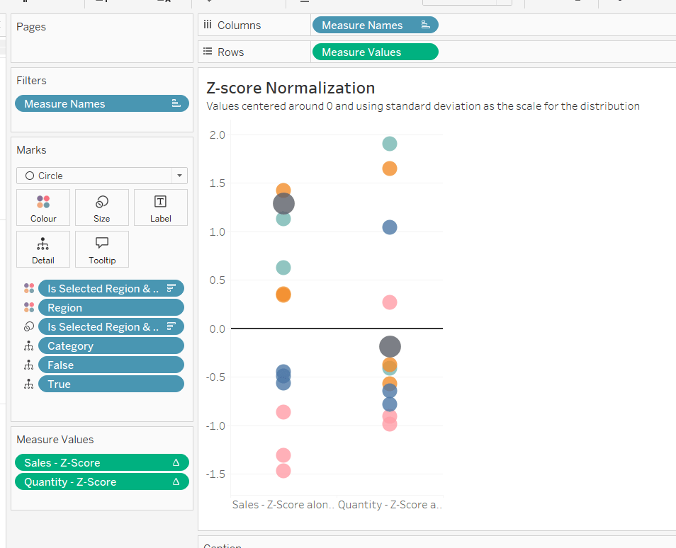
Building the Z-Score Normalisation Chart
Duplicate the Max-Min sheet, and name Z-Score or similar. Update the title.
Drag Sales – Z-Score onto the canvas and drop directly over the existing Sales – Max-Min pill in the Measure Values section, so it replaces it. Do the same with the Quantity – Z-Score pill.
Adjust the table calculation setting for each of the measures so they are computing by Category, Region and Is Selected Region & Category. Remove the reference line for the constant value of 1. Edit the axis, so the range is now Automatic rather than fixed.
As before, adjust the Tooltip again if required, edit the column labels using the alias feature, and update the caption.
Creating the dashboard and adding the interactivity
Add all 4 charts onto a dashboard, using a horizontal container to arrange the charts side by side. From the object context menu on the dashboard, select the option to show the caption
To disable the default highlighting ‘on click’ create a dashboard filter action based on the True/False method described here – you’ll need to create an action per sheet.
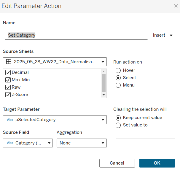
To set the parameters, create a parameter action
Set Category
On select of all the sheets, set the pSelectedCategory parameter passing in the value from the Category field.
Create another similar action called Set Region which sets the pSelectedRegion parameter with the value from the region field.
Finally, add a text section to the top right of the dashboard that references the pSelectedRegion and pSelectedCategory parameters.
Lorna provided this week’s challenge, drawing on some tips she’d picked up from Nhung Lee at #TC25. We’re building 2 charts, but for the second we need some supplementary data, and for this we need to start with some data modelling.
Modelling the data
I downloaded the ChatGPT Android reviews data from Kaggle into a csv file called chatgpt_reviews.csv. I also then copied the additional data Lorna provided in the challenge into another csv called WOW2025_19_Additional Data.csv.
I chose to model the data using a physical model rather than relationships, as I needed to ensure all the review data would always exist in the view. To do this I started by connecting to the chatgpt_reviews.csv. From the context menu of the sheet added to the datasource canvas, I selected Open to ‘open’ the physical model ‘window’
I then added a new connection to the WOW2025_19_Additional Data.csv file And added a Left Join to it, joining from the chatgpt_reviews.csv using a join calculation of
DATE(DATETRUNC(‘day’,[At]))
and joining this to the Release Date field from the WOW2025_19_Additioanal Data.csv file
Now with this set up, we can start to build.
Creating the bar chart
Add Score as a discrete dimension (blue disaggregated pill) to Rows and chatgtp_reviews.csv (Count) to Columns.
Add Score as a discrete continuous (green disaggregated pill) to Colour and adjust to use a grey colour palette. Make each row a bit wider, and show labels
Hide the Score column (uncheck show header), increase the size of the font for the Star Rating field, hide the Count of chatgpt_reviews axis (uncheck show header), hide all gridlines/axis rulers/ zero lines and row and column dividers. Adjust the font style of the label, hide the ‘Star Rating’ column label (right click > hide field labels for rows). AAjust the Tooltip as desired and update the sheet title. Name the sheet star Rating Bar or similar.
Building the line chart
On a new sheet, add At as a continuous pill at the ‘1st May 2025‘ day level (green pill) to Columns and add chatgpt_reviews.csv (Count) to Rows. Change the Colour of the line to dark grey.
For the ‘reference lines’ we’re actually adding bars all at the same height. The height we’re going to use is the maximum number of reviews, so create
Max Review Count
IF NOT ISNULL(MIN([Release Date (WOW2025 19 Additional Data.csv1)])) THEN WINDOW_MAX(COUNT([chatgpt_reviews.csv])) END
Add this to Rows and hide the null indicator (right click > hide indicator). Change the Mark type to bar.
Add Product to the Label of the Max Review Date marks card, and align as below
Adjust the table calculation of the Max Review Count field so it is computing by both the At and Product fields.
Make the chart dual axis and synchronise the axis. Adjust the Label to explicitly add a couple of carriage returns after the Product text. This has the effect of shifting the text to the left of the bars.
Fix the Count of chatgpt_reviews axis from -100 to 10,800
Ensure mark labels are set to allow labels to overlapother marks.
Tidy up by
hiding the right hand axis (uncheck show header)
Updating the title of both axis (right click > edit axis)
remove all gridlines, zero lines, row & columns dividers
show axis rulers
update tooltips as required
update the sheet title
name the sheets Trend or similar.
Then add both charts to a dashboard. My published viz is here.
It was Yoshi’s first challenge as a #WOW coach this week, and it provided us with an opportunity to develop our data densification and date calculation skills. I will admit, this certainly was a challenge that made me have to think a lot and reference other content where I’d done similar things before.
Modelling the data
Yoshi provided us with an adapted data set of patient waiting times, based on the Healthcare dataset from the Real World Fake Data (#RWFD) site. This provides 1 row per patient with a wait start time and end time. The requirement was to understand how many patients were waiting in each 30 min time slot in a 24hr period, so if a patient waited over 30 mins, or the start & wait time spanned a 30 min time slot, then the data needed to be densified appropriately. Yoshi therefore provided an additional data set to use for this densification, and I have to be honest, it wasn’t quite what I was expecting.
So the first challenge was to understand how to relate the two sets of data together, and this took some testing before I got it right. Yoshi provided hints about using a DATEDIFF calculation to find the time difference between the wait start time (rounded to 30 mins) and the wait end time (rounded to 30 mins).
To work out the calculation required, I actually first connected to the Hospital ER data set and then spent time working out the various parts of the formula required. I wanted to work out what the waiting start time was ’rounded down’ to the previous 30 min time slot, and what the waiting end time was ’rounded up’ to the next 30 min time slot.
If the minute of Date Start is between 0 and 29, then return the date at the hour mark, otherwise (if the minute of Date Start is between 30-59) then find the date at the hour mark, and add on 30 minutes. So if Date Start is 23/04/2019 13:23:00 then return 23/04/2019 13:00:00, but if DateStart is 23/04/2019 13:47, then return 23/04/2019 13:30:00.
If the minute of Date End is between 0 and 29, then find the date at the hour mark, and add on 30 minutes, otherwise (if the minute of Date End is between 30-59) then find the date at the hour mark, and add on 1 hour. So if Date End is 23/04/2019 13:23:00 then return 23/04/2019 13:30:00, but if DateEnd is 23/04/2019 13:47, then return 23/04/2019 14:00:00.
With this, I was then able to relate the Hospital ER data set to the dummy by 30 min data set by adding a relationship calculation to the Hospital ER data set of
(which returns the difference in minutes between the ’rounded down’ Date Start and the ’rounded up’ Date End – you can’t reference calculated fields in the relationship, so you have to recreate)
and set this to be >= to Range End from the dummy by 30 min data set
Let’s see what this has done to the data.
On a sheet add Patient ID. Date Start (as discrete exact date – blue pill), Date End(as discrete exact date – blue pill), Date Start Round (as discrete exact date – blue pill), Date End Round(as discrete exact date – blue pill) and Index (as discrete dimension – blue pill) to Rows and add Patient Waittime to Text.
Looking at the data for Patient Id 899-89-7946 : they started waiting at 06:18 and ended at 07:17. This meant they spanned three 30 min time slots: 06:00-06:30, 06:30-07:00 and 07:00-07:30, and consequently there are 3 rows displayed, and the ’rounded’ start & end dates go from 06:00 to 07:30.
Identifying the axis to plot the 24hr time period against
Having ‘densified’ the data, we now need to get a date against each row related to the 30 min time slot it represents. ie, for the example above we need to capture a date with the 06:00 time slot, the 06:30 time slot and the 07:00 time slot.
But, as the chart we want to display is depicted over a 24hr timeframe, we need to align all the dates to the exact same day, while retaining the time period associated to each record. This technique to shift the dates to the same date, is described in this Tableau Knowledge Base article.
Add this into the table, you can see what this data all looks like – note, I’m just choosing a arbitrary date of 01 Jan 1990, so my baseline dates are all on this date, but the time portions reflect that of the Date Start Round field.
With the day all aligned, we now want to get a time reflective of each 30 min timeslot. The logic took a bit of trial and error to get right, and there may well be a much better method than what I came up with. It became tricky as I had to handle what happens if the time is after 11pm (23:00) as I needed to make sure I didn’t end up returning dates on a different day (ie 2nd Jan 1990). I’ll describe my logic first.
If the Index is 0 then we just want the date time we’ve already adjusted – ie Date Start Baseline
If the Index is 1, then we need to shift the Date Start Baseline by 30 minutes. However, if Date Start Baseline is already 23:30, then we need to hardcode the date to be 01 Jan 1990 00:00:00, as ‘adding’ 30 mins will result in 02 Jan 1990 00:00:00.
If the Index is 2, then we need to shift the Date Start Baseline by 1 hour. However, if Date Start Baseline is already 23:30, then we need to hardcode the date to be 01 Jan 1990 00:30:00, as ‘adding’ 1 hour will result in 02 Jan 1990 00:30:00. Similarly, if Date Start Baseline is already 23:00, then we need to hardcode the date to 01 Jan 1990 00:00:00, otherwise we’ll end up with 02 Jan 1990 00:00:00.
As the relationship didn’t result in any instances of Index > 2, I stopped my logic there. This is all encapsulated within the calculation
Date to Plot
CASE [Index] WHEN 0 THEN [Date Start Baseline ] WHEN 1 THEN IIF(DATEPART(‘hour’, [Date Start Baseline ])=23 AND DATEPART(‘minute’, [Date Start Baseline ])=30, #1990-01-01 00:00:00#, DATEADD(‘minute’, 30, [Date Start Baseline ])) WHEN 2 THEN IIF(DATEPART(‘hour’, [Date Start Baseline ])=23 AND DATEPART(‘minute’, [Date Start Baseline ])=30, #1990-01-01 00:30:00#, IIF(DATEPART(‘hour’, [Date Start Baseline ])=23 AND DATEPART(‘minute’, [Date Start Baseline ])=0, #1990-01-01 00:00:00#, DATEADD(‘hour’, 1, [Date Start Baseline ]))) END
Phew!
Add this to the table as a discrete exact date (blue pill), and you can see what’s happening.
For Patient Id 899-89-7946, we have the 3 timeslots we wanted: 06:00 (representing 06:00-06:30), 06:30 (representing 06:30 -07:00) and 07:00 (representing 07:00-07:30).
On a new sheet, add Date To Plot as a discrete exact date (blue pill) and then create
Count Patients
COUNT([Patient Id])
and add to Text and you have a list of the 48 30 min time slots that exist within a 24hr period, with the patient counts.
We need to be able to filter this based on a quarter, so create
Date Start Quarter
DATE(DATETRUNC(‘quarter’,[Date Start]))
and custom format this to yyyy-“Q”q
Add to the Filter shelf selecting individual dates and filter to 2019-Q2, and the results will adjust, and you should be able to reconcile against the solution.
Building the 30 minute time slot bar chart
On a new sheet, add Date Start Quarter to the Filter shelf and set to 2019-Q2. Then add Date to Plot as a continuous exact date (green pill) to Columns and Count Patients to Rows. Change the mark type to a bar and show mark labels.
Custom format Date To Plot to hh:nn.
We need to identify a selected bar in a different colour. We’ll use a parameter to capture the selected bar.
pSelectTimePeriod
date parameter defaulted to 01 Jan 1990 14:00 with a display format of hh:nn
Then create a calculated field
Is Selected Time Period
[Date to Plot] = [pSelectTimePeriod]
and add to the Colour shelf, adjusting colours to suit and setting the font on the labels to match mark colour.
A ‘bonus’ requirement is to make each bar ’30 mins’ wide. For this we need
Size – 30 Mins
//number of seconds in 30 mins divided by number of seconds in a day (24hrs) (30 * 60) / 86400
Add this to the Size shelf, change it to be a dimension (so no longer aggregated to SUM), then click on the Size shelf, and set it to be fixed width, left aligned.
Via the Colour shelf, change the border of the mark to white.
Next, we need to get the tooltip to reflect the ‘current’ time slot, as well as the next time slot. For this I created
Next Time Period
IIF(LAST()=0, #1990-01-01 00:00:00#, LOOKUP(MIN([Date to Plot]),1))
This is a table calculation. If it’s the last record (ie 01 Jan 1990 23:30), then set the time slot to be 1st Jan 1990 00:00, otherwise return the next time slot (lookup the next (+1) record). Custom format this to hh:nn and add to the Tooltip shelf. Set the table calculation to compute by Date to Plot and Is Selected Time Period.
Update the Tooltip as required.
The final part of this bar chart is another ‘bonus’ requirement – to add 2 hr time interval ‘bandings’. For this I created another calculated field
2hr Time Period to Plot
IIF(DATEPART(‘hour’, MIN([Date to Plot]))%4 = 0 AND DATEPART(‘minute’, MIN([Date to Plot]))=0,WINDOW_MAX([Count Patients])*1.1,NULL)
If the hour part of the date is divisible by 4 (ie 0, 4, 8,12,16, 20), and we’re at the hour mark (minute of date is 0), then get the value of highest patient count displayed in the chart, and uplift it by 10%, otherwise return nothing.
Add this to Rows. On the 2nd marks card created, remove Is Selected Time Period from Colour and Next Time Period from Tooltip. Adjust the table calculation of the 2hr Time Period to Plot to compute by Date to Plot only. Remove labels from displaying.
The bars are currently showing all at the same height (as required) but at a width of 30 minutes. We want this to be 2 hrs instead, so create
Size – 2 Hrs
//number of seconds in 2hrs / number of seconds in a day (24 hrs) (60*60*2)/86400
Add this to the Size shelf instead (fixing it to left again). Adjust the colour to a pale grey, and delete all the text from the Tooltip.
Hide the nulls indicator. Make the chart dual axis and synchronise the axis. Right click on the 2hr Time Period Plot axis (the right hand axis) and move marks to back.
Tidy up the chart by removing row & column dividers, hiding the right hand axis, removing the titles from the other axes. Update the title accordingly.
Building the Patient Detail bar chart
On a new sheet, add Is Selected Time Period to Filter and set to True. Then go back to the other bar chart, and set the Date Start QuarterFilter to Apply to Worksheets -> Selected Worksheets and select the new one being built.
Add Department Referral, Patient Id, Date Start (as discrete exact date – blue pill) and Date End(as discrete exact date – blue pill) to Rows and Patient Waittime to Columns. Manually drag the NoneDepartment Referral option to the top of the chart. Add Patient Waittime to Colour and adjust to use the grey colour palette. Remove column dividers.
The title of this chart needs to display the number of patients in the selection, as well as the timeframe of the 30 min period. We already have the start of this captured in the parameter pSelectTimePeriod. We can use parameters to capture the other values too.
pNumberPatients
integer parameter defaulted to 0
pNextTimePeriod
date parameter, defaulted to 01 Jan 1990 14:30:00, with a custom display format of hh:nn
Update the title of the Patient Detail bar chart to reference these parameters (don’t worry about the count not being right at this point).
Capturing the selections
Add the sheets onto a dashboard. Then create the following dashboard parameter actions.
Set Selected Start
On select of the 30 Min bar chart, set the pSelectTimePeriod parameter passing in the value from the Date To Plot field.
Set Selected End
On select of the 30 Min bar chart, set the pNextTimePeriod parameter passing in the value from the Next Time Period field.
Set Count of Patients
On select of the 30 Min bar chart, set the pNumberPatients parameter passing in the value from the Count Patients field, aggregated at the SUM level.
With these all set, you should find you can click on a bar in the 30 minute chart and filter the list of patients below, with the title reflecting the bar chosen.
The basic viz itself wasn’t overly tricky, once you get over the hurdle of the calculations needed for the relationship and identifying the relevant 30 min time periods.
For the next few Workout Wednesdays, the coaches will be revisiting old challenges – retro month! Erica kicked the month off with this challenge, to recreate Ann Jackson’s challenge from 2018 Week 38. I completed this challenge at the time (see here), but the additions and changes to the visual display Erica incorporated meant I couldn’t just republish it 🙂
So I built it from scratch using the data source from the google drive Erica referenced in the requirements (which I believe may be why my summary KPIs didn’t actually match Erica’s).
There’s a heck of a lot going on in this challenge – it certainly took some time to complete, which may mean this blog becomes quite lengthy… I will endeavour to be as succinct as I can, which may mean I don’t explicitly state every step, or show lots of screen shots.
Setting up the parameters
I used parameters and subsequently dashboard parameter actions to build my solution. Erica mentions set actions, but I chose not use any sets.
As a result there’s lots of parameters that need creating
pAggregate
This is a string parameter that contains the list of possible dimensions to define the lowest level of detail to show on the scatter plot (ie what each dot represents). Default to Sub-Category. Note how the Display As field differs from the Value field.
pColour Dimension
This is a string parameter that will contain the value of the dimension used to split the display into rows (where each row is coloured). This will get set by a parameter action from interactivity on the dashboard, so no list of options is displayed. Default to Segment.
pSplit-Colour
boolean parameter to control whether the chart should be split with a row per ‘colour’ dimension, or just have a single row. The values are aliased to Yes/No
pSplit-Year
another boolean parameter to control whether the chart should be split with a column per year or just have a single column. The values are aliased to Yes/No (essentially similar to above)
pX-Axis
string parameter that contains the value of the measure to display on the x-axis. This will be set by a dashboard parameter action, so no list is required. Default to Sales.
pY-Axis
Similar to above, a string parameter that contains the value of the measure to display on the y-axis. This will be set by a dashboard parameter action, so no list is required. Default to Profit.
pSelectedDimensionValue
string parameter that contains the dimension value associated to the mark that a user clicks on when interacting with the scatter plot, and then causes other marks to be highlighted, or a line to be drawn to connect the marks. This will be set by a dashboard parameter action, so no list is required. Default to <nothing>/empty string.
Building the basic Scatter Plot
The scatter plot will display information based on the measures defined in the pX-Axis and pY-Axis parameters. We need to translate exactly what the measures will be based on the text strings
X-Axis
CASE [pX-Axis] WHEN ‘Profit’ THEN SUM([Profit]) WHEN ‘Sales’ THEN SUM([Sales]) WHEN ‘Quantity’ THEN SUM([Quantity]) END
Y-Axis
CASE [pY-Axis] WHEN ‘Profit’ THEN SUM([Profit]) WHEN ‘Sales’ THEN SUM([Sales]) WHEN ‘Quantity’ THEN SUM([Quantity]) END
We also need to define which field will control the lowest level of detail based on the pAggregate dimension
Dimension Detail
CASE [pAggregate] WHEN ‘Category’ THEN [Category] WHEN ‘Sub-Category’ THEN [Sub-Category] WHEN ‘Product’ THEN [Product Name] WHEN ‘Region’ THEN [Region] WHEN ‘State’ THEN [State] WHEN ‘City’ THEN [City] END
Similarly we need to know which field to split our rows by (the colour)
Dimension Row
CASE [pColour Dimension] WHEN ‘Segment’ THEN [Segment] WHEN ‘Category’ THEN [Category] WHEN ‘Region’ THEN [Region] WHEN ‘Ship Mode’ THEN [Ship Mode] END
but as we need different behaviour depending on whether the pSplit-Colour field is yes or no, we need
Row Display
IF [pSplit-Colour] THEN [Dimension Row] ELSEIF [pColour Dimension] = ‘Category’ THEN ‘All Categories’ ELSE ‘All ‘ + [pColour Dimension] + ‘s’ END
If the parameter is true, then just show the value from the Dimension Row, otherwise display as ‘All Categories’ or ‘All Segments’ or ‘All Regions’ etc.
Similarly, as the columns can be split by years or not, we need
Years
IF [pSplit-Year] THEN STR(YEAR([Order Date])) ELSE ” END
Add the fields to a sheet with
Years & X-Axis on Columns
Row Display & Y-Axis on Rows
Dimension Detail on Detail
Dimension Row on Colour
Set the mark type to circle and reduce colour opacity
Edit the axes, so the titles are sourced from the pX-Axis and pY-Axis parameters
Show all the parameters and manually edit the values/change the selections to test the functionality.
Highlighting corresponding marks
Show the pSelectedDimension parameter and hover over a mark in the scatter plot to read the value of the Dimension Detail field. Enter than value into the pSelectedDimension parameter (eg based on what is displayed above, each mark is a Sub-Category, so I’ll set the field to ‘Phones’).
We need to determine whether the value in the parameter matches the dimension in the detail
Highlight Mark
[pSelectedDimensionValue] = [Dimension Detail]
This returns True or False. Add this field to the Detail shelf, then add it as second field on the Colour shelf.
Adjust the default sorting of the Highlight Mark field, so the True is listed before False (sorted descending) – right click on the field > Default Properties > Sort. And ensure the colour fields on the shelf are listed so Dimension Row is above Highlight Mark. If all this is done, then the colour legend show look similar to below, where the Dimension Row is listed before the True/False, and the Trues are listed above the Falses, so the True is a darker shade of the colour.
Add Highlight Mark to the Size shelf and then edit the size legend to be reversed and adjust the sizes so the smaller ones aren’t too small, but you can differentiate (you may need to adjust the overall size slider on the size shelf too).
Making a connected dot plot
Add Order Date at the Year level (blue discrete pill) to the Detail shelf of the scatter plot.
To make the lines join up when the viz isn’t split by year, we need a field
Y-Axis Line
IF NOT [pSplit-Year] AND [pSelectedDimensionValue] = MIN([Dimension Detail]) THEN [Y-Axis] END
This will only return a value to plot on the Y-Axis if pSplit-Year = No and a user has clicked on a mark.
Set the pSplit-Year parameter to No, then add Y-Axis Line to Rows. On the Y-Axis Line marks card, remove Highlight Mark from colour and size and also remove Dimension Row from Colour. Add Order Date at the Year level (blue discrete pill) to Detail. Change the mark type to Line then add Year(Order Date) to Path instead of Detail.
Make the chart dual axis and synchronise the axis.
Play around changing the pSplit-Year parameter and the value in the pSelectedDimension parameter to test the functionality.
Tidy the scatter plot by adjusting font sizes, removing the right hand axis & the gridlines, lightening the row & column dividers, removing row & column label headings. Tidy up tooltips. Add a title that references the parameter values.
Building the Total Marks KPI
Create a new field
Count Marks
SIZE()
and a field
Index
INDEX()
Set this field to be a discrete dimension (right click > convert to discrete)
On a new sheet, add Dimension Row, Dimension Detail and Order Date (set to Year level as blue discrete pill) to the Detail shelf. Add Count Marks to Text. Adjust the table calculation setting of Count Marks so that all the fields are selected.
Add Index to the Filter shelf and select 1. Then adjust the table calculation setting of this field so it is also computing by all fields. Re-edit the filter, and adjust so only 1 is selected. This should leave you with 1 mark. Change the mark type to shape and set to use a transparent shape.
Adjust font size & style, set background colour of worksheet to grey, adjust title, hide tooltips.
Building the X-Axis KPI
For this we need
Total X-Axis
TOTAL([X-Axis ])
Min X-Axis
WINDOW_MIN([X-Axis ])
Max X-Axis
WINDOW_MAX([X-Axis ])
On a new sheet add Dimension Row, Dimension Detail, YEAR(Order Date) to Detail. Add pX-Axis, Total X-Axis, Min X-Axis & Max X-Axis to Text. Adjust all the table calcs of the Total, Min, Max fields to compute using all dimensions listed. Add Index to filter and again set to 1, then adjust the table calc and re-edit so it is just filtered to be 1. Set the mark type to shape and use a transparent shape. Adjust the layout & font of the text on the label. Set background colour of worksheet to grey, adjust title, hide tooltips.
Building the Y-Axis KPI
Repeat the steps above, creating equivalent Total, Min & Max fields referencing the Y-Axis.
Creating the Y-Axis ‘buttons’
We’ll start with creating a Profit button
Create a field
Label: Profit
“Profit”
and
Y-Axis is Profit
[pY-Axis] = ‘Profit’
We will also need the field below for later on
Y-Axis not Profit
[pY-Axis] <> ‘Profit’
On a new sheet double click on Columns and manually type in MIN(1). Add Label: Profit to Text and Y-Axis is Profit to Colour. Change the mark type to bar.
Set the Size of the bar to maximum, adjust the axis to be fixed from 0-1 and hide the axis. Remove all column/row banding, axis line, gridlines etc.
Show the pY-Axis parameter. If the colour legend is set to True (as pY-Axis contains Profit), then adjust the colour to a dark grey. Then change the value of the pY-Axis parameter, which should then display False in the colour legend. Adjust this to light grey. You may need to do this the other way round. Hide tooltips.
Repeat the same process to create separate sheets for Sales and Quantity with equivalent calculated fields (I found the easiest way was to duplicate the sheet and then swap out the fields).
Creating the X-Axis ‘buttons’
Again, just duplicate the above steps but reference the pX-Axis parameter instead.
You should end up with 6 sheets (1 per measure – Sales, Profit, Quantity – per axis), and 18 calculated fields (3 per measure & axis) as a result.
Creating the ‘Select Colour’ buttons
For the Category button, create
Label: Category
‘Category’
and
Colour is Category
[pColour Dimension] = ‘Category’
Build a ‘button’ as a bar chart, using the same principals as above. You will need to show the pColour Dimension parameter to test changing the value to set the different colours.
Repeat the same steps to build 3 further sheets for Region, Segment and Ship Mode.
Building the dashboard
You will need to use layout containers to arrange all the objects in. The main body of the dashboard consists of a horizontal layout container, which contains 3 objects: a vertical container (left column with configuration options), the scatter plot in the middle and then another vertical container (right column with KPIs).
The left hand ‘Configure Your Chart’ vertical container consists of text objects, parameters, the X-Axis ‘button’ sheets, the Y-Axis ‘button’ sheets and the Colour ‘button’ sheets.
For each of the X-Axis and Y-Axis button sheets, a parameter action needs to be created like below
Set Y-Axis to Profit
On select of the Y-Axis Profit sheet (or whatever you have named the sheet), set the pY-Axis parameter with the value from the Label:Profit field.
You should end up with 6 different parameter actions for these fields – 1 per measure per axis .
For each of the ‘Colour’ buttons, a similar parameter action is also required
Set Colour to Category
On select of the Colour-Category sheet (or whatever you have named the sheet), set the pColour Dimension parameter with the value from the Label:Category field.
You should end up with 4 parameter actions like this.
The Y-Axis and X-Axis buttons should only display 2 options at a time, so you can’t select the same measure for both axis.
Assuming Profit is currently selected on the Y-Axis, then select the object that displays the Profit X-Axis ‘button’ and from the Layout tab, set to control visibility using value and select the Y-Axis not Profit calculated field. As the Y-Axis is set to Profit, the Profit X-Axis button will disappear.
Repeat these steps for each of the X & Y Axis button sheets. Note, sometimes it’s easier to select the object via the Item Hierarchy section of the Layout tab.
For the scatter plot, the user needs the ability to select a mark and the others be highlighted/connected depending on the current settings. This needs another parameter action
Select Dimension Value
On select of the scatter plot, set the pSelectedDimensionValue parameter with the value from the Dimension Detail field.
For the right hand KPI nav, the vertical container consists of text objects, and the KPI sheets.
To make horizontal line separators, set the padding on a blank object to 0, the background colour to the colour you want, and then edit the height of the blank object to 2pt.
For the Info ‘button’, add a floating text box containing the relevant text and position it where you want it to display. Give the object a border and set the background to white. Then select the object and choose the Add Show/HideButton from the context menu. Edit the button to display an info icon when hidden. Ensure the button is also floating and position where you want.
I used additional floating text boxes to display some of the other text information on the dashboard.
No doubt you’ll need to spend some time adjusting padding and layout to get everything where you want, but this should get you the core functionality.
This week’s challenge, set by Lorna, made use of the newly released ‘dotted line’ format in v2023.2, so you’ll need that version in order to achieve the dotted line that spans the 2 marks being compared. If you don’t have this version, you can still recreate the challenge, but you’ll just have a continuous line.
Building the calculations
This challenge involves table calculations, so my preferred startig point is to build out all the fields I need in a tabular format.
So start by adding Category to Columns and Order Date at the discrete (blue) week level to Rows. Add Sales to Text (I formatted Sales to $ with 0 dp, just for completeness).
Apply a Moving Average Quick Table Calculation to the Sales pill, then edit the table calculation to it is averaging over the previous 5 values (including the current value – ie 6 weeks in total), and it is computing by Order Date only.
Add another instance of Sales back into the table, so you can check the values.
The ‘moving average’ Sales pill is what will be used to plot the main line chart.
But we need to identify 2 points on the chart to compare – the values associated to a start date determined by the user clicking on the chart, and the values associated to an end date determined by the user hovering on the chart. We’ll make use of parameters to store these dates
pDateClick
date parameter defaulted to 27th Dec 2020
pDateHover
date parameter defaulted to 28 Nov 2011
We can then determine what the moving average Sales values were at these two dates
Sales to Compare
IF DATETRUNC(‘week’, MIN([Order Date])) = [pDateClick] OR DATETRUNC(‘week’, MIN([Order Date])) = [pDateHover] THEN WINDOW_AVG(SUM([Sales]), -5, 0) END
Add this to the table, and the values for the moving average will only be populated for the two dates stored in the parameters
This is the field we will use to plot the points to draw the lines with.
But we also need to work out the difference between these values so we can display the labels.
If the date matches the pDateHover (end) date then return the moving average and then spread that value over every row.
Add these into the table, and you can see how the table calculations are working
The moving avg value for the start date is displayed in every row against the Sales to Compare Start column, while the moving avg for the end date is displayed in every row for the Sales to Compare End column.
With these values now displayed on the same row, we can calculate
Difference
[Sales to Compare End]-[Sales to Compare Start]
formatted to $ with 0 dp
and
% Difference
[Difference]/[Sales to Compare Start]
formatted to a custom number format of ▲0.0%;▼0.0%;0.0%
Popping these into the tables, the values populate over every row, but when it comes to the label, we only want to show data against the comparison date, so I created
Label Difference
IF DATETRUNC(‘week’, MIN([Order Date])) = [pDateHover] THEN [Difference] END
formatted to $ with 0 dp, and
Label Difference %
IF DATETRUNC(‘week’, MIN([Order Date])) = [pDateHover] THEN [% Difference] END
formatted to a custom number format of ▲0.0%;▼0.0%;0.0%
With all these fields, we can now build the chart
Building the viz
On a new sheet, add Order Date set to the continuous (green) week level to Columns and Category to Rows. Add Sales to Rows and apply the moving average quick tablecalculation discussed above, adjusting so it is computing over 5 previous weeks and by Order Date only
Add Category to Colour and adjust accordingly, then reduce the opacity to around 40%
Add pDateClick to Detail then add a reference line to the Order Date axis the references this field. Adjust the Label and Tooltip fields, and set the line format to be a thick grey line.
Format the reference line text so it is aligned top right.
Then add pDateHover to Detail and add another reference line, but this time set the line so it is formatted as a dashed line.
Next, add Sales to Compare to Rows. Adjust the colour of the associated marks cards so it is 100% opacity.
Right click on the Sales to Compare pill and Format. On the Pane tab on the left hand side, set the Marks property of the Special Values section to Hide (Connect Lines). Click on the Path shelf and choose the dashed display option.
Set the chart to be Dual axis and synchronise the axis. Remove Measure Names from the All marks card. Hide the right hand axis.
Add Label Difference and Label Difference % to the Label shelf. Set the font to match mark colour and adjust font size and positioning. I left aligned the font but added a couple of spaces so it wasn’t as close to the line. I also added a couple of extra carriage returns so the text shifted up too.
Finally adjust tooltips, remove column dividers and hide the Category column title. Adjust the axis titles.
Adding the interactivity
Add the sheet onto a dashboard, then add 2 parameter actions
Set Start on Click
On select of the Viz sheet, pass the Order Date (week) into the pDateClick parameter. Leave the current value when selection is cleared (ie when user clicks elsewhere in viz, but not on another mark).
and
Set Comparison on Hover
On select of the Viz sheet, pass the Order Date (week) into the pDateHover parameter. Leave the current value when selection is cleared (ie when user clicks elsewhere in viz, but not on another mark).
Instructions were provided to get the data from this site , select ‘Share & Export’ then ‘Export as CSV’. I couldn’t find an actual ‘export as CSV’ option. In stead I selected the ‘Get table as CSV (for Excel)’ option under the ‘Share & Export’ menu, and then copied the text displayed into notepad. I then save this as a csv file.
Building the Calculated Fields
There aren’t that many fields needed for this viz.
Firstly, we need to organise the years into rows on the viz, based on the decade
Decade
STR(FLOOR([Year]/10) * 10) + ‘s’
This takes the Year eg 1968, divides by 10 to get 196.8, applies the FLOOR function which rounds down to the nearest whole number ie 196, then multiples that by 10 to get 1960.
We also need to a counter for each year in the decade to organise the data into the columns. I just used
Index
INDEX()
Let’s see what we’ve got so far
Add Year (as a blue discrete field)and Decade to Rows. Then add Index to Rows as a blue discrete field. Adjust the table calculation settings, so the Index is computing by Year only.
We also need to convert the Time/9I field into a duration in minutes
take the hour part of the date field and multiply by 60 to get the total number of minutes for the hours the game took, then add on the minute part of the date field.
Add this field to the Text shelf, and additionally add Year to the Filter shelf, and set so that it is filtered to be at least 1960.
This gives us the measure we’ll be plotting on the bar chart, but we also need to plot a reference line based on the time for the year 2023.
2023 is the last value in our data, so we can get the value against that year by the following
Latest Duration
WINDOW_MAX(IF LAST()=0 THEN SUM([Duration (mins)]) END)
As 2023 is the last value, then the Duration(mins) value is returned for this point only – the value is null/empty for all other years. The Window_Max function then ‘spreads’ that value across every other row in the data set.
Add this onto the sheet, and verify the table calculation is set to compute by both Year and Decade
The final piece of information we need is to determine whether the duration for each year is bigger or smaller than the latest years’ value
Duration > Latest
SUM([Duration (mins)]) >= [Latest Duration]
Add this to the Rows and the values will be True or False depending on how the data compares.
Building the Viz
On a new sheet, add Decade to Rows, Index to Columns and Year to Detail (discrete blue pill). Adjust the table calculation setting of Index to compute by Year only. Add Year to filter and set to at least 1960.
Add Duration(mins) to Rows and Duration > Latest to Colour. Modify the table calculation setting so it is computing by both Year and Decade then adjust the colour accordingly.
Add Time/9I and Year to the Label shelf. Modify the Time/9I field so that it is using Exact Date and set to be a discrete Attribute rather than a measure.
Also, apply a custom date format to the Time/9I field so that is displays as h:nn
Adjust the text on the Label shelf, so that the Year is above the Time/9I, the font colour is black and the label is aligned bottom centre
Add Latest Duration to the Detail shelf, and adjust the table calculation setting so that it is computing by both the Year and the Decade.
Add a Reference Line to the Duration(mins) axis that works by pane and references the Latest Duration average value. Manually set the Label to the text to 2:38 in 2023. Don’t show a tooltip.
The format the reference line, so the text is aligned top right.
To add a bit of ‘breathing space’ between each row, add another reference line. This time set it to use a Distribution that is 150% of the average Latest Duration. Don’t show any labels, tooltips or lines or fill.
Finalise the viz by hiding the Duration(mins) axis and the Index headings (uncheck show header). Remove all gridlines, and column dividers. Hide the Decade column label (right click label and Hide Field labels for Rows). Click the Tooltip shelf and uncheck Show Tooltips.
Add the viz to a dashboard, add title and publish. My published viz is here.
I’ve built jitter plots in the past for #WorkoutWednesday challenges (the hidden RANDOM() function is your friend in this), but I wanted to see how far I could get without having to peak at my previous solutions.
So I connected to the baseball data provided, and cracked on, building the jitter in a single sheet using Measure Names on the columns. But then I got stuck when it came to labelling the tooltips…. surely this didn’t need a sheet per measure did it…
…maybe it did… so I proceeded to recreate as 4 separate sheets, and felt quite smug that I’d managed to make use of the ‘little used’ worksheet caption to provide the summary detail at the bottom of each measure. When I’d finished, I checked Kyle’s solution, as the summary values for the SLG & OPS measures seemed to be mixed up…. and what did I find…. he had managed to build the jitter within a single sheet as he had pivoted the data first! Argggghhhh! It just hadn’t crossed my mind, and Kyle had chosen not to drop that hint in the requirements…. hey ho! c’est la vie! I may well recreate with a pivoted version at a later date, but for now, I am blogging what I did…
My solution has ended up with a lot of calculated fields as a result, as equivalent fields needed to be created for every measure. Most of this was managed via duplicating and editing existing fields, so it actually wasn’t too onerous.
Building the calculated fields
We’ll start as usual by building out the fields required, and will focus on the BA measure initially.
Add Name and BA into a tabular view and Sort descending. Format the BA measure to be a number with 3 decimal places.
We need to know the rank of each player. Create a calculated field
Rank BA
RANK(SUM([BA]))
Add this to the view, and we should get the player rankings displayed from 1 downwards.
Now the requirement wants us to normalise the measures so they can be displayed on the same axis (or in my case, since it’s not a single chart I’m building), within the same axis range.
What this means is we want to plot the measure on a scale between 0 and 1 where 0 represents the lowest measure value, and 1 the highest. for this we need
Min BA
{FIXED :MIN([BA])}
and
Max BA
{FIXED :MAX([BA])}
The normalised value then becomes
Normalise BA
([BA] – [Min BA])/([Max BA]-[Min BA])
The difference between the current value and the lowest value, as a proportion of the range (ie the difference between the highest and lowest values).
Adding this to the table, you should see that the Normalise BA value for the highest ranked player is 1 and that for the lowest ranked is 0.
As part of the information displayed, we also need to know the percentile each player is in.
Percentile BA
RANK_PERCENTILE(SUM([BA]))
Format this to a percentage with 0 dp and add into the table.
Next we need to identify the player selected, so we’re going to create a parameter based off of the Name.
Select a Player
Right click Name -> create -> Parameter. This will open the parameter dialog and auto populate the list of options with the values from the Name field. Default the parameter to Julio Rodriguez.
We can then create a field to identify if the player is the one selected
Is Selected Player?
[Name] = [Select a Player]
Add this into the table, on the Rows before Name and sort so True is listed at the top (just easier to check the results).
So now we need to identify the rank and percentile of the selected player only
Selected Player BA Rank
WINDOW_MAX(IF ATTR([Is Selected Player]) THEN [Rank BA] END)
format this to a number with 0 dp
Selected Player BA Percentile
WINDOW_MAX(IF ATTR([Is Selected Player]) THEN [Percentile BA] END)
format this to a percentage with 0 dp.
The window_max function has the effect of ‘spreading’ the result over all the rows.
Finally we need to get a count of all the players
Count Players
{FIXED:COUNTD([Name])}
format this to a number with 0 dp.
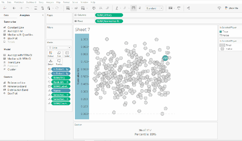
Building the Jitter Plot
To build a jitter plot, we need to plot each mark against 2 axes. The Normalise BA measure is one axis, but we need to create ‘something’ for the other. This is the value to make the ‘jitter’ which is essentially an arbitrary value between 0 and 1 that we can plot the mark against, and means the marks don’t all end up in a single line on top of each other, and we can get a better ‘feel’ for the volume of data being represented.
Jitter
RANDOM()
The random() function is a ‘hidden’ function that will, as it’s name suggests, generate a random number. It is ‘hidden’ as it only works with some data sources. Excel for example is fine, but if you were connected to a Snowflake database, you can’t use it.
The nature of random, also means that you can’t guarantee the value it produces, and it will regenerate on data refresh, so if you’re looking to compare your solution directly, your dots will not be positioned exactly the same.
On a new sheet add Jitter to Columns and Normalise BA to Rows. Add Name to Detail and change the mark type to Circle.
Add Is Selected Player to Colour, adjust accordingly and add a border to the circle. I dropped the opacity to 70%. Order the colour legend, so True is listed first, to ensure this circle is always ‘on top’.
Then add Is Selected Player to Size. Edit the sizes so they are reversed and adjust the sizes until you’re happy.
To label just the selected player mark
Label:BA
IF [Is Selected Player] THEN [BA] END
format this with a custom number font ,##.000;-#,##.000
Add this to the Label shelf and adjust the font colour, and align centrally
Add Rank BA and BA to the Tooltip shelf and adjust tooltip to suit. You will need to adjust the table calculation setting of the Rank BA field so that it is computing by all the fields.
Add Selected Player BA Rank and Selected Player BA Percentile and Count Players to the Detail shelf. Adjust the table calculations as above (including any nested calcs), then show the worksheet caption (Worksheet -> Show Caption), and edit the caption to display the relevant text.
From the analytics pane, drag the Median with Quartiles option onto the canvas and drop it on the table / Normalise BA axis option. Remove the quartile reference lines (right cick axis -> remove reference line), and edit the median reference line to be a dashed line with no label.
Finally remove all gridlines/dividers/axes lines and hide the axes. Title the sheet as per the measure ie BA, and align centrally.
Format the Caption and the Title to have a light grey background and a slightly darker thin border.
Now, repeat all that for the other measures 🙂 This isn’t that bad. All the fields above labelled BA, need duplicating, renaming and updated to reference the next measure eg OBP.
Once done, duplicate the BA jitter plot sheet, and replace all the ‘BA’ related fields with the equivalent ones, by dragging the equivalent field and dropping it directly on top. Sense check the table calculation settings are all ok. You may need to update the text in the caption, as that seems to lose anything to do with the table calculation fields referenced when they get touched.
Ultimately you should end up with 4 sheets.
Putting it all together
On a dashboard, use a horizontal container to position all 4 sheets in side by side. Show the worksheet caption for each sheet. Reduce the outer padding for each sheet to 0, and add a thin border around each sheet.
Add a parameter action to drive the interactivity ‘on click’ of a circle
Select Player
On select of any of the source sheets, update the Select a Player parameter with the value from the Name field. Retain the selected value on ‘unclick’
To prevent the selection on click from being ‘highlighted’, and al the other marks ‘fading’, we need one final step.
Create new calculated fields
True
TRUE
False
FALSE
Add both these fields to the Detail shelf of each of the 4 sheets.
Then add a dashboard filter action for each sheet which on select, goes from the sheet on the dashboard to the worksheet itself, passing the selected fields of True = False. Show all values when unselected.
My published viz is here. Kyle’s solution with a lot less calculated fields, and only 2 sheets (1 for the jitter and 1 for the summary section at the bottom) is here. You will need to pivot the data via the data source pane first through 🙂 Next time, when I really feel something should be able to be done in 1 sheet, I’ll try to think a little longer…. upshot though, I impressed myself at the use of the caption for the summary – something I must consider using more often!