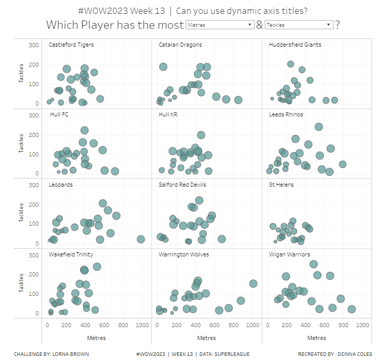
The theme of alternative chart types continued with Lorna setting this challenge to create a jittered bar chart. We needed to use the same fake survey data set used in week 4, so initially some data remodelling was required. I’ve already blogged that here, so please refer to the modelling the data section if you need help.
The questions all need to be grouped based on the text that preceded the question, so I created
Question Group
TRIM( SPLIT( [Question], “-“, 1 ) )
which split off the text in front of the first ‘-‘. I actually created this by right-clicking on the Question field > Transform > Custom Split and selecting to to split off the first 1 column using the – separator.
I also created a field to number the responses
Response No
CASE [Response] WHEN ‘Strongly Disagree’ THEN 1 WHEN ‘Disagree’ THEN 2 WHEN ‘Neutral’ THEn 3 WHEN ‘Agree’ THEN 4 ELSE 5 END
Once I’d done that I was able to ratify the numbers by building a simple table with Response No and Response on Columns, Question Group on Rows, and CNT(Id) on Text.
Eyeballing these numbers against where the ‘bars’ in Lorna’s viz stopped and I figured that was on the right track. However then I wasn’t particularly sure what to do next.
Lorna’s instructions were very brief. I figured I’d need to use a jitter (ie RANDOM()) somewhere, and as I’d need to add Id to the Detail shelf at some point, to generate 1 dot per respondent, I deduced I’d also need
Total Respondents
{FIXED [Response], [Question Group]:COUNT([Id])}
Adding this into by table above and I got the same values as CNT(Id) which is what I expected.
After scratching my head a bit, I decided that Lorna was possibly being vague, as there was probably help ‘out there’. So I googled, and immediately stumbled upon this very useful blog post, which pointed me in the right direction for the additional calculations required.
I created
Columns
RANDOM()
Jitter
RANDOM()
note – due to the way RANDOM() works, Jitter and Columns won’t contain the same value.
Rows
[Jitter] * [Total Respondents]
And with these I could build out the viz
Add Response No, Response and Columns to Columns. Change Columns to be a dimension.
Add Question Group and Rows to Rows. Change Rows to be a dimension. Add Id to Detail.
Change the mark type to circle, reduce the size and add Question Group to Colour and adjust accordingly.
Finally add Question to Tooltip and adjust the tooltip. Then remove all gridlines, hide the Columns axis, change the title of the Rows axis, and remove the row and column titles (hide field labels for rows / columns).
A pretty short blog today! My published viz is here.
I’ve built jitter plots in the past for #WorkoutWednesday challenges (the hidden RANDOM() function is your friend in this), but I wanted to see how far I could get without having to peak at my previous solutions.
So I connected to the baseball data provided, and cracked on, building the jitter in a single sheet using Measure Names on the columns. But then I got stuck when it came to labelling the tooltips…. surely this didn’t need a sheet per measure did it…
…maybe it did… so I proceeded to recreate as 4 separate sheets, and felt quite smug that I’d managed to make use of the ‘little used’ worksheet caption to provide the summary detail at the bottom of each measure. When I’d finished, I checked Kyle’s solution, as the summary values for the SLG & OPS measures seemed to be mixed up…. and what did I find…. he had managed to build the jitter within a single sheet as he had pivoted the data first! Argggghhhh! It just hadn’t crossed my mind, and Kyle had chosen not to drop that hint in the requirements…. hey ho! c’est la vie! I may well recreate with a pivoted version at a later date, but for now, I am blogging what I did…
My solution has ended up with a lot of calculated fields as a result, as equivalent fields needed to be created for every measure. Most of this was managed via duplicating and editing existing fields, so it actually wasn’t too onerous.
Building the calculated fields
We’ll start as usual by building out the fields required, and will focus on the BA measure initially.
Add Name and BA into a tabular view and Sort descending. Format the BA measure to be a number with 3 decimal places.
We need to know the rank of each player. Create a calculated field
Rank BA
RANK(SUM([BA]))
Add this to the view, and we should get the player rankings displayed from 1 downwards.
Now the requirement wants us to normalise the measures so they can be displayed on the same axis (or in my case, since it’s not a single chart I’m building), within the same axis range.
What this means is we want to plot the measure on a scale between 0 and 1 where 0 represents the lowest measure value, and 1 the highest. for this we need
Min BA
{FIXED :MIN([BA])}
and
Max BA
{FIXED :MAX([BA])}
The normalised value then becomes
Normalise BA
([BA] – [Min BA])/([Max BA]-[Min BA])
The difference between the current value and the lowest value, as a proportion of the range (ie the difference between the highest and lowest values).
Adding this to the table, you should see that the Normalise BA value for the highest ranked player is 1 and that for the lowest ranked is 0.
As part of the information displayed, we also need to know the percentile each player is in.
Percentile BA
RANK_PERCENTILE(SUM([BA]))
Format this to a percentage with 0 dp and add into the table.
Next we need to identify the player selected, so we’re going to create a parameter based off of the Name.
Select a Player
Right click Name -> create -> Parameter. This will open the parameter dialog and auto populate the list of options with the values from the Name field. Default the parameter to Julio Rodriguez.
We can then create a field to identify if the player is the one selected
Is Selected Player?
[Name] = [Select a Player]
Add this into the table, on the Rows before Name and sort so True is listed at the top (just easier to check the results).
So now we need to identify the rank and percentile of the selected player only
Selected Player BA Rank
WINDOW_MAX(IF ATTR([Is Selected Player]) THEN [Rank BA] END)
format this to a number with 0 dp
Selected Player BA Percentile
WINDOW_MAX(IF ATTR([Is Selected Player]) THEN [Percentile BA] END)
format this to a percentage with 0 dp.
The window_max function has the effect of ‘spreading’ the result over all the rows.
Finally we need to get a count of all the players
Count Players
{FIXED:COUNTD([Name])}
format this to a number with 0 dp.
Building the Jitter Plot
To build a jitter plot, we need to plot each mark against 2 axes. The Normalise BA measure is one axis, but we need to create ‘something’ for the other. This is the value to make the ‘jitter’ which is essentially an arbitrary value between 0 and 1 that we can plot the mark against, and means the marks don’t all end up in a single line on top of each other, and we can get a better ‘feel’ for the volume of data being represented.
Jitter
RANDOM()
The random() function is a ‘hidden’ function that will, as it’s name suggests, generate a random number. It is ‘hidden’ as it only works with some data sources. Excel for example is fine, but if you were connected to a Snowflake database, you can’t use it.
The nature of random, also means that you can’t guarantee the value it produces, and it will regenerate on data refresh, so if you’re looking to compare your solution directly, your dots will not be positioned exactly the same.
On a new sheet add Jitter to Columns and Normalise BA to Rows. Add Name to Detail and change the mark type to Circle.
Add Is Selected Player to Colour, adjust accordingly and add a border to the circle. I dropped the opacity to 70%. Order the colour legend, so True is listed first, to ensure this circle is always ‘on top’.
Then add Is Selected Player to Size. Edit the sizes so they are reversed and adjust the sizes until you’re happy.
To label just the selected player mark
Label:BA
IF [Is Selected Player] THEN [BA] END
format this with a custom number font ,##.000;-#,##.000
Add this to the Label shelf and adjust the font colour, and align centrally
Add Rank BA and BA to the Tooltip shelf and adjust tooltip to suit. You will need to adjust the table calculation setting of the Rank BA field so that it is computing by all the fields.
Add Selected Player BA Rank and Selected Player BA Percentile and Count Players to the Detail shelf. Adjust the table calculations as above (including any nested calcs), then show the worksheet caption (Worksheet -> Show Caption), and edit the caption to display the relevant text.
From the analytics pane, drag the Median with Quartiles option onto the canvas and drop it on the table / Normalise BA axis option. Remove the quartile reference lines (right cick axis -> remove reference line), and edit the median reference line to be a dashed line with no label.
Finally remove all gridlines/dividers/axes lines and hide the axes. Title the sheet as per the measure ie BA, and align centrally.
Format the Caption and the Title to have a light grey background and a slightly darker thin border.
Now, repeat all that for the other measures 🙂 This isn’t that bad. All the fields above labelled BA, need duplicating, renaming and updated to reference the next measure eg OBP.
Once done, duplicate the BA jitter plot sheet, and replace all the ‘BA’ related fields with the equivalent ones, by dragging the equivalent field and dropping it directly on top. Sense check the table calculation settings are all ok. You may need to update the text in the caption, as that seems to lose anything to do with the table calculation fields referenced when they get touched.
Ultimately you should end up with 4 sheets.
Putting it all together
On a dashboard, use a horizontal container to position all 4 sheets in side by side. Show the worksheet caption for each sheet. Reduce the outer padding for each sheet to 0, and add a thin border around each sheet.
Add a parameter action to drive the interactivity ‘on click’ of a circle
Select Player
On select of any of the source sheets, update the Select a Player parameter with the value from the Name field. Retain the selected value on ‘unclick’
To prevent the selection on click from being ‘highlighted’, and al the other marks ‘fading’, we need one final step.
Create new calculated fields
True
TRUE
False
FALSE
Add both these fields to the Detail shelf of each of the 4 sheets.
Then add a dashboard filter action for each sheet which on select, goes from the sheet on the dashboard to the worksheet itself, passing the selected fields of True = False. Show all values when unselected.
My published viz is here. Kyle’s solution with a lot less calculated fields, and only 2 sheets (1 for the jitter and 1 for the summary section at the bottom) is here. You will need to pivot the data via the data source pane first through 🙂 Next time, when I really feel something should be able to be done in 1 sheet, I’ll try to think a little longer…. upshot though, I impressed myself at the use of the caption for the summary – something I must consider using more often!
For my first #WOW2023 challenge, as an ‘official’ part of the #WOW crew, I challenged everyone to build this funnel chart. Inspiration came from a colleague who posed me the challenge of building something similar, ensuring the bars were a single entity when clicked on. In that example we’d just used Superstore data, but it wasn’t really reflective of how a funnel would typically work, so I sourced some dummy sales opportunity data and made the challenge more relevant to a real business scenario.
Building the Funnel Chart
I saw this as a table calculation exercise, though I have subsequently seen solutions that manage it all through LODs. I’ll obviously blog my solution.
Let’s start by getting the core data into a table, so we can see what we’re aiming for
The total value of all the Opportunities is $91.4M. Based on the sales pipeline process and the assumptions documented in the requirements, all of that value will have passed through the first stage – Prospecting.
There is $6.1M still sitting in Prospecting, so when we move onto the next stage, stage 2 -Qualification, the total amount that has passed through will be $91.4M – $6.1M = $85.3M
As there is $6.5M sitting in Qualification, as we move to stage 3, the total amount that has passed through will be $85.3M – $6.5M = $78.7M. A similar pattern repeats for Stage 4, but for Stage 5, Closed Won, the value that has ‘passed’ through that stage, is equivalent to itself.
If we amend the Value field to be a Running Total quick table calculation (and add Value back into the view too), we get
The Running Sum is computing down the table , with the value in each row being the sum of the preceding rows. But this is opposite to what we want. We want Stage 1 to have the biggest value, the total, and the values to get smaller as you look down the table.
To resolve this, edit the table calculation and change the Sort order to custom sort by Minimum Stage No Descending
This results in the running total to sum from the last row (Stage 6) up to the first row (Stage 1), and you can see the value against Stage 1 matches the total for the Value column.
However, this still isn’t quite what we need. While we need to consider the amount for Closed Lost in stages 1-4, we shouldn’t be including it in stage 5, Closed Won.
While excluding the Stage 6 from the view (Stage No on Filter shelf set to Exclude 6) , gives the correct value for Stage 5, we’ve now lost the amount for Closed Lost in the other rows
So, we need some additional calculations to help resolve this.
Amount Lost
{FIXED : SUM(IF [Stage No]=6 THEN [Value] END)}
This just captures the amount of Stage 6 and ‘spreads it across every row of data.
Let’s now get our running total field, baked into it’s own calculation, as this will help with other calcs
Cumulative Value Per Stage
RUNNING_SUM(SUM([Value]))
Replace the Value table calc field with this one, ensuring the table calculation settings are identical to those described above.
Now let’s add the Amount Lost onto the Cumulative Value Per Stage unless we’re at Stage 5, Closed Won
Total Amount Per Stage Inc Lost
IF MIN([Stage No]) = 5 THEN [Cumulative Value Per Stage] ELSE [Cumulative Value Per Stage] + SUM([Amount Lost]) END
Pop this into the table (checking the table calc settings are as expected) and the total amount now stored against Stage 1, is the total value of all the Opportunities.
Ok, so now we know the values, how do we plot this in such a way that it represents a funnel. I chose to do this by first working out the proportion of the total value that the ‘reverse’ cumulative value represented.
Total Value
{FIXED:SUM([Value])}
meant I could determine
Proportion of Total
[Total Amount Per Stage Inc Lost] / SUM([Total Value])
I formatted this to percentage with 0 dp.
Adding these into the table
If we plotted this information on a bar chart, we’d get this
but we need to ‘centre’ each bar in relation to the first bar to give us the funnel effect. This means we need to shift each ‘bar’ to the right, by half the amount that is the difference between 100% and the Proportion of Total.
Position to Plot
(1 – [Proportion of Total])/2
We can’t represent this with a actual bar chart, but instead we can use a Gannt chart.
Stage No to Rows
Stage No to Filter and exclude Stage 6
Stage to Detail
Position to Plot to Columns, adjusting the table calculation as previously described
Change mark type to Gantt bar
Add Proportion of Total to Size (and verify the table calc is set properly)
Hey presto! A funnel!
To finalise
add Stage to Label and align centrally. Make the font bold and match mark colour.
add Cumulative Value per Stage to Colour and reverse the colour range (via the Edit Colours dialog)
Widen each row a bit.
Fix the Position to Plot axis to start at 0 and end at 1 to ensure the funnel is centred exactly.
Add Value and Total Amount Per Stage Inc Lost to the Tooltip and adjust the tooltip text accordingly (don’t forget to sense check the table calc settings!).
Hide the Position to Plot axis, and the Stage No column. Remove all gridlines, zero lines, axis rulers /row/column banding etc.
Building the KPIs
We need a few calculated fields to store the required numbers
Won
{FIXED:SUM(IF [Stage No]=5 THEN [Value] END)} / [Total Value]
formatted to a percentage with 0 dp.
Lost
{FIXED:SUM(IF [Stage No]=6 THEN [Value] END)} / [Total Value]
formatted to a percentage with 0 dp.
Outstanding
1-([Lost] + [Won])
formatted to a percentage with 0dp.
On a new sheet add Measure Names to Columns and Measure Values to Text. Add Measure Names to Filter and select Total Value, Won, Lost, Outstanding. Manually re-order the columns.
Format Total Value to be a number displayed in millions with 1 decimal place & prefixed with $.
Add Measure Names to Text and adjust the text as required. Align the text to be centred.
Remove the row banding, and hide the column heading.
Then arrange the two sheets on the dashboard, ensuring both are set to fit entire view.
It was Sean’s first challenge of 2023, and he asked us to recreate this chart . Sean referred to it in the requirements as a floating bar chart, others may refer to it as a diverging bar chart or likert chart.
Modelling the data
Fake survey data was provided which was structured with each question in a column
The first thing we need to do is to pivot the data, so we have 1 row per question, per respondent. On the data source tab in Tableau Desktop, multi-select the question columns (Ctrl-click), then click the context menu for one of the selected columns and select Pivot
Due to the width of the screen and the number of columns, you may have to do this in multiple steps. Just multi-select the next set of columns, and select Add Data to Pivot from the context menu instead.
Once complete you should have a data set with 3 columns
Rename Pivot Field Names to Question and Pivot Field Values to Response.
Building the calculations
All the questions have 5 options to respond to ranging from Strongly Disagree -> Disagree -> Neutral -> Agree – > Strongly Agree. Sean hinted we would need to group the questions based on their sentiment. Some questions were worded in a positive way, which meant ‘agree’ responses could be taken as a ‘good thing’. While other questions were worded in a negative way, meaning agree’ responses were actually a ‘bad thing’.
So the first thing to do was to group the questions. I used the group functionality (right click on Question -> Create -> Group).
Sentiment
All the questions where I deemed an ‘agree’ answer was a favourable response to the product I grouped under Positive.
All the question where I deemed an ‘agree’ answer was a non-favourable response to the product I grouped under Negative.
I then wanted to bucket the responses into 3 groups – Disagree, Neutral and Agree – based on the combination of the actual Response, and the Sentiment grouping.
Response Group
IF [Sentiment] = ‘Positive’ THEN IF CONTAINS([Response],’Disagree’) THEN ‘Disagree’ ELSEIF CONTAINS([Response], ‘Agree’) THEN ‘Agree’ ELSE ‘Neutral’ END ELSEIF [Sentiment] = ‘Negative’ THEN IF CONTAINS([Response],’Disagree’) THEN ‘Agree’ ELSEIF CONTAINS([Response], ‘Agree’) THEN ‘Disagree’ ELSE ‘Neutral’ END END
With this I am essentially swapping disagree responses against questions of a negative sentiment into the agree/positive grouping and vice versa.
Finally I need another couple of calculations just to sense check were we are
Count Respondents
COUNTD([Id])
Question – Display
TRIM( SPLIT( [Question], “-“, -1 ) )
This removes the text that precedes the ‘-‘ from the Question string. I actually created this field using the Split functionality. Right click on Question -> Transform -> Custom Split. Use the separator – and split off the Last 1 columns
This will generate the field int he dimensions pane which I then renamed.
If we put all these out into a table, we can see how the data is shaping up
The next step is to work out the NPS values. When I’ve dealt with NPS in the past, I’ve referred to terms such as Promoters and Detractors, with an NPS score being computed as (Number of Promoters – Number of Detractors)/Total No of Respondents.
In this case a Promoter is anyone who is in the agree bucket.
Promoters
IF [Response Group]=’Agree’ THEN 1 ELSE 0 END
while a Detractor is anyone who is in the disagree bucket
Let’s put this into another table so we can validate the data.
Ok, so this gives us the data required to plot the circle marks.
But we need to work out what’s need to plot the bars. And for this we need to know the respondents who are neither Promoters or Detractors.
Neutrals
IF [Response Group] = ‘Neutral’ THEN 1 ELSE 0 END
We are going to plot 2 bars for each row. 1 bar that represents the proportion of respondents who are in the positive side and 1 bar to represent the proportion of respondents who are in the negative side. The positive side mainly consist of the promoters, while the negative is the detractors. However, we need to consider the neutrals too, and we do this by halving the number and making half positive and half negative. Let’s see what I mean
In this case the result is multipled by -1 as we want the bar to be plotted on the negative side of the axis.
Let’s pop these into the table too.
Ok. So now we have the core building blocks required to start building the viz.
Building the Likert Chart
Add Question – Display to Rows and # Respondents – Positive to Columns.
Click and drag # Respondents – Negative onto the canvas and drop the pill on the bottom axis when you see the 2 green columns icon appear.
This will automatically add the pill onto the same axis, and the view will update to use Measure Names and Measure Values
Remove Measure Names from the Rows and the bars will all appear on the same row. Sort the Question – Display field by NPS descending.
Add Response Group to the Colour shelf and adjust colours accordingly (using the Nuriel Stone palette). I also set the transparency to about 70%. You may need to reorder the values of Response Group – just do this manually in the colour legend if need be.
Increase the width of each row a bit, expand the Question – Display column, and remove the tooltips from displaying. Format the Question – Display column so it is aligned left and the font is a bit bolder/darker. Remove the Question – Display column heading (right click label > hide field labels for rows).
Format the axis to display as percentages to 0 dp, then edit the axis and
remove the title
fix the axis from -1.05 to 1.05
fix the tick marks to display every 0.5
Adjust the row banding to show, and remove any column/row dividers. Remove all gridlines. Adjust the column axis rulers and tick marks to be a solid dark line. Set the zero line for the columns to be a wider solid white line – it should just about be visible through the viz.
Now we need to label the agree and the disagree sections only. For this we need additional fields
Label – Positive
If MIN([Response Group]) = ‘Agree’ THEN [# Respondents – Positive] END
and
Label – Negative
If MIN([Response Group]) = ‘Disagree’ THEN [# Respondents – Negative] END
Add both these fields to the Label shelf and arrange side by side. Manually adjust the colour of the font to a dark grey.
This is the core design of a likert chart. It could be bult using dual axis too, but that wasn’t an option in this instance, as we need to add the additional NPS circles to the chart.
Adding the NPS circles
Add NPS to Columns. On the NPS marks card, remove all the fields, and change the mark type to circle. Add NPS to the Colour shelf, and adjust the colours so they range from the same yellow/green to blue/teal colours already used. The easiest way to do this is to click on the coloured square at each of the edit colour dialog and use the pick screen colour option to select the colours already used.
Set the colour to be 100% opacity and add a white border around the circles (via the Colour shelf)
Set the chart to be dual axis and synchronise the axis. Change the mark types back to bar and circle accordingly if they changed.
Now we can see some of the labels on the bar chart are positioned where the circles are/very close to them. Manually move those affected – click on the section of the bar to highlight it, then click on the label and when the cursor changes to a crosshatch, drag the label to where you want. Note – this isn’t something I would typically do if the data was to change behind this viz without any manual involvement.
Hide the top axis (uncheck show header) and remove all row/column dividers.
Now we just need to label the circles. I need additional fields for this. Firstly, the NPS field is on the wrong format – it’s actually stored as a decimal, formatted to a percentage. Secondly, I ended up with two label fields, due to the colouring. Sometimes when you add a label to a mark, the colour of the text may display black or white depending on the contrast with the underlying colour. Tableau automatically does this, and it isn’t something you can really control. As soon as you start manually adjusting any colours, it can be hard to get back to the right state. I fiddled around trying to get things to work properly for a while using the auto colouring (which involved rebuilding by starting with the NPS dot plot and then adding the bars), but it still wasn’t a ‘cast-iron’ solution. So I ended up creating
Label -NPS-Black
IF [NPS] * 100 <=70 THEN [NPS] *100 END
Label-NPS-White
IF [NPS]*100 >70 THEN [NPS]*100 END
I just chose an arbitrary ‘cut off’ for when the colour might change.
Add both these fields to the Label shelf of the NPS marks card, and arrange them side by side. Edit to font so the Label-NPS-White field is coloured with white font, and the other black. Set the alignment of the text to be middle centre. Adjust the size of the circles if required. Verify tooltips don’t exist on any marks.
Stopping the chart from being clicked
In the solution, if you try to click on the bar chart, you get no interaction – nothing highlights, like it does if you click on the axis or the questions. On a dashboard, this is managed by adding a floating blank object and carefully placing it over the top of the section you don’t want to be clickable.
I have to admit I did have a few false starts when building this out, and its highly probable this could have been created without all the fields I ended up with. It’s sometimes just the path your brain follows, and there’s nothing wrong with that!
In this week’s #WOW2023 challenge, Erica asked us to show the data for the selected year for a set of EU countries, but within the tooltip, provide additional information as to how the data compared to the same month in the previous year.
A note about the data
For this we needed to use the EU Superstore data set, a copy of which was provided via a link in the challenge page. Since part of validating whether I’ve done the right thing is to have the same numbers, I often tend to use any link to the data provided, rather than use any local references I may have to data sets (ie I have so many instances of Superstore on my local machine due to the number of Tableau instances I have installed). I did find however, that using the data from the link Erica provided, I ended up with a data set spanning 2015-2018 rather than 2016-2019. However I quickly saw that the numbers for each year had just been shifted by a year, so 2018 in Erica’s solution was equivalent to the 2017 data I had.
The viz is also just focussed on a subset of 6 countries. I chose to add a data source filter on Country to restrict the data to just those countries required (right click data source in the data pane -> Add data source filter).
Building out the required data calculations
The data will be controlled by two parameters relating to the Year and the Country
pYear
integer parameter, defaulted to 2017, displayed using the 2017 format (ie no thousand separators). 3 options available in a list : 2016,2017,2018
pCountry
string parameter defaulted to Germany. This is a list parameter and rather than type the values, I chose the option Add values from -> Country
We need to use the pYear parameter to determine the data we want to display, rather than simply apply a quick filter on Order Date, as we need to reference data from across years. Simply filtering by Order Date = 2017 will remove all the data except that for 2017, and so we won’t be able to work out the difference from the previous year. Instead we create
Sales Selected Year
ZN(IF [pYear] = YEAR([Order Date]) THEN [Sales] END)
Wrapping within ZN means the field will return 0 if there is no data.
Format this to € with 0 dp.
We can then also work out
Sales Prior Year
ZN(IF [pYear]-1 = YEAR([Order Date]) THEN [Sales] END)
This will display a positive change in the format +12.1%, a negative change as -12.1% and no change as 0.0%
Let’s pop all this information out in a tabular view along with the Country and Order Date to sense check the numbers
This gives us the core data to build the basic viz.
Core viz
Add Order Date at the Month date part level (blue pill) to Columns and Sales Selected Year to Rows and Country to Colour. Make sure it’s a line chart (use Show Me) if need be. Adjust the colours accordingly.
Amend the Order Date axis, so the month names are in the abbreviated format (right click on the bottom axis -> format)
Identifying the selected country
We need to change the colours of the lines to only show a coloured line for the selected country. For this we need
Is Selected Country
[Country]=[pCountry]
Add this field to the Detail shelf . Then click on the small icon to the left of the Is Selected Country pill, and select the Colour option.
This will mean that both Country and Is Selected Country are on the Colour shelf, and the colour legend will have changed to a combo of both pills
Move the Is Selected Country pill so it is positioned above the Country pill in the marks card section, and this will swap the order to be True | Country instead. Modify all the colours in the legend that start with False to be ‘grey’. Change the pCountry parameter and check the right colour combinations are displayed.
Change the Sort on the Is Selected Country pill so it is sorted by Data source orderdescending. This will ensure the coloured line is in front of the grey lines.
Adding the circles on the marks
We need a new field that will just identify the Sales for the selected country and selected year.
Sales Selected Year & Country
IF [Is Selected Country] AND [Year Order Date]=[pYear] THEN [Sales] END
Add this to Rows, then make the chart dual axis and synchronise the axis. Change the mark type of the Sales Selected Year & Country marks card to a circle, and adjust the Size to suit.
Finalising the line chart
Add Diff From PY onto the Tooltip shelf of the All marks card.
Create a new field
Month Order Date
DATENAME(‘month’, [Order Date])
and also add this to the Tooltip shelf. Adjust the tooltip to match the required formatting.
Hide the right hand axis (uncheck Show header).
Edit the left hand axis and delete the title, fix the axis from 0 to 50,000 and verify the axis ticks are displaying every 10,000 units.
Hide the 60 nulls indicator (right click -> hide indicator).
Remove the row & column dividers. Hide the Order Date column heading (right click -> hide field labels for columns)
Create the Country name for the heading
On a new sheet
Add Country to Rows
Add Is Selected Country to Filters and set to True
Add Country to Colour and then also add Is Selected Country to colour in the way described above.
Add Country to Label
Adjust the formatting of the Text so it is much larger font.
Hide the Country column (uncheck show header), and remove all row/column dividers. Ensure the tooltip won’t display.
Putting it all together
I used a horizontal container placed above the core viz. In the horizontal container I added blank objects, a text object, and the Country label sheet. I adjusted the size of the objects to leave space to then float the parameters. The parameters were resized to around 25 pixels so they just displayed the arrow part of the parameter. All this was a little bit of trial and error, and I did find that after publishing to Tableau Public, I had to adjust this section again using web edit.
For Luke’s first challenge of 2023, he asked us to recreate this visualisation which showed multiple chart types (donut charts and bar charts) within a tabular layout, all built on a single sheet.
As with most challenges, I’m going to first work on building out the calculations needed to provide the data being presented.
Building the calculations
Firstly we need to identify the number of orders, based on unique Order IDs
Total Orders
COUNTD([Order ID])
and then to get the average order value we need
Avg Order Size
SUM([Sales]) / [Total Orders]
format this to $ with 0 dp.
In order to build the donut chart, we will need two measures for each region; one which shows the % number of orders for that region, and one which shows the % number of orders across the remaining regions.
% Orders for Region
[Total Orders]/SUM({FIXED:COUNTD([Order ID])})
Format this to % with 0 dp
and then
% Orders for not Region
1 – [% Orders For Region]
format this to % with 0 dp.
Pop all these out in a table along with Sales formatted to $ with 0 dp, and Sort the Region field based on Total Orders descending.
Building the table view
Add Region to Rows and sort by Total Orders descending.
All the columns are going to be managed by what I refer to as a ‘fake axis’. Double click into the Columns shelf and type in MIN(0). This will create an axis.
Change the mark type to Text and add Total Orders to the Text shelf. Remove all the text from the Tooltip dialog box.
This is our 1st ‘column’ in the table.
Create another column by adding another instance of MIN(0) to Columns.
Change the mark type of this 2nd MIN(0) marks card to Pie Chart and remove Total Orders from the text shelf.
Add Measure Names to the Filters shelf, and ensure only % Orders for Region and % Orders for not Region are selected.
Add Measure Values to the Angle shelf of the pie chart, and add Measure Names to Colour. Adjust the colours to suit and ensure a white border is added (via the Colour shelf options). Again remove all the text in the Tooltip dialog.
Now add another instance of MIN(0) to Columns.
Change the mark type of this marks card to Circle and set the colour to white. Add % Orders for Region to the Label and align centre.
Now make this Min(0) pill to be dual axis and synchronise the axis. Reduce the size of the circle mark type marks card, so some of the pie chart is visible. Remove Tooltip text again.
Add another instance of MIN(0) for our ‘3rd’ column. Set the mark type to Text and add Sales to the Text shelf, and remove the tooltip text.
For the final column, add Avg Order Size to Columns. Change the mark type to bar. Reduce the size and adjust the Colour to suit. Add Avg Order Size to the Label and remove all tooltip text.
Remove all gridlines zero lines and column dividers. Add row dividers at the highest level so you have a divider per row. Uncheck Show Header on the first MIN(0) pill to hide the axes, and right click the Region column label and Hide field labels for rows.
This gives you the viz you need to add to a dashboard. Use a horizontal container with a blank and 4 text boxes positioned above the viz to provide the label heading to the columns.
OR…
you can do what I did, and having not noticed the comment about the textboxes, used further instances of MIN(0) to make every ‘column’ a dual axis so I could use the axis label for the secondary axis displayed at the top to provide the required labels.
I set the mark type of these additional MIN(0) axis to polygon, and ensured no other pills existed on the marks shelf. The tick marks on all the top and bottom axes had to be set to none, and the title on all the bottom axis had to be deleted.
The benefit of using the text boxes option is that you aren’t left with a ‘blank’ space underneath the chart. However wide your axis is at the top to display the labels, will be repeated as ‘blank space’ underneath the chart too (vote up this idea to prevent this).
New year means only one thing – a change to the WorkoutWednesday hashtag! We’re now #WOW2023, and it was Lorna’s turn to kick the next year of challenges off with a focus on the latest Tableau features. This challenge uses the image role function introduced in 2022.4 and the dynamic role visibility feature introduced in 2022.3 (so you need to make sure you’re using at least 2022.4 to complete this).
Setting up the data source
Lorna provided an excel based data sheet which I downloaded. It contains several tabs, but the two you need to relate are Player Stats and Player Positions, relating as Lorna describes on both the Game ID and the Player Name
The data needs to be filtered to just the men’s competition, so I did this by adding a data source filter (right click on the data source -> Edit Data Source Filter) where Comp = Rugby League World Cup. Doing this meant I didn’t have to worry about adding fields to the Filter shelf at all.
Building the scatter plot
For the basic chart, simply add All Run Metres to Columns and Passes to Rows, then add Game ID and Name to the Detail shelf.
We need to identify which player and game is selected when a user clicks, so we need parameters to capture these.
pSelectedGameID
integer parameter defaulted to 0
pSelectedPlayer
string parameter defaulted to nothing/empty string/ ”
Show these parameters on the canvas, and then manually enter Brandon Smith and 21.
We now need calculated fields to reference the parameter values
Is Selected Player
[Name] = [pSelectedPlayer]
Is Selected Game
[Game ID] = [pSelectedGameID]
Both return a boolean True / False value, and we can then determine which combination of player/game each mark represents, which we need in order to colour the marks.
Colour : Scatter
IF [Is Selected Game] AND [Is Selected Player] THEN ‘Both’ ELSEIF [Is Selected Player] THEN ‘Player’ ELSEIF [Is Selected Game] THEN ‘Game’ ELSE ‘Neither’ END
Add this field to the Colour shelf, change the mark type to Circle and adjust the colours accordingly. Manually sort the order of the values so that the light grey ‘Neither’ option is listed last (which means it will always be underneath any other mark).
While not stated in the requirements, the marks for the selected player are larger than the others, so add Is Selected Player to the Size shelf, and adjust the size range to suit.
Adjust the tooltip and name the sheet Scatter.
Building the Bar Chart
On a new sheet, add Player Image and Game ID to Rows and All Run Metres and Passes to Columns. Add Is Selected Player to Filter and set to True. Edit the title of the sheet so it references the pSelectedPlayer parameter, and align centre.
Set the Player Image field to use the actual image of the player stored at the URL, by clicking on the ABC datatype icon to the left of the field in the data pane, and selecting Image Role -> URL
This will change the data type icon and update the view to show the actual player image
Add Is Selected Game to the Colour shelf on the All marks card and adjust accordingly. Remove the tooltips.
We need to show the axis titles at the top, rather than bottom. To do this add another instance of the All Run Metres field to the right of the existing one. Make dual axis and synchronise axis. Repeat with the Passes field by adding another instance to the right of the existing one and making dual axis again.
Set the mark type on the All marks card back to bar.
Right click on the All Run Metres bottom axis, remove the title, and set the tick marks to none. Repeat for the Passes bottom axis.
Right click on the All Run Metres top axis, and just set the tick marks to none. Again repeat for the Passes top axis.
Adjust the font of both axis title (right click axis -> format; I just set to Tableau Book) and then manually decrease the height of the axis.
Finally click the Label button on the All marks card and check the Show mark labels check box.
Then remove all column and row divider lines.
Adding the interactivity
On a dashboard, add a Vertical Layout Container, then add the bar chart into it and then add the scatter plot underneath. Remove the container that contains all the legends and parameters – we don’t need to show any of these. Hide the title of the scatter plot.
Add a dashboard parameter action to set the pSelectedPlayer parameter on select of a circle on the scatter plot. Set this parameter to pass the Name field into the parameter, and when clearing the selection, set the value to empty string/ nothing / ”
Select Player
Add another similar dashboard parameter action, which sets the pSelectedGame parameter in a similar way. This time, the Game ID field is passed into the parameter which is then set to 0 when the selection is cleared.
Select Game
If you test clicking on the scatter plot, you should now see the bar chart data disappear (although some white space about the height of the title remains) and you’ll also see that the circle selected is ‘highlighted’ compared to all the others.
To resolve the highlighting issue, navigate back to the scatter plot sheet, create a new calculated field called Dummy which just contains the string ‘Dummy’. Add this field to the Detail shelf.
Navigate back to the dashboard, and add a dashboard highlight action, that on select on the scatter plot, targets the same sheet on the same dashboard, but only focus on the Dummy field.
Deselect Marks
To make the whole section where the player bar chart is displayed, completely collapse, we need another parameter
pShowPlayerDetail
boolean parameter defaulted to false
We also need a boolean calculated field called
Show Player Detail
TRUE
Add this to the Detail shelf of the Scatter plot sheet.
Then navigate back to the dashboard, and create another parameter dashboard action, which on select of a circle on the scatter plot, sets the pShowPlayerDetail parameter based on the value from the Show Player Detail field. When the selection is cleared, reset the parameter to False.
Show Player Detail
Finally select the bar chart on the dashboard, then click the Layout tab on the left and side, and tick the Control visibility using value check box, and in the drop down select Parameters – > pShowPlayerDetail.
Now when a circle is clicked on, the bar chart section will completely disappear and the scatter plot will fill up the whole space.
Finalise the dashboard by adding the title and legend. My published viz is here.
Kyle Yetter ended the #WOW2022 year with this challenge, to create a waffle chart. I haven’t built one for a while, so needed a quick google to refresh my memory.
You’ll need a ‘template’ data source which defines the grid pattern layout, and what each square represents. Every square represents a percentage point from 1% to 100%, and is positioned in a row numbered from 1 to 10 and a column numbered from 1 to 10. This information is stored in the ‘template’. You can build your own, or you can use the waffle_template.xlsx file I created that is stored here.
Connect to the Waffle_Template excel file and make Row and Column discrete dimensions (just drag them to above the line on the left hand data pane). Then add Row to Rows and Column to Columns and Percent to Text.
Building the waffle
Now connect to the Orders data from the SuperStoreSales data source. In that data source, create a new field
Consumer %
ROUND(SUM(IF [Segment]=’Consumer’ THEN [Sales] END) / SUM({FIXED:SUM([Sales])}),2)
If the Segment is Consumer, get the sum of Sales as a proportion of the total Sales. Round the result to 2 decimal places.
Create similar fields for the other segments
Corporate %
ROUND(SUM(IF [Segment]=’Corporate’ THEN [Sales] END) / SUM({FIXED:SUM([Sales])}),2)
Home Office %
ROUND(SUM(IF [Segment]=’Home Office’ THEN [Sales] END) / SUM({FIXED:SUM([Sales])}),2)
Then in the Waffle_Template datasource, create the following field
Add Colour : Consumer to the Colour shelf, and adjust colours. If you get any warning messages about blending, just acknowledge.
To make the blocks, double click in the Columns shelf and type in MIN(1). Change the mark type to bar. Edit the MIN(1) axis, and fix it from 0 to 1. Remove the Percent field from the Text shelf.
Set the row and column dividers to be thick white lines, and hide the column and row headings and axis (uncheck Show Header). Uncheck Show Tooltip on the Tooltip shelf.
Name this sheet Consumer.
Then duplicate this sheet, and replace the Colour : Consumer pill on the Colour shelf with the Colour : Corporate pill. Adjust colours to suit. Name the sheet Corporate.
Then duplicate again, and repeat the process for the Colour : Home Office pill, naming the sheet Home Office.
Building the KPIs
On a new sheet, using the Orders – SuperStoreSales data source add Segment to Columns.
Create a new field
Percent of Total
ROUND(SUM([Sales]) / TOTAL(SUM([Sales])),2)
format this to percent with 0 dp and add this to the Text shelf.
Create a new field
Segment UPPER
UPPER([Segment])
and add this to the Text shelf.
Format the text and align centrally
Remove the row dividers, the Segment column labels, and uncheck Show Tooltips from the Tooltip shelf. Name the sheet BANs.
Creating the dashboard
Use a horizontal container to position the three waffle charts in. Ensure each chart is set to fit entire view. Hide the titles, and from the context menu on the container, distribute the contents evenly. Use padding on the objects to create more white space.
Add the BANs object underneath, remove the title and set to fit entire view. Adjust the heights and widths as required to ensure the waffles are spaced evenly and are square, and the BANs line up underneath.
It was Sean’s final #WOW2022 challenge of the year, and he set this task to provide alternative options for visualising time series across dimensions with high cardinality.
I had a play with Sean’s viz before I started tackling the challenge and noticed the following behaviour in addition to the requirements listed, which may or may not have been intentional.
When the cardinality of the dimension to display was more than 1 higher than the top n parameter, and the Show Others? option was set to Group By, the sales value to display was based on average sales rather than sum (as indicated in the requirements), and all the values not in the top n, were grouped under an ‘Other (Avg)’ label. But if the cardinality of the dimension was only 1 more than the top n parameter (so there was essentially only 1 value within ‘other’), then this value would display as itself (ie not labelled ‘other’) and the sales values would be summed rather than averaged (eg if the lines were to be split based on Ship Mode, and the top n was set to top 3 and Show Others? set to Group By, all four ship modes would display with the sum of sales rather than average).
This observation meant some of the calculations were slightly more complex than what I thought they would need to be initially, as I had to build in logic based on the number of values within a dimension.
So with that understood, let’s build the calcs…
Defining the calculations
Firstly we need some parameters
pDimensionToDisplay
String parameter defaulted to Subcategory, with the list of possible dimensions to split the chart by
pTop
integer parameter defaulted to 5
pShowOthers
I used an integer parameter with values 0 and 1 which I ‘aliased’ to the relevant values, defaulted to ‘Group Others’
I then needed to determine which dimension to be used based on the selected from the pDimensionToDisplay parameter.
DimensionSelected
CASE [pDimensionToDisplay] WHEN ‘Subcategory’ THEN [Sub-Category] WHEN ‘State’ THEN [State/Province] WHEN ‘Ship Mode’ THEN [Ship Mode] WHEN ‘Segment’ THEN [Segment] ELSE ‘All’ END
From this, I could then use a Set to determine which of the values would be in the top n. Create a set of off DimensionSelected (right click -> Create -> Set)
Dimension Selected Set
select the Top tab, and create set based on the pTop parameter of Sales
To check this is working as expected, on a sheet, add DimensionSelected and Dimension Selected Set to Rows, add Sales to Text and sort by Sales descending. Show the pTop and pDimensionToDisplay parameters. Change the parameters and observe the results behave as expected.
Now we need to determine how many values are not in the set, ie, how many of the DimensionSelected values display as ‘Out’ in the above image.
Count Non-Set Items
{FIXED:COUNTD(IF NOT([Dimension Selected Set]) THEN [DimensionSelected] END)}
If the entry is not in the set, then return the entry, and the count the number of distinct entries we have. Using the FIXED level of detail calculation, wraps the value across every row.
Now this is understood, we need to work out whether we want to group the ‘non-set’ values under ‘other’
Dimension To Display
IF [pShowOthers]=0 AND NOT([Dimension Selected Set]) AND [Count Non-Set Items]>1 THEN ‘Other (Avg)’ ELSE [DimensionSelected] END
If we’re opting to ‘group’ the values, and the entry isn’t in the set, and we’ve got more than 1 entry that isn’t in the set, then we can label as ‘Other (Avg)’, otherwise, we just want the dimension value.
We use similar logic to determine whether to display the SUM or AVG Sales.
Sales to Display
IF [pShowOthers]=0 AND SUM([Count Non-Set Items]) > 1 THEN AVG([Sales]) ELSE SUM([Sales]) END
Format this to $ with 0 dp.
We can then remove the DimensionSelected from our view, and test the behaviour, switching the pShowOthers parameter
Building the core viz
On a new sheet, add Order Date set to continuous quarters (green pill) to Columns and Sales To Display to Rows and Dimension To Display to Label. Show all the parameters.
Create a new field
Colour
[pShowOthers]=0 AND NOT([Dimension Selected Set]) AND [Count Non-Set Items]>1
add add to Colour shelf, and set colours accordingly.
Add Sub-Category, Ship Mode, State and Segment to the Filter shelf. Show them all, and then test the behaviour is as expected.
Extending the date axis
The date axis in the solution goes beyond 2022 Q4, and means the labels have a bit more ‘breathing space’. To extend the axis, click on Order Date pill in the Columns, and select Extend Date Range -> 6 months.
Then double click into the space next to the Sales To Display pill on the Rows and type MIN(0). This will create a second axis, and the date axis should now display to 2023 Q2
On the MIN(0) marks card, remove the Colour and Dimension To Display pills. Reduce the Size to as small as possible, and set the Colour opacity to 0%. Set the chart to dual axis, and synchronise the axis.
Finally tidy up the chart – hide the right hand axis, remove the title from the date axis, change the title on the left axis. Remove all row and column divider lines, but ensure the axis rulers are displayed. Title the viz referencing the pDimensionToDisplay parameter.
Building the dashboard
When putting the dashboard together, you need to ensure that the filters, parameters and main viz are all contained within a vertical container to ensure the viz ‘fills up’ the space when the controls section is collapsed.
The controls section itself is also a vertical container, which consists of 2 horizontal containers, one of which contains all the filters, and one which contains the parameters.
The layout tab shows how I managed this (I also like to rename the objects to keep better control).
The green Base vertical container is the first container. This essentially contains 3 ‘rows’ – the title, the User Controls vertical container and the viz itself.
The User Controls vertical container, then contains 2 rows itself – the Filters horizontal container (which has a pale grey background colour) and the Fine Tune horizontal container (which has a slightly darker grey background colour).
The User Controls vertical container is then set to ‘hide/show’ by selecting the whole container (click on the object in the item hierarchy on the left), and then selecting Add Show/Hide Button from the context menu. Adjust the button settings as required (I just altered the text displayed on hover) and then position accordingly.
It can take a bit of trial and error to get this right, and to get your containers working as expected. My published viz is here.
For her final challenge of #WOW2022, Erica set this interesting challenge; to show how the sales of the top n Products within each Sub-Category compared against the total sales. An added twist was to flip the display between actual sales, and % of total.
It did take me a short while to get my starting point. When I’ve worked with the concept of proportional brushing before, it’s typically involved set actions and one viz driving the interactivity on another viz via a dashboard action. I didn’t have this. I’ve obviously come up with a solution, but I’m not sure if it’s overly complicated… it doesn’t seem it, but for some reason I feel it could have been simpler than I’ve made it. Only time will tell as I check out other solutions.
My solution involves table calcs, so as I do with many challenges, I’ll start by building out all the data I need in tabular form.
Defining the calculated fields
Start off by adding Sub-Category to Rows, Product Name to Rows and Sales into Text and sort descending. We want to identify the Product Names in the top n, so lets first rank the products per sub-category. Create a calculated field
Sales Rank
RANK_UNIQUE(SUM([Sales]))
Make it a discrete field, then add it to Rows between Sub-Category and Product Name. Set the table calculation to compute using Product Name.
The rows should be numbered from 1 upwards, and restart at 1 when the Sub-Category changes
We want to get the sum of the sales for all those products in the top n. We’ll use a parameter to identify the n
pTop
Integer parameter defaulted to 10
Then we’ll use another table calculation to get the sum of the sales in that top n
Sales in Top n
WINDOW_SUM(IF [Sales Rank]<=[pTop] THEN SUM([Sales]) END)
If the Sales Rank is less than or equal to the top parameter, then get the Sales for that row, then sum all the sales values up together.
Show the parameter on screen, and add Sales in Top n into the table, setting the table calc to once again compute using by Product Name.
You should see that the sum of the sales for the rows marked 1-10 should equate to the value in the Sales in Top n column for the Sub-Category
We also need to get the total sales for each Sub-Category, which we can do with
Sub Cat Sales
{FIXED [Sub-Category]: SUM([Sales])}
Format to $ with 0 dp and displayed in k.
With this , we can also determine the proportion of sales
Top n % of Total
[Sales in Top n]/SUM([Sub Cat Sales])
Format this to a % with 0 dp.
Add both these fields to the table, making sure the table calcs are set to compute using Product Name.
So now we’ve got the base fields that form the building blocks for the viz. But we have this added functionality where we want to show either actual values (ie Sales in Topn and Sub Cat Sales), or we want to show the Top n % of Total compared to the ‘whole’ ie 1.
To manage this, we first need the parameter to control the decision
pView
integer list parameter set to 0 or 1, with appropriate display values. and defaulted to Sales Value
We can then build
Measure 1 to Display
CASE [pView] WHEN 0 THEN [Sub Cat Sales] ELSE 1 END
and
Measure 2 to Display
CASE [pView] WHEN 0 THEN [Sales in Top n] ELSE [Top n % of Total] END
Pop these into the table and show the pView parameter. Test changing the parameter and see the results. Don’t worry that the % shows 0.. you can format the Measure 2 to Display field to show 2 dp if you want to see the data really changing.
Building the bar chart
On a new sheet, add Sub-Category to Rows, Product Name to Detail and Measure 1 to Display to Columns.
Drag the Measure 2 to Display field onto the Measue 1 to Display axis, and release when the 2 green columns symbol appears
Set the Measure 2 to Display field to compute using Product Name, then move Measure Names from Rows to Colour, and adjust the colours. Ensure Measure 2 to Display is listed first in the colour legend, so the marks are on top. Set stack marks to off (Analysis menu -> Stack marks -> off) to make the bars a single block, rather than being split per Product.
Switch the view parameter to change the display and verify it behaves as expected
Add the Top n % of Total field to Rows and change to be discrete (blue). Ensure the field is set to compute by Product Name still.
Create a new field
Label to Display
CASE [pView] WHEN 0 THEN [Sub Cat Sales] ELSE NULL END
Format this to $ with 0 dp and displayed in k. Add this to the Label shelf
Add Sub Cat Sales to the Tooltip shelf and then adjust the tooltip to match.
The final step (other than formatting) is to apply the sorting. Create a new field
Sort
CASE [pView] WHEN 0 THEN SUM([Sub Cat Sales]) * -1
ELSE [Top n % of Total] *-1 END
Make this field discrete and then add to Rows in front of the Sub-Category pill. You should now find the bars are being sorted descended depending on the view being displayed
Finally, tidy everything up – Uncheck show header on both the Sort and Measure Values pills. Hide field labels for rows to remove the column headings. Change the font size/format of the first two columns, and adjust the colour of the bar label. Remove all gridlines, column banding etc.
Finally add to a dashboard. I used a horizontal container, text boxes and padding to build up the parameter selections at the top. My published viz is here.