
Erica set the #WOW2024 challenge this week, asking us to recreate this ‘drillable’ functionality within a single dashboard.
To achieve this, I used 4 sheets
- A large map
- A small map
- A table of data
- A navigational control
along with parameter actions to drive the interactivity, and dynamic zone visibility to control what displayed when.
Building the large map
On a new sheet, double click on State/Province to automatically generate a map of the United States – if this doesn’t display by default, then make sure the location of your map settings are referencing the USA (Map menu > Edit Locations). Hide the ‘unknown’ indicator displayed bottom right. Change the mark type to map to create a filled map. Change the colour to a grey (I used #c0c0c0). Add State/Province to the Filter shelf and select Arkansas. Show the filter.

Click on the Tooltip button, and delete all the text in the dialog.
Now drag City onto the map and drop it on the section that appears labelled Add a Marks Layer. On the ‘City’ marks card that now appears, change the mark type to circle. Move City to the Label shelf and then also add State/Province to Detail. Change the colour of the circles to dark grey (I used #767f8b).

Update the Tooltip on the City marks card. Turn off all the map options to stop the pan/zoom map control options from appearing (map menu -> map options -> deselect all the options). Remove all row/column dividers.
Name the sheet Map-Large or similar.
Building the Small Map
Duplicate the Map-Large sheet, and name the new sheet Map-Small. Remove all background layers so just the state outline remains (Map menu -> background layers -> set washout to 100%).

On the Label shelf of the City marks card, uncheck show mark layers so the name of the city is not displayed and click on the Tooltip shelf and uncheck show tooltips, so they aren’t displayed either.
On this map, we need to highlight a selected City. For this we need a parameter to capture the City, and a calculated field to identify which City has been selected. We will also need a parameter to capture the State/Province to ensure the interactivity works as required.
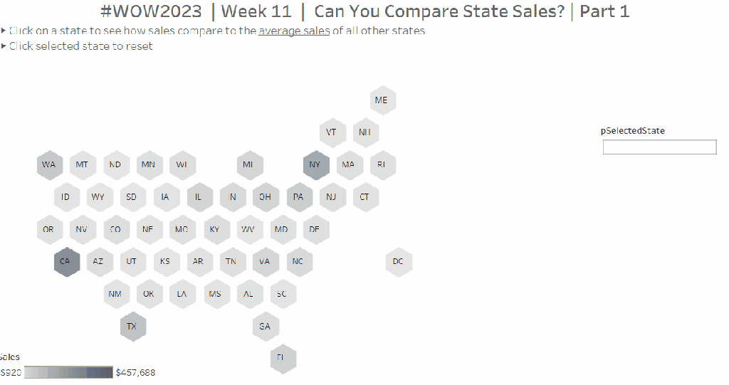
pSelectedState
string parameters defaulted to ” (ie empty string)

pSelectedCity
string parameter defaulted to ” (ie empty string)

Is Selected City
[City] = [pSelectedCity]
Add Is Selected City to the Colour shelf of the City marks card.
Show the pSelectedCity parameter and type in ‘Fayetteville’. The colour legend should display values for True & False. Adjust colours to suit.
Also add Is Selected City to the Size shelf and adjust the sizes accordingly.

Building the table
On a new sheet, add
- State/Province to Filter and filter to ‘Arkansas’
- Add Is Selected City to Filter and filter to True
- Add Customer Name, Order ID and Product Name to Rows
- Right-click on the State/Province field in the Filter shelf and apply to worksheets > selected worksheets and select the Large Map & Small Map sheets. This makes the filter shared between all those sheets.
Create a new field
Unit Price
SUM([Sales])/SUM([Quantity])
and add to Text.
Drag Quantity onto the canvas and drop on the ‘unit price’ column when you see show me appear. This will automatically add Measure Values to Columns and Measure Names to Filter.

Do the same for Sales. Reorder the pills in the Measure Values box so they are arranged as required.

Add subtotals (Analysis menu > Totals > Add all subtotals), then display at the top (Analysis menu > Totals > Column Totals to Top).
Right-click on the Customer Name pill in Rows and uncheck Subtotals from the context menu.

Format the table: set the worksheet background colour to light grey and set the total (pane & header) background colour to a shade darker.

Adjust the width and height of the columns and rows to suit.

Uncheck show tooltip from the Tooltip shelf, and name the sheet Table or similar.
Building the Navigation sheet
The ‘back to main map’ navigational display is actually a worksheet rather than a navigational object on a dashboard, as we need to apply parameter actions to it in order to reset some parameters.
On a new sheet, double click into the space on the marks card below the shelf buttons, and type ‘X’

Change the mark type to Text and move the X field to the Text shelf. Update the text to include the additional words, adjust the font size and then align middle centre. Uncheck Show tooltip.

Create the following fields
City – Reset
”
State – Reset
”
and add both to the Detail shelf. Name the sheet Navigation or similar.
Building the dashboard
Using horizontal and vertical layout containers, arrange all the objects on a dashboard. You will need to adjust the background colour of some objects and the padding to get everything looking as expected. This can be quite tricky and is very hard to explain in a blog. The item hierarchy in the image below will help give you an idea

To draw horizontal or vertical lines, add a blank object to the layout container, change the background colour, reduce the padding to 0 and then adjust the height or width of the object so it is very narrow.
These are the properties associated with the red ‘tab’ in the heading – the background colour is red, inner and outer padding is 0, width is 4px and the object is contained within a horizontal container

For the City/State title, reference the pSelectedState and pSelectedCity parameters, along with a unicode symbol which I copy and past from here.

Adding the interactivity
Add the following dashboard actions
Set State
on select of the Map-Large sheet, set the pSelectedState parameter passing in the value of the State/Province field. When the selection is cleared, retain that value.

Set City
on select of the Map-Large sheet, set the pSelectedCity parameter passing in the value of the City field. When the selection is cleared, retain that value.

Reset State
On select of the Navigation sheet, set the pSelectedState parameter passing in the value of the State – Reset field. When the selection is cleared, retain that value.

Reset City
On select of the Navigation sheet, set the pSelectedCity parameter passing in the value of the City- Reset field. When the selection is cleared, retain that value.

Click around on the dashboard and sense check the parameters appear to be behaving – ie if you click on a city on the large map sheet, the table and small map should update, and if you then click the navigation sheet, the table shouldn’t show anything, and the small map shouldn’t show anything highlighted.
Hide and show the objects
Finally, we need to only show the required objects depending on the actions taken. For this we need some additional calculated boolean fields. Go back to any sheet, and create the following calculated fields
City is Selected
[pSelectedCity]<>”
City Not Selected
[pSelectedCity]=”
Note, these fields just have to exist, they don’t need adding to any sheet.
Navigate back to the dashboard.
Click on the Map-Large object, and on the Layout tab, check the control visibility using value option, and choose the City Not Selected value.

This means that when City Not Selected is true (ie the pSelectedCity parameter is empty), this object will display. When City Not Selected is false (ie the pSelectedCity parameter has a value), this object will be hidden.
Depending on what you’ve been clicking, this object might disappear immediately.
Click on the Table object, and do the same steps, but this time choose the City is Selected field. This means the table will only show then the pSelectedCity parameter has a value.
Apply the same settings so the small map, the table title, and the navigation sheet only show when City is Selected. Note – depending on how you have built the dashboard, you may find you can apply the setting once against a container which contains all the objects you want to hide rather than against each individual object.
I also chose to only display the Select a State filter control when the City Not Selected was true.
And hopefully, that should be it. My published viz is here.
Happy vizzin’!
Donna


 Donna + DataViz