Can you create a sales dashboard by effectively utilising headers?

Community Month continues and this week Hideaki Yamamoto provided us with this 1 sheet view. He very kindly posted requirements aimed at different levels, but I’m writing the solution for the Level 1 version.

Identifying the Current & Previous FY

The dashboard is all focused on reporting over financial years, and Tableau very kindly allows us to set the start month of the FY, in this case April. Right click on Order Date -> Default Properties -> Fiscal Year Start

If you now double click on Order Date to add it to a new sheet, you automatically get the discrete YEAR part of the Order Date displayed with the relevant FY label.

Expand the field to show the quarter & month, then create an explicit field

Year Order Date

YEAR([Order Date])

convert to discrete, and format as a number with 0dp and no thousand separators.

Add this to the display too and you can see how the dates behave…. every FY start with the month of April, but the FY label is based on the year of the last month (ie March), so FY2024 contains data from April 2023 to March 2024.

Throughout the challenge though, the FY is displayed in the FYXXXX-XX format, and there doesn’t seem to be a way to get a handle on the formatting Tableau applies when the fiscal year is set. So I had to come up with a calculated field to get the FY to display as I wanted.

FY Display

IF MONTH([Order Date])>=4 THEN “FY” + STR(YEAR([Order Date])) + “-” + RIGHT(STR(YEAR([Order Date])+1),2)
ELSE “FY” + STR(YEAR([Order Date])-1) + “-” + RIGHT(STR(YEAR([Order Date])),2) END

Add this to the display (remove the quarter field too).

With this we can identify the maximum FY display (as there’s a requirement not to hardcode anything).

Max FY

{MAX([FY Display])}

Add this to the table

Now we can create a parameter which will display the values of FY Display and automatically show the latest/maximum value by default. Right click on FY Display -> Create -> Parameter

pSelectedFY

string parameter that sets the value to Max FY when workbook opened and lists the value when the workbook opens from the FY Display field.

To identify what records relate to the current or previous year, we create

FY End Year

INT(RIGHT([FY Display],2))

which returns the last two numbers of the FY Display string. Make this a dimension. Then we can get whether the row is related to the FY selected in the parameter by

Is Current Year

INT(RIGHT([pSelectedFY],2)) = [FY End Year]

and

Is Previous Year

INT(RIGHT([pSelectedFY],2))-1 = [FY End Year]

Add the fields onto the table, and show the pSelectedFY parameter

Adjust the parameter to see how the values change. We can now create a field that we can use to filter the data to the rows we’ll need – ie just those for the current year or the previous year

Dates to Display

[Is Current Year] OR [Is Previous Year]

It feels like I created a lot of fields just to get to this point…. there’s probably a more efficient route, but that’s just where my logical next step went to as I built out what I thought I’d need…

Building the basic chart

On a new sheet, add Dates to Display to Filter and set to True.

Add Order Date to Columns and set to the discrete Month level (blue pill). Add Sales to Rows. Add Is Current Year to Colour and adjust accordingly. Re-order so True is listed first.

We need to split the chart by Region, but the headings need to be adjusted based on which region is going to be selected. The selected Region will be stored in a parameter

pSelectedRegion

string parameter defaulted to ‘East’

Show this parameter on the sheet and then create a new field

Region to Display

IF [Region] = [pSelectedRegion] THEN ‘â–¼’ + [Region]
ELSE ‘â–º’ + [Region]
END

Add this field in front of MONTH(Order Date) on Columns and Sort based on Region ascending.

We need to show the cumulative sales. We can do this with a quick table calculation on the Sales pill, but sometimes like to create an explicit field, so I know exactly what pill is what

Running Sum Sales

RUNNING_SUM(SUM([Sales]))

This is the same code that a quick table calculation will generate. Format to $ with 0 dp.

Replace the Sales field on Rows with Running Sum Sales and adjust the table calculation setting, so it is computing by Month of Order Date only. Add Order Date to Detail too.

Now, the required solution at Level 3 shows the line (above), the area underneath coloured, and circular markers on the line where the end point is larger than the rest. This ‘feels’ like 3 different marks – line, area and circle, but we can’t do more than 2 mark types with dual axis….

…but we can ‘fake’ it. Now getting the large circle to display was actually part of the challenge that got me stumped, and that I ended up applying at the end after mulling it over with my colleague, Sam Parsons. For the purposes of this blog though, it’s easier to add the relevant logic now.

We want to identify the value associated to the last point for the current year

Last Sales Value

IF LAST() = 0 AND ATTR([Is Current Year]) THEN RUNNING_SUM(SUM([Sales])) END

Drag this onto the Running Sum Sales axis, and drop it when the two green columns appear

This will automatically add Measure Names and Measure Values to the sheet. Move Measure Names from Columns to Detail. Change the mark type explicitly to line. Adjust the table calculation settings of the Last Sales Value field so it is computing by Month of Order Date only. You should notice the end of each ‘current year’ line has a little circle. It’s still a line mark type, but as it’s only 1 point it has no other points to join up to, so looks lie a circle.

We want it to be more prominent though, so move Measure Names from Detail to Size. Reorder the size the fields on the size legend, so the Last Sales Value is bigger. Then from the Colour shelf, add markers to lines

Add another instance of Running Sum Sales to the Rows shelf. This will create a 2nd marks card. Change the mark type of this to Area. Remove Measure Names from this marks card, and adjust the Colour to have an opacity of around 30%. Turn stack marks off (Analysis Menu ->Stack Marks -> off). Set the chart to dual axis and synchronise axis.

Hide the right hand axis, and rename the title of the left hand axis. Format the axis to be $ with 0 dp.

On the bottom half of the chart, we want to display the current year sales as bars with previous year as a reference line, so we need

Sales – CY

IF [Is Current Year] THEN [Sales] END

and

Sales – PY

IF [Is Previous Year] THEN [Sales] END

Format both to $ with 0dp.

Add Sales – CY to Rows which will add a 3rd marks card. Change the mark type to Bar.

Add Sales – PY to Detail. The right click on the Sales – CY axis and Add Reference Line.

Set the reference line to be per cell based on the Sales-PY field, formatted as a line and with a fill below of light grey to give the appearance of a bar.

Change the title of the Sales – CY axis. Remove all gridlines and zero lines. Format the MONTH(Order Date) to use 1st letter only. Hide the null indicator.

Adding the ‘headers’

We need to have 4 rows of headers at the top – currently we’ve got 1 – the Region.

Below Region we want to split the data by Category if its the selected region, so we need

Category to Display

IIF([Region]=[pSelectedRegion], [Category],”)

Add this on to Columns after Region to Display. The visuals should automatically adapt. Adjust the value of the pSelectedRegion parameter to see how the viz changes.

Now double click into the Columns shelf and manually type ‘Total Sales’ (including the quotes). This will create a ‘dummy’ header pill. Move it to be after Category To Display.

Finally, create a new field

Current Year Sales

{FIXED [Region], [Category To Display]: SUM([Sales – CY])}

change this to be a dimension and format to $ with 0dp. Add this field to Columns after Total Sales, and we now have all the header fields we need.

Change the formatting as follows

  • Region To Display : Shading navy, font white, size 12, Tableau Medium Bold
  • Category to Display : font black, Tableau Medium size 12
  • Current Year Sales : font dark teal, Tableau Medium size 14 bold

Adjust the width of each header row to give a bit more ‘breathing room’.

Format the column dividers so the Header level is set to a thick white line, and set the row divider so the header level is set to None

Hide the ‘Region To Display / Category To Display / ‘Total Sales’/… etc heading label (right click and hide field labels for columns). Adjust the font of both axis to be smaller (I set to 8pt).

Adding the Tooltips

Add FY Display, Year Order Date, Region, Sales and Category To Display to the Tooltip shelf of the All marks card.

We need another couple of fields to get the required display.

Month Order Date

MONTH([Order Date])

convert to a dimension and custom format as 00

Tooltip |

IF [Category To Display] <> ” THEN ‘|’ END

Add these fields to the Tooltip shelf too of the All marks card and adjust the tooltip

Adding the sheet title

For the sheet title, we need to display the FY of the previous year

FY Display Prev Year

‘FY’ + STR(INT(MID([pSelectedFY],3,4))-1) + ‘-‘ + STR(INT(RIGHT([pSelectedFY],2))-1)

Add this to the Detail shelf of the All marks card. Then adjust the title of the sheet so its referencing the pSelectedFY parameter and the FY Display Prev Year field.

Adding the interactivity

Add the sheet onto a dashboard. I floated the pSelectedFY parameter and displayed it as a slider but customised to not show the slider.

Create a single dashboard parameter action to select the Region

Set Region

On select of the viz, set the pSelectedRegion parameter passing in the Region field. Set the value to empty when selection is cleared.

And with that, you should have a completed solution. My published viz is here.

Happy vizzin’!

Donna

Playing with Stacks

For this week’s challenge, Sean Miller introduced multiple ways to get insight from a stacked bar chart. I managed this using 5 sheets and 1 dashboard.

Preparing the data

As the requirement stated only 2024 was to be considered, I chose to add a data source filter (right click data source -> Add Data Source Filter) where the Order Date Year = 2024.

Option 1 : The Analytics Pane

On a new sheet, add Order Date to Columns as a discrete month (blue pill) and Sales to Rows. Format Sales to $ with 0 dp. Change the mark type to bar and add Ship Mode to the Colour shelf.

Format MONTH(Order Date) to display the dates as Abbreviation. Manually move Ship Mode = Same Day in the colour legend so it is listed first. Hide the Order Date heading (right click -> hide field labels for columns).

Add a reference line (right click Sales axis -> add reference line) that sets a reference line per cell to the sum of Sales and displays the Value on the label.

Format the reference line (right click on one of the lines) and align the label top centre. Adjust the Tooltip if required. Add a white border around the bars (via the colour shelf).

Right click on the Ship Mode pill on the Colour shelf and check the Show Highlighter option to display the highlight input box. Test that selecting an option in the highlight box shows a recalculated reference line.

Name this sheet Option 1 or similar.

Option 2 – Dual Axis

Duplicate the Option 1 sheet and rename to Option 2 or similar.

We will capture the selected ship mode in a parameter.

pShipModeSelected

string parameter defaulted to empty string.

Show the parameter and then enter the text ‘First Class’

Create a new calculated field

Selected Ship Mode Sales

IF [Ship Mode] = [pShipModeSelected] THEN [Sales] END

format this to $ with 0dp.

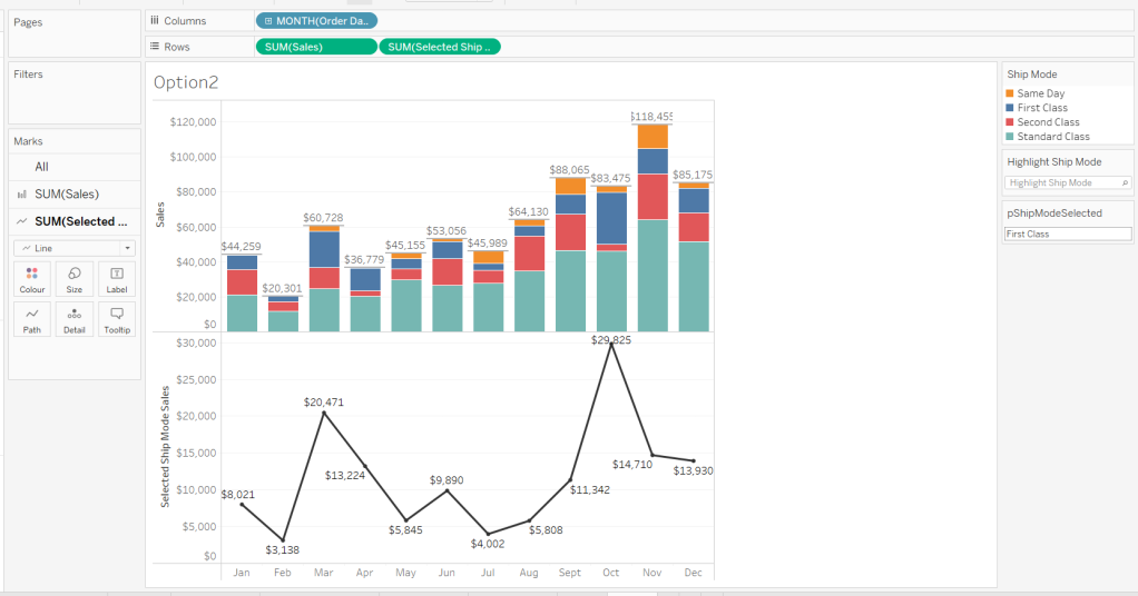
Add Selected Ship Mode Sales to Rows. Change the mark type on the associated marks card to line and remove Ship Mode from the Colour shelf. Adjust the colour of the line to a dark grey/black and show mark labels.

Make the chart dual axis and synchronise the axis. Hide the right hand axis (uncheck show header) and remove column and row dividers.

Change the text in the parameter to Same Day. You should now get a broken line. Right click on the Selected Ship Mode Sales pill and format. Set the marks for special values to Hide (Connect Lines).

Option 3 – Dynamic Stacks

Duplicate the Option1 sheet again and rename to Option3. Show the pShipModeSelected parameter and enter text ‘Same Day’.

Create a new calculated field

Sort

IIF([Ship Mode]=[pShipModeSelected],1,0)

and drag it into the ‘dimension’ section of the data pane (above the line).

Right click on the Ship Mode pill on the Colour shelf and select Sort.. Change the Sort By option to Field ascending and Field Name = Sort. This will push the bars related to Same Day to the bottom of the stacked bar.

Building the Ship Mode Selector

On a new sheet, add Ship Mode to Columns and then double click into Columns and manually type MIN(1). Change the mark type to bar and edit the MIN(1) axis to fix it from 0 to 1.

Add Ship Mode to Colour and to Label (you may have to widen the bars to make the label visible). Align the label middle centre and bold the font. Adjust the size to the largest possible.

Hide the axis and the Ship Mode headings (uncheck show header). Remove all column/row dividers. Hide the Tooltip from displaying. Name the sheet accordingly.

Building the Navigation selector

I chose to add all the sheets onto a single dashboard (rather than separate dashboards), so created a navigation sheet.

To help with this, I basically utilised the Segment field that wasn’t being used, and essentially translated the values to repurpose them for the navigation options.

Navigation

CASE [Segment]
WHEN ‘Consumer’ THEN ‘Option 1: The Analytics Pane’
WHEN ‘Corporate’ THEN ‘Option 2: Dual Axis’
ELSE ‘Option 3: Dynamic Stacks’
END

Add this field to Columns and type in a MIN(1) in Columns too. Change mark type to bar, fix the axis from 0-1. Make the Size as large as possible. Add Navigation to Label and align middle centre and set the font to white. Adjust the column divider to be a thick white line and remove row divider. Hide the axis and the Navigation headings.

Create a new parameter to capture the navigation selection.

pSelectedDisplay

string parameter defaulted to : Option 1: The Analytics Pane

Show the parameter. Create a new field

Is Selected Display

[Navigation] = [pSelectedDisplay]

and add to the Colour shelf. Adjust to suit. Adjust Tooltip as required and rename the sheet.

Building the Dashboard

Create a dashboard and arrange all the objects on the dashboard, with the different options placed above each other. Use containers if need be. You’ll have something like this – it’ll look a little messy but don’t worry.

We’ll be using Dynamic Zone Visibility to control which object displays based on which option from the Navigation sheet is selected.

First, let’s set the interactivity to control the navigation selection. Add a parameter action

Select Display

on select of the Navigation sheet, set the pSelectedDisplay parameter, passing in the value from the Navigation field. Keep current value when deselected.

Clicking on the different options in the Navigation control will now change the parameter value, but this won’t do anything yet. We need several calculated fields

Option 1 Selected

[pSelectedDisplay] = ‘Option 1: The Analytics Pane’

Option 2 Selected

[pSelectedDisplay] = ‘Option 2: Dual Axis’

Option 3 Selected

[pSelectedDisplay] = ‘Option 3: Dynamic Stacks’

Option 2 or 3 Selected

[pSelectedDisplay] <> ‘Option 1: The Analytics Pane’

All of these fields will return True if the condition is met, so we can use these to control which objects display.

Back on the dashboard, select the Highlight Ship Mode object, and from the Layout pane, check the Control visibility using value and choose the Option 1 Selected field.

Select the Option1 bar chart and apply the same settings.

Now select the Ship Mode Selection sheet, but this time, choose the Option 2 or 3 Selected field to control visibility. It’s likely this field will now disappear.

Select the Option2 bar chart and choose Option 2 Selected field. This will disappear.

Select the Option3 bar chart and choose Option 3 Selected field. This will disappear.

Now click on the different options in the Navigation control and the different charts should display.

(Note – I actually chose to contain the highlight selector and the option1 bar chart within their own layout container, which meant I could then just apply the setting to control visibility of the layout container rather than the individual objects).

Ensure either Option2 or 3 on the navigation bar is selected so the Ship Mode selector is displayed. Create another parameter action

Set Ship Mode

On select of the Option 2 & 3 Selector sheet, set the pShipModeSelected parameter, passing in the value from the Ship Mode field. When clearing the selection, set the value to <empty string>.

Clicking on a ship mode should now display the line or reorder the stack depending what Option you were on.

In clicking the nav or the ship mode selector, you will probably have noticed that the other options become ‘greyed out’ or ‘faded’ To stop this from happening, use a highlight dashboard action.

Create a new field, mine happened to be

True

TRUE

but it could just as easily be named anything containing any string. Add this field to the Detail shelf of the Navigation sheet and the Ship Mode Selection sheet.

Back on the dashboard create a new highlight dashboard action

Deselect Ship Mode Selector

On select of the Option 2&3 Selector sheet, target itself but using the selected field of True.

Create another highlight dashboard action apply the same principals for the Navigation sheet (for more information and worked examples on ‘deselecting marks’, see this blog.

And hopefully you should now have a working solution. My published workbook is here.

Happy vizzin’!

Donna

Can you create a time-focused Gantt chart?

It was Kyle’s turn to set the challenge this week, and took inspiration from a work based scenario he had encountered. As a result 3 fictitious data sets were provided, and a viz was required to be built against each of them.

Building the Marketing Campaigns Gantt chart

All 3 vizzes are tied together by 2 parameters – the highlight date and number of days, so lets’ start with defining those

pHighlightDate

date parameter defaulted to 01 Dec 2023

and

pDays

integer parameter defaulted to 120

On a new sheet, show both of these parameters.

Using the Campaign data source, add Campaign to Rows and Start Date to Columns as a continuous exact date (green pill).

To define the width of each mark, we need

Duration

DATEDIFF(‘day’, [Start Date], [End Date])

Add this to the Size shelf, then add Category to the Colour shelf and adjust accordingly.

Add Start Date as a discrete exact date (blue pill) to Rows and position in front of the Campaign pill. This will order each row based on the Start Date ascending.

Hide the Start Date pill on Rows (uncheck Show Header). Add End Date as a continuous attribute to Tooltip, and amend the tooltip as required.

Add pHighlightDate to Detail, then right click on the Start Date axis and Add Reference Line. Add a dotted line for the entire table based on the pHighlightDate field.

Remove all row and column dividers; delete the axis title (right click > edit axis) and hide the Campaign column heading (right click > hide field labels for rows). Format the Campaign numbers so they are aligned right.

Update the title of the sheet, and include the details for the legend title within

Finally, we need to filter the rows shown based on whether the campaign was running within the window based on the number of days before/after the highlight date. We need

Window Start

DATE(DATEADD(‘day’, [pDays]*-1, [pHighlightDate]))

Window End

DATE(DATEADD(‘day’, [pDays], [pHighlightDate]))

and then

Campaigns to Include

[End Date] > [Window Start] AND [Start Date] < [Window End]

Add Campaigns to Include to the Filter shelf and set to True. Test the viz changes as the parameters are changed.

Building the Experiments Gantt Chart

This is built in very much the same way as the above using the Experiments data source instead. In this case, Start Time and Experiment ID will be on Rows, Start Time on Columns and Status on Colour,

A Duration field should be on Size, but the calculation needs to be slightly different to handle those records where there is a start but not an end. In this case, we assume the experiment is still ongoing, so set the end to ‘today’.

Duration

DATEDIFF(‘day’, [Start Time], IFNULL([End Time], TODAY()))

A Window Start and Window End field will need to added to this data source too, and then

Experiments to Include

IFNULL([End Time], TODAY()) > [Window Start] AND [Start Time] < [Window End]

should be added to the Filter shelf, and set to True – at this point all the experiments that didn’t have a start date either will disappear. Add a title and the reference line and format as before

Building the Emails bar chart

On a new sheet, using the CRM data source, add Date as a continuous exact date (green pill) to Columns and Sent to Rows. Change the mark type to bar chart. Click on the Size button, and change to be Fixed.

Add Email Type to Colour and adjust. Update the Tooltip.

Create fields Window Start and Window End as before, then create

Emails to Include

[Date] > [Window Start] AND [Date] < [Window End]

and add to the Filter shelf, set to True.

Add pHighlightDate to the Detail shelf, and add a reference line as before.

Remove all row/column dividers, gridlines & axis lines; delete the axis titles; add a sheet title including the legends.

The add all 3 sheets to a dashboard – I placed them all in their own vertical container, so I could then distribute contents evenly.

And that should be it! My published viz is here.

Happy vizzin’!

Donna

Can you compare salaries to the median?

For the first WOW challenge of 2024, I set the task of completing a viz related to HR salary data.

Creating the calculations

To start, we’ll build out all the necessary calculations required, and display them in tabular form. First create

Employee

[Forename] + ‘ ‘ + [Surname]

then add Employee ID and Employee to Rows, along with Department and Job Title. Add Pay Level as a discrete dimension (blue pill) to Rows too, then format Salary to £ with 0 dp, and add to Text.

We want to compare each employee’s salary with the median salary of all the employees in the same pay level. For this we need

Median Salary per Pay Level

{FIXED [Pay Level]: MEDIAN([Salary])}

Add this to the view too. You should see that the value is the same for those rows where the Pay Level is the same.

We need to compute the difference between these numbers (to draw a line from the median to the salary)

Difference From Median

SUM([Salary])- SUM([Median Salary per Pay Level])

and we also need to understand the salary as a proportion of the median

Salary / Median %

SUM([Salary])/SUM([Median Salary per Pay Level])

format this to % with 0 dp and add both these fields to the table

Each employee is given a scale value based on the proportion

Salary Scale

IF [Salary / Median %] > 1.2 THEN 6
ELSEIF [Salary / Median %] >1.1 AND [Salary / Median %] <=1.2 THEN 5

ELSEIF [Salary / Median %] >1 AND [Salary / Median %] <= 1.1 THEN 4

ELSEIF [Salary / Median %] > 0.9 AND [Salary / Median %] <= 1 THEN 3

ELSEIF [Salary / Median %] > 0.8 AND [Salary / Median %] <=0.9 THEN 2
ELSE 1
END

Set this to be discrete, then add to the view on Rows.

Finally we need the markers for the 80%, 90% etc of the median salary

80% Median

0.8 * [Median Salary per Pay Level]

90% Median

0.9 * [Median Salary per Pay Level]

110% Median

1.1 * [Median Salary per Pay Level]

120% Median

1.2 * [Median Salary per Pay Level]

Building the Viz

On a new sheet, add Employee ID, Employee, Department and Job Title to Rows. Add Salary to Columns and set the mark type to Circle. Set the Colour of the circle to suit (or use #64cdcc).

Add Median Salary per Pay Level, 80% Median, 90% Median, 100% Median, 120% Median to the Detail shelf. Add Pay Level, Salary Scale and Salary / Median % to Tooltip.

Format the axis (right click) and set the scale to be at £k with 0dp

This will also change the formatting of the salary on the tooltip, but we want it to be more detailed so create

Tooltip-Salary

[Salary]

and format this to £ with 0 dp. Add this to Tooltip too and adjust tooltip to match.

Add a reference line to the axis (right click axis > add reference line) for the Median Salary per Pay Level. Set it to be per cell and display a dashed line with no labels/tooltips displaying.

Add another reference line. This time set it to be a band at the cell level which ranges from the 80% Median to the 90% Median. Don’t display any labels or tooltips or lines and fill the band with the appropriate colour.

Repeat the above process, adding a reference band from 90% – 110% of the median, and a further band from 110% – 120% of the median.

Add another instance of Salary to Columns. Change the mark type of the 2nd Salary marks card to gantt and adjust the colour. Add Difference From Median to Size and decrease the size as small as possible. Double click into the Difference From Median pill on the size shelf and manually type in * -1 to the end.

Now make the chart dual axis and synchronise the axis. Right click on the top axis and move marks to back.

We want the user to be able to filter the chart, so add Department, Pay Level (select All values) and Salary Scale to the Filter shelf.

Finally, format the chart – make each row a bit wider; set the background colour of the worksheet to #f9f8f7; remove column dividers; set row dividers to a thick white line; remove all gridlines, zero lines and axis rulers. Reduce the size of the axis values and increase the width of the initial 3 columns so the text doesn’t wrap as much. Test your filters.

If all working, then add the sheet to a dashboard.

Building the Legend

To build the legend, I simply duplicated the core sheet, then filtered to a specific Employee ID and hid the Employee ID, Employee, Department and Job Title fields. I then edited the reference lines to add custom labels to label each line band, formatting the text to display to the top or bottom. I added an annotation to the Salary circle mark to label that as ‘Employee Salary’ which I then manually moved into position.

When I added this to the dashboard, I then floated a blank object over the top so the legend could not be interacted with.

My published viz is here.

Happy vizzin’!

Donna

Can you build this simple KPI card?

For this week’s challenge, Luke asked us to recreate this KPI card on a single sheet.

We needed to display data for the last 2 years up to the latest complete month. If this was being built for a business situation, we’d make use of the TODAY() function to get a handle on the current date. Since this is being built with a static dataset which includes data up until 31st Dec 2023, I am using a parameter to ‘hardcode’ the ‘today’ date, as I want this viz to still present the relevant data on my public profile if it’s accessed in a year’s+ time.

pToday

date parameter defaulted to 12th Dec 2023

With this I can the define the data I want to include within the viz

Records to Include

[Order Date] < DATETRUNC(‘month’, [pToday]) AND [Order Date] >= DATEADD(‘year’,-2,DATETRUNC(‘month’, [pToday]))

based on pToday = 12th Dec 2023, this includes records where the Order Date is less than 01 Dec 2023 and greater or equal to 01 Dec 2021.

Add this to the Filter shelf and set to True. Then add Order Date set to the Continuous Month level (green pill) to Columns and Sales to Rows.

The add another instance of Sales to Rows and change the Mark type on the ‘Sales 2’ marks card to Area. Make the chart dual axis and synchronise the axis. Adjust the opacity of the area chart via the Colour shelf as required, and amend the Tooltip on the All marks card to display the month and sales value in the relevant format.

This has formed the basis of the sparkline. Now we need to determine the calculations we need which are displayed in the text.

The text displays information related to the month the user ‘selects’ by hovering over the sparkline. By default the information for the latest full month (in this case Nov 2023) is displayed. We need to capture this latest month in a field

Latest Month

DATE(DATEADD(‘month’, -1, DATETRUNC(‘month’, [pToday])))

We also need to capture the month the user selects via the hover into a parameter.

pSelectedMonth

date parameter defaulted to 01 Jan 1900 (think of this as a ‘null’ date)

With this we can then create

SelectedMonth

IF [pSelectedMonth] = #1900-01-01# THEN [Latest Month]
ELSE [pSelectedMonth]
END

format this to the <month year> format ie November 2023

and then also create

Selected Month Sales

{SUM(IF DATETRUNC(‘month’, [Order Date]) = [Selected Month] THEN [Sales] END)}

notice the function is wrapped in { } which makes it a Level of Detail (LOD) calculation, so the value is fixed across every row in the data set.

We also need to work out the sales from the same month in the previous year

Select Month Sales -PY

{SUM(IF DATETRUNC(‘month’, [Order Date]) = DATEADD(‘year’, -1, [Selected Month]) THEN [Sales] END)}

and subsequencty we can work out the change in sales

Change from PY

(SUM([Selected Month Sales]) – SUM([Selected Month Sales – PY ]))/SUM([Selected Month Sales – PY ])

To sense check what we’ve got, on a new sheet display the pSelectedMonth parameter then build a sheet as below

with the parameter set to 01 Nov 2023 we can see the values for Nov 2023 and Nov 2022 and captured in the relevant fields, and then the % change between the two also reflected.

But the % change is displayed on the KPI in different coloured text depending on whether the field is +ve or -ve. FOr this we need

Change from PY +ve

IF [Change from PY] >=0 THEN [Change from PY] END

and

Change from PY -ve

IF [Change from PY] <0 THEN [Change from PY] END

apply a custom number format to both fields of ↑0%;↓0% and add both fields to the sheet. Only 1 of these columns will ever be populated. If you change the parameter to 01 Aug 2022, you’ll see a negative change.

Now we have these fields, we can start to add the text element to the sparkline chart.

We’re going to plot a ‘mark’ against the first point in the x-axis, in this instance the point associated to the 1st Dec 2021. But we don’t want to ‘hardcode’ this date, so we can use

Dummy Y-Axis

IF FIRST() = 0 THEN 1 END

where FIRST() is a table calculation that is 0 for the first point on the month axis.

Add this to Rows before the Sales pills.

We have a single mark plotted for 1st Dec 2021 on a second Y-axis at position 1 on the axis. But no other marks. Change this mark type to shape and use a transparent shape (see this blog for details on how to do this).

Add Selected Month as an exact date to the Label shelf, along with Selected Month Sales, Change from PY +ve and Change from PY -ve. We also need

Previous Year

YEAR(DATEADD(‘year’,-1,[Selected Month]))

convert this to a dimension (drag to be above the line in the left hand data pane) and then add to Label too. Adjust the layout of the label as below and align top left. Note I added some spaces to the front on each line of text.

You should have something that looks similar to

To get the vertical line to display on hover, we need to create

Ref Line

IF [pSelectedMonth]<>#1900-01-01# THEN [pSelectedMonth] END

Add this to the Detail shelf of the Area chart sales marks card and set to be exact date (green pill). The right click on the date axis and Add Reference Line

Changing the pSelectedMonth parameter the line will display

Finally clean up the chart by hiding all the axis, removing all row & column dividers, gridlines, axis lines and zero lines. Hide the ‘null’ indicator.

Add the sheet to a dashboard, then create a parameter action

Select Month

on hover of the KPI card, update the pSelectedMonth parameter with the value from the Month(Order Date) field. When the selection is cleared, set the value to 01 Jan 1900.

Note – you may find that based on the size of the dashboard, you don’t get the text part to display. This is an annoyance in Desktop, that it isn’t completely WYSIWIG (what you see is what you get). I spent time adjusting font sizes etc to make the text display in Desktop, but once published to Tableau Public, it all looked too small. After setting it all back to the sizes I wanted in Desktop and re-publishing, I found it did actually display ok on Public. So you may find you just need to play around a bit to get the display as you want.

My published viz is here.

Happy vizzin’!

Donna

Can you build a heat map with bathymetry lines?

What??? That was the first thought that went through my mind when Luke set this challenge. Bathy..huh… ??? What’s that all about. Well read the challenge to find out more 🙂

The what?? was quickly followed by errr…..? The indicator on the challenge overview page said ‘hard’ and this was a Luke challenge after all, so certainly not for the faint hearted! I wasn’t sure how this was going to go, so just started with a basic tabular view and went from there. (hint – it might be worth reading the blog to the end before you start building.. it could save some time 😉 )

I quickly built a basic heat map. I added Order Date at the discrete (blue) month level to Columns and Sub-Category to Rows. I added Sales to Colour and changed the mark type to square then added Sales to Label.

We ultimately need the cumulative Percent of Total Sales per Sub-Category, to display as the label. Click on the Sales pill on the Label shelf and Add Table Calculation. From the dialog window, choose Running Total and verify the calculation is computing Table (across) (or amend and select Specific Dimensions and ensure Month Order Date is selected). Then check Add secondary calculation and in the secondary calc dialog, select Percent of Total, again ensuring Table (across).

If applied correctly, the values in the December column should all be 100%.

I wanted to ensure this calculation was stored so I could reuse, so while pressing shift key, I dragged the Sales pill from the label shelf into the data pane, and renamed the calculation

Cumulative % of Total

RUNNING_SUM(SUM([Sales])) / TOTAL(SUM([Sales]))

Format the field to be % with 0 dp

Editing the field should show the details above. Of course, you can just create the calculated field manually and type in the syntax. If you do that, then replace the Sales field on the label field, with this one. Centre align the text.

With this field, we can create the calculation Luke provides for the colouring

Colour

ROUND([Cumulative % of Total]*50, -1)

Replace the Sales field on the Colour shelf with this field, and adjust the colour to use the Blue sequential colour palette. You should now have the basic structure and colouring of the heat map.

Adjust the font style and alignment of the Sub-Category and Order Date Month label headings, and change the month labels to be abbreviated. Hide the Order Date column label and the Sub-Category title (right click hide field labels for columns/rows). Remove all gridlines, row/column dividers etc.

Looking good.. but what next.. how to get those divider lines…. I wasn’t too sure at this point, but I knew I had to identify the cells when a ‘change in colour’ happened both horizontally and vertically.

So the first thing I did was to duplicate the above sheet into a basic crosstab (right click sheet > duplicate as crosstab), and I removed Cumulative % of Total from the display, so I just had the values used for the colour.

I decided I wanted to flag each cell with a 1 or 0 depending on whether the next cell was different or not. I started horizontally. So for each row, and starting with January, I wanted to compare the colour value for Jan with the colour value for Feb. If they were the same, I wanted to record 0 against Jan. If they were different I wanted to record 1 against Jan. I used the following calculation

Horizontal – Next Value Diff

IF ([Colour] = LOOKUP([Colour],1) OR LAST()=0) THEN 0 ELSE 0.99 END

If the Colour value for the current cell (eg Jan) matches the Colour value of the next cell (eg Feb) OR, the current cell is the last month (ie Dec), then return 0 otherwise there is a mismatch so return 0.99. Originally I used 1, but later found I had to adjust the calc to make the line show as I wanted.

Add this field to the tabular display and verify the table calculations used within the field are running Table (across).

You can see that for Accessories, the Colour value for Feb is not equal to the Colour value for Mar, and so the Horizontal – Next Value Diff value for Feb is 0.99. Whereas as the Colour value for Apr matches May, the Horizontal – Next Value Diff for Apr is 0.

I created a similar calculation to test the vertical settings

Vertical – Next Value Diff

IF ([Colour] = LOOKUP([Colour],1) OR LAST()=0) THEN 0 ELSE 1 END

This is essentially exactly the same calculation, but when added to the tabular view, the table calculation for the Vertical – Next Value Diff calc should be set to Table (down) instead

You can see that in Feb, the Colour value for Paper is equal to the Colour value for Phones, so the Vertical – Next Value Diff calc for Paper is 0. But in Mar, the Colour value for Storage is different from the Colour value for Supplies, and so the Vertical – Next Value Diff calc for Storage is 1.

Using these markers, I now want to ‘plot’ them on a viz.

So back to the heat map sheet we built above, we need some axis.

Double click into the Columns shelf and type MIN(1.0) and change the mark type to bar.

You can see a hole has appeared. To fix this, on the Analysis menu, select Infer Properties from Missing Values. The cell will populate.

Confession – I didn’t get this bit initially. I had the chart built with the lines in the correct places, but with a hole. I’d tried all sorts of combinations of ZN, and LOOKUP(expression,0) in calculations to try to make the number appear, but couldn’t get anything to work. I showed my colleague Sam Parsons, who mentioned the above setting. I have honestly never ever used it and was completely unaware of it’s existence. But it solved the problem, so massive hi-five to Sam 🙂

Double click into the Rows shelf and again type MIN(1.0). Having an axis on both rows and columns, means we can now fix the Size of the bar. Click on the Size shelf and select Fixed, width in axis units to 1 and alignment right.

Now we have both an x and y axis, we can add additional detail to get the white bar dividers displaying.

First, adjust the label so it is aligned middle centre.

Add Horizontal – Next Value Diff to Columns. Ensure the table calc settings are Table (across).

Remove both the Colour and the Cumulative % of Total fields from the marks card, and then add Horizontal – Next Value Diff as a discrete (blue) pill to Colour. Remove all gridlines, zero lines, axis ticks and row/column dividers. Change the Size to be Manual and reduce size. Make the chart dual axis and synchronise the axis.

You should have something similar to the above, assuming the colours for the Horizontal – Next Value Diff are distinguishable enough.

I adjusted the colours to set 0 to be a transparent colour (refer to this blog to learn how to add a transparent colour hex code into your custom colour palette, and then 0.99 to be white. Edit the x-axis and fix to be from 0 to 1. The white dividers between the relevant months should now be noticeable.

To set the dividers between the Sub-Category, I decided I just needed to use a constant 0 reference line. For this I needed

Vertical Ref Line

IF [Vertical – Next Value Diff] = 1 THEN 0 END

Add this to the Detail shelf on the All marks card, and verify the table calc setting for the Vertical – Next Value Diff calc is set to Table (down).

Right click on the y-axis and Add Reference Line. Set it per cell using the Vertical Ref Line field, with no label or tooltip displaying. Set the Line properties to be white, 100% opacity and a thick width.

Then edit the y-axis to also be fixed between 0 and 1. The lines separating the Sub-Category should now be prominent.

Then it’s just a case of tidying up – hide the axis, stop tooltips from displaying, and then add to the dashboard, setting as fit to entire view.

If need be you may want to tweak either the size of the bar on the Horizontal – Next Value Diff marks card, or change the thickness of the reference line to get similar sizes.

I have no idea when I’d ever need to use this type of display, but I enjoyed the puzzle and discovered something new which is what I love about using Tableau!

This version of my published viz is here.

BUT….

after writing all this up, and stepping away for a bit, I suddenly realised I’d over-complicated things! I didn’t need a dual axis after all. I could just use a reference line to show the dividers between the months, exactly like I did for the 0 constant reference line – doh! So I made some adjustments..

Amend

Horizontal – Next Value Diff

IF ([Colour] = LOOKUP([Colour],1) OR LAST()=0) THEN 0 ELSE 1 END

Then create

Horizontal Ref Line

IF [Horizontal – Next Value Diff] = 1 THEN 1 END

Then remove the Horizontal – Next Value Diff field from the Rows shelf, so there is no longer a dual axis. Add Horizontal Ref Line to Detail , and display the x-axis MIN(1.0) axis, and add a reference line per cell which references Horizontal Ref Line. Apply the same settings to the reference line as detailed above.

And this resulted in a much simpler looking viz

I know I could reduce the number of calcs used, but I like to have ‘building blocks’ to follow my thought process. I have published the simpler version within the same workbook on a separate tab, here.

Happy vizzin’!

Donna

Can you create a jitterfly chart?

This week it’s the Tableau Conference edition – and as I was at #data23, I’m a bit delayed in getting the challenge and solution posted – too much going on and too much sleep to catch up on over the weekend 🙂

It was great to catch up with the #WOW crew in person and to meet so many participants at the social nights out and at the hands on live session too. And thank you for all those who complimented me on this blog – it really does make the time and effort I put into it worthwhile, when I get to hear how much it has helped you all!

Here’s a few pics from the Tableau Conference, and a massive shout out to Chris McClellan, who made me a custom WOW t-shirt!

Ok, enough of the pre-amble, onto the challenge and solution. Lorna set this challenge to recreate what she referred to as a ‘jitterfly’ chart.

Modelling the data

The data needs to be downloaded from data world. This contains multiple files and it was expected to connect to the central_trend_2017_base.xslx file. This file contains multiple sheets. The Population – Females and Population – Males sheets need to be unioned together in the data source canvas.

Drag Population – Females onto the canvas, then drag Population- Males on too, and drop it when the Union option appears beneath the Population – Females

You’ll know you’ve done it right, if you only have a single object in the canvas and the union symbol is displayed

The data displays all years in separate columns – we need to transpose this, so we have a column for Year and a column for the population value.

Click on the first year column (2011), then scroll across to the last year column (2050). Hold down shift and click the last column, and all the columns in between should be highlighted/selected. Right-click on any of the selected columns and select Pivot.

Rename the Pivot Field Names column to Year and rename Pivot Field Values to Population.

To tidy things up a bit, hide the following fields (right click on column and hide) : Sheet, Table Name, Gss Code, Component. Also, change the data type of the Year field to be a number rather than a string. This should leave you with 5 columns

Navigate to Sheet 1 and in the left hand data pane, drag Age from the lower ‘measures’ section to above the line and into the dimensions section. Age isn’t going to be something we aggregate (sum/avg) etc – it is simply a categorical property of the record. This step isn’t critical, but I just like things to be neat :-).

Finally, though it isn’t stated in the requirements, the data relating to District = London needs to be excluded, as it is a summarised total of the other rows. To handle this I added this exclusion as a Data Source Filter, so once applied, I didn’t have to worry about it when I built the chart. Right click on the data source listed on the top left, and select Edit Data Source Filters, then add a condition to exclude the London District.

Creating the calculations

The chart requires a user to select two years to compare – I’ll refer to these as the Primary and Secondary year. We’ll create parameters to enable the selections.

pPrimaryYear

Integer parameter, defaulted to 2033 and displayed in ‘2033’ format (ie no commas). It should allow all other years to be selected (easiest way to get this populated is to right-click on the Year field in the data pane, and Create > Parameter). If you don’t do this, then use the Add values from button to select the Year field to populate the list.

pSecondaryYear

as above, but default to 2023 (the easiest way to create this parameter is to duplicate the first and just amend the name and default value).

With these parameters, we can then create the calculated fields needed to present the relevant values for each year and gender (as hinted by Lorna).

Population – Primary Male

IF [Year] = [pPrimaryYear] AND [Sex] = ‘male’ THEN [Population] END

format this to K with 1 dp

Population – Primary Female

IF [Year] = [pPrimaryYear] AND [Sex] = ‘female’ THEN [Population] END

format this to K with 1 dp

Population – Secondary Male

IF [Year] = [pSecondaryYear] AND [Sex] = ‘male’ THEN [Population] END

format this to K with 1 dp

Population – Secondary Female

IF [Year] = [pSecondaryYear] AND [Sex] = ‘female’ THEN [Population] END

format this to K with 1 dp

popping these into a table as below, you can see the results

The final calculation we need is for the age banding. We can’t use the in-built ‘bins’ function as the final ‘bin’ contains the ‘rest’ and not just 10 values. Also if we used ‘bins’ the ‘labels’ would be based on the data values and not a custom display as we have here.

Age Bracket

IF [Age] <= 10 THEN ‘<=10’
ELSEIF [Age] <=20 THEN ’11-20′
ELSEIF [Age] <=30 THEN ’21-30′
ELSEIF [Age] <=40 THEN ’31-40′
ELSEIF [Age]<=50 THEN ’41-50′
ELSEIF [Age]<=60 THEN ’51-60′
ELSEIF [Age]<=70 THEN ’61-70′
ELSEIF [Age]<=80 THEN ’71-80′
ELSE ’80+’
END

Note – I altered the calculation and label to be <=10 rather than just <10 as is shown in the solution

Building the Viz

On a new sheet, add Age Bracket to Rows, Population Primary Male to Columns and District to Detail. Change the mark type to circle. Manually re-sort the Age Bracket values so <=10 is listed at the top (just drag the value from the bottom to the top).

Drag Population Primary Female onto the canvas and drop it on the Population Primary Male axis when the double green column symbol appears

This will make the values for both male & female display on the same axis, and Measure Names and Measure Values automatically gets added to the viz. But the values are all displaying in the same direction (the positive axis).

To resolve this, double click into the Population Primary Female pill that is in the Measure Values box underneath the marks card and type in *-1 to the end of the pill and press return

The female values will then be displayed in the opposite direction. Adjust the colours of the Measure Names legend to suit.

To make the dots ‘jitter’, that is appear in a random vertical position, we need a measure (green pill) on the Rows so we generate a y-axis.

Now typically when I am creating jitter plots I use the undocumented RANDOM() function which generates a random number between 0 and 1. The function is undocumented, as it only works for some data sources (excel being one). Using RANDOM() was something I mentioned to several attendees of the Live WOW session at Tableau Conference.

However, due to a later requirement, you’ll need to use a different function instead – in this case INDEX(). For clarity I created an explicit calculated field for this

Jitter

INDEX()

INDEX()is a table calculation that creates a unique sequence number from 1 to n for each record in the table partition. In this case the partition is each Age Bracket. Add Jitter to Rows and adjust the table calculation setting so it is computing by District only. Set the fit of the chart to Fit Width to ensure you can see the display better.

Adjust the colour of the marks to 50% opacity.

To handle the detail displayed on the Tooltip we need to create some additional fields for the population values, these ones not split based on gender.

Population – Primary Year

IF [Year] = [pPrimaryYear] THEN [Population] END

format to K with 1 dp

Population – Secondary Year

IF [Year] = [pSecondaryYear] THEN [Population] END

format to K with 1 dp

Then

Population Change

(SUM([Population – Primary Year]) – SUM([Population – Secondary Year]))/SUM([Population – Primary Year])

custom format this as â–²0.0%;â–¼0.0%;0.0%

Add Sex, Population – Secondary Year, Population – Primary Year and Population Change to the Tooltip and adjust accordingly.

The coloured bands are based on the average for the ‘primary’ year and sex. Add Population Primary Female and Population Primary Male to the Detail shelf. Double click on Population Primary Female and type in *-1 to ensure you get the relevant negative value.

Right click on the ‘value’ x-axis and Add Reference Line.

Change the option to be a reference band per pane, and set a band to go from Population Primary Female *-1 : Average to a Constant of 0. Ensure no labels/tooltips display, and set the fill colour of the band accordingly.

Add another reference band for the which goes from constant 0 to the Average of Population Primary Male. Adjust fill colour to suit.

Add Population Secondary Male and Population Secondary Female to the Detail shelf. Double click into the Population Secondary Female pill and add *-1 to the end.

Right click on the ‘value’ x-axis and Add Reference Line.

Add a reference line that is the Average of the Population Secondary Female * -1 field. Adjust colour and thickness of line to suit (I used the middle thickness and line coloured at 80% transparency).

Repeat the same to add an average reference line for the Population Secondary Male field.

The final step is to add the age banding label into the centre of the viz.

Double click into the Columns shelf and type MIN(0). This will create a secondary axis with a new marks card. Remove all the pills except District from the MIN(0) marks card. Add Age Bracket to the Label shelf. Adjust the label properties as below – to label the Min/Max per pane; at the District field level, and label the maximum value only.

This positions the label in the same place on each age banding. This works because we have used INDEX() to control the jittering which means the maximum value is always the same for each bracket. If we had used RANDOM() to define the jittering, there would be no guarantee the same maximum value would have existed for every banding.

Reduce the opacity to 0% and size of the circle to be as small as possible on the MIN(0) marks card, and then make the chart dual axis and synchronise the axis.

Finally format the chart by

  • Hide the Age Bracket column (uncheck show header)
  • Hide the Jitter axis (uncheck show header)
  • Hide the MIN(0) axis (again uncheck show header)
  • Format the Value axis so the title is Population, and the scale is in 0K format and positive in both directions (custom format ,##0,”K”;#,##0,”K”) NOTE wrapping the K in “” ensures the display is retained when publishing to Tableau Public – thank you Deborah for the tip!)
  • Hide the nulls indicator (right click – hide indicator)
  • Remove all gridlines, zero line, axis ticks etc
  • Remove column dividers
  • Set Row dividers to white with the widest thickness
  • Set the chart to fit entire view

Add the sheet to a dashboard. Use a text object to display the title and sub-tile which should reference the pPrimaryYear and pSecondaryYear parameters. Float the parameter controls and resize to give the appearance of just the drop down option – this will take a bit of tweaking to get just right, and you may need to edit via Tableau Public to get the positioning right.

My published viz is here.

Happy vizzin’!

Donna

How short are baseball games in 2023?

It’s time for Community Month at #WOW2023 Towers, and this week, Spencer Baucke teamed up with Luke to provide this baseball related challenge.

Sourcing the data

Instructions were provided to get the data from this site , select ‘Share & Export’ then ‘Export as CSV’. I couldn’t find an actual ‘export as CSV’ option. In stead I selected the ‘Get table as CSV (for Excel)’ option under the ‘Share & Export’ menu, and then copied the text displayed into notepad. I then save this as a csv file.

Building the Calculated Fields

There aren’t that many fields needed for this viz.

Firstly, we need to organise the years into rows on the viz, based on the decade

Decade

STR(FLOOR([Year]/10) * 10) + ‘s’

This takes the Year eg 1968, divides by 10 to get 196.8, applies the FLOOR function which rounds down to the nearest whole number ie 196, then multiples that by 10 to get 1960.

We also need to a counter for each year in the decade to organise the data into the columns. I just used

Index

INDEX()

Let’s see what we’ve got so far

Add Year (as a blue discrete field) and Decade to Rows. Then add Index to Rows as a blue discrete field. Adjust the table calculation settings, so the Index is computing by Year only.

We also need to convert the Time/9I field into a duration in minutes

Duration (mins)

(DATEPART(‘hour’,[Time/9I]) * 60) + DATEPART(‘minute’, [Time/9I])

take the hour part of the date field and multiply by 60 to get the total number of minutes for the hours the game took, then add on the minute part of the date field.

Add this field to the Text shelf, and additionally add Year to the Filter shelf, and set so that it is filtered to be at least 1960.

This gives us the measure we’ll be plotting on the bar chart, but we also need to plot a reference line based on the time for the year 2023.

2023 is the last value in our data, so we can get the value against that year by the following

Latest Duration

WINDOW_MAX(IF LAST()=0 THEN SUM([Duration (mins)]) END)

As 2023 is the last value, then the Duration(mins) value is returned for this point only – the value is null/empty for all other years. The Window_Max function then ‘spreads’ that value across every other row in the data set.

Add this onto the sheet, and verify the table calculation is set to compute by both Year and Decade

The final piece of information we need is to determine whether the duration for each year is bigger or smaller than the latest years’ value

Duration > Latest

SUM([Duration (mins)]) >= [Latest Duration]

Add this to the Rows and the values will be True or False depending on how the data compares.

Building the Viz

On a new sheet, add Decade to Rows, Index to Columns and Year to Detail (discrete blue pill). Adjust the table calculation setting of Index to compute by Year only. Add Year to filter and set to at least 1960.

Add Duration(mins) to Rows and Duration > Latest to Colour. Modify the table calculation setting so it is computing by both Year and Decade then adjust the colour accordingly.

Add Time/9I and Year to the Label shelf. Modify the Time/9I field so that it is using Exact Date and set to be a discrete Attribute rather than a measure.

Also, apply a custom date format to the Time/9I field so that is displays as h:nn

Adjust the text on the Label shelf, so that the Year is above the Time/9I, the font colour is black and the label is aligned bottom centre

Add Latest Duration to the Detail shelf, and adjust the table calculation setting so that it is computing by both the Year and the Decade.

Add a Reference Line to the Duration(mins) axis that works by pane and references the Latest Duration average value. Manually set the Label to the text to 2:38 in 2023. Don’t show a tooltip.

The format the reference line, so the text is aligned top right.

To add a bit of ‘breathing space’ between each row, add another reference line. This time set it to use a Distribution that is 150% of the average Latest Duration. Don’t show any labels, tooltips or lines or fill.

Finalise the viz by hiding the Duration(mins) axis and the Index headings (uncheck show header). Remove all gridlines, and column dividers. Hide the Decade column label (right click label and Hide Field labels for Rows). Click the Tooltip shelf and uncheck Show Tooltips.

Add the viz to a dashboard, add title and publish. My published viz is here.

Happy vizzin’!

Donna

Can you create a normalised jitter plot?

Continuing the theme of alternative chart types, Kyle decided to challenge us to recreate this jitter plot inspired by an example from The Big Book of Dashboards.

I’ve built jitter plots in the past for #WorkoutWednesday challenges (the hidden RANDOM() function is your friend in this), but I wanted to see how far I could get without having to peak at my previous solutions.

So I connected to the baseball data provided, and cracked on, building the jitter in a single sheet using Measure Names on the columns. But then I got stuck when it came to labelling the tooltips…. surely this didn’t need a sheet per measure did it…

…maybe it did… so I proceeded to recreate as 4 separate sheets, and felt quite smug that I’d managed to make use of the ‘little used’ worksheet caption to provide the summary detail at the bottom of each measure. When I’d finished, I checked Kyle’s solution, as the summary values for the SLG & OPS measures seemed to be mixed up…. and what did I find…. he had managed to build the jitter within a single sheet as he had pivoted the data first! Argggghhhh! It just hadn’t crossed my mind, and Kyle had chosen not to drop that hint in the requirements…. hey ho! c’est la vie! I may well recreate with a pivoted version at a later date, but for now, I am blogging what I did…

My solution has ended up with a lot of calculated fields as a result, as equivalent fields needed to be created for every measure. Most of this was managed via duplicating and editing existing fields, so it actually wasn’t too onerous.

Building the calculated fields

We’ll start as usual by building out the fields required, and will focus on the BA measure initially.

Add Name and BA into a tabular view and Sort descending. Format the BA measure to be a number with 3 decimal places.

We need to know the rank of each player. Create a calculated field

Rank BA

RANK(SUM([BA]))

Add this to the view, and we should get the player rankings displayed from 1 downwards.

Now the requirement wants us to normalise the measures so they can be displayed on the same axis (or in my case, since it’s not a single chart I’m building), within the same axis range.

What this means is we want to plot the measure on a scale between 0 and 1 where 0 represents the lowest measure value, and 1 the highest. for this we need

Min BA

{FIXED :MIN([BA])}

and

Max BA

{FIXED :MAX([BA])}

The normalised value then becomes

Normalise BA

([BA] – [Min BA])/([Max BA]-[Min BA])

The difference between the current value and the lowest value, as a proportion of the range (ie the difference between the highest and lowest values).

Adding this to the table, you should see that the Normalise BA value for the highest ranked player is 1 and that for the lowest ranked is 0.

As part of the information displayed, we also need to know the percentile each player is in.

Percentile BA

RANK_PERCENTILE(SUM([BA]))

Format this to a percentage with 0 dp and add into the table.

Next we need to identify the player selected, so we’re going to create a parameter based off of the Name.

Select a Player

Right click Name -> create -> Parameter. This will open the parameter dialog and auto populate the list of options with the values from the Name field. Default the parameter to Julio Rodriguez.

We can then create a field to identify if the player is the one selected

Is Selected Player?

[Name] = [Select a Player]

Add this into the table, on the Rows before Name and sort so True is listed at the top (just easier to check the results).

So now we need to identify the rank and percentile of the selected player only

Selected Player BA Rank

WINDOW_MAX(IF ATTR([Is Selected Player]) THEN [Rank BA] END)

format this to a number with 0 dp

Selected Player BA Percentile

WINDOW_MAX(IF ATTR([Is Selected Player]) THEN [Percentile BA] END)

format this to a percentage with 0 dp.

The window_max function has the effect of ‘spreading’ the result over all the rows.

Finally we need to get a count of all the players

Count Players

{FIXED:COUNTD([Name])}

format this to a number with 0 dp.

Building the Jitter Plot

To build a jitter plot, we need to plot each mark against 2 axes. The Normalise BA measure is one axis, but we need to create ‘something’ for the other. This is the value to make the ‘jitter’ which is essentially an arbitrary value between 0 and 1 that we can plot the mark against, and means the marks don’t all end up in a single line on top of each other, and we can get a better ‘feel’ for the volume of data being represented.

Jitter

RANDOM()

The random() function is a ‘hidden’ function that will, as it’s name suggests, generate a random number. It is ‘hidden’ as it only works with some data sources. Excel for example is fine, but if you were connected to a Snowflake database, you can’t use it.

The nature of random, also means that you can’t guarantee the value it produces, and it will regenerate on data refresh, so if you’re looking to compare your solution directly, your dots will not be positioned exactly the same.

On a new sheet add Jitter to Columns and Normalise BA to Rows. Add Name to Detail and change the mark type to Circle.

Add Is Selected Player to Colour, adjust accordingly and add a border to the circle. I dropped the opacity to 70%. Order the colour legend, so True is listed first, to ensure this circle is always ‘on top’.

Then add Is Selected Player to Size. Edit the sizes so they are reversed and adjust the sizes until you’re happy.

To label just the selected player mark

Label:BA

IF [Is Selected Player] THEN [BA] END

format this with a custom number font ,##.000;-#,##.000

Add this to the Label shelf and adjust the font colour, and align centrally

Add Rank BA and BA to the Tooltip shelf and adjust tooltip to suit. You will need to adjust the table calculation setting of the Rank BA field so that it is computing by all the fields.

Add Selected Player BA Rank and Selected Player BA Percentile and Count Players to the Detail shelf. Adjust the table calculations as above (including any nested calcs), then show the worksheet caption (Worksheet -> Show Caption), and edit the caption to display the relevant text.

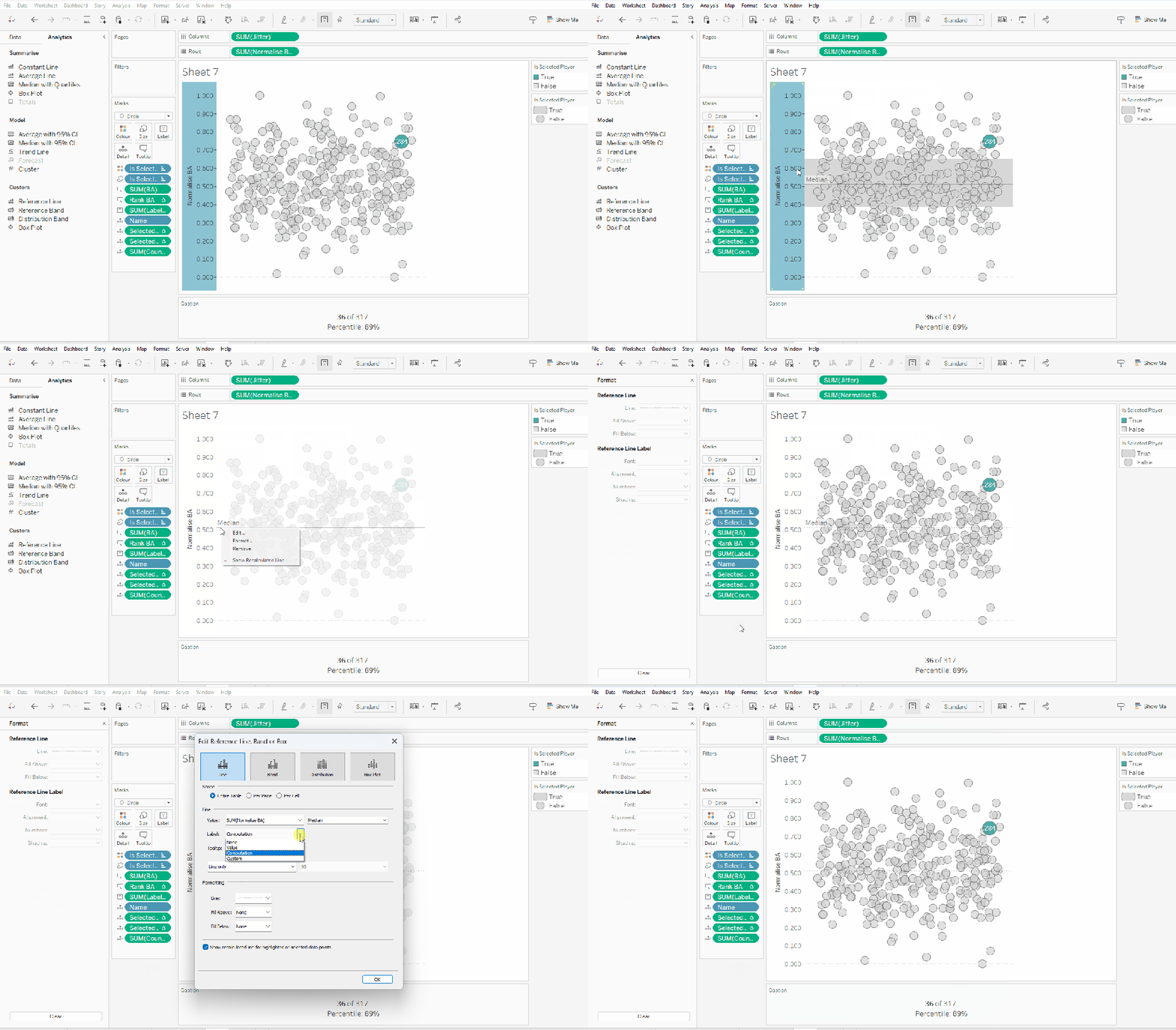
From the analytics pane, drag the Median with Quartiles option onto the canvas and drop it on the table / Normalise BA axis option. Remove the quartile reference lines (right cick axis -> remove reference line), and edit the median reference line to be a dashed line with no label.

Finally remove all gridlines/dividers/axes lines and hide the axes. Title the sheet as per the measure ie BA, and align centrally.

Format the Caption and the Title to have a light grey background and a slightly darker thin border.

Now, repeat all that for the other measures 🙂 This isn’t that bad. All the fields above labelled BA, need duplicating, renaming and updated to reference the next measure eg OBP.

Once done, duplicate the BA jitter plot sheet, and replace all the ‘BA’ related fields with the equivalent ones, by dragging the equivalent field and dropping it directly on top. Sense check the table calculation settings are all ok. You may need to update the text in the caption, as that seems to lose anything to do with the table calculation fields referenced when they get touched.

Ultimately you should end up with 4 sheets.

Putting it all together

On a dashboard, use a horizontal container to position all 4 sheets in side by side. Show the worksheet caption for each sheet. Reduce the outer padding for each sheet to 0, and add a thin border around each sheet.

Add a parameter action to drive the interactivity ‘on click’ of a circle

Select Player

On select of any of the source sheets, update the Select a Player parameter with the value from the Name field. Retain the selected value on ‘unclick’

To prevent the selection on click from being ‘highlighted’, and al the other marks ‘fading’, we need one final step.

Create new calculated fields

True

TRUE

False

FALSE

Add both these fields to the Detail shelf of each of the 4 sheets.

Then add a dashboard filter action for each sheet which on select, goes from the sheet on the dashboard to the worksheet itself, passing the selected fields of True = False. Show all values when unselected.

My published viz is here. Kyle’s solution with a lot less calculated fields, and only 2 sheets (1 for the jitter and 1 for the summary section at the bottom) is here. You will need to pivot the data via the data source pane first through 🙂 Next time, when I really feel something should be able to be done in 1 sheet, I’ll try to think a little longer…. upshot though, I impressed myself at the use of the caption for the summary – something I must consider using more often!

Happy vizzin’!

Donna

Adding Detail & Context

It was Sean Miller’s turn to expand on last week’s #WOW2022 challenge, by adding an additional viz to the scatter plot (challenge details here).

The assumption is you should be able to build on the challenge solution you have built in the previous week. My solution to the Reference Box challenge is here. I adopted (and blogged about) a table calc solution. However, the published solution used LoDs. Both methods achieved the desired result, but I decided when starting this challenge, that I would build this ‘extension’ using LoDs too, so anyone who uses the published solution as a starting point, gets help via this blog.

So if you used my previous blog to build the challenge, you’ll need to first create the LoD equivalent of the calculated fields we used (note I did not change the scatter plot viz to use these fields) :

PR- 25th Percentile LoD

{PERCENTILE({FIXED [State]: SUM([Profit])/SUM([Sales]) },0.25)}

PR-75th Percentile LoD

{PERCENTILE({FIXED [State]: SUM([Profit])/SUM([Sales]) },0.75)}

Sales- 25th Percentile LoD

{PERCENTILE({ FIXED [State]: SUM([Sales]) },0.25)}

Sales- 75th Percentile LoD

{PERCENTILE({ FIXED [State]: SUM([Sales]) },0.75)}

Note – It’s also worth reiterating at this point, that I will be referencing calculated fields/parameters/objects in this blog created as part of my initial challenge.

In order to build the bar chart, we need to categorise each State into a grouping; the selected/highlighted state, the states in the reference box, all other states.

To identify the states in the reference box, we need to use FIXED LoDs to get the value of the Sales and Profit Ratio at the State level.

Sales by State

{FIXED [State]: SUM([Sales])}

PR by State

{FIXED [State]: SUM([Profit])/SUM([Sales])}

We can then use these fields along with the LoDs further above to determine whether a State is in the reference box

In Reference Box?

[PR by State]>=[PR-25th Percentile LOD] AND
[PR by State]<= [PR-75th Percentile LOD] AND [Sales by State]>=[Sales – 25th Percentile LOD] AND
[Sales by State]<= [Sales – 75th Percentile LOD]

This simply returns a boolean.

Now we can categorise each State

State to Display

IF [Selected State] THEN [State]
ELSEIF [In Reference Box?] THEN [State]
ELSE ‘Other (median)’
END

And with the above, we can then define the measures we want to show

Sales to Display

{FIXED [State To Display]: MEDIAN([Sales by State])}

PR to Display

{FIXED [State To Display]: MEDIAN([PR by State])}

And with these fields we can now build the bar chart.

  • Add Selected State to Rows and drag the dimension value, so True is listed before False.
  • Add In Reference Box? to Rows, and again drag so the True is listed before False.
  • Add State to Display to Rows
  • Add Sales to Display to Columns and Sort descending
  • Add PR to Display to Columns
  • On the All Marks Card add Selected State to Colour
  • Then add In Reference Box? to the Detail shelf. Then click on the … icon to the left of the In Reference Box? pill on the marks card, and change to the Colour icon. This should result in 2 fields on the Colour shelf.
  • Adjust the colours accordingly.
  • Add Sales to Display and PR to Display to the Tooltip shelf and adjust.
  • Change the titles of the axis
  • Remove row banding
  • Uncheck Show Header against Selected State and In Reference Band?
  • Hide field labels for Rows against the State to Display column heading

Add this sheet onto the dashboard and you’re done 🙂

My published viz is here.

Happy vizzin’! Stay Safe!

Donna