Sean’s #WOW2024 challenge this week was to visualise the comparisons between different entities within a limited space, by using a Viz In Tooltip (VIT) to provide additional information on hover.
Building the Treemap
Add Sales to Size, Category to Colour and Sub-Category to Detail to create the basic tree map. Tableau will automatically define the layout based on the space available, and you can’t control this, so don’t worry if it doesn’t match the final output.
Move Sub-Category from Detail to Label and add Sales to Label too. Format Sales to to be $ at 0dp, then adjust the Label as required.
Crete a new field
Rank
RANK(SUM([Sales]))
Format the field so it is formatted to be a whole number with a suffix of .)
Convert to discrete and add to the Detail shelf. Adjust the table calculation and verify it is computing by both Category and Sub-Category – this ranks every cell from 1 to 17 based on the Sales.
Adjust the Tooltip to just show the Category, Sub-Category and Sales data.
Name the sheet TreeMap.
Building the bar chart (the VIT)
On a new sheet add Sub-Category to Rows and Sales to Columns. Sort by Sales descending. Add Category to Colour and adjust the opacity to around 30%. Manually widen each row.
Add Sales and Sub-Category to Label and adjust to get the correct layout and then align left middle.
Add Rank to Rows after Sub-Category. Hide the Sub-Category field (uncheck show header).
We need to identify a row that has been ‘selected’ by the user. For this we need a parameter
pSelectedRank
Integer parameter defaulted to 0
Show the parameter on the page. We need to indicate which row is selected.
Selected Rank Indicator
IF [Rank] = [pSelectedRank] THEN ‘●’ ELSE ” END
Add this field to Rows before Rank, then update the pSelectedRank parameter to a valid number, eg 5.
Hide field labels for rows, make the Selected Rank Indicator and Rank columns narrower. Adjust alignment of columns and increase the font size of the Selected Rank Indicator column.
Hide the Sales axis, remove all gridlines, zero lines and row & column dividers. Format the Row Axis Ruler to be a black line.
We only want a subset of the rows to show – those that are 2 below and 2 above the selected rank. Create a new field
Rank in Range
([Rank] >= [pSelectedRank]-2) AND ([Rank]<= [pSelectedRank]+2)
Add this to Rows in front of Sub-Category. The bar chart will split.
We only want to see the ‘True’ rows. You can do this in 2 ways.
1 – Click on the word True and select Keep Only from the dialog box displayed. This will add Rank in Rangeto the Filter shelf
or
2 – right click on the section with the False records and select Hide from the context menu. The rows associated to False will disappear but won’t actually be filtered out of the view (this is what I did)
Hide the Rank in Range column from showing (uncheck show header). Name this sheet VIT or similar.
On the TreeMap sheet, update the Tooltip to show the VIT worksheet (via Insert > Sheets). Adjust the code snipped inserted so the filter property = “” (ie no filters are passed and the complete viz is displayed).
If you test it from the worksheet, and still have the pSelectedRank set to 5, you should see the same set of bars regardless of which part of the TreeMap you hover on.
Applying the filter
Create a dashboard of the required size and add the TreeMap sheet. Set the viz to fit entire view. It’s likely it will now rearrange itself to (nearly) match the solution.
Add a parameter dashboard action to set the selected rank
Set Rank
On hover of the TreeMap sheet, set the pSelectedRank parameter by passing in the value from the Rank field aggregated to nothing. When the selection is cleared, set to 0.
Hovering over the dashboard should now update the display in the VIT to ‘focus’ on whichever Sub-Category has been selected on the TreeMap.
For this week’s challenge, Erica wanted us to be able to set a discount value for a Sub-Category which once set, overwrote the value displayed in the table and applied the discount to the other visuals. She added an additional complexity to display the input field aligned with the selected Sub-Category. She alluded to the fact this last requirement was likely to be tricky, and she wasn’t wrong. I managed to build a solution, and I’ll walk through the principles, but there will be a bit of trial and error involved….
Building the table
We will need to capture the discount value to apply in a parameter, so create
pDiscount
integer parameter defaulted to 5
and we also need capture the Sub-Category to apply the discount to
pSubCat
string parameter defaulted to Art
The discount to display will need to be adjusted for the selected Sub-Category
Discount to Display
IF [Sub-Category] = [pSubCat] THEN [pDiscount]/100 ELSE [Discount] END
format this to % with 1 dp.
Add Category and Sub-Category to Rows. Double-click into rows and manually type in MIN(1). Change the mark type to shape and change the shape to be a transparent shape (see this blog for more details). Add Discount to Display to the Label shelf, and change the aggregation to Average. Align middle centre. You should see that the value associated to Art is 5%.
Note – you may be wondering why this is not being displayed in a standard table – why the need for the fake axis? I can’t recall exactly why I ended up with this, but it will have been borne out of later steps, and the need to try and get the input parameter aligned – by all means feel free to try without and see how it goes 🙂
Hide the MIN(1) axis, remove column dividers and gridlines / zero lines, axis rulers etc. Add subtotals (Analysis menu > Totals > Add all subtotals). Stop the Tooltip from displaying. Adjust the height and width of the cells so you can see all the rows on the screen. Show the parameters, and test the functionality by manually changing the parameters.
Create a new field
Index
INDEX()
Set this to be a discrete field and add to Rows after Sub-Category. Adjust the table calculation so it is set to compute using both Category and Sub-Category, and you show see the rows numbered from 1 to 17 (except for the total rows).
In order to help us position the input parameter, we will need to capture the index of the selected Sub-Category, so create a parameter
pIndex
integer parameter defaulted to 6 (the value associated to Art)
For now, we’ll leave the index displaying in the table. But we will hide it eventually. Name this sheet Table.
Building the line chart
The line chart needs to show the actual Sales and the sales as they would be if the revised discount was applied for the selected Sub-Category. The value stored in the Sales field will already account for the original value stored in the existing Discount field. So to work out what the adjusted Sales will be, we need to determine the full sale price (Sales / (1 – Discount)) and then apply the inputted discount value from pDiscount (multiply by (1- (pDiscount/100))
Adjusted Sales
IF [Sub-Category] = [pSubCat] THEN ([Sales] / (1-[Discount])) * (1- ([pDiscount]/100)) ELSE [Sales] END
format this and the Sales fields to $ with 0do
On a new sheet add Order Date at the continuous Month/Year level (green pill) to Columns. Add Sales to Rows, and then drag Adjusted Sales and drop it on the Sales axis when the green ‘2 column’ icon appears. This will automatically add Measure Values to Rows and Measure Names to Filter and Colour.
Calculate the difference as
Difference
IF [pSubCat]<>” THEN (SUM([Adjusted Sales]) -SUM([Sales])) / SUM([Sales]) END
and apply a custom number format of ▲0.00%;▼0.00%;0%
Format the date axis to display dates as custom format mmm yy, and edit the axis to change the title to Month.
Add Sales, Adjusted Sales and Difference to the Tooltip and update to suit. Show the pDiscount parameter and update it to a really large value, say 10,000. The 2 lines will show more prominently and the Sales axis will adjust its scale.
The requirement is to ensure the grey line (the original sales) doesn’t move, so edit the value axis, adjust the title to Sales and then fix the start from 0, but end ‘automatic’
This will push the Adjusted Sales off the chart. Reset the pDiscount to something more reasonable like 5.
Remove row/column dividers and gridlines, but retain axis rulers. Name the sheet Line.
Building the KPI card
On a new sheet, add Sales to Text. Change the Mark type to shape and select a transparent shape. Align the text middle centre, and set the display to Entire View.
We want to only show the Adjusted Sales if a Sub-Category has been selected, but we need to line chart to display a blue line all the time, so we need another field
Label Sales
IF [pSubCat]<>” THEN [Adjusted Sales] END
format this to $ with 0dp and add to the Label shelf.
Adjust the layout and display of the text as required. Hide the Tooltip. Name the sheet KPI.
Right, we’ve got the key components. Let’s get these all on a dashboard first.
Building the dashboard
Getting all the objects you want on the dashboard (including titles, footers etc) positioned exactly where you want them, with the appropriate padding set is crucial to getting the method I’m going to use to reposition the input parameter. It’s also quite fiddly and I can’t guarantee that even if you follow the steps, you’ll get things looking right…
Anyway, let’s start with the dashboard.
I set the dashboard size to 1100 x 650, then I added a floating vertical container which I positioned 0,0 and sized 1100 x 650. I formatted the dashboard and set the background colour to light grey.
I then switched to Tiled and added a text box for my title. I set the background of this to white, outer padding to 0 and inner padding to 5.
I then added another text box beneath for the instructions. I set the outer padding to 0 and inner padding to 5. I then fixed the height to 70.
Next I added a horizontal container beneath the instructions. I add a blank object to it as a placeholder. Ensuring the horizontal container was selected (blue border), I set the outer padding to 5.
I then added another horizontal container beneath this, and added my standard footer (created by, recreated by etc). I set the outer padding of this container to have 5px on the left and right, and 0 on top and bottom. All the text boxes within I set to have 0 outer padding and 0 inner padding.
I then added another text box beneath to add in the link to the challenge, also part of my ‘standard footer. I set the outer padding for this text box to 0.
I then calculated how high all the ‘rows’ of objects were on the dashboard (the height of the title + the height of the instructions + height of my standard footer and challenge link), and then subtracted this from 650. I then fixed the height of the central horizontal container based on this value
Add the Table sheet into the left side of this container. Remove the title. Set the background to white. Adjust the outer padding to 0. Set the sheet to Fit Width. Very carefully, adjust the width of a row, so the table fills as much of the vertical space as possible without there being a scroll bar. This is really fiddly to do.
The addition of the table will have automatically added some parameters and a Tiled object to the layout. We’ll deal with these shortly, but leave them be for now.
Add a Vertical container to the right hand side. Add the KPI sheet and then then Line sheet underneath. Remove the blank object that was the placeholder. Widen the vertical container so the vizzes have more space. For both the KPI and the Line objects, remove the title, set the background to white, set the outer padding to 0. Set the inner padding of the KPI chart to 20, and the inner padding of the line chart to 10. Adjust the height of the KPI chart so its visible.
If all is well, you should have something like
Adding the interactivity
Create a parameter action
Set Sub Cat
On select of the Table chart, set the pSubCat parameter, passing in the value from the Sub-Category field. Reset to ” when unselected.
Set Index
On select of the Table chart, set the pIndex parameter, passing in the value from the Index field aggregated to None. Reset to 0 when unselected.
If you click different Sub-Categorys, the KPI and line chart will change. Once unselected, no adjusted sales or discount will display.
Getting the parameter to move
Duplicate the Table sheet, and remove all subtotals. On this sheet, we’re only going to display the rows up to the row before the selected Sub–Category. For this we need
Show Top Rows
[pIndex]=0 OR [Index]<[pIndex]
Add this to the Filter shelf and set to True. Verify the table calculation is computing by both Category and Sub-Category. If need be adjust, then recheck the filter is just displaying True still. Show the pIndex parameter and just test the filter is working, by changing the value. Here, with the parameter set to 6, it is showing rows up to 5.
What we’re trying to do is just display the rows necessary so that the parameter input can be added beneath this sheet on the dashboard. The reason we have removed the subtotals, is that if the index is set to 2, we only want to display 1 row above; that for Bookcases. With subtotals included we’d get a row for Bookcases and a Total row. However once we get to a new Category as we have above, we need to show an additional row to accommodate for the subtotal displayed within the original table.
So we need to force additional rows to show in some circumstances but not others.
To help with this I have made use of the Region field. I checked that for two regions, Central & East, there were Sales in both Regions for every Sub-Category.
Add Region to the Filter shelf and set to Central & East only. Add Region to the Detail shelf. Remove Discountto Display from the Label shelf. Create
Extra Row
IF LAST()=0 THEN STR(ATTR([Region]) )
ELSE ''
END
Add this to Rows after Index. Adjust the table calculation so that it is computing by Sub-Category only. With pIndex set to 0, this should just display the two Regions against the last Sub-Categorys in each Category, simulating the subtotal rows.
But set the index to 6 and we just get the additional rows for the Furniture Category
and set to 2 and we just the row for Bookcases
Hide the Category column (uncheck show header). Name the sheet Top. Set the pIndex back to 0, and let’s start seeing how this works on the dashboard.
Add a vertical container between the existing table and the kpi/line chart. Reduce the width. Add the Top sheet into this container. Remove the title and set the inner and outer padding to 0. Set the sheet to fit width. If you’re lucky, all the rows should align. If not you may need to tweak again.
Select a Sub-Category in the original table, and the 2nd table should shrink.
From the Tiled section on the layout item hierarchy, navigate through until you find the pDiscount parameter. Click it to select it on the dashboard, then move that object to sit beneath the shortened table. Then select the Tiled section on the item hierarchy, and right click and remove from dashboard, which will remove all the unnecessary parameters/legends that were being displayed.
For the pDiscount object, remove the title, set the background to white and set the outer padding to 0. Set the background of the vertical container to white too. We only want this discount parameter to show when a Sub-Category has been selected. To manage this, we need
Show pDiscount
[pSubCat]<>”
Select the pDiscount object on the dashboard, and then from the Layout tab, check the Control visibility using value and choose the Show pDiscount field
Unselecting the Sub-Category and the field won’t display
So now we’ve got the basics of what we’re trying to do, we obviously don’t actually want any of the table to be visible. But if we hide all the fields (uncheck show header), we lose the column headings which was helping with the positioning, as we can see below – the input box is no longer aligned with Art.
To fix this, create a new field
Dummy Header
”
and add to the Columns of the Top sheet. If you haven’t already, uncheck show header against all the other blue pills (Category, Sub-Category, Index and Extra Row). The sheet should look like below, and what the Dummy Header has done is create an extra spacing at the bottom of the page, which compensates for the heading we don’t have at the top… and this is the reason for creating a table using a fake axis 🙂
Back on the dashboard, everything is aligned again.
… except when we select Bookcases … argghhh!
Add a blank object above the parameter. Set the padding to 0, and adjust the height to about 18 px – enough to bring the parameter in line. Create a new field
Show Blank
[pIndex]=1
and use this to control the visibility of the blank object – ie we only want the blank object to come into play when Bookcases is selected, and nothing else.
Click around every Sub-Category and hopefully the parameter box is aligned each time.
Final touches
On the Top sheet, remove row dividers, so the sheet just always looks empty.
On the Table sheet, hide the Index field (uncheck show header).
Add left outer padding of 10px to the vertical container that contains the Top sheet and the pDiscount parameter. This should mean some grey spacing appears between the table and the input field.
Adjust the width of the objects to suit BUT DON’T fiddle with the heights at all!
To stop the other discounts from ‘fading’ when a Sub-Category is clicked, create a new field
HL
‘HL’
and add to the Detail shelf on the Table sheet. Then on the dashboard, add a highlight dashboard action that on select of the Table sheet, targets the Table sheet with the HL field only. This essentially has the effect of highlighting all the fields, since the HL field is applicable to every row.
Phew! This took some time and a lot of fiddling to get right, and even then I know there’s every chance that you can’t quite get things to align just right, or publishing to Tableau Public and it all seems to shift … My published viz is here. Fingers crossed you’re successful!
Yoshi set this week’s challenge to build a page navigator, but there was so much more in it too, so this could be a bit lengthy 🙂
Note, I’m blogging based on the full ‘advanced’ challenge, to include an ‘apply all’ button as well. I built the following sheets to build this via and I’ll talk through the basics of each of them in turn
List of State names
Bar chart of total State sales
Line chart of monthly State sales
Jitter plot of State sales by order
Navigation page number buttons
Back arrow
Forward arrow
Filter summary
Apply button
Preparing the data
The data being presented is only applicable to the states of the US. In the latest versions of Superstore, information for both Canada and the US is included, so I started by adding a data source filter to include only Country/Region = United States (right click data source -> Add Data Source Filter).
Building the list of State names
Add State/Province to Rows, and apply a sort to sort by the field Salesdescending
Add State/Province to Text and to Colour. Adjust font to be bold and widen each row.
Create a new field
Index
INDEX()
and add to Rows before State/Province. Set the table calculation to be explicitly computing by State/Province. Index is essentially ranking each State from 1 to 49, as we’ve already sorted the listing of the states.
The requirement is to show up to 7 states on a page, so create
Page No
INT(((INDEX()-1) /7)) +1
Set to be a discrete field and add to Rows in front of Index. Again explicitly set the table calculation to compute by State/Province. This shows us which states are on which page.
We’re going to identify the page we’re on based on a parameter
pPageSelected
integer parameter defaulted to 1
Show the parameter, then create a new field
Is Selected Page
[pPageSelected] = [Page No]
Add to the Filter shelf. Initially select All. Then adjust/verify the table calculation is explicitly set to compute using State/Province. Then edit the filter to just show values that are True.
Adjust the pPageSelected parameter to test the functionality.
Hide the Page No, Index, and State/Province field from Rows (uncheck show header). Remove column dividers and don’t show the tooltip. Name this sheet States.
Building the bar chart
Note – to get the labelling and the spacing between the bars, this isn’t a ‘standard bar chart’. This is a technique that has been included in previous WOW challenges.
On a new sheet, add State/Province to Rows and sort by Sales descending. Add Sales to Columns and Add State/Province to Colour. Add a grey border to the bars (via Colour shelf).
Double click into Rows and manually type MIN(1.0) and change the Mark Type to bar. Add Sales to Size, then click on the Size button and adjust the size from Manual to Fixed and align right.
Add Sales to Label and align top left. Adjust the Tooltip. Add Index to the front of Rows and adjust the table calculation to be computing by State/Province.
Add Page No to the front of Rows and adjust to computing by State/Province.
Set the page to Fit Width. Show the pPageSelected parameter and add Is Selected Page to the Filter shelf and set to True. Verify the table calculation is set to compute using State/Province. If not adjust, and then recheck the filter is just showing True value.
Change the parameter to show page 2. You’ll notice the axis has now adjusted from 0 – $80,000 whereas on page 1 it went up to $450,000. We want to retain the axis scale across the pages. For this, create
Max Sales
WINDOW_MAX(SUM([Sales]))
Add this to the Detail shelf and ensure the table calculation is computing by State/Province.
Add a reference line to the bottom Sales axis (right click axis > add reference line) and set it to cover the entire table, using the average Max Sales value. Don’t show any label., tooltip or line
The axis will now have readjusted and display up to 450,000 regardless of the page you’re on.
Adjust the Min(1.0) axis to be fixed from -0.5 to 2 to add some white space around the bars.
Hide both axis, the Page No, Index and State/Province fields in Rows. Remove all gridlines, zero lines, axis rulers & tick marks. Remove column dividers. Add Row Banding.
Name the sheet Total Sales.
Building the line chart
On a new sheet, add State/Province to Rows and sort by Sales descending. Add Index and Page No to Rows too and adjust both table calcs to be explicitly computing by State/Province.
Add Order Date to Columns and adjust to be at the continuous Month/Year level (green pill ). You’ll notice the page numbering & indexes start to look odd – ie multiple states have same index.
Adjust the Order Date field to Show Missing Values, and our numbers are all aligned again.
If we just add Sales to Rows though, the indexes all mess up again due to the there being no values for some points.
To fix this create
Sales to Plot
ZN(LOOKUP(SUM([Sales]),0))
This returns 0 if there is no value for the date / state combination. Add this to Rows instead and adjust the table calculation so it is computing by both State/Province and Month Order Date.
Edit the Sales to Plot axis, so it is displays an independent axis range for each row or column – this makes the records near the bottom show peaks, rather than just a straight line.
Add Is Selected Page to the Filter shelf and set to True. Verify the table calculation is set to compute using State/Province. If not adjust, and then recheck the filter is just showing True value.
Add State/Province to Colour. Adjust Tooltip. Reduce the Size of the line.
Hide both axis, the Page No, Index and State/Province fields in Rows. Remove all gridlines, zero lines, axis rulers & tick marks. Remove column dividers. Add Row Banding.
Building the Jitter Plot
On a new sheet, add State/Province to Rows and sort by Sales descending. Add Index and Page No to Rows too and adjust both table calcs to be explicitly computing by State/Province. Add Sales to Columns and Order ID to Detail. Change mark type to circle.
Readjust the table calc settings of Page No& Index to also include Order ID, but also set the leval at State/Province.
Add State/Province to Colour, and reduce the opacity.
To get the marks to not overlap so much, create a new field
Jitter
RANDOM()
add add to Rows as a dimension. Again adjust the table calcs so Jitter is also included in the settings.
Add Max Sales to Detail and adjust the table calc settings to be computing over all 3 fields – State/Province, Jitter & Order ID.
Add a Reference line to the Sales axis across the entire table, using the average of Max Sales and don’t display any label/tooltip or line.
Add Is Selected Page to the Filter shelf and set to True. Verify the table calculation is set to compute using all fields and at the level of State/Province. If not adjust, and then recheck the filter is just showing True value.
Adjust the Tooltip. Hide both axis, the Page No, Index and State/Province fields in Rows. Remove all gridlines, zero lines, axis rulers & tick marks. Remove column dividers. Add Row Banding.
Name the sheet Sales by Order.
Building the Navigation Number Buttons
On a new sheet add State/Province to Rows and sort by Sales descending. Add Index to Rows and set the table calc to compute by State/Province. Move Index to Columns and State/Province to Detail.
Change the mark type to square and add Index to Label, aligning middle centre.
Create a new field
Colour – Page No
[Index] = [pPageSelected]
and add to the Colour shelf. Verify table calc is set to compute by State/Province. Adjust colours to suit and add a dark border.
We only want to show the indexes relating to the number of pages we have, which in turn is going to be based on what the data has been filtered by. So firstly we want to understand what the maximum number of pages is
Max Pages
IF SIZE()%7 = 0 THEN INT(SIZE()/7) ELSE INT(SIZE()/7)+1 END
If the number of results (ie number of states after filtering has occurred – the SIZE()) is exactly divisible by 7 (%7 = 0) then divide the results by 7 to get the max number of pages, otherwise, increment this value by 1. Eg if 14 results, it’ll be 2 pages, but 15 results will require 3 pages.
Now we know that, we can create
Pages to Show
INDEX() <= [Max Pages]
Add this to the Filter shelf.Set the True, Then adjust the table calc settings to be explicitly computing by State/Province for all nested calcs too.
Re-edit the filter to ensure it just shows True results.
Hide the Index from Rows and don’t show row/column dividers. Don’t show the tooltip. Name the sheet Page Nos.
Building the back arrow
On a new sheet, show the pPageSelected parameter, and change the mark type to Shape.
Create a new field
Show Page Back
[pPageSelected]>1
Add to the Shape shelf. If pPageSelected = 1, then False should display and adjust the shape to use a transparent shape (refer to this blog on how to set this up). Change the pPageSelected parameter to 2 and adjust the shape of the True option to be a filled arrow. Change colour to black.
On the dashboard ,we will need to define what page is being navigated to on click, so we need
Page Back
IF [pPageSelected]>1 THEN [pPageSelected]-1 END
Add this to the Detail shelf as a dimension.
Name the sheet Page Back.
Building the Forward Arrow
This is slightly more tricky than the back arrow, as we need to know how many pages are being displayed to know when we no longer need to show the arrow.
On a new sheet, add State/Province to Detail and sort by Sales descending. Remove the Lat/Long fields that automatically get added and change the mark type to shape. Create a new field
Show Page Forward
[pPageSelected]<[Max Pages]
and add to the Shape shelf. Set the table calc to be computing by State/Province explicitly. Set the mark type for ‘True’ to be a filled arrow and adjust colour to black.
Show the pPageSelected parameter and set to 7. Adjust the ‘False’ option to be a transparent shape.
Once again, on the dashboard, we will need to define what page is being navigated to on click, so we need
Page Forward
IF [pPageSelected]<[Max Pages] THEN [pPageSelected]+1 END
Add this to the Detail shelf as a dimension, and verify table calc is set to compute by State/Province explicitly.
We only want 1 arrow to show at most, so add Index to filter. Set to 1, then adjust table calc so it is set to compute by State/Province explicitly, and then re-edit filter to just select 1 again. Name the sheet Page Forward
Building the Filter Summary
On a new sheet add Category, Segment and Ship Mode to the Detail shelf and change the mark type to polygon..
Edit the Title of sheet and update as required
Name the sheet Filter Summary
Building the Apply Button
The basic outline for this is documented in this Tableau KB article here.
Create a calculated field
Apply
‘Apply Filters’
and add to Rows on a new sheet.
Add Category, Segment and Ship Mode to the Detail shelf and to the Filter shelf (set to All for each). Change the mark type to polygon. Right click the work ‘Apply’ in the column header and select hide field labels for rows.
Right click on the words ‘Apply Filters’ and select Format – set the shading of the header to teal.
As well as applying filters when the button is clicked, the page needs to reset to the first page. For this create
Reset Page 1
1
Add this to the Detail shelf as a dimension.
Adjust the size and colour of the font. Remove row dividers. Set the background of the worksheet to light grey. Remove the Tooltip. Name the sheet Apply Button.
Creating the dashboard
Now we have all the components, we can arrange the objects on a dashboard.
I added the 4 sheets making up the main viz int a horizontal container. All the sheets had the titles hidden, were set to fit entire view and had 0 padding, which gives the illusion of them all being a single viz. I added some outer padding to the container itself.
I used another horizontal container positioned above this one to add text boxes to give the viz headings.
Another horizontal container was placed above the title one. IN the left hand side I placed the Filter Summary viz., and in the right, I added a vertical container.
The vertical container had a blank and then a horizontal container underneath the blank object. The horizontal container then stored the page back, the page nos and the page forward sheets.
Another horizontal container was place above all this and I add the Apply Button sheet. I then moved the 3 filter objects automatically added to the sheet into this horizontal container too. I set the background of this container to light grey
Adding the interactivity
Multiple dashboard actions are needed to get the page to function as required. Now, I did have issues getting somethings to behave as I wanted, and I believe it was something to do with the order in which the actions were added. I can’t prove this… all I know is that I spent a long time trying to figure out why the filters I selected were getting reset when I pressed a page number, but removing all actions and adding again worked…
You need these actions
Apply Filters
Filter action that on select of the Apply Button sheet, targets all other sheets. Clearing the selection keeps filtered values. Category, Segment and Ship Mode should be passed through as selected fields.
Set Page No from Square
Parameter action that on select of the Page Nos sheet, sets the pPageSelected parameter passing in the value from the Index field that is not aggregated. Clearing the selection, keeps the current value.
Reset to Page 1
Parameter action that on select of the Page Nos sheet, sets the pPageSelected parameter passing in the value from the Reset Page 1 field that is not aggregated. Clearing the selection, keeps the current value.
Prev Page From Arrow
Parameter action that on select of the Page Back sheet, sets the pPageSelected parameter passing in the value from the Page Back field that is not aggregated. Clearing the selection, keeps the current value.
Next Page From Arrow
Parameter action that on select of the Page Forward sheet, sets the pPageSelected parameter passing in the value from the Page Forward field that is not aggregated. Clearing the selection, keeps the current value.
With these actions, you should be able to test the functionality, but you will find some fields become greyed out/ need clicking twice. We need to automatically ‘deselect’ them on click. For this I applied the basic principles discussed here.
Create new calculated fields
True
TRUE
False
FALSE
Add both these fields to the Detail shelf of the Page Back, Page Forward, Page Nos, and Apply Button sheets. Then add a dashboard filter action for each sheet.
Deselect Apply
On select of the Apply Button sheet on the dashboard, target the Apply Button sheet itself (ie not the object on the dashboard), passing the selected fields of True = False. Show all values when the selection is cleared.
Repeat the above for the Page Back, Page Forward and Page Nos sheets.
Hopefully with all this you have a fully functioning dashboard. My published viz is here.
As community month draws to a close, long term participant Deborah Simmonds set us a map based challenge based on TC23 data.
I chose to use the data that was associated to the solution workbook, rather than take the direct source, so bear that in mind if you’re following along.
Examining the data
As there were quite a few fields in the data set which were directly related to the solution, I just wanted to familiarise myself with what I was working with initially. Essentially we have a row per person (Names Full) with the hotel they stayed at (Label Hotels), and how many steps (Steps) they took each day (Date). The details of the convention centre (Label Convention Centre) exist against every row.
The LAT and LON fields contain the location details of the hotels, while Convention LAT and Convention LON contain the location details of the Mandalay Bay Convention Centre.
Names Full already had the logic applied to create names for users based on their User ID if the Name was NULL, so I didn’t need to do anything for that requirement.
We only want to consider records relating to those people who attended ‘In Person’ and who had provided a hotel. Consequently I added the following as data source filters (right click data source -> edit data source filters) to exclude unrequired records from the whole analysis.
Did you attend in person or virtual? : In person
Label Hotels : excludes NULL
Building the BANs
The BANs have 3 metrics – the number of attendees, the number of steps, and the distance in metres (based on the logic that 1 step = 0.75m).
Attendees
COUNTD([User ID])
Distance (m)
[Steps] * 0.75
On a new sheet add Date to Filter as a range of dates and show the filter control. Add Attendees, Steps and Distance (m) so the measures are displayed in a row.
Change the mark type to shape and add a transparent shape (see this blog for more details). Add Measure Names to Label too and then adjust label accordingly and align centrally.
Hide the header row (uncheck show header), remove row dividers and don’t show tooltips. Name the sheet BANs or similar. Adjust the date slider and the values should adjust.
Building the bar chart (viz in tooltip)
On a new sheet add Names Full to Rows and Steps to Columns. Apply the same Date filter (from the BANs worksheet, set the filter to apply to this new worksheet too).
The viz needs to display a reference line showing the overall average of the steps per person across the selected dates, regardless as to whether the records are filtered to a hotel or not.
What do I mean by this… well if I add a standard average reference line to the viz above, the average for the whole table is 78.2k steps.
If I now filter this by a Label Hotel, then the average changes, and I don’t want that – I still want to see 78.2k.
But the average does need to change if the date range changes
This took a bit of effort to get right, but I needed
Format this as a number with 1dp set to the K (thousandths) level
and I also needed to add the Date field on the Filter shelf to context.
So reverting back to the initial view of the bar chart… right click on the Date filter and Add to Context. Add Avg Steps to the Detail shelf. Then add a reference line (right click the Steps axis > add reference line) that displays the Avg Steps with a dark dashed line with a custom label.
Format the reference line to position the label at the top and adjust the font style.
To colour the bars we need
Steps above average
SUM([Steps]) >=[Avg Steps]
Add this to the Colour shelf, change the colours and adjust the opacity to about 75%.
Hide the column heading, and adjust the font size of the names and the axis. Name the sheet Bars or similar.
Building the initial map
I decided to create 2 maps – one for the initial display of all the hotels and the convention centre, and then one for the selected location and buffer.
To plot the hotels on the map I created
Hotel Locations
MAKEPOINT([LAT],[LON])
On a new sheet, add this to the Detail shelf. A map will automatically generate with Latitude and Longitude fields. Change the Mark Type to Circle, then add Label Hotels to Label and align left middle. Edit the map Background Layers (via the map menu) to add Streets, Highways etc to the display
Add Steps, Attendees and Distance(m) to the Tooltip. Add Attendees to the Size shelf and adjust the size to vary by range
Apply the Date filter from the other worksheets to this sheet too. For the tooltip, We need to know about the min and max dates in the range selected. Create
Min Date
MIN([Date])
and custom format simply as dd (the day only)
Also create
Max Date
MAX([Date])
and custom form this as dd mmm yyyy
Add both of these fields to the Tooltip shelf. Adjust the text in the Tooltip and add a reference to the Bars sheet as a viz in tooltip (Insert > sheets > ). Adjust the height of the sheet to be 900.
The viz in tooltip should now display nicely on hover
To add the mark for the convention centre, we need
Conf Location
MAKEPOINT([Convention LAT], [Convention LON])
Drag this onto the map, and drop it when Add A Marks Layer displays
This will create a 2nd marks card. Change the mark type to shape and select the Tableau sparkle image if you have it stored. If not, just use another shape or circle (coloured differently).
Add Attendees to Size and add Label Convention Centre to Label and align left middle. Add Steps and Distance(m) to Tooltip and adjust to suit. Hide all the map options (map menu -> map options -> uncheck all the selections). Name the sheet Map – Initial or similar.
Building the ‘selected’ map
This will use parameters to identify what’s been selected – a hotel or the convention centre, so we need
pSelectedHotel
string parameter defaulted to empty string
and
pSelectedCentre
string parameter defaulted to empty string, just like above
The intention is that either both these parameters will be empty or only one will be populated.
To plot on a map we need
Selected Hotel Location
IF [pSelectedHotel] = [Label Hotels] AND [pSelectedCentre] =” THEN [Hotel Locations] END
and
Selected Centre Location
IF [pSelectedHotel] = ” AND [pSelectedCentre] =[Label Convention Centre] THEN [Conf Location] END
Duplicate the initial map sheet and name it Map – Selection. Show the two parameters and verify both are empty.
On the Hotel Locations marks card, drag the Selected Hotel Location field and drop it straight onto the Hotel Locations field. On the Conf Location marks card, drag Selected Centre Location and drop straight onto the Conf Locations field. Your map shouldn’t display anything…
Manually type ‘Luxor’ into the pSelectedHotel parameter. A mark should display. Adjust the Label of the Selected Hotel marks card so it is larger font, and aligned top middle. Set the colour to orange and remove the halo.
Remove the text from the pSelectedHotel parameter and manually type ‘Mandalay Bay Convention Centre’ into the pSelectedCentre parameter. A mark should display. Adjust the Label of the Selected Centre marks card so it is larger font, and aligned top middle. Remove the halo from the Colour shelf.
To create the buffer circle, we need to define the buffer radius, which is the attendee steps in metres.
Buffer Distance (m)
{FIXED : SUM(IF [pSelectedHotel] = [Label Hotels] OR [pSelectedCentre] = [Label Convention Centre] THEN [Steps] END)} * 0.75
and then we create
Buffer
IF [pSelectedHotel] <> ” THEN BUFFER([Selected Hotel Location], [Buffer Distance (m)], ‘m’) ELSEIF [pSelectedCentre] <> ” THEN BUFFER([Selected Centre Location], [Buffer Distance (m)], ‘m’) END
Add this as another marks layer.
Reduce the opacity on the colour shelf to 0% and set the border to be orange. We don’t want to allow any interactivity with the buffer, so disable selection of the layer, and also move down so it is listed at the bottom of the 3 map layers.
Show the Date filter control and adjust the dates to see the buffer adjusting. Test the behaviour with a hotel too (you may find you want to add some more detail to the background layers of the map).
We will use dynamic zone visibility on the dashboard to decide whether to display the initial or the selected map. To control this, we need
Show Initial Map
[pSelectedCentre]=” and [pSelectedHotel]=”
and
Show Selected Map
[pSelectedHotel]<>” OR [pSelectedCentre]<>”
Adding the interactivity
Create a dashboard, add the BANs and both the map sheets.
Create a dashboard parameter action
Set Hotel
On selection of the Initial Map set the pSelectedHotel parameter passing in the value from the Label Hotels field. When the selection is cleared, reset to ”.
and another parameter action
Set Conv Centre
On selection of the Initial Map set the pSelectedCentre parameter passing in the value from the Label Convention Centre field. When the selection is cleared, reset to ”.
Select the Initial Map object, and from the Layout tab, set the visibility to be controlled by the Show Initial Map field
Then select the Selected Map object, and set the visibility to be controlled by the Show Selected Map field. Only one of the maps should display based on the interactivity.
This is all the core functionality of the map, but Deborah threw in a couple of extra asks…
Building the Distance Legend
We’re using map layers again for this. Create a new field
Zero
MAKEPOINT(0,0)
Add it to the Detail shelf of a new worksheet to create the 1st map layer, then immediately add another map layer, by adding another instance of Zero to the sheet.
Switch the axis, and the map will disappear, and you’ll have axis displayed instead. Change the mark type of the first map layer to circle and colour orange.
Change the mark type of the 2nd map later to circle and colour pale grey with an orange border. Increase the Size of this circle so it appears as a ring around the filled orange circle. Move the 2nd marks layer down to the bottom and disable both marks from being selectable.
Hide the axis and gridlines/zero lines.
Right click on the central circle and annotate point. Don’t enter any text into the annotation box, just click OK. You should get the annotation box with a line.
Move the box so the connector line is horizontal, then format the annotation so the shading is set to none and the line is formatted to be a darker dashed line. Update the title of the sheet.
Building the Size Legend
Apply a similar process to that described above, but this time create 3 mark layers where the mark type is an open circle shape which is coloured blue, and for each layer, the size of the circle is slightly bigger. This time show the zero lines.
Set the background of both the legend sheets to be none (ie transparent), then add them as floating objects onto the dashboard. Use the control visibility feature to only display the Size legend when Show Initial Map is set, and only display the Distance legend when Show Selected Map is set. Set a background against each object of light grey, that is then set to 80% transparency.
With this you should have a completed challenge. My published version is here.
Community Month continues and this week Hideaki Yamamoto provided us with this 1 sheet view. He very kindly posted requirements aimed at different levels, but I’m writing the solution for the Level 1 version.
Identifying the Current & Previous FY
The dashboard is all focused on reporting over financial years, and Tableau very kindly allows us to set the start month of the FY, in this case April. Right click on Order Date -> Default Properties -> Fiscal Year Start
If you now double click on Order Date to add it to a new sheet, you automatically get the discrete YEAR part of the Order Date displayed with the relevant FY label.
Expand the field to show the quarter & month, then create an explicit field
Year Order Date
YEAR([Order Date])
convert to discrete, and format as a number with 0dp and no thousand separators.
Add this to the display too and you can see how the dates behave…. every FY start with the month of April, but the FY label is based on the year of the last month (ie March), so FY2024 contains data from April 2023 to March 2024.
Throughout the challenge though, the FY is displayed in the FYXXXX-XX format, and there doesn’t seem to be a way to get a handle on the formatting Tableau applies when the fiscal year is set. So I had to come up with a calculated field to get the FY to display as I wanted.
FY Display
IF MONTH([Order Date])>=4 THEN “FY” + STR(YEAR([Order Date])) + “-” + RIGHT(STR(YEAR([Order Date])+1),2) ELSE “FY” + STR(YEAR([Order Date])-1) + “-” + RIGHT(STR(YEAR([Order Date])),2) END
Add this to the display (remove the quarter field too).
With this we can identify the maximum FY display (as there’s a requirement not to hardcode anything).
Max FY
{MAX([FY Display])}
Add this to the table
Now we can create a parameter which will display the values of FY Display and automatically show the latest/maximum value by default. Right click on FY Display -> Create -> Parameter
pSelectedFY
string parameter that sets the value to Max FY when workbook opened and lists the value when the workbook opens from the FY Display field.
To identify what records relate to the current or previous year, we create
FY End Year
INT(RIGHT([FY Display],2))
which returns the last two numbers of the FY Display string. Make this a dimension. Then we can get whether the row is related to the FY selected in the parameter by
Is Current Year
INT(RIGHT([pSelectedFY],2)) = [FY End Year]
and
Is Previous Year
INT(RIGHT([pSelectedFY],2))-1 = [FY End Year]
Add the fields onto the table, and show the pSelectedFY parameter
Adjust the parameter to see how the values change. We can now create a field that we can use to filter the data to the rows we’ll need – ie just those for the current year or the previous year
Dates to Display
[Is Current Year] OR [Is Previous Year]
It feels like I created a lot of fields just to get to this point…. there’s probably a more efficient route, but that’s just where my logical next step went to as I built out what I thought I’d need…
Building the basic chart
On a new sheet, add Dates to Display to Filter and set to True.
Add Order Date to Columns and set to the discrete Month level (blue pill). Add Sales to Rows. Add Is Current Year to Colour and adjust accordingly. Re-order so True is listed first.
We need to split the chart by Region, but the headings need to be adjusted based on which region is going to be selected. The selected Region will be stored in a parameter
pSelectedRegion
string parameter defaulted to ‘East’
Show this parameter on the sheet and then create a new field
Region to Display
IF [Region] = [pSelectedRegion] THEN ‘▼’ + [Region] ELSE ‘►’ + [Region] END
Add this field in front of MONTH(Order Date) on Columns and Sort based on Region ascending.
We need to show the cumulative sales. We can do this with a quick table calculation on the Sales pill, but sometimes like to create an explicit field, so I know exactly what pill is what
Running Sum Sales
RUNNING_SUM(SUM([Sales]))
This is the same code that a quick table calculation will generate. Format to $ with 0 dp.
Replace the Sales field on Rows with Running Sum Sales and adjust the table calculation setting, so it is computing by Month of Order Date only. Add Order Date to Detail too.
Now, the required solution at Level 3 shows the line (above), the area underneath coloured, and circular markers on the line where the end point is larger than the rest. This ‘feels’ like 3 different marks – line, area and circle, but we can’t do more than 2 mark types with dual axis….
…but we can ‘fake’ it. Now getting the large circle to display was actually part of the challenge that got me stumped, and that I ended up applying at the end after mulling it over with my colleague, Sam Parsons. For the purposes of this blog though, it’s easier to add the relevant logic now.
We want to identify the value associated to the last point for the current year
Last Sales Value
IF LAST() = 0 AND ATTR([Is Current Year]) THEN RUNNING_SUM(SUM([Sales])) END
Drag this onto the Running Sum Sales axis, and drop it when the two green columns appear
This will automatically add Measure Names and Measure Values to the sheet. Move Measure Names from Columns to Detail. Change the mark type explicitly to line. Adjust the table calculation settings of the Last Sales Value field so it is computing by Month of Order Date only. You should notice the end of each ‘current year’ line has a little circle. It’s still a line mark type, but as it’s only 1 point it has no other points to join up to, so looks lie a circle.
We want it to be more prominent though, so move Measure Names from Detail to Size. Reorder the size the fields on the size legend, so the Last Sales Value is bigger. Then from the Colour shelf, add markers to lines
Add another instance of Running Sum Sales to the Rows shelf. This will create a 2nd marks card. Change the mark type of this to Area. Remove Measure Names from this marks card, and adjust the Colour to have an opacity of around 30%. Turn stack marks off (Analysis Menu ->Stack Marks -> off). Set the chart to dual axis and synchronise axis.
Hide the right hand axis, and rename the title of the left hand axis. Format the axis to be $ with 0 dp.
On the bottom half of the chart, we want to display the current year sales as bars with previous year as a reference line, so we need
Sales – CY
IF [Is Current Year] THEN [Sales] END
and
Sales – PY
IF [Is Previous Year] THEN [Sales] END
Format both to $ with 0dp.
Add Sales – CY to Rows which will add a 3rd marks card. Change the mark type to Bar.
Add Sales – PY to Detail. The right click on the Sales – CY axis and Add Reference Line.
Set the reference line to be per cell based on the Sales-PY field, formatted as a line and with a fill below of light grey to give the appearance of a bar.
Change the title of the Sales – CY axis. Remove all gridlines and zero lines. Format the MONTH(Order Date) to use 1st letter only. Hide the null indicator.
Adding the ‘headers’
We need to have 4 rows of headers at the top – currently we’ve got 1 – the Region.
Below Region we want to split the data by Category if its the selected region, so we need
Category to Display
IIF([Region]=[pSelectedRegion], [Category],”)
Add this on to Columns after Region to Display. The visuals should automatically adapt. Adjust the value of the pSelectedRegion parameter to see how the viz changes.
Now double click into the Columns shelf and manually type ‘Total Sales’ (including the quotes). This will create a ‘dummy’ header pill. Move it to be after Category To Display.
Finally, create a new field
Current Year Sales
{FIXED [Region], [Category To Display]: SUM([Sales – CY])}
change this to be a dimension and format to $ with 0dp. Add this field to Columns after Total Sales, and we now have all the header fields we need.
Change the formatting as follows
Region To Display : Shading navy, font white, size 12, Tableau Medium Bold
Category to Display : font black, Tableau Medium size 12
Current Year Sales : font dark teal, Tableau Medium size 14 bold
Adjust the width of each header row to give a bit more ‘breathing room’.
Format the column dividers so the Header level is set to a thick white line, and set the row divider so the header level is set to None
Hide the ‘Region To Display / Category To Display / ‘Total Sales’/… etc heading label (right click and hide field labels for columns). Adjust the font of both axis to be smaller (I set to 8pt).
Adding the Tooltips
Add FY Display, Year Order Date, Region, Sales and Category To Display to the Tooltip shelf of the All marks card.
We need another couple of fields to get the required display.
Month Order Date
MONTH([Order Date])
convert to a dimension and custom format as 00
Tooltip |
IF [Category To Display] <> ” THEN ‘|’ END
Add these fields to the Tooltip shelf too of the All marks card and adjust the tooltip
Adding the sheet title
For the sheet title, we need to display the FY of the previous year
Add this to the Detail shelf of the All marks card. Then adjust the title of the sheet so its referencing the pSelectedFY parameter and the FY Display Prev Year field.
Adding the interactivity
Add the sheet onto a dashboard. I floated the pSelectedFY parameter and displayed it as a slider but customised to not show the slider.
Create a single dashboard parameter action to select the Region
Set Region
On select of the viz, set the pSelectedRegion parameter passing in the Region field. Set the value to empty when selection is cleared.
And with that, you should have a completed solution. My published viz is here.
For this week’s challenge, Sean Miller introduced multiple ways to get insight from a stacked bar chart. I managed this using 5 sheets and 1 dashboard.
Preparing the data
As the requirement stated only 2024 was to be considered, I chose to add a data source filter (right click data source -> Add Data Source Filter) where the Order Date Year = 2024.
Option 1 : The Analytics Pane
On a new sheet, add Order Date to Columns as a discrete month (blue pill) and Sales to Rows. Format Sales to $ with 0 dp. Change the mark type to bar and add Ship Mode to the Colour shelf.
Format MONTH(Order Date) to display the dates as Abbreviation. Manually move Ship Mode = Same Day in the colour legend so it is listed first. Hide the Order Date heading (right click -> hide field labels for columns).
Add a reference line (right click Sales axis -> add reference line) that sets a reference line per cell to the sum of Sales and displays the Value on the label.
Format the reference line (right click on one of the lines) and align the label top centre. Adjust the Tooltip if required. Add a white border around the bars (via the colour shelf).
Right click on the Ship Mode pill on the Colour shelf and check the Show Highlighter option to display the highlight input box. Test that selecting an option in the highlight box shows a recalculated reference line.
Name this sheet Option 1 or similar.
Option 2 – Dual Axis
Duplicate the Option 1 sheet and rename to Option 2 or similar.
We will capture the selected ship mode in a parameter.
pShipModeSelected
string parameter defaulted to empty string.
Show the parameter and then enter the text ‘First Class’
Create a new calculated field
Selected Ship Mode Sales
IF [Ship Mode] = [pShipModeSelected] THEN [Sales] END
format this to $ with 0dp.
Add Selected Ship Mode Sales to Rows. Change the mark type on the associated marks card to line and remove Ship Mode from the Colour shelf. Adjust the colour of the line to a dark grey/black and show mark labels.
Make the chart dual axis and synchronise the axis. Hide the right hand axis (uncheck show header) and remove column and row dividers.
Change the text in the parameter to Same Day. You should now get a broken line. Right click on the Selected Ship Mode Sales pill and format. Set the marks for special values to Hide (Connect Lines).
Option 3 – Dynamic Stacks
Duplicate the Option1 sheet again and rename to Option3. Show the pShipModeSelected parameter and enter text ‘Same Day’.
Create a new calculated field
Sort
IIF([Ship Mode]=[pShipModeSelected],1,0)
and drag it into the ‘dimension’ section of the data pane (above the line).
Right click on the Ship Mode pill on the Colour shelf and select Sort.. Change the Sort By option to Field ascending and Field Name = Sort. This will push the bars related to Same Day to the bottom of the stacked bar.
Building the Ship Mode Selector
On a new sheet, add Ship Mode to Columns and then double click into Columns and manually type MIN(1). Change the mark type to bar and edit the MIN(1) axis to fix it from 0 to 1.
Add Ship Mode to Colour and to Label (you may have to widen the bars to make the label visible). Align the label middle centre and bold the font. Adjust the size to the largest possible.
Hide the axis and the Ship Mode headings (uncheck show header). Remove all column/row dividers. Hide the Tooltip from displaying. Name the sheet accordingly.
Building the Navigation selector
I chose to add all the sheets onto a single dashboard (rather than separate dashboards), so created a navigation sheet.
To help with this, I basically utilised the Segment field that wasn’t being used, and essentially translated the values to repurpose them for the navigation options.
Navigation
CASE [Segment] WHEN ‘Consumer’ THEN ‘Option 1: The Analytics Pane’ WHEN ‘Corporate’ THEN ‘Option 2: Dual Axis’ ELSE ‘Option 3: Dynamic Stacks’ END
Add this field to Columns and type in a MIN(1) in Columns too. Change mark type to bar, fix the axis from 0-1. Make the Size as large as possible. Add Navigation to Label and align middle centre and set the font to white. Adjust the column divider to be a thick white line and remove row divider. Hide the axis and the Navigation headings.
Create a new parameter to capture the navigation selection.
pSelectedDisplay
string parameter defaulted to : Option 1: The Analytics Pane
Show the parameter. Create a new field
Is Selected Display
[Navigation] = [pSelectedDisplay]
and add to the Colour shelf. Adjust to suit. Adjust Tooltip as required and rename the sheet.
Building the Dashboard
Create a dashboard and arrange all the objects on the dashboard, with the different options placed above each other. Use containers if need be. You’ll have something like this – it’ll look a little messy but don’t worry.
We’ll be using Dynamic Zone Visibility to control which object displays based on which option from the Navigation sheet is selected.
First, let’s set the interactivity to control the navigation selection. Add a parameter action
Select Display
on select of the Navigation sheet, set the pSelectedDisplay parameter, passing in the value from the Navigation field. Keep current value when deselected.
Clicking on the different options in the Navigation control will now change the parameter value, but this won’t do anything yet. We need several calculated fields
Option 1 Selected
[pSelectedDisplay] = ‘Option 1: The Analytics Pane’
Option 2 Selected
[pSelectedDisplay] = ‘Option 2: Dual Axis’
Option 3 Selected
[pSelectedDisplay] = ‘Option 3: Dynamic Stacks’
Option 2 or 3 Selected
[pSelectedDisplay] <> ‘Option 1: The Analytics Pane’
All of these fields will return True if the condition is met, so we can use these to control which objects display.
Back on the dashboard, select the Highlight Ship Mode object, and from the Layout pane, check the Control visibility using value and choose the Option 1 Selected field.
Select the Option1 bar chart and apply the same settings.
Now select the Ship Mode Selection sheet, but this time, choose the Option 2 or 3 Selected field to control visibility. It’s likely this field will now disappear.
Select the Option2 bar chart and choose Option 2 Selected field. This will disappear.
Select the Option3 bar chart and choose Option 3 Selected field. This will disappear.
Now click on the different options in the Navigation control and the different charts should display.
(Note – I actually chose to contain the highlight selector and the option1 bar chart within their own layout container, which meant I could then just apply the setting to control visibility of the layout container rather than the individual objects).
Ensure either Option2 or 3 on the navigation bar is selected so the Ship Mode selector is displayed. Create another parameter action
Set Ship Mode
On select of the Option 2 & 3 Selector sheet, set the pShipModeSelected parameter, passing in the value from the Ship Mode field. When clearing the selection, set the value to <empty string>.
Clicking on a ship mode should now display the line or reorder the stack depending what Option you were on.
In clicking the nav or the ship mode selector, you will probably have noticed that the other options become ‘greyed out’ or ‘faded’ To stop this from happening, use a highlight dashboard action.
Create a new field, mine happened to be
True
TRUE
but it could just as easily be named anything containing any string. Add this field to the Detail shelf of the Navigation sheet and the Ship Mode Selection sheet.
Back on the dashboard create a new highlight dashboard action
Deselect Ship Mode Selector
On select of the Option 2&3 Selector sheet, target itself but using the selected field of True.
Create another highlight dashboard action apply the same principals for the Navigation sheet (for more information and worked examples on ‘deselecting marks’, see this blog.
And hopefully you should now have a working solution. My published workbook is here.
It was Yoshi’s first challenge as a #WOW coach this week, and it provided us with an opportunity to develop our data densification and date calculation skills. I will admit, this certainly was a challenge that made me have to think a lot and reference other content where I’d done similar things before.
Modelling the data
Yoshi provided us with an adapted data set of patient waiting times, based on the Healthcare dataset from the Real World Fake Data (#RWFD) site. This provides 1 row per patient with a wait start time and end time. The requirement was to understand how many patients were waiting in each 30 min time slot in a 24hr period, so if a patient waited over 30 mins, or the start & wait time spanned a 30 min time slot, then the data needed to be densified appropriately. Yoshi therefore provided an additional data set to use for this densification, and I have to be honest, it wasn’t quite what I was expecting.
So the first challenge was to understand how to relate the two sets of data together, and this took some testing before I got it right. Yoshi provided hints about using a DATEDIFF calculation to find the time difference between the wait start time (rounded to 30 mins) and the wait end time (rounded to 30 mins).
To work out the calculation required, I actually first connected to the Hospital ER data set and then spent time working out the various parts of the formula required. I wanted to work out what the waiting start time was ’rounded down’ to the previous 30 min time slot, and what the waiting end time was ’rounded up’ to the next 30 min time slot.
If the minute of Date Start is between 0 and 29, then return the date at the hour mark, otherwise (if the minute of Date Start is between 30-59) then find the date at the hour mark, and add on 30 minutes. So if Date Start is 23/04/2019 13:23:00 then return 23/04/2019 13:00:00, but if DateStart is 23/04/2019 13:47, then return 23/04/2019 13:30:00.
If the minute of Date End is between 0 and 29, then find the date at the hour mark, and add on 30 minutes, otherwise (if the minute of Date End is between 30-59) then find the date at the hour mark, and add on 1 hour. So if Date End is 23/04/2019 13:23:00 then return 23/04/2019 13:30:00, but if DateEnd is 23/04/2019 13:47, then return 23/04/2019 14:00:00.
With this, I was then able to relate the Hospital ER data set to the dummy by 30 min data set by adding a relationship calculation to the Hospital ER data set of
(which returns the difference in minutes between the ’rounded down’ Date Start and the ’rounded up’ Date End – you can’t reference calculated fields in the relationship, so you have to recreate)
and set this to be >= to Range End from the dummy by 30 min data set
Let’s see what this has done to the data.
On a sheet add Patient ID. Date Start (as discrete exact date – blue pill), Date End(as discrete exact date – blue pill), Date Start Round (as discrete exact date – blue pill), Date End Round(as discrete exact date – blue pill) and Index (as discrete dimension – blue pill) to Rows and add Patient Waittime to Text.
Looking at the data for Patient Id 899-89-7946 : they started waiting at 06:18 and ended at 07:17. This meant they spanned three 30 min time slots: 06:00-06:30, 06:30-07:00 and 07:00-07:30, and consequently there are 3 rows displayed, and the ’rounded’ start & end dates go from 06:00 to 07:30.
Identifying the axis to plot the 24hr time period against
Having ‘densified’ the data, we now need to get a date against each row related to the 30 min time slot it represents. ie, for the example above we need to capture a date with the 06:00 time slot, the 06:30 time slot and the 07:00 time slot.
But, as the chart we want to display is depicted over a 24hr timeframe, we need to align all the dates to the exact same day, while retaining the time period associated to each record. This technique to shift the dates to the same date, is described in this Tableau Knowledge Base article.
Add this into the table, you can see what this data all looks like – note, I’m just choosing a arbitrary date of 01 Jan 1990, so my baseline dates are all on this date, but the time portions reflect that of the Date Start Round field.
With the day all aligned, we now want to get a time reflective of each 30 min timeslot. The logic took a bit of trial and error to get right, and there may well be a much better method than what I came up with. It became tricky as I had to handle what happens if the time is after 11pm (23:00) as I needed to make sure I didn’t end up returning dates on a different day (ie 2nd Jan 1990). I’ll describe my logic first.
If the Index is 0 then we just want the date time we’ve already adjusted – ie Date Start Baseline
If the Index is 1, then we need to shift the Date Start Baseline by 30 minutes. However, if Date Start Baseline is already 23:30, then we need to hardcode the date to be 01 Jan 1990 00:00:00, as ‘adding’ 30 mins will result in 02 Jan 1990 00:00:00.
If the Index is 2, then we need to shift the Date Start Baseline by 1 hour. However, if Date Start Baseline is already 23:30, then we need to hardcode the date to be 01 Jan 1990 00:30:00, as ‘adding’ 1 hour will result in 02 Jan 1990 00:30:00. Similarly, if Date Start Baseline is already 23:00, then we need to hardcode the date to 01 Jan 1990 00:00:00, otherwise we’ll end up with 02 Jan 1990 00:00:00.
As the relationship didn’t result in any instances of Index > 2, I stopped my logic there. This is all encapsulated within the calculation
Date to Plot
CASE [Index] WHEN 0 THEN [Date Start Baseline ] WHEN 1 THEN IIF(DATEPART(‘hour’, [Date Start Baseline ])=23 AND DATEPART(‘minute’, [Date Start Baseline ])=30, #1990-01-01 00:00:00#, DATEADD(‘minute’, 30, [Date Start Baseline ])) WHEN 2 THEN IIF(DATEPART(‘hour’, [Date Start Baseline ])=23 AND DATEPART(‘minute’, [Date Start Baseline ])=30, #1990-01-01 00:30:00#, IIF(DATEPART(‘hour’, [Date Start Baseline ])=23 AND DATEPART(‘minute’, [Date Start Baseline ])=0, #1990-01-01 00:00:00#, DATEADD(‘hour’, 1, [Date Start Baseline ]))) END
Phew!
Add this to the table as a discrete exact date (blue pill), and you can see what’s happening.
For Patient Id 899-89-7946, we have the 3 timeslots we wanted: 06:00 (representing 06:00-06:30), 06:30 (representing 06:30 -07:00) and 07:00 (representing 07:00-07:30).
On a new sheet, add Date To Plot as a discrete exact date (blue pill) and then create
Count Patients
COUNT([Patient Id])
and add to Text and you have a list of the 48 30 min time slots that exist within a 24hr period, with the patient counts.
We need to be able to filter this based on a quarter, so create
Date Start Quarter
DATE(DATETRUNC(‘quarter’,[Date Start]))
and custom format this to yyyy-“Q”q
Add to the Filter shelf selecting individual dates and filter to 2019-Q2, and the results will adjust, and you should be able to reconcile against the solution.
Building the 30 minute time slot bar chart
On a new sheet, add Date Start Quarter to the Filter shelf and set to 2019-Q2. Then add Date to Plot as a continuous exact date (green pill) to Columns and Count Patients to Rows. Change the mark type to a bar and show mark labels.
Custom format Date To Plot to hh:nn.
We need to identify a selected bar in a different colour. We’ll use a parameter to capture the selected bar.
pSelectTimePeriod
date parameter defaulted to 01 Jan 1990 14:00 with a display format of hh:nn
Then create a calculated field
Is Selected Time Period
[Date to Plot] = [pSelectTimePeriod]
and add to the Colour shelf, adjusting colours to suit and setting the font on the labels to match mark colour.
A ‘bonus’ requirement is to make each bar ’30 mins’ wide. For this we need
Size – 30 Mins
//number of seconds in 30 mins divided by number of seconds in a day (24hrs) (30 * 60) / 86400
Add this to the Size shelf, change it to be a dimension (so no longer aggregated to SUM), then click on the Size shelf, and set it to be fixed width, left aligned.
Via the Colour shelf, change the border of the mark to white.
Next, we need to get the tooltip to reflect the ‘current’ time slot, as well as the next time slot. For this I created
Next Time Period
IIF(LAST()=0, #1990-01-01 00:00:00#, LOOKUP(MIN([Date to Plot]),1))
This is a table calculation. If it’s the last record (ie 01 Jan 1990 23:30), then set the time slot to be 1st Jan 1990 00:00, otherwise return the next time slot (lookup the next (+1) record). Custom format this to hh:nn and add to the Tooltip shelf. Set the table calculation to compute by Date to Plot and Is Selected Time Period.
Update the Tooltip as required.
The final part of this bar chart is another ‘bonus’ requirement – to add 2 hr time interval ‘bandings’. For this I created another calculated field
2hr Time Period to Plot
IIF(DATEPART(‘hour’, MIN([Date to Plot]))%4 = 0 AND DATEPART(‘minute’, MIN([Date to Plot]))=0,WINDOW_MAX([Count Patients])*1.1,NULL)
If the hour part of the date is divisible by 4 (ie 0, 4, 8,12,16, 20), and we’re at the hour mark (minute of date is 0), then get the value of highest patient count displayed in the chart, and uplift it by 10%, otherwise return nothing.
Add this to Rows. On the 2nd marks card created, remove Is Selected Time Period from Colour and Next Time Period from Tooltip. Adjust the table calculation of the 2hr Time Period to Plot to compute by Date to Plot only. Remove labels from displaying.
The bars are currently showing all at the same height (as required) but at a width of 30 minutes. We want this to be 2 hrs instead, so create
Size – 2 Hrs
//number of seconds in 2hrs / number of seconds in a day (24 hrs) (60*60*2)/86400
Add this to the Size shelf instead (fixing it to left again). Adjust the colour to a pale grey, and delete all the text from the Tooltip.
Hide the nulls indicator. Make the chart dual axis and synchronise the axis. Right click on the 2hr Time Period Plot axis (the right hand axis) and move marks to back.
Tidy up the chart by removing row & column dividers, hiding the right hand axis, removing the titles from the other axes. Update the title accordingly.
Building the Patient Detail bar chart
On a new sheet, add Is Selected Time Period to Filter and set to True. Then go back to the other bar chart, and set the Date Start QuarterFilter to Apply to Worksheets -> Selected Worksheets and select the new one being built.
Add Department Referral, Patient Id, Date Start (as discrete exact date – blue pill) and Date End(as discrete exact date – blue pill) to Rows and Patient Waittime to Columns. Manually drag the NoneDepartment Referral option to the top of the chart. Add Patient Waittime to Colour and adjust to use the grey colour palette. Remove column dividers.
The title of this chart needs to display the number of patients in the selection, as well as the timeframe of the 30 min period. We already have the start of this captured in the parameter pSelectTimePeriod. We can use parameters to capture the other values too.
pNumberPatients
integer parameter defaulted to 0
pNextTimePeriod
date parameter, defaulted to 01 Jan 1990 14:30:00, with a custom display format of hh:nn
Update the title of the Patient Detail bar chart to reference these parameters (don’t worry about the count not being right at this point).
Capturing the selections
Add the sheets onto a dashboard. Then create the following dashboard parameter actions.
Set Selected Start
On select of the 30 Min bar chart, set the pSelectTimePeriod parameter passing in the value from the Date To Plot field.
Set Selected End
On select of the 30 Min bar chart, set the pNextTimePeriod parameter passing in the value from the Next Time Period field.
Set Count of Patients
On select of the 30 Min bar chart, set the pNumberPatients parameter passing in the value from the Count Patients field, aggregated at the SUM level.
With these all set, you should find you can click on a bar in the 30 minute chart and filter the list of patients below, with the title reflecting the bar chosen.
The basic viz itself wasn’t overly tricky, once you get over the hurdle of the calculations needed for the relationship and identifying the relevant 30 min time periods.
It was my turn this week to set the challenge which I based on an example of a viz that I’d seen at work.
I built the viz using 3 sheets and using techniques similar to that described in a previous challenge documented here where I used parameter actions. It’s likely set actions can be used too, although I haven’t tested this out.
Building the bar chart
Format Sales to $ with 0dp, then add State/Province to Rows and Sales to Columns and sort descending. Add State/Province to Filter and filter by Top 5 based on Sales.
Double click on the Columns shelf and manually type MIN(0) to create a second axis. Make the chart dual axis and synchronise the axis. Change the mark type of the Sales marks card to Bar and the mark type of the MIN(0) axis to Gantt. Add Measure Names to Rows.
Remove Measure Names from the Colour shelf of both marks cards. Then add State/Province and Sales the Label shelf of the MIN(0) marks card. Arrange the text to match.
Reduce the size of the MIN(0) gantt bar to as small as possible, and reduce the opacity of the mark (via the Colour shelf) to 0%.
Update the Tooltip on the Sales marks card to match, but delete all text from the Tooltip of the MIN(0) marks card.
Add State/Province to the Colour shelf of the Sales marks card, and adjust accordingly. I chose to set the opacity to 50% based on the colours I chose.
Hide both axis, and both row heading (uncheck show header). Remove all gridlines, row/column dividers, axis ruler etc.
Name the sheet Bar or similar. We’ll come back to this later.
Building the trend line
On a new sheet, add Order Date to Columns set to a continuous monthly level (green pill) and Sales to Rows. Add State/Province to Colour (and reduce opacity if need be).
Go back to the bar chart sheet, and apply the State/Province filter to the trend line sheet too (right click on the pill in the filter shelf > apply to worksheets > selected worksheets).
Add a Running Total quick table calculation to the Sales pill (right click > quick table calculation > running total).
Add State/Province to the Label shelf, and set the font of the label to match mark colour. Adjust the text in the Tooltip. Format the Running Total Sales pill on the Rows shelf to be in $k with 0 dp. Delete the titles of both axis, and reduce the font size on the axis. Remove axis rulers/tick marks, zero lines, row/column dividers. Name the sheet Trend or similar.
Now, we need to be able to capture which States are being excluded. We need a parameter for this.
pUnselectedStates
string parameter defaulted to empty string/nothing
Show the parameter and manually type ‘Texas’ into the field. Based on what is in this parameter, will determine whether the state is unselected or not.
State is unselected
CONTAINS([pUnSelectedStates], [State/Province])
This returns True if the associated State/Province is listed in the parameter (so shouldn’t be visible) and False if it’s not listed (so should display).
Add State is unselected to the Filter shelf and set to False. The line for Texas will now disappear
Experiment by typing multiple states into the parameter eg Texas California
Building the selection control
On a new sheet add State/Province to Rows and sort by the Sales descending
Set the State/Province filter from another sheet to also apply to this sheet.
Double click into Columns and type MIN(0). Add State/Province to Colour (and apply opacity if required – I set this to 75%). Set the mark type to Shape and add State is unselected to shape. Use the Ratings shape palette to set the options.
We want the Tooltip to say something different, depending on whether the State/Province is selected or not.
Tooltip Include/Exclude
IF [State is unselected] THEN ‘include’ ELSE ‘exclude’ END
Add this to the Tooltip shelf, then update the text
We want to align this sheet with the bar chart, so we need to add another instance of MIN(0) to Columns. Make the chart dual axis and synchronise the axis. Remove Measure Names from the Colour shelf of both marks cards. Add Measure Names to the Rows shelf.
On the first MIN(0) marks card, remove all the fields from the card, reduce the size to as small as possible, and the opacity to 0%. Set the Shape to be a transparent shape (see this post for more details).
Now, we need a way to populate the pUnSelectedStates parameter with values from the selector sheet itself. Given the set of ‘unselected’ states can ‘build’ up, we can’t just pass in a single state from the State/Province field itself. We need to capture a delimited list of the states as they are unselected & reselected. We will use the | character as the delimiter, and will modify the string as follows
Action
pUnSelectedStates
All states selected
<empty string>
1 state unselected eg Texas
|Texas|
2 states unselected eg Texas then California
|Texas||California|
1 state then reselected eg Texas then California unselected, Texas reselected
|California|
1 state reselected again eg Texas then California unselected, Texas reselected, then California reselected
<empty string>
This is captured within this logic
States for Param
IF CONTAINS([pUnSelectedStates], [State/Province]) THEN //state already in parameter, so remove it REPLACE([pUnSelectedStates],’|’ + [State/Province]+ ‘|’,”) ELSE //add state to string [pUnSelectedStates] + ‘|’ + [State/Province] + ‘|’ END
If the State is already stored in the parameter, then remove it, by replacing the text with ” (empty string), otherwise append the state to the existing text in the parameter.
Add this field to the Detail shelf of the first MIN(0) marks card.
Hide all the axis and the row headings. Remove all row/column dividers, gridlines, zero lines, axis rulers etc. Reset the parameter back to an empty string.
Name the sheet Selector or similar.
Identifying if the bars are selected or not
Before we build the dashboard, we can now tweak the bar chart, so the colour of the bars reflects whether the State/Province is selected or not.
Back onto the bar chart sheet, add State is unselected to the Detail shelf of the Sales marks card. Then use the icon next to the pill and change it from Detail to Colour to add a secondary pill to the Colour shelf
Swap the pills around, so the State is unselected pill is above the State/Province pill, and the colour legend should list entries as False, <State>. Readjust the colours if need be.
Now enter ‘Texas’ into the pUnselectedStates parameter. The legend will update so that True,Texas is now listed. Adjust the colour of this option to white, and set a light grey border (via the Colour shelf), so the outline of the bar is visible.
Go through each listed State/Province adding it to the parameter and the adjusting the True, < State> colour legend to white each time.
Once done, set the pUnselectedStates parameter back to empty string.
Building the dashboard and adding the interactivity
Using containers, add the objects to a dashboard. I used a horizontal container to store the 3 charts, but the selector and the bar chart were also then contained within their own horizontal container. All charts were set to fit entire view. This allows for a border to be set around both objects. If everything is set right, you should be able to get the selector circles aligned with the bars.
I also used background colours and padding to get everything displayed as required.
Add a dashboard parameter action to capture the user interactivity
Unselect State
on select of the Selector sheet, update the pUnselectedStates parameter by passing the value of the States for Param field. Keep current value when unselected.
Finally to prevent the selected option from remaining ‘highlighted’ and all the other options becoming ‘faded’ out’, we can use the True/False trick described here.
Erica set the #WOW2024 challenge this week, asking us to recreate this ‘drillable’ functionality within a single dashboard.
To achieve this, I used 4 sheets
A large map
A small map
A table of data
A navigational control
along with parameter actions to drive the interactivity, and dynamic zone visibility to control what displayed when.
Building the large map
On a new sheet, double click on State/Province to automatically generate a map of the United States – if this doesn’t display by default, then make sure the location of your map settings are referencing the USA (Map menu > Edit Locations). Hide the ‘unknown’ indicator displayed bottom right. Change the mark type to map to create a filled map. Change the colour to a grey (I used #c0c0c0). Add State/Province to the Filter shelf and select Arkansas. Show the filter.
Click on the Tooltip button, and delete all the text in the dialog.
Now drag City onto the map and drop it on the section that appears labelled Add a Marks Layer. On the ‘City’ marks card that now appears, change the mark type to circle. Move City to the Label shelf and then also add State/Province to Detail. Change the colour of the circles to dark grey (I used #767f8b).
Update the Tooltip on the City marks card. Turn off all the map options to stop the pan/zoom map control options from appearing (map menu -> map options -> deselect all the options). Remove all row/column dividers.
Name the sheet Map-Large or similar.
Building the Small Map
Duplicate the Map-Large sheet, and name the new sheet Map-Small. Remove all background layers so just the state outline remains (Map menu -> background layers -> set washout to 100%).
On the Label shelf of the City marks card, uncheck show mark layers so the name of the city is not displayed and click on the Tooltip shelf and uncheck show tooltips, so they aren’t displayed either.
On this map, we need to highlight a selected City. For this we need a parameter to capture the City, and a calculated field to identify which City has been selected. We will also need a parameter to capture the State/Province to ensure the interactivity works as required.
pSelectedState
string parameters defaulted to ” (ie empty string)
pSelectedCity
string parameter defaulted to ” (ie empty string)
Is Selected City
[City] = [pSelectedCity]
Add Is Selected City to the Colour shelf of the City marks card.
Show the pSelectedCity parameter and type in ‘Fayetteville’. The colour legend should display values for True & False. Adjust colours to suit.
Also add Is Selected City to the Size shelf and adjust the sizes accordingly.
Building the table
On a new sheet, add
State/Province to Filter and filter to ‘Arkansas’
Add Is Selected City to Filter and filter to True
Add Customer Name, Order ID and Product Name to Rows
Right-click on the State/Province field in the Filter shelf and apply to worksheets > selected worksheets and select the Large Map & Small Map sheets. This makes the filter shared between all those sheets.
Create a new field
Unit Price
SUM([Sales])/SUM([Quantity])
and add to Text.
Drag Quantity onto the canvas and drop on the ‘unit price’ column when you see show me appear. This will automatically add Measure Values to Columns and Measure Names to Filter.
Do the same for Sales. Reorder the pills in the MeasureValues box so they are arranged as required.
Add subtotals (Analysis menu > Totals > Add all subtotals), then display at the top (Analysis menu > Totals > Column Totals to Top).
Right-click on the Customer Name pill in Rows and uncheck Subtotals from the context menu.
Format the table: set the worksheet background colour to light grey and set the total (pane & header) background colour to a shade darker.
Adjust the width and height of the columns and rows to suit.
Uncheck show tooltip from the Tooltip shelf, and name the sheet Table or similar.
Building the Navigation sheet
The ‘back to main map’ navigational display is actually a worksheet rather than a navigational object on a dashboard, as we need to apply parameter actions to it in order to reset some parameters.
On a new sheet, double click into the space on the marks card below the shelf buttons, and type ‘X’
Change the mark type to Text and move the X field to the Text shelf. Update the text to include the additional words, adjust the font size and then align middle centre. Uncheck Show tooltip.
Create the following fields
City – Reset
”
State – Reset
”
and add both to the Detail shelf. Name the sheet Navigation or similar.
Building the dashboard
Using horizontal and vertical layout containers, arrange all the objects on a dashboard. You will need to adjust the background colour of some objects and the padding to get everything looking as expected. This can be quite tricky and is very hard to explain in a blog. The item hierarchy in the image below will help give you an idea
To draw horizontal or vertical lines, add a blank object to the layout container, change the background colour, reduce the padding to 0 and then adjust the height or width of the object so it is very narrow.
These are the properties associated with the red ‘tab’ in the heading – the background colour is red, inner and outer padding is 0, width is 4px and the object is contained within a horizontal container
For the City/State title, reference the pSelectedState and pSelectedCity parameters, along with a unicode symbol which I copy and past from here.
Adding the interactivity
Add the following dashboard actions
Set State
on select of the Map-Large sheet, set the pSelectedState parameter passing in the value of the State/Province field. When the selection is cleared, retain that value.
Set City
on select of the Map-Large sheet, set the pSelectedCity parameter passing in the value of the City field. When the selection is cleared, retain that value.
Reset State
On select of the Navigation sheet, set the pSelectedState parameter passing in the value of the State – Reset field. When the selection is cleared, retain that value.
Reset City
On select of the Navigation sheet, set the pSelectedCity parameter passing in the value of the City- Reset field. When the selection is cleared, retain that value.
Click around on the dashboard and sense check the parameters appear to be behaving – ie if you click on a city on the large map sheet, the table and small map should update, and if you then click the navigation sheet, the table shouldn’t show anything, and the small map shouldn’t show anything highlighted.
Hide and show the objects
Finally, we need to only show the required objects depending on the actions taken. For this we need some additional calculated boolean fields. Go back to any sheet, and create the following calculated fields
City is Selected
[pSelectedCity]<>”
City Not Selected
[pSelectedCity]=”
Note, these fields just have to exist, they don’t need adding to any sheet.
Navigate back to the dashboard.
Click on the Map-Large object, and on the Layout tab, check the control visibility using value option, and choose the City Not Selected value.
This means that when City Not Selected is true (ie the pSelectedCity parameter is empty), this object will display. When City Not Selected is false (ie the pSelectedCity parameter has a value), this object will be hidden.
Depending on what you’ve been clicking, this object might disappear immediately.
Click on the Table object, and do the same steps, but this time choose the City is Selected field. This means the table will only show then the pSelectedCity parameter has a value.
Apply the same settings so the small map, the table title, and the navigation sheet only show when City is Selected. Note – depending on how you have built the dashboard, you may find you can apply the setting once against a container which contains all the objectsyou want to hiderather than against each individual object.
I also chose to only display the Select a State filter control when the City Not Selected was true.
And hopefully, that should be it. My published viz is here.
The first part of the challenge involves modelling the data. Since I’d blogged a solution guide to the original 2021 challenge here, I thought I’d refer myself to my own blog. Re-reading it though, I found I originally had some issues getting all the data sources pivoted in the way I needed, and ended up having to create the csv files as extracted hyper files separately before putting them together. I encountered the same issues again (I was hoping that ‘maybe’ it had been a version problem).
However, I then watched the solution guide that was posted on the old blog page that Lorna had provided, and I found where the problem was.
When I was trying to add connections to the additional data sources into Tableau, I was using the Add option, browsing for the file, and then dragging it into the pane, where I was then unable to pivot it
However, as the csv files I needed are all located in the same directory, the files were already listed on the left hand pane, and dragging from there allowed me to do what I needed, and I’ll talk through that now. Why, adding via the Add button does not work, I don’t know….
The data provided consists of 4 files
Life Expectancy csv
Population csv
Income csv
Geographies (Region Mapping) excel file
The first 3 files are stored as a matrix of Country (rows) by Year (columns) with the appropriate measure in the intersection. This isn’t the ideal format for Tableau so the data needs to pivoted to show 3 columns – Country, Year and the relevant measure (life expectancy, population or income depending on which file is referenced).
In Tableau Desktop, connect to the Life Expectancy file and check the Use Data Interpreter checkbox, so the top row of the file is understood to be the column headings.
Now we need to pivot this data; click on the 1800 column, then scroll across to the end, press shift and click on the final column to select all the year columns. While highlighted, right-click and select Pivot. Your data will be reshaped into 3 columns.
I then renamed each column as
Country
Year
Life Expectancy
Change the datatype of the Year column to be a number (whole), as we’ll need to relate the data on this field later, and working with numeric data is more efficient than strings.
Now from the left hand Files pane, drag in the Population file. By default it will pick up a relationship based on the Country field in each file
Once again, multi-select the columns from 1800 across to 2100, and pivot. Rename the fields to Year – Population and Population and change the datatype of the Year – Population field to a whole number. Add an additional relationship on Year = Year – Population
Next, drag in the Income file from the left hand pane and link to the Life Expectancy file. By default it should pick up a relationship based on the Country field in each file (if not add it). Once again pivot the date fields, and rename the fields Year – Income and Income. Change the data type of the Year – Income field to a whole number, and add an additional relationship on the Year fields.
Finally, using the Add option, add a connection to the Geographies/Region excel file and drag the list-of-countries-etc sheet onto the canvas and link to the Life Expectancy file. Add a relationship from County to Name.
Now the data is modelled, we can build out the viz.
Building the Scatter Plot
We only need to show information for the years up to the ‘current’ year. I created a parameter to represent ‘Today’, essentially hard coding a date.
pToday
date parameter defaulted to 16 Jan 2024
I then created a field
Year <= Current Year
[Year] <= YEAR([pToday])
and added this to the Filter shelf of a new worksheet and set the value to True.
Change the Year field to be discrete (right click > convert to discrete),then add to the Filter shelf, select All Values and then select 2024 from the list. Show the filter on the canvas, and change to a single value (dropdown) that displays only relevant values. Also Customise so the ‘All’ value does not show. Only options from 1800 – 2024 should be listed.
Create a new field to get the regions in the correct format
Region
UPPER(REPLACE([Eight Regions],’_’, ‘ ‘))
Now add Income to Columns and Life Expectancy to Rows and add Country to Detail and Region to Colour and adjust accordingly. Change the mark type to circle. Add Population to Size and adjust. Set the opacity of the colour to around 70%.
If you examine the Income axis on the solution, you’ll see the scale isn’t uniform. This is because it’s using a logarithmic scale instead, which you can set by right-clicking on the Income axis -> Edit Axis and selecting the relevant checkbox. Also, untick the Include zero checkbox, and the display should now start looking more like what’s expected.
Add Year to the Tooltip shelf and update the tooltip. Format the Year field so it’s a number with 0dp that does not include the thousand separators.
Also format the Population field to be a number with 1dp displayed in millions, and format the Life Expectancy field to be a number to 1dp.
Adjust the display of the Life Expectancy axis so that it is displayed without the decimal place. Right click on the axis > format, and on the axis tab on the left hand side, format the numbers to be Number standard
We need to be able to adjust the axis based on selection, so need to set the axis to be able to adjust. For this we will need parameters.
pIncomeMin
integer parameter defaulted to 500
pIncomeMax
integer parameter defaulted to 100,000
pLifeExpectancyMin
integer parameter defaulted to 0
pLifeExpectancyMax
integer parameter defaulted to 100
Right click on the Income axis and edit and set the range to be custom, selecting the pIncomeMin and pIncomeMax parameters
Do the same for the Life Expectancy axis, selecting the relevant parameters.
Hide the null indicator and name the sheet Scatter or similar.
Building the Viz in Tooltip
On a new sheet, add the Year <= Current Year field to Filter and set to True.
Then add Year as a continuous dimension field (green pill) to Columns and Country, Income, Life Expectancy and Population to rows. Add Region to Colour.
Edit each of the Income, Life Expectancy and Population axis in turn and select the Independent axis range for each row or column option.
Hide the Country column (uncheck show header) and remove all gridlines, zero lines, axis lines. Set the display to Entire View and name the sheet VIT or similar.
Back on the Scatter worksheet, edit the Tooltip and add a reference to VIT sheet, adjusting the height and width of the sheet to suit (after a bit of trial and error I used 700 x 450) and setting the filter to Country.
When you hover over a mark, the VIT chart should also be displayed, filtered to the country related to the mark hovered on.
Building the Legend
Create a simple ‘table’ with Region on Columns, Colour and Text. Hide the column heading (uncheck show header) and remove all row & column dividers. Align the text centrally and adjust the font to suit.
Name the sheet Regions or similar.
Adding the interactivity
Arrange the sheets on a dashboard and ensure the Year filter is displayed as a single value drop down that only shows relevant values and doesn’t show the All option.
To filter the chart by the Region, add a filter dasboard action
Filter Region
On select of the Region sheet on the dashboard, target the Scatter sheet on the dashboard, passing the selected fields of Region only. Show all values when the region is unselected.
To allow the chart to zoom in, we need to set the parameters referenced in the axis by using parameter actions.
Income-MinSelected
On selection of marks on the Scatter sheet, update the pIncomeMin parameter using the Minimum value of the Income field. When the selection is cleared, reset the field to 500.
Income-Max Selected
On selection of marks on the Scatter sheet, update the pIncomeMax parameter using the Maximum value of the Income field. When the selection is cleared, reset the field to 100,000.
Create 2 further parameter actions similar to above but referencing the pLifeExpectancyMin and Max parameters and resetting to their defaults of 0 and 100 accordingly.
Once done, the viz should be complete. My published version is here.
Note – I found that after publishing from Desktop to Tableau Public, the ‘zoom’ interactivity was lost, and when I edited my viz on Tableau Public the axis had lost their references to the parameters. I updated and republished the viz from Tableau Public. I don’t know why this happened, and whether it’s a known issue, but thought worth noting in case you encountered the same issue.


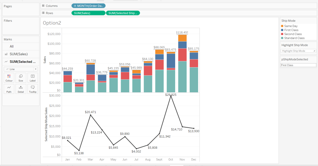


 Donna + DataViz