As community month draws to a close, long term participant Deborah Simmonds set us a map based challenge based on TC23 data.
I chose to use the data that was associated to the solution workbook, rather than take the direct source, so bear that in mind if you’re following along.
Examining the data
As there were quite a few fields in the data set which were directly related to the solution, I just wanted to familiarise myself with what I was working with initially. Essentially we have a row per person (Names Full) with the hotel they stayed at (Label Hotels), and how many steps (Steps) they took each day (Date). The details of the convention centre (Label Convention Centre) exist against every row.

The LAT and LON fields contain the location details of the hotels, while Convention LAT and Convention LON contain the location details of the Mandalay Bay Convention Centre.
Names Full already had the logic applied to create names for users based on their User ID if the Name was NULL, so I didn’t need to do anything for that requirement.
We only want to consider records relating to those people who attended ‘In Person’ and who had provided a hotel. Consequently I added the following as data source filters (right click data source -> edit data source filters) to exclude unrequired records from the whole analysis.
- Did you attend in person or virtual? : In person
- Label Hotels : excludes NULL
Building the BANs
The BANs have 3 metrics – the number of attendees, the number of steps, and the distance in metres (based on the logic that 1 step = 0.75m).
Attendees
COUNTD([User ID])
Distance (m)
[Steps] * 0.75
On a new sheet add Date to Filter as a range of dates and show the filter control. Add Attendees, Steps and Distance (m) so the measures are displayed in a row.

Change the mark type to shape and add a transparent shape (see this blog for more details). Add Measure Names to Label too and then adjust label accordingly and align centrally.

Hide the header row (uncheck show header), remove row dividers and don’t show tooltips. Name the sheet BANs or similar. Adjust the date slider and the values should adjust.
Building the bar chart (viz in tooltip)
On a new sheet add Names Full to Rows and Steps to Columns. Apply the same Date filter (from the BANs worksheet, set the filter to apply to this new worksheet too).

The viz needs to display a reference line showing the overall average of the steps per person across the selected dates, regardless as to whether the records are filtered to a hotel or not.
What do I mean by this… well if I add a standard average reference line to the viz above, the average for the whole table is 78.2k steps.

If I now filter this by a Label Hotel, then the average changes, and I don’t want that – I still want to see 78.2k.

But the average does need to change if the date range changes

This took a bit of effort to get right, but I needed
Avg Steps
SUM({FIXED Date: SUM([Steps])})/SUM({FIXED:COUNTD([User ID])})
Format this as a number with 1dp set to the K (thousandths) level
and I also needed to add the Date field on the Filter shelf to context.
So reverting back to the initial view of the bar chart… right click on the Date filter and Add to Context. Add Avg Steps to the Detail shelf. Then add a reference line (right click the Steps axis > add reference line) that displays the Avg Steps with a dark dashed line with a custom label.

Format the reference line to position the label at the top and adjust the font style.

To colour the bars we need
Steps above average
SUM([Steps]) >=[Avg Steps]
Add this to the Colour shelf, change the colours and adjust the opacity to about 75%.
Hide the column heading, and adjust the font size of the names and the axis. Name the sheet Bars or similar.

Building the initial map
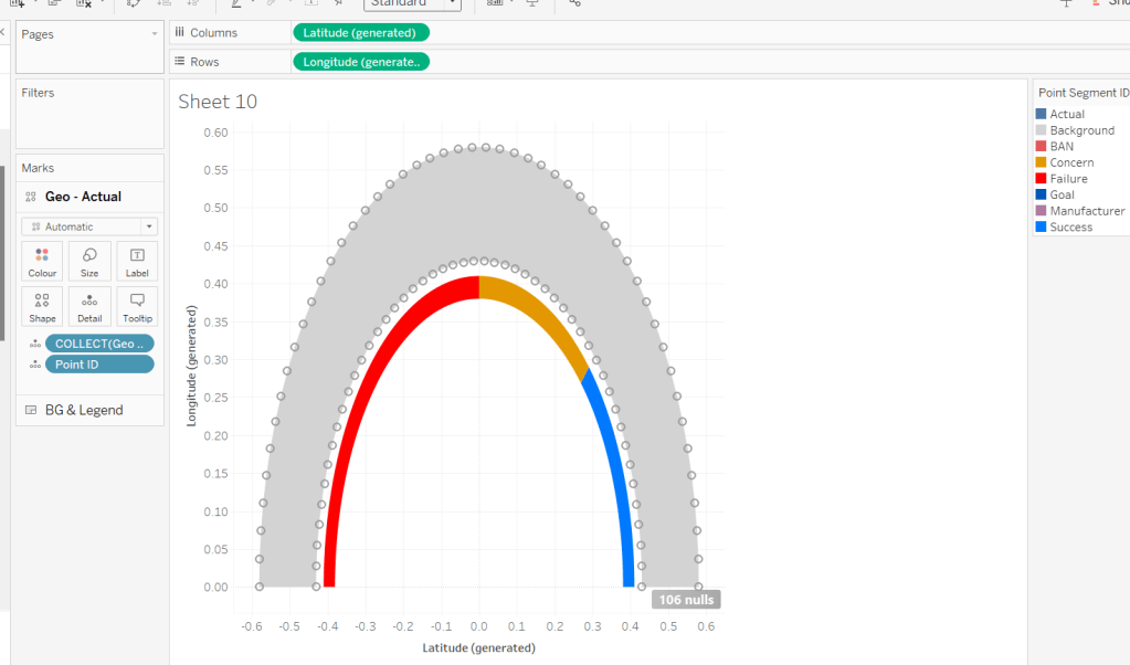
I decided to create 2 maps – one for the initial display of all the hotels and the convention centre, and then one for the selected location and buffer.
To plot the hotels on the map I created
Hotel Locations
MAKEPOINT([LAT],[LON])
On a new sheet, add this to the Detail shelf. A map will automatically generate with Latitude and Longitude fields. Change the Mark Type to Circle, then add Label Hotels to Label and align left middle. Edit the map Background Layers (via the map menu) to add Streets, Highways etc to the display

Add Steps, Attendees and Distance(m) to the Tooltip. Add Attendees to the Size shelf and adjust the size to vary by range

Apply the Date filter from the other worksheets to this sheet too. For the tooltip, We need to know about the min and max dates in the range selected. Create
Min Date
MIN([Date])
and custom format simply as dd (the day only)
Also create
Max Date
MAX([Date])
and custom form this as dd mmm yyyy
Add both of these fields to the Tooltip shelf. Adjust the text in the Tooltip and add a reference to the Bars sheet as a viz in tooltip (Insert > sheets > ). Adjust the height of the sheet to be 900.

The viz in tooltip should now display nicely on hover

To add the mark for the convention centre, we need
Conf Location
MAKEPOINT([Convention LAT], [Convention LON])
Drag this onto the map, and drop it when Add A Marks Layer displays

This will create a 2nd marks card. Change the mark type to shape and select the Tableau sparkle image if you have it stored. If not, just use another shape or circle (coloured differently).
Add Attendees to Size and add Label Convention Centre to Label and align left middle. Add Steps and Distance(m) to Tooltip and adjust to suit. Hide all the map options (map menu -> map options -> uncheck all the selections). Name the sheet Map – Initial or similar.

Building the ‘selected’ map
This will use parameters to identify what’s been selected – a hotel or the convention centre, so we need
pSelectedHotel
string parameter defaulted to empty string

and
pSelectedCentre
string parameter defaulted to empty string, just like above
The intention is that either both these parameters will be empty or only one will be populated.
To plot on a map we need
Selected Hotel Location
IF [pSelectedHotel] = [Label Hotels] AND [pSelectedCentre] =” THEN [Hotel Locations] END
and
Selected Centre Location
IF [pSelectedHotel] = ” AND [pSelectedCentre] =[Label Convention Centre] THEN [Conf Location] END
Duplicate the initial map sheet and name it Map – Selection. Show the two parameters and verify both are empty.
On the Hotel Locations marks card, drag the Selected Hotel Location field and drop it straight onto the Hotel Locations field. On the Conf Location marks card, drag Selected Centre Location and drop straight onto the Conf Locations field. Your map shouldn’t display anything…
Manually type ‘Luxor’ into the pSelectedHotel parameter. A mark should display. Adjust the Label of the Selected Hotel marks card so it is larger font, and aligned top middle. Set the colour to orange and remove the halo.

Remove the text from the pSelectedHotel parameter and manually type ‘Mandalay Bay Convention Centre’ into the pSelectedCentre parameter. A mark should display. Adjust the Label of the Selected Centre marks card so it is larger font, and aligned top middle. Remove the halo from the Colour shelf.

To create the buffer circle, we need to define the buffer radius, which is the attendee steps in metres.
Buffer Distance (m)
{FIXED : SUM(IF [pSelectedHotel] = [Label Hotels] OR [pSelectedCentre] = [Label Convention Centre] THEN [Steps] END)} * 0.75
and then we create
Buffer
IF [pSelectedHotel] <> ” THEN
BUFFER([Selected Hotel Location], [Buffer Distance (m)], ‘m’)
ELSEIF [pSelectedCentre] <> ” THEN
BUFFER([Selected Centre Location], [Buffer Distance (m)], ‘m’)
END
Add this as another marks layer.

Reduce the opacity on the colour shelf to 0% and set the border to be orange. We don’t want to allow any interactivity with the buffer, so disable selection of the layer, and also move down so it is listed at the bottom of the 3 map layers.

Show the Date filter control and adjust the dates to see the buffer adjusting. Test the behaviour with a hotel too (you may find you want to add some more detail to the background layers of the map).

We will use dynamic zone visibility on the dashboard to decide whether to display the initial or the selected map. To control this, we need
Show Initial Map
[pSelectedCentre]=” and [pSelectedHotel]=”
and
Show Selected Map
[pSelectedHotel]<>” OR [pSelectedCentre]<>”
Adding the interactivity
Create a dashboard, add the BANs and both the map sheets.

Create a dashboard parameter action
Set Hotel
On selection of the Initial Map set the pSelectedHotel parameter passing in the value from the Label Hotels field. When the selection is cleared, reset to ”.

and another parameter action
Set Conv Centre
On selection of the Initial Map set the pSelectedCentre parameter passing in the value from the Label Convention Centre field. When the selection is cleared, reset to ”.

Select the Initial Map object, and from the Layout tab, set the visibility to be controlled by the Show Initial Map field

Then select the Selected Map object, and set the visibility to be controlled by the Show Selected Map field. Only one of the maps should display based on the interactivity.
This is all the core functionality of the map, but Deborah threw in a couple of extra asks…
Building the Distance Legend
We’re using map layers again for this. Create a new field
Zero
MAKEPOINT(0,0)
Add it to the Detail shelf of a new worksheet to create the 1st map layer, then immediately add another map layer, by adding another instance of Zero to the sheet.

Switch the axis, and the map will disappear, and you’ll have axis displayed instead. Change the mark type of the first map layer to circle and colour orange.
Change the mark type of the 2nd map later to circle and colour pale grey with an orange border. Increase the Size of this circle so it appears as a ring around the filled orange circle. Move the 2nd marks layer down to the bottom and disable both marks from being selectable.

Hide the axis and gridlines/zero lines.
Right click on the central circle and annotate point. Don’t enter any text into the annotation box, just click OK. You should get the annotation box with a line.

Move the box so the connector line is horizontal, then format the annotation so the shading is set to none and the line is formatted to be a darker dashed line. Update the title of the sheet.

Building the Size Legend
Apply a similar process to that described above, but this time create 3 mark layers where the mark type is an open circle shape which is coloured blue, and for each layer, the size of the circle is slightly bigger. This time show the zero lines.

Set the background of both the legend sheets to be none (ie transparent), then add them as floating objects onto the dashboard. Use the control visibility feature to only display the Size legend when Show Initial Map is set, and only display the Distance legend when Show Selected Map is set. Set a background against each object of light grey, that is then set to 80% transparency.

With this you should have a completed challenge. My published version is here.
Happy vizzin’!
Donna